but How to Re shine on Album Covers After 80’s Mode on Album Covers After 80’s ... Depeche Mode...
11
Sociology Study, December 2015, Vol. 5, No. 12, 920‐930 doi: 10.17265/2159‐5526/2015.12.003 Simple but Dominant: How to Reshine Depeche Mode on Album Covers After 80’s Cinla Seker a Abstract The aim of this paper is to analyze the album covers of English band Depeche Mode after 80’s according to the principles of graphic design. Established in 1980, the musical style of the band was turned from synth‐pop to new wave, from new wave to electronic, dance, and alternative‐rock in decades, but their message stayed as it was: A non‐hypocritical, humanist, and decent manner against what is wrong and in love sincerely. As a graphic design product, album covers are pre‐print design solutions of two dimensional surfaces. Graphic design, as a design field, has its own elements and principles. Visual elements and typography are the two components which should unite with the help of the six main principles which are: unity/harmony; balance; hierarchy; scale/proportion; dominance/emphasis; and similarity and contrast. All album covers of Depeche Mode after 80’s were designed in a simple but dominant way in order to form a unique style. On every album cover, there are huge color, size, tone, and location contrasts which concluded in simple domination; domination of a non‐hypocritical, humanist, and decent manner against what is wrong and in love sincerely. Keywords Graphic design, album cover, design principles, dominance, Depeche Mode Design is the formal and functional features determination process, made before the production of a product. Among many other production items, printed 2D materials are the subjects which graphic design is dealing with. Graphic designer organizes the 2D surfaces with typography and visuals like photographs or illustrations (Shaughnessy 2005: 18). As graphic design products, album covers are the packages of music at the same time (Gomez-Palacio and Wit 2011: 251). These packages both protect and visualize musical expression. The genre of music and the expression of the musicians shows itself on these covers by using special visuals and typographic combinations which are the main components of graphic design. With the help of an album cover, the music reflects itself visually. The main visual elements of graphic design are line, shape, color, value, texture, and space. For a successful visualization, some graphic design principles should have been considered by the designers. The six main graphic design principles are: unity/harmony; balance; hierarchy; scale/proportion; dominance/emphasis; and similarity and contrast (Dabner, Calvert, and Casey 2012: 34-58). This means that in the organization of the visual elements, the graphic designer should take the graphic design principles into consideration. The aim of this paper is to analyze the album covers as a Dokuz Eylul University, Turkey Correspondent Author: Cinla Seker, Ugur Mumcu Caddesi 135 Sokak No. 5 Buca 35150 Izmir, Turkey E‐mail: [email protected] DAVID PUBLISHING D
Transcript of but How to Re shine on Album Covers After 80’s Mode on Album Covers After 80’s ... Depeche Mode...

Sociology Study, December 2015, Vol. 5, No. 12, 920‐930 doi: 10.17265/2159‐5526/2015.12.003
Simple but Dominant: How to Reshine Depeche Mode on Album Covers After 80’s
Cinla Sekera
Abstract
The aim of this paper is to analyze the album covers of English band Depeche Mode after 80’s according to the principles of
graphic design. Established in 1980, the musical style of the band was turned from synth‐pop to new wave, from new wave to
electronic, dance, and alternative‐rock in decades, but their message stayed as it was: A non‐hypocritical, humanist, and
decent manner against what is wrong and in love sincerely. As a graphic design product, album covers are pre‐print design
solutions of two dimensional surfaces. Graphic design, as a design field, has its own elements and principles. Visual elements
and typography are the two components which should unite with the help of the six main principles which are:
unity/harmony; balance; hierarchy; scale/proportion; dominance/emphasis; and similarity and contrast. All album covers of
Depeche Mode after 80’s were designed in a simple but dominant way in order to form a unique style. On every album cover,
there are huge color, size, tone, and location contrasts which concluded in simple domination; domination of a
non‐hypocritical, humanist, and decent manner against what is wrong and in love sincerely.
Keywords
Graphic design, album cover, design principles, dominance, Depeche Mode
Design is the formal and functional features
determination process, made before the production of
a product. Among many other production items,
printed 2D materials are the subjects which graphic
design is dealing with. Graphic designer organizes the
2D surfaces with typography and visuals like
photographs or illustrations (Shaughnessy 2005: 18).
As graphic design products, album covers are the
packages of music at the same time (Gomez-Palacio
and Wit 2011: 251). These packages both protect and
visualize musical expression. The genre of music and
the expression of the musicians shows itself on these
covers by using special visuals and typographic
combinations which are the main components of
graphic design.
With the help of an album cover, the music
reflects itself visually. The main visual elements of
graphic design are line, shape, color, value, texture,
and space. For a successful visualization, some
graphic design principles should have been
considered by the designers. The six main graphic
design principles are: unity/harmony; balance;
hierarchy; scale/proportion; dominance/emphasis; and
similarity and contrast (Dabner, Calvert, and Casey
2012: 34-58). This means that in the organization of
the visual elements, the graphic designer should take
the graphic design principles into consideration. The
aim of this paper is to analyze the album covers as
aDokuz Eylul University, Turkey Correspondent Author: Cinla Seker, Ugur Mumcu Caddesi 135 Sokak No. 5 Buca 35150 Izmir, Turkey E‐mail: [email protected]
DAVID PUBLISHING
D

Seker
921
form and content of the English band Depeche Mode
during and after 80’s according to the principles of
graphic design.
Established in 1980, the musical style of the band
Depeche Mode was turned from synth-pop to new
wave, from new wave to electronic, dance, and
alternative-rock in decades, but their message stayed
as it was: a non-hypocritical, humanist, and decent
manner against what is wrong and in love sincerely.
Depeche Mode is still an active band and has been 31
times nominated and 10 times won the highly
prestigious worldwide prizes. It is the most popular
electronic band the world has ever known and it is in
the list of the 50 bands that changed the world. As
seen in Figure 1 from left to right, Depeche Mode
are Alan Wilder (1959), Martin L. Gore (1961),
Andy Fletcher (1961), and Dave Gahan (1962) with
slight differences (Miller 2009: 7-9; Bernhardt 2007:
3-5).
MUSICAL GENRES RELATED TO DEPECHE MODE
Music can be defined as an art form which is vocal or
instrumental sounds (or both) combined in such a way
as to produce beauty of form, harmony, and
expression of emotion (Steyn 2012: 10). Genres and
subgenres of popular music named after the musical
techniques, the style, the cultural context, and the
content and the spirit of the themes and sometimes,
simply features of musical instruments or geography
used (Holt 2007: 4-9). The musical style of Depeche
Mode has changed from synth-pop to new wave, from
new wave to electronic, dance, and alternative-rock in
decades from 1980s to nowadays.
While electronic music was defined as music
made by electronic musical instruments and
technology (Emerson 2007: 90), synth-pop was also
known as electro-pop or techno-pop used synthesizer
as a dominant instrument (Kosmicki 2009: 236).
Modular synthesizer was designed in 1960, generating
electric signals that are converted to sound through
instrument amplifiers and loudspeakers or headphones
(T. B. Holmes and T. Holmes 2002: 5-7). Industrial
music, which is also a genre of
experimental/electronic music that draws on
transgressive and provocative themes. It is the most
abrasive and aggressive fusion of rock and electronic
music; initially a blend of avant-garde electronics
experiments and punk provocation (Reed 2013: 317).
Rock music is one of the many genres which is
under the effect of the usage of electronic musical
instruments, and a subgenre called electronic rock,
synth-rock, electro-rock, techno-rock, or digital rock
(Waksman 2001: 238). Another musical genre of
popular rock was created 1975-1985 called the new
wave. The sound of the genre was rooted in smooth
blues and rock & roll but was differed with its twitchy,
agitated feel, choppy rhythm guitars, and fast tempos.
New wave has resemblance to first-wave punk but not
punk rock with touches of electronic, experimental,
mod, disco, and pop (Ray 2013: 210; Bernhardt
2007: 7).
Simply punk or punk rock is also rock music
developed during 1974-1976 as a rejection to the
mainstream 1970s rock. It is typical with its short or
fast-paced songs, with hard-edge melodies and singing
styles, stripping down instrumentation, and is often
political, and having anti-establishment lyrics which
are standing in opposition to the conventional social,
political, and economic principles of the society. After
punk movement of 1970s, post-punk occurred as a
combined type of rock music. Post-punk musicians
were innovators and experimentalists mixed a group
of genres, like electronic music, black dance styles,
and the avant-garde with rock music. They have not
hesitated trying new and interesting recording and
production technology and techniques (Crossley
2015: 49).
In the early 1980s besides punk, disco also died
and as a post-disco genre, dance-rock occurred
connected with electronic and pop rock with fewer

Sociology Study 5(12)
922
Figure 1. Depeche Mode (1990s). Source: Http://classicalbumsundays.com/album‐of‐the‐month‐depeche‐
mode‐violator.
rhythm and blues influences (Haden-Guest 2015: 149).
Alternative rock, also called alternative music,
alt-rock or alternative, is a genre of rock music that
emerged from the 1980s’ independent music
underground and became widely popular in the 1990s
and 2000s. The word alternative refers to the genre’s
distinction from mainstream rock music. The term
originally refers to a generation of musicians unified
by their collective debt to either the musical style or
simply the independent, do-it-yourself culture of punk
rock, which in the late 1970s laid the groundwork for
alternative music. Term has been used as to refer all
music from underground rock artists that receives
mainstream recognition, or for any music, whether
rock or not, that is seen to be descended from punk
rock, punk itself, as well as new wave, and post-punk
(The Wikipedians 2010: 2; Star 2009: 10).
So from 1980 until 2010s, Depeche Mode had
combined many different genres and styles in their
own way and created a unique music to themselves.
Like every human in their journey of life, on the
journey of musical creation and expression, they had
tried different paths to find themselves. In this artistic
journey, visual designs also helped them to
communicate, meet their audience and create an
audio-visual history, as a conclusion, helping them
with their self-actualization. The next chapter put forth
the visual reflections of this musical journey by
analyzing the formal and contextual features of the
studio album covers of Depeche Mode.
FORM—CONTEXT ANALYSIS OF DEPECHE MODE ALBUM COVERS
Musical Periods of Depeche Mode
1980s. After establishing in 1980, the group released
four studio albums every year until 1984. While the
first two of the quartet both Speak & Spell released in
1981, and A Broken Frame released in 1982 were
labelled as synth-pop as musical genre. While the
third album Construction Time Again released in 1983
was labelled as industrial music, the last of the quartet
Some Great Reward released in 1984 was labelled as
pop, industrial, and electronic music. Like their
musical styles, the design attitudes of the four album
covers are quite similar.
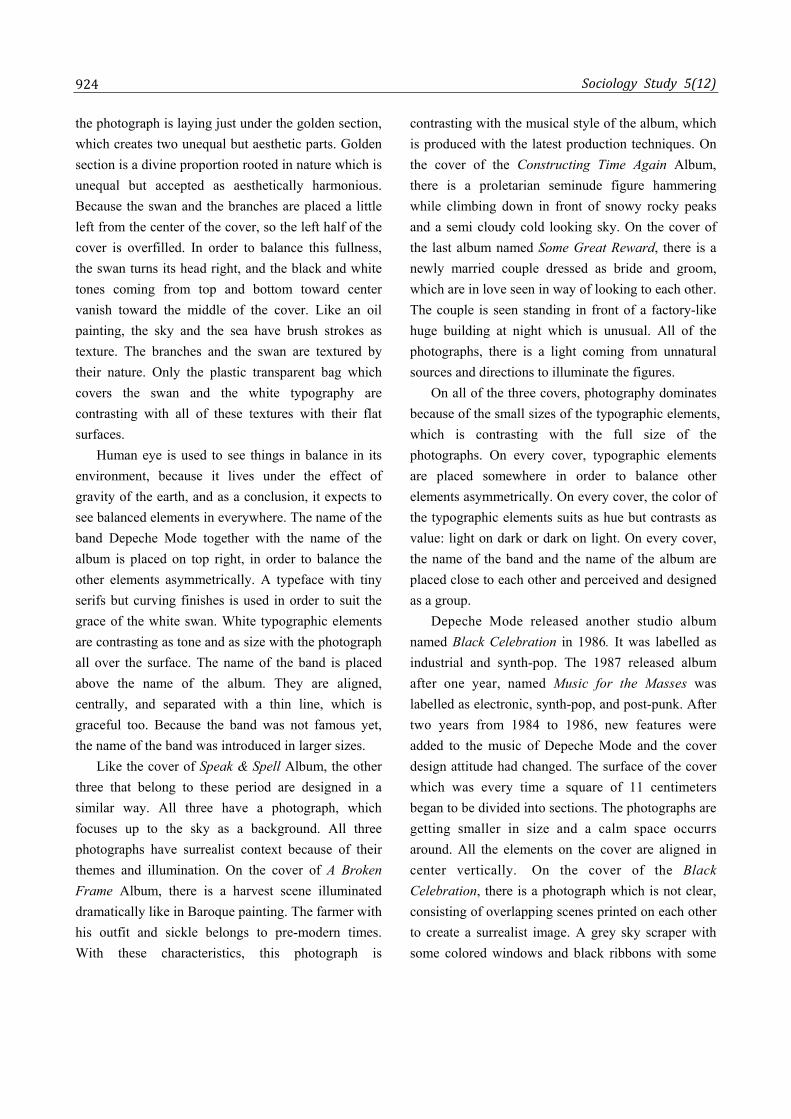
On the all of four album covers, as seen in Figure
2, realist photography is used in the surrealist context.
This means real life object and environments can be

Seker
923
Figure 2. 1981‐1984 Album Covers. Source: The author’s collection.
seen as real but in unreal situation or environments. At
first sight, it is easy to see that the color scheme used
is getting colder and less saturated cover by cover.
The brightest of the four is the oldest one: Speak &
Spell. On the cover of the album, a real white swan is
seen in a red sea swimming in front of a red sky. It is
in a plastic transparent bag in which it cannot breathe,
so it cannot be alive. The grey branches the swan
sitting on look like they belong to a different world
because of their color. The monochrome color scheme
is used in red with millions of tones. While bright red
is the main color, white, black, and millions of tones
between are neutrals. The neutrals are suitable for
every color scheme and they leave the leading role to
the owner, the red.
If looking carefully, it is seen that the horizon of
Sociology Study 5(12)
924
the photograph is laying just under the golden section,
which creates two unequal but aesthetic parts. Golden
section is a divine proportion rooted in nature which is
unequal but accepted as aesthetically harmonious.
Because the swan and the branches are placed a little
left from the center of the cover, so the left half of the
cover is overfilled. In order to balance this fullness,
the swan turns its head right, and the black and white
tones coming from top and bottom toward center
vanish toward the middle of the cover. Like an oil
painting, the sky and the sea have brush strokes as
texture. The branches and the swan are textured by
their nature. Only the plastic transparent bag which
covers the swan and the white typography are
contrasting with all of these textures with their flat
surfaces.
Human eye is used to see things in balance in its
environment, because it lives under the effect of
gravity of the earth, and as a conclusion, it expects to
see balanced elements in everywhere. The name of the
band Depeche Mode together with the name of the
album is placed on top right, in order to balance the
other elements asymmetrically. A typeface with tiny
serifs but curving finishes is used in order to suit the
grace of the white swan. White typographic elements
are contrasting as tone and as size with the photograph
all over the surface. The name of the band is placed
above the name of the album. They are aligned,
centrally, and separated with a thin line, which is
graceful too. Because the band was not famous yet,
the name of the band was introduced in larger sizes.
Like the cover of Speak & Spell Album, the other
three that belong to these period are designed in a
similar way. All three have a photograph, which
focuses up to the sky as a background. All three
photographs have surrealist context because of their
themes and illumination. On the cover of A Broken
Frame Album, there is a harvest scene illuminated
dramatically like in Baroque painting. The farmer with
his outfit and sickle belongs to pre-modern times.
With these characteristics, this photograph is
contrasting with the musical style of the album, which
is produced with the latest production techniques. On
the cover of the Constructing Time Again Album,
there is a proletarian seminude figure hammering
while climbing down in front of snowy rocky peaks
and a semi cloudy cold looking sky. On the cover of
the last album named Some Great Reward, there is a
newly married couple dressed as bride and groom,
which are in love seen in way of looking to each other.
The couple is seen standing in front of a factory-like
huge building at night which is unusual. All of the
photographs, there is a light coming from unnatural
sources and directions to illuminate the figures.
On all of the three covers, photography dominates
because of the small sizes of the typographic elements,
which is contrasting with the full size of the
photographs. On every cover, typographic elements
are placed somewhere in order to balance other
elements asymmetrically. On every cover, the color of
the typographic elements suits as hue but contrasts as
value: light on dark or dark on light. On every cover,
the name of the band and the name of the album are
placed close to each other and perceived and designed
as a group.
Depeche Mode released another studio album
named Black Celebration in 1986. It was labelled as
industrial and synth-pop. The 1987 released album
after one year, named Music for the Masses was
labelled as electronic, synth-pop, and post-punk. After
two years from 1984 to 1986, new features were
added to the music of Depeche Mode and the cover
design attitude had changed. The surface of the cover
which was every time a square of 11 centimeters
began to be divided into sections. The photographs are
getting smaller in size and a calm space occurrs
around. All the elements on the cover are aligned in
center vertically. On the cover of the Black
Celebration, there is a photograph which is not clear,
consisting of overlapping scenes printed on each other
to create a surrealist image. A grey sky scraper with
some colored windows and black ribbons with some

Seker
925
Figure 3. 1986‐1987 Album Covers. Source: The author’s collection.
flowers in front, form an image of black celebration.
The black background, some colored windows, and
flowers make the photography perceived as closer.
Typography is designed as a logotype with an emblem
colored in bright warm colors and the small size of the
lettering is contrasting with the rest of the cover. With
the big sizes of the flowers in front, the designer
balances the colorful typography which is on top.
The modern sans-serif fonts are used on both of
the covers suiting the plain grounds behind, as seen in
Figure 3. Again on the cover of the Music for the
Masses Album, typographic elements are organized as
a logotype with an emblem. An extraordinary
surrealist photograph is placed in the middle of the
cover. In the middle of the photograph, there is a pole
with three red megaphones on it. It is an extraordinary
scene. With their proportions and locations, the
photograph and the typographic elements balance each
other. The asymmetry is caused by the three
megaphones in the middle, balanced diagonally with
the bright sunlight coming from left up. The cream
colored background comes closer and is perceived as a
frame in front of the photograph because of the deep
going effect of the photography.
Texture as design element is also contrasting on
the both of the covers with the non-textured areas.
While on the first cover Black Celebration, windows
of a skyscraper are contrasting with plain black
background, on Music for the Masses, textured cream
background is contrasting with the plain areas of
photography.
1990s. Another Depeche Mode studio album
named Violator was released in 1990 labelled as pop,
rock, and electronic. After Violator, in 1993 Songs of
Faith and Devotion was released and labelled as
electronic rock, alternative dance, industrial rock, and
new wave. The design attitudes of the two album
covers are similar, despite at first sight, they are
looking different. As seen in Figure 4, the visuals used
on the covers are not photographs anymore. They are
rough-edged and multi-piece illustrations with three
tones only, which are black, white, and powerful dark
colors like red or purple. There are black backgrounds
and freehand typography designed in a unique way.
Freehand typography is handwritings made for these
covers only and used only for once. After pure rock
effecting their music, the designs of the covers are
turned into something rough, full of irregular shapes

Sociology Study 5(12)
926
Figure 4. 1990‐1993 Album Covers. Source: The author’s collection.
Figure 5. 1997‐2001 Album Covers. Source: The author’s collection.
with reduced number of tones and colors. But this
time, the color itself dominates the cover with its
power because of its singularity. The design attitude
of balancing asymmetrical elements with others has
not changed.
In 1997, released studio album of the band named
Ultra was labelled as alternative dance, electronic,
industrial, and alternative rock. On the other hand, in
2001, released studio album Exciter combined all
characteristics of Depeche Mode with soul music,
which combined the elements of African-American
gospel music, rhythm, and blues and jazz. For Depeche
Mode, being an alternative music band, is reflected by
visual effects on the cover of the album Ultra.

Seker
927
Undefinable textures of over-blurred image are
seen on the cover in a combination with typographic
elements. With the invention of digital typography
and photography, a new design approach occurs. The
old, torn, and worn looking image created on the
cover’s visual and verbal elements has a resemblance
of the situation of the soul of Depeche Mode, which is
reflected with their music and lyrics. Texture
dominates the cover as an element of design with a
small amount flat grounds left. A form and content
relation can be seen on the size of the name of the
album which covers almost all the surface. In order to
make the composition more dynamic, the name of the
band is placed top left in little sizes. Neutral color
scheme is used with a little bit in three colors purple,
red, and green, which are complementary.
On the cover of the album Exciter, texture is the
dominant element again, but this time in fine-grained.
In between the leaves, there are flat black shadows
helping to increase the effect of texture. The reddish
green color of the plant is all over and the centralized
composition takes the attention. Dynamism is created
with the top left placement of the typographic
elements again. Freehand typography has
characteristic cambers like the leaves have. White
typographic elements tone as color suits with the light
areas around the center of the plant. Size contrast is
used as a feature to take attention on both covers.
While in Ultra, huge typography takes the attention,
in Exciter, huge plant with its oddity and size take the
attention, as seen in Figure 5. On the cover of Exciter,
both shapes and textures smoothen like the
smoothened musical style of the album. Rebellious
hard guitar riffs leave some of its place to smooth
soul’s companionship combined the style of the band.
New millennium. While in 2005, released studio
album of Depeche Mode Playing the Angel was
labelled as synth-pop, alternative dance, industrial,
and alternative rock, the Sounds of the Universe album
released in 2009 was labelled as synth-pop and
electronic rock. On both covers, as seen in Figure 6,
graphic design elements—line and shape dominate the
covers, which means both covers’ designs turn their
faces to the basic elements of graphic design. On the
cover of the Playing the Angel, black figures are seen
on a multi-piece background formed with different
tones of grey. The names of the band and the album
are drew freehand on both sides and a creature made
of feather standing in the middle. While different sizes
and organization among the typographic elements
balance the two halves, the location and the shapes of
the pieces on the background balance the asymmetry.
On this cover, texture is again a dominant element.
The multi-piece background’s giant grains are
contrasting with the thinness of the feathers of the
creature.
On the cover of the Sounds of the Universe, an
image is created resembling a message sending world
with the help of thick lines in different colors. Lines
with different directions on a black circle are
contrasting with the grey flat surface. Like many
covers, the initials of the name of the band are
emphasized with the thick lines. While the name of
the band written with a sans-serif modern font lays on
top justified, the name of the album lays down in the
middle with lower cases of the same font but in white.
The two groups are balancing each other with their
sizes and locations.
Last album of Depeche Mode was Delta Machine
released in 2013, which was labelled as electro-pop,
industrial, and synth-rock. A multi-piece factory is
seen in monochrome dark red in Figure 7. What a
coincidence red was the color of the first Depeche
Mode studio album released in 1981. The photograph
consists of lots of geometric shapes and a few lines in
different tones. Dark red color lightens while going up
step by step. A huge logotype is designed by using
freehand shapes, letters, and a line in black. A little
change in size and the location between words
indicates which is the name of the band and which is
the album. Placing the logotype’s line in the center,
balancing the dark red areas which is under the line

Sociology Study 5(12)
928
Figure 6. 2005‐2009 Album Covers. Source: The author’s collection.
Figure 7. Delta Machine (2013) Album Cover. Source: The author’s collection.
with the huge name of the band which is over. The
black triangles are used to create the two Ds,
balancing the two cylinder tanks which are rising. The
two triangles created M, suiting the cone roofs of the
tanks. The thick black line in the middle of the
logotype suits with the dark red horizontal thick lines
down.
CONCLUSIONS
During 80s, on every album cover of Depeche Mode,
there is a photography as a background, which looks
real but they are contextually surreal. All six
photographs focus above the horizon and have the
illusion of depth. Photographs which are dominating
the covers got smaller in size on cover by cover.

Seker
929
Figure-ground differentiation began to occur on
covers. Any image of the band or band members is
used as photograph. The warm color schemes are
getting colder and colder. Fonts using in typography
have tiny or no serifs but they are classic. The classic
fonts leave its place in modern sans-serif fonts.
Asymmetrically, balanced, and diagonal compositions
are turned into symmetric ones.
During 90s, no photography was used on the
covers, only illustrations and shapes were used as
visuals, except Exciter, on which an unusual framed
photography of an unusual plant was used as an image.
On these illustrations, there was always one powerful
color dominating neutral colors, which were brown,
grey, black, and white. Freestyle typography made
freehand was used in order to create an artistic and
unique look. Figure and ground separated,
figure-ground differentiation occurred. Typography,
color, or texture dominated the covers. There was
always a black background. Asymmetric composition
was turned into symmetric, centered, or justified.
With the new millennium, no photography or
highly effected photography was used on the covers.
Figure-ground differentiation continued. While some
elements were perceived as figure, some perceived as
ground and grey, fragmented or colored backgrounds
they had. Shapes dominated the cover as figure or as
typography made by shapes or thick lines. On every
cover, neutral color scheme was used in a combination
with some mature colors and all the covers had
centered or justified compositions. Freestyle
typography continued as mixture of shapes, lines, or
typed writings.
When looking in general, the album cover design
attitudes are related with the musical attitudes. Album
cover design attitudes are changing with the musical
changes. Album cover design attitudes are every time
based on the six main design principles. With 90’s,
there is a significant and ongoing musical change
followed by the changing design attitudes, which are:
Realist imagery left its place into fragmented
surrealist imagery toward new millennium. Real life
photography left its place to the elements of design
like line, shape, and texture. Real life colors left its
place into neutrals dominating with one brilliant.
Regular typographic style left its place to freestyle
typography based on lines and shapes. Asymmetrical
balance left its place to symmetrically balanced,
centered, or justified composition.
References
Bernhardt, T. 2007. Depeche Mode: A Band, Its Music, and the Cult. Norderstedt: Grin Verlag.
Crossley, N. 2015. Networks of Sound, Style, and Subversion: The Punk and Post-Punk Worlds of Manchester, London, Liverpool, and Sheffield, 1975-80. Manchester: Manchester University Press.
Dabner, D., S. Calvert, and A. Casey. 2012. The New Graphic Design School: A Foundation Course in Principles and Practice. Hoboken: John Wiley & Sons.
Emerson, S. 2007. Living Electronic Music. Hampshire: Ashgate Publishing.
Gomez-Palacio, B. and A. Wit. 2011. Graphic Design, Referenced: A Visual Guide to the Language, Applications, and History of Graphic Design. Beverly: Rockport Publishers.
Haden-Guest, A. 2015. The Last Party: Studio 54, Disco, and the Culture of the Night. New York: Open Road Integrated Media.
Holmes, T. B. and T. Holmes. 2002. Electronic and Experimental Music: Pioneers in Technology and Composition. New York: Routledge.
Holt, F. 2007. Genre in Popular Music. Chicago: University of Chicago Press.
Kosmicki, G. 2009. Musiques Electronics: Des Avant-Gardes aux Dance Floors (Electronic Music: Avant-Gardes to the Dance Floors). Marseille: Mot et le Reste.
Miller, J. 2009. Stripped: Depeche Mode. London: Onmibus Press.
Ray, M. ed. 2013. Disco, Punk, New Wave, Heavy Metal, and More: Music in the 1970s and 1980s. New York: Britannica Educational Publishing.
Reed, S. A. 2013. Assimilate: A Critical History of Industrial Music. New York: Oxford University Press.
Shaughnessy, A. 2005. How to Be a Graphic Designer, Without Losing Your Soul. London: Laurence King Publishing.
Star, E. 2009. The Everything Rock Drums Book With CD: From Basic Rock Beats and Syncopation to Fills and Drum Solos. Avon: Everything Books.

Sociology Study 5(12)
930
Steyn, J. 2012. Structuring Music Through Markup Language: Design and Architectures. Hershey: IGI Global.
The Wikipedians. 2010. Alternative Rock: The Complete Guide. Mainz: Pedia Press.
Waksman, S. 2001. Instruments of Desire: The Electric Guitar and the Shaping of Musical Experience. Cambridge: Harvard University Press.
Bio
Cinla Seker, Ph.D., assistant professor, Buca Faculty of Education, Department of Fine Arts Education, Dokuz Eylul University, Turkey; research fields: graphic design, album cover design, design elements and principles, graphic design education, fine arts, art history.