
Business Intelligence & Process Modellingliacs.leidenuniv.nl/~takesfw/BIPM/lecture2.pdf · Lecture...
84
Business Intelligence & Process Modelling Frank Takes Universiteit Leiden Lecture 2 — BI & Visual Analytics BIPM — Lecture 2 — BI & Visual Analytics 1 / 74
Transcript of Business Intelligence & Process Modellingliacs.leidenuniv.nl/~takesfw/BIPM/lecture2.pdf · Lecture...

Business Intelligence & Process Modelling
Frank Takes
Universiteit Leiden
Lecture 2 — BI & Visual Analytics
BIPM — Lecture 2 — BI & Visual Analytics 1 / 74
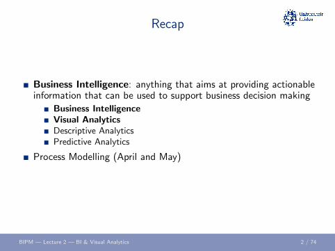
Recap
Business Intelligence: anything that aims at providing actionableinformation that can be used to support business decision making
Business IntelligenceVisual AnalyticsDescriptive AnalyticsPredictive Analytics
Process Modelling (April and May)
BIPM — Lecture 2 — BI & Visual Analytics 2 / 74

Business Intelligence
BIPM — Lecture 2 — BI & Visual Analytics 3 / 74

Business Intelligence goals
Operational intelligence
Corporate governance
Risk assessment
Compliance
Auditing
Sarbanes-Oxley (SOX) — role of IT in corporate governance
BIPM — Lecture 2 — BI & Visual Analytics 4 / 74

Management Approaches in BI
Continuous Process Improvement (CPI): ongoing effort toimprove products, services or processes
Incremental improvements vs. Breakthrough improvementsEvaluate based on efficiency, effectiveness and flexibility
Total Quality Management (TQM): improve processes up to themicroscopic level, focussing on meeting customer demands andrealizing strategic company goals, e.g., Six Sigma
BIPM — Lecture 2 — BI & Visual Analytics 5 / 74
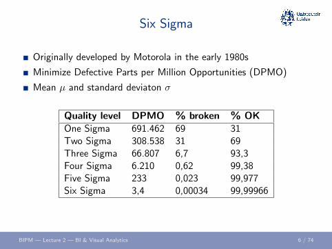
Six Sigma
Originally developed by Motorola in the early 1980s
Minimize Defective Parts per Million Opportunities (DPMO)
Mean µ and standard deviaton σ
Quality level DPMO % broken % OKOne Sigma 691.462 69 31Two Sigma 308.538 31 69Three Sigma 66.807 6,7 93,3Four Sigma 6.210 0,62 99,38Five Sigma 233 0,023 99,977Six Sigma 3,4 0,00034 99,99966
BIPM — Lecture 2 — BI & Visual Analytics 6 / 74

Normal distribution
BIPM — Lecture 2 — BI & Visual Analytics 7 / 74

DMAIC approach
Define the problem and set targets,
Measure key performance indicators (KPI’s) and collect data,
Analyze the data to investigate and verify cause-and-effectrelationships,
Improve the current process based on this analysis,
Control the process to minimize deviations from the target.
BIPM — Lecture 2 — BI & Visual Analytics 8 / 74

Key Performance Indicators
KPI: measure, variable or metric to analyze the performance of(part of) an organization
Strategic goals → Measurable variables
SMARTSpecificMeasurableAcceptableRealisticTime-sensitive
BIPM — Lecture 2 — BI & Visual Analytics 9 / 74
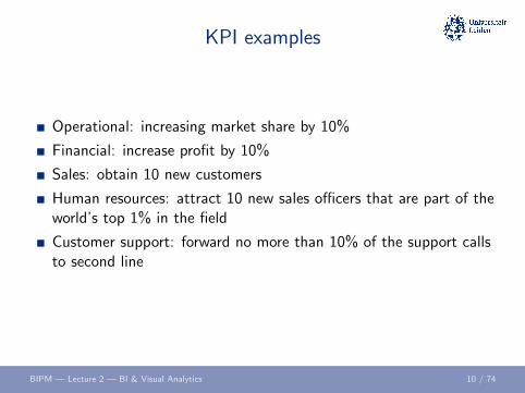
KPI examples
Operational: increasing market share by 10%
Financial: increase profit by 10%
Sales: obtain 10 new customers
Human resources: attract 10 new sales officers that are part of theworld’s top 1% in the field
Customer support: forward no more than 10% of the support callsto second line
BIPM — Lecture 2 — BI & Visual Analytics 10 / 74
BI in practice
Codeless reporting
Instant querying
Rich visualization
Dashboards (“Management cockpits”)
Scorecards
BIPM — Lecture 2 — BI & Visual Analytics 11 / 74
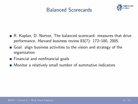
Balanced Scorecards
R. Kaplan, D. Norton, The balanced scorecard: measures that driveperformance, Harvard business review 83(7): 172–180, 2005.
Goal: align business activities to the vision and strategy of theorganization
Financial and nonfinancial goals
Monitor a relatively small number of summative indicators
BIPM — Lecture 2 — BI & Visual Analytics 12 / 74

Balanced Scorecard
BIPM — Lecture 2 — BI & Visual Analytics 13 / 74
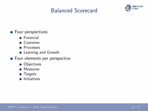
Balanced Scorecard
Four perspectives:
FinancialCustomerProcessesLearning and Growth
Four elements per perspective
ObjectivesMeasuresTargetsInitiatives
BIPM — Lecture 2 — BI & Visual Analytics 14 / 74
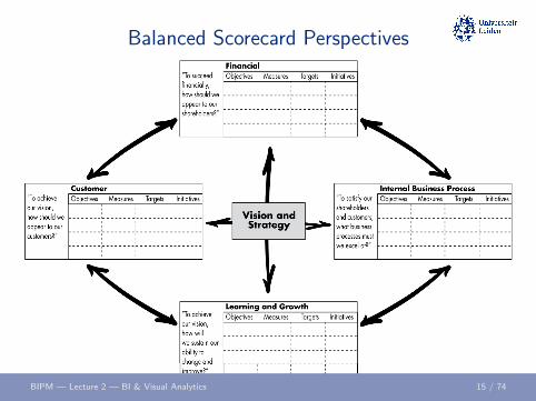
Balanced Scorecard Perspectives
BIPM — Lecture 2 — BI & Visual Analytics 15 / 74
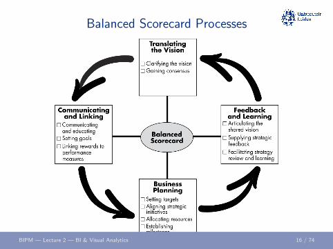
Balanced Scorecard Processes
BIPM — Lecture 2 — BI & Visual Analytics 16 / 74

Relations between Perspectives
BIPM — Lecture 2 — BI & Visual Analytics 17 / 74

Some terms . . .
Business Activity Monitoring (BAM): insight in operationalstatus and events of a business
Complex Event Processing (CEP): monitor events and reactimmediately if a pattern occurs
Corporate Performance Management (CPM): measuring the(financial) performance of a process or organization
BIPM — Lecture 2 — BI & Visual Analytics 18 / 74

Some systems . . .
Enterprise Resource Planning (ERP) Systems
Enterprise Information Systems (EIS)
Business Information Systems (BIS)
Management Information System (MIS)
Executive Information System (EIS)
BIPM — Lecture 2 — BI & Visual Analytics 19 / 74

ETL
Extract data from source systems: generate dumps, exports, etc.
Transform data: aggregating, linking, sorting, joining, etc.
Loading data into target system into desired (reporting) format
BIPM — Lecture 2 — BI & Visual Analytics 20 / 74

OLAP
OnLine Analytical Processing (OLAP)
Given a data table with n attributes:
Dimensions of an (n − 1)-dimensional cube represent n − 1 attributesof the dataValue in a cell of the cube represents the remaining attribute
Use a slice or dice to get the desired information
Suitable for, e.g., star schema data
BIPM — Lecture 2 — BI & Visual Analytics 21 / 74

OLAP Example
Example: website visitor logs, storing:
1 Time
2 Web page
3 Action
4 Conversion
BIPM — Lecture 2 — BI & Visual Analytics 22 / 74
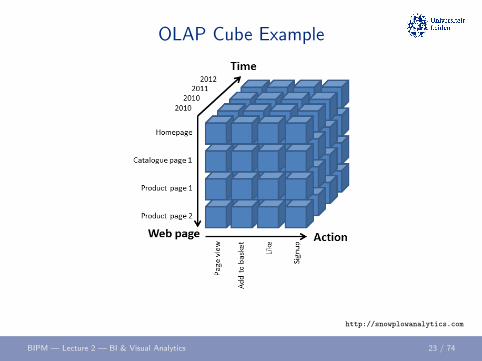
OLAP Cube Example
http://snowplowanalytics.com
BIPM — Lecture 2 — BI & Visual Analytics 23 / 74

OLAP Cube Example Slice
http://snowplowanalytics.com
BIPM — Lecture 2 — BI & Visual Analytics 24 / 74

OLAP Cube Dice
http://snowplowanalytics.com
BIPM — Lecture 2 — BI & Visual Analytics 25 / 74

OLAP Formalized
OnLine Analytical Processing (OLAP)
Given a data table D with 4 attributes W ,X ,Y and Z
An OLAP cube can be characterized as a functionf : (X ,Y ,Z )→W
An example of a slice is a function g : (Y ,Z )→W
Given subsets X ′ ⊆ X and Z ′ ⊆ Z a dice is a functionh : (X ′,Y ,Z ′)→W
BIPM — Lecture 2 — BI & Visual Analytics 26 / 74

Break?
BIPM — Lecture 2 — BI & Visual Analytics 27 / 74

Visual Analytics
BIPM — Lecture 2 — BI & Visual Analytics 28 / 74
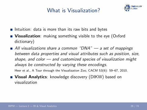
What is Visualization?
Intuition: data is more than its raw bits and bytes
Visualization: making something visible to the eye (Oxforddictionary)
All visualizations share a common “DNA” — a set of mappingsbetween data properties and visual attributes such as position, size,shape, and color — and customized species of visualization mightalways be constructed by varying these encodings.Heer et al., A Tour through the Visualization Zoo, CACM 53(6): 59–67, 2010.
Visual Analytics: knowledge discovery (DIKW) based onvisualization
BIPM — Lecture 2 — BI & Visual Analytics 29 / 74

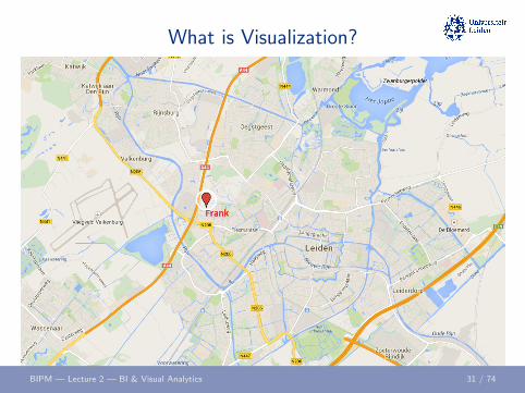
What is Visualization?
Data properties: attributes of (groups of) data objectsName; Age; City
Frank; 28; ”Niels Bohrweg 1, Leiden”
Visual attributes: e.g., position, size, shape, label, color, etc.Label; Size; Position
Visualization: mapping data properties to visual attributesName → LabelAge → SizeCity → Position"Frank", log2(28), (52.1603216, 4.4939262)
BIPM — Lecture 2 — BI & Visual Analytics 30 / 74
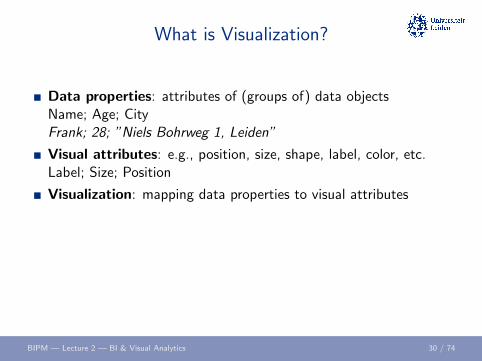
What is Visualization?
Data properties: attributes of (groups of) data objectsName; Age; CityFrank; 28; ”Niels Bohrweg 1, Leiden”
Visual attributes: e.g., position, size, shape, label, color, etc.Label; Size; Position
Visualization: mapping data properties to visual attributesName → LabelAge → SizeCity → Position"Frank", log2(28), (52.1603216, 4.4939262)
BIPM — Lecture 2 — BI & Visual Analytics 30 / 74
What is Visualization?
Data properties: attributes of (groups of) data objectsName; Age; CityFrank; 28; ”Niels Bohrweg 1, Leiden”
Visual attributes: e.g., position, size, shape, label, color, etc.Label; Size; Position
Visualization: mapping data properties to visual attributes
Name → LabelAge → SizeCity → Position"Frank", log2(28), (52.1603216, 4.4939262)
BIPM — Lecture 2 — BI & Visual Analytics 30 / 74

What is Visualization?
Data properties: attributes of (groups of) data objectsName; Age; CityFrank; 28; ”Niels Bohrweg 1, Leiden”
Visual attributes: e.g., position, size, shape, label, color, etc.Label; Size; Position
Visualization: mapping data properties to visual attributesName → LabelAge → SizeCity → Position
"Frank", log2(28), (52.1603216, 4.4939262)
BIPM — Lecture 2 — BI & Visual Analytics 30 / 74

What is Visualization?
Data properties: attributes of (groups of) data objectsName; Age; CityFrank; 28; ”Niels Bohrweg 1, Leiden”
Visual attributes: e.g., position, size, shape, label, color, etc.Label; Size; Position
Visualization: mapping data properties to visual attributesName → LabelAge → SizeCity → Position"Frank", log2(28), (52.1603216, 4.4939262)
BIPM — Lecture 2 — BI & Visual Analytics 30 / 74
What is Visualization?
BIPM — Lecture 2 — BI & Visual Analytics 31 / 74
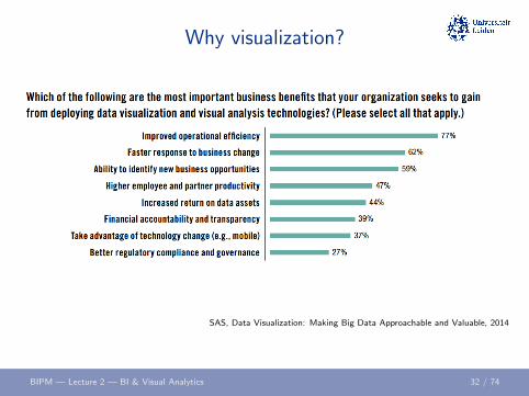
Why visualization?
SAS, Data Visualization: Making Big Data Approachable and Valuable, 2014
BIPM — Lecture 2 — BI & Visual Analytics 32 / 74

Why visualization?
SAS, Data Visualization: Making Big Data Approachable and Valuable, 2014
BIPM — Lecture 2 — BI & Visual Analytics 33 / 74

Visualization theory
Discrete vs. continuous data
Categorical vs. quantitative data
Mean or median?
Variance?
Correlations? Regression?
Normal distribution or power law?
The correct visualization depends on the data itself!
BIPM — Lecture 2 — BI & Visual Analytics 34 / 74

Listen to the data to . . .
Catch mistakes
See patterns
Find violations of statistical assumptions
Generate hypotheses
Do outlier detection
BIPM — Lecture 2 — BI & Visual Analytics 35 / 74

Anscombe’s quartet
F.J. Anscombe, Graphs in Statistical Analysis, American Statistician 27 (1): 1721, 1973.
BIPM — Lecture 2 — BI & Visual Analytics 36 / 74

Anscombe’s quartet
Property Value AccuracyMean of x 9 exact
Sample variance of x 11 exactMean of y 7.50 to 2 decimal places
Sample variance of y 4.125 plus/minus 0.003Correlation between x and y 0.816 to 3 decimal places
Linear regression line y = 3.0 + 0.50x to 2 decimal places
BIPM — Lecture 2 — BI & Visual Analytics 37 / 74

Simpson’s Paradox
BIPM — Lecture 2 — BI & Visual Analytics 38 / 74

Visualization Quality
When is a certain visualization “good”?
“Proper mapping of data properties to visual attributes”?
The number of data properties (variables) that is visualized?
The number of visual attributes that is utilized?
Aesthetics?
. . .
Hard to answer objectively!
BIPM — Lecture 2 — BI & Visual Analytics 39 / 74
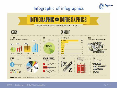
Infographic of infographics
BIPM — Lecture 2 — BI & Visual Analytics 40 / 74

Visualization Metaphors
Important is Big
Happy is Up
More is Up
Categories Are Containers
Organization is Physical Structure
Similarity is Closeness
Control is Up
http://www.bostondatafest.com/wp-content/uploads/2013/11/big_data_viz.pdf
BIPM — Lecture 2 — BI & Visual Analytics 41 / 74

Visualization Metaphors
Important is Big
Happy is Up
More is Up
Categories Are Containers
Organization is Physical Structure
Similarity is Closeness
Control is Up
http://www.bostondatafest.com/wp-content/uploads/2013/11/big_data_viz.pdf
BIPM — Lecture 2 — BI & Visual Analytics 41 / 74
Visualization Metaphors
Important is Big
Happy is Up
More is Up
Categories Are Containers
Organization is Physical Structure
Similarity is Closeness
Control is Up
http://www.bostondatafest.com/wp-content/uploads/2013/11/big_data_viz.pdf
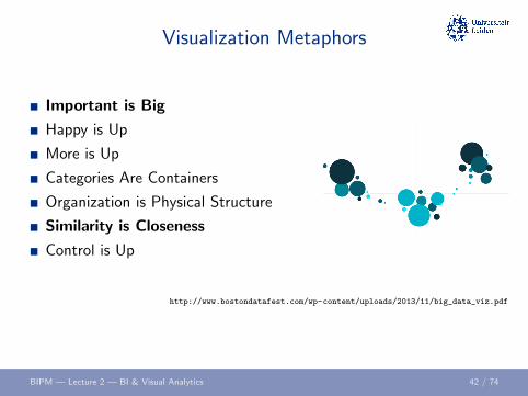
BIPM — Lecture 2 — BI & Visual Analytics 42 / 74

Visualization Metaphors
Important is Big
Happy is Up
More is Up
Categories Are Containers
Organization is Physical Structure
Similarity is Closeness
Control is Up
http://www.bostondatafest.com/wp-content/uploads/2013/11/big_data_viz.pdf
BIPM — Lecture 2 — BI & Visual Analytics 43 / 74

Visualization Metaphors
Important is Big
Happy is Up
More is Up
Categories Are Containers
Organization is Physical Structure
Similarity is Closeness
Control is Up
http://www.bostondatafest.com/wp-content/uploads/2013/11/big_data_viz.pdf
BIPM — Lecture 2 — BI & Visual Analytics 44 / 74
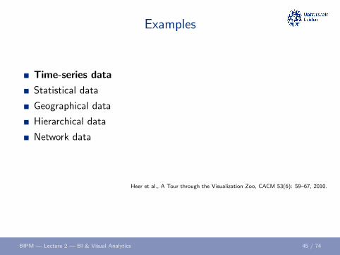
Examples
Time-series data
Statistical data
Geographical data
Hierarchical data
Network data
Heer et al., A Tour through the Visualization Zoo, CACM 53(6): 59–67, 2010.
BIPM — Lecture 2 — BI & Visual Analytics 45 / 74

Index chart
BIPM — Lecture 2 — BI & Visual Analytics 46 / 74
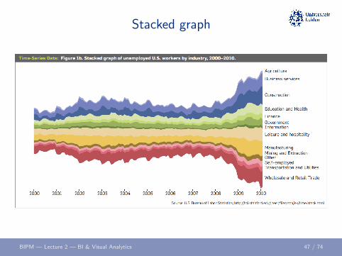
Stacked graph
BIPM — Lecture 2 — BI & Visual Analytics 47 / 74

Small multiples
BIPM — Lecture 2 — BI & Visual Analytics 48 / 74
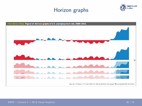
Horizon graphs
BIPM — Lecture 2 — BI & Visual Analytics 49 / 74

Examples
Time-series data
Statistical data
Geographical data
Hierarchical data
Network data
BIPM — Lecture 2 — BI & Visual Analytics 50 / 74

Scatter plot matrix
BIPM — Lecture 2 — BI & Visual Analytics 51 / 74

Parallel coordinates
BIPM — Lecture 2 — BI & Visual Analytics 52 / 74

Examples
Time-series data
Statistical data
Geographical data
Hierarchical data
Network data
BIPM — Lecture 2 — BI & Visual Analytics 53 / 74
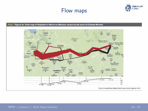
Flow maps
BIPM — Lecture 2 — BI & Visual Analytics 54 / 74

Choropleth maps
BIPM — Lecture 2 — BI & Visual Analytics 55 / 74
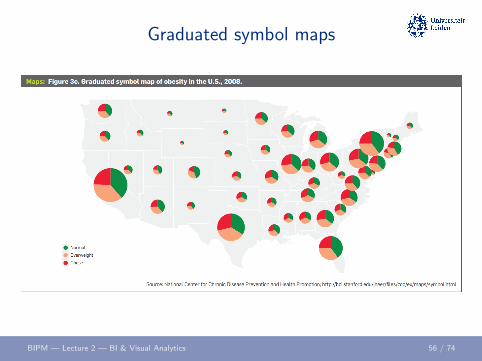
Graduated symbol maps
BIPM — Lecture 2 — BI & Visual Analytics 56 / 74

Cartogram
BIPM — Lecture 2 — BI & Visual Analytics 57 / 74

Examples
Time-series data
Statistical data
Geographical data
Hierarchical data
Network data
BIPM — Lecture 2 — BI & Visual Analytics 58 / 74

Node-link diagram
BIPM — Lecture 2 — BI & Visual Analytics 59 / 74

Circular dendogram
BIPM — Lecture 2 — BI & Visual Analytics 60 / 74
Examples
Time-series data
Statistical data
Geographical data
Hierarchical data
Network data
BIPM — Lecture 2 — BI & Visual Analytics 61 / 74

Force-directed layout
BIPM — Lecture 2 — BI & Visual Analytics 62 / 74

Arc diagram
BIPM — Lecture 2 — BI & Visual Analytics 63 / 74

Annotated matrix
BIPM — Lecture 2 — BI & Visual Analytics 64 / 74
Dashboards
Multiple widgets on one page
A widget can contain:
OLAP sliceKPI metricData mining results. . .
Codeless reporting
BI in the blink of an eye!
BIPM — Lecture 2 — BI & Visual Analytics 65 / 74
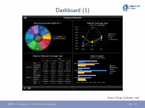
Dashboard (1)
http://blog.jinfonet.com/
BIPM — Lecture 2 — BI & Visual Analytics 66 / 74

Dashboard (2)
http://www.axosoft.com/
BIPM — Lecture 2 — BI & Visual Analytics 67 / 74
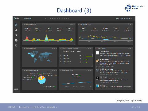
Dashboard (3)
http://www.cyfe.com/
BIPM — Lecture 2 — BI & Visual Analytics 68 / 74

Dashboard (4)
http://www.klipfolio.com/BIPM — Lecture 2 — BI & Visual Analytics 69 / 74
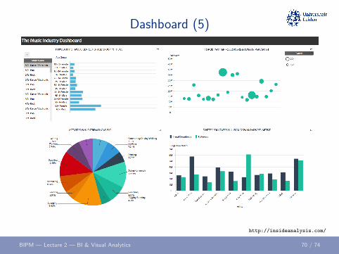
Dashboard (5)
http://insideanalysis.com/
BIPM — Lecture 2 — BI & Visual Analytics 70 / 74
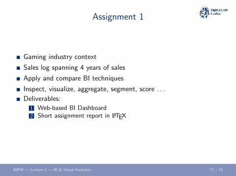
Assignment 1
Gaming industry context
Sales log spanning 4 years of sales
Apply and compare BI techniques
Inspect, visualize, aggregate, segment, score . . .
Deliverables:
1 Web-based BI Dashboard2 Short assignment report in LATEX
BIPM — Lecture 2 — BI & Visual Analytics 71 / 74
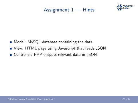
Assignment 1 — Hints
Model: MySQL database containing the data
View: HTML page using Javascript that reads JSON
Controller: PHP outputs relevant data in JSON
BIPM — Lecture 2 — BI & Visual Analytics 72 / 74

Lab session February 17
Make progress with Assignment 1
Read paper by Kooti et al.
Setup a framework for your dashboard
Load some data into your framework
Investigate visualization options
BIPM — Lecture 2 — BI & Visual Analytics 73 / 74

Credits
Lecture based on (slides of the (previous edition of the)) course book:W. van der Aalst, Process Mining: Data Science in Action, 2nd edition,Springer, 2016.
BIPM — Lecture 2 — BI & Visual Analytics 74 / 74


![40th meeting of the JCRB - BIPM - BIPM · [The corresponding BIPM presentation is available on the restricted-access JCRB working documents webpage as JCRB-40/03.1.] 3.2. BIPM QMS](https://static.fdocuments.net/doc/165x107/6047869895787e1e9f1920f7/40th-meeting-of-the-jcrb-bipm-bipm-the-corresponding-bipm-presentation-is-available.jpg)
![BIPM Practice Update - Ver 1 [Read-Only]](https://static.fdocuments.net/doc/165x107/577cc6b31a28aba7119ef283/bipm-practice-update-ver-1-read-only.jpg)


