
Building Multi-Density and Multi-Platform UIs with...
53
© 2010 Adobe Systems Incorporated. All Rights Reserved. Adobe Condential. Narciso (nj) Jaramillo Building Multi-Density and Multi-Platform UIs with Flex
Transcript of Building Multi-Density and Multi-Platform UIs with...

© 2010 Adobe Systems Incorporated. All Rights Reserved. Adobe Con!dential.
Narciso (nj) Jaramillo Building Multi-Density and Multi-Platform UIs with Flex

© 2010 Adobe Systems Incorporated. All Rights Reserved. Adobe Con!dential.
Calibrating…
Have a touchscreen smartphone (Android, iOS, other)?
Have a touchscreen tablet (Android, iOS, other)?
Know what a ViewNavigator is?
Used Flash Builder “Burrito”/Flex “Hero” prerelease?
Built a mobile Flex app?
2

© 2010 Adobe Systems Incorporated. All Rights Reserved. Adobe Con!dential.
Overview
Challenges in multiscreen development
Designing adaptive UI for multiple mobile screens
Building adaptive UI using Flex
3

© 2010 Adobe Systems Incorporated. All Rights Reserved. Adobe Con!dential.
What I won’t be covering in depth
New mobile app components (ViewNavigator, ActionBar, ViewMenu)
Overall app architecture
Code sharing between mobile and desktop apps
Packaging work"ows for multiple platforms
4

© 2010 Adobe Systems Incorporated. All Rights Reserved. Adobe Con!dential.
Challenges in multiscreen development

© 2010 Adobe Systems Incorporated. All Rights Reserved. Adobe Con!dential.
What does multiscreen mean?
6
Pixel densities Form factors UI and hardware
conventions
240 dpi
160/320 dpi

© 2010 Adobe Systems Incorporated. All Rights Reserved. Adobe Con!dential.
Leveraging Flex 4.5 for multiscreen mobile UI development
7
Classic Flex features Core Spark components Dynamic layout States and state groups
Mobile components and skins
App components (ViewNavigator / ActionBar / ViewMenu) Cross-platform component skins Alternative skins for certain platform conventions Per-platform CSS rules
DPI management Automatic DPI-based application scaling DPI-aware skins Multi-DPI bitmaps Per-DPI CSS rules

© 2010 Adobe Systems Incorporated. All Rights Reserved. Adobe Con!dential.
Designing adaptive UI for multiple mobile screens

© 2010 Adobe Systems Incorporated. All Rights Reserved. Adobe Con!dential.
Before you design…
Know your platforms Platform UI guidelines | Great apps | UI pa#erns
Know your devices Screen resolutions | Pixel densities | Hardware affordances
Know your app Core information | Key user tasks | Appropriateness for mobile
9
© 2010 Adobe Systems Incorporated. All Rights Reserved. Adobe Con!dential.
UI pa#erns: Phones
10

© 2010 Adobe Systems Incorporated. All Rights Reserved. Adobe Con!dential.
UI pa#erns: Tablets
11

© 2010 Adobe Systems Incorporated. All Rights Reserved. Adobe Con!dential.
Example: Floupon – a Groupon browser
12

© 2010 Adobe Systems Incorporated. All Rights Reserved. Adobe Con!dential.
Example: Floupon – a Groupon browser
Information
Deals for current location
Info on a speci!c deal
Discussions for a given deal
User tasks
Refresh the deal list
Buy a deal
Post to a deal discussion
13

© 2010 Adobe Systems Incorporated. All Rights Reserved. Adobe Con!dential.
Floupon: Phone version
14

© 2010 Adobe Systems Incorporated. All Rights Reserved. Adobe Con!dential.
Floupon: Tablet version (landscape)
15

© 2010 Adobe Systems Incorporated. All Rights Reserved. Adobe Con!dential.
Floupon: Tablet version (portrait)
16

© 2010 Adobe Systems Incorporated. All Rights Reserved. Adobe Con!dential.
Floupon: Tablet version (portrait)
17

© 2010 Adobe Systems Incorporated. All Rights Reserved. Adobe Con!dential.
Floupon: Tablet version (portrait)
18

© 2010 Adobe Systems Incorporated. All Rights Reserved. Adobe Con!dential.
Building adaptive UI with Flex: Phone vs. tablet

© 2010 Adobe Systems Incorporated. All Rights Reserved. Adobe Con!dential.
Floupon: Separate phone and tablet apps
20
ViewNavigatorApplication
List
ActionBar
ViewNavigator
List
ActionBar
ViewNavigator

© 2010 Adobe Systems Incorporated. All Rights Reserved. Adobe Con!dential.
Floupon: Uni!ed phone and tablet app
21
ViewNavigator
List
ActionBar
ViewNavigator
List
ActionBar
ViewNavigator

© 2010 Adobe Systems Incorporated. All Rights Reserved. Adobe Con!dential.
Handling the Back key
private function initializeHandler(event:Event):void{
systemManager.stage.addEventListener(KeyboardEvent.KEY_DOWN, deviceKeyDownHandler);systemManager.stage.addEventListener(KeyboardEvent.KEY_UP, deviceKeyUpHandler);
}
private function deviceKeyDownHandler(event:KeyboardEvent):void{
if (event.keyCode == Keyboard.BACK && mainNavigator.length > 1) event.preventDefault();
}
private function deviceKeyUpHandler(event:KeyboardEvent):void{
if (event.keyCode == Keyboard.BACK && mainNavigator.length > 1) mainNavigator.popView();
}
22

© 2010 Adobe Systems Incorporated. All Rights Reserved. Adobe Con!dential.
Using states to handle layout variations
private function resizeHandler(event:ResizeEvent):void{
var isPortrait:Boolean = height > width;var isTablet:Boolean = height > 960 || width > 960;
currentState = (isPortrait ? "portrait" : "landscape") + (isTablet ? "Tablet" : "Phone");
}
23
<ViewNavigator id="mainNavigator" left="0" left.landscapeTablet="{LIST_WIDTH}" top="0" top.portraitTablet="{ACTIONBAR_HEIGHT + LIST_HEIGHT}" right="0" bottom="0"firstView="views.SummaryView" firstView.landscapeTablet="views.DetailView”firstView.portraitTablet=“views.DetailView”
/>

© 2010 Adobe Systems Incorporated. All Rights Reserved. Adobe Con!dential.
Using state groups
<states><State name="portraitPhone" stateGroups="portrait,phone"/><State name="landscapePhone" stateGroups="landscape,phone"/><State name="portraitTablet" stateGroups="portrait,tablet"/><State name="landscapeTablet" stateGroups="landscape,tablet"/>
</states>
24
<ViewNavigator id="mainNavigator" left="0" left.landscapeTablet="{LIST_WIDTH}" top="0" top.portraitTablet="{ACTIONBAR_HEIGHT + LIST_HEIGHT}" right="0" bottom="0"firstView="views.SummaryView" firstView.tablet="views.DetailView”
/>

© 2010 Adobe Systems Incorporated. All Rights Reserved. Adobe Con!dential.
Managing states in views
private function handleViewActivate(): void {
setCurrentState(getCurrentViewState());}
override public function getCurrentViewState(): String{
var newState: String = getPlatform() + (isTablet() ? "Tablet" : "Phone");if (hasState(newState)) return newState;else return currentState;
}
25

© 2010 Adobe Systems Incorporated. All Rights Reserved. Adobe Con!dential. 26
DEMO: Floupon running on Droid Pro, iPad (portrait/landscape).

© 2010 Adobe Systems Incorporated. All Rights Reserved. Adobe Con!dential.
Building adaptive UI with Flex: Density management

© 2010 Adobe Systems Incorporated. All Rights Reserved. Adobe Con!dential. 28
DEMO: App designed for 160 dpi running on Droid 2, iPhone 4
with no autoscaling.

© 2010 Adobe Systems Incorporated. All Rights Reserved. Adobe Con!dential.
CHEAT SHEET: How to deal with density
Set applicationDPI=“160” on your application tag
Lay out your application for a 160 dpi device
Use MultiDPIBitmapSource for all bitmaps
29

© 2010 Adobe Systems Incorporated. All Rights Reserved. Adobe Con!dential.
Multiple densities: %e problem
30
150 x 40 pixel bu#on
Desktop monitor @100 dpi
= 1.5” x 0.4”
Galaxy Tab @160 dpi
= 0.9” x 0.25”
Droid 2 @240 dpi
= 0.6” x 0.17”
iPhone 4 @320 dpi
= 0.46” x 0.13”
Same pixel count, different physical sizes (Minimum recommended size: 0.25” x 0.25”)

© 2010 Adobe Systems Incorporated. All Rights Reserved. Adobe Con!dential.
Another perspective
31
3.5” diagonal screen
Same physical size, different pixel counts

© 2010 Adobe Systems Incorporated. All Rights Reserved. Adobe Con!dential.
Can I use dynamic layout to solve this?
32
(Not easily. You can make stuff !ll the screen using percent sizing, but your fonts and icons will still be tiny. And any !xed pixel sizes, e.g. in constraint-based layouts or padding values, will be wrong.)
(Not easily. You can make stuff !ll the screen using percent sizing, but your fonts and icons will still be tiny. And any !xed pixel sizes, e.g. in constraint-based layouts or padding values, will be wrong.)
320x480 @160dpi 640x960 (at same density) 640x960 @320dpi
100%
100%
100%
100%

© 2010 Adobe Systems Incorporated. All Rights Reserved. Adobe Con!dential.
Solution: Automatic scaling for different DPIs
33
<Application applicationDPI=“160”><Button width=“160” height=“40”/>
</Application>
REMEMBER: To your code, the screen is always 160 dpi, and this bu#on is always 160 x 40, regardless of how the application is being scaled.
160 dpi 240 dpi 320dpi
Scaled 1.5x Scaled 2x
© 2010 Adobe Systems Incorporated. All Rights Reserved. Adobe Con!dential.
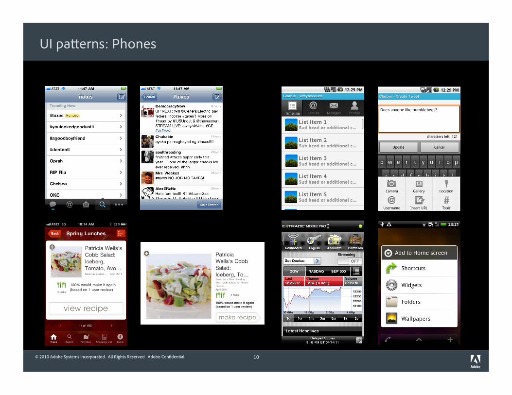
Resolution and density
34
Droid Pro 320 x 480 @160dpi
Droid 2 480 x 854 @240dpi
iPhone 4 640 x 960 @320dpi
= 320 x 570 @160dpi = 320 x 480 @160dpi
Use scaling (applicationDPI) to deal with density differences Use resizing (dynamic layout) to deal with physical size/aspect ratio differences
100%
100%
100%

© 2010 Adobe Systems Incorporated. All Rights Reserved. Adobe Con!dential. 35
DEMO: App running on device with proper autoscaling
(Droid 2, iPhone 4).

© 2010 Adobe Systems Incorporated. All Rights Reserved. Adobe Con!dential.
Scaling different types of objects
36
Vectors scale up well
(scaling down can be bad) Outlines may blur slightly
Text scales up well
(Flash scales font size)
Lorem
Ipsum
Dolor
Bitmaps do not scale up well

© 2010 Adobe Systems Incorporated. All Rights Reserved. Adobe Con!dential. 37
DEMO: Refresh bu#on icon without MultiDPIBitmapSource
(on desktop).
© 2010 Adobe Systems Incorporated. All Rights Reserved. Adobe Con!dential.
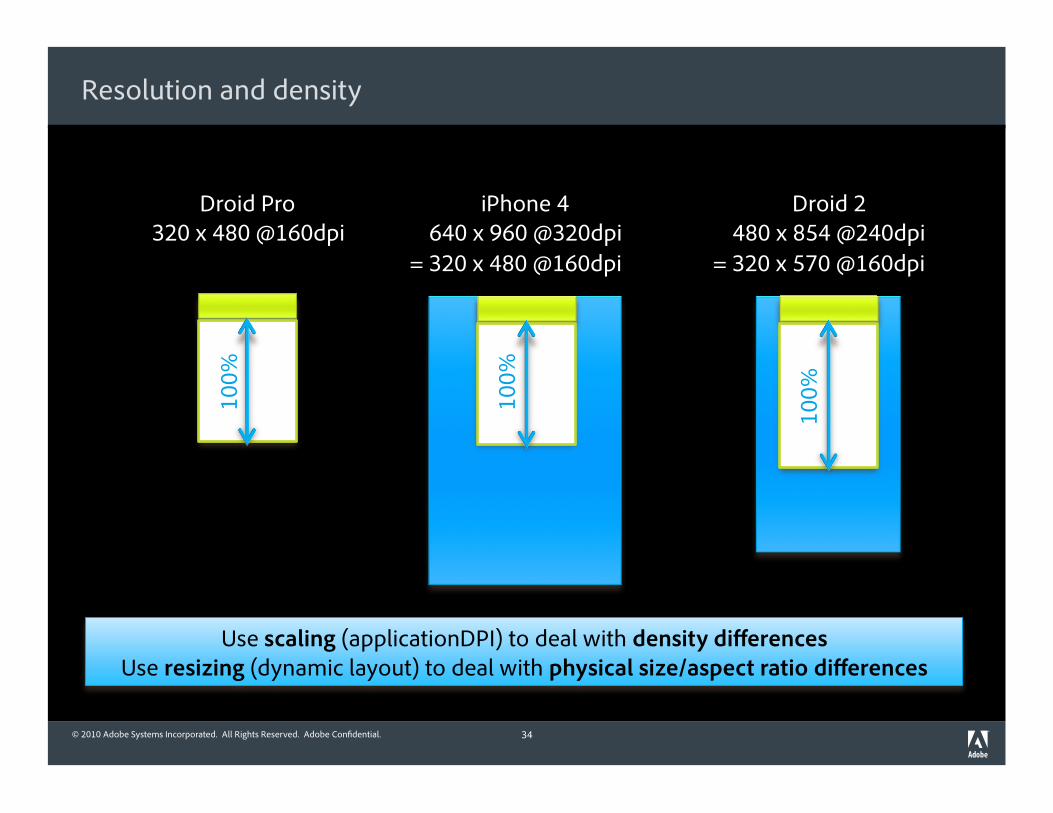
Flex density concepts: Multi-DPI bitmaps
<Button click="dealSummaryList.refresh()"> <icon> <MultiDPIBitmapSource source160dpi="@Embed('assets/refresh160.png')" source240dpi="@Embed('assets/refresh240.png')" source320dpi="@Embed('assets/refresh320.png')"/> </icon></Button>
38
Design icon for 160 dpi
Make a 1.5x bigger version for 240 dpi
Make a 2x bigger version for 320 dpi
(e.g. 32x32, 48x48, 64x64)

© 2010 Adobe Systems Incorporated. All Rights Reserved. Adobe Con!dential. 39
DEMO: Refresh bu#on icon with MultiDPIBitmapSource.

© 2010 Adobe Systems Incorporated. All Rights Reserved. Adobe Con!dential.
Default mapping for DPI classi!cations
40
Classi"cation 160 DPI
Devices Most tablets iPhone 3GS
Motorola Droid Pro
Mapped range < 200 DPI
Typical range 132 DPI (iPad) to
181 DPI (HTC Hero)
Source: h#p://en.wikipedia.org/wiki/List_of_displays_by_pixel_density
Can override default mappings using runtimeDPIProvider
240 DPI
Most Android phones
>= 200 DPI <= 280 DPI
217 DPI (HTC Evo) to
254 DPI (NexusOne)
320 DPI
iPhone 4
> 280 DPI
326 DPI (iPhone 4)
Flex groups devices into DPI classi"cations based on actual device density

© 2010 Adobe Systems Incorporated. All Rights Reserved. Adobe Con!dential.
CHEAT SHEET revisited
Set applicationDPI=“160” on your application tag
Lay out your application for a 160 dpi device
Use MultiDPIBitmapSource for all bitmaps
41

© 2010 Adobe Systems Incorporated. All Rights Reserved. Adobe Con!dential.
Manual DPI management
Leave applicationDPI unset (will default to same as runtimeDPI)
Built-in component skins in mobile theme will adapt to different DPIs
Your own layouts and skins will need to adapt (pixel and font sizes)
Can use @media to set CSS rules for different DPIs
Use data binding or code to adapt layout properties per DPI
Multi-DPI bitmaps still work
42

© 2010 Adobe Systems Incorporated. All Rights Reserved. Adobe Con!dential.
Building adaptive UI with Flex: Multiple platforms

© 2010 Adobe Systems Incorporated. All Rights Reserved. Adobe Con!dential.
UI differences across platforms
44
Android phone iPhone
Title le&-aligned Title centered
No back bu#on On-screen back bu#on
Flat-look bu#ons Beveled bu#ons
Multiple actions Single action

© 2010 Adobe Systems Incorporated. All Rights Reserved. Adobe Con!dential.
Per-platform style rules
@media (os-platform: "ios") { ActionBar {
defaultButtonAppearance: "beveled”; titleAlign: "center”; }
}
45

© 2010 Adobe Systems Incorporated. All Rights Reserved. Adobe Con!dential.
Using states for platform differences
<states><State name="androidPhone" stateGroups="phone"/> <State name="androidTablet" stateGroups="tablet"/> <State name="iosPhone” stateGroups="phone,needsBackButton"/> <State name="iosTablet" stateGroups="tablet,needsBackButton"/> <State name=“playbook” stateGroups=“tablet,needsBackButton”/>
</states>
46
<navigationContent> <Button includeIn="needsBackButton" label="Back"
click="handleBackClick()"/></navigationContent>

© 2010 Adobe Systems Incorporated. All Rights Reserved. Adobe Con!dential. 47
DEMO: App running on iPhone/iPad compared to Droid 2/Galaxy Tab.

© 2010 Adobe Systems Incorporated. All Rights Reserved. Adobe Con!dential.
Other common platform differences
48
Android
Menu bu#on (use ViewMenu)
Longpress menu (use List,
SkinnablePopup Container)
iOS
Bo#om toolbar (can use HGroup or SkinnableContainer)

© 2010 Adobe Systems Incorporated. All Rights Reserved. Adobe Con!dential. 49
Know your platforms!

© 2010 Adobe Systems Incorporated. All Rights Reserved. Adobe Con!dential.
Conclusion

© 2010 Adobe Systems Incorporated. All Rights Reserved. Adobe Con!dential.
Key takeaways
Design for multiple screens Resolution | Orientation | Density | Platform
Use states to handle layout and platform variations
Use applicationDPI to handle density
Test on desktop or on device
51

© 2010 Adobe Systems Incorporated. All Rights Reserved. Adobe Con!dential.
What next?
Watch my blog: rictus.com/muchado for slides and code
Follow me on Twi#er: @rictus
Look forward to Android support in the May release...
… and iOS and PlayBook support in the June release!
52

© 2010 Adobe Systems Incorporated. All Rights Reserved. Adobe Con!dential.