ENGM 732 Formalization of Network Flows Network Flow Models.

Brief 15. Commuting Flow Patterns
January 2015
Commuting in america 2013The National Report on Commuting Patterns and Trends

About the AASHTO Census Transportation Planning Products ProgramEstablished by the American Association of State Highway and Transportation Officials (AASHTO) and the U.S. Department of Transportation (U.S. DOT), the AASHTO Census Transportation Planning Products Program (CTPP) compiles census data on demographic characteristics, home and work locations, and journey-to-work travel flows to assist with a variety of state, regional, and local transportation policy and planning efforts. CTPP also supports corridor and project studies, environmental analyses, and emergency operations management.
In 1990, 2000, and again in 2006, AASHTO partnered with all of the states on pooled-fund projects to sup-port the development of special census products and data tabulations for transportation. These census transpor-tation data packages have proved invaluable in understanding characteristics about where people live and work, their journey-to-work commuting patterns, and the modes they use for getting to work. In 2012, the CTPP was established as an ongoing technical service program of AASHTO.
CTPP provides a number of primary services:
• Special Data Tabulation from the U.S. Census Bureau—CTPP oversees the specification, purchase, and delivery of this special tabulation designed by and for transportation planners.
• Outreach and Training—The CTPP team provides training on data and data issues in many formats, from live briefings and presentations to hands-on, full-day courses. The team has also created a number of electronic sources of training, from e-learning to recorded webinars to downloadable presentations.
• Technical Support—CTPP provides limited direct technical support for solving data issues; the pro-gram also maintains a robust listserv where many issues are discussed, dissected, and resolved by the CTPP community.
• Research—CTPP staff and board members routinely generate problem statements to solicit research on data issues; additionally, CTPP has funded its own research efforts. Total research generated or funded by the current CTPP since 2006 is in excess of $1 million.
Staff• Penelope Weinberger, CTPP Program Manager• Matt Hardy, Program Director, Policy and Planning• Jim Tymon, Chief Operating Officer/Director of Policy and Management
Project Team• Steven E. Polzin, Co-Author, Center for Urban Transportation Research, University of South Florida• Alan E. Pisarski, Co-Author, Consultant, Falls Church, Virginia• Bruce Spear, Data Expert, Cambridge Systematics, Inc.• Liang Long, Data Expert, Cambridge Systematics, Inc.• Nancy McGuckin, Data Expert, Travel Behavior Analyst
ContactPenelope Weinberger, e-mail: [email protected], phone: 202-624-3556; or [email protected]
© 2015 by the American Association of State Highway and Transportation Officials. All rights reserved. Duplication is a violation of applicable law.
Pub Code: CA15-4 ISBN: 978-1-56051-586-9

Commuting in America 2013: The National Report on Commuting Patterns and Trends
Brief 15. Commuting Flow Patterns
This brief is the fifteenth in a series describing commuting in America. This body of work, sponsored by American Association of State Highway and Transportation Officials (AASHTO) and carried out in conjunction with a National Cooperative Highway Research Program (NCHRP) project that provided supporting data, builds on three prior Commut-ing in America documents that were issued over the past three decades. Unlike the prior reports that were single volumes, this effort consists of a series of briefs, each of which addresses a critical aspect of commuting in America. These briefs, taken together, comprise a comprehensive summary of American commuting. The briefs are disseminated through the AASHTO website (traveltrends.transportation.org). Accompanying data tables and an Executive Summary complete the body of information known as Commuting in America 2013 (CIA 2013).
Brief 15 describes the pattern of commuting travel. Specifically, the home-to-work trip is analyzed to understand the flow of travel that has to be accommodated by transportation infrastructure and services. The discussion covers two distinct elements: first, information about the length of commute trips; and second, information about the spatial orientation of trip flows.
Commuting Trip LengthsAssessing patterns of commuting flows at the national level requires the use of broader, more abstract information than can occur at the metropolitan level where more detail is possible. At the national scale, reliance on aggregate units of geography is necessary, which may mask some of the detail needed for local project-level planning but provides an understanding of aggregate needs and trends. The nature of the categorization used to classify urban areas as, for example, cities or suburbs, is often bound by historically-deter-mined jurisdictional boundaries that may not always provide a precise understanding of the physical characteristics of the area or commute trip length or orientation. What may be seen very clearly as a suburb in one area may be very unclear to others unfamiliar with the area. The Census Bureau’s use of multiple principal cities, rather than a single central city per metropolitan area, exacerbates the difficulty. Thus, the flow measures presented here are necessarily relatively blunt instruments to characterize what is happening at the broad national or regional scale.
A fundamental element of all flows is simply the typical lengths of work trips. Data are limited in this area, available only intermittently via the National Household Travel Survey (NHTS). Figure 15-1 presents the average trip lengths for more recent periods in which NHTS data are available. By and large, the pattern for work trips, and for trips of all

4 Commuting in America 2013: The National Report on Commuting Patterns and Trends
purposes, has been slowly increasing in length over time, with a small dip in 2009, pre-sumed to be attributable to the slow economy, but which is not statistically significant at the 95 percent confidence level. The next NHTS, scheduled for 2015, will help resolve whether this is a pattern change or a cyclical phenomenon.
Figure 15-1. Trip Length Trends for All ModesSource: NHTS
Examination of trip lengths by metropolitan area size, shown in Figure 15-2, as ob-served in the 2009 NHTS, shows an almost 30 percent increase in trip lengths as metro size increases. Not surprisingly, non-metro workers are shown to have the longest trip lengths of all. Work-trip lengths have shown only slight variation, with no significant trends, from the 2001 survey. Note that discussions of NHTS work trip length do not include work-at-home trips in the calculation.
8.5
10.7
11.612.1 11.8
8.7
9.5 9.210 9.7
0
2
4
6
8
10
12
14
1983 1990 1995 2001 2009
Trip
Len
gth
in M
iles
Work All Purposes

5Brief 15. Commuting Flow Patterns
Figure 15-2. Average Work Trip Length by Metro Size Source: NHTS
A broader measure is that shown in Figure 15-3, which breaks trips into 10-mile catego-ries. It shows that, over time, the trend among both men and women is toward longer trip lengths. One might expect work trip lengths to rise during recession periods, as workers become more willing to travel greater distances to obtain employment. However, while that may be a valid hypothesis, the statistical trends are more about job losses than increases; as noted in other briefs, job losses in the recent past were high in factory work and construc-tion, which are typically longer-distance trips. High fuel prices also dampen the enthusiasm of individuals to take jobs more distant from home. The dramatic decline in home values also locked many households into their existing home location due to “underwater” mort-gages and an inability to relocate to find work or move closer to a new or existing job in their current location. Data are not available to diagnose and fully disentangle the magni-tude of the impact of these events.
0
2
4
6
8
10
12
14
Less than250,000
250,000–500,000
500,000–1,000,000
1M–3M 3M+ Not in MSA ALL
Mile
s
Metro Size Category (Population)

6 Commuting in America 2013: The National Report on Commuting Patterns and Trends
Figure 15-3. Work Trip Length Trends by Gender Source: 2009 NHTS
Workers Working beyond Their County of ResidenceAnother indicator of commuting flows is the Census long-term data regarding workers leaving their home county to travel to work. The Census asks whether workers work in their residence county or in another county in-state or out-of-state. Commuting in America has tracked these patterns since the 1960 Census. It can be argued that counties are a weak source of such basic information given the substantial variations in county sizes, especially comparing East Coast to West Coast counties. Ever-larger metropolitan areas are encom-passing multiple counties as well. The trends over time are very clear and are a strong indi-cator of increasing cross-county flows. As the nation’s workers roughly doubled from 1960 to 2010, workers leaving for jobs in counties outside their residence county quadrupled, from 9.4 to 37.5 million. As a result, the share of all workers leaving their home county rose from 14.5 to 27.4 percent of workers, as shown in Figure 15-4. Note that the lower level of increase from 2000 to 2010 is not a sign of a diminishing trend, but, rather, of the relatively smaller percentage change in workers in the period compared to previous decades.
Table 15-1 provides more detail on the 2010 pattern, differentiating between male and female worker travel. The data reveal a strong distinction in male–female patterns. Men are more likely to work outside the county of residence but inside the state (25.5 percent vs. 21.6 percent) and to work outside the state (4.5 percent vs. 3.0 percent), a total difference
0
10
20
30
40
50
60
70
Less Than10 Miles
10–20Miles
More Than20 miles
Less Than10 Miles
10–20Miles
More Than20 Miles
Less Than10 Miles
10–20Miles
More Than20 Miles
Men Women All Workers
Perc
ent o
f Wor
k Tr
ips
Trip Length
199520012009

7Brief 15. Commuting Flow Patterns
Figure 15-4. Workers Commuting Outside Their County of ResidenceSource: CIA3 and ACS
of 30 vs. 24.6 percent. Historically, this pattern had been true because of the greater ten-dency of women to often take jobs that are closer to home and part-time, to be available for household-serving activities. The pattern persists even as gender-based household roles and responsibilities continue to evolve.
Table 15-1 Commuting Behavior by Jurisdiction and Gender
All Male Female
Total workers 136,941,010 100.0% 71,948,651 100.0% 64,992,359 100.0%
Worked in state of residence 131,726,663 96.2% 68,712,557 95.5% 63,014,106 97.0%
Worked in county of residence 99,361,852 72.6% 50,380,850 70.0% 48,981,002 75.4%
Worked outside county of residence 32,364,811 23.6% 18,331,707 25.5% 14,033,104 21.6%
Worked outside state of residence 5,214,347 3.8% 3,236,094 4.5% 1,978,253 3.0%
Total working outside county of residence 37,579,158 27.4% 21,567,801 30.0% 16,011,357 24.6%
Source: ACS 2010
9.4
14.8
20.1
27.5
34.237.5
14.5%
19.2%
20.8%
23.9%
26.7% 27.4%
0%
5%
10%
15%
20%
25%
30%
0
5
10
15
20
25
30
35
40
45
50
1960 1970 1980 1990 2000 2010
Perc
ent o
f Wor
kers
Mill
ions
of W
orke
rs

8 Commuting in America 2013: The National Report on Commuting Patterns and Trends
Another significant distinction in workers staying or leaving their county of residence has to do with their choice of mode depending upon their travel circumstances. One would certainly expect that walking would be a close-to-home mode; yet, four percent of walk-ers indicate that they cross a county line and another two percent cross state lines in their walk-to-work travel, indicating they live near jurisdictional boundaries. While the percent of inter-county commute trips by walking is certainly a lower percentage than other modes, it is still significant.
Another somewhat surprising observation is that transit has more significant shares in worked outside the residence county and state. Only 59 percent of transit travel is within the residence county, with about 32 percent working outside the county and more than 9 percent working in another state. This raises transit’s share of work travel from its over-all average of 5 percent to 6.7 percent in inter-county travel and 12.2 percent—more than double the overall average—for interstate work travel. Carpooling also increases share for trips leaving the home county, but only slightly compared to transit. Figure 15-5 identifies the geographic distribution for each mode.
Figure 15-5. Commute Mode by Jurisdiction of DestinationSource: ACS 2010
The high share of “Work outside state of residence” for the “Other” mode could be reflecting individuals who fly or take intercity rail to out-of-state jobs.
0%
10%
20%
30%
40%
50%
60%
70%
80%
90%
Drive Alone Carpool Transit Walk Other
Mod
e Sh
are
Commute Mode
Worked in county of residence
Worked outside county of residence
Worked outside state of residence

9Brief 15. Commuting Flow Patterns
Geographic Variations in Flows outside the County of ResidenceFigure 15-6 lists the states in order of the percentage of commuters leaving their home county to work. In reality, the data illustrates the attractive power of major metropolitan areas; perhaps a better term is “megalopolitan” areas.
Figure 15-6. Percent of Workers Leaving Their Residence County for WorkNote: Includes work outside residence county, both within and outside the state.
Red bars indicate states in which > 40% of residents leave their home county to work. Yellow bars indicate national average.
Source: ACS 2010
0% 10% 20% 30% 40% 50% 60%HIAZNVAK
WYMTNDNMCAUT
WAFLSDIDNEVTTXDEMEORKSIADCAROKCTILALNCWITNSCPALAOHMIKYIN
WVCOMONYMAMSRI
NHMNGANJ
MDVA

10 Commuting in America 2013: The National Report on Commuting Patterns and Trends
Virginia, which leads the nation in residents who leave their home county to work, at over 51 percent, and Maryland, at 47 percent, have heavy emphasis on the Washington DC area and the federal employment complex. New Jersey is affected by near-by major job centers in Pennsylvania and New York; Georgia is affected by the major metropolitan multi-county, multi-state job complex that is Atlanta. Many of the areas with more than 30 percent leaving their residence county exhibit similar character-istics. North Carolina and Alabama bracket the national average of 27.6 percent.
If only workers who cross state lines are considered, the numbers are substantial. If it were treated as a state, the District of Columbia would lead the nation, at just below 24 percent of workers leaving. Among states, Maryland leads at 17.5 percent, with New Hampshire, Delaware, and Rhode Island following at above 15 percent, although only 6 states have more than 10 percent of workers leaving their residence state. Perhaps a more pertinent measure is the absolute numbers that travel across
state borders. This is led by New Jersey at 548,000, followed by Mary-land at 501,000, and Virginia at 354,000. A total of 20 states have more than 100,000 workers leaving their home state each day.
Figure 15-7 maps the U.S. by county, showing the trend from 2000 to 2010. The increases nationwide are clear. The counties indicated in red are those whose share of cross-county commut-ing grew to exceed 25 percent between 2000 and 2010. These are counties that might be characterized as emerging bedroom communities where workers often commute to adjacent more economically-mature counties. Those counties shown in blue are counties whose cross-county commute share declined between 2000 and 2010. This condition occurs when a developing com-munity matures to the point where it begins to add new jobs, often to provide services for the emerging population, and is no longer as dependent on exporting workers to adjacent counties.

11Brief 15. Commuting Flow Patterns
Figure 15-7. Change in Percent of Workers Leaving Their Residence County for WorkSource: Census, ACS 2010
Two keys factors determine where workers go each day:• where the jobs are• what jobs match the skills, interests, and needs of the worker population
A simple way to categorize the job location factor is the jobs-to-worker ratio of an area—that is, how many jobs there are in a county in contrast with how many workers re-side there. A useful way to think of it is in the context of urban development. Central cities typically are those places where the job/worker ratio exceeds one—that is, the place has more jobs than workers, so even in the best of circumstances it must import workers each day to fill the available jobs. Traditional suburbs can be categorized simply as those places where the job/worker ratio is below one—that is, workers typically must leave the area ev-ery day to reach potential job opportunities. The second significant statistical measure is the percentage of workers who both live and work in their county of residence, which measures the success of a given jurisdiction in matching the job needs of its resident workers with the jobs available. Thus, historically, suburbs, to a greater or lesser degree, are worker exporters and cities are worker importers. It is not always so simple, as the case of Fairfax County, Virginia, illustrates.

12 Commuting in America 2013: The National Report on Commuting Patterns and Trends
The Case of Fairfax County VirginiaFairfax County, Virginia, has been traced by the Commuting in America series over several de-cades. The county, like so many suburban areas, has become a major worker destination. Beyond now being the suburban jurisdiction with the largest number of workers in the Washington DC area, the key to Fairfax’s history is that since roughly 2000, the number of jobs and the number of workers in the county have been very close to being equal—that is, the county has a ratio of jobs-to-workers of very close to 1, so it constitutes an excellent case study of significant continued inter-county travel by workers, even with the nearly balanced jobs-to-workers ratio.
In Fairfax County, were all the jobs in the county filled by residents, no workers would arrive each day in the county from outside and there would be only 8,000 workers who had to leave to find work. In fact, because “only” 52 percent actually live and work there, the total flow in and out is more than 550,000. Fairfax County’s 52 percent share of stay-in-county workers is high among metropolitan collar counties (for example, Prince George’s County just across the Potomac River is at 39 percent), but it does demonstrate the realities of contemporary commuting flows.
It could be argued that just meeting the needs of the 300,000 workers who both live and work in the county would be enough of a challenge. But, in addition to the internal flow, the flows into Fairfax to meet job skill needs are prodigious: more than 55,000 each from adjacent Prince William and Loudoun counties; 22,000 from Arlington; 15,000 from Alexandria and a similar number from Montgomery County, Maryland; 18,000 from Prince George’s County, Maryland; and an almost 13,000 reverse-worker outflow from the District of Columbia. In all, almost 200,000 workers flow into Fairfax each day from 80 different jurisdictions in Virginia and more than 50,000 from 23 jurisdictions in Maryland. In addition, more than 1,600 arrive from Pennsylvania and almost 3,000 from West Virginia. This indicates the powerful economic engine that Fairfax has become and how important access to workers is for communities.
A brief retrospective of the patterns of Fairfax is useful, tracing the historical evolution of Fair-fax from a more traditional bedroom suburb to the present metropolitan complex. The following table and figure present the three-decade trend.
In 1980, Fairfax County workers exceeded jobs by more than 100,000—a classic bedroom suburb—and only 200,000 both lived and worked in the county, indicating that almost as many workers left the county each day to head elsewhere for jobs, likely toward Washington, DC, as worked in the county. From 1980 to 2010, workers increased by about 48 percent, and those who lived and worked in the county increased by almost the same amount, about 44 percent, as jobs more than doubled, led by the Tyson’s Corner area. Another significant pattern change is that in the early period, as in most suburban areas, jobs available to working residents were fewer but were largely filled by residents, indicating that the jobs were largely household-serving jobs such

13Brief 15. Commuting Flow Patterns
as local services and retail, as businesses followed the housing. Later, as the number of suburban jobs expanded, it often was employers seeking to be near their potential work force and to escape central area costs, so the nature of employment changed to jobs requiring skills drawn from a larger worker catchment area. Tyson’s Corner is a model of such development.
Perhaps the primary message to be derived from the lesson of Fairfax County is that, like Fairfax County, most of America is moving toward greater job/worker balance as suburbs and cities move toward a jobs-to-workers ratio of 1.0 over time, but that apparently helpful sign of balance is only a sign of some degree of balance potential, often not realized because of mismatches in skills needed and skills available, and residential location affordability and preferences.
Summary of Worker Flows, Fairfax County
Resident workers 582,000
Jobs 574,000
Jobs/workers ratio 0.99
Workers who live and work in county 302,000
Percent who live and work in county 52%
Workers exported each day 280,000
Workers imported each day 272,000
Source: 2010 ACS
Figure 15-8. Jobs and Workers Trends, Fairfax CountySources: Census, 2006–2010 ACS
700,000
600,000
500,000
400,000
300,000
200,000
100,000
01980 1990 2000 2010
Jobs
, Wor
kers
Jobs Live and Work Workers

14 Commuting in America 2013: The National Report on Commuting Patterns and Trends
Commute Trip LengthThe only nationally available data on commute trip length is that derived from The National Household Travel Survey. Figure 15-9 presents the trip length distribution for commute trips based on 2009 NHTS. This data indicates that over 12 percent of trips are less than 1 mile, 60 percent of trips are 10 miles or less and over 80 percent of trips are less than 20 miles.
Figure 15-9. Work Trip Length DistributionSource: 2009 NHTS
National Flows Measured by Metropolitan StructureTable 15-3 provides a broad summary of national commuting flows. It is divided into two major groupings: metro areas, subdivided into “in principal cities” and “not in principal cities” (somewhat analogous to central cities and suburbs), and non-metro areas, subdivid-ed into micropolitan and non-micropolitan areas. This is less clear than past summaries, given changes in Census geographic constructs, most particularly the failure to differentiate principal cities into their central city and suburban city components.
The second column summarizes where the workers live—roughly 85 percent in metro areas and the remainder in non-metro areas. Metropolitan areas not in principal city ar-eas—the narrowest definition of suburbs—accounted for 52 percent of the nation’s workers. A rough approximation of the split of principal cities into central cities and suburban-based cities would be 75–25, varying sharply by metro size, so that those in principal-city areas would be split into 35 million in central cities and the remaining 10 million in the suburbs. Thus, the central city residents share would be roughly 25 percent of workers, and the
0
2
4
6
8
10
12
14
161/4
mil
1/4 to
1/2 m
ile
1/2 to
1 mi
le
1–2 m
iles
2–4
4–6
6–8
8–10
10–1
2
12–1
4
14–1
6
16–1
8
18–2
0
20–2
2
22–2
4
24–2
6
26–2
8
28–3
0
31–4
0
41–5
0
51–1
00
100+
Perc
ent o
f Wor
k Tr
ips
Trip Length

15Brief 15. Commuting Flow Patterns
suburban share would rise to just above 59 percent. This is based on estimates developed in previous CIA Briefs that address job dynamics. Making a rough comparison to 2000, the overall number of workers living in metropolitan areas was 104.4 million compared to the 117.6 million in 2011, a gain of 13.2 million. The central-city-to-suburban share was 35.7 percent central city and, therefore, 64.3 percent suburban in 2000. In contrast, with defini-tions shifted to principal cities, the principal city share rose to only 38.8 percent in 2011.
Table 15-3. Broad Summary of Commuter Flows
Worker Lived in
Workers Worker Worked in (millions)
number (millions) Percent
Own Metro
Other Metro
Own Micro
Other Micro
non-Metro Micro
Metro 117.6 85.1 108.6 7.2 1.2 0.7
In principal city 45.6 33.0 43.3 1.9 0.3 0.2
Not in principal city 72.1 52.1 65.4 5.2 0.9 0.5
non-metro 20.6 14.9 3.1 9.9 1.3 6.3
In micro 12.9 9.3 2.0 9.9 0.6 0.4
Non-micro 7.7 5.6 1.1 0.7 5.9
Total 138.3 100.0 108.6 10.3 9.9 2.5 7.0
Source: ACS 2011
Within the non-metro group, the 14.9 percent share of workers is composed of 9.3 per-cent micro and 5.6 percent non-micro. These flow patterns are expressed in Figure 15-10.
Figure 15-10. Broad Summary of National Flows Source: ACS 2011
0 10 20 30 40 50 60 70 80
Live in MetroPrincipal City
Live in Metro Suburb
Live in Micro
Live in Non-Micro
Workers (millions)
Work in Own Metro Work in Other Metro
Work in Own Micro Work in Other Micro
Work in Non-Micro

16 Commuting in America 2013: The National Report on Commuting Patterns and Trends
Expanding the metropolitan flow level of detail provides the data shown in Table 15-4. This table expands the information by indicating the sub-detail of flows between principal city and non-principal city areas in both the worker’s own metro and in other metros in which they may work.
Table 15-4. Metro Worker Flows
Live in Principal City
Live outside Principal City Total
Work in Workers Percent Workers Percent Workers Percent
Own metro 43,253,843 94.8% 65,372,887 90.8% 108,626,730 92.3%
Principal city 34,302,899 75.2% 22,963,660 31.9% 57,266,559 48.7%
Outside principal city 8,950,944 19.6% 42,409,227 58 .9% 51,360,171 43.7%
Other metro 1,932,129 4.2% 5,216,954 7.3% 7,149,083 6.1%
Other metro principal city 1,029,984 2.3% 2,241,224 3.1% 3,271,208 2.8%
Other metro outside principal city
902,145 2.0% 2,975,730 4.1% 3,877,875 3.3%
non-metro area 460,778 1.0% 1,411,188 2.0% 1,871,966 1.6%
all 45,646,750 100.0% 72,001,029 100.0% 117,647,779 100.0%
Source: ACS 2011
Despite the definitional weaknesses in which principal cities are spread across central cities and suburbs, there are several revealing factors observable from the data:
• A total of 75 percent of those who live in a principal city work in a principal city in the same metro, but not necessarily the same principal city in which they reside.
• Among those who live outside a principal city, 59 percent work in their own metro outside a principal city and 32 percent work inside a principal city in their own metro; note that this could be any of several principal cities.
• Of those living outside a principal city, more than 7 percent work in another metro area versus only 4 percent of principal city dwellers; another 2 percent work in non-metro areas.
• When workers do work in a different metro, those who live in a principal city are more likely to work in a principal city, and those who reside outside a principal city are more likely to work outside a principal city; this can be best explained in that suburban workers are likely to be close to the suburban jobs

17Brief 15. Commuting Flow Patterns
of an adjacent metro, reachable by auto, but central city residents are more likely to have effective transit or intercity rail service to the central city of an adjacent metro or otherwise have a propensity for urban work environments.
• Within the metro context of Table 15-4, about 60 million workers have a destina-tion within a principal city, whereas non-principal city destinations are about 55 million.
Figure 15–11 shows work trip flow patterns across residential location categories. This graphic portrays the volumes of commuting flows between various geographic area classifi-cations. Several observations are relevant:
• Within-suburb or suburb-to-suburb commute trips remain the largest category, capturing 42.4 million commuters or more than 30 percent of commute trips.
• The second largest share of commuting occurs within or between principal cities, at nearly 25 percent.
• Third in significance is suburb-to-city commuting, at more than 16 percent of commuting.
• Fourth in significance is non-metro-to-non-metro commuting, at more than 12 percent.
• Next is principal-city-to-suburb commuting, at more than 6 percent.• Remaining flows to and from other metros and non-metro areas are modest,
the largest being suburb-to-suburb in other metro, at 2 percent, but it should be recognized that the flows affect two-metro areas.

18 Commuting in America 2013: The National Report on Commuting Patterns and Trends
•
Figure 15-11. Work Trip Flow Patterns across Geographic CategoriesSource: ACS 2011
Non-Metro Work TravelAs metropolitan areas expand geographically, the remaining area and its residents that can be considered rural declines. The Census definition of “rural” includes the potential for some areas within metropolitan areas to be defined as rural, but the term suffers from definitional complexity with multiple meanings and uses, so the term is avoided in this text. The term used here to treat those areas that most Americans would consider rural is “non-metropolitan.” This includes areas that are not part of any metropolitan area and consist of either those areas designated as micropolitan, a new concept, developed by the Office of Management and Budget in 2003, to delineate small urban-like clusters of between 10,000 and 50,000 in population (the threshold of the “metropolitan” definition is 50,000 in population); or those areas outside any census-designated metropolitan or micropolitan area which are labeled “non-micro.”
Table 15-3 indicated, in broad terms, the general nature of flows in the non-metro-politan sector. Table 15-5 takes that table as a base and expands that information one step further in detail, and Figure 15-12 summarizes it graphically.
Principal Cities Suburbs
42.4
22.9
34.3 8.9
17.5
1.4
3.02.21.20.9
0.51.41.7
Note: Numbers are in millions
Non-Metro
Own Metro
Other Metro
19Brief 15. Commuting Flow Patterns
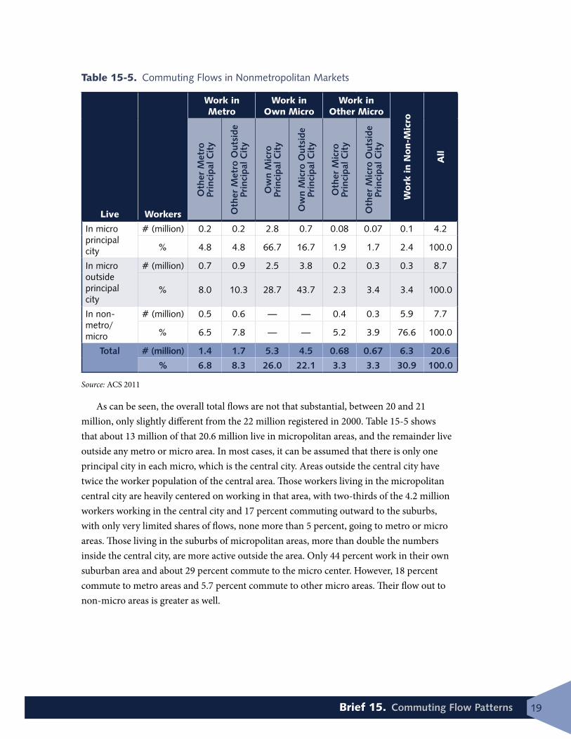
Table 15-5. Commuting Flows in Nonmetropolitan Markets
Live Workers
Work in Metro
Work in Own Micro
Work in Other Micro
Work
in N
on-M
icro
All
Oth
er M
etro
Pr
inci
pal C
ity
Oth
er M
etro
Out
side
Pr
inci
pal C
ity
Ow
n M
icro
Pr
inci
pal C
ity
Ow
n M
icro
Out
side
Pr
inci
pal C
ity
Oth
er M
icro
Pr
inci
pal C
ity
Oth
er M
icro
Out
side
Pr
inci
pal C
ity
In micro principal city
# (million) 0.2 0.2 2.8 0.7 0.08 0.07 0.1 4.2
% 4.8 4.8 66.7 16.7 1.9 1.7 2.4 100.0
In micro outside principal city
# (million) 0.7 0.9 2.5 3.8 0.2 0.3 0.3 8.7
% 8.0 10.3 28.7 43.7 2.3 3.4 3.4 100.0
In non-metro/micro
# (million) 0.5 0.6 — — 0.4 0.3 5.9 7.7
% 6.5 7.8 — — 5.2 3.9 76.6 100.0
Total # (million) 1.4 1.7 5.3 4.5 0.68 0.67 6.3 20.6
% 6.8 8.3 26.0 22.1 3.3 3.3 30.9 100.0
Source: ACS 2011
As can be seen, the overall total flows are not that substantial, between 20 and 21 million, only slightly different from the 22 million registered in 2000. Table 15-5 shows that about 13 million of that 20.6 million live in micropolitan areas, and the remainder live outside any metro or micro area. In most cases, it can be assumed that there is only one principal city in each micro, which is the central city. Areas outside the central city have twice the worker population of the central area. Those workers living in the micropolitan central city are heavily centered on working in that area, with two-thirds of the 4.2 million workers working in the central city and 17 percent commuting outward to the suburbs, with only very limited shares of flows, none more than 5 percent, going to metro or micro areas. Those living in the suburbs of micropolitan areas, more than double the numbers inside the central city, are more active outside the area. Only 44 percent work in their own suburban area and about 29 percent commute to the micro center. However, 18 percent commute to metro areas and 5.7 percent commute to other micro areas. Their flow out to non-micro areas is greater as well.

20 Commuting in America 2013: The National Report on Commuting Patterns and Trends
Figure 15-12. Micropolitan Summary FlowsSource: ACS 2011
As shown in Figure 15-13, approximately 15 percent of the workers living outside any metro or micro area commute to metro areas, and 9 percent commute into micro areas. The great majority however—76 percent—work in the same area, in that the destination is neither in a metro or micro area. However, it must be recognized that these trips can still register long distances traveling from one “rural” area to another.
Figure 15-13. Workplaces of Non-Metro, Non-Micro WorkersSource: ACS 2011
0
2,000,000
4,000,000
6,000,000
8,000,000
10,000,000
12,000,000
Work in Own Micro Work in Other Micro Work in aMetro Area
Outside anyMicro or Metro
Com
mut
ers
Live outside Principal City
Live in Principal City
Worked in Principal
City of MSA7%
Worked in MSA outside
Principal City 8%
Worked in a Principal City of
Micro Area5%
Worked in Micro Area outside any
Principal City 4%
Worked outside any Metropolitan or
Micropolitan Statistical Area
76%

21Brief 15. Commuting Flow Patterns
Summary of Work-Area DestinationsTable 15-6 summarizes the worker flows by destination for the three main categories of destinations.
Overall the total flow with destinations in metro areas is about 119 million out of a total of 138 million workers, or 86 percent. In addition, micropolitan destinations account for 8 percent and non-metro/micro areas almost 6 percent of all destinations. Almost 90 percent of all work destinations lie within the same metro, micro, or non-metro/micro area of their origin. The shares of internal flows are greatest for metros and least for non-metro/micros. The most significant pattern outside of the internal flows is the flow from other metro to metro at 7.2 million, or more than 5 percent of all commuting flows.
Table 15-6. Metro Work Destinations
Worker Residences Workers (million) Share
Metropolitan Destinations
From metro to own metro 108.6 91.4%
From other metro to metro 7.2 6.1%
From micro to metro 2 1.7%
From non-metro/micro to metro 1.1 0.9%
Total to Metros 118.9 100.0%
Micropolitan Destinations
From micro to own micro 8.8 79.3%
From other micro to micro 0.7 6.3%
From metro to micro 0.9 8.1%
From non-metro to micro 0.7 6.3%
Total to Micros 11.1 100.0%
non-Metro/non-Micro Destinations
From non-metro/micro to non-metro/micro 5.9 72.8%
From metro to non-metro/micro 1.8 22.2%
From micro to non-metro/micro 0.4 4.9%
Total to non-Metro/Micro 8.1 100.0%Source: ACS 2011
Note: Percentages do not always sum to 100% due to rounding.

22 Commuting in America 2013: The National Report on Commuting Patterns and Trends
SummaryThe orientation of commuting patterns is a critical transportation information need as local areas plan specific transportation investments and services to meet the needs of commuters. At the national level, the interest in aggregate patterns of flow over the past several decades has been focused on understanding general patterns of commuting. This brief puts a specif-ic focus on an understanding of the extent to which the historical central business district and core city dominate commuting travel orientation. The data reveal that as employment has dispersed and monocentric urban areas have tended to add additional concentrations of employment, commuting flow patterns have become much more diverse and diffused. Recent data also confirm the ongoing dispersion of employment and, with that, the more complex pattern of commute flows.
As metropolitan areas have continued to grow, jurisdictional boundaries become less meaningful as mechanisms to understand commuting flow patterns. Metropolitan areas often encompass several counties with cross-county trips no longer being indicative of lengthy metropolitan-destined commuting flows. In addition, new classification nomencla-tures further complicate aggregate measures of commuting flow.
Metropolitan areas remain the dominant destination for commuting flows and, as home to the majority of the labor force, are also the origin for most commute trips.

1. Overview—establishes institutional context, objectives, importance, data sources, and products to be produced.
2. The Role of Commuting in Overall Travel—presents national trend data on the relative role of commuting in overall person travel; explores commuting as a share of trips, miles of travel, and travel time at the national level.
3. Population and Worker Trends—provides very basic and key national demographic data.4. Population and Worker Dynamics—focuses on the dynamics of the population and work-
force, including data on migration, immigration, and differential rates of growth.
5. The Nature and Pattern of Jobs—defines employment and describes it in terms of its temporal, geographic, and other features.
6. Job Dynamics—looks at trends as they relate to jobs, including work at home, full-time versus part-time, job mobility, and changes in the nature and distribution of job types.
7. Vehicle and Transit Availability—reports on vehicle ownership and licensure levels and the availability of transit services. It also references factors influencing the availability of bike, walk, and carpool commute options.
8. Consumer Spending on Transportation—reports on various trends related to household spending on transportation.
9. How Commuting Influences Travel—explores how commuting travel influences overall travel trends temporally and geographically.
10. Commuting Mode Choice—provides a summary of mode choice for commuting (including work at home).
11. Commuting Departure Time and Trip Time—reports descriptive information on travel time and time left home, including national and selected additional data for metro area sizes.
12. Auto Commuting—addresses trends in privately-owned vehicle (POV) and shared-ride commuting.
13. Transit Commuting—addresses transit commuting.14. Bicycling and Walking Commuting—addresses bicycling and walking as commuting modes.
15. Commuting Flow Patterns—addresses commuting flow patterns for metro area geographic classifications.
16. The Evolving Role of Commuting—synthesizes and interprets materials developed in the prior briefs to paint a picture of the current role of commuting in overall travel and evolving trends to watch going forward.
ES. CIA 2013 Executive Summary
Commuting in America 2013 Briefs Series The CIA 2013 series will include the briefs listed below as well as a CIA 2013 Executive Summary and supporting data files, all available at the CIA 2013 website traveltrends.transportation.org. The website also includes a glossary of terms, documentation of data sources, and additional resources. The series of briefs included in CIA 2013 are:

Pub Code: CA15-4 ISBN: 978-1-56051-586-9
American Association of State Highway and Transportation Officials444 North Capitol Street, N.W.; Suite 249
Washington, DC 20001
www.transportation.orgctpp.transportation.org
traveltrends.transportation.org


![Calderdale Local Plan Examination STAGE 1 - HEARINGS ......commuting patterns within the Borough. 5a4) The Calderdale Employment Land Study [ELS] 2018 examined commuting flows from](https://static.fdocuments.net/doc/165x107/5f2248cbdd0d490563171622/calderdale-local-plan-examination-stage-1-hearings-commuting-patterns.jpg)