brand style guide - Kenoralistview.kenora.ca/Files/LOWDC/Shared Documents/Reports and...
24
brand style guide
Transcript of brand style guide - Kenoralistview.kenora.ca/Files/LOWDC/Shared Documents/Reports and...
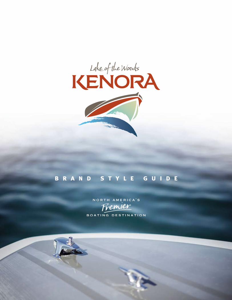
b r a n d s t y l e g u i d e
The Brand
The New Identity
Typography
Colour Scheme
Photography
Brand Examples
Whitecap Pavilon
461214151622
kenora, lake of the woods 3 brand style guide
As a community, we’re not responsible for just delivering a logo or
a communication strategy - or even putting out an ad campaign.
We are in the business of delivering an experience.
This new identity and accompanying style guide will be the visual
that represents that experience. It will represent the promise that we
make to everyone that holds a special place in their hearts for Kenora
and Lake of the Woods.
This brand will convey an emotion. It will tell a story.
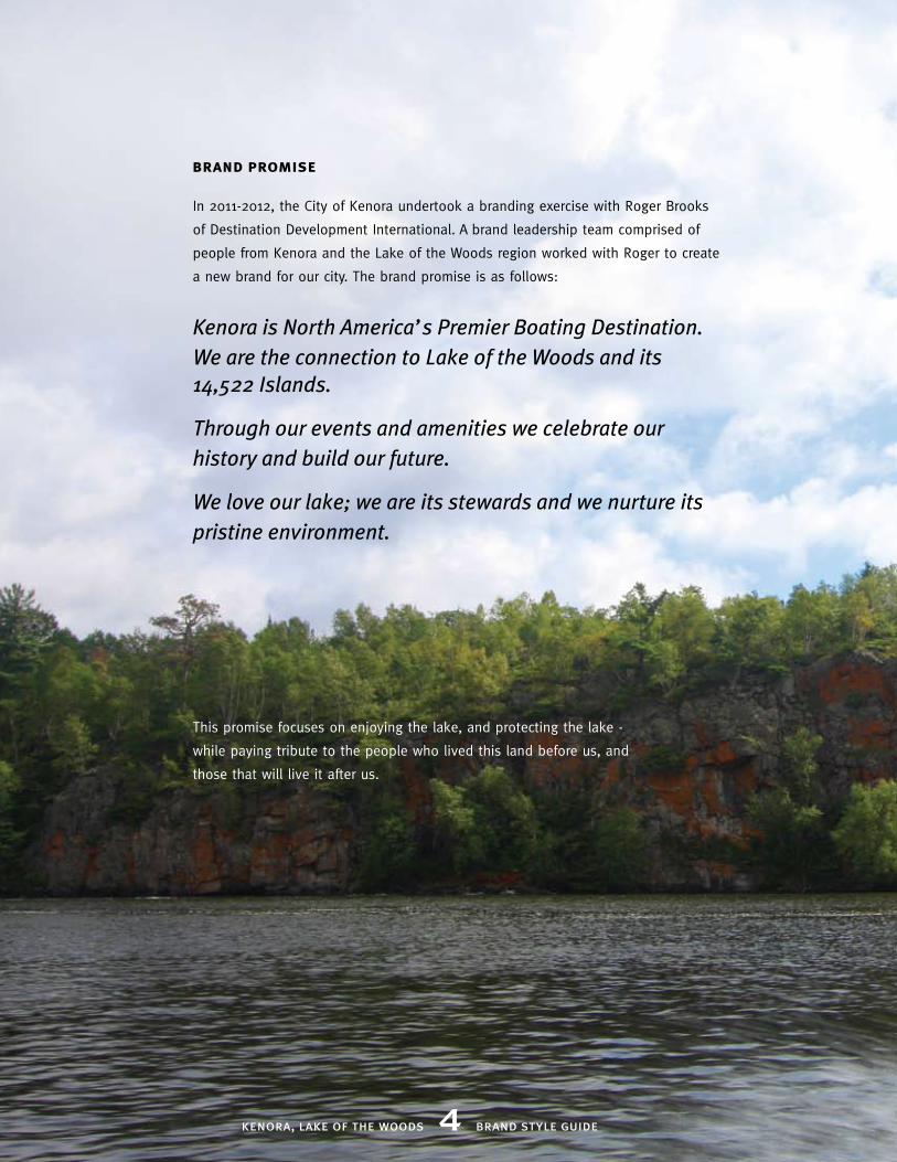
Kenora is North America’s Premier Boating Destination. We are the connection to Lake of the Woods and its 14,522 Islands.
Through our events and amenities we celebrate our history and build our future.
We love our lake; we are its stewards and we nurture its pristine environment.
kenora, lake of the woods 4 brand style guide
In 2011-2012, the City of Kenora undertook a branding exercise with Roger Brooks
of Destination Development International. A brand leadership team comprised of
people from Kenora and the Lake of the Woods region worked with Roger to create
a new brand for our city. The brand promise is as follows:
This promise focuses on enjoying the lake, and protecting the lake -
while paying tribute to the people who lived this land before us, and
those that will live it after us.
brand promise

kenora, lake of the woods 5 brand style guide
brand personality
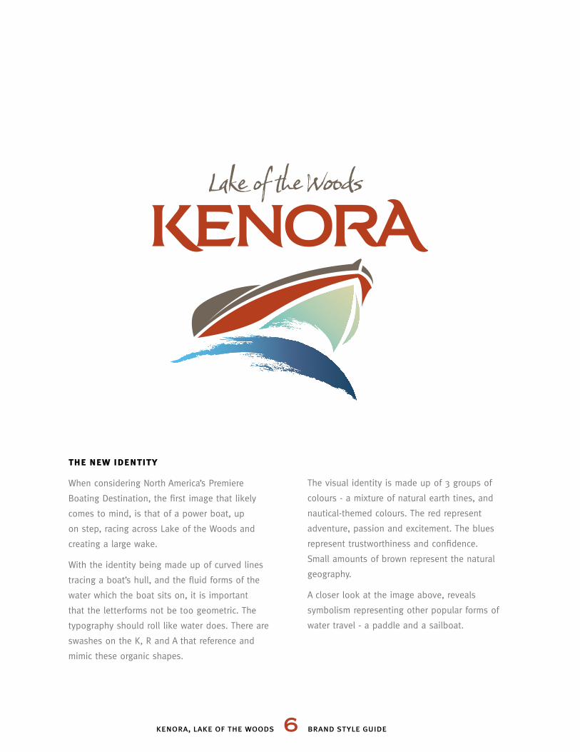
the new identity
When considering North America’s Premiere
Boating Destination, the first image that likely
comes to mind, is that of a power boat, up
on step, racing across Lake of the Woods and
creating a large wake.
With the identity being made up of curved lines
tracing a boat’s hull, and the fluid forms of the
water which the boat sits on, it is important
that the letterforms not be too geometric. The
typography should roll like water does. There are
swashes on the K, R and A that reference and
mimic these organic shapes.
The visual identity is made up of 3 groups of
colours - a mixture of natural earth tines, and
nautical-themed colours. The red represent
adventure, passion and excitement. The blues
represent trustworthiness and confidence.
Small amounts of brown represent the natural
geography.
A closer look at the image above, reveals
symbolism representing other popular forms of
water travel - a paddle and a sailboat.
kenora, lake of the woods 6 brand style guide
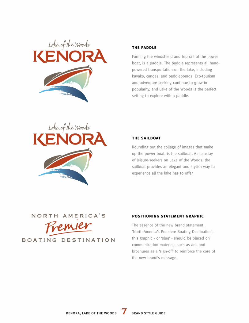
the paddle
Forming the windshield and top rail of the power
boat, is a paddle. The paddle represents all hand-
powered transportation on the lake, including
kayaks, canoes, and paddleboards. Eco-tourism
and adventure seeking continue to grow in
popularity, and Lake of the Woods is the perfect
setting to explore with a paddle.
the sailboat
Rounding out the collage of images that make
up the power boat, is the sailboat. A mainstay
of leisure-seekers on Lake of the Woods, the
sailboat provides an elegant and stylish way to
experience all the lake has to offer.
positioning statement graphic
The essence of the new brand statement,
‘North America’s Premiere Boating Destination’,
this graphic - or ‘slug’ - should be placed on
communication materials such as ads and
brochures as a ‘sign-off’ to reinforce the core of
the new brand’s message.
kenora, lake of the woods 7 brand style guide
kenora, lake of the woods 8 brand style guide
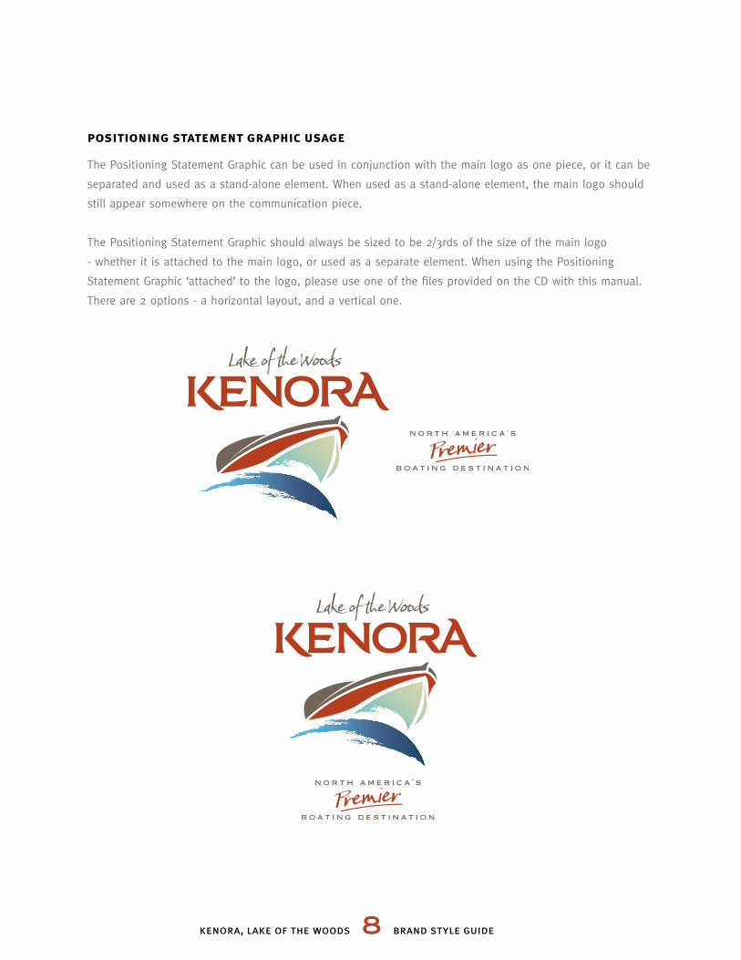
positioning statement graphic usage
The Positioning Statement Graphic can be used in conjunction with the main logo as one piece, or it can be
separated and used as a stand-alone element. When used as a stand-alone element, the main logo should
still appear somewhere on the communication piece.
The Positioning Statement Graphic should always be sized to be 2/3rds of the size of the main logo
- whether it is attached to the main logo, or used as a separate element. When using the Positioning
Statement Graphic ‘attached’ to the logo, please use one of the files provided on the CD with this manual.
There are 2 options - a horizontal layout, and a vertical one.
kenora, lake of the woods 9 brand style guide
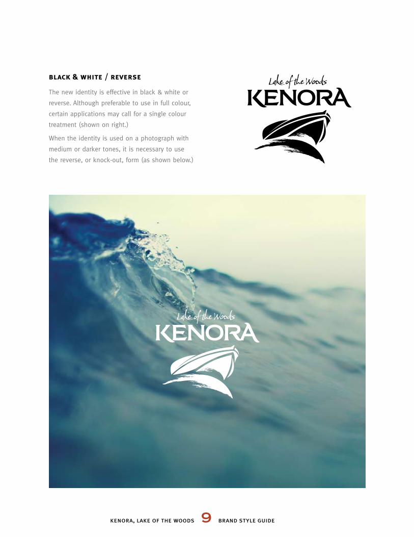
black & white / reverse
The new identity is effective in black & white or
reverse. Although preferable to use in full colour,
certain applications may call for a single colour
treatment (shown on right.)
When the identity is used on a photograph with
medium or darker tones, it is necessary to use
the reverse, or knock-out, form (as shown below.)
kenora, lake of the woods 10 brand style guide
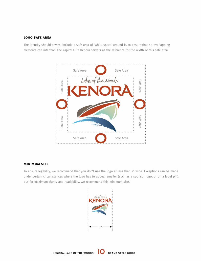
logo safe area
The identity should always include a safe area of ‘white space’ around it, to ensure that no overlapping
elements can interfere. The capital O in Kenora servers as the reference for the width of this safe area.
minimum size
To ensure legibility, we recommend that you don’t use the logo at less than 1” wide. Exceptions can be made
under certain circumstances where the logo has to appear smaller (such as a sponsor logo, or on a lapel pin),
but for maximum clarity and readability, we recommend this minimum size.
Safe Area Safe Area
Safe Area
1”
Safe Area
Safe
Are
aSa
fe A
rea
Safe Area
Safe Area
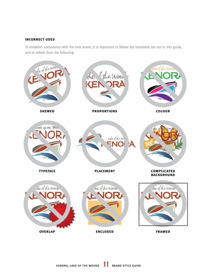
incorrect uses
To establish consistency with the new brand, it is important to follow the standards set out in this guide,
and to refrain from the following:
skewed proportions colour
kenora, lake of the woods 11 brand style guide
typeface placement complicated background
overlap enclosed framed
ABCDEFGHIJKLM NOPQRSTUVWXYZ1234567890
AGHKMNRTVXYZ
kenora, lake of the woods 12 brand style guide
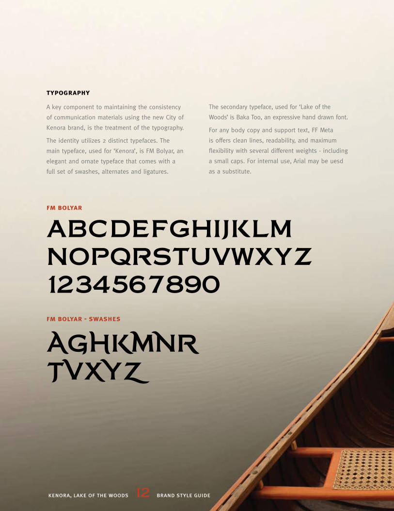
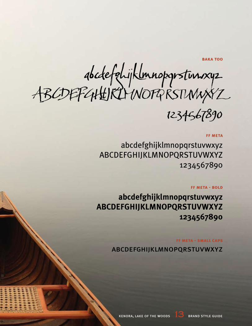
typography
A key component to maintaining the consistency
of communication materials using the new City of
Kenora brand, is the treatment of the typography.
The identity utilizes 2 distinct typefaces. The
main typeface, used for ‘Kenora’, is FM Bolyar, an
elegant and ornate typeface that comes with a
full set of swashes, alternates and ligatures.
fm bolyar
fm bolyar - swashes
The secondary typeface, used for ‘Lake of the
Woods’ is Baka Too, an expressive hand drawn font.
For any body copy and support text, FF Meta
is offers clean lines, readability, and maximum
flexibility with several different weights - including
a small caps. For internal use, Arial may be uesd
as a substitute.
abcdefghijklmnopqrstuvwxyzABCDEFGHIJKLMNOPQRSTUVWXYZ
1234567890
abcdefghijklmnopqrstuvwxyzABCDEFGHIJKLMNOPQRSTUVWXYZ
1234567890
abcdefghijklmnopqrstuvwxyzABCDEFGHIJKLMNOPQRSTUVWXYZ
1234567890
abcdefghijklmnopqrstuvwxyz
kenora, lake of the woods 13 brand style guide
baka too
ff meta
ff meta - bold
ff meta - small caps
kenora, lake of the woods 14 brand style guide
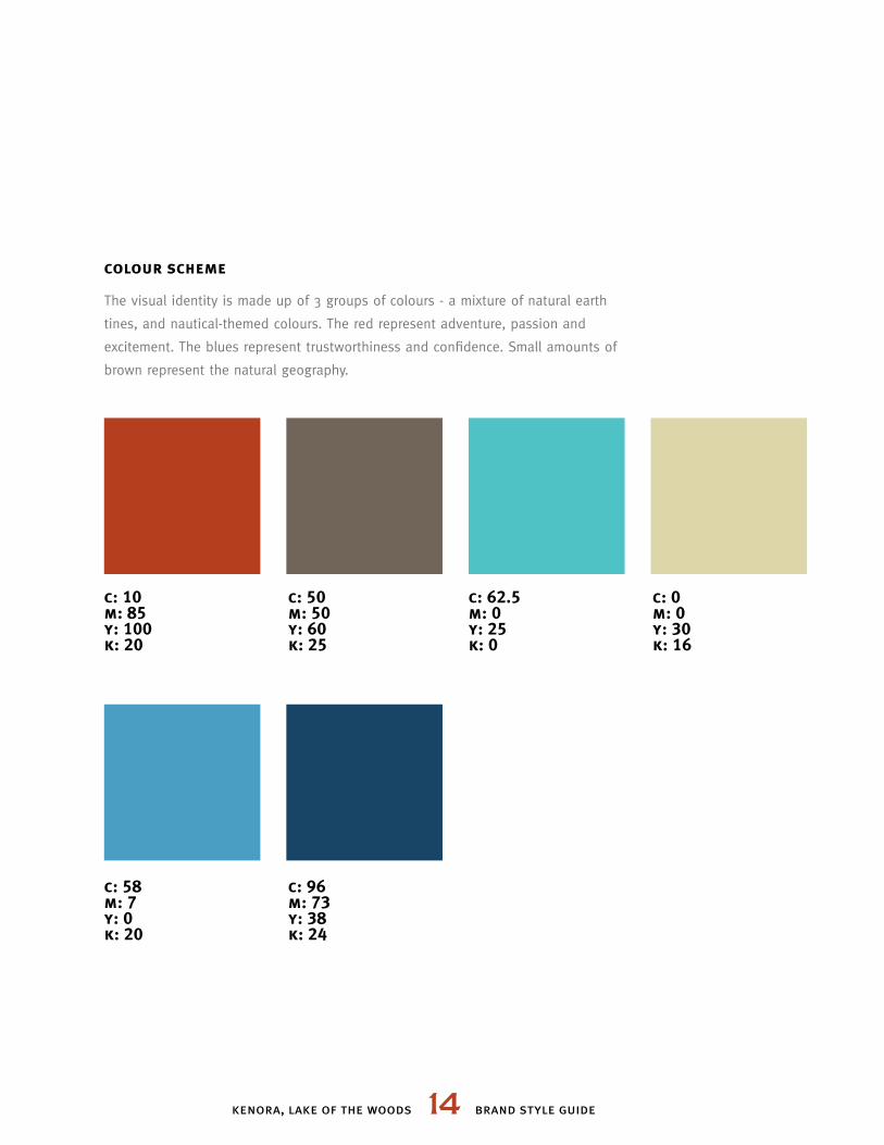
colour scheme
The visual identity is made up of 3 groups of colours - a mixture of natural earth
tines, and nautical-themed colours. The red represent adventure, passion and
excitement. The blues represent trustworthiness and confidence. Small amounts of
brown represent the natural geography.
c: 10 m: 85 y: 100 k: 20
c: 58 m: 7 y: 0 k: 20
c: 96 m: 73 y: 38 k: 24
c: 50 m: 50 y: 60 k: 25
c: 62.5 m: 0 y: 25 k: 0
c: 0 m: 0 y: 30 k: 16
kenora, lake of the woods 15 brand style guide
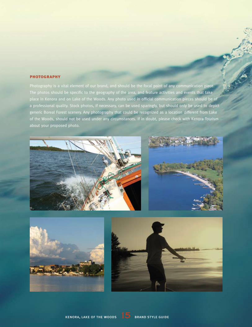
photography
Photography is a vital element of our brand, and should be the focal point of any communication piece.
The photos should be specific to the geography of the area, and feature activities and events that take
place in Kenora and on Lake of the Woods. Any photo used in official communication pieces should be of
a professional quality. Stock photos, if necessary, can be used sparingly, but should only be used to depict
generic Boreal Forest scenery. Any photography that could be recognized as a location different from Lake
of the Woods, should not be used under any circumstances. If in doubt, please check with Kenora Tourism
about your proposed photo.
kenora, lake of the woods 16 brand style guide
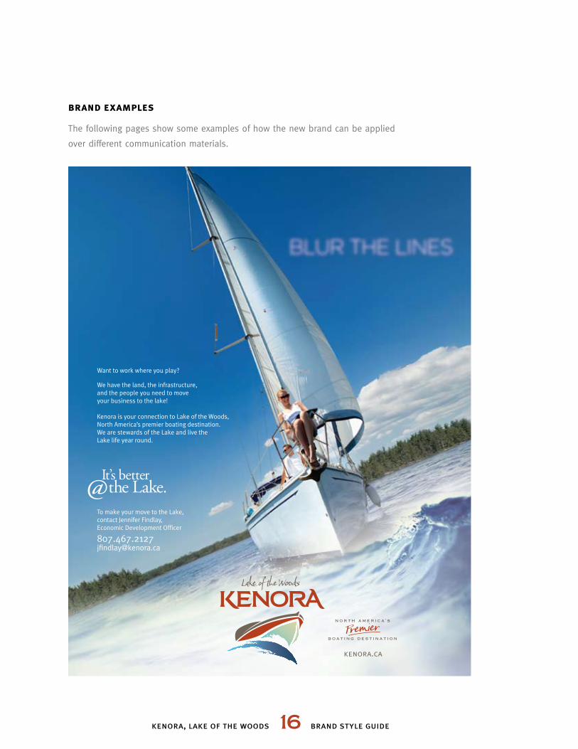
brand examples
The following pages show some examples of how the new brand can be applied
over different communication materials.
Want to work where you play?
We have the land, the infrastructure, and the people you need to move your business to the lake!
Kenora is your connection to Lake of the Woods, North America’s premier boating destination.We are stewards of the Lake and live the Lake life year round.
To make your move to the Lake,contact Jennifer Findlay,Economic Development Officer
kenora.ca
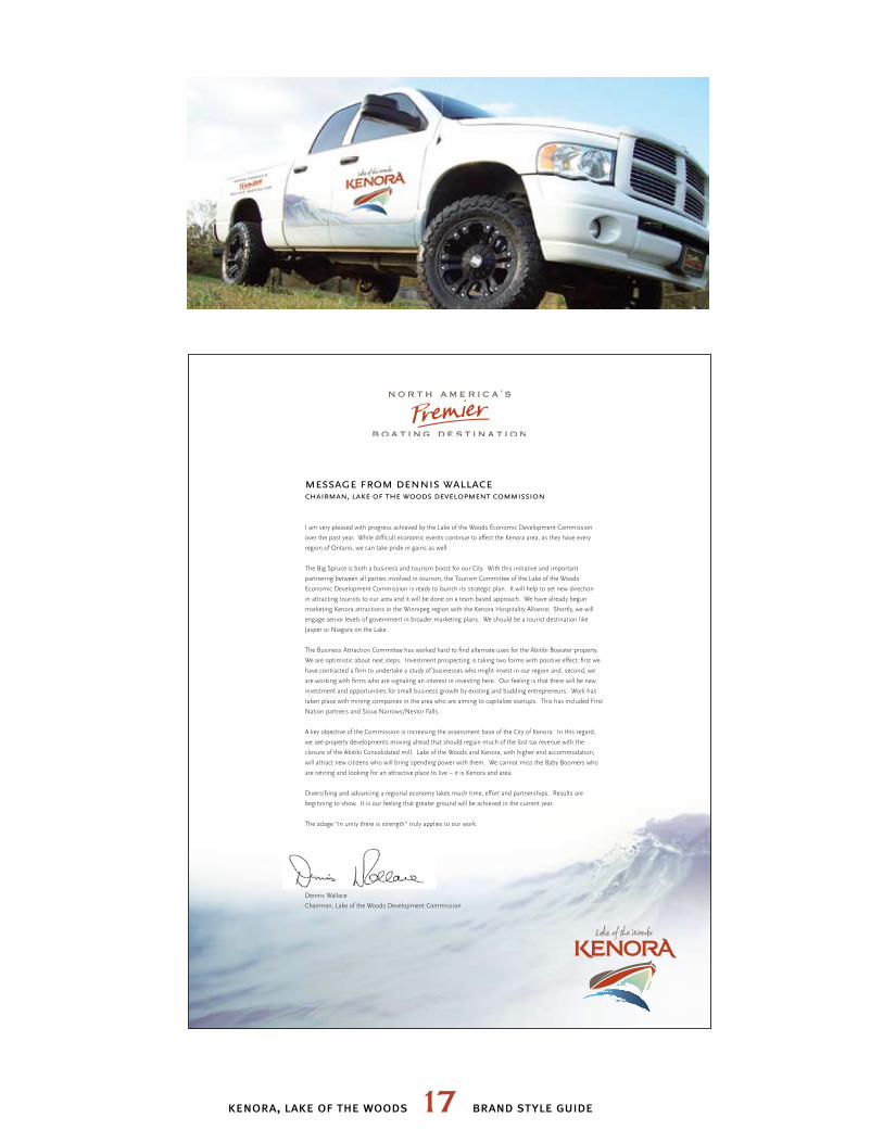
message from dennis wallace chairman, lake of the woods development commission
I am very pleased with progress achieved by the Lake of the Woods Economic Development Commission
over the past year. While difficult economic events continue to affect the Kenora area, as they have every
region of Ontario, we can take pride in gains as well.
The Big Spruce is both a business and tourism boost for our City. With this initiative and important
partnering between all parties involved in tourism, the Tourism Committee of the Lake of the Woods
Economic Development Commission is ready to launch its strategic plan. It will help to set new direction
in attracting tourists to our area and it will be done on a team based approach. We have already begun
marketing Kenora attractions in the Winnipeg region with the Kenora Hospitality Alliance. Shortly, we will
engage senior levels of government in broader marketing plans. We should be a tourist destination like
Jasper or Niagara on the Lake.
The Business Attraction Committee has worked hard to find alternate uses for the Abitibi Bowater property.
We are optimistic about next steps. Investment prospecting is taking two forms with positive effect; first we
have contracted a firm to undertake a study of businesses who might invest in our region and, second, we
are working with firms who are signaling an interest in investing here. Our feeling is that there will be new
investment and opportunities for small business growth by existing and budding entrepreneurs. Work has
taken place with mining companies in the area who are aiming to capitalize startups. This has included First
Nation partners and Sioux Narrows/Nestor Falls.
A key objective of the Commission is increasing the assessment base of the City of Kenora. In this regard,
we see property developments moving ahead that should regain much of the lost tax revenue with the
closure of the Abitibi Consolidated mill. Lake of the Woods and Kenora, with higher end accommodation,
will attract new citizens who will bring spending power with them. We cannot miss the Baby Boomers who
are retiring and looking for an attractive place to live – it is Kenora and area.
Diversifying and advancing a regional economy takes much time, effort and partnerships. Results are
beginning to show. It is our feeling that greater ground will be achieved in the current year.
The adage “in unity there is strength” truly applies to our work.
Dennis Wallace
Chairman, Lake of the Woods Development Commission
kenora, lake of the woods 17 brand style guide

kenora, lake of the woods 19 brand style guide
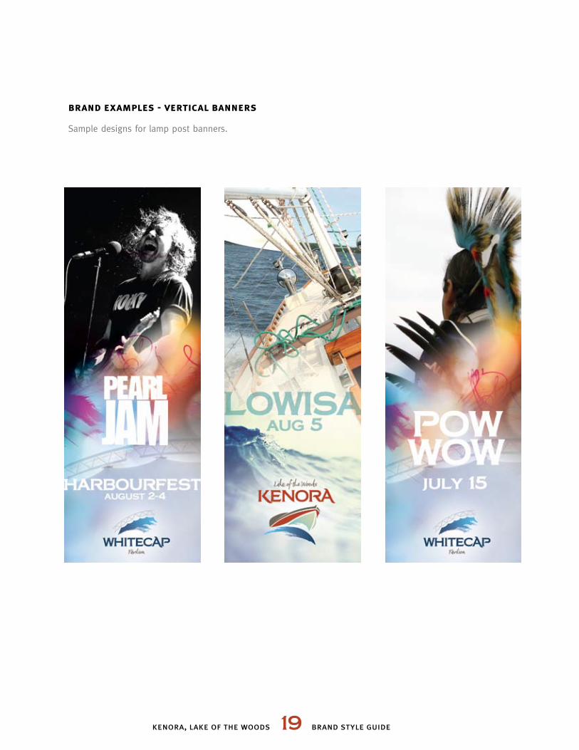
brand examples - vertical banners
Sample designs for lamp post banners.
kenora, lake of the woods 20 brand style guide
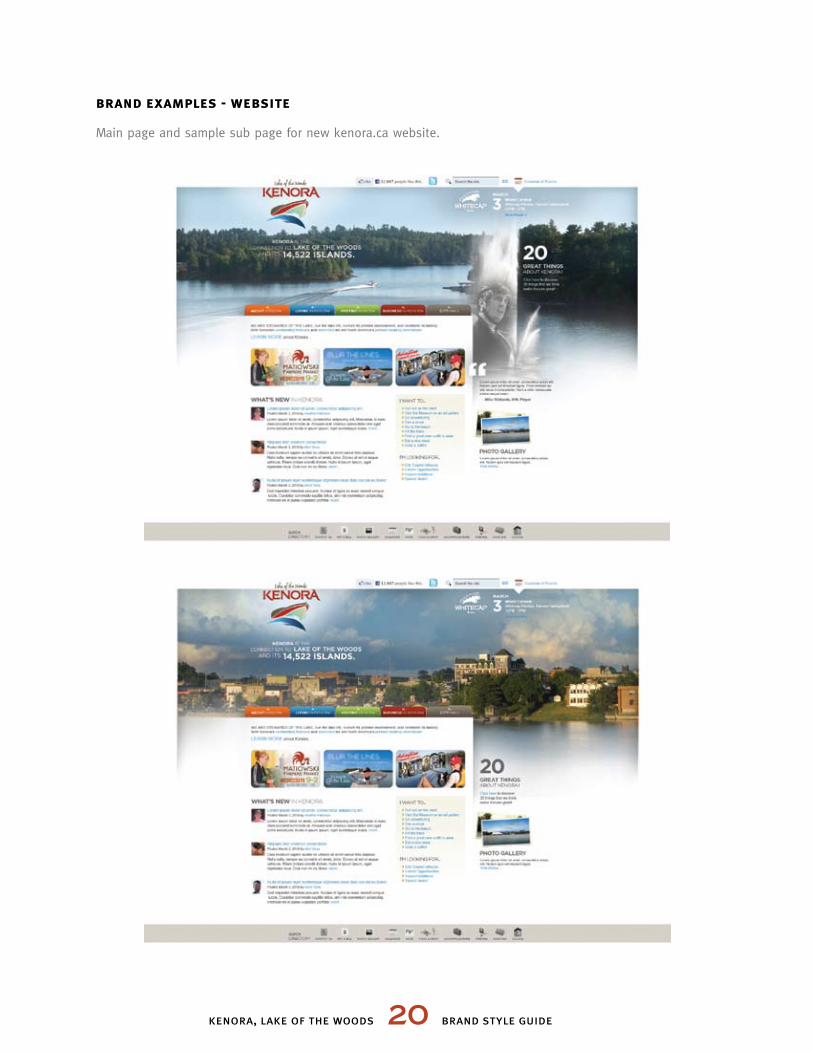
brand examples - website
Main page and sample sub page for new kenora.ca website.
kenora, lake of the woods 21 brand style guide
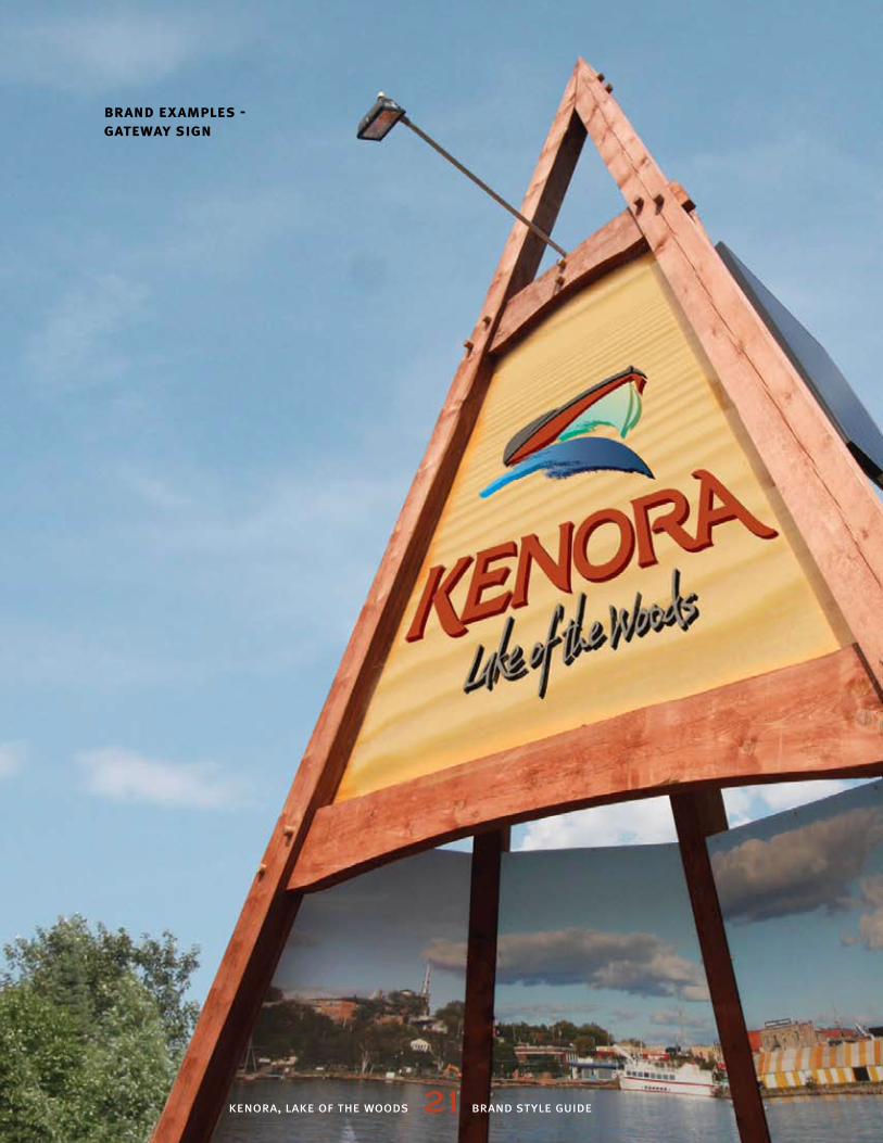
brand examples - gateway sign
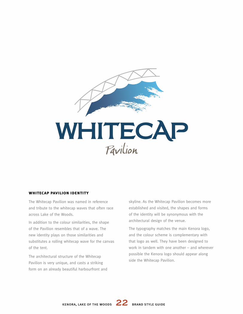
whitecap pavilion identity
The Whitecap Pavilion was named in reference
and tribute to the whitecap waves that often race
across Lake of the Woods.
In addition to the colour similarities, the shape
of the Pavilion resembles that of a wave. The
new identity plays on those similarities and
substitutes a rolling whitecap wave for the canvas
of the tent.
The architectural structure of the Whitecap
Pavilion is very unique, and casts a striking
form on an already beautiful harbourfront and
skyline. As the Whitecap Pavilion becomes more
established and visited, the shapes and forms
of the identity will be synonymous with the
architectural design of the venue.
The typography matches the main Kenora logo,
and the colour scheme is complementary with
that logo as well. They have been designed to
work in tandem with one another – and wherever
possible the Kenora logo should appear along
side the Whitecap Pavilion.
kenora, lake of the woods 22 brand style guide
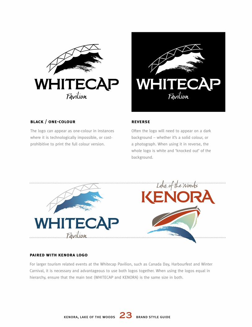
black / one-colour
The logo can appear as one-colour in instances
where it is technologically impossible, or cost-
prohibitive to print the full colour version.
reverse
Often the logo will need to appear on a dark
background – whether it’s a solid colour, or
a photograph. When using it in reverse, the
whole logo is white and ‘knocked out’ of the
background.
paired with kenora logo
For larger tourism related events at the Whitecap Pavilion, such as Canada Day, Harbourfest and Winter
Carnival, it is necessary and advantageous to use both logos together. When using the logos equal in
hierarchy, ensure that the main text (WHITECAP and KENORA) is the same size in both.
kenora, lake of the woods 23 brand style guide
This style guide, and the brand contained herein, were designed
by Mike Newton Design and the Brand Leadership Team at the
City of Kenora.
This brand guidelines and standards manual contains the
intellectual property of The City of Kenora, and is copyright 2012.
Information included here is for the reference of The City of Kenora
and its agents. It may not be shared with a third party without
permission by The City of Kenora.
Tourism Kenora
(807) 468-4637