
BRAND STYLE GUIDE - ACDSee...
19
BRAND STYLE GUIDE For ACD Systems’ partners and other third parties
Transcript of BRAND STYLE GUIDE - ACDSee...
BRAND STYLE GUIDEFor ACD Systems’ partners and other third parties

An innovative technology company creating digital image solutions for people
and businesses around the world.
ACDSee Brand Style Guide, © 2014 ACD Systems International Inc.
CONTENTSBuilding Our Brand . . . . . . . . . . . . . . . . . . . . . . . . . . . . . . . . . 4
Who We Are . . . . . . . . . . . . . . . . . . . . . . . . . . . . . . . . . . . . . 5
What We Do. . . . . . . . . . . . . . . . . . . . . . . . . . . . . . . . . . . . . . 5
ACDSee Brand Voice . . . . . . . . . . . . . . . . . . . . . . . . . . . . . . . . 6
ACDSee Brand Building Blocks/Basics . . . . . . . . . . . . . . . . . . . . 7Color Palette and UsageACDSee TypographyACDSee Corporate LogoACDSee Product LogosACDSee Corporate and Product Logo Colorand Component Guidelines
Visual Identity Size & Positioning . . . . . . . . . . . . . . . . . . . . . . . 12ACDSee Corporate LogoACDSee Product Logos
Visual Identity Reproduction . . . . . . . . . . . . . . . . . . . . . . . . . . 14
Visual Identity Pictorial . . . . . . . . . . . . . . . . . . . . . . . . . . . . . . 15
Unapproved Identity Formats . . . . . . . . . . . . . . . . . . . . . . . . . . 16
ACDSee Brand Review/Approval . . . . . . . . . . . . . . . . . . . . . . 18
ACDSee Brand Style Guide, © 2014 ACD Systems International Inc.
BUILDING OUR BRAND
4
Every interaction we have with our customers, partners and the world at large is a defining moment for our brand. It is our opportunity to deliver on the promise that sets us apart - a promise of extraordinary service, of quality and innovation, and of a passionate and committed ACDSee team.
ACD Systems’ continued growth brings with it the need for a consistent identity and clear brand strategy across all media and in every country. Our brand expresses our personality and sets us apart from the competition. A consistent program of visual and verbal identity is essential to driving not just brand recognition, but brand preference.
• It’s in the style and function of our user interface• It’s the look and usability of our web site• It’s how we respond in forums• It’s in the business card we share• It’s in everything we do
This document is intended as a tool to help ensure that in our journey to become and maintain our status as the industry leader, we all have the look and commitment of a leader, and that our partners are prepared to support this brand position in all communication on behalf of ACDSee.
For more information on the ACDSee brand, brand usage or to obtain art files and other assets, please contact [email protected].
ACDSee Brand Style Guide, © 2014 ACD Systems International Inc.
WHO WE ARE
WHAT WE DO
5
An innovative technology company creating digital image solutions for people and businesses around the world.
Passionate and determined, we’re building an innovative technology company that can anticipate industry trends and satisfy our customers’ evolving needs. We will deliver, year in and year out, the absolute best customer-focused technology, the highest standards of design, and unparalleled usability. By providing unmatched service to our customers, shareholders and employees we will become the preferred provider of digital image solutions.

ACDSee Brand Style Guide, © 2014 ACD Systems International Inc.
ACDSEE BRAND VOICE
6
Photography brings joy and a sense of fulfillment to both our professional and enthusiast customers. Whether as a hobby or livelihood, it’s very valuable to them, and they expect people to engage them about it in a passionate, informed, caring, and personable voice.
Therefore, when talking about ACDSee and our products, we want to speak to that joy and sense of fulfillment. We want to communicate that our position in the market is to facilitate the joy of photography. Whether it’s doing mundane image management tasks quickly, sharing polished photos effectively and creatively with a sense of pride and accomplishment, or streamlining business workflow so photographers can spend more time behind the lens, ACDSee’s purpose is to get the customer directly in touch with their digital photo collections, quickly and easily.
ACDSee Brand Style Guide, © 2014 ACD Systems International Inc.
ACDSEE BRAND BUILDING BLOCKS
7
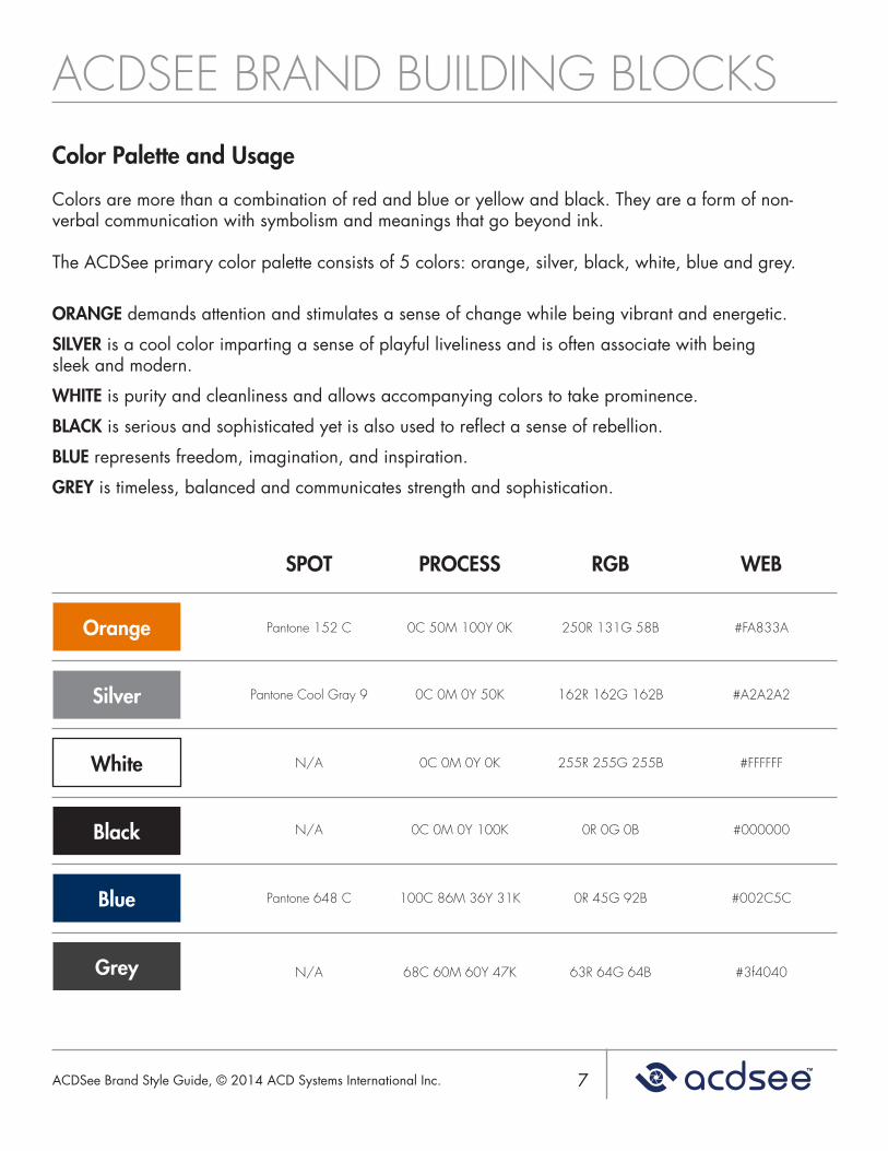
Color Palette and Usage
Colors are more than a combination of red and blue or yellow and black. They are a form of non-verbal communication with symbolism and meanings that go beyond ink.
The ACDSee primary color palette consists of 5 colors: orange, silver, black, white, blue and grey.
ORANGE demands attention and stimulates a sense of change while being vibrant and energetic.
SILVER is a cool color imparting a sense of playful liveliness and is often associate with being sleek and modern.
WHITE is purity and cleanliness and allows accompanying colors to take prominence.
BLACK is serious and sophisticated yet is also used to reflect a sense of rebellion.
BLUE represents freedom, imagination, and inspiration.
GREY is timeless, balanced and communicates strength and sophistication.
WEB
#FA833A
#A2A2A2
#FFFFFF
#000000
#002C5C
#3f4040
RGB
250R 131G 58B
162R 162G 162B
255R 255G 255B
0R 0G 0B
0R 45G 92B
63R 64G 64B
PROCESS
0C 50M 100Y 0K
0C 0M 0Y 50K
0C 0M 0Y 0K
0C 0M 0Y 100K
100C 86M 36Y 31K
68C 60M 60Y 47K
SPOT
Pantone 152 C
Pantone Cool Gray 9
N/A
N/A
Pantone 648 C
N/A
Orange
Silver
White
Black
Blue
Grey
ACDSee Brand Style Guide, © 2014 ACD Systems International Inc.
ACDSEE BRAND BUILDING BLOCKS
8
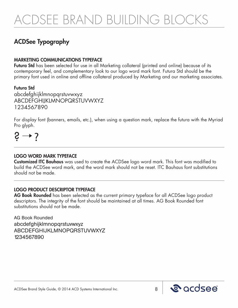
ACDSee Typography
MARKETING COMMUNICATIONS TYPEFACEFutura Std has been selected for use in all Marketing collateral (printed and online) because of its contemporary feel, and complementary look to our logo word mark font. Futura Std should be the primary font used in online and offline collateral produced by Marketing and our marketing associates.
Futura StdabcdefghijklmnopqrstuvwxyzABCDEFGHIJKLMNOPQRSTUVWXYZ1234567890
For display font (banners, emails, etc.), when using a question mark, replace the futura with the Myriad Pro glyph.
? ?LOGO WORD MARK TYPEFACECustomized ITC Bauhaus was used to create the ACDSee logo word mark. This font was modified to build the ACDSee word mark, and the word mark should not be reset. ITC Bauhaus font substitutions should not be made.
LOGO PRODUCT DESCRIPTOR TYPEFACEAG Book Rounded has been selected as the current primary typeface for all ACDSee logo product descriptors. The integrity of the font should be maintained at all times. AG Book Rounded font substitutions should not be made.
AG Book RoundedabcdefghijklmnopqrstuvwxyzABCDEFGHIJKLMNOPQRSTUVWXYZ1234567890
ACDSee Brand Style Guide, © 2014 ACD Systems International Inc.
ACDSEE BRAND BUILDING BLOCKS
9
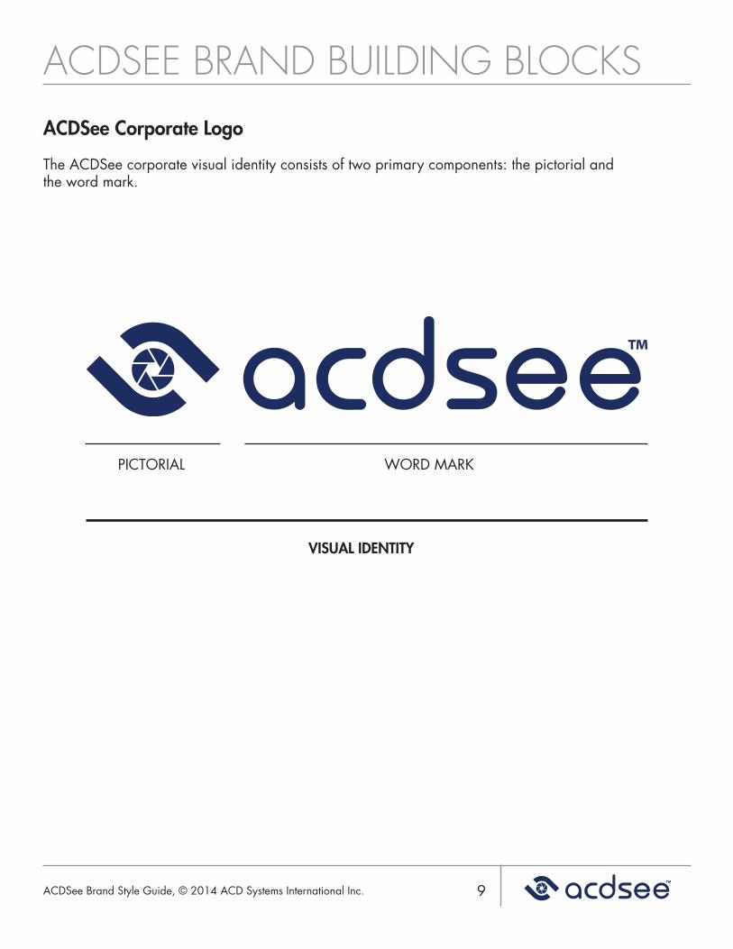
ACDSee Corporate Logo
The ACDSee corporate visual identity consists of two primary components: the pictorial and the word mark.
PICTORIAL WORD MARK
VISUAL IDENTITY
ACDSee Brand Style Guide, © 2014 ACD Systems International Inc.
ACDSEE BRAND BUILDING BLOCKS
10
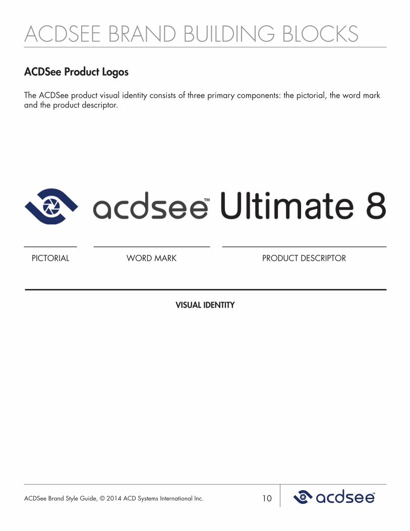
ACDSee Product Logos
The ACDSee product visual identity consists of three primary components: the pictorial, the word mark and the product descriptor.
PICTORIAL WORD MARK PRODUCT DESCRIPTOR
VISUAL IDENTITY
ACDSee Brand Style Guide, © 2014 ACD Systems International Inc.
ACDSEE BRAND BUILDING BLOCKS
11
ACDSee Corporate and Product Logo Color and Component Guidelines
1. Wherever there is a discrepancy relating to corporate colors, the color values defined within this document’s matrix shall prevail.
2. PMS colors should be used whenever they are available for implementation.
3. No other color combinations or permutations are permitted, unless accepted and included with these usage guidelines.
4. The trademark symbol must always be included when reproducing corporate or product visual identities.
5. Pictorials should never be displayed without a word mark when representing corporate identity. Pictorials may be used alone as a graphic (see “Visual Identity Pictorial as Graphic“ in this document).
6. Product identity may be displayed as a word mark, with or without the pictorial.
7. The pictorial should always remain to the left of the word mark for both the corporate and product identities.
8. The product identity should have an accompanying product descriptor in all instances, where the product has an associated descriptor.
9. The product descriptor should never precede the product word mark.
ACDSee Brand Style Guide, © 2014 ACD Systems International Inc.
VISUAL IDENTITY SIZE & POSITIONING
12
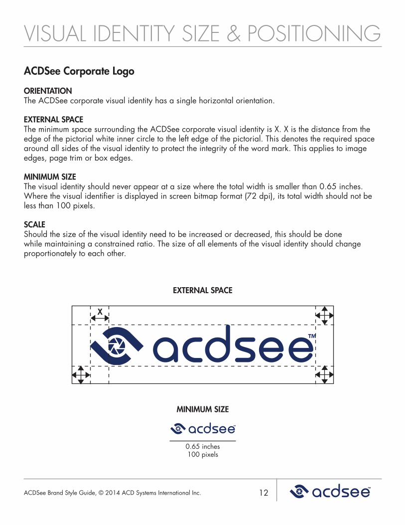
ACDSee Corporate Logo
ORIENTATIONThe ACDSee corporate visual identity has a single horizontal orientation.
EXTERNAL SPACEThe minimum space surrounding the ACDSee corporate visual identity is X. X is the distance from the edge of the pictorial white inner circle to the left edge of the pictorial. This denotes the required space around all sides of the visual identity to protect the integrity of the word mark. This applies to image edges, page trim or box edges.
MINIMUM SIZEThe visual identity should never appear at a size where the total width is smaller than 0.65 inches. Where the visual identifier is displayed in screen bitmap format (72 dpi), its total width should not be less than 100 pixels.
SCALEShould the size of the visual identity need to be increased or decreased, this should be done while maintaining a constrained ratio. The size of all elements of the visual identity should change proportionately to each other.
X
EXTERNAL SPACE
MINIMUM SIZE
0.65 inches 100 pixels
ACDSee Brand Style Guide, © 2014 ACD Systems International Inc.
VISUAL IDENTITY SIZE & POSITIONING
13
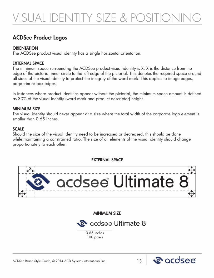
ACDSee Product Logos
ORIENTATIONThe ACDSee product visual identity has a single horizontal orientation.
EXTERNAL SPACEThe minimum space surrounding the ACDSee product visual identity is X. X is the distance from the edge of the pictorial inner circle to the left edge of the pictorial. This denotes the required space around all sides of the visual identity to protect the integrity of the word mark. This applies to image edges, page trim or box edges.
In instances where product identities appear without the pictorial, the minimum space amount is defined as 30% of the visual identity (word mark and product descriptor) height.
MINIMUM SIZEThe visual identity should never appear at a size where the total width of the corporate logo element is smaller than 0.65 inches.
SCALEShould the size of the visual identity need to be increased or decreased, this should be done while maintaining a constrained ratio. The size of all elements of the visual identity should change proportionately to each other.
X
EXTERNAL SPACE
MINIMUM SIZE
0.65 inches 100 pixels
ACDSee Brand Style Guide, © 2014 ACD Systems International Inc.
VISUAL IDENTITY REPRODUCTION
14
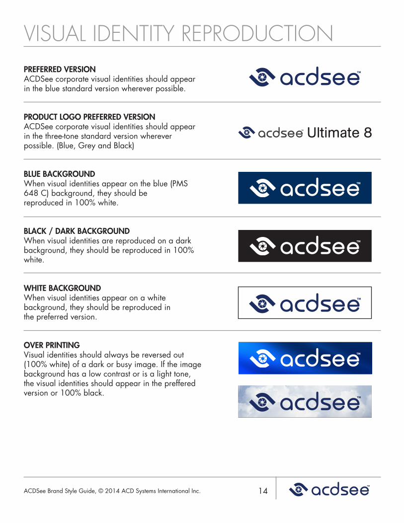
PREFERRED VERSIONACDSee corporate visual identities should appear in the blue standard version wherever possible.
PRODUCT LOGO PREFERRED VERSIONACDSee corporate visual identities should appear in the three-tone standard version wherever possible. (Blue, Grey and Black)
BLUE BACKGROUNDWhen visual identities appear on the blue (PMS 648 C) background, they should bereproduced in 100% white.
BLACK / DARK BACKGROUNDWhen visual identities are reproduced on a dark background, they should be reproduced in 100% white.
WHITE BACKGROUNDWhen visual identities appear on a white background, they should be reproduced inthe preferred version.
OVER PRINTINGVisual identities should always be reversed out (100% white) of a dark or busy image. If the image background has a low contrast or is a light tone, the visual identities should appear in the preffered version or 100% black.
ACDSee Brand Style Guide, © 2014 ACD Systems International Inc.
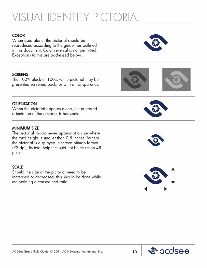
VISUAL IDENTITY PICTORIAL
15
COLORWhen used alone, the pictorial should be reproduced according to the guidelines outlined in this document. Color reversal is not permitted. Exceptions to this are addressed below.
SCREENSThe 100% black or 100% white pictorial may be presented screened back, or with a transparency.
ORIENTATIONWhen the pictorial appears alone, the preferred orientation of the pictorial is horizontal.
MINIMUM SIZEThe pictorial should never appear at a size where the total height is smaller than 0.5 inches. Where the pictorial is displayed in screen bitmap format (72 dpi), its total height should not be less than 48 pixels.
SCALEShould the size of the pictorial need to be increased or decreased, this should be done while maintaining a constrained ratio.
ACDSee Brand Style Guide, © 2014 ACD Systems International Inc.
UNAPPROVED IDENTITY FORMATS
16
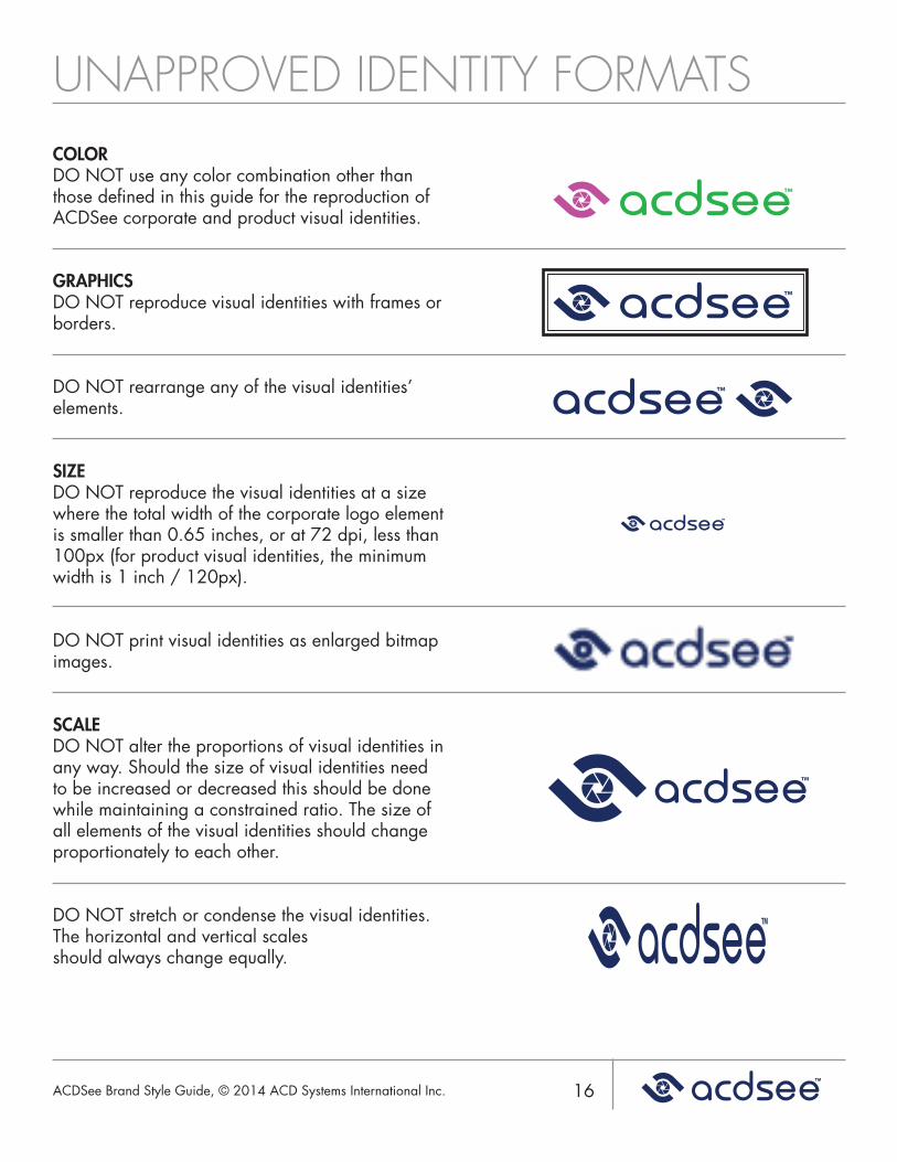
COLORDO NOT use any color combination other than those defined in this guide for the reproduction of ACDSee corporate and product visual identities.
GRAPHICSDO NOT reproduce visual identities with frames or borders.
DO NOT rearrange any of the visual identities’ elements.
SIZEDO NOT reproduce the visual identities at a size where the total width of the corporate logo element is smaller than 0.65 inches, or at 72 dpi, less than 100px (for product visual identities, the minimum width is 1 inch / 120px).
DO NOT print visual identities as enlarged bitmap images.
SCALEDO NOT alter the proportions of visual identities in any way. Should the size of visual identities need to be increased or decreased this should be done while maintaining a constrained ratio. The size of all elements of the visual identities should changeproportionately to each other.
DO NOT stretch or condense the visual identities. The horizontal and vertical scalesshould always change equally.
ACDSee Brand Style Guide, © 2014 ACD Systems International Inc.
UNAPPROVED IDENTITY FORMATS
17
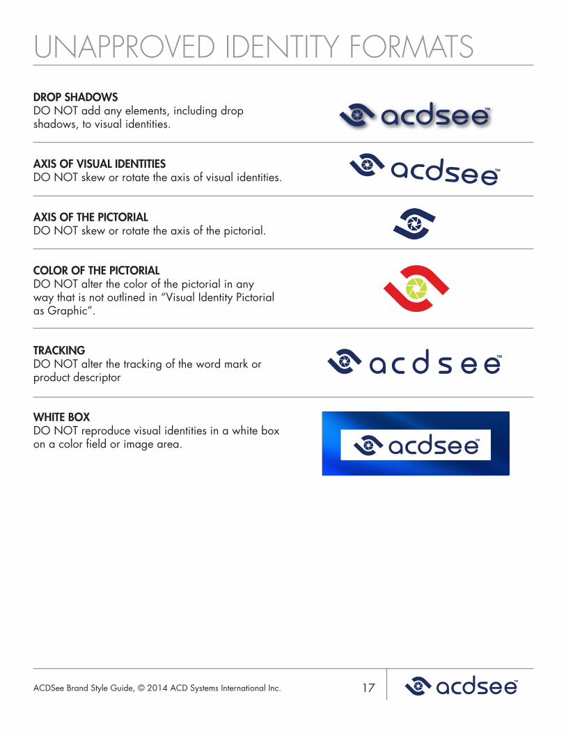
DROP SHADOWSDO NOT add any elements, including drop shadows, to visual identities.
AXIS OF VISUAL IDENTITIESDO NOT skew or rotate the axis of visual identities.
AXIS OF THE PICTORIALDO NOT skew or rotate the axis of the pictorial.
COLOR OF THE PICTORIALDO NOT alter the color of the pictorial in any way that is not outlined in “Visual Identity Pictorial as Graphic”.
TRACKINGDO NOT alter the tracking of the word mark or product descriptor
WHITE BOXDO NOT reproduce visual identities in a white box on a color field or image area.
ACDSee Brand Style Guide, © 2014 ACD Systems International Inc.
ACDSEE BRAND REVIEW/APPROVAL
18
Any use of the ACDSee brand (corporate and product) needs to be reviewed and approved by the ACDSee Marketing Services team. Any requests for exceptions to the brand rules will be considered on a case by case basis. Special circumstances or deviation from the brand guidelines must also be reviewed and approved by Marketing Services.
If you have questions about using the ACDSee brand, or your brand application is not covered in this guide, please contact [email protected].
ACDSee Brand Style Guide, © 2014 ACD Systems International Inc.