Brand Guidelines - Joomla · PDF fileabout other elements of this brand manual, please contact...
58
Brand Guidelines Draſt 1.0 March 2015
Transcript of Brand Guidelines - Joomla · PDF fileabout other elements of this brand manual, please contact...
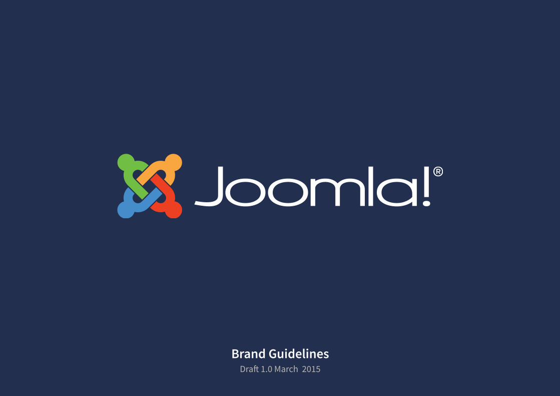
Brand GuidelinesDraft 1.0 March 2015

DRAFT 1.0 MARCH 2015 - Do not duplicate or distribute. 2
Contents
BASICS
This document presents basic guidelines for the correct usage of the graphic elements of Joomla’s identity, in order to create high quality, visually stunning communication materials.
How to use this manual
About Joomla!
7 What is Joomla?
8 State of ownership
Brand identity elements
11 Signature
12 Joomla! signature: full-colour
13 Joomla! signature: single-colour
14 The brandmark
15 Signature with tagline
16 Name in text
17 Examples of using the name Joomla! in text
18 Important note on registered indicia
Colour
21 Brand colour system
22 Default colour system
24 Incorrect usage of signature colours
26 Incorrect usage of background colours
27 Full-colour signature: background colours
28 Single-colour signature: background colours
29 Signature usage on a background image
Signature usage 31 Horizontal signature: empty space
32 Vertical signature: empty space
33 Brandmark: empty space
34 Signature size in print
35 Signature size for digital use
36 Small version for print and web
37 Brandmark size
38 Signature usage with partners
39 Incorrect usage of signature
Typography
44 Primary typeface
45 Alternative primary typefaces
46 Secondary typeface
47 Alternative secondary typefaces
48 Tone of voice with typography: primary typeface
49 Tone of voice with typography: secondary typeface
Questions and answersGlossary

A brand is a person’s gut feelingabout a product, service,
or a company.Marty Neumeier, Zag
C70 M35 Y0 K0 R80 G145 B205 #5091cd
Welcome to Joomla!

Joomla! Brand Guidelines | BasicsDRAFT 1.0 MARCH 2015 - Do not duplicate or distribute. 5Joomla! World Conference 2012
C90 M80 Y40 K40 R37 G48 B79 #25304f
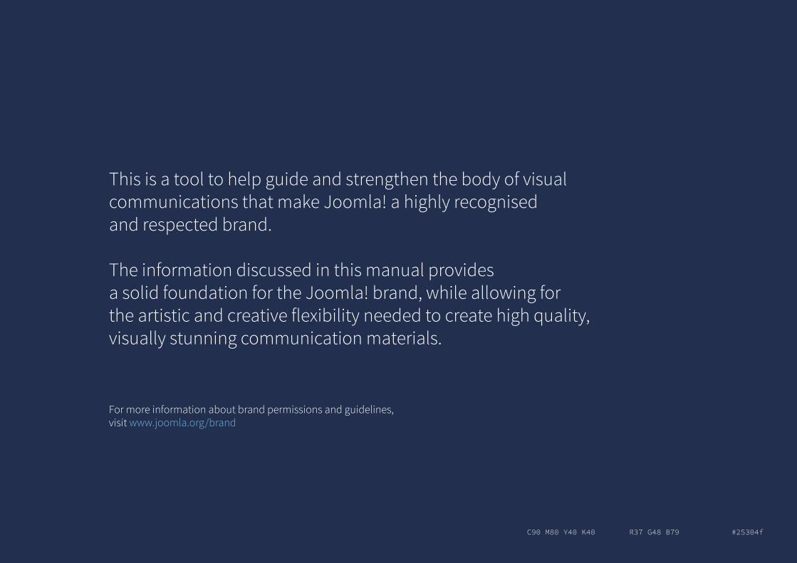
This is a tool to help guide and strengthen the body of visual communications that make Joomla! a highly recognised and respected brand.
The information discussed in this manual provides a solid foundation for the Joomla! brand, while allowing for the artistic and creative flexibility needed to create high quality, visually stunning communication materials.
For more information about brand permissions and guidelines,visit www.joomla.org/brand
Joomla! Brand Guidelines | BasicsDRAFT 1.0 MARCH 2015 - Do not duplicate or distribute. 7
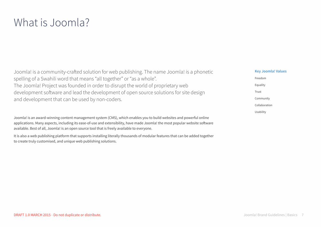
What is Joomla?
Joomla! is a community-crafted solution for web publishing. The name Joomla! is a phonetic spelling of a Swahili word that means “all together” or “as a whole”. The Joomla! Project was founded in order to disrupt the world of proprietary web development software and lead the development of open source solutions for site design and development that can be used by non-coders.
Joomla! is an award-winning content management system (CMS), which enables you to build websites and powerful online applications. Many aspects, including its ease-of-use and extensibility, have made Joomla! the most popular website software available. Best of all, Joomla! is an open source tool that is freely available to everyone.
It is also a web publishing platform that supports installing literally thousands of modular features that can be added together to create truly customised, and unique web publishing solutions.
Key Joomla! Values
Freedom
Equality
Trust
Community
Collaboration
Usability
Joomla! Brand Guidelines | BasicsDRAFT 1.0 MARCH 2015 - Do not duplicate or distribute. 8
State of ownership
The Joomla! name and various related trademarks and service marks are owned by Open Source Matters, Inc., a not-for-profit organisation formed specifically to advance the principles of open source software and to support the software development and community activities of the Joomla! Project.
If you would like to use the Joomla! name or logo for any other use, please contact the Joomla! project and we’ll discuss a way to make that happen. We don’t have strong objections to people using the name for their websites and businesses, we just want to have a chance to review such use.
For more information about the trademark policy visit http://opensourcematters.org/legal/trademark/trademark-policy.html
Confidentiality Statement
All material in this document is registered to Open Source Matters, Inc. This material includes but it is not limited to printed and/or electronic text and images. All registration privileges and other rights implied or explicit are reserved.
Exemptions
We ask you to adhere in full to the specification of this document, especially for items such as the signature, colour scheme and typography. The usage of each of these aspects of the brand identity has been granted conditional exemption by the Trademark Team.
To request an exemption or further information about other elements of this brand manual, please contact the Marketing Working Group by email: [email protected]. org

C70 M35 Y0 K0 R80 G145 B205 #5091cd
Brand identity elements

C90 M80 Y40 K40 R37 G48 B79 #25304f
Brandmark
Tagline
Logotype or wordmark
Signature with tagline
Joomla! Brand Guidelines | Basics 11BRAND IDENTITY ELEMENTS DRAFT 1.0 MARCH 2015 - Do not duplicate or distribute.
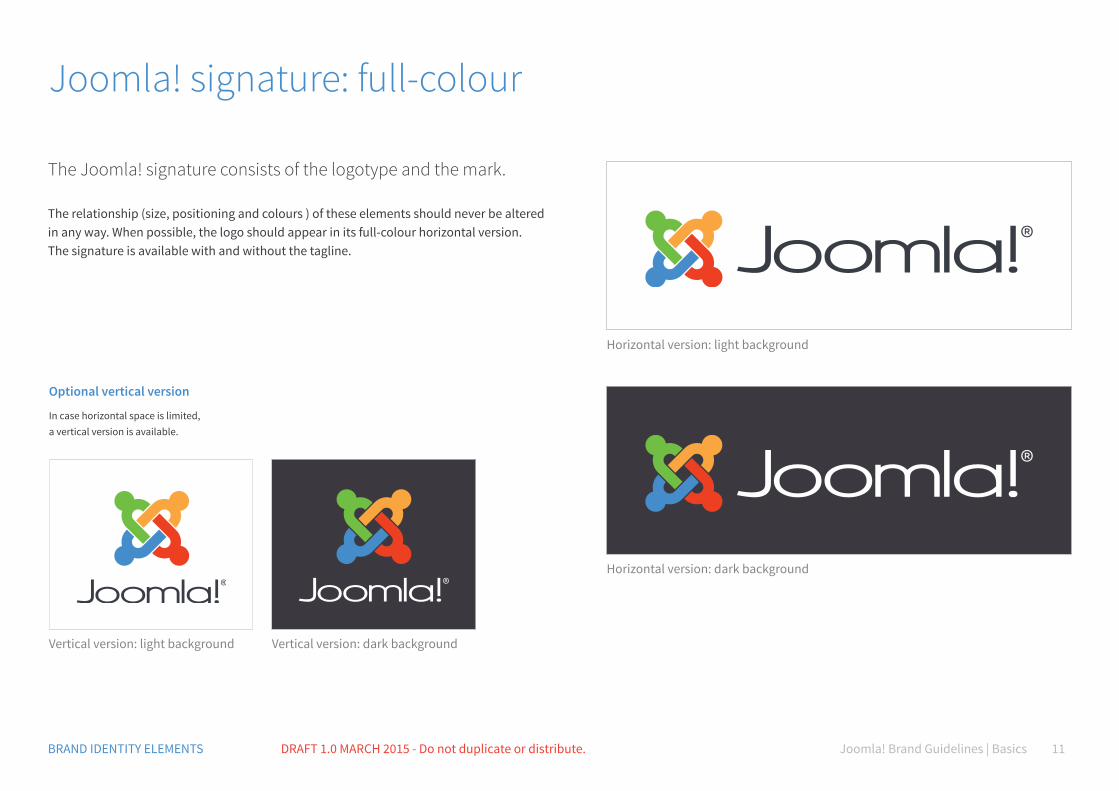
Joomla! signature: full-colour
The Joomla! signature consists of the logotype and the mark.
The relationship (size, positioning and colours ) of these elements should never be altered in any way. When possible, the logo should appear in its full-colour horizontal version.The signature is available with and without the tagline.
Horizontal version: dark background
Horizontal version: light background
Vertical version: light background Vertical version: dark background
Optional vertical version
In case horizontal space is limited, a vertical version is available.
Joomla! Brand Guidelines | Basics 12BRAND IDENTITY ELEMENTS DRAFT 1.0 MARCH 2015 - Do not duplicate or distribute.
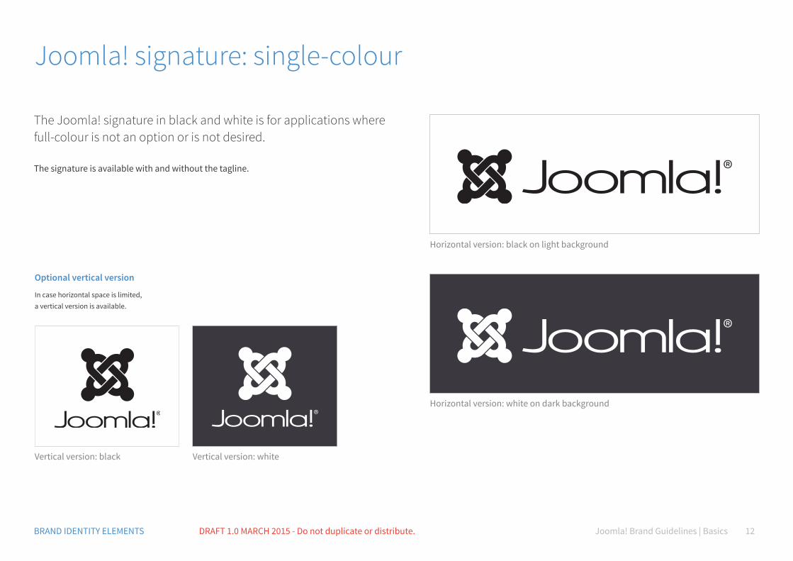
Joomla! signature: single-colour
The Joomla! signature in black and white is for applications where full-colour is not an option or is not desired.
The signature is available with and without the tagline.
Horizontal version: white on dark background
Horizontal version: black on light background
Vertical version: black Vertical version: white
Optional vertical version
In case horizontal space is limited, a vertical version is available.
Joomla! Brand Guidelines | Basics 13BRAND IDENTITY ELEMENTS DRAFT 1.0 MARCH 2015 - Do not duplicate or distribute.
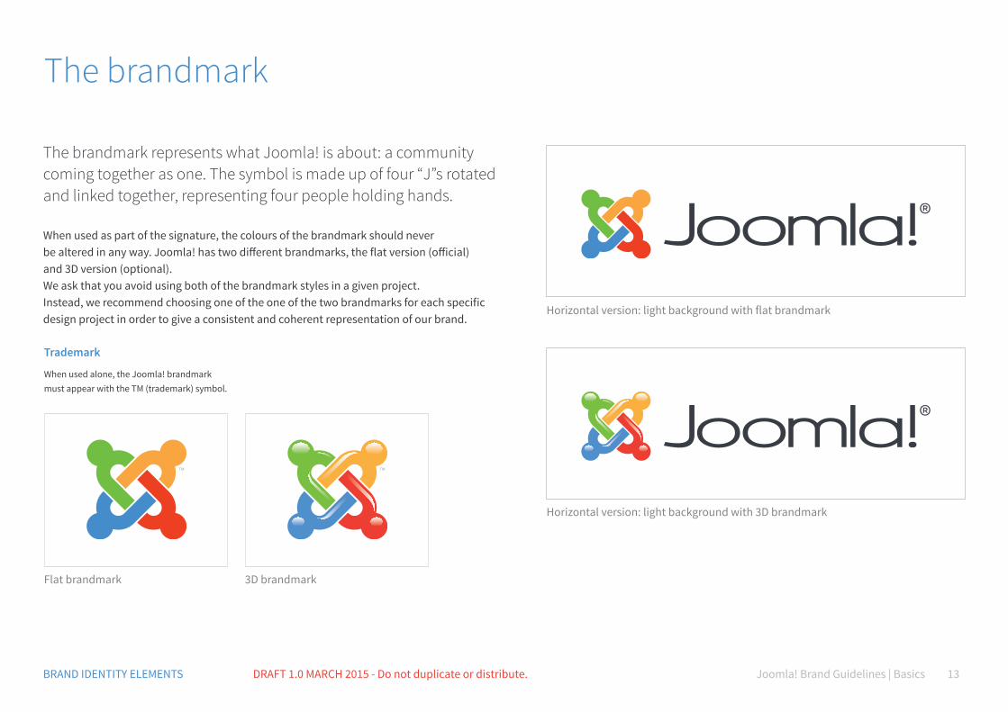
The brandmark
The brandmark represents what Joomla! is about: a community coming together as one. The symbol is made up of four “J”s rotated and linked together, representing four people holding hands.
When used as part of the signature, the colours of the brandmark should never be altered in any way. Joomla! has two different brandmarks, the flat version (official) and 3D version (optional).We ask that you avoid using both of the brandmark styles in a given project. Instead, we recommend choosing one of the one of the two brandmarks for each specific design project in order to give a consistent and coherent representation of our brand.
Horizontal version: light background with 3D brandmark
Horizontal version: light background with flat brandmark
Flat brandmark 3D brandmark
Trademark
When used alone, the Joomla! brandmark must appear with the TM (trademark) symbol.
Joomla! Brand Guidelines | Basics 14BRAND IDENTITY ELEMENTS DRAFT 1.0 MARCH 2015 - Do not duplicate or distribute.
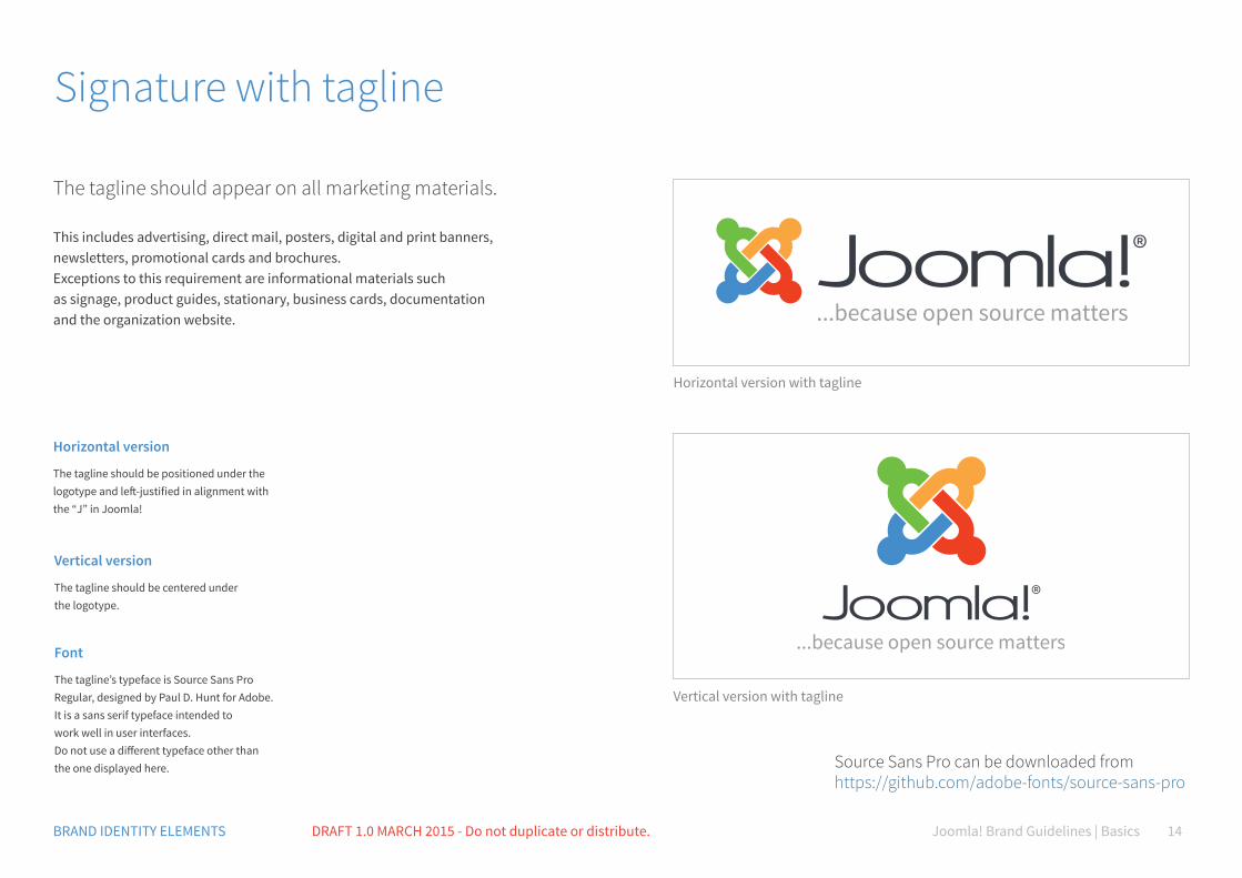
Signature with tagline
The tagline should appear on all marketing materials.
This includes advertising, direct mail, posters, digital and print banners, newsletters, promotional cards and brochures. Exceptions to this requirement are informational materials such as signage, product guides, stationary, business cards, documentation and the organization website.
Horizontal version
The tagline should be positioned under the logotype and left-justified in alignment with the “J” in Joomla!
Vertical version
The tagline should be centered under the logotype.
Font
The tagline’s typeface is Source Sans Pro Regular, designed by Paul D. Hunt for Adobe. It is a sans serif typeface intended to work well in user interfaces. Do not use a different typeface other than the one displayed here.
Horizontal version with tagline
Vertical version with tagline
Source Sans Pro can be downloaded from https://github.com/adobe-fonts/source-sans-pro
Joomla! Brand Guidelines | Basics 15BRAND IDENTITY ELEMENTS DRAFT 1.0 MARCH 2015 - Do not duplicate or distribute.
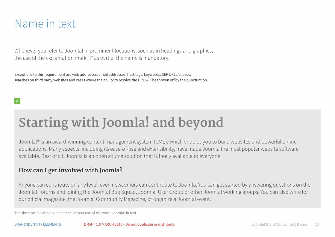
Name in text
Whenever you refer to Joomla! in prominent locations, such as in headings and graphics, the use of the exclamation mark “!” as part of the name is mandatory.
Exceptions to this requirement are web addresses, email addresses, hashtags, keywords, SEF URLs/aliases, searches on third party websites and cases where the ability to resolve the URL will be thrown off by the punctuation.
Starting with Joomla! and beyondJoomla!® is an award-winning content management system (CMS), which enables you to build websites and powerful online applications. Many aspects, including its ease-of-use and extensibility, have made Joomla the most popular website software available. Best of all, Joomla is an open source solution that is freely available to everyone.
How can I get involved with Joomla?
Anyone can contribute on any level; even newcomers can contribute to Joomla. You can get started by answering questions on the Joomla! Forums and joining the Joomla! Bug Squad, Joomla! User Group or other Joomla! working groups. You can also write for our official magazine, the Joomla! Community Magazine, or organize a Joomla! event.
The short article above depicts the correct use of the word Joomla! in text.
Joomla! Brand Guidelines | Basics 16BRAND IDENTITY ELEMENTS DRAFT 1.0 MARCH 2015 - Do not duplicate or distribute.
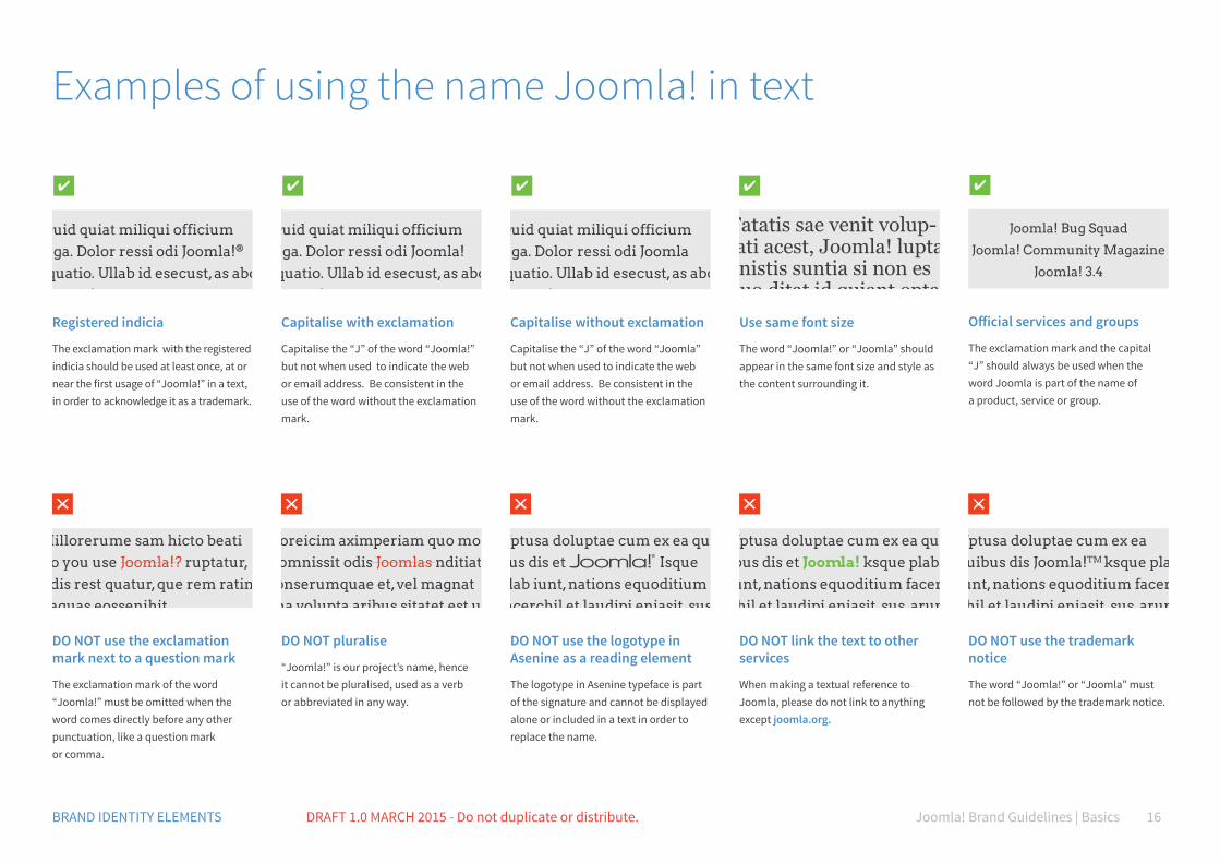
Examples of using the name Joomla! in text
Capitalise with exclamation
Capitalise the “J” of the word “Joomla!” but not when used to indicate the web or email address. Be consistent in the use of the word without the exclamation mark.
Capitalise without exclamation
Capitalise the “J” of the word “Joomla” but not when used to indicate the web or email address. Be consistent in the use of the word without the exclamation mark.
Registered indicia
The exclamation mark with the registered indicia should be used at least once, at or near the first usage of “Joomla!” in a text, in order to acknowledge it as a trademark.
Official services and groups
The exclamation mark and the capital “J” should always be used when the word Joomla is part of the name of a product, service or group.
Use same font size
The word “Joomla!” or “Joomla” should appear in the same font size and style as the content surrounding it.
DO NOT use the exclamation mark next to a question mark
The exclamation mark of the word “Joomla!” must be omitted when the word comes directly before any other punctuation, like a question mark or comma.
DO NOT pluralise
“Joomla!” is our project’s name, hence it cannot be pluralised, used as a verb or abbreviated in any way.
DO NOT use the logotype in Asenine as a reading element
The logotype in Asenine typeface is part of the signature and cannot be displayed alone or included in a text in order to replace the name.
DO NOT link the text to other services
When making a textual reference to Joomla, please do not link to anything except joomla.org.
DO NOT use the trademark notice
The word “Joomla!” or “Joomla” must not be followed by the trademark notice.
Quid quiat miliqui officium fuga. Dolor ressi odi Joomla! equatio. Ullab id esecust, as abo. Ut eosa!
Quid quiat miliqui officium fuga. Dolor ressi odi Joomla equatio. Ullab id esecust, as abo. Ut eosa!
Quid quiat miliqui officium fuga. Dolor ressi odi Joomla!® equatio. Ullab id esecust, as abo. Ut eosa!
Joomla! Bug Squad
Joomla! Community Magazine
Joomla! 3.4
Tatatis sae venit volup-tati acest, Joomla! lupta gnistis suntia si non es quo ditat id quiant opta-que rempos sit, que vel estium nus aturepere prae no
Hillorerume sam hicto beati do you use Joomla!? ruptatur, odis rest quatur, que rem ratin eaquas eossenihit
Loreicim aximperiam quo mo comnissit odis Joomlas nditiat ionserumquae et, vel magnat ma volupta aribus sitatet est ut
Uptusa doluptae cum ex ea qui-bus dis et Isque plab iunt, nations equoditium facerchil et laudipi eniasit, sus, arum
Uptusa doluptae cum ex ea qu-ibus dis et Joomla! ksque plab iunt, nations equoditium facer-chil et laudipi eniasit, sus, arum
Uptusa doluptae cum ex ea quibus dis Joomla!TM ksque plab iunt, nations equoditium facer-chil et laudipi eniasit, sus, arum
Joomla! Brand Guidelines | Basics 17BRAND IDENTITY ELEMENTS DRAFT 1.0 MARCH 2015 - Do not duplicate or distribute.
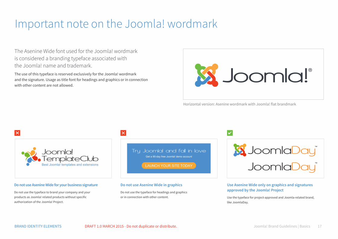
Important note on the Joomla! wordmark
The Asenine Wide font used for the Joomla! wordmark is considered a branding typeface associated with the Joomla! name and trademark.The use of this typeface is reserved exclusively for the Joomla! wordmark and the signature. Usage as title font for headings and graphics or in connection with other content are not allowed.
Horizontal version: Asenine wordmark with Joomla! flat brandmark
Joomla!TemplateClubBest Joomla! templates and extensions The best CMS
Try Joomla! and fall in loveGet a 90-day free Joomla! demo account
LAUNCH YOUR SITE TODAY
Do not use Asenine Wide for your business signature
Do not use the typeface to brand your company and your products as Joomla! related products without specific authorization of the Joomla! Project.
Do not use Asenine Wide in graphics
Do not use the typeface for headings and graphics or in connection with other content.
Use Asenine Wide only on graphics and signatures approved by the Joomla! Project
Use the typeface for project-approved and Joomla-related brand, like JoomlaDay.
Joomla! Brand Guidelines | Basics 18BRAND IDENTITY ELEMENTS DRAFT 1.0 MARCH 2015 - Do not duplicate or distribute.
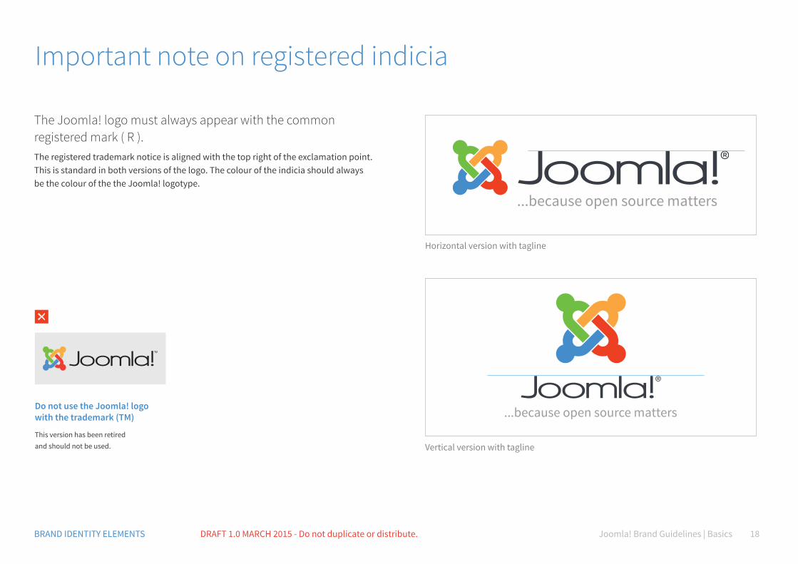
Important note on registered indicia
The Joomla! logo must always appear with the common registered mark ( R ).The registered trademark notice is aligned with the top right of the exclamation point. This is standard in both versions of the logo. The colour of the indicia should always be the colour of the the Joomla! logotype.
Do not use the Joomla! logo with the trademark (TM)
This version has been retired and should not be used.
Horizontal version with tagline
Vertical version with tagline
C70 M35 Y0 K0 R80 G145 B205 #5091cd
Colour
C90 M80 Y40 K40 R37 G48 B79 #25304f
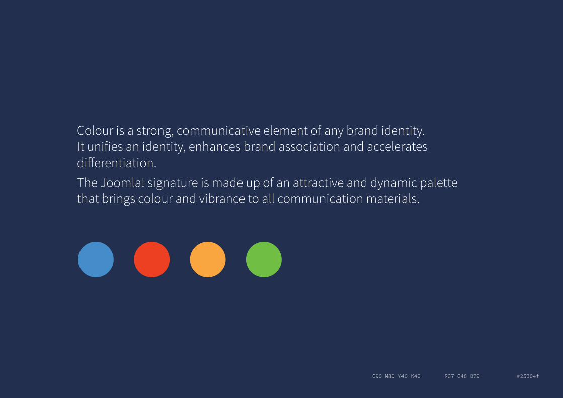
Colour is a strong, communicative element of any brand identity. It unifies an identity, enhances brand association and accelerates differentiation.The Joomla! signature is made up of an attractive and dynamic palette that brings colour and vibrance to all communication materials.
Joomla! Brand Guidelines | Basics 21BRAND IDENTITY ELEMENTS DRAFT 1.0 MARCH 2015 - Do not duplicate or distribute.
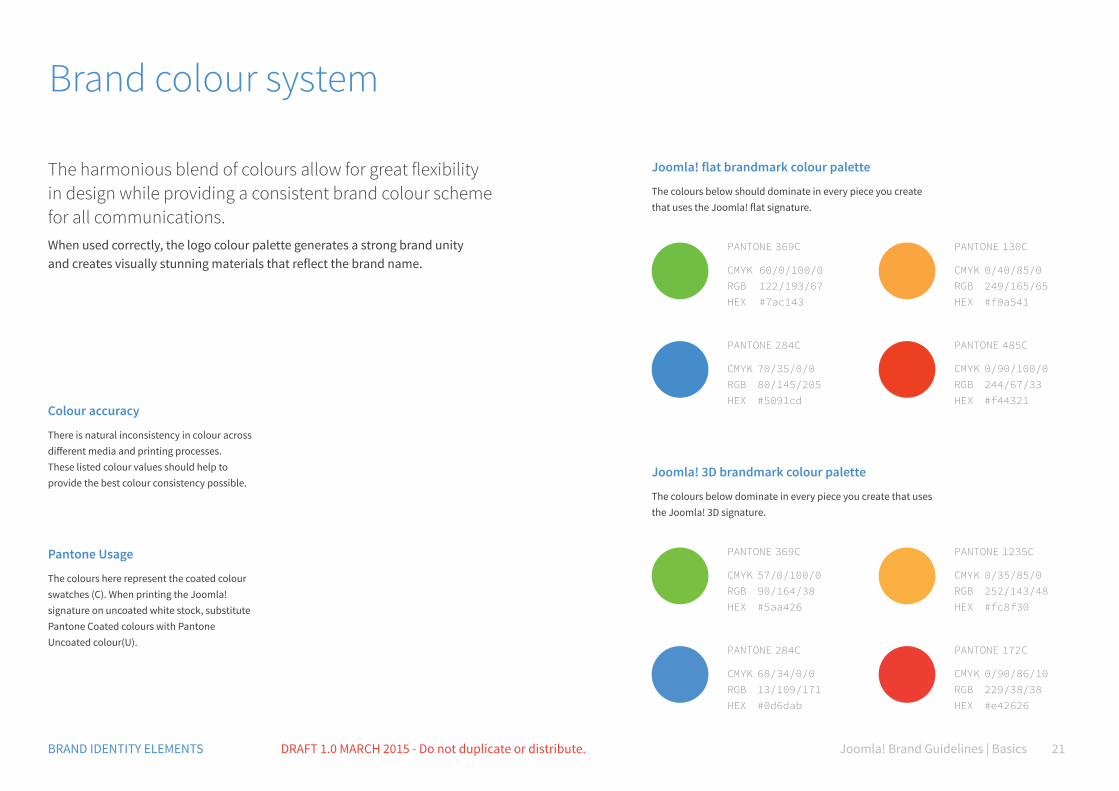
Brand colour system
The harmonious blend of colours allow for great flexibility in design while providing a consistent brand colour scheme for all communications.When used correctly, the logo colour palette generates a strong brand unity and creates visually stunning materials that reflect the brand name.
Colour accuracy
There is natural inconsistency in colour across different media and printing processes. These listed colour values should help to provide the best colour consistency possible.
Pantone Usage
The colours here represent the coated colour swatches (C). When printing the Joomla! signature on uncoated white stock, substitute Pantone Coated colours with Pantone Uncoated colour(U).
Joomla! flat brandmark colour palette
The colours below should dominate in every piece you create that uses the Joomla! flat signature.
Joomla! 3D brandmark colour palette
The colours below dominate in every piece you create that uses the Joomla! 3D signature.
PANTONE 369C
CMYK 60/0/100/0 RGB 122/193/67 HEX #7ac143
PANTONE 369C
CMYK 57/0/100/0 RGB 90/164/38 HEX #5aa426
PANTONE 130C
CMYK 0/40/85/0 RGB 249/165/65 HEX #f9a541
PANTONE 1235C
CMYK 0/35/85/0 RGB 252/143/48 HEX #fc8f30
PANTONE 284C
CMYK 70/35/0/0 RGB 80/145/205 HEX #5091cd
PANTONE 284C
CMYK 68/34/0/0 RGB 13/109/171 HEX #0d6dab
PANTONE 485C
CMYK 0/90/100/0 RGB 244/67/33 HEX #f44321
PANTONE 172C
CMYK 0/90/86/10 RGB 229/38/38 HEX #e42626
Joomla! Brand Guidelines | Basics 22BRAND IDENTITY ELEMENTS DRAFT 1.0 MARCH 2015 - Do not duplicate or distribute.
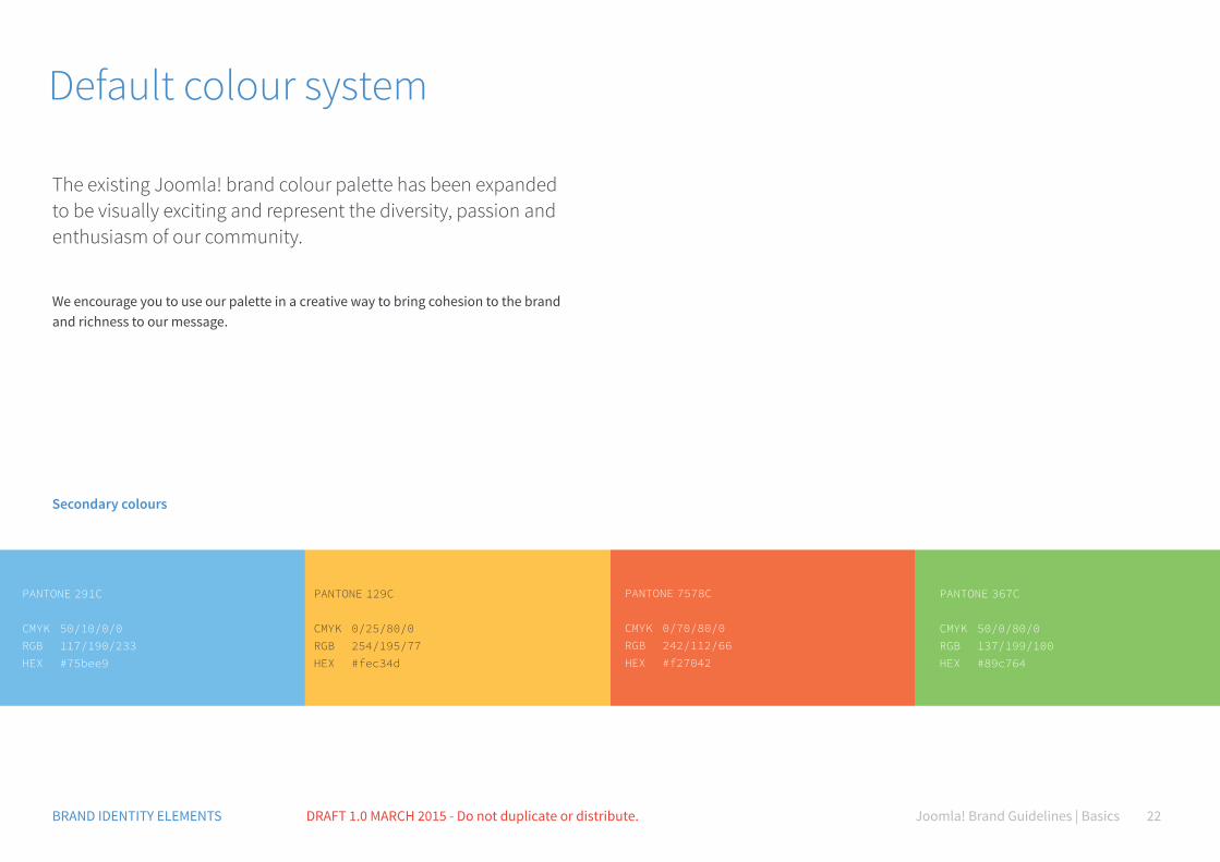
Default colour system
The existing Joomla! brand colour palette has been expanded to be visually exciting and represent the diversity, passion and enthusiasm of our community.
We encourage you to use our palette in a creative way to bring cohesion to the brand and richness to our message.
PANTONE 291C
CMYK 50/10/0/0RGB 117/190/233 HEX #75bee9
PANTONE 129C
CMYK 0/25/80/0RGB 254/195/77 HEX #fec34d
PANTONE 7578C
CMYK 0/70/80/0RGB 242/112/66 HEX #f27042
PANTONE 367C
CMYK 50/0/80/0RGB 137/199/100 HEX #89c764
Secondary colours
Joomla! Brand Guidelines | Basics 23BRAND IDENTITY ELEMENTS DRAFT 1.0 MARCH 2015 - Do not duplicate or distribute.
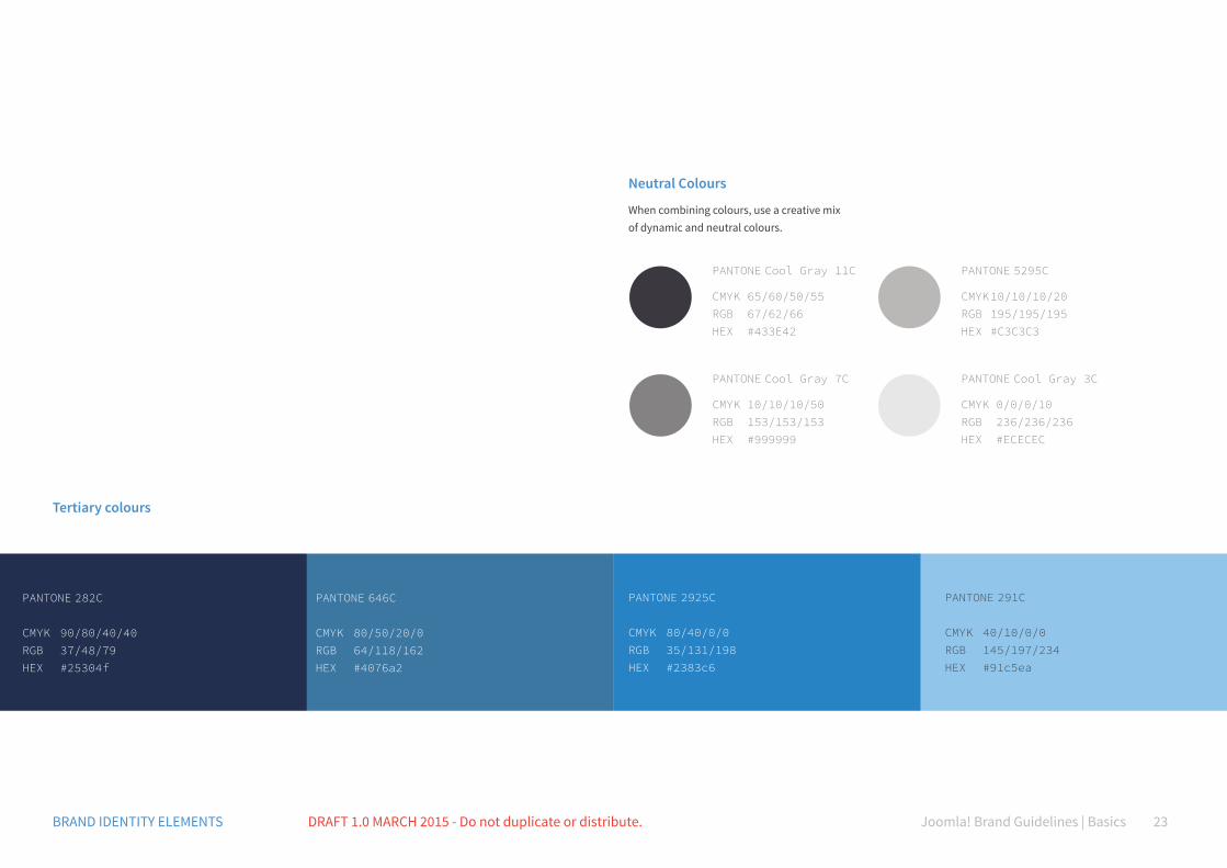
PANTONE 282C
CMYK 90/80/40/40RGB 37/48/79 HEX #25304f
PANTONE Cool Gray 11C
CMYK 65/60/50/55 RGB 67/62/66 HEX #433E42
PANTONE 5295C
CMYK 10/10/10/20 RGB 195/195/195 HEX #C3C3C3
PANTONE Cool Gray 7C
CMYK 10/10/10/50 RGB 153/153/153 HEX #999999
PANTONE Cool Gray 3C
CMYK 0/0/0/10 RGB 236/236/236 HEX #ECECEC
PANTONE 646C
CMYK 80/50/20/0RGB 64/118/162 HEX #4076a2
PANTONE 2925C
CMYK 80/40/0/0RGB 35/131/198 HEX #2383c6
PANTONE 291C
CMYK 40/10/0/0RGB 145/197/234 HEX #91c5ea
Neutral Colours
When combining colours, use a creative mix of dynamic and neutral colours.
Tertiary colours
Joomla! Brand Guidelines | Basics 24BRAND IDENTITY ELEMENTS DRAFT 1.0 MARCH 2015 - Do not duplicate or distribute.
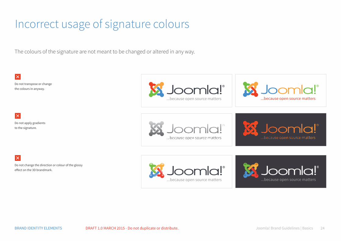
Incorrect usage of signature colours
The colours of the signature are not meant to be changed or altered in any way.
Do not transpose or change the colours in anyway.
Do not apply gradients to the signature.
Do not change the direction or colour of the glossy effect on the 3D brandmark.
Joomla! Brand Guidelines | Basics 25BRAND IDENTITY ELEMENTS DRAFT 1.0 MARCH 2015 - Do not duplicate or distribute.
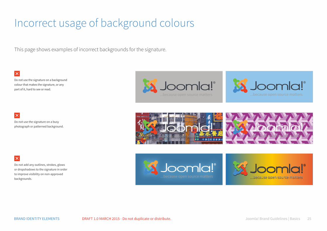
This page shows examples of incorrect backgrounds for the signature.
Incorrect usage of background colours
Do not use the signature on a background colour that makes the signature, or any part of it, hard to see or read.
Do not use the signature on a busy photograph or patterned background.
Do not add any outlines, strokes, glows or dropshadows to the signature in order to improve visibility on non-approved backgrounds.
Joomla! Brand Guidelines | Basics 26BRAND IDENTITY ELEMENTS DRAFT 1.0 MARCH 2015 - Do not duplicate or distribute.
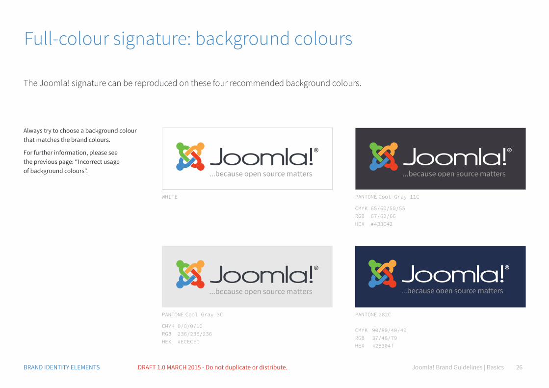
Full-colour signature: background colours
WHITE
PANTONE Cool Gray 3C
CMYK 0/0/0/10 RGB 236/236/236 HEX #ECECEC
PANTONE Cool Gray 11C
CMYK 65/60/50/55 RGB 67/62/66 HEX #433E42
PANTONE 282C
CMYK 90/80/40/40RGB 37/48/79 HEX #25304f
The Joomla! signature can be reproduced on these four recommended background colours.
Always try to choose a background colour that matches the brand colours.
For further information, please see the previous page: “Incorrect usage of background colours”.

Joomla! Brand Guidelines | Basics 27BRAND IDENTITY ELEMENTS DRAFT 1.0 MARCH 2015 - Do not duplicate or distribute.
Single-colour signature: background colours
We have defined a core set of colours for you to start with. Be creative!Always try to choose a background colour that matches the brand colours and your communication. For further information, please see the previous page: “Incorrect usage of background colours”.
Joomla! Brand Guidelines | Basics 28BRAND IDENTITY ELEMENTS DRAFT 1.0 MARCH 2015 - Do not duplicate or distribute.
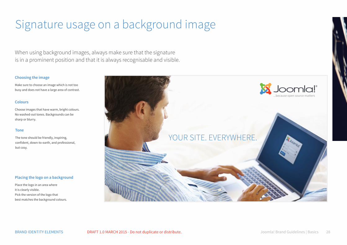
Signature usage on a background image
When using background images, always make sure that the signature is in a prominent position and that it is always recognisable and visible.
Choosing the image
Make sure to choose an image which is not too busy and does not have a large area of contrast.
Placing the logo on a background
Place the logo in an area where it is clearly visible. Pick the version of the logo that best matches the background colours.
YOUR SITE. EVERYWHERE.
Colours
Choose images that have warm, bright colours. No washed-out tones. Backgrounds can be sharp or blurry.
Tone
The tone should be friendly, inspiring, confident, down-to-earth, and professional, but cosy.

Joomla! Brand Guidelines | Basics 29BRAND IDENTITY ELEMENTS DRAFT 1.0 MARCH 2015 - Do not duplicate or distribute.
Overcoming a busy background
You may have a beautiful image but no ideal space for the Joomla! signature. Use a colourful background or transparent layers that allow the signature to be clearly visible.
Typography
Please use only the recommended typography for all our communications. Position text in a way that it is visible and visually balances the image.
OPEN YOUR MIND TO NEW POSSIBILITIES
Learn how to use Joomla!®
C70 M35 Y0 K0 R80 G145 B205 #5091cd
Signature usage
Joomla! Brand Guidelines | Basics 31BRAND IDENTITY ELEMENTS DRAFT 1.0 MARCH 2015 - Do not duplicate or distribute.
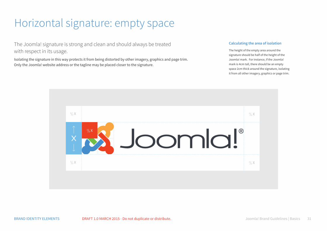
Horizontal signature: empty space
The Joomla! signature is strong and clean and should always be treated with respect in its usage.Isolating the signature in this way protects it from being distorted by other imagery, graphics and page trim. Only the Joomla! website address or the tagline may be placed closer to the signature.
1/2 X
1/2 X 1/2 X
1/2 X
Calculating the area of isolation
The height of the empty area around the signature should be half of the height of the Joomla! mark. For instance, if the Joomla! mark is 4cm tall, there should be an empty space 2cm thick around the signature, isolating it from all other imagery, graphics or page trim.
1/2 X
Joomla! Brand Guidelines | Basics 32BRAND IDENTITY ELEMENTS DRAFT 1.0 MARCH 2015 - Do not duplicate or distribute.
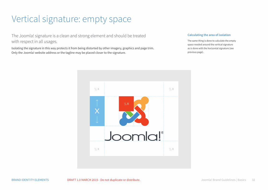
Vertical signature: empty space
1/2 X
1/2 X
1/2 X
1/2 X
The Joomla! signature is a clean and strong element and should be treated with respect in all usages. Isolating the signature in this way protects it from being distorted by other imagery, graphics and page trim. Only the Joomla! website address or the tagline may be placed closer to the signature.
Calculating the area of isolation
The same thing is done to calculate the empty space needed around the vertical signature as is done with the horizontal signature (see previous page).
1/2 X
Joomla! Brand Guidelines | Basics 33BRAND IDENTITY ELEMENTS DRAFT 1.0 MARCH 2015 - Do not duplicate or distribute.
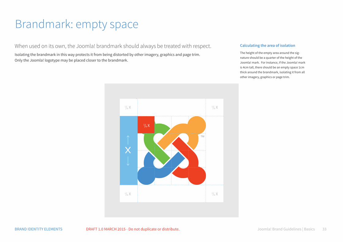
Brandmark: empty space
When used on its own, the Joomla! brandmark should always be treated with respect.Isolating the brandmark in this way protects it from being distorted by other imagery, graphics and page trim. Only the Joomla! logotype may be placed closer to the brandmark.
1/4 X
1/4 X
1/4 X
1/4 X
Calculating the area of isolation
The height of the empty area around the sig-nature should be a quarter of the height of the Joomla! mark. For instance, if the Joomla! mark is 4cm tall, there should be an empty space 1cm thick around the brandmark, isolating it from all other imagery, graphics or page trim.
1/4 X
Joomla! Brand Guidelines | Basics 34BRAND IDENTITY ELEMENTS DRAFT 1.0 MARCH 2015 - Do not duplicate or distribute.
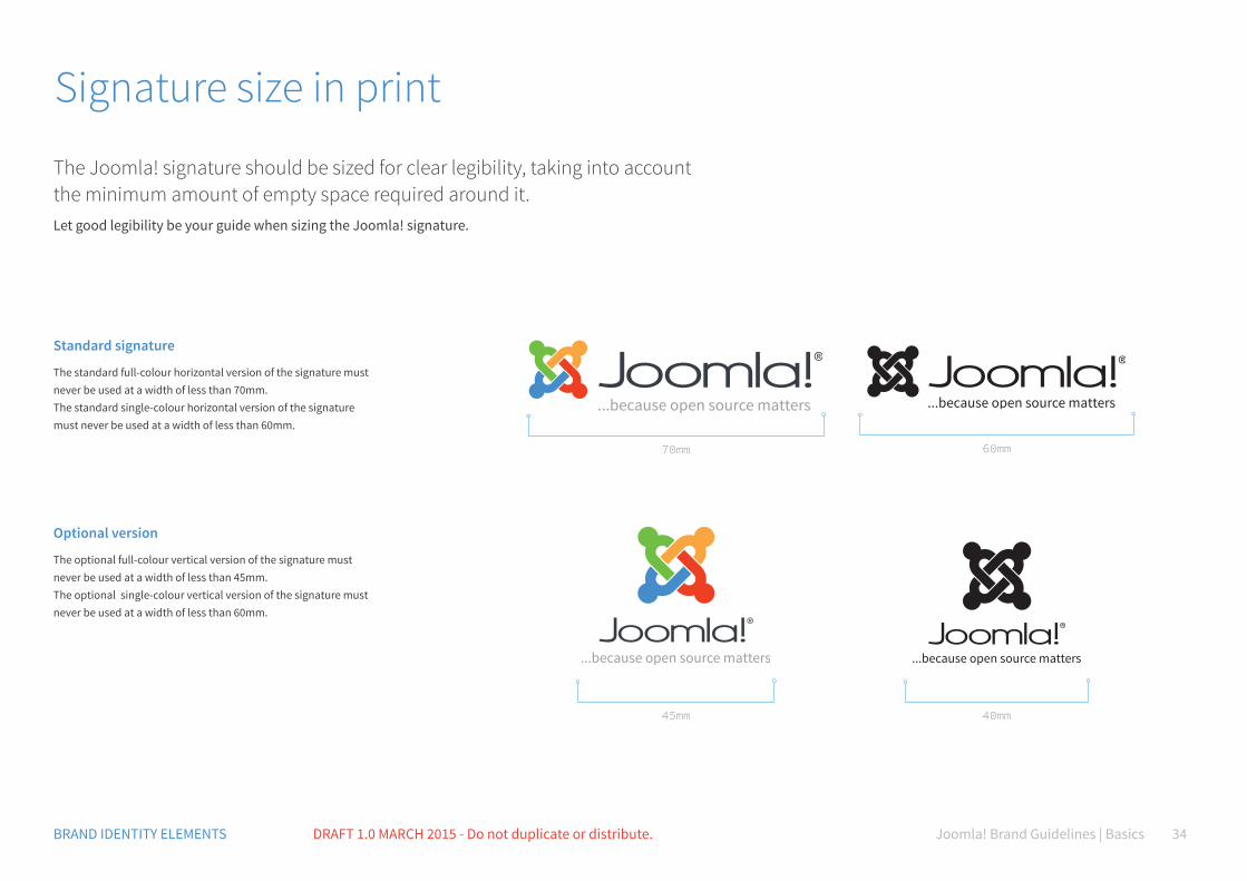
Signature size in print
The Joomla! signature should be sized for clear legibility, taking into account the minimum amount of empty space required around it.Let good legibility be your guide when sizing the Joomla! signature.
Standard signature
The standard full-colour horizontal version of the signature must never be used at a width of less than 70mm. The standard single-colour horizontal version of the signature must never be used at a width of less than 60mm.
Optional version
The optional full-colour vertical version of the signature must never be used at a width of less than 45mm. The optional single-colour vertical version of the signature must never be used at a width of less than 60mm.
70mm 60mm
45mm 40mm
Joomla! Brand Guidelines | Basics 35BRAND IDENTITY ELEMENTS DRAFT 1.0 MARCH 2015 - Do not duplicate or distribute.
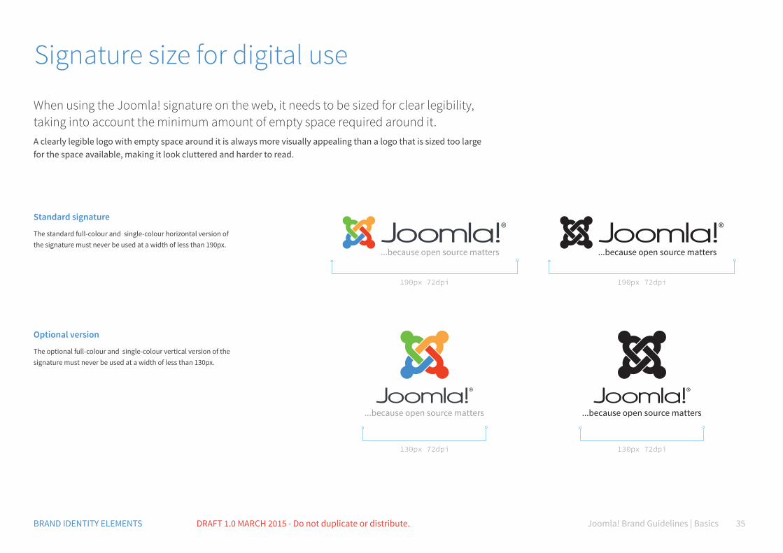
Signature size for digital use
When using the Joomla! signature on the web, it needs to be sized for clear legibility, taking into account the minimum amount of empty space required around it.A clearly legible logo with empty space around it is always more visually appealing than a logo that is sized too large for the space available, making it look cluttered and harder to read.
Standard signature
The standard full-colour and single-colour horizontal version of the signature must never be used at a width of less than 190px.
Optional version
The optional full-colour and single-colour vertical version of the signature must never be used at a width of less than 130px.
190px 72dpi 190px 72dpi
130px 72dpi 130px 72dpi

Joomla! Brand Guidelines | Basics 36BRAND IDENTITY ELEMENTS DRAFT 1.0 MARCH 2015 - Do not duplicate or distribute.
Small version for print and web
It may be necessary to use the Joomla! signature at a width narrower than that specified.In this case, we recommend removing both the registered indicia and the tagline, as both elements may be hard to read.
Small horizontal version
The small use horizontal full-colour version must never be used at a width of less than 35mm or 100px (72dpi) The small use horizontal single-colour version must never be used at a width of less than 30mm or 90px (72dpi).
Small vertical version
The optional full-colour vertical version of the signature must never be used at a width of less than 45mm. The standard single-colour vertical version of the signature must never be used at a width of less than 60mm.
35mm100px 72dpi
30mm90px 72dpi
20mm80px 72dpi
15mm70px 72dpi
Joomla! Brand Guidelines | Basics 37BRAND IDENTITY ELEMENTS DRAFT 1.0 MARCH 2015 - Do not duplicate or distribute.
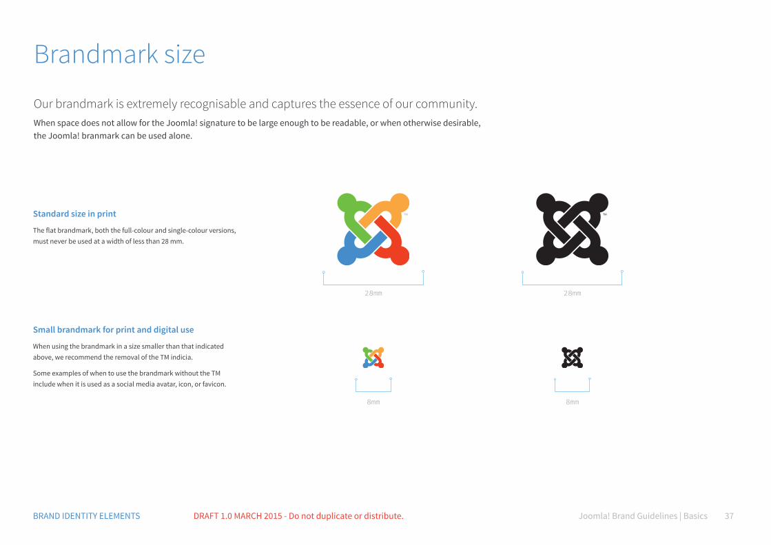
Brandmark size
Our brandmark is extremely recognisable and captures the essence of our community.When space does not allow for the Joomla! signature to be large enough to be readable, or when otherwise desirable, the Joomla! branmark can be used alone.
Standard size in print
The flat brandmark, both the full-colour and single-colour versions, must never be used at a width of less than 28 mm.
Small brandmark for print and digital use
When using the brandmark in a size smaller than that indicated above, we recommend the removal of the TM indicia.
Some examples of when to use the brandmark without the TM include when it is used as a social media avatar, icon, or favicon.
28mm
8mm 8mm
28mm
Joomla! Brand Guidelines | Basics 38BRAND IDENTITY ELEMENTS DRAFT 1.0 MARCH 2015 - Do not duplicate or distribute.
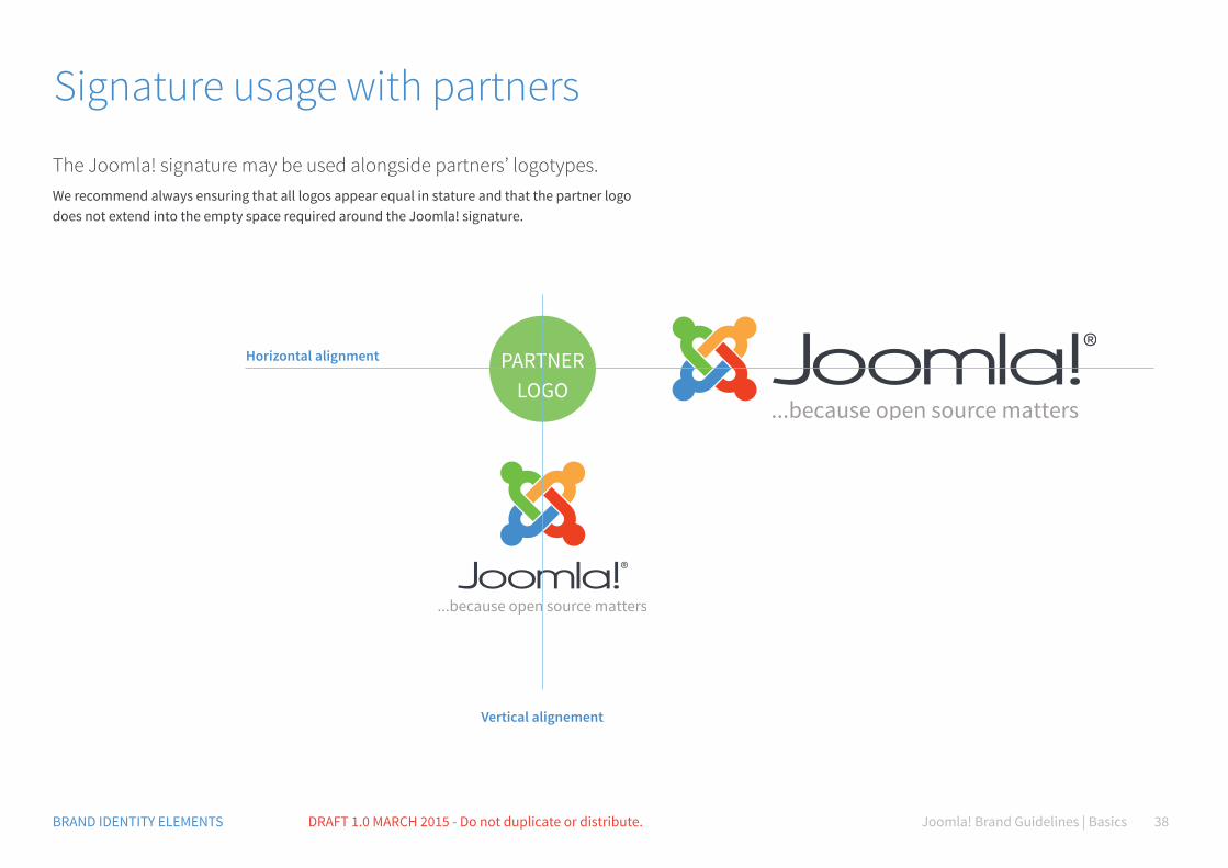
Signature usage with partners
The Joomla! signature may be used alongside partners’ logotypes.We recommend always ensuring that all logos appear equal in stature and that the partner logo does not extend into the empty space required around the Joomla! signature.
PARTNERLOGO
Horizontal alignment
Vertical alignement
Joomla! Brand Guidelines | Basics 39BRAND IDENTITY ELEMENTS DRAFT 1.0 MARCH 2015 - Do not duplicate or distribute.
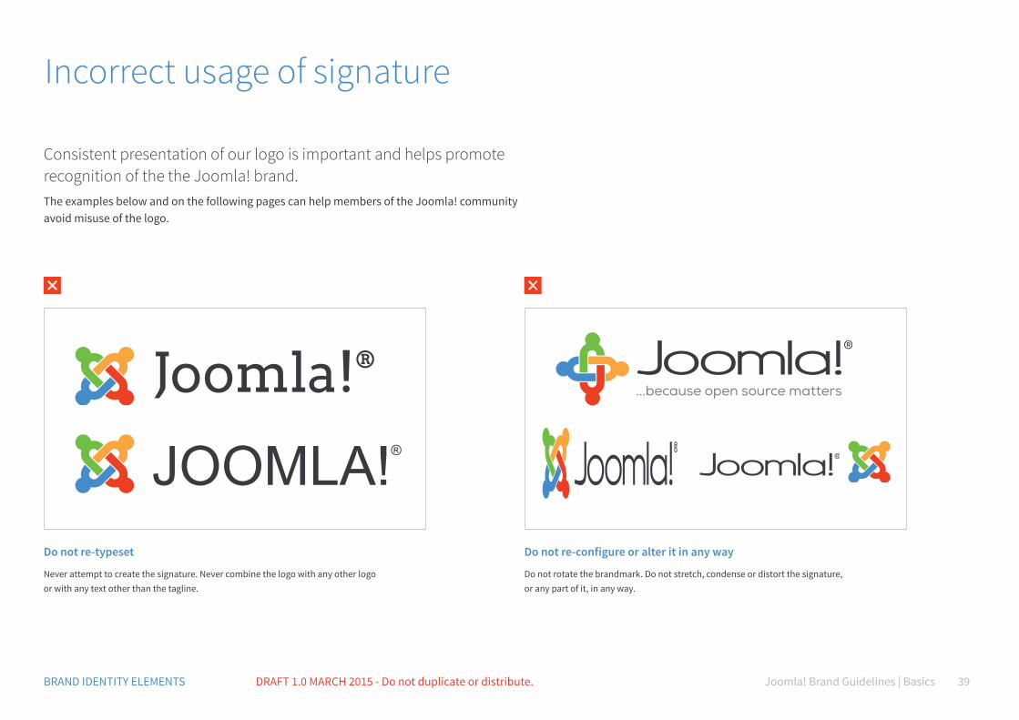
Incorrect usage of signature
Consistent presentation of our logo is important and helps promote recognition of the the Joomla! brand. The examples below and on the following pages can help members of the Joomla! community avoid misuse of the logo.
Joomla!®
JOOMLA!®
Do not re-typeset
Never attempt to create the signature. Never combine the logo with any other logo or with any text other than the tagline.
Do not re-configure or alter it in any way
Do not rotate the brandmark. Do not stretch, condense or distort the signature, or any part of it, in any way.
Joomla! Brand Guidelines | Basics 40BRAND IDENTITY ELEMENTS DRAFT 1.0 MARCH 2015 - Do not duplicate or distribute.
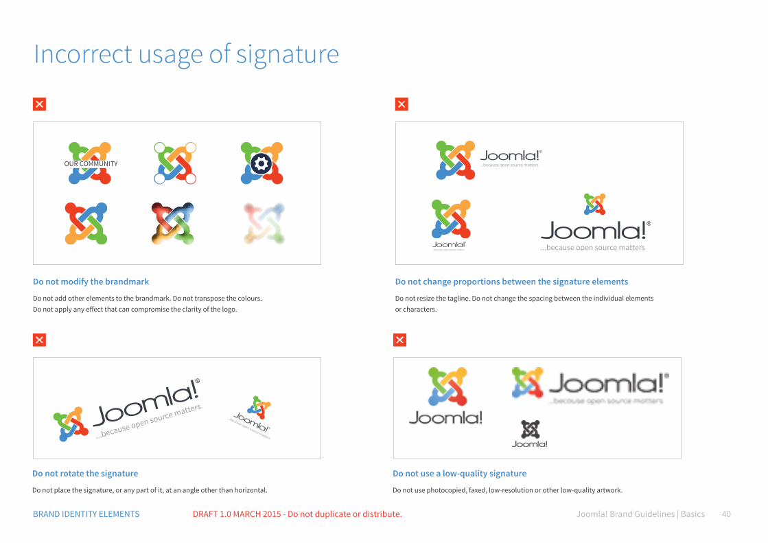
Do not modify the brandmark
Do not add other elements to the brandmark. Do not transpose the colours. Do not apply any effect that can compromise the clarity of the logo.
Do not rotate the signature
Do not place the signature, or any part of it, at an angle other than horizontal.
Do not use a low-quality signature
Do not use photocopied, faxed, low-resolution or other low-quality artwork.
Do not change proportions between the signature elements
Do not resize the tagline. Do not change the spacing between the individual elements or characters.
OUR COMMUNITY
Incorrect usage of signature
Joomla! Brand Guidelines | BasicsDRAFT 1.0 MARCH 2015 - Do not duplicate or distribute. 41
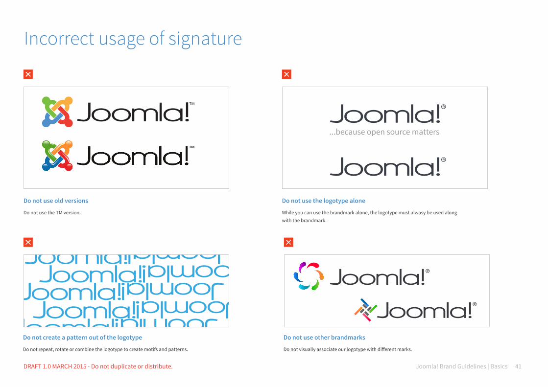
Incorrect usage of signature
Do not use old versions
Do not use the TM version.
Do not use the logotype alone
While you can use the brandmark alone, the logotype must alwasy be used along with the brandmark.
Do not create a pattern out of the logotype
Do not repeat, rotate or combine the logotype to create motifs and patterns.
Do not use other brandmarks
Do not visually associate our logotype with different marks.
Joomla! Brand Guidelines | BasicsDRAFT 1.0 MARCH 2015 - Do not duplicate or distribute. 42
because open source matters
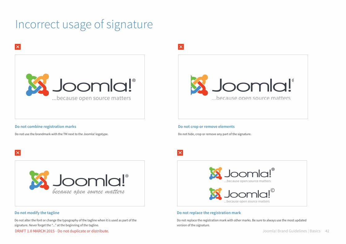
Do not combine registration marks
Do not use the brandmark with the TM next to the Joomla! logotype.
Do not crop or remove elements
Do not hide, crop or remove any part of the signature.
Incorrect usage of signature
Do not modify the tagline
Do not alter the font or change the typography of the tagline when it is used as part of the signature. Never forget the “...” at the beginning of the tagline.
Do not replace the registration mark
Do not replace the registration mark with other marks. Be sure to always use the most updated version of the signature.

C70 M35 Y0 K0 R80 G145 B205 #5091cd
Typography
Joomla! Brand Guidelines | Basics 44BRAND IDENTITY ELEMENTS DRAFT 1.0 MARCH 2015 - Do not duplicate or distribute.
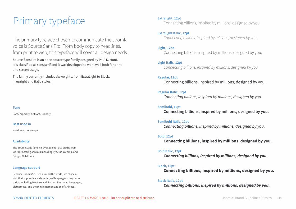
Primary typeface
The primary typeface chosen to communicate the Joomla! voice is Source Sans Pro. From body copy to headlines, from print to web, this typeface will cover all design needs.Source Sans Pro is an open source type family designed by Paul D. Hunt. It is classified as sans serif and it was developed to work well both for print and screen usage.
The family currently includes six weights, from ExtraLight to Black, in upright and italic styles.
Language support
Because Joomla! is used around the world, we chose a font that supports a wide variety of languages using Latin script, including Western and Eastern European languages, Vietnamese, and the pinyin Romanization of Chinese.
Availability
The Source Sans family is available for use on the web via font hosting services including Typekit, WebInk, and Google Web Fonts.
Tone
Contemporary, brilliant, friendly.
Best used in
Headlines, body copy.
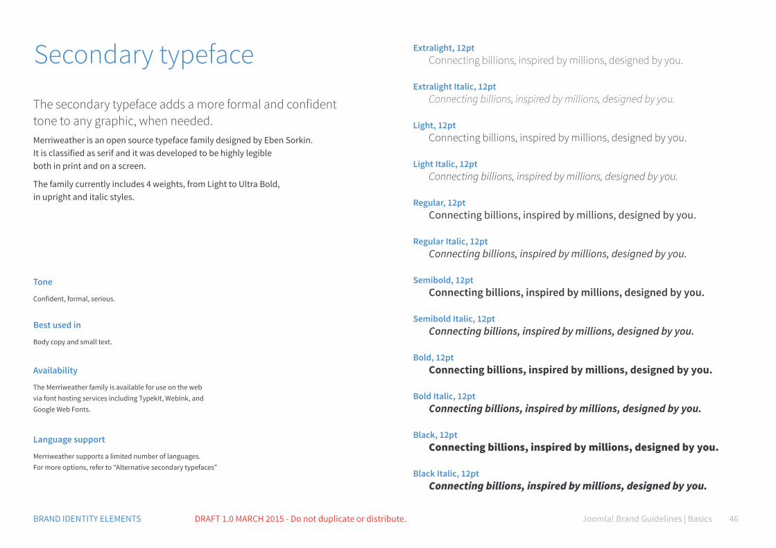
Extralight, 12pt Connecting billions, inspired by millions, designed by you.
Extralight Italic, 12pt Connecting billions, inspired by millions, designed by you.
Light, 12pt Connecting billions, inspired by millions, designed by you.
Light Italic, 12pt Connecting billions, inspired by millions, designed by you.
Regular, 12pt Connecting billions, inspired by millions, designed by you.
Regular Italic, 12pt Connecting billions, inspired by millions, designed by you.
Semibold, 12pt Connecting billions, inspired by millions, designed by you.
Semibold Italic, 12pt Connecting billions, inspired by millions, designed by you.
Bold, 12pt Connecting billions, inspired by millions, designed by you.
Bold Italic, 12pt Connecting billions, inspired by millions, designed by you.
Black, 12pt Connecting billions, inspired by millions, designed by you.
Black Italic, 12pt Connecting billions, inspired by millions, designed by you.
Joomla! Brand Guidelines | BasicsDRAFT 1.0 MARCH 2015 - Do not duplicate or distribute. 45
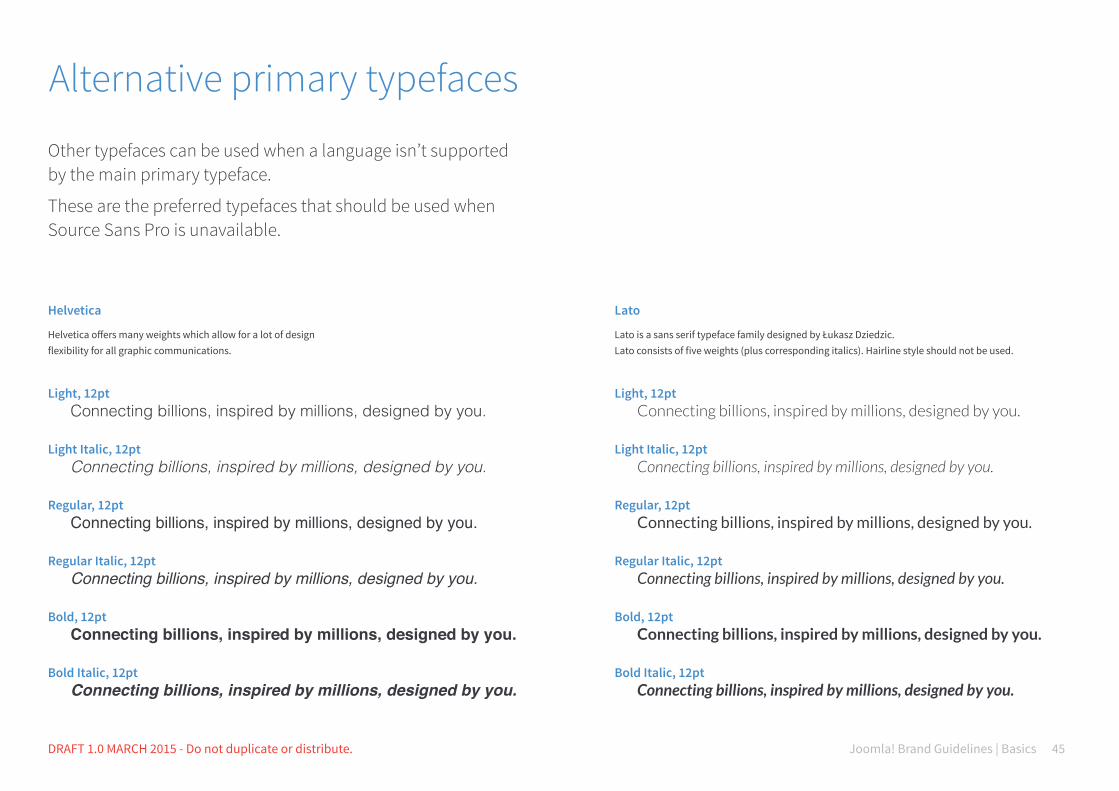
Alternative primary typefaces
Other typefaces can be used when a language isn’t supported by the main primary typeface.
These are the preferred typefaces that should be used when Source Sans Pro is unavailable.
Helvetica
Helvetica offers many weights which allow for a lot of design flexibility for all graphic communications.
Lato
Lato is a sans serif typeface family designed by Łukasz Dziedzic. Lato consists of five weights (plus corresponding italics). Hairline style should not be used.
Light, 12pt Connecting billions, inspired by millions, designed by you.
Light Italic, 12pt Connecting billions, inspired by millions, designed by you.
Regular, 12pt Connecting billions, inspired by millions, designed by you. Regular Italic, 12pt Connecting billions, inspired by millions, designed by you.
Bold, 12pt Connecting billions, inspired by millions, designed by you. Bold Italic, 12pt Connecting billions, inspired by millions, designed by you.
Joomla! Brand Guidelines | Basics 46BRAND IDENTITY ELEMENTS DRAFT 1.0 MARCH 2015 - Do not duplicate or distribute.
Secondary typeface
The secondary typeface adds a more formal and confident tone to any graphic, when needed.Merriweather is an open source typeface family designed by Eben Sorkin. It is classified as serif and it was developed to be highly legible both in print and on a screen.
The family currently includes 4 weights, from Light to Ultra Bold, in upright and italic styles.
Language support
Merriweather supports a limited number of languages. For more options, refer to “Alternative secondary typefaces”
Availability
The Merriweather family is available for use on the web via font hosting services including Typekit, WebInk, and Google Web Fonts.
Tone
Confident, formal, serious.
Best used in
Body copy and small text.
Extralight, 12pt Connecting billions, inspired by millions, designed by you.
Extralight Italic, 12pt Connecting billions, inspired by millions, designed by you.
Light, 12pt Connecting billions, inspired by millions, designed by you.
Light Italic, 12pt Connecting billions, inspired by millions, designed by you.
Regular, 12pt Connecting billions, inspired by millions, designed by you.
Regular Italic, 12pt Connecting billions, inspired by millions, designed by you.
Semibold, 12pt Connecting billions, inspired by millions, designed by you.
Semibold Italic, 12pt Connecting billions, inspired by millions, designed by you.
Bold, 12pt Connecting billions, inspired by millions, designed by you.
Bold Italic, 12pt Connecting billions, inspired by millions, designed by you.
Black, 12pt Connecting billions, inspired by millions, designed by you.
Black Italic, 12pt Connecting billions, inspired by millions, designed by you.
Joomla! Brand Guidelines | BasicsDRAFT 1.0 MARCH 2015 - Do not duplicate or distribute. 47
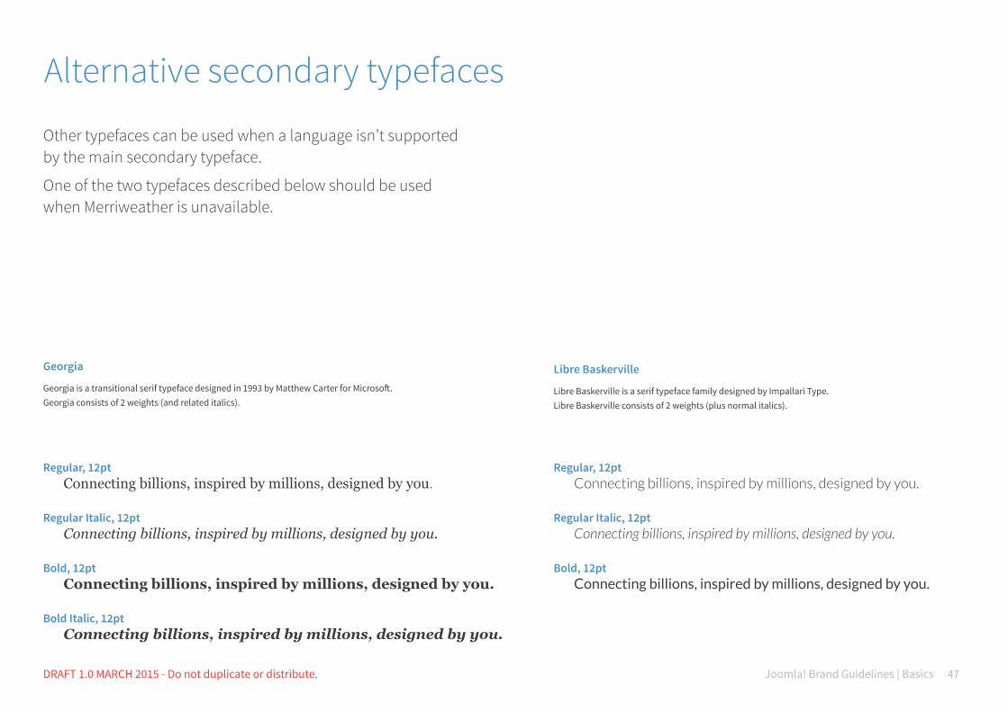
Alternative secondary typefaces
Other typefaces can be used when a language isn’t supported by the main secondary typeface.
One of the two typefaces described below should be used when Merriweather is unavailable.
Georgia
Georgia is a transitional serif typeface designed in 1993 by Matthew Carter for Microsoft. Georgia consists of 2 weights (and related italics).
Libre Baskerville
Libre Baskerville is a serif typeface family designed by Impallari Type. Libre Baskerville consists of 2 weights (plus normal italics).
Regular, 12pt Connecting billions, inspired by millions, designed by you.
Regular Italic, 12pt Connecting billions, inspired by millions, designed by you.
Bold, 12pt Connecting billions, inspired by millions, designed by you. Bold Italic, 12pt Connecting billions, inspired by millions, designed by you.
Regular, 12pt Connecting billions, inspired by millions, designed by you.
Regular Italic, 12pt Connecting billions, inspired by millions, designed by you.
Bold, 12pt Connecting billions, inspired by millions, designed by you.

Joomla! Brand Guidelines | Basics 48BRAND IDENTITY ELEMENTS DRAFT 1.0 MARCH 2015 - Do not duplicate or distribute.
Tone of voice with typography: primary typeface
Cid mo et que et as autem aut offici sant esseque nobit quis quo intem faccupt atescim restium eaquis sum quati officip sandia doluptati ditiis as maximint omnitatur.
Ferspit quidi consecabo. Ni optatat iatusda erionet dolorestrum suntemque comnis dolor resto eaqui.Lestibuscit, quis everes aut vent dolorepel est et lis cum alit quuntis enimpore.Gitatis velissit eos eum aut occum, acerum voluptate de dem qui nos utas et eos andi conseque doloriora non rerro inci sentia aut hictus, cum lab il ipicidus eniae consequamet rem. Namendu ciustrum illiqui sinctur mosapist, ut audam aut lignis volut aut as doluptiis nihita natemo blab in consequi beatiam et odio est quatusam ut aruntium faccae nit intia conseditas duntincte accus et, odipica boribeaque re veliciendis peles dolo quati nistibus maximos rescium del illaborerum voluptat.
Ferspit quidi consecabo. Ni optatat iatusda erionet dolorestrum suntemque comnis dolor resto eaqui.
Source Sans Pro Bold
Confident, important, powerful.
Source Sans Pro Light
Informal, friendly, modern.
Source Sans Pro Regular
Friendly, descriptive, calm.
Source Sans Pro is a sans serif typeface which has a fresh, modern and friendly tone. Not all the weights available are described below, but feel free to find new and original combinations depending on the aesthetic direction you would like to give your design. You can also use primary and secondary typefaces in the same design, but make sure they are balanced and give the right tone of voice to the message.

Joomla! Brand Guidelines | Basics 49BRAND IDENTITY ELEMENTS DRAFT 1.0 MARCH 2015 - Do not duplicate or distribute.
Cid mo et que et as autem aut offici sant esseque nobit quis quo intem faccupt atescim restium eaquis sum quati officip sandia doluptati ditiis.
Ferspit quidi consecabo. Ni optatat iatusda erionet dolorestrum suntemque comnis dolor resto eaqui.Lestibuscit, quis everes aut vent dolorepel est et lis cum alit quuntis enimpore.Gitatis velissit eos eum aut occum, acerum voluptate de dem qui nos utas et eos andi conseque doloriora non rerro inci sentia aut hictus, cum lab il ipicidus eniae consequamet rem. Namendu ciustrum illiqui sinctur mosapist, ut audam aut lignis volut aut as doluptiis nihita natemo blab in consequi beatiam et odio est quatusam ut aruntium faccae nit intia conseditas duntincte accus et, odipica boribeaque re veliciendis peles dolo quati nistibus maximos rescium del illaborerum voluptat.
Ferspit quidi consecabo. Ni optatat iatusda erionet dolorestrum suntemque comnis dolor resto eaqui.
Merriweather Bold
Serious, bold, incisive.
Merriweather Light
Important, friendly, official.
Merriweather Regular
Friendly, formal, consistent.
Tone of voice with typography: secondary typeface
Merriweather is a serif typeface which has a formal, serious and official tone. Not all the weights available are described below, but feel free to find new and original combinations depending on the aesthetic direction you would like to give your design. You can also use primary and secondary typefaces in the same design, but make sure they are balanced and give the right .

C70 M35 Y0 K0 R80 G145 B205 #5091cd
Questions and answers

Great guidelines must help designers find solutions, rather than restrict their creativity to a list of things they are not allowed to do. This is why we are answering some of the most common questions about our signature and its usage in this section.
Please feel free to submit your questions to [email protected]

Joomla! Brand Guidelines | Basics 52BRAND IDENTITY ELEMENTS DRAFT 1.0 MARCH 2015 - Do not duplicate or distribute.
Questions and answers
Joomla! has two brandmarks, the flat and 3D version, which one should I use for my next project?
Can I use the Joomla! signature on my website?
The brandmark used for all our internal communication is the flat brandmark. The 3D version of our symbol is still an option and is widely used by our community. In general, we suggest that you use the brandmark that best suits your design. For example, you may have artwork that has glossy and three-dimensional graphic elements. In that case, the 3D brandmark is probably the best choice.
Please refer to the “Trademark Policy” page on the Open Source Matters website for specific information about how to use the Joomla! name and logo: http://opensourcematters.org/legal/trademark/ trademark-policy.html
We don’t have strong objections to people using the name on their websites and businesses, we just want to have a chan ce to review such use. Generally, we approve your use if you agree to a few things: (1) that our rights to the Joomla! trademark are valid and superior to yours and (2) you’ll take appropriate steps to make sure people don’t confuse your website for ours. In other words, it’s not a big deal and a short conversation (usually done via email) should clear everything up in a timely fashion.
Joomla! Brand Guidelines | Basics 53BRAND IDENTITY ELEMENTS DRAFT 1.0 MARCH 2015 - Do not duplicate or distribute.
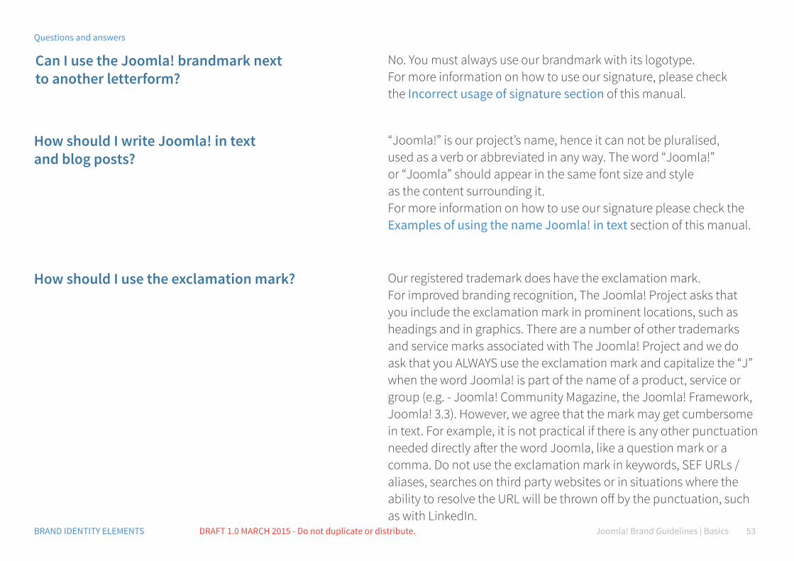
Can I use the Joomla! brandmark next to another letterform?
How should I write Joomla! in text and blog posts?
How should I use the exclamation mark?
No. You must always use our brandmark with its logotype. For more information on how to use our signature, please check the Incorrect usage of signature section of this manual.
“Joomla!” is our project’s name, hence it can not be pluralised, used as a verb or abbreviated in any way. The word “Joomla!” or “Joomla” should appear in the same font size and style as the content surrounding it. For more information on how to use our signature please check the Examples of using the name Joomla! in text section of this manual.
Our registered trademark does have the exclamation mark. For improved branding recognition, The Joomla! Project asks that you include the exclamation mark in prominent locations, such as headings and in graphics. There are a number of other trademarks and service marks associated with The Joomla! Project and we do ask that you ALWAYS use the exclamation mark and capitalize the “J” when the word Joomla! is part of the name of a product, service or group (e.g. - Joomla! Community Magazine, the Joomla! Framework, Joomla! 3.3). However, we agree that the mark may get cumbersome in text. For example, it is not practical if there is any other punctuation needed directly after the word Joomla, like a question mark or a comma. Do not use the exclamation mark in keywords, SEF URLs /aliases, searches on third party websites or in situations where the ability to resolve the URL will be thrown off by the punctuation, such as with LinkedIn.
Questions and answers
Joomla! Brand Guidelines | Basics 54BRAND IDENTITY ELEMENTS DRAFT 1.0 MARCH 2015 - Do not duplicate or distribute.
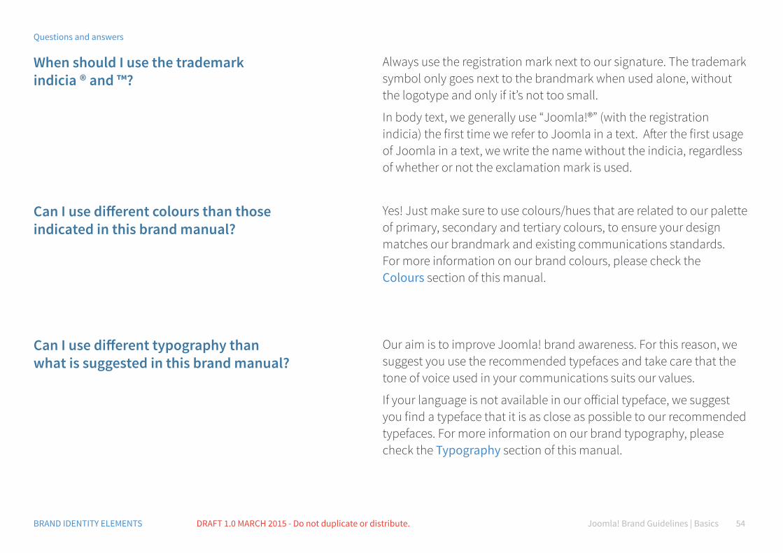
When should I use the trademark indicia ® and ™?
Can I use different colours than those indicated in this brand manual?
Can I use different typography than what is suggested in this brand manual?
Always use the registration mark next to our signature. The trademark symbol only goes next to the brandmark when used alo ne, without the logotype and only if it’s not too small.
In body text, we generally use “Joomla!®” (with the registration indicia) the first time we refer to Joomla in a text. After the first usage of Joomla in a text, we write the name without the indicia, regardless of whether or not the exclamation mark is used.
Yes! Just make sure to use colours/hues that are related to our palette of primary, secondary and tertiary colours, to ensure your design matches our brandmark and existing communications standards. For more information on our brand colours, please check the Colours section of this manual.
Our aim is to improve Joomla! brand awareness. For this reason, we suggest you use the recommended typefaces and take care that the tone of voice used in your communications suits our values.
If your language is not available in our official typeface, we suggest you find a typeface that it is as close as possible to our recommended typefaces. For more information on our brand typography, please check the Typography section of this manual.
Questions and answers
Joomla! Brand Guidelines | Basics 55BRAND IDENTITY ELEMENTS DRAFT 1.0 MARCH 2015 - Do not duplicate or distribute.
How small can I reproduce the logotype?
Are there any tones of voice that you particularly prefer when I communicate on behalf Joomla?
Are there any imagery styles that you particularly prefer me to use when communicating on behalf Joomla?
The Joomla! signature should be sized for clear legibility, taking into account the mi nimum amount of empty space required around it. For more information on recommended signature size, please check the Signature sizes section of this manual.
Our communication must always have a friendly and inspiring tone of voice. We also need to keep in mind that our community is made up of different cultures, so we should always be culturally-sensitive in the way we choose words and combine them with images.
We do prefer pictures that represent our principles: teamwork, cultural diversity, collaboration and a friendly environment. We do prefer daylight, or natural light, over artificial sources of light in images. Colours should be vivid, bright and sharp.
Avoid washed-out colours and heavily filtered images.
Questions and answers

C70 M35 Y0 K0 R80 G145 B205 #5091cd
Glossary
Joomla! Brand Guidelines | BasicsDRAFT 1.0 MARCH 2015 - Do not duplicate or distribute. 57
Glossary
Brand
Brand essence
Brand identity
Brandmark
Icon
Logo
Logotype
Media
Perception
Signature
Tagline
Touchpoint
Trademark
A person’s perception of a product, service, experience, or organisation.
The distillation of a brand’s promise into the simplest possible terms.
The outward expression of a brand, including its name, trademark, communications, and visual appearance.
An icon, avatar, wordmark or other symbol for a brand.
The visual symbol of a brand.
An abbreviation of logotype, now applied broadly (if incorrectly) to all the trademarks.
A distinctive typeface or lettering style used to represent a brand name.
The channels through which brand messages are delivered (such as television, printed publications, and direct mail).
An impression received through the senses; a building block of customer experience.
The defined visual relationship between logotype and a symbol.
A sentence, phrase, or word used to summarise a market position.
Any place where people come in contact with a brand, including product use, packaging, advertising, editiorial and casual conversation.
A name and/or a symbol that indicates a source of goods or services and prevents confusion in the marketplace; a legally protectable form of intellectual property.

2015 Open Source Matters, Inc. All rights reserved.