BRAND GUIDE 1 - Malouf · Iniasitate comnias nis et quati dem nimus. Ature et assitat experum quam...
19
BRAND GUIDE 1.2
Transcript of BRAND GUIDE 1 - Malouf · Iniasitate comnias nis et quati dem nimus. Ature et assitat experum quam...

BRAND GUIDE 1 .2

CO N T E N TS
SECTION 1Introduction
SECTION 2Brand Platform
SECTION 3The Malouf Logo
SECTION 4Visual Identity
About This Guide
Brand ArchitectureTaglinePersonality
OverviewWordmarkTabUsage Examples
ColorTypographyImagery

1
I N T R O D U CT I O N
Sensible guidance for clear communication

Think of this document as a guide to an exciting new destination. Its purpose is to encourage exploration, foster understanding and lead you where you want to go.
Like any guide worth its salt, this one is filled with practiced know-how, engaging history and informed recommendations.
It’s not meant to be a rigid “rule book,” dictating your every move. Rather, it’s a set
1 .1 HOW TO USE THIS GUIDE
of suggestions, with the intent to provide sensible guidance as you come to know our incredible brand.
In the end, Malouf is only as meaningful as the people who stand behind it. When we communicate with clarity and unity, we express our values in an impactful way. And that’s when our brand really shines.
So go ahead and explore. Take time to discover what Malouf is all about. Come back to
this guide again and again as you work your way through the brand back streets and uncharted paths. You may find something you hadn’t noticed before.
Welcome to Malouf!

2
B RA N D P L AT F O R M
As the underpinnings of our core values, the brand platform provides context to the entirety of our brand expression.
It defines who we are, what we believe, and what westrive to accomplish.
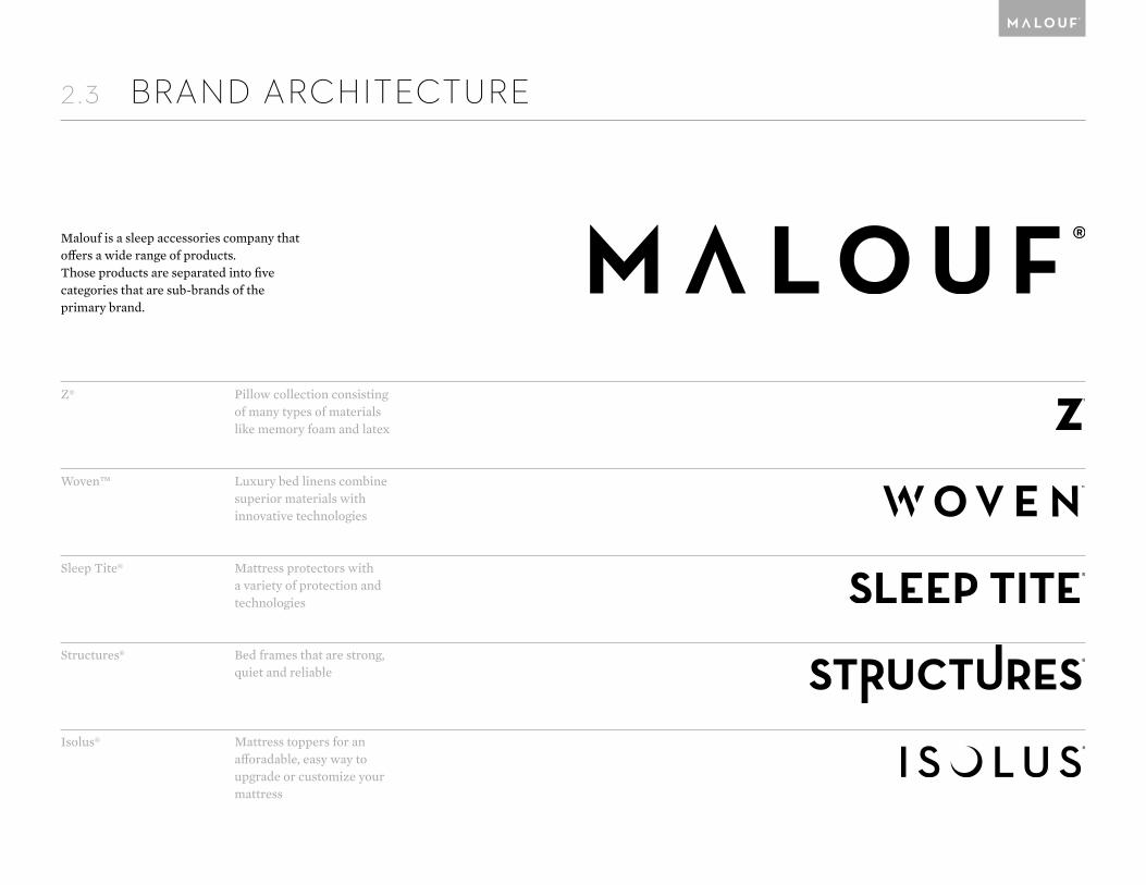
2.3 BRAND ARCHITECTURE
Z®
Woven™
Sleep Tite®
Structures®
Isolus®
Pillow collection consisting of many types of materials like memory foam and latex
Luxury bed linens combine superior materials with innovative technologies
Mattress protectors with a variety of protection and technologies
Bed frames that are strong, quiet and reliable
Mattress toppers for an afforadable, easy way to upgrade or customize your mattress
Malouf is a sleep accessories company that offers a wide range of products.Those products are separated into fivecategories that are sub-brands of theprimary brand.

2.4 TAGLINE
Our tagline is an expression of our brand. “Attainable luxury” speaks to our commit-ment to creating moments of comfort and ease, beauty and elegance, refinement and sophistication every day through custom-ized bedding options.
The tagline is best used for placements that benefit from the additional context it provides, such as areas of limited space and materials where the brand is new to the audience.
ATTAINABLELUXURY

2.5 PERSONALITY
Our brand voice should reflect our per-sonality and values, as well as accurately portray our brand promise. Consider these guidelines when writing content for all brand applications.
Understated Elegance
Luxury needs no special introduction. It is self-assured without being self- absorbed. Our quality, expertise and style should speak for itself.
Approachable Expertise
We are the sleep experts. We speak with authority, but we never talk down to our consumers. Industry terminology can be used when relevant but, we should always strive for clarity.
Refined Casualness
Having class not mere formality: it's dis-playing poise in proper context. Casual can be classy; spontaneity can be sophisticat-ed; a bit of humor will go a long way—but always with a subtle touch.
LUXURY LIES NOT IN RICHNESS AND
ORNATENESS BUT IN THE ABSENCE OF
VULGARITYCoco Channel

3
THE MALOUF LOGO
Our logos are the cornerstone of our visual identity.It is essential that these marks are executed consis-
tently according to the following guidelines.

The wordmark is our primary logomark and the basis of our identity system. It should be used in instances where the mas-ter brand is front and center. It is used in applications that are center-aligned, in-line with text, document footers and headers.It should be used only in one of the three brand colors: black, silver, or white.
The ® symbol should always accompany the mark, except in applications where it is too small to be legible.
Never stretch, condense, or otherwise modify the wordmark in any way.
3.1 OVERVIEW

3.2 WORDMARK
Adequate spacing should be given to the wordmark. Use the wordmark’s “M” character as a guide to determine proper spacing.
Artisans of SleepArtisans of Sleep

3.3 TAB
The tab is a distinct element in our identity system, used on products and packaging to connect sub-brands to the master brand. It is placed in the top-right corner of the page or product whenever possible.
The tab should always be used in instances where the Malouf brand is meant to take a supporting role, specifically in its roll as an endorser brand. Where the master brand is featured prominently, use the wordmark instead.
For visual reinforcement of this conven-tion, the tab can be used in many instances outside of these applications, such as presentations, letterheads, business cards, advertisements, etc.
Placed in the top right corner, the distance from the edge
should be equal to the height of the tab. The top of the tab
should align with the top of the layout (with sufficient bleed
in print applications).
The wordmark within the tab is knocked out to the color be-
hind the tab, except in instances where it creates problems
with legibility.

3.4 USAGE EXAMPLES
These are good.
P

4
VISUAL IDENTITY
The colors we use are a reflection of our brand voice. Understated elegance is manifest in deep, rich blacks,
clean whites and glossy metallic finishes.

4.1 COLORS
Black
Pantone® Neutral Black CPantone® Neutral Black U
C 60M 40Y 40K 100
R 0G 0B 0
#000000
K 100
White
Paper or Opaque whitePaper or Opaque white
C 0M 0Y 0K 0
R 255G 255B 255
#FFFFFF
K 0
Silver
Pantone® Silver CPantone® Silver C
C 37M 27Y 27K 0
R 168G 172B 174
#A8ACAE
K 40
Accent
Accent colors may extend to metallics outside Silver C. These colors should remain harmonious to the main brand colors and not be overly bright or saturated.
Above (clockwise)
Pantone® 8001 CPantone® 10274 CPantone® 871 CPantone® 876 C
Spot Color Coated paperUncoated paper
Process Color
RGB
Hex
Grayscale
These primary brand colors should be predominantly used in all brand collateral. Use of any other colors—such as special call-outs or links— should be refined, carefully considered, and extremely limited.

The following ratios should be consid-ered when working with the brand colors. These ratios are meant as a general guide-line and may be altered in instances where a different approach might offer increased legibility or function.
60%
30%
10%
Black creates a sense of drama, mystique and elegance. Use generously.
White evokes clarity, cleanliness and calm. Use for large bodies of text or information.
Silver adds a subtle touch of flash. In print, use as a metallic ink whenever possible.
4.2 COLOR RATIOS

4.3 TYPOGRAPHY
AaAaAa
NEUTRAFACE 2 DISPLAYABCDEFGHIJKLMNOPQ0123456789+
Neutraface 2 TextAaBbCcDdEeFfGgHhIiJjKk0123456789+
Mercury TextAaBbCcDdEeFfGgHhIiJj0123456789+
Our suite of premium typefaces is carefully selected to reinforce the Malouf asethetic in both subtle and striking ways. A bold yet refined application of these typefaces can elevate every instance of our brand.
Neutraface 2 Display
Neutraface 2 Display is always used for headers, page titles, or any large copy, nev-er for body copy. It should often be used in the lightest weight possible that is clearest for the application being used.
Neutraface 2 Text
Neutraface 2 Text is best used for subheads or small bodies of text, such as captions, di-agrams, etc. It can also be used for headers at smaller sizes.
Mecury Text
Mercury Text is our standard typeface for body copy—specifically for large bodies of text. For emphasis, italics may be used. Se-mibold or bold may be used when second-ary or tertiary emphasis is required.

In order to maintain the integrity of our type system, the following general guide-lines should be observed when laying out text.
Headlines
Headlines should be set in Neutraface 2 Display in all caps with sufficient tracking (about 50–75) at sizes 16 pt and up. Keep the leading fairly tight. Using a different color from the rest of the text can better set the headline apart. Headers below the 16 pt size can be set in Neutraface 2 Text
Subheads
Subheads may be set in Neutraface 2 Text 16 pt and below in sentence case without tracking. The leading can be tightened up a bit but make sure ascenders and descend-ers don’t overlap.
Text
Mercury Text comprises the bulk of the body copy. Feel free to loosen the leading to better match the typographic “color” of the header and subheads.
MALOUF® OFFERS QUALITY SLEEP PRODUCTS
Tia nus il magnihit autenis in comnihi litiatus, adit que qui odi dolorem porest ma porerch ilicius, cus pressec abores aut et quodi quam siminum verro quat.
Itas ipist, se venis ut quis acia qui blab ipsandae. Iniasitate comnias nis et quati dem nimus. Ature et assitat experum quam laute nobit, illorias qui optat que ped quam, od que omnis modit, aut alia dolectibero officium endam quae sape verio oditiae rferspis et aut essitistrum everorepel imusciisquo tet escient perias sima nissuntin num quunt, ut volupta il initiatius eatios restrup tatumqu iandel ius ut quidell andaecatest, que min nobis dolorro ea conseque nonserae velignam aspere pro molupta versper rumquodi offictatem sed quia nobis el modi optat reptas dolest ellaci corerchicias eic tendit ut el ipsanto taspid unt anti berovid mo consed que verum eat.
Hea
der:
Neu
traf
ace
2 D
ispl
ay, 2
4 pt
size
, 26
pt le
adin
g, 5
0 tr
acki
ng, a
ll ca
ps, s
ilver
; Su
bhea
d: N
eutr
afac
e 2
Text
, 14
pt si
ze, 1
6 pt
lead
ing,
0 tr
acki
ng, s
ente
nce
case
, whi
te;
Text
: Mer
cury
Tex
t G2,
10 p
t siz
e, 14
pt l
eadi
ng, 0
trac
king
, sen
tenc
e ca
se, w
hite
4.4 TYPOGRAPHIC HIERARCHY

4.5 IMAGERY
Brand Personality
Malouf is masculine and refined. He has a high-class sense of style and appreciates the finer things in life. Malouf lives in mod-ern homes and lofts with details set in hard lines and darker shades. Simple and ele-gant, Malouf embodies affordable luxury.
Imagery Mood
Modern elegance with a masculine feel.
Identity Colors
Gray, Black, Charcoal, Metallics