Brand book Kratki | pdfkratkifiles.s3.amazonaws.com/do-pobrania/logo-CI/EN-CI-brand-book... ·...
30
Brand Book
Transcript of Brand book Kratki | pdfkratkifiles.s3.amazonaws.com/do-pobrania/logo-CI/EN-CI-brand-book... ·...

Brand Book
Kratki Brand Book
2
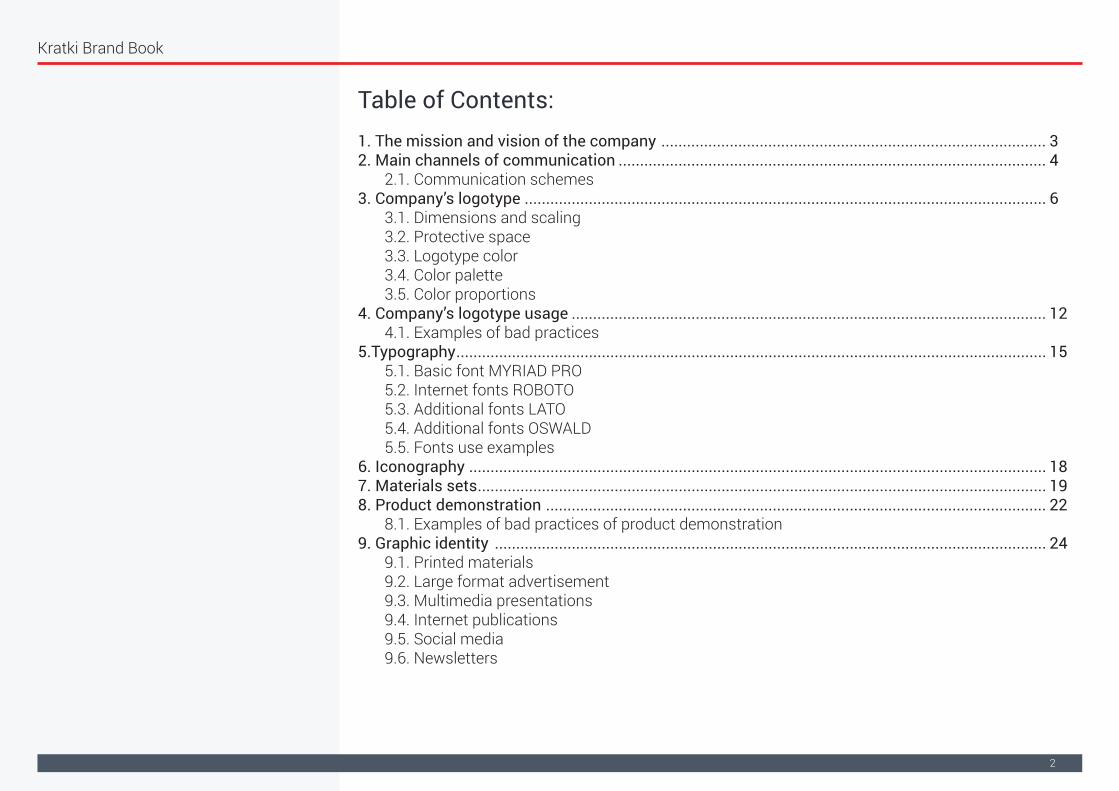
Table of Contents:1. The mission and vision of the company .......................................................................................... 32. Main channels of communication .................................................................................................... 4 2.1. Communication schemes3. Company’s logotype .......................................................................................................................... 6 3.1. Dimensions and scaling 3.2. Protective space 3.3. Logotype color 3.4. Color palette 3.5. Color proportions4. Company’s logotype usage ............................................................................................................... 12 4.1. Examples of bad practices 5.Typography .......................................................................................................................................... 15 5.1. Basic font MYRIAD PRO 5.2. Internet fonts ROBOTO 5.3. Additional fonts LATO 5.4. Additional fonts OSWALD 5.5. Fonts use examples6. Iconography ....................................................................................................................................... 187. Materials sets ..................................................................................................................................... 198. Product demonstration ..................................................................................................................... 22 8.1. Examples of bad practices of product demonstration9. Graphic identity ................................................................................................................................. 24 9.1. Printed materials 9.2. Large format advertisement 9.3. Multimedia presentations 9.4. Internet publications 9.5. Social media 9.6. Newsletters

Kratki Brand Book
3
"Warm hearts Warm interiors Fire the imagination"
Creating warm atmosphere and providing the warmth of hearth and home to the homes of our customers
Promoting the idea of "Good because it's Polish"
Supporting events and socio-cultural initiatives and charitable aid focused on children
Constant product development responding to the needs of the market and customers
Creating the image of fireplaces as efficient, economical and ecological heating devices
Providing high quality products at an affordable price
1. The mission and vision of the company
Our goals:

Kratki Brand Book
4
2. Main channels of communication
In order to build a positive image of the company external and internal communication is directly correlated with the mission, vision and objectives of the Kratki.pl company. With an emphasis on communication consistency matched to the appropriate audience we operate in the following areas.
Internet
EventyCharity help
Social media
Newsletters
Printed materials
Outdoor
Public awareness campaigns
Education
Printed materials
Press articles
Aadvertising campaigns
Advertising gadgets
Printed materials
Display marketingFilm
Performance marketing

Kratki Brand Book
5
2.1. Communication schemes
a. We create warm atmosphere,
Communication scheme which assumes the emphasis on the family aspect of having a fireplace that is the center of hearth and home.
b. Fireplace inserts experts,
It focuses on the flagship products offered by the company. Emphasizing their unique design quality and technological advantage.
c. With passion for perfection
Is about creating predominance based on the dynamic development and application of modern production processes
With passion for perfection
Wyróżniki: Quality, Polish product Modern technology,
Fireplace inserts experts
Wyróżniki: design, awards, selling values
We create warm atmosphere
Wyróżniki: familly, home, warm joy, safety, ecology,
charity
Kratki Brand Book
6
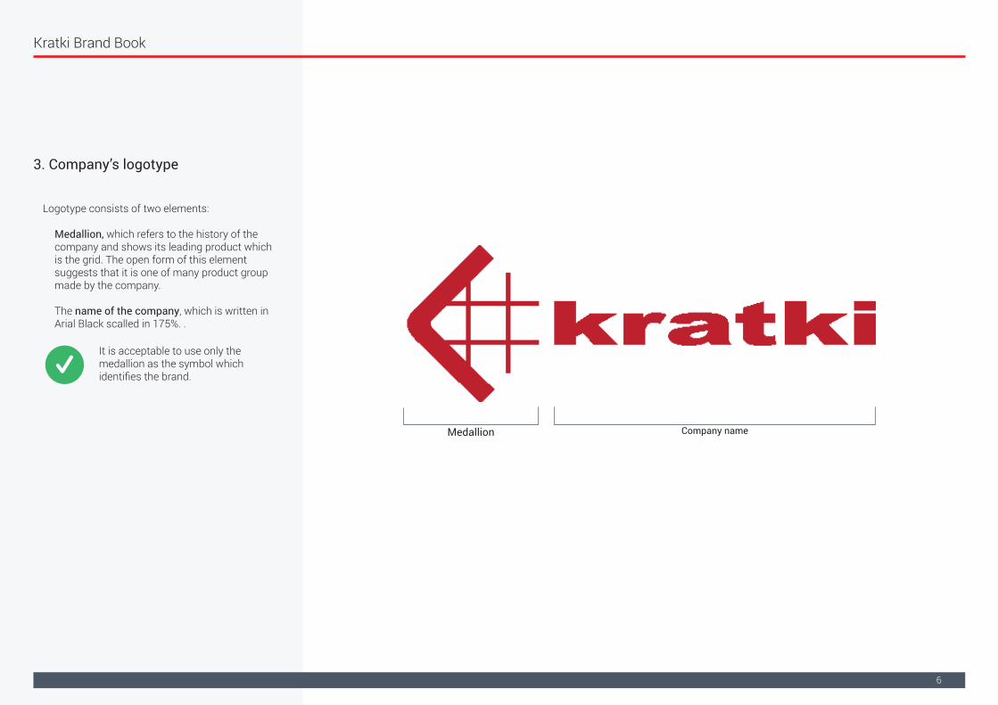
3. Company’s logotype
Logotype consists of two elements:
Medallion, which refers to the history of the company and shows its leading product which is the grid. The open form of this element suggests that it is one of many product group made by the company.
The name of the company, which is written in Arial Black scalled in 175%. .
Medallion Company name
WIt is acceptable to use only the medallion as the symbol which identifies the brand.
Kratki Brand Book
7
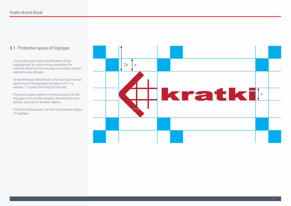
3.1. Protective space of logotype
To provide good visual identification of the logotype and its autonomous character the minimal distance from the sign to another graphic elements was defined.
To set the basic field which is the optimal minimal space to put the logotype the basic unit ‘x’ is needed. “x’ equals the height of the text.
Protective space defines minimal distance of the logotype from another graphic elements like text, photos, pictures or another objects.
Protective field equals ‘2x’ from the extreme edges of logotype.
x
x
2x

Kratki Brand Book
8
3.2. Graduation of logotype
Dimension and proportions of logotype are precisely defined and the attention should be paid not to change them.
The sign should be scaled proportionally, integrally, not separating the individual components, taking into account protective space.
To keep quantity and to display properly individual elements, logotype shouldn’t be scaled below recommended values.Minimal size for logotype is X=25 pixels ~8 mm
x
Kratki Brand Book
9
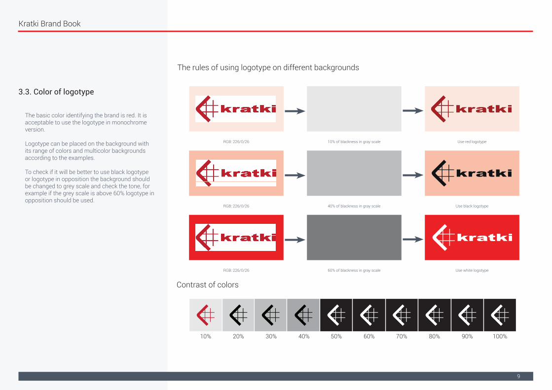
3.3. Color of logotype
The rules of using logotype on different backgrounds
Contrast of colors
The basic color identifying the brand is red. It is acceptable to use the logotype in monochrome version.
Logotype can be placed on the background with its range of colors and multicolor backgrounds according to the examples.
To check if it will be better to use black logotype or logotype in opposition the background should be changed to grey scale and check the tone, for example if the grey scale is above 60% logotype in opposition should be used.
RGB: 226/0/26
RGB: 226/0/26
40% of blackness in gray scale
10% of blackness in gray scale
60% of blackness in gray scale
Use black logotype
Use red logotype
Use white logotypeRGB: 226/0/26
10% 20% 30% 40% 50% 60% 70% 80% 90% 100%

Kratki Brand Book
10
Color scheme used in the visual identification of company Kratki.pl is divided into basic colors and additional ones.
They give an impression of minimalistic and clear image which emphasizes on warmth, openness and professionalism. Colors of basic palette should be used in a majority of materials used in the visual identification.
rgb: 226, 0, 26hex: e2001acmyk: 10, 100, 90, 10pantone: 2035 C
rgb: 0, 0, 0hex: 000000cmyk: 0, 0, 0, 100pantone: 6 C
rgb: 255, 255, 255hex: ffffffcmyk: 0, 0, 0, 0pantone: 663 C
rgb: 60, 183, 105hex: 3cb769cmyk: 73, 0, 80, 0pantone: 2256 C
rgb: 224, 226, 230hex: e0e2e6cmyk: 11, 7, 6, 0pantone: 649 C
rgb: 33, 117, 188hex: 2175bccmyk: 84, 50, 0, 0pantone: 7683 C
rgb: 78, 87, 102hex: 4e5766cmyk: 72, 59, 44, 23pantone: 2376 C
rgb: 247, 141, 43hex: f78d2bcmyk: 0, 54, 94, 0pantone: 715 C
rgb: 44, 48, 56hex: 2c3038cmyk: 76, 68, 56, 56pantone: 426 C
Kolory podstawowe
Kolory pomocnicze
3.4. Color palette

Kratki Brand Book
11
Additional color palette is only a supplementation of primary color scheme and perform a supplementary function for the use in a smaller elements e.g. icons, infographics, backgrounds etc.
CMYK and Pantone color codes should be used in printed materials.
RGB and HEX color codes should be used in multimedia materials.
rgb: 226, 0, 26cmyk: 10, 100, 90, 10
pantone: 2035 C
rgb: 226, 0, 26cmyk: 10, 100, 90, 10
pantone: 2035 C
rgb: 255, 255, 255cmyk: 0, 0, 0, 0pantone: 663 C
rgb: 60, 183, 105cmyk: 73, 0, 80, 0pantone: 2256 C
rgb: 60, 183, 105cmyk: 73, 0, 80, 0pantone: 2256 C
rgb: 224, 226, 230cmyk: 11, 7, 6, 0pantone: 649 C
rgb: 33, 117, 188cmyk: 84, 50, 0, 0pantone: 7683 C
rgb: 33, 117, 188cmyk: 84, 50, 0, 0pantone: 7683 C
rgb: 78, 87, 102cmyk: 72, 59, 44, 23
pantone: 2376 C
rgb: 78, 87, 102cmyk: 72, 59, 44, 23
pantone: 2376 Crgb: 247, 141, 43cmyk: 0, 54, 94, 0pantone: 715 C
rgb: 247, 141, 43cmyk: 0, 54, 94, 0pantone: 715 C
rgb: 44, 48, 56cmyk: 76, 68, 56, 56
pantone: 426 C
rgb: 44, 48, 56cmyk: 76, 68, 56, 56
pantone: 426 C
80%
60%
40%
20%
70% 100%
10%
10%
10%
3.5. Color proportions

Kratki Brand Book
12
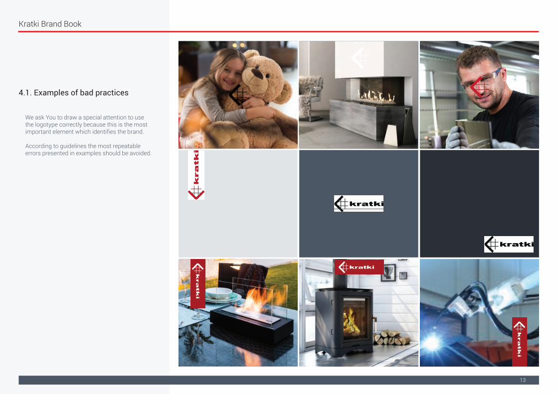
We ask You to draw a special attention to use the logotype correctly because this is the most important element which identifies the brand.
According to guidelines the most repeatable errors presented in examples should be avoided.
4. Company’s logotype usage
Kratki Brand Book
13
We ask You to draw a special attention to use the logotype correctly because this is the most important element which identifies the brand.
According to guidelines the most repeatable errors presented in examples should be avoided.
4.1. Examples of bad practices

Kratki Brand Book
14
We ask You to draw a special attention to use the logotype correctly because this is the most important element which identifies the brand. According to guidelines the most repeatable errors presented in examples should be avoided.
It is not allowed to change the dimensions of singular elements
It is not allowed to add typography and signatures
It is not allowed to put the logotype on irregular backgrounds
It is not allowed to use outdated versions of the logo
It is not allowed to cover the logo up with different elements
It is not allowed to change the placing of singular elements
It is not allowed to change the color
It is not allowed to use the logo in the text
It is not allowed to put the logo at an angle
It is not allowed to cut the logo
It is not allowed to change the shape (do not extend and do not flatten out)
It is not allowed to add special effects
It is not allowed to put the logo on backgrounds with simmilar colour scheme
It is not allowed to use the contour of logo’s shape
It is not allowed to use the logo constituting only its contour
4.1. Examples of bad practices
Kratki Brand Book
15
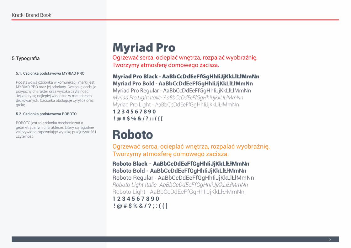
5.Typografia
5.1. Czcionka podstawowa MYRIAD PRO
Podstawową czcionką w komunikacji marki jest MYRIAD PRO oraz jej odmiany. Czcionkę cechuje przyjazny charakter oraz wysoka czytelność.Jej zalety są najlepiej widoczne w materiałach drukowanych. Czcionka obsługuje cyrylicę oraz grekę.
5.2. Czcionka podstawowa ROBOTO
ROBOTO jest to czcionka mechaniczna o geometrycznym charakterze. Litery są łagodnie zakrzywione zapewniając wysoką przejrzystość i czytelność.
Myriad Pro
Roboto
Myriad Pro Black - AaBbCcDdEeFfGgHhIiJjKkLlŁłMmNnMyriad Pro Bold - AaBbCcDdEeFfGgHhIiJjKkLlŁłMmNnMyriad Pro Regular - AaBbCcDdEeFfGgHhIiJjKkLlŁłMmNnMyriad Pro Light Italic- AaBbCcDdEeFfGgHhIiJjKkLlŁłMmNnMyriad Pro Light - AaBbCcDdEeFfGgHhIiJjKkLlŁłMmNn1 2 3 4 5 6 7 8 9 0 ! @ # $ % & / ? ; : ( { [
Roboto Black - AaBbCcDdEeFfGgHhIiJjKkLlŁłMmNnRoboto Bold - AaBbCcDdEeFfGgHhIiJjKkLlŁłMmNnRoboto Regular - AaBbCcDdEeFfGgHhIiJjKkLlŁłMmNnRoboto Light Italic- AaBbCcDdEeFfGgHhIiJjKkLlŁłMmNnRoboto Light - AaBbCcDdEeFfGgHhIiJjKkLlŁłMmNn1 2 3 4 5 6 7 8 9 0 ! @ # $ % & / ? ; : ( { [
Ogrzewać serca, ocieplać wnętrza, rozpalać wyobraźnię.Tworzymy atmosferę domowego zacisza.
Ogrzewać serca, ocieplać wnętrza, rozpalać wyobraźnię.Tworzymy atmosferę domowego zacisza.

Kratki Brand Book
16
5. Typography
5.3. Czcionka alternatywna LATO
Alternatywną czcionką w komunikacji marki jest LATO oraz jej odmiany. Geometria czcionki jest miękka i przyjazna. Jednocześnie silna struktura zapewnia powagę oraz wyrazistość.
5.4. Czcionka dodatkowa OSWALD
Czcionka dodatkowa OSWALD idealnie nadaję się do nagłówków oraz komunikacji internetowej. Na jej podstawie można wyróżnić tekst lub zbudować wyróżniający się nagłówek.
Lato
Oswald
Lato Black - AaBbCcDdEeFfGgHhIiJjKkLlŁłMmNnLato Bold - AaBbCcDdEeFfGgHhIiJjKkLlŁłMmNnLato Regular - AaBbCcDdEeFfGgHhIiJjKkLlŁłMmNnLato Light Italic- AaBbCcDdEeFfGgHhIiJjKkLlŁłMmNnLato Light - AaBbCcDdEeFfGgHhIiJjKkLlŁłMmNn1 2 3 4 5 6 7 8 9 0 ! @ # $ % & / ? ; : ( { [
Oswald Black - AaBbCcDdEeFfGgHhIiJjKkLlŁłMmNnOswald Bold - AaBbCcDdEeFfGgHhIiJjKkLlŁłMmNnOswald Regular - AaBbCcDdEeFfGgHhIiJjKkLlŁłMmNnOswald Light Italic- AaBbCcDdEeFfGgHhIiJjKkLlŁłMmNnOswald Light - AaBbCcDdEeFfGgHhIiJjKkLlŁłMmNn1 2 3 4 5 6 7 8 9 0 ! @ # $ % & / ? ; : ( { [
Ogrzewać serca, ocieplać wnętrza, rozpalać wyobraźnię.Tworzymy atmosferę domowego zacisza.
Ogrzewać serca, ocieplać wnętrza, rozpalać wyobraźnię.Tworzymy atmosferę domowego zacisza.

Kratki Brand Book
17
5. Typography
5.5. Przykłady posługiwania się stylami typograficznymi
Przy tworzeniu przekazu należy dbać o jego czytelność. Hasło powinno być pisane zdecydowanie większym krojem niż pozostałe bloki tekstowe.
Czcionki podstawowe oraz alternatywne posiadają różnorodne style od bardzo cienkich do bardzo grubych. Umiejętne wykorzystywanie stylów typograficznych intensyfikuje przekaz oraz atrakcyjność materiału.

Kratki Brand Book
18
6. Iconography
Ważnym elementem komunikacji dotyczącej produktów oraz ich cech są symbole. Dzięki nim czytelnik skupia uwagę na kluczowych walorach danego produktu.
Ikony używane do opisu podstawowych parametrów produktów (mocy, wagi, średnicy czopucha). Pozwalają w prosty i czytelny sposób podkreślić najważniejsze parametry użytkowe produktu.
Symbole internetowe stosowane na strnie www podkreślają cechy i walory użytkowe produktu.
Kratki Brand Book
19
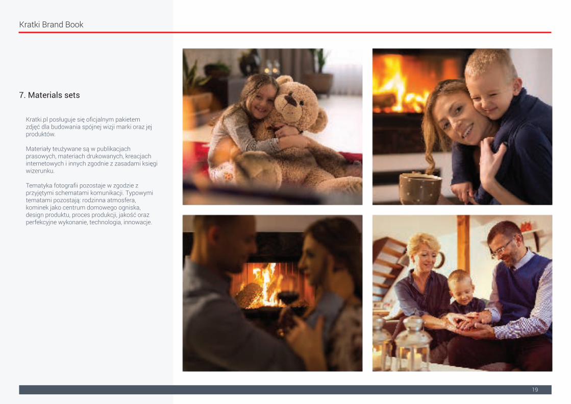
7. Materials sets
Kratki.pl posługuje się oficjalnym pakietem zdjęć dla budowania spójnej wizji marki oraz jej produktów.
Materiały teużywane są w publikacjach prasowych, materiach drukowanych, kreacjach internetowych i innych zgodnie z zasadami księgi wizerunku.
Tematyka fotografii pozostaje w zgodzie z przyjętymi schematami komunikacji. Typowymi tematami pozostają: rodzinna atmosfera, kominek jako centrum domowego ogniska, design produktu, proces produkcji, jakość oraz perfekcyjne wykonanie, technologia, innowacje.

Kratki Brand Book
20
7. Materials sets
Przykłady aranżacji wnętrz.

Kratki Brand Book
21
7. Materials sets
Przykłady zdjęć produkcyjnych.

Kratki Brand Book
22
8. Product demonstration
Oficjalnym standardem prezentacji produktów firmy Kratki są 4 rzuty na transparentnym tle oraz ich aranżacje katalogowe.
Widok lewy
Widok przód
Widok prawy
Widok tył

Kratki Brand Book
23
8.1. Examples of bad practices
Prezentując produkty należy:- nie łączyć ich z wizualizacjami innych marek;- prezentować rzuty produktowe na jednolitym jasnym tle;- dbać o prawidłową skalę oraz proporcje;- zachować pole ochronne wokół wizualizacji lub rzutu; - dbać o prawidłowe podpisy oraz nazewnictwo zgodnie z katalogiem;- nie usuwać znaków wodnych oraz innych atrybutów identyfikujących produkty Kratki- nie zasłaniać innymi elementami projektu.
Najlepszy Towar w mieście
moje logo
Nie odbijać lustrzanie
Nie umieszczać tekstu na produkcie
Nie zmieniać proporcji
Nie zasłaniać elementami graficznymi

Kratki Brand Book
24
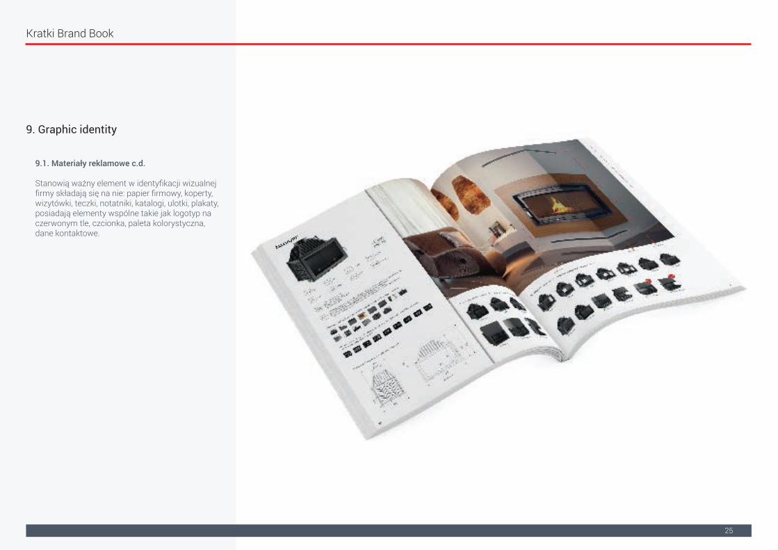
9. Graphic identity
9.1. Druki firmowe
Stanowią ważny element w identyfikacji wizualnej firmy składają się na nie: papier firmowy, koperty, wizytówki, teczki, notatniki, katalogi, ulotyki, plakaty, posiadają elementy wspólne takie jak logotyp na czerwonym tle, czcionka, paleta kolorystyczna, dane kontaktowe.
Kratki Brand Book
25
9. Graphic identity
9.1. Materiały reklamowe c.d.
Stanowią ważny element w identyfikacji wizualnej firmy składają się na nie: papier firmowy, koperty, wizytówki, teczki, notatniki, katalogi, ulotki, plakaty, posiadają elementy wspólne takie jak logotyp na czerwonym tle, czcionka, paleta kolorystyczna, dane kontaktowe.

Kratki Brand Book
26
9. Graphic identity
9.2. Materiały reklamowe
Stanowią narzędzie wspierające sprzedaż. Należą do nich różne rodzaje nośników reklamy: gadżety, rollupy, banery, oklejenie aut, itp.

Kratki Brand Book
27
9. Przykłady identyfikacji wizualnej
9.3. Prezentacje multimedialne
Prezentacje są używane w szerokim spektrum działalności firmy (szkolenia, spotkania biznesowe) dlatego pełnią bardzo ważną rolę w identyfikacji wizualnej. Prezentacje wykorzystują większość elementów identyfikujących markę, logotyp, kolorystykę, czcionki, zdjęcia i wizualizacje.
Kratki Brand Book
28
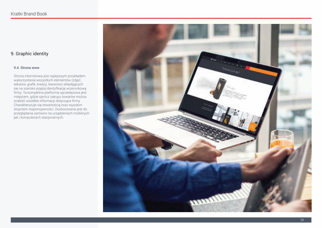
9. Graphic identity
9.4. Strona www
Strona internetowa jest najlepszym przykładem wykorzystania wszystkich elementów (zdjęć, tekstów, grafik, kreacji, banerów) składających się na szeroko pojętą identyfikację wizerunkową firmy. Ta kompletna platforma sprzedażowa jest miejscem, gdzie oprócz zakupu towarów można znaleźć wszelkie informacji dotyczące firmy. Charakteryzuje się otwartością oraz wysokim stopniem responsywności. Dostosowana jest do przeglądania zarówno na urządzeniach mobilnych jak i komputerach stacjonarnych.

Kratki Brand Book
29
9. Graphic identity
9.5. Social Media
Obecność w mediach społecznościowych oraz internecie jest realizacją celów strategicznych obejmujących ciągły kontakt z klientem, reagowanie na zmiany rynkowe oraz promocję marki.

Kratki Brand Book
30
9. Przykłady identyfikacji wizualnej
9.6. Newslettery
Komunikacja za pośrednictwem poczty email to zwarta oraz rzeczowa forma przekazu najważniejszych informacji o wydarzeniach, promocjach i aktualnościach z życia firmy.
![.UHDWRU=DZDUWR FL · z Widok ¾ Wzorzec ¾ Wzorzec slajdów. Wzorzec Slajdów z Formatowanie tekstu wzorca (Format - Czcionka) z 7ÆRZ]RUFD )RUPDW -7ÆR z Obiekt graficzny we wzorcuFile](https://static.fdocuments.net/doc/165x107/5edfe687ad6a402d666b2f0b/uhdwrudzduwr-fl-z-widok-wzorzec-wzorzec-slajdw-wzorzec-slajdw-z-formatowanie.jpg)