BMC Brand Guidelines · When using the original logo, white is the preferred background color. Use...
31
BMC Brand Guidelines
Transcript of BMC Brand Guidelines · When using the original logo, white is the preferred background color. Use...
BMC Brand Guidelines

2© Copyright 2019 BMC Software, Inc.
03 About BMC
04 Logo
05 Symbol – Helix
06 Symbol | Construction
07-10 Logo Usage
11-14 Logo Lockups
15-17 Typography
18 Color
19-21 Icons
22-31 Image Strategy
Table of Contents

3© Copyright 2019 BMC Software, Inc.
About BMCAbout BMC
BMC helps customers run and reinvent their businesses with open, scalable, and modular solutions to complex IT problems. Bringing both unmatched experience in optimization and limitless passion for innovation to technologies from mainframe to mobile to cloud and beyond, BMC helps more than 10,000 customers worldwide reinvent, grow, and build for the future success of their enterprises, including 92 of the Forbes Global 100.

4© Copyright 2019 BMC Software, Inc.
LogoLogo
The BMC logo is our single most important brand visual and the most visible element of our identity. Correct and consistent application of our logo accelerates audience engagement, raises our credibility, and improves brand recall.
The BMC logo consists of two elements: the symbol and the logotype. It is both simple and bold, and using it correctly will allow it to be memorable and lasting. symbol logotype
our logo

5© Copyright 2019 BMC Software, Inc.
Symbol – Helix
Our symbol is an abstraction of a double helix structure. It signifies that BMC is a driver of innovation and transformation.
The symbol also resembles fluid arrows, indicating our commitment to our customers—we put our customers and their success first.
Additionally, the symbol resembles a capitalized B, calling to mind the BMC name and tying together past and present as we move to the future.
DNA Arrowsforward
B BMC
Logo
6© Copyright 2019 BMC Software, Inc.
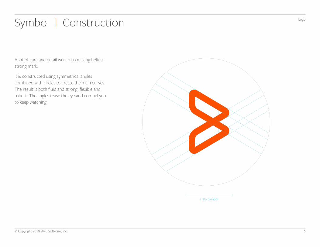
LogoSymbol | Construction
A lot of care and detail went into making helix a strong mark.
It is constructed using symmetrical angles combined with circles to create the main curves. The result is both fluid and strong, flexible and robust. The angles tease the eye and compel you to keep watching.
Helix Symbol

7© Copyright 2019 BMC Software, Inc.
LogoLogo UsageClear Space, Minimum Size, Proportion
CLEAR SPACE MINIMUM SIZE MAINTAIN PROPORTIONS
Providing the right amount of clear space around the logo makes it easier to distinguish, and reinforces the importance of the BMC identity. The required amount of clear space to ensure maximum visibility and legibility is determined by the height of the letter “c” in bmc.
The minimum print size of the logo is .5” (12.7 mm) wide. The minimum screen size of the logo is 60 pixels wide.
To ensure accurate and consistent use, never alter, rotate, embellish, or attempt to recreate the “bmc” logo. The proportions and shape of the helix should never be altered for any reason. To resize, hold the “Shift” key in most software programs to maintain the proportions while scaling up or down. Always maintain the minimum clear space, even when proportionally scaling the logo.
X
X
X
X
X
1/2X
1/2X
.5”(12.7mm, 60px )

8© Copyright 2019 BMC Software, Inc.
LogoLogo UsageColor Versions & Backgrounds
PREFERRED REVERSED COLOR BACKGROUND IMAGE BACKGROUND
When using the original logo, white is the preferred background color.
Use the reversed version when placing the logo over dark backgrounds.
The logo may be used over any color within the BMC color palette. Choose the appropriate version of the logo to ensure adequate contrast. The background should never impair the logo’s legibility or impact.
The logo may be used over calm areas of photography, provided there is adequate contrast. Be judicious about where and when this is used

9© Copyright 2019 BMC Software, Inc.
LogoLogo UsageStaging Placement, Relative Size
HORIZONTAL PLACEMENT VERTICAL PLACEMENT RELATIVE SIZE
The location of the logo in layouts is important for recognition, especially when seen multiple times across various touchpoints. The identity system gives guidance as to general logo placement. Generally, logo placement priority is as follows: Lower Right, Lower Left, Upper Right, and Upper Left.
The BMC logo should not appear inappropriately large on any layout, surface, or display. It should be proportionate to the other elements surrounding it. The width of the logo should not exceed 30 percent of the total width of a layout.
4 43 3
2 21 1
30% of X
X = application width

10© Copyright 2019 BMC Software, Inc.
LogoLogo UsageIncorrect Usage
DO NOT OUTLINE DO NOT ROTATE DO NOT DISTORT OR SKEW DO NOT USE DROP SHADOW
DO NOT ALTER SIZE RELATIONSHIP OF ELEMENTS
DO NOT REARRANGE DO NOT STACK DO NOT ALTER LOGOTYPE
DO NOT ADD EFFECTS DO NOT ALTER COLOR DO NOT PLACE ON POOR CONTRASTING BACKGROUNDS
DO NOT PLACE ON BUSY PHOTO BACKGROUNDS

11© Copyright 2019 BMC Software, Inc.
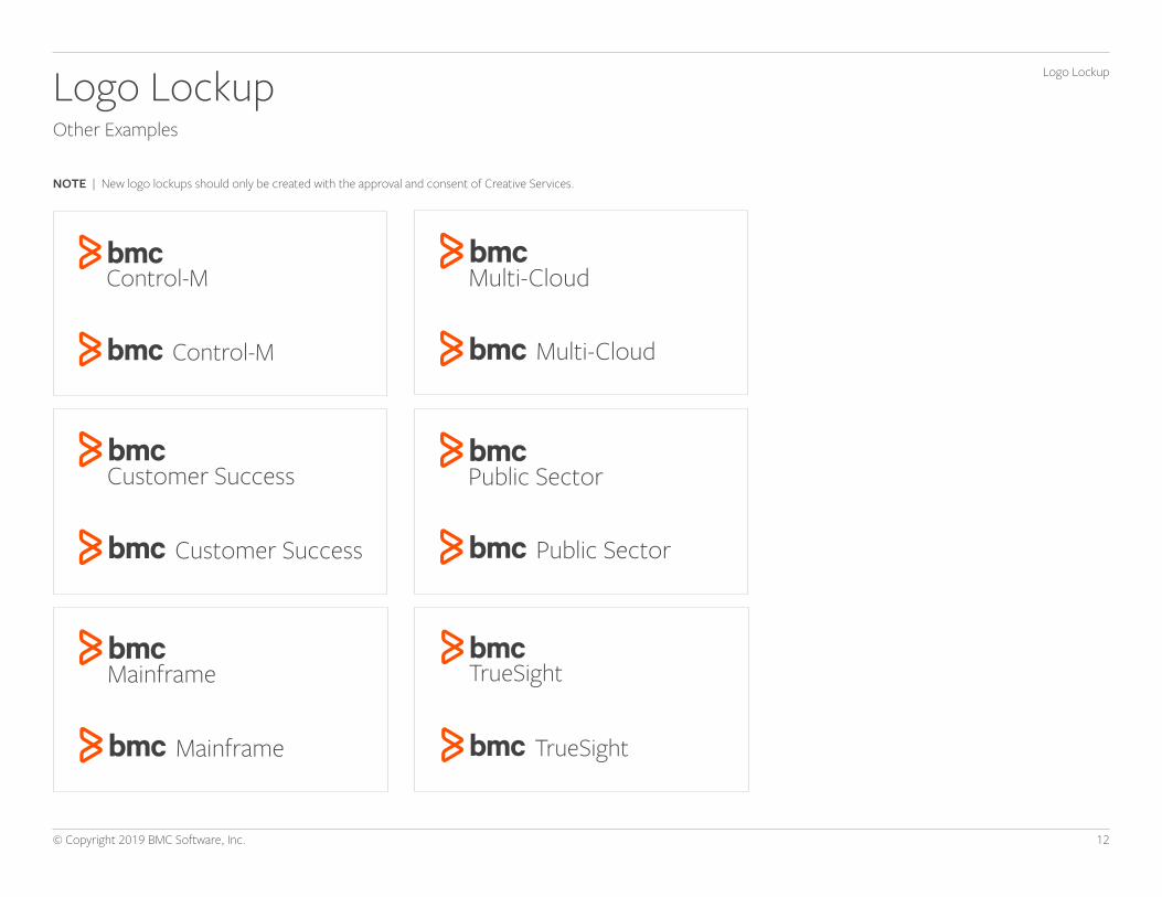
Logo LockupLogo LockupStandard
BMC logo lockups represent BMC products, services, external programs, events, social and community groups, and third-party properties. It is important to understand how and when to use these two categories of identities, as they play a key role in our communications to audiences worldwide.
Within the BMC brand, a logotype is defined as a word or words, set in the Freight Sans typeface, and arranged in a predetermined lockup with the BMC logo. These lockups are part of a system, and should not be altered, manipulated, or created by anyone other than the Creative Services team. Our goal is to maintain a logotype system that is consistently branded, yet flexible enough to meet the needs of the various groups in and around BMC.
12© Copyright 2019 BMC Software, Inc.
NOTE | New logo lockups should only be created with the approval and consent of Creative Services.
Logo LockupOther Examples
Logo Lockup

13© Copyright 2019 BMC Software, Inc.
Logo Lockup: Special circumstancesExamples
NOTE | For new products, solution groups, or other marketing-driven initiatives, or in cases of extensive character counts or other spacing considerations, additional BMC colors or different layouts may be employed. All new logo lockups must be created in partnership with Creative Services.
Logo Lockup

14© Copyright 2019 BMC Software, Inc.
Logo Lockup: Special circumstancesExamples
NOTE | For new products, solution groups, or other marketing-driven initiatives, or in cases of extensive character counts or other spacing considerations, additional BMC colors or different layouts may be employed. All new logo lockups must be created in partnership with Creative Services.
DevOps Tools
DevOps Tools

15© Copyright 2019 BMC Software, Inc.
TypographyTypographyPrimary Typeface: Freight Sans Pro
The BMC primary brand typeface is Freight Sans. Typography is an essential part of the BMC brand. It helps to unify messaging and create familiarity. A consistent typographic style is essential in creating a distinctive identity.
As the primary typeface, it is important that most BMC communications are set in Freight Sans. The typeface is made up of six weights, each with an italic version: Book, Light, Medium, Semibold, Bold, and Black. The default weight to use is Freight Sans Book, but the supporting weights may also be used for various cases.
Note: Do not use the default figure of numbers like “12345…”. Use the Tabular Lining function or appropriate function to type the uppercase numbers “12345…”.
Freight Sans ProBook
ABCDEFGHIJKLMNOPQRSTUVWXYZabcdefghijklmnopqrstuvwxyz1234567890 (.,;:?!@#$%^&*-)
Freight Sans Pro Light
ABCDEFGHIJKLMNOPQRSTUVWXYZ abcdefghijklmnopqrstuvwxyz1234567890 (.,;:?!@#$%^&*-)Freight Sans Pro Medium
ABCDEFGHIJKLMNOPQRSTUVWXYZ abcdefghijklmnopqrstuvwxyz1234567890 (.,;:?!@#$%^&*-)Freight Sans Pro Semibold
ABCDEFGHIJKLMNOPQRSTUVWXYZ abcdefghijklmnopqrstuvwxyz1234567890 (.,;:?!@#$%^&*-)Freight Sans Pro Bold
ABCDEFGHIJKLMNOPQRSTUVWXYZ abcdefghijklmnopqrstuvwxyz1234567890 (.,;:?!@#$%^&*-)Freight Sans Pro Black
ABCDEFGHIJKLMNOPQRSTUVWXYZ abcdefghijklmnopqrstuvwxyz1234567890 (.,;:?!@#$%^&*-)
PRIMARY TYPEFACE DEFAULT WEIGHT
SUPPORTING WEIGHTS

16© Copyright 2019 BMC Software, Inc.
TypographyTypographySubstitute Typeface: Open Sans
Open Sans should be used as a substitute. These cases may include digital applications such as websites, HTML emails, and apps. Open Sans is made up of five weights, each with an italic version: Regular, Light, Semibold, Bold, and Extrabold. The default weight to use is Open Sans Regular, but the supporting weights may also be used for various cases.
Open Sans Regular
ABCDEFGHIJKLMNOPQRSTUVWXYZabcdefghijklmnopqrstuvwxyz1234567890 (.,;:?!@#$%^&*-)
Open Sans Light
ABCDEFGHIJKLMNOPQRSTUVWXYZ abcdefghijklmnopqrstuvwxyz1234567890 (.,;:?!@#$%^&*-)Open Sans Semibold
ABCDEFGHIJKLMNOPQRSTUVWXYZ abcdefghijklmnopqrstuvwxyz1234567890 (.,;:?!@#$%^&*-)Open Sans Bold
ABCDEFGHIJKLMNOPQRSTUVWXYZ abcdefghijklmnopqrstuvwxyz1234567890 (.,;:?!@#$%^&*-)Open Sans Extrabold
ABCDEFGHIJKLMNOPQRSTUVWXYZ abcdefghijklmnopqrstuvwxyz1234567890 (.,;:?!@#$%^&*-)
SUPPORTING TYPEFACE DEFAULT WEIGHT
SUPPORTING WEIGHTS

17© Copyright 2019 BMC Software, Inc.
TypographyTypographySubstitute Typeface: Calibri
Calibri should be used as a substitute in PowerPoint presentations. Calibri is made up of three weights, each with an italic version: Bold, Light, and Regular. The default weight to use is Calibri Bold, but the supporting weights may also be used for various cases.
Calibri Bold ABCDEFGHIJKLMNOPQRSTUVWXYZabcdefghijklmnopqrstuvwxyz1234567890 (.,;:?!@#$%^&*-)
Calibri Light
ABCDEFGHIJKLMNOPQRSTUVWXYZ abcdefghijklmnopqrstuvwxyz1234567890 (.,;:?!@#$%^&*-)Calibri Regular
ABCDEFGHIJKLMNOPQRSTUVWXYZ abcdefghijklmnopqrstuvwxyz1234567890 (.,;:?!@#$%^&*-)
SUPPORTING TYPEFACE DEFAULT WEIGHT
SUPPORTING WEIGHTS
18© Copyright 2019 BMC Software, Inc.
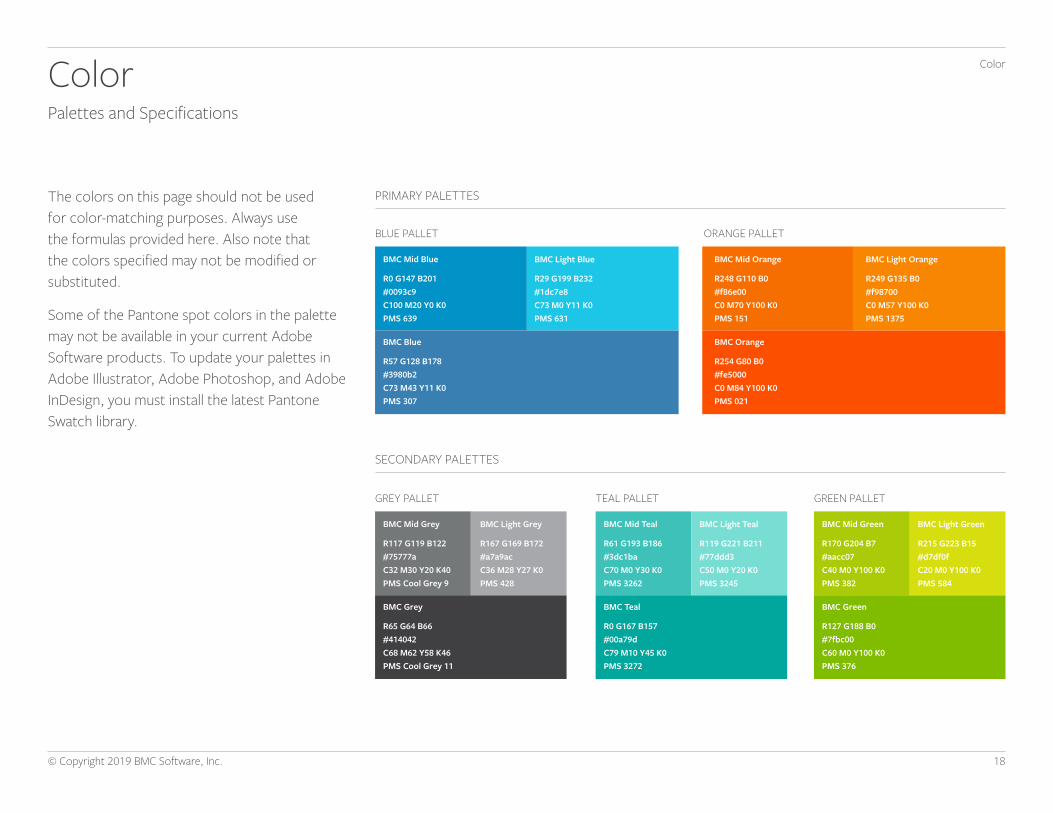
ColorColorPalettes and Specifications
The colors on this page should not be used for color-matching purposes. Always use the formulas provided here. Also note that the colors specified may not be modified or substituted.
Some of the Pantone spot colors in the palette may not be available in your current Adobe Software products. To update your palettes in Adobe Illustrator, Adobe Photoshop, and Adobe InDesign, you must install the latest Pantone Swatch library.
BLUE PALLET
GREY PALLET GREEN PALLET
ORANGE PALLET
TEAL PALLET
PRIMARY PALETTES
SECONDARY PALETTES
BMC Mid Grey
R117 G119 B122#75777aC32 M30 Y20 K40PMS Cool Grey 9
BMC Mid Blue
R0 G147 B201#0093c9C100 M20 Y0 K0PMS 639
BMC Mid Green
R170 G204 B7#aacc07C40 M0 Y100 K0PMS 382
BMC Mid Orange
R248 G110 B0#f86e00C0 M70 Y100 K0PMS 151
BMC Mid Teal
R61 G193 B186#3dc1baC70 M0 Y30 K0PMS 3262
BMC Grey
R65 G64 B66#414042C68 M62 Y58 K46PMS Cool Grey 11
BMC Blue
R57 G128 B178#3980b2C73 M43 Y11 K0PMS 307
BMC Green
R127 G188 B0#7fbc00C60 M0 Y100 K0PMS 376
BMC Orange
R254 G80 B0#fe5000C0 M84 Y100 K0PMS 021
BMC Teal
R0 G167 B157#00a79dC79 M10 Y45 K0PMS 3272
BMC Light Grey
R167 G169 B172#a7a9acC36 M28 Y27 K0PMS 428
BMC Light Blue
R29 G199 B232#1dc7e8C73 M0 Y11 K0PMS 631
BMC Light Green
R215 G223 B15#d7df0fC20 M0 Y100 K0PMS 584
BMC Light Orange
R249 G135 B0#f98700C0 M57 Y100 K0PMS 1375
BMC Light Teal
R119 G221 B211#77ddd3C50 M0 Y20 K0PMS 3245
19© Copyright 2019 BMC Software, Inc.
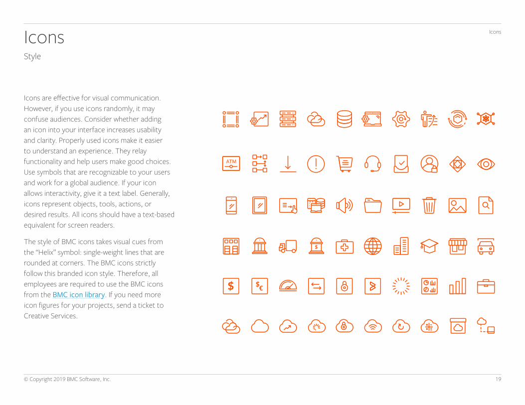
IconsIconsStyle
Icons are effective for visual communication. However, if you use icons randomly, it may confuse audiences. Consider whether adding an icon into your interface increases usability and clarity. Properly used icons make it easier to understand an experience. They relay functionality and help users make good choices. Use symbols that are recognizable to your users and work for a global audience. If your icon allows interactivity, give it a text label. Generally, icons represent objects, tools, actions, or desired results. All icons should have a text-based equivalent for screen readers.
The style of BMC icons takes visual cues from the “Helix” symbol: single-weight lines that are rounded at corners. The BMC icons strictly follow this branded icon style. Therefore, all employees are required to use the BMC icons from the BMC icon library. If you need more icon figures for your projects, send a ticket to Creative Services.

20© Copyright 2019 BMC Software, Inc.
Use the standard version against white background.
Use the reversed version when placing the logo lockup over dark or color backgrounds.
The multi-cloud icon may be used over calm areas of photography, provided there is adequate contrast. Be judicious about where and when this is used.
IconsIconsMulti-Cloud
The signature multi-cloud icon of BMC reinforces BMC’s commitment to helping organizations effectively manage their entire multi-cloud infrastructures, including public clouds and/or on-premises physical, virtual, and private clouds.
STANDARD REVERSED IMAGE BACKGROUND

21© Copyright 2019 BMC Software, Inc.
IconsIconsSizes and Placement
VISUAL SIZE CONSISTENCY ICONS IN SHAPES
DO
DON’T
ICON SIZES
Visual size consistency is important. BMC icons are created in four shape templates so that users experience consistency of icon sizes across pages.
If you place an icon in a shape, there should be enough clear space from the edge of the shape so that the icon is clearly visible in any type of application.
Icons accommodate limited space, but are sized for interactive, touch-friendly experiences. They can indicate change, provide visual cues for the eye, and increase recognition. For digital applications, the following sizes are generally recommended: minimum 16 by 16 and maximum 96 by 96 pixels.
Square Horizontalrectangle
Verticalrectangle
Circle
16 x 16
32 x 32
64 x 64
96 x 96
22© Copyright 2019 BMC Software, Inc.
How We Look and Feel
BMC’s design strategy supports and amplifies our content and drives our brand perception in the marketplace. With our bold, differentiated color palette, image choices, and design elements, we help ensure that our customers, partners, and employees see BMC as an increasingly modern, approachable, and memorable brand.Some of the key elements of our brand design strategy include:
SIMPLEWe keep the focus on our content and messaging with a straightforward, generous clear-space approach in our photos, graphics, and other visual storytelling elements.
BRIGHTWe employ high-contrast colors from our brand palette and include a subtle background ripple for depth and dimension.
BOLDWe use recognizable, evocative icons and graphics, with often-surprising interplay between human subjects and graphic elements.
MEMORABLEWe create visual narratives that leave our customers with an impression of who our company is and what solutions we offer.

23© Copyright 2019 BMC Software, Inc.
Image Components
BACKGROUND COLOR + GRADIENT
Mid-blue is our primary brand background color. Each business unit has a specific brand color when represented on our web site to provide variation and contrast.
RIPPLE
The ripple is a subtle design technique used behind the image to help further differentiate our identity.
SYMBOL
The symbol helps convey a specific business outcome, idea, or action in the simplest way possible.
IMAGE
Each image ties back to a specific category, business unit, or outcome.
Several elements combine to create the BMC brand identity: Color, Gradient, Ripple, Image, and Symbol. Each element has been carefully chosen and customized to define and distinguish BMC’s personality and impact.

24© Copyright 2019 BMC Software, Inc.
Image Approach and VariationsBuilding flexibility into our modern and simple design system
1. PERSONA 2. STORYTELLING 3. IMAGE FILL
The strategic use of images of people helps connect the viewer to the content. Visual personas have been carefully researched and are incorporated according to specific criteria. Special attention is paid to gender, attire, expressions, hairstyles, etc., when selecting a persona for a business category or piece of collateral.
There are three options to select from when applying the new image strategy to any deliverable.
By including storytelling elements and contextual cues, we provide a visually compelling way to explain a business need or outcome, building on the persona approach.
Placing an evocative image inside the symbol used in the design offers visual variation and depth, and can further clarify the business need or outcome.

25© Copyright 2019 BMC Software, Inc.
TEAL
BLUE
LIGHT ORANGE
MID-BLUE
GREY
GREEN
Background and Color Palette
Ripple lines15%-30% Opacity
BackgroundGradient
The use of intentionally bright, bold colors from our brand palette helps highlight the images and showcases BMC in a more unexpected, ownable, and modern way.
While specific business units or product categories have a color assigned to them, in most instances, our primary mid-blue corporate color should be used.
MID-BLUE — PRIMARY CORPORATE COLOR

26© Copyright 2019 BMC Software, Inc.
Symbols
The symbol can represent multiple products, themes, or concepts, as opposed to a simple icon that may represent a single element. A customer story or business outcome can’t be comprehensively told with a single image or symbol.
The use of symbols can convey more complex ideas or actions in the simplest way possible, helping customers quickly connect concepts to their needs or desired results.

27© Copyright 2019 BMC Software, Inc.
Background and Symbol ColorsPutting the system together
MID-BLUE BACKGROUND WITH ORANGE SYMBOL
MID-BLUE BACKGROUND WITH LIGHT BLUE SYMBOL GREY BACKGROUND WITH ORANGE SYMBOL
GREEN BACKGROUND WITH LIGHT GREEN SYMBOL
TEAL BACKGROUND WITH LIGHT TEAL SYMBOL
BLUE BACKGROUND WITH LIGHT BLUE SYMBOL
LIGHT ORANGE BACKGROUND WITH ORANGE SYMBOL
Solid Light Color
When the system is employed thoughtfully and creatively, the design elements create a bold, unexpected image that appeals to our customers and prospects and helps to convey BMC’s brand identity.

28© Copyright 2019 BMC Software, Inc.
Image Usage Examples
BMC.com
AdvertisementSocial

29© Copyright 2019 BMC Software, Inc.
PowerPoint
Datasheet
Image Usage Examples

30© Copyright 2019 BMC Software, Inc.
eBook
Event Booth
Image Usage Examples

31© Copyright 2019 BMC Software, Inc.
Image Usage Don’tsThe examples shown below demonstrate incorrect usage of the new image strategy, and are not intended for usage.
Don’t use background colors that are not in our brand palette
Inconsistent ripple line thickness
Don’t use the image fill without a symbol
Don’t use treatments for the background color that are not part of the BMC brand
Too tight ripple gaps
Don’t use incorrect color combinations between the background and symbol
Don’t use inconsistent line thickness for the symbol
Too wide ripple gaps
Don’t create relationships between the persona and symbol that are unbalanced or incorrectly aligned
Don’t use a ripple around the logo
Don’t create a ripple around a persona
Too thick ripple lines Inconsistent ripple gaps
Don’t crop or distort the persona Don’t use clothing colors that are not in our brand palette
![General Information and Requirements - Web viewRemove the BCA logo when using. Please leave logo in place when distributing template. [Name of Organization] Request for Proposal. To](https://static.fdocuments.net/doc/165x107/5a7017467f8b9aa7538ba92d/general-information-and-requirements-bcxawwwbcxaorg10133-cxnewconstructionrfpdoc.jpg)