Beyond Ptolemy
126
Beyond Ptolemy Mercator and other Distorted Maps Geographies of Place Conference’ Presentation of 25 February 2011 Center for Spatial Studies Interdisciplinary Humanities Center University of California at Santa Barbara Waldo Tobler Geographer Professor Emeritus University of California Santa Barbara, CA 93106-4060 www.geog.ucsb.edu/~tobler
Transcript of Beyond Ptolemy

Beyond Ptolemy Mercator and other Distorted Maps
Geographies of Place Conference’
Presentation of 25 February 2011
Center for Spatial Studies Interdisciplinary Humanities Center University of California at Santa Barbara
Waldo Tobler Geographer
Professor Emeritus University of California
Santa Barbara, CA 93106-4060 www.geog.ucsb.edu/~tobler
This talk is about transformations
The subject of transformations has a long history.
Of interest here are geometrical transformations.
In this talk I describe geographical transformations as represented by map projections.
First some other views:
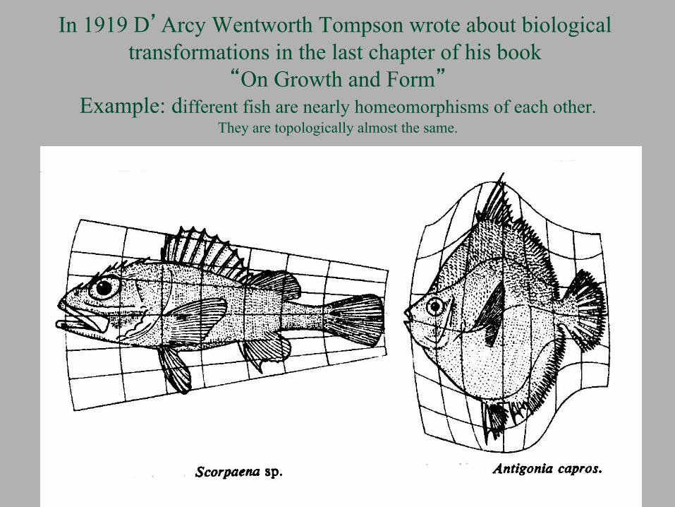
In 1919 D’Arcy Wentworth Tompson wrote about biological transformations in the last chapter of his book
“On Growth and Form” Example: different fish are nearly homeomorphisms of each other.
They are topologically almost the same.

Abrecht Dürer’s book “Vier Bücher von Menschlicher Proportionen”, Nürenberg, 1528, described geometric transformations of human bodies and faces.

Now
Three types of geographic transformations will be discussed
The primary emphasis - the first type of transformation - is on transformations to solve specific geographical problems.
Here one can think of map projections as spherical versions of graph
paper: that is, as nomograms. Logarithmic graph paper is often used to illustrate,
or study, trends over time, or rates of change. A logarithmic map projection can depict geographical rates of change.
This use of map projection is in the classical
Transform - Solve - Invert paradigm.

A second type of transformation illustrates a property of the world, or a point of view.
The “Atlas of the Real World”, here showing the world by population, is a wonderful version of this attribute. Colors are here used to represent different countries.
This is a type of anaphomose, as are all map projections. But, when perverted, such transformations could also be a form of propaganda.

A third type of transformation illustrates a more psychological view.
This is a cognitive or behavioral map wherein believed or imagined attributes of the world are depicted and these
may be used to influence action.
I will show examples of all three types of transformations.

All map projections result in distorted maps!
Since the time of Ptolemy an objective of map makers has been a high metric fidelity representation of the earth’s
surface.
Ptolemy asserted the the objective was to make a map of the world so that the distances thereon were nearly as correct
as possible and noted that “the difficulty is evident”.
That was 2000 years ago.
Distance, area, or angular preservation is still the dominant theme today!

In 1569 Mercator broke this mold and introduced a new paradigm.
His idea was to use a systematic warping to assist in the solution of a particular global problem.
The notion caught on, even though it took almost a century.
The seaman plots a straight line on the distorted Mercator map and
follows the indicated directions. The same course is a curve on the earth but it is much easier to draw a straight line on a map.
Today the seaman will hardly accept any other map projection.
Anamorphic projections of the world, or parts thereof, can similarly be used to enlightening effect for a variety of problems, but are
also used for interesting displays.

The loxodrome is a logarithmic spiral on a sphere. It intersects all meridians at the same angle.
Mercator’s projection warps it into a straight line.

The next several maps are examples of other purposeful distortions introduced in order to provide
solutions to particular problems.
These examples are in the spirit of the change introduced by Mercator.

Conventional Way of Tracking Satellites The range rings on the conventional map are circles on the earth.
Satellite tracks are curves.

An engineer at the Radio Corporation of America was faced with the task of tracking earth satellites.
So, instead of straight meridians and parallels
with curved satellite tracks, as on the previous map, he bent the meridians so that the satellite tracks
become straight lines.
This is convenient for automatic plotting of the satellite tracks.
Jack Breckman, 1962, “The Theory and use of B-Charts”, Radio
Corporation of America, 18 pp.

Bend The Meridians Instead The map is also folded about the furthest southern extent of a particular satellite

This Map Shows Magnetic ‘Parallels’ And ‘Meridians’

Choosing the correct coordinate system is often used to simplify a problem
On the next map we straighten the magnetic coordinates in order to simplify the solution of problems involving
terrestrial magnetism.
This warps the normal geographic coordinates, but so what?
It is not difficult to produce such maps graphically. They can also be computed in a mathematical conformal way.
Mathematical models of historic world wide magnetic
intensity go back a few centuries.
What an opportunity for animation!

Map Which Straightens The Magnetic Coordinates. Student Drawing with geographical latitude & longitude.

Coordinates from Distances
For the next map a student used a table of travel distances between places from a road atlas.
From this table of distances he computed
coordinate locations of the places. Converting distances to coordinates is a well known surveying problem.
Interpolation was then used to fill in the boundaries.
The locations used are shown by dots on the map.


The “warped” road map, and similar distorted maps, can be evaluated by the methods of Tissot.
M.A. Tissot, 1881, Memoire sur la reresentation des surfaces, Paris, Gautier Villars.
The road system introduces distance distortion, as is obvious, but there are also area and direction distortions and these can also be measured.
In other words, cartographic theory can be used to
evaluate quantitatively several geometric impacts of a road system
or of any transportation innovation and many other changes to the world.
Including measuring distortion on mental maps, as on the next slides.

Cognitive-behavioral geography looks at how the world is believed to be by people, not how it is.
It is associated with the work of Kevin Lynch and Peter Gould. The first map shows distances from Seattle, as estimated in an
informal survey, on a north oriented azimuthal equidistant projection centered at Seattle.
South American places and Hawaii are estimated as being closer, Europe and Asia as further away.
The second map has examples drawn from young students
throughout the world.
Both maps can be analyzed using Tissot’s method.

Estimated distances from Seattle Azimuthal equidistant projection centered at Seattle.

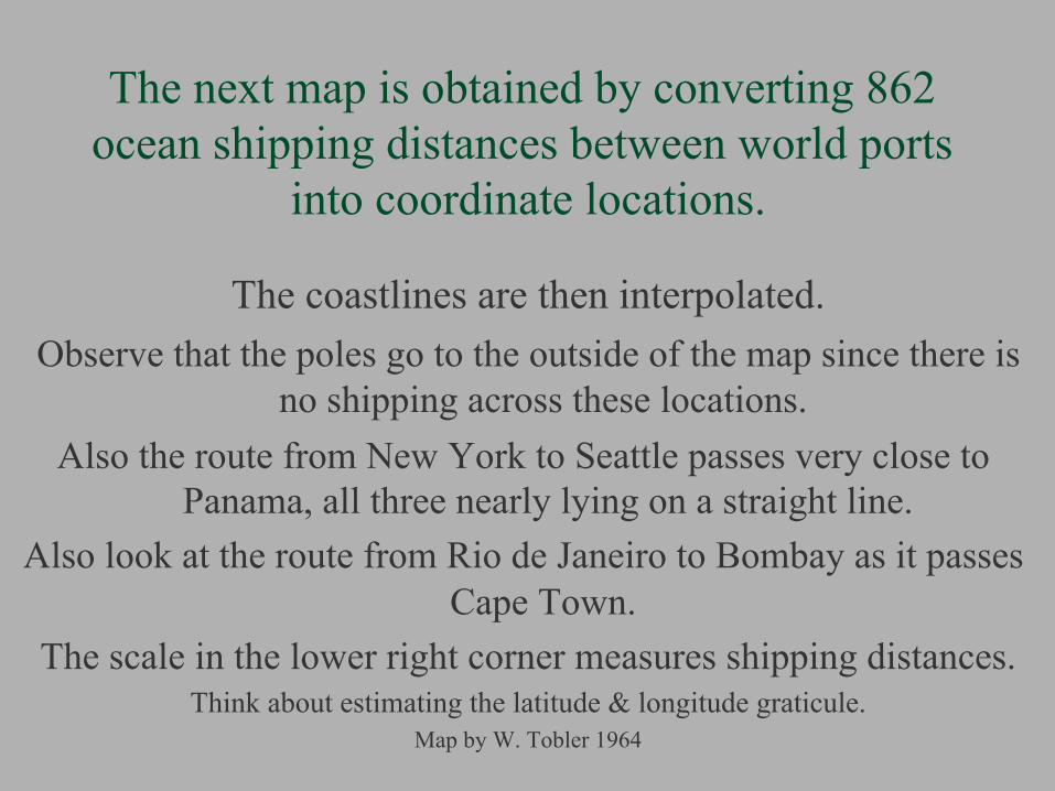
The next map is obtained by converting 862 ocean shipping distances between world ports
into coordinate locations. The coastlines are then interpolated.
Observe that the poles go to the outside of the map since there is no shipping across these locations.
Also the route from New York to Seattle passes very close to Panama, all three nearly lying on a straight line.
Also look at the route from Rio de Janeiro to Bombay as it passes Cape Town.
The scale in the lower right corner measures shipping distances. Think about estimating the latitude & longitude graticule.
Map by W. Tobler 1964

World Ocean Distances Map Based on Shipping Distances Between 42 Ports
Observe the scale bar in the lower right corner

The London Underground Map breaks the mold again, as did Mercator, this time by
not preserving the metric properties. Would Ptolemy be shocked?
The map preserves the topology, which is perhaps even more important.
And this famous distorted map serves a very useful purpose.
As evidenced by the many worldwide imitations, even though in 1933 H. Beck had a difficult time getting it accepted!

H. Beck’s 1933 Map Can, and has been, analyzed using Tissot’s method

Compare with the old underground map. From 1910
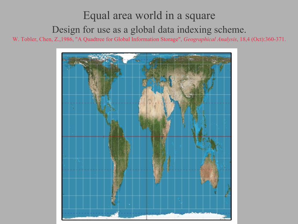
Equal area world in a square Design for use as a global data indexing scheme.
W. Tobler, Chen, Z.,1986, "A Quadtree for Global Information Storage", Geographical Analysis, 18,4 (Oct):360-371.

A Map Projection To Solve A Special Problem
The next illustration shows the U.S. population assembled into one degree latitude-longitude quadrilaterals instead of
ephemeral political units.
We would like to partition the U.S. into regions containing the same number of people.
There follows a map projection (anamorphose) that may be
useful for this problem.
Think political districting! Or central place theory!

US Population By One Degree Quadrilaterals The population is indicated by the height of cities

Now use the Transform-Solve-Invert paradigm
Transform the graticule, and map, to obtain areas of equal population.
Then position a hexagonal tesselation on the distorted map.
Then take the inverse transformation.
This partitions the US into approximately equal population areas.
W. Tobler, 1973, “A Continuous Transformation Useful for Districting”, Annals, N.Y Academy of Sciences, 219:215-220.
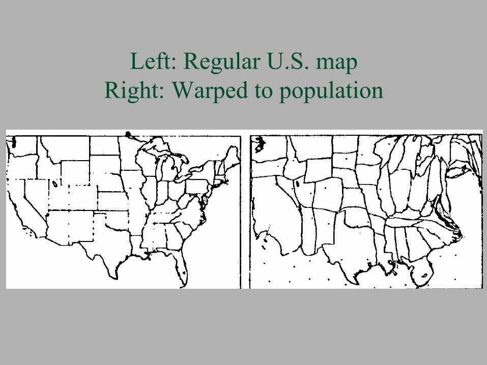
Left: Regular U.S. map Right: Warped to population

Left: One degree Latitude–Longitude cells Right: Same, warped by population

Right: Hexagons on population map. Left: Hexagons inverted to normal map.
To estimate equal population cells. Compare Nevada with California.


How to use area cartograms. As in the example just illustrated.
Cartograms are to be used just as is Mercator’s projection, that is, as a problem solving device.
As such, their primary purpose is not visualization, just as
the Mercator projection is not for visualization.
For epidemiologists and poll takers, after viewing their population of interest in the demographic-cartogram space,
devise a sampling scheme, then implement it using the inverse transformation.

Another class of distorted maps attempts to present a point of view
This may be to influence or it may be simply to reflect an opinion or to illustrate a property of the world.
The “Atlas of the Real World” contains many examples of this.
There are also many psychological caricatures of state’s views of the US.
(I have a large collection of the state post cards - but would appreciate your sending me more of them.)
Also included in this category is Steinbeck’s “The View from New York”
Every major city in the world has a replica.


Wallingford’s New Yorker’s View of America Dating from 1939 this is an example of a type of quasi-
psychological impression of a world view. Many of the tourists (and retirees) from New York travel to
Florida, thus it looms large. Spatial interaction and distance decay are easily recognized.
“Cousins live in the West - in Delaware”. Thus areal, angular, and distance distortion are all included.
Inversions, tearings of space, & topological violations, occur: Idaho is a city in the state of Oregon, which is to the North of
the state of Washington, etc. Wallingford, an architect, also did a “Bostonion’s View”.
This kind of map needs serious study as a thesis topic!.


A businessman wants taxes reduced in “important” states.


Every state seems to have at least one of these. Often as a postcard, in color, and “humorous”

The next map is “azimuthal”, in the sense that it focuses on a particular location and has a ‘fish eye
lens’ effect. Think of rotating a globe
until your home town is in the center in front of you.
Now take a picture of the globe in this position, thus simulating a map of the world centered on this location.
On such a map directions from the center are correct.
The distances from the center can be stretched.
Such maps are easy to make and are quite common.

Snyder’s Magnifying Glass Projection J.P.Snyder, 1987, “Magnifying Glass Azimuthal Map Projection”, Am. Cartographer, 14(1):61-68

Snyder’s Magnifying Glass Projection In the radial function display, with two scales and a discontinuity.

In studying migration about the Swedish city of Asby, Hägerstrand used the logarithm of
the actual distance as the radial scale. This enlarges the scale near the center of Asby, where most of the migration takes place.
The map nicely shows the spatial rate of change.
In other words, the distance decay function.
Plotting the migrations on the map allowed users to see, but more importantly to count, the instances of interest.
This is another instance of using a map projection as graph paper to solve a problem.
Actually, but not shown, there is a small hole in the middle of the map since the logarithm of zero is minus infinity.
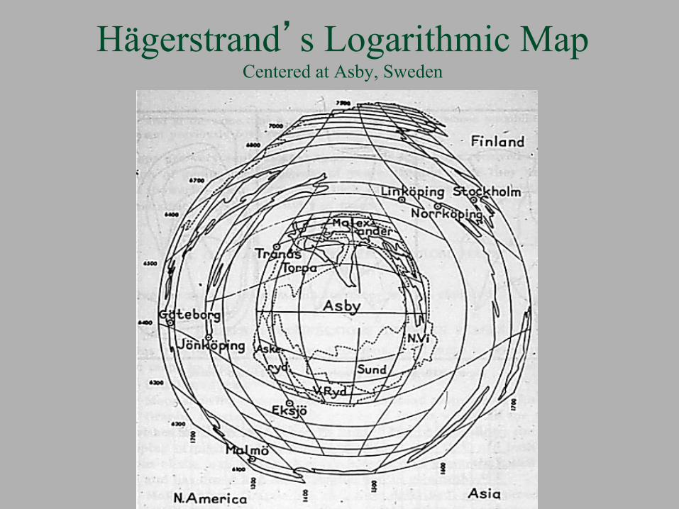
Hägerstrand’s Logarithmic Map Centered at Asby, Sweden

Hägerstrand’s Asby maps, with data

The Ultimate Azimuthal “Fish-Eye” Projections ρ is spherical distance. θ is direction.
Using quarter circles.
The myopic view r = (πρ/2 - (ρ/2)2)½
X = r sin θ, Y = r cos θ
The Anti-Myopic view
r = ½π - (π2/4 - (ρ/2)2)½
X = r sin θ, Y = r cos θ
Another possibility: use half an ellipse instead of quarter circles,

Draw Your Own I’ve drawn a quarter circle, but you can invent your own azimuthal map
projection.This one encourages myopia.

Or reverse the effect to combat myopia.

Experiment with this type of map.
Can you see how to get an azimuthal map with the following property:
Show the center and the periphery in reduced size,
and with the middle portion enlarged?
Or the opposite effect?


A New Yorker’s View Square root azimuthal projection, with obvious distortion

The View From Michigan with less obvious distortion


Centered at Santa Barbara, California
54

A variant of this type of map uses isochrones: travel times, or costs, from a center.
Travel times can be warped into circles. Use the orthogonals to the isolines as the directions.
This gives one a map in polar coordinates.

Travel time from center of Seattle as isochrones and then circles on the warped map.
after W. Bunge

But this can get complicated, as shown by a one hour distance circle around Liege

Parcel post rates in the United States are broken into distance zones.
The rate increases with distance at a decreasing rate.
This is a common downward convex tariff structure in transportation
The largest cost jump is in the first zone.
Within each zone the rate is constant.

Parcel postage rate classes from Seattle

The next map is an azimuthal map projection with all places shown at their correct direction from Seattle.
But the distance scale is in parcel postage cents. Look at the radial distance function in the lower right
hand corner of the map, where the x-axis is the spherical distance from Seattle, and the y-axis is the cost in dollars to send a one pound package
within the United States as a function of distance. The graph shows a step function and this collapses much
of the geographic space. The places are on the arcs! Spherical directions from Seattle are correct.
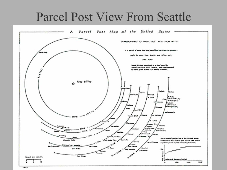
Parcel Post View From Seattle

Can other convex down transport systems be represented cartographically?
Consider the class of azimuthal map projections with radial equations
r = (ρ)1/n, n > 1, where ρ is the spherical distance and r is the map distance.
Can this be related to geographical distance decay?
Consider another map with Santa Barbara as center.

The Santa Barbaran View A cube root distance azimuthal projection

Consider first maps with correct distances from the center
The azimuthal equidistant projection comes to mind.
Then Add the equal area requirement.
To get Werner’s projection.

Werner’s Projection, from 1515 Distances from center (North Pole in this case) are correct
and areas are correctly rendered..

Oblique equidistant & equal area Werner projection Great circle from New York City through Seattle is the horizontal axis.
A rarely seen view, courtesy of R, Böhm.

Can a map with a different distance decay be made equal area? With a convex down transport function?
Try n = 2, square root distance decay. Then use
X = R(ρ)1/2 sin(λ sin ρ) Y = R(ρ)1/2 cos(λ sin ρ)
where R is the assumed earth radius and
λ is the longitude, ρ is spherical distance. The result is an equal area map projection
with shrinking distances.
But this map no longer preserves directions (azimuths)!

Equal Area Projection with Square Root Distances from Center
Polar Case

Next is the oblique case of this equal area projection, with the great circle from New York (at the center) passing through Seattle as a straight line.
Here are the coastlines.

Oblique Version Of The Previous Projection Centered on New York and Directed Toward Seattle
North orientation

Mercator’s projection is not the only one that can render loxodromes (rhumb lines) as straight lines and correct
directions But it is the only one that does it for all loxodromes.
The projection shown here has all loxodromes from one location as straight lines, going in their correct direction and with correct length.
This can be considered an azimuthal loxodromic projection. The present map is focused on 45 degrees north latitude and the Greenwich
meridian, near Le Havre. When centered on the equator the north and south hemispheres are
symmetrical. When centered at the pole this becomes the azimuthal equidistant projection.
W. Tobler, 1966, “Notes on Two Projections: Loximuthal and Two Point
Equidistant”, The Cartographic Journal, 87-89.
As an exercise, consider the possibility of a two-point loximuthal projection.

The Loximuthal Projection Centered off the west coast of France, at 45o N & 0o E

The result will look like the next map. This map could be analyzed using Tissot’s method.
Therefore the interstate highway system can be drawn as orthogonal equidistant lines on a map and the meridians and parallels bent to fit this.
Try it!
As you know, the even numbered highways of the US interstate system run East-West and the odd numbered ones run North-South.

US Highway Coordinates Student Drawing. Use it to travel?

Area Cartograms often depict political concepts. Numbers of members of congress by state.
Or the vote by party, sometimes colored in red or blue.
Expect one, or more, of these maps in the newspapers every
voting season.

Numbers of members of congress by state.

Area cartograms are anamorphoses - a form of map projection designed to solve or demonstrate particular
problems. They represent map area proportional to some
distribution on the earth, through a ‘uniformization’. This property, and the inversion, are useful in
studying distributions.
Cartograms are such a departure from Ptolemy that some people don’t even consider them maps.
The equations show that all equal area projections are a special case of area cartograms.
Area cartograms can also be displayed on a globe.


US Population Cartogram depicts states with sizes proportional to 1960 population.
The first computer generated cartogram, 1967, using a program written by W. Tobler.

World Population “Value-by-Area” Map A world map projection computed and rendered by Van Kreveld & Speckmann, 2007

There Are Many More Unusual Projections
Of these the strangest may be the retro azimuthals, on which the map may fold over on itself.
The size of the overlap, and the void,
depends on the latitude of the center.

A radio station was established at Rugby (UK) to broadcast a time signal to British colonies overseas. The equidistant retro-azimuthal projection was used to let the colonials know in which direction to point their radio antennas. The result, which served its purpose, resulted in a very strange map. Only the coordinate outline is shown here.
A. R. Hinks, 1929, “A retro-azimuthal equidistant projection of the whole sphere”, Geogr. J., 73(2):245-247.
E. A. Reeves, 1929, “A Chart Showing the true bearing of Rugby from
all Parts of the World, Geogr. J., 73:247-250

Hinks’ Retro Azimuthal Projection Centered at Rugby, UK

Retro-azimuthal projections show reverse directions to a center. This property can also be combined with correct
distances to the center.
J.I.Craig, 1910, Map Projections, Cairo, Ministry of Finance. E. Hammer, 1910, “Gegenazimutale Projektionen”,
Petermanns Mitteilungen, 56(3):153-155+Plate. C. F. Arden-Close, 1938, A polar retro azimuthal
projection”, Geogr. J., 92(6):536-537. D. A. King, 1999, World Maps for Finding the Direction
and Distance to Mecca, Leiden, Brill.

Here is a New Retro-Azimuthal Projection Centered at 20N, 40E, Close to Mecca
Mecca along top. Up is distance to Mecca, left to right is direction to Mecca. The map contains a hole and overlaps itself.

Ptolemy vindicated! The best spherical distance preserving map.
An “empirical” map projection. The projection is produced by covering the United States with a
lattice of latitude and longitude points, then computing the spherical distances between these points, and then computing plane coordinates for these points. The plane coordinates are computed to minimize, in the least squares sense, the difference between the plane distances and the spherical distances. The map information is then interpolated by cubic splining and drawn by computer using a ~10,000 coordinate digital file. The meridians are slightly curved, resulting in a ‘polyconic’ type map.
W. Tobler, 1971, “Numerical Approaches to Map Projections”, pp. 51-66 of I. Kretschmer, Studies in
Theoretical Cartography, Vienna, Deuticke

Optimal Distance Preserving Projection Of The Contiguous United States

Another ‘empirical’ map projection.
Instead of great circle distances one can
construct a map to preserve, in the least squares sense, loxodromic (rhumb line) distances, an hypothesis being that Portolan charts made prior to 1500 AD might have used such distances in their construction.
W. Tobler, 1971.

Mediterranean Sea Preserving Loxodromic Distances

Distance-Direction Diagram Distance from Santa Barbara read down. Direction from Santa Barbara read across.
The line across the top represents Santa Barbara.
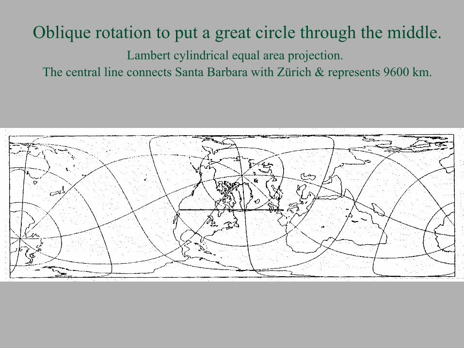
Oblique rotation to put a great circle through the middle. Lambert cylindrical equal area projection.
The central line connects Santa Barbara with Zürich & represents 9600 km.

Same view, just another map projection. Equal area within a square. The great circle arc connects 34°N, 120°W with 47.5°N, 8.5°E.

The azimuthal equidistant projection has the property that all distances from the center are rendered correctly, to scale. It is also possible to do this from two points, yielding the so-called two-point equidistant projection. The world map is then contained within an ellipse, the eccentricity of which depends on how far apart the two points are. The points are at the foci of the ellipse. Can you see why it must be an ellipse?* When the two points coincide the map is circular; when they are antipodal the map is a straight line. Distances from each node are hyperbolae. Azimuths are no longer correct, although there is also a map projection with directions correct from two points. C.F. Close, 1934, “A Doubly Equidistant Projection of the Sphere”,
Geogr. J., 83(2):144-145. *Recall the method of constructing an ellipse by fixing the ends of a length of string to two points on paper and then using a
pencil constrained by stretching the string to its limit to draw a shape.
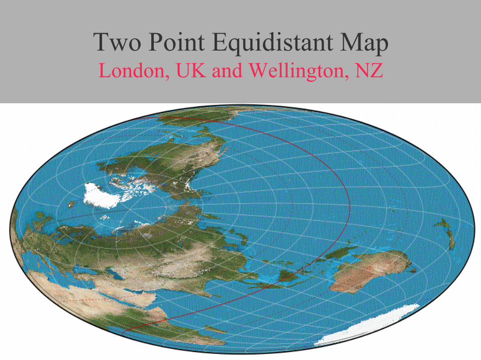
Two Point Equidistant Map London, UK and Wellington, NZ
W. Chamberlin, 1947, The Round Earth on Flat Paper, Washington D.C., Nat. Geogr. Soc.
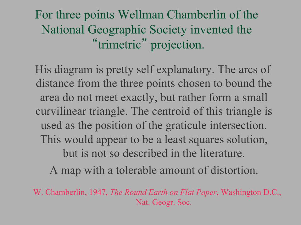
For three points Wellman Chamberlin of the National Geographic Society invented the
“trimetric” projection. His diagram is pretty self explanatory. The arcs of
distance from the three points chosen to bound the area do not meet exactly, but rather form a small
curvilinear triangle. The centroid of this triangle is used as the position of the graticule intersection. This would appear to be a least squares solution,
but is not so described in the literature. A map with a tolerable amount of distortion.

Constructing A Trimetric Projection

Trimetric Projection Nodes at: 40N, 110W; 40N, 70W; 25N, 95W

A really strange thing to want! It is possible to draw a map of the world on a Moebius strip. The map must be drawn on both sides of the paper, inverting the image on one side. Then twisting and gluing the ends together. The resulting map, when one uses a cylindrical projection, with the poles at the edges of the strip, has the curious property that a pin pushed through the map exits at the antipodal point.
W. Tobler, & Kumler, M., 1986, “Three World Maps on a Moebius Strip”, Cartography and Geographic Information Systems, 18(4):275-276.
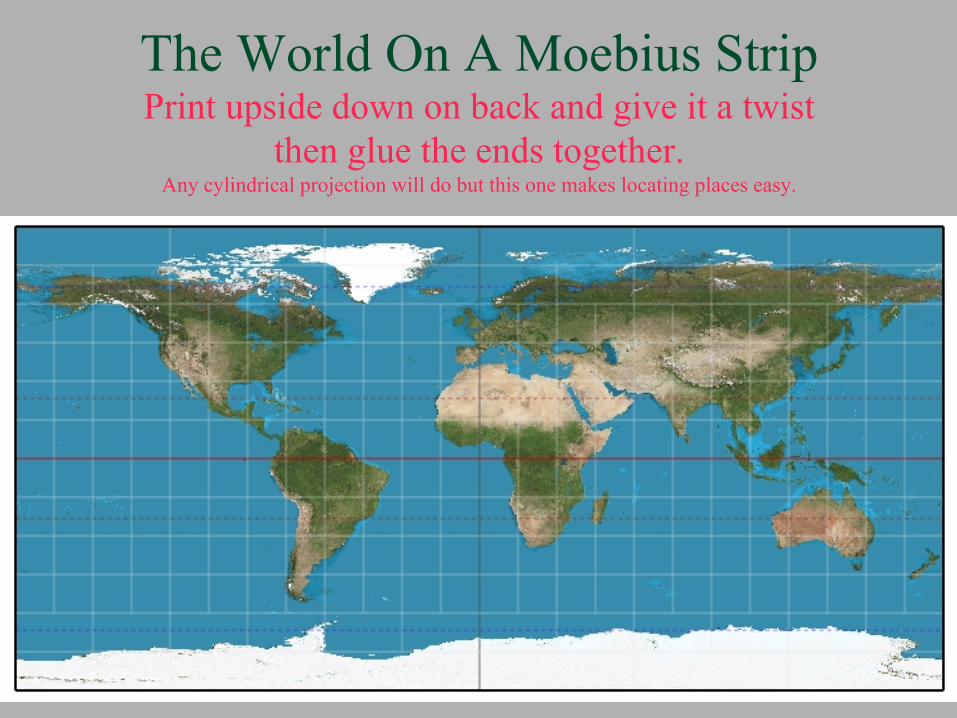
The World On A Moebius Strip Print upside down on back and give it a twist
then glue the ends together. Any cylindrical projection will do but this one makes locating places easy.
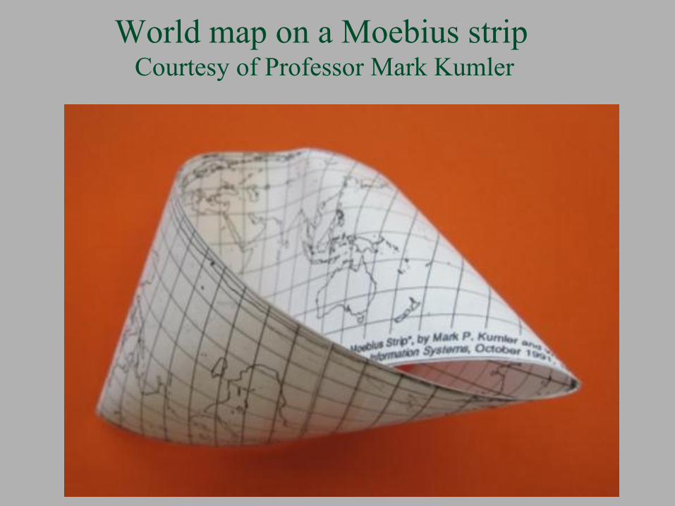
World map on a Moebius strip Courtesy of Professor Mark Kumler
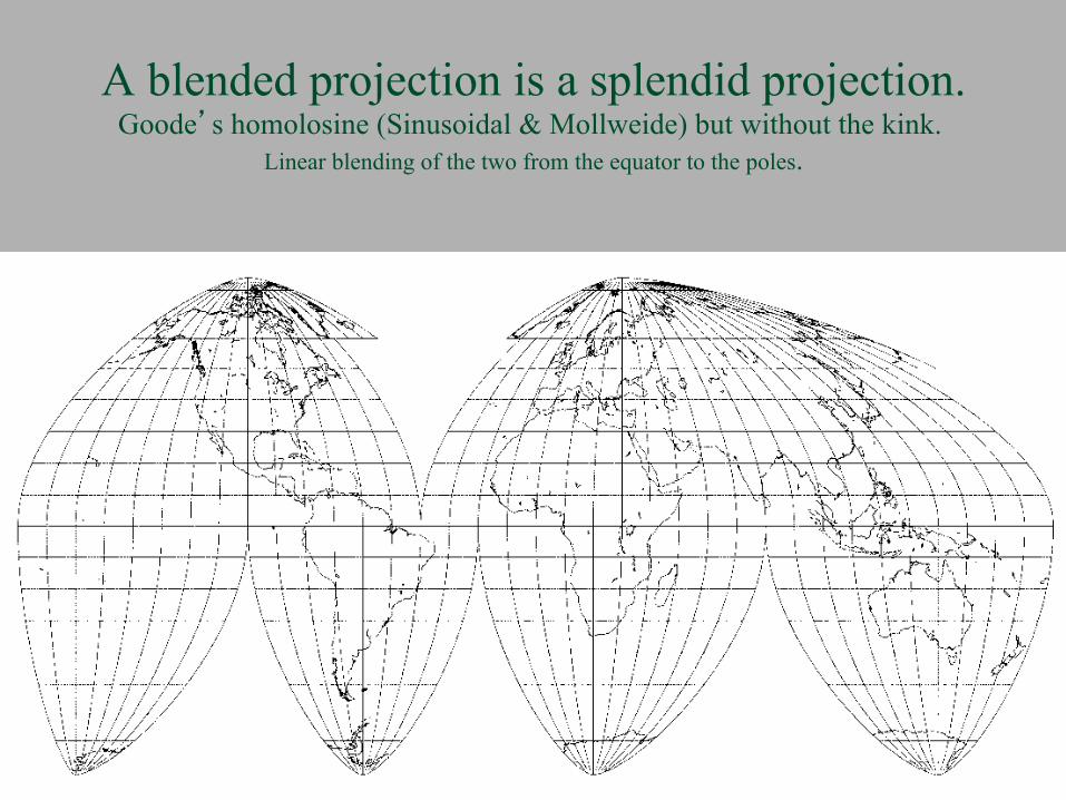
A blended projection is a splendid projection. Goode’s homolosine (Sinusoidal & Mollweide) but without the kink.
Linear blending of the two from the equator to the poles.

Minard’s 1864 Map of Wine Exports from France Move continents to make room for volume through Gibraltar..
What would Ptolemy think!

C. J. Minard compresses Africa to make way for coal British coal exports for 1864.
What would Ptolemy think of this one?
Thus far neglected were The gnomonic projection.
A classic “graph paper” projection. Which transforms great circles into straight lines.
And another classic The stereographic projection.
Which represents all spherical circles as circles. And
the Schmidt Net used by geologists (Lambert’s equal area azimuthal projection).

But not all Azimuthal Projections are Circular. Directions are correct from the intersection of Greenwich and the Equator. Based on an
idea by J. Craig, Cairo, 1910. The map could be centered anywhere, including your home town.

Another use of map projections.
Maps are frequently used in advertisements in newspapers and magazines.
As part of a design.
Thus one also finds unusual map projections In these publications.
Here’s one of several possibilities:

A haberdashery could use this to advertise ties.

Or perhaps this floppy one, which is a bit more elegant

Design for a Japanese Lantern Waldo Tobler & Miklos Pinter

Alternately, one of several possible Christmas ornaments. An equal area projection with latitude spacing as on the Mercator projection.

Maps on the five platonic solids have been known for a long time. They can be equal area or conformal. The gnomonic projection is particularly easy to do
on the surface of these solids.

Conformal facets for a map on an octahedron

Icosahedron Globe

An equal area map on a pyramid
Apparently a map on the surface of pyramid has never been done. The next illustration is a special case of an equal area projection having N pointed triangular protrusions on an N sided base. For three lobes the base is a triangle (this folds into a tetrahedron). With four lobes we get the pyramid. For six lobes the base is a hexagon, etc. All can be drawn with one computer program, with N as a parameter.
This item is a bonus, and does not solve any serious problem.
The gnomonic on a pyramid is easy. The stereographic works well for the conformal version.

An Equal Area Projection on a Pyramid Cut out and glue together

Equal area world on a pyramid.

Certainly there are more analytical uses of map transformations.
Send me suggestions for other projections to be displayed in this theme.
With sources and illustrations.
Thank you.

References: J. Breckman, 1962, “The Theory and use of B-Charts”, Radio Corporation of America, 18 pp J. Berggren, Jones, A., 2000, Ptolemy’s Geography, Princeton University Press. W. Chamberlin, 1947, The Round Earth on Flat Paper, Washington D.C., Nat. Geogr. Soc. C. Close, 1934, “A Doubly Equidistant Projection of the Sphere”, Geogr. J., 83(2):144-145. C. Arden-Close, 1938, “A polar retro azimuthal projection”, Geogr. J., 92(6):536-537. J. Craig, 1910, Map Projections, Cairo, Ministry of Finance. D. Dorling, et al, 2008, Atlas of the Real World, Thames & Hudson. A. Dürer, 1528, Vier Bücher von Menschlicher Proportionen, Nueremberg J. Gott, Mugnolo, C., Colley, W., 2007, “Map Projections Minimizing Distance
Errors”, Cartographica, 42(3): 291-234. P. Gould, White, R., 1974, Mental Maps, Penguin. T. Hagerstrand, 1957, “Migration and Area”, In: Migration in Sweden, D, Hannerberg,
ed., University of Lund. E. Hammer, 1910, “Gegenazimutale Projektionen”, Petermanns Mitteilungen, 56(3):
153-155+Plate. A. Hinks, 1929, “A retro-azimuthal equidistant projection of the whole sphere”, Geogr. J., 73(2):
245-247.

References, Continued B. Jenny, 2006, “Geometric distortion of schematic network maps”, Bulletin, Society of
Cartographers, 40: 15-18. D. King, 1999, World Maps for Finding the Direction and Distance to Mecca, Leiden, Brill. M. van Kreveld, Speckmann, B., 2007, “On Rectangular Cartograms”, Computational Geometry:
Theory & Applications, 37(3):175-187. K. Lynch, 1960, Image of the City, MIT. E. Reeves, 1929, “A Chart Showing the true bearing of Rugby from all Parts of the World,
Geogr. J., 73:247-250. M. Tissot, 1881, Memoire sur la representation des surfaces, Paris, Gautier Villars. W. Tobler, 1961, Map Transformations of Geographic Space, PhD Dissertation, Seattle. W. Tobler, 1966, “Notes on Two Projections: Loximuthal and Two Point Equidistant”, The Cartographic Journal, 87-89. W. Tobler, Chen, Z.,1986, "A Quadtree for Global Information Storage", Geographical Analysis,
18,4 (Oct):360-371. W. Tobler, & Kumler, M., 1986, “Three World Maps on a Moebius Strip”, Cartography and
Geographic Information Systems, 18(4):275-276. W. Tobler. 1996, “Thirty Five Years of Computer Cartograms”, Annals, AAG. W. Tobler, 2008, "Unusual Map Projections", Cartographic Perspectives, 59, 4-16. D. Tompson. 1917, On Growth and Form, Cambridge University Press.

Acknowledgement
Several of the colored world maps were produced using Daniel R. Strebe’s “Geocart” program.