BASKERVILLE - Zemni Imagesdesign.zemniimages.info/wp-content/uploads/2015/06/Typeface...History In...
83
BASKERVILLE Category Serif Classification Transitional Designer(s) Henry Baskerville Foundry Baskerville NB Here using Baskerville URW from Adobe Typekit Baskerville is a transitional serif typeface designed in 1757 by John Baskerville (1706–1775) in Birmingham, England. Baskerville is classified as a transitional typeface, positioned between the old style typefaces of William Caslon, and the newer styles of Giambattista Bodoni & Firmin Didot. References Wikipedia : Baskerville Font: The Sourcebook Black dog Publishing Pau and Berger eds: 30 Essential Typefaces for a Lifetime
Transcript of BASKERVILLE - Zemni Imagesdesign.zemniimages.info/wp-content/uploads/2015/06/Typeface...History In...

BASKERVILLE
Category SerifClassification Transitional Designer(s) Henry BaskervilleFoundry Baskerville
NB Here using Baskerville URW from Adobe Typekit
Baskerville is a transitional serif typeface designed in 1757 by John Baskerville (1706–1775) in Birmingham, England. Baskerville is classified as a transitional typeface, positioned between the old style typefaces of William Caslon, and the newer styles of Giambattista Bodoni & Firmin Didot.
ReferencesWikipedia : BaskervilleFont: The Sourcebook Black dog PublishingPau and Berger eds: 30 Essential Typefaces for a Lifetime

History
In Birmingham, England, Henry Baskerville ad-vanced the use of more delicate typefaces that could withstand the repeated poundings on the press. He also developed smoother paper so the typefaces could print without breaks or clogs. Had an airy quality due to the lightness of the letterforms and generosity of the page margins. Melted down his type after each printing.
Baskerville’s typeface was the culmination of a larg-er series of experiments to improve legibility which also included paper making and ink manufactur-ing. His background as a writing master is evident in the distinctive swash tail on the uppercase Q and in the cursive serifs in the Baskerville Italic.
In 1757, Baskerville published his first work, a col-lection of Virgil, which was followed by some fifty other classics. In 1758, he was appointed printer to the Cambridge University Press. It was there in 1763 that he published his master work, a folio Bible, which was printed using his own typeface, ink, and paper.
The perfection of his work seems to have unsettled his contemporaries, and some claimed the stark contrasts in his printing damaged the eyes. Abroad, however, he was much admired, notably by Pierre Simon Fournier, Giambattista Bodoni (who intend-ed at one point to come to England to work under him), and Benjamin Franklin.
After falling out of use with the onset of the modern typefaces such as Bodoni, Baskerville was revived in 1917 by Bruce Rogers, for the Harvard University Press and released by Deberny & Peignot.
Digital versions are available from Linotype, URW++, Monotype, and Bitstream as well as many others. The Baskerville typeface was used as the basis for theMrs Eaves typeface in 1996, de-signed by Zuzana Licko.
CharaCteristiCs
The Baskerville typeface is the result of John Baskerville’s intent to improve upon the types of William Caslon. He was aim-ing at simplicity and quiet refinement though:
• increasing the contrast between thick and thin strokes• making the serifs sharper and more tapered• shifting the axis of rounded letters to a more vertical position.• making curved strokes more circular in shape and making characters more regu-lar. • distinctive swash tail on the uppercase Q • cursive serifs in the Baskerville Italic.
These changes created a greater consisten-cy in size and form.
Regular Regular REGULAR
Italic Italic ITALIC
Bold Bold BOLD
Bold Italic Bold Italic BOLD ITALIC

A B C D E F G H I J K L M N O P Q R S T U V W X Y Za b c d e f g h i j k l m n o p q r s t u v w x y z1 2 3 4 5 6 7 8 9 0

20,000 LEAGUES UNDER THE SEAChapter 1 a shifting reef
The year 1866 was signalised by a remark-able incident, a mysterious and puzzling phenomenon, which doubtless no one has yet forgotten. Not to mention rumours which agitated the maritime population and excit-ed the public mind, even in the interior of continents, seafaring men were particularly excited.
The year 1866 was signalised by a remarkable inci-dent, a mysterious and puzzling phenomenon, which doubtless no one has yet forgotten. Not to mention rumours which agitated the maritime population and excited the public mind, even in the interior of continents, seafaring men were particularly excited.
The year 1866 was signalised by a remarkable incident, a mysterious and puzzling phenomenon, which doubtless no one has yet forgotten. Not to mention rumours which agitated the maritime population and excited the public mind, even in the interior of continents, seafaring men were particularly excited.
The year 1866 was signalised by a remarkable incident, a mysterious and puzzling phenomenon, which doubtless no one has yet forgotten. Not to mention rumours which agitated the maritime population and excited the public mind, even in the interior of continents, seafaring men were particularly excited.
The year 1866 was signalised by a remarkable incident, a mysterious and puzzling phenomenon, which doubtless no one has yet forgotten. Not to mention rumours which agitated the maritime population and excited the public mind, even in the interior of continents, seafaring men were particularly excited.
The year 1866 was signalised by a remarkable incident, a mysterious and puz-zling phenomenon, which doubtless no one has yet forgotten. Not to mention rumours which agitated the maritime population and excited the public mind, even in the interior of continents, seafaring men were particularly excited. Merchants, common sailors, captains of vessels, skippers, both of Europe and America, naval officers of all countries, and the Governments of several States on the two continents, were deeply interested in the matter.
The year 1866 was signalised by a remarkable incident, a mysterious and puzzling phenomenon, which doubtless no one has yet forgotten. Not to mention rumours which agitated the maritime population and excited the public mind, even in the interior of continents, seafaring men were particularly excited.
The year 1866 was signalised by a remarkable incident, a mysterious and puzzling phenomenon, which doubtless no one has yet forgotten. Not to mention rumours which agitated the maritime pop-ulation and excited the public mind, even in the interior of continents, seafaring men were particu-larly excited.
The year 1866 was signalised by a remarkable incident, a mysterious and puzzling phenome-non, which doubtless no one has yet forgotten. Not to mention rumours which agitated the maritime population and excited the public mind, even in the interior of continents, seafar-ing men were particularly excited.
The year 1866 was signalised by a re-markable incident, a mysterious and puzzling phenomenon, which doubtless no one has yet forgotten. Not to mention rumours which agitated the maritime population and excited the public mind,
The year 1866 was signalised by a remarkable incident, a mysterious and puzzling phenome-non, which doubtless no one has yet forgotten. Not to mention rumours which agitated the maritime population and excited the public
The year 1866 was signalised by a re-markable incident, a mysterious and puzzling phenomenon, which doubtless no one has yet forgotten. Not to mention rumours which agitated the maritime population and excited the public mind,


BODONICategory Serif
Classification Didone or modern, earlier ver-sions are transitional
Designer(s) Giambattista Bodoni
Date created 1795-8
Variations Berthold Bodoni Antiqua
LTC Bodoni 175
Linotype Bodoni
Bauer Bodoni
Filosofia
ReferencesWikipedia : BodoniFont: The Sourcebook Black dog PublishingPau and Berger eds: 30 Essential Typefaces for a Lifetime
http://www.christinelai.com/2014/10/bodoni-spec-imen-poster.html
Bodoni has been used for a wide variety of material, ranging from 18th century Italian books to 1960s periodicals.• Journal de Bruxelles, was a French revolutionary republic newspaper edited during the French occu-pation of Brussels.
In the 21st century, the late manner versions contin-ue to be used in advertising: • Poster Bodoni is used in Mamma Mia! posters.• Hilton Hotels for restaurant or bar menu content.• Sony's Columbia Records (owned by CBS from 1938 to 1989) utilizes Bodini for their wordmark.
• Nirvana's logo is written with Bodoni (specifically Bodoni Poster-Compressed).
• Bauer Bodoni Black is used for Carnegie Mellon University's wordmark.
• Bauer Bodoni Roman is used for Brandeis Uni-versity's wordmark.
• Tom Clancy used Bodoni font for the artwork of all his affiliated works until his novel Dead or Alive.
• A variation of Bodoni called "Postoni" is the primary headline font for The Washington Post newspaper.
• Roman Bauer Bodoni is used in Slow Food’s logotype
Early manner versions are occasionally used for fine book printing.• Bodoni was the favorite typeset of Ted Hughes, UK Poet Laureate, 1984–1998.
• used in Manila Bulletin's headline text until the early 2000s.

History
Bodoni refers to a series of serif typefaces first designed by Giambattista Bodoni (1740–1813) in 1798. Bodoni admired the work of John Baskerville increased stroke contrast and a more vertical axis but took them to a more extreme conclusion. He also studied in detail the designs of French type founders Pierre Simon Fournier and Firmin Didot.
Bodoni had a long career and his designs evolved and varied. He was an expert printer who ran a prestig-ious printing-office under the patronage of the Duke of Parma. The design of his type was permitted by and showcased the quality of his company’s work in metal-casting, printing and of the paper made in Parma.The hairline serifs and fine strokes reflected a high quality of casting, since on poor-quality printing equipment serifs had to be large to avoid wear snapping them.The smooth finish of his paper allowed fine detail to be retained on the surface. Bodoni also took care in the composition of his printing, using hierarchy and borders to create an appearance of elegance, and his range of type sizes allowed him flexibility of composi-tion. His these later designs are called “modern”, the earlier designs are “transitional”.
The version of Bodoni in primary use today was created between 1908 and 1915 by Morris Fuller Benton for American Type Founders Company.
Importance of optical sizes: The effective use of Bo-doni in modern printing poses challenges common to all Didone designs. Optical sizes were a natural requirement of printing technology at the time of Bodoni, who had to cut each size of type separately. Pantograph, phototypesetting and digital fonts made printing the same font at any size simpler. However while Bodoni can look very elegant due to the regu-lar, rational design and fine strokes, a known effect on readers is ‘dazzle’, where the thick verticals draw the reader’s attention and cause them to struggle to concentrate on the other, much thinner strokes that define which letter is which. For this reason, using the right optical size of font has been described as particularly essential to achieve professional results. Fonts to be used at text sizes will be sturdier designs with thicker ‘thin’ strokes and serifs (less stroke contrast) and more space between letters than on display designs, to increase legibility. Modern Bodoni revivals intended for professional use such as Parma-giano and ITC Bodoni have a range of optical sizes, but this is less common on default computer fonts.
Characteristics
Distinctive characteristics of Bodoni include:• overall geometric construction and rational axis - straight strokes that go against the natural handwriting curve.
• extreme contrast between thick and thin strokes - in the 18th Century Bodoni would have used a pointed quill that enabled writing to change quickly between thick and thin strokes.
• narrow underlying structure • flat, unbracketed serifs
Lower case:• Round dot over the letter i.• Double story a.
Upper case:• The tail of the Q is centered under the letter.• The J has a slight hook.• There are two versions of R, one with a straight tail and one with a curved tail.
Bodoni URW (used here)
Light Light oblique LIGHT LIGHT OBLIQUE
Regular Regular Oblique REGULAR REGULAR OBLIQUE
Medium Medium oblique MEDIUM MEDIUM OBLIQIE
Bold Bold Oblique BOLD BOLD OBLIQUE
Extra Bold Extra Bold Oblique EXTRA BOLD EXTRA BOLD OBLIQUE

A B C D E F G H I J K L M N O P Q R S T U V W X Y Za b c d e f g h i j k l m n o p q r s t u v w x y z
1 2 3 4 5 6 7 8 9 0

20,000 LEAGUES UNDER THE SEAChapter 1 a Shifting reef
The year 1866 was signalised by a remarkable inci-dent, a mysterious and puzzling phenomenon, which doubtless no one has yet forgotten. Not to mention rumours which agitated the maritime population and excited the public mind, even in the interior of continents, seafaring men were particularly excited. Merchants, common sailors, captains of vessels, skip-pers, both of Europe and America, naval officers of all countries, and the Governments of several States on the two continents, were deeply interested in the matter.
The year 1866 was signalised by a remarkable incident, a mysterious and puzzling phenomenon, which doubtless no one has yet forgotten. Not to mention rumours which agitated the maritime population and excited the public mind, even in the interior of continents, seafaring men were particularly excited. Merchants, common sailors, captains of vessels, skippers, both of Europe and Ameri-ca, naval officers of all countries, and the Governments of several States on the two continents, were deeply interest-ed in the matter.
The year 1866 was signalised by a remarkable incident, a mysterious and puzzling phenomenon, which doubtless no one has yet forgotten. Not to mention rumours which agitated the maritime population and excited the public mind, even in the interior of continents, seafaring men were particularly excited. Merchants, common sailors, captains of vessels, skippers, both of Europe and America, naval officers of all countries, and the Governments of several States on the two continents, were deeply interested in the matter.
The year 1866 was signalised by a remarkable incident, a mysterious and puzzling phenomenon, which doubtless no one has yet forgotten. Not to mention rumours which agitated the maritime population and excited the public mind, even in the interior of continents, seafaring men were particularly excited. Merchants, common sailors, captains of vessels, skippers, both of Europe and America, naval officers of all countries, and the Governments of several States on the two conti-nents, were deeply interested in the matter.
The year 1866 was signalised by a remarkable incident, a mysterious and puz-zling phenomenon, which doubtless no one has yet forgotten. Not to mention rumours which agitated the maritime population and excited the public mind, even in the interior of continents, seafaring men were particularly excited. Merchants, common sailors, captains of vessels, skippers, both of Europe and America, naval officers of all countries, and the Governments of several States on the two continents, were deeply interested in the matter.
The year 1866 was signalised by a remarkable incident, a mysterious and puzzling phenomenon, which doubtless no one has yet forgotten. Not to mention rumours which agitated the maritime population and excited the public mind, even in the interior of continents, seafaring men were particularly excited. Merchants, common sailors, captains of vessels, skippers, both of Europe and Ameri-ca, naval officers of all countries, and the Governments of several States on the two continents, were deeply interest-ed in the matter.
The year 1866 was signalised by a remarkable incident, a mysterious and puzzling phenomenon, which doubtless no one has yet forgotten. Not to mention rumours which agitated the maritime population and excited the public mind, even in the interior of continents, seafaring men were particularly excited. Merchants, common sailors, captains of vessels, skippers, both of Europe and Ameri-ca, naval officers of all countries, and the Governments of several States on the two continents, were deeply interest-ed in the matter.
The year 1866 was signalised by a remarkable incident, a mysterious and puzzling phenome-non, which doubtless no one has yet forgotten. Not to mention rumours which agitated the maritime population and excited the public mind, even in the interior of continents, sea-faring men were particularly excited.
Merchants, common sailors, captains of ves-sels, skippers, both of Europe and America, naval officers of all countries, and the Govern-ments of several States on the two continents, were deeply interested in the matter.
The year 1866 was signalised by a remark-able incident, a mysterious and puzzling phenomenon, which doubtless no one has yet forgotten. Not to mention rumours which agitated the maritime population and excit-ed the public mind, even in the interior of continents, seafaring men were particularly excited.
Merchants, common sailors, captains of ves-sels, skippers, both of Europe and America, naval officers of all countries, and the Gov-ernments of several States on the two conti-nents, were deeply interested in the matter.

Category SerifClassification Old Style
Designer(s) William Caslon IFoundry Caslon Type Foundry
Shown here: Adobe Caslon by Carol TwomblyCaslon
Will
iam
Cas
lon's 1
734
Speci
men
shee
t, so
me o
f whi
ch is
set i
n th
e Cas
lon ty
pefa
ce

Characteristics
Caslon is a group of serif typefaces de-signed by William Caslon I (1692–1766), and various revivals thereof.
Caslon shares the irregularity characteris-tic of Dutch Baroque types. It is charac-terized by:• short ascenders and descenders, • bracketed serifs, • moderately high contrast, • robust texture• moderate modulation of stroke. • The A has a concave hollow at the apex• the G is without a spur. • Caslon’s italics have a rhythmic cal-ligraphic stroke.
• Characters A, V, and W have an acute slant.
• The italic p, Q, v, w, and z all have a suggestion of a swash.
History
Caslon is cited as the first original typeface of Eng-lish origin. Caslon's earliest design dates to 1722. The Caslon legacy began in 1725 with the founding of the Caslon Type Foundry. In 1734, Caslon’s first one-page specimen was produced, illustrating forty-seven of his typefaces, including Caslon. The founts cut by Caslon and his son, were close copies of the Dutch Old face cut by Van Dyck. These founts were rather fashion-able at that time. The alternative founts they cut for text were a smaller, rather than a condensed letter.
The Caslon types were distributed throughout the British Empire, including British North America. Much of the decayed appearance of early American printing is thought to be due to oxidation caused by long expo-sure to seawater during transport from England to the Americas. Caslon's types were immediately successful and used in many historic documents, including the U.S. Declaration of Independence and the US constitution.
After William Caslon I’s death, the use of his types diminished, but had a revival between 1840–80 as a part of the British Arts and Crafts movement. The Caslon design is still widely used today. For many years a com-mon rule of thumb of printers and typesetters was When in doubt, use Caslon.
Several revivals of Caslon do not include a bold weight. This is because it was unusual to use bold weights in typesetting during the 18th century, and Caslon nev-er designed one. For emphasis, italics or a larger point size, and sometimes caps and small caps would be used instead.
It should be noted, that some revivals have little or nothing in common with the 18th century type cut by Caslon, besides the serifs and the name.
Revivals
With the rise of hot metal typesetting beginning at the close of the 19th century, existing foundry metal typefac-es such as Caslon's had to be adapted to specific type-setting technology. This was true again with phototype-setting, mostly in the 1960s and 1970s, and then again with digital typesetting technology, mostly since the mid-1980s. As a result of that, and the lack of trademark on the name "Caslon" by itself, there are many typefaces called "Caslon" with some other distinguishing element, which reproduce the original designs in varying degrees of faithfulness.
In 1990 Carol Twombly used the specimen pages of the late Caslon to update the font as Adobe Caslon Pro.
Regular REGULAR Regular
Italic ITALIC ItalIc
Semibold SEMIBOLD Semibold
Semibold italic SEMIBOLD ITALIC Semibold italic
Bold BOLD Bold
Bold Italic BOLD ITALIC Bold ItalIc

A B C D E F G H I J K L M N O P Q R S T U V W X Y Za b c d e f g h i j k l m n o p q r s t u v w x y z1 2 3 4 5 6 7 8 9 0

20,000 LEAGUES UNDER THE SEA
Chapter 1 a Shifting reef
The year 1866 was signalised by a remarkable incident, a mysterious and puzzling phe-nomenon, which doubtless no one has yet forgotten. Not to mention rumours which agitated the maritime population and excit-ed the public mind, even in the interior of continents, seafaring men were particularly excited.
The year 1866 was signalised by a remarkable inci-dent, a mysterious and puzzling phenomenon, which doubtless no one has yet forgotten. Not to mention rumours which agitated the maritime population and excited the public mind, even in the interior of conti-nents, seafaring men were particularly excited.
The year 1866 was signalised by a remarkable incident, a mysterious and puzzling phenomenon, which doubtless no one has yet forgotten. Not to mention rumours which agitated the maritime population and excited the public mind, even in the interior of continents, seafaring men were particularly excited.
The year 1866 was signalised by a remarkable incident, a mysterious and puzzling phenomenon, which doubtless no one has yet forgotten. Not to mention rumours which agitated the maritime population and excited the public mind, even in the interior of continents, seafaring men were particularly excited.
The year 1866 was signalised by a remarkable incident, a mysterious and puzzling phenomenon, which doubtless no one has yet forgotten. Not to mention rumours which agitated the maritime population and excited the public mind, even in the interior of continents, seafaring men were particularly excited.
The year 1866 was signalised by a remarkable incident, a mysterious and puz-zling phenomenon, which doubtless no one has yet forgotten. Not to mention rumours which agitated the maritime population and excited the public mind, even in the interior of continents, seafaring men were particularly excited. Merchants, common sailors, captains of vessels, skippers, both of Europe and America, naval officers of all countries, and the Governments of several States on the two continents, were deeply interested in the matter.
The year 1866 was signalised by a remarkable incident, a mysterious and puzzling phenomenon, which doubtless no one has yet forgotten. Not to mention rumours which agitated the maritime population and excited the public mind, even in the interior of continents, seafaring men were particularly excited. Merchants, common sailors, captains of vessels, skippers, both of Europe and America, naval officers of all countries, and the Governments of several States on the two continents, were deeply inter-ested in the matter.
The year 1866 was signalised by a remarkable incident, a mysterious and puzzling phenomenon, which doubtless no one has yet forgotten. Not to mention rumours which agitated the maritime population and excited the public mind, even in the interior of continents, seafaring men were particu-larly excited. Merchants, common sailors, captains of vessels, skippers, both of Europe and America, naval officers of all countries, and the Govern-ments of several States on the two continents, were deeply interested in the matter.
The year 1866 was signalised by a remarkable inci-dent, a mysterious and puzzling phenomenon, which doubtless no one has yet forgotten. Not to mention rumours which agitated the maritime population and excited the public mind, even in the interior of conti-nents, seafaring men were particularly excited. Mer-chants, common sailors, captains of vessels, skippers, both of Europe and America, naval officers of all coun-tries, and the Governments of several States on the two continents, were deeply interested in the matter.

Category SerifClassification Old-styleDesigner(s) ClaudeGaramond,JeanJannon
Garamond refers to a group of old-style serif typefaces based on Renaissance roman typefaces named after the punch-cutter Claude Garamont (also spelled as Garamond) (c. 1480–1561).
Garamond is considered to be among the most legible and reada-ble serif typefaces for use in print (offline) applications. • Used in textbooks and magazines. • The large picture books of Dr. Seuss are set in a version of
Garamond.• In 1988 British newspaper The Guardian redesigned its mast-
head to incorporate “The” in Garamond and “Guardian” in bold Helvetica. This led to a repopularising of Garamond in the UK.
• Nvidia uses it in their scientific PDF documents.• The Everyman’s Library publication of ‘The Divine Comedy is
set in twelve-point Garamond.• Until not long ago it was the main font used in Apple’s adver-
tising. Not being a multiple master font, stroke contrast in some characters was too light, and some of the interior counters appeared awkward. To address these problems, Apple commis-sioned ITC and Bitstream to develop a variant for their proprie-tary use that was similar in width and feeling, but addressed the digitally condensed version’s shortcomings. The fonts delivered to Apple were known as Apple Garamond.
• Many O’Reilly Media books are set in ITC Garamond Light.• The logo of clothing company Abercrombie & Fitch uses a
variation of the Garamond typeface.
Garamond
Original Roman design

History
Clause Garamond (1480-1561) was a punchcutter who created fonts for his own publishing business. He was the first designer to work independently of a print shop. The carefully drawn and geometrically proportioned Garamond fonts were influential in replacing Gothic handwritten style. and became the dominant style throughout Europe. The first Roman type designed by Claude Garamond was used in an edition of the Erasmus book Paraphrasis in Elegantiarum Libros Laurentii Vallae published in 1530. The Roman design was based on an Aldus Manutius type, De Aetna, cut in 1455 by Francesco Griffo. After Claude Garamond died in 1561, most of his punches and matrices were acquired by Christophe Plantin from Antwerp, the Le Bé type foundry and the Frankfurt foundry Egenolff-Berner. The only complete set of the original Garamond dies and matrices is at the Plantin-Moretus Museum, in Antwerp, Belgium.
But many of the Garamond faces used today are more closely related to the work of a later punch-cutter, Jean Jannon (1580-1635). In 1621, sixty years after Garamond’s death, the French printer Jean Jannon issued a specimen of typefaces that had some characteristics similar to the Garamond designs, though his letters were more asymmetrical and irregular in slope and axis. After the French government raided Jannon’s printing office, Cardinal Richelieu named Jannon’s type Caractère de l’Université (literally “Character of the University”), and it became the house style of Royal Printing Office. In 1825, the French National Printing Office adapted the type used by Royal Printing Office in the past, and claimed the type as the work of Claude Garamond. A typeface based on the work of Jannon was introduced at the Paris World’s Fair in 1900 as the ‘original Garamond’.
Throughout 20th century many foundries cast similar faces. A direct relationship with Garamond’s letterforms and contempo-rary type can be found in the Roman versions of:
Sabon:Sabon is an oldstyle serif typeface named after Gara-mond’s pupil Jean Sabon. Designed by Jan Tschichold in 1964, jointly released by Linotype, Monotype and Stempel in 1967.
AdobeGaramond:Released in 1989, Adobe Garamond is designed by Robert Slimbach for Adobe Systems, based on the Roman types of Garamond and the Italic types of Robert Gran-jon. The font family contains the regular, semibold, and bold weights. The OpenType version of the font family was released in 2000 as Adobe Garamond Pro, with enhanced support for alternate glyphs.
EBGaramond:Released in 2011 by Georg Duffner, EB Garamond is a free software version of Garamond released under the Open Font License and available through Google Fonts. Duffner based the design off of a specimen printed by Egelnoff-Berner in 1592, with italic and Greek characters based on Robert Granjon’s work, as well as the addition of Cyrillic characters. It is intended to include multiple optical weights, as of 2014 including fonts based on the 8 and 12 point forms on the specimen.
Characteristics
Garamond’s letterforms convey a sense of fluidity and consistency. Some unique characteristics in his letters are:• short characters and narrow strokes (compared to eg
Times New Roman)• the small bowl of the a • the small eye of the e. • long extenders and top serifs have a downward slope.
It has been noted that it uses much less ink than Times New Roman at a similar point size, a fact partially attributable to Garamond having shorter characters at the same point size compared to Times New Roman and also to Garamond’s narrower stroke widths. Garamond, along with Times New Roman and Century Gothic, has been identified by the GSA as a “toner-efficient” font.
Garamond
Regular REGULAR RegulaR
Italic ITALIC ItalIc
BoldBOLD Bold
Adobe Garamond Pro
Regular REGULAR Regular
Italic ITALIC ItalIc
Bold BOLD Bold
Bold italic BOLD ITALIC Bold italic

A B C D E F G H I J K L M N O P Q R S T U V W X Y Za b c d e f g h i j k l m n o p q r s t u v w x y z1 2 3 4 5 6 7 8 9 0
Garamond

A B C D E F G H I J K L M N O P Q R S T U V W X Y Za b c d e f g h i j k l m n o p q r s t u v w x y z1 2 3 4 5 6 7 8 9 0
Adobe Garamond Pro

Garamond
20,000LEAGUES UNDERTHESEAChapter 1 a Shifting reef
The year 1866 was signalised by a remarkable inci-dent, a mysterious and puzzling phenomenon, which doubtless no one has yet forgotten. Not to mention rumours which agitated the maritime population and excited the public mind, even in the interior of continents, seafaring men were particularly excited. Merchants, common sailors, captains of vessels, skip-pers, both of Europe and America, naval officers of all countries, and the Governments of several States on the two continents, were deeply interested in the matter.
The year 1866 was signalised by a remarkable incident, a mysterious and puzzling phenomenon, which doubtless no one has yet forgotten. Not to mention rumours which agitated the maritime population and excited the public mind, even in the interior of continents, seafaring men were particularly excited. Merchants, common sailors, cap-tains of vessels, skippers, both of Europe and America, naval officers of all countries, and the Governments of several States on the two continents, were deeply interest-ed in the matter.
The year 1866 was signalised by a remarkable incident, a mys-terious and puzzling phenomenon, which doubtless no one has yet forgotten. Not to mention rumours which agitated the maritime population and excited the public mind, even in the interior of continents, seafaring men were particularly excited. Merchants, common sailors, captains of vessels, skippers, both of Europe and America, naval officers of all countries, and the Governments of several States on the two continents, were deeply interested in the matter.
The year 1866 was signalised by a remarkable incident, a mysterious and puzzling phenomenon, which doubtless no one has yet forgotten. Not to mention rumours which agitated the maritime population and excited the public mind, even in the interior of continents, seafaring men were particularly excited. Merchants, common sailors, captains of vessels, skippers, both of Europe and America, naval officers of all countries, and the Governments of several States on the two conti-nents, were deeply interested in the matter.
The year 1866 was signalised by a remarkable incident, a mysterious and puz-zling phenomenon, which doubtless no one has yet forgotten. Not to mention rumours which agitated the maritime population and excited the public mind, even in the interior of continents, seafaring men were particularly excited. Merchants, common sailors, captains of vessels, skippers, both of Europe and America, naval officers of all countries, and the Governments of several States on the two continents, were deeply interested in the matter.
The year 1866 was signalised by a remarkable incident, a mysteri-ous and puzzling phenomenon, which doubtless no one has yet forgot-ten. Not to mention rumours which agitated the maritime population and excited the public mind, even in the interior of continents, seafaring men were particularly excited. Merchants, common sailors, captains of vessels, skippers, both of Europe and America, naval officers of all countries, and the Governments of several States on the two continents, were deeply interested in the matter.
Theyear1866wassignalisedbyaremarkableinci-dent,amysteriousandpuzzlingphenomenon,whichdoubtlessnoonehasyetforgotten.Nottomentionrumourswhichagitatedthemaritimepopulationandexcitedthepublicmind,evenintheinteriorof continents,seafaringmenwereparticularlyexcited.Merchants,commonsailors,captainsof vessels,skippers,bothof EuropeandAmerica,navalofficersof allcountries,andtheGovernmentsof severalStatesonthetwocontinents,weredeeplyinterestedinthematter.

Adobe Garamond
20,000 LEAGUES UNDER THE SEAChapter 1 a Shifting reef
The year 1866 was signalised by a remarkable inci-dent, a mysterious and puzzling phenomenon, which doubtless no one has yet forgotten. Not to mention rumours which agitated the maritime population and excited the public mind, even in the interior of continents, seafaring men were particularly excited. Merchants, common sailors, captains of vessels, skip-pers, both of Europe and America, naval officers of all countries, and the Governments of several States on the two continents, were deeply interested in the matter.
The year 1866 was signalised by a remarkable incident, a mysterious and puzzling phenomenon, which doubtless no one has yet forgotten. Not to mention rumours which agitated the maritime population and excited the public mind, even in the interior of continents, seafaring men were particularly excited. Merchants, common sailors, captains of vessels, skippers, both of Europe and America, naval officers of all countries, and the Governments of several States on the two continents, were deeply interest-ed in the matter.
The year 1866 was signalised by a remarkable incident, a mysterious and puzzling phenomenon, which doubtless no one has yet forgotten. Not to mention rumours which agitated the maritime population and excited the public mind, even in the interior of continents, seafaring men were particularly excited. Merchants, common sailors, captains of vessels, skippers, both of Europe and America, naval officers of all countries, and the Governments of several States on the two continents, were deep-ly interested in the matter.
The year 1866 was signalised by a remarkable incident, a mysterious and puzzling phenomenon, which doubtless no one has yet forgotten. Not to mention rumours which agitated the maritime population and excited the public mind, even in the interior of continents, seafaring men were particularly excited. Merchants, common sailors, captains of vessels, skippers, both of Europe and America, naval officers of all countries, and the Governments of several States on the two conti-nents, were deeply interested in the matter.
The year 1866 was signalised by a remarkable incident, a mysterious and puz-zling phenomenon, which doubtless no one has yet forgotten. Not to mention rumours which agitated the maritime population and excited the public mind, even in the interior of continents, seafaring men were particularly excited. Merchants, common sailors, captains of vessels, skippers, both of Europe and America, naval officers of all countries, and the Governments of several States on the two continents, were deeply interested in the matter.
The year 1866 was signalised by a remarkable incident, a mysterious and puzzling phenomenon, which doubtless no one has yet forgotten. Not to mention rumours which agitated the maritime population and excited the public mind, even in the interior of continents, seafaring men were particular-ly excited. Merchants, common sailors, captains of vessels, skippers, both of Europe and America, naval officers of all countries, and the Governments of several States on the two continents, were deeply interested in the matter.
The year 1866 was signalised by a remarkable incident, a mysterious and puzzling phenomenon, which doubt-less no one has yet forgotten. Not to mention rumours which agitated the maritime population and excited the public mind, even in the interior of continents, seafaring men were particularly excited.
Merchants, common sailors, captains of vessels, skip-pers, both of Europe and America, naval officers of all countries, and the Governments of several States on the two continents, were deeply interested in the matter.

MinionCategory Serif
Classification Garalde Old style serif based on late Renaissance period classic typefaces
Designer(s) Robert Slimbach
Company Linotype/Adobe Adobe has created over one hundred and for-
ty-three variations, ranging from basic styles to extended sweeping serif styles and even a set of
ornamental characters. Many other renowned type foundries have produced some version of the
Minion family
Date released 1990 by Linotype. The original Minion designs by Slimbach were up-
dated with Cyrillic editions in 1992 and OpenType® versions released in 2000.
The name Minion is derived from the traditional clas-sification and naming of typeface sizes, minion being a size in between brevier and nonpareil. It approxi-mates to a modern 7 point lettering size.
This typeface encapsulates the aesthetic appeal of the Renais-sance and the exceptional readability of typefaces of the day. The Minion design is an ideal typeface to use where high levels of legibility are required. Its clarity helps readability for both young and old.
• Ideal font for newspapers and newsletters trying to get as much copy onto every square inch of paper they can.
• Popular font for on-screen use.
• Where instructions have to be followed precisely – crit-ical applications where words cannot be misinterpreted eg operator manual for air traffic control. Packaging and newsletters are another potential application for the Min-ion typefaces.
• Several universities use Minion as their primary typeface in title and body text, including Wake Forest, Brown, Pur-due and Trinity College Dublin, Leiden University because it “… exhibits warmth and balance …”
• Academic and typographical publications: John Benja-min’s Publishing Company uses Minion in the body text of its journals and books. Robert Bringhurst’s The Elements of Typographic Style;. Zack Hart’s A Writer’s Coach: An Editor’s Guide to Words that Work; The Cambridge Gram-mar of the English Languag. Adobe Systems reference manuals PDF Reference third edition, InDesign 2.0 User Guide, FrameMaker 7.0 User Guide, etc.
• Marketing: used for packaging. Logo font for: The Ron Paul presidential campaign, 2012, Red Lobster, Ateneo Junior Marketing Association.
• Aesthetic: Stieg Larsson’s Millennium Trilogy; Scott Lynch’s The Republic of Thieves; Richard Dawkins’ The Greatest Show on Earth: The Evidence for Evolution;
References
http://www.fonts.com/font/adobe/minion
Wikipedia : Minion

CharacteristicsThe overall appearance of the Minion design is very much related to the aesthetic of mass-pro-duced publications of late Renaissance, noted for their elegant and attractive typefaces that were also highly readable. But there is an added touch of classic typography design to produce a crisper outline and print clarity not possible with older, inaccurate print machinery.
It comes in PostScript format, and supports ISO-Adobe character set. A unique feature is the support of Regular and Display optical sizes in Regular and Italic fonts.
The Minion design’s lowercase characters use old-style glyphs in keeping with its Baroque typeface roots. These are most noticeable on the lowercase “g” and “q”.
Subtle, but important, details allow the upper and lower case to match well and sit comfortably next to each other.
The strokes of the upper and lower case “y”, with its italicized narrowing of the secondary stroke, reinforce the strength of the primary stroke.
The letter “z” in both cases has the tell-tale heavy dropped serif and matching line thicknesses. Interestingly, the “Z” character has a thick stroke in perpendicularity to the “Y”, and though it may look a little odd on close examination, within a body of text it enhances readability by providing good differentiation between adjacent letters.
Adobe Minion Pr (shown here) An OpenType update of the original Minion family, released in 2000. The update is based on Minion MM but features slight changes to the selection of instances and modifications of the font metrics. The family comes with:
3 weights: each in roman and italic and caps: regular, semi-bold, bold then later 4, which adds Medium. The Black weight from Minion Black Expert was not included.
Regular Medium Semibold Bold
Italic Medium italic Semibold italic Bold italic
SLOPED CAPITALS BOLD ITALICSloped small capitals medium italic2 widths: regular and condensed
Bold Condensed Bold condensed italic
4 optical sizes : with different stroke contrasts and details, designed to opti-mize texts for specific applications:
Caption (6–8.4) Regular (8.4–13.0) Subhead (13.0–19.9 ) Display (19.9–72).
Glyphs: Each font includes the expert glyphs and dingbats that were previ-ously found in Minion Expert package (swashes available in italic fonts only), Cyrillic Glyphs from Minion Cyrillic.
Font families: supports Adobe CE, Adobe Western 2, Greek, Latin Extended, Vietnamese character sets.
VersionsMinion Expert: Minion Expert is a separate font package that include fonts containing small caps, ligatures, old style figures, and swash glyphs. There are also fonts for dingbats (Minion Ornaments), and a Black-weighted font (Minion Black Expert). Swash fonts are included for only the 2 lightest font weights. An ‘expert set’ font is used for older and simpler applications that cannot handle multiple text styles for the same letter (such as both lower-case letters and small caps) in the same font.
Minion Cyrillic Minion Cyrillic was designed in 1992 by Robert Slimbach and was conceived as a non-Latin counterpart to Slim-bach’s Minion typeface family. There were no Display-sized fonts, expert fonts, or Black-weighted fonts in this family.
Minion MM: The Multi Master version of the original Minion family, released in 1992. Commonly used in Adobe Acrobat to replace unknown fonts.
Minion Std Black An OpenType version of the Minion Black font, but includes features found in Expert versions of PostScript Minion Black fonts. In addition, character set was updated to support Adobe Western 2.
Minion Pro (featured here): An OpenType update of the original Minion family, released in 2000. The update is based on Minion MM but features slight changes to the selection of instances and modifications of the font metrics.
Minion Web: A TrueType version of Minion, designed for screen use. It supports ISO-Adobe character set. Version 1.00 of the font was distributed with Internet Explorer 4.0.
Minion Web Pr: An updated version of Minion Web, which supports Adobe CE and Adobe Western 2 character sets.
Minion Math and MnSymbol: Minion Math is a variant designed by Johannes Küster from typoma GmbH, for mathematical applications.[3][4] Minion Math family includes 20 fonts in 4 weights and 5 optical sizes each. An additional optical size ‘Tiny’ is added. The October 2011 version (1.020) contains about 2900 glyphs per font; it also added OpenType math features. Minion Math had a working title, typoma MnMath. The final form is expected to include all Unicode mathematical symbols and many additional symbols.
Minion in other font families: The Latin Minion glyphs are also used in other Adobe font families, including Adobe Arabic (Ara-bic), Adobe Hebrew (Hebrew), Adobe Thai (Thai), and Adobe Song (simplified Chinese).

A B C D E F G H I J K L M N O P Q R S T U V W X Y Za b c d e f g h i j k l m n o p q r s t u v w x y z
1 2 3 4 5 6 7 8 9 0

20,000 LEAGUES UNDER THE SEAChapter 1 A Shifting Reef
The year 1866 was signalised by a remarkable in-cident, a mysterious and puzzling phenomenon, which doubtless no one has yet forgotten. Not to mention rumours which agitated the maritime population and excited the public mind, even in the interior of continents, seafaring men were particularly excited.
The year 1866 was signalised by a remarkable incident, a mysterious and puzzling phenomenon, which doubtless no one has yet forgotten. Not to mention rumours which agitated the maritime population and excited the public mind, even in the interior of continents, seafaring men were particularly excited.
The year 1866 was signalised by a remarkable incident, a mys-terious and puzzling phenomenon, which doubtless no one has yet forgotten. Not to mention rumours which agitated the maritime population and excited the public mind, even in the interior of continents, seafaring men were particularly excited.
The year 1866 was signalised by a remarkable incident, a mysterious and puzzling phenomenon, which doubtless no one has yet forgot-ten. Not to mention rumours which agitated the maritime popula-tion and excited the public mind, even in the interior of continents, seafaring men were particularly excited.
The year 1866 was signalised by a remarkable incident, a mysterious and puzzling phenomenon, which doubtless no one has yet forgotten. Not to mention rumours which agitated the maritime population and excited the public mind, even in the interior of continents, seafaring men were particu-larly excited.
The year 1866 was signalised by a remarkable incident, a mysterious and puzzling phenomenon, which doubtless no one has yet forgotten. Not to mention rumours which agitated the maritime population and excited the public mind, even in the interior of continents, seafaring men were particularly excited. Merchants, common sailors, captains of vessels, skippers, both of Europe and America, naval officers of all countries, and the Governments of several States on the two continents, were deeply interested in the matter.
The year 1866 was signalised by a remarkable incident, a mysterious and puzzling phenomenon, which doubtless no one has yet forgotten. Not to mention rumours which agitated the maritime population and excited the public mind, even in the interior of continents, seafaring men were particularly excited.
The year 1866 was signalised by a remarkable incident, a mysterious and puzzling phenomenon, which doubtless no one has yet forgotten. Not to mention rumours which agitated the maritime population and excited the public mind, even in the interior of continents, seafaring men were particularly excited.
The year 1866 was signalised by a remarkable incident, a mysterious and puzzling phenomenon, which doubtless no one has yet forgotten. Not to mention rumours which agitated the maritime population and excited the public mind, even in the interior of continents, seafaring men were particularly excited.
The year 1866 was signalised by a remarkable incident, a mysterious and puzzling phenomenon, which doubtless no one has yet forgotten. Not to mention rumours which agitated the maritime population and excited the public mind, even in the interior of continents, seafaring men were particularly excited.
The year 1866 was signalised by a remarkable incident, a mysterious and puzzling phenomenon, which doubt-less no one has yet forgotten. Not to mention rumours which agitated the maritime population and excited the public mind, even in the interior of continents, seafar-ing men were particularly excited.
The year 1866 was signalised by a remarkable incident, a mysterious and puzzling phenomenon, which doubtless no one has yet forgotten. Not to mention rumours which agitated the maritime population and excited the public mind, even in the interior of continents, seafaring men were particularly excited.
The year 1866 was signalised by a remarkable incident, a mysterious and puzzling phenomenon, which doubt-less no one has yet forgotten. Not to mention rumours which agitated the maritime population and excited the public mind, even in the interior of continents, seafaring men were particularly excited.
The year 1866 was signalised by a remarkable incident, a mysterious and puzzling phenomenon, which doubt-less no one has yet forgotten. Not to mention rumours which agitated the maritime population and excited the public mind, even in the interior of continents, seafaring men were particularly excited.
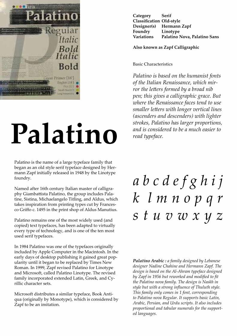
Basic Characteristics
Palatino is based on the humanist fonts of the Italian Renaissance, which mir-ror the letters formed by a broad nib pen; this gives a calligraphic grace. But where the Renaissance faces tend to use smaller letters with longer vertical lines (ascenders and descenders) with lighter strokes, Palatino has larger proportions, and is considered to be a much easier to read typeface.
Category SerifClassificationOld-styleDesigner(s) HermannZapfFoundry LinotypeVariations PalatinoNova,PalatinoSans
AlsoknownasZapfCalligraphic
PalatinoPalatino is the name of a large typeface family that began as an old style serif typeface designed by Her-mann Zapf initially released in 1948 by the Linotype foundry.
Named after 16th century Italian master of calligra-phy Giambattista Palatino, the group includes Pala-tine, Sistina, Michaelangelo Titling, and Aldus, which takes inspiration from printing types cut by Frances-co Griffo c. 1495 in the print shop of Aldus Manutius.
Palatino remains one of the most widely used (and copied) text typefaces, has been adapted to virtually every type of technology, and is one of the ten most used serif typefaces. In 1984 Palatino was one of the typefaces originally included by Apple Computer in the Macintosh. In the early days of desktop publishing it gained great pop-ularity until it began to be replaced by Times New Roman. In 1999, Zapf revised Palatino for Linotype and Microsoft, called Palatino Linotype. The revised family incorporated extended Latin, Greek, and Cy-rillic character sets.
Microsoft distributes a similar typeface, Book Anti-qua (originally by Monotype), which is considered by Zapf to be an imitation.
Palatino Arabic : a family designed by Lebanese designer Nadine Chahine and Hermann Zapf. The design is based on the Al-Ahram typeface designed by Zapf in 1956 but reworked and modified to fit the Palatino nova family. The design is Naskh in style but with a strong influence of Thuluth style. This family only comes in 1 font, corresponding to Palatino nova Regular. It supports basic Latin, Arabic, Persian, and Urdu scripts. It also includes proportional and tabular numerals for the support-ed languages.
a b c d e f g h i j k l m n o p q r s t u v w x y z

A B C D E F G H I J K L M N O P Q R S T U V W X Y Za b c d e f g h i j k l m n o p q r s t u v w x y z
1 2 3 4 5 6 7 8 9 0

20,000LEAGUES UNDERTHESEA
Chapter1AShiftingReefThe year 1866 was signalised by a re-markable incident, a mysterious and puzzling phenomenon, which doubtless no one has yet forgotten. Not to mention rumours which agitated the maritime population and excited the public mind, even in the interior of continents, seafar-ing men were particularly excited.
The year 1866 was signalised by a remarkable incident, a mysterious and puzzling phenome-non, which doubtless no one has yet forgotten. Not to mention rumours which agitated the maritime population and excited the public mind, even in the interior of continents, seafar-ing men were particularly excited.
The year 1866 was signalised by a remarkable incident, a mysterious and puzzling phenomenon, which doubtless no one has yet forgotten. Not to mention rumours which agitated the maritime population and excited the public mind, even in the interior of continents, seafaring men were particu-larly excited.
The year 1866 was signalised by a remarkable incident, a mysterious and puzzling phenomenon, which doubtless no one has yet forgotten. Not to mention rumours which agitated the maritime population and excited the public mind, even in the interior of continents, seafaring men were particularly excited.
The year 1866 was signalised by a remarkable incident, a mysterious and puzzling phenomenon, which doubtless no one has yet forgotten. Not to mention rumours which agitated the maritime population and excited the public mind, even in the interior of continents, seafaring men were particularly excited.
The year 1866 was signalised by a remarkable incident, a mysterious and puzzling phenomenon, which doubtless no one has yet forgotten. Not to mention rumours which agitated the maritime population and excited the public mind, even in the interior of continents, seafaring men were particularly excited. Merchants, common sailors, captains of vessels, skippers, both of Europe and America, naval officers of all countries, and the Governments of several States on the two continents, were deeply interested in the matter.
The year 1866 was signalised by a remarkable inci-dent, a mysterious and puzzling phenomenon, which doubtless no one has yet forgotten. Not to mention rumours which agitated the maritime population and excited the public mind, even in the interior of continents, seafaring men were particularly excit-ed. Merchants, common sailors, captains of vessels, skippers, both of Europe and America, naval officers of all countries, and the Governments of several States on the two continents, were deeply interested in the matter.
Theyear1866wassignalisedbyaremarkableincident,amysteriousandpuzzlingphenome-non,whichdoubtlessnoonehasyetforgotten.Nottomentionrumourswhichagitatedthemaritimepopulationandexcitedthepublicmind,evenintheinteriorofcontinents,sea-faringmenwereparticularlyexcited.Mer-chants,commonsailors,captainsofvessels,skippers,bothofEuropeandAmerica,navalofficersofallcountries,andtheGovernmentsofseveralStatesonthetwocontinents,weredeeplyinterestedinthematter.
The year 1866 was signalised by a remarkable incident, a mysterious and puzzling phenome-non, which doubtless no one has yet forgotten. Not to mention rumours which agitated the maritime population and excited the public mind, even in the interior of continents, seafar-ing men were particularly excited. Merchants, common sailors, captains of vessels, skippers, both of Europe and America, naval officers of all countries, and the Governments of several States on the two continents, were deeply inter-ested in the matter.
Palatino Hermann Zapf

20,000 LEAGUES UNDER THE SEA
Chapter 1 a Shifting reef
The year 1866 was signalised by a re-markable incident, a mysterious and puzzling phenomenon, which doubtless no one has yet forgotten. Not to mention rumours which agitated the maritime population and excited the public mind, even in the interior of continents, seafar-ing men were particularly excited.
The year 1866 was signalised by a remarkable incident, a mysterious and puzzling phenome-non, which doubtless no one has yet forgotten. Not to mention rumours which agitated the maritime population and excited the public mind, even in the interior of continents, seafar-ing men were particularly excited.
The year 1866 was signalised by a remarkable incident, a mysterious and puzzling phenomenon, which doubtless no one has yet forgotten. Not to mention rumours which agitated the maritime population and excited the public mind, even in the interior of continents, seafaring men were particu-larly excited.
The year 1866 was signalised by a remarkable incident, a mysterious and puzzling phenomenon, which doubtless no one has yet forgotten. Not to mention rumours which agitated the maritime population and excited the public mind, even in the interior of continents, seafaring men were particularly excited.
The year 1866 was signalised by a remarkable incident, a mysterious and puzzling phenomenon, which doubtless no one has yet forgotten. Not to mention rumours which agitated the maritime population and excited the public mind, even in the interior of continents, seafaring men were particularly excited.
The year 1866 was signalised by a remarkable incident, a mysterious and puzzling phenomenon, which doubtless no one has yet forgotten. Not to mention rumours which agitated the maritime population and excited the public mind, even in the interior of continents, seafaring men were particularly excited. Merchants, common sailors, captains of vessels, skippers, both of Europe and America, naval officers of all countries, and the Governments of several States on the two continents, were deeply interested in the matter.
The year 1866 was signalised by a remarkable inci-dent, a mysterious and puzzling phenomenon, which doubtless no one has yet forgotten. Not to mention rumours which agitated the maritime population and excited the public mind, even in the interior of continents, seafaring men were particularly excit-ed. Merchants, common sailors, captains of vessels, skippers, both of Europe and America, naval officers of all countries, and the Governments of several States on the two continents, were deeply interested in the matter.
The year 1866 was signalised by a remarkable incident, a mysterious and puzzling phenome-non, which doubtless no one has yet forgotten. Not to mention rumours which agitated the maritime population and excited the public mind, even in the interior of continents, sea-faring men were particularly excited. Mer-chants, common sailors, captains of vessels, skippers, both of Europe and America, naval officers of all countries, and the Governments of several States on the two continents, were deeply interested in the matter.
The year 1866 was signalised by a remarkable incident, a mysterious and puzzling phenome-non, which doubtless no one has yet forgotten. Not to mention rumours which agitated the maritime population and excited the public mind, even in the interior of continents, seafar-ing men were particularly excited. Merchants, common sailors, captains of vessels, skippers, both of Europe and America, naval officers of all countries, and the Governments of several States on the two continents, were deeply inter-ested in the matter.
Book Antiqua Microsoft

Serif Typefaces
What is serif?
Other Terms Used

History

Classification
Old Style
Old style or humanist typefaces date back to 1465, shortly after Johannes Gutenberg’s adoption of the movable type printing press. Early printers in Italy created types that broke with Gutenberg’s blackletter printing, creating upright and later italic styles inspired by Renaissance calligraphy.Old style serif fonts have remained popular for setting body text because of their excellent readability on book paper. The increasing interest in early printing during the late nineteenth and early twentieth centuries saw a return to the designs of the earliest printers, many of whose names and designs are still used today. Old style faces are sub-divided into Venetian (or humanist) and Garalde (or Aldine), a division made on the Vox-ATypI classification system.
Humanist
The style is characterized by:• a lack of large differences between thick and thin lines (low line contrast) • a diagonal stress (the thinnest parts of letters are at an angle rather than at the top and bottom). An old style font normally has a left-inclining curve axis with weight stress at about 8 and 2 o’clock; • serifs are almost always bracketed (they have curves which connect the serif to the stroke); • head serifs are often angled.• an ‘e’ where the cross stroke is angled, not horizon-tal, a slightly more irregular design, following the work of Nicolas Jenson
Examples of Venetian old style typefaces are
Adobe Jenson
Arno
Centaur (not avaiolablenon Typekit).
Garalde
Examples of Garalde old style typefaces are:
GaramondCaslonMinion
Palatino Goudy Old Style
Also: Bembo, Ehrhardt, Galliard, Granjon, Janson, Renard, Sabon, Scala and VandenKeere.
Transitional
Transitional or baroque serif typefaces first appeared in the mid-18th century, although many of the most famous transitional designs are later creations in the same style. Fonts from this period include
Baskerville
Fournier, Bulmer
More recent fonts in the same style include
Times New Roman (1932) Bookman CenturyGeorgia and Plantin.
They are in between modern and old style, thus the name “transitional.” • Differences between thick and thin lines are more pronounced than they are in old style, but they are still less dramatic than they are in modern serif fonts.• Stress is more likely to be vertical. • The ends of many strokes are marked not by blunt or angled serifs but by ball terminals. Later 18th century transitional typefaces in Britain begin to show influences of Didone typefaces from Europe.
Modern or Didone
Didone or Modern serif typefaces, which first emerged in the late 18th century, are characterized by:• extreme contrast between thick and thin lines.• a vertical stress • long and fine serifs, with minimal bracketing (con-stant width). • Serifs tend to be very thin and vertical lines very heavy. Many Didone fonts are less readable than transi-tional or old style serif typefaces.
Period examples include BodoniDidot

and Walbaum, while Computer Modern is a popular contemporary example.
Didone typefaces are among the earliest designed for ‘display’ use. The period of Didone types’ greatest popularity coincided with the rapid spread of printed posters and commercial ephemera and the arrival of bold type. In print, Didone fonts are often used on high-gloss magazine paper for magazines such as Harper’s Bazaar, where the paper retains the detail of their high contrast well, and for whose image a crisp, ‘European’ design of type may be considered appropriate.
Slab serif
Slab serif typefaces date to about 1800. Originally intended as attention-grabbing designs for posters, they have:• very thick serifs, which tend to be as thick as the vertical lines themselves. Because of the clear, bold nature of the large serifs, slab serif designs are often used for posters and in small print. Many early slab serif types, being intended for posters, only come in bold styles with the key differentiation being width, and often have no lower-case letters at all.
Slab serif fonts vary considerably: some such as
• Rockwell have a geometric design with minimal variation in stroke width: they are sometimes described as sans-serif fonts with added serifs.
• the “Clarendon” model have a structure more like most other serif fonts, though with larger and more obvious serifs.These designs may have bracketed serifs which increase width along their length.
Many monospace fonts, on which all characters occupy the same amount of horizontal space as in a typewriter, are slab serif designs. While not always purely slab-serif designs, many fonts intended for newspaper use have large slab-like serifs for clearer reading on poor-quality paper.
Courier Fira Mono from MozillaAnonymous Proare examples of newspaper and small print-orientated typefaces with some slab serif characteristics, often most visible in the bold weights.

Times New Roman
Category SerifClassification TransitionalDesigner(s) Victor LardentCommissioned by The TimesFoundry MonotypeDate released 1931License Proprietary
Although no longer used by The Times, Times New Roman is still frequent in book typography, particularly in mass-mar-ket paperbacks in the United States. Especially because of its adoption in Microsoft products, it has become one of the most widely used typefaces in history.• Microsoft has distributed Times New Roman with every
copy of Microsoft Windows since version 3.1,[23] and the typeface is used as the default in many applications for MS Windows, especially word processors and Web browsers. (Calibri became the default font for Microsoft Word begin-ning with Microsoft Office 2007).
• Linotype's Times Roman is the default Apple Mac OS X font for serif/roman generic font family and is installed by default in Mac OS X. Monotype's Times New Roman is installed by default only in latest versions of Mac OS X (e.g. 10.5).
• The United States Department of State announced that as of 1 February 2004, all US diplomatic documents would use 14 pitch (sic) Times New Roman instead of the previous 12 point (equivalent to 10 pitch) Courier New.
• Researchers in 2008 found that satirical readings of text printed in Times New Roman were perceived as more funny and angry than those printed in Arial.
Category SerifClassification TransitionalDesigner(s) VictorLardentFoundry Monotype

History
Times New Roman is a serif typeface commissioned by the British newspaper The Times in 1931, created by Victor Lardent at the English branch of Monotype.It was commissioned after Stanley Morison had written an article criticizing The Times for being badly print-ed and typographically antiquated.The font was su-pervised by Morison and drawn by Victor Lardent, an artist from the advertising department of The Times. Morison based his design on the Plantin typeface redesign of 1913, the original design of which goes back on the 16th century Garamond typeface. But made revisions for legibility and economy of space.
Morison’s revision became known as Times New Ro-man and made its debut in the 3 October 1932 issue of The Times newspaper.After one year, the design was released for commercial sale. The Times stayed with Times New Roman for 40 years, but new production techniques and the format change from broadsheet to tabloid in 2004 have caused the newspaper to switch font five times since 1972. However, all the new fonts have been variants of the original New Roman font.
Because of its popularity, the typeface has been influ-ential in the subsequent development of a number of serif typefaces both before and after the start of the digital-font era.
Characteristics
Based on Plantin and Perpetua.
‘The new types for the Times will tend towards the ‘modern,’ though the body of the letter will be more or less old-face in appearance’.
Characterised by the varied rhythm between thick strokes and fine hairlines, and between the various movements of the stems, bowls and stresses.
Regular REGULAR Regular Italic ITALIC Italic
Bold BOLD Bold
Bold Italic BOLD ITALIC Bold Italic
Because of its popularity, Times New Roman has been influential in the subsequent development of a number of serif typefaces both before and after the start of the digi-tal-font era. Georgia has very similar stroke shapes to Times New Roman but wider serifs.
Because of its popularity, Times New Roman has been influential in the subsequent development of a number of serif typefaces both before and after the start of the digi-tal-font era. Georgia has very similar stroke shapes to Times New Roman but wider serifs.
Because of its popularity, Times New Roman has been influential in the subsequent development of a number of serif type-faces both before and after the start of the digital-font era. Georgia has very simi-lar stroke shapes to Times New Roman but wider serifs.
Because of its popularity, Times New Roman has been influential in the subsequent development of a number of serif typefaces both before and after the start of the digital-font era. One notable example is Georgia, shown below, which has very similar stroke shapes to Times New Roman but wider serifs.
Because of its popularity, tTimes New Roman has been influential in the subsequent development of a number of serif typefaces both before and after the start of the digital-font era. One notable example is Georgia, shown be-low, which has very similar stroke shapes to Times New Roman but wider serifs.
Because of its popularity, Times New Roman has been influential in the subsequent development of a number of serif typefaces both before and after the start of the digital-font era. One no-table example is Georgia, shown below, which has very similar stroke shapes to Times New Roman but wider serifs.
Times New Roman 12pt
Georgia 12pt

A B C D E F G H I J K L M N O P Q R S T U V W X Y Za b c d e f g h i j k l m n o p q r s t u v w x y z
1 2 3 4 5 6 7 8 9 0

20,000 LEAGUES UNDER THE SEA
Chapter 1 A Shifting Reef
The year 1866 was signalised by a remark-able incident, a mysterious and puzzling phenomenon, which doubtless no one has yet forgotten. Not to mention rumours which agitated the maritime population and excit-ed the public mind, even in the interior of continents, seafaring men were particularly excited.
The year 1866 was signalised by a remarkable inci-dent, a mysterious and puzzling phenomenon, which doubtless no one has yet forgotten. Not to mention rumours which agitated the maritime population and excited the public mind, even in the interior of conti-nents, seafaring men were particularly excited.
The year 1866 was signalised by a remarkable incident, a mysterious and puzzling phenomenon, which doubtless no one has yet forgotten. Not to mention rumours which agitated the maritime population and excited the public mind, even in the interior of continents, seafaring men were particularly excited.
The year 1866 was signalised by a remarkable incident, a mysterious and puzzling phenomenon, which doubtless no one has yet forgotten. Not to mention rumours which agitated the maritime population and excited the public mind, even in the interior of continents, seafaring men were particularly excited.
The year 1866 was signalised by a remarkable incident, a mysterious and puzzling phenomenon, which doubtless no one has yet forgotten. Not to mention rumours which agitated the maritime population and excited the public mind, even in the interior of continents, seafaring men were particularly excited.
The year 1866 was signalised by a remarkable incident, a mysterious and puz-zling phenomenon, which doubtless no one has yet forgotten. Not to mention rumours which agitated the maritime population and excited the public mind, even in the interior of continents, seafaring men were particularly excited. Merchants, common sailors, captains of vessels, skippers, both of Europe and America, naval officers of all countries, and the Governments of several States on the two continents, were deeply interested in the matter.
The year 1866 was signalised by a remarkable inci-dent, a mysterious and puzzling phenomenon, which doubtless no one has yet forgotten. Not to mention rumours which agitated the maritime population and excited the public mind, even in the interior of continents, seafaring men were particularly excited. Merchants, common sailors, captains of vessels, skippers, both of Europe and America, naval officers of all countries, and the Governments of several States on the two continents, were deeply interested in the matter.
The year 1866 was signalised by a remarkable incident, a mysterious and puzzling phenomenon, which doubtless no one has yet forgotten. Not to mention rumours which agitated the maritime population and excited the public mind, even in the interior of continents, seafaring men were particularly excited. Merchants, common sailors, captains of vessels, skippers, both of Europe and America, naval officers of all countries, and the Governments of several States on the two conti-nents, were deeply interested in the matter.
The year 1866 was signalised by a remarkable incident, a mysterious and puzzling phenomenon, which doubtless no one has yet forgotten. Not to mention rumours which agitated the maritime population and excited the public mind, even in the interior of continents, seafaring men were particu-larly excited. Merchants, common sailors, captains of vessels, skippers, both of Europe and America, naval officers of all countries, and the Govern-ments of several States on the two continents, were deeply interested in the matter.

Sans Serif Typefaces
What is sans serif?
In typography, a sans-serif, sans serif, gothic, san serif or simply sans typeface is one that does not have the small projecting features called “serifs” at the end of strokes. The term comes from the French word sans, meaning “without” and “serif” from the Dutch word schreef meaning “line”.
Uses
Sans-serif fonts tend to have less line width vari-ation than serif fonts.
In print, sans-serif fonts are often used for head-lines rather than for body text.
Sans-serif fonts have become the most prevalent for display of text on computer screens. This is partly because interlaced screens have shown twittering on the fine details of the horizontal serifs. Additionally, on lower-resolution digital displays, fine details like serifs may disappear or appear too large.
Other Terms Used
Egyptian: The term was first used by Joseph Farington after seeing the sans serif inscription on John Flaxman’s memorial to Isaac Hawkins Brown in 1805, though today the term is com-monly used to refer to slab serif, not sans serif.Antique: In about 1817, the Figgins foundry in London made a type with square or slab-serifs which it called ‘Antique’, and that name was adopted by most of the British and US type-founders. Grotesque: It was originally coined by William Thorowgood of Fann Street Foundry in 1832. The name came from the Italian word ‘grottes-co’, meaning ‘belonging to the cave’. In Germa-ny, the name became Grotesk. Doric: It was the term first used by H. W. Caslon Foundry in Chiswell Street in 1870 to describe various stressed sans-serif fonts. Gothic: Not to be confused with blackletter typeface, the term was used mainly by Ameri-can type founders. The term probably derived from the architectural definition, which is nei-ther Greek nor Roman, and from the extended adjective term of “Germany”, which was the place where sans-serif typefaces became popu-lar in 19th to 20th century.
Recent terms
Lineale, or linear: The term was defined by typographic historian Maximilien Vox in the VOX-ATypI classification to describe sans-serif types. Later, in British Standards Classification of Typefaces (BS 2961:1967), lineale replaced sans-serif as classification name.Simplices: In Jean Alessandrini’s désignations préliminaries (preliminary designations), sim-plices (plain typefaces) is used to describe sans-serif on the basis that the name ‘lineal’ refers to lines, whereas, in reality, all typefaces are made of lines, including those that are not lineals.Swiss: It is used as a synonym to sans-serif, as opposed to roman (serif) in The OpenDoc-ument format (ISO/IEC 26300:2006) and Rich Text Format.

History
The first sans-serif types were developed in the 18th century to represent ancient inscriptions. Thus, Thomas Dempster’s De Etruria regali libri VII (1723), used special types intended for the representation of Etruscan epigraphy, and in c. 1745, Caslon foundry made Etruscan types for pamphlets written by Etruscan scholar John Swinton. Architects like John Soane used sans-serif letters on his drawings and architec-tural designs incorporating ancient Greek and Roman elements. By 1816, the Ordnance Survey began to use ‘Egyptian’ type, which was print-ed using copper plate engraving of monoline sans-serif capital letters, to name ancient Ro-man sites.
An interesting development was the 1786 rounded sans-serif font developed by Valentin Haüy in his book titled “Essai sur l’éducation des aveugles” (An Essay on the Education of the Blind). The purpose of this font was to be invis-ible and address accessibility. It was designed to emboss paper and allow the blind to read with their fingers. The design was eventually known as Haüy type.
Early-19th-century commercial sign writers and engravers modified the sans-serif styles of neoclassical designers to include the uneven stroke weights found in serif Roman fonts, pro-ducing sans-serif letters. In London, ‘Egyptian’ lettering was popular due to their clarity and legibility at distance in advertising and display use, when printed very large or very small. Much early sans-serif signage was not actually printed but hand-painted or lettered, since large
signs were difficult to print but could easily be painted by hand.
Sans-serif letters began to appear in printed media as early as 1805, in European Magazine. Because sans-serif type was often used for headings and commercial printing, many early sans-serif designs did not feature lower-case letters. The first Grotesque typeface complete with lower-case letters was probably cast by the Schelter & Giesecke Foundry as early as 1825. The term sans-serif was first employed in 1832 by Vincent Figgins. The first use of sans serif as a running text is believed to be the short book-let Feste des Lebens und der Kunst: eine Betra-chtung des Theaters als höchsten Kultursymbols (Celebration of Life and Art: A Consideration of the Theater as the Highest Symbol of a Cul-ture),by Peter Behrens, in 1900.
Through the early twentieth century, an increase in popularity of sans-serif fonts took place as more artistic and complex designs were created. By the mid-century, neo-grotesque fonts such as Univers and Helvetica had become popular through offering a more unified range of styles than on previous designs, allowing a wider range of text to be set artistically through setting headings and body text in a single font.
With digital media sans serifs have become increasingly important because of their higher onscreen legibilibity. Desire for both brand dis-tinctiveness and brand consistency across both printed and web designs have led to increasing innovation and blurring of distinctions between serif and sans serif fonts.

Classification
For the purposes of type classification, sans-serif designs are usually divided into three or four major groups:
Grotesque
This group features the early (19th century to early 20th) sans-serif designs. Influenced by Didone serif fonts of the period and signpainting, these were often quite solid, bold designs suitable for headlines and advertisements. Because for this purpose they were not needed, many did not feature a lower case or italics. They were some-times released by width, with a range of widths from extended to normal to condensed, with each style different, meaning to modern eyes they can look quite irregular and eccentric. Grotesque fonts have a vertical axis and limited variation of stroke width (often none perceptible in capitals). The terminals of curves are usually horizontal, and many have a spurred “G” and an “R” with a curled leg.The term realist has also been applied to grotesque designs due to their practicality and simplicity. Most avoid having a true italic in favour of a more restrained oblique or sloped design, although at least some did have true italics
Examples of grotesque fonts include Akzidenz Grotesk, Franklin Gothic and Monotype Gro-tesque, though some digital releases of these reduce their eccentricities in order to make them more suitable to modern tastes. Akzidenz Grotesk Old Face, Knockout by Hoefler & Frere-Jones and Monotype Grotesque are examples of digital fonts that retain the characteristics of early sans-serif types.
Neo-grotesque
As the name implies, these modern designs consist of a direct evolution of grotesque types. They are relatively straightforward in appear-ance with limited width variation. Unlike earlier grotesque designs, many were issued in ex-tremely large and versatile families from the time of release, making them easier to use for body text.
The story of neo-grotesque types began in the 1950s with the emergence of the International
Typographic Style, or Swiss style. Its members looked at the clear lines of Akzidenz Grotesk (1896) as an inspiration to create rational, al-most neutral typefaces. In 1957 the release of Helvetica, Univers, and Folio, the first typefac-es categorized as neo-grotesque, had a strong impact internationally:
Helvetica came to be the most used typeface for the following decades (available on Mac).
Arial produced as an alternative (copy?) of Helvetica by Microsoft to avoid license fees.
Bell Centennial produced for telephone books
Other examples no longer freely available in-clude: Rail Alphabet, Highway Gothic, MS Sans Serif.
Geometric
As their name suggests, Geometric sans-serif typefac-es are based on geometric shapes, like near-perfect circle and square. Note the optically circular letter “O” and the simple construction of the lowercase letter “a”. Of these four categories, geometric fonts tend to be the least useful for body text.
The geometric sans is strongly associated with the Bauhaus art school (1919-1933). Two early efforts in designing geometric types were made by Herbert Bayer and Jakob Erbar, who worked respectively on Universal Typeface (unreleased at the time but revived digitally as Architype Bayer) and Erbar (circa 1925).
In 1927 Futura, by Paul Renner, was released to great acclaim and popularity. This also inspired the later Avenir (designed by Frutiger in 1989 and available on Mac).
Geometric sans-serif fonts were popular from the 1920s and 30s due to their clean, modern design, and many new geometric designs and revivals have been created since. Other examples include:
Century Gothic
Other examples no longer freely available include Kabel, Nobel, ITC Avant Garde, Gotham and Dro-gowskaz not available.

Humanist
These are the most calligraphic of the sans-serif typefaces. Humanist sans serif designs expanded greatly during the 1980s and 1990s, partly as a reaction against the overwhelming popularity of Helvetica and Univers. Many take extensive inspiration from serif fonts, with true italic designs, ligatures and even swashes in italic.
Designs proliferated in 1970s and 1980s also due to the need for legible fonts on low-reso-lution computer displays. Humanist sans-serif designs are often particularly legible on screen or at distance due to their wide aper-tures or separation between strokes.
Humanist designs vary more than gothic or geometric designs.
Some are more geometric. One of the earli-est humanist designs was Johnston (Edward Johnston, 1916), and, a decade later, Gill Sans (Eric Gill, 1928 and available on Mac). Edward Johnston, a calligrapher by profession, was inspired by classic letter forms. The capitals, like Roman capitals are often based on per-fect squares, half-squares and circles. These somewhat architectural designs may feel too stiff for body text.
Some have stroke modulation (strokes that clearly vary in width along their line) or alter-nating thick and thin strokes. These include Lydian Stellar, Rotis SemiSans, and most pop-
ularly Hermann Zapf’s Optima (1958 and ava-lable on Mac), a typeface expressly designed to be suitable for both display and body text. Others such as Syntax and Goudy Sans may more resemble handwriting or calligraphy.
Frutiger, designed in 1976 and the model for Segoe, has been particularly influential, as designs intended to be particularly legible above all other design considerations.
Typefaces designed for print from 1980s and 1990s include:
Myriad
FF Meta, , Thesis, Charlotte Sans and Scala Sans
Typefaces created for computer use include Microsoft’s
Tahoma
Trebuchet
Verdana
Calibri
Corbel
as well as Lucida Grande, Fira Sans and Droid Sans.
Other
Due to the diversity of sans-serif typefaces, many do not fit neatly into the above catego-ries. For example, Neuzeit S has both neo-gro-tesque and geometric influences, as does Her-man Zapf’s URW Grotesk, while Klavika blends humanist and geometric influences. A particular subgenre of sans-serifs is those with stroke contrast, which have been called ‘modulated’ sans-serifs and are often placed within the hu-manist genre. These may take inspiration from calligraphy, grotesque or humanist designs.

Category: Sans-serifClassification: Neo-grotesque sans-serif
Designers: Robin Nicholas, Patricia SaundersFoundry: Monotype Imaging
Date released: 1982License: Proprietary
Design based on: Monotype Grotesque, Helvetica
ArialArial is an extremely versa-tile family of typefaces which can be used for text setting in reports, presentations, magazines etc, and for dis-play use in newspapers, ad-vertising and promotions.
Contemporary
UNIVERSALversatile
Authoritative
cool, calm & collected
NOTES:
Arial is not included as one of the 30 Essential Typefaces for a Lifetime or in Font: The Sourcebook. Both of which include Helvetica.
A 2010 Princeton University study involving presenting students with text in a font slightly more difficult to read found that they consistently re-tained more information from material displayed in so-called disfluent or ugly fonts (Monotype Corsiva, Hae-ttenschweiler, Comic Sans Italicized were used) than in a simple, more readable font such as Arial.
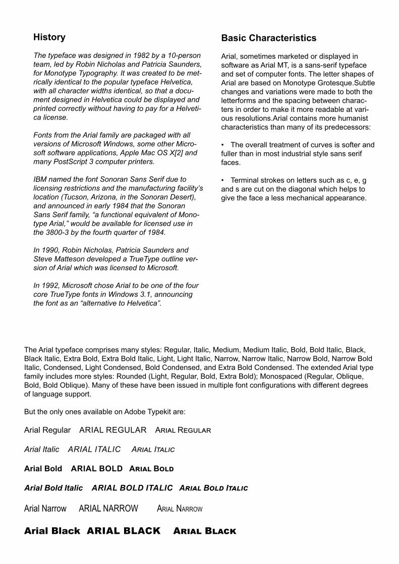
Basic Characteristics
Arial, sometimes marketed or displayed in software as Arial MT, is a sans-serif typeface and set of computer fonts. The letter shapes of Arial are based on Monotype Grotesque.Subtle changes and variations were made to both the letterforms and the spacing between charac-ters in order to make it more readable at vari-ous resolutions.Arial contains more humanist characteristics than many of its predecessors: • The overall treatment of curves is softer and fuller than in most industrial style sans serif faces.
• Terminal strokes on letters such as c, e, g and s are cut on the diagonal which helps to give the face a less mechanical appearance.
History
The typeface was designed in 1982 by a 10-person team, led by Robin Nicholas and Patricia Saunders, for Monotype Typography. It was created to be met-rically identical to the popular typeface Helvetica, with all character widths identical, so that a docu-ment designed in Helvetica could be displayed and printed correctly without having to pay for a Helveti-ca license.
Fonts from the Arial family are packaged with all versions of Microsoft Windows, some other Micro-soft software applications, Apple Mac OS X[2] and many PostScript 3 computer printers.
IBM named the font Sonoran Sans Serif due to licensing restrictions and the manufacturing facility’s location (Tucson, Arizona, in the Sonoran Desert), and announced in early 1984 that the Sonoran Sans Serif family, “a functional equivalent of Mono-type Arial,” would be available for licensed use in the 3800-3 by the fourth quarter of 1984.
In 1990, Robin Nicholas, Patricia Saunders and Steve Matteson developed a TrueType outline ver-sion of Arial which was licensed to Microsoft.
In 1992, Microsoft chose Arial to be one of the four core TrueType fonts in Windows 3.1, announcing the font as an “alternative to Helvetica”.
The Arial typeface comprises many styles: Regular, Italic, Medium, Medium Italic, Bold, Bold Italic, Black, Black Italic, Extra Bold, Extra Bold Italic, Light, Light Italic, Narrow, Narrow Italic, Narrow Bold, Narrow Bold Italic, Condensed, Light Condensed, Bold Condensed, and Extra Bold Condensed. The extended Arial type family includes more styles: Rounded (Light, Regular, Bold, Extra Bold); Monospaced (Regular, Oblique, Bold, Bold Oblique). Many of these have been issued in multiple font configurations with different degrees of language support.
But the only ones available on Adobe Typekit are:
Arial Regular ARIAL REGULAR Arial Regular
Arial Italic ARIAL ITALIC Arial Italic
Arial Bold ARIAL BOLD Arial Bold
Arial Bold Italic ARIAL BOLD ITALIC Arial Bold Italic
Arial Narrow ARIAL NARROW AriAl NArrow
Arial Black ARIAL BLACK Arial Black

A B C D E F G H I J K L M N O P Q R S T U V W X Y Za b c d e f g h i j k l m n o p q r s t u v w x y z1 2 3 4 5 6 7 8 9 0

20,000 LEAGUES UNDER THE SEAChapter 1 A Shifting Reef
The year 1866 was signalised by a re-markable incident, a mysterious and puzzling phenomenon, which doubtless no one has yet forgotten. Not to mention rumours which agitated the maritime population and excited the public mind, even in the interior of continents, seafar-ing men were particularly excited.
The year 1866 was signalised by a remarkable incident, a mysterious and puzzling phenome-non, which doubtless no one has yet forgotten. Not to mention rumours which agitated the mar-itime population and excited the public mind, even in the interior of continents, seafaring men were particularly excited.
The year 1866 was signalised by a remarkable incident, a mysterious and puzzling phenomenon, which doubtless no one has yet forgotten. Not to mention rumours which agitated the maritime pop-ulation and excited the public mind, even in the interior of continents, seafaring men were particular-ly excited.
The year 1866 was signalised by a remarkable incident, a mysterious and puzzling phenomenon, which doubtless no one has yet forgotten. Not to mention rumours which agitated the maritime population and excited the public mind, even in the interior of continents, seafaring men were particularly excited.
The year 1866 was signalised by a remarkable incident, a mys-terious and puzzling phenomenon, which doubtless no one has yet forgotten. Not to mention rumours which agitated the mari-time population and excited the public mind, even in the interior of continents, seafaring men were particularly excited.
The year 1866 was signalised by a remarkable incident, a mysterious and puzzling phenomenon, which doubtless no one has yet forgotten. Not to mention rumours which agitated the maritime population and excited the public mind, even in the interior of continents, seafaring men were particularly excited. Merchants, common sailors, captains of vessels, skippers, both of Europe and America, naval officers of all countries, and the Governments of several States on the two continents, were deeply interested in the matter.
The year 1866 was signalised by a remarkable incident, a mysterious and puzzling phenomenon, which doubtless no one has yet forgotten. Not to mention rumours which agitated the maritime population and excited the public mind, even in the interior of continents, seafaring men were particularly excited. (Narrow)
Not to mention rumours which agitated the maritime population and excited the public mind, even in the interior of con-tinents, seafaring men were particularly excited.
The year 1866 was signalised by a remarkable incident, a mysterious and puzzling phenomenon, which doubt-less no one has yet forgotten. Not to mention rumours which agitated the maritime population and excited the public mind,even in the interior of continents, seafaring men were par-ticularly excited. (Bold)
The year 1866 was signalised by a remarkable incident, a myste-rious and puzzling phenomenon, which doubtless no one has yet forgotten. Not to mention ru-mours which agitated the mari-time population and excited the public even in the interior of con-tinents, seafaring men were par-ticularly excited. (Black)

Category Sans-serif
Designer Matthew Carter Commissioned by AT&T
Foundry Mergenthaler Linotype
Precursor: Bell Gothic
Date created 1975–8
Prior to 1937 telephone books were printed in a variety of typefaces.
Bell Gothic was designed in 1937 by Chauncey H Griffith for use in American telephone directories. Bell Gothic created very readable blocks of very small text and is still ideal for communicating large amounts of information on a single page. Bell Gothic was used till 1970s but new printing technology compromised its readabiity.
Bell Centennial as designed in 1978 by Matthew Carter for hundredth anniversary of AT&T Corpo-ration.
The text needed to be legible at very small sizes and be economical with space. An increase in counter spaces increased legibility and curved terminals helped define the stroke.
The high speed printing process for telephone newsprint meant that the typeface should also take into account any ink spread or ‘dot’ gain. Ink traps or ‘notches’ were exaggerated on letters x, w and k in order to preserve the shape in adverse printing conditions.
Bell Centennial
BELL BELL BELL BELL
BELL BELL BELL BELL
BELL BELL BELL BELL
BELL BELL BELL BELL

BellBellBellBellBellBell
Bell Centennial12345678910Bold Listing 30pt12345678910Bold Listing 14pt
Name and Number 30pt12345678910Name and Number 14pt
Subcaption 30pt12345678910Subcaption 14pt
Address 30pt12345678910Address 14pt
Linda Mayoux61, Cheney Way,Cambridge CB41UETel 01223 501030E-mail [email protected]
Linda Mayoux61, Cheney Way,Cambridge CB41UETel 01223 501030E-mail [email protected]
Linda Mayoux61, Cheney Way,
Cambridge CB41UETel 01223 501030
E-mail [email protected]
Linda Mayoux61, Cheney Way,
Cambridge CB41UETel 01223 501030
E-mail [email protected]

A B C D E F G H I J K L M N O P Q R S T U V W X Y Za b c d e f g h i j k l m n o p q r s t u v w x y z1 2 3 4 5 6 7 8 9 0

20,000 LEAGUES UNDER THE SEAChapter 1 a Shifting reef
The year 1866 was signalised by a remarkable incident, a mysterious and puzzling phenomenon, which doubtless no one has yet forgotten. Not to mention rumours which agitated the maritime population and excited the public mind, even in the interior of continents, seafaring men were particularly excited.
The year 1866 was signalised by a remarkable incident, a mysterious and puzzling phenomenon, which doubtless no one has yet forgotten. Not to mention rumours which agitated the maritime population and excited the public mind, even in the interior of continents, seafaring men were particularly excited.
The year 1866 was signalised by a remarkable incident, a mysterious and puzzling phenomenon, which doubtless no one has yet forgotten. Not to mention rumours which agitated the maritime population and excited the public mind, even in the interior of continents, seafaring men were particularly excited.
The year 1866 was signalised by a remarkable incident, a mysterious and puzzling phenomenon, which doubtless no one has yet forgotten. Not to mention rumours which agitated the maritime population and excited the public mind, even in the interior of continents, seafaring men were particularly excited.
The year 1866 was signalised by a remarkable incident, a mysterious and puz-zling phenomenon, which doubtless no one has yet forgotten. Not to mention rumours which agitated the maritime population and excited the public mind, even in the interior of continents, seafaring men were particularly excited.
The year 1866 was signalised by a remarkable incident, a mysterious and puzzling phenomenon, which doubtless no one has yet forgotten. Not to mention rumours which agitated the maritime population and excited the public mind, even in the interior of continents, seafaring men were particularly excited. Merchants, common sailors, cap-tains of vessels, skippers, both of Europe and America, naval officers of all countries, and the Governments of several States on the two continents, were deeply interested in the matter.
The year 1866 was signalised by a remarkable incident, a mysterious and puzzling phenomenon, which doubtless no one has yet forgotten. Not to men-tion rumours which agitated the mari-time population and excited the public mind, even in the interior of conti-nents, seafaring men were particularly excited. (Address 18pt)
Not to mention rumours which agitated the maritime population and excited the public mind, even in the interior of con-tinents, seafaring men were particularly excited. (Name and Number 12)
The year 1866 was signalised by a remarkable incident, a mysterious and puzzling phenom-enon, which doubtless no one has yet forgot-ten. Not to mention rumours which agitated the maritime population and excited the pub-lic mind, even in the interior of continents, seafaring men were particularly excited. (Sub Caption 14)
The year 1866 was signalised by a remarkable incident, a myste-rious and puzzling phenomenon, which doubtless no one has yet forgotten. Not to mention ru-mours which agitated the mari-time population and excited the public mind,even in the interi-or of continents, seafaring men were particularly excited. (bold listing 14)

CalibriCalIbrICalIbrICalIbrICalIbrICalIbrI
CalIbrICalIbrICalIbrICalIbrICalIbrI
CalIbrICalIbrICalIbrICalIbrICalIbrI
CalIbrICalIbrICalIbrICalIbrICalIbrI
CalIbrICalIbrICalIbrICalIbrICalIbrI
CalIbrICalIbrICalIbrICalIbrICalIbrI
CalIbrICalIbrICalIbrICalIbrICalIbrI
CalIbrICalIbrICalIbrICalIbrICalIbrI
CalIbrICalIbrICalIbrICalIbrICalIbrI
CalIbrICalIbrICalIbrICalIbrICalIbrI
CalIbrICalIbrICalIbrICalIbrICalIbrI
CalIbrICalIbrICalIbrICalIbrICalIbrICalIbrICalIbrICalIbrICalIbrICalIbrICalIbrI
Category: Sans-serifClassification: Humanist
Designer: Lucas de GrootFoundry: MicrosoftDate created: 2004
Cri

Basic Characteristics
The font features subtly rounded stems and cor-ners that are visible at larger sizes.
The font contains a homoglyph – the lowercase letter L and the uppercase letter i (l and I) of the Latin script are practically indistinguishable.
As with other Sans Serif ClearType Collection fonts, it includes italic type features, which are common in modern typefaces.
The typeface includes characters from Latin, Latin extended, Greek and Cyrillic scripts. OpenType features include small caps, subscripts and super-scripts, and extra ligatures.
CalIbrI
History
Calibri is a humanist sans-serif typeface family un-der the Microsoft ClearType Font Collection. In Mi-crosoft Office 2007, it replaced Times New Roman as the default typeface in Word and replaced Arial as the default in PowerPoint, Excel, Outlook, and WordPad. It continued to be the default typeface in Microsoft Office 2010 and Microsoft Office 2013 applications.
Calibri was designed by Lucas de Groot for Micro-soft to take advantage of Microsoft’s ClearType rendering technology.
CALIBRI 48PTLight LIGHT Light Light Regular REGULAR RegularBold BOLD bold Bold BOLD
CALIBRI 24PTLight LIGHT Light
Light italic LIGHT ITALIC Light ItalicRegular REGULAR Regular
Italic ITALIC ItalicBold BOLD bold
Bold Italic BOLD ITALIC Bold Italic
CALIBRI 12PTLight LIGHT Light
Light italic LIGHT ITALIC Light ItalicRegular REGULAR Regular
Italic ITALIC ItalicBold BOLD bold
Bold Italic BOLD ITALIC Bold Italic
CALIBRI 14PTLight LIGHT Light Light italic LIGHT ITALIC Light ItalicRegular REGULAR RegularItalic ITALIC ItalicBold BOLD boldBold Italic BOLD ITALIC Bold Italic

A B C D E F G H I J K L M N O P Q R S T U V W X Y Za b c d e f g h i j k l m n o p q r s t u v w x y z1 2 3 4 5 6 7 8 9 0

20,000 LEAGUES
Under the SeaChapter 1 A Shifting Reef
The year 1866 was signalised by a remarka-ble incident, a mysterious and puzzling phe-nomenon, which doubtless no one has yet forgotten. Not to mention rumours which agitated the maritime population and excit-ed the public mind, even in the interior of continents, seafaring men were particularly excited.
The year 1866 was signalised by a remarkable incident, a mysterious and puzzling phenomenon, which doubtless no one has yet forgotten. Not to mention rumours which agitated the maritime population and excited the public mind, even in the interior of continents, seafaring men were particu-larly excited.
The year 1866 was signalised by a remarkable incident, a mysterious and puzzling phenomenon, which doubtless no one has yet forgotten. Not to mention rumours which agitated the maritime population and excited the public mind, even in the interior of continents, seafaring men were particularly excited.
The year 1866 was signalised by a remarkable incident, a mysterious and puzzling phenomenon, which doubtless no one has yet forgotten. Not to mention rumours which agitated the maritime population and excited the public mind, even in the interior of continents, seafaring men were particularly excited.
The year 1866 was signalised by a remarkable incident, a mysterious and puz-zling phenomenon, which doubtless no one has yet forgotten. Not to mention rumours which agitated the maritime population and excited the public mind, even in the interior of continents, seafaring men were particularly excited. Merchants, common sailors, captains of vessels, skippers, both of Europe and America, naval officers of all countries, and the Governments of several States on the two continents, were deeply interested in the matter.
The year 1866 was signalised by a remark-able incident, a mysterious and puzzling phenomenon, which doubtless no one has yet forgotten. Not to mention rumours which agitated the maritime population and excited the public mind, even in the interior of conti-nents, seafaring men were particularly excit-
ed. (Light14pt)
The year 1866 was signalised by a remark-able incident, a mysterious and puzzling phenomenon, which doubtless no one has yet forgotten. Not to mention rumours which agitated the maritime population and excited the public mind, even in the interior of continents, sea-faring men were particularly excited. (Bold14pt and 12pt)
Not to mention rumours which agitated the mari-time population and excited the public mind, even in the interior of continents, seafaring men were particularly excited. (Italic 12)
The year 1866 was signalised by a remarkable incident, a mysterious and puzzling phenomenon, which doubtless no one has yet forgotten. Not to mention rumours which agitated the maritime population and excited the public mind, even in the interior of continents, seafaring men were particu-larly excited. (Bold Italic12pt)

Century Gothic
Century Gothic is a geometric sans-serif typeface released by Monotype Imaging in 1991. It is a digital typeface that has never been made into actual foundry type.
Publishing/government/sustainability: Along with the serif typeface Garamond, Century Gothic is one of the two typefaces that PrintWise, an initiative of the U.S. government’s General Services Administration, recommends U.S. government workers use for print-ed documents. The standard title typeface in Key Club publications. Victoria School uses this typeface as their official typeface for letters and other print material. The main typeface for the Greek Fanzine “Aglaea”
TV Shows and credits: The main typeface of The Ellen DeGeneres Show. The beginning and end credits in the US television series House. The opening titles and the credits of The Hunger Games. One of the lower thirds graphics for Fox News Channel.
Corporate logos: GMA Network, Arca South, Sam-sung ATIV, Weezer’s “weezer” logo.
Sport: The default typeface on the 2012 Summer Olympic Games medallions.
Films and Video games: Heavily used in the stand-ing sets of Star Trek: Enterprise as part of the Star-fleet standards for that television series’ stated time period of the 2150s.The main typeface for the video game BioShock. Used briefly throughout the Jak and Daxter video game series. The main typeface of EA’s third-person shooter, Battlefield Heroes. The main typeface of the video game Civilization V. The interface typeface of the computer game SimCity 5. The console typeface in the video game The Elder Scrolls III: Morrowind.
Music albums: logo of the Canadian music duo Crystal Castles. The band Franz Ferdinand’s logo.
Category: Sans-serifClassification: Geometric
Foundry: MonotypeDate created: 1991
Based on:Twentieth Century, Futura, ITC Avant-Garde
Re-issuing foundries: Intertype
CENTURY GOTHIC 48PTRegular REGULAR RegulaR
Italic ITALIC ItalIc
Bold BOLD bold italic

C H A R A C T E R I S T I C S
Century Gothic is a geometric sans-serif typeface strongly influenced by the font Fu-tura, though with a higher x-height. Its de-sign history also derives from two separate typefaces intended as Futura competitors: Twentieth Century and ITC Avant-Garde.
NOTE: Century Gothic uses much less ink than other, similar sans-serif typefaces. It was found that Century Gothic uses about 30% less ink than Arial. In order to save money that would be spent on printer ink for other type-faces, the university reportedly switched their default e-mail and printing typeface from Arial to Century Gothic. However, the type-face has also been found to use more pa-per—due to its wider letters—meaning that the savings on ink are offset by an increase in paper costs. Therefore, when using paper, margins may be adjusted for compensation.
It does not feature in either Font: the Sourcebook or 30 Essential Typefaces.
CENTURY GOTHIC 10PT
Regular REGULAR RegulaR
Italic ITALIC ItalIc
Bold BOLD bold
Bold Italic BOLD ITALIC bold italic
CENTURY GOTHIC 14PT
Regular REGULAR RegulaR
Italic ITALIC ItalIc
Bold BOLD bold
Bold Italic BOLD ITALIC bold italic
CENTURY GOTHIC 30PTRegular REGULAR RegulaR
Italic ITALIC ItalIc
Bold BOLD boldBold Italic BOLD ITALIC bold italic
CENTURY GOTHIC 48PTRegular REGULAR RegulaR
Italic ITALIC ItalIc
Bold BOLD bold italic
A B C D E F G H I J K L M N O P Q R S T U V W X Y Za b c d e f g h i j k l m n o p q r s t u v w x y z
1 2 3 4 5 6 7 8 9 0

20,000 LEAGUES Under the SeaChapteR 1 a Shifting Reef
The year 1866 was signalised by a re-markable incident, a mysterious and puzzling phenomenon, which doubt-less no one has yet forgotten. Not to mention rumours which agitated the maritime population and excited the public mind, even in the interior of con-tinents, seafaring men were particularly excited.
The year 1866 was signalised by a remarkable incident, a mysterious and puzzling phenom-enon, which doubtless no one has yet forgot-ten. Not to mention rumours which agitated the maritime population and excited the public mind, even in the interior of continents, seafaring men were particularly excited.
The year 1866 was signalised by a remarkable incident, a mysterious and puzzling phenomenon, which doubtless no one has yet forgotten. Not to mention rumours which agitated the maritime population and excited the public mind, even in the interior of continents, seafaring men were particularly excited.
The year 1866 was signalised by a remarkable incident, a mysterious and puzzling phenomenon, which doubt-less no one has yet forgotten. Not to mention rumours which agitated the maritime population and excited the public mind, even in the interior of continents, sea-faring men were particularly excited.
The year 1866 was signalised by a remarkable incident, a mysterious and puzzling phenomenon, which doubtless no one has yet forgotten. Not to mention rumours which agitated the maritime population and excited the public mind, even in the interior of continents, seafaring men were particularly excited.
The year 1866 was signalised by a remarkable incident, a mysterious and puzzling phenomenon, which doubtless no one has yet forgot-ten. Not to mention rumours which agitated the maritime popula-tion and excited the public mind, even in the interior of continents, seafaring men were particularly excited. Merchants, common sailors, captains of vessels, skippers, both of Europe and America, naval officers of all countries, and the Governments of several States on the two continents, were deeply interested in the matter.
The year 1866 was signalised by a remarkable incident, a mysterious and puzzling phe-nomenon, which doubtless no one has yet forgotten. Not to mention rumours which agitated the maritime popu-lation and excited the pub-lic mind, even in the interior of continents, seafaring men were particularly excited. (Ital-ic18pt)
Not to mention rumours which agitated the maritime population and excited the public mind, even in the interior of continents, sea-faring men were particularly excited. (Italic12)
The year 1866 was signalised by a remark-able incident, a mysterious and puzzling phenomenon, which doubtless no one has yet forgotten. Not to mention rumours which agitated the maritime population and excited the public mind, even in the interior of conti-nents, seafaring men were particularly excit-ed. (Bold 12)
The year 1866 was signalised by a re-markable incident, a mysterious and puzzling phenomenon, which doubt-less no one has yet forgotten. Not to mention rumours which agitated the maritime population and excited the public mind,even in the interior of con-tinents, seafaring men were particular-ly excited. (Bold italic 14)

Category Sans-serifClassification Grotesque
Designer Morris Fuller BentonFoundry American Type Founders
Date released 1902–1967 Based on Akzidenz-
Grotesk(Berthold)
Franklin Gothic• Games and TV Gameshows: The letter tiles in the American and Canadian versions of Scrabble currently uses the Franklin Gothic Book font. Countdown with Keith Olbermann used this font in its graphics during its period on Current TV. The Price is Right uses this font in the pricing game, Range Game. CBS’s coverage of the Macy’s Thanksgiving Day Parade uses this font in their graphics and lower thirds. Showtime uses this font in its logo.• Banks, insurance and Corporations: Bank of Amer-ica’s logo uses Franklin Gothic Condensed. AXA Group in the UK use Franklin Gothic Heavy and Book in their Redefining/Standards branding. Lidl uses Franklin Gothic as its main font.Microsoft used Franklin Gothic Medium for product branding during the Windows XP timeframe. • Political Parties: The Conservative Party of Canada uses this font in their logo.• Colleges and Universities: Cardiff University uses Franklin Gothic as its main corporate typeface. Columbia College Chicago implements Franklin Gothic in its primary branding
• Film and Music Titles and Publicity: The film Rocky’s title is Franklin Gothic Heavy; Intertitle during commercials on 1980s Nickelodeon. The 2008 Batman film, The Dark Knight, used Franklin Gothic in its adver-tising material. Lady Gaga’s cover text on her second album, The Fame Monster. Van Morrison’s cover text on his single Brown Eyed Girl. Dutch record label Spinnin Records also uses this font in its logo, as well as on the artworks of songs released by the label. Sgt. Peppers Lonely Hearts Club Band: 20 Years Ago Today uses the font for counting the dates going down (“1 JUN 1987 — 1 JUN 1967”)• Art: Franklin Gothic is the official typeface of the Museum of Modern Art in New York: Many of Lawrence Weiner’s art works are set in Franklin Gothic Extra Con-densed. Loesje uses this font on its posters.• Headings in newspapers and magazines: Various section headlines of The New York Times. The printed ver-sion of The Onion uses Franklin Gothic Extra Condensed for all headline text.

Characteristics
Franklin Gothic itself is an extra-bold sans-serif type. It draws upon earlier, nineteenth century models, from many of the twenty-three found-ries consolidated into American Type Founders in 1892.
It can be distinguished from other sans serif typefaces by:
• double-story a
• double story g (double-story gs are rare in sans-serif fonts) and the ear of the g
• the tail of the Q curls down from the bottom center of the letterform in the book weight and shifts slightly to the right in the bolder fonts
History
Franklin Gothic and its related faces are realist sans-serif typefaces originated by Morris Fuller Benton (1872–1948) in 1902. It was named in honor of a prolific American printer, Benjamin Franklin. The faces were issued over a period of ten years, all of which were designed by Ben-ton and issued by A.T.F.
Despite a period of eclipse in the 1930s, after the introduction of European faces like Kabel and Futura, they were re-discov-ered by American designers in the 1940s and have remained popular ever since.
Franklin Gothic Medium regular FRANKLIN GOTHIC MEDIUM REGULAR Franklin Gothic MediuM reGular
Franklin Gothic Medium italic FRANKLIN GOTHIC MEDIUM ITALIC Franklin Gothic MediuM italic
Franklin Gothic URW light FRANKLIN GOTHIC URW LIGHT Franklin Gothic UrW liGht
Franklin Gothic URW book FRANKLIN GOTHIC URW BOOK Franklin Gothic UrW book
Franklin Gothic URW book FRANKLIN GOTHIC URW BOOK Franklin Gothic UrW book
Franklin Gothic URW medium FRANKLIN GOTHIC URW MEDIUM Franklin Gothic UrW mediUm
Franklin Gothic URW medium FRANKLIN GOTHIC URW MEDIUM Franklin Gothic UrW mediUm
Franklin Gothic URW demi FRANKLIN GOTHIC URW DEMI Franklin Gothic UrW demi
Franklin Gothic URW demi FRANKLIN GOTHIC URW DEMI Franklin Gothic UrW demi
Franklin Gothic URW heavy FRANKLIN GOTHIC URW HEAVY Franklin Gothic UrW heavy
Franklin Gothic URW heavy FRANKLIN GOTHIC URW HEAVY Franklin Gothic UrW heavy
Franklin Gothic URW condensed Book FRANKLIN GOTHIC URW CONDENSED Franklin Gothic UrW condensed
Franklin Gothic URW condensed Book FRANKLIN GOTHIC URW CONDENSED Franklin Gothic UrW condensed
Franklin Gothic URW consensed medium FRANKLIN GOTHIC URW CONDENSED Franklin Gothic UrW condensed
Franklin Gothic URW condensed FRANKLIN GOTHIC CONDENSED Franklin Gothic UrW condensed
Franklin Gothic URW condensed demi FRANKLIN GOTHIC URW CONDENSED Franklin Gothic UrW condensed
Franklin Gothic URW condensed demi FRANKLIN GOTHIC URW CONDENSED Franklin Gothic UrW condensed
A B C D E F G H I J K L M N O P Q R S T U V W X Y Za b c d e f g h i j k l m n o p q r s t u v w x y z1 2 3 4 5 6 7 8 9 0

20,000 LEAGUES
UNDER THE SEAchapter 1 a ShiFtinG reeF
The year 1866 was signalised by a remark-able incident, a mysterious and puzzling phenomenon, which doubtless no one has yet forgotten. Not to mention rumours which agitated the maritime population and excited the public mind, even in the interior of continents, seafaring men were particularly excited.
The year 1866 was signalised by a remarkable incident, a mysterious and puzzling phenomenon, which doubtless no one has yet forgotten. Not to mention rumours which agitated the maritime population and excited the public mind, even in the interior of continents, seafaring men were particularly excited.
The year 1866 was signalised by a remarkable inci-dent, a mysterious and puzzling phenomenon, which doubtless no one has yet forgotten. Not to mention rumours which agitated the maritime population and excited the public mind, even in the interior of conti-nents, seafaring men were particularly excited.
The year 1866 was signalised by a remarkable incident, a mysterious and puzzling phenomenon, which doubtless no one has yet forgotten. Not to mention rumours which agitated the maritime population and excited the public mind, even in the interior of continents, seafaring men were particularly excited.
The year 1866 was signalised by a remarkable incident, a myste-rious and puzzling phenomenon, which doubtless no one has yet forgotten. Not to mention rumours which agitated the maritime population and excited the public mind, even in the interior of conti-nents, seafaring men were particularly excited.
The year 1866 was signalised by a remarkable incident, a mysterious and puzzling phenomenon, which doubtless no one has yet forgotten. Not to mention rumours which agitated the maritime population and excited the public mind, even in the interior of continents, seafaring men were particu-larly excited. Merchants, common sailors, captains of vessels, skippers, both of Europe and America, naval officers of all countries, and the Govern-ments of several States on the two continents, were deeply interested in the matter.
The year 1866 was signalised by a remarkable incident, a mysterious and puzzling phenomenon, which doubtless no one has yet forgotten. Not to mention rumours which agitated the maritime population and excited the public mind, even in the interior of continents, seafaring men were particu-larly excited. (Light)
Not to mention rumours which agitated the maritime population and excited the public mind, even in the interior of continents, seafaring men were particularly excited. (Book italic)
The year 1866 was signalised by a re-markable incident, a mysterious and puzzling phenomenon, which doubtless no one has yet forgotten. Not to mention rumours which agitated the maritime pop-ulation and excited the public mind, even in the interior of continents, seafaring men were particularly excited. (Medium/Italic)
The year 1866 was signalised by a re-markable incident, a mysterious and puz-zling phenomenon, which doubtless no one has yet forgotten. Not to mention ru-mours which agitated the maritime pop-ulation and excited the public mind,even in the interior of continents, seafaring men were particularly excited. (Demi/Italic)
The year 1866 was signalised by a remarkable incident, a mysterious and puzzling phenomenon, which doubt-less no one has yet forgotten. Not to mention rumours which agitated the maritime population and excited the public even in the interior of conti-nents, seafaring men were particularly excited. (Heavy/Italic)

Futura
Futura remains an important typeface family and is used on a daily basis for print and digital purposes as both a headline and body font.
Advertisements and logos: IKEA (until 2010), Supreme, Party City, Volkswagen, Royal Dutch Shell, Crayola and HP in their print ads.
Publishing industry as a general purpose font par-ticularly until the 1950s.
Film and TV shows: used for the title logo of the 1999 film American Beauty; TV shows including Doug, Lost, Warehouse 13, the American version of Sesame Street. throughout the film adaptation of V for Vendet-ta, used for everything from the title logo and ending credits, to signs, newspapers, computer screens and other props. Films by Wes Anderson and Stanley Kubrick. Channel 4’s drama series Utopia. 2008 sci-ence fiction-fantasy film City of Ember features Futura. Futura is used on the current TV5 (Philippines) logo and is also Animax Asia’s main typeface. The 2013 film Gravity and 2014 films Interstellar and Gone Girl also use Futura on their theatrical release posters. RAI, the Italian public service broadcaster, also uses this font from 2000.
Music: All three of Vampire Weekend’s albums use Futura on the covers, with the first two being exclusively Futura.
Sports: A bold version of the font was used for NBC Sports on-screen graphics from 1989-91, and CBS Sports 1992-6. In 1997, the Pittsburgh Steelers (an American Football team) switched to rounded numbers on the jersey to match the number font (Futura Con-densed) on their helmets. In 2012 the newly formed Western Sydney Wanderers Football Club use Futura on their logo and club documentation. The Boston Celtics’ championship banners are also in Futura Con-densed. Medium in many prints through the story.
Video games: The condensed version is the main font in the 2011 role-playing video game The Elder Scrolls V: Skyrim, as well as being used extensively through-out the Watchmen graphic novel as well as the movie based on it. The Medium version is a font used predom-inantly alongside the Stratum 2 font in the 2014 racing video game Driveclub. In season 2 of Stargate: Uni-verse, episode “Common Descent – Part 1” the ances-tors of the crew state that one of the two continents was named “Futura”. Destiny and Wolfenstein: The New Order both use Futura on their covers, with Wolfenstein using the font throughout the in-game menus also.
Category: Sans-serifClassification: Geometric sans-serif
Designers: Paul Renner, Edwin W. Shaar (Extra Bold, Extra Bold Italic),
Tommy Thompson (Extra Bold Italic)Foundry: Bauer Type Foundry
Date created:1927Re-issuing foundries: Intertype

History
Futura is a geometric sans-serif typeface designed in 1927 by Paul Renner. It was designed as a contribu-tion on the New Frankfurt-project. Commissioned by the Bauer Type Foundry, in reaction to Ludwig & May-er’s seminal Erbar of 1922, Futura was commercially released in 1936.
Renner’s original plan was for two versions: a more conventional version suitable for general use, and a more eccentric, geometric lower case based on the circle and triangle. This plan was scrapped, although the characters did appear on an early specimen and more recently on at least one digitisation.
Futura was immediately very successful, due to its combination of classicism and modernity. It spawned a range of derivative geometric sans-serif typefaces from competing foundries, particularly in the United States. In the UK it was overshadowed by Gill Sans, which became popular for similar reasons in the UK and came to define 1930s and 40s printing. While more humanist, it also has geometric leanings which are particularly visible in the capitals.
With the demise of hot metal typesetting, Futura has been redrawn in digital formats. Because of complex licensing agreements, there is no one digital version of Futura but several, each with different features.
Typeface designer Adrian Frutiger acknowledges Futura as one of his inspirations for his 1988 typeface Avenir. More recently Futura has been the basis of Ikea Sans and Opel Sans, fonts designed (for Ikea and Opel, respectively) by Robin Nicholas.
CHARACTERISTICS
Futura is based on geometric shapes. Renner’s design rejected the approach of previous sans-serif designs (now often called grotesques), which were based on the models of signpainting, condensed lettering and nineteenth-century serif typefaces.
Although Renner was not associated with the Bauhaus, Futura became representative of visual elements of the Bauhaus design style of 1919–33. He believed that a modern typeface should express modern models, rather than be a revival of a previous design.
Futura has a timeless elegance and simplicity, an appearance of efficiency and forwardness. It is charac-terised by simple geometric forms, eliminating decora-tion and balancing the relationship between type and whitespace:
• near-perfect circles, triangles and squares. trokes of near-even weight, which are low in contrast• low x-height, reducing its stridency and increasing its suitability for body text.• lowercase has tall ascenders, which rise above the cap line• uses a single-story ‘a’ and ‘g,’ previously more com-mon in handwriting than in printed text. • uppercase characters present proportions similar to those of classical Roman capitals.• makes subtle departures from pure geometric designs that allow the letterforms to seem balanced. For exam-ple the apparently almost perfectly round stroke of the o, which is nonetheless slightly ovoid, and in how the circular strokes of letters like b gently thin as they merge with the verticals.
FUTURA PT
Book BOOK Book
Book oblique BOOK OBLIQUE Book oBlique
Heavy HEAVY Heavy
Heavy oblique HEAVY OBLIQUE Heavy oblique

A B C D E F G H I J K L M N O P Q R S T U V W X Y Za b c d e f g h i j k l m n o p q r s t u v w x y z
1 2 3 4 5 6 7 8 9 0

20,000 LEAGUES
under tHe seaChapter 1 a Shifting reef
The year 1866 was signalised by a remarkable incident, a mysterious and puzzling phenome-non, which doubtless no one has yet forgotten. Not to mention rumours which agitated the maritime population and excited the public mind, even in the interior of continents, seafar-ing men were particularly excited.
The year 1866 was signalised by a remarkable inci-dent, a mysterious and puzzling phenomenon, which doubtless no one has yet forgotten. Not to mention rumours which agitated the maritime population and excited the public mind, even in the interior of conti-nents, seafaring men were particularly excited.
The year 1866 was signalised by a remarkable incident, a mysterious and puzzling phenomenon, which doubtless no one has yet forgotten. Not to mention rumours which agitated the maritime population and excited the public mind, even in the interior of continents, seafaring men were particularly excited.
The year 1866 was signalised by a remarkable incident, a mys-terious and puzzling phenomenon, which doubtless no one has yet forgotten. Not to mention rumours which agitated the maritime population and excited the public mind, even in the interior of continents, seafaring men were particularly excited.
The year 1866 was signalised by a remarkable incident, a mysterious and puzzling phenomenon, which doubtless no one has yet forgotten. Not to mention rumours which agitated the maritime population and excited the public mind, even in the interior of continents, seafaring men were particularly excited.
The year 1866 was signalised by a remarkable incident, a mysterious and puzzling phenomenon, which doubtless no one has yet forgotten. Not to mention rumours which agitated the maritime population and excited the public mind, even in the interior of continents, seafaring men were particularly excited. Merchants, common sailors, captains of vessels, skippers, both of Europe and America, naval officers of all countries, and the Governments of several States on the two conti-nents, were deeply interested in the matter.
The year 1866 was signalised by a remarkable incident, a mysterious and puzzling phenomenon, which doubtless no one has yet forgotten. Not to mention rumours which ag-itated the maritime population and excited the public mind, even in the interior of continents, seafaring men were particularly excited. (Book oblique 18pt)
Not to mention rumours which agitated the maritime population and excited the public mind, even in the interior of continents, seafaring men were particularly excited. (Book oblique 12)
The year 1866 was signalised by a remarkable incident, a mysterious and puzzling phenome-non, which doubtless no one has yet forgotten. Not to mention rumours which agitated the maritime population and excited the public mind, even in the interior of continents, seafar-ing men were particularly excited. (Heavy 12)
The year 1866 was signalised by a re-markable incident, a mysterious and puzzling phenomenon, which doubtless no one has yet forgotten. Not to men-tion rumours which agitated the mari-time population and excited the public mind,even in the interior of continents, seafaring men were particularly excit-ed. (Heavy oblique 14)

Category: Sans-serifClassification: Humanist
Designers: Robert Slimbach, Carol TwomblyFoundry: Adobe Type
Date released: 1992
Myriad
Logos and typefaces: Wells Fargo, Walmart, and Modern Telegraph, as the primary headline typefaces of those companies, Rolls-Royce, Gmail logo uses Myr-iad for the last three letters. The Linkedin and Mash-able text based logo uses Myriad font. Myriad MM is the official font for the Tata group of companies. The metro company of Hong Kong, MTR, uses Myriad as its corporate identity font. KCRC (a former rail transport company in Hong Kong) developed Casey in 1996, which uses Myriad Condensed for English and Forma-ta Condensed for numbers. Today the KCRC is part of the MTR and Myriad is used on much of the MTR. The font was adopted in 2005 by the London Borough of Redbridge as its primary font for use in publications, as part of the overall rebrand of the council. Myriad Pro Light is also chosen by Visa Inc. as the official com-pany font since 2014. Woolworths (Australia) has used Myriad in its branding and logo since 2008. Australian department store, Myer, has used Myriad as one of its corporate fonts since the late 1990s.
University Fonts: Myriad is also one of the two official standard fonts of Cambridge University, along with Arial. Myriad Pro is the wordmark logo font for The University of Iowa and the primary typeface for Uni-versity of Nevada, Reno and the University of Ottawa and Foxtranslate. Myriad Roman, Myriad Italic, and Myriad Headline are primary sans-serif fonts at The George Washington University. Two variants of Myriad MM are used as the primary typefaces for the Carl von Ossietzky University of Oldenburg (Germany).
Transport: A variety of fonts from the Myriad family are used on most CT Transit schedules. All Nippon Airways, a Japanese airline uses the Myriad font for their new international cabin class logos as well as promotional materials of its new “Inspiration of Japan” in-flight service concept.

Basic Characteristics
Myriad is similar to Frutiger, although the italic is different; Adrian Frutiger described it as ‘not badly done’ but felt that it had gone ‘a little too far’.
The later Segoe UI and Corbel are also similar.
Myriad is easily distinguished from other sans-serif fonts due to its special “y” descender (tail) and slanting “e” cut.
History
Myriad Pro is the OpenType version of the original Myriad font family. It first shipped in 2000, as Adobe moved towards the OpenType standard. Adobe ships a large subset of the Myriad Pro family with a num-ber of their products, including Adobe Reader.
Since the launch of the eMac in 2002, Myriad has replaced Apple Garamond as Apple Inc.’s corporate font. It is now used in all of Apple’s marketing and on its products. Myriad was included with the third generation of iPod.
Myriad Pro originally included thirty fonts in three widths and five weights each, with complementary italics. A “semi-condensed” width was added in early 2002,expanding the family to forty fonts in four widths and five weights each, with complementary italics.
Compared to Myriad MM, it added support for Latin Extended, Greek, and Cyrillic characters, as well as oldstyle figures.
MYRIAD PRO 14PTCondensed CONDENSED Condensed
Condensed CONDENSED CondensedCondensed CONDENSED Condensed
Condensed CONDENSED CondensedRegular REGULAR RegulaR
Italic ITALIC ItalIcBold BOLD bold
Bold Italic BOLD ITALIC Bold ItalIc
MYRIAD PRO 24PTCondensed CONDENSED Condensed
Condensed CONDENSED CondensedCondensed CONDENSED Condensed
Condensed CONDENSED CondensedRegular REGULAR RegulaR
Italic ITALIC ItalIcBold BOLD bold
Bold Italic BOLD ITALIC Bold ItalIc
MYRIAD PRO 36PTCondensedCONDENSEDCondensedCondensed
RegularSEMI-BOLDboldBoldItalic

A B C D E F G H I J K L M N O P Q R S T U V W X Y Za b c d e f g h i j k l m n o p q r s t u v w x y z1 2 3 4 5 6 7 8 9 0

20,000 LEAGUES
Under the SeaChapter 1 a Shifting reef
The year 1866 was signalised by a remark-able incident, a mysterious and puzzling phenomenon, which doubtless no one has yet forgotten. Not to mention rumours which agitated the maritime population and excited the public mind, even in the interior of continents, seafaring men were particularly excited.
The year 1866 was signalised by a remarkable incident, a mysterious and puzzling phenomenon, which doubtless no one has yet forgotten. Not to mention rumours which agitated the maritime population and excited the public mind, even in the interior of continents, seafaring men were par-ticularly excited.
The year 1866 was signalised by a remarkable incident, a mysterious and puzzling phenomenon, which doubt-less no one has yet forgotten. Not to mention rumours which agitated the maritime population and excited the public mind, even in the interior of continents, sea-faring men were particularly excited.
The year 1866 was signalised by a remarkable incident, a mysterious and puzzling phenomenon, which doubtless no one has yet forgotten. Not to mention rumours which agitated the maritime population and excited the public mind, even in the interior of continents, seafaring men were particularly excited.
The year 1866 was signalised by a remarkable incident, a mysterious and puzzling phenomenon, which doubtless no one has yet forgot-ten. Not to mention rumours which agitated the maritime popula-tion and excited the public mind, even in the interior of continents, seafaring men were particularly excited.
The year 1866 was signalised by a remarkable incident, a mysterious and puzzling phenomenon, which doubtless no one has yet forgotten. Not to mention rumours which agitated the maritime population and excited the public mind, even in the interior of continents, seafaring men were particu-larly excited. Merchants, common sailors, captains of vessels, skippers, both of Europe and America, naval officers of all countries, and the Governments of several States on the two continents, were deeply interested in the matter.
The year 1866 was signalised by a remarkable incident, a mysterious and puzzling phenomenon, which doubtless no one has yet forgotten. Not to mention rumours which agitat-ed the maritime population and excited the public mind, even in the interior of continents, seafaring men were particularly
excited. (Condensed14pt)
The year 1866 was signalised by a remarkable incident, a mysterious and puzzling phenomenon, which doubtless no one has yet forgotten. Not to mention rumours which agitated the maritime popu-lation and excited the public mind, even in the interior of continents, seafaring men were particularly excited.
(Bold condensed14pt )
Not to mention rumours which agitated the maritime population and excited the public mind, even in the interior of continents, sea-faring men were particularly excited. (Italic 14pt)
The year 1866 was signalised by a remark-able incident, a mysterious and puzzling phenomenon, which doubtless no one has yet forgotten. Not to mention rumours which agitated the maritime population and excited the public mind, even in the interior of continents, seafaring men were particularly excited. (Semiboldf 14pt)
The year 1866 was signalised by a re-markable incident, a mysterious and puzzling phenomenon, which doubtless no one has yet forgotten. Not to mention rumours which agitated the maritime pop-ulation and excited the public mind, even in the interior of continents, seafaring men were particularly excited. (Bold 14pt)

Basic Characteristics
Segoe UI is a member of the Segoe family used in Microsoft products for user interface text, as well as for some online user assistance material, intended to improve the consistency in how users see all text across all languages. It is distinguishable from its predecessor Tahoma and the Mac OS user interface font Lucida Grande by its rounder letters.
Several letters have distinctly different forms in Segoe UI and Frutiger, re-flecting Segoe UI’s different intended use — low-resolution screen display, rather than airport signage (Frutiger). However, many of these differences were introduced in later versions of Segoe UI — earlier versions of Segoe UI were closer to Frutiger.
Segoe UI is optimized for Vista’s default ClearType rendering environment, and it is significantly less legible when ClearType is disabled, except at key user interface sizes (8, 9 and 10 point) where Segoe UI has been hinted for bi-level rendering. The standard font size increased to 9 pt. in Windows Vista to accommodate for better layout and readability for all languages.
The Windows Vista version of Segoe UI (version 5.00) contains complete Unicode 4.1 coverage for Latin, Greek, Cyrillic and Arabic (romans only), totaling 2843 glyphs in the regular weight.
Segoe UI has a true cursive italic, unlike the oblique used in Frutiger and Helvetica.
Segoe
Category: Sans-serifDesigner: Steve Matteson
Foundry: Microsoft TypographyDate released: 2004Category: Sans-serif
Designer: Steve MattesonFoundry: Microsoft Typography
Date released: 2004

History
Segoe (/ˈsiːɡoʊ/ see-goh) is a typeface, or family of fonts, that is best known for its use by Mi-crosoft. The company uses Segoe in its online and printed marketing materials, including recent logos for a number of products. Additionally, the Segoe UI font sub-family is utilized by numer-ous Microsoft applications, and may be installed by applications (such as Microsoft Office 2007 and Windows Live Messenger 2009). It was adopted as Microsoft’s default system font begin-ning with Windows Vista, and is also used on outlook.com, Microsoft’s web-based email service. In August 2012, Microsoft unveiled its new corporate logo based on the Segoe font, replacing the logo it had used for the previous 25 years.
Licensing controversy: In 2004, Microsoft registered certain Segoe and Segoe Italic fonts as orig-inal font designs with the European Union trademark and design office. The German font found-ry Linotype protested, citing Segoe UI’s similarity to its licensed Frutiger family of typefaces. In its submission to the EU, Microsoft claimed that Linotype had failed to properly prove that it had been selling Frutiger and Frutiger Next prior to 2004. The EU rejected these claims, and in Feb-ruary 2006 the EU withdrew Microsoft’s registration.[2] Microsoft did not appeal the decision. Microsoft still holds US design patents to various Segoe based fonts. During the same period, in late 2004, after six years under the Agfa Corporation, the Monotype assets were acquired by TA Associates and the company was incorporated as Monotype Imaging. Later, in August 2006, Monotype Imaging acquired Linotype.[3] So at the end of 2006, Linotype — the company that had challenged the validity of Microsoft’s Segoe patents — was a wholly owned subsidiary of the company — Monotype — that had originally licensed Segoe to Microsoft.
In November 2005, Simon Daniels, a program manager in Microsoft’s typography group, stated that “The original Segoe fonts were not created for or by Microsoft. It was an existing Monotype design which we licensed and extensively extended and customized to meet the requirements of different processes, apps and devices.”In April 2006, a Microsoft public relations spokesman, who asked not to be named, stated:
Segoe was an original design developed by Agfa Monotype (now Monotype Imaging) in 2000. In 2003, we acquired the original Segoe fonts and used them to develop an extended family of fonts retaining the Segoe name. Many of these new fonts received design patent protection in the United States. Segoe was not derived from Frutiger. Microsoft also has a current up-to-date license that allows us to distribute certain Frutiger fonts in connection with Microsoft products including Office and Windows. There are distinct differences between Segoe and Frutiger. Ad-ditionally, unlike clone typefaces, the Segoe family of fonts are not metrically compatible with Frutiger so cannot be used as replacements.Under United States copyright law, the abstract letter shapes of functional text fonts cannot be copyrighted; only the computer programming code in a font is given copyright protection. This makes the production and distribution of clone fonts possible.
The Segoe name is a registered trademark of the Microsoft Corporation, although the typeface was originally developed by Monotype.


Segoe UI was produced by Monotype Imaging.
Light and Semibold versions of Segoe UI were introduced with Windows 7.
A Semilight version was introduced in order to make a perfect lightweight down to 11 pixels.True italic variants were introduced for the Light, Semilight, and Semibold weights.The Light and Semibold versions have been tuned for better quality for screen reading.Typography design changes were made that closely resemble the Segoe WP font family. Notable changes have been made from Windows Vista and Windows 7, such as to the letters “I” and “Q”, and the digits 1, 2, 4, 5, 7 and 8.Additional scripts and character sets are supported, such as Arabic, Armenian, Georgian (Mkhedruli and Khutsuri), Hebrew, and Fraser alphabet (Lisu).[15]OpenType variants were included.The updated Segoe UI from Windows 8 has also been officially backported to Windows 7.[16]
In Windows 8.1 Segoe UI gained Black and Black Italic weights, but only for Latin, Greek and Cyrillic scripts.[17]
Variations
Segoe UI Mono is a variation of Segoe UI with monospace characters. It supports Latin (including Eastern European, and Turkish), Greek, Cyrillic, Hebrew and Thai characters, and symbols, geomet-

TahOmATahOmATAHOMATahoma
Tahoma
Tahoma
Tahoma
Tahoma
Tahoma
Tahoma
Tahoma
Tahoma
Tahoma
Tahoma
Tahoma
Tahoma
Tahoma
Tahoma
Tahoma
Tahoma
Tahoma
Tahoma
Tahoma
Tahoma
Tahoma
Tahoma
Tahoma
T
T
TahomaTahomaTaHomA
Tahoma
TAHoMATAHOMA
Category: Sans-serifClassification: Humanist
Designer: Matthew CarterFoundry: Microsoft
Date released: 1994
TAHOMA 48PTRegular REGULAR RegulaR
Bold BOLD bold iTalic

TahOmATahOmATahomaTaHomA
TAHOMA
History
Tahoma is a humanist sans-serif typeface de-signed by Matthew Carter for Microsoft Corpo-ration. The initial distribution was done in 1994 along with Verdana for Windows 95.
The Tahoma typeface family was named after the Native American name for the stratovolcano Mount Rainier (Mount Tahoma) which is a prom-inent feature of the southern landscape around the Seattle metropolitan area.
Tahoma was an official font supplied with Office 97, Office 2000, and Office XP, and was freely distributed with Word Viewer 97.
Tahoma was the default screen font used by Windows 2000, Windows XP, and Windows Server 2003 (replacing MS Sans Serif) and was also used for Skype and Sega’s Dreamcast pack-aging and promotional material. Bundled in the font library of Windows, the typeface was widely used as an alternative to Arial.
In 2007, Apple announced that Tahoma would be bundled with the next version of Mac OS X v10.5 (“Leopard”). Leopard also shipped with several other previously Microsoft-only fonts, including Microsoft Sans Serif, Arial Unicode, and Wingdings.
Basic Characteristics
Tahoma was first designed as a bitmap font, and TrueType outlines were “carefully wrapped” around those bitmaps.The bold weight was based upon a double pixel width, rendering it closer to a heavy or black weight.
While similar to Verdana, Tahoma has • a narrower body,• less generous counters, • much tighter letter spacing, and • a more complete Unicode character set.
It has a distinct advantage over such fonts as Arial for use with technical material in that uppercase “I” (eye) is distinguished from lowercase “l” (ell).
Since 2010, Italic and small caps versions are available from Ascender Corporation (but not on Adobe).
Tahoma is often compared to the humanist sans-serif typeface Frutiger. In an interview with Daniel Will-Harris, Matthew Carter acknowledges some similarities with his earlier typeface Bell Cen-tennial.
NOTE: Tahoma is not listed in either 30 Essential Fonts or Font: The Sourcebook.
TAHOMA 48PTRegular REGULAR RegulaR
Bold BOLD bold iTalic
TAHOMA 36PTRegular REGULAR RegulaR
Bold BOLD bold iTalic

A B C D E F G H I J K L M N O P Q R S T U V W X Y Za b c d e f g h i j k l m n o p q r s t u v w x y z
1 2 3 4 5 6 7 8 9 0

20,000 LEAGUES Under The SeaChapteR 1 a Shifting Reef
The year 1866 was signalised by a remark-able incident, a mysterious and puzzling phenomenon, which doubtless no one has yet forgotten. Not to mention rumours which agitated the maritime population and excited the public mind, even in the interior of continents, seafaring men were particularly excited.
The year 1866 was signalised by a remarkable incident, a mysterious and puzzling phenomenon, which doubtless no one has yet forgotten. Not to mention rumours which agitated the maritime population and excited the public mind, even in the interior of continents, seafaring men were particularly excited.
The year 1866 was signalised by a remarkable inci-dent, a mysterious and puzzling phenomenon, which doubtless no one has yet forgotten. Not to mention rumours which agitated the maritime population and excited the public mind, even in the interior of conti-nents, seafaring men were particularly excited.
The year 1866 was signalised by a remarkable incident, a mysterious and puzzling phenomenon, which doubtless no one has yet forgotten. Not to mention rumours which agitated the maritime population and excited the public mind, even in the interior of continents, seafaring men were particularly excited.
The year 1866 was signalised by a remarkable incident, a myste-rious and puzzling phenomenon, which doubtless no one has yet forgotten. Not to mention rumours which agitated the maritime population and excited the public mind, even in the interior of continents, seafaring men were particularly excited.
The year 1866 was signalised by a remarkable incident, a mysterious and puzzling phenomenon, which doubtless no one has yet forgotten. Not to mention rumours which agitated the maritime population and excited the public mind, even in the interior of continents, seafaring men were par-ticularly excited. Merchants, common sailors, captains of vessels, skippers, both of Europe and America, naval officers of all countries, and the Gov-ernments of several States on the two continents, were deeply interested in the matter.
The year 1866 was signalised by a remarkable incident, a mysterious and puzzling phe-nomenon, which doubtless no one has yet forgotten. Not to mention rumours which agitated the maritime popu-lation and excited the public mind, even in the interior of continents, seafaring men were particularly excited. (Bold18pt)Not to mention rumours which agitated the maritime population and excited the pub-lic mind, even in the interior of continents, seafaring men were particularly excited. (Bold12)
The year 1866 was signalised by a remarka-ble incident, a mysterious and puzzling phe-nomenon, which doubtless no one has yet forgotten. Not to mention rumours which agitated the maritime population and excit-ed the public mind, even in the interior of continents, seafaring men were particularly excited. (10degree angle 12pt)
The year 1866 was signalised by a re-markable incident, a mysterious and puzzling phenomenon, which doubt-less no one has yet forgotten. Not to mention rumours which agitated the maritime population and excited the public mind,even in the interior of continents, seafaring men were particularly excited. (20degreeangle 14pt)

FFMeta/Trebuchet
Category: Sans-serifClassification: Humanist sans-serif
Designer: FF Meta Erik Spiekerman Date released: 1991
Designer: Trebuchet: Vincent Connare for MicrosoftDate released: 1996
TREBUCHET 24PTRegular REGULAR Regular
Italic ITALIC ItalicBold BOLD bold
Bold Italic BOLD ITALIC Bold Italic
TREBUCHET 24PTRegular REGULAR Regular
Italic ITALIC ItalicBold BOLD bold
Bold Italic BOLD ITALIC Bold Italic

FF Meta
Meta was originally designed by Erik Spiekerman as a corporate font. It is based on an earlier font commissioned by the German Post Office and gets its name from MetaBesign, the Berlin studio where it was developed. The typeface was not accepted by the Post Office who continued to use Helvetica, and the project was cancelled. In 1989 it was given three digitised styles by Just van Rossum.This font was extremely successful in the period. It is listed in both 30 Essential Fonts and Font: The Sourcebook. It is only available from Adobe in Webfonts.
It has resurfaced as 2013 Fira Sans, a free derivative for Mozilla’s Firefox OS
Characteristics: Meta was intended for rapid printing on poor quality paper. This needed a very legible, neutral, space-saving typeface with special attention to producing unmistakable characters be easily read from any angle and in smaller point sizes and in two clearly distinguishable weights. Lower case
• Round dot over the letter i and j.• Ends of the letter s are nearly horizontal• Curved bottom of l, making it clearly differ-ent to a 1 or upper-case i.• Double-storey a with a very open aperture at the top.• Not fully closed bottom loop in binocular g.• Bend to the left at the top of the letters b, h, k, l.• A very distinctive y where the two strokes do not join smoothly.
Upper case• Dropped horizontal element on A.• Angled letter M, more resembling Futura or an upturned W than Helvetica or Gill Sans• Slanted upper terminal on the top right of E, T, F. E and T are not symmetrical.
A general feature of FF Meta is relatively open apertures, in contrast to the more folded-up appearance of Helvetica. This is believed to promote legibility and make the letterforms more clearly different from one another.
Trebuchet MS (used here)
A humanist sans-serif typeface designed by Vin-cent Connare for the Microsoft Corporation in 1996. It is named after the trebuchet, a medieval siege engine. Connare “thought that would be a great name for a font that launches words across the Internet”.
Trebuchet MS is one of Microsoft’s “Core fonts for the Web”. Trebuchet MS has been released with the Microsoft Windows operating system since Microsoft Windows 2000. The typeface has been released with Internet Explorer since version 4.0 and Microsoft Word since Word 2000. It is also included with Mac OS X and iOS.
The Trebuchet 2010 font family was introduced by Ascender Corp in July 2010 as part of the Ascender 2010 Font Pack. In addition to extensive OpenType typographic feature support, the family was extended with new black and black italic fonts. The new weights and OpenType features were developed by Ascender’s Steve Matteson and Terrance Weinzierl.
Characteristics: Designed for web use.
• The splayed edges of the uppercase “M” which form a 10° angle with a vertical line, reminiscent of a tighter version of Futura.• The shape of the tail of the uppercase “Q”,• The bar of the capital “A” is low,• The shortened tails of the lowercase “e” and the numerals “6” and “9”,• The hybrid open and looped tail of the low-ercase “g”,• The rounded dots above and the shapes of the lowercase “i” and “j”,• The curved tail beneath the lowercase “l”,• The dollar sign symbol “$”, in which the vertical strike only appears above the top and below the bottom curves of the S,• The ampersand “&” in the form of an “Et” ligature and• The exclamation point “!”, whose dot is large and round.• Italic fonts incorporate italic type charac-teristics instead of just tilting roman glyphs, making it the first sans serif font family from Microsoft to use true italic features.• The en dash and hyphen are essentially indistinguishable

A B C D E F G H I J K L M N O P Q R S T U V W X Y Za b c d e f g h i j k l m n o p q r s t u v w x y z
1 2 3 4 5 6 7 8 9 0

20,000 LEAGUES
Under the SeaChapter 1 A Shifting Reef
The year 1866 was signalised by a re-markable incident, a mysterious and puzzling phenomenon, which doubtless no one has yet forgotten. Not to men-tion rumours which agitated the mari-time population and excited the public mind, even in the interior of continents, seafaring men were particularly excit-ed.
The year 1866 was signalised by a remarkable incident, a mysterious and puzzling phenome-non, which doubtless no one has yet forgotten. Not to mention rumours which agitated the maritime population and excited the public mind, even in the interior of continents, sea-faring men were particularly excited.
The year 1866 was signalised by a remarkable incident, a mysterious and puzzling phenomenon, which doubtless no one has yet forgotten. Not to mention rumours which agitated the maritime pop-ulation and excited the public mind, even in the interior of continents, seafaring men were particu-larly excited.
The year 1866 was signalised by a remarkable incident, a mysterious and puzzling phenomenon, which doubtless no one has yet forgotten. Not to mention rumours which agitated the maritime population and excited the public mind, even in the interior of continents, seafaring men were particularly excited.
The year 1866 was signalised by a remarkable incident, a mysterious and puzzling phenomenon, which doubtless no one has yet forgotten. Not to mention rumours which agitated the maritime population and excited the public mind, even in the interior of continents, seafaring men were particularly excited.
The year 1866 was signalised by a remarkable incident, a mysterious and puzzling phenomenon, which doubtless no one has yet forgotten. Not to mention rumours which agitated the maritime population and excited the public mind, even in the interior of continents, seafaring men were particularly excited. Merchants, common sailors, captains of vessels, skippers, both of Europe and America, naval officers of all countries, and the Governments of several States on the two conti-nents, were deeply interested in the matter.
The year 1866 was signalised by a remarkable incident, a mysterious and puzzling phe-nomenon, which doubtless no one has yet forgotten. Not to mention rumours which agi-tated the maritime population and excited the public mind, even in the interior of conti-nents, seafaring men were par-ticularly excited. (Italic18pt)
Not to mention rumours which agitated the maritime population and excited the public mind, even in the interior of continents, sea-faring men were particularly excited. (Ital-ic12)
The year 1866 was signalised by a remark-able incident, a mysterious and puzzling phenomenon, which doubtless no one has yet forgotten. Not to mention rumours which agitated the maritime population and excit-ed the public mind, even in the interior of continents, seafaring men were particularly excited. (Bold 12)
The year 1866 was signalised by a re-markable incident, a mysterious and puzzling phenomenon, which doubt-less no one has yet forgotten. Not to mention rumours which agitated the maritime population and excited the public mind,even in the interior of continents, seafaring men were par-ticularly excited. (Bold italic 14)

Verdana
Category: Sans-serif, humanistDesigner: Matthew Carter
Foundry: MicrosoftDate released:1996
VerdanaVerdanaVerdana Bold
VERDANA
VERDANAVERDANA
VERDANAVERDANAVERDANA
VERDANAVERDANA
VERDANAVERDANA
VERDANAVERDANA
VERDANAVERDANA
VERDANAVERDANAVERDANAVERDANAVERDA-VERDA-

History
Verdana is a humanist sans-serif typeface designed by Matthew Carter for Microsoft Corporation, with hand-hinting done by Thomas Rickner, then at Monotype. De-mand for such a typeface was recognized by Virginia Howlett of Microsoft’s typogra-phy group. The name “Verdana” is based on verdant (something green), and Ana (the name of Howlett’s eldest daughter).
Released in 1996, Verdana was bundled with subsequent versions of the Windows operating system, as well as their Office and Internet Explorer software on both Win-dows and Mac OS. Since at least Mac OS X 10.4 it is even bundled with the operating system itself. Verdana is also one of the bundled book-reading fonts on the iPad.
According to one long-running survey, the availability of Verdana is 99.70% on Win-dows, 98.05% on computers running Mac OS, and 67.91% on free operating systems like Linux.
In 2008, during their merger with North-west Airlines and resulting rebranding ef-fort, Delta Airlines changed their official logo typeface from Times New Roman to Verdana.
IKEA caused furor in the graphic design world in 2009 when it changed the typeface used in its catalog from Futura to Verdana, expressing a desire to unify its branding be-tween print and web media. Many newspa-pers ran articles. The Guardian asked “Ikea is changing its font to Verdana – causing outrage among typomaniacs. Should the rest of us care? Absolutely.” The New York Times said the change to Verdana “is so offensive to many because it seems like a slap at the principles of design by a compa-ny that has been hailed for its adherence to them.”
Basic Characteristics
Verdana was designed to be readable at small sizes on a computer screen.The lack of serifs, large x-height, wide proportions, loose letter-spacing, large counters, and empha-sized distinctions between similarly-shaped characters are chosen to increase legibility.
Characteristics of the typeface are:
Lower case• square dot over the letter i• the lowercase j has a short bar on top that protrudes left• double-story a
Upper case• the capital Q’s tail is centered under the figure• the uppercase J has a slight hook• there are two versions of uppercase R, one with a straight tail and one with a curved tail.• the uppercase I has short bars on the top and bottom
• Numerals
• the digit “1”’ (one) in Verdana was given a horizontal base and a hook in the upper left to distinguish it from lowercase “l” (L) and uppercase “I” (i).
VERDANA 24PTRegular REGULAR Regular
Italic ITALIC ItalicBold BOLD bold
Bold Italic BOLD ITALIC Bold Italic
VERDANAVERDA-

A B C D E F G H I J K L M N O P Q R S T U V W X Y Za b c d e f g h i j k l m n o p q r s t u v w x y z1 2 3 4 5 6 7 8 9 0

20,000 LEAGUES Under the SeaChapter 1 A Shifting Reef
The year 1866 was signalised by a remarkable incident, a mysterious and puzzling phenomenon, which doubtless no one has yet forgotten. Not to mention rumours which ag-itated the maritime population and excited the public mind, even in the interior of continents, seafaring men were particularly excited.
The year 1866 was signalised by a re-markable incident, a mysterious and puzzling phenomenon, which doubtless no one has yet forgotten. Not to men-tion rumours which agitated the maritime population and excited the public mind, even in the interior of continents, seafar-ing men were particularly excited.
The year 1866 was signalised by a remark-able incident, a mysterious and puzzling phenomenon, which doubtless no one has yet forgotten. Not to mention rumours which agitated the maritime population and excited the public mind, even in the interior of conti-nents, seafaring men were particularly excit-ed.
The year 1866 was signalised by a remarkable incident, a mysterious and puzzling phenomenon, which doubtless no one has yet forgotten. Not to mention rumours which agitated the maritime population and excited the public mind, even in the interior of continents, seafaring men were particularly excited.
The year 1866 was signalised by a remarkable incident, a mysterious and puzzling phenomenon, which doubtless no one has yet forgotten. Not to mention rumours which agitated the maritime population and excited the public mind, even in the interior of continents, seafaring men were particularly excited. Merchants, common sailors, captains of vessels, skippers, both of Europe and America, naval officers of all countries, and the Governments of several States on the two continents, were deeply interested in the matter.
The year 1866 was signalised by a remarkable incident, a mysterious and puzzling phe-nomenon, which doubtless no one has yet forgotten. Not to mention rumours which agitated the maritime population and excited the public mind, even in the interior of continents, seafaring men were par-ticularly excited. (Bold14pt and 12pt)
Not to mention rumours which agitated the maritime population and excited the public mind, even in the interior of con-tinents, seafaring men were particularly excited. (Italic 12)
The year 1866 was signalised by a re-markable incident, a mysterious and puzzling phenomenon, which doubt-less no one has yet forgotten. Not to mention rumours which agitated the maritime population and excited the public mind, even in the interior of continents, seafaring men were par-ticularly excited. (Bold Italic12pt)