Basic Graphing in Gnumeric Graphing in Gnumeric.pdf · 2013-04-09 · Basic Graphing in Gnumeric....
15
Basic Graphing in Gnumeric. Here are some instructions to help you recreate the graphs you see below.
Transcript of Basic Graphing in Gnumeric Graphing in Gnumeric.pdf · 2013-04-09 · Basic Graphing in Gnumeric....

Basic Graphing in Gnumeric.
Here are some instructions to help you recreate the graphs you see below.

Boxplot
1. Highlight a column of data you wish to turn
into a boxplot.

2. Click the “Insert Charts” icon.

3. Select the appropriate type of graph from
the menu. Then click forward.
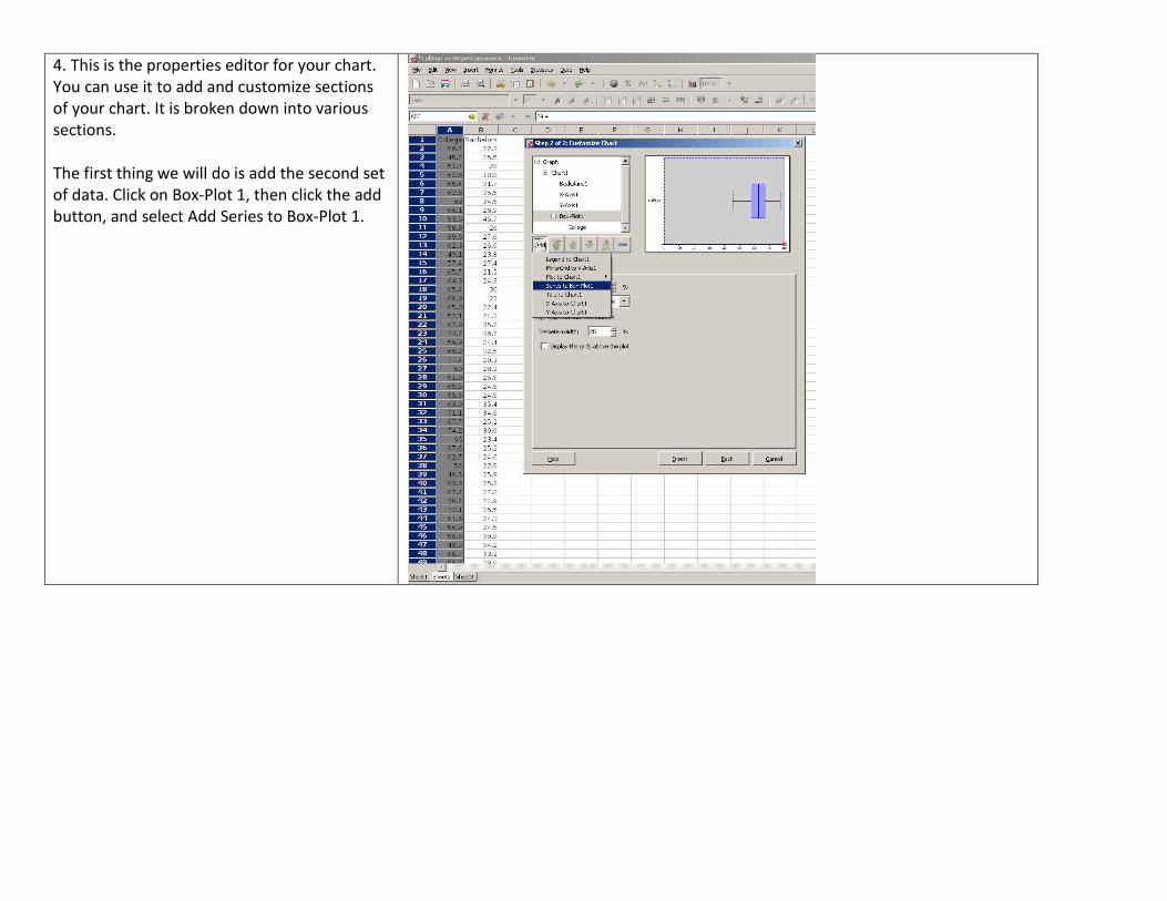
4. This is the properties editor for your chart.
You can use it to add and customize sections
of your chart. It is broken down into various
sections.
The first thing we will do is add the second set
of data. Click on Box-Plot 1, then click the add
button, and select Add Series to Box-Plot 1.

5. Your screen should look similar to the one
at right. You can click the boxes to select
where the information it’s asking for is found.
(Name): is in the first row of the second
column.
Values: are located in the second column.

6. We will now add labels and a title.
Click on X-Axis 1, then add, select Label to X-
Axis 1. In the text field, type the name of your
label and then press enter.
Click on Chart 1, then add, select Title to Chart
1. In the text field, type the name of your title
and then press enter.
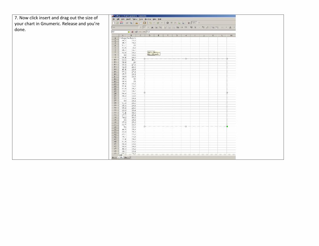
7. Now click insert and drag out the size of
your chart in Gnumeric. Release and you’re
done.

Histogram
1. Creating a histogram starts the same way
as a boxplot. Highlight a column of data, click
insert chart, select histogram and then click
forward.
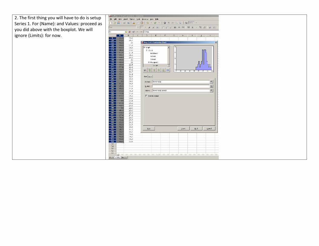
2. The first thing you will have to do is setup
Series 1. For (Name): and Values: proceed as
you did above with the boxplot. We will
ignore (Limits): for now.

3. We will now add the second set of data,
but we will want it to use a different y-axis;
so we must add that first. Click Chart 1, Click
Add, select Add Y-Axis to Chart 1.
Since this axis is closer to our first set of data
we can change the college data to use this
axis. Click on Histogram 1, Axes, then change
Y axis: to
Y-Axis2.

4. To add the Bachelor’s Degree data we
must add a separate histogram (you cannot
have a single histogram with two series).
Click Chart 1, Click Add, Add Plot to Chart 1,
navigate to and click on Histogram.
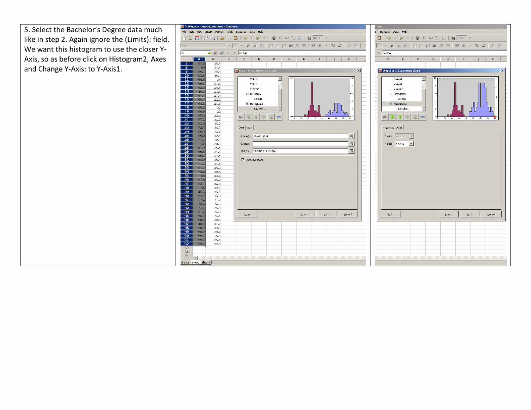
5. Select the Bachelor’s Degree data much
like in step 2. Again ignore the (Limits): field.
We want this histogram to use the closer Y-
Axis, so as before click on Histogram2, Axes
and Change Y-Axis: to Y-Axis1.

6. Next you will add the drop lines. Click on
College, Click Add, Select Drop lines to
College. Repeat for Bachelors.
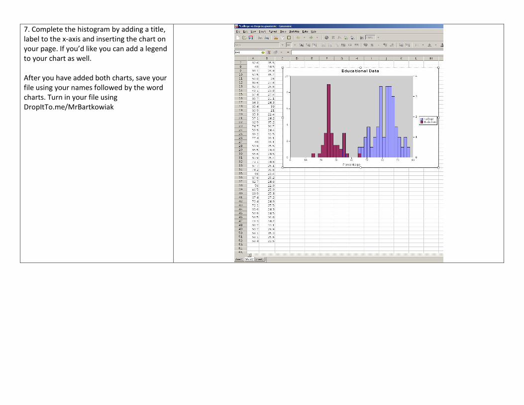
7. Complete the histogram by adding a title,
label to the x-axis and inserting the chart on
your page. If you’d like you can add a legend
to your chart as well.
After you have added both charts, save your
file using your names followed by the word
charts. Turn in your file using
DropItTo.me/MrBartkowiak