
Barry B. Bannister, CFA Managing Director, Equity Research Stifel Nicolaus & Co....
35
Barry B. Bannister, CFA Managing Director, Equity Research Stifel Nicolaus & Co. [email protected] All relevant disclosures and certifications can be found on page 33-34 of this report and on the research page at stifel.com. Macro-Trends Update for Financial Sense Newshour “In the spring, there will be growth*” March 1, 2010 * Paraphrasing Chauncey Gardener in “Being There,” United Artists Films, 1980.
-
date post
20-Dec-2015 -
Category
Documents
-
view
226 -
download
4
Transcript of Barry B. Bannister, CFA Managing Director, Equity Research Stifel Nicolaus & Co....
Barry B. Bannister, CFAManaging Director, Equity Research
Stifel Nicolaus & [email protected]
All relevant disclosures and certifications can be found on page 33-34 of this report and on the research page at stifel.com.
Macro-Trends Update for
Financial Sense Newshour
“In the spring, there will be growth*”
March 1, 2010
* Paraphrasing Chauncey Gardener in “Being There,” United Artists Films, 1980.

2
• Barry B. Bannister, CFA – Managing Director, Equity Research, Stifel Nicolaus & Co. of Baltimore, MD provides investment research to financial institutions globally in the areas of Engineering, Machinery and associated strategy related to commodity markets served by companies in those industries.
• He is a five-time winner of the Wall Street Journal All-Star analyst award, four-time winner of the Forbes Magazine/Financial Times/Starmine top analyst award, Top-10 U.S. Stock Pick analyst for CNBC/Zacks and two-time Institutional Investor magazine All Star Analyst (2007, 2008).
• Prior to joining Stifel Nicolaus and its predecessor Legg Mason Capital Markets in 1998, he was a senior analyst providing North American Machinery industry coverage and later co-head of U.S. equity research in the New York office of the UK investment bank S.G. Warburg & Company (Now UBS) from 1992 to 1998. Prior to that he served as an equity analyst for the buy-side firm FTIM/Highland Capital Management (1990-1992), and before that he was an equity analyst for the mutual funds and trusts of AmSouth Investment Management (now Regions Financial) from 1987-1990.
• He holds an MBA (1987) from the Emory University School of Business Administration, and a BA from Emory College (1984). He has held a Chartered Financial Analyst (CFA) designation since 1991.
Barry B. Bannister, CFAManaging Director, Equity ResearchStifel Nicolaus & [email protected]
3
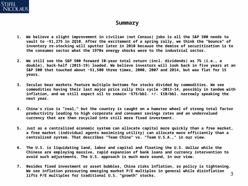
Summary
1. We believe a slight improvement in civilian (not Census) jobs is all the S&P 500 needs to vault to ~$1,275 in 2Q10. After the excitement of a spring rally, we think the "bounce" of inventory re-stocking will sputter later in 2010 because the demise of securitization is to the consumer sector what the 1970s energy shocks were to the industrial sector.
2. We still see the S&P 500 forward 10-year total return (incl. dividends) as 7% (i.e., a double), back-half (2015-19) loaded. We believe investors will look back in five years at an S&P 500 that touched about ~$1,500 three times, 2000, 2007 and 2014, but was flat for 15 years.
3. Secular bear markets feature multiple bottoms for stocks divided by commodities. We see commodities having their last major price rally this cycle ~2013-14, possibly in tandem with inflation, and we still expect oil to remain ~$75/bbl. +/- $10/bbl. narrowly speaking the next year.
4. China's rise is "real," but the country is caught on a hamster wheel of strong total factor productivity leading to high corporate and consumer savings rates and an undervalued currency that are then recycled into still more fixed investment.
5. Just as a centralized economic system can allocate capital more quickly than a free market, a free market (individual agents maximizing utility) can allocate more efficiently than a centralized system. That describes "Team China" vs. "Team U.S.A.," in our view.
6. The U.S. is liquidating land, labor and capital and floating the U.S. dollar while the Chinese are employing massive, rapid expansion of bank loans and currency intervention to avoid such adjustments. The U.S. approach is much more sound, in our view.
7. Besides fixed investment or asset bubbles, China risks inflation, so policy is tightening. We see inflation pressuring emerging market P/E multiples in general while disinflation lifts P/E multiples for traditional U.S. "growth" stocks.

4
Deflation vs. Inflation
1. The S&P 500 came quite close to the 8% correction to $1,050 we called for in our 1Q10 Macro-Slides “Macro-Update: 1Q10 Correction, ‘Growth Scare’” published January 21, 2010.
2. The S&P 500 needs a civilian jobs recovery within a year of the price bottoming, and the S&P 500 trough was March 09. Slight improvement in civilian jobs is all the S&P 500 needs to vault to ~$1,275 in 2Q10, in our view.
3. After the excitement of a spring bounce, we postulate that reduced securitization has permanently ratcheted down consumption in the U.S., preventing anything more than a “bounce” in inventory re-stocking in 2010.
4. The Fed and Treasury are using their last non-inflationary bullets in an attempt to restart private credit. Consumer leverage is too great to expect a meaningful resumption, so debt deflation could resume by 2011.
5. The U.S. historically chooses taxation and inflation (1930s/40s, 1960s/70s) rather than revolutionary expropriation to deal with deflation. The end result is similar, the former just gives investors time to prepare.
5
Debt as a Percentage of U.S. GDP, by Category
0%
10%
20%
30%
40%
50%
60%
70%
80%
90%
100%
110%
120%
1952
Q1
1955
Q3
1959
Q1
1962
Q3
1966
Q1
1969
Q3
1973
Q1
1976
Q3
1980
Q1
1983
Q3
1987
Q1
1990
Q3
1994
Q1
1997
Q3
2001
Q1
2004
Q3
2008
Q1
2011
Q3
2015
Q1
Financial Debt / US GDP
Public Nonfinancial Debt / US GDP
Private Nonfinancial Household Debt / US GDPPrivate Nonfinancial Business Debt / US GDP
Change in debt since the peak as a % of GDP (bps):
Financial debt Peak: 1Q09 Change: -700 bpsPrivate household Peak: 2Q09 Change: -100 bpsPrivate business Peak: 2Q09 Change: -100 bpsPublic debt Bottom: 2Q08 Change: +1,700 bps= Total debt/GDP up from 354% (2Q08) to 370% (3Q09)
Civilian Non-Institutional* Employment to Population Ratio versus S&P 500 Index (log scale)
55
56
57
58
59
60
61
62
63
64
65
66
67
68
69
70
71
72
73
74
75
Jan
-70
Jan
-72
Jan
-74
Jan
-76
Jan
-78
Jan
-80
Jan
-82
Jan
-84
Jan
-86
Jan
-88
Jan
-90
Jan
-92
Jan
-94
Jan
-96
Jan
-98
Jan
-00
Jan
-02
Jan
-04
Jan
-06
Jan
-08
Jan
-10
Jan
-12
10
100
1,000
10,000
Civilian Employment to Population Ratio (Left Axis)
S&P 500 Index (log Scale, Right Axis)
?
12 mos. 9
mos.
9 mos.
14mos.
12mos.
*The civilian non-institutional population consists of persons 16 years of age and older residing in the 50 States and the District of Columbia who are not inmates of institutions (for example, penal and mental facilities and homes for the aged) and who are not on active duty in the Armed Forces.
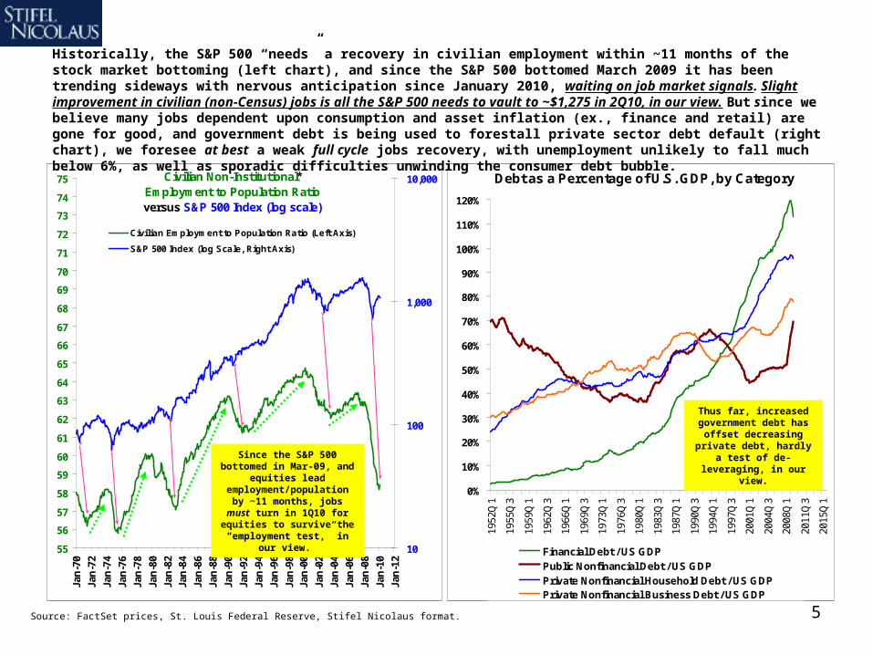
Historically, the S&P 500 “needs” a recovery in civilian employment within ~11 months of the stock market bottoming (left chart), and since the S&P 500 bottomed March 2009 it has been trending sideways with nervous anticipation since January 2010, waiting on job market signals. Slight improvement in civilian (non-Census) jobs is all the S&P 500 needs to vault to ~$1,275 in 2Q10, in our view. But since we believe many jobs dependent upon consumption and asset inflation (ex., finance and retail) are gone for good, and government debt is being used to forestall private sector debt default (right chart), we foresee at best a weak full cycle jobs recovery, with unemployment unlikely to fall much below 6%, as well as sporadic difficulties unwinding the consumer debt bubble.
Source: FactSet prices, St. Louis Federal Reserve, Stifel Nicolaus format.
Since the S&P 500 bottomed in Mar-09, and equities lead employment/population by ~11 months, jobs must turn
in 1Q10 for equities to survive the “employment
test,” in our view.
Thus far, increased government debt has
offset decreasing private debt, hardly a test of de-leveraging, in our view.

6Source: Bank Credit Analyst
Most of the arguments for domestic GDP recovery that we hear involve an inventory re-stocking argument. (Commodity recovery appears to depend on Chinese bank loans, but we discuss that later). We postulate that the demise of securitization (issuance of securities that ‘package’ many individual consumer debts such as credit cards and mortgages) in the current era is analogous to the 1970s energy shocks. Recall that the 1973-1974 first energy shock rendered a large swath of industrial America effectively obsolete in the 1970s due to its inefficient energy intensity (think Chrysler’s first bail-out). That capacity limped along until it was finished off by the second oil shock in 1979-1980 as well as U.S. Fed moves to deal with price inflation (high real interest rates, a strong dollar). We suspect that the demise of securitization has permanently ratcheted down U.S. consumer spending, reducing the need for anything more than a “bounce” in inventory. Weaker retail and financial capacity may limp along for a few years until it is finished off in a shake-out, in our view.

7Source: Historical Statistics of the United States, Millennial Edition, U.S. Census.
U.S. GDP per capita for 209 years has grown at 1.6%/year, with population growth of 2.0% and real GDP growth of 3.6%. Recent trends have supported at least 2% growth in productivity, and for the past decade the U.S. population has grown at a fairly consistent 1.0%. This indicates that at least 3.0% (2% + 1%) U.S. real GDP growth can be maintained in a normal credit environment, in our view. If deleveraging the consumption side of the U.S. economy causes U.S. per capita real GDP to converge on the long-term trend shown in the chart below; however, such a process would be a headwind for growth shaving perhaps 150bps/year from U.S. real GDP/capita over perhaps five years, which is not “fatal,” in our view.
Log of U.S. Real GDP per Capita, 1800 to 2009Trend growth since 1800 of 1.6%, with population growth of 2.0% and U.S. real GDP growth of 3.6%
3.0
3.2
3.4
3.6
3.8
4.0
4.2
4.4
4.6
4.8
18
00
18
10
18
20
18
30
18
40
18
50
18
60
18
70
18
80
18
90
19
00
19
10
19
20
19
30
19
40
19
50
19
60
19
70
19
80
19
90
20
00
20
10
E
Trend 1.6%U.S. GDP/capita
growth
To return to trend U.S.
GDP would have to
decline 12% (twelve
percent) at once, or
somewhat less over
time.
8
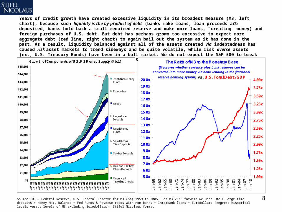
Years of credit growth have created excessive liquidity in its broadest measure (M3, left chart), because such liquidity is the by-product of debt (banks make loans, loan proceeds are deposited, banks hold back a small required reserve and make more loans, “creating” money) and foreign purchases of U.S. debt. But debt has perhaps grown too excessive to expect more aggregate debt (red line, right chart) to again bail out the system as it has done in the past. As a result, liquidity balanced against all of the assets created via indebtedness has caused risk asset markets to trend sideways and be quite volatile, while risk averse assets (ex., U.S. Treasury Bonds) have been in a bull market. We do not expect the S&P 500 to break out of its 2000 to 2010 price range of ~$667-$1,576 until 2015.
Source: U.S. Federal Reserve, U.S. Federal Reserve for M3 (SA) 1959 to 2005. For M3 2006 forward we use: M2 + Large time deposits + Money Mkt. Balance + Fed Funds & Reverse repos with non-banks + Interbank loans + Eurodollars (regress historical levels versus levels of M3 excluding Eurodollars), Stifel Nicolaus format.
The Ratio of M3 to the Monetary Base (Measures whether currency plus bank reserves can be
converted into more money via bank lending in the fractional
reserve banking system) vs. U.S. Total Debt / GDP
5.0x
6.0x
7.0x
8.0x
9.0x
10.0x
11.0x
12.0x
13.0x
14.0x
15.0x
16.0x
17.0x
18.0x
19.0x
20.0x
Jan-
59
Jan-
62
Jan-
65
Jan-
68
Jan-
71
Jan-
74
Jan-
77
Jan-
80
Jan-
83
Jan-
86
Jan-
89
Jan-
92
Jan-
95
Jan-
98
Jan-
01
Jan-
04
Jan-
07
Jan-
10
1.00x
1.25x
1.50x
1.75x
2.00x
2.25x
2.50x
2.75x
3.00x
3.25x
3.50x
3.75x
4.00x
M3/Monetary Base (Left)
Total Debt/GDP
(Right)
Growth of Components of U.S. M3 Money Supply ($ bil.)
$0
$1,000
$2,000
$3,000
$4,000
$5,000
$6,000
$7,000
$8,000
$9,000
$10,000
$11,000
$12,000
$13,000
$14,000
$15,000
Ja
n-8
1J
an
-82
Ja
n-8
3J
an
-84
Ja
n-8
5J
an
-86
Ja
n-8
7J
an
-88
Ja
n-8
9J
an
-90
Ja
n-9
1J
an
-92
Ja
n-9
3J
an
-94
Ja
n-9
5J
an
-96
Ja
n-9
7J
an
-98
Ja
n-9
9J
an
-00
Ja
n-0
1J
an
-02
Ja
n-0
3J
an
-04
Ja
n-0
5J
an
-06
Ja
n-0
7J
an
-08
Ja
n-0
9J
an
-10
Institutional MoneyFunds
Eurodollars
Repos
Large-TimeDeposits
Retail MoneyFunds
Small Denom.Time Deposits
Savings Deposits
Demand & OtherCheck Deposits
Currency &Travelers Checks
M2 = Below
Sum = M3
M1 = Below
A combination of importing the
savings of emerging markets and using leverage (money
multiplier) to grow money supply.
The multiplier has subsided, hence
fiscal stimulus and quantitative easing.
9
S&P 500 y/y% Earnings Growth (Trailing 4-quarter Sum)
-100%
-80%
-60%
-40%
-20%
0%
20%
40%
60%
80%
100%19
55Q
1
1956
Q3
1958
Q1
1959
Q3
1961
Q1
1962
Q3
1964
Q1
1965
Q3
1967
Q1
1968
Q3
1970
Q1
1971
Q3
1973
Q1
1974
Q3
1976
Q1
1977
Q3
1979
Q1
1980
Q3
1982
Q1
1983
Q3
1985
Q1
1986
Q3
1988
Q1
1989
Q3
1991
Q1
1992
Q3
1994
Q1
1995
Q3
1997
Q1
1998
Q3
2000
Q1
2001
Q3
2003
Q1
2004
Q3
2006
Q1
2007
Q3
2009
Q1
1955Q1 through 2009Q4
-40%
-30%
-20%
-10%
0%
10%
20%
30%
40%
50%
1955
Q1
1956
Q3
1958
Q1
1959
Q3
1961
Q1
1962
Q3
1964
Q1
1965
Q3
1967
Q1
1968
Q3
1970
Q1
1971
Q3
1973
Q1
1974
Q3
1976
Q1
1977
Q3
1979
Q1
1980
Q3
1982
Q1
1983
Q3
1985
Q1
1986
Q3
1988
Q1
1989
Q3
1991
Q1
1992
Q3
1994
Q1
1995
Q3
1997
Q1
1998
Q3
2000
Q1
2001
Q3
2003
Q1
2004
Q3
2006
Q1
2007
Q3
2009
Q1
S&P 500 Price y/y% Change(Trailing 4-quarter Average)
1955Q1 through 2010Q1
4Q2009 = 246.2%
Sou
rce:
Fac
tSet
, S
tifel
Nic
olau
s, S
tand
ard
& P
oor’s
.
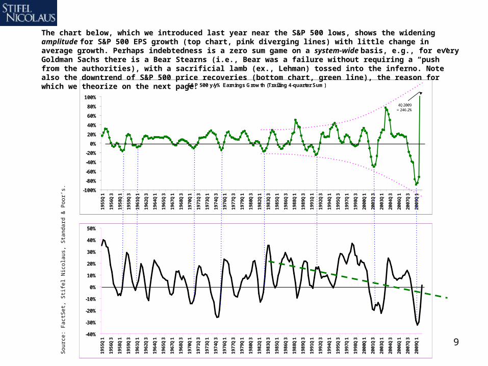
The chart below, which we introduced last year near the S&P 500 lows, shows the widening amplitude for S&P 500 EPS growth (top chart, pink diverging lines) with little change in average growth. Perhaps indebtedness is a zero sum game on a system-wide basis, e.g., for every Goldman Sachs there is a Bear Stearns (i.e., Bear was a failure without requiring a “push” from the authorities), with a sacrificial lamb (ex., Lehman) tossed into the inferno. Note also the downtrend of S&P 500 price recoveries (bottom chart, green line), the reason for which we theorize on the next page.
10
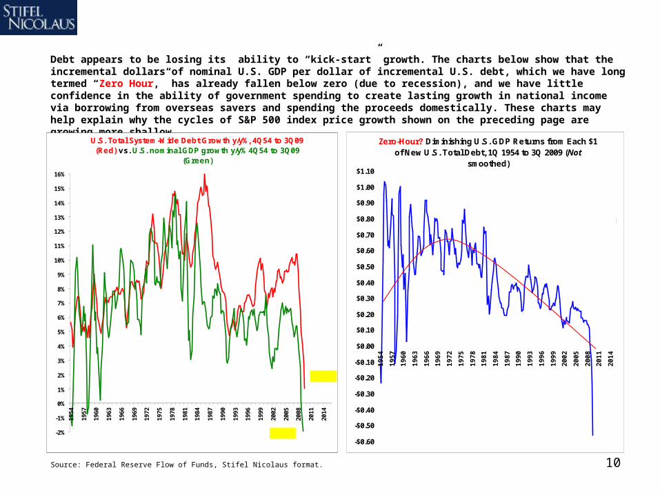
Debt appears to be losing its ability to “kick-start” growth. The charts below show that the incremental dollars of nominal U.S. GDP per dollar of incremental U.S. debt, which we have long termed “Zero Hour,” has already fallen below zero (due to recession), and we have little confidence in the ability of government spending to create lasting growth in national income via borrowing from overseas savers and spending the proceeds domestically. These charts may help explain why the cycles of S&P 500 index price growth shown on the preceding page are growing more shallow.
Source: Federal Reserve Flow of Funds, Stifel Nicolaus format.
U.S. Total System-Wide Debt Growth y/y%, 4Q54 to 3Q09 (Red) vs. U.S. nominal GDP growth y/y% 4Q54 to 3Q09
(Green)
-2%
-1%
0%
1%
2%
3%
4%
5%
6%
7%
8%
9%
10%
11%
12%
13%
14%
15%
16%
1954
1957
1960
1963
1966
1969
1972
1975
1978
1981
1984
1987
1990
1993
1996
1999
2002
2005
2008
2011
2014
One...
Two?
Zero-Hour? Diminishing U.S. GDP Returns from Each $1 of New U.S. Total Debt, 1Q 1954 to 3Q 2009 (Not
smoothed)
-$0.60
-$0.50
-$0.40
-$0.30
-$0.20
-$0.10
$0.00
$0.10
$0.20
$0.30
$0.40
$0.50
$0.60
$0.70
$0.80
$0.90
$1.00
$1.10
19
54
19
57
19
60
19
63
19
66
19
69
19
72
19
75
19
78
19
81
19
84
19
87
19
90
19
93
19
96
19
99
20
02
20
05
20
08
20
11
20
14
Dollar change y/y in U.S. Nominal GDP divided by dollar change y/y
in U.S. Debt equals the dollar increase in GDP per $1.00
increase in U.S. Total Debt. It went below zero in 1Q09.
11Source: Ned Davis Research.Source: Bank Credit Analyst
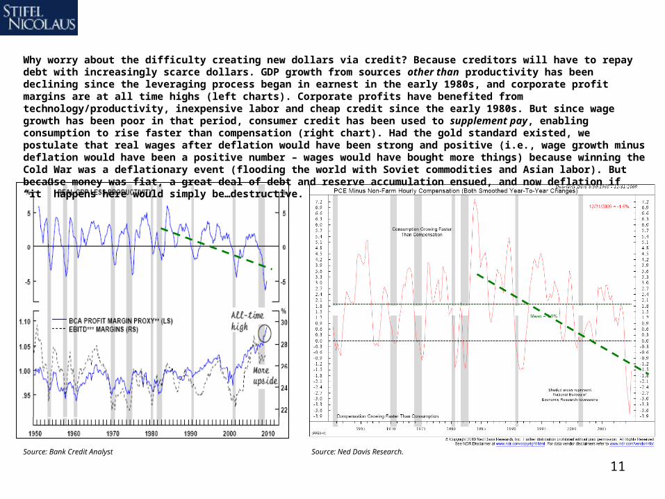
Why worry about the difficulty creating new dollars via credit? Because creditors will have to repay debt with increasingly scarce dollars. GDP growth from sources other than productivity has been declining since the leveraging process began in earnest in the early 1980s, and corporate profit margins are at all time highs (left charts). Corporate profits have benefited from technology/productivity, inexpensive labor and cheap credit since the early 1980s. But since wage growth has been poor in that period, consumer credit has been used to supplement pay, enabling consumption to rise faster than compensation (right chart). Had the gold standard existed, we postulate that real wages after deflation would have been strong and positive (i.e., wage growth minus deflation would have been a positive number – wages would have bought more things) because winning the Cold War was a deflationary event (flooding the world with Soviet commodities and Asian labor). But because money was fiat, a great deal of debt and reserve accumulation ensued, and now deflation if “it” happens here would simply be…destructive.

12
Federal Reserve Bank Assets & Liabilities
-$2,500
-$2,000
-$1,500
-$1,000
-$500
$0
$500
$1,000
$1,500
$2,000
$2,500
5-S
ep-0
7
5-N
ov-
07
5-Ja
n-0
8
5-M
ar-0
8
5-M
ay-0
8
5-Ju
l-08
5-S
ep-0
8
5-N
ov-
08
5-Ja
n-0
9
5-M
ar-0
9
5-M
ay-0
9
5-Ju
l-09
5-S
ep-0
9
5-N
ov-
09
Liquidity Facilities
Other
Repurchase Agreements
Term Auction Credit
Securities Held Outright
Reserve Balances withFederal Reserve Banks
Treasury SupplementaryFinancing Program (SPF)
Other
Currency in Circulation
Assets
Liabilities
$ Billion
In an attempt to restart the credit process the Fed has been a large purchaser of assets (mortgages). After sterilizing early intervention in 1H08 with a $300B Treasury sale (point “A”), the Fed repurchased those Treasuries in 1Q09 (i.e., so-called Quantitative Easing, shown as point “B”) and that restarted the market’s engine, helping the S&P 500 put in its March 6, 2009 low of $667. The market liked the Fed’s actions so much that the Fed kept going, buying Agency debt (point “C”). As liquidity facilities have been wound down (point “D”) the lender of last resort has simply become the buyer of last resort, hardly a testament to strength.
Source: U.S. Federal Reserve.
A B
C
D
13Source: Ned Davis Research.
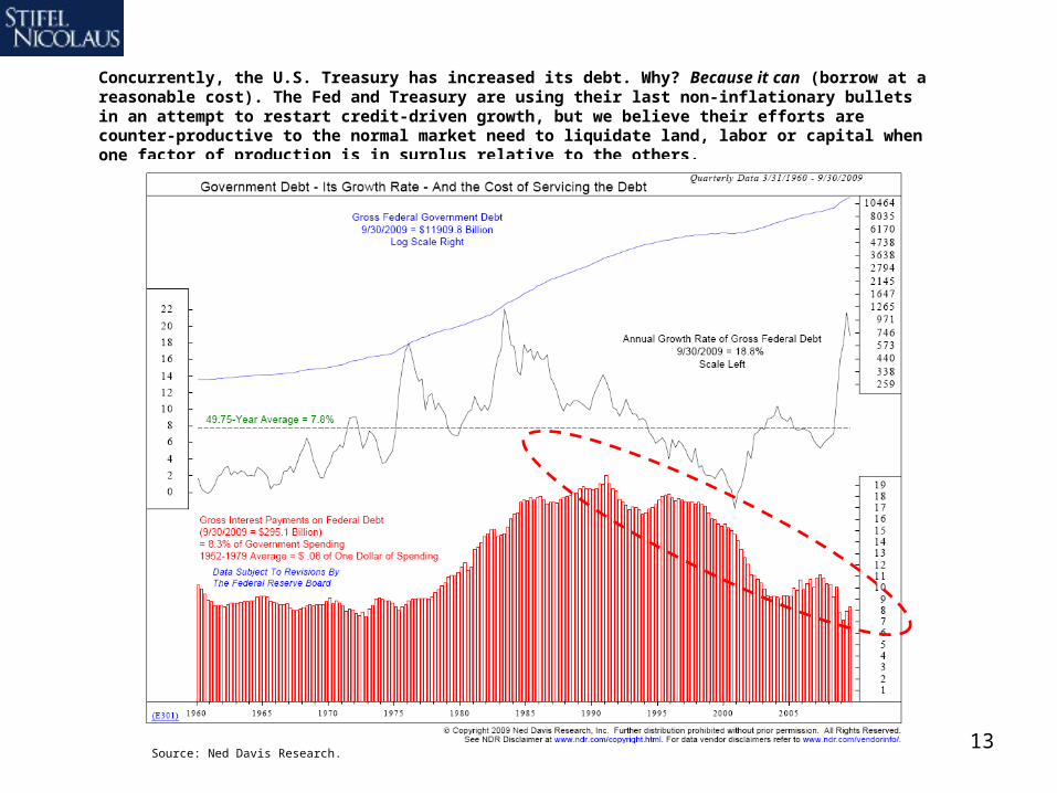
Concurrently, the U.S. Treasury has increased its debt. Why? Because it can (borrow at a reasonable cost). The Fed and Treasury are using their last non-inflationary bullets in an attempt to restart credit-driven growth, but we believe their efforts are counter-productive to the normal market need to liquidate land, labor or capital when one factor of production is in surplus relative to the others.
14
Source: Ned Davis Research.
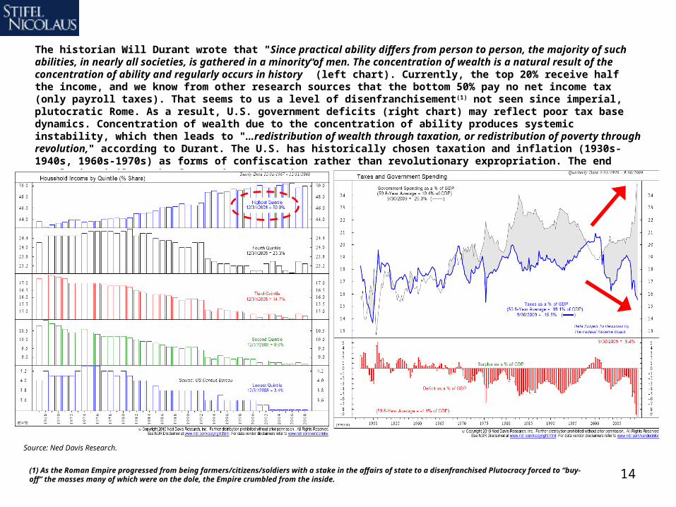
The historian Will Durant wrote that "Since practical ability differs from person to person, the majority of such abilities, in nearly all societies, is gathered in a minority of men. The concentration of wealth is a natural result of the concentration of ability and regularly occurs in history” (left chart). Currently, the top 20% receive half the income, and we know from other research sources that the bottom 50% pay no net income tax (only payroll taxes). That seems to us a level of disenfranchisement(1) not seen since imperial, plutocratic Rome. As a result, U.S. government deficits (right chart) may reflect poor tax base dynamics. Concentration of wealth due to the concentration of ability produces systemic instability, which then leads to "…redistribution of wealth through taxation, or redistribution of poverty through revolution," according to Durant. The U.S. has historically chosen taxation and inflation (1930s-1940s, 1960s-1970s) as forms of confiscation rather than revolutionary expropriation. The end result is similar, the former just gives investors more time to prepare.
(1) As the Roman Empire progressed from being farmers/citizens/soldiers with a stake in the affairs of state to a disenfranchised Plutocracy forced to “buy-off” the masses many of which were on the dole, the Empire crumbled from the inside.

15Source: “A New Historical Database for the NYSE 1815 to 1925: Performance and Predictability” William N. Goetzmann, Roger G. Ibbotson, Liang Peng, Yale School of Management; 1925-to-present are Ibbotson Associates large-cap total return and Standard & Poor’s data.
In closing this section of our report, investors in 2008 & 2009 were whipsawed by the best and worst years, back-to-back, in a half century for stocks relative to long-term U.S. government bonds. The U.S. dollar mirrored those moves, soaring and plunging. We think this turn of events marks the end, or at least the terminal phase, of credit-driven asset inflation and moral hazard related to guarantees. At this point we are simply interested in the mechanics of de-leveraging and the implications of consumer credit retrenchment for the U.S. equity market.
Total Return of Large Cap Stocks Minus Total Return of Long-Term Government Bonds
-80%
-60%
-40%
-20%
0%
20%
40%
60%
19
60
19
62
19
64
19
66
19
68
19
70
19
72
19
74
19
76
19
78
19
80
19
82
19
84
19
86
19
88
19
90
19
92
19
94
19
96
19
98
20
00
20
02
20
04
20
06
20
08
20
10
E
2008: Worst year in a half century for U.S.
stocks relative to long-term Treasuries.
2009: Best year in a half century for U.S.
stocks relative to long-term Treasuries.

16
U.S. Equity Market Outlook1. Longer term, from Dec-2009 to Dec-2019, we expect the S&P 500, dividends reinvested, to produce a back-
half (i.e., mostly 2015 to 2019) loaded 7% CAGR return (i.e., a price double with dividends reinvested).
2. Intermediate term, we do not expect the S&P 500 to break out of its 2000 to 2010 price range of ~$667-$1,576 until 2015, thus forming a classic secular bear market 15-year trading range.
3. An S&P 500 price of ~$1,100 (close to the current price) is the midpoint of the 10-year secular bear market range. This price may be thought of as a “ledge” or a “step,” depending on the investor’s outlook.
4. Short-term, we believe the S&P 500 price moves up from the $1,100 midpoint outlined above, but we remain alert and have no intention of fighting the tape (a wise strategy in a range-bound market).
5. The nominal low in a secular bear market is usually ~7-10 years before a new secular bull market begins; Mar-09 ($667) appears to us to have been the nominal low, although inflation could produce a deeper “real” or inflation-adjusted low by 2015. We are taking a wait-and-see approach to inflation.
17
S&P Stock Market Composite 10-Year Compound Annual Total Return (Incl. Reinvested Dividends) Data 1830 to February-23-2010
-2.5%
0.0%
2.5%
5.0%
7.5%
10.0%
12.5%
15.0%
17.5%
20.0%
22.5%
1839
1849
1859
1869
1879
1889
1899
1909
1919
1929
1939
1949
1959
1969
1979
1989
1999
2009
Source: “A New Historical Database for the NYSE 1815 to 1925: Performance and Predictability” William N. Goetzmann, Roger G. Ibbotson, Liang Peng, Yale School of Management; 1925-to-present are Ibbotson Associates large-cap total return and Standard & Poor’s data.
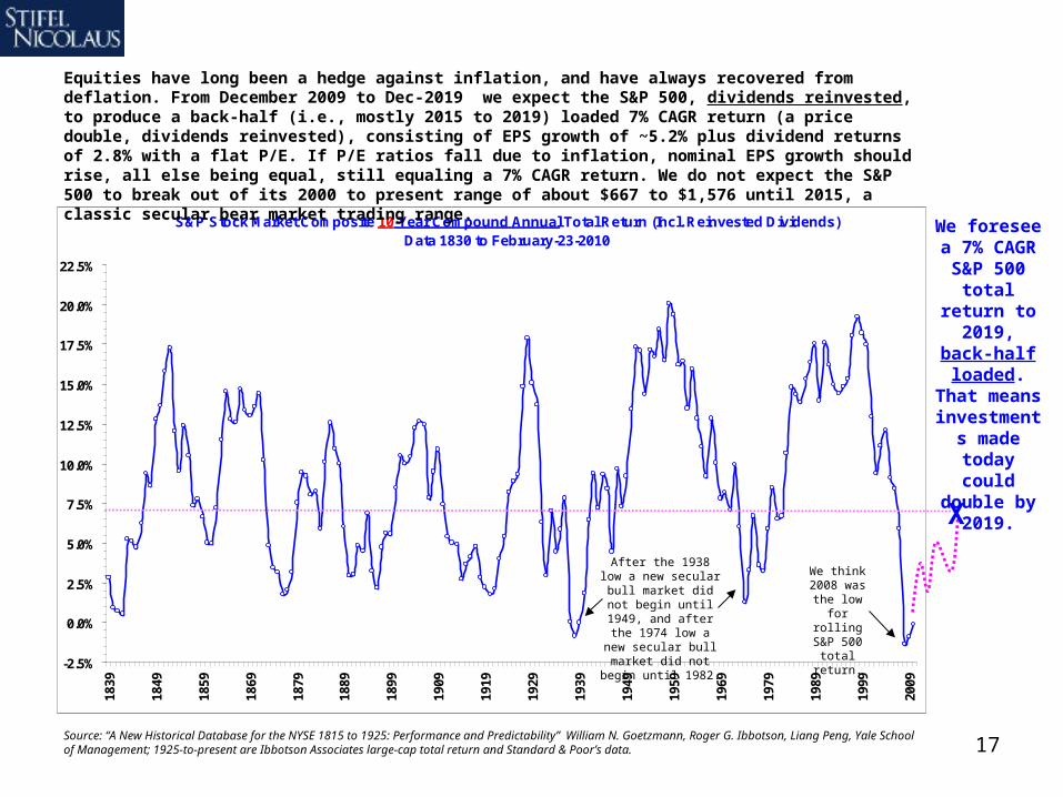
Equities have long been a hedge against inflation, and have always recovered from deflation. From December 2009 to Dec-2019 we expect the S&P 500, dividends reinvested, to produce a back-half (i.e., mostly 2015 to 2019) loaded 7% CAGR return (a price double, dividends reinvested), consisting of EPS growth of ~5.2% plus dividend returns of 2.8% with a flat P/E. If P/E ratios fall due to inflation, nominal EPS growth should rise, all else being equal, still equaling a 7% CAGR return. We do not expect the S&P 500 to break out of its 2000 to present range of about $667 to $1,576 until 2015, a classic secular bear market trading range.
We foresee a 7% CAGR S&P 500
total return to 2019,
back-half loaded. That
means investments made today
could double by 2019.
X
After the 1938 low a new secular bull
market did not begin until 1949, and after the 1974 low a new
secular bull market did not begin until 1982.
We think 2008 was the low
for rolling S&P 500 total return.

18
Secular bear markets flatten in nominal terms (but decline in real terms, after inflation) for ~14 years (average of the past cycles below), and this secular bear began in 2000. The nominal low in a secular bear is usually seen ~7-10 years before a new secular bull begins, and we believe 2009 may have been the nominal low in this cycle. We believe secular bear markets end when equity has been de-capitalized as a percentage of GDP and all types of investors have been impacted, e.g., buy and hold loses capital or purchasing power, momentum buys high/sells low several times, and market timers lose because increased awareness of the secular bear market causes rallies to expend the bulk of their return quickly (ex., the 2009 rally).
Source: Dow Jones, U.S. Census, Stifel Nicolaus format.
Real (Inflation-adjusted) Dow Jones Industrial Average (2008$) versus Nominal Dow Jones Industrial Average - Chart is through most current data
$10
$100
$1,000
$10,000
$100,000
1896
1901
1906
1911
1916
1921
1926
1931
1936
1941
1946
1951
1956
1961
1966
1971
1976
1981
1986
1991
1996
2001
2006
1907 to 19211929 to 1942
1966 to 1982
2000 to ….Inflation-adjusted Dow
Jones Industrial Average
Dow Jones Industrial Average
1914wasthelow
1921new
secularbull
market
1932wasthelow
1942new
secularbull
market
1974wasthelow
1982new
secularbull
market
2009wasthe
secular bear
nominallow, in
our view.
19
M2 Growth vs. CPI GrowthAverage Annual Growth
-3%
-2%
-1%
0%
1%
2%
3%
4%
5%
6%
7%
8%
9%
10%
0% 1% 2% 3% 4% 5% 6% 7% 8% 9% 10% 11%
M2 Money Supply (Average Annual Percent Growth)
CP
I Gro
wth
(A
vera
ge
An
nu
al P
erce
nt
Gro
wth
)
1920s
1940s
1950s
1930s
1960s
1990s
1980s
1970s1910s
2000s
Trailing 2-year range of actual M2 growth = 5% to 10% y/y
Source: Standard & Poor’s, U.S. Census, NBER.org Macro-history Database, Federal Reserve.
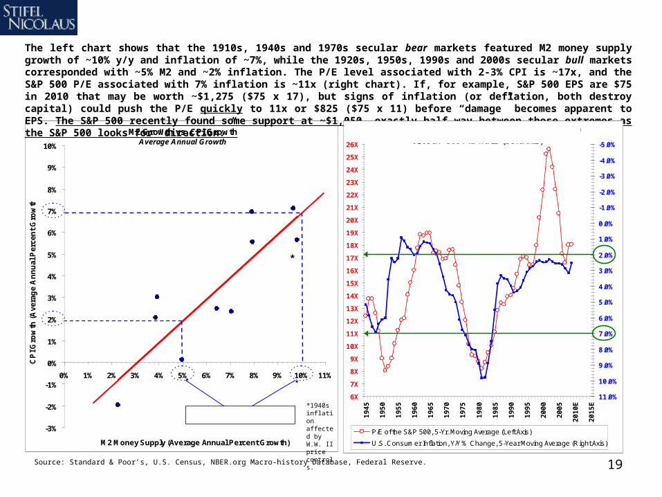
The left chart shows that the 1910s, 1940s and 1970s secular bear markets featured M2 money supply growth of ~10% y/y and inflation of ~7%, while the 1920s, 1950s, 1990s and 2000s secular bull markets corresponded with ~5% M2 and ~2% inflation. The P/E level associated with 2-3% CPI is ~17x, and the S&P 500 P/E associated with 7% inflation is ~11x (right chart). If, for example, S&P 500 EPS are $75 in 2010 that may be worth ~$1,275 ($75 x 17), but signs of inflation (or deflation, both destroy capital) could push the P/E quickly to 11x or $825 ($75 x 11) before “damage” becomes apparent to EPS. The S&P 500 recently found some support at ~$1,050, exactly half way between those extremes as the S&P 500 looks for “direction.”
*
*1940s inflation affected by W.W. II price controls.
6X
7X
8X
9X
10X
11X
12X
13X
14X
15X
16X
17X
18X
19X
20X
21X
22X
23X
24X
25X
26X
19
45
19
50
19
55
19
60
19
65
19
70
19
75
19
80
19
85
19
90
19
95
20
00
20
05
20
10
E
20
15
E
-5.0%
-4.0%
-3.0%
-2.0%
-1.0%
0.0%
1.0%
2.0%
3.0%
4.0%
5.0%
6.0%
7.0%
8.0%
9.0%
10.0%
11.0%
P/E of the S&P 500, 5-Yr. Moving Average (Left Axis)
U.S. Consumer Inflation, Y/Y % Change, 5-Year Moving Average (Right Axis)
U.S. Consumer Price Inflation (Inverted, Right Axis) vs. S&P 500 P/E Ratio (Left Axis)

20
Crude Oil Factors to Consider
1. The balance of years in the next several probably favor the price return of U.S. equities over commodities until such time that inflation materializes, which we do not expect until ~2013, if at all.
2. Secular bear markets featured multiple bottoms for stocks relative to commodities before a sustained bull market for equities may begin. We see commodities their last major price rally ~2013-14 for this cycle.
3. We’re nimbly “trend following” rather than making hard projections, but we think oil has more down than upside, while the S&P 500 only needs modest – not strong – recovery in civilian jobs to vault higher.
4. We expect oil to remain ~$75/bbl. +/- $10/bbl. narrowly speaking, and at most $53/bbl. to $89/bbl. very broadly speaking through 2012. Equities closely correlated to oil prices may follow the trend in oil.
21
U.S. Commodity Price Index*, y/y% change, 1912 to 2010 latest, 5-yr. M.A. versus Deere relative to the S&P 500 1927 to Present
-9%
-6%
-3%
0%
3%
6%
9%
12%
15%
18%
1912
1918
1924
1930
1936
1942
1948
1954
1960
1966
1972
1978
1984
1990
1996
2002
2008
2014
E
Co
mm
od
ity
Pri
ce
s,
y/y
%,
5-y
r. m
ov
. a
vg
.
0%
1%
2%
3%
4%
5%
6%
7%
Dee
re s
tock
div
ided
by
the
S&
P 5
00
Commodity Price Index, y/y % change, 5-yr. moving average, left axis
Deere stock relative to the S&P 500 (S&P Composite in earliest periods), right axis
* P roducer P rice Index for Commodities 1907-56, CRB Futures 1957-present
Crude oil and FLR stock relative strength versus the S&P 500, 1965 to 2010 latest
0%
5%
10%
15%
20%
25%
30%
35%
40%
De
c-6
5
De
c-6
7
De
c-6
9
De
c-7
1
De
c-7
3
De
c-7
5
De
c-7
7
De
c-7
9
De
c-8
1
De
c-8
3
De
c-8
5
De
c-8
7
De
c-8
9
De
c-9
1
De
c-9
3
De
c-9
5
De
c-9
7
De
c-9
9
De
c-0
1
De
c-0
3
De
c-0
5
De
c-0
7
De
c-0
9
WT
I o
il p
rice
rel
ativ
e to
th
e S
&P
500
0%
3%
5%
8%
10%
13%
15%
18%
20%
23%
25%
28%
FL
R p
rice
rel
ativ
e to
th
e S
&P
500
WTI oil price relative to the S&P 500 FLR price relative to the S&P 500
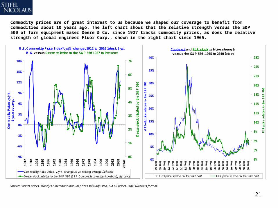
Commodity prices are of great interest to us because we shaped our coverage to benefit from commodities about 10 years ago. The left chart shows that the relative strength versus the S&P 500 of farm equipment maker Deere & Co. since 1927 tracks commodity prices, as does the relative strength of global engineer Fluor Corp., shown in the right chart since 1965.
Source: Factset prices, Moody’s / Merchant Manual prices split-adjusted, EIA oil prices, Stifel Nicolaus format.

22
Commodity price momentum appears to be coming off a cyclical high (left chart), while the S&P 500 total return (price change + dividend) momentum appears to be coming off a cyclical low (right chart). The balance of years in the next several probably favor U.S. equities over commodities until (if) inflation materializes, which we do not expect until ~2013.
Source: Stifel Nicolaus format, data Historical Statistics of the United States, a U.S. Census publication.
S&P Stock Market Composite 10-Year Compound Annual Total Return (Incl. Reinvested Dividends),
Data 1830 to Feb-23, 2010
-2.5%
0.0%
2.5%
5.0%
7.5%
10.0%
12.5%
15.0%
17.5%
20.0%
22.5%
1839
1849
1859
1869
1879
1889
1899
1909
1919
1929
1939
1949
1959
1969
1979
1989
1999
2009
Commodity prices are cyclical and move in unisonCommodities by category, data 1795 to January-2010, 10-yr. M.A.
-12%
-10%
-8%
-6%
-4%
-2%
0%
2%
4%
6%
8%
10%
12%
14%
16%
18%
20%
22%
1805
1810
1815
1820
1825
1830
1835
1840
1845
1850
1855
1860
1865
1870
1875
1880
1885
1890
1895
1900
1905
1910
1915
1920
1925
1930
1935
1940
1945
1950
1955
1960
1965
1970
1975
1980
1985
1990
1995
2000
2005
2010
All Commodities Fuels & Lighting
Cold War/Bretton Woods/OPEC
War of 1812
W.W. I I &
Korean Conflict
W.W. I
CivilWar
U.S. industrial
revolution & overheating / gold surplus.
Easy credit speculativeboom.
23
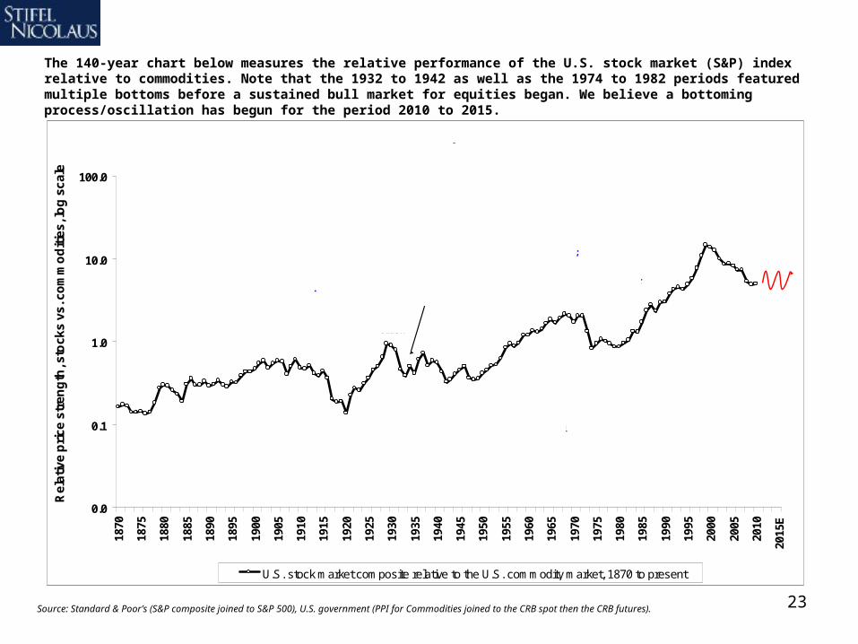
The 140-year chart below measures the relative performance of the U.S. stock market (S&P) index relative to commodities. Note that the 1932 to 1942 as well as the 1974 to 1982 periods featured multiple bottoms before a sustained bull market for equities began. We believe a bottoming process/oscillation has begun for the period 2010 to 2015.
Source: Standard & Poor’s (S&P composite joined to S&P 500), U.S. government (PPI for Commodities joined to the CRB spot then the CRB futures).
0.0
0.1
1.0
10.0
100.0
1870
1875
1880
1885
1890
1895
1900
1905
1910
1915
1920
1925
1930
1935
1940
1945
1950
1955
1960
1965
1970
1975
1980
1985
1990
1995
2000
2005
2010
2015
E
Re
lati
ve
pri
ce
str
en
gth
, sto
ck
s v
s. c
om
mo
dit
ies
, lo
g s
ca
le
U.S. stock market composite relative to the U.S. commodity market, 1870 to present
Key: When the line is rising, the S&P stock market index beats the commodity price index and inflation eventually falls. When the line is falling, the opposite occurs.
U.S. Stock Market Relative to The Commodity Market, 1870 to December 1, 2009.
Post-Civil War Reconstruction ends in
1877, gold standard begins 1879,
deflationary boom, stocks rally.
Pearl Harbor, WW2
1939-45
Gold nationalized
U.S.$ devalued in 1933. FDR's "New Deal" &
reflation begins.
'29 Crash
Post-WW 1 commodity
bubble bursts, deflation ensues
in 1920, bull market begins.
WW11914 to
1918
OPEC '73 embargo;
1973-74 Bear Market, Iran
fell '79.
LBJ's Great Society +
Vietnam 1960s; Nixon closed gold window
1971, all inflationary.
Post-WW 2 commodity &
inflation bubble bursts ca. 1950,
disinflation ensues,
Eisenhower bull market begins.
OPEC overplays hand and oil prices collapse 1981, Volcker stops inflation
1981-82, then Reagan tax cuts, long Soviet
collapse, disinflation & bull market begin.
Tech Bubble 2000, 9/11, Mid-East wars, Asian oil use, strong global U.S.$ demand
after the 1990s emerging markets debt crisis, credit
crisis in U.S.
Populism in U.S. politics.
Panic of 1907, a banking crisis &
stock market crash.

24Source: Factset prices, Stifel Nicolaus format.
One asset’s 50% retracement……could be another asset’s
head-and-shoulders.
In the spirit of this momentum market, we’re nimbly “following the trend” rather than making projections, but if we had to speculate we believe oil is vulnerable for currency (U.S. dollar strength) and fundamental (OPEC 6mb/d over-capacity, as well as refined product over-capacity), whereas the S&P 500 only needs modest – not at all strong – recovery in civilian jobs to vault higher, especially if the “tax” on consumption of oil prices were to moderate.
S&P 500Daily price 1/1/05 to 2/18/10
$600
$700
$800
$900
$1,000
$1,100
$1,200
$1,300
$1,400
$1,500
$1,600
Jan-05
Jul-05
Jan-06
Jul-06
Jan-07
Jul-07
Jan-08
Jul-08
Jan-09
Jul-09
Jan-10
50% retracecomplete
WTI Oil $/bbl. (blue)Daily price 1/1/05 to 2/18/10
$5
$15
$25
$35
$45
$55
$65
$75
$85
$95
$105
$115
$125
$135
$145
$155
Jan-05
Jul-05
Jan-06
Jul-06
Jan-07
Jul-07
Jan-08
Jul-08
Jan-09
Jul-09
Jan-10
An emerging head-and-
shoulders?
?

25
Nominal Trade-Weighted U.S.$ Major Currency Index, 1935 to 2009 (Left) versus U.S. GDP as a share of global GDP expressed in U.S. $, 1950 to 2010E (Right)
30
40
50
60
70
80
90
100
110
120
1935
1940
1945
1950
1955
1960
1965
1970
1975
1980
1985
1990
1995
2000
2005
2010
E
2015
E
No
min
al t
rad
e-w
eig
hte
d U
.S. $
12%
14%
16%
18%
20%
22%
24%
26%
28%
U.S
. GD
P s
har
e o
f g
lob
al G
DP
(ex
pre
ssed
in
U.S
. $)
Bretton WoodsAgreement
began U.S. dollar bubble; U.S. share
of world GDP dominates. Vietnam, social
programs, EU and Japan recovery weigh on dollar resulting is
gold outflows.
Emerging markets reserves increase,
dollar rallies.
Fed tightens 1969, dollar rallies, Martin > Burns Fed transition 1970 then Bretton
Woods abandoned 1971
Fed's Volcker hikes rates sharply.
Source: U.S. GDP with a base year 1990 links the OECD Geary-Khamis 1950 to 1979 series to the IMF World Economic Outlook 1980 to present series, including 2009 & 2010 estimates. U.S. dollar data is from the U.S. Federal Reserve 1971 to present, for 1970 and prior we use R.L. Bidwell - “Currency Conversion Tables - 100 Years of Change,” Rex Collins, London, 1970, and B.R. Mitchell - British Historical Statistics - Cambridge Press, pp. 700-703. For trade weightings pre-1971 we use “Historical Statistics of the United States, Colonial Times to 1970,” a U.S. Census publication.
We see the U.S. status as a debtor nation as the spoils of war, the benefit of defeating the fascists (WW2) and collectivists (Cold War). The dollar surged after WW2 with the Bretton Woods Agreement in which the U.S. dollar tied to gold and the world’s currencies floated (usually down) versus the dollar. As capitalism and/or democracy (the debate rages over whether one can exist without the other) have proliferated, the U.S. dollar has fallen since the early 1970s (break in the blue line, the end of Bretton Woods), mirroring the falling U.S. share of world GDP (red line), the result not of U.S. “decline” but rather rising wealth in the rest of the world. As the reserve currency country, the U.S. logically chose to accumulate debt as well as gradually inflate. Given poor debt fundamentals we see emerging overseas, a rally in the U.S. dollar beyond what we have seen in 2010 would not surprise us.
26Source: U.S. Federal Reserve, FactSet, Stifel Nicolaus.
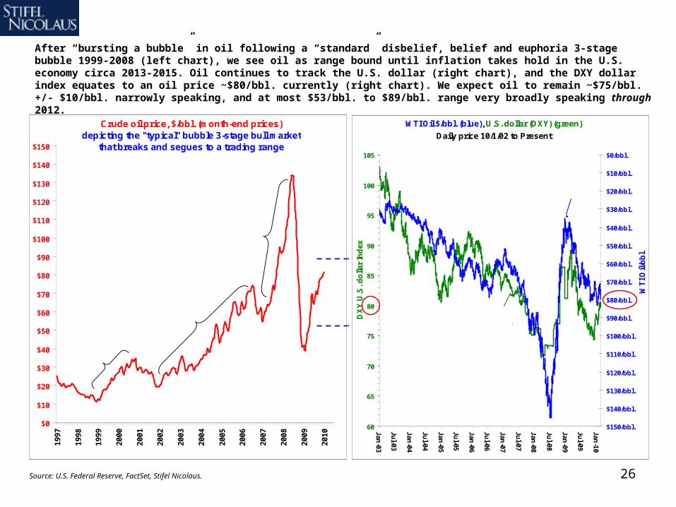
After “bursting a bubble” in oil following a “standard” disbelief, belief and euphoria 3-stage bubble 1999-2008 (left chart), we see oil as range bound until inflation takes hold in the U.S. economy circa 2013-2015. Oil continues to track the U.S. dollar (right chart), and the DXY dollar index equates to an oil price ~$80/bbl. currently (right chart). We expect oil to remain ~$75/bbl. +/- $10/bbl. narrowly speaking, and at most $53/bbl. to $89/bbl. range very broadly speaking through 2012.
Crude oil price, $/bbl. (month-end prices)depicting the "typical" bubble 3-stage bull market
that breaks and segues to a trading range
$0
$10
$20
$30
$40
$50
$60
$70
$80
$90
$100
$110
$120
$130
$140
$150
19
97
19
98
19
99
20
00
20
01
20
02
20
03
20
04
20
05
20
06
20
07
20
08
20
09
20
10
Disbelief~$11 to $34
= ~3x
Euphoria ~$55 to $147 (high)
= ~3x
Belief~$24 to $74
= ~3x
WTI Oil $/bbl. (blue), U.S. dollar (DXY) (green)
Daily price 10/1/02 to Present
60
65
70
75
80
85
90
95
100
105
Jan-03
Jul-03
Jan-04
Jul-04
Jan-05
Jul-05
Jan-06
Jul-06
Jan-07
Jul-07
Jan-08
Jul-08
Jan-09
Jul-09
Jan-10
DX
Y U
.S. d
olla
r In
dex
$0/bbl.
$10/bbl.
$20/bbl.
$30/bbl.
$40/bbl.
$50/bbl.
$60/bbl.
$70/bbl.
$80/bbl.
$90/bbl.
$100/bbl.
$110/bbl.
$120/bbl.
$130/bbl.
$140/bbl.
$150/bbl.
WT
I Oil/
bb
l.
DXY dollar index
WTI Oil $/bbl.

27
Real Crude Oil prices (left axis, solid area) vs. y/y GDP converted to monthly (right axis)
$0.00
$10.00
$20.00
$30.00
$40.00
$50.00
$60.00
$70.00
$80.00
$90.00
$100.00
$110.00
$120.00
$130.00
$140.00
Jan-
73Ja
n-74
Jan-
75Ja
n-76
Jan-
77Ja
n-78
Jan-
79Ja
n-80
Jan-
81Ja
n-82
Jan-
83Ja
n-84
Jan-
85Ja
n-86
Jan-
87Ja
n-88
Jan-
89Ja
n-90
Jan-
91Ja
n-92
Jan-
93Ja
n-94
Jan-
95Ja
n-96
Jan-
97Ja
n-98
Jan-
99Ja
n-00
Jan-
01Ja
n-02
Jan-
03Ja
n-04
Jan-
05Ja
n-06
Jan-
07Ja
n-08
Jan-
09
-6.0%
-5.0%
-4.0%
-3.0%
-2.0%
-1.0%
0.0%
1.0%
2.0%
3.0%
4.0%
5.0%
6.0%
7.0%
8.0%
9.0%
10.0%
Inflation- adjusted Crude Oil $ per bbl U.S. Real GDP Monthly y/y % chng (left)
If oil doesn’t actually cause a recession, we believe it certainly renders the coup de grâce by causing already slowing GDP to “go negative.” As a result, following oil is critical for any industrial analyst. This chart also shows that particularly deep U.S. recessions occur at ~$85/bbl. and higher (in inflation-adjusted terms), consistent with our earlier charts.
Source: U.S. Department of Commerce, BEA, NYMEX.
28
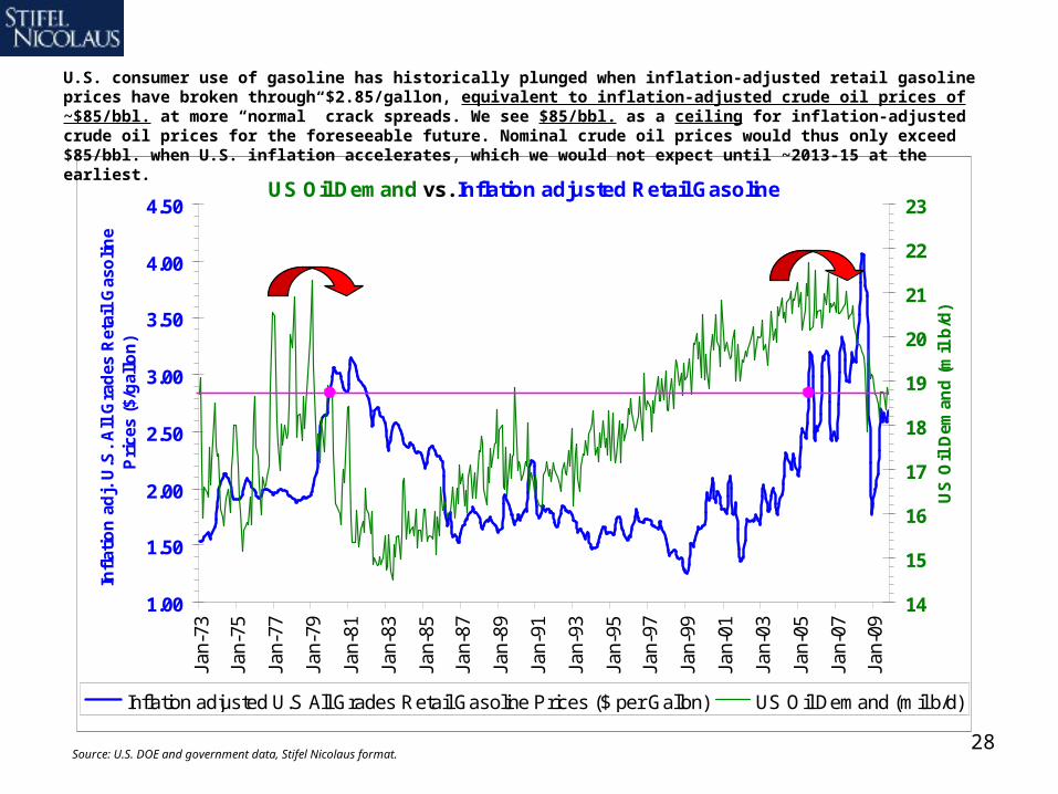
US Oil Demand vs. Inflation adjusted Retail Gasoline
1.00
1.50
2.00
2.50
3.00
3.50
4.00
4.50Ja
n-73
Jan-
75
Jan-
77
Jan-
79
Jan-
81
Jan-
83
Jan-
85
Jan-
87
Jan-
89
Jan-
91
Jan-
93
Jan-
95
Jan-
97
Jan-
99
Jan-
01
Jan-
03
Jan-
05
Jan-
07
Jan-
09
Infl
atio
n a
dj.
U.S
. A
ll G
rad
es R
etai
l G
aso
lin
e P
rice
s ($
/gal
lon
)
14
15
16
17
18
19
20
21
22
23
US
Oil
Dem
and
(m
il b
/d)
Inflation adjusted U.S All Grades Retail Gasoline Prices ($ per Gallon) US Oil Demand (mil b/d)
Source: U.S. DOE and government data, Stifel Nicolaus format.
U.S. consumer use of gasoline has historically plunged when inflation-adjusted retail gasoline prices have broken through $2.85/gallon, equivalent to inflation-adjusted crude oil prices of ~$85/bbl. at more “normal” crack spreads. We see $85/bbl. as a ceiling for inflation-adjusted crude oil prices for the foreseeable future. Nominal crude oil prices would thus only exceed $85/bbl. when U.S. inflation accelerates, which we would not expect until ~2013-15 at the earliest.
29
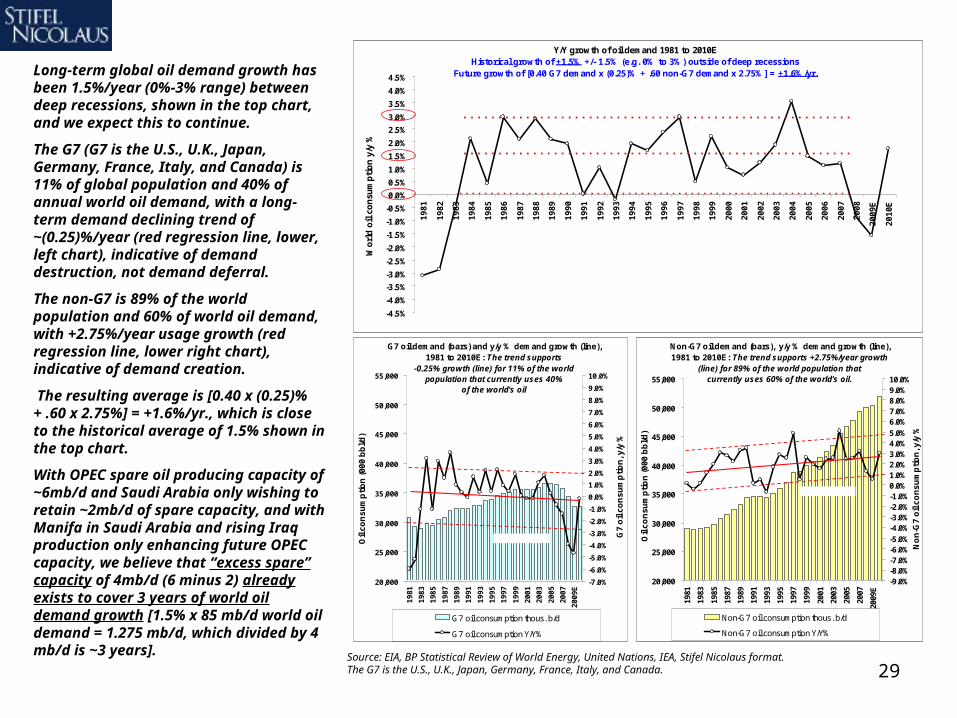
Long-term global oil demand growth has been 1.5%/year (0%-3% range) between deep recessions, shown in the top chart, and we expect this to continue.
The G7 (G7 is the U.S., U.K., Japan, Germany, France, Italy, and Canada) is 11% of global population and 40% of annual world oil demand, with a long-term demand declining trend of ~(0.25)%/year (red regression line, lower, left chart), indicative of demand destruction, not demand deferral.
The non-G7 is 89% of the world population and 60% of world oil demand, with +2.75%/year usage growth (red regression line, lower right chart), indicative of demand creation.
The resulting average is [0.40 x (0.25)% + .60 x 2.75%] = +1.6%/yr., which is close to the historical average of 1.5% shown in the top chart.
With OPEC spare oil producing capacity of ~6mb/d and Saudi Arabia only wishing to retain ~2mb/d of spare capacity, and with Manifa in Saudi Arabia and rising Iraq production only enhancing future OPEC capacity, we believe that “excess spare” capacity of 4mb/d (6 minus 2) already exists to cover 3 years of world oil demand growth [1.5% x 85 mb/d world oil demand = 1.275 mb/d, which divided by 4 mb/d is ~3 years]. Source: EIA, BP Statistical Review of World Energy, United Nations, IEA, Stifel Nicolaus format.
The G7 is the U.S., U.K., Japan, Germany, France, Italy, and Canada.
Y/Y growth of oil demand 1981 to 2010EHistorical growth of +1.5% +/- 1.5% (e.g. 0% to 3%) outside of deep recessions
Future growth of [0.40 G7 demand x (0.25)% + .60 non-G7 demand x 2.75%] = +1.6%/yr.
-4.5%
-4.0%
-3.5%
-3.0%
-2.5%
-2.0%
-1.5%
-1.0%
-0.5%
0.0%
0.5%
1.0%
1.5%
2.0%
2.5%
3.0%
3.5%
4.0%
4.5%
198
1
198
2
198
3
198
4
198
5
198
6
198
7
198
8
198
9
199
0
199
1
199
2
199
3
199
4
199
5
199
6
199
7
199
8
199
9
200
0
200
1
200
2
200
3
200
4
200
5
200
6
200
7
200
8
200
9E
201
0E
Wo
rld
oil
co
nsu
mp
tio
n y
/y %
Non-G7 oil demand (bars), y/y % demand growth (line), 1981 to 2010E: The trend supports +2.75%/year growth
(line) for 89% of the world population that currently uses 60% of the world's oil.
20,000
25,000
30,000
35,000
40,000
45,000
50,000
55,000
1981
1983
1985
1987
1989
1991
1993
1995
1997
1999
2001
2003
2005
2007
2009
E
Oil
co
nsu
mp
tion
(00
0 b
bl/d
)
-9.0%-8.0%-7.0%-6.0%-5.0%-4.0%-3.0%-2.0%-1.0%0.0%1.0%2.0%3.0%4.0%5.0%6.0%7.0%8.0%9.0%10.0%
No
n-G
7 o
il c
on
sum
ptio
n, y
/y %
Non-G7 oil consumption thous. b/d
Non-G7 oil consumption Y/Y%
+ 1 st. deviation
- 1 st. deviation
G7 oil demand (bars) and y/y % demand growth (line), 1981 to 2010E: The trend supports
-0.25% growth (line) for 11% of the world population that currently uses 40%
of the world's oil
20,000
25,000
30,000
35,000
40,000
45,000
50,000
55,000
19
81
19
83
19
85
19
87
19
89
19
91
19
93
19
95
19
97
19
99
20
01
20
03
20
05
20
07
20
09
E
Oil
co
nsu
mp
tion
(00
0 b
bl/d
)
-7.0%
-6.0%
-5.0%
-4.0%
-3.0%
-2.0%
-1.0%
0.0%
1.0%
2.0%
3.0%
4.0%
5.0%
6.0%
7.0%
8.0%
9.0%
10.0%
G7
oil
con
sum
pti
on
, y/y
%G7 oil consumption thous. b/d
G7 oil consumption Y/Y%
+ 1 st. deviation
- 1 st. deviation

30
China: Aspiring or Expiring?1. China’s rise is “real,” but the country is caught on a hamster wheel of strong total factor productivity leading
to high corporate and consumer savings rates that are then recycled into still more fixed investment.
2. Just as a centralized economic system can allocate capital more quickly than a free market, a free market (individual agents maximizing utility) can allocate more efficiently than a centralized system.
3. That is why the U.S. is liquidating land, labor & capital and floating the U.S. $ while the Chinese are employing massive expansion of bank loans and fixing their currency to avoid such adjustments. The U.S. approach is more sound, in our view.
4. China’s lending surge is not new, the country pumped up lending in the last recession eight years ago. The problem is at the margin - ever larger amounts of lending are required to achieve the same effect.
5. Chinese bank lending ($1.4 trillion in 2009, 29% of GDP) and currency policies are driving rapid Chinese M1 growth. Besides fixed investment or asset bubbles, China risks inflation, so policy is tightening.
6. We see inflation pressuring emerging market P/E multiples while disinflation lifts P/E multiples for traditional U.S. “growth” stocks, punishing the herd that is heavily invested in emerging market equities.

31
4%
6%
8%
10%
12%
14%
16%
18%
20%
22%
24%
26%
28%
30%
32%
34%
36%
Sep
-01
Mar
-02
Sep
-02
Mar
-03
Sep
-03
Mar
-04
Sep
-04
Mar
-05
Sep
-05
Mar
-06
Sep
-06
Mar
-07
Sep
-07
Mar
-08
Sep
-08
Mar
-09
Sep
-09
3%
6%
9%
12%
15%
18%
21%
24%
27%
30%
33%
36%
China bank loans (bil. yuan/month, bars, left axis) vs. China oil usage (LTM, mil. bbls./day, line, right axis)
12,500B Yuan
15,000B Yuan
17,500B Yuan
20,000B Yuan
22,500B Yuan
25,000B Yuan
27,500B Yuan
30,000B Yuan
32,500B Yuan
35,000B Yuan
37,500B Yuan
40,000B Yuan
42,500B Yuan
45,000B Yuan
Jan
-04
Ma
y-04
Se
p-0
4
Jan
-05
Ma
y-05
Se
p-0
5
Jan
-06
Ma
y-06
Se
p-0
6
Jan
-07
Ma
y-07
Se
p-0
7
Jan
-08
Ma
y-08
Se
p-0
8
Jan
-09
Ma
y-09
Se
p-0
9
Jan
-10
5.5mb/d
5.8mb/d
6.0mb/d
6.3mb/d
6.5mb/d
6.8mb/d
7.0mb/d
7.3mb/d
7.5mb/d
7.8mb/d
8.0mb/d
8.3mb/d
8.5mb/d
8.8mb/d
9.0mb/d
9.3mb/d
9.5mb/d
China bank loans (billion yuan, bars, left axis) vs. China net coal* imports (LTM tons, mil., line, right axis)
12,500B Yuan
15,000B Yuan
17,500B Yuan
20,000B Yuan
22,500B Yuan
25,000B Yuan
27,500B Yuan
30,000B Yuan
32,500B Yuan
35,000B Yuan
37,500B Yuan
40,000B Yuan
42,500B Yuan
45,000B Yuan
Jan
-04
Ma
y-04
Se
p-0
4
Jan
-05
Ma
y-05
Se
p-0
5
Jan
-06
Ma
y-06
Se
p-0
6
Jan
-07
Ma
y-07
Se
p-0
7
Jan
-08
Ma
y-08
Se
p-0
8
Jan
-09
Ma
y-09
Se
p-0
9
Jan
-10
-100.0mt/y
-90.0mt/y
-80.0mt/y
-70.0mt/y
-60.0mt/y
-50.0mt/y
-40.0mt/y
-30.0mt/y
-20.0mt/y
-10.0mt/y
0.0mt/y
10.0mt/y
20.0mt/y
30.0mt/y
40.0mt/y
50.0mt/y
60.0mt/y
70.0mt/y
80.0mt/y
90.0mt/y
100.0mt/y
110.0mt/y
*Met coal + anthracite + steam coal
China bank loans (billion yuan, bars, left axis) vs. China iron ore imports (LTM tons, mil., line, right axis)
12,500B Yuan
15,000B Yuan
17,500B Yuan
20,000B Yuan
22,500B Yuan
25,000B Yuan
27,500B Yuan
30,000B Yuan
32,500B Yuan
35,000B Yuan
37,500B Yuan
40,000B Yuan
42,500B Yuan
45,000B Yuan
Jan
-04
Ma
y-04
Se
p-0
4
Jan
-05
Ma
y-05
Se
p-0
5
Jan
-06
Ma
y-06
Se
p-0
6
Jan
-07
Ma
y-07
Se
p-0
7
Jan
-08
Ma
y-08
Se
p-0
8
Jan
-09
Ma
y-09
Se
p-0
9
Jan
-10
5.0mt/y
10.0mt/y
15.0mt/y
20.0mt/y
25.0mt/y
30.0mt/y
35.0mt/y
40.0mt/y
45.0mt/y
50.0mt/y
55.0mt/y
60.0mt/y
65.0mt/y
70.0mt/y
China bank loans (billion yuan, bars, left axis) vs. China bank loans y/y % change (line, right axis)
10,000B Yuan
12,500B Yuan
15,000B Yuan
17,500B Yuan
20,000B Yuan
22,500B Yuan
25,000B Yuan
27,500B Yuan
30,000B Yuan
32,500B Yuan
35,000B Yuan
37,500B Yuan
40,000B Yuan
42,500B Yuan
45,000B Yuan
Fe
b-0
1Ju
n-0
1O
ct-0
1F
eb
-02
Jun
-02
Oct
-02
Fe
b-0
3Ju
n-0
3O
ct-0
3F
eb
-04
Jun
-04
Oct
-04
Fe
b-0
5Ju
n-0
5O
ct-0
5F
eb
-06
Jun
-06
Oct
-06
Fe
b-0
7Ju
n-0
7O
ct-0
7F
eb
-08
Jun
-08
Oct
-08
Fe
b-0
9Ju
n-0
9O
ct-0
9
0%
5%
10%
15%
20%
25%
30%
35%
40%
Just as a centralized economic system can allocate capital more quickly than a free market, a free market (of individual agents acting to maximize their own utility) can allocate more efficiently than a centralized system. The U.S. is liquidating land, labor and capital and floating the U.S. dollar while the Chinese are employing massive, rapid expansion of bank loans and currency intervention to avoid such adjustments. The U.S. approach is much more sound, in our view. Chinese bank loan growth the past year has been driving exuberance for minerals, especially those used in construction. We spot “bubble trouble,” however, and note that the PBOC and Chinese banking regulators have already announced measures to curb loan growth.
Surge in lending
coincides with surge in net coal imports.
Surge in lending
coincides with surge in iron ore imports.
Source: People’s Bank of China, National Bureau of Statistics of China, FactSet, Stifel Nicolaus Metals & Mining research.
No such surge in oil usage,
because the lending program
was geared toward
“infrastructure.”
32
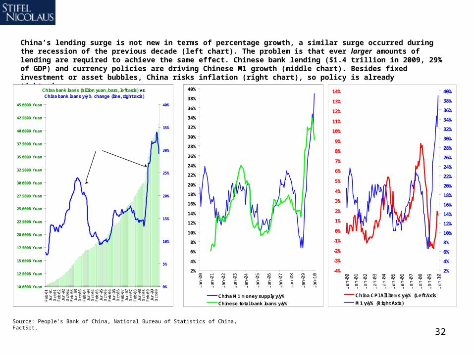
China’s lending surge is not new in terms of percentage growth, a similar surge occurred during the recession of the previous decade (left chart). The problem is that ever larger amounts of lending are required to achieve the same effect. Chinese bank lending ($1.4 trillion in 2009, 29% of GDP) and currency policies are driving Chinese M1 growth (middle chart). Besides fixed investment or asset bubbles, China risks inflation (right chart), so policy is already tightening.
China bank loans (billion yuan, bars, left axis) vs. China bank loans y/y % change (line, right axis)
10,000B Yuan
12,500B Yuan
15,000B Yuan
17,500B Yuan
20,000B Yuan
22,500B Yuan
25,000B Yuan
27,500B Yuan
30,000B Yuan
32,500B Yuan
35,000B Yuan
37,500B Yuan
40,000B Yuan
42,500B Yuan
45,000B Yuan
Feb
-01
Jun-
01O
ct-0
1F
eb-0
2Ju
n-02
Oct
-02
Feb
-03
Jun-
03O
ct-0
3F
eb-0
4Ju
n-04
Oct
-04
Feb
-05
Jun-
05O
ct-0
5F
eb-0
6Ju
n-06
Oct
-06
Feb
-07
Jun-
07O
ct-0
7F
eb-0
8Ju
n-08
Oct
-08
Feb
-09
Jun-
09O
ct-0
9
0%
5%
10%
15%
20%
25%
30%
35%
40%The issue isn’t that loan growth is strong, it was similarly strong in
response to the recession a decade ago. The issue is the ever larger amounts of debt, and the
circular role debt plays in growth, leading to more lending capacity.
Source: People’s Bank of China, National Bureau of Statistics of China, FactSet.
2%
4%
6%
8%
10%
12%
14%
16%
18%
20%
22%
24%
26%
28%
30%
32%
34%
36%
38%
40%
Jan
-00
Jan
-01
Jan
-02
Jan
-03
Jan
-04
Jan
-05
Jan
-06
Jan
-07
Jan
-08
Jan
-09
Jan
-10
China M1 money supply y/y%
Chinese total bank loans y/y%
Chinese bank loans (and currency
policy) are driving extraordinary M1
money supply growth...
-4%
-3%
-2%
-1%
0%
1%
2%
3%
4%
5%
6%
7%
8%
9%
10%
11%
12%
13%
14%
Jan-
00
Jan-
01
Jan-
02
Jan-
03
Jan-
04
Jan-
05
Jan-
06
Jan-
07
Jan-
08
Jan-
09
Jan-
10
2%
4%
6%
8%
10%
12%
14%
16%
18%
20%
22%
24%
26%
28%
30%
32%
34%
36%
38%
40%
China CPI All Items y/y% (Left Axis)
M1 y/y% (Right Axis)
…and despite claims of an output gap, extraordinary
M1 growth is historically inflationary.
33Source: Bank Credit Analyst
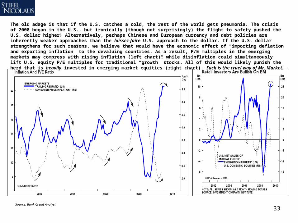
The old adage is that if the U.S. catches a cold, the rest of the world gets pneumonia. The crisis of 2008 began in the U.S., but ironically (though not surprisingly) the flight to safety pushed the U.S. dollar higher! Alternatively, perhaps Chinese and European currency and debt policies are inherently weaker approaches than the laissez-faire U.S. approach to the dollar. If the U.S. dollar strengthens for such reasons, we believe that would have the economic effect of “importing deflation and exporting inflation” to the devaluing countries. As a result, P/E multiples in the emerging markets may compress with rising inflation (left chart), while disinflation could simultaneously lift U.S. equity P/E multiples for traditional “growth” stocks. All of this would likely punish the herd that is heavily invested in emerging market equities (right chart). Such is the cruel way of Mr. Market.
34
Important Disclosures and Certifications
I , Barry Bannister, certify that the views expressed in this research report accurately reflect my personal views about the subject securities or issuers; and I, Barry Bannister, certify that no part of my compensation was, is, or will be directly or indirectly related to the specific recommendation or views contained in this research report.
Stifel, Nicolaus & Company, Inc.'s research analysts receive compensation that is based upon (among other factors) Stifel Nicolaus' overall investment banking revenues.
Our investment rating system is three tiered, defined as follows:
BUY - We expect this stock to outperform the S&P 500 by more than 10% over the next 12 months. For higher-yielding equities such as REITs and Utilities, we expect a total return in excess of 12% over the next 12 months.
HOLD - We expect this stock to perform within 10% (plus or minus) of the S&P 500 over the next 12 months. A Hold rating is also used for those higher-yielding securities where we are comfortable with the safety of the dividend, but believe that upside in the share price is limited.
SELL - We expect this stock to underperform the S&P 500 by more than 10% over the next 12 months and believe the stock could decline in value.
Of the securities we rate, 37% are rated Buy, 59% are rated Hold, and 4% are rated Sell.
Within the last 12 months, Stifel, Nicolaus & Company, Inc. or an affiliate has provided investment banking services for 11%, 10% and 3% of the companies whose shares are rated Buy, Hold and Sell, respectively.
35
Additional Disclosures
Please visit the Research Page at www.stifel.com for the current research disclosures applicable to the companies mentioned in this publication that are within Stifel Nicolaus’ coverage universe. For a discussion of risks to target price please see our stand-alone company reports and notes for all Buy-rated stocks.
The information contained herein has been prepared from sources believed to be reliable but is not guaranteed by us and is not a complete summary or statement of all available data, nor is it considered an offer to buy or sell any securities referred to herein. Opinions expressed are subject to change without notice and do not take into account the particular investment objectives, financial situation or needs of individual investors. Employees of Stifel, Nicolaus & Company, Inc. or its affiliates may, at times, release written or oral commentary, technical analysis or trading strategies that differ from the opinions expressed within. Past performance should not and cannot be viewed as an indicator of future performance.
Stifel, Nicolaus & Company, Inc. is a multi-disciplined financial services firm that regularly seeks investment banking assignments and compensation from issuers for services including, but not limited to, acting as an underwriter in an offering or financial advisor in a merger or acquisition, or serving as a placement agent in private transactions. Moreover, Stifel Nicolaus and its affiliates and their respective shareholders, directors, officers and/or employees, may from time to time have long or short positions in such securities or in options or other derivative instruments based thereon.
These materials have been approved by Stifel Nicolaus Limited, authorized and regulated by the Financial Services Authority (UK), in connection with its distribution to professional clients and eligible counterparties in the European Economic Area. (Stifel Nicolaus Limited home office: London +44 20 7557 6030.) No investments or services mentioned are available in the European Economic Area to retail clients or to anyone in Canada other than a Designated Institution. This investment research report is classified as objective for the purposes of the FSA rules. Please contact a Stifel Nicolaus entity in your jurisdiction if you require additional information.
The use of information or data in this research report provided by or derived from Standard & Poor’s Financial Services, LLC is Copyright © 2010, Standard & Poor’s Financial Services, LLC (“S&P”). Reproduction of Compustat data and/or information in any form is prohibited except with the prior written permission of S&P. Because of the possibility of human or mechanical error by S&P’s sources, S&P or others, S&P does not guarantee the accuracy, adequacy, completeness or availability of any information and is not responsible for any errors or omissions or for the results obtained from the use of such information. S&P GIVES NO EXPRESS OR IMPLIED WARRANTIES, INCLUDING, BUT NOT LIMITED TO, ANY WARRANTIES OF MERCHANTABILITY OR FITNESS FOR A PARTICULAR PURPOSE OR USE. In no event shall S&P be liable for any indirect, special or consequential damages in connection with subscriber’s or others’ use of Compustat data and/or information. For recipient’s internal use only.
Additional information is available upon request
© 2010 Stifel, Nicolaus & Company, Incorporated, One South Street, Baltimore, MD 21202. All rights reserved.