BANKWEST CURTIN ECONOMICS CENTRE BACK FUTURE TO
114
Western Australia’s economic future aſter the boom BANKWEST CURTIN ECONOMICS CENTRE Focus on Western Australia Report Series, No.8 October 2016 BACK FUTURE TO THE
Transcript of BANKWEST CURTIN ECONOMICS CENTRE BACK FUTURE TO

Western Australia’s economic future after the boom
BANKWEST CURTIN ECONOMICS CENTRE
Focus on Western Australia Report Series, No.8October 2016
BACK FUTURETOTHE

About the Centre
The Bankwest Curtin Economics Centre is an independent economic and social research organisation located within the Curtin Business School at Curtin University. The centre was established in 2012 through the generous support from Bankwest (a division of the Commonwealth Bank of Australia), with a core mission to examine the key economic and social policy issues that contribute to the sustainability of Western Australia and the nation, and the wellbeing of households both in WA and nationally.
The Bankwest Curtin Economics Centre is the first research organisation of its kind in Western Australia, and draws great strength and credibility from its partnership with Bankwest, Curtin University and the Western Australian government.
The centre brings a unique philosophy to research on the major economic issues facing the state. By bringing together experts from the research, policy and business communities at all stages of the process – from framing and conceptualising research questions, through the conduct of research, to the communication and implementation of research findings – we ensure that our research is relevant, fit for purpose, and makes a genuine difference to the lives of Australians, both in WA and nationally.
The centre is able to capitalise on Curtin University’s reputation for excellence in economic modelling, forecasting, public policy research, trade and industrial economics and spatial sciences. Centre researchers have specific expertise in economic forecasting, quantitative modelling, micro-data analysis and economic and social policy evaluation. The centre also derives great value from its close association with experts from the corporate, business, public and not-for-profit sectors.

Contents
BACK TO THE FUTURE Western Australia’s economic future after the boom
i
List of figuresList of tablesForewordExecutive summaryKey findings
iiv
viviivii
WA economic trends after the boomThe end of the mining boom?Returning to a ‘new normal’
147
Household income and wealth in Western AustraliaHow do incomes in Western Australia compare?The distribution of incomes in WAHas income inequality changed in WA after the boom?Household wealth in Western AustraliaHow has household wealth in WA changed after the boom?Financial security among WA households after the boom?
9111315202426
Prices and the cost of living in Western AustraliaHow does WA’s cost of living compare to the rest of Australia?Regional cost of living variations in WAAre WA incomes keeping pace with prices?
29313840
Workforce transitions in Western AustraliaUnemployment trendsChanges in labour supply and demandLabour force status Labour force underutilisationJob security and precarious employmentThe demand for industry training
43454752555759
Should I stay or should I go? Migration flows after the boomInterstate migration flowsOverseas migration flowsTemporary skilled visa workersRegional migration in WA
6163656871
WA’s industrial landscape after the boomIndustry contributions to economic growth in WAEmployment trends across WA industries Is WA industry becoming more diversified or more specialised?The changing profile of the WA mining industry
7375788083
Discussion and conclusions 85Glossary 91References 95

List of figures
ii
Figure 1 Annual real growth of WA Gross State Product and national Gross Domestic Product: 1991 to 2015
3
Figure 2 Iron ore price and quantity in WA, 1999-2015 4
Figure 3 Employment in the WA mining industry, 2001-2015 4
Figure 4 Mining investment in WA versus rest of Australia, 2006-2015 5
Figure 5 Mineral exploration expenditure in WA versus rest of Australia, 2006-2015 6
Figure 6 Average and median household weekly incomes by states and territories: 2013-14 and change since 2009-10
12
Figure 7 Relative income inequality in WA and Australia: 2003 to 2014 16
Figure 8 Share of WA households with wages/salaries and government payments as principal source of income: 2005-06 to 2013-14
19
Figure 9 Share of household net wealth by quintile: Western Australia, 2013-14 22
Figure 10 Household net wealth composition by quintile: Western Australia, 2013-14 23
Figure 11 Perceived prosperity in 2010 and 2014, Western Australia and the rest of Australia
26
Figure 12 Incidence of financial difficulties, Western Australia and the rest of Australia, 2001 to 2014
27
Figure 13 Average annual inflation rate by groups, Perth, 2007-2016, per cent 31
Figure 14 Annual inflation rate by groups, Perth and metropolitan Australian, 2012 to 2016, per cent
32
Figure 15 Percentage change in rents, Perth versus metropolitan Australia, 2007-08 to 2015-16
33
Figure 16 Percentage change in new dwelling purchase price, Perth versus metropolitan Australia, 2007-08 to 2015-16
33
Figure 17 Percentage change in established house purchase prices: 2007-08 to 2015-16
34
Figure 18 Percentage change in the price of tradable and non-tradable goods, Perth versus metropolitan Australia, 2007-08 to 2015-16
35
Figure 19 Percentage change in quarterly retail trade turnover, WA versus Australia, chain volume, 2010-2016
35
Figure 20 Percentage change in quarterly retail trade implicit price deflator, WA versus Australia, 2010-2016
36
Figure 21 Retail trade turnover in dollars per capitabased on chain volume measure, WA versus Australia, 2005 to 2016
37
Figure 22 Retail trade turnover per capita, household goods and restaurants service, 2010-2016
37
Figure 23 Gap between the Regional Price Index of each region and Perth, 2011-2015 38

iii
iii
BACK TO THE FUTURE Western Australia’s economic future after the boom
Figure 24 Gap between the Regional Price Index of each region and Perth, 2011-2015, by groups, 2011-2015 39
Figure 25 Percentage change in the Wage Price Index and Consumer Price Index, WA versus Australia, 2007-2016
40
Figure 26 Percentage change in Wage Price Index deflated by percentage change in Consumer Price Index, WA versus Australia, 2007-2016
41
Figure 27 Unemployment rate in WA versus Australia, 2006 to 2016, per cent 45
Figure 28 Labour force participation rate in WA versus Australia, 2006 to 2016, per cent
47
Figure 29 Internet Vacancy Index for WA versus Australia, 2006 to 2016 48
Figure 30 Internet Vacancy Index for WA versus Australia, by occupation, 2006 to 2016
50
Figure 31 Labour force participation and Internet Vacancy Index growth rates in WA versus Australia, 2009 to 2016
51
Figure 32 Unemployment rate by gender in WA versus Australia, 2009 to 2016, per cent
53
Figure 33 Growth in full-time and part-time employment by gender in WA versus rest of Australia, 2009 to 2016, per cent
54
Figure 34 Underemployment rate across the five most populous states, 2009 to 2016, per cent
55
Figure 35 Underemployment rate by gender in WA versus the average of other states and territories, 2009 to 2016, per cent
56
Figure 36 Share of casual employees, WA versus Australia, 2006 to 2014, per cent 57
Figure 37 Share of employees who report more than 50 per cent chance of losing their job next year across the five most populous states, 2006 to 2014, per cent
58
Figure 38 Ratio of individuals undertaking industry training to number of people of working age in each of the five most populous states, 2011 to 2016, per cent
59
Figure 39 Growth in new trainees in WA versus Australia, 2012 to 2016 60
Figure 40 Interstate migration to WA, persons aged 15-64 years, 1997 to 2015 63
Figure 41 Interstate migration to WA, by state or territory of origin, 2011 to 2015 64
Figure 42 Overseas migration to WA, 2007 to 2015 65
Figure 43 Number of 457 visas granted to primary applicants located in WA, 2005-06 to 2015-16
68
Figure 44 Number of 457 visa grants in WA, by top six sponsor industries, 2005-06 to 2015-16
69
Figure 45 Number of 457 visa grants in WA, by top five occupations, 2005-06 to 2015-16
70
Figure 46 Net interstate migration to WA regions, 2006-07 to 2014-15 71
Figure 47 Net intrastate migration across WA regions, 2006-07 to 2014-15 72

iv
Figure 48 Number of 457 visa grants in WA, by statistical division, 2005-06 to 2015-16 72
Figure 49 Percentage contribution of each industry to GVA in WA, 2010 and 2015, per cent
75
Figure 50 Growth in industry GVA in WA, 2009-10 and 2014-15, per cent 76
Figure 51 Industry contribution to GVA, WA versus Australia, 1990 to 2015, per cent 77
Figure 52 Percentage contribution of each industry to employment in WA, 2010 and 2015, per cent
78
Figure 53 Growth in industry GVA and employment in WA, 2014-15, per cent 79
Figure 54 Industry production concentration across states and territories, 1990 to 2015, GVA-based Herfindahl-Hirschman index
80
Figure 55 Industry production concentration, WA versus Australia, 1990 to 2015, Herfindahl-Hirschman index
81
Figure 56 Industry employment concentration in Australia and WA, 1990 to 2015, Herfindahl-Hirschman index
82
Figure 57 Commodity shares in the mining industry in WA, 2001 to 2015, per cent 83
Figure 58 Commodity shares of employment in the mining industry in WA, 2001 to 2015, per cent
84

List of tables
v
v
BACK TO THE FUTURE Western Australia’s economic future after the boom
Table 1 Household incomes by family type in Western Australia: 2013-14 and change from 2009-10
14
Table 2 Principal sources of income among WA households: by family type, 2009-10 and 2013-14
18
Table 3 Median household net wealth by states and territories, 2005-06 to 2013-14
21
Table 4 Median household wealth by asset class, Western Australia: 2013-14 and change from 2009-10
25
Table 5 Unemployment rate by state and territories, 2009 to 2016, per cent 46
Table 6 Net overseas migration to WA, by visa type, 2005 to 2014 66
Table 7 Net overseas migration to WA on permanent visas, by visa type, 2005 to 2014
66
Table 8 Net overseas migration to WA on temporary visas, by visa type, 2005 to 2014
67

Foreword
vi
Professor Alan DuncanDirector, Bankwest Curtin Economics CentreCurtin Business School, Curtin University
In 2014, the first report in the Bankwest Curtin Economics Centre’s Focus on Western Australia series highlighted the abnormally high growth rate enjoyed by the state in the early years of the new millennium. This extended period of economic growth was driven primarily by the state’s mining boom. It gave rise to unprecedented growth in Western Australia’s economy, with the annual growth rate of WA’s gross state product spiking at 9 per cent in 2011-12. However, the economic outlook post-2012 is very different. By 2015, the state’s GSP growth rate had slid to 3.5 per cent and the gap between the state and nation’s economic growth rate had narrowed.
Back to the Future is the eighth report in the Bankwest Curtin Economics Centre’s Focus on Western Australia series. Using the latest data available, this report examines recent changes in the state’s economic trends following the tailing off of the resources boom. It identifies the implications of these trends for the wellbeing of West Australian households, and sheds light on the challenges and opportunities that have arisen along with changes in the state’s economic position. It represents a timely follow up to the Centre’s first Focus on Western Australia report in 2014 – Sharing the Boom – which explored the distribution of income and wealth over the course of the latest resources boom, and examined the extent to which the wealth of WA was shared among those who live here.
This new report examines the extent to which WA has been undergoing an economic downturn in recent years. How has income and wealth inequality changed since the peak of the mining boom? Have prices and cost of living in WA fallen in line with incomes and wealth? How does WA compare with the rest of the states and territories? Have the recent changes in economic conditions negatively affected opportunities in the labour markets for West Australians? On the other hand, are we starting to see more industry diversification outside the resources sector?
This report shows that after a prolonged period of economic bonanza driven by the resources boom, WA’s economic trajectory has returned to a ‘new normal’ more consistent with national economic growth rates. However, the reversion in the state’s economic fortunes has undoubtedly had significant impacts on the economic and social wellbeing of West Australians. There has been a shift away from full-time towards part-time employment, underemployment is on the rise, and feelings of job insecurity are more prevalent than before. The state has also experienced a net population outflow as its economic performance declined. However, the recent economic slowdown has also resulted in some positive outcomes, including a narrowing of the gap between the rich and poor in WA and a general easing of cost of living pressures in resource-rich regions. While the mining sector has no doubt slowed in recent years, it remains the dominant industry in WA, both in terms of its contribution to production and employment in the state. Signs of industry diversification following the economic slowdown are scarce.

Executive summary
Key findings
This eighth report in the Bankwest Curtin Economics Centre’s Focus on Western Australia series examines the implications of recent economic trends for the wellbeing of West Australian households.
It represents a timely follow up to the Centre’s first Focus on Western Australia report in 2014 – Sharing the Boom – which explored the distribution of income and wealth over the course of the latest resources boom, and examined the extent to which the wealth of WA was shared among those who live here.
The report’s analysis draws on a range of data sources including but not limited to data from the Australian Bureau of Statistics, Australian Department of Employment, Department of Immigration and Border Protection, and WA Department of Mines and Petroleum to shed light on the challenges and opportunities that have arisen along with changes in the state’s economic position.
This report focuses on a series of key issues:
• How has income and wealth inequality changed since the peak of the resources boom?
• Has cost of living in WA fallen since the economic slowdown and are there variations across regions?
• How have recent changes in economic conditions affected labour market opportunities for men and women in WA?
• Is industry diversification increasing outside the resources sector?
• To what extent has there been a reversal to the huge influx of migrants that took place during the resources boom?
After the boom• WA’s gross state product growth rate
dropped from 9 per cent in 2011-12 to 3.5 per cent in 2014-15 below the state’s long-term average growth rate of 4.7 per cent.
• Though the gap between the WA and Australia’s economic growth rate has narrowed post-2012, WA’s growth rate still remains above the nation’s growth rate of 2.3 per cent.
• The size of the WA mining workforce has steadily shrunk from nearly 106,000 FTE in mid2013 to around 84,000 FTE by the end of 2015.
• Despite a drop in the value of WA’s mining investment and mineral exploration expenditure, WA’s share of national mining investment has grown from half to around two thirds during 2013-15 and its share of national mineral exploration expenditure has remained stable at under 60 per cent.
Income and wealth distribution• Perth attained the highest average
gross household income across all of Australia’s six state capital cities and two territories in 2013-14, at $2,840 per week in 2016 dollars
• Average household gross weekly income for regional Western Australia sits at $2,199, comfortably exceeding those for regional Queensland (at $2,001), New South Wales ($1,768) and Victoria (at $1,599).
• Average gross incomes in regional areas of Western Australia have fallen by 1.6 per cent since 2009-10. This likely reflects the greater economic challenges for families living in regional Western Australia after the state’s resources boom.
vii
vii
BACK TO THE FUTURE Western Australia’s economic future after the boom

viii
• Single parents have seen a much lower growth in median gross income since 2009-10, up 5 per cent to $64,200.
• There is an evident gender gap of some 33 per cent in median gross incomes between non-elderly single men ($72,500) and women ($48,900).
• Non-elderly single men and women have disposable incomes of $821 and $674 respectively after housing costs, representing a gender gap of 18 per cent.
• Income inequality in WA has reversed since 2009-10.
• The incomes of the state’s richest 10 per cent of households were at least 5 times those of the poorest 10 per cent in 2010, but the gap has fallen substantially since, to a multiple of around 4.5 by 2015.
• Nearly six in ten (58 per cent) single parent households draw most of their income from earnings, a rise of 7.9 percentage points since 2009-10.
• Government payments, principally the age pension, now make up the principal source of income for nearly three quarters of elderly single men (73 per cent) and four in five (81 per cent) elderly single women.
• Perth ranks fourth in terms of the median net wealth of households in the state’s capital, at $508,500.
• Median net wealth in the balance of Western Australia ranks seventh across all capital cities and state/territory balances, at $424,700.
• Western Australian households held assets with an aggregate net value of some $895 billion in 2013-14.
• The richest 20 per cent of WA households in wealth terms (the fifth quintile) holds at least 64.7 per cent of the state’s aggregate household net wealth.
• Superannuation assets constitute around 17 per cent of total household assets by value for the third and fourth wealth quintiles, and nearly 20 per cent for the wealthiest quintile.
Cost of living pressures• The average inflation rate was in Perth
declined from 3 per cent during the resource boom to under 2 per cent during the post-boom period.
• During the post-boom period, Perth has experienced slower price growth than metropolitan Australia in categories representing basic day-to-day necessities i.e. Food, Housing, Transport and Health.
• Between 2013-14 and 2015-16, the percentage change in the price of non-tradable goods dipped from 4 per cent to 1 per cent Perth. In the case of tradable goods, the percentage change in price fell much less from around 1.8 per cent to 0.7 per cent.
• Since 2013, the retail trade turnover in WA has been growing much more slowly than in Australia and even exhibited negative growth rates in some quarters.
• Between 2012 and 2016, the WA-Australia gap in per capita expenditure shrunk from $146 to $61 for durable goods and from $160 to $54 for restaurant food services.

ix
ix
BACK TO THE FUTURE Western Australia’s economic future after the boom
• The cost of living in Pilbara was 37 per cent higher than in Perth in 2011 but just 18 per cent higher in 2015.
• The cost of living in the Kimberley region was 20 higher than Perth in 2011 and this gap narrowed to 15 per cent in 2015.
• Regions with more diverse economies such as the Gascoyne, Wheatbelt and South West have become more expensive in recent years.
• During 2000-01 and 2014, the inflation rate was greater than the wage growth rate in WA, implying that the purchasing power of West Australian households declined during these two periods.
• Between 2013 and 2015 WA’s real income growth fell behind Australia. However, during the first two quarters of 2016, there are signs that the growth in real incomes in Western Australia is once again outpacing Australia’s real income growth.
• For the first time since 2006, the state’s unemployment rate surpassed the nation’s unemployment rate in mid-2015.
Workforce in transition• As at August 2016, the unemployment
rate in WA was over 6.0 per cent compared with 5.7 per cent in Australia.
• In WA, the Internet Vacancy Index (IVI) plummeted from a high of 160 in 2012 to 90 in 2013 as growth in the resources sector stalled and in 2015, the state’s IVI dipped below the nation’s IVI for the first time in a decade.
• In general, the IVI for both WA and Australia have remained below 2006 levels since the slowdown of the resources sector ushered in a new era of weaker demand in labour markets.
• High skilled occupations in WA appear to benefit the most from economic booms, with IVIs for managers and professionals peaking at over 200 during the pre-GFC high in the economic cycle and the peak of the resources boom.
• Blue collar occupations have benefited more from the resources boom than white collar occupations. The IVI for technicians surged from 90 to 210 between 2009 and 2012, and the IVI for machinery operators and drivers also almost tripled from 60 to 150 over this period.
• Demand for high skilled and blue collar occupations are more sensitive to the movements of the economic cycle than demand for low skilled and white collar occupations respectively.
• In August 2016, the labour force participation growth rate in WA dipped to -1.7 per cent, almost six times the negative growth rate experienced by Australia as a whole at -0.3 per cent.
• During 2013-16, the IVI growth rate for WA turned negative and plunged below Australia’s IVI growth rate.
• During the resource boom years of 2011 and 2013, the WA unemployment rate was lower than Australian unemployment rate for both males and females. During the post-boom years, the reverse can be observed.

x
• For both males and females, full-time employment growth in WA dipped below the national average after the resources boom to -5 per cent in 2016.
• By 2016, the biennial part-time employment growth rate had climbed to 10 per cent for males and females in WA. In the case of females, this represents the highest growth rate among all states and territories in 2016.
• The underemployment rate in WA has risen more sharply than the other four most populous states in Australia – from 6 per cent in 2011 to 10 per cent in 2016.
• Between 2008 and 2014 the share of casual employees in WA rose from 20.5 to 22.5 per cent and the rate of growth of this casualisation accelerated from -1.5 per cent to 1.5 per cent.
• The share of employees who report more than 50 per cent chance of losing their job in the next year has doubled from 1.5 to 3 per cent between 2010 and 2012.
• The per capita measure of industry training has remained constant at 2 per cent in WA compared with a decline in other states. In 2011, the per capita measure of industry training was the lowest in WA. By 2016, it was the highest in WA.
• In both the state and nation, the growth in new trainees has been negative in recent years, indicating a decline in the number of new traineeships offered.
Migration flows• WA experienced the steepest decline
in net interstate migration in decades. WA’s migration numbers dipped from a net inflow of 8,898 in 2012 to a net outflow of 3,005 in 2015.
• The number of temporary visa holders more than halved between 2012 and 2014 from 27,090 to 12,130 and the net number of New Zealand Citizens moving to WA dived from 9,330 to 650.
• During the post-boom period 2012-14, the number of skilled migration visa holders in WA fell from 7,960 to 7,220 and temporary visa holders dropped from 10,940 to just 820.
• The number of 457 visa grants to primary applicants located in WA dipped from nearly 17,000 (25 per cent of the total granted in Australia) in 2011-12 to just 6,000 (10 per cent) in 2015-16.
• The number of 457 visas granted to workers in WA mining and construction fell by around 3,000 per industry in the five year to 2015-16.
• The WA Outback has lost 2,000 to 3,000 migrants annually to other regions within WA since 2007-08. In contrast, the Wheatbelt region has been experiencing a net gain in intrastate migrants since 2013-14.
• The Pilbara region has experienced the largest decline in the number of 457 visa grants among all statistical divisions in regional WA from over 1,600 grants to around 440 (nearly 75 per cent) between 2011-12 and 2015-16.

xi
xi
BACK TO THE FUTURE Western Australia’s economic future after the boom
Industrial landscape• The mining industry contributed 37 per
cent and 30 per cent of GVA in 2015 and 2010 respectively.
• Most industries including mining have experienced positive GVA growth in both timeframes despite the economic slowdown in the state.
• Industries that feature strongly in the tourism sector – Accommodation and food services, Retail trade, and Arts and recreation services – together made up only 5.4 per cent of total GVA in 2010 and this contribution has shrunk to 4.9 per cent in 2015.
• Health care and social services and Arts and recreation displayed the highest employment growth rates in 2014-15 while also increasing their GVA.
• The industry profile in WA has become less diversified over the course of the mining boom and throughout the post-boom years.
• The Western Australian industry profile has always been more concentrated than Australia overall in terms of GVA.
• WA has similar industry concentration levels as Australia overall, but the state’s industry profile is getting slightly more diversified over time in terms of the workforce the industries employ.
• In 2015, iron contributed to 55 per cent of the value of the mining industry, followed by LNG (13 per cent) and gold (10 per cent).
• The contribution of iron ore to the WA mining industry has contracted by six percentage points since 2013, and this has been replaced by growing contributions by gold, alumina and LNG.
• While the WA economy has become more specialised over time, some diversification has actually taken place within the mining sector itself.


WAeconomic trends after the boom

2
WA’s gross state product growth rate dropped from 9 per cent in 2011-12 to 3.5 per cent in 2014-15 below the state’s long-term average growth rate of 4.7 per cent.
Introduction
The Bankwest Curtin Economics Centre’s first Focus on Western Australia report series highlighted the impact of the sustained period of growth enjoyed by WA in the first decade of the new millennium. This period of economic growth was driven primarily by the state’s mining boom, particularly in the iron ore industry. During this period, global demand – particularly from China – fuelled the growth of the resources industry in WA. It gave rise to an unprecedented growth in the state’s population, as an influx of migrants from both overseas and interstate flowed into Western Australia to capitalise on the resources boom.
After a period of slow growth in the late 1990s, the annual real economic growth rate in Western Australia measured by Gross State Product (GSP) shot above Australia’s national GDP growth rate in 2002 (as shown in Figure 1). The growth rate in WA has remained above the national trend ever since, giving rise to a popular proposition that Australia has become a two-speed economy. The extended resources boom culminated in a spike in the state’s GSP in 2011-12, with annual GSP growth rate hitting 9 per cent, nearly three times the national GDP growth rate of 3.6 per cent.
Economic growth in Western Australia remains above the national trend, but the gap has narrowed considerably over the last three years. WA’s GSP growth moderated to around 3.5 per cent in 2014-15 compares with a national GDP growth rate of 2.3 per cent. This is below the state’s long-term average GSP growth 4.7 per cent, but nonetheless above previous economic troughs in the cycle experienced in 1990-91 and 1999-2001.

3
3
BACK TO THE FUTURE Western Australia’s economic future after the boom
Though the gap between the WA and Australia’s economic growth rate has narrowed post-2012, WA’s growth rate still remains above the nation’s growth rate.
Figure 1 Annual real growth of WA Gross State Product and national Gross Domestic Product: 1991 to 2015
10.0
9.0
8.0
7.0
6.0
5.0
4.0
3.0
2.0
1.0
0.0
-1.0
1990
-91
1991
-92
1992
-93
1993
-94
1994
-95
1995
-96
1996
-97
1997
-98
1998
-99
1999
-00
2000
-01
2001
-02
2002
-03
2003
-04
2004
-05
2005
-06
2006
-07
2007
-08
2008
-09
2009
-10
2010
-11
2011
-12
2012
-13
2013
-14
2014
-15
Annu
al re
al G
SP/G
DP
grow
th (p
er c
ent)
Western Australia (GSP) Australia (GDP) WA’s long-term average growth rate
Note: GDP and GSP are derived from chain volume measures.Source: BANKWEST CURTIN ECONOMICS CENTRE | AUSTRALIAN BUREAU OF STATISTICS Cat. No. 5220.0
Back to the Future is the eighth report in the Bankwest Curtin Economics Centre’s Focus on Western Australia series. Using the latest data available, this report addresses a key economic issue facing Western Australia – that of recent changes in the State’s economic trends following the tailing off of the resources boom.
This report aims to identify the implications of recent economic trends for the wellbeing of Western Australian households, as well as shed light on the challenges and opportunities that have arisen along with changes in the State’s economic position since the slowdown of the resources boom. How has income and wealth inequality changed since the peak of the mining boom? Have prices and cost of living in WA fallen in line with incomes and wealth? How does WA compare with the rest of the states and territories? Have the recent changes in economic conditions negatively affected opportunities in the labour markets for West Australians? On the other hand, are we starting to see more industry diversification outside the resources sector? This report also highlights the implications of these trends for regional WA’s economic outlook.
4
The end of the mining boom?
There is no doubt that the mining industry in WA has experienced a slowdown in recent years. Commodity prices are on a decline and the average price of iron ore has more than halved from a historic high of $160 per tonne to around $70 per tonne in the last four years (see Figure 2). As such, it is not surprising to find that the WA mining workforce of recent years is a shrinking one, as measured by the number of full-time equivalent employees (FTEs). The FTE takes into account the hours worked by each employee. A full-time worker is counted having a workload of 1.0 FTE. So for instance, a part-time employee who works half-time would be counted as 0.5 FTE. According to Figure 3, the size of the WA mining workforce has steadily shrunk from nearly 106,000 FTE in mid2013 to around 84,000 FTE by the end of 2015.
Figure 2 Iron ore price and quantity in WA, 1999-2015
180
160
140
120
100
80
60
40
20
0
800
700
600
500
400
300
200
100
0
1999
2000
2001
2002
2003
2004
2005
2006
2007
2008
2009
2010
2011
2012
2013
2014
2015
Aver
age
pric
e ($
per
ton
ne)
Qua
ntit
y (m
illio
n to
nnes
)
Quantity (Mt) Avg. Price (A$/tonne)
Source: BANKWEST CURTIN ECONOMICS CENTRE | WA Department of Mines and Petroleum
Figure 3 Employment in the WA mining industry, 2001-2015
120,000
100,000
80,000
60,000
40,000
20,000
0
Dec
200
1
Jun
2002
Dec
200
2
Jun
2003
Dec
200
3
Jun2
004
Dec
200
4
Jun2
005
Dec
200
5
Jun2
006
Dec
200
6
Jun2
007
Dec
2007
Jun2
008
Dec
200
8
Jun2
009
Dec
200
9
Jun2
010
Dec
201
0
Jun2
011
Dec
201
1
Jun2
012
Dec
201
2
Jun2
013
Dec
201
3
Jun2
014
Dec
201
4
Jun2
015
Dec
201
5
FTEs
Mining Company Employees FTEs Mining Contractors FTEs Total Mining FTEs
Source: BANKWEST CURTIN ECONOMICS CENTRE | WA Department of Mines and Petroleum
The size of the WA mining workforce has steadily shrunk from nearly 106,000 FTE in mid2013 to around 84,000 FTE by the end of 2015.
5
5
BACK TO THE FUTURE Western Australia’s economic future after the boom
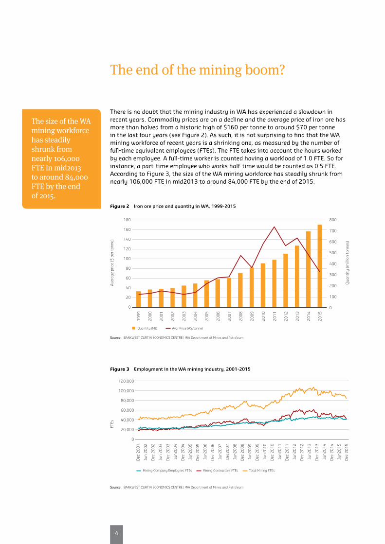
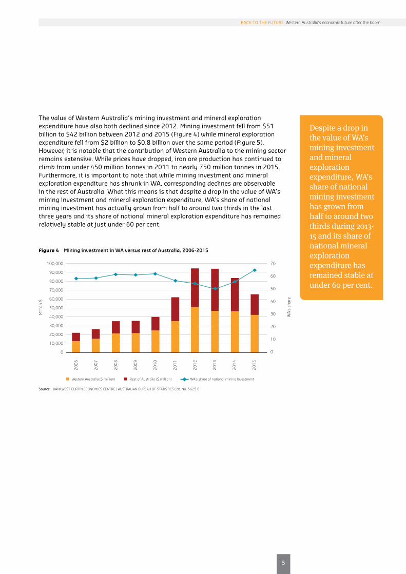
Despite a drop in the value of WA’s mining investment and mineral exploration expenditure, WA’s share of national mining investment has grown from half to around two thirds during 2013-15 and its share of national mineral exploration expenditure has remained stable at under 60 per cent.
The value of Western Australia’s mining investment and mineral exploration expenditure have also both declined since 2012. Mining investment fell from $51 billion to $42 billion between 2012 and 2015 (Figure 4) while mineral exploration expenditure fell from $2 billion to $0.8 billion over the same period (Figure 5). However, it is notable that the contribution of Western Australia to the mining sector remains extensive. While prices have dropped, iron ore production has continued to climb from under 450 million tonnes in 2011 to nearly 750 million tonnes in 2015. Furthermore, it is important to note that while mining investment and mineral exploration expenditure has shrunk in WA, corresponding declines are observable in the rest of Australia. What this means is that despite a drop in the value of WA’s mining investment and mineral exploration expenditure, WA’s share of national mining investment has actually grown from half to around two thirds in the last three years and its share of national mineral exploration expenditure has remained relatively stable at just under 60 per cent.
Figure 4 Mining investment in WA versus rest of Australia, 2006-2015
100,000
90,000
80,000
70,000
60,000
50,000
40,000
30,000
20,000
10,000
0
70
60
50
40
30
20
10
0
Mill
ion
$
WA’
s sh
are
Western Australia ($ million) Rest of Australia ($ million) WA’s share of national mining Investment
2006
2007
2008
2009
2010
2011
2012
2013
2014
2015
Source: BANKWEST CURTIN ECONOMICS CENTRE | AUSTRALIAN BUREAU OF STATISTICS Cat. No. 5625.0
6
Figure 5 Mineral exploration expenditure in WA versus rest of Australia, 2006-2015
4,000
3,500
3,000
2,500
2,000
1,500
1,000
500
0
70
60
50
40
30
20
10
0
Mill
ion
$
WA’
s sh
are
Western Australia ($ million) Rest of Australia ($ million) WA’s share of national mineral exploration expenditure
2006
2007
2008
2009
2010
2011
2012
2013
2014
2015
Source: BANKWEST CURTIN ECONOMICS CENTRE | AUSTRALIAN BUREAU OF STATISTICS Cat. No. 5625.0

7
7
BACK TO THE FUTURE Western Australia’s economic future after the boom
Returning to a ‘new normal’
After a prolonged period of economic bonanza driven by the resources boom, WA’s economic trajectory has returned to a ‘new normal’ more consistent with national averages.
The latest data does show that the Western Australian economy has well and truly passed the peak of the construction phase of the commodities boom, characterized by growth in productive capacity and high employment. The state has also clearly moved into a production phase in which the state’s productive capacity is ‘put to work’ in driving resource volume and export growth, as evidenced by lower investment in mining and a shrinking workforce.
Taken together, these trends are consistent with an economic slowdown in the state after an economic boom lasting a decade. However, the mining boom was clearly an economic bonanza – albeit a protracted one – that drove WA’s long-term average real GSP growth rate to 4.7 per cent between 1990 and 2015, well above the national average real GDP growth rate of 3.1 per cent over the same 25-year period. While the state’s GSP growth rate has dipped to 3.5 per cent in 2015, this is nonetheless a higher growth rate than observed during previous economic downturns in 1990-91 and 1999-2001. Moreover, WA’s annual GSP growth rate of 3.5 per cent remains above the nation’s GDP growth rate of 2.3 per cent.
These statistics suggest that the state’s economic trajectory has returned to a ‘new normal’ more consistent with national averages. However, the reversion in the state’s economic fortunes will undoubtedly have significant impacts on the economic and social wellbeing of Western Australian households. These impacts are the subject of investigation in the next chapters of this report.


Household income and wealth in Western Australia

10
Introduction
How have Western Australian households fared over the period since the end of the state’s resources boom? Has the distribution of income in WA been affected by the more challenging economic climate after the end of the resources boom? Which asset classes contribute most to household net worth, and have there been any changes in household wealth holdings since the heat has come out of the WA economy?
The first BCEC Focus on Western Australia report, Sharing the Boom, challenged the common orthodoxy of a ‘trickle down’ effect for Western Australia, whereby the benefits of the wealth created by resources-led economic growth in WA were shared by all. Instead, that report showed that the benefits of the resources boom in WA were distributed unevenly, with low income households losing ground even to the typical WA household on median incomes. Now that WA has passed the height of the resources boom, is there any evidence of a reversal in this trend? Have incomes become more equally distributed? And if so, by what mechanism?
In this new report, we take a closer look at the major trends in household income and wealth for West Australian households, using data from the ABS’ Survey of Income and Housing (SIH) up to the latest survey round in 2013-14. We compare the scale and composition of income and wealth between WA and other Australian states and territories, and assess the degree to which household incomes have changed since the end of the resources boom.
A direct comparison of incomes between different household types is made more challenging when the number of people, and number of earners, vary across households within or between each group. A more appropriate comparison can be achieved by standardising (or equivalising) household incomes using factors called equivalence scales to take account of differences in household size and composition. Where appropriate, in this report we use the OECD modified equivalence scale to standardise household incomes. These scales apply a weight of 1.0 for the first adult in the household, 0.5 for any subsequent adults and 0.3 for children.
The SIH survey data also provide us with useful breakdowns of aggregate income and wealth data into components of income (wages and salaries, government payments and public pensions, income from superannuation, and investment and business income) and wealth (residential home value, home contents, other property assets, superannuation balances, shares and other financial and business assets).

11
11
BACK TO THE FUTURE Western Australia’s economic future after the boom
How do incomes in Western Australia compare?
Perth attained the highest average gross household income across all of Australia’s six state capital cities and two territories in 2013-14, at $2,840 per week in 2016 dollars.
Average household gross weekly income for regional Western Australia sits at $2,199, comfortably exceeding those for regional Queensland (at $2,001), New South Wales ($1,768) and Victoria (at $1,599).
Figure 6 compares the incomes of Western Australian households with those in other states and territories, using both average incomes (in orange) and a more stable median measure (in red) that shows the income of the ‘typical’ household in each geographical region, along with the percentage change since 2009-10 (the blue diamonds, against the right hand scale).
Perth attained the highest average gross household income across all of Australia’s six state capital cities and two territories in 2013-14, at $2,840 per week in 2016 dollars – an increase of some 23 per cent on 2009-10 figures. The ACT and Northern Territory came in second at $2,671 per week, with lower real growth since the start of the decade (3.6 per cent). Sydney and Melbourne comes in third and fourth, at $2,601 and $2,304 respectively, followed by Brisbane, Adelaide. Average gross household income in Hobart, at $1,819 in 2016 dollars, was the lowest across all capital cities in 2013-14.
The red bars in Figure 6 show the median weekly gross household incomes in 2013-14 for capital cities and regional areas across all states and territories, as an indication of the level of incomes enjoyed by a ‘typical’ household. The median gross income for Western Australian households (at $2,025) was again higher than the major east coast capital cities of Sydney (at $1,894) and Melbourne (at $1,770). Median household incomes in Perth have grown strongly (rising 15.5 per cent to $2,025 since 2009-10) relative to either Sydney (rising 8.4 per cent since 2009-10) or Melbourne (rising 5.1 per cent). Indeed, Perth now ranks second behind the two territories in terms of median household incomes.
The same broad relativities apply for regional areas outside the states’ capital (the “balance of states”). Average household gross weekly income for regional Western Australia sits at $2,199, comfortably exceeding those for regional Queensland (at $2,001), New South Wales ($1,768) and Victoria (at $1,599). However, in contrast to Perth, average gross incomes in regional areas of Western Australia have fallen by 1.6 per cent since 2009-10. This likely reflects the greater economic challenges for families living in regional Western Australia after the state’s resources boom.

12
Average gross incomes in regional areas of Western Australia have fallen by 1.6% since 2009-10. This likely reflects the greater economic challenges for families living in regional Western Australia after the state’s resources boom.
Figure 6 Average and median household weekly incomes by states and territories: 2013-14 and change since 2009-10
3,000
2,500
2,000
1,500
1,000
500
0
-500
-1,000
30
25
20
15
10
5
0
-5
-10
Mea
n an
d m
edia
n re
al h
ouse
hold
gros
s in
com
e (2
016
$s)
Perc
enta
ge c
hang
e: 2
009-
10 t
o 20
13-1
4 (p
er c
ent)
Hob
art
Adel
aide
Bris
bane
Mel
bour
ne
Sydn
ey
ACT
and
NT
Pert
h
Tasm
ania
Sout
h Au
stra
lia
Vict
oria
New
Sou
th W
ales
Que
ensl
and
Wes
tern
Aus
tral
ia
Aust
ralia
Capital cities Balance of states
1,81
9
1,85
0 2,24
6
2,30
4 2,60
1
2,67
1
2,84
0
1,46
7
1,51
2
1,59
9
1,76
8
2,00
1
2,19
9
2,20
9
1,47
9
1,37
4 1,76
2
1,77
0
1,89
4 2,33
0
2,02
5
1,08
7
1,09
1
1,24
3
1,22
0 1,49
3 1,77
7
1,64
7
Mean Median Percentage change (right axis)
Note: Chart reports the average (in orange) and median (red) value of real household gross weekly incomes for all households in each state and territory, with incomes uprated to June 2016. Figures are sorted separately for cities and balance of state in ascending order of average weekly incomes.
Source: BANKWEST CURTIN ECONOMICS CENTRE | Authors’ estimates based on ABS Survey of Income and Housing, 2009-10 and 2013-14.

13
13
BACK TO THE FUTURE Western Australia’s economic future after the boom
The distribution of incomes in WA
Single parents have seen a much lower growth in median gross income since 2009-10, up 5% to $64,200.
There is an evident gender gap of some 33% in median gross incomes between non-elderly single men ($72,500) and women. ($48,900).
Table 1 presents a breakdown of annual gross incomes for households differentiated by family status (couples, single and multiple adult households) and the presence of children, as well as the age of the head of household (those non-elderly under retirement age, and those over). Average and median incomes are presented for the latest 2013-14 SIH data, as well as the percentage changes since 2009-10.
Average annual gross household incomes (the first column in Table 1) were higher for non-elderly couples with children (at $182,100, rising 11 per cent on 2009-10 figures) than for non-elderly couple only households (at $158,700, up 20 per cent from 2009-10). Single parent families in WA had an average gross income of $93,000 in 2013-14 (up 23 per cent from 2009-10), compared with $87,000 for single men and $61,500 for single women. Elderly households have lower average gross annual incomes than their non-elderly counterparts (whether male-only, female-only or couple households). Gross incomes are higher for single men compared with single women, whether elderly or non-elderly.
As noted earlier, the calculation of average incomes can be influenced strongly by the presence of a few high income households in each class surveyed in a given year. The second column in Table 1 reports the more stable median annual gross incomes for the ‘typical’ household in each category. Relatively, the median incomes for WA households are similar in pattern to average incomes, but with generally a lower rate of growth since 2009-10. Median incomes are again highest among non-elderly couples with children (up 18 per cent since 2009-10 at $160,300) compared with non-elderly couple only families (up 11 per cent since 2009-10 at $143,000). Single parents have seen a much lower growth in median gross income since 2009-10, up 5 per cent to $64,200.
There is an evident gender gap of some 33 per cent in median gross incomes between non-elderly single men ($72,500) and women ($48,900). Incomes are lower for elderly single men and women, at $27,200 and $26,300 respectively, growing 14 per cent and 12 per cent respectively since 2009-10. The gender gap in gross incomes between elderly single men and women is much lower than for their non-elderly counterparts, at 3.3 per cent.
The third column of Table 1 presents the median equivalised gross income within each household category to provide a more consistent income comparison across households of different size and composition. This analysis shows that single people have the lowest equivalent income resources on a standardised measure, with single parents, non-elderly single women and men people also seeing the lowest rates of growth in their incomes since 2009-10 (of 1 per cent, 2 per cent and 7 per cent respectively).
The fifth to seventh columns in Table 1 present median weekly disposable incomes for the same household types. These account for taxes and payments, and better represent the level and change in the resources available to households on a week-to-week basis. With adjustments for household size and housing costs, the seventh column shows that the typical single parent in WA has only $511 per week to live off after housing costs are accounted for. This figure hasn’t grown since 2009-10.
Non-elderly single men and women have disposable incomes of $821 and $674 respectively after housing costs, representing a gender gap of around 18 per cent. Their elderly single counterparts live on little more than $450 per week after housing costs.

14
Tab
le 1
H
ouse
hol
d in
com
es b
y fa
mily
ty
pe
in W
este
rn A
ust
ralia
: 201
3-14
an
d c
ha
ng
e fr
om 2
009-
10
Gro
ss a
nnua
l hou
seho
ld in
com
e: 2
013-
14 (%
cha
nge
from
200
9-10
)W
eekl
y di
spos
able
inco
me:
201
3-14
(% c
hang
e fr
om 2
009-
10)
Mea
n
gros
sM
edia
n
gros
sM
edia
n gr
oss
equi
valis
ed
Wee
kly
disp
osab
le
inco
me:
201
3-14
(%
cha
nge
from
20
09-1
0)
Med
ian
di
spos
able
Med
ian
equi
valis
ed
disp
osab
le M
edia
n eq
uiva
lised
di
spos
able
(AH
C)
Hou
seho
ld t
ype
%%
%%
%%
%
Non
-eld
erly
cou
ple
only
158,
700
+20
143,
000
+12
92,9
00+1
177
,700
+15
2,24
7+1
21,
423
+91,
146
+12
Non
-eld
erly
cou
ple
wit
h ch
ildre
n18
2,10
0+1
116
0,30
0+1
872
,600
+12
61,6
00+1
22,
452
+15
1,12
1+9
881
+7
One
par
ent
wit
h ch
ildre
n93
,200
+23
64,2
00+5
36,8
00+1
28,2
00+3
1,18
9+8
679
+251
1+0
Non
-eld
erly
sin
gle
mal
e87
,000
+172
,500
+772
,500
+759
,200
+19
1,13
7+5
1,13
7+5
821
+15
Non
-eld
erly
sin
gle
fem
ale
61,5
00+1
048
,900
+248
,900
+240
,400
+684
8-2
848
-267
4+5
Elde
rly
coup
le73
,500
+651
,300
+933
,500
+931
,600
+996
6+7
631
+759
4+7
Elde
rly
sing
le m
ale
39,8
00+3
127
,200
+14
27,2
00+1
424
,100
+22
524
+14
524
+14
464
+22
Elde
rly
sing
le fe
mal
e33
,300
+17
26,3
00+1
226
,300
+12
23,6
00+1
250
5+1
150
5+1
145
4+1
0
Gro
up h
ouse
hold
149,
500
+19
120,
900
-7
80,6
00+1
767
,800
+17
2,04
2-2
1,28
1+1
31,
014
+10
Oth
er h
ouse
hold
184,
300
+56
144,
200
+51
65,2
00+2
256
,300
+23
2,35
8+4
11,
040
+12
913
+15
All
hous
ehol
ds13
0,30
0+1
510
0,60
0+1
160
,900
+11
50,6
00+1
21,
659
+11
994
+878
6+9
Inco
me
quin
tile
Firs
t (lo
wes
t)37
,600
+24
29,6
00+2
723
,800
+18
18,4
00+2
156
9+2
745
3+1
633
2+1
7
Seco
nd67
,000
+13
58,2
00+1
236
,000
+11
31,5
00+1
51,
013
+10
661
+10
537
+11
Thir
d10
5,30
0+1
810
0,50
0+1
958
,000
+10
49,7
00+1
31,
677
+18
939
+678
2+1
0
Four
th15
9,90
0+2
216
0,00
0+2
487
,100
+12
76,9
00+1
32,
452
+20
1,34
6+9
1,14
1+9
Fift
h (h
ighe
st)
277,
100
+11
247,
100
+18
135,
100
+712
5,80
0+1
13,
562
+91,
987
+41,
789
+6
All
hous
ehol
ds13
0,30
0+1
510
0,60
0+1
160
,900
+11
50,6
00+1
21,
659
+11
994
+878
6+9
Not
e:
All i
ncom
es a
re e
xpre
ssed
in re
al 2
016
dolla
rs. M
edia
n gr
oss
equi
valis
ed in
com
es a
re a
djus
ted
for h
ouse
hold
siz
e us
ing
the
mod
ified
OEC
D e
quiv
alen
ce
scal
es. S
ee G
loss
ary
for d
efini
tion
s of
ter
ms.
Sour
ce:
BAN
KWES
T CU
RTIN
ECO
NO
MIC
S CE
NTR
E | A
utho
rs’ e
stim
ates
bas
ed o
n AB
S Su
rvey
of I
ncom
e an
d H
ousi
ng, 2
009-
10 a
nd 2
013-
14.

15
15
BACK TO THE FUTURE Western Australia’s economic future after the boom
Income inequality in WA has indeed reversed. The incomes of the state’s richest 10 per cent of households were at least 5 times those of the poorest 10 per cent in 2010, but the gap has fallen substantially since, to a multiple of around 4.5 by 2015.
The incomes of the poorest 10 per cent of households in Western Australia are now significantly closer to those of the median household.
Has income inequality changed in WA after the boom?
The first BCEC report in the Focus on Western Australia series showed that the benefits of the resources boom in Western Australia had not ‘trickled down’ to all sections of WA society. Income inequality was found to have risen in WA between 2003-04 and 2009-10 at a faster rate than for the rest of Australia, with low-income households losing ground to even the ‘typical’ WA household on median incomes.
Now that WA has passed the height of the resources boom, is there any evidence of a reversal in this trend? Have incomes become more equally distributed?
Table 1 gives some indication that income inequality has fallen in WA post-resources boom, with equivalised disposable incomes of those in the first income quintile growing more strongly (up 17 per cent between 2009-10 and 2013-14) compared with the fifth quintile (up 6 per cent over the same period).
To provide further insights, we look at how incomes in WA have evolved over time compared with other Australian states and territories (Figure 7). We compare the incomes of the richest 10 per cent of households – those above the 90th percentile of the income distribution – with the incomes of the median household – the 50th percentile – and the poorest 10 per cent of households – those below the 10th income percentile.
The ratio of the 90th and 10th income percentile (the 90-10 ratio) gives an overall measure of income inequality – a simple interpretation would be the richest compared with the poorest. The 90-50 ratio tracks inequalities at the top half of the income distribution – the distance between the richest households and the typical household – while the 50-10 ratio shows the separation in the lower half of the distribution, between the median household and the poorest 10 per cent. Each ratio can be interpreted as an income multiple: for example, a 90-10 ratio of 4 means that the incomes of the richest 10 per cent of households are (at least) four times those of the poorest 10 per cent.
What is immediately clear from a comparison of the 90-10 ratios for WA and Australia – Figure 7 panel (a) – is that income inequality in WA has indeed reversed. The incomes of the state’s richest 10 per cent of households were at least 5 times those of the poorest 10 per cent in 2010, but the gap has fallen substantially since, to a multiple of around 4.5 by 2015. For Australia, the 90-10 measure of income inequality has declined from a multiple of 4.6 in 2008 to around 4.2 by 2013-14.
Panel (b) looks at overall income inequality for all states and territories, and shows that while WA recorded the highest 90-10 ratio across the Federation since 2008, the gap between WA and NSW pretty much disappeared by 2014.
So what has contributed to the fall in income inequality since the end of the resources boom? Are the richest households losing out at a greater rate than those lower down the income distribution? Or are the poorest households in WA moving closer to a ‘typical’ income household?
The trends in Figure 7 suggest the latter. The 90-50 ratios for WA and Australia – panel (c) – track fairly closely over the period since 2010, with incomes for the richest 10 per cent of households at just over twice the incomes of the median household.

16
The same is true for all other states, as shown in panel (d), although median incomes in ACT/NT are somewhat closer to the top end of the distribution, with a 90-50 ratio closer to 1.75.
However, Western Australia’s 50-10 ratio – panel (e) - has declined at a faster rate than for Australia since 2012, dropping to around 2.2 by 2014. This supports the conclusion that the incomes of the poorest 10 per cent of households in Western Australia are now significantly closer to those of the median household.
Figure 7 Relative income inequality in WA and Australia: 2003 to 2014
(a) 90-10 ratios (WA and Australia) (b) 90-10 ratios (states and territories)
6.0
5.5
5.0
4.5
4.0
3.5
3.0
90/1
0 ra
tio
of e
quiv
alis
eddi
spos
able
inco
me
WA Australia
2004
2005
2006
2007
2008
2009
2010
2011
2012
2013
2014
6.0
5.0
4.0
3.0
2.0
1.0
0
90/1
0 ra
tio
of e
quiv
alis
eddi
spos
able
inco
me
NSW VIC QLD SA WA Tas ACT/NT Australia
2004
2005
2006
2007
2008
2009
2010
2011
2012
2013
2014
(c) 90-50 ratios (WA and Australia) (d) 90-50 ratios (states and territories)
90/5
0 ra
tio
of e
quiv
alis
eddi
spos
able
inco
me
2.6
2.4
2.2
2.0
1.8
1.6
1.4
WA Australia
2004
2005
2006
2007
2008
2009
2010
2011
2012
2013
2014
3.0
2.5
2.0
1.5
1.0
0.5
0
90/5
0 ra
tio
of e
quiv
alis
eddi
spos
able
inco
me
NSW VIC QLD SA WA Tas ACT/NT Australia
2004
2005
2006
2007
2008
2009
2010
2011
2012
2013
2014
(e) 50-10 ratios (WA and Australia)
3.0
2.5
2.0
1.5
1.0
0.5
0
50/1
0 ra
tio
of e
quiv
alis
eddi
spos
able
inco
me
NSW VIC QLD SA WA Tas ACT/NT Australia
2004
2005
2006
2007
2008
2009
2010
2011
2012
2013
2014
(f) 50-10 ratios (states and territories)
2.6
2.4
2.2
2.0
1.8
1.6
1.4
50/1
0 ra
tio
of e
quiv
alis
eddi
spos
able
inco
me
WA Australia
2004
2005
2006
2007
2008
2009
2010
2011
2012
2013
2014
Note: All ratios are calculated using household equivalised disposable income. See Glossary for definitions. Source: BANKWEST CURTIN ECONOMICS CENTRE | Authors’ estimates based on ABS Survey of Income and Housing, 2003-04 to 2013-14.

17
17
BACK TO THE FUTURE Western Australia’s economic future after the boom
Nearly six in ten (58 per cent) single parent households draw most of their income from earnings, a rise of 7.9 percentage points since 2009-10.
Government payments, principally the age pension, now make up the principal source of income for nearly three quarters of elderly single men (73 per cent) and four in five (81 per cent) elderly single women.
What are the principal sources of income for Western Australian households, and have these changed to any degree since the end of the resources boom?
Table 2 shows the proportion of households who draw their principal income from wages and salaries, income from government sources (both welfare payments and pensions), income from superannuation, investment and business income.
In 2013-14, around nine in ten non-elderly WA couples without children drew most of their income from wages and salaries – panel (a) of Table 2. This represents an increase of 3.9 percentage points since 2009-10 – panel (b). Only 2 per cent now draw income mainly from government payments (down nearly 5 percentage points since 2009-10), and 3 per cent each from superannuation and investment income sources (up 1.5 percentage points and 1 percentage point respectively).
The proportion of non-elderly couples with children who derive income mainly from wages and salaries also sits at 90 per cent, with only 4 per cent who draw government benefits as their main income source. These shares have been relatively stable since the end of the resources boom.
Nearly six in ten (58 per cent) single parent households draw most of their income from earnings, a rise of 7.9 percentage points since 2009-10. Around 39 per cent of single parents rely on government payments as their main income source, down 9.5 percentage points since 2009-10. Despite this, it remains the case that government payments provide a critical source of support to single parent households.
Elderly people, particularly women, who live alone have become more reliant on public pensions since the resources boom ended. Government payments, principally the age pension, now make up the principal source of income for nearly three quarters of elderly single men (73 per cent) and four in five (81 per cent) elderly single women – for the latter, an increase of 4.7 percentage points since 2009-10.

18
Tab
le 2
P
rin
cip
al s
ourc
es o
f in
com
e a
mon
g W
A h
ouse
hol
ds:
by
fam
ily t
yp
e, 2
009-
10 a
nd
201
3-14
Inco
me
clas
sIn
com
e cl
ass
Hou
seho
lds
Wag
es
& s
alar
ies
Gov
t in
com
eSu
per
inco
me
Inve
stm
’nt
inco
me
Bus
ines
s in
com
eO
ther
so
urce
sW
ages
&
sal
arie
sG
ovt
inco
me
Supe
r in
com
eIn
vest
m’n
t in
com
eB
usin
ess
inco
me
Oth
er
sour
ces
Hou
seho
ld t
ype
#%
(a) P
rinc
ipal
sou
rce
of h
ouse
hold
inco
me:
201
3-14
(b) p
pt c
hang
e in
pri
ncip
al s
ourc
e of
inco
me:
200
9-10
to
2013
-14
Non
-eld
erly
cou
ple
only
180,
100
2090
%2%
3%3%
1%0%
+3.9
-4.9
+1.5
+1.0
-1.2
-0.3
Non
-eld
erly
cou
ple
wit
h ch
ildre
n29
2,80
032
90%
4%1%
2%3%
1%-0
.2-0
.2+0
.6+0
.4-0
.9+0
.4
One
par
ent
wit
h ch
ildre
n44
,200
558
%39
%-
0%-
3%+7
.9-5
.5-1
.1-1
.9+0
.0+0
.6
Non
-eld
erly
sin
gle
mal
e83
,000
976
%13
%0%
4%3%
3%+6
.7-8
.3-1
.5+0
.3+2
.0+0
.9
Non
-eld
erly
sin
gle
fem
ale
57,7
006
64%
24%
5%2%
0%5%
-2.7
-2.6
+3.9
+2.1
-2.2
+1.4
Elde
rly
coup
le95
,600
1020
%50
%21
%9%
0%-
-2.8
+3.1
+0.5
-0.4
-0.4
+0.0
Elde
rly
sing
le m
ale
25,3
003
9%7
3%14
%4%
--
-1.9
-0.8
+2.9
+2.1
-1.2
-1.0
Elde
rly
sing
le fe
mal
e52
,700
61%
81%
9%7%
-2%
-0.5
+4.7
-5.8
-0.4
+0.0
+2.1
All
hous
ehol
ds91
3,40
010
069
%20
%4%
4%2%
1%+1
.7-2
.4+0
.5+0
.8-0
.6-0
.1
Mea
n h/
h in
com
e:
2013
-14
Cha
nge:
20
09-1
0 to
20
13-1
4W
ages
&
sal
arie
sG
ovt
inco
me
Supe
r in
com
eIn
vest
m’n
t in
com
eB
usin
ess
inco
me
Oth
er
sour
ces
Wag
es
& s
alar
ies
Gov
t in
com
eSu
per
inco
me
Inve
stm
’nt
inco
me
Bus
ines
s in
com
eO
ther
so
urce
s
Hou
seho
ld t
ype
$%
(c) M
ean
gros
s w
eekl
y ho
useh
old
inco
me
by s
ourc
e: 2
013-
14(d
) Cha
nge
in m
ean
h/h
inco
me
by s
ourc
e: 2
009-
10 t
o 20
13-1
4
Non
-eld
erly
cou
ple
only
3,05
1+2
02,
784
1854
122
2747
+461
-19
+22
+79
-20
-11
Non
-eld
erly
cou
ple
wit
h ch
ildre
n3,
502
+52,
952
5239
208
157
94+5
0+4
+29
+27
+55
-3
One
par
ent
wit
h ch
ildre
n1,
498
-0
945
341
-40
-17
1+7
8-3
6-
-54
-+2
0
Non
-eld
erly
sin
gle
mal
e1,
673
+11,
447
572
6666
35-2
9-2
4-1
2+1
5+6
4+1
0
Non
-eld
erly
sin
gle
fem
ale
1,18
2+1
091
210
530
485
82+3
0+5
+21
+51
-65
+63
Elde
rly
coup
le1,
413
+640
627
625
623
47
234
-63
+56
+17
+57
-8-
Elde
rly
sing
le m
ale
765
+31
132
362
181
827
3+1
6+4
9+8
1+4
7-
-
Elde
rly
sing
le fe
mal
e64
0+1
716
394
126
96-
7-3
+52
+25
+15
-+3
All
hous
ehol
ds2,
506
+15
1,96
812
269
183
5710
7+2
04+1
+22
+82
+10
+7
Not
e:
Dat
a ex
clud
e ho
useh
olds
wit
h ze
ro o
r neg
ativ
e in
com
es. H
ouse
hold
s re
port
ing
gros
s an
nual
inco
mes
in e
xces
s of
$2m
, or w
eekl
y bu
sine
ss o
r inv
estm
ent
inco
mes
of a
bove
$20
K, a
re e
xclu
ded
from
cal
cula
tion
s.So
urce
: BA
NKW
EST
CURT
IN E
CON
OM
ICS
CEN
TRE
| Aut
hors
’ est
imat
es b
ased
on
ABS
Surv
ey o
f Inc
ome
and
Hou
sing
, 200
9-10
and
201
3-14
.

19
19
BACK TO THE FUTURE Western Australia’s economic future after the boom
Figure 8 provides a graphical representation of how principal income sources have evolved for WA households over time. The graphs show the proportion of WA households with wages and salaries (top panel) or government payments (bottom panel) as their main income source for each of three periods: 2005-06, 2009-10 and 2013-14. It is certainly the case that a greater share of households in most categories now draw most of their income from earnings.
Although the share has fallen since 2009-10, one parent families still depend on government payments more than do any other non-elderly household group. Equally, more elderly couples, and more elderly single men and women, are now drawing most of their income from government pensions, a fact that highlights the need for adequate support to minimise financial vulnerabilities for these groups.
Figure 8 Share of WA households with wages/salaries and government payments as principal source of income: 2005-06 to 2013-14
Shar
e of
hou
seho
lds
(per
cen
t) 100908070605040302010
0
2005-06 2009-10 2013-14
Non
-eld
erly
Non
-eld
erly
co
uple
wit
h ki
ds
coup
le o
nly
One
par
ent
wit
h ki
ds
Non
-eld
erly
si
ngle
mal
e
Non
-eld
erly
si
ngle
fem
ale
Gro
up
hous
ehol
d
Oth
er
hous
ehol
d
Elde
rly
coup
le
Elde
rly
sing
le m
ale
Elde
rly
sing
le fe
mal
e
All
hous
ehol
ds
81.9 87
.5
50.1
72.9
67.7
83.1
83.5
7.5
2.9
1.0
86.2
89.0
49.9
69.8
66.8 77
.8
75.7
22.5
11.3
2.0
90.0
89.3
57.8
76.5
64.1
86.6
79.8
19.7
9.3
1.5
64.4
67.2
69.0
Wages/salaries
Non
-eld
erly
Non
-eld
erly
co
uple
wit
h ki
ds
coup
le o
nly
One
par
ent
wit
h ki
ds
Non
-eld
erly
si
ngle
mal
e
Non
-eld
erly
si
ngle
fem
ale
Gro
up
hous
ehol
d
Oth
er
hous
ehol
d
Elde
rly
coup
le
Elde
rly
sing
le m
ale
Elde
rly
sing
le fe
mal
e
All h
ouse
hold
s
Shar
e of
hou
seho
lds
(per
cen
t) 100908070605040302010
0
2005-06 2009-10 2013-14
10.4
4.8
43.9
17.2 21
.7
11.1
13.1
73.1 82
.5
81.2
7.2
3.9
44.0
21.5 26
.5
4.3
18.8
46.8
74.2
76.1
2.3
3.8
38.5
13.2 24
.0
7.6 10
.8
49.9
73.4 80
.8
25.8
22.1
20.7
Government payments
Source: BANKWEST CURTIN ECONOMICS CENTRE | Authors’ estimates based on ABS Survey of Income and Housing, 2013-14.

20
Household wealth in Western Australia
Perth ranks fourth in terms of the median net wealth of households in the state’s capital, at $508,500.
Median net wealth in the balance of Western Australia ranks seventh across all capital cities and state/territory balances, at $424,700.
For this next section of the report, we turn to a consideration of the distribution of wealth in Western Australia, and the value of wealth across the main asset classes held by Western Australian households compared with their counterparts in other states and territories. In particular, we are interested in whether there have been any significant changes in the wealth asset portfolios held by WA households since the end of the resources boom.
Household net wealth is preferred as the basic unit of analysis. Total household net wealth comprises the aggregate of home value, home contents, property investments, business assets, superannuation, shares and other forms of financial assets, less any liabilities held either in the form of mortgages or other loans.
So how do Western Australian households measure up in terms of net worth compared with their counterparts in other states and territories? Table 3 compares the real median net worth (expressed in 2016 prices) for households in all capital cities and balance of state areas of Australia over four periods from 2005-06 to 2013-14.
Perth ranks fourth in terms of the median net wealth of households in the state’s capital, at $508,500. Yet the median value of household net worth has endured something of a roller-coaster ride since the height of the resources boom – increasing by $93,000 to $530,900 (or 21 per cent) between 2005-06 and 2009-10, then dropping $43,200 to $487,700 by 2011-12 following the fall-out from the global financial crisis, before increasing by $20,800 to $508,500 between 2011-12 and 2013-14 (a rise of 4 per cent). Median net wealth in the balance of Western Australia ranks seventh across all capital cities and state/territory balances, at $424,700. This has remained fairly stable since 2011-12.
ACT and Northern Territory households rank first in terms of median net wealth in 2013-14, at $582,500. Households in the two territories enjoyed substantial growth of $121,100 in total net worth up to the global financial crisis, but heavy falls of nearly $76,000 in the post-GFC period. Melbourne ranks in second place in terms of net wealth (at $576,600) and Sydney third ($553,500).

21
21
BACK TO THE FUTURE Western Australia’s economic future after the boom
The poorest 20 per cent of households hold a mere 0.8 per cent of the state’s total household net wealth by value – less than one hundredth of the value of all household wealth holdings.
The richest 20% of WA households in wealth terms (the fifth quintile) holds at least 64.7 per cent of the state’s aggregate household net wealth.
Table 3 Median household net wealth by states and territories, 2005-06 to 2013-14
Region Median net worth (2016$s) Change in net worth (2016$s)
2005-06 2009-10 2011-12 2013-14 2005-06 to 2009-10
2009-10 to 2011-12
2009-10 to 2011-12
$ R $ R $ $ R $ % $ % $ %
ACT and NT 492,000 2 613,100 1 537,400 2 582,500 1 +121,100 +25% -75,600 -12% +45,000 +8%
Melbourne 437,800 6 578,600 2 571,500 1 576,600 2 +140,800 +32% -7,100 -1% +5,100 +1%
Sydney 528,100 1 540,100 3 525,000 3 553,500 3 +12,000 +2% -15,100 -3% +28,500 +5%
Perth 437,900 5 530,900 4 487,700 4 508,500 4 +93,000 +21% -43,200 -8% +20,800 +4%
Balance of NSW 427,300 7 449,900 8 441,900 8 455,700 5 +22,600 +5% -8,000 -2% +13,800 +3%
Adelaide 376,200 10 464,500 6 472,900 6 443,700 6 +88,300 +23% +8,400 +2% -29,200 -6%
Balance of WA 393,400 9 447,200 9 421,000 9 424,700 7 +53,700 +14% -26,200 -6% +3,700 +1%
Balance of VIC 401,000 8 362,500 13 363,900 13 402,800 8 -38,500 -10% +1,400 +0% +38,900 +11%
Hobart 456,900 4 459,500 7 482,500 5 401,600 9 +2,600 +1% +23,000 +5% -80,900 -17%
Brisbane 468,100 3 482,500 5 448,400 7 400,600 10 +14,500 +3% -34,100 -7% -47,800 -11%
Balance of TAS 331,300 13 425,400 11 385,400 11 394,000 11 +94,100 +28% -39,900 -9% +8,600 +2%
Balance of QLD 362,300 11 433,600 10 400,200 10 364,700 12 +71,200 +20% -33,400 -8% -35,500 -9%
Balance of SA 341,200 12 403,900 12 373,800 12 361,400 13 +62,700 +18% -30,100 -7% -12,400 -3%
Australia 430,300 488,900 465,600 473,700 +58,600 +14% -23,300 -5% +8,100 +2%
Note: Wealth values are expressed in 2016 dollars, and for those with positive net worth. See Glossary for a definitions.Source: BANKWEST CURTIN ECONOMICS CENTRE | Authors’ estimates based on ABS Survey of Income and Housing, 2009-10 and 2013-14.
Household wealth is distributed far more unevenly than incomes, a fact that is true not just for Western Australia but for all states and territories. But how unevenly? To what degree is wealth concentrated among the wealthiest households in the state?
Noting the difficulties in accessing data on the wealth holdings of the richest in the state, we estimate (conservatively) that Western Australian households held assets with an aggregate net value of some $895 billion in 2013-14. This represents an increase of 18 per cent compared with 2011-12, and an increase of 9% on the $822 billion held in 2009-10. The average net household wealth of the top wealth quintile in the state came to just under $3.2 million in 2011-13, an increase of 43 per cent on 2009-10 asset holdings.
There is a huge degree of inequality in the distribution of household net wealth. Figure 9 shows that the richest 20 per cent of WA households in wealth terms (the fifth quintile) holds at least 64.7 per cent of the state’s aggregate household net wealth. This is around 3.4 percentage points more than the 61.3 per cent share of wealth held by the richest fifth of households nationally. The fourth quintile in WA holds 18.7 per cent of the state’s total net wealth on 2013-14 data. Taken together, the wealthiest 40 per cent of households in WA account for 83.2 per cent of total household net wealth in the state.
In contrast, the poorest 20 per cent of households hold a mere 0.8 per cent of the state’s total household net wealth by value – less than one hundredth of the value of all household wealth holdings.
22
Net home value rises from 36% as a share of total asset holdings for the second quintile, rising to nearly 60% for the fourth quintile.
Superannuation assets constitute around 17 per cent of total household assets by value for the third and fourth wealth quintiles, and nearly 20 per cent for the wealthiest quintile.
Figure 9 Share of household net wealth by quintile: Western Australia, 2013-14
3,500,000
3,000,000
2,500,000
2,000,000
1,500,000
500,000
0
-500,000
Aver
age
net
wor
th (J
une
2016
$s)
First (lowest) Second Third Fourth Fifth (highest)
Home value (net) Home contents (net) Other property value (net) Other financial assets (net) Super assets Shares Business assets
0.8%5.1%
10.7%
18.7%
64.7%
Note: Percentages represent the share of total net wealth held by each wealth quintile.Source: BANKWEST CURTIN ECONOMICS CENTRE | Authors’ estimates based on ABS Survey of Income and Housing (SIH), 2013-14.
Figure 9 shows how the composition of household net wealth differs for richer and poorer households in the five wealth quintiles. For the poorest households, most positive wealth value is held in the form of home contents and superannuation. The net values of home and other property assets are both actually negative for the first wealth segment, with liabilities exceeding the gross property asset value.
Net home value rises from 36 per cent as a share of total asset holdings for the second quintile, rising to nearly 60 per cent for the fourth quintile, before falling as a share of total assets for the wealthiest fifth of households. It is interesting to see from Figure 9 the growth in the value of other asset classes for the richest households. The net value of other property and superannuation assets rise substantially as a share of total assets as wealth increases. For the fifth wealth quintile, other property assets account for up to 12 per cent of total wealth holdings. Superannuation assets constitute around 17 per cent of total household assets by value for the third and fourth wealth quintiles, and nearly 20 per cent for the wealthiest quintile.

23
23
BACK TO THE FUTURE Western Australia’s economic future after the boom
Figure 10 Household net wealth composition by quintile: Western Australia, 2013-14
100
80
60
40
20
0
-20
Shar
e of
qui
ntile
net
wor
th (p
er c
ent)
First (lowest) Second Third Fourth Fifth (highest)
Home value (net) Home contents (net) Other property value (net) Other financial assets (net) Super assets Shares Business assets
Note: Bars that fall below the zero horizontal axis denote asset classes with negative average net worth for households in that quintile.Source: BANKWEST CURTIN ECONOMICS CENTRE | Authors’ estimates based on ABS Survey of Income and Housing (SIH), 2013-14.

24
How has household wealth in WA changed after the boom?
Table 4 breaks down the level of asset ownership among households in Western Australia, by reporting the share of households of different characteristics who own each of the main asset classes, as well as the median values of those asset holdings.
The first panel (a) of Table 4 summarises the proportion of households who hold different classes of private assets, while the second panel (b) reports the percentage point change in this share since 2009-10. Around three quarters of non-elderly couples with children, and 71 per cent of couples with no children own a home asset. These shares fell slightly since 2009-10, by 3.5 and 2.2 percentage points respectively. In contrast, just over a third of single parent families have a home asset, down by more than 10 percentage points since 2009-10.
Fewer households own investment properties compared four years earlier. The share of households with property assets other than their main home has fallen by 2.7 percentage points since 2009-10, to around 21% overall in 2013-14. In contrast, the share of households with superannuation assets has grown 5.5 percentage points since 2009-10, to 80 per cent.
There is a noticeable gender gap in the share of households with superannuation assets; a quarter of single women don’t hold any superannuation assets, compared with one in ten men. So too are the values of superannuation assets lower for women compared with men for those who do hold the asset. This highlights the lower propensities for women to accumulate superannuation savings due to a greater likelihood of interrupted labour market careers. If there is a pattern emerging of a substitution away from property assets towards superannuation, this risks widening the gender wealth gap further.
For those holding property assets as part of their wealth portfolio, the Survey of Income and Housing data provide evidence of a significant fall of $77,900 in asset value compared with four years earlier. On the other hand, the median value of superannuation assets has risen by nearly $25,000 since 2009-10.

25
25
BACK TO THE FUTURE Western Australia’s economic future after the boom
Tab
le 4
M
edia
n h
ouse
hol
d w
ealt
h b
y a
sset
cla
ss, W
este
rn A
ust
ralia
: 201
3-14
an
d c
ha
ng
e fr
om 2
009-
10
Hou
seho
ld t
ype
Ass
et c
lass
Ass
et c
lass
#ho
useh
olds
Hom
e
asse
tH
ome
cont
ents
Oth
er
prop
erty
Supe
r as
sets
Oth
er
fina
ncia
l Sh
ares
Hom
e
asse
tH
ome
cont
ents
Oth
er
prop
erty
Supe
r as
sets
Oth
er
fina
ncia
l Sh
ares
(a) s
hare
of h
ouse
hold
s w
ho o
wn
asse
t cl
ass
(b) p
pt c
hang
e in
ow
ners
hip,
200
9-10
to
2013
-14
Non
-eld
erly
cou
ple
only
180,
100
71%
100%
30%
92%
98%
25%
-3.5
--2
.17.
31.
5-2
.4
Non
-eld
erly
cou
ple
wit
h ch
ildre
n29
2,80
076
%10
0%28
%91
%98
%28
%-2
.2-
-5.9
5.3
2.3
-7.5
One
par
ent
wit
h ch
ildre
n44
,200
36%
100%
13%
74%
98%
7%-1
0.6
-3.
88.
31.
8-3
.5
Non
-eld
erly
sin
gle
mal
e83
,000
48%
100%
13%
89%
97%
25%
-3.8
--4
.214
.64.
14.
4
Non
-eld
erly
sin
gle
fem
ale
57,7
0055
%10
0%15
%75
%95
%16
%9.
2-
-0.5
5.6
--0
.6
Elde
rly
coup
le95
,600
92%
100%
12%
59%
99%
34%
3.1
--1
0.3
0.8
1.5
-3.4
Elde
rly
sing
le m
ale
25,3
0066
%10
0%9%
30%
100%
15%
-8.0
-1.
6-8
.64.
4-6
.9
Elde
rly
sing
le fe
mal
e52
,700
77%
100%
7%26
%99
%16
%3.
1-
1.2
2.8
-0.3
-2.0
Gro
up h
ouse
hold
29,4
0018
%10
0%10
%92
%10
0%8%
-2.8
--8
.110
.00.
7-1
4.8
Oth
er h
ouse
hold
52,7
0072
%10
0%24
%78
%10
0%14
%10
.0-
12.7
0.5
0.3
1.8
All
hous
ehol
ds91
3,40
068
%10
0%21
%80
%98
%23
%-0
.1-
-2.7
5.5
1.8
-3.2
Hou
seho
ld t
ype
Ass
et c
lass
Ass
et c
lass
Med
ian
net
wor
th:
2013
-14
Hom
e
(net
)H
ome
cont
ents
Oth
er
prop
erty
(n
et)
Supe
r as
sets
Oth
er
fina
ncia
l (n
et)
Shar
esH
ome
(n
et)
Hom
e co
nten
tsO
ther
pr
oper
ty
(net
)Su
per
asse
tsO
ther
fi
nanc
ial
(net
)Sh
ares
(c) M
edia
n as
set
valu
e am
ong
thos
e ow
ning
ass
et c
lass
(d) C
hang
e in
med
ian
asse
t va
lue,
200
9-10
to
2013
-14
Non
-eld
erly
cou
ple
only
492,
400
418,
700
84,5
0023
7,70
076
,100
14,4
0021
,100
-13,
800
-5,5
00-7
7,90
0-4
,200
+6,8
00+8
,300
Non
-eld
erly
cou
ple
wit
h ch
ildre
n61
9,50
041
2,00
010
0,40
023
2,40
011
1,60
08,
700
13,7
00-4
8,60
0-8
,400
-128
,500
+26,
900
+5,2
00+4
,400
One
par
ent
wit
h ch
ildre
n83
,300
348,
600
40,1
0031
6,90
023
,200
300
(a)
-90,
800
-12,
400
+24,
700
+2,5
00+2
00(a
)
Non
-eld
erly
sin
gle
mal
e22
0,80
033
8,10
038
,000
241,
200
53,9
003,
200
10,6
00+4
4,40
0-2
,900
+31,
300
+20,
000
+500
+1,8
00
Non
-eld
erly
sin
gle
fem
ale
299,
000
419,
600
44,4
0013
7,30
059
,200
5,30
09,
500
+68,
900
+3,5
00-7
3,10
0+2
4,10
0+4
,100
+1,5
00
Elde
rly
coup
le90
5,60
058
1,00
095
,100
528,
200
221,
800
28,0
0030
,200
-3,5
00+8
,500
-56,
300
+18,
700
-9,4
00+4
,100
Elde
rly
sing
le m
ale
428,
100
444,
000
37,0
00(a
)15
8,50
011
,700
(a)
+13,
700
-9,8
00(a
)-2
2,80
0-7
,000
(a)
Elde
rly
sing
le fe
mal
e54
9,70
053
8,80
052
,800
(a)
114,
100
15,8
008,
500
+71,
200
+2,0
00(a
)+2
2,50
0+1
,200
-3,2
00
Gro
up h
ouse
hold
93,3
0052
8,20
026
,400
98,8
0042
,300
6,90
0(a
)+1
19,0
00-1
2,20
0+5
2,10
0+1
8,90
0-4
,800
(a)
Oth
er h
ouse
hold
516,
400
423,
100
71,0
0018
8,70
089
,000
10,8
0037
,200
+13,
900
+6,7
00-3
8,00
0+5
8,10
0+5
,900
+22,
000
All
hous
ehol
ds50
8,50
044
3,70
073
,900
237,
700
84,5
0010
,800
15,8
00-1
6,90
0-2
,000
-77,
900
+24,
900
+4,9
00+4
,700
Not
e:
All a
sset
val
ues
have
bee
n up
rate
d to
201
6 do
llars
. Cel
ls a
re m
arke
d (a
) whe
re t
oo fe
w o
bser
vati
ons
exis
t fo
r rel
iabl
e es
tim
ates
. So
urce
: BA
NKW
EST
CURT
IN E
CON
OM
ICS
CEN
TRE
| Aut
hors
’ est
imat
es b
ased
on
ABS
Surv
ey o
f Inc
ome
and
Hou
sing
, 200
9-10
and
201
3-14
.

26
Financial security among WA households after the boom?
It is now clear that Western Australians have higher levels of net income and wealth than the national average. So do these translate into stronger perceptions of financial security? Figure 11 suggests it is the case. Specifically, Western Australians were more likely to report feeling “prosperous”, “very comfortable” or “reasonably comfortable” than non-Western Australians in both 2010 and 2014. From 2010 to 2014, the proportion of Western Australians reporting feeling “reasonably comfortable”, “very comfortable” or “prosperous” increased from 71 per cent to 76 per cent while that of non-Western Australians was stable at around 69 per cent. However, during the same period, the proportion of Western Australians reported feeling “prosperous” or “very comfortable” remained stable at around 20% while the proportion of non-Western Australians reported the same level of financial prosperity increase slightly from 16 per cent in 2010 to 17 per cent in 2014.
Figure 11 Perceived prosperity in 2010 and 2014, Western Australia and the rest of Australia
100
90
80
70
60
50
40
30
20
10
0 WA ROA WA ROA
Per c
ent
Very poor
Poor
Just getting along
Reasonably comfortable
Very comfortable
Prosperous
2010 2014
26.6 27.922.0
26.6
51.4 52.7 56.2 52.4
17.1 14.3 18.4 15.5
Source: BANKWEST CURTIN ECONOMICS CENTRE | Author’ estimates based on HILDA Survey data.
Figure 12 also indicates higher levels of net income and wealth indeed result in higher levels of financial security perceptions. In particular, Figure 12 represents the percentages of Western Australians and non-Western Australians reporting incidence of financial difficulties due to shortage of money. As shown in Figure 12 Western Australians are less likely to pay electricity, gas or telephone bills after the due date, ask for financial health from friends or family or ask for help from welfare/community organisations. During 2010 and 2014, the gap in the proportion of Western and non-Western Australians reporting such financial difficulty incidents tend to peak at around the end of the last decade, before starting to fall. By 2014, there is no clear difference in the proportion of Western and non-Western Australians reporting such financial difficulty incidents, except asking for financial health from friends or family.

27
27
BACK TO THE FUTURE Western Australia’s economic future after the boom
Figure 12 Incidence of financial difficulties, Western Australia and the rest of Australia, 2001 to 2014
(a) Could not pay electricity, gas or telephone bills on time
Per c
ent
WA Rest of Australia
2001
2002
2003
2004
2005
2006
2007
2008
2009
2010
2011
2012
2013
2014
Per c
ent
WA Rest of Australia
2001
2002
2003
2004
2005
2006
2007
2008
2009
2010
2011
2012
2013
2014
(b) Could not pay the mortgage or rent on time
Per c
ent
WA Rest of Australia
2001
2002
2003
2004
2005
2006
2007
2008
2009
2010
2011
2012
2013
2014
(c) Pawned or sold something
Per c
ent
WA Rest of Australia
2001
2002
2003
2004
2005
2006
2007
2008
2009
2010
2011
2012
2013
2014
(d) Went without meals
Per c
ent
Per c
ent
WA Rest of Australia
WA Rest of Australia
2001
2002
2003
2004
2005
2006
2007
2008
2009
2010
2011
2012
2013
2014
2001
2002
2003
2004
2005
2006
2007
2008
2009
2010
2011
2012
2013
2014
(e) Was unable to heat home
(g) Asked for help from welfare/community organisations
Per c
ent
Per c
ent
WA Rest of Australia
WA Rest of Australia
2001
2002
2003
2004
2005
2006
2007
2008
2009
2010
2011
2012
2013
2014
2001
2002
2003
2004
2005
2006
2007
2008
2009
2010
2011
2012
2013
2014
(f) Asked for financial help from friends or family
(h) Any of the above financial difficulty incidence
25
20
15
10
5
0
10
8
6
4
2
0
6
5
4
3
2
1
0
6
4
2
0
10
8
6
4
2
0
5
4
3
2
1
0
20
15
10
5
0
40
30
20
10
0
Source: BANKWEST CURTIN ECONOMICS CENTRE | Authors’ estimates based on HILDA Survey data.

28

Prices and the cost of living in Western Australia

30
Introduction
During the resources boom, price increases in Perth consistently outpaced the rest of Australia. The Consumer Price Index (CPI) in Perth regularly reached an annual rate of increase of five percentage points between 2005 and 2008, more than one percentage point higher than national CPI changes over the same period. The Pilbara, Kimberley and Gascoyne regions experienced even larger increases in the CPI than Perth during the boom, and housing costs in WA soared above the national average (Cassells et al. 2014). This chapter provides updated cost of living estimates for WA to shed light on the extent to which prices and household spending in Perth and regional WA have been impacted by the downturn in the resources sector in recent years.

31
31
BACK TO THE FUTURE Western Australia’s economic future after the boom
How does WA’s cost of living compare to the rest of Australia?
The average inflation rate was in Perth declined from 3 per cent during the resource boom to under 2 per cent during the post-boom period.
Figure 13 compares the average inflation rate in Perth over two periods corresponding to the resources boom and post-boom period. The inflation rate is measured on the basis of changes in the CPI. Firstly, the percentage change in CPI in each quarter from the corresponding quarter of the previous year is calculated to derive an annual inflation rate for each quarter. The annual inflation rates during March 2007 to December 2011 are averaged to derive an average inflation rate for the boom period. Similarly, the annual inflation rates during March 2012 to June 2016 are averaged to derive the inflation rate for the post-boom period. As indicated by the bars in the rightmost corner of the figure, the average inflation rate was 3 per cent during boom times, but it declined by one-third to under 2 per cent during the post-boom period.
As the most important household consumption components, Food (16.8 per cent), Housing (22.3 per cent), Transport (11.6 per cent) account for more than half of the household budget according to ABS Household Expenditure Survey. The price increases of these three components have decelerated significantly since 2011. The annual increase in food prices was 3.5 per cent before 2011, which sits above the overall Perth CPI of 3 per cent. After 2011, food prices only increased by 0.4 per cent every year. As this category includes processed food and restaurant services, the small price rise can be explained by the declining agricultural price index and slow growth of other costs such as rent, electricity and labour. The Housing component of the CPI has dropped from 5 per cent to 3 per cent. In addition, transport costs in Perth have been on a negative growth trajectory in the last five years compared with 1.8 per cent annual growth before 2012. The group with most significant price drop is Communication, with a 1.3 per cent decrease every year. All CPI categories except Clothing and footware and Alcohol and tobacco, have experienced a slower price increase during the post-boom period compared to the boom years.
Figure 13 Average annual inflation rate by groups, Perth, 2007-2016, per cent
7.0
6.0
5.0
4.0
3.0
2.0
1.0
0
-1.0
-2.0
Food
and
no
n-al
coho
lic
beve
rage
s
Alco
hol a
nd
toba
cco
Clot
hing
and
fo
otw
ear
H
ousi
ng
Furn
ishi
ngs,
ho
useh
old
equi
pmen
t an
d se
rvic
es
Hea
lth
Tran
spor
t
Com
mun
icat
ion
Recr
eati
on a
nd
cultu
re
Educ
atio
n
In
sura
nce
and
finan
cial
se
rvic
es
All g
roup
s CP
I
Qua
rter
ly a
vera
ge a
nnua
l per
cent
age
chan
ge (
per c
ent)
2007 to 2001 2012 to 2016
3.5
0.4
5.2 5.
5
-0.8
1.2
4.9
4.6
1.0
1.8
1.1
4.9
4.6
-0.0
3
0.6 0.
8
0.8
-1.3
6.8
5.6
2.7
2.5 3.
0
1.9
Source: BANKWEST CURTIN ECONOMICS CENTRE | AUSTRALIAN BUREAU OF STATISTICS Cat. No. 6401.0
32
Since 2012, the CPI trend in Perth has been highly consistent with the metropolitan Australian average (as represented by the weighted average of the eight capital cities). Figure 14 compares the inflation rate during the post-boom period by CPI groups in Perth and metropolitan Australia. Perth has experienced slower price growth than metropolitan Australia in categories representing basic day-to-day necessities i.e. Food, Housing, Transport and Health. However, it has experienced greater price increases in categories such as Alcohol and tobacco, Clothing and footware, Education, and Insurance and financial service.
Figure 14 Annual inflation rate by groups, Perth and metropolitan Australian, 2012 to 2016, per cent
7.0
6.0
5.0
4.0
3.0
2.0
1.0
0
-1.0
-2.0
Food
and
no
n-al
coho
lic
beve
rage
s
Alco
hol a
nd
toba
cco
Clot
hing
and
fo
otw
ear
H
ousi
ng
Furn
ishi
ngs,
ho
useh
old
equi
pmen
t an
d se
rvic
es
Hea
lth
Tran
spor
t
Com
mun
icat
ion
Recr
eati
on a
nd
cultu
re
Educ
atio
n
In
sura
nce
and
finan
cial
se
rvic
es
All g
roup
s CP
I
Qua
rter
ly a
vera
ge a
nnua
l per
cent
age
chan
ge (
per c
ent)
Perth Australia
0.4 0.6
5.5
5.2
-0.5
1.2
3.1 3.
3
1.1
0.1
1.0
4.6 5.
0
-0.0
3
0.8
0.7
-1.3
5.6
5.3
2.5
2.2
1.9
1.9
-1.3
Source: BANKWEST CURTIN ECONOMICS CENTRE | AUSTRALIAN BUREAU OF STATISTICS Cat. No. 6401.0
As the major contributor of living costs, Housing takes up to nearly one quarter of household expenditure. The recent softening of the housing market has a considerable influence on cost of living in Perth. Figure 15 and Figure 16 illustrate the annual percentage change in rental cost and new house purchase price by owner-occupiers between 2007 and 2016. Rental costs have been on a decline in both Perth and metropolitan Australia. The annual growth rate in rents was 0.8 per cent in Perth in 2014-15 compared to 2.2 per cent in metropolitan Australia in the same year. However, by 2015-16, rents in Perth were exhibiting a negative growth trend of 3.5 per cent compared to a positive growth rate of 1.1 per cent in metropolitan Australia on average. The price of new dwelling purchase in Perth has dropped to 0.2 per cent in 2015-16 after positive growth over a decade. This contrasts with the Australian capital city average, which showed a positive growth trend of 3 per cent in 2015-16. Other capital cities such as Sydney and Melbourne still have very active housing markets while the Perth housing market has softened considerably in recent years, putting downward pressure on rents and house prices.

33
33
BACK TO THE FUTURE Western Australia’s economic future after the boom
Figure 15 Percentage change in rents, Perth versus metropolitan Australia, 2007-08 to 2015-16
12.0
10.0
8.0
6.0
4.0
2.0
0
-2.0
-4.0
2007
-08
2008
-09
2009
-10
2010
-11
2011
-12
2012
-13
2013
-14
2014
-15
2015
-16
Qua
rter
ly a
vera
ge a
nnua
l pe
rcen
tage
cha
nge
(per
cen
t)
Perth Australia
11.3 11
.6
5.2
3.4
4.3
6.8
5.0
0.8
-3.5
Source: BANKWEST CURTIN ECONOMICS CENTRE | AUSTRALIAN BUREAU OF STATISTICS Cat. No. 6401.0
Figure 16 Percentage change in new dwelling purchase price, Perth versus metropolitan Australia, 2007-08 to 2015-16
6.0
5.0
4.0
3.0
2.0
1.0
0
-1.0
2007
-08
2008
-09
2009
-10
2010
-11
2011
-12
2012
-13
2013
-14
2014
-15
2015
-16
Qua
rter
ly a
vera
ge a
nnua
l pe
rcen
tage
cha
nge
(per
cen
t)
Perth Australia
2.7
1.6
2.6
1.8
2.4
5.1
3.0
-0.2
3.0
Source: BANKWEST CURTIN ECONOMICS CENTRE | AUSTRALIAN BUREAU OF STATISTICS Cat. No. 6401.0
A comparison of established house prices also demonstrates how significant the slowdown in the Perth housing market has been since the tailing off of the resources boom. Similar movements in established house prices can be observed in Perth and metropolitan Australia till late 2013. Since then, the average established house price growth rate has been about 8-9 per cent in metropolitan Australia. However, in Perth the established house purchase price has been on a sharp decline in recent years, with the annual percentage change in established house prices declining to -4 per cent in 2015-16.

34
The significant slowdown in Perth’s inflation rate after the boom has been largely for non-tradable goods.
Figure 17 Percentage change in established house purchase prices: 2007-08 to 2015-16
14.0
12.0
10.0
8.0
6.0
4.0
2.0
0
-2.0
-4.0
-6.0
2007
-08
2008
-09
2009
-10
2010
-11
2011
-12
2012
-13
2013
-14
2014
-15
2015
-16
Qua
rter
ly a
vera
ge a
nnua
l pe
rcen
tage
cha
nge
(per
cen
t)
Perth Weighted average of eight capital cities
-5.6
10.1
-1.0
-2.4
6.7
7.0
0.8
-3.7
1.1
Source: BANKWEST CURTIN ECONOMICS CENTRE | AUSTRALIAN BUREAU OF STATISTICS Cat. No. 6416.0
Interestingly, the significant slowdown in Perth’s inflation rate after the boom has been largely for non-tradable goods (see Figure 18). Between 2013-14 and 2015-16, the percentage change in the price of non-tradable goods dipped from 4 per cent to 1 per cent Perth. In the case of tradable goods, the percentage change in price fell much less from around 1.8 per cent to 0.7 per cent in Perth. By 2015-16, the percentage change in the price of non-tradable goods was lower in Perth than in metropolitan Australia whereas the percentage change in the price of tradable goods was lower in Perth than metropolitan Australia. Non-tradable goods have relatively little exposure to international competition compared to tradable good and are more likely to be influenced by developments in the domestic economy. Specifically, the rate of inflation of non-tradable goods is affected by the domestic business cycle. The sluggish growth in the prices of non-tradable items has coincided with a high unemployment rate and slow growth in labour costs in the domestic economy. Indeed, non-tradable items such as restaurant food, housing and health services has exhibited slow or even negative growth after the boom.

35
35
BACK TO THE FUTURE Western Australia’s economic future after the boom
Since 2013, the retail trade turnover in WA has been growing much more slowly than in Australia and even exhibited negative growth rates in some quarters.
Figure 18 Percentage change in the price of tradable and non-tradable goods, Perth versus metropolitan Australia, 2007-08 to 2015-16
5.0
4.0
3.0
2.0
1.0
0
-1.0
2007
-08
2008
-09
2009
-10
2010
-11
2011
-12
2012
-13
2013
-14
2014
-15
2015
-16
2007
-08
2008
-09
2009
-10
2010
-11
2011
-12
2012
-13
2013
-14
2014
-15
2015
-16
Qua
rter
ly a
vera
ge a
nnua
l pe
rcen
tage
cha
nge
(per
cen
t)
Perth Australia
4.7
4.5
3.5
3.2 3.4 4.
1
3.8
2.6
1.1
Non-tradable goods Tradable goods
2.1
0.9 1.
1
2.2
0.7
-0.4
1.7
0.8
0.7
Source: BANKWEST CURTIN ECONOMICS CENTRE | AUSTRALIAN BUREAU OF STATISTICS Cat. No. 6401.0
To provide further explanation for the slow price growth in the non-tradable sector, we investigate the retail trade sector most closely. Controlling for inflation, Figure 19 shows the chain volume measure of retail trade turnover for WA and Australia from 2010 to 2016. During peak period 2011-12, WA retail trade expanded much faster than Australia overall. However, since 2013 the retail trade turnover in WA has been growing much more slowly than in Australia and even exhibited negative growth rates in some quarters.
Figure 19 Percentage change in quarterly retail trade turnover, WA versus Australia, chain volume, 2010-2016
0.4
3.0
2.0
1.0
0
-1.0
Mar
201
0
Jun
2010
Sep
2010
Dec
201
0
Mar
201
1
Jun
2011
Sep
2011
Dec
201
1
Mar
201
2
Jun
2012
Sep
2012
Dec
201
2
Mar
201
3
Jun
2013
Sep
2013
Dec
201
3
Mar
201
4
Jun
2014
Sep
2014
Dec
201
4
Mar
201
5
Jun
2015
Sep
2015
Dec
201
5
Mar
201
6
Jun
2016
Qua
rter
ly a
vera
ge a
nnua
l pe
rcen
tage
cha
nge
(per
cen
t)
WA Australia
0.2
0.1 0.
6
2.8
1.5
2.4
2.3 2.
6
2.5
1.1
1.2
0.3
0.3
-0.5
0.5
-0.9
-0.5
0.6 1.
0
0.3
-0.1
0.5
-0.8
-0.3
0.5
Source: BANKWEST CURTIN ECONOMICS CENTRE | AUSTRALIAN BUREAU OF STATISTICS Cat. No. 8510.0

36
As shown in Figure 20, the implicit retail trade price deflator in Western Australia is consistent with other states and territories. However, in the most recent quarter for which data is available (June 2016), the WA price deflator has decreased by 0.1 per cent while the Australian average deflator has grown by 0.2 per cent.
Figure 20 Percentage change in quarterly retail trade implicit price deflator, WA versus Australia, 2010-2016
0.1
1.5
1.0
0.5
0
-0.5
Mar
201
0
Jun
2010
Sep
2010
Dec
201
0
Mar
201
1
Jun
2011
Sep
2011
Dec
201
1
Mar
201
2
Jun
2012
Sep
2012
Dec
201
2
Mar
201
3
Jun
2013
Sep
2013
Dec
201
3
Mar
201
4
Jun
2014
Sep
2014
Dec
201
4
Mar
201
5
Jun
2015
Sep
2015
Dec
201
5
Mar
201
6
Jun
2016
Qua
rter
ly a
vera
ge a
nnua
l pe
rcen
tage
cha
nge
(per
cen
t)
WA Australia
0.4
0.3
-0.2
0.8
0.4
0.0 0.1
-0.3
0.4
0.8
0.0
0.0 0.2
0.2
0.9
0.7
0.5
0.4
0.0
0.5
0.2 0.
3
1.0
0.1
-0.1
Source: BANKWEST CURTIN ECONOMICS CENTRE | AUSTRALIAN BUREAU OF STATISTICS Cat. No. 8510.0
According to ABS retail trade data, the per capita expenditure on retail trade in the first quarter of 2016 in Western Australia was $3,221 compared to an Australian average of $3,101 (Figure 21). The WA per capita spending on retail trade has been higher than the Australian average for a decade. However the gap between WA and Australia grew during in 2011-12 before returning to the pre-boom gap levels recently. The retail trade expenditure gap is mainly from two retail trade categories – household goods retailing and restaurant food services.
As can be seen in Figure 22, WA residents spent per capita $61 more on household goods in the first quarter of 2016 than Australian residents. In the second quarter of 2013, this gap was much larger at $146. As household goods are mostly durables, the spending cut in this category reflects low cash capacity or low expectations of future income flow.
Similarly, the WA-Australia gap in expenditure on restaurant food services shrunk from $160 in the third quarter of 2012 to $54 in the first quarter of 2016 (see Figure 22). It is clear that in WA there has been a shift away from restaurant services towards meals at home as incomes declined after the boom. WA household quarterly spending on basic food goods has increased from $1,239 to $1,315 between 2012 and 2016, while expenditure on restaurant food has dropped from $542 to $484.
Between 2012 and 2016, the WA-Australia gap in per capita expenditure shrunk from $146 to $61 for durable goods and from $160 to $54 for restaurant food services.

37
37
BACK TO THE FUTURE Western Australia’s economic future after the boom
Figure 21 Retail trade turnover in dollars per capitabased on chain volume measure, WA versus Australia, 2005 to 2016
3,500
3,000
2,500
2,000
1,500
1,000
500
0
450
400
350
300
250
200
150
100
50
0
$, p
er c
apit
a
$
Gap: WA-AUS (right axis) WA Australia
Mar
200
5
Sep
2005
Mar
200
6
Sep
2006
Mar
200
7
Sep
2007
Mar
200
8
Sep
2008
Mar
200
9
Sep
2009
Mar
201
0
Sep
2010
Mar
201
1
Sep
2011
Mar
201
2
Sep
2012
Mar
201
3
Sep
2013
Mar
201
4
Sep
2014
Mar
201
5
Sep
2015
Mar
201
6
Source: BANKWEST CURTIN ECONOMICS CENTRE | Authors calculations using ABS Cat. No. 8510.0 and 3101.0
Figure 22 Retail trade turnover per capita, household goods and restaurants service, 2010-2016
700
600
500
400
300
200
100
0
160
140
120
100
80
60
40
20
0
$, p
er c
apit
a
$
Gap: WA-AUS (right axis) WA Australia
Mar
200
5
Sep
2005
Mar
200
6
Sep
2006
Mar
200
7
Sep
2007
Mar
200
8
Sep
2008
Mar
200
9
Sep
2009
Mar
201
0
Sep
2010
Mar
201
1
Sep
2011
Mar
201
2
Sep
2012
Mar
201
3
Sep
2013
Mar
201
4
Sep
2014
Mar
201
5
Sep
2015
Mar
201
6
Household goods retailing
600
500
400
300
200
100
0
180
160
140
120
100
80
60
40
20
0
$, p
er c
apit
a
$
Gap: WA-AUS (right axis) WA Australia
Mar
200
5
Sep
2005
Mar
200
6
Sep
2006
Mar
200
7
Sep
2007
Mar
200
8
Sep
2008
Mar
200
9
Sep
2009
Mar
201
0
Sep
2010
Mar
201
1
Sep
2011
Mar
201
2
Sep
2012
Mar
201
3
Sep
2013
Mar
201
4
Sep
2014
Mar
201
5
Sep
2015
Mar
201
6
Cafes, restaurants and take away food service
Source: BANKWEST CURTIN ECONOMICS CENTRE | Authors calculations using ABS Cat. No. 5801.0 and 3101.0

38
Regional cost of living variations in WA
Resource-rich regions remain the most expensive in WA, but the price gap between the Pilbara and Kimberley regions and Perth has declined since the slowdown of the resource sector. Regions with more diverse economies have become more expensive in recent years.
This section examines whether the slowing down of the mining industry has had a severe impact on cost of living in mining regions such as Pilbara and Kimberley due to the lack of economic diversity in these regions. Figure 23 plots the growth in Regional Price Index (RPI) in nine WA regions relative to Perth. Perth is the base index of 100 in every year. Hence, the vertical axis represents the gap between the RPI of each region and the Perth’s price index of 100. The resource-rich regions of the Pilbara and Kimberley remain the most expensive in Western Australia but these regions’ price gaps with Perth have been narrowed since 2011. As indicated by the RPI, the cost of living in Pilbara was 37 per cent higher than in Perth in 2011 but just 18 per cent higher in 2015. The cost of living in the Kimberley region was 20 higher than Perth in 2011 and this gap narrowed to 15 per cent in 2015. Regions with more diverse economies such as the Gascoyne, Wheatbelt and South West have become more expensive in recent years.
Figure 23 Gap between the Regional Price Index of each region and Perth, 2011-2015
40
30
20
10
0
-10
Gas
coyn
e
Gol
dfiel
ds-
Espe
ranc
e
Gre
at S
outh
ern
Kim
berle
y
Mid
Wes
t
Peel
Pilb
ara
Sout
h W
est
Whe
atbe
lt
Qua
rter
ly a
vera
ge a
nnua
l pe
rcen
tage
cha
nge
(per
cen
t)
2011 2013 2015
9.3
5.1
0.2
20.0
2.2
-0.1
37.1
0.2
1.0
10.0
4.1
-2.4
14.7
2.8
-0.3
18.6
-0.1
0.5
12.3
3.2
0.0
15.4
2.9
-1.4
17.5
2.2
2.3
Source: BANKWEST CURTIN ECONOMICS CENTRE | WA DEPARTMENT OF REGIONAL DEVELOPMENT

39
39
BACK TO THE FUTURE Western Australia’s economic future after the boom
Figure 24 Gap between the Regional Price Index of each region and Perth, 2011-2015, by groups, 2011-2015
40
30
20
10
0
-10
Gas
coyn
e
Gol
dfiel
ds-
Espe
ranc
e
Gre
at S
outh
ern
Kim
berle
y
Mid
Wes
t
Peel
Pilb
ara
Sout
h W
est
Whe
atbe
lt
Rela
tive
gro
wth
to
Pert
h,
per c
ent
Food Housing Health Transportation Recreation and Education
18.1
6.4
3.8
16.6
6.4 7.7
17.6
12.3
7.112
.0
-5.6
-5.3
15.4
-1.6
-5.6
32.2
-0.8
-5.8
8.4
8.9
-8.2
12.5
9.9
-1.6
16.9
0.7 3.77.
1
7.0
-3.2
10.0
1.7
-4.8
15.6
0.5 6.
1
1.0
1.9
0.0
12.4
-4.3
-3.8 -2
.1
-3.3
6.2
2015 RPI
40
30
20
10
0
-10
Gas
coyn
e
Gol
dfiel
ds-
Espe
ranc
e
Gre
at S
outh
ern
Kim
berle
y
Mid
Wes
t
Peel
Pilb
ara
Sout
h W
est
Whe
atbe
lt
Rela
tive
gro
wth
to
Pert
h,
per c
ent
Food Housing Health Transportation Recreation and Education
12.2
9.9
1.1
18.3
7.8
4.2
13.4
4.9
4.39.
7
2.9
-4.5
33.1
-3.8
-4.2
99.8
-6.6 -3
.7
1.8 3.7
3.6 8.
9
3.3
-2.2
10.7
-0.3
3.0
9.4
2.7
0.6
14.2
0.9
0.2
11.6
0.9 3.1
2.3 5.
9
-1.0
13.9
1.6
2.1
10.8
6.2
-1.0
2011 RPI
Source: BANKWEST CURTIN ECONOMICS CENTRE | WA DEPARTMENT OF REGIONAL DEVELOPMENT
Figure 24 displays the gap between the RPI of each WA region and Perth by key goods and services for 2011 and 2015. It is clear that in the resource-rich regions of the Pilbara and Kimberley, housing costs have dropped significantly. However, the Pilbara, Kimberley and Gascoyne regions still had higher housing costs than Perth in 2015, while all other regions have remained cheaper than Perth. Transport prices have become relatively cheaper in most regions except Pilbara. On the other hand, food prices have gone up in the regions relative to Perth, and health services have also become relatively more expensive in all regions except the Great Southern.

40
Between 2013 and 2015 WA’s real income growth fell behind Australia. However, during the first two quarters of 2016, there are signs that the growth in real incomes in Western Australia is once again outpacing Australia’s real income growth.
Are WA incomes keeping pace with prices?
In this section, we examine whether the purchasing power of WA households have increased or decreased over time, and whether there are variations across the economic cycle and regions. Figure 25 shows the percentage change in the Wage Price Index (WPI) and CPI in each quarter from the corresponding quarter of previous year. As can be seen in the figure, the inflation rate and wage growth rate trends for WA are generally very similar to the Australian average. There are two periods during which the percentage change in the CPI exceeds the percentage change in the WPI in WA by a clear margin. During 2000-01 and 2014, the inflation rate was greater than the wage growth rate, implying that the purchasing power of West Australian households declined during these two periods.
Figure 26 plots the wage growth rate deflated by the inflation rate for WA and Australia to derive at a proxy for real income growth for both the state and nation. Real income growth was stronger in WA than Australia overall during the GFC and the peak of mining boom in 2011-12. Between 2013 and 2015 WA’s real income growth fell behind Australia. However, during the first two quarters of 2016, there are signs that the growth in real incomes in Western Australia is once again outpacing the growth in real incomes in Australia.
Figure 25 Wage Index and CPI
7.0
6.0
5.0
4.0
3.0
2.0
1.0
0
2000
2001
2002
2003
2004
2005
2006
2007
2008
2009
2010
2011
2012
2013
2014
2015
2016
Perc
enta
ge c
hang
e (p
er c
ent)
Wage Index, WA CPI, Perth
7.0
6.0
5.0
4.0
3.0
2.0
1.0
0
2000
2001
2002
2003
2004
2005
2006
2007
2008
2009
2010
2011
2012
2013
2014
2015
2016
Perc
enta
ge c
hang
e (p
er c
ent)
Wage Index, Australia CPI, Australia
Source: BANKWEST CURTIN ECONOMICS CENTRE | AUSTRALIAN BUREAU OF STATISTICS Cat. No. 6345.0 and Cat. No. 6401.0Note: Wage Index represents Total hourly rates of pay excluding bonuses, private and all industries

41
41
BACK TO THE FUTURE Western Australia’s economic future after the boom
Figure 26 Percentage change in Wage Price Index deflated by percentage change in Consumer Price Index, WA versus Australia, 2007-2016
5.0
4.0
3.0
2.0
1.0
0
-1.0
-2.0
-3.0
-4.0
-5.0
Mar
ch 2
000
Mar
ch 2
001
Mar
ch 2
002
Mar
ch 2
003
Mar
ch 2
004
Mar
ch 2
005
Mar
ch 2
006
Mar
ch 2
007
Mar
ch 2
008
Mar
ch 2
009
Mar
ch 2
010
Mar
ch 2
011
Mar
ch 2
012
Mar
ch 2
013
Mar
ch 2
014
Mar
ch 2
015
Mar
ch 2
016
Diff
eren
ce in
cha
nge
WA Australia
Source: BANKWEST CURTIN ECONOMICS CENTRE | Authors calculations using AUSTRALIAN BUREAU OF STATISTICS Cat. No. 6345.0 and 6401

42

43
43
BACK TO THE FUTURE Western Australia’s economic future after the boom
Workforce transitions in Western Australia

44
During the mining boom, the resources industry delivered an expansion in the number of jobs, soaring wages and record low unemployment rates. Without doubt, benefits from the sustained economic growth of the last decade have flowed to the labour market. With the tailing off of the resources boom, it is reasonable to expect significant accompanying shifts in the labour market.
This chapter sheds light on the extent and ways in which the WA labour market has changed in response to the recent economic slowdown in the state. Has the turnaround in the state’s economic fortunes reduced labour market opportunities for West Australians looking for work, both in terms of the number of jobs and hours of work available? Is there evidence of growing casualisation of the workforce, and how has the job security of West Australians been affected by the economic slowdown? Are businesses reducing the number of traineeship opportunities available to West Australians? How do employment conditions in WA current compare with the rest of Australia, and are West Australian men and women facing different labour market circumstances post-boom? Overall, this report highlights post-boom transitions in the labour market and offers insights into the future of work for West Australians in a new era marked by slower economic growth.
Introduction

45
45
BACK TO THE FUTURE Western Australia’s economic future after the boom
Unemployment trends
We begin by reviewing recent trends in unemployment in Western Australia compared to the rest of Australia across different point in time. We are particularly interested in comparing unemployment during critical periods of the economic cycle that represent the highs and lows of the resources boom. The labour force includes people of working age (usually aged 15 years and over) who are either employed or actively looking for work. The unemployment rate is defined as the proportion of the labour force that is unemployed.
Figure 27 tracks long-run trends in the unemployment rate over the period 2006 to 2016, using monthly labour force data from the Australian Bureau of Statistics. Since 2006 up until the GFC years of 2008-09, the unemployment rate in Australia was around 4 to 5 per cent; in WA this was even lower at 3 to 4 per cent. During the GFC, the unemployment rate spiked in both the state and nation though WA’s unemployment rate was still below that of Australia. The GFC appeared to have sparked a structural shift in labour market conditions. As shown in Figure 27, since the GFC, the unemployment rates in both WA and Australia have been higher than pre-GFC levels, and in 2014-15 the nation’s unemployment rate peaked at just above 6 per cent.
There are two notable differences between the state and nation in the performance of the labour market. Firstly, a consistent observation over the long-run is the higher volatility in unemployment rates in the state compared to Australia as a whole. Secondly, WA has traditionally enjoyed unemployment rates that sit below the national average, but for the first time since 2006 the state’s unemployment rate surpassed the nation’s average in mid-2015. As at August 2016, the unemployment rate in WA was over 6.0 per cent compared with 5.7 per cent in Australia.
Figure 27 Unemployment rate in WA versus Australia, 2006 to 2016, per cent
7.06.05.04.03.02.01.0
0-1.0-2.0-3.0-4.0-5.0-6.0-7.0
2.0
1.5
1.0
0.5
0
-0.5
-1.0
-1.5
-2.0
Une
mpl
oym
ent,
per
cen
t
per
cen
t po
int,
diff
eren
ce
Gap: AUS-WA (right axis) WA Australia
Jan
2006
Jul 2
006
Jan
2007
Jul 2
007
Jan
2008
Jul 2
008
Jan
2009
Jul 2
009
Jan
2010
Jul 2
010
Jan
2011
Jul 2
011
Jan
2012
Jul 2
012
Jan
2013
Jul 2
013
Jan
2014
Jul 2
014
Jan
2015
Jul 2
015
Jan
2016
Jul 2
016
Source: BANKWEST CURTIN ECONOMICS CENTRE | AUSTRALIAN BUREAU OF STATISTICS Cat. No. 6202.0
For the first time since 2006, the state’s unemployment rate surpassed the nation’s unemployment rate in mid-2015.
46
State-by-state comparisons in Table 5 highlights some further nuances pertaining to WA’s labour market position relative to the rest of Australia. Unemployment rates in the territories have been traditionally been the lowest in Australia in recent years. New South Wales, Victoria and South Australia enjoyed a reduction in their unemployment rate between 2011 and 2016 (though in some cases marginal). On the other hand, WA, along with Queensland and Tasmania have experience an increase in the unemployment rate.
In Table 5, states and territories are assigned unemployment rankings in each year with the first rank indicating the lowest unemployment rate among all states and territories. At the height of the resources boom, WA’s unemployment ranking among all states and territories was very high at second rank in 2011 and third rank in 2013. However, as the resources boom tailed off, WA’s unemployment ranking among all states and territories has dropped to fifth in 2016 as its unemployment rate rose from 4.3 to 6.2 per cent between 2011 and 2016.
Table 5 Unemployment rate by state and territories, 2009 to 2016, per cent
Region August 2016 August 2015 August 2013 August 2011 August 2009
% Rank % Rank % Rank % Rank % Rank
Australia 5.68% – 6.09% – 5.69% – 5.14% – 5.73% –
NSW 5.10% 3 5.77% 3 5.70% 4 5.28% 7 5.97% 8
VIC 5.68% 4 6.07% 4 5.80% 5 5.18% 6 5.85% 7
QLD 6.29% 6 6.24% 6 5.84% 6 5.52% 8 5.75% 6
SA 6.59% 7 7.77% 8 6.42% 7 5.18% 5 5.62% 5
WA 6.19% 5 6.12% 5 4.57% 2 4.25% 3 5.42% 4
TAS 6.70% 8 6.39% 7 8.14% 8 5.17% 4 5.03% 3
NT 3.47% 1 4.55% 1 5.53% 3 4.06% 2 3.65% 1
ACT 3.58% 2 4.89% 2 4.00% 1 4.01% 1 3.68% 2
Notes: States and territories are ranked from 1 to 8, with 1 signifying the lowest unemployment rate and 8 signifying the highest unemployment rate among all states and territories.
Source: BANKWEST CURTIN ECONOMICS CENTRE | AUSTRALIAN BUREAU OF STATISTICS Cat. No. 6202.0

47
47
BACK TO THE FUTURE Western Australia’s economic future after the boom
Changes in labour supply and demand
Like any other market, the labour market is driven by a combination of supply and demand forces. Labour is supplied by those who are willing to offer their skills for paid work, while labour is demanded by employers looking to recruit staff to fill job vacancies in their firms. In this section, we take the labour force participation rate as a proxy for labour supply. The labour force participation rate is defined as the proportion of the population aged 15 years or over that is in the labour force, i.e. either employed or looking for work. The Internet Vacancy Index (IVI) acts as a proxy for labour demand. This index has been generated and released by the Australian Department of Employment to measure the number of vacancies advertised online at any point in time. While it may not encapsulate total labour market demand, it provides a reliable indicator with which we can gauge changes in labour demand over time.
As shown in Figure 28, the labour force participation rate is generally higher in WA than Australia in general. The participation rate in Australia has remained more or less constant at around 65 per cent between 2006 and 2016. Though WA labour force participation trends are more volatile, this has remained consistently above the Australian rate at around 67 to 70 per cent. The state’s labour force participation rate peaked at nearly 70 per cent in early 2013. Since then, the WA labour force participation rate has been somewhat lower; in mid-2016 it sat at around 67 per cent. Hence, the gap between the state and nation’s labour force participation rate (as represented by the bars) was the greatest at nearly five percentage points in early 2013, but this gap has narrowed since to around 3 percentage points.
Figure 28 Labour force participation rate in WA versus Australia, 2006 to 2016, per cent
80.0
75.0
70.0
65.0
60.0
55.0
50.0
5.0
4.0
3.0
2.0
1.0
0
-1.0
-2.0
-3.0
-4.0
-5.0
Par
tici
pati
on R
ate,
per
cen
t
Diff
eren
ce, p
er c
ent
poin
t
Gap: AUS-WA (right axis) WA Australia
Jan
2006
Jul 2
006
Jan
2007
Jul 2
007
Jan
2008
Jul 2
008
Jan
2009
Jul 2
009
Jan
2010
Jul 2
010
Jan
2011
Jul 2
011
Jan
2012
Jul 2
012
Jan
2013
Jul 2
013
Jan
2014
Jul 2
014
Jan
2015
Jul 2
015
Jan
2016
Jul 2
016
Source: BANKWEST CURTIN ECONOMICS CENTRE | AUSTRALIAN BUREAU OF STATISTICS Cat. No. 6202.0
48
In WA, the IVI plummeted from a high of 160 in 2012 to just 90 in 2013 as growth in the resources sector stalled and in 2015, the state’s IVI dipped below the nation’s IVI for the first time in a decade.
In general, the IVI for both WA and Australia have remained below 2006 levels since the slowdown of the resources sector ushered in a new era of weaker demand in labour markets.
Figure 29 shows how the IVI has changed since 2006 for WA and Australia, with the index base set at 100 in January 2006. The bars once again represent the gap in the index between the state and nation. The IVI trends suggest that there are four distinct phases throughout the economic cycle from 2006 to 2016 with respect to labour demand – 2006 to mid-2008 (pre-GFC), mid-2008 to mid-2009 (GFC period), mid-2009 to 2012 (post-GFC recovery period to the height of the resources boom), and 2013-16 (the post-boom period).
The pre-GFC period saw the IVI climb for both WA and Australia, peaking at 180 and 140 respectively in the first half of 2008. In the second half of 2008, the damaging impacts of the GFC set in and the IVI dived sharply for both the state and the nation to a trough of 80 as demand for labour shrunk in the wake of a worldwide economic crisis. During the post-GFC recovery period, the IVI recovered partially. Indeed, at the height of the resources boom in 2011-12, the IVI reached another high point of 160 for WA; it also climbed for the nation as a whole but only back to the base level of 100 as WA benefited more from the resources boom than the rest of Australia.
In the first three phases, the IVI performed generally performed better for WA than Australia as a whole, with the difference between the state and the nation being the greatest in mid-2012. However, the post-boom period presents a very different picture. The IVI for Western Australia plummeted from a high of 160 in 2012 to just 90 in 2013 as growth in the resources sector stalled. Beyond 2014, the IVI for WA continued to decline while the index showed some signs of steady recovery for Australia. For the first time since 2006, the IVI for WA dipped below Australia in 2015 as the state’s index continued on a downward trend. In general though, the IVI for both WA and Australia have remained consistently below the 2006 base level of 100, since the slowdown of the resources sector ushered in a new era of weaker demand in labour markets.
Figure 29 Internet Vacancy Index for WA versus Australia, 2006 to 2016
200
180
160
140
120
100
80
60
40
20
0
80
60
40
20
0
-20
-40
-60
-80
Inte
rnet
Vac
ancy
Inde
x, J
an-2
006=
100
Diff
eren
ce
Gap: AUS-WA (right axis) WA Australia
Jan
2006
Jul 2
006
Jan
2007
Jul 2
007
Jan
2008
Jul 2
008
Jan
2009
Jul 2
009
Jan
2010
Jul 2
010
Jan
2011
Jul 2
011
Jan
2012
Jul 2
012
Jan
2013
Jul 2
013
Jan
2014
Jul 2
014
Jan
2015
Jul 2
015
Jan
2016
Jul 2
016
Source: BANKWEST CURTIN ECONOMICS CENTRE | Australian Department of Employment, LMIP, Internet Vacancy Index

49
49
BACK TO THE FUTURE Western Australia’s economic future after the boom
High skilled and blue collar occupations in WA have benefited more from the resources boom than other occupations.
Demand for high skilled and blue collar occupations are more sensitive to the movements of the economic cycle than demand for low skilled and white collar occupations respectively.
Figure 30 delves deeper into IVI variations in the labour market by disaggregating IVI trends by occupational categories for WA and Australia. Firstly, the occupations can be classified under three broad groupings – high skilled (managers and professionals), medium skilled (technicians and trade workers, community and personal service workers, clerical and administrative workers, and sales workers), and low skilled (machinery operators and drivers, and labourers). Secondly, they can be viewed as blue collar versus white collar occupations, with the former predominantly made up of trade occupations (i.e. technicians and trade workers, and machinery operators and drivers).
When analysed by skill level, we find that high skilled occupations in WA appear to benefit the most from economic booms, with the IVIs for managers and professionals peaking at over 200 during the pre-GFC high in the economic cycle and the peak of the resources boom. It is also clear that blue collar occupations have benefited more from the resources boom than white collar occupations. The IVI for technicians surged from 90 to 210 between 2009 and 2012, and the IVI for machinery operators and drivers also almost tripled from 60 to 150 over this period.
Demand for high skilled and blue collar occupations are clearly more sensitive to the movements of the economic cycle in WA than demand for other occupations. During the post-resources boom period of 2013 to 2016, the IVI for managers, professionals and technicians and trade workers more than halved from over 200 to under 100. Similarly, the IVI for machinery operators and drivers reverted from 150 back to 60 over this period. On the other hand, demand for low skilled and white collar occupations appear to be less sensitive to the cyclical movements of the economy.

50
Figure 30 Internet Vacancy Index for WA versus Australia, by occupation, 2006 to 2016
270
240
210
180
150
120
90
60
30
0
160
140
120
100
80
60
40
20
0
-20
WA Australia Difference WA – Australia (right axis)
Jan
2006
Jul 2
006
Jan
2007
Jul 2
007
Jan
2008
Jul 2
008
Jan
2009
Jul 2
009
Jan
2010
Jul 2
010
Jan
2011
Jul 2
011
Jan
2012
Jul 2
012
Jan
2013
Jul 2
013
Jan
2014
Jul 2
014
Jan
2015
Jul 2
015
Jan
2016
Jul 2
016
Managers
270
240
210
180
150
120
90
60
30
0
160
140
120
100
80
60
40
20
0
-20
WA Australia Difference WA – Australia (right axis)
Jan
2006
Jul 2
006
Jan
2007
Jul 2
007
Jan
2008
Jul 2
008
Jan
2009
Jul 2
009
Jan
2010
Jul 2
010
Jan
2011
Jul 2
011
Jan
2012
Jul 2
012
Jan
2013
Jul 2
013
Jan
2014
Jul 2
014
Jan
2015
Jul 2
015
Jan
2016
Jul 2
016
Professionals
Technicians and Trades Workers
270
240
210
180
150
120
90
60
30
0
160
140
120
100
80
60
40
20
0
-20
WA Australia Difference WA – Australia (right axis)
Jan
2006
Jul 2
006
Jan
2007
Jul 2
007
Jan
2008
Jul 2
008
Jan
2009
Jul 2
009
Jan
2010
Jul 2
010
Jan
2011
Jul 2
011
Jan
2012
Jul 2
012
Jan
2013
Jul 2
013
Jan
2014
Jul 2
014
Jan
2015
Jul 2
015
Jan
2016
Jul 2
016
Community and Personal Service Workers
270
240
210
180
150
120
90
60
30
0
160
140
120
100
80
60
40
20
0
-20
WA Australia Difference WA – Australia (right axis)
Jan
2006
Jul 2
006
Jan
2007
Jul 2
007
Jan
2008
Jul 2
008
Jan
2009
Jul 2
009
Jan
2010
Jul 2
010
Jan
2011
Jul 2
011
Jan
2012
Jul 2
012
Jan
2013
Jul 2
013
Jan
2014
Jul 2
014
Jan
2015
Jul 2
015
Jan
2016
Jul 2
016
Clerical and Administrative Workers
270
240
210
180
150
120
90
60
30
0
160
140
120
100
80
60
40
20
0
-20
WA Australia Difference WA – Australia (right axis)
Jan
2006
Jul 2
006
Jan
2007
Jul 2
007
Jan
2008
Jul 2
008
Jan
2009
Jul 2
009
Jan
2010
Jul 2
010
Jan
2011
Jul 2
011
Jan
2012
Jul 2
012
Jan
2013
Jul 2
013
Jan
2014
Jul 2
014
Jan
2015
Jul 2
015
Jan
2016
Jul 2
016
Sales Workers
270
240
210
180
150
120
90
60
30
0
160
140
120
100
80
60
40
20
0
-20
WA Australia Difference WA – Australia (right axis)
Jan
2006
Jul 2
006
Jan
2007
Jul 2
007
Jan
2008
Jul 2
008
Jan
2009
Jul 2
009
Jan
2010
Jul 2
010
Jan
2011
Jul 2
011
Jan
2012
Jul 2
012
Jan
2013
Jul 2
013
Jan
2014
Jul 2
014
Jan
2015
Jul 2
015
Jan
2016
Jul 2
016
Machinery Operators and Drivers
270
240
210
180
150
120
90
60
30
0
160
140
120
100
80
60
40
20
0
-20
WA Australia Difference WA – Australia (right axis)
Jan
2006
Jul 2
006
Jan
2007
Jul 2
007
Jan
2008
Jul 2
008
Jan
2009
Jul 2
009
Jan
2010
Jul 2
010
Jan
2011
Jul 2
011
Jan
2012
Jul 2
012
Jan
2013
Jul 2
013
Jan
2014
Jul 2
014
Jan
2015
Jul 2
015
Jan
2016
Jul 2
016
Labourers
270
240
210
180
150
120
90
60
30
0
160
140
120
100
80
60
40
20
0
-20
WA Australia Difference WA – Australia (right axis)
Jan
2006
Jul 2
006
Jan
2007
Jul 2
007
Jan
2008
Jul 2
008
Jan
2009
Jul 2
009
Jan
2010
Jul 2
010
Jan
2011
Jul 2
011
Jan
2012
Jul 2
012
Jan
2013
Jul 2
013
Jan
2014
Jul 2
014
Jan
2015
Jul 2
015
Jan
2016
Jul 2
016
Source: BANKWEST CURTIN ECONOMICS CENTRE | Australian Department of Employment, LMIP, Seasonally adjusted Internet Vacancy Index

51
51
BACK TO THE FUTURE Western Australia’s economic future after the boom
Figure 31 plots the growth in both labour supply and demand for WA and Australia during critical points in time representing the GFC (2009), resources boom (2011 and 2013), and post-boom period (2015 and 2016). The bars represent the growth in the labour force participation rate while the lines represent the growth in the IVI across the years.
On the supply side, the difference in the labour force participation growth rate between WA and Australia was relatively small prior to 2016. However, in August 2016, the labour force participation growth rate in WA dipped to -1.7 per cent, almost six times the negative growth rate experienced by Australia as a whole at -0.3 per cent.
There are three notable differences between WA and Australia with respect to the IVI growth rate. The first is observed in 2009, when Western Australia’s IVI growth rate peaked at 70 per cent, more than three times Australia’s IVI growth rate of 20 per cent. The second important observation arises in August 2013, when the IVI growth rate for Western Australia plunged below the nation’s IVI growth rate. In August 2013, the IVI growth rates for both the state and the nation turned negative. During the post-boom years of 2015 and 2016, the labour demand growth rate in Western Australia remained in the negative while the growth in labour demand has recovered to a positive rate again for Australia.
Figure 31 Labour force participation and Internet Vacancy Index growth rates in WA versus Australia, 2009 to 2016
80.0
60.0
40.0
20.0
0
-20.0
-40.0
-60.0
-80.0
2009
2011
2013
2015
2016
Gro
wth
in in
tern
et v
acan
cy in
dex,
per
cen
t
WA – Growth in Participation (right axis) WA – Growth in IVI Australia – Growth in Participation (right axis) Australia – Growth in IVI
2.0
1.5
1.0
0.5
0
-0.5
-1.0
-1.5
-2.0
Gro
wth
in p
arti
cipa
tion
rate
, per
cen
t
Source: BANKWEST CURTIN ECONOMICS CENTRE | Australian Department of Employment, LMIP, Internet Vacancy Index, AUSTRALIAN BUREAU OF STATISTICS Cat. No. 6202.0
In August 2016, the labour force participation growth rate in WA dipped to -1.7 per cent, almost six times the negative growth rate experienced by Australia as a whole at -0.3 per cent.
During 2013-16, the IVI growth rate for WA turned negative and plunged below Australia’s IVI growth rate.

52
Labour force status
As indicated in the previous section, the supply of labour in WA is made up of the pool of working age West Australians who are in the labour force. However, the labour force pool is a heterogeneous one that is made up of persons employed full-time, employed part-time and unemployed. This section sheds light on how the composition of the labour force across these three categories have changed since the resources boom. We also highlight differences by gender where they exist.
Overall, we find that labour force participation trends have remained more or less constant from 2009 to 2016. The male labour force participation rate in WA has declined mildly from around 77 per cent to 73 per cent, but this has remained consistently higher than the male labour force participation rate in Australia or around 70 per cent. The female labour force participation rate has remained below males at around 60 per cent in both the state and nation over the same period.
However, a more detailed investigation of full-time workers, part-time workers and the unemployed reveals substantial variations between WA and the rest of Australia, and between men and women.
Figure 32 explores gender difference in the unemployment rate for WA and Australia, with the lines and bars representing trends for males and females respectively. On an Australia-wide basis, the male and female unemployment rates have tracked quite closely over time. A similar observation can be made of WA for the period 2009 to 2013, but in 2015 the WA male unemployment rate surpassed the WA female unemployment rate. In 2016, the reverse can be observed, with the WA male unemployment rate dipping below the WA female unemployment rate.
When comparisons are made between WA and Australia, we find that both the male unemployment rate and female unemployment rate was lower in WA than Australia during the resources boom period of 2011 to 2013.However, during the post-resources boom years, the WA unemployment rate exceeded the Australian unemployment for males and females in 2015 and 2016 respectively.

53
53
BACK TO THE FUTURE Western Australia’s economic future after the boom
Figure 32 Unemployment rate by gender in WA versus Australia, 2009 to 2016, per cent
7.0
6.0
5.0
4.0
3.0
2.0
1.0
0
2009
2011
2013
2015
2016
Une
mpl
oym
ent,
per
cen
t
WA Female WA Male Australia Female Australia Male
Source: BANKWEST CURTIN ECONOMICS CENTRE | AUSTRALIAN BUREAU OF STATISTICS Cat. No. 6202.0
Next, we turn the focus of the investigation to the growth in full and part-time employment in WA versus Australia, and for males versus females. Figure 33 is divided into four panels that display the biennial or two-yearly growth in male full-time employment, female full-time employment, male part-time employment and female part-time employment. The line trends in the figure offer direct comparisons between WA and Australia, while the shaded bands record the maximum and minimum growth rates from all other states and territories combined. As expected, the national trends are found within this band, being the weighted average of all states and territories in Australia. However, in some cases the data for WA yield points outside these bands suggesting that at certain points in time, the growth rate of an employed state in WA does exceed or dip below that of other states and territories.
Comparing the top and bottom left hand panels, we find that the full-time employment trends for WA and Australia are very similar across gender. The biennial full-time employment rate for both males and females in WA grew to 10 per cent during the resources boom, but declined to a negative growth rate of around 5 per cent in 2016. In the case of both males and females, the full-time employment growth rate in WA dipped below the national average after the resources boom. Indeed, by 2016, the growth in male and female full-time employment rates were lower in WA than any other state or territory as shown by the WA line dipping below the shaded band in that year.
During the resource boom years of 2011 and 2013, the WA unemployment rate was lower than Australian unemployment rate for both males and females.
During the post-boom years, the reverse can be observed with the WA unemployment rate rising above the Australian unemployment rate for both males and females.

54
By 2016, the biennial part-time employment growth rate had climbed to 10 per cent for males and females in WA. In the case of females, this represents the highest growth rate among all states and territories in that year.
The post-boom decline in the full-time employment growth rate is paralleled by a rise in the part-time employment growth rate for both males and females between 2013 and 2016. By 2016, the Western Australian part-time employment growth rate had climbed to 10 per cent in the case of both males and females. However, this growth in part-time employment represents a more pronounced labour market shift for West Australian females than females in other states and territories. As shown in the bottom right hand panel of the figure, the line representing the growth in WA female part-time employment has climbed above the shaded band representing the maximum of other states and territories.
Figure 33 Growth in full-time and part-time employment by gender in WA versus rest of Australia, 2009 to 2016, per cent
Full-time, male
30.0
25.0
20.0
15.0
10.0
5.0
0
-5.0
-10.0
-15.0
-20.0
-25.0
-30.0
Gro
wth
, per
cen
t
1 2 3 4 5
Australia WA
Part-time, male
30.0
25.0
20.0
15.0
10.0
5.0
0
-5.0
-10.0
-15.0
-20.0
-25.0
-30.0
Gro
wth
, per
cen
t
1 2 3 4 5
Australia WA
Full-time, female
30.0
25.0
20.0
15.0
10.0
5.0
0
-5.0
-10.0
-15.0
-20.0
-25.0
-30.0
Gro
wth
, per
cen
t
1 2 3 4 5
Australia WA
Part-time, female
30.0
25.0
20.0
15.0
10.0
5.0
0
-5.0
-10.0
-15.0
-20.0
-25.0
-30.0
Gro
wth
, per
cen
t
1 2 3 4 5
Australia WA
Notes: The shaded bands represent the maximum and minimum growth rates of all other states and territories combined.Source: BANKWEST CURTIN ECONOMICS CENTRE | AUSTRALIAN BUREAU OF STATISTICS Cat. No. 6202.0

55
55
BACK TO THE FUTURE Western Australia’s economic future after the boom
Labour force underutilisation
Underemployment is an increasingly common measure of labour force underutilisation. The underemployment rate is defined as the percentage of employed persons who prefer to work more hours than they currently have Figure 34 compares the underemployment rate across the five most populous states in Australia between 2009 and 2016. In New South Wales and Queensland, the underemployment rate has remained reasonably constant at 8 per cent over time. However, in three other states – Victoria, South Australia and Western Australia – the underemployment rate has risen between 2011 and 2016. In Victoria and South Australia, the underemployment rate rose by three percentage points, but in WA it rose more by four percentage points. Indeed, in 2011 the underemployment rate in WA was the lowest among the five states at 6 per cent compared to 7 per cent in Victoria and 8 per cent in New South Wales, Queensland and South Australia. By 2016, the underemployment rate in WA had risen to 10 per cent, exceeding the underemployment rate in all other states except South Australia.
Figure 34 Underemployment rate across the five most populous states, 2009 to 2016, per cent
Aug 2009 Aug 2011 Aug 2013 Aug 2015 Aug 2016
12.0
10.0
8.0
6.0
4.0
2.0
0
NSW VI
C
QLD SA W
A
Und
erem
ploy
men
t, p
er c
ent
Notes: Tasmania and the territories are excluded from the figure because of small sample numbers.Source: BANKWEST CURTIN ECONOMICS CENTRE | AUSTRALIAN BUREAU OF STATISTICS Cat. No. 6202. Table 23
Figure 35 highlights gender differences in the underemployment rate in WA relative to the rest of Australia. The first key observation is that the female underemployment rate is consistently higher than the male underemployment rate across all years. For instance, in 2009 the underemployment rate was around 10 per cent for females in WA and the average of other states and territories, compared to just 6 per cent for males. Secondly, the underemployment rate has been on the rise for both males and females in and out of WA. However, it would appear that underemployment has grown at a sharper rate for both males and females in WA than in the rest of Australia since the resources boom tailed off. In 2011, the male and female underemployment rate
The underemployment rate in WA has risen more sharply than the other four most populous states in Australia – from 6 per cent in 2011 to 10 per cent in 2016.

56
in WA was 4 and 8 per cent respectively, which were noticeably lower than the male and female equivalent rates in other states and territories combined. By 2016, the male and female underemployment in rate in WA had risen to 8 and 12.5 per cent respectively, exceeding the male and female average of other states and territories respectively. Thirdly, the gender gap in underemployment rate appears to have widened slightly over time, from around 4 to 4.5 percentage points between 2011 and 2016.
Figure 35 Underemployment rate by gender in WA versus the average of other states and territories, 2009 to 2016, per cent
14.0
12.0
10.0
8.0
6.0
4.0
2.0
0
2009
2011
2013
2015
2016
Und
erem
ploy
men
t, p
er c
ent
WA Female Average of other States and Territories – Female WA Male Average of other States and Territories – Male
Source: BANKWEST CURTIN ECONOMICS CENTRE | AUSTRALIAN BUREAU OF STATISTICS Cat. No. 6202. Table 23
Underemployment has grown at a sharper rate for both males and females in WA than in the rest of Australia since the resources boom tailed off.

57
57
BACK TO THE FUTURE Western Australia’s economic future after the boom
Job security and precarious employment
This section examines whether the changing economic conditions in WA has led to growing precariousness in the state’s labour market characterised by job insecurity. Measures of workforce casualisation and workers’ self-reported feelings of vulnerability to job loss are invoked to shed light on the extent to which WA’s labour market has become more insecure.
Figure 36 reports the share of employees on casual contracts in WA versus Australia across the period 2006 to 2014, as depicted by the bars. The year-on-year percentage point change in the share of casual employees are depicted by the lines in the figure.
On comparing the bars representing the 2006 and 2014 shares for each state, it is clear that there has been a mild increase in the share of casual employees in Australia from 21 to 22 per cent. However, the share of casual employees has grown at a quicker rate in WA than Australia; between 2008 and 2014 the share of casual employees in the state rose from 20.5 to 22.5 per cent and the rate of growth of this casualisation accelerated from -1.5 per cent to 1.5 per cent.
Figure 36 Share of casual employees, WA versus Australia, 2006 to 2014, per cent
Share of casual percentage point difference (right axis)
23.0
22.5
22.0
21.5
21.0
20.5
20.0
19.5
19.0
2006
2008
2010
2012
2014
2006
2008
2010
2012
2014
Shar
e of
cas
ual e
mpl
oyee
s (p
er c
ent)
WA Australia
2.0
1.5
1.0
0.5
0
-0.5
-1.0
-1.5
Perc
enta
ge p
oint
diff
eren
ce
Notes: Tasmania and the territories are excluded from the figure because of small sample numbers.Source: BANKWEST CURTIN ECONOMICS CENTRE | Authors calculations using the HILDA Survey
Figure 37 tracks another measure of job insecurity drawn from workers’ perceptions of vulnerability to job loss over the period 2006 to 2014. Specifically, the figure shows the percentage of employees in each of the five most populous states who report a greater than 50 per cent chance of losing their job next year. Prior to the tailing off of the resources boom, the share of employees report this level of vulnerability to job loss was the lowest in WA at 1.5 per cent in 2010. By 2012, this share had surged to 3 per cent indicating a rise in feelings of job insecurity in the state.
Between 2008 and 2014 the share of casual employees in WA rose from 20.5 to 22.5 per cent and the rate of growth of this casualisation accelerated from -1.5 per cent to 1.5 per cent.
The share of employees who report more than 50 per cent chance of losing their job in the next year has doubled from 1.5 to 3 per cent between 2010 and 2012.

58
Figure 37 Share of employees who report more than 50 per cent chance of losing their job next year across the five most populous states, 2006 to 2014, per cent
2006 2008 2010 2012 2014
4.5
4.0
3.5
3.0
2.5
2.0
1.5
1.0
0.5
0
NSW VI
C
QLD SA W
A
Per c
ent
Notes: Tasmania and the territories are excluded from the figure because of small sample numbers.Source: BANKWEST CURTIN ECONOMICS CENTRE | Authors Calculations on HILDA

59
59
BACK TO THE FUTURE Western Australia’s economic future after the boom
The demand for industry training
During an economic downturn, competition for job vacancies is high and this may sharpen incentives to undertake additional training or education than during periods of economic boom when job opportunities are abundant. This section documents trends in industry training to offer an indication of whether trends in industry training have shifted in recent years in WA compared to other states and territories.
Figure 38 captures a per capita measure of industry training, that is, it shows the ratio of the number of individuals undertaking industry training in each year to the number of people of working age (aged 15 years and over) in the same year. WA stands out as having very different industry training patterns in recent years compared to the other states. While the per capita measure of industry training has clearly declined in all other states between 2011 and 2016, it has remained relatively constant in WA at around 2 per cent. While the per capita measure of industry training was the lowest in WA among all the states in 2011, it was the highest in 2016 as a result of the decline in industry traineeships being undertaken in other states. The findings suggest that the incentive to undertake industry training may have been higher in WA than other states in recent years as job opportunities associated with the resources boom dissipated.
Figure 38 Ratio of individuals undertaking industry training to number of people of working age in each of the five most populous states, 2011 to 2016, per cent
3.0
2.5
2.0
1.5
1.0
0.5
0
NSW VI
C
QLD SA W
A
Per c
ent
2011 2012 2013 2014 2015 2016
Source: BANKWEST CURTIN ECONOMICS CENTRE | NCVER Australia and AUSTRALIAN BUREAU OF STATISTICS Cat. No. 6202.0
The per capita measure of industry training has remained constant at 2 per cent in WA compared with a decline in other states. In 2011, the per capita measure of industry training was the lowest in WA. By 2016, it was the highest in WA.

60
While individuals may be more inclined to take up additional training during periods of economic downturn, businesses may be less willing to offer new training opportunities due to the associated training costs involved. Figure 39 captures the growth in the number of traineeship commencements in each year in WA and Australia. In both the state and nation, the growth in new trainees has been negative in recent years, indicating a decline in the number of new traineeships offered. However, in WA the growth of new traineeships has continued to decline further into the negative while the new traineeship opportunities on offer in Australia seems to be recovering as of 2016.
Figure 39 Growth in new trainees in WA versus Australia, 2012 to 2016
Gro
wth
, per
cen
t
2012 2013 2014 2015 2016
15
10
5
0
-5
-10
-15
-20
-25
-30
-35
WA Australia
Notes: Tasmania and the territories are excluded from the figure because of small sample numbers.Source: BANKWEST CURTIN ECONOMICS CENTRE | NCVER Australia
In both the state and nation, the growth in new trainees has been negative in recent years, indicating a decline in the number of new traineeships offered.

Should I stay, or should I go? Migration flows after the boom

62
During the peak of the boom, worldwide demand, particularly from China, fed the resource industry and Western Australia gained a large influx of population as people flowed in from both within and outside Australia to seek their fortune. Indeed, during the first decade of the new millennium, Western Australia’s population expand by nearly 30 per cent.
With the decline in mining production, there are signs of shifts in the patterns and directions of migration flows both into and within the state. This section examines the dynamics of these migration flows. We examine both interstate and overseas migration flows to WA. In addition, itrastate migration flows are analysed to highlight regions in Western Australia that have suffered the most from a migration outflow since the slowdown in the resources sector. The analysis in this chapter also uncovers implications of recent economic trends in WA for 457 visa grants.
Introduction

63
63
BACK TO THE FUTURE Western Australia’s economic future after the boom
Interstate migration flows
Having previously enjoyed significant net gains in the population from other states and territories during the mining boom, Western Australia has been suffering from a net loss in interstate migration in more recent years. As indicated in Figure 40, interstate arrivals aged 15-64 years has dropped and the departures have risen since 2012. In 2012, net interstate migration to Western Australia peaked at 8,898 but has been on a steep downward trend since then. Net migration numbers halved to 4,000 between 2012 and 2013. In 2014, net migration was nearly zero and in 2015, Western Australia lost 3,005 residents aged 15-64 to other states and territories. This is the steepest decline in net interstate migration that WA has experienced in decades.
Figure 40 Interstate migration to WA, persons aged 15-64 years, 1997 to 2015
35,000
30,000
25,000
20,000
15,000
10,000
5,000
0
1997
1998
1999
2000
2001
2002
2003
2004
2005
2006
2007
2008
2009
2010
2011
2012
2013
2014
2015
Peop
le
Net In-migration (right axis) Arrivals Departures
10,000
8,000
6,000
4,000
2,000
0
-2,000
-4,000
Peop
le
Source: BANKWEST CURTIN ECONOMICS CENTRE | AUSTRALIAN BUREAU OF STATISTICS Cat. No. 3412.0
Figure 41 plots the interstate migration flow to WA by the state or territory of origin in the most recent five years for which data is available. The year 2012 was a ‘peak’ year for interstate migration to WA from most other states and territories. Since then, the net number of migrants from most other states and territories has dropped. This has been primarily due to a decline in arrivals paralleled with a rise in departures from WA over the years. The greatest changes observed during this five-year period are the net migration flows between Victoria and Western Australia, and between New South Wales and Western Australia. In 2012, WA gained 2,328 arrivals from Victoria but lost 2,667 to Victoria in 2015. In 2012, New South Wales was the state from which WA received its largest net migration flow of 3,644 persons. However by 2015, WA had suffered a net loss of 883 migrants to New South Wales. South Australia and the Northern territory are the only two states that suffered a net loss of migrants to WA in 2015.
Western Australia is experiencing the steepest decline in net interstate migration in decades. WA’s migration numbers dipped from a net inflow of 8,898 in 2012 to a net outflow of 3,005 in 2015.

64
Figure 41 Interstate migration to WA, by state or territory of origin, 2011 to 2015
4,000
3,000
2,000
1,000
0
-1,000
-2,000
-3,000
NSW VI
C
QLD SA TA
S
NT
ACT
Peop
le
2011 2012 2013 2014 2015
(a) Net migration
12,000
10,000
8,000
6,000
4,000
2,000
0
NSW VI
C
QLD SA TA
S
NT
ACT
Peop
le
(b) Arrivals
2011 2012 2013 2014 2015
12,000
10,000
8,000
6,000
4,000
2,000
0
NSW VI
C
QLD SA TA
S
NT
ACT
Peop
le
(c) Departures
2011 2012 2013 2014 2015
Source: BANKWEST CURTIN ECONOMICS CENTRE | AUSTRALIAN BUREAU OF STATISTICS Cat. No. 3412.0

65
65
BACK TO THE FUTURE Western Australia’s economic future after the boom
Overseas migration flows
During 2012-2014, the number of temporary visa holders more than halved from 27,090 to 12,130 and the net number of New Zealand Citizens moving to WA dived from 9,330 to 650.
Like interstate migration, it is clear that overseas migration to WA has been on the decline with a steadily growing number of departures. The trend with respect to overseas arrivals is more volatile. But Western Australia is still a wining receiver from overseas migration. Overall, however, WA still experienced a net gain in overseas migration during the last decade, and this has remained at a more of less consistent net level of 200,000 persons since 2010.
Figure 42 Overseas migration to WA, 2007 to 2015
600,000
500,000
400,000
300,000
200,000
100,000
0
2007
2008
2009
2010
2011
2012
2013
2014
2015
Peop
le
Arrivals Departures Net migration
Source: BANKWEST CURTIN ECONOMICS CENTRE | AUSTRALIAN BUREAU OF STATISTICS Cat. No. 3412.0
Table 6 documents the net overseas migration numbers to WA by visa type between 2005 and 2014. Net overseas migration of permanent visa holders has been stable in the past 3 years, but the number of temporary visa holders more than halved from 27,090 to 12,130 between 2012 and 2014. Significant change can also be found in the flow of New Zealand citizens and Australian citizens. The net number of New Zealand Citizens moving to Western Australia dived from 9,330 in 2012 to 650 in 2014. Between 2013 and 2014, 2,960 Australian citizens living in WA moved overseas, which is the highest loss of Australian citizens in a decade.

66
During the post-boom period 2012-14, the number of skilled migration visa holders in WA fell from 7,960 to 7,220 and temporary visa holders dropped from 10,940 to just 820.
Table 6 Net overseas migration to WA, by visa type, 2005 to 2014
Permanent visa
Temporary visa
New Zealand Citizen (subclass 444)
Australian Citizen
Other visas
2005 9,280 10,030 2,110 -1,590 -630
2006 10,860 13,560 2,650 -1,020 -520
2007 12,450 17,730 3,550 -1,290 -1,040
2008 12,820 24,580 5,950 -1,210 -950
2009 12,560 25,590 5,290 420 480
2010 10,010 13,120 3,140 -270 2,880
2011 8,840 17,530 6,480 -220 3,800
2012 11,970 27,090 9,330 -1,030 5,850
2013 12,140 23,100 6,290 -940 7,410
2014 11,140 12,130 650 -2,960 -1,640
Source: BANKWEST CURTIN ECONOMICS CENTRE | AUSTRALIAN BUREAU OF STATISTICS Cat. No. 3412.0
More than half of permanent visa migration to WA is comprised of skilled migration in which visa are granted in a targeted manner to applicants based on demand for their skills set in Australia (see Table 7). The annual number of permanent visas granted has undergone two cycles, peaking at around in 2008 just before the GFC and in 2013 just as the WA was beginning to slow down. As the economy has slowed, the number of permanent visas grants has been on a mild decline from 12,140 to 11,140. Between 2012 and 2014, the number of skilled migration visa holders fell from 7,960 to 7,220. At the same time, the net number of temporary skill work visa holders has reduced from a peak of 10,940 in 2012 to just 820 in 2014 (see Table 8). On the other hand, due to a depreciation in the Australian dollar, a growing number of education related temporary visa holders and visitors came to Western Australia in the past 4 years.
Table 7 Net overseas migration to WA on permanent visas, by visa type, 2005 to 2014
Total Family Skill Special Eligibility and humanitarian
Other permanent visas
2005 9,280 2,340 5,390 1,760 -210
2006 10,860 2,500 7,090 1,360 -90
2007 12,450 2,720 8,130 1,670 -70
2008 12,820 2,830 8,570 1,430 0
2009 12,560 3,070 7,850 1,700 -60
2010 10,010 3,190 5,850 1,160 -180
2011 8,840 3,340 4,770 800 -70
2012 11,970 3,390 7,960 750 -120
2013 12,140 3,750 7,920 540 -60
2014 11,140 3,280 7,220 840 -190
Source: BANKWEST CURTIN ECONOMICS CENTRE | AUSTRALIAN BUREAU OF STATISTICS Cat. No. 3412.0

67
67
BACK TO THE FUTURE Western Australia’s economic future after the boom
Table 8 Net overseas migration to WA on temporary visas, by visa type, 2005 to 2014
TotalVocational
Education and Training
Higher education
Other student
Temporary work skilled
(subclass 457)
Visitor Working Holiday
Other temporary
visas
2005 10,030 420 1,920 1,200 2,110 2,670 970 750
2006 13,560 400 1,610 1,000 5,480 3,140 1,500 430
2007 17,730 1,020 2,400 1,380 7,090 3,890 1,820 130
2008 24,580 1,530 4,740 1,810 9,800 4,330 2,770 -390
2009 25,590 3,450 4,770 1,730 9,490 3,560 3,480 -880
2010 13,120 1,820 2,580 1,380 2,890 3,440 2,470 -1,460
2011 17,530 150 1,380 1,280 5,640 4,300 6,030 -1,250
2012 27,090 530 1,240 1,190 10,940 5,240 9,220 -1,260
2013 23,100 470 2,390 1,240 7,270 5,220 8,380 -1,860
2014 12,130 710 3,360 1,320 820 4,210 3,810 -2,090
Source: BANKWEST CURTIN ECONOMICS CENTRE | AUSTRALIAN BUREAU OF STATISTICS Cat. No. 3412.0

68
The number of 457 visa grants to primary applicants located in WA dipped from nearly 17,000 (25 per cent of the total granted in Australia) in 2011-12 to just 6,000 (10 per cent) in 2015-16.
Temporary skilled visa workers
The 457 visa was introduced to enable businesses to sponsor highly skilled workers, with the aim of contributing to productivity growth in Australia. Initially, the 457 visa was largely used to facilitate the temporary entry of highly-skilled senior executives and specialists. In the 2000s, the use of the 457 programme was expanded to a broader range of skilled occupations to address skill shortages in the trad occupations within the Australian labour market. As can be observed in Figure 43, the number of 457 visa grants to primary applicants located in WA peaked at nearly 17,000 in 2011-12. This acounted for nearly one-quarter of 457 visas granted in Australia in that year. After 2011, the number of 457 visas granted to primary applicants based in WA has dipped to around 6,000 in 2015-16 or just 10 per cent of the total granted in Australia in that year.
Figure 43 Number of 457 visas granted to primary applicants located in WA, 2005-06 to 2015-16
18,000
16,000
14,000
12,000
10,000
8,000
6,000
4,000
2,000
0
2005
-06
2006
-07
2007
-08
2008
-09
2009
-10
2010
-11
2011
-12
2012
-13
2013
-14
2014
-15
2015
-16
Num
ber o
f vis
as
457 visa granted in WA per cent of Australia total (right axis)
30.0
25.0
20.0
15.0
10.0
5.0
0
Gro
wth
– p
er c
ent
Source: BANKWEST CURTIN ECONOMICS CENTRE | DEPARTMENT OF IMMIGRATION AND BORDER PROTECTION
Figure 44 documents the number of 457 visas granted to workers in key industries in WA in the last decade. The numbers of 457 visas granted to workers in mining and construction industries peaked at 4,095 and 3,631 respecitvely in 2011-12. However, by 2015-16, the number of 457 visas granted to workers in these industries in WA had dipped by nearly 3,000 per industry by 2015-16. Indeed, there has been a decline in 457 visas granted to workers in WA in nearly every other industry although not to the same extent as in the mining and construction industries. The exceptions are Accommodation and food services and Agriculture, forestry and fishing where the number of 457 visas to workers in WA rose slightly.
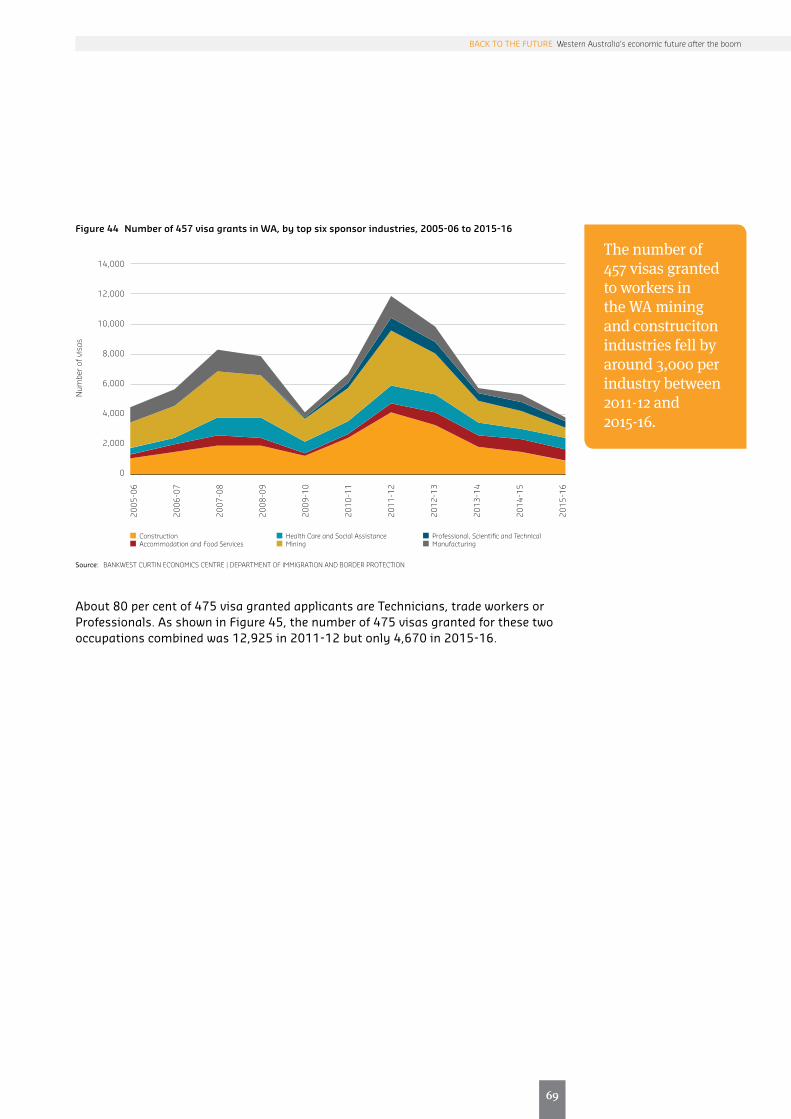
69
69
BACK TO THE FUTURE Western Australia’s economic future after the boom
The number of 457 visas granted to workers in the WA mining and construciton industries fell by around 3,000 per industry between 2011-12 and 2015-16.
Figure 44 Number of 457 visa grants in WA, by top six sponsor industries, 2005-06 to 2015-16
14,000
12,000
10,000
8,000
6,000
4,000
2,000
0
2005
-06
2006
-07
2007
-08
2008
-09
2009
-10
2010
-11
2011
-12
2012
-13
2013
-14
2014
-15
2015
-16
Num
ber o
f vis
as
Construction Accommodation and Food Services
Health Care and Social Assistance Mining
Professional, Scientific and Technical Manufacturing
Source: BANKWEST CURTIN ECONOMICS CENTRE | DEPARTMENT OF IMMIGRATION AND BORDER PROTECTION
About 80 per cent of 475 visa granted applicants are Technicians, trade workers or Professionals. As shown in Figure 45, the number of 475 visas granted for these two occupations combined was 12,925 in 2011-12 but only 4,670 in 2015-16.

70
Figure 45 Number of 457 visa grants in WA, by top five occupations, 2005-06 to 2015-16
18,000
16,000
14,000
12,000
10,000
8,000
6,000
4,000
2,000
0
2005
-06
2006
-07
2007
-08
2008
-09
2009
-10
2010
-11
2011
-12
2012
-13
2013
-14
2014
-15
2015
-16
Num
ber o
f vis
as
Technicians and Trades Workers Professionals
Managers Community and Personal Service Workers
Clerical and Administrative Workers
Source: BANKWEST CURTIN ECONOMICS CENTRE | DEPARTMENT OF IMMIGRATION AND BORDER PROTECTION

71
71
BACK TO THE FUTURE Western Australia’s economic future after the boom
The WA Outback has lost 2,000 to 3,000 migrants annually to other regions within WA since 2007-08. In contrast, the Wheatbelt region has been experiencing a net gain in intrastate migrants since 2013-14.
Regional migration in WA
This section takes a closer look at migration flows to different regions within WA in recent years. First, we analyse patterns of net interstate migration to WA regions in Figure 46. Greater Perth and Bunbury have consistently been ‘winners’ in interstate migration between 2006-07 and 2013-14. Net interstate migration to the WA Outback was positive till 2012-13 before turning negative in 2013-14. The Wheatbelt region tended to suffer a net loss of migrants during the timeframe. By 2014-15, all four regions were experiencing a net loss in interstate migration.
Turning next to intrastate migration flows (see Figure 47), it can be observed that urban areas i.e. Greater Perth and Bunbury experienced net gains while and the remote WA Outback have lost 2,000 to 3,000 migrants annually to other regions within WA since 2007-08. Furthermore, net out-migration from the WA Outback has grown since 2011-12. On the other hand, while the Wheatbelt region lost 1,008 people to other regions in 2010-11, the loss of population has since eased and indeed the Wheatbelt region has been experiencing a net gain in intrastate migrants since 2013-14.
Finally, it can be observed from Figure 48 that the number of 457 visas granted to applicants based in the resource-rich Pilbara region has declined from over 1,600 to around 440 between 2011-12 and 2015-16 – a nearly 75 per cent decline. This is the largest recorded decline in the number of 457 visa grants in a statistical division in regional WA since the tailing off of the resources boom. The only other statistical division with a larger decline is Perth, where the number of 457 visas granted fell from around 12,000 to 5,000 – although this amounts to a smaller percentage decline of 61 per cent.
Figure 46 Net interstate migration to WA regions, 2006-07 to 2014-15
2,000
1,500
1,000
500
0
-500
-1,000
10,000
8,000
6,000
4,000
2,000
0
-2,000
2006
-07
2007
-08
2008
-09
2009
-10
2010
-11
2011
-12
2012
-13
2013
-14
2014
-15
Peop
le
WA Outback Bunbury Wheatbelt Greater Perth (right axis)
Source: BANKWEST CURTIN ECONOMICS CENTRE | AUSTRALIAN BUREAU OF STATISTICS Cat. No. 3412.0
Peop
le

72
Figure 47 Net intrastate migration across WA regions, 2006-07 to 2014-15
3,000
2,000
1,000
0
-1,000
-2,000
-3,000
-4,000
2,500
2,000
1,500
1,000
500
0
2006
-07
2007
-08
2008
-09
2009
-10
2010
-11
2011
-12
2012
-13
2013
-14
2014
-15
WA Outback Bunbury Wheatbelt Greater Perth
Peop
le
Source: BANKWEST CURTIN ECONOMICS CENTRE | AUSTRALIAN BUREAU OF STATISTICS Cat. No. 3412.0
Figure 48 Number of 457 visa grants in WA, by statistical division, 2005-06 to 2015-16
3,500
3,000
2,500
2,000
1,500
1,000
500
0
14,000
12,000
10,000
8,000
6,000
4,000
2,000
0
2005
-06
2006
-07
2007
-08
2008
-09
2009
-10
2010
-11
2011
-12
2012
-13
2013
-14
2014
-15
2015
-16
Num
ber o
f vis
as
Pilbara South Eastern Lower Great Southern
South West Central Upper Great Southern
Kimberley Midlands
Perth (right axis)
Source: BANKWEST CURTIN ECONOMICS CENTRE | DEPARTMENT OF IMMIGRATION AND BORDER PROTECTION
Since the tailing off of the resources boom, the Pilbara region has experienced the largest decline in the number of 457 visa grants among all statistical divisions in regional WA.
Peop
leN
umbe
r of v
isas

73
WA’s industrial landscape after the boom

74
It has long been accepted that WA’s prolonged economic growth in the last decade has been primarily driven by the growth in the resources sector. The mining industry has traditionally been a key contributor to the WA economy. This chapter appraises the post-boom contribution of the mining industry to the state’s economy relative to other industries including agriculture, manufacturing, construction, financial and insurance services, electricity, gas, water and waste services, wholesale trade, retail trade, accommodation etc.
The analysis in this chapter uncovers the extent to which industry diversification has taken place outside the resources sector since its growth slowed. Are the contributions of non-resource industries growing in importance to the WA economy and if so, which industries are growing in prominence? Has the dominance of the mining industry to the WA economy weakened in the post-boom period, or is it likely to retain its long-standing position as the key contributor to economic growth in the state?
To shed light on these questions, we compare gross value added (GVA) estimates across industries to gauge each industry’s relative contribution to the state’s output. The GVA is typically used to describe the contribution of each industry to the gross product of the economy. It measures each industry’s output value at basic prices less its intermediate consumption value at purchasers’ prices (Australian Bureau of Statistics, Cat. 5204.0). The contribution of each industry to the state’s employment is also estimated and an appraisal is made of the extent to which each industry’s relative contribution has shifted since the slowdown of the resources sector.
Introduction

75
75
BACK TO THE FUTURE Western Australia’s economic future after the boom
The mining industry continues to maintain its dominance in the WA economy, contributing about 37 per cent and 30 per cent of GVA in 2015 and 2010 respectively.
Industry contributions to economic growth in WA
Figure 49 displays the percentage contribution of each industry to the state’s output based on GVA measures. The sum of GVA across all industries was $247 billion in 2015 compared to $186 billion in 2010. By comparing each industry’s share of GVA in 2010 and 2015, we are able to assess the extent to which each industry’s contribution to the state’s output has changed since the slowdown of the resources sector.
A comparison of industry GVA shares across both years suggests that the slowdown of the resources sector has done little to alter the distribution of GVA across industries. The mining industry continues to maintain its dominance in the WA economy, contributing about 37 per cent and 30 per cent of GVA in 2015 and 2010 respectively. The second largest industry is still the Construction industry, capturing around 13 per cent of GVA in both years. This is followed by Manufacturing, Transport, postal and warehousing, and Health care and social assistance, with each of these industries contributing to around 5 to 6 per cent of GVA in both years. On the other hand, industries that feature strongly in the tourism sector – Accommodation and food services, Retail trade, and Arts and recreation services – together made up only 5.4 per cent of total GVA in 2010 and this contribution has shrunk slightly to 4.9 per cent in 2015.
Figure 49 Percentage contribution of each industry to GVA in WA, 2010 and 2015, per cent
June 2010 June 2015
Mining Construction Manufacturing Transport, postal and warehousing
Health care and social assistance
Professional, scientific and technical services
Financial and insurance services
Retail trade Education and training Administrative and support services
Public administration and safety
Wholesale trade Electricity, gas, water and waste services
With less than 2% 2015 GVA
$186.7 billion
9.2%
29.9%
12.5%
6.4%6.1%6.0%
5.3%
4.2%
3.8%
3.8%
3.5%
3.3%
3.2%2.8%
$246.9 billion
36.6%
12.5%5.3%
5.2%
5.0%
4.6%
4.2%
3.4%
3.2%
3.0%
2.9%2.5%
3.0%
8.6%
Notes: Ownership of dwellings is excluded from the GVA. Industries that made less than 2 per cent contribution to GVA in 2015 are grouped together.Source: BANKWEST CURTIN ECONOMICS CENTRE | Australian Bureau of Statistics Cat. No. 5220.0
In Figure 50, each industry’s GVA growth rate in 2009-10 is displayed in horizontal axis, and plotted again its GVA growth rate in 2014-15 on the vertical axis. The relative size of the bubbles reflects the relative size of each industry’s GVA in 2014-15. For instance, the bubble representing the mining industry is the largest because the mining industry generated the highest amount of GVA of 90,278 million in 2014-15, more than any other industry in that year.
The figure is divided into four quadrants. Industries in the blue upper right quadrant are those which experienced positive growth in both timeframes. Most industries
Accommodation and food services, Retail trade, and Arts and recreation services together made up only 5.4 per cent of total GVA in 2010 and this has shrunk to 4.9 per cent in 2015.
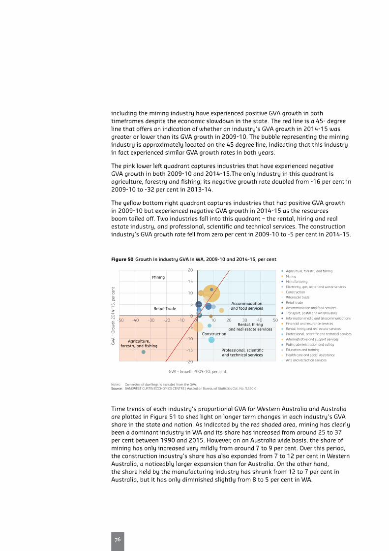
76
including the mining industry have experienced positive GVA growth in both timeframes despite the economic slowdown in the state. The red line is a 45- degree line that offers an indication of whether an industry’s GVA growth in 2014-15 was greater or lower than its GVA growth in 2009-10. The bubble representing the mining industry is approximately located on the 45 degree line, indicating that this industry in fact experienced similar GVA growth rates in both years.
The pink lower left quadrant captures industries that have experienced negative GVA growth in both 2009-10 and 2014-15.The only industry in this quadrant is agriculture, forestry and fishing; its negative growth rate doubled from -16 per cent in 2009-10 to -32 per cent in 2013-14.
The yellow bottom right quadrant captures industries that had positive GVA growth in 2009-10 but experienced negative GVA growth in 2014-15 as the resources boom tailed off. Two industries fall into this quadrant – the rental, hiring and real estate industry, and professional, scientific and technical services. The construction industry’s GVA growth rate fell from zero per cent in 2009-10 to -5 per cent in 2014-15.
Figure 50 Growth in industry GVA in WA, 2009-10 and 2014-15, per cent
GVA
– G
row
th 2
014-
15, p
er c
ent
GVA - Growth 2009-10, per cent
Agriculture, forestry and fishing
Mining
Manufacturing
Electricity, gas, water and waste services
Construction
Wholesale trade
Retail trade
Accommodation and food services
Transport, postal and warehousing
Information media and telecommunications
Financial and insurance services
Rental, hiring and real estate services
Professional, scientific and technical services
Administrative and support services
Public administration and safety
Education and training
Health care and social assistance
Arts and recreation services
-50 -40 -30 -20 -10 0 10 20 30 40 50
20
15
10
5
0
-5
-10
-15
-20
Mining
Retail Trade
Agriculture, forestry and fishing
Accommodation and food services
Rental, hiring and real estate services
Construction
Professional, scientific and technical services
Notes: Ownership of dwellings is excluded from the GVA.Source: BANKWEST CURTIN ECONOMICS CENTRE | Australian Bureau of Statistics Cat. No. 5220.0
Time trends of each industry’s proportional GVA for Western Australia and Australia are plotted in Figure 51 to shed light on longer term changes in each industry’s GVA share in the state and nation. As indicated by the red shaded area, mining has clearly been a dominant industry in WA and its share has increased from around 25 to 37 per cent between 1990 and 2015. However, on an Australia wide basis, the share of mining has only increased very mildly from around 7 to 9 per cent. Over this period, the construction industry’s share has also expanded from 7 to 12 per cent in Western Australia, a noticeably larger expansion than for Australia. On the other hand, the share held by the manufacturing industry has shrunk from 12 to 7 per cent in Australia, but it has only diminished slightly from 8 to 5 per cent in WA.

77
77
BACK TO THE FUTURE Western Australia’s economic future after the boom
Figure 51 Industry contribution to GVA, WA versus Australia, 1990 to 2015, per cent
100
90
80
70
60
50
40
30
20
10
0
1990
1991
1992
1993
1994
1995
1996
1997
1998
1999
2000
2001
2002
2003
2004
2005
2006
2007
2008
2009
2010
2011
2012
2013
2014
2015
Agriculture, forestry and fishing Mining Manufacturing Electricity, gas, water and waste services Construction Wholesale trade Retail trade Accommodation and food services Transport, postal and warehousing Information media and telecommunications
Financial and insurance services Rental, hiring and real estate services Professional, scientific and technical services Administrative and support services Public administration and safety Education and training Health care and social assistance Arts and recreation services Other services
Per c
ent
(b) Australia
100
90
80
70
60
50
40
30
20
10
0
1990
1991
1992
1993
1994
1995
1996
1997
1998
1999
2000
2001
2002
2003
2004
2005
2006
2007
2008
2009
2010
2011
2012
2013
2014
2015
Agriculture, forestry and fishing Mining Manufacturing Electricity, gas, water and waste services Construction Wholesale trade Retail trade Accommodation and food services Transport, postal and warehousing Information media and telecommunications
Financial and insurance services Rental, hiring and real estate services Professional, scientific and technical services Administrative and support services Public administration and safety Education and training Health care and social assistance Arts and recreation services Other services
Per c
ent
(a) Western Australia
Notes: Ownership of dwellings is excluded from the GVA.Source: BANKWEST CURTIN ECONOMICS CENTRE | Australian Bureau of Statistics Cat. No. 5220.0

78
The slowdown of the resources sector has done little to alter the distribution of employment across industries.
Employment trends across WA industries
In addition to GVA, the contribution of each industry to the WA economy can also be measured by its contribution to total employment in the state. Figure 52 displays the percentage contribution of each industry to the state’s employment. The total number of persons employed across all industries was 1.4 million in 2015 compared to 1.2 million in 2010. By comparing each industry’s share of employment in 2010 and 2015, we are able to assess the extent to which each industry’s contribution to the state’s employment has changed since the slowdown of the resources sector.
While the mining industry was the primary contributor to the state’s GVA in 2015, it accounted for only 7 per cent of the state’s employment in that year. The Construction, Health care and social assistance, and Retail trade industries are more labour intensive, with each accounting for around one-tenth of the state’s employment in 2015. Once again, a comparison of employment shares across both years suggests that the slowdown of the resources sector has done little to alter the distribution of employment across industries.
Figure 52 Percentage contribution of each industry to employment in WA, 2010 and 2015, per cent
June 2010 June 2015 Health care and social assistance
Construction Retail trade Professional, scientific and technical services
Education and training Mining Manufacturing Public administration and safety
Accommodation and food services
Transport, postal and warehousing
Other services Administrative and support services
Wholesale trade Financial and insurance services
Agriculture, forestry and fishing
Arts and recreation services
Industries with less than 2% of share of 2015 employment
1,195,776persons
4.6%
10.2%
7.4%
7.8%6.9%
7.2%
5.8%
5.7%
6.2%
1.6%
3.1%
3.6%2.6%
3.0%
1,372,924persons
11.3%
8.9%
7.9%
7.4%6.8%
6.3%
6.1%
5.4%
4.9%
3.4%
2.3% 2.1%
3.0%
11.9%
6.1%
2.1%4.1%9.5%
10.0%
4.8%
Source: BANKWEST CURTIN ECONOMICS CENTRE | Australian Bureau of Statistics Cat. No. 6291.0.55.003
To derive a clearer picture of the interactions between the growth in employment and GVA since the state’s economic slowdown, we plot each industry’s 2014-15 employment growth rate on the vertical axis against the GVA growth rate on the horizontal axis in in Figure 53. The relative size of each bubble represents the relative share of GVA from each industry in 2014-15. Industries found above the 45 degree line are those that experienced a higher employment growth rate than GVA growth rate in 2014-15. Industries below the 45 degree line are those that experienced a higher employment growth rate than GVA growth rate in 2014-15.
Health care social assistance and and Arts and recreation services are two industries with highest growth in employment while they also had an increase in their GVA. In the opposite side, Real estate services has shrunk both in terms of employment and GVA. ICT and Utilities also had negative growth in employment but their GVA has

79
79
BACK TO THE FUTURE Western Australia’s economic future after the boom
Health care and social services and Arts and recreation displayed the highest employmentgrowth rates in 2014-15 while also increasing their GVA.
increased. Situation for Agriculture and Professional services are almost the same, negative growth in both dimensions, although agriculture has shrunk more in terms of GVA.
Importantly, while the Mining industry experienced a positive GVA growth rate of 10 per cent in 2014-15, its employment growth rate was pretty much static in the same year. On the other hand, the Construction industry experienced a higher employment growth rate than GVA growth rate. The Agriculture, forestry and fishing industry experienced a decline in both employment and GVA, but the decline was greater in the case of GVA than employment. Other industries of interest include Health care and social services and Arts and recreation, which displayed the highest employment growth rates in 2014-15 while also increasing their GVA. In contrast, the Real estate services industry shrunk in terms of both employment and GVA estimates.
Figure 53 Growth in industry GVA and employment in WA, 2014-15, per cent
Gro
wth
in E
mpl
oym
ent
2014
-15,
per
cen
t
Growth in GVA 2014-15, per cent
Agriculture, forestry and fishing
Mining
Manufacturing
Electricity, gas, water and waste services
Construction
Wholesale trade
Retail trade
Accommodation and food services
Transport, postal and warehousing
Information media and telecommunications
Financial and insurance services
Rental, hiring and real estate services
Professional, scientific and technical services
Administrative and support services
Public administration and safety
Education and training
Health care and social assistance
Arts and recreation services
-20 -15 -10 -5 0 5 10 15 20
40
30
20
10
0
-10
-20
-30
Art & Recreation
Health Care &Social Service
Mining
Construction
Agriculture
Real Estate
Source: BANKWEST CURTIN ECONOMICS CENTRE | Australian Bureau of Statistics Cat. No. 6291.0.55.003 and Cat. No. 5220.0
Accommodation
Retail trade

80
The industry profile in WA has become less diversified over the course of the mining boom and throughout the post-boom years.
Is WA industry becoming more diversified or more specialised?
Next we assess whether Western Australia’s industry profile has become more diversified or more specialised over time using a measure known as the Herfindahl–Hirschman Index or HH Index. The HH index is a common measure of market concentration calculated by squaring the market share of each firm in a market, and then summing up the squares (Herfindahl, 1950; Hirschman, 1980) . The index ranges from 0 to 1. The higher the index, the more market power is concentrated among a small number of firms. In the present context, a higher HH index indicates a more specialised economy while a lower index indicates a more diversified economy. A rising (declining) index over time indicates that the economy is becoming less (more) diversified over time. As per previous sections, we calculate the index based on two measures – GVA shares and employment shares.
Figure 54 graphically illustrated how the GVA-based HH index has changed between 1990 and 2015 for all states and territories. The trends reveal that in terms of GVA, Western Australia and the ACT consistently display the least diversified industry portfolio over time. However, while the HH index for the ACT has remained relatively stable in recent years at around 0.12, the HH index for Western Australia has been rising since 2004. Between 2004 and 2012, the HH index for WA rose from 0.1 to 0.12 as the industry profile in WA became more specialised over the course of the mining boom. However, while a reversal of this trend might have been expected in the post-boom years, it would appear that the state’s industry profile has continued to become more specialised between 2012 and 2015, rising from 0.12 to nearly 0.15 over the three years. In most other states, the HH index has remained relatively stable and low over time at 0.4 to 0.6.
Figure 54 Industry production concentration across states and territories, 1990 to 2015, GVA-based Herfindahl-Hirschman index
0.16
0.14
0.12
0.10
0.08
0.06
0.04
0.02
0
1990
1991
1992
1993
1994
1995
1996
1997
1998
1999
2000
2001
2002
2003
2004
2005
2006
2007
2008
2009
2010
2011
2012
2013
2014
2015
WA NSW Vic Qld SA Tas NT ACT Aus
Her
finda
hl-H
irsch
man
Inde
x –
GVA
Notes: Higher values of the index represent less industry diversification. | Ownership of dwellings is excluded from the GVA.Source: BANKWEST CURTIN ECONOMICS CENTRE | Authors Calculations based on Australian Bureau of Statistics Cat. No. 5220.0

81
81
BACK TO THE FUTURE Western Australia’s economic future after the boom
The Western Australian industry profile has always been more concentrated than Australia overall in terms of GVA.
WA has similar industry concentration levels as Australia overall, but the state’s industry profile is getting slightly more diversified over time in terms of the workforce the industries employ.
The next figure offers a sharper focus on WA by directly comparing the state with Australia, with the bars representing the gap in HH index between the state and nation. It is clear that the Western Australian industry profile has always been more concentrated than Australia overall, in terms of industry GVA. Furthermore, while the GVA-based HH index for Australia has remained more or less static just over 0.5, the index has been on a persistent rise in WA since 2004.
Figure 55 Industry production concentration, WA versus Australia, 1990 to 2015, Herfindahl-Hirschman index
0.16
0.14
0.12
0.10
0.08
0.06
0.04
0.02
0
0.3
0.25
0.2
0.15
0.1
0.05
0
1990
1991
1992
1993
1994
1995
1996
1997
1998
1999
2000
2001
2002
2003
2004
2005
2006
2007
2008
2009
2010
2011
2012
2013
2014
2015
Her
finda
hl-H
irsch
man
Inde
x –
GVA
Gap: WA-AUS (right axis) WA Australia
Notes: Higher values of the index represent less industry diversification. Ownership of dwellings is excluded from the GVA.Source: BANKWEST CURTIN ECONOMICS CENTRE | Authors Calculations based on Australian Bureau of Statistics Cat. No. 5220.0
Next, we investigate changes in industry concentration over time from the perspective of employment. Figure 56 captures the industry employment diversity in Australia and WA. Higher employment-based HH-index values represent greater employment concentration into a few industries (or less diversity). As can be seen from the figure, the employment-based HH index in both WA and Australia has remained quite state at a relatively high 0.07 since 1990. However, the long-run employment-based HH index for WA has been on a mild incline, from just under 0.07 in 1990 to just over 0.07 in 2015, that is, WA’s industry profile is getting slightly more diversified over time in terms of the workforce the industries employ. As indicated by the bars, the gap in industry employment concentration between WA and Australia has been narrowing slightly over time.

82
Figure 56 Industry employment concentration in Australia and WA, 1990 to 2015, Herfindahl-Hirschman index
0.08
0.07
0.06
0.05
0.04
0.03
0.02
0.01
0
0.008
0.006
0.004
0.002
0
-0.002
-0.004
-0.006
-0.008
1990
1991
1992
1993
1994
1995
1996
1997
1998
1999
2000
2001
2002
2003
2004
2005
2006
2007
2008
2009
2010
2011
2012
2013
2014
2015
Her
finda
hl-H
irsch
man
Inde
x –
Em
ploy
men
t
Gap: WA-AUS (right axis) WA Australia
Notes: Higher values of the index represent less industry diversification.Source: BANKWEST CURTIN ECONOMICS CENTRE | Authors Calculations based on Australian Bureau of Statistics Cat. No. 6291.0.55.003

83
83
BACK TO THE FUTURE Western Australia’s economic future after the boom
The changing profile of the WA mining industry
While the WA economy has become more specialised over time, some diversification has actually taken place within the mining industry.
The mining industry has clearly continued its dominance in WA despite the recent slowdown in the sector. However, a deeper investigation reveals some interesting trends within the mining industry. Importantly, the mining industry is made up of a diverse range of sub-industries including iron ore, liquefied natural gas (LNG), gold, coal, natural gas and liquefied petroleum gas (LPG), nickel, alumina, crude oil, heavy mineral sands, base metals, etc. The value of the mining industry is not distributed equally across its sub-industries. Indeed Figure 57 shows that the WA mining industry has been dominated by iron ore in recent years. Iron ore has contributed to over half of the value of the mining industry since 2010. In 2015, iron contributed to 55 per cent of the value of the mining industry, followed by LNG (13 per cent) and gold (10 per cent).
The share of iron ore tripled from 20 per cent in 2001 to 61 per cent in 2013. Between 2013 and 2015, the contribution of iron ore to the WA mining industry fell by six percentage points as iron ore prices dropped. At the same time, three sub-industries have expanded their shares – gold, alumina and LNG by three, two and one percentage points respectively. It would appear that while the WA economy has become more specialised over time, some diversification has actually taken place within the mining sector itself.
Figure 57 Commodity shares in the mining industry in WA, 2001 to 2015, per cent
200
180
160
140
120
100
80
60
40
20
0
100%
90%
80%
70%
60%
50%
40%
30%
20%
10%
0
2001
2002
2003
2004
2005
2006
2007
2008
2009
2010
2011
2012
2013
2014
2015
Billi
ons,
$
Iron ore LNG Gold Crude oil and condensate
Alumina Nickel industry Natural gas and LPG Base metals
Heavy mineral sands Coal
Total (All Commodities)
Source: BANKWEST CURTIN ECONOMICS CENTRE | WA DEPARTMENT OF MINES AND PETROLEUM

84
Together, the two key mining sub-industries in WA – iron ore and gold – accounted for half of the workforce in the WA resource sector in 1990. By 2015, this had blown out to 73 per cent.
Figure 58 Commodity shares of employment in the mining industry in WA, 2001 to 2015, per cent
200
180
160
140
120
100
80
60
40
20
0
100%
90%
80%
70%
60%
50%
40%
30%
20%
10%
0
2001
2002
2003
2004
2005
2006
2007
2008
2009
2010
2011
2012
2013
2014
2015
Thou
sand
s, p
eopl
e
Iron ore Gold Bauxite/Alumina Nickel Other
Base metals Heavy mineral sands Exploration Construction Materials Diamond
Coal Salt Tin – Tantalum – Lithium
Total Direct Employment in WA Resources Sector (LHS)
Source: BANKWEST CURTIN ECONOMICS CENTRE | WA DEPARTMENT OF MINES AND PETROLEUM
Iron ore has also had the largest share of employment within the mining sector in WA in recent years. In 2015, iron ore accounted for 53 per cent of employment in the mining industry, followed by gold at 20 per cent (see Error! Reference source not found.). It is clear that the distribution of employment across mining sub-industries has changed drastically over the long-term. In 1990, iron ore only accounted for around 21 per cent of employment in the mining industry, below the 29 per cent accounted for by gold. As a result of the expansion in employment in the iron ore sector in recent years, it overtook gold as the primary contributor to the resource sector workforce in WA as its share of employment in he WA mining industry expanded to over 50 per cent while gold’s share of employment fell by nine percentage points.
Together, the two key mining sub-industries in WA – iron ore and gold – accounted for half of the workforce in the WA resource sector in 1990. By 2015, the two sub-industries’ combined contribution to the WA mining workforce had blown out to 73 per cent. With total employment in resource sector sitting at around 100,000 persons in 2015, this means the iron ore sub-industry employed around 50,000 persons and the gold sub-industry employed around 20,000 people in 2015.
Since 2013, the contribution of iron ore to the WA mining industry has contracted by six percentage points, and this has been replaced by growing contributions by gold, alumina and LNG.

85
Summary and conclusions

86
A more egalitarian future?
A more egalitarian future?The resources boom in Western Australia led to an unprecedented growth in employment, wages and economic growth for the state. Demand for skilled workers drew many to Western Australia to share in the state’s growth story, and to walk on streets paved with gold towards new economic and lifestyle opportunities.
But high and rising incomes posed risks too, of creating a society of have’s and have-not’s. Income inequality rose substantially in Western Australia over the course of the resources boom, and by more than for the rest of Australia. Costs of living, especially housing costs, tracked to the rising trend in incomes, not just in Perth but in the resource-rich regional areas of WA. All this meant that the poorest WA households, particularly those reliant on welfare pensions and payments, failed to keep pace even with those on ‘typical’ median incomes.
Now that WA has passed the height of the resources boom, is there evidence of a reversal in the rising inequality trend? The evidence in this report confirms a fall in overall inequality in Western Australia since 2009-10. Interestingly, most of the action is at the bottom end of the income distribution. The incomes of the poorest 10 per cent of households in Western Australia are now closer to those of the median household. Yet the spread of incomes at the top end of the distribution appears no less unequal than at the end of the boom.
The report also uncovers evidence of a shift away from investment property and towards superannuation. The share of households with property assets fell 2.7 percentage points to 21 per cent overall since 2009-10, while the share of households with superannuation assets has grown 5.5 percentage points to 80 per cent since 2009-10.
In fact, wealth inequality has actually risen slightly in Western Australia in the last two years. The wealthiest 20 per cent of households now account for 65 per cent of all household net wealth, while the poorest 20 per cent hold less than 1 per cent. The gap may be closing at the lower end, but there are no strong signs that we are moving towards a more egalitarian society.
The future of workThis BCEC Focus on Western Australia report has highlighted significant shifts in Western Australia’s labour market position in recent years, as growth in the resources sector slowed. The post-boom labour market is one characterised by weaker demand, growing precariousness and reduced work hours after a sustained period of strong labour market performance.
While WA has traditionally enjoyed unemployment rates that sit below the national average, for the first time since 2006 the state’s unemployment rate surpassed the nation’s average in mid-2015. According to the Internet Vacancy Index, job vacancies in the state also dipped below the nation for the first time in a decade in 2015.
West Australians are also working or seeking jobs within an increasingly precarious environment, including those in high-earning occupations. The report findings

87
87
BACK TO THE FUTURE Western Australia’s economic future after the boom
The post-boom labour market is one characterised by weaker demand, growing precariousness and reduced work hours after a sustained period of strong labour market performance.
indicate that while high skilled and trade occupations have benefited the most from the WA resources boom, demand for these two occupational categories are also more susceptible to the highs and lows of the economic cycle. During the post-resources boom period, job vacancies for managers, professionals and technicians and trade workers plummeted more than other occupations. Importantly, workforce casualisation is on the rise; between 2008 and 2014 the share of casual employees in WA rose from 20.5 to 22.5 per cent and the rate of growth of this casualisation accelerated from -1.5 per cent to 1.5 per cent. The share of employees who report more than 50 per cent chance of losing their job in the next year has doubled from 1.5 to 3 per cent between 2010 and 2012.
The biennial full-time employment rate for both males and females in WA declined from 10 per cent during the boom to a negative growth rate of around 5 per cent in 2016, dipping below the national average after the resources boom. This downward full-time employment trend has been paralleled by a rise in the part-time employment. The statistics show that some of the growth in part-time employment has been largely involuntary in nature. Underemployment has grown at a sharper rate for both males and females in WA than in the rest of Australia since the resources boom tailed off.
There are some distinct gender differences. The growth in part-time employment represents a more pronounced labour market shift for Western Australian females than females in other states and territories. The female underemployment rate is also consistently higher than the male underemployment rate in all years.
Overall, West Australians now face a labour market future that is marked by weaker demand, growing precariousness and reduced work hours. These are at odds with the long-held notion that an individuals will secure and sustain long-term full-time employment held over the course of his or her working life until retirement. On the contrary, labour market careers will likely be increasingly insecure. There are strong signals emanating from the labour market that career pathways will be less straightforward; it may be that more and more West Australians will need to hold multiple jobs at any point in time to make up preferred work hours, and multiple job turnovers and career shifts before retirement would not be unusual. According to the BCEC’s 2015 report on population ageing (Dockery et al. 2015), growing numbers of baby boomers are extending their working lives through ‘blended’ retirement transition pathways that involve part-tie work. Hence, the competition for part-time jobs by all age groups is likely to grow as businesses reduce the number of full-time jobs on offer.
A changing industrial landscape?Much has been made in policy and media commentary about the growing diversification of the West Australian economy following the end of the resources boom. Industries outside the mining sector, such as tourism and agriculture, are being looked to as potential new ‘growth’ sectors that are positioned to replace the mining sector as the primary driver of the state’s economic growth.
There are strong signals emanating from the labour market that career pathways will be less straightforward, more and more West Australians will need to hold multiple jobs at any point in time to make up preferred work hours, and multiple job turnovers and career shifts before retirement would not be unusual.

88
The slow growth of industries that are particularly important to regional economies raises important questions around the degree to which the state’s regional economic blueprints coordinated with state development plans to deliver the best outcomes for WA.
Mining contributes to be the primary contributor to the state’s GVA. The report’s findings contradict commonly mooted propositions that the tourism industry will contribute growing shares of GVA and employment as the resources economy slows.
However, our report dispels any notion that the mining industry has receded in importance to the WA economy. Indeed, the slowdown of the resources sector has done little to alter the distribution of GVA across industries. The mining industry continues to maintain its dominance in the WA economy, contributing about 37 per cent and 30 per cent of GVA in 2015 and 2010 respectively. The second largest industry is still the Construction industry, capturing around 13 per cent of GVA in both years, followed by Manufacturing, Transport, postal and warehousing, and Health care and social assistance, with each of these industries contributing to around 5 to 6 per cent of GVA in both years. On the other hand, industries that feature strongly in the tourism sector – Accommodation and food services, Retail trade, and Arts and recreation services – together made up only 5.4 per cent of total GVA in 2010 and this contribution has shrunk slightly to 4.9 per cent in 2015.
A comparison of employment shares across both years suggests that the slowdown of the resources sector has done little to alter the distribution of employment across industries. Unsurprisingly, the three tourism-related industries mentioned above contribute a higher share of employment (17 per cent) than the mining industry (7 per cent) in the state given the service-oriented nature of tourism. However, this share has remained stagnant between 2010 and 2015, contradicting one of the prevailing narratives of the state’s future economic direction post-resources boom, that the tourism industry will contribute growing shares of employment after the slowdown of the mining sector. The Agriculture, forestry and fishing sector has also shrunk proportionately in both GVA and employment terms. On the other hand, the contribution of Health care and social assistance to the state’s employment has grown from 9.5 to 12 per cent over the five-year period. This is not surprising given the growing importance of this industry within an ageing WA population.
Overall, the industrial landscape in WA has become less diversified in terms of GVA since the slowdown of the resources boom, once again contradicting the popular notion that new ‘growth’ sectors are emerging from other industries that are positioned to replace the mining sector as the primary driver of the state’s economic growth. However, there is some evidence of diversification taking place within the mining sector itself. The state’s industry profile is also getting slightly more diversified over time in terms of the workforce the industries employ.
It would appear that the industrial landscape in WA has changed very little in recent years. Despite the prevailing narrative of new economic initiatives combined with to promote the development of regional industries such as food, tourism and agriculture. The relatively slow growth of industries that are especially important to regional economies – agriculture, energy, tourism and food among others - raises important questions around the degree to which the state’s regional economic blueprints are coordinated with state development plans to deliver the best outcomes for WA.
It is also clear that the Health care and social assistance sector is growing as the population ages. However, the sector also faces challenges related to high costs, and issues relating to low pay.

89
89
BACK TO THE FUTURE Western Australia’s economic future after the boom
If the state is to capitalise on the growth of the health care and social assistance sector, then issues associated with wages and working conditions within this sector will need to be addressed.
If the state is to capitalise on the growth of this sector, then issues associated with sectoral wages and working conditions will need to be addressed. For instance, the WA aged care sector is often afflicted with high turnover rates and issues related to low pay, which are commonly attributed to the undervaluation of care work. It should also be recognised that the majority of the health care and social assistance workforce is made up of women. Hence, workforce strategies to support the growth of this sector will need to take into account the family, community and informal care roles that are typically performed by women to build a health care workforce that can support the growth of this sector.
Is WA ready for a ‘new normal’?Western Australia is entering a critical phase in its economic trajectory after the boom. The state’s prevailing narrative for economic development has been built around a strong resources sector, combined with a diversified industrial development strategy promoting growth in other sectors of the economy. Agriculture, food and tourism and food feature strongly in this narrative, but are these sectors well enough positioned, or of sufficient scale, to continue the state’s growth story?
In considering Western Australia’s economic future after the boom, we do need also to reflect on where the state has come from. It is certainly the case that prices and rents have fallen, but from unprecedented highs during the boom period. Income inequality in WA has been high relative to eastern coast states, but is reverting to the sorts of income separation seen elsewhere in Australia. Unemployment in WA has risen at a faster rate than for Australia, but again, from historic lows.
Overall, the evidence in this report suggest that, economically speaking, Western Australia is set for a ‘new normal’. Yet this should not diminish the need for efficient, creative and imaginative policy settings to take full advantage of new opportunities for economic growth and future industrial development. This responsibility extends to the imperative for new, secure employment opportunities for the state’s workforce. In doing so, it is surely also worth reflecting on the fact that the labour market of the future – flexible, multi-faceted, portfolio-based – may well be substantially different from the labour market of the past.

90

91
Glossary
92
Consumer Price Index (CPI)The Consumer Price Index measures quarterly changes in the price of a 'basket' of goods and services which account for a high proportion of expenditure by metropolitan households.
Equivalised IncomeEquivalising income is a method of standardising household income to take account of household size and compositional differences.
Disposable IncomeDisposable income is total income less income tax, the Medicare levy and the Medicare levy surcharge.
Gini coefficientThe Gini coefficient is a single statistic between zero and one which is a summary indicator of the degree of inequality. Values closer to 0 represent less inequality, and values closer to one represent greater inequality.
Gross Value Added (GVA)Gross Value Added (GVA) measures each industry’s output value at basic prices less its intermediate consumption value at purchasers’ prices. It is typically used to describe the contribution of each industry to the gross product of the economy.
PercentilesA percentile is a measure indicating the value below which a given percentage of observations in a group of observations fall. For example, the 20th percentile is the value (or score) below which 20% of the observations may be found.
Household Reference PersonThe reference person for each household is chosen by applying, to all household members aged 15 years and over, the selection criteria below, in the order listed, until a single appropriate reference person is identified: (1) the person with the highest tenure when ranked as follows: owner without a mortgage, owner with a mortgage, renter, other tenure; (2) one of the partners in a registered or de facto marriage, with dependent children; (3) one of the partners in a registered or de facto marriage, without dependent children; (4) a lone parent with dependent children; (5) the person with the highest income; (6) the eldest person.

93
93
BACK TO THE FUTURE Western Australia’s economic future after the boom
Gross Domestic Product (GDP)Gross Domestic Product (GDP) is an economic indicator of the value of a country’s total output, calculated as the sum of the following measures: consumption expenditures; business investment; government spending; and net exports (defined as exports minus imports).
Gross State Product (GSP)Gross State Product (GSP) is a measure of the economic output of a state, province or region, and serves as the counterpart to gross domestic product for a country. Conceptually, GSP is measured on the same basis as GDP, although there are practical difficulties in measuring ‘import’ and ‘export’ flows across state boundaries, and attributing state-specific income accruing from factors of production in national and multinational firms.
Herfindahl–Hirschman Index or HH IndexThe HH index is a common measure of market concentration calculated by squaring the market share of each firm in a market, and then summing up the squares. The index ranges from 0 to 1. The higher the index, the more market power is concentrated among a small number of firms.
Labour force participation rateThe labour force participation rate is defined as the proportion of the population aged 15 years and over that is in the labour force, i.e. either employed or looking for work.
Net worthNet worth is the value of a household's assets less the value of its liabilities. Net worth may be negative when household liabilities exceed household assets.
QuintilesQuintiles are groupings that result from ranking all households in ascending order according the relevant characteristic (i.e. net income or net wealth) and then dividing the household population into five equal groups, each comprising 20% of the total household population.
Real GDP/GSP Real GDP (GSP) is GDP (GSP) at market prices (ie. adjusting for price changes) in order that measures can be compared over time. The Australian Bureau of Statistics (ABS) measures real GDP (GSP) using chain volume estimates. Such estimates are derived by revaluing current price, income-based estimates of GDP (GSP), using deflators which are calculated from the expenditure components of the state series concerned.

94
Regional Price Index (RPI)The Regional Price Index compares the cost of a common basket of goods and services at a number of regional locations to the Perth metropolitan region.
UnderemploymentThe underemployment rate is the percentage of employed persons aged 15 years and over who prefer to work more hours than they currently have.
Unemployment rateThe unemployment rate is the proportion of the labour force that is unemployed.
Temporary Work (Skilled) visa (subclass 457)A subclass 457 visa allows a skilled worker to travel to Australia to work in their nominated occupation for their approved sponsor up to a period of four years. 457 visa holders must only work in the nominated occupation and for the approved sponsor.
Wage Price IndexThe Wage Price Index measures quarterly changes in the price of wages. Changes in rates of pay arise from various sources including award variations, enterprise and workplace agreements, minimum wage setting, individual contracts and informal arrangements.

95
References

96
Australian Bureau of Statistics (2015), Australian National Accounts: State Accounts, 2014-15, Cat. no. 5220.0, Australian Bureau of Statistics, Canberra.
Australian Bureau of Statistics (2015), Australian System of National Accounts: State Accounts, 2014-15, Cat. no. 5204.0, Australian Bureau of Statistics, Canberra.
Australian Bureau of Statistics (2016), Australian Demographic Statistics, Cat. no. 3101.0, Australian Bureau of Statistics, Canberra.
Australian Bureau of Statistics (2016), Consumer Price Index, Cat. no. 6401.0, Australian Bureau of Statistics, Canberra.
Australian Bureau of Statistics (2016), Migration, Cat. no. 3412.0, Australian Bureau of Statistics, Canberra.
Australian Bureau of Statistics (2016), Mineral and Petroleum Exploration, Cat. no. 8412.0, Australian Bureau of Statistics, Canberra.
Australian Bureau of Statistics (2016), Private New Capital Expenditure and Expected Expenditure, Cat. no. 5625.0, Australian Bureau of Statistics, Canberra.
Australian Bureau of Statistics (2016), Residential Property Price Indexes: Eight Capital Cities, Cat. no. 6416.0, Australian Bureau of Statistics, Canberra.
Australian Bureau of Statistics (2016), Retail Trade, Cat. no. 8501.0, Australian Bureau of Statistics, Canberra.
Australian Bureau of Statistics (2016), Wage Price Index, Cat. no. 6345.0, Australian Bureau of Statistics, Canberra.
Cassells, R., Duncan, A. and Gao, G. (2014), Sharing the Boom: The Distribution of Income and Wealth in WA, Bankwest Curtin Economics Centre, Focus on Western Australia Report Series #1, February.
Department of Immigration and Border Protection (2016), Work in Australia Statistics, available at https://www.border.gov.au/about/reports-publications/research-statistics/statistics/work-in-australia.
Herfindahl, O.C. (1950), Concentration in the Steel Industry, Doctoral dissertation, Columbia University.
Hirschman, A.O. (1980), National Power and the Structure of Foreign Trade, Vol. 105, University of California Press.
WA Department of Mines and Petroleum (2016), Economic Indicators Resources Data, Government of Western Australia, available at http://www.dmp.wa.gov.au/About-Us-Careers/Latest-Statistics-Release-4081.aspx.

97
97
BACK TO THE FUTURE Western Australia’s economic future after the boom
WA Department of Regional Development (2012), Regional Price Index, available at http://www.drd.wa.gov.au/Publications/Documents/Regional_Price_Index_2011.pdf.
WA Department of Regional Development (2014), Regional Price Index, available at http://www.drd.wa.gov.au/Publications/Documents/Regional_Price_Index_2013.pdf.
WA Department of Regional Development (2016), Regional Price Index, available at http://www.drd.wa.gov.au/Publications/Documents/Regional_Price_Index_2015.pdf.

98

DisclaimerWhile every effort has been made to ensure the accuracy of this document, the uncertain nature of economic data, forecasting and analysis means that the centre, Curtin University and/or Bankwest are unable to make any warranties in relation to the information contained herein. Any person who relies on the information contained in this document does so at their own risk. The centre, Curtin University, Bankwest, and/ or their employees and agents disclaim liability for any loss or damage, which may arise as a consequence of any person relying on the information contained in this document. Except where liability under any statute cannot be excluded, the centre, Curtin University, Bankwest and/or their advisors, employees and officers do not accept any liability (whether under contract, tort or otherwise) for any resulting loss or damage suffered by the reader or by any other person.
The views in this publication are those of the authors and do not represent the views of Curtin University and/or Bankwest or any of their affiliates. This publication is provided as general information only and does not consider anyone’s specific objectives, situation or needs. Neither the authors nor the centre accept any duty of care or liability to anyone regarding this publication or any loss suffered in connection with the use of this publication or any of its content.
Authorised Use© Bankwest Curtin Economics Centre, October 2016
Bankwest Curtin Economics Centre Focus on Western Australia Report Series
ISBN: 978-1-925083-48-4
This report was written by: Alan Duncan, Grace Gao, Ha Nguyen, Rachel Ong and Yashar Tarverdi from the Bankwest Curtin Economics Centre at Curtin Business School.
This report may be cited as: Duncan A, Gao G, Nguyen H, Ong R and Tarverdi Y (2016), ‘Back to the future: Western Australia’s economic future after the boom’, Bankwest Curtin Economics Centre, Focus on Western Australia Series, Issue #8, October 2016.
This report uses unit record data from the Household, Income and Labour Dynamics in Australia (HILDA) Survey. The HILDA Project was initiated and is funded by the Australian Government Department of Social Services (DSS) and is managed by the Melbourne Institute of Applied Economic and Social Research (Melbourne Institute). The findings and views reported in this paper, however, are those of the authors and should not be attributed to either DSS or the Melbourne Institute.
This publication contains confidential and proprietary information of the Bankwest Curtin Economics Centre. All of the material in this publication is for your exclusive use and may not be otherwise used or modified for, or by, any other person or sold to or otherwise provided in whole or in part to any other person or entity without the prior written consent of the Bankwest Curtin Economics Centre.
A standard hard copy of, or electronic subscription to, this publication entitles employees of the same organisation and same physical location as the subscriber to the use of its contents for internal reporting purposes only. Multiple user licenses are available for organisations with more than one location.

business.curtin.edu.au/bcec
Bankwest Curtin Economics CentreTel: +61 8 9266 2873 Email: [email protected]
© Curtin University of Technology 2016Curtin University is a trademark of Curtin University of TechnologyCRICOS Provider Code 00301JADV092142
Contact