Avsar, Huseyin and Fischer, Joel E. and Rodden, Tom (2016...
10
Avsar, Huseyin and Fischer, Joel E. and Rodden, Tom (2016) Designing touch screen user interfaces for future flight deck operations. In: IEEE/AIAA 35th Digital Avionics Systems Conference (DASC), 25-29 Sept 2016, Sacramento, USA. Access from the University of Nottingham repository: http://eprints.nottingham.ac.uk/37401/1/Designing%20Touch%20Screen%20User %20Interfaces%20for%20Future%20Flight%20Deck%20Operations.pdf Copyright and reuse: The Nottingham ePrints service makes this work by researchers of the University of Nottingham available open access under the following conditions. This article is made available under the University of Nottingham End User licence and may be reused according to the conditions of the licence. For more details see: http://eprints.nottingham.ac.uk/end_user_agreement.pdf A note on versions: The version presented here may differ from the published version or from the version of record. If you wish to cite this item you are advised to consult the publisher’s version. Please see the repository url above for details on accessing the published version and note that access may require a subscription. For more information, please contact [email protected]
Transcript of Avsar, Huseyin and Fischer, Joel E. and Rodden, Tom (2016...
Avsar, Huseyin and Fischer, Joel E. and Rodden, Tom (2016) Designing touch screen user interfaces for future flight deck operations. In: IEEE/AIAA 35th Digital Avionics Systems Conference (DASC), 25-29 Sept 2016, Sacramento, USA.
Access from the University of Nottingham repository: http://eprints.nottingham.ac.uk/37401/1/Designing%20Touch%20Screen%20User%20Interfaces%20for%20Future%20Flight%20Deck%20Operations.pdf
Copyright and reuse:
The Nottingham ePrints service makes this work by researchers of the University of Nottingham available open access under the following conditions.
This article is made available under the University of Nottingham End User licence and may be reused according to the conditions of the licence. For more details see: http://eprints.nottingham.ac.uk/end_user_agreement.pdf
A note on versions:
The version presented here may differ from the published version or from the version of record. If you wish to cite this item you are advised to consult the publisher’s version. Please see the repository url above for details on accessing the published version and note that access may require a subscription.
For more information, please contact [email protected]
Designing Touch Screen User Interfaces for Future Flight Deck Operations
Huseyin Avsar, Joel E. Fischer, Tom Rodden Mixed Reality Lab
The University of Nottingham {psxha6, joel.fischer, tom.rodden}@nottingham.ac.uk
Abstract— Many interactional issues with Flight Management Systems (FMS) in modern flight decks have been reported. Avionics designers are seeking for ways to reduce cognitive load of pilots with the aim to reduce the potential for human error. Academic research showed that touch screen interfaces reduce cognitive effort and provide an intuitive way of interaction. A new way of interaction to manipulate radio frequencies of avionics systems is presented in this paper. A usability experiment simulating departures and approaches to airports was used to evaluate the interface and compare it with the current system (FMS). In addition, interviews with pilots were conducted to find out their personal impressions and to reveal problem areas of the interface. Analyses of task completion time and error rates showed that the touch interface is significantly faster and less prone to user input errors than the conventional input method (via physical or virtual keypad). Potential problem areas were identified and an improved interface is suggested.
Keywords— Flight Deck Design, Avionics, Touch Screen, User Interface, Usability Test, Input Device, Comparative Study
I. INTRODUCTION
Various input devices such as mouse, trackpad, keyboard and touch screen serve users to input data into (or navigate through) a system. Since each application area has its own specific requirements the performance of input devices may vary across conditions and type of task.
The flight deck is a safety critical environment, where errors in operation may result in death or serious injuries to all passengers on board [1]. Advanced avionics systems installed in the modern flight deck cannot prevent that “human error” is the primary cause for fatal accidents. According to Civil Aviation Authority [2] (CAA) two-thirds of fatal accidents are caused by human error.
Traditionally, cockpit designers relied on hard controls such as knobs, buttons, switches and sliders. With the integration of touch screens into all sort of consumer products, avionics manufacturers started to work on potential solutions with touch screen interfaces. Albinson and Zhai [3] reported that zero displacement between input and output, control and feedback, hand action and eye gaze make touch screens very intuitive to use.
The first academic research that compared touch screen devices with other input devices in a flight deck situation was conducted by Jones [4]. A simulator was used to compare
trackball, touch screen and speech recognition. Results revealed that the touch screen concept was the most effective input method for specific tasks. It took less time to address crew alerting messages, change altitude and navigate through several subsystem menus. Authors concluded that touch screens help pilots to keep their attention, reduce cognitive effort, search time, and motor movement. A similar study was conducted by Stanton et al. [5] which confirmed these findings. However, subjective impressions revealed an increased discomfort compared to other input devices.
Noyes and Starr [6] demonstrated that touch screens are not the ultimate solution for input devices within flight decks. An experiment compared speech recognition and touch screen technology for executing checklists. Results showed that control inputs through touch screen are disrupting the flight performance (awareness) more than speech recognition. This is because the need of focusing on the touch screen display while interacting, which is not required for speech recognition.
Manipulating radio frequencies of radio communication (COM), very high frequency (VHF) omnidirectional range (VOR), automatic direction finder (ADF) or transponder (XPDR) device are another tasks that pilots have to do while flying an aircraft. A new touch screen interface was developed and evaluated in experiments with pilots from the Spanish Maritime Safety Agency (SASEMAR) using a tablet PC and the Flight Management System (FMS) of the Agusta Westland 139 (AW139).
Key hypotheses driving this work are:
• Participants will be faster and will make less errors on the new developed user interface.
• Completion time using the keypad virtual will be similar to physical buttons.
II. BACKGROUND
This chapter is divided into three sections. The first section will define the terminology that is used in this study. In addition to mentioned studies, the second section will review other works that conducted similar comparison studies. The user interface studied in this paper builds on a prior series of qualitative and quantitative research. Findings from these previous studies were used to develop the interface used in this study which are summarised in the final section.
A. Definitions
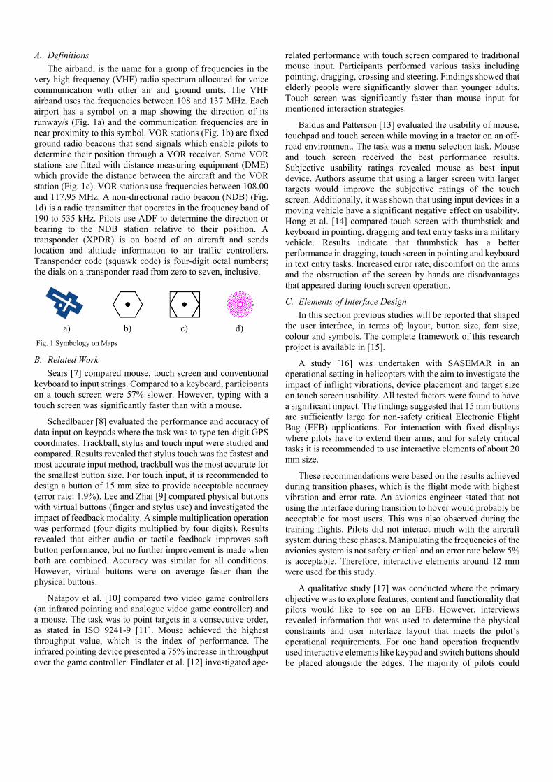
The airband, is the name for a group of frequencies in the very high frequency (VHF) radio spectrum allocated for voice communication with other air and ground units. The VHF airband uses the frequencies between 108 and 137 MHz. Each airport has a symbol on a map showing the direction of its runway/s (Fig. 1a) and the communication frequencies are in near proximity to this symbol. VOR stations (Fig. 1b) are fixed ground radio beacons that send signals which enable pilots to determine their position through a VOR receiver. Some VOR stations are fitted with distance measuring equipment (DME) which provide the distance between the aircraft and the VOR station (Fig. 1c). VOR stations use frequencies between 108.00 and 117.95 MHz. A non-directional radio beacon (NDB) (Fig. 1d) is a radio transmitter that operates in the frequency band of 190 to 535 kHz. Pilots use ADF to determine the direction or bearing to the NDB station relative to their position. A transponder (XPDR) is on board of an aircraft and sends location and altitude information to air traffic controllers. Transponder code (squawk code) is four-digit octal numbers; the dials on a transponder read from zero to seven, inclusive.
B. Related Work
Sears [7] compared mouse, touch screen and conventional keyboard to input strings. Compared to a keyboard, participants on a touch screen were 57% slower. However, typing with a touch screen was significantly faster than with a mouse.
Schedlbauer [8] evaluated the performance and accuracy of data input on keypads where the task was to type ten-digit GPS coordinates. Trackball, stylus and touch input were studied and compared. Results revealed that stylus touch was the fastest and most accurate input method, trackball was the most accurate for the smallest button size. For touch input, it is recommended to design a button of 15 mm size to provide acceptable accuracy (error rate: 1.9%). Lee and Zhai [9] compared physical buttons with virtual buttons (finger and stylus use) and investigated the impact of feedback modality. A simple multiplication operation was performed (four digits multiplied by four digits). Results revealed that either audio or tactile feedback improves soft button performance, but no further improvement is made when both are combined. Accuracy was similar for all conditions. However, virtual buttons were on average faster than the physical buttons.
Natapov et al. [10] compared two video game controllers (an infrared pointing and analogue video game controller) and a mouse. The task was to point targets in a consecutive order, as stated in ISO 9241-9 [11]. Mouse achieved the highest throughput value, which is the index of performance. The infrared pointing device presented a 75% increase in throughput over the game controller. Findlater et al. [12] investigated age-
related performance with touch screen compared to traditional mouse input. Participants performed various tasks including pointing, dragging, crossing and steering. Findings showed that elderly people were significantly slower than younger adults. Touch screen was significantly faster than mouse input for mentioned interaction strategies.
Baldus and Patterson [13] evaluated the usability of mouse, touchpad and touch screen while moving in a tractor on an off-road environment. The task was a menu-selection task. Mouse and touch screen received the best performance results. Subjective usability ratings revealed mouse as best input device. Authors assume that using a larger screen with larger targets would improve the subjective ratings of the touch screen. Additionally, it was shown that using input devices in a moving vehicle have a significant negative effect on usability. Hong et al. [14] compared touch screen with thumbstick and keyboard in pointing, dragging and text entry tasks in a military vehicle. Results indicate that thumbstick has a better performance in dragging, touch screen in pointing and keyboard in text entry tasks. Increased error rate, discomfort on the arms and the obstruction of the screen by hands are disadvantages that appeared during touch screen operation.
C. Elements of Interface Design
In this section previous studies will be reported that shaped the user interface, in terms of; layout, button size, font size, colour and symbols. The complete framework of this research project is available in [15].
A study [16] was undertaken with SASEMAR in an operational setting in helicopters with the aim to investigate the impact of inflight vibrations, device placement and target size on touch screen usability. All tested factors were found to have a significant impact. The findings suggested that 15 mm buttons are sufficiently large for non-safety critical Electronic Flight Bag (EFB) applications. For interaction with fixed displays where pilots have to extend their arms, and for safety critical tasks it is recommended to use interactive elements of about 20 mm size.
These recommendations were based on the results achieved during transition phases, which is the flight mode with highest vibration and error rate. An avionics engineer stated that not using the interface during transition to hover would probably be acceptable for most users. This was also observed during the training flights. Pilots did not interact much with the aircraft system during these phases. Manipulating the frequencies of the avionics system is not safety critical and an error rate below 5% is acceptable. Therefore, interactive elements around 12 mm were used for this study.
A qualitative study [17] was conducted where the primary objective was to explore features, content and functionality that pilots would like to see on an EFB. However, interviews revealed information that was used to determine the physical constraints and user interface layout that meets the pilot’s operational requirements. For one hand operation frequently used interactive elements like keypad and switch buttons should be placed alongside the edges. The majority of pilots could
a) b) c) d)
Fig. 1 Symbology on Maps

reach interactive elements up to 5 cm away from the display edge. For differences in handedness pilots should be able to set these interactive elements on the opposite edge.
Another advantage of placing interactive elements close to the edge is that pilots can support/stabilise their hand (hold the device) while interacting with the interface. The tendency of holding the device was observed in both studies. Worth mentioning is also that this strategy will avoid occlusions which were present in a lab study [18] that evaluated the potential impact of display position on touch screen usability.
Dee Ree and Block [19] recommended minimum font size for cockpit documentation is 0.10 inch (~8 pt). Degani [20] suggested that a font size between 0.14 and 0.20 inches is suitable for checklists and other critical documentation used on the flight deck. The average age of SASEMAR pilots, who participated in this study, is above 40 years. Due to old-age-related short-sightedness experienced pilots mentioned that they have difficulties in retrieving information from head down display during high vibration phases. The checklists used in the cockpit are created with a 12 pt font size on prolonged A5 sheets. Therefore, 12 pt font size was used for the user interface.
The main reason for using colours is to distinguish and group information on a dense (cluttered) display area [21]. Colours should be standardized, consistent in their use and easily distinguishable for all possible flight conditions. It is recommended to not use more than six colours. Table I shows aviation related colour coding and the functional meaning related with each colour [22].
Greyscale will be used in a pronounced form to avoid distraction. In the new design pre-set frequencies will have a grey background colour and active frequencies will have a green background colour.
Today’s operating systems use more symbols/icons in their interface (see iOS and Android OS). Researches [23] showed that symbols can be easily recognized and remembered. Compared to text (only) there is the possibility that symbols lead to faster recognition [24]. Symbols can reduce the necessity of reading, save space and support the learning of a system [25].
To achieve this benefits symbols must be immediately recognizable to the targeted user population [26]. Interpreting a symbol depends on factors like type of software application, text labels and the user’s familiarity with the particular symbol [25]. Confusion may result if the user is unfamiliar with the symbol [48]. Labelled symbols reduce the risk for wrong interpretations and increase the usability significantly [23]. Symbols which were used in the interface was selected in cooperation with avionic experts and pilots. In addition, each symbol received a descriptive text label.
III. APPROACH
The design rationale was to develop a user interface for radio frequency changes on a touch screen, which is easy to use and learn, error proof and fast to operate.
Fig. 2 shows the “Seven Stages of Action” coined by Norman [27]. The pilot will define a goal. The “gulf of execution” includes the steps that pilots have to do to achieve this goal. In the “gulf of evaluation” the pilot will check if his actions produced the desired results.
An example that applies to the current study is given below;
Goal – The main objective for the pilot is to operate the aircraft safely. Forming the Intention – Navigating from departure airport. Specifying an Actions Sequence – Search appropriate VOR frequency. Execution of Action – Input frequency into aircraft system.
Perceiving the state of the world – Morse code signal comes up in pilot’s headphone. Interpreting the State of the World - Pilot listens to the Mors code from the VOR station and takes note. Evaluation of Outcome - Pilot is comparing the code with the desired code given on the map.
This example can be repeated for COM, ADF and XPDR devices. The aim of this study was to create an interface that will shorten time between search and execution tasks. The new interface was evaluated and compared with a user study.
Feature Colour
Warnings Red
Flight envelope and system limitations exceedances Red or Yellow
Caution, non-normal sources Yellow/Amber
Scales, dials, tapes, and associated information elements
White
Earth Tan/Brown
Sky Blue/Cyan
Engaged Modes/normal condition Green
Instrument landing system deviation pointer Magenta
Divisor lines, units and labels for inactive soft buttons Light Grey
TABLE I RECOMMENDED COLOURS FOR FEATURES.
Fig. 2 Normans 7 Stages of Action.
The World
Perceiving the state of the
world
Interpreting the perception
Evaluation
Goal
Intention to act
Sequence of actions
Execution of the action sequence
Gulf of E
valuation
Gulf of E
xecution
A. Interface
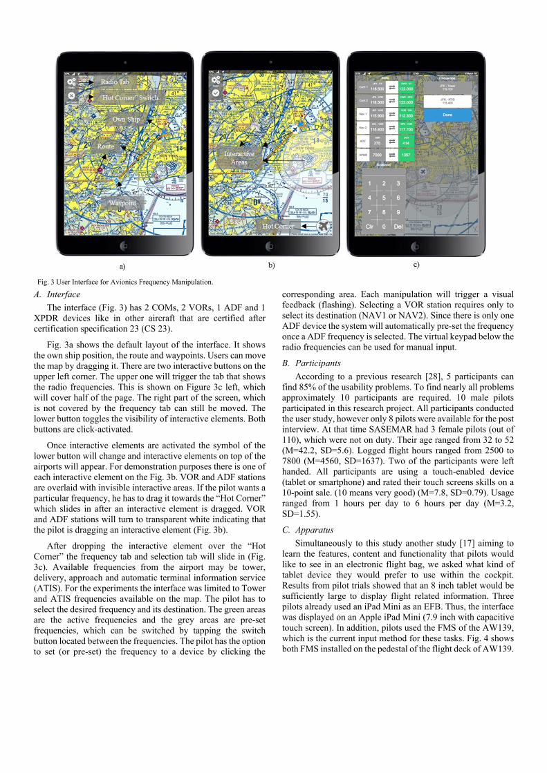
The interface (Fig. 3) has 2 COMs, 2 VORs, 1 ADF and 1 XPDR devices like in other aircraft that are certified after certification specification 23 (CS 23).
Fig. 3a shows the default layout of the interface. It shows the own ship position, the route and waypoints. Users can move the map by dragging it. There are two interactive buttons on the upper left corner. The upper one will trigger the tab that shows the radio frequencies. This is shown on Figure 3c left, which will cover half of the page. The right part of the screen, which is not covered by the frequency tab can still be moved. The lower button toggles the visibility of interactive elements. Both buttons are click-activated.
Once interactive elements are activated the symbol of the lower button will change and interactive elements on top of the airports will appear. For demonstration purposes there is one of each interactive element on the Fig. 3b. VOR and ADF stations are overlaid with invisible interactive areas. If the pilot wants a particular frequency, he has to drag it towards the “Hot Corner” which slides in after an interactive element is dragged. VOR and ADF stations will turn to transparent white indicating that the pilot is dragging an interactive element (Fig. 3b).
After dropping the interactive element over the “Hot Corner” the frequency tab and selection tab will slide in (Fig. 3c). Available frequencies from the airport may be tower, delivery, approach and automatic terminal information service (ATIS). For the experiments the interface was limited to Tower and ATIS frequencies available on the map. The pilot has to select the desired frequency and its destination. The green areas are the active frequencies and the grey areas are pre-set frequencies, which can be switched by tapping the switch button located between the frequencies. The pilot has the option to set (or pre-set) the frequency to a device by clicking the
corresponding area. Each manipulation will trigger a visual feedback (flashing). Selecting a VOR station requires only to select its destination (NAV1 or NAV2). Since there is only one ADF device the system will automatically pre-set the frequency once a ADF frequency is selected. The virtual keypad below the radio frequencies can be used for manual input.
B. Participants
According to a previous research [28], 5 participants can find 85% of the usability problems. To find nearly all problems approximately 10 participants are required. 10 male pilots participated in this research project. All participants conducted the user study, however only 8 pilots were available for the post interview. At that time SASEMAR had 3 female pilots (out of 110), which were not on duty. Their age ranged from 32 to 52 (M=42.2, SD=5.6). Logged flight hours ranged from 2500 to 7800 (M=4560, SD=1637). Two of the participants were left handed. All participants are using a touch-enabled device (tablet or smartphone) and rated their touch screens skills on a 10-point sale. (10 means very good) (M=7.8, SD=0.79). Usage ranged from 1 hours per day to 6 hours per day (M=3.2, SD=1.55).
C. Apparatus
Simultaneously to this study another study [17] aiming to learn the features, content and functionality that pilots would like to see in an electronic flight bag, we asked what kind of tablet device they would prefer to use within the cockpit. Results from pilot trials showed that an 8 inch tablet would be sufficiently large to display flight related information. Three pilots already used an iPad Mini as an EFB. Thus, the interface was displayed on an Apple iPad Mini (7.9 inch with capacitive touch screen). In addition, pilots used the FMS of the AW139, which is the current input method for these tasks. Fig. 4 shows both FMS installed on the pedestal of the flight deck of AW139.
Fig. 3 User Interface for Avionics Frequency Manipulation.

D. Experimental Design
A 3x3 within-subjects design with repeated measures was used for the user study. Independent variables were 3 scenarios simulating departures and approaches to airports. 3 input methods were compared; physical keypad on the FMS, integrated virtual keypad (Fig. 3c) and new developed drag and drop strategy. Recorded dependent variables were completion time and error rate.
E. Task Design
The task is to configure the system for departure (or approach) with a particular input method. Pilots have to manipulate the frequencies of four avionic devices; COM, NAV, ADF and XPDR.
Tasks are given below;
Task 1: Depart from La Guardia
• COM 1 LGA Control Tower • COM 2 LGA ATIS • NAV 1 VOR LGA (113.100) • NAV 2 VOR SBJ (112.900) • XPDR 2466
Task 2: Approach to JFK
• COM 1 JFK Control Tower • COM 2 JFK ATIS • NAV 1 VOR JFK (115.900) • ADF OGY (414) • XPDR 4756
Task 3: Approach to Teterboro
• COM 1 TEB Control Tower • COM 2 TEB ATIS • NAV 1 VOR TEB (108.400) • ADF TE (214) • XPDR 4756
If pilots want to change a particular frequency, they have to look this up on a paper chart, or (if available) on the digital map. The desired frequency then has to be given (copied) into the device. In operational use, usually pilots put the new frequency to pre-set before they make the change. Once they intend to
make the change, they will press the switch button to set the frequency. To achieve consistency throughout the experiment, it was requested to put the frequency first to pre-set position and then set it.
Pilots setting a COM or NAV device via FMS have to make at least 5 inputs (without zeros at the end) to get the frequency on the scratchpad. Then they will pre-set and set frequencies. In total they have to conduct at least 7 key strokes. These are 5 for ADF and 6 for XPDR. Virtual keypad does not require the separating dot (.) the system will automatically put the dot at the desired position once a destination is selected. This means pilots were able to make one keystroke less compared to FMS input.
Touch interaction requires dragging and dropping the interactive element over the “Hot Corner”. Possibly if there is only one frequency (like in VOR and NDB stations) than it is preselected, if not the user has to select the desired one and select its destination. For COM, NAV, ADF devices the number of interaction is 4, 3 and 2 respectively. Since the squawk code (XPDR) is not fixed and usually given by the air traffic control. This input was performed via the virtual keypad.
The number of interactions required for task 2 and 3 are same. Input via FMS require for task 1 and 2&3 34 and 32, via virtual keypad 30 and 28 and for touch interaction users have to make 20 and 19 interactions respectively.
F. Counter Balance (Latin Square)
In order to eliminate order effect, the sequence of task and input method is counter balanced using 3x3 Latin Square. Participants were assigned sequentially to one of the three groups. Table II shows the tasks order of the groups. Table III shows the sequence of input device.
Participants assigned to first group performed the tasks in the following order; Task 1 (Sequence 1), Task 2 (Sequence 2) and Task 3 (Sequence 3). Participants assigned to second group performed the tasks in the following order; Task 2 (Sequence 2), Task 3 (Sequence 3) and Task 1 (Sequence 1). Participants assigned to second group performed the tasks in the following order; Task 3 (Sequence 3), Task 1 (Sequence 1) and Task 2 (Sequence 2).
Group
1 Task 1 Task 2 Task 3
2 Task 2 Task 3 Task 1
3 Task 3 Task 1 Task 2
TABLE II ORDER OF TASKS
Seq.
1 FMS Keypad Touch
2 Keypad Touch FMS
3 Touch FMS Keypad
TABLE III ORDER OF INPUT DEVICES
Fig. 4 Flight Management System of AW139
All group settings were repeated 3 times with 9 participants. Participant number 10 conducted the experiments as described for group 1.
G. Procedure
The investigator explained the aim and objectives of the experiment. It was clarified that the aim was not to test the abilities of participants. The main objective is to find out how the current status of the new interface is and to detect problem areas. After that participants gave their consent. The investigator demonstrated the user interface, then pilots had a familiarization session for 5-10 minutes. The investigator gave instructions like “set COM1 to La Guardia ATIS” or “NAV1 to JFK”.
Once the familiarization session finished participants opened the route for their first task. The investigator provided the task written on a paper (as stated in section E). Pilots searched the frequencies they need to use in the current task. Once ready participants used the desired interaction method to manipulate radio frequencies. To achieve consistency in data input it was requested to put the frequency to pre-set and press the switch button to set it. In addition, it was requested to perform the tasks in the pace as they would do in a real operation. Participants held the tablet device during all input methods. Input errors were recorded and participants were requested to repeat the task. Additionally, participants could repeat the task if they thought they could improve the completion time.
There were always two pilots on duty. One pilot performed the experiments while the other rested. The entire experiment lasted on average 30 minutes. The completion time and error rates were recorded. After the experiment there was an informal interview with pilots about their experiences and impressions.
IV. RESULTS
Completion time results from 90 measurements which were imported to SPSS. The distribution characteristic for completion results were assessed. The mean skewness of the distributions, for input methods was 0.85, for tasks was 0.57. The mean kurtosis was 1.31 and 0.66 respectively. Both of these values are low, indicating no overall tendency towards a negative or positive skewness or towards a flat or peaked distribution. A Shapiro-Wilk test and a visual inspection of their histograms, normal Q-Q plots and box plots showed that completion time scores for keypad and tasks were approximately normally distributed. The p-value for FMS (p=.047 for input device) was slightly below the cut-off value of 0.05. Therefore, parametric tests were applied. All mean (M) and standard deviation (SD) values are in seconds. Few input errors were made by the participants using the physical and virtual keypad. These were excluded from the analyses and pilots repeated the task.
ANOVA revealed a medium effect (ηp2=0.13) in input
methods (F2,89=6.578 p=.002). Touch interaction (drag&drop) was the fastest interaction method (M=33.0, SD=6.7). Bonferroni post hoc test revealed that there was no significant
difference between FMS (M=39.8, SD=9.6) and virtual keypad (M=40.2, SD=9.4). Other pairwise comparisons showed significant differences. ANOVA could not detect a significant difference between tasks (F2,89=2.60 p=.080).
V. POST EXPERIMENT INTERVIEW
Overall all participants had a positive impression from the new developed way of interaction. They found the key idea design for “one hand operation” (placing interactive elements alongside the edges) a good countermeasure for in-flight vibrations. Another point which is not directly related to interface design was the request for arm support if the display would be fixed on the dashboard. Each pilot agreed that the size of the font and interactive elements were large enough for operational use. Pilots confirmed that this interaction strategy is easier to learn and to use than the current system.
Pilots said that the 8 inch display is too small for this type of interaction. Some pilots mentioned that they had difficulties with moving the map while the radio tab was retracted, because the draggable area was too small. This was also found by Hamblin [29]. Their recommendation was to display this system on a larger display. Some pilots estimated the size of displays like in the Agusta Westland 189 (AW189, with four 13-inch head down displays) may be large enough to perform this task easily.
In addition, pilots said that it was nice to see the name of the station above the radio frequencies. However, if that could save space and provide more area for the map, it should be avoided. Pilots would prefer to fix the radio frequencies to its place (rather than making it retractable).
The way of drag and drop interaction was found to be easy and intuitive. A previous research conducted in military vehicles [14] suggested not to perform drag operations with touch screen on a moving vehicle. This was reminded to pilots and asked if they would think that might be an issue for their domain. Pilots opinion was that it would not cause a problem since there is no precision drag required to select the frequency. The current way of interaction requires click and drag operations. The invisible interactive area over navigation aids caused mapping problems. Some pilots suggested to use only click interactions. Pilots stated that they had sometimes difficulties finding the location of the invisible interactive element especially if interactive elements overlapped. The most difficult part of this interaction method was to identify and point the interactive element, the rest seemed to be easy and straight forward.
Their suggestion was to put visible interactive elements over VOR and NDB stations like on airports. So clicking a navigation aid will open a message box asking for its destination. Pilots predicted that using solely click operations would make the process easier. A common request was to have a button that centres the own ship position (north up and track up).
Another suggestion was to separate the virtual keypad for manual input. Pilots assumed that they would use rarely the
virtual keypad if they would have the option to tune radio frequencies that way. Last but not least, a further request was to design the interface for portrait as well as landscape mode (adaptive view).
Data saturation was achieved after the interviews with the 5th and 6th participant. Last two pilots did not produce any new information.
VI. DISCUSSION
There were only 2 (out of 30) task sequences where the input with FMS was faster than touch (drag&drop) interaction. These measurements were taken at task 1 where some movements to the left were required to get VOR SBJ. Comparison of physical and virtual keypad showed no significant difference. However, Lee and Zhai [9] found that input via virtual keypad is significantly faster than its physical counterpart. A reason for that could be the experience of using the FMS on a daily basis and the virtual keypad was used for the very first time in this setting. Results revealed that designing user interfaces that represent their real-word counterparts will not affect the completion time significantly. Advantage of skeuomorphism is that users understand the purpose of the system immediately and there is no additional training required. However, considered in the long term, such novel designs as shown in this study are more efficient in terms of completion time and error robustness.
The New York airspace is one of the densest airspaces in the world. Consequently, there were interactive areas that overlapped. This caused the following problems; pilots could not detect immediately where they have to put their finger first or they dropped the wrong interactive area over the “Hot Corner”. This would likely be less a problem in areas not as densely covered by airports and navigation aids. Pilots suggestions to perform the entire interaction by clicking interactive areas is integrated in the new design. This has the advantage that pilots will immediately spot the interactive element and click it, which will produce consequently its disadvantage by adding more clutter onto the map.
Pilots opinion that the hardest part to localize the target interactive element and to point it was coherent with the investigators observation. After the familiarisation session pilots swiped the interactive element over (sometimes slide over the edge) the ”Hot Corner” without paying attention to its location. This interaction method seemed intuitive and fluent.
In addition, the size of interactive elements was 8 mm, which is optimal for usage in a static environment but not for dynamic environments. Making the size of icons bigger could cover important information. So using this strategy has the trade-off between acceptable error rate/speed of interaction.
Two pilots performed the experiments at the same time. The majority of pilots were right handed. Pilots sitting on the right hand side had to use their non-dominant hand to make inputs via FMS. In touch interaction participants always used their preferred hand. Results from the lab study [18] that explored the potential impact of display position on usability revealed
that handedness plays a significant role in touch screen performance. This could be another factor that increased the difference between the input methods.
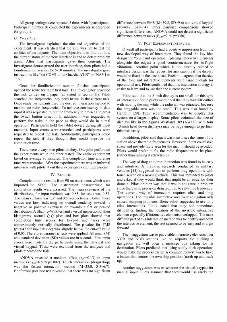
VII. IMPROVED INTERFACE
Feedback from pilots and observations were integrated into the new design. Fig. 5 shows the new design which is designed for a 13.3-inch display. Fig. 5a shows the default view of the improved inteface. The frequencies are now fixed alongside the edge, which can be mirrored to the opposite side. In the previous design there were 3 buttons for each frequency (pre-set, active and switch). For the sake of saving space this was reduced to one button with description, active frequency (large font) and pre-set frequency on it. This button will be used to switch frequencies. Near bottom edge there are 3 buttons; activation switch for interactive elements, centring own ship position and keypad.
a)
b)
c)
Fig. 5 Improved User Interface.
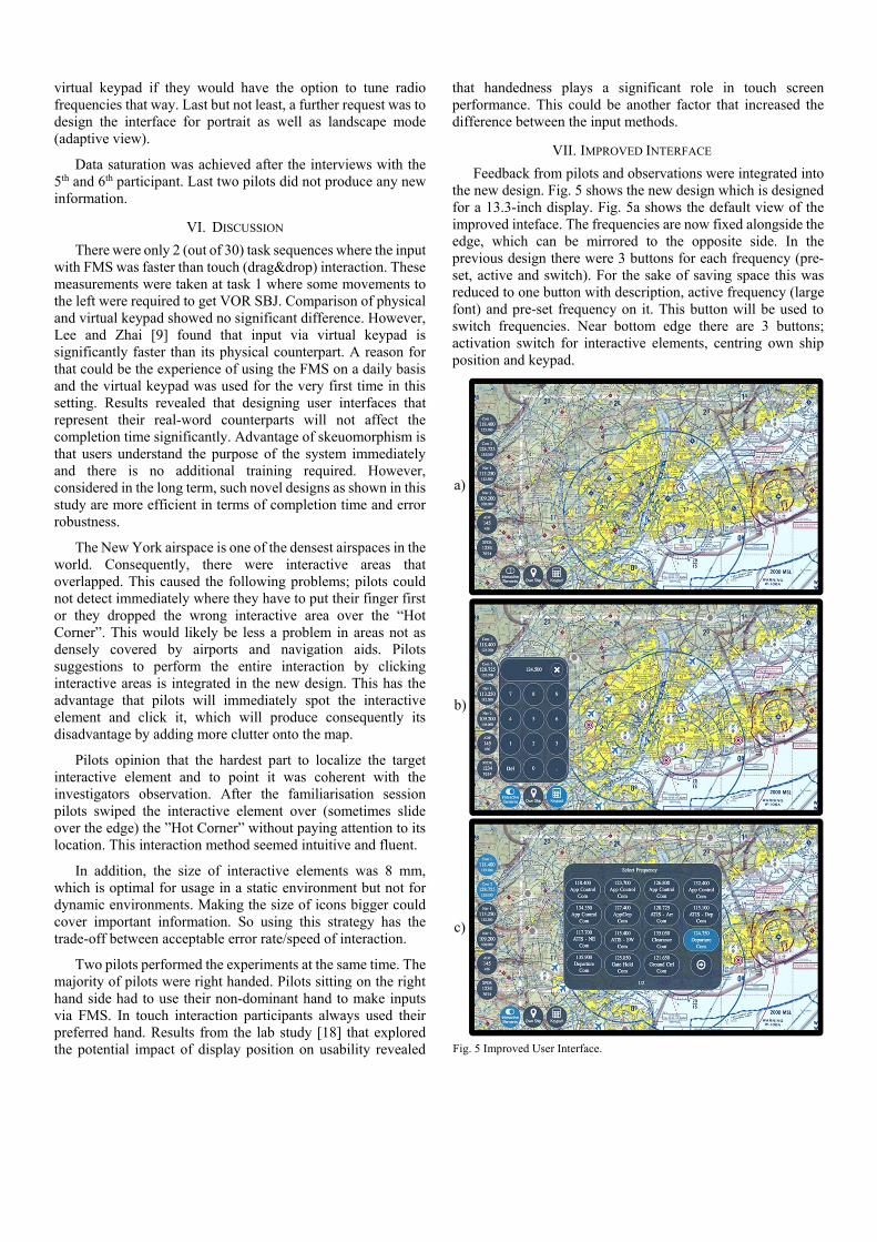
In Fig. 5b interactive elements and the keypad are activated. This will be visualised with a light blue background colour. The key pad and interactive elements over airports and navigations aids are displayed. Fig. 6a, b and c show the interactive elements over VOR, NDB and Airports respectively. Some airports incorporate navigation aids. Rather than placing two interactive areas in close proximity a new icon (Fig. 6d) was designed showing that both frequencies. Both frequencies can be found by clicking this interactive element.
Clicking on an interactive element will open a new window with available frequencies (up to 15 per page). On the example shown on Fig. 5c the interactive element over John F. Kennedy Airport is selected. On the page there are interactive elements describing the frequency, description and the destination device. Once the desired frequency is selected, possible destinations will turn to light blue (in this example Com1 and Com 2). Pilots selecting the destination will receive a visual feedback (flashing). The system will put the frequency to pre-set first, another click is required to activate it. As it was present in the first version of the interface selecting a VOR station requires only to select the destination and another click to activate it. Selecting a NDB station requires only an activation click. As requested the entire operation is executed with clicks. A comparison study [30] revealed that pointing at targets is significantly faster than dragging them. The weakest part of the design may be still the size (8mm) of interactive elements over navigation aids and airports. This design was tried out in a static environment and users found the size sufficiently large. An in-flight experiment could show whether the size is large enough.
VIII. CONCLUSION
A new way of interaction to manipulate frequencies of the avionics system was presented. Analyses of task completion time showed that the touch interface is significantly faster and less prone to user input errors than the conventional input method (via physical and virtual keypad). Results revealed that designing user interfaces that represent their real-word counterparts (skeuomorphism) will not improve the usability and the design of user interface plays a key role in performance. An improved interface is proposed that was shaped by interviews with pilots and personal observations.
IX. ACKNOWLEDGMENTS
I would like to thank the Spanish Maritime Safety Agency and INAER for opening their facilities. Especially, Nestor Perales Gomez who organized my visits, flights and approved required permissions I would like to thank GE Aviation Systems Ltd., which is the industrial partner of my EPSRC
ICase (EP/K504506/1) PhD Program. I would like to thank Veronika Stibane for proof reading this paper.
X. REFERENCES [1] J. C. Knight, “Safety critical systems: challenges and directions,” Proc.
24th Int. Conf. Softw. Eng. (ICSE, 2002), pp. 547–550, 2002. [2] Civil Aviation Authority, “CAP 780 - Aviation safety review,” 2008. [3] P.-A. Albinsson and S. Zhai, “High precision touch screen interaction,”
in Proceedings of the SIGCHI Conference on Human Factors in Computing Systems - CHI ’03, 2003, p. 105.
[4] D. Jones, “Three input concepts crew interaction presented electronic for flight with information on a large-screen cockpit display,” 1990.
[5] N. A. Stanton, C. Harvey, K. L. Plant, and L. Bolton, “To twist, roll, stroke or poke? A study of input devices for menu navigation in the cockpit.,” Ergonomics, vol. 56, no. 4, pp. 590–611, 2013.
[6] J. M. Noyes and A. F. Starr, “A comparison of speech input and touch screen for executing checklists in an avionics application,” Int. J. Aviat. Psychol., vol. 17, no. 3, pp. 299–315, Jun. 2007.
[7] A. Sears, “Improving touchscreen keyboards: design issues and a comparison with other devices,” Interact. Comput., vol. 3, no. 3, pp. 253–269, Dec. 1991.
[8] M. Schedlbauer, “Effects of key size and spacing on the completion time and accuracy of input tasks on soft keypads using trackball and touch input,” Proc. Hum. Factors Ergon. Soc. Annu. Meet., vol. 51, no. 5, pp. 429–433, Oct. 2007.
[9] S. Lee and S. Zhai, “The performance of touch screen soft buttons,” in Proceedings of the 27th international conference on Human factors in computing systems - CHI 09, 2009, p. 309.
[10] D. Natapov, S. J. Castellucci, and I. S. MacKenzie, ISO 9241-9 evaluation of video game controllers. Canadian Information Processing Society, 2009.
[11] International Standard Organisation, “ISO 9241-9 Ergonomic requirements for office work with visual display terminals,” 2007.
[12] L. Findlater, J. E. Froehlich, K. Fattal, J. O. Wobbrock, and T. Dastyar, “Age-related differences in performance with touchscreens compared to traditional mouse input,” in Proceedings of the SIGCHI Conference on Human Factors in Computing Systems - CHI ’13, 2013, pp. 343–347.
[13] T. Baldus and P. Patterson, “Usability of pointing devices for office applications in a moving off-road environment,” Applied Ergonomics, vol. 39, no. 6. pp. 671–677, 2008.
[14] T. C. Hong, N. A. Kuan, T. K. Kiang, and S. K. T. John, “Evaluation of Input Devices for Pointing, Dragging and Text Entry Tasks On A Tracked Vehicle,” Proc. Hum. Factors Ergon. Soc. Annu. Meet., vol. 55, no. 1, pp. 2078–2082, Sep. 2011.
[15] H. Avsar, J. Fischer, and T. Rodden, “Mixed method approach in designing flight decks with touchscreens: A framework,” in 2016 IEEE/AIAA 35th Digital Avionics Systems Conference (DASC), 2016.
[16] H. Avsar, J. Fischer, and T. Rodden, “Target size guidelines for interactive displays on the flight deck,” in 2015 IEEE/AIAA 34th Digital Avionics Systems Conference (DASC), 2015, pp. 3C4–1–3C4–15.
[17] H. Avsar, J. Fischer, and T. Rodden, “Designing touch-enabled electronic flight bags in sar helicopter operations,” in International Conference on Human Computer Interaction in Aerospace: HCI-Aero, 2016.
[18] H. Avsar, J. Fischer, and T. Rodden, “Physical and environmental considerations for touchscreen integration on the flight deck,” Unpublished, 2016.
[19] H. De Ree and G. Blok, “Font to use in cockpit documentation,” in 7th International symposium --- 1993 Apr: Columbus; OH, 1993, vol. 7, pp. 115–118.
[20] A. Degani, “On the typography of flight-deck documentation,” p. 40, 1992.
[21] D. Harris, Human factors for civil flight deck design. Gower Publishing, Ltd., 2004.
[22] Federal Aviation Administration (FAA), “AC 25-11B - Electronic flight displays,” 2014.
[23] S. Wiedenbeck, “The use of icons and labels in an end user application program: An empirical study of learning and retention,” Behav. Inf. Technol., vol. 18, no. 2, pp. 68–82, Jan. 1999.
[24] R. N. Shepard, “Recognition memory for words, sentences, and pictures,” J. Verbal Learning Verbal Behav., vol. 6, no. 1, pp. 156–163,
a) b) c) d)
Fig. 6 Interactive Elements

1967. [25] W. Horton, “The icon book: visual symbols for computer systems and
documentation,” New York: John Wiley & Sons, 1994. . [26] M. E. Familant and M. C. Detweiler, “Iconic reference: evolving
perspectives and an organizing framework,” Int. J. Man. Mach. Stud., vol. 39, no. 5, pp. 705–728, Nov. 1993.
[27] D. Norman, The Design of Everyday Things. New York: Basic Books, 1988.
[28] J. Nielsen and T. K. Landauer, A mathematical model of the finding of usability problems. IOS Press, 1993.
[29] Hamblin C, “Electronic Flight Bags (EFBs) with small screens significantly increase information retrieval times,” in Proceedings of 12th International Symposium on Aviation Psychology, 2003, pp. 463–468.
[30] I. S. MacKenzie, A. Sellen, and W. a S. Buxton, “A comparison of input devices in element pointing and dragging tasks,” Proc. SIGCHI Conf. Hum. factors Comput. Syst. Reach. through Technol., no. 1978, pp. 161–166, 1991.