Author's personal copy - Galit Shmueli · Author's personal copy Computational Statistics and ......
22
This article appeared in a journal published by Elsevier. The attached copy is furnished to the author for internal non-commercial research and education use, including for instruction at the authors institution and sharing with colleagues. Other uses, including reproduction and distribution, or selling or licensing copies, or posting to personal, institutional or third party websites are prohibited. In most cases authors are permitted to post their version of the article (e.g. in Word or Tex form) to their personal website or institutional repository. Authors requiring further information regarding Elsevier’s archiving and manuscript policies are encouraged to visit: http://www.elsevier.com/copyright
-
Upload
nguyenquynh -
Category
Documents
-
view
215 -
download
1
Transcript of Author's personal copy - Galit Shmueli · Author's personal copy Computational Statistics and ......
This article appeared in a journal published by Elsevier. The attachedcopy is furnished to the author for internal non-commercial researchand education use, including for instruction at the authors institution
and sharing with colleagues.
Other uses, including reproduction and distribution, or selling orlicensing copies, or posting to personal, institutional or third party
websites are prohibited.
In most cases authors are permitted to post their version of thearticle (e.g. in Word or Tex form) to their personal website orinstitutional repository. Authors requiring further information
regarding Elsevier’s archiving and manuscript policies areencouraged to visit:
http://www.elsevier.com/copyright

Author's personal copy
Computational Statistics and Data Analysis 52 (2008) 4000–4020www.elsevier.com/locate/csda
Transformations for semi-continuous data
Galit Shmuelia,b,∗, Wolfgang Janka,b, Valerie Hydeb,1
a Department of Decision, Operations and Information Technologies, Robert H. Smith School of Business, University of Maryland, College Park,MD 20742, United States
b Applied Mathematics and Scientific Computation Program, University of Maryland, College Park, MD 20742, United States
Received 12 December 2006; received in revised form 23 July 2007; accepted 22 January 2008Available online 7 February 2008
Abstract
Semi-continuous data arise in many applications where naturally-continuous data become contaminated by the data generatingmechanism. The resulting data contain several values that are “too frequent”, and in that sense are a hybrid between discrete andcontinuous data. The main problem is that standard statistical methods, which are geared towards continuous or discrete data,cannot be applied adequately to semi-continuous data. We propose a new set of two transformations for semi-continuous data that“iron out” the too-frequent values thereby transforming the data to completely continuous. We show that the transformed datamaintain the properties of the original data, but are suitable for standard analysis. The transformations and their performance areillustrated using simulated data and real auction data from the online auction site eBay.c© 2008 Elsevier B.V. All rights reserved.
1. Introduction and motivation
Standard statistical methods can be divided into methods for continuous data and those for discrete data. However,there are situations in which observed data do not fall in either category. In particular, we consider data that areinherently continuous but get contaminated by inhomogeneous discretizing mechanisms. Such data lose their basiccontinuous structure and instead are spotted with a set of “too-frequent” values. We call these semi-continuous data.
Semi-continuous data arise in various settings. Reasons range from human tendencies to enter rounded numbersor to report values that conform to given specifications (e.g., reporting quality levels that conform to specifications),to contamination mechanisms related to the data entry, processing, storage, or any other operation that introduces adiscrete element into continuous data. Examples are numerous and span various applications. In accounting, for ex-ample, a method for detecting fraud in financial reports is to search for figures that are “too common”, such as endingwith 99 or being “too round”. In quality control sometimes data are manipulated in order to achieve or meet certaincriteria. For example, Bzik (2005) describes practices of data handling in the semiconductor industry that deterioratethe performance of statistical monitoring. One of these is replacing data with “physical limits”: in reporting contami-nation levels negative values tend to be replaced with zeros and values above 100% are replaced with 100%. However,
∗ Corresponding author at: Department of Decision, Operations and Information Technologies, Robert H. Smith School of Business, Universityof Maryland, College Park, MD 20742, United States.
E-mail address: [email protected] (G. Shmueli).1 Author names are listed in reverse-alphabetical order. This paper is part of the Doctoral Dissertation of the third author.
0167-9473/$ - see front matter c© 2008 Elsevier B.V. All rights reserved.doi:10.1016/j.csda.2008.01.025

Author's personal copy
G. Shmueli et al. / Computational Statistics and Data Analysis 52 (2008) 4000–4020 4001
negative and >100% values are feasible due to measurement error, flawed calibration, etc. Another questionable prac-tice is “rounding” actual measurements to values that are considered ideal in terms of specifications. This results indata that include multiple repetitions of one or more values. We will use the term “too frequent” to describe suchvalues. We encountered two particular studies where semi-continuous data were present. The first is a research projectby IBM on customer wallet estimation, where the marketing experts who derived the estimates tended to report roundestimates thereby leading to data with several too-frequent values (Perlich and Rosset, 2006). A second study, whichmotivated this work, studies consumer surplus in the online marketplace eBay (www.eBay.com). Here, the observedsurplus values had several too-frequent values, most likely due to the discrete set of bid increments that eBay uses andthe tendency of users to place integer bids. The top panels in Fig. 1 show the frequencies of the values in samples fromeach of these two datasets. In the eBay surplus data (top panel) the value $0 accounts for 6.35% of the values, andvalues such as $0.01, $0.50, $1.00, $1.01, $1.50, $2.00, $2.01, $3.00 are much more frequent than their neighboringvalues. In the IBM customer wallet estimates (middle panel) too-frequent values are 0, 100, 200, 250, 300, and 400.
We will use the surplus data throughout the paper to illustrate and motivate the proposed transformations. Wetherefore describe a few more details about the mechanism that generates the data. Consumer surplus, used byeconomists to measure consumer welfare, is the difference between the price paid and the amount that consumersare willing to pay for a good or service. In second-price auctions, such as those on the famous online marketplaceeBay, the winner is the highest bidder; however, s/he pays a price equal to the second highest bid. Surplus in a second-price auction is defined (under some conditions) as the difference between the price paid and the highest bid. Bapnaet al. (in press), who investigate consumer surplus in eBay, found that although surplus is inherently continuous,observed surplus data are contaminated by too-frequent values, as shown in the top left panel of Fig. 1.
The main problem with semi-continuous data is that they tend to be unfit for use with many standard statisticalanalysis methods.
Semi-continuous data can appear as if they come from a mixture of discrete and continuous populations. Graphssuch as scatter plots and frequency plots might indicate segregated areas or clouds. Such challenges arise in the surplusdata described above. Fig. 2 displays two probability plots for log(surplus + 1): the first is a lognormal fit and thesecond is a Weibull fit. It is obvious that neither of these two models approximate the data well (other distributionsfit even worse) because there are too many 0 values in the data. Furthermore, using log(surplus + 1) as the responsein a linear regression model yields residual plots that exhibit anomalies that suggest a mixture of populations. Fig. 3shows two residual plots exhibiting such behavior; these plots indicate clear violation of the assumptions of a linearregression model.
One possible solution is to separate the data into continuous and discrete parts, to model each part separately, andthen to integrate the models. For example, in a dataset that has too many zeros (zero-inflated) but otherwise positive,continuous values, we might create a classification model for zero/nonzero and then a prediction model for the positivedata. This approach has two practical limitations: first, partitioning the data leads to loss of statistical power, andsecond, it requires the “too-frequent” values to be concentrated in a limited area or in some meaningful locations. Tosolve the first issue one might argue for a mixture model. Although there exists a plethora of such models for mixedcontinuous populations or for mixed discrete populations (e.g., “zero-inflated” models, Lambert, 1992), we have notencountered models for mixtures of continuous and discrete data. Moreover, there is a major conceptual distinctionbetween mixture and semi-continuous data: unlike mixture data, semi-continuous data are inherently generated froma single process. Therefore treating them as a mixture of populations is artificial. The ideal solution, of course, wouldbe to find the source of discretization in the data generation mechanism and to eliminate it or account for it. However,in many cases this is impossible, very costly, or very complicated. We therefore strive for a method that “unites” theapparent “sub-populations” so that the data can be integrated into a single model and treated with ordinary models forcontinuous data.
Our proposed solution is a set of two transformations which yield continuous data. We distinguish between twocases: one, where the goal is to obtain data that fit a particular continuous distribution (e.g., a normal distribution, forfitting a linear regression model); and two, where there is no particular parametric distribution in mind, but the dataare still required to be continuous. The first approach, when the goal is simply to obtain continuous data, is based onjittering. As in graphical displays, where jittering is used to better see duplicate observations, our data transformationadds a random perturbation to each too-frequent value, thereby ironing out the anomalous high frequencies. We callthis the jittering transform. The second approach, suitable when the data should fit a particular distribution, is based on

Author's personal copy
4002 G. Shmueli et al. / Computational Statistics and Data Analysis 52 (2008) 4000–4020
Fig. 1. Frequencies of values for three datasets: eBay surplus data (top), IBM customer wallet estimates (middle), and contaminated-normalsimulated data (bottom). The left column displays the max-bin histograms, and the right column shows the top part of the ordered pivot-table.
binning the data in a way that is meaningful with respect to the assumed underlying distribution, and then replacing thetoo-frequent values with randomly generated observations in that bin. We call this the local regeneration transform.
Jittering is used not only in graphical displays, but also in data privacy protection. It is a common method fordisguising sensitive continuous data while retaining the distributional properties of the sample that are required for

Author's personal copy
G. Shmueli et al. / Computational Statistics and Data Analysis 52 (2008) 4000–4020 4003
Fig. 2. Probability plots for log(surplus + 1): lognormal fit (left) and Weibull fit (right).
Fig. 3. Residuals from a linear regression model of log(surplus + 1) on log(price + 1) (left) and normal probability plot of residuals (right).
statistical inference. The difference between this application of jittering and our proposed jittering transform is thatunlike in data privacy protection, we do not jitter each observation but rather only the too-frequent values.
Local regeneration is related to smoothing histograms and re-binning of histograms. However, there are twofundamental differences. First, the assumption about the data origin is different: in histogram smoothing and binningthe underlying assumption is that extreme peaks and dips in the histogram result from sampling error. Thereforeincreasing the sample size should alleviate these phenomena, and in the population such peaks would not appear atall (Good and Gaskins, 1980). In contrast, in semi-continuous data the cause of the peaks is not sampling error butrather a structural distortion created by the data generating mechanism. This means that even very large samples willexhibit the same semi-continuousness. The second difference is the goal: whereas histogram smoothing and binningare used mainly for density estimation (without attempting to modify the data), the purpose of local regeneration isto transform the semi-continuous data into data that fit a particular continuous parametric distribution, similar to thefamous Box–Cox transformation.
Local regeneration and binning both attempt to find the best representation of the data in histogram form. Theliterature on optimal bin sizes focuses on minimizing some function of the difference between the histogram f̂ (x)
and the real density f (x) (such as the mean integrated squared error, or MISE). In practice, f (x) is assumed to bea particular density function (e.g., Scott (1979)) or else it is estimated by using an estimator that is known to have asmaller IMSE (e.g., a kernel estimator). Methods range from rules of thumb to (asymptotically) theoretically-optimalbin-width formulas. The methods also vary widely with respect to computational complexity and performance. Simple

Author's personal copy
4004 G. Shmueli et al. / Computational Statistics and Data Analysis 52 (2008) 4000–4020
bin-width formulas such as Sturge’s rule and Doane’s modifications, which are used in many software packages(e.g., Minitab and S-Plus), have been criticized as leading to over smoothing (Wand, 1997). On the other hand,methods that have better asymptotic optimality features tend to be computationally intensive and less straightforwardto implement in practice. In the semi-continuous data case we assume that it is impossible to obtain a set of data thatare not distorted. Our target function is therefore a parametric distribution.
Another related approach is that of Scott (2001), who considers robust estimation in a number of different datacontaminations. In particular, he shows that minimizing the integrated squared error distance rather than the maximumlikelihood function is useful for robust estimation under a given parametric distribution, and requires less tuning thanrobust likelihood algorithms. Like Scott (2001), we consider the case where a parametric model represents a significantfraction of the data, with a nontrivial fraction of “bad data”. In contrast, we do not assume that the parametric modelis known. We either try to select a distribution from among a given set of parametric distributions, or else we donot assume any particular parametric distribution. A second difference is that we consider a particular contaminationmechanism that leads to the rounding of certain values. We therefore wish to recover the original data rather thanto down-weight or ignore the contaminated data in the estimation. In fact, “too-frequent” values are different thanoutliers in that they are not necessarily at the tails of the distribution. Finally, our approach separates the data recoverystep from the model estimation part, in that it allows the application of standard statistical methods (for estimation orany other goal) to the transformed data.
The remainder of the paper is organized as follows: in Section 2 we describe a method for identifying semi-continuous data. Section 3 describes the jittering and local regeneration transforms in detail. We illustrate theperformance of these methods using simulated data in Section 4, and apply them to the online auction surplus data inSection 5. Further issues and future directions are discussed in Section 6.
2. Identifying semi-continuous data
To identify whether a continuous dataset suffers from semi-continuity, we examine each of the unique values andsee whether there are one or more that are too-frequent. One way to check this is to examine a one-way pivot table,with counts for each value in the data, for very large counts. Sorting the counts in descending order can alleviatethe search process, which is especially useful when considering a large number of variables. However, since such atable looses the ordering of the values, too-frequent values that appear in sparser areas might remain undetected. Asolution is to scan the ordered pivot table for values that are located much higher than their neighboring values. Forexample, consider the right column in Fig. 1, which displays ordered pivot tables for the eBay surplus data, the IBMcustomer wallet estimates, and simulated normal data (see details below), with only the top 20 or 40 most frequentvalues displayed. In the top panel we can see that the value $4.00 is much higher in the table than its neighboringvalues ($3.98, $3.99, $4.01, $4.01, etc.). It is therefore suspected to be a too-frequent value.
An alternative, which enhances the spotting of too-frequent values while preserving the interval scale of the datais a new visualization that is a hybrid between a bar-chart and a histogram: the max-bin histogram. The max-binhistogram is essentially a histogram with bin widths equal to the smallest unit in the data. It is therefore equivalent toa bar chart with as many nonzero bars as there are unique values in the data, except that its x-axis has a continuousmeaning rather than labels. On the max-bin histogram of the raw data, where frequencies are represented by bars,frequencies that are outstandingly high compared to their neighbors indicate values suspected of being “too frequent”for a continuous scheme. We further recommend zooming in on various regions of the x-axis to further aid in thelocation of too-frequent values locally. The code for producing max-bin histograms and ordered pivot tables can befound at http://www.smith.umd.edu/ceme/statistics/code.html.
The left column in Fig. 1 displays three max-bin histograms. The top two are for the eBay surplus data and theIBM customer wallet estimates. As mentioned in the previous section, too-frequent values are very visible in eachof these plots. The bottom panel shows a simulated dataset of size 10 000, where 9000 observations were generatedfrom a standard normal distribution, retaining 4 decimal digits. The remaining 1000 observations were obtained byduplicating 25 of the generated values 40 times. The 25 too-frequent values are clearly visible in the max-bin histogramand they also show up at the top of the ordered pivot table (Fig. 1, bottom right panel).
Using standard plots for continuous data can also assist in identifying semi-continuous data. For instance,probability plots might display “steps”, or contain other indications of mixed populations. Scatter plots of thesuspected variable vs. other variables of interest can also reveal multiple clouds of data. However, depending on

Author's personal copy
G. Shmueli et al. / Computational Statistics and Data Analysis 52 (2008) 4000–4020 4005
the locations and prevalence of the too-frequent values, standard plots might not enhance the detection of such values(e.g., if the too-frequent values are in high-frequency areas of the distribution). The max-bin histogram is therefore apowerful and unique display, ideal for this purpose.
3. Transforming semi-continuous data
Given a set of semi-continuous data, the influence of “bouts” of high-frequency values can be “ironed out” (aterm coined by Good and Gaskins (1980)) in one of the following ways, depending on the goal of the analysis. Thefirst approach is to jitter each of the too-frequent values, which means that we add a random perturbation to eachsuch observation. The second approach first defines local neighborhoods by binning the data, and then replaces thetoo-frequent values with randomly generated observations within their respective neighborhoods. The two methodsare similar in several respects. First, they both assume that the too-frequent values are distortions of other, close-byvalues. Second, both methods define a local neighborhood for the too-frequent values, and the transformed data areactually randomly generated observations from within this neighborhood. Third, in both cases only the too-frequentvalues are replaced while the other observations remain in their original form. And finally, in both cases the definitionof a local neighborhood must be determined. We describe each of the two methods in detail next.
3.1. The jittering transform
Although many statistical methods assume a parametric distribution of the data, there are many nonparametricmethods that only assume a continuous nature. This is also true of various graphical displays, which are suitable formany data structures, as long as they are continuous (e.g., scatter plots). After identifying the “too-frequent” values,the transform operates by perturbing each of them by adding random noise. If we denote the i th original observationby X i , and the transformed observation by X̃ i , then the jittering transformation is
X̃ i =
{X i + ε if X i is a too-frequent valueX i else,
(1)
where ε is a random variable with mean 0 and standard deviation σε . The choice of distribution for ε depends onthe underlying process that the too-frequent values are most likely a result of. If there is no reason to believe that thetoo-frequent values are a result of an asymmetric process, then a symmetric distribution (e.g., normal or uniform) isadequate. If there is some information on a directional distortion that leads to the too-frequent values, then that shouldbe considered in the choice of the perturbing distribution. In general, the choice of distribution is similar to that inkernel estimation, where the choice of kernel is based on domain knowledge, trial-and-error, and robustness. We alsonote that an alternative to choosing an asymmetric distribution with bins placed symmetrically around the specialvalues (in order to account for an asymmetric contamination mechanism) is to choose a symmetric or asymmetricdistribution with bins not centered around the special values. Shifting the bin locations can therefore serve as anothermechanism to account for specific types of contamination. An example is a contamination mechanism that uses aceiling-type function. Here a sensible bin would be shifted to the left of the special values.
The second choice is the value of σε which should depend on the scale of the data and its practical meaning withinthe particular application. Specifically, domain knowledge should guide the maximal distance from a too-frequentvalue that can still be considered reasonable. For example, if the data are measurements of product length in inches,where the target value is 10 inches and a deviation of more than an inch is considered “large”, then σε should bechosen such that the jittering will be less than one inch. This, in turn, defines σmax, the upper bound on σε . A series ofincreasing values of σε is then chosen in the range (0, σmax], and the performance of the transformation is evaluatedat each of these values in order to determine the adequate level.
Let 2δ be the width of the jittering neighborhood (symmetric around the too-frequent value). The mapping betweenδ and σε depends on the jittering distribution. If the perturbation distribution for ε is normal, then σε should be chosensuch that 3σε = δ since almost 100% of the data should fall within 3 standard deviations of the mean. If the underlyingdistribution is Uniform (a, b), then 2δ = b − a and therefore
√3σε = δ.
Determining σε is equivalent to determining δ. We can therefore use the following guideline for obtaining the rangeof reasonable values of δ: for practical purposes, the smallest δ (δmin) is the unit of the data. If the too-frequent valuesare evenly spaced and the contamination mechanism acts within these even distances, then a reasonable δmax is half

Author's personal copy
4006 G. Shmueli et al. / Computational Statistics and Data Analysis 52 (2008) 4000–4020
the distance between the (evenly-spaced) special values. If the too-frequent values are not evenly spaced, or if thecontamination mechanism can act across the entire range of the data, then a conservative δmax is equal to half therange of the data. δ is then chosen by incrementally increasing it from δmin to δmax. In practice, there will be a pointwhere the data is “ironed out” so much that the data no longer resemble the observed data and large gaps appear wherethe too-frequent values were formerly present. Goodness-of-fit tests, as discussed in Section 3.3 will be able to detectmajor differences from the original data.
Since jittering is performed in a way that is supposed to (inversely) mimic the data mechanism that generated thetoo-frequent observations, the transformed data should be similar to the unobserved, continuous data in the sense thatthey are both samples from the same distribution. In fact, since we only transform the few too-frequent values, mostof the observations in the original and transformed data are identical.
3.2. The local regeneration transform
Many standard statistical methods assume a particular parametric distribution that underlies the data. In that casethe jittering transform can still be used, but it might require additional tweaking (in the choice of the perturbationdistribution and of σε) in order to achieve a satisfactory parametric fit. The reason is that the jittering operationis anchored around the too-frequent values, and the locations of these values is independent of the unobservable,underlying continuous distribution.
A more direct approach is therefore to anchor the transformation not to the too-frequent values, but rather toanchors that depend on the parametric distribution of interest. We achieve this by first binning the observed data intobins that correspond to percentiles of the distribution. In particular, we create k bins that have upper bounds at the100k , 2 100
k , . . . , k 100k percentiles of the distribution. For example, for k = 10 we create 10 bins, each as wide as the
corresponding probability between the two distribution deciles. Each bin now defines a local neighborhood in thesense that values within a bin have similar densities. This will create narrow bins in areas of the distribution thatare high density, and much wider bins in sparse areas such as tails. The varying neighborhood width differentiatesthis transformation from the jittering transform, which has constant-sized neighborhoods. This means that the maindifference between the two transforms will be in areas of low density that include too-frequent values.
As to the location of the bin origin, the effect is similar to the choice of bin origin in a standard histogram: if thesample size is sufficiently large and the distribution of interest contains no discontinuities, then the choice of bin originis negligible (Scott, 1992).
To estimate the percentile of the distribution we use the original data. If the continuous distribution belongs to theexponential family, we can use the sufficient statistics computed from the original data for estimating the distributionparameters, and then compute percentiles. Because too-frequent values are assumed to be close to their unobservablecounterparts, summary statistics based on the observed data should be sufficiently accurate for initial estimation. Inthe second step each too-frequent value is replaced with a randomly generated observation within its bin. As in thejittering transform, the choice of the generating distribution is guided by domain knowledge about the nature of themechanism that generates the too-frequent values (symmetry, reasonable distance of a too-frequent value from theunobservable value, etc.).
The local regeneration transform for the i th observation can be written as
X̃ i =
{l j + ε if X i is a too-frequent valueX i else,
(2)
where l j is the j th percentile closest to X i from below (i.e., the lower bound of the bin), j = 1, 2, . . . , k, and ε is arandom variable with support [l j , l j+1).
The two settings that need to be determined are therefore the parametric distribution and the number of bins (k).For the distribution, one might try transforming the data according to a few popular distributions, and choose thedistribution that best fits the data (according to measures of goodness-of-fit). For k, the smallest possible value iskmin = 1 (which assumes contamination across the entire range of the data), and the maximum number of bins(kmax) must be chosen such that the frequency in each bin is at least equal to the frequency of the most commontoo-frequent value. For example, suppose that the most common too-frequent value has frequency 0.1. Choosingk = 11 would yield bin widths containing approximately 9% of the data, which would not be sufficient for “ironingout” the mentioned too-frequent value. A better starting point would therefore be kmax = 10. Obviously, if there is
Author's personal copy
G. Shmueli et al. / Computational Statistics and Data Analysis 52 (2008) 4000–4020 4007
knowledge about the largest possible contamination range, this information should be integrated into the choice ofkmin. In general, a decreasing series of k’s can be examined until the fit, as judged by goodness-of-fit measures, failsto improve because the data has been spread out too much or no longer resembles the underlying distribution.
3.3. Goodness-of-fit and deviation
Our goal is to find a level of jittering or binning that sufficiently “irons out” the discrete bursts in the dataand creates a dataset that is continuous and perhaps fits a parametric distribution. In the parametric fitting (usingthe local regeneration transform) we can measure how well the data fit pre-specified distributions at each level ofbinning. For example, the three most popular distributions used for fitting data and which serve as the basis for manystatistical analyses are the normal, lognormal, and Weibull distributions. Evaluating how well data are approximatedby each of these distributions, graphical tools such as probability plots, and goodness-of-fit measures such as theAnderson–Darling statistic, Kolmogorov–Smirnov statistic, Chi-squared statistic, and the correlation based on aprobability plot can be useful.
In the nonparametric case where the goal is to achieve continuous data without a specified parametric distribution,we use the notion of local smoothness. Treating the max-bin histogram as an estimate of a continuous density function,we require frequencies of neighboring bins to be relatively similar. One approach is to look for the presence of an“abnormality” in the max-bin histogram by comparing each frequency to its neighbors. Shekhar et al. (2003) definean abnormal point as one that is extreme relative to its neighbors (rather than relative to the entire dataset). Theyconstruct the following measure of deviation, αi :
αi = pi − E j∈Ni (p j ), (3)
where pi = fi/∑
j f j is the observed relative frequency at value i , Ni is the set of neighbors of pi , and E j∈Ni (p j )
is the average proportion of the neighboring values. They then assume an a priori distribution of the data of their his-togram, which allow them to determine what is considered an abnormal value for αi . In our context, the underlying dis-tribution of the data is assumed to be unknown. We therefore use an ad-hoc threshold: values i that have αi larger than3 standard deviations of αi are considered abnormal (assuming that deviations are approximately normal around 0).
An alternative approach is to measure smoothness of the max-bin histogram by looking at every pair of consecutivefrequencies ( fi − fi+1). Various distance metrics can be devised based on these pairwise deviations, such as thesum-of-absolute-deviations or the sum-of-squared-deviations. We use one such measure here, the “sum-of-absolute-deviations between neighboring frequencies”:
SADBNF =
∑i
| fi − fi+1|. (4)
A third approach is fitting a nonparametric curve to the max-bin histogram and measuring the smoothness of theresulting curve or the deviation of the bar heights from the curve (e.g. Efromovich (1997)).
In addition to measuring the fit to a distribution, we also measure deviation from the original data by computingsummary statistics at each level of binning or jittering, and comparing them to those from the original data.
4. Performance evaluation via simulation
In order to evaluate the performance of the jittering and local regeneration transformations in practice, we simulatedata from known distributions and then contaminate them to resemble observable semi-continuous real-world data. Inparticular, we choose parameters and contaminations that mimic the surplus data. We apply the transformations to thedata and choose the transformation parameters (δ in jittering and k in local regeneration) that best achieve the goal ofapproximating the underlying (unobserved) distribution or at least obtaining a continuous distribution (which shouldcoincide with the underlying generating distribution).
4.1. Data simulation
We simulate “unobservable” data from three continuous distributions: lognormal, Weibull, and normal. We thencontaminate each dataset in a way that resembles the surplus data. The three datasets are called Contaminated

Author's personal copy
4008 G. Shmueli et al. / Computational Statistics and Data Analysis 52 (2008) 4000–4020
Table 1Summary statistics for simulated lognormal (top), Weibull (middle), and normal (bottom) data
Lognormal (µ = 0, σ = 2) Sample mean (Standard deviation) Sample median
Original 8.1494 (63.8572) 1.040Contaminated 8.1482 (63.8574) 1.010Jittered (Uniform, δ = 0.07) 8.1489 (63.8573) 1.030Local Regeneration (k = 5) 8.1532 (63.8572) 1.050
Weibull (γ = shape = 0.5, β = scale = 10) Sample mean (Standard deviation) Sample median
Original 19.7319 (44.5956) 4.465Contaminated 19.7313 (44.5956) 4.465Jittered (Uniform, δ = 0.02) 19.7316 (44.5955) 4.465Local Regeneration (k = 16) 19.7351 (44.5941) 4.465
Normal (µ = 4, σ = 1) Sample mean (Standard deviation) Sample median
Original 3.9759 (1.0227) 3.990Contaminated 3.9759 (1.0227) 4.000Jittered (Uniform, δ = 0.07) 3.9763 (1.0229) 3.980Local Regeneration (k = 20) 3.9783 (1.0208) 3.990
Summaries are for the original data, the contaminated data, jitter-transformed data (with best parameters), and local regeneration-transformed data(with best parameters).
Lognormal (CLNorm), Contaminated Weibull (CWeibull), and Contaminated Normal (CNorm). The steps for allthree simulations are similar except that each simulation starts with a different underlying distribution, different too-frequent values, and different contamination spreads. The initial data, whether lognormal, Weibull, or normal, arethought to be the unobservable data that come about naturally. However, a mechanism contaminates the observeddata, thereby introducing a few values with high frequencies. Some of the original characteristics of the data are stillpresent, but the contamination makes it difficult to work with the observed data in their present form. In the followingwe describe the details and use the notation for the CLNorm data. Equivalent steps are taken for the CWeibull andCNorm simulated data.
We generate 3000 observations (Yi , i = 1, . . . , 3000) from a lognormal distribution with parameters µ = 0, σ = 2.We choose the too-frequent values {s j } = {0, 0.25, 0.50, 0.75, 1.00, 1.50, 2.00, 3.00, 5.00, 10.00}, and contaminate750 of the 3000 observations by replacing values that fall within ν = 0.10 of a too-frequent value by that frequentvalue (in other words, ν is the width of the contamination neighborhood). The contaminated data are therefore obtainedby the following operation:
X i =
{s j if Yi ∈ [s j − ν, s j + ν], and i = 1, . . . , 750Yi else.
(5)
The underlying distribution for the CWeibull data is Weibull(γ = shape = 0.5, β = scale = 10) with too-frequent values {s j } = {0, 0.25, 0.50, 0.75, 1.00, 1.50, 2.00, 3.00, 5.00, 10.00} and contamination neighborhoodof ν = 0.12. The underlying distribution for the CNorm data is N (µ = 4, σ = 1) with too-frequent values{s j } = {2.00, 3.00, 3.50, 3.75, 4.00, 4.25, 4.50, 5.00, 6.00} and contamination neighborhood of ν = 0.05.
The top two panels of Figs. 4–6 show max-bin histograms of the unobservable and contaminated data. Thelognormal and Weibull plots show a zoomed-in region in order to better see the areas where most of the data are located(i.e., not in the tail(s)). The theoretical density is also drawn on as a solid grey line. We see that the contaminated datahave the shape of the original distributions with peaks at the too-frequent values. For the lognormal and Weibull data,only the too-frequent values with high density overall are discernible. These are 0, 0.25, 0.50, 0.75, 1.00, 1.50, 2.00,and 3.00 for the CLNorm data and 0, 0.25, 0.50, 0.75, 1.00, and 1.50 for the CWeibull data. For the CNorm data, thetoo-frequent values 2.00, 3.00, 3.50, 3.75, 4.00, 4.25, and 5.00 stand out; The values 1.80 and 5.12 also stand out,however this is the result of random noise.
Table 1 provides the sample mean, standard deviation, and median for each dataset. The summary statistics are veryclose for the original and contaminated samples. This supports the use of summary statistics from the contaminated

Author's personal copy
G. Shmueli et al. / Computational Statistics and Data Analysis 52 (2008) 4000–4020 4009
Fig. 4. Histograms of the original, contaminated, jittered (uniform, δ = 0.07) and locally regenerated (k = 5) data for the simulated lognormaldata. The solid grey line is the lognormal density. Note that the y-axis scale is different for the contaminated data.
data for parameter estimation. These statistics serve as benchmarks for comparing the transformed statistics, to makesure that the chosen transformation preserves the main characteristics of the distribution.
4.2. Transforming the contaminated data: Jittering
We start by choosing a range of values for δ that defines the neighborhood for jittering. We choose six values6σ = 0.01, 0.02, 0.05, 0.08, 0.010 and 0.12 and compare the uniform and normal perturbation distributions for eachof these values. Note that we use the observed too-frequent values for the transformations to better mimic a realisticimplementation.
Max-bin histograms are produced for each δ and perturbation distribution. To be concise, only the best jitterlevel/distribution (as determined in Section 4.4) is shown for each underlying distribution in the third panel of Figs. 4–6; The complete set of max-bin histograms can be found at www.smith.umd.edu/ceme/statistics/papers.html. Wesee that indeed jittering irons out the too-frequent values and the distribution of the transformed data more closelyresembles that of the original data. In addition, for all three distributions the jittering transformation hardly affects theoverall summary statistics, as can be seen in Table 1.

Author's personal copy
4010 G. Shmueli et al. / Computational Statistics and Data Analysis 52 (2008) 4000–4020
Fig. 5. Histograms of the original, contaminated, jittered (uniform, δ = 0.02) and locally regenerated (k = 16) data for the simulated Weibull data.The solid grey line is the Weibull density.
4.3. Transforming the contaminated data: Local regeneration
We start by choosing the levels of binning, the regeneration distribution, and the parametric distributions of interest.To determine the largest viable number of bins (kmax) we use the highest frequency in the data. For the CNorm datathe highest frequency is 1.73% (kmax = 52), for CLNorm 3.4% (kmax = 29), and for CWeibull 4.4% (kmax = 23).For ease of presentation for all three distributions we show results for seven k values: 4, 5, 8, 10, 16, 20 and 25. Eachof these values divide 100 easily. For the CLNorm data, we bin the observed too-frequent values corresponding tothe percentiles of the LNorm(µ̂, σ̂ ) where µ̂ and σ̂ are estimated from the CLNorm data, and then we “iron out” thetoo-frequent values within their corresponding percentile bin. The CWeibull and CNorm data are also “ironed out”using parameter estimates from the contaminated data.
Max-bin histograms are produced for each k, but only the best k (as determined in Section 4.4) is shown foreach underlying distribution in the bottom panel of Figs. 4–6; The complete collection of max-bin histograms can befound at www.smith.umd.edu/ceme/statistics/papers. From the max-bin histograms we see that the local regenerationtransformation yield data that closely resemble the original data. In the Weibull case, it also appears to perform betterthan the jittering, probably because the too-frequent values are located in low-density areas of the distribution. In suchcases, the local regeneration spreads out the too-frequent values over a wider neighborhood (because the percentilesof the distribution are farther away from each other). As with the jittering transform, the summary statistics for thetransformed data, for all three distributions, are extremely close to those of the original data, as shown in Table 1.

Author's personal copy
G. Shmueli et al. / Computational Statistics and Data Analysis 52 (2008) 4000–4020 4011
Fig. 6. Histograms of the original, contaminated, jittered (uniform, δ = 0.07) and locally regenerated (k = 20) data for the simulated normal data.The solid grey line is the normal density. Note that the y-axis scale is different for the contaminated data.
4.4. Choosing the transformation parameters
While visual inspection of the transformation process (and in particular via max-bin histograms) is valuable indetermining the parameters of the transformation (δ and the perturbing distribution in jittering, and k in the localregeneration transform), quantitative metrics to assess the data fit can also be helpful, especially for purposes ofautomation. In order to determine how well the “ironed out” data fit an underlying distribution, we use three parametricgoodness-of-fit measures: the Anderson–Darling (AD), Cramer von Mises (CvM), and Kolmogorov (K) statistics.These are computed for each combination of distribution and δ for the jittering transform, and for each k for the localregeneration transform.
We define a “good” parameter as one that captures the underlying (unobserved) distribution, while altering the dataas little as possible. In other words, we seek to obtain a reasonable distributional fit while minimizing the differencesbetween the original and transformed too-frequent values.
4.4.1. JitteringTable 2 provides the goodness-of-fit test statistics and corresponding p-values for the jittering transformation, on
each of the three simulated datasets. We tried two perturbation distributions (uniform and normal) and six values for δ.Note that when the goal is fitting a parametric distribution we advocate the local regeneration transform over jittering.

Author's personal copy
4012 G. Shmueli et al. / Computational Statistics and Data Analysis 52 (2008) 4000–4020
Table 2Goodness-of-fit statistics (and p-values) for the original, contaminated, and jittering-transformed lognormal (top), Weibull (middle), and normal(bottom) data
Lognormal (µ = 0, σ = 2) Anderson–Darling Cramer von Mises Kolmogorov SADBNF
Original 1.07498(0.2500) 0.14710(0.2500) 0.01519(0.2500) 1997Contaminated 15.66362(0.0010) 0.33215(0.1118) 0.03526(0.0013) 2523
Uniform, δ = 0.01 7.39696(0.0010) 0.29758(0.1392) 0.03526(0.0013) 2224Uniform, δ = 0.02 4.15047(0.0078) 0.27164(0.1665) 0.03163(0.0049) 2264Uniform, δ = 0.05 1.51551(0.1761) 0.18024(0.2500) 0.02063(0.1545) 2128Uniform, δ = 0.07 1.16053(0.2500) 0.15369(0.2500) 0.01705(0.2500) 2102Uniform, δ = 0.10 1.12067(0.2500) 0.15953(0.2500) 0.01848(0.2500) 2131Uniform, δ = 0.12 1.51830(0.1753) 0.17985(0.2500) 0.01999(0.1842) 2119
Normal, δ = 0.01 13.85711(0.0010) 0.33399(0.1183) 0.03526(0.0013) 2415Normal, δ = 0.02 8.53960(0.0010) 0.30145(0.1362) 0.03526(0.0013) 2211Normal, δ = 0.05 3.75108(0.0124) 0.24890(0.1969) 0.02730(0.0231) 2158Normal, δ = 0.07 2.26555(0.0703) 0.20365(0.2500) 0.02313(0.0830) 2140Normal, δ = 0.10 1.60181(0.1523) 0.18187(0.2500) 0.01985(0.1905) 2089Normal, δ = 0.12 1.23879(0.2500) 0.16900(0.2500) 0.01719(0.2500) 2106
Weibull (γ = shape = 0.5, β = scale = 10) Anderson–Darling Cramer von Mises Kolmogorov SADBNF
Original 1.18198(0.2500) 0.17168(0.2500) 0.01643(0.2500) 3119Contaminated 3.91916(0.0097) 0.23084(0.2209) 0.03438(0.0021) 3442
Uniform, δ = 0.01 1.62037(0.1484) 0.19327(0.2500) 0.02238(0.0984) 3259Uniform, δ = 0.02 1.43849(0.1974) 0.18677(0.2500) 0.01729(0.2500) 3233Uniform, δ = 0.05 2.20825(0.0754) 0.20315(0.2500) 0.02796(0.0195) 3149Uniform, δ = 0.07 2.69824(0.0411) 0.21936(0.2363) 0.02962(0.0102) 3166Uniform, δ = 0.10 3.52627(0.0166) 0.25847(0.1841) 0.03062(0.0074) 3165Uniform, δ = 0.12 4.28996(0.0067) 0.29302(0.1429) 0.03282(0.0037) 3125
Normal, δ = 0.01 2.81331(0.0361) 0.21185(0.2463) 0.02738(0.0227) 3357Normal, δ = 0.02 1.67628(0.1397) 0.19317(0.2500) 0.02204(0.1081) 3209Normal, δ = 0.05 1.56618(0.1621) 0.18744(0.2500) 0.02296(0.0865) 3324Normal, δ = 0.07 1.66818(0.1410) 0.18739(0.2500) 0.02462(0.0524) 3183Normal, δ = 0.10 2.08413(0.0865) 0.19856(0.2500) 0.02796(0.0195) 3149Normal, δ = 0.12 2.35303(0.0624) 0.20625(0.2500) 0.02896(0.0139) 3180
Normal (µ = 4, σ = 1) Anderson–Darling Cramer von Mises Kolmogorov SADBNF
Original 1.49595(0.1815) 0.26142(0.1802) 0.02237(0.0985) 1358Contaminated 1.52262(0.1741) 0.26692(0.1728) 0.02237(0.0985) 1710Uniform, δ = 0.01 1.50537(0.1789) 0.26318(0.1778) 0.02237(0.0985) 1442Uniform, δ = 0.02 1.49538(0.1817) 0.26134(0.1803) 0.02237(0.0985) 1470Uniform, δ = 0.05 1.50839(0.1781) 0.26366(0.1772) 0.02237(0.0985) 1462Uniform, δ = 0.07 1.47181(0.1882) 0.25517(0.1885) 0.02237(0.0985) 1378Uniform, δ = 0.10 1.50025(0.1803) 0.26109(0.1806) 0.02237(0.0985) 1398Uniform, δ = 0.12 1.58696(0.1564) 0.28140(0.1536) 0.02237(0.0985) 1422
Normal, δ = 0.01 1.51624(0.1759) 0.26557(0.1746) 0.02237(0.0985) 1592Normal, δ = 0.02 1.51205(0.1771) 0.26449(0.1761) 0.02237(0.0985) 1408Normal, δ = 0.03 1.50311(0.1795) 0.26282(0.1783) 0.02237(0.0985) 1410Normal, δ = 0.07 1.50455(0.1791) 0.26326(0.1777) 0.02237(0.0985) 1406Normal, δ = 0.10 1.49069(0.1830) 0.26134(0.1803) 0.02237(0.0985) 1428Normal, δ = 0.12 1.50565(0.1788) 0.26215(0.1792) 0.02237(0.0985) 1420
However, we do show here the results of the jittering transform for purposes of comparison, and also to assess theability of the jittering transform to recover the original generating distribution. In order to determine the best jitterlevel, we plot the tabular results using scree plots for the test statistics, as shown in Fig. 8. On each scree plot, thelower horizontal line is the test statistic for the original data. The upper horizontal line is the test statistic for thecontaminated data. An optimal parameter would have a test statistic close to the lower horizontal line.

Author's personal copy
G. Shmueli et al. / Computational Statistics and Data Analysis 52 (2008) 4000–4020 4013
Fig. 7. Comparing kernel density estimates for the original data (solid line) versus (dashed) the contaminated data (top), jittered data (middle), andlocally regenerated data (bottom). The columns correspond to the lognormal (left), Weibull (center), and normal (right) simulated data.
For simplicity, we only discuss the results using a uniform perturbation (which provided better results than normalperturbation). For the CLNorm data, the AD statistic suggests δ = 0.07, the CvM statistic suggests δ = 0.12 (thelargest value tested), while the K statistic indicates δ = 0.10. Looking at the p-values in Table 2, when δ = 0.07, the p-value is large for all tests, suggesting that these transformed data resembles the underlying distribution. Since we wantto manipulate the data as little as possible, we choose δ = 0.07. The CWeibull data has more straightforward results,where the lowest test statistic for each of the three goodness-of-fit statistics is achieved at δ = 0.02. In contrast, resultsfor the CNorm data are very fuzzy, with no clear pattern in the scree plots. Indeed, according to the p-values for thesetest statistics, even the contaminated data resemble a N (4, 1) distribution quite well! This highlights the robustnessof these tests in the normal case, which in our case is a limitation. It is obvious from the max-bin histograms thatthe contaminated data differ from a reasonable normal sample. We also attempted asymmetric contamination for theCNorm data, but the robustness result remained unchanged.
Finally, to determine the level of jittering using the nonparametric measures, we look at the three proposed methodsfor evaluating smoothness of the max-bin histogram: kernel smoothers of the max-bin histogram, deviations betweenpairs of neighboring frequencies (e.g., SADBNF), and looking for local abnormalities (using the αi measure). Thekernel smoothers are shown in Fig. 7 for the original data, the contaminated data, and the transformed data. In theLognormal and Weibull cases the kernel smoother for the jittered data shows an improvement over the contaminateddata and closely resembles that of the original data. In contrast, in the normal case we see once again the robustness
Author's personal copy
4014 G. Shmueli et al. / Computational Statistics and Data Analysis 52 (2008) 4000–4020
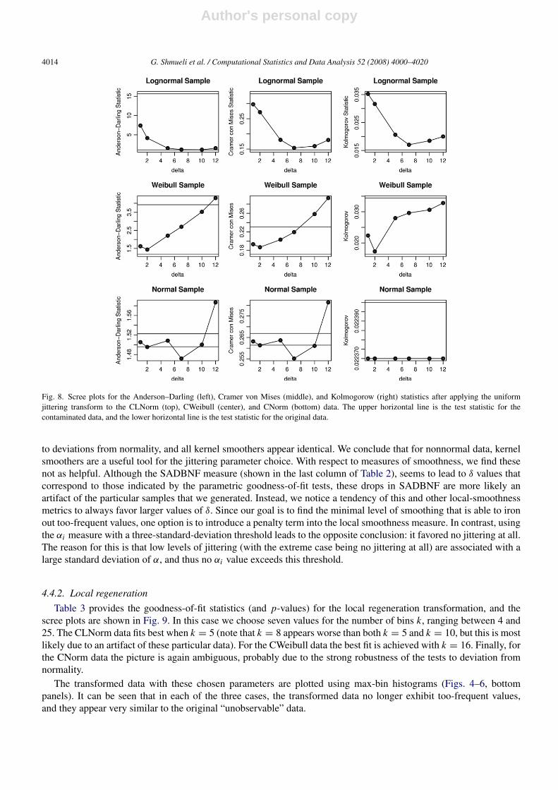
Fig. 8. Scree plots for the Anderson–Darling (left), Cramer von Mises (middle), and Kolmogorow (right) statistics after applying the uniformjittering transform to the CLNorm (top), CWeibull (center), and CNorm (bottom) data. The upper horizontal line is the test statistic for thecontaminated data, and the lower horizontal line is the test statistic for the original data.
to deviations from normality, and all kernel smoothers appear identical. We conclude that for nonnormal data, kernelsmoothers are a useful tool for the jittering parameter choice. With respect to measures of smoothness, we find thesenot as helpful. Although the SADBNF measure (shown in the last column of Table 2), seems to lead to δ values thatcorrespond to those indicated by the parametric goodness-of-fit tests, these drops in SADBNF are more likely anartifact of the particular samples that we generated. Instead, we notice a tendency of this and other local-smoothnessmetrics to always favor larger values of δ. Since our goal is to find the minimal level of smoothing that is able to ironout too-frequent values, one option is to introduce a penalty term into the local smoothness measure. In contrast, usingthe αi measure with a three-standard-deviation threshold leads to the opposite conclusion: it favored no jittering at all.The reason for this is that low levels of jittering (with the extreme case being no jittering at all) are associated with alarge standard deviation of α, and thus no αi value exceeds this threshold.
4.4.2. Local regeneration
Table 3 provides the goodness-of-fit statistics (and p-values) for the local regeneration transformation, and thescree plots are shown in Fig. 9. In this case we choose seven values for the number of bins k, ranging between 4 and25. The CLNorm data fits best when k = 5 (note that k = 8 appears worse than both k = 5 and k = 10, but this is mostlikely due to an artifact of these particular data). For the CWeibull data the best fit is achieved with k = 16. Finally, forthe CNorm data the picture is again ambiguous, probably due to the strong robustness of the tests to deviation fromnormality.
The transformed data with these chosen parameters are plotted using max-bin histograms (Figs. 4–6, bottompanels). It can be seen that in each of the three cases, the transformed data no longer exhibit too-frequent values,and they appear very similar to the original “unobservable” data.

Author's personal copy
G. Shmueli et al. / Computational Statistics and Data Analysis 52 (2008) 4000–4020 4015
Fig. 9. Scree plots for the Anderson–Darling (left), Cramer von Mises (middle), and Kolmogorow (right) statistics after applying the localregeneration transform to the CLNorm (top), CWeibull (center), and CNorm (bottom) data. The upper horizontal line is the test statistic for thecontaminated data, and the lower horizontal line is the test statistic for the original data.
5. Transforming the surplus data
We now apply the local regeneration transform to the auction surplus data, with the goal of obtaining data froma parametric continuous distribution. Since the data are real-world, the underlying distribution is unknown. The databest fit a three-parameter Weibull distribution when using the log-scale + 1, as can be seen from the probability plotsin Fig. 2. The data did not fit any distribution without the log transformation.
By inspecting zoomed-in regions of the max-bin histogram (such as the top left panel in Fig. 1) and the orderedpivot table (top right panel in Fig. 1), the too-frequent values appear to be {0, 0.01, 0.50, 0.51, 1.00, 1.01, 1.49,1.50, 1.75, 2.00, 2.01, 2.50, 3.00, 3.50, 4.00, 4.50, 5.00, 6.00, 10.00}. These same values also appear in a max-binhistogram applied to the log-transformed data (top panel in Fig. 10). As explained above, from now on we operate onthe log-transformed data.
The first step is to estimate the three parameters of a Weibull distribution from the observed (contaminated) data.These turn out to be γ̂ = shape = 1.403793, β̂ = scale = 2.129899, and τ̂ = threshold = −0.10379. Thelocal regeneration transformation is then applied using k bins from the estimated Weibull distribution, where k = 15,12, 10, 8, 7, 6, 5, 4, 3, 2. We start with k = 15 because the most frequent value in the data (zero) has a frequencyof 6.35%. Therefore, the maximum value of k to consider is 100/6.35 = 15.75, which rounds down to 15. Themax-bin histograms of the transformed data for several k values are shown in Fig. 10. The overlaid grey line is thethree-parameter Weibull density estimate. Note that the y-axis for the original data is much larger than that for thetransformed data. This emphasizes the extremeness in frequency of the zero value. With k = 15 there are still toomany zero and near-zero values compared to a Weibull distribution. However, k = 5 appears to “iron out” the dataquite well. This can also be seen in the corresponding probability plots (right column of Fig. 10), where a small “step”is visible in all plots except for the data transformed with k = 5. Furthermore, the probability plot with k = 5 alsoappears closest to a straight line, even in the right tail.
Author's personal copy
4016 G. Shmueli et al. / Computational Statistics and Data Analysis 52 (2008) 4000–4020
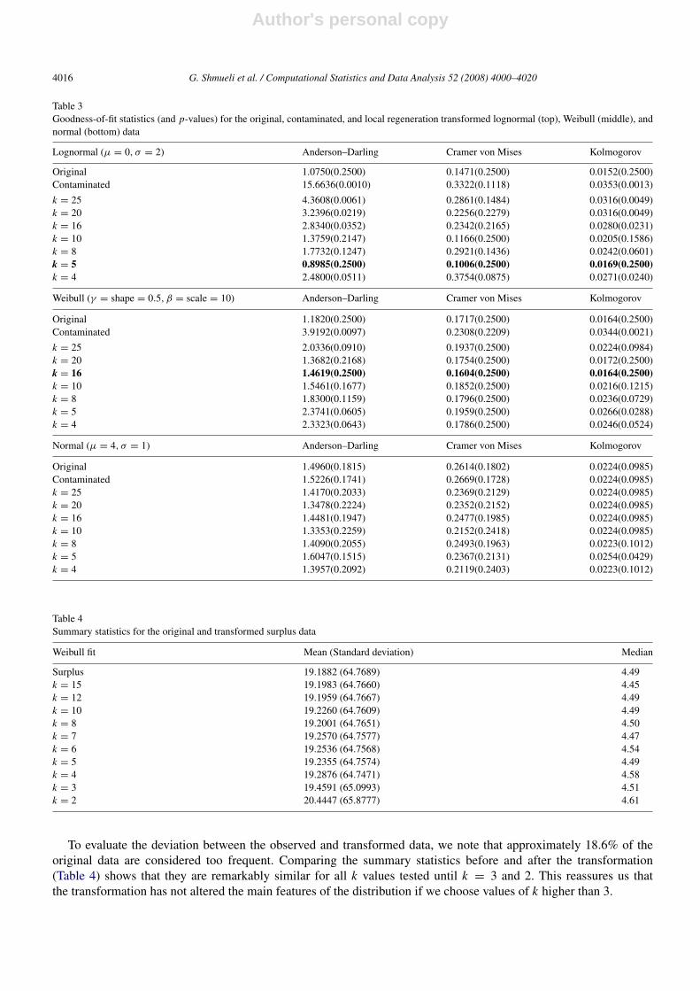
Table 3Goodness-of-fit statistics (and p-values) for the original, contaminated, and local regeneration transformed lognormal (top), Weibull (middle), andnormal (bottom) data
Lognormal (µ = 0, σ = 2) Anderson–Darling Cramer von Mises Kolmogorov
Original 1.0750(0.2500) 0.1471(0.2500) 0.0152(0.2500)Contaminated 15.6636(0.0010) 0.3322(0.1118) 0.0353(0.0013)
k = 25 4.3608(0.0061) 0.2861(0.1484) 0.0316(0.0049)k = 20 3.2396(0.0219) 0.2256(0.2279) 0.0316(0.0049)k = 16 2.8340(0.0352) 0.2342(0.2165) 0.0280(0.0231)k = 10 1.3759(0.2147) 0.1166(0.2500) 0.0205(0.1586)k = 8 1.7732(0.1247) 0.2921(0.1436) 0.0242(0.0601)k = 5 0.8985(0.2500) 0.1006(0.2500) 0.0169(0.2500)k = 4 2.4800(0.0511) 0.3754(0.0875) 0.0271(0.0240)
Weibull (γ = shape = 0.5, β = scale = 10) Anderson–Darling Cramer von Mises Kolmogorov
Original 1.1820(0.2500) 0.1717(0.2500) 0.0164(0.2500)Contaminated 3.9192(0.0097) 0.2308(0.2209) 0.0344(0.0021)
k = 25 2.0336(0.0910) 0.1937(0.2500) 0.0224(0.0984)k = 20 1.3682(0.2168) 0.1754(0.2500) 0.0172(0.2500)k = 16 1.4619(0.2500) 0.1604(0.2500) 0.0164(0.2500)k = 10 1.5461(0.1677) 0.1852(0.2500) 0.0216(0.1215)k = 8 1.8300(0.1159) 0.1796(0.2500) 0.0236(0.0729)k = 5 2.3741(0.0605) 0.1959(0.2500) 0.0266(0.0288)k = 4 2.3323(0.0643) 0.1786(0.2500) 0.0246(0.0524)
Normal (µ = 4, σ = 1) Anderson–Darling Cramer von Mises Kolmogorov
Original 1.4960(0.1815) 0.2614(0.1802) 0.0224(0.0985)Contaminated 1.5226(0.1741) 0.2669(0.1728) 0.0224(0.0985)k = 25 1.4170(0.2033) 0.2369(0.2129) 0.0224(0.0985)k = 20 1.3478(0.2224) 0.2352(0.2152) 0.0224(0.0985)k = 16 1.4481(0.1947) 0.2477(0.1985) 0.0224(0.0985)k = 10 1.3353(0.2259) 0.2152(0.2418) 0.0224(0.0985)k = 8 1.4090(0.2055) 0.2493(0.1963) 0.0223(0.1012)k = 5 1.6047(0.1515) 0.2367(0.2131) 0.0254(0.0429)k = 4 1.3957(0.2092) 0.2119(0.2403) 0.0223(0.1012)
Table 4Summary statistics for the original and transformed surplus data
Weibull fit Mean (Standard deviation) Median
Surplus 19.1882 (64.7689) 4.49k = 15 19.1983 (64.7660) 4.45k = 12 19.1959 (64.7667) 4.49k = 10 19.2260 (64.7609) 4.49k = 8 19.2001 (64.7651) 4.50k = 7 19.2570 (64.7577) 4.47k = 6 19.2536 (64.7568) 4.54k = 5 19.2355 (64.7574) 4.49k = 4 19.2876 (64.7471) 4.58k = 3 19.4591 (65.0993) 4.51k = 2 20.4447 (65.8777) 4.61
To evaluate the deviation between the observed and transformed data, we note that approximately 18.6% of theoriginal data are considered too frequent. Comparing the summary statistics before and after the transformation(Table 4) shows that they are remarkably similar for all k values tested until k = 3 and 2. This reassures us thatthe transformation has not altered the main features of the distribution if we choose values of k higher than 3.

Author's personal copy
G. Shmueli et al. / Computational Statistics and Data Analysis 52 (2008) 4000–4020 4017
Fig. 10. Histograms (left) and Weibull probability plots (right) for the original and transformed surplus data. The solid grey line on the histogramis the Weibull density.
Finally, examining the three goodness-of-fit statistics (Table 5) and the corresponding scree plots (Fig. 11) indicatesthat k = 5 leads to the best fit to an underlying three-parameter Weibull distribution. While k = 3 and k = 2 havelower test statistics, as we’ve already indicated, the data become dissimilar to the contaminated data at these pointsand are ironing out the data too much so that the data no longer resemble the observed data. These indications, coupledwith visual evidence from the max-bin histograms and probability plots, lead us to conclude that the (log) surplus dataare best approximated by a three-parameter Weibull distribution. The transformed data can then be used in further
Author's personal copy
4018 G. Shmueli et al. / Computational Statistics and Data Analysis 52 (2008) 4000–4020
Table 5Goodness-of-fit statistics (and p-values) for surplus original and transformed data (log-scale + 1) fit to a Weibull distribution
Anderson–Darling Cramer von Mises Kolmogorov
surplus 23.4733(0.0010) 2.4524(0.0010) 0.0567(0.0010)k = 15 18.0161(0.0010) 2.4549(0.0010) 0.0523(0.0010)k = 12 15.3583(0.0010) 2.1903(0.0010) 0.0502(0.0010)k = 10 11.8877(0.0010) 1.7407(0.0010) 0.0444(0.0010)k = 8 9.8501(0.0010) 1.5706(0.0010) 0.0455(0.0010)k = 7 10.8875(0.0010) 1.6627(0.0010) 0.0431(0.0010)k = 6 9.6503(0.0010) 1.5702(0.0010) 0.0458(0.0010)k = 5 5.5782(0.0021) 0.8996(0.0046) 0.0352(0.0010)k = 4 7.3568(0.0010) 1.2331(0.0010) 0.0422(0.0010)k = 3 4.6183(0.0047) 0.6881(0.0151) 0.0333(0.0026)k = 2 3.0625(0.0253) 0.4004(0.0766) 0.0249(0.0432)
Fig. 11. Scree plots for Anderson–Darling (left), Cramer von Mises (middle), and Kolmogorow (right) statistics for the transformed surplus data,for an increasing number of bins.
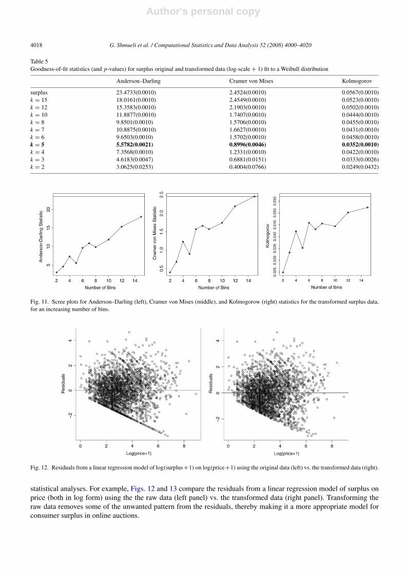
Fig. 12. Residuals from a linear regression model of log(surplus+1) on log(price+1) using the original data (left) vs. the transformed data (right).
statistical analyses. For example, Figs. 12 and 13 compare the residuals from a linear regression model of surplus onprice (both in log form) using the the raw data (left panel) vs. the transformed data (right panel). Transforming theraw data removes some of the unwanted pattern from the residuals, thereby making it a more appropriate model forconsumer surplus in online auctions.

Author's personal copy
G. Shmueli et al. / Computational Statistics and Data Analysis 52 (2008) 4000–4020 4019
Fig. 13. Normal probability plots for regression residuals using the original surplus data (left) vs. the transformed data (right).
6. Discussion
We introduce two transformations for semi-continuous data, jittering and local regeneration, that are aimed atyielding data that are continuous. One method is directly aimed at fitting a parametric continuous distribution, whilethe other is nonparametric and leads to continuous data of an unspecified parametric form. The idea behind bothtransformations is to replace too-frequent values with values randomly generated within their neighborhood. Thedifference between the two transformations is with respect to the definition of a neighborhood. While jittering definesa fixed-size neighborhood that is anchored around the too-frequent values, local regeneration uses percentiles of thefitted parametric distribution to define neighborhoods. In the latter case, the size of the neighborhood depends on theshape of the fitted distribution, with wider neighborhoods in tail or other low-density areas. The transformed data fromthe the two transformations therefore defer when too-frequent values are located in low-frequency areas of the data.
The proposed transforms, and in particular the local regeneration transformation, are similar in flavor to the well-known and widely-used Box–Cox transformation. In both cases the goal is to transform data into a form that can befed into standard statistical methods. Like the Box–Cox transformation, the process of finding the best transformationlevel (λ in the Box–Cox case, δ in jittering, and k in local regeneration) is iterative.
To evaluate the performance of the transformations we use simulated data from three common parametricdistributions, which were “contaminated”. We find that both transformations perform well, yielding transformed datathat are close to the original simulated data. We use both graphical aids and test statistics to evaluate goodness-of-fit.However, for some distributions (e.g., the normal) statistical tests of goodness-of-fit appear to be insensitive to the too-frequent values. The same occurs when comparing transformed data using different parameter values. We thereforeadvocate the use of max-bin histograms for identifying too-frequent values, for choosing parameters, and for assessinggoodness-of-fit.
When the goal is to achieve continuous data without a specific parametric fit, we find that kernel smoothers providea useful visual aid in determining the level of required jittering, with the exception of the normal distribution. We alsonote that simple measures of smoothness of the max-bin histogram such as SADBNF or αi tend to favor no jitteringor excessive jittering, and therefore there is room for developing measures that can better assist in determining theright level of jittering.
We apply our transformations to univariate data sets. However, one could imagine multivariate data where severalof the variables are contaminated. For example, a positive relationship was found from the regression of surpluson price, and price might also be semi-continuous due to the same mechanisms acting upon surplus. To transformmultivariate semi-continuous data, the jittering or local regeneration transformations can be applied univariately toeach of the variables, using the correlation (or another dependence measure) for choosing the parameter k or δ. Forthe case of fitting the data to a specific parametric multivariate distribution (with the multivariate normal distributionas the most popular choice), the binning can be formulated in multivariate space. However, this also requires making

Author's personal copy
4020 G. Shmueli et al. / Computational Statistics and Data Analysis 52 (2008) 4000–4020
assumptions about how the contamination mechanism affects the different variables, and whether the contaminationitself is dependent across the variables.
In conclusion, we believe that further studies with real semi-continuous data will show the importance andusefulness of these transformations.
Acknowledgements
The authors thank Ravi Bapna from the Indian School of Business and Claudia Perlich from the IBM T.J. WatsonResearch Center for their assistance with real applications. They also thank the two anonymous referees and theassociate editor for their helpful comments and suggestions.
References
Bapna, R., Jank, W., Shmueli, G., 2008. Consumer surplus in online auctions. Information Systems Research (in press).Bzik, T.J., 2005. Overcoming problems associated with the statistical reporting and analysis of ultratrace data.
http://www.micromanagemagazine.com/archive/05/06/bzik.html [08 January 2007].Efromovich, S., 1997. Nonparametric Curve Estimation. Springer-Verlag, New York.Good, I.J., Gaskins, R.J., 1980. Density estimation and bump hunting by the penalized maximum likelihood method exemplified by scattering and
meteorite data. Journal of the American Statistical Association 75 (369), 42–56.Lambert, D., 1992. Zero-inflated poisson regression, with an application to defects in manufacturing. Technometrics 34, 1–14.Perlich, C., Rosset, S., 2006. Quantile tress for marketing. In: Proceedings of Data Mining in Business Applications Workshop, International
Conference on Knowledge and Data Mining, Philadelphia, PA.Scott, D.W., 1979. On optimal and data-based histograms. Biometrika 66, 605–610.Scott, D.W., 1992. Multivariate Density Estimation: Theory, Practice, and Visualization. In: Wiley Series in Probability and Statistics.Scott, D.W., 2001. Parametric statistical modeling by minimum integrated square error. Technometrics 43( (3), 274–285.Shekhar, S., Lu, C.T., Zhang, P., 2003. Unified approach to spatial outliers detection. GeoInformatica 7 (2), 139–166.Wand, M.P., 1997. Data-based choice of histogram bin width. The American Statistician 51 (1), 59–64.