ATP Tennis Player Comparisons - University of California...
32
ATP Tennis Player Comparisons Owen Hsiao, Pi-Tan Hu, Ganesh Iyer Project demo: http://lacontra.github.io/info247-final/
-
Upload
truongthien -
Category
Documents
-
view
216 -
download
0
Transcript of ATP Tennis Player Comparisons - University of California...

ATP Tennis Player Comparisons
Owen Hsiao, Pi-Tan Hu, Ganesh Iyer
Project demo: http://lacontra.github.io/info247-final/

INTRODUCTION In this project, our goal is to visualize a history of performance and betting data in the field of
Men’s tennis and allow users to explore interesting trends and stories behind the numbers.
Specifically, we narrowed our design to visualize performances - what happened on the
tennis court - and a simplified way of representing betting odds - measures of what was
predicted to happen on the court. By linking the two, we hope to aid the user - whom we see
as someone is new to betting and/or is passionate about tennis - to mine information on
what bookies thought of certain matches are and if their prediction was reasonably accurate.
Our reasons for reducing our scope to only Association of Tennis Professional (ATP) Players
was to be able to explore a smaller data in greater visual breadth and also in a way such that
the end result can be transposed to Women’s tennis and also other sports with few
modifications.
In this project, we would also would like to present a visualization proof of concept to code
betting and match information in a single visualization unit and also discuss its strengths and
weaknesses. Additionally, we discuss other limits of our scope further at the end of this
report.
PROJECT GOALS
For this project we aim to conduct the information visualization in the following two goals:
1. We aim to provide several visualization charts that users can view or compare players’
performance by over the of 2007-2015 via different dimensions such as world ranking,
tournament type, surface type in major ATP tournaments (i.e. Australian Open,
Wimbledon, French Open and US Open).
2. We are also visualizing betting information from different betting companies in
conjunction with upsets where we define a threshold of people’s perceived chances of
winning of each competing player and look for trends in major tournaments.

Key questions that we aimed to answer through our visualizations:
● Who has the best overall record in terms of wins and losses in Grand Slam
performances since 2007?
● How did player rankings vary since 2007?
● Who were the most dominant players in various playing surfaces - clay, hard, grass
courts?
● Who were the most dominant players in various Grand Slams - does the Australian
Open for example, have an undisputed favorite?
● How did betting odds vary for a particular player over various surfaces?
● How did betting odds vary for a particular player in a single tournament? (cases of
surprise wild card performances)
● How did betting odds vary for a particular player as he faced off against another
player? (arch rivals, head-to-head records)
● Which players were a part of some of the most unexpected results in the last 8-9
years? (upsets)

RELATED WORK and INSPIRATIONS
The Rally Tree
Link: http://tennisviz.blogspot.com/2015/11/rally-tree-point-distribution-and-win.html

The "Rally Tree" depicts the distribution of points across various rally lengths, beginning at
the top with rally lengths of Zero, which indicate either Aces, Serve Winners, or Double Faults.
Color coding differentiates errors where balls were "netted" vs. hit long. Additionally, the
data could be shown on a single match level or over several matches.
This work is a perfect example which utilize a tree chart or a two sided bar chart to visualize
the players performance. Our two-sided bar chart which visualize the ATP top 50 players’
winning and losses over the past 9 years is inspired by this design.
IBM Grand Slam Infographic
Link:
http://dataconomy.com/wimbledon-big-data-predictive-or-missing-the-mark/
The IBM Grand Slam infographic depicts the key information in the grand slam tournaments
including the number of participants in the tournaments, the amount of data point being
analyzed, and the number of matches being analyzed

This work inspired us to conduct exploratory data analysis to discover ATP players’
performances over the four grand slam tournaments with the dataset we possess.
Furthermore, this work also inspired us in terms of the color themes and visual designed in
our player performance section.
Wimbledon Best and Worst Game

Link:
http://www.picodoc.org/wimbledon-2015-the-best-and-worst-games/
The wimbledon best and worst game example visualize two players’ implied probability of
winning over a single match. Each player of a game is assigned with a color and their
probability of winning over the duration of the match is shown as the size of the area of each
player.
This work inspired our design and visualization in the betting odds section. We utilize the
concept learned from this work and our comparison between the betting odds of two
players. Our design also assigned color to each player and utilize the height of each bar chart
to show people’s perceived possibility of winning for each player.

DATA The scope of our visualization covers Men’s Tennis performances in Grand Slam Tournaments
- Australian Open, French Open, Wimbledon and US Open - from 2007 to today (2016 only
contains Australian Open data) and betting odds data for individual match by 5 companies -
Bet365, Centrebet, Expekt, Pinnacle Sports and Unibet. We also understand that betting in
tennis is an extremely nuanced territory and since odds for tournament winners (who wins
the tournament), set winners, game winners (this can be incredibly dynamic and fast paced),
proposition betting and number of sets/games etc. were not available in our dataset, we only
focused our attention on bets that predicted the match-winner. The dataset we used is categorised by year, tournament series, venue place, scores, and the
betting information in the form of odds. (Please see below for the source of our data set.)
a. Tennis open data: http://tennis-data.co.uk/alldata.php
b. Dataset Code Book: http://tennis-data.co.uk/notes.txt
TOOLS
The following are the tolls which we utilize to accomplish our tasks and achieve our goals:
1. OpenRefine
2. MS Excel
3. Javascript
4. Tableau
5. D3
6. Adobe Illustrator
7. Git and Github
8. Good ol’ paper, sketch-pens and pencils
We utilized tools such as OpenRefine and Excel to clean our data and into the format that fits
our purpose. We also utilized JavaScript and D3 to accomplish our charts in the betting and
performance section. In addition, we also utilized Tableau to derive the charts which visualize

players’ performance on different surfaces and in different tournaments as well as their
ranking over years. For the designs, we used sketching to quickly mock up concepts and
Illustrator to detail them out as wireframes. The development was split between the three
team members and co-ordinated using Git and Github for version control.
STEPS and DESIGN DECISIONS We started with a bottom-up approach on how to best represent the data in the story we’re
trying to convey. We also took pointers from visualization design processes from the likes of
Alberto Cairo and Krist Wongsuphasawat (explained further), considering the time
available and utilizing our unique team composition.
The chart below represents our process:

Charting Process:
For the performance charts, we employed Krist Wongsuphasawat’s What-Where-When
approach to create our story in the performance page. The rankings over time showed the
what and the when, the player performances over various surfaces showed the what and the
where and the performances over various tournaments showed the what, the where and the
when, since these tournaments happen at around the same time every year.
To decide the type of we chose an exploratory analysis method on tools like Tableau and
simple d3 bar charts to mine insights and Tableau was extremely helpful to quickly obtain
many types of visualization communicating the same performance data. What was pleasantly
surprising to us was that using tree maps which are technically used to represent hierarchical
data, to show a linear prioritized list worked because the representation of the tree map with
the right color resembled that of a tennis court which fits our context perfectly. Using a line
chart to show rankings and using a two-sided bar chart to show number of wins and loss
during the time period offered us both the simplicity and clarity that our performance page
needed.
Visually representing betting data especially was an important challenge as the model
available in the dataset was in the form of ratios relative to 1. These ratios were intentionally
designed to indicate how much the placer of a bet would win or lose depending on the result.
This model however, needed further cognitive processing for a non-seasoned better to
understand who is more favored to win a particular match. To do this, the design has to
answer what kind of information about the dataset should the visual representation answer.
Hence, we transformed the cumbersome question ‘How much am I going to win if Player A
wins?’ to ‘How much likely do bookies think Player is going to win?’. This transformed our
metric from betting odds in favor of a player to predicted probability of his winning the
match. Once we had a visual representation, the data should accordingly be modified to
facilitate that design. Using Cairo’s process in this way to sketch and place charting elements
on paper before jumping to software tools also helped us get started on the development as
the ideas were quickly communicated and were flexible enough to be changed easily.

Even before jumping to actually coding the betting charts on d3, it was extremely helpful to
revisit some of the Gestalt principles and our betting page has meticulous uses of the
proximity principle (as demonstrated below). This intermediate arrangement of charts on
Adobe Illustrator helped us to avoid using a lot of lines to indicate differences between
various components. This of course was thwarted by d3’s requirement of using fixed
measurements.


Proof-of-concept: Betting Chart
Our main efforts were driven to create a unique visualization from our dataset to better
understand and implement principles learned in the class. We used a concept we call unit
chart where we code a certain amount of information into a flexible visual form and use this
form repeatedly in various arrangements to convey stories of higher abstraction.
For our project, we tried to code every betting information from every row in our dataset, i.e.
every match, into this unit chart. Then we arranged the matches horizontally as rounds in a
tournament and arranged the tournaments reverse-chronologically.
Why we say flexible visual form is if we’re coding information about two players, we might
need to view the same chart from the perspective of each player (A versus B and B versus A).
Referring back to Krist’s what-where-when concept, the unit form is our ‘what and where’,
since it contains betting information for every match and we designed the chart such that it
contains surface information, and the spatial arrangement of these unit forms is our higher
level ‘when’. The scalability of these unit forms lends itself to various combinations of those
three questions. We used the bigger summary charts to show average unit form data (‘what’)
for a particular surface (‘where’) and created a filter function at the highest level as a design
input to allow the users to decide the ‘when’ of the summary data.
The form that we finalized was a teeth graph where the idea was to make immediately clear
who the favored player is to win the match, according to bookies. Despite the demerits of
stacked bar charts (where it is difficult to compare bars if their baselines are not even), we felt
that since there is a priority for viewing one player’s data over the other, this form was
represented player odds and visually, a dominance over the other player. Since there would
be numerous unit forms in the page, we also felt a need to oversupply the information
regarding the surface since that was an integral part of the ‘where’.

The challenge was keeping it simple because we imagined that were going to be a lot of
charts on the page. As a result, we only wanted to keep the most important data readily
visible to communicate our story without the need for tooltips. We tried and tested various
combinations of visual modifications to also indicate data of who won and if the idea of
someone winning despite having lesser odds was communicated readily. Our user tests were
non-conclusive when we added information on who won and for the showcase, we chose to
not have that information up front since this chart was not a commonplace means to
represent betting data to begin with.
RESULTS To evaluate the strengths of our unit chart and to see if it was possible to embed additional
information into the same area, we tried various visual modifications to see if these
additional information was perceived by the users.

The method here was to have the user comparatively guess what the charts mean. Each
individual chart picture here was printed on a piece of paper and presented to a test user one
by one to evaluate its own individual merit. What we found that while all 10 of our test users
managed to interpret the simple teeth graph (no stroke or transparency) as one player’s
dominance over the other, results on if the users were able to guess who won (based on the
added stroke, or reduced opacity on the bars) were non-conclusive. Most users when given
the context also managed to guess the playing surface. For the showcase, we went with the
no-stroke, no-transparency approach.
As the visualization started to take shape, we realized that the data in its new form, informed
additional UI modifications. We needed to now have a row of tournament rounds fixed at the
top of the screen as you scroll, because the number of charts could be enormous for a
particular selection. We also added grey round placeholders after the showcase when a
player saw head-to-head player information.

The showcase however, had an interesting outcome. While the users understandably had a
learning curve to understand what each individual chart meant, they were able to quickly
extrapolate that information to what a list of charts could mean and this is something that we
could potentially test for in the future to make this visualization better.
Through the showcase, we found that as the odds for a player dropped in a particular
tournament round, the user hovered over the chart curious to know what exactly happened.
When we asked users about what they would like to see more, they said things along the lines
of ‘Federer went out in the 3rd round of the Australian Open? That’s impossible! How did it
happen?’. Following the showcase, we then incorporated a tooltip that shows this
information for the match in addition to showing % values. This we hope is a starting point to
explore how to increase the density of information in a particular visual form without
overburdening the users; for the time available we chose to proceed with the normally
accepted practice of tooltips.
We also faced challenges in terms of layout and considering that part of our story involves the
spatial arrangements, this was an important technical consideration that should inform any
design modification in the future. While we tried to make our website responsive by using
Bootstrap which uses % values to specify widths of divs, incorporating d3 charts which
requires specific width values in pixels was incompatible and hence, our product is not
scalable beyond a common monitor resolution.
One important feedback we received after the showcase was adding a % of winning
information as some players might not have the luck of the tournament rounds and play an
unfavorable player early leading to lesser matches and hence lesser wins. We created a
sketch on Tableau to present a viable solution for this problem; however, future evaluation
will be required.

The other important feedback we got from the showcase was the use of annotations in our
Tableau tree maps to indicate an insight up front that a user can walk away with. This we
incorporated in our final deliverable. We also provided a textual guidance on how to read a
tree map.
IMPLEMENTATION
The basic layout for our website is built with Bootstrap front-end framework. For the search 1
tool in the betting odds tab, we added autocomplete feature to player search fields using
Bootstrap 3 Typeahead . We also used bootstrap-slider to build the timeline slider and the 2 3
upset slider. All the charts in the bettings odds tab, including the match result horizontal
1 Bootstrap official website: http://getbootstrap.com/ 2 Bootstrap 3 Typeahead Github repository: https://github.com/bassjobsen/Bootstrap-3-Typeahead 3 bootstrap-slider Github repository: https://github.com/seiyria/bootstrap-slider

stack chart, summary charts and detailed charts are drawn using d3.js. The tooltip on each
chart is implemented with d3-tip. Since the website is a static page, we utilized Github Pages 4
to host our project website. We had also used Font Awesome’s icon fonts to represent the 5 6
icons on the tab and the checkbox that filters data by surface on the betting page.
Two-Sided Bar Chart:
Our two-sided bar cart is built with the reference from Jason Neylon’s two-sided bar chart d3
example. We made modification to the example code to fit our design goal and to visualize
50 ATP players and their aggregated wins and losses records. The original example of the
chart is shown in the footnote. 7
Another challenge we faced was since the ATP website did not allow scraping of player’s info,
we had to manually scour Google’s image search for player photos and the current
deliverable has photos for only the Top 20 ranked players in the world.
4 d3-tip Github repository: https://github.com/Caged/d3-tip 5 Github Pages official website: https://pages.github.com/ 6 Font Awesome’s Icon fonts: https://fortawesome.github.io/Font-Awesome/
7 Two-Sided Bar Chart Example: https://jasonneylon.wordpress.com/2013/09/05/two-sided-horizontal-barchart-using-d3-js/

DEMO The project can be found here: http://lacontra.github.io/info247-final/
The wireframes that shows how we started with our design created can be found here:
http://lacontra.github.io/info247-final/other/Wireframes.pdf The entire code for the project can be found in this central repository:
https://github.com/LaContra/info247-final/

SCREENSHOTS Performance
Top 10 Players World Ranking Trend (2007-2015)
The top 10 players’ world ranking line chart shows players performance in terms of world
rank over the years. One could find that the major four players, namely Djokovic, Federer,
Murray and, Nadal’s performances are relatively stable over the years while Nishikori, the
Japanese rising star leaped from 147 in 2010 to number 7 in 2016.

Win/Loss Record (2007-2015) The two-sided bar chart shows the aggregate wins and losses. We also show the same data with percentage to demonstrate the performances of the world’s top tennis players in terms of the overall percentage of of winning.

Treemap for Tennis Players’ Performance on different court Surface: The series of treemaps shows top 20 ATP players’ performance on different court surface. The charts allow the users to explore the performances of each player in different surface. For example, Nadal is shown to enjoy more wins on Clay whereas Djokovic is enjoying more wins on hard surface court. Additionally, our team made a designed decision to only shows 20 players in the chart so that the treemap doesn’t get overclustered and can show information clearly.
Top 20 Tennis Players on Clay
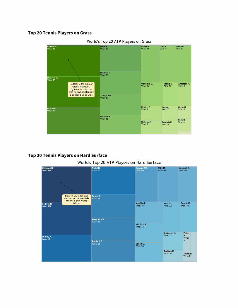
Top 20 Tennis Players on Grass
Top 20 Tennis Players on Hard Surface

Treemap for Tennis Players’ Performance in Different Tournaments: The series of treemap shows top 20 ATP players’ performance in each grand slam tournament. The charts allow the users to explore the performances of each player in different tournaments. For example, Nadal is shown to posses more championship titles in French Open whereas Djokovic is enjoying more championship titles in Australian Open. Similarly to the treemap in the surface section, our team made a designed decision to only shows 20 players in the chart so that the treemap doesn’t get overclustered and can show information clearly.
Wimbledon

French Open Records

Australian Open Records
BETTING ODDS Search Interface with Filters Our concept revolved around making this page interactive as we thought betting information is not something that is absorbed by just mere reading. We also incorporated a slider for the user to manipulate the threshold of upsets. If a player who has a percentage chance of winning less than this threshold and still wins the match, it can be seen as an unexpected result or an upset. We give this freedom to the user to decide that threshold.
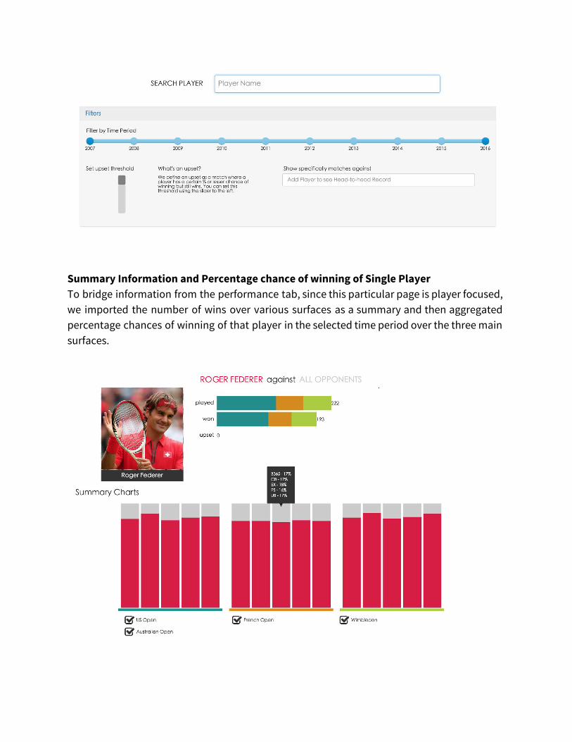
Summary Information and Percentage chance of winning of Single Player To bridge information from the performance tab, since this particular page is player focused, we imported the number of wins over various surfaces as a summary and then aggregated percentage chances of winning of that player in the selected time period over the three main surfaces.

Summary Information and Percentage chances of winning between Two Players (Roger Federer vs. Novak Djokovic) The user has the option in the filters to choose another player to view a head-to-head record since most tennis betting guides like - http://www.gamingtheodds.com/sports-betting/tennis - suggest that it is prudent to do research on head-to-head record before placing bets. Summarizing this information helps us also gather insights on upsets between the two players although a potential work in the future could also outline the number of upsets Federer has caused against Djokovic and the other way around.
Detailed Percentage chances of winning arranged by Year, Tournament and Round of Single Player This is where we had gathered more insights about how the betting process works and on what factors it depends. Seeing as even odds in favor of the perceived overwhelming favorite drops in the games they lose, this indicates that the data contains in-play betting - that upto a certain point in a match, odds in favor of a player can change. The factors that change this can be numerous - a poor first set performance, endurance or lack thereof, playing the home favorite, overall momentum etc. We also get to see these kind of insights reverse-chronologically and over various surfaces to analyze their influence on a player’s predicted chances of winning the match.

Detailed percentage chance of winning arranged by Year, Tournament and Round for Two Players (Roger Federer vs. Novak Djokovic) This is a filtered list of the predicted chances of winning of one player when faced with another player. The main insight here is to see who’s the stronger on head-to-head winning record, who is favored more on which surface and how the balance of power may have shifted over time from one player to the other (Federer on grass to Djokovic on grass for example).

INDIVIDUAL CONTRIBUTIONS
Owen Hsiao Data Lead
Pi-Tan Hu Development Lead
Ganesh Iyer Design Lead
● Utilized OpenRefine to combine different data sets gathered from the internet and clean up data into desired format and create relevant dimensions for usage in the development phase.
● Manipulated data and create desired calculated numbers for the two-sided bar chart in the performance section
● Conducted researches for related visualization works
● Conducted exploratory data analysis via Tableau
● Created performance analysis charts in the performance section via Tableau
● Created two-sided bar charts with both aggregate and percentage data via d3
● Consolidated final write-up report
● Handled the entire back-end logic, betting charts drawing and arrangement, betting odds search tools and search mechanism using d3 and jQuery - this involved translating the design to a reusable SVG representation, and implementing interactions with various checkboxes and radiobuttons that filtered the information on the charts.
● Created the central git repo for the team and manually co-ordinated all merge conflicts as individual team members pushed their content to the repo.
● Modified and integrated the d3 code for the two-sided bar chart.
● Set up the Bootstrap framework and the basic website layout to get things started.
● Explored the data to create initial sketches for the chart as well as website layouts that ties those charts together.
● Translated sketches to wireframes in Adobe Illustrator.
● Coded front-end UI elements like tabs, headers, etc. that housed the charts and also integrated the charts in the right positions and flow.
● Chose the color scheme for the website and the charts.
● Illustrated the picture that represents the use of the unit betting chart
● Designed the logo. ● Wrote the textual
content on the website as well as consolidated the final write-up with Owen.
● Illustrated the process chart for the write-up.
FUTURE CONSIDERATIONS and CONCLUSION Since the betting chart was based on a proof-of-concept, we could conduct additional
usability testing on it as a standalone chart and in a representation with other charts. Owing
to the general incompatibility of Bootstrap with d3, any developments on that front would
also help us to modify the layout more to our design. There were unresolved cosmetic bugs in
some of our UI controls like the slider and any future work in this visualization would also
include polishing the UI for this and a cleaner visual appeal.
From the way the users interpreted the charts in the showcase, we think that this has
uncovered tennis as a more nuanced sport by simply analyzing how bookies think about it.
Factors such as surface, head-to-head records, and even a discomfort playing against
left-handers start to influence the overall outcome in little increments. While we
acknowledge the weaknesses and bugs in the current implementation, we are confident that
this is a good start into plotting predicted chance of events happening with the actual result.