Assignment #13 Ancillary Research
36
tage 2 – Research Of Effective Channe Adverts
Transcript of Assignment #13 Ancillary Research
Stage 2 – Research Of
Effective ChannelAdverts
Chosen Level …
Some Could – At least four adverts or more each.
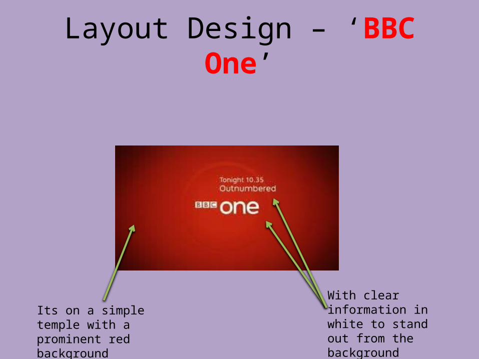
Layout Design – ‘BBC One’
Its on a simple temple with a prominent red background
With clear information in white to stand out from the background

Content – ‘BBC One’
Their is not a lot of content just simple text with a background and some animation around the words
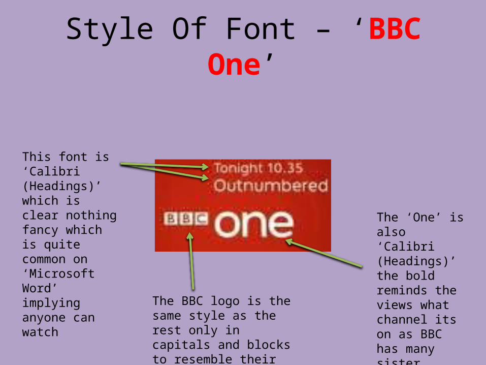
Style Of Font – ‘BBC One’
This font is ‘Calibri (Headings)’ which is clear nothing fancy which is quite common on ‘Microsoft Word’ implying anyone can watch
The ‘One’ is also ‘Calibri (Headings)’ the bold reminds the views what channel its on as BBC has many sister Channels
The BBC logo is the same style as the rest only in capitals and blocks to resemble their logo
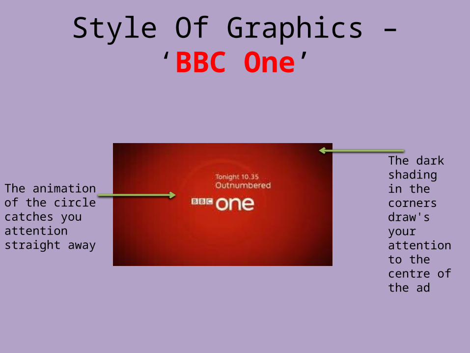
Style Of Graphics – ‘BBC One’
The animation of the circle catches you attention straight away
The dark shading in the corners draw's your attention to the centre of the ad
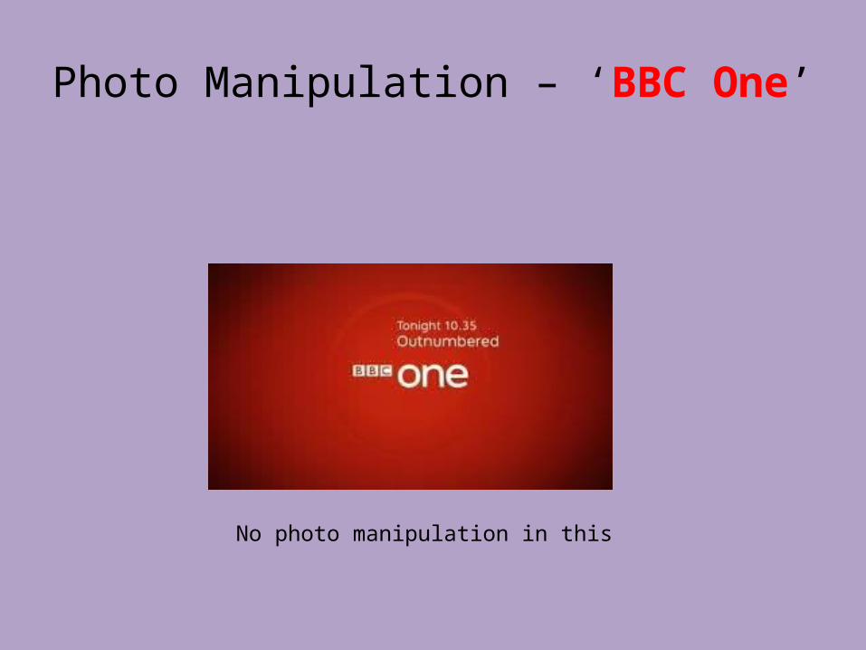
Photo Manipulation – ‘BBC One’
No photo manipulation in this

Organisation Of Information – ‘BBC One’
All the info is in the centre of the ad with is straight forward
The animation helps draw attention in

Kaya

Layout Design
Text is centred and bold in the advert – to be most prominent and obvious to viewer
Rule of Thirds used whereby its clear at the top, the middle is text, and the bottom is the rose (landscape)
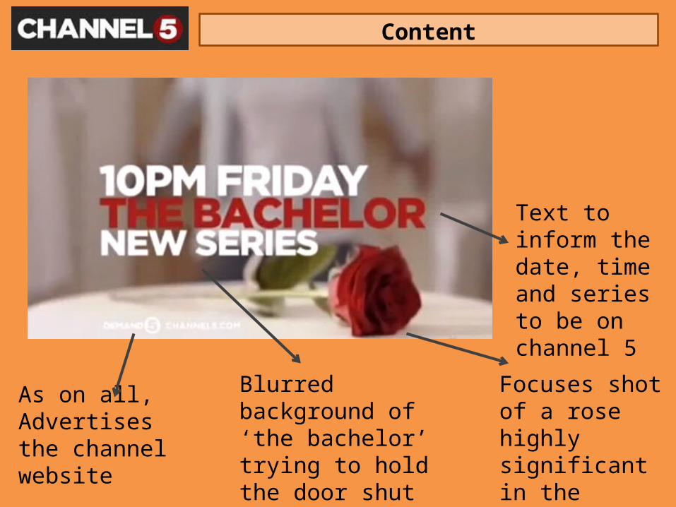
Content
Text to inform the date, time and series to be on channel 5
Focuses shot of a rose highly significant in the series
Blurred background of ‘the bachelor’ trying to hold the door shut of girls on the other side
As on all, Advertises the channel website
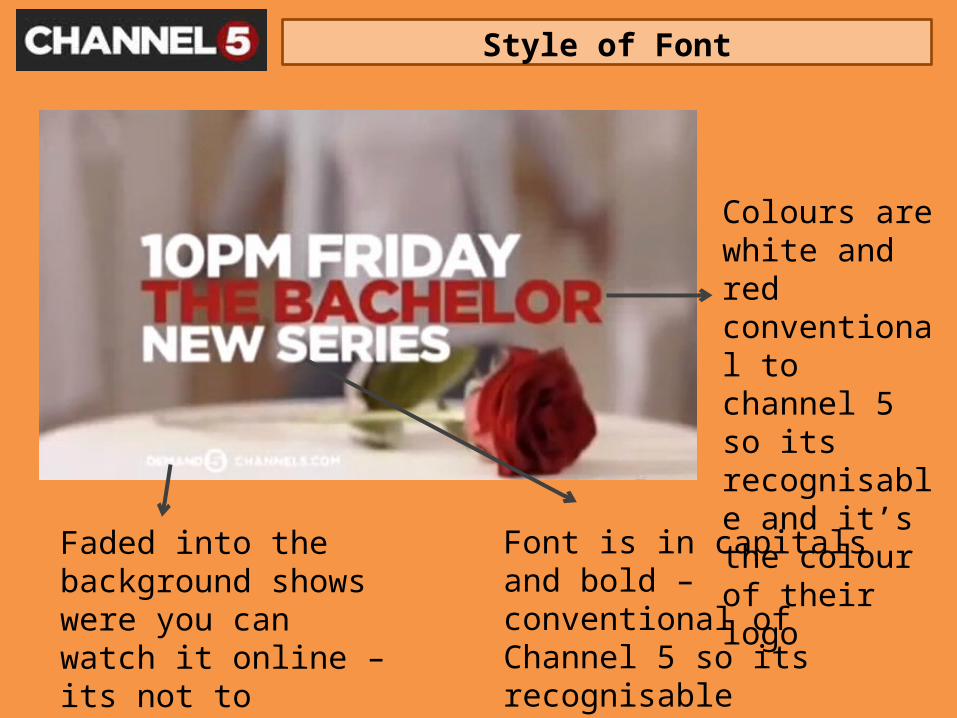
Style of Font
Faded into the background shows were you can watch it online – its not to visible because series hasn’t started yet
Font is in capitals and bold – conventional of Channel 5 so its recognisableTo grab attention and evident to viewers
Colours are white and red conventional to channel 5 so its recognisable and it’s the colour of their logo
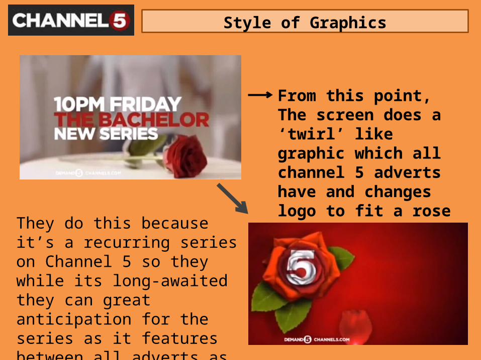
Style of Graphics
From this point,The screen does a ‘twirl’ like graphic which all channel 5 adverts have and changes logo to fit a rose
They do this because it’s a recurring series on Channel 5 so they while its long-awaited they can great anticipation for the series as it features between all adverts as well – constantly reminding of the programme
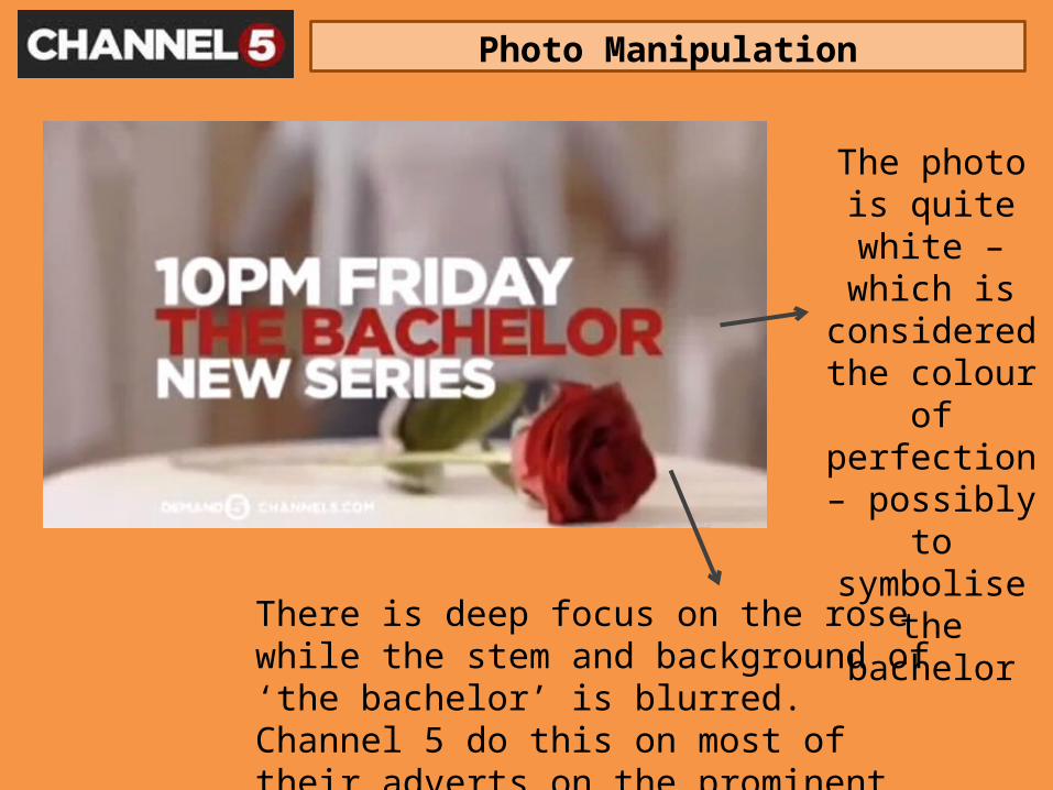
Photo Manipulation
There is deep focus on the rose while the stem and background of ‘the bachelor’ is blurred.Channel 5 do this on most of their adverts on the prominent feature of the programme
The photo is quite white –
which is considered the
colour of perfection – possibly to
symbolise the bachelor
Organisation of Information
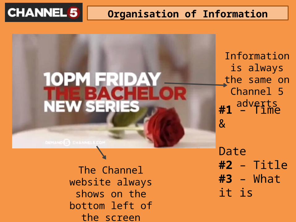
#1 – Time & Date#2 – Title#3 – What it is
Information is always the same
on Channel 5 adverts
The Channel website always shows on the
bottom left of the screen
Layout Design
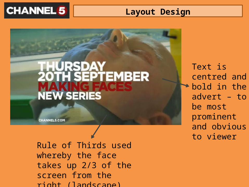
Text is centred and bold in the advert – to be most prominent and obvious to viewer
Rule of Thirds used whereby the face takes up 2/3 of the screen from the right (landscape)
Content
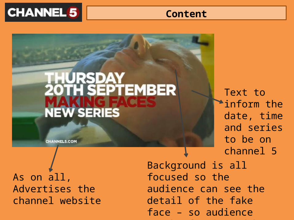
Text to inform the date, time and series to be on channel 5
Background is all focused so the audience can see the detail of the fake face – so audience can be fascinated by documentary’
As on all, Advertises the channel website
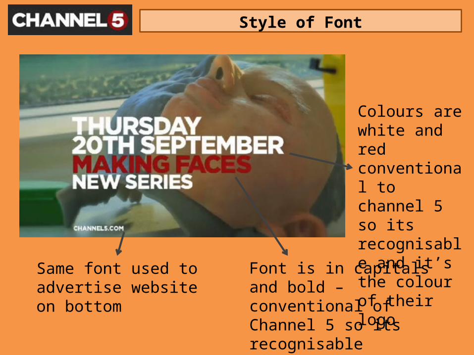
Style of Font
Colours are white and red conventional to channel 5 so its recognisable and it’s the colour of their logo
Font is in capitals and bold – conventional of Channel 5 so its recognisableTo grab attention and evident to viewers
Same font used to advertise website on bottom
Style of Graphics
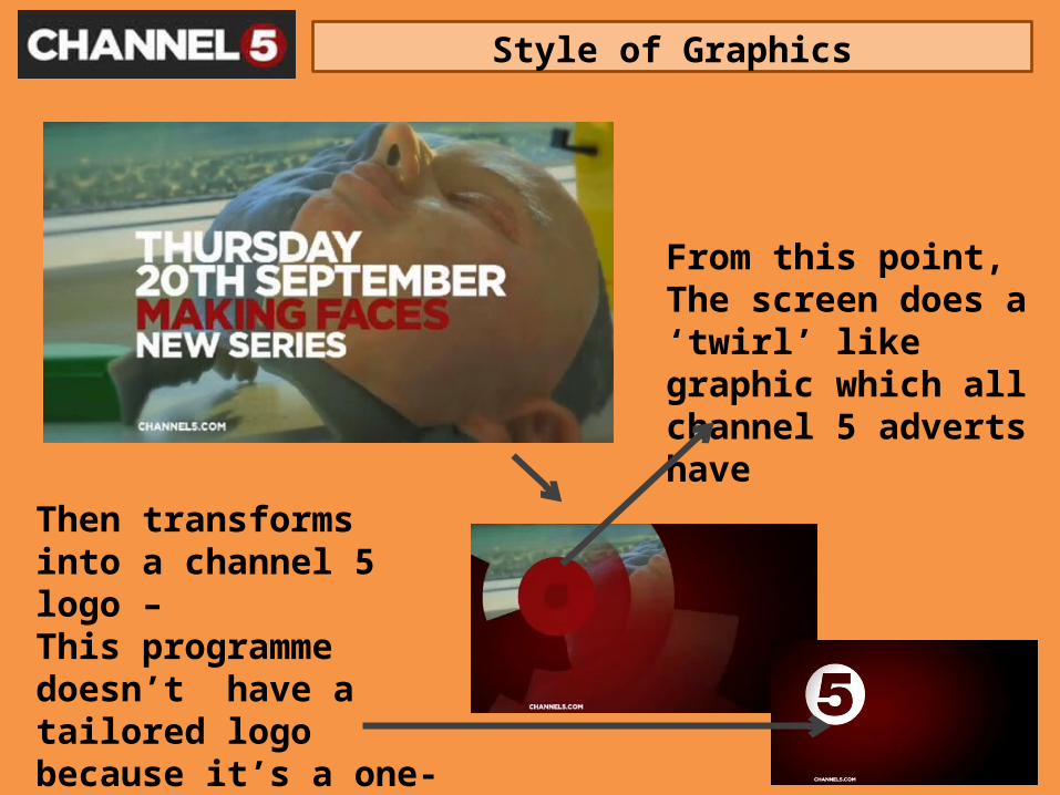
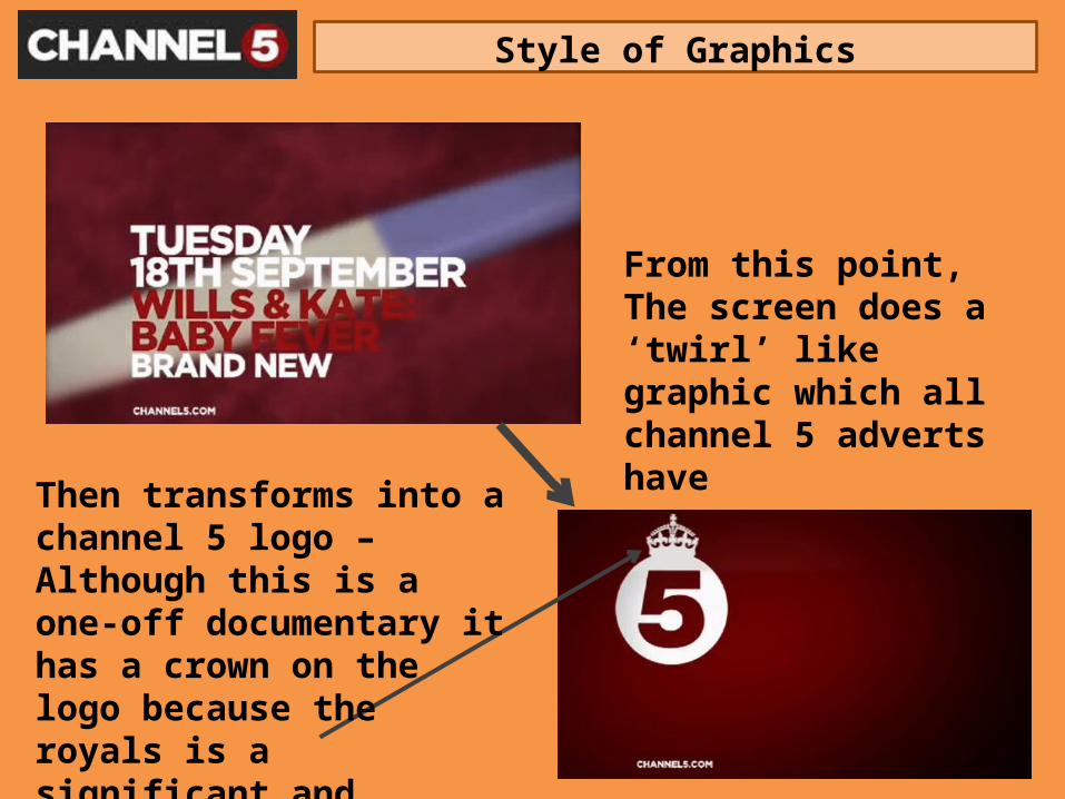
From this point,The screen does a ‘twirl’ like graphic which all channel 5 adverts have
Then transforms into a channel 5 logo –This programme doesn’t have a tailored logo because it’s a one-off documentary
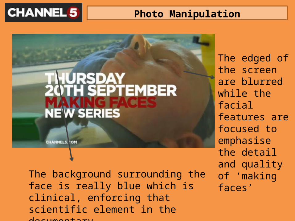
Photo Manipulation
The edged of the screen are blurred while the facial features are focused to emphasise the detail and quality of ‘making faces’
The background surrounding the face is really blue which is clinical, enforcing that scientific element in the documentary
Organisation of Information
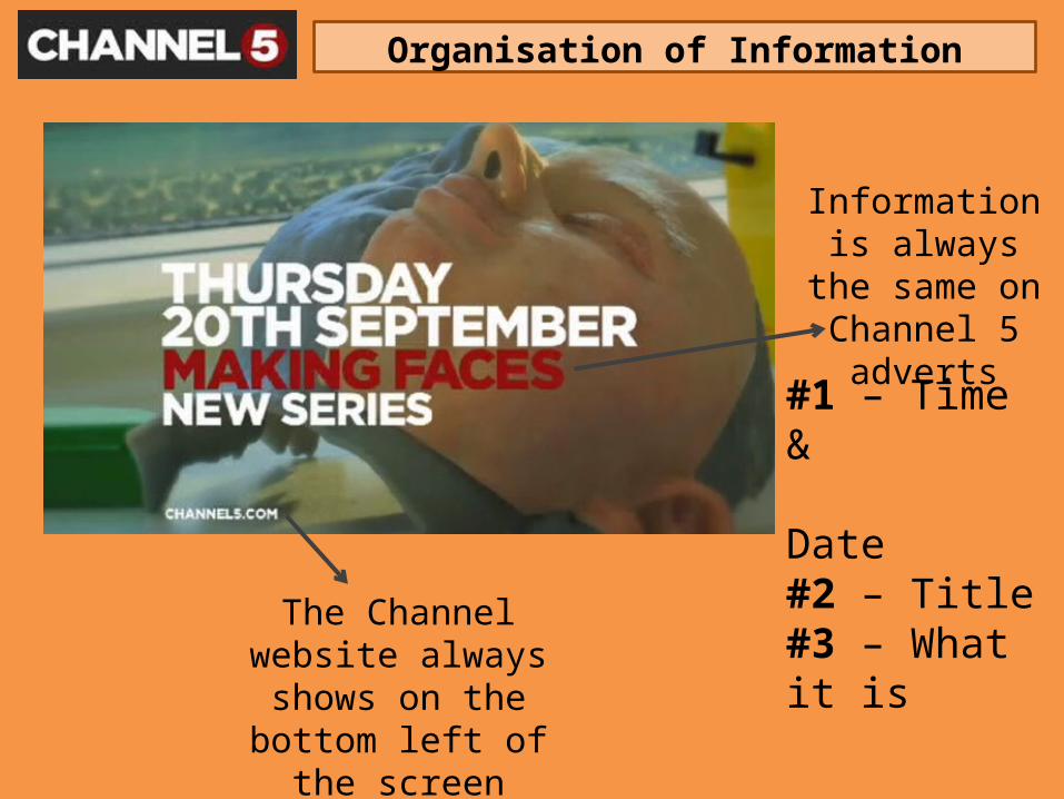
Information is always the same
on Channel 5 adverts
#1 – Time & Date#2 – Title#3 – What it is
The Channel website always shows on the
bottom left of the screen
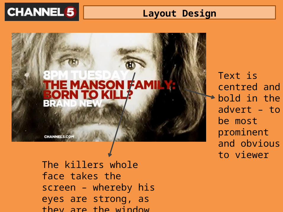
Layout Design
Text is centred and bold in the advert – to be most prominent and obvious to viewer
The killers whole face takes the screen – whereby his eyes are strong, as they are the window to a persons soul

Content
Text to inform the date, time and series to be on channel 5
The background is of the killers whole face to emphases the cold/evil feeling his face enforces
As on all, Advertises the channel website
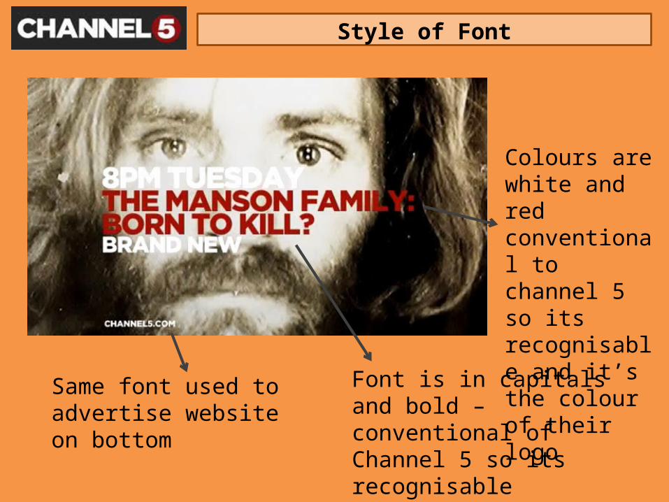
Style of Font
Colours are white and red conventional to channel 5 so its recognisable and it’s the colour of their logo
Font is in capitals and bold – conventional of Channel 5 so its recognisableTo grab attention and evident to viewers
Same font used to advertise website on bottom
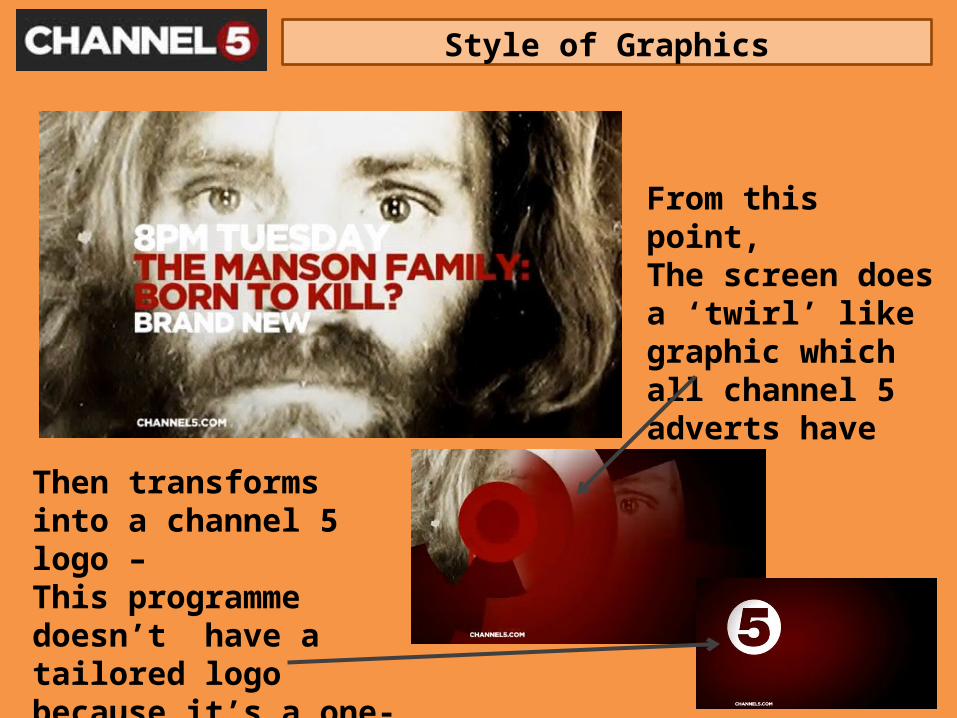
Style of Graphics
From this point,The screen does a ‘twirl’ like graphic which all channel 5 adverts have
Then transforms into a channel 5 logo –This programme doesn’t have a tailored logo because it’s a one-off documentary
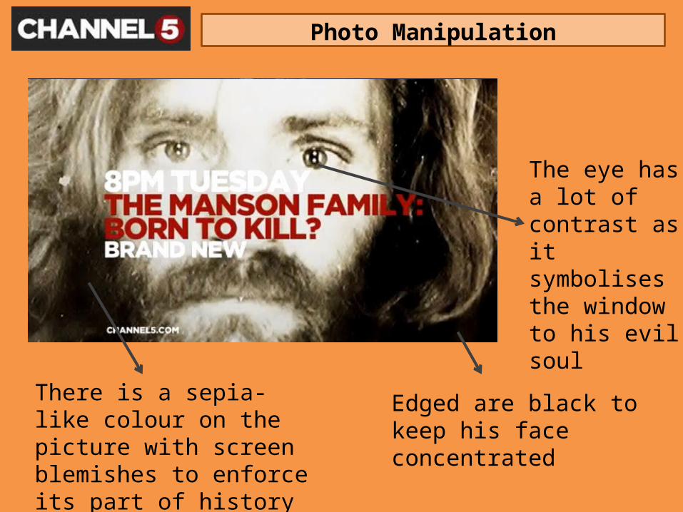
Photo Manipulation
The eye has a lot of contrast as it symbolises the window to his evil soul
Edged are black to keep his face concentrated
There is a sepia-like colour on the picture with screen blemishes to enforce its part of history and dead colours
Organisation of Information
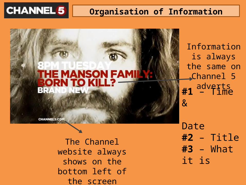
Information is always the same
on Channel 5 adverts
#1 – Time & Date#2 – Title#3 – What it is
The Channel website always shows on the
bottom left of the screen
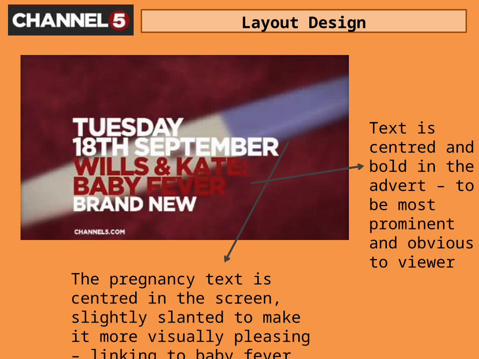
Layout Design
Text is centred and bold in the advert – to be most prominent and obvious to viewer
The pregnancy text is centred in the screen, slightly slanted to make it more visually pleasing – linking to baby fever
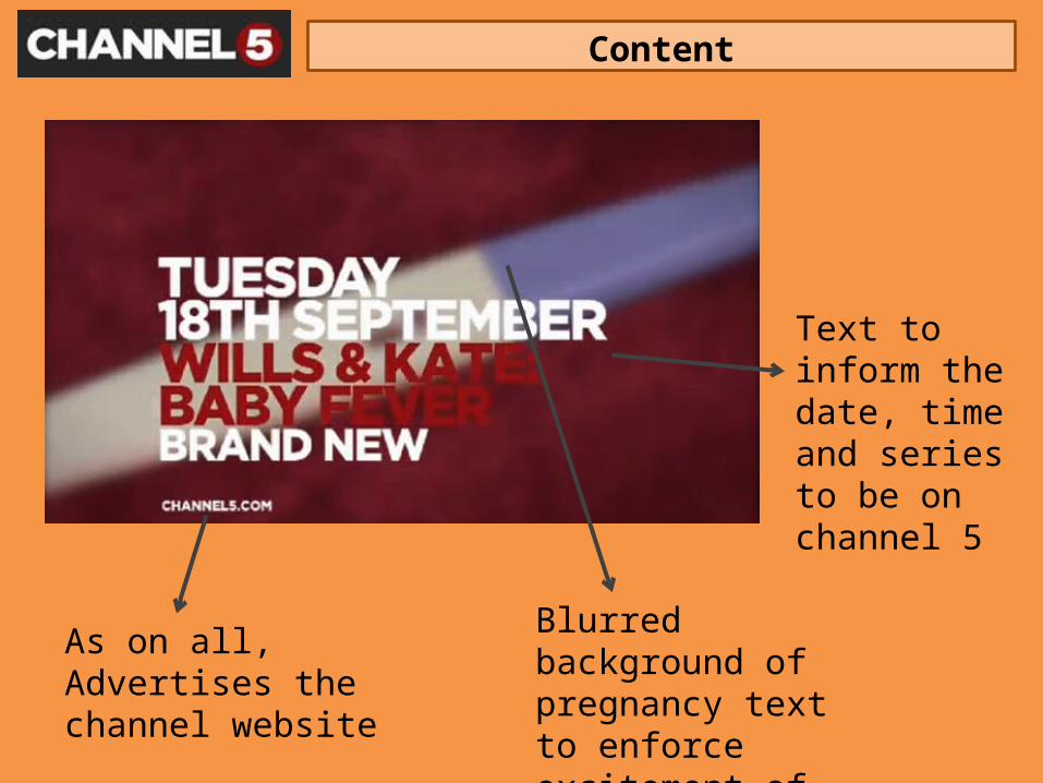
Content
Text to inform the date, time and series to be on channel 5
Blurred background of pregnancy text to enforce excitement of royal baby
As on all, Advertises the channel website
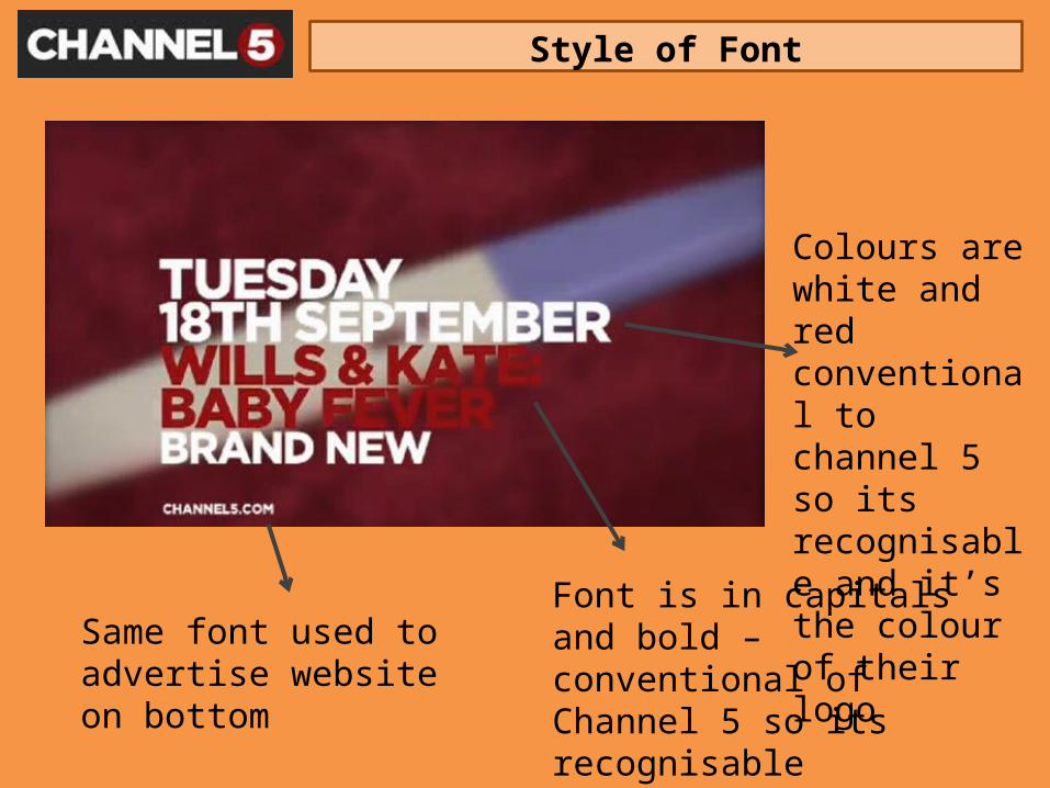
Style of Font
Colours are white and red conventional to channel 5 so its recognisable and it’s the colour of their logo
Font is in capitals and bold – conventional of Channel 5 so its recognisableTo grab attention and evident to viewers
Same font used to advertise website on bottom
Style of Graphics
From this point,The screen does a ‘twirl’ like graphic which all channel 5 adverts have
Then transforms into a channel 5 logo –Although this is a one-off documentary it has a crown on the logo because the royals is a significant and popular culture in Britain
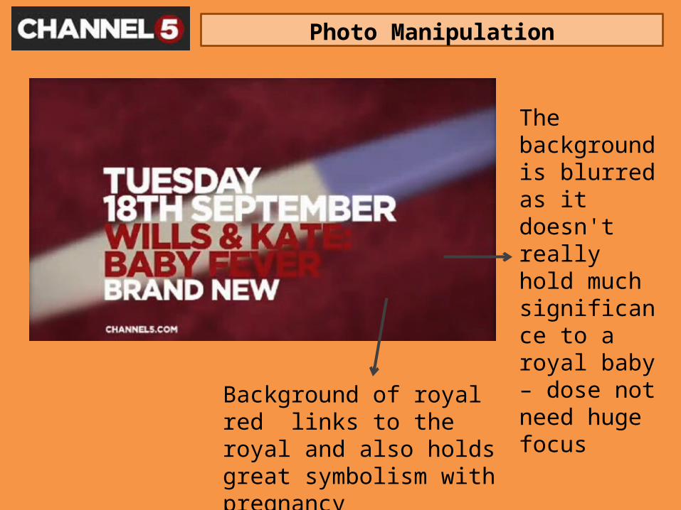
Photo Manipulation
The background is blurred as it doesn't really hold much significance to a royal baby – dose not need huge focus
Background of royal red links to the royal and also holds great symbolism with pregnancy
Organisation of Information
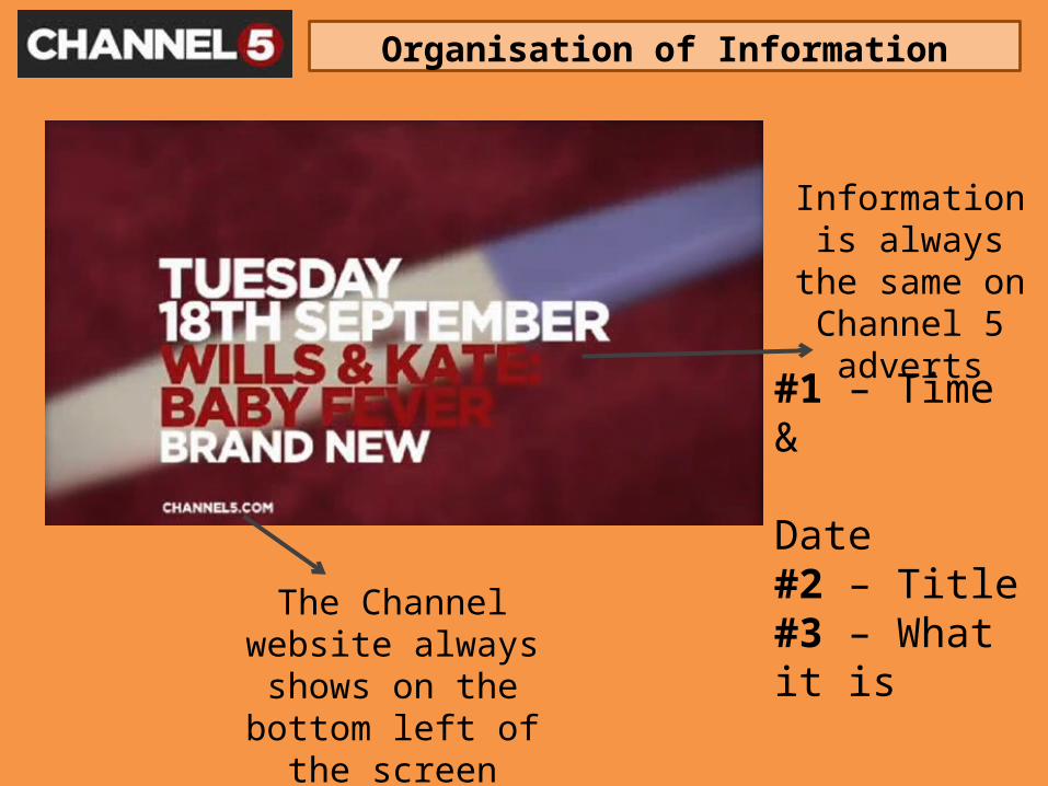
Information is always the same
on Channel 5 adverts
#1 – Time & Date#2 – Title#3 – What it is
The Channel website always shows on the
bottom left of the screen
Stage Two: Research and analysis of effective channel adverts
Chosen channel: ITV
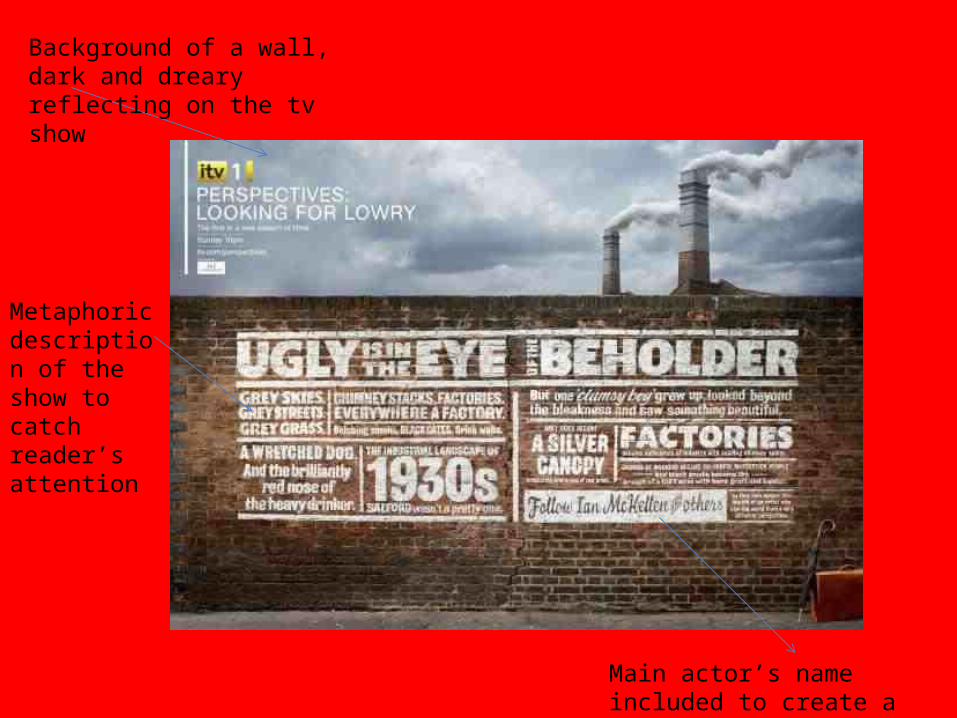
Background of a wall, dark and dreary reflecting on the tv show
Main actor’s name included to create a buzz as he is well known
Metaphoric description of the show to catch reader’s attention
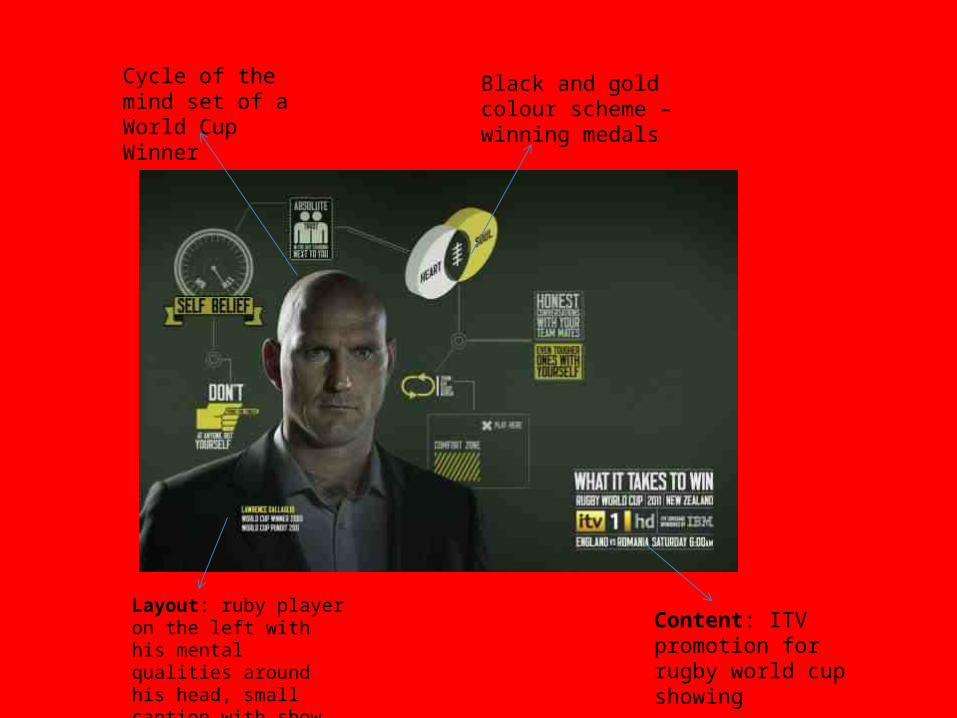
Cycle of the mind set of a World Cup Winner
Black and gold colour scheme – winning medals
Content: ITV promotion for rugby world cup showing
Layout: ruby player on the left with his mental qualities around his head, small caption with show information on the right