Assignment #13 Ancillary Research
43
Stage 2 – Research & Analysis f Effective Doub Page Magazine Spreads
Transcript of Assignment #13 Ancillary Research
Stage 2 – Research& Analysis
Of Effective DoublePage Magazine
Spreads
Chosen Level …
Some Could – At least four adverts or more each.
Layout Design
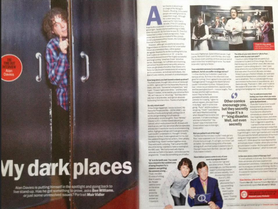
Dominating image of the comedian
Image from his show
Image of a show he guest stars in
Important quote
Web link for tickets
Capital letter shows start of interview
Showing who's being interviewed
Rhetorical question + small intro
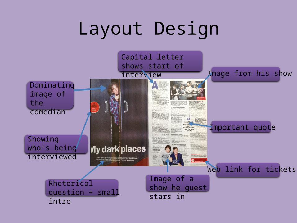
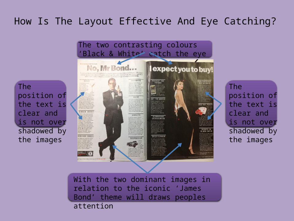
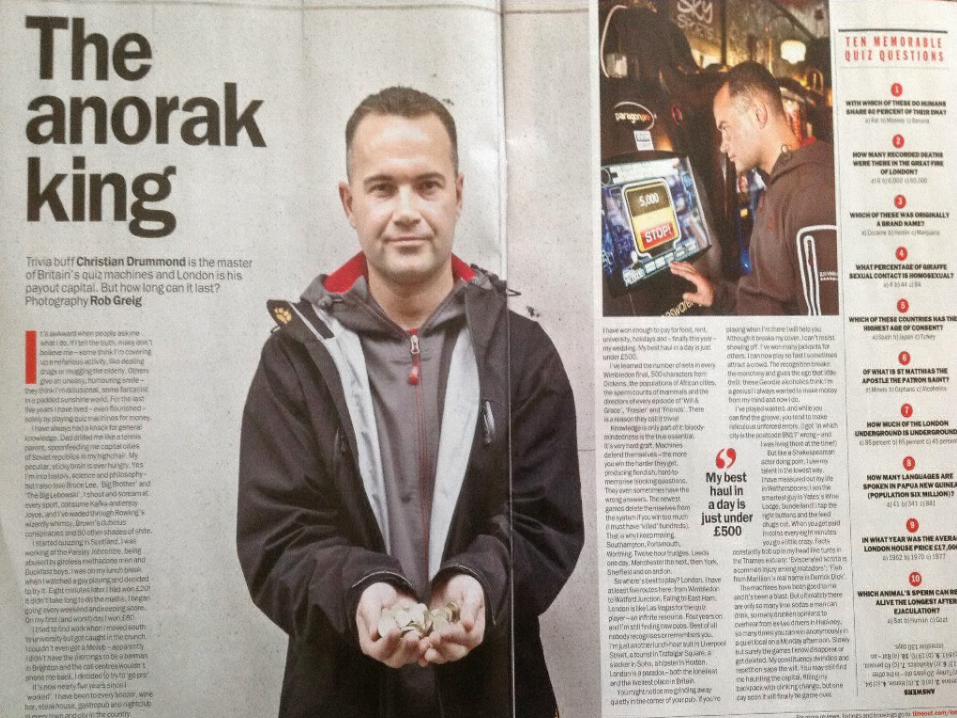
How Is The Layout Effective And Eye Catching?
• It does this by its dominant image and the person who's being interviewed popularity
• The sentence quotes catches your eye and is one of the first things you read
• The placement of the images does not draw away from the writing
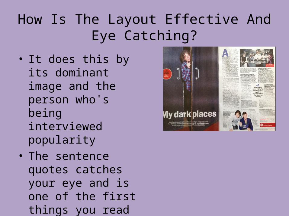
Style of Font
The capital ‘A’ tell the reader its the beginning of the interview
The slightly bigger font for the quotes identifies its importance and is one of the first things people read
The white colour stands out from the red background which makes it readable
The boldness of the from and sizes is noticeably the title
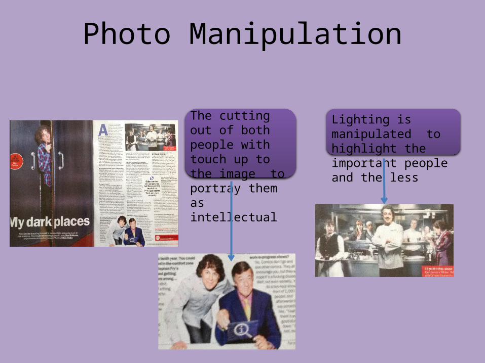
Photo Manipulation
Lighting is manipulated to highlight the important people and the less
The cutting out of both people with touch up to the image to portray them as intellectual
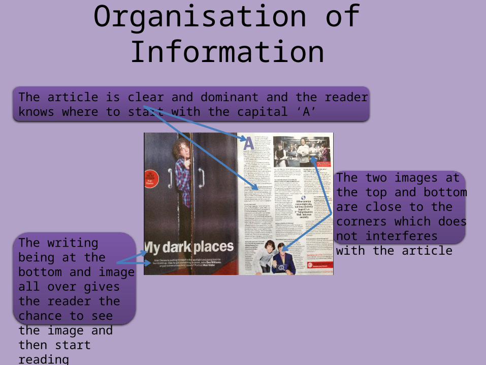
Organisation of Information
The writing being at the bottom and image all over gives the reader the chance to see the image and then start reading
The two images at the top and bottom are close to the corners which does not interferes with the article
The article is clear and dominant and the reader knows where to start with the capital ‘A’
Layout Design
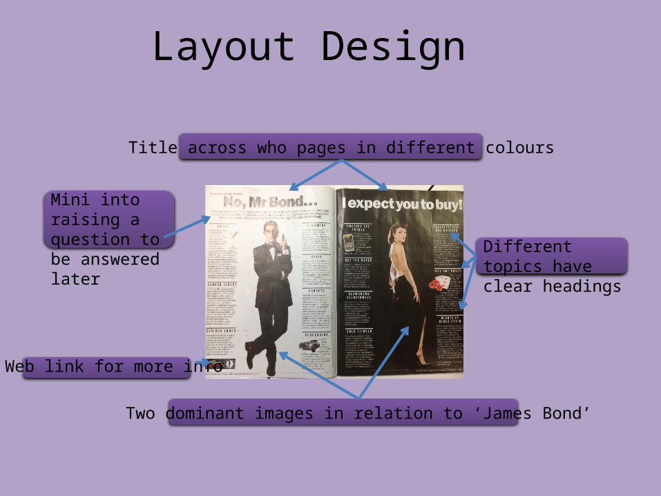
Title across who pages in different colours
Different topics have clear headings
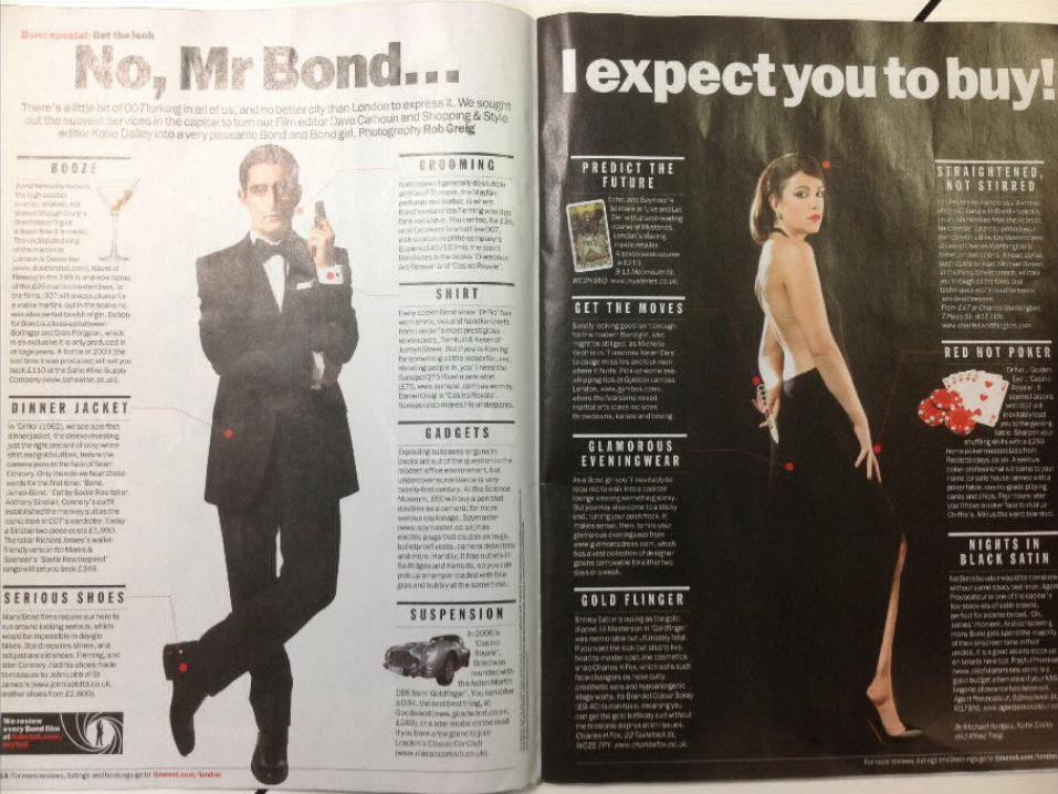
Two dominant images in relation to ‘James Bond’
Web link for more info
Mini into raising a question to be answered later
How Is The Layout Effective And Eye Catching?
With the two dominant images in relation to the iconic ‘James Bond’ theme will draws peoples attention
The two contrasting colours ‘Black & White’ catch the eye
The position of the text is clear and is not over shadowed by the images
The position of the text is clear and is not over shadowed by the images
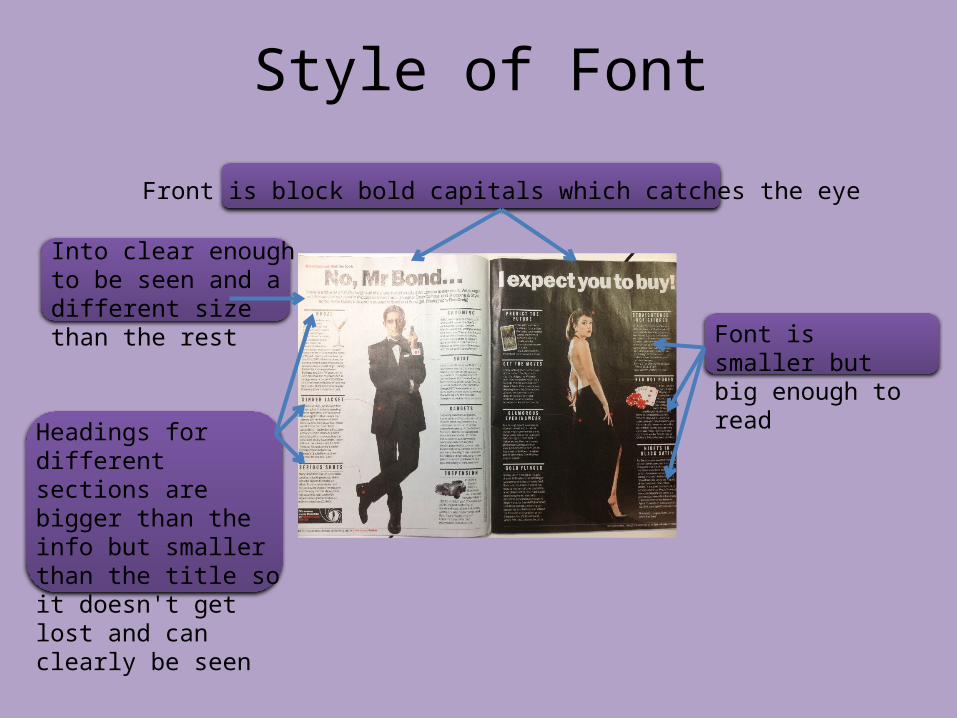
Style of Font
Front is block bold capitals which catches the eye
Font is smaller but big enough to read
Headings for different sections are bigger than the info but smaller than the title so it doesn't get lost and can clearly be seen
Into clear enough to be seen and a different size than the rest
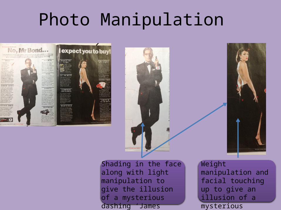
Photo Manipulation
Shading in the face along with light manipulation to give the illusion of a mysterious dashing ‘James Bond’
Weight manipulation and facial touching up to give an illusion of a mysterious perfect women
Organisation of Information
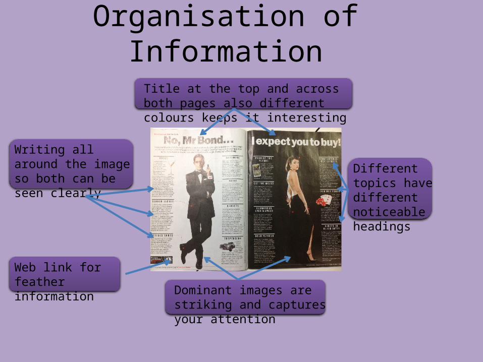
Dominant images are striking and captures your attention
Web link for feather information
Title at the top and across both pages also different colours keeps it interesting
Different topics have different noticeable headings
Writing all around the image so both can be seen clearly

Layout Design
Simple bold black titleImage relating to the article
Steps to become an ‘anorak king’
Dominant image in the middle of both pages
Small intro with a question to be addressed in the article
Quote
Article runs on both side
How Is The Layout Effective And Eye Catching?
The dominant image in the middle catches the eye along with the other image for its different colours
The titles simplicity of the page spread
Two images in neatly spaced allows readers eyes to see the main image first followed by the other to back up the article
The placement of the words with a specific quote in the middle

Style of Font
The size and boldness of the title stand out from the article font
The font is smaller but big enough to be read
The capital ‘I’ tell the reader where the article starts
The bigger font for the quote tells the reader its the most important part
The small info is a bigger font then the title but bigger than the article making it readable
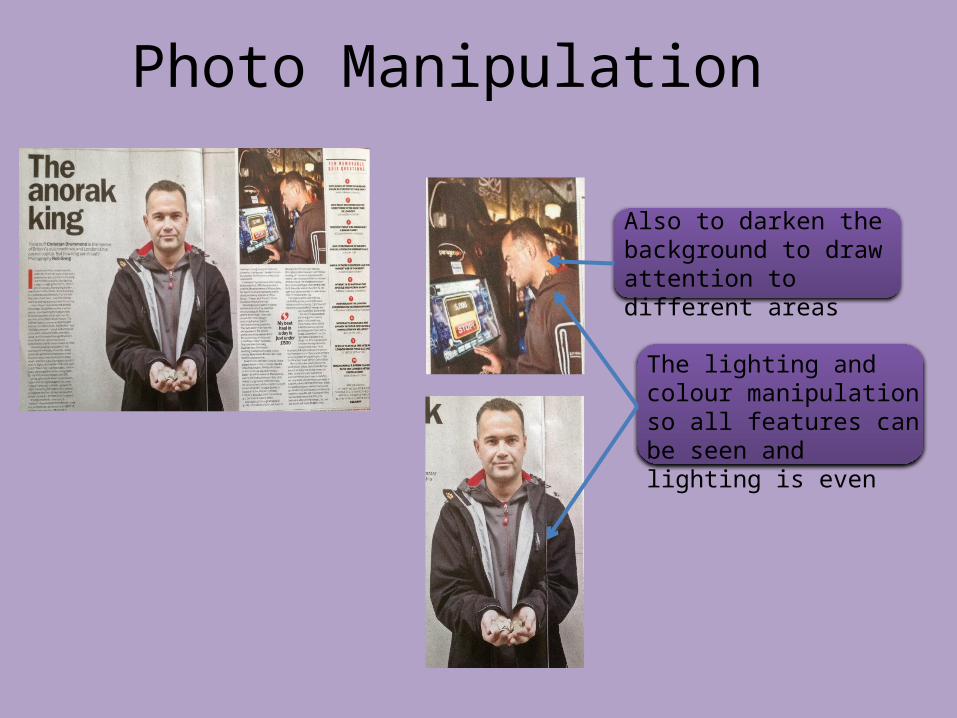
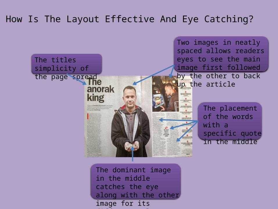
Photo Manipulation
The lighting and colour manipulation so all features can be seen and lighting is even
Also to darken the background to draw attention to different areas
Organisation of Information
The image in the centre of both pages highlights its dominance
The image near the top corner of the page relating to the reading
The article is in a rectangle shape in appealing
The title in the top right corner is bold and this one of the first things that catches your eye
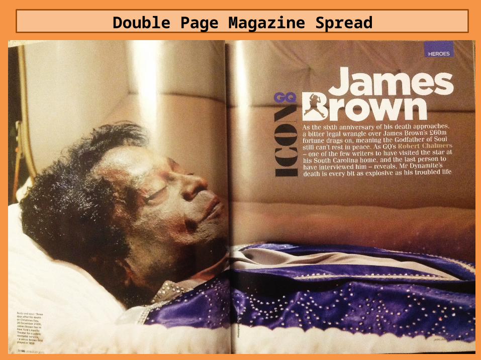
Double Page Magazine Spread
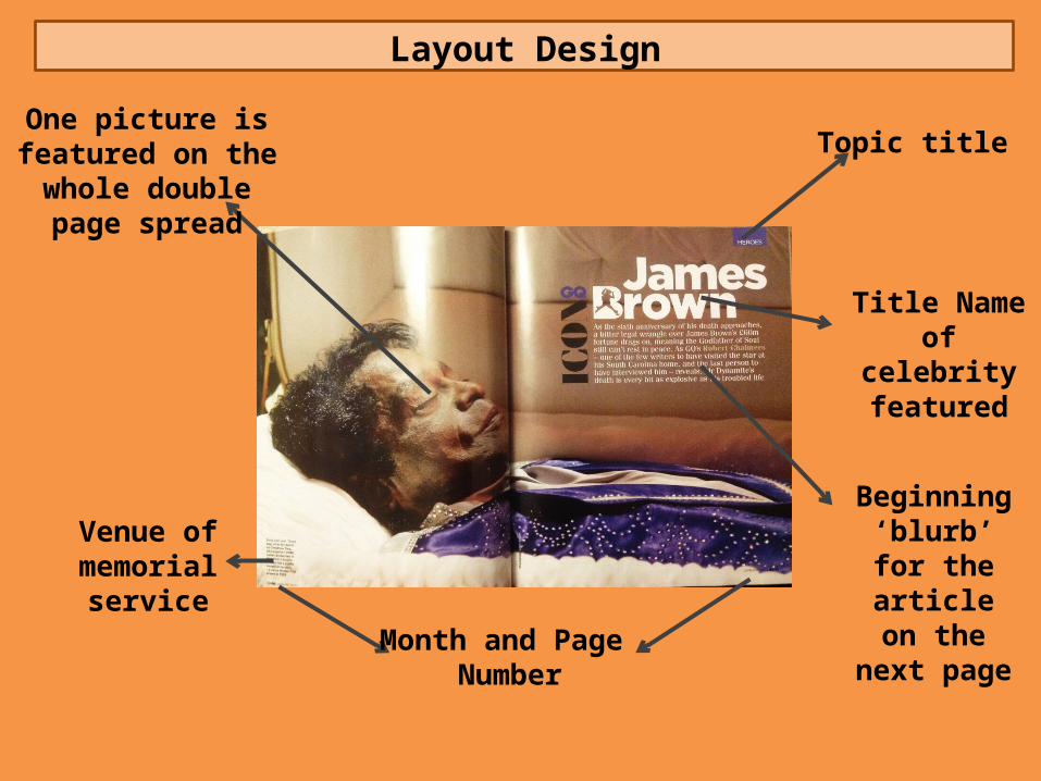
Layout Design
One picture is featured on the whole
double page spread
Topic title
Venue of memorial
serviceMonth and Page
Number
Title Name of celebrity featured
Beginning ‘blurb’ for the article on the
next page
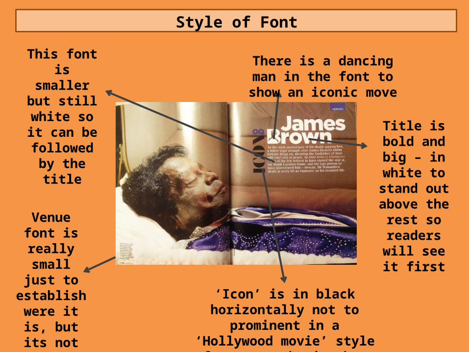
Style of Font
Venue font is really small
just to establish
were it is, but its not
necessarily important
There is a dancing man in the font to show an iconic move
‘Icon’ is in black horizontally not to prominent in a ‘Hollywood movie’ style font to emphasise how iconic
he is
Title is bold and big – in
white to stand out above the
rest so readers will see it first
This font is smaller but
still white so it can be
followed by the title
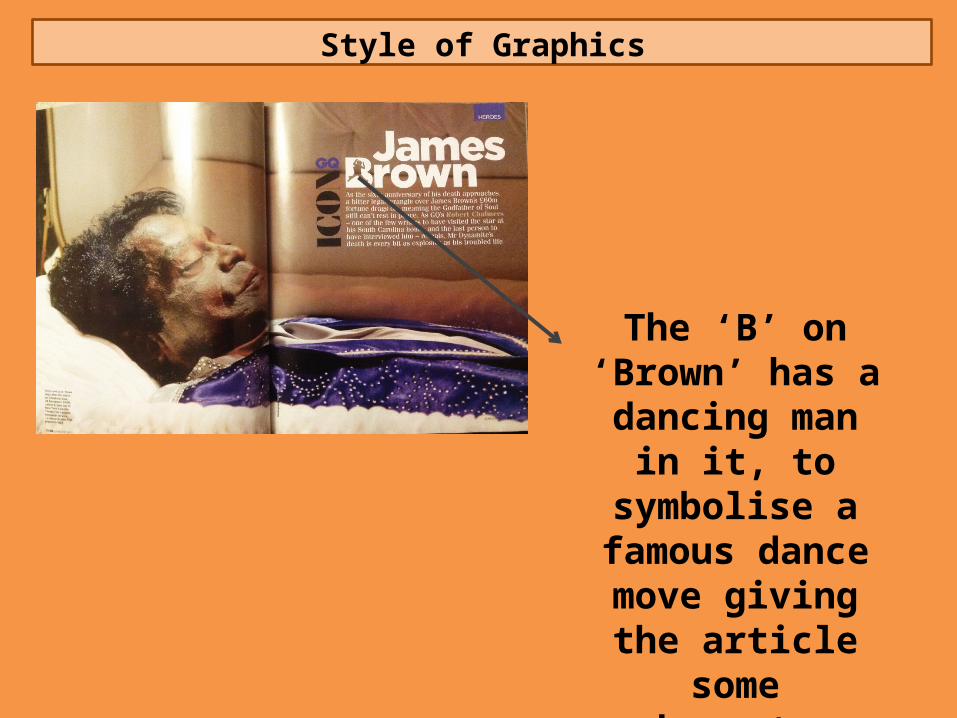
Style of Graphics
The ‘B’ on ‘Brown’ has a dancing man in it, to symbolise a famous dance move giving the
article some character
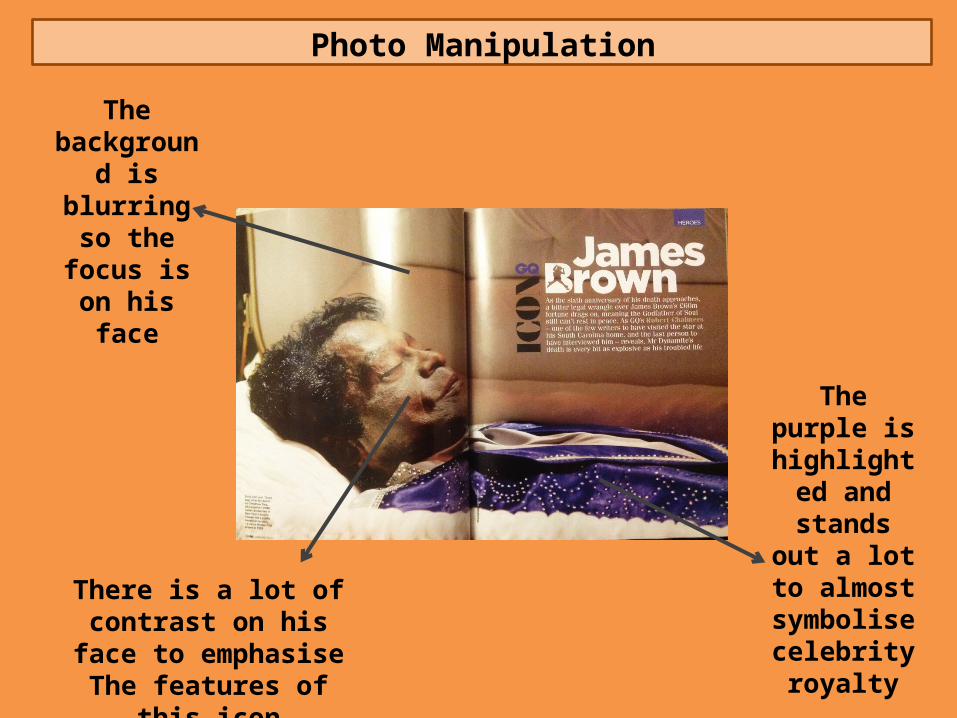
Photo Manipulation
The background is
blurring so the focus is on his face
There is a lot of contrast on his face to emphasiseThe features of this icon
The purple is highlighted and stands out a lot to
almost symbolise celebrity royalty
Organisation of Information
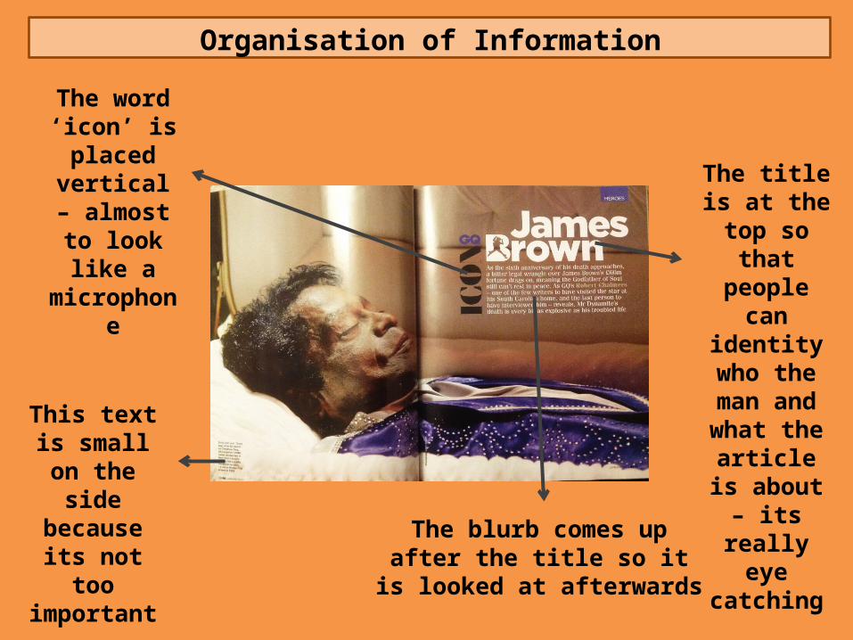
The word ‘icon’ is placed
vertical – almost to look like a
microphone
This text is small on the side because
its not too important
The title is at the top so
that people can identity
who the man and what the
article is about – its really eye catching
The blurb comes up after the title so it is looked at afterwards
Double Page Magazine Spread
Layout Design
Beginning ‘blurb’ for the article on the
next page
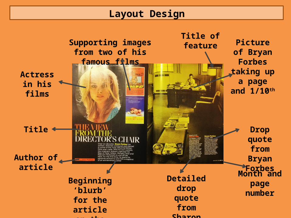
Author of article
Title
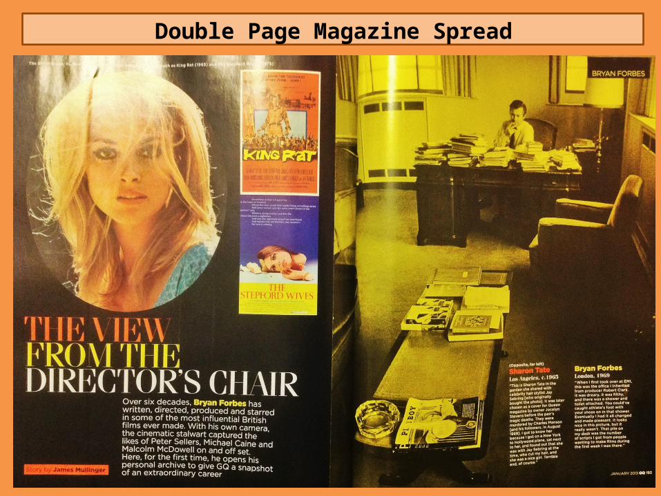
Actress in his films
Supporting images from two of his famous films
Picture of Bryan Forbes taking up a page and
1/10th
Detailed drop quote from Sharon Tate
Drop quote from Bryan
Forbes
Month and page number
Title of feature
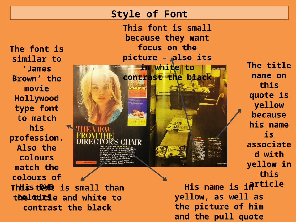
Style of Font
The font is similar to
‘James Brown’ the movie
Hollywood type font to match his profession.
Also the colours match the
colours of his DVD colours
This font is small because they want focus on the
picture – also its in white to contrast the black
The title name on this
quote is yellow
because his name is
associated with yellow in
this article
This text is small than the title and white to contrast the black
His name is in yellow, as well as the picture of him and the
pull quote
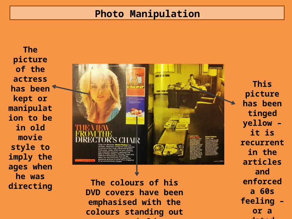
Photo Manipulation
The picture of the actress
has been kept or
manipulation to be in old
movie style to imply the
ages when he was directing
The colours of his DVD covers have been emphasised with
the colours standing out very bold
This picture has been
tinged yellow – it is
recurrent in the articles
and enforced a 60s feeling – or a dated
feeling
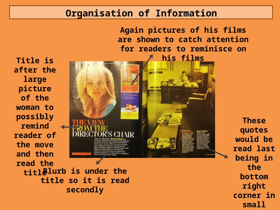
Organisation of Information
Title is after the large
picture of the woman to possibly remind
reader of the move and
then read the title
Blurb is under the title so it is read secondly
These quotes would be read last
being in the bottom right
corner in small writing before they
turn the page
Again pictures of his films are shown to catch attention for readers to reminisce on
his films

Double Page Magazine Spread
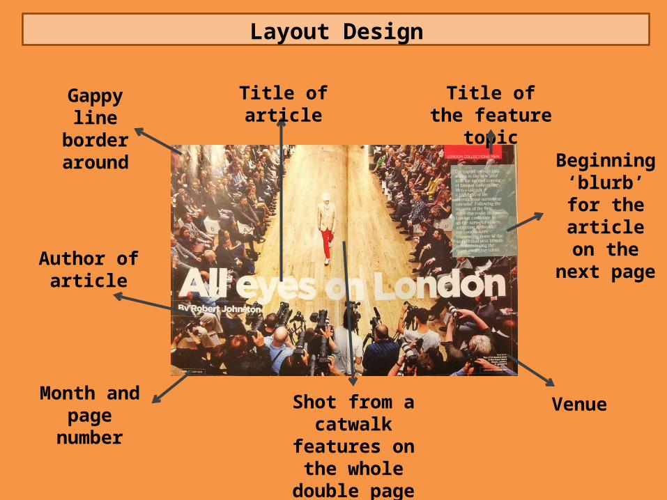
Layout Design
Beginning ‘blurb’ for the article on the
next page
Title of the feature topic
Month and page number
Shot from a catwalk features on the
whole double page spread
Venue
Gappy line border around
Author of article
Title of article
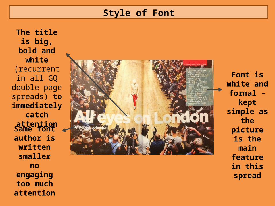
Style of Font
The title is big, bold and white (recurrent in all GQ double page
spreads) to immediately
catch attention
Same font author is written
smaller no engaging too
much attention
Font is white and formal – kept simple
as the picture is the main
feature in this spread
Style of Graphics
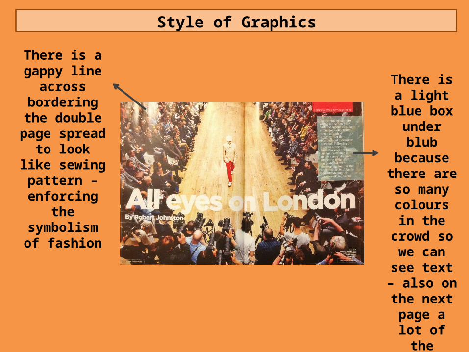
There is a gappy line across
bordering the double page
spread to look like sewing pattern –
enforcing the symbolism of
fashion
There is a light blue box
under blub because there are so many
colours in the crowd so we
can see text – also on the next page a
lot of the clothes are
blue to this is to match the
clothes
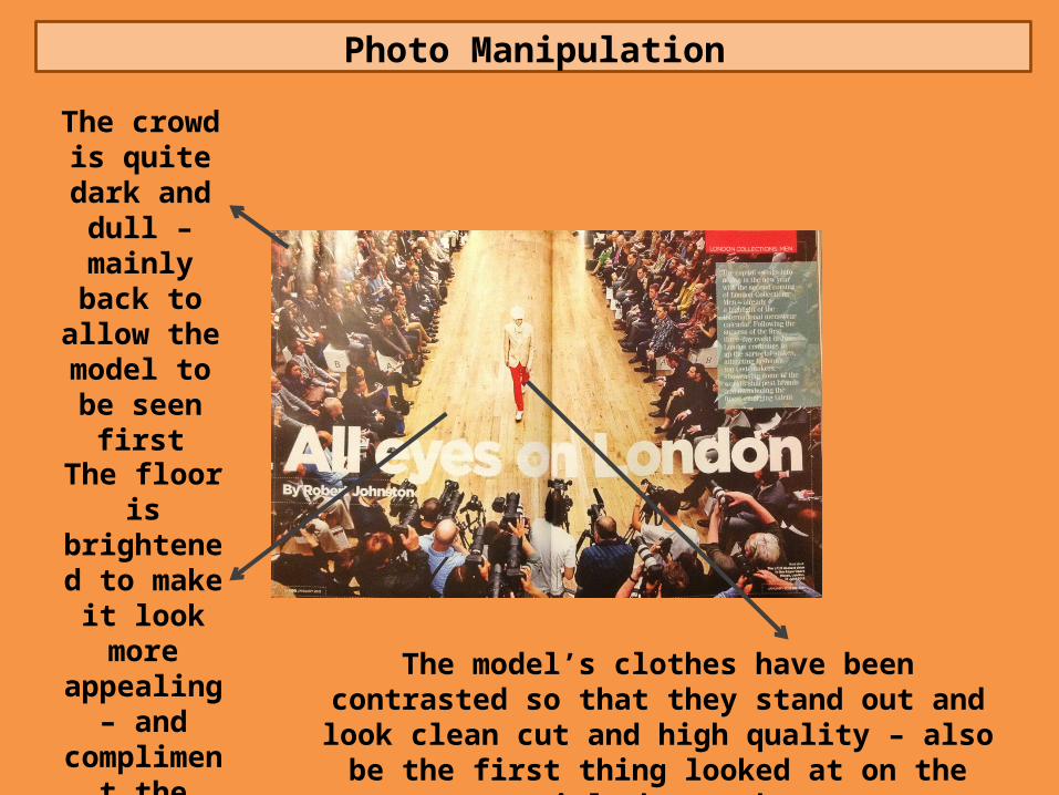
Photo Manipulation
The crowd is quite dark and dull –
mainly back to allow the model to be
seen first
The model’s clothes have been contrasted so that they stand out and look clean cut and high quality – also be
the first thing looked at on the article by readers
The floor is brightened to make it look
more appealing –
and compliment the model
Organisation of Information
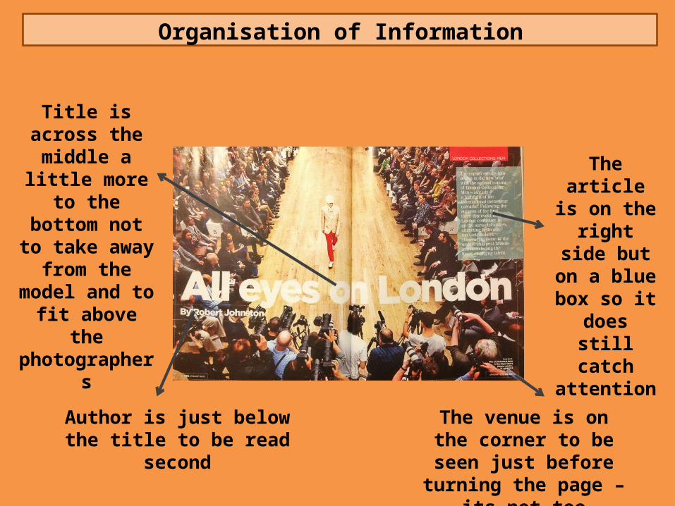
Title is across the middle a little more to the
bottom not to take away from
the model and to fit above the
photographers
Author is just below the title to be read second
The venue is on the corner to be seen just before
turning the page – its not too important
The article is on the right
side but on a blue box so it
does still catch
attention

Double Page Magazine Spread
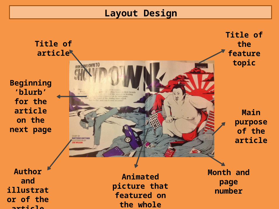
Layout Design
Beginning ‘blurb’ for the article on the
next page
Title of article
Author and illustrator of
the article
Animated picture that featured on the whole double page
Title of the feature topic
Main purpose of the article
Month and page number
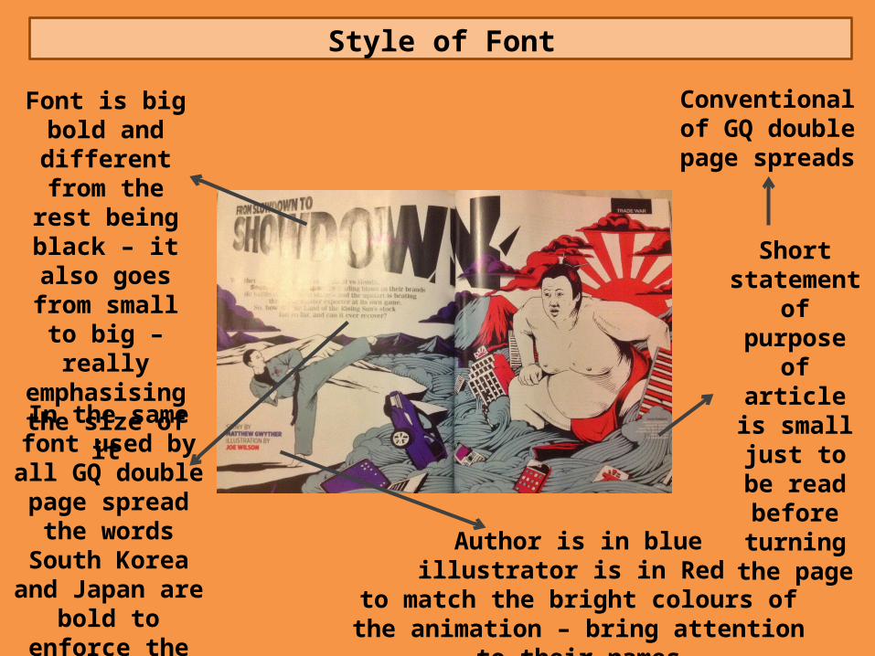
Style of Font
Font is big bold and different from the rest
being black – it also goes from small to big –
really emphasising the size of it
In the same font used by all GQ
double page spread the words South Korea and Japan
are bold to enforce the countries this is
on
Short statement of purpose of
article is small just to
be read before
turning the page
Author is in blueillustrator is in Red
to match the bright colours of the animation – bring attention to their names
Conventional of GQ double page
spreads
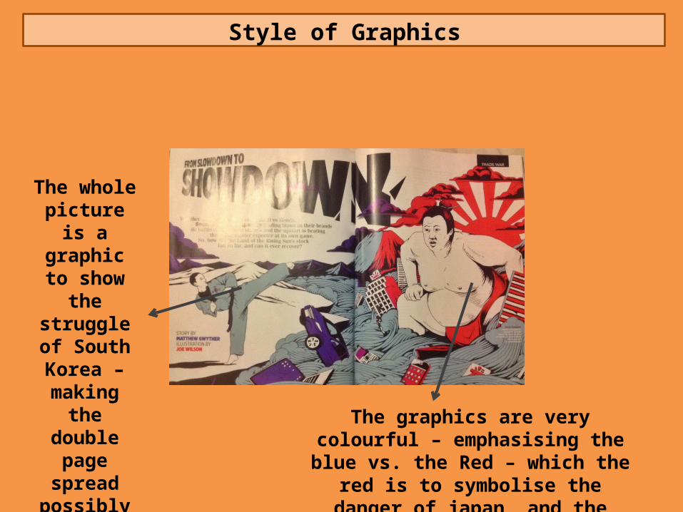
Style of Graphics
The whole picture is a graphic to show the
struggle of South Korea –
making the double page
spread possibly more
appealing The graphics are very colourful – emphasising the blue vs. the Red –
which the red is to symbolise the danger of japan, and the humble South Korea
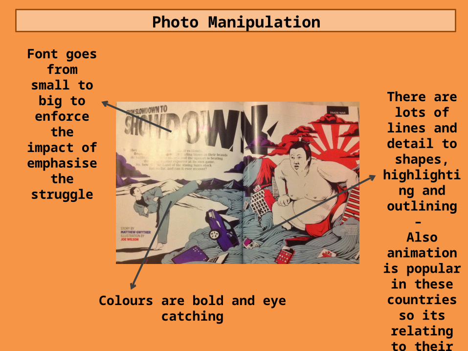
Photo Manipulation
Font goes from small to big to enforce the impact of
emphasise the struggle
Colours are bold and eye catching
There are lots of lines and
detail to shapes,
highlighting and outlining – Also animation
is popular in these
countries so its relating to
their culture
Organisation of Information
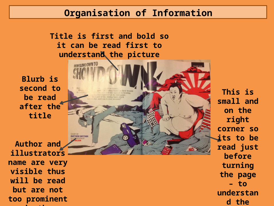
Blurb is second to be read after the
title
Author and illustrators name are very visible
thus will be read but are not too
prominent in the feature
This is small and on the right corner so its to be read just
before turning the page – to
understand the stock flotation
Title is first and bold so it can be read first to understand the picture