ASSESSMENT OF THE URC SUPPORT TO THE TB … · SOP Standard Operating Procedures URC ... Improved...
47
ASSESSMENT OF THE URC SUPPORT TO THE TB PROGRAM OF SOUTH AFRICA Dr Venanzio Vella, Senior Epidemiologist, Consultant URC 13 th September 2012
Transcript of ASSESSMENT OF THE URC SUPPORT TO THE TB … · SOP Standard Operating Procedures URC ... Improved...

ASSESSMENT OF THE URC SUPPORT TO THE TB PROGRAM OF SOUTH AFRICA
Dr Venanzio Vella, Senior Epidemiologist, Consultant URC
13th
September 2012

2
ACRONYMS
DOTS Directly Observed Treatment Short course
DR-TB Drug Resistant Tuberculosis
ETR Electronic TB Register
MDR-TB Multi Drug Resistant Tuberculosis
M&E Monitoring & Evaluation
NDOH National Department of Health
NGO Non Governmental Organization
SOP Standard Operating Procedures
URC University Research Co

3
ACKNOWLEDGEMENT
Several URC staff contributed to this report including
Dr Mpho Ratshikana (Chief of Party)
Dr Claudio Marra (DR Technical Advisor),
Ms Vimbai Mkwambeni (Monitoring and Evaluation Officer),
Mr Reginald Pule (Data Capturer),
The following TB Expansion Coordinators: Ms. Thandeka Dayimani, Ms. Fikile Dlongolo, Ms.
Cindy Dladla, Ms. Tumi Mbengo and Mr. Bonginkosi Khumalo,
Provincial Coordinator: Ms Nomsa Sebitlo
Mr. Sicelo Dlamini, Director of Research, Information, Monitoring, Evaluation and Surveillance
(RIMES) of the National TB Control Program (NTCP).
The URC Office was very efficient in providing logistic support.
USAID supported and funded the evaluation.

4
SUMMARY
This report is covering two topics. The first one is the assessment of the monitoring and evaluation
(M&E) system of the URC support project to the TB program in South Africa. The second topic is
the assessment of the children's data of the Electronic TB Register (ETR). Both topics are related
to the use of data for M&E, with a particular emphasis on the methodological aspects of data
reliability check and on the methodological issues. These include the complexity of evaluating the
link between the URC support and TB treatment outcomes.
URC SUPPORT
The overall M&E strategy was assessed and the data were reviewed. URC has been providing
support to the TB program at national, provincial, district and facility level and in 100 champion
facilities. The analysis considered the following data sets: (a) PEPFAR indicators that were
collected in 61 facilities between October 2008 and August 2011; (b) data from the Electronic TB
Register from 20 districts under URC support between Q1 2009 (January to March 2009) and Q1
2012 (January to March 2012); and (c) data on case finding, smear conversion and treatment
outcomes from 19 champion facilities between Q1 2010 (January to March 2010) and Q2 2011
(April to June 2011).
The results showed an improvement of the HIV and TB indicators. The PEPFAR indicators, which
were focused on HIV screening among outpatients and TB patients, showed an increase in
coverage. The 20 districts showed a positive trend in bacteriological coverage and in treatment
outcomes. Even more promising was the trend in treatment outcomes in the 19 champion facilities
that had the most complete data set.
This analysis has shown how the data should be used to take into account several methodological
issues when analyzing TB indicators. This is particularly important in the context of the support
of the URC to the TB program, part of which is to provide technical assistance in M&E.
The first constraint was the absence of a control group. Ideally the control group should have been
selected at the beginning of the project. As no control group was available, internal control groups
were created by dividing the 19 districts into three groups characterized by their different length of
support.
Of the 100 champion facilities, 19 had sufficient continuous data for 6 quarters and they were
analyzed as a whole group. The first assessment was about the data reliability and the
identification of outliers to better understand the trends of the indicators. All indicators related to
case finding and treatment outcomes improved between Q1 2010 and Q2 2011, but it will be
necessary to find a control group to strengthen the link between the project and the treatment
outcomes. One solution would be to match project facilities with facilities extracted from the
national ETR according to baseline indicators.
This could be done by ranking all the South African facilities present in the ETR according to a key
treatment outcome indicator (e.g. success rate). Non-project Facilities will be then matched with
the champion facilities supported by URC according to the same treatment outcome indicator. This
would allow to compare the trends occurred after the baseline in the control and supported facilities.

5
Conclusions & Recommendations
It will be necessary to design a stronger M&E strategy to cover the areas mentioned below.
Annual Work plan Indicators
The Provincial Coordinators, besides writing field reports, should adopt a standardize checklist to
update the indicators of the Annual Work plan. The M&E Officer should organize indicators
according to a hierarchical structure in such a way that the most critical ones will function like a
dashboard to reflect the status of each domain. The indicators of the dashboard will provide a better
alert system to take action when targets are not reached.
Champion Facilities
Standard operating procedure (SOP) should be produced on the criteria to select and drop champion
facilities, on the data collection, data quality check and indicators' interpretation.
The M&E officer should organize and update a data archive related to the champion facilities since
their baseline. This will avoid losing a few facilities that have been dropped off in the past and will
provide an institutional memory and a consistent basis for the analysis.
The Provincial Coordinators should begin collecting individual data from the TB register of the
champion facilities, replacing the present system of manually counting quarterly case finding, smear
conversion and treatment outcomes.
The M&E officer should check the reliability of incoming data according to the method outlined in
Annex I. The missing data and the outliers should be communicated to the Provincial Coordinators
who will correct them during their visits to the champion facilities.
The Provincial Coordinators should use a standardized facility module to monitor management
indicators. These could include: (a) task analysis on the time and procedures taken by the staff
during the various phases of the TB case finding and treatment; (b) assessment of expenditures from
the clinics' accounting records; (c) presence of stock outs and other management problems; (d)
follow up on the decisions agreed upon during the previous visits; and (e) update of key variables
collected during the baseline of management indicators.
Analytical strategy
The national ETR should be analyzed to rank all the facilities in South Africa by success rate to
constitute a control group to be matched with champion facilities according to baseline success rate.
An analytical strategy on how to use the information coming from the districts, sub-districts and
champion facilities should be outlined. For example, it should be clarified how the information on
baseline management indicators will be analyzed to improve management and to identify critical
factors explaining the variation in performance. There are certain analytical techniques such as
nonlinear principal component analysis which could be used to produce facility profiles according
to management characteristics. These facility profiles could contribute to understand the link
between management and performance, providing a better understanding on the type of support

6
required to improve management. The analysis could be also used to create a better system to rank
facilities according to performance.
The analytical strategy should clarify how data should be used to monitor progress. The present
system of presenting the data by district by extrapolating from a few facilities is misleading because
the champion facilities do not represent the districts. The data should be presented by groups of
facilities according to the length of support, which is including different districts.
CHILD TB INDICATORS FOR 2010
According to the request of the National TB Control Program, an analysis of the National TB
Electronic Register was carried out to analyze the data related to the children aged 0 to 7 years old.
The first data quality check was carried out on the age estimation, as this was critical to the
extraction of the subsample to carry out the analysis on children. The variable "AGE" as recorded
in the ETR was validated against the age estimated from the date of birth and the date of treatment.
This allowed to find out that 15% of children had their age miscalculated and to reassign them to
the correct age.
Once the subsample of records related to children 0-7 years old were extracted for 2010, a
reliability check allowed to find out other inconsistencies. The most relevant ones were related to
patient's categories, MDR diagnosis, disease classification, smear conversion and treatment
outcomes. The inclusion of transfers among the treatment outcomes caused under-estimation of
success rates which varied across districts and sub-districts.
There was a high frequency of "not evaluated" among treatment outcomes. Unknown outcomes
were 38% at the national level, with KZN having the lowest frequency of not evaluated (23%) and
Limpopo having the highest one (66%). This variability in unknown outcomes makes any
comparison across provinces very difficult. The highest concentration of "not evaluated" was for
children aged 0-4 years while it was quite low between 5 and 7 years of age.
Conclusions and Recommendations
This preliminary analysis has suggested that a data quality check should be conducted for the ETR
for a period covering at least the last 5 years. This would allow to confirm if the inconsistencies
found for the children's records related to 2010 is widespread. This will be done by setting similar
validation rules used in this analysis to recuperate inconsistent data.
After this preliminary data cleaning the indicators related to diagnosis and treatment outcomes will
be estimated. This will allow to validate the statistics published in the past and to improve the
estimation of past trends. The analysis will take into account the methodological issues of
including/excluding transfers among the outcomes and will identify how districts and sub-districts
might have been affected in their past performance. Other outputs of this analysis will be the
identification of factors that have influenced the variation in treatment outcomes.
7
Introduction
The USAID TB Project, a five-year, cooperative agreement, was awarded to the University
Research Co., LCC (URC) led partnership on September 30, 2009. In South Africa, the project
provides support to the national, provincial, district and facility level through key experts and
Provincial Coordinators. The project covers 23 districts across the 9 provinces of South Africa and
100 champion facilities, and is composed of the following domains:
(a) Increased quality of services through DOT, support to MDR-TB and PHC strengthening;
(b) Increased availability of TB services by addressing TB/HIV, MDR-TB and the needs of
vulnerable populations;
(c) Increased demand of TB services by empowering people with TB and fostering community
participation in TB care, prevention and health promotion by providing grants to NGOs;
(d) Improved Management of TB support;
(e) Testing new DOTS approaches.
Objectives
This report has two objectives. The first one is to assess the Project's Monitoring & Evaluation
(M&E) system used by URC and to analyze the data from the districts and champion facilities
covered by the project. The second objective is to review the national data on children recorded in
the ETR as requested by the National TB program.
Report structure
The report is organized into two sections covering the two above mentioned objectives. The first
section is focused on the M&E system of the URC project while the second section is covering the
analysis of the children records of the national ETR.

8
SECTION I URC SUPPORT
The framework of the URC M&E system is provided by the Annual Work plan. The latest Work
plan covers the period October-September 2012, with each domain being disaggregated into
activities with related outputs and targets.
The backbone of the M&E system is constituted by the Provincial Coordinators. Besides providing
support to the provinces, districts and selected facilities in the several domains of the project, the
coordinators compile field reports that update the status of the activities. Although the field reports
are quite detailed in describing the situation, they could be better standardized to reflect the format
of the table of indicators of the Annual Work plan. This would avoid that these indicators remain
unfilled up to the last moment before the annual report.
The other major contribution from the coordinators in the field of M&E is the updating of indicators
coming from the champion facilities. These facilities were selected according to poor performance
and some of them were dropped according to low workload and lack of cooperation. However a
standardized guideline on entry and exit criteria was not available and this might have caused
certain subjectivity in selecting and dropping the facilities. In addition to this, the Provincial
Coordinators render data quality support at district and provincial level. This is done through
conducting joint (with DOH staff) data validation exercises on the Electronic TB register and the
District Health Information system (DHIS).
The first observation is that the indicators' framework of the Work Plan is well structured but there
are no details on how the indicators are to be collected. The indicators are a mix of one shot and
continuous activities which can be partly filled by extracting the information from the field reports
but this would only partially fill all the boxes of the Indicators' Table of the Annual Work plan. It
is therefore necessary for the provincial coordinators to fill the indicators in a standardized way
during their field visits.
The outcome and impact indicators are collected at district and champion facility level. The
district data are related to case finding, smear conversion and treatment outcomes and are derived
from the Electronic TB Register (ETR). The champion facility data are instead derived from the
manual counting of the TB registers.
Methodology
The PEPFAR indicators that were analyzed in this report are related to HIV indicators. These
include HIV screening among outpatients attending clinics and among TB patients. Of the 264
facilities that collected these indicators, 61 were considered in this analysis because they had
continuous information between Q10 2008 and Q10 2011.
The districts and the facilities that received support from the project should not be treated as a
homogeneous group but as separate groups according to the length of support. The hypothesis to
be tested was that the project activities had directly or indirectly produced an impact on the TB
indicators. The effect has been likely occurred first in the champion facilities because they have
received a direct support, the intensity of which varied according to the length of support. The
districts had a variable length of support and thus they might have benefited differently from the
project according to when activities started.
9
The districts and the facilities were clustered according to the above mentioned rationale. Tables 1
and 2 provide the timeline when districts and champion facilities were followed up. The districts
were clustered into the following group: (a) since October-December 2009; (b) since October-
December 2010, and since July-September 2011. Group (b) and (c) form a sort of internal control
groups to group (a) because of their later entry. In the case of the champion facilities it was
possible to create one group of 19 units which had full sets of data covering the period between Q1
2010 and Q2 2011, while the other facilities has insufficient data to create internal control groups.
Table 1 District support period
Province GROUP 1
(since Oct-Dec 2009)
GROUP 2
(since Oct-Dec 2010)
GROUP 3
(since July-Sept 2011)
Eastern Cape Amathole
NMBM
KZN eThekwini uMkhanyakude uMgungundlovu
Zululand
Mpumalnga Nkangala Gert Sibande
Limpopo Waterberg
Limpopo Sekhukhune
Gauteng Sedibeng
North West Mafikeng
North West Matlosana
North West Greater Taung
North West Ventersdorp
North West Zeerust
Free State Motheo
Fezile Dabi
Lejweleputswa
Northern Cape Siyanda
Table 2 Facility Support Period

10
The indicators were those related to the Suspects and the TB registers. At the district level, the
indicators were derived from the ETR and thus were those ones used by the TB program. At the
facility level there was instead an active data gathering by the provincial coordinators who during
their regular visits were using the TB suspects and TB registers.
As the TB program indicators are based on a cohort approach, the influence of the project in the
three groups of districts depends on the time each cohort was under the support. As only new SM+
cases are presented and most of them are assumed to be sensitive to treatment, a cohort starting
treatment in Q4 2009 is assumed to convert in Q1 2010 and to become treated in Q2 2010.
Therefore, in Group 1, at the time of baseline (Q4 2009), the following cohorts converged: Q4 2009
for bacteriological coverage, Q3 2009 for smear conversion and Q2 2009 for treatment outcome.
Similarly, in Q4 2010 and in Q3 2011 several cohorts converged to form the Group 2 and Group 3.
Although it is impossible to set a date when the influence of support started to take effect, using the
above rationale helps to make comparisons across the district groups.
Results
Results are shown for the PEPFAR indicators, the three groups of districts and the 19 champion
facilities. For PEPFAR, the indicators are shown for outpatients and TB patients. For the districts
and the champion facilities, the indicators are shown for new cases only because the retreated had
similar results for the districts and because they were not available for the champion facilities.
PEPFAR indicators outpatients
The indicators related to the outpatients show a positive trend with an increasing uptake of HIV
testing. Almost all of those who were offered counseling and testing (C&T) accepted to be tested
for HIV. The prevalence of HIV among outpatients who accepted to be tested declined from 35%
to 20%, which is unlikely to be due to a real decline of prevalence in such a short period.
The reasons for such a decline are unclear, but it cannot be excluded that the outpatients' population
accepting to be tested in 2008-09 differed from that one of 2010-11. As in any activity that is based
on willingness to be tested, the characteristics of the early participants might differ from
participants at later dates. For example, the support given to the champion facilities by the project
might have been accompanied by a more intensive effort to convince outpatients to undergo testing.
In the initial period, the acceptors might have been a more risky group than in the later period and
this might have produced a spurious decline of HIV prevalence among those accepting to be tested.
Another potential explanation could be a higher uptake of tested patients in 2010-11 in facilities
located in areas characterized by lower HIV prevalence.
11
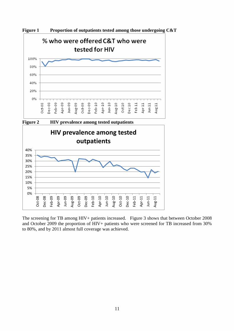
Figure 1 Proportion of outpatients tested among those undergoing C&T
Figure 2 HIV prevalence among tested outpatients
The screening for TB among HIV+ patients increased. Figure 3 shows that between October 2008
and October 2009 the proportion of HIV+ patients who were screened for TB increased from 30%
to 80%, and by 2011 almost full coverage was achieved.
0%
5%
10%
15%
20%
25%
30%
35%
40%
Oct
-08
Dec
-08
Feb
-09
Ap
r-0
9
Jun
-09
Au
g-0
9
Oct
-09
Dec
-09
Feb
-10
Ap
r-1
0
Jun
-10
Au
g-1
0
Oct
-10
Dec
-10
Feb
-11
Ap
r-1
1
Jun
-11
Au
g-1
1
HIV prevalence among tested outpatients

12
Figure 3 Proportion of HIV+ who were screened for TB symptoms
The prevalence of TB symptoms among HIV+ patients declined. Although the data show wide
fluctuations, especially at the end of 2008, there is a clear declining trend. The reason might be
due to the intensive efforts of including all HIV+ patients with the results that many more HIV+
patients were captured at a stage when they had not yet developed TB symptoms. This is a good
sign that the screening efforts are reaching the objective of capturing patients at an earlier stage.
Figure 4 Proportion of HIV+ patients who were suspect for TB
HIV+ who were diagnosed with TB were well covered by TB treatment. The trend shows high
fluctuations and if the initial period is excluded because of unreliability of data, the coverage varied
between 70% and 90% between June 2009 and August 2011.
0%
10%
20%
30%
40%
50%
60%
70%
Oct
-08
Dec
-08
Feb
-09
Ap
r-0
9
Jun
-09
Au
g-0
9
Oct
-09
Dec
-09
Feb
-10
Ap
r-1
0
Jun
-10
Au
g-1
0
Oct
-10
Dec
-10
Feb
-11
Ap
r-1
1
Jun
-11
Au
g-1
1
%HIV+ who were Suspect for TB

13
Figure 5 Proportion of co infected HIV/TB patients who started TB treatment
PEPFAR indicators TB patients
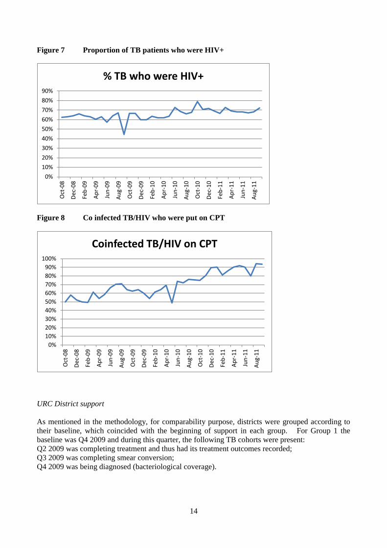
The coverage of HIV screening has also improved among TB patients. Between September 2008
and September 2011, the coverage of HIV testing among all the TB patients registered for treatment
has varied between 70% and 90%, while the HIV prevalence varied between 60% and 70%, if the
outliers (e.g. August 2009) are excluded. The most promising finding was that CPT coverage
among co-infected TB/HIV patients increased from 50% to almost 100%.
Figure 6 Proportion of TB patients who were HIV tested
0%
10%
20%
30%
40%
50%
60%
70%
80%
90%
100%
Oct
-08
Dec
-08
Feb
-09
Ap
r-0
9
Jun
-09
Au
g-0
9
Oct
-09
Dec
-09
Feb
-10
Ap
r-1
0
Jun
-10
Au
g-1
0
Oct
-10
Dec
-10
Feb
-11
Ap
r-1
1
Jun
-11
Au
g-1
1
% HIV+ with TB starting Treatment
0%
10%
20%
30%
40%
50%
60%
70%
80%
90%
100%
Oct
-08
Dec
-08
Feb
-09
Ap
r-0
9
Jun
-09
Au
g-0
9
Oct
-09
Dec
-09
Feb
-10
Ap
r-1
0
Jun
-10
Au
g-1
0
Oct
-10
Dec
-10
Feb
-11
Ap
r-1
1
Jun
-11
Au
g-1
1
% TB patients tested for HIV
14
Figure 7 Proportion of TB patients who were HIV+
Figure 8 Co infected TB/HIV who were put on CPT
URC District support
As mentioned in the methodology, for comparability purpose, districts were grouped according to
their baseline, which coincided with the beginning of support in each group. For Group 1 the
baseline was Q4 2009 and during this quarter, the following TB cohorts were present:
Q2 2009 was completing treatment and thus had its treatment outcomes recorded;
Q3 2009 was completing smear conversion;
Q4 2009 was being diagnosed (bacteriological coverage).
0%
10%
20%
30%
40%
50%
60%
70%
80%
90%
Oct
-08
Dec
-08
Feb
-09
Ap
r-0
9
Jun
-09
Au
g-0
9
Oct
-09
Dec
-09
Feb
-10
Ap
r-1
0
Jun
-10
Au
g-1
0
Oct
-10
Dec
-10
Feb
-11
Ap
r-1
1
Jun
-11
Au
g-1
1
% TB who were HIV+
0%
10%
20%
30%
40%
50%
60%
70%
80%
90%
100%
Oct
-08
Dec
-08
Feb
-09
Ap
r-0
9
Jun
-09
Au
g-0
9
Oct
-09
Dec
-09
Feb
-10
Ap
r-1
0
Jun
-10
Au
g-1
0
Oct
-10
Dec
-10
Feb
-11
Ap
r-1
1
Jun
-11
Au
g-1
1
Coinfected TB/HIV on CPT

15
The above rationale is justified by the fact that the indicators are presented for new smear positive
patients most of which should respond by smear converting after three months and by completing
treatment by six months.
The other baselines were Q4 2010 for Group 2 and Q3 2011 for Group 3. Following the same
rationale, the bacteriological coverage was related to the cohorts of Q4 2010 and Q3 2011 for
bacteriological coverage of Group 2 and 3 respectively. Smear conversion was related to the cohort
of Q3 2010 and Q2 2011 for Group 2 and 3 respectively, while the treatment outcomes were related
to the cohort Q2 2010 and Q1 2011.
The following figures represent for each indicator the trends in the three districts' groups, with a
blue dot indicating the baseline cohort. Group 1 had a static coverage of 60%- 65% before the
baseline, while between the beginning of 2010 and the end of 2011, the bacteriological coverage
increased to more than 85%. Group 2 had a similar static trend before the baseline, with
bacteriological coverage remaining around 65%-70% before Q1 2011, but after Q4 2010
bacteriological coverage increased from 68% to 79%. Also Group 3 had a substantial increase in
coverage but its trend was already increasing before the baseline and it remained around 90% after
Q3 2010, when the project's support started.
Figure 9 Districts bacteriological coverage
As smear conversion is at 3 month, the baseline cohorts for this indicator in the three groups are
preceding of one quarter the cohorts for bacteriological conversion. The comparison of the three
groups should be as follow; Q3 2009 onwards for Group 1, Q3 2010 onwards for Group 2 and Q2
2011 onwards for Group 3. Also in this case the baseline quarterly cohorts for smear conversion
are indicated by blue dots, which divide the trends into pre-support and support period. The trends
in conversion rates showed a random pattern moving between 60-70% in Group 1, 75-80% in
Group 2, and 75-85% in Group 3.

16
Figure 10 New Smear + conversion rate
Cure and success rates improved in all the districts' group (Figures 11-12). As for most cohorts of
new SM+ cases it takes 6 months to complete treatment, the division between pre-support and
support period is the following: Q2 2009 onwards for Group 1, Q2 2010 for Group 2 and Q1 2011
for Group 3. Group 1 increased its cure rate from 60% to 70%, Group 2 increased its cure rate
from 70% to 75% while for Group 3 it was too early to register any treatment rate because the last
quarter of Q1 2011 was just ending the treatment at the time of the baseline. Treatment success
rates improved as well reaching a level near 80% in all the three groups in Q1 2011.
Figure 11 New Smear+ Cure Rate
50%
55%
60%
65%
70%
75%
80%
85%
90%
95%
100% Q
1:2
00
9
Q2
:20
09
Q3
:20
09
Q4
:20
09
Q1
:20
10
Q2
:20
10
Q3
:20
10
Q4
:20
10
Q1
:20
11
Q2
:20
11
Q3
:20
11
Q4
:20
11
Group 1 Since Oct-Dec 2009
Group 2 Since Oct-Dec 2010
Group 3 Since Jul-Aug 2011
New Smear + Conversion Rate

17
Figure 12 New Smear+ Success Rate
Champion facilities
Of the 100 champion facilities enrolled in the project, only 19 had complete data for a few quarters
covering the period between Q1 2010 and Q2 2012 and thus the analysis has been limited to this
subsample, without disaggregation between individual facilities.
To check the quality of the data, quarterly frequency distributions were run for all the data elements
constituting the numerators and denominators of the indicators. This allowed identifying outliers
that were more than 100% or less than 50% of the quarterly average for each facility for the period
considered for the analysis. Once the quarterly outliers were identified, their influence on the
indicators were assessed and if the outliers exceeded the above mentioned cut off points, they were
substituted with the quarterly average for the data element of the specific facility (see Annex II).
Table 3 represents how the cohorts in a facility moved through case finding, smear conversion and
treatment outcomes. For example the 19 cases forming the first cohort of the baseline October-
December 2009 (Q4 2009) are reported as 19 in the section of the conversion rate and as 19 in the
section of the treatment outcomes. However, there were some cohorts that began with a certain
number as case finding and ended up with a lower number in the smear conversion and treatment
outcomes sections of the table (underlined with a circle).
The above inconsistencies are due to the fact that the numbers were counted manually from the
registers during the follow up visits. This method is prone to error and produce wide fluctuations
of the numerators and denominators of the indicators, making the trends not always comparable.
Therefore, the first data quality check was to measure the quarterly variation in the data elements.

18
Table 3 Example of data mismatch in one champion facility
Table 4 shows as an example the variation around the mean for the number of outpatients. Each
cell of the table shows the number of outpatients per quarter per facility and the last column
represents the facility quarterly average. As a rule of thumb reporting a number exceeding twice
(+100%) the average or less than half (-50%) the average is considered unlikely, unless proven
otherwise. Therefore, any outlier should be checked by recounting the numbers in the registers and
confirming that such increase is real and not due to mistakes. One example of a reporting over
100% above the average is Empumelweni (Extension 10 Clinic) that reported 93,536 outpatients in Q3
2010 versus an average of 22,943.
This substantial increase is visually evident in Fig 13 representing the variation above and below
the quarterly average. The outlier reported by Empumelweni (Extension 10 Clinic) is represented
by the bar reaching +300% or three times the quarterly average. This outlier should have been
corrected because it influenced the total outpatients aggregate for Q3 2010 (bottom of the Table),
which was 295,756 against an overall quarterly average of 246,256. As the indicator "suspect rate"
is calculated by dividing the number of suspects for TB by the number of outpatients, the artificial
increase of the number of outpatients in Q3 caused by the outlier inflated the denominator of Q3
and reduced slightly the suspect rate in Q3 as shown in Fig 14. Annex I provides the details of the
method to identify outliers.
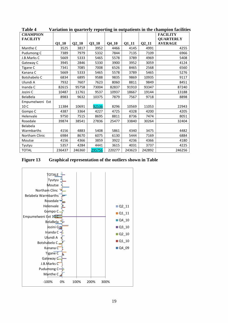
19
Table 4 Variation in quarterly reporting in outpatients in the champion facilities CHAMPION
FACILITY
Q1_10 Q2_10 Q3_10 Q4_10 Q1_11 Q2_11
FACILITY
QUARTERLY
AVERAGE
Manthe C 3525 3817 3952 4466 4145 4991 4255
Pudumong C 7389 7979 5332 7844 7135 7109 6966
J.B.Marks C 5669 5333 5465 5578 3789 4969 5408
Gateway C 3945 2846 5330 3900 3952 3059 4124
Tigane C 7341 7085 7008 6526 8465 2568 6560
Kanana C 5669 5333 5465 5578 3789 5465 5276
Botshabelo C 6834 6895 9588 9835 9869 10935 9117
Ulundi A 7932 7607 7623 8060 8811 9849 8451
Inanda C 82615 95758 73004 82837 91910 93347 87240
Jozini C 10487 11761 9537 10937 18667 19144 13188
BelaBela 8983 9632 10375 7879 7567 9718 8898
Empumelweni Ext 10 C 11384 10691 92536 8296 10569 11053 22943
Gompo C 4387 3364 4227 4725 4328 4200 4205
Helenvale 9750 7515 8695 8811 8736 7474 8051
Rosedale 39874 38541 27836 25477 33840 30264 32404
Belabela Warmbarths 4156 4883 5408 5861 4340 3475 4482
Northam Clinic 6984 8670 6075 6130 5444 7169 6884
Moutse 4156 4366 3859 3922 4236 4366 4180
Tyutyu 5357 4284 4441 3615 4031 3737 4225
TOTAL 236437 246360 295756 220277 243623 242892 246256
Figure 13 Graphical representation of the outliers shown in Table
-100% 0% 100% 200% 300%
Manthe C
Pudumong C
J.B.Marks C
Gateway C
Tigane C
Kanana C
Botshabelo C
Ulundi A
Inanda C
Jozini C
BelaBela
Empumelweni Ext 10 C
Gompo C
Helenvale
Rosedale
Belabela Warmbarths
Northam Clinc
Moutse
Tyutyu
TOTALE
Q2_11
Q1_11
Q4_10
Q3_10
Q2_10
Q1_10
Q4_09

20
Figure 14 TB Suspect rate in the group of 19 champion facilities
TB detection
Almost every outpatient having symptoms of TB was tested (Figure 15). The testing rate was high,
varying between 95% and 97%. The proportion of smear positivity rate varied between 11% and
14%.
Figure 15 Proportion of TB Suspects who were tested and who were SM+
The information about the laboratory 48 hour turnaround time was patchy. Because of the many
missing values it was not possible to estimate the trends for the whole sample and the results are
presented by facility (Figure 16). Besides the problems related to incomplete information, there
was a high variation across champion facilities. Some of them improved and then deteriorated their
turnaround time, other sites maintained a high turnaround time but with a wide variation across
quarters. Other facilities (e.g. Jozini Clinic) maintained a consistently lower turnaround than other
facilities.

21
Figure 16 48-hour turnaround rate of smear tests
The coverage of smear testing increased. Fig 17 shows that the proportion of new PTB without
smear decreased by more than half, from 30% to 12% and the SM positivity rate increased from
40% to 50%, although there were wide fluctuations due to reporting problems.
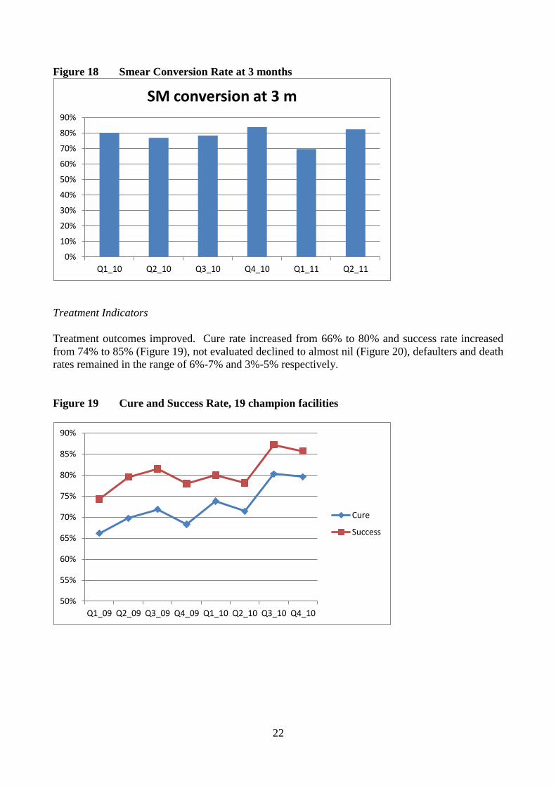
There was an increase in treatment coverage of smear positive cases. The proportion of TB SM+
that started TB treatment varied between 77% and 92%. The smear conversion rate at 3 months
varied between 70% and 82%.
Figure 17 Proportion of TB SM+ who started treatment
0.00%
10.00%
20.00%
30.00%
40.00%
50.00%
60.00%
70.00%
80.00%
90.00%
100.00%
Q1_10 Q2_10 Q3_10 Q4_10 Q1_11 Q2_11
Manthe C
Pudumong C
J.B.Marks C
Gateway C
Tigane C
Kanana C
Ulundi A
Inanda C
Jozini C
Mbazwana C
Dimbaza CHC
Mbalenhle Ext14
0%
10%
20%
30%
40%
50%
60%
70%
80%
90%
100%
Q1_10 Q2_10 Q3_10 Q4_10 Q1_11 Q2_11 Q3_11
TB SM+ starting treatment
22
Figure 18 Smear Conversion Rate at 3 months
Treatment Indicators
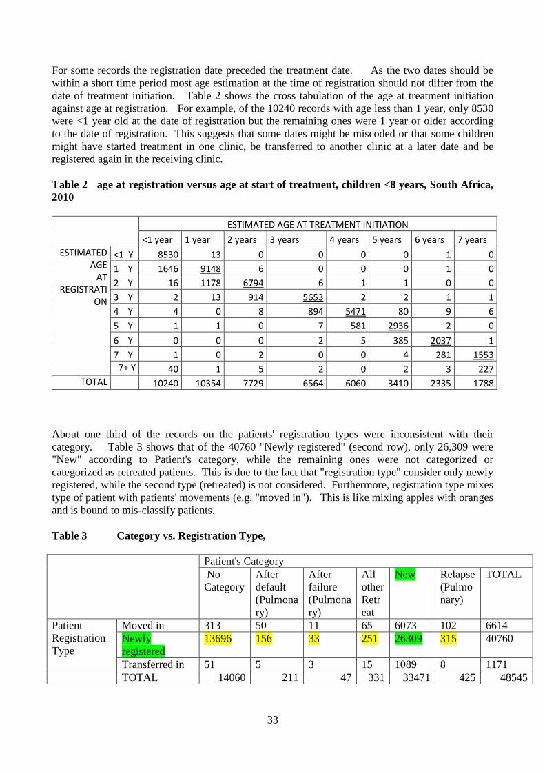
Treatment outcomes improved. Cure rate increased from 66% to 80% and success rate increased
from 74% to 85% (Figure 19), not evaluated declined to almost nil (Figure 20), defaulters and death
rates remained in the range of 6%-7% and 3%-5% respectively.
Figure 19 Cure and Success Rate, 19 champion facilities
0%
10%
20%
30%
40%
50%
60%
70%
80%
90%
Q1_10 Q2_10 Q3_10 Q4_10 Q1_11 Q2_11
SM conversion at 3 m
50%
55%
60%
65%
70%
75%
80%
85%
90%
Q1_09 Q2_09 Q3_09 Q4_09 Q1_10 Q2_10 Q3_10 Q4_10
Cure
Success

23
Figure 20 Proportion of TB patients who were not evaluated
HIV
A few HIV indicators were collected from the TB register. Coverage of HIV testing for TB
patients varied between 50% to 100% (Figure 21) suggesting that this indicator is unreliable and
should be rechecked for outliers. HIV prevalence among TB patients varied between 64% and
77% (Figure 22) and CPT coverage among co infected HIV/TB patients increased from 34% to
72% (Figure 23).
Figure 21 Proportion of TB cases with HIV tests
0%
1%
1%
2%
2%
3%
3%
4%
4%
5%
Q2_09 Q3_09 Q4_09 Q1_10 Q2_10 Q3_10 Q4_10 Q1_11
not evaluated
0%
10%
20%
30%
40%
50%
60%
70%
80%
90%
100%
Q1_10 Q2_10 Q3_10 Q4_10 Q1_11 Q2_11 Q3_11
% TB cases with HIV results

24
Figure 22 HIV+ prevalence among TB patients
Figure 23 Confected HIV/TB patients put on CPT
Discussion
This analysis has reviewed the M&E system used by the URC in their support to the South Africa
TB control program. This has included the overview of the M&E strategy, the data quality checks,
the interpretation of the statistical outputs and the methodological problems in directly linking the
activities of the project to the trends in treatment outcomes. The identification of the strengths and
weaknesses of the M&E system can be used to plan the way forward for the next two years.
The rationale of the project is to give enhanced support at the macro and micro level. Technical
assistance is provided to the national, provincial and district level in the area of planning,
management, training, M&E. At the micro level, support is provided to champion facilities to
strengthen capacity in using the information to enhance effectiveness of TB and HIV programs.
0%
10%
20%
30%
40%
50%
60%
70%
80%
90%
Q1_10 Q2_10 Q3_10 Q4_10 Q1_11 Q2_11
% HIV+
0%
10%
20%
30%
40%
50%
60%
70%
80%
Q1_10 Q2_10 Q3_10 Q4_10 Q1_11 Q2_11

25
The project has been gradually expanded to 23 districts and 100 champion facilities, but the
duration of coverage varied. As a result, the district and champion facilities covered in different
time periods should be considered as different groups to be analyzed separately as has been done in
this assessment.
This analysis has taken into account the quality of the data and the results coming from the districts
and from the champion facilities. Outliers were identified according to the method described in
Annex I, which can be utilized by the URC staff to check the quality of the incoming data so that
outliers can be corrected. The data collectors should be made aware of the effect that the outliers
have on the reliability of the indicators and the need to first identify and correct outliers before
trying to interpret the trends.
There was evidence that the TB indicators have been improving in the supported districts and
facilities. Bacteriological coverage and treatment outcomes increased in the groups of districts that
were supported. In the 19 champion facilities covered in this analysis, cure rates increased from
66% to 80% and success rate increased from 74% to 85%, the proportion of patients who were not
evaluated declined to almost zero, coverage of co-infected TB/HIV patients with CPT more than
doubled from 34% to 72%.
The major limitation was that only 19 facilities had sufficient data and no control group was
available. The results may be made more robust when all the 100 champion facilities could be
included in the final analysis at the end of the project. The final evaluation should strive to show a
convincing link between project activities and impact, by having an analytical strategy on how best
to use the information and by adding a control group of districts and facilities that are not supported.
Way forward
The findings have identified the gaps to be covered during the remaining life time of the project.
These include a strengthened M&E strategy, a more reliable data collection system through data
quality control, an analytical strategy and a better interpretation of the data.
M&E strategy
The project provides support at national, provincial, district and facility level to improve several
domains of the TB program. These domains (e.g. quality, demand) and the relative indicators of
the Annual Work plan are at the basis of the M&E system. The monitoring of inputs and outputs
indicators is carried out by URC staff during field visits and it is in the form of field reports.
Outcome and impact indicators are monitored through the ETR (for the districts) and by collecting
registers' information in the champion facilities.
The objective of the M&E system should be to draw lessons from what has been occurring in the
project area. This requires a significant length of time, sufficient variation in project units to
explain why certain units are successful while other are not, a control group, a data management
and analytical strategy to identify what data to be collected, how and for what purpose.
There is insufficient documentation on the M&E methodology and standard operating procedures
(SOP) to implement it. For example, it appears that the district and facilities were selected
according to low performance but no specific written criteria were available on how the ranking
was done. Similarly, some champion facilities were dropped because of low number of patients
and poor cooperation, but standardized guidelines of why and how the facilities should have been
dropped was not available. The absence of SOP on selection and dropping criteria can create

26
subjectivity, ending up with a variety of districts or champion facilities that might not be in line
with the original objective of forming project group(s) with given characteristics.
The absence of a control group does not allow to draw firm conclusions about project's impact.
Any improvement (or deterioration) can occur for reasons other than the project and the absence of
a similar control group does not allow to draw conclusions about the link between changes in the
indicators and the project support. This problem can be solved by selecting a control group of
similar districts and facilities from the national ETR to compare their trends with the trends of the
champion facilities. Finding control districts would be more difficult because these are wide areas
that are not always comparable in terms of baseline characteristics. Furthermore, the link between
the support of the project at the macro level and the trends of a whole district's TB indicators is
much more tenuous than the link between the support at facility level and the change of their
indicators.
Project areas are not homogeneous. At the moment there are several groups of districts and
facilities because several selection criteria were used, including time of entry and exit. This
complicates further the cohort analysis of the TB indicators, as cohorts enter and complete
treatment at different points in time in areas with different length of support. This would require
standard criteria on how to cluster districts and facilities in homogeneous groups, such as baseline
and length of support, and matching criteria for control groups such as baseline success rates.
The overall strategy should also revisit the scope and limitations of the data collection in the
champion facilities to effectively link the project support to the treatment outcomes. It appears that
the strategy of the project was to take mostly the worst performing facilities, and to move to other
facilities when the worst performers had improved. This would have increased the coverage of
facilities, creating a spillover effect on the whole districts.
However the above approach has several problems and champion facilities should be kept until the
end of the project, even if they improve. The first problem is the difficulty of creating a critical
mass of champion facilities that would be powerful enough to drive the improvement of entire
districts. It is likely that within the remaining two years of the project the number of champion
facilities would still be too low to have an overall effect on whole districts. The second problem is
that because champion facilities are selected according to their poor performance, the phenomenon
of the regression to the mean will create a natural improvement because the indicators start from a
low level of performance. It might therefore be possible that the poorest performers will improve
anyway even without an intervention and the issue is to assess what it takes to keep them from
deteriorating again. Therefore, dropping a facility only because its performance has improved will
defeat the whole objective of the project.
There is a need to change the M&E strategy. The first change is to keep the 19 facilities that were
taken into account in this analysis up to the end of the project and possibly to recuperate other
facilities that were dropped. Similarly, the other facilities that have recently entered into the
project should be kept till the end of the project.
The second change of the strategy is to shift the focus from the data collection to the information
use. The real benefit for having champion facilities is to analyze what is working successfully and
less successfully in the clinics so that a management model can be based on field experience and
used at the policy and planning level to improve management of the overall program. The baseline
management indicators should be used to build facility profiles which could explain the variation in
performance. This will be used to identify effectiveness factors that could be at the basis of
management decisions on how to improve the TB program.

27
The fact that there are different groups of districts and facilities should help to capture the reason
for different levels of performance. The factors explaining the variation in performance across
champion facilities can be identified through several analytic tarnishes such as Cox regression
analysis. Once these factors are captured, management and cost-effectiveness modeling could
identify the most cost-effective options to be tested on the whole TB program. This will achieve
the objective of using the champion facilities to improve the overall performance of the TB
program.
Data collection on inputs/outputs
A substantial amount of information is collected at the moment, including the management baseline
and the data update from the TB registers. What is missing is a routine data quality control system
that will help to fill missing data and correct outliers and an analytical framework on how the
information should be used for monitoring and evaluation purpose.
It is therefore necessary to clarify the scope of the M&E system. The Annual Work plan has a
Framework of two types of indicators: (a) inputs and outputs which are under the control of the
project, and the scope of which is to check if the project is on track to reach its targets; (b) treatment
outcomes that are influenced by many factors outside the direct control of the project and the scope
of which is to draw general lessons on how to redirect the TB program strategy. The first type of
indicators has a management scope because they attempt to take immediate action to avoid delays
and thus any failing of these indicators is used to judge the project's performance. The second type
of indicators have a higher scope going beyond the lifetime of the project and the responsibility of
the project is to explain why certain facilities have been more successful than others in improving
outcomes. This would include a more standardized data collection system during the routine visits
to champion facilities and the establishment of an analytical strategy to identify effectiveness
factors that might link project activities to change in performance.
The monitoring system of the project is based on several types of indicators and data sources. If a
hierarchical structure is used, the macro picture is related to what happens at the provincial or
district level, while the micro picture is related to what happens in the facilities. The support given
by the project can also be considered under a different intensity of efforts provided at the macro
level (province, district) and at the micro level (champion facilities). If the assumptions behind the
projects are correct the support given at provincial or district level should slowly improve the
impact of the TB program that should be in the medium/long term transformed into better treatment
outcomes. The support given to the champion facilities is instead more direct and thus its effect
should be visible in a shorter period of time.
There should be a more efficient data gathering. At the macro level, the project established the
FY2012 Workplan, in which a given domain (e.g. IR3 Demand) is contributed by a set of activities
(e.g. grants to NGOs), the progress of which should be monitored through specific indicators
(Number of NGOs receiving grants) to check if targets are met. The indicators related to the inputs
and outputs are provided through field reports compiled by the project staff (e.g. provincial
coordinators), while the case finding and treatment indicators are derived from the routine data
collection system of the TB program.
The field reports from URC staff are informative but they should be accompanied by a more
standardized quantitative updating of the indicators of the FY12 Work plan. Although field
reports are critical to give more details and are essential to go deeper into management aspects, they

28
should be accompanied by a standardized quantification of the indicators related to the FY2012
Work plan.
The provincial coordinators and the other key experts could start filling the boxes of the framework
of the indicators of the Annual Work plan during their field visits. This could be done according to
a check list to update their status in the follow up visits. The Monitoring & Evaluation Officer will
then gather all the updates from the provincial coordinators and other URC staff to reconcile
inconsistencies and interpret the status of the indicators against the targets.
The visits to the champion facilities could provide the opportunity to collect management data to
shed light on the link between project support, changes in management and trends. At the time of
their field visits, the provincial coordinators could fill a check list to monitor how champion
facilities are doing for certain management indicators such as patient/staff ratio, time taken to
conduct certain tasks, stock outs of drugs, follow up on decisions agreed upon during the previous
visits and so on. The information could be analyzed to find associations between management
indicators and treatment outcomes. Further information could be added from secondary sources
(e.g. GIS index for accessibility) which could further enrich the variation in facility profiles.
Data collection on outcomes
The collection of the treatment outcomes at the champions' facilities level could be more efficiently
done by an electronic data entry on the individual records contained in the registers. During the
visits to the champion facilities, the URC staff aggregate the numbers found for the relative quarter
in terms of case detection, case finding, smear conversion, treatment outcomes and HIV indicators.
The manual counting is inevitably associated with mistakes that are reflected in poor reliability and
complicate the comparability across quarters to estimate trends in the TB indicators. The system
should be replaced by a data entry of individual records on a paper module or an excel template
reflecting the same format of the case finding and treatment registers. The data entry should start
with the baseline cohorts of 2009 and after the initial phase of data gathering the updating should be
less time consuming and less prone to errors compared with the present manual counting.
Another alternative to the above individual data entry would be to request access to the ETR to
extract the data related to the champion facilities. This would be value added because the
champion facilities could be compared with the other facilities having similar baseline TB
indicators. Even if the ETR might be affected by data quality issues, it is unlikely that these
problems will affect the comparison of trends between the champion and control facilities. This
comparison between project and matched non-project facilities will help to strengthen the
association between project and impact.
Using the information for action
Although any monitoring system should lead to action, this is not always the case if there is too
much information. The M&E Officer should avoid information overload by prioritizing the
attention to the indicators at the top of the information chain. The sheer number of indicators in the
Annual Work plan might fail to give the broader picture of the overall progress. Indicators should
be organized according to a hierarchical system to visualize the link between the inputs, outputs,
outcomes and impact. The top level indicators of each domain could then be framed on a sort of
dashboard where they will be updated and underlined in different color to flash if the progress of a
given domain is out of track. As in the dashboard of a car, the color of an indicator will suggest
that something is not working properly and there is a need to check the underline problems. It will

29
be at that point that other less important indicators will be checked to monitor what activities are not
on track.
Assessment of project effectiveness
As in any project there are several challenges in evaluating the direct impact of URC support. On
one side the project covered different districts and champion facilities at different points in time, on
the other side there were facilities that were dropped for various reasons. This does not allow to
consider the district and champion facilities covered at the moment as a homogeneous group and
any comparison of trends should be measured only in groups that received the same length of
support. For this reason, the champion facilities taken into consideration in this evaluation were
limited to the 19 that were continuously covered for the longest period.
Although some effects were evident, no conclusion can be drawn without a comparison group.
Because any change in TB indicators could have been due to other factors besides the project, there
is a need to match the champion facilities with similar control facilities.
To make the analysis more robust it could be possible to extract from the ETR register the data
related to champion facilities and similar non-project facilities. As mentioned in the
recommendations this would be done by matching project and control facilities by treatment
outcome (e.g. success rate) at baseline. The matching would eliminate many confounders and
would make conclusions about project impact more plausible.
Conclusions &Recommendation
Information strategy
The project should produce an overall M&E strategy. This should provide objectives, scope and
limitations of the information system, a log-frame of the M&E strategy, methodological issues to be
tackled and Standard Operating Procedures.
There is a need to discuss about hypotheses to be tested and the relevant methodology such as
sampling of project and control areas, with standardized criteria on which districts, sub-districts and
facilities should be selected and on what basis they should be dropped. This is necessary to
understand the rationale behind the selection, to form comparable groups.
The information strategy should be designed to strengthen the link between management and
treatment outcomes. For example, the baseline indicators collected in the champion facilities can
provide a unique opportunity to identify influential factors for effectiveness. These might include
staff, infrastructure, logistics, accessibility and other variables that could be gathered from the
facilities. This could create a certain management profiles (e.g. staff/patient ratios) having a
significant association with outcomes.
The implementation of the strategy will require writing the SOP to standardize the information
system. This includes a hierarchical list of indicators linking inputs/outputs/outcomes/impact,
definition of "quantifiable" numerators and denominators for each indicator, how the indicators
should be used, data sources and standardized data collection procedures, identification and
correction of the outliers, type of analytical outputs to be produced and how they should be
interpreted. The results of this report should give sufficient food for thought to frame the
information strategy.

30
Data gathering
Relevant URC staff should start filling the indicators of the FY2012 Workplan. Besides continuing
producing the field reports, the coordinators and other URC experts should fill the sections of the
indicators of the Table of the Work Plan.
The M&E Officer will receive the indicators updates of the Work Plan and will produce a
hierarchical structure in which the indicators are interlinked according to how they are supposed to
influence a few top indicators. One or two top indicators per domain could be structured in a
dashboard that will provide an overall management tool to monitor progress towards targets. As
with the dashboard of a car flashing orange when the fuel is low, dashboard indicators can be
underlined in colors if their targets are not achieved. This will help management to have an
overall picture of the situation and to flash timely alerts before the problems become entrenched.
Champion facilities
A data archive should be organized to provide an institutional memory of the past and present
support. The data files are presently updated without always keeping track of facilities that have
been dropped that are then disappearing from the system. It will be necessary to cluster the
facilities according to initial and final quarter when they were effectively supported by the project.
This would keep track of all facilities followed up and would create different groups with similar
project exposure. For example, at the moment Helenvale has data for the period Q1 2009 - Q3
2011, this facility will be assigned to the group formed by the other champion facilities that were
covered during the same period.
Introduce the data collection on individual patients' records and define non-project and project
periods. As the champion facilities are regularly visited and the manual counting of the patients in
each cohort is prone to error there is a need to enter individual data on the same basis of the ETR.
This will help avoid mistakes in estimating the TB indicators and will be also used to validate the
indicators produced by the champion facilities according to the manual counting.
The use of the individual recording will also avoid potential problems in mixing patients who start
during a given quarter but might not be end treatment at the same expected dates. With the present
system of manual counting, most of the baselines in the champion facilities were conducted in Q4
2009. During the baseline visit, besides the case finding of Q4 2009, manual counting was carried
out for smear conversion and for treatment outcomes for the cohorts with records available during
the baseline visit. This created the need to define the baseline cohorts for treatment outcome, that
is not standardized because while most facilities with case finding baseline Q4 2009 used as
baseline treatment outcome the cohort Q1 2009 some facilities selected Q4 2008 as baseline
treatment outcome. The data entry of the individual records will automatically allow to extract
electronically a given cohort from diagnosis to treatment outcomes.
Project vs. control facilities
The URC should discuss with the national DOH the possibility of using the ETR to extract a control
group of facilities. For each quarterly cohort, the facilities in the ETR (whole South Africa) can be
ranked according to a specific treatment outcome (e.g. cure rate). Once this is done, for each
quarterly cohort (e.g. Q4 2009) each champion facility having a given treatment outcome at the
time of the baseline will be matched with the control facilities that had the same outcome rate for

31
the same baseline period. This will create project and control groups that will be followed up
historically to check how trends will differ for the remaining lifetime of the project.
Next steps
Write up a detailed M&E strategy. The M&E Officer will have to produce a log frame of the
indicators listed in the Annual Work plan according to their relationship, their level of importance
and their expected influence on the top indicators of the dashboard.
M&E Officer should write Standard Operating Procedures for the definition of each indicator and
how they should be updated in a standardized way by the provincial coordinators and other officers
during their field visit.
Instruct coordinators and other relevant staff to regularly update the indicators outlined in the table
of the Annual Work plan.
The M&E Officer should define standard criteria for selecting or dropping champion facilities and
introduce a Form to collect defined management indicators for the champion facilities.
The M&E Officer should introduce an excel spreadsheet reflecting the format of the TB registers
and to instruct coordinators to conduct a data entry of the individual patients' records for the period
Q1 2008 onwards.
Assignment of facilities and districts to cohort groups according to exposure to project activities
Discuss with NDOH access to ETR to extract the facility data and rank them according to treatment
outcomes.

32
SECTION II TB AMONG CHILDREN IN SA IN 2010
This analysis is related to a specific request from the South Africa TB Control Program to provide
technical assistance in analyzing the ETR records related to the children between 0 and 7 years old1
for 2010. The objective was to provide a method on how to assess the data quality, suggest how to
correct inconsistent data and interpret the results.
The data were extracted from the ETR and the first assessment was about the identification of
problematic data. This was carried out by frequency distribution and cross tabulation of related
variables to identify inconsistencies. The inconsistencies were dealt by establishing validation
rules that could be used to correct the problematic data.
Results
As this analysis was about children, the first issue was to assess the reliability of age estimation.
The "ETR-AGE", that is the age that is recorded by the staff on the relative column of the register at
the time of treatment, was validated against the "estimated-age" from the date at the start of
treatment and the date of birth.
Table 1 shows the cross tabulation between the ETR-AGE (rows) and "estimated-age" (columns).
For example, the first column shows that of the 10,508 records with the estimated-age <1 year
(according to dates of birth and date of treatment), only 8539 were < 1 year old according to ETR-
AGE, while the remaining records under column <1 year old were categorized as 1 year or older
according to ETR-AGE. Similarly, of the 10231 children 1 year old according to the estimated-age
at treatment initiation, 8879 were also classified as 1 year old according to the ETR-AGE but the
remaining records were classified younger or older than 1 by the ETR-AGE. These inconsistencies
could be due to a miscalculation of ETR-age by staff or due to data entry problems. It was decided
to consider the "estimated-age" as the valid one as it is based on the date of birth and on the date of
initiation of treatment. This produced a sample of 48515 children.
Table 1 "AGE" as recorded by the ETR versus age estimated from dates of birth and
registration, children <8 years, South Africa, 2010
ESTIMATED AGE AT TREATMENT INITIATION
<1 year 1 year 2 years 3 years 4 years 5 years 6 years 7 years ETR-AGE
<1 Y 8539 4 0 0 0 0 1 0
1 Y 1919 8879 2 0 0 0 1 0
2 Y 17 1334 6641 3 1 1 0 0
3 Y 1 13 1035 5535 1 2 1 1
4 Y 3 0 6 983 5392 73 9 6
5 Y 1 0 0 5 656 2867 0 0
6 Y 0 0 0 2 5 453 1970 0
7 Y 0 0 2 0 0 5 327 1507 7+Y 28 1 5 2 0 2 2 272
TOTAL 10508 10231 7691 6530 6055 3403 2311 1786
1 This is the reference age group for children used by the TB program
33
For some records the registration date preceded the treatment date. As the two dates should be
within a short time period most age estimation at the time of registration should not differ from the
date of treatment initiation. Table 2 shows the cross tabulation of the age at treatment initiation
against age at registration. For example, of the 10240 records with age less than 1 year, only 8530
were <1 year old at the date of registration but the remaining ones were 1 year or older according
to the date of registration. This suggests that some dates might be miscoded or that some children
might have started treatment in one clinic, be transferred to another clinic at a later date and be
registered again in the receiving clinic.
Table 2 age at registration versus age at start of treatment, children <8 years, South Africa,
2010
ESTIMATED AGE AT TREATMENT INITIATION
<1 year 1 year 2 years 3 years 4 years 5 years 6 years 7 years ESTIMATED
AGE AT
REGISTRATION
<1 Y 8530 13 0 0 0 0 1 0
1 Y 1646 9148 6 0 0 0 1 0
2 Y 16 1178 6794 6 1 1 0 0
3 Y 2 13 914 5653 2 2 1 1
4 Y 4 0 8 894 5471 80 9 6
5 Y 1 1 0 7 581 2936 2 0
6 Y 0 0 0 2 5 385 2037 1
7 Y 1 0 2 0 0 4 281 1553 7+ Y 40 1 5 2 0 2 3 227
TOTAL 10240 10354 7729 6564 6060 3410 2335 1788
About one third of the records on the patients' registration types were inconsistent with their
category. Table 3 shows that of the 40760 "Newly registered" (second row), only 26,309 were
"New" according to Patient's category, while the remaining ones were not categorized or
categorized as retreated patients. This is due to the fact that "registration type" consider only newly
registered, while the second type (retreated) is not considered. Furthermore, registration type mixes
type of patient with patients' movements (e.g. "moved in"). This is like mixing apples with oranges
and is bound to mis-classify patients.
Table 3 Category vs. Registration Type,
Patient's Category
No
Category
After
default
(Pulmona
ry)
After
failure
(Pulmona
ry)
All
other
Retr
eat
New Relapse
(Pulmo
nary)
TOTAL
Patient
Registration
Type
Moved in 313 50 11 65 6073 102 6614
Newly
registered
13696 156 33 251 26309 315 40760
Transferred in 51 5 3 15 1089 8 1171
TOTAL 14060 211 47 331 33471 425 48545

34
The variable MDR was inconsistent with the culture results. The ETR file had a variable "ETR-
MDR" that similarly to ETR-AGE was directly coded by the staff. When ETR-MDR was cross
tabulated against the "culture results" only 4 cases were in accordance with the culture resistance
for both Rifampicin and Isoniazide. The "ETR MDR" missed 105 cases that were resistant to both
Rifampicine and Isoniazide and wrongly coded 13 cases, which were not resistant according to
culture results.
Table 4 MDR according to Culture and as recorded in the ETR, children <8 years,
South Africa, 2010
MDR according to culture
No Yes Total
ETR_MDR No 48423 105 48528
Yes 13 4 17
Totale 48436 109 48545
There were some inconsistencies between the Disease classification and the ICD10 codes. Table 5
shows that of the 1708 records categorized as extra-pulmonary according to "disease classification",
285 and 359 cases were coded as A15 (confirmed PTB) and A16 (Unconfirmed Pulmonary)
respectively. Of the 66 records classified as "both", 12 cases and 29 cases were coded as A15 and
A16 respectively.
Table 5 ICD codes Vs Disease Classification, children <8 years, South Africa, 2010
DISEASE
CLASSIFICATION
ICD_codes
A15 PTB
Confirmed
A16 PTB
Unconfirmed
A17_A19
EPT TOTAL
Both 12 29 25 66
Extra-
Pulmonary 285 359 1064 1708
Pulmonary 1052 30843 0 31895
TOTAL
1349 31231 1089 33669
Microscopy results at 2, 3 and 6 months were not always consistent with related ETR variables. At
each time interval (e.g. end of 2nd month) more than one smear was sometimes carried out on the
same patient. In case the results were positive in one test and negative in another one carried out at
the same time (e.g. end of 2nd month), the positive one overruled the negative ones. The ETR
created a variable "SC2MTH" for the smear conversion at 2 months. Table 6 is a cross-validation
between "SC2MTH" and the results of the Smears carried out at 2 months. Of the 765 smear that
had a positive SM results, 744 (97%) did not have any code according to SC2MTH and thus they
would have been considered missing according to "SC2MTH". Table 7 shows similar results for
the 3 month smear conversion rate for which most of the 257 smear positive cases were not coded
according to "SM3MTH".

35
Table 6 Smear Conversion at 2 month, Culture results against what recorded in the
ETR variable "SC2MTH", children <8 years, South Africa, 2010
Result of smear at 2 months
ETR VARIABLE"SC2MTH" SM - SM+ TOTAL
No Code 47179 744 47923
Converted to smear neg 364 9 373
Defaulted from treatment 3 0 3
Died during treatment 19 0 19
New 1 0 1
Remaining smear pos 6 9 15
Smear results not available 182 2 184
Transferred 26 1 27
TOTAL 47780 765 48545
Table 7 Smear Conversion at 3 month, Culture results against what recorded in the
ETR variable "SC3MTH", children <8 years, South Africa, 2010
Result of smear at 3 months
ETR VARIABLE"SC2MTH" SM - SM+ TOTAL
No Code 47675 249 47924
Converted to smear neg 448 4 452
Defaulted from treatment 9 0 9
Died during treatment 19 0 19
Remaining smear pos 8 3 11
Smear results not available 100 0 100
Transferred 29 1 30
48288 257 48545
There were cases for which the treatment outcomes were inconsistent with the smear results at 6
month. Table 8 shows that of the 182 cases that had a smear positive at 6 month, 87 were
categorized as completed, 1 as cured, 5 as defaulted, 21 as moved, 62 as not evaluated and 2 as
transferred out. These are likely to be due to incorrect treatment outcome on the register or to data
entry problems.
Table 8 Smear Conversion at 6 month against Treatment Outcomes as coded in the
ETR, children <8 years, South Africa, 2010
SM at 6M Completed Cured Defaulted Died Failed Moved Not Evaluated
Transferred Out Total
neg 22739 379 1497 698 44 6676 15014 1315 48362
pos 87 1 5 1 4 21 61 2 182
22826 380 1502 699 48 6697 15075 1317 48544

36
There were some methodological issues related to the inclusion of transfers among treatment
outcomes. At the moment, transfers out are coded as a treatment outcome by the transferring clinic
although the same patient will have the final outcome coded by the receiving clinic at the end of
treatment. This creates a double counting and inflates the denominators of all the real treatment
outcome, causing their under-estimation. The effect of under-estimating the treatment outcomes
will depend on the number of transfers, with district transferring more patients being the most
affected.
There is a high variability in the underestimation of treatment outcomes across administrative
levels. Figures 1 shows that while at provincial level, the underestimation of success rate varies
from -0.5% to -2.5%. Such variation increases at district and sub-district level where success rates
can vary between -18% and 0% compared with their real success rate. This means that there are
sub-districts with a real success rate of 78% which becomes 58% if transfers are included.
Figure 1 Under-estimation of success rate due to the inclusion of transfers, provinces,
children <8 years, South Africa, 2010
-0.03
-0.025
-0.02
-0.015
-0.01
-0.005
0

37
Figure 2 Under-estimation of success rate due to the inclusion of transfers, districts,
children <8 years, South Africa, 2010
Figure 3 Under-estimation of success rate due to the inclusion of transfers, sub-districts
The treatment outcomes were characterized by a high variation across provinces. Overall the
success rate for SA was 56% but there was a very high prevalence of not evaluated (Fig 4) which
biased the estimation of the real treatment outcome rates. KZN had the lowest prevalence of "not
evaluated", followed by Gauteng and Eastern Cape, while the highest prevalence of not evaluated
was in Limpopo where only 34% of treatment outcomes were known. The prevalence of unknown
treatment outcomes was higher under the age of 5 (Figure 5). The high frequency of loss of
information is also confirmed by the length of treatment which frequently stops during the first
month (Figure 6)
-0.07
-0.06
-0.05
-0.04
-0.03
-0.02
-0.01
0
District Underestimation of success rate due to tyhe inclusion of transferes
-0.2
-0.18
-0.16
-0.14
-0.12
-0.1
-0.08
-0.06
-0.04
-0.02
0
Um
do
ni
Um
zim
khu
lu
Nka
nd
la
Man
den
i
LEK
WA
Ingw
e
Um
voti
eTh
ekw
ini
MO
SSEL
BA
Y
SALD
AN
HA
BA
Y
Um
hla
bu
yalin
ga…
!KH
AR
A H
AIS
LM
SETS
OTO
RU
STEN
BU
RG
NK
OM
AZI
uM
hla
thu
ze
Nq
uth
u
GO
VA
N M
BEK
I
MET
SIM
AH
OLO
GR
EATE
R …
BO
TSH
AB
ELO
NA
LA
Sudistrict underestiamtion of succes rate

38
Figure 4 Treatment Outcomes by province, children <8 years, South Africa, 2010
Figure 5 Treatment Outcomes by age, South Africa 2010, children <8 years, South
Africa, 2010
0%
10%
20%
30%
40%
50%
60%
70%
80%
90%
100%
Not Evaluated
Default, Death, failed
Success
0%
10%
20%
30%
40%
50%
60%
70%
80%
90%
100%
<1 1 2 3 4 5 6 7
Not Evaluated
Default, Death, failed
Sucess

39
Figure 6 Frequency of length of treatment in months, children <8 years, South Africa,
2010
Discussion
This preliminary analysis has revealed a few problems affecting the reliability of data of the ETR.
Each variable (e.g. age) has been validated against a related one that has been considered more valid
because it was based on more specific data (e.g. date of birth and date of treatment). The variables
on smear conversion at 2 and 3 months were validated against the smear results. Similarly, the
treatment outcomes have been validated against the smear results at six month, which is considered
a valid reflection of treatment results. The software used to form these variables could be
reprogrammed according to validation rules to judge the reliability of extracting the correct
variable.
There are some methodological issues to be sorted out. The variable registration type is a mix of
patient diagnosis (new) and movement (transfers) while treatment outcomes include transfers out
which is a management indicator. These mixes of different types of variables can be avoided by
discussing the objectives of the indicators derived from these variables.
The major issue is the high frequency of not evaluated treatment outcomes. This high frequency of
unknown outcomes is worrisome because it is a sign of high frequency of lost to follow up. This
creates problems in reliably estimating the real treatment outcomes just from the remaining known
cases because the high frequency of lost to follow up biases the results.
At the moment there are several uncertainties about the child TB indicators. As few children can
expectorate, it is difficult to carry out smear or culture tests and MDR can only be diagnosed in a
small subsample, making generalization of incidence rates quite difficult. This affects also the cure
rate because the smear positive are such a small subsample that only success rate is considered.
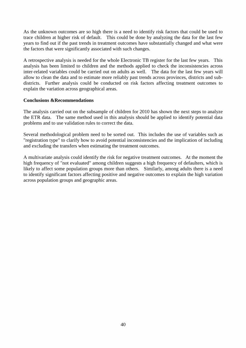
40
As the unknown outcomes are so high there is a need to identify risk factors that could be used to
trace children at higher risk of default. This could be done by analyzing the data for the last few
years to find out if the past trends in treatment outcomes have substantially changed and what were
the factors that were significantly associated with such changes.
A retrospective analysis is needed for the whole Electronic TB register for the last few years. This
analysis has been limited to children and the methods applied to check the inconsistencies across
inter-related variables could be carried out on adults as well. The data for the last few years will
allow to clean the data and to estimate more reliably past trends across provinces, districts and sub-
districts. Further analysis could be conducted on risk factors affecting treatment outcomes to
explain the variation across geographical areas.
Conclusions &Recommendations
The analysis carried out on the subsample of children for 2010 has shown the next steps to analyze
the ETR data. The same method used in this analysis should be applied to identify potential data
problems and to use validation rules to correct the data.
Several methodological problem need to be sorted out. This includes the use of variables such as
"registration type" to clarify how to avoid potential inconsistencies and the implication of including
and excluding the transfers when estimating the treatment outcomes.
A multivariate analysis could identify the risk for negative treatment outcomes. At the moment the
high frequency of "not evaluated" among children suggests a high frequency of defaulters, which is
likely to affect some population groups more than others. Similarly, among adults there is a need
to identify significant factors affecting positive and negative outcomes to explain the high variation
across population groups and geographic areas.
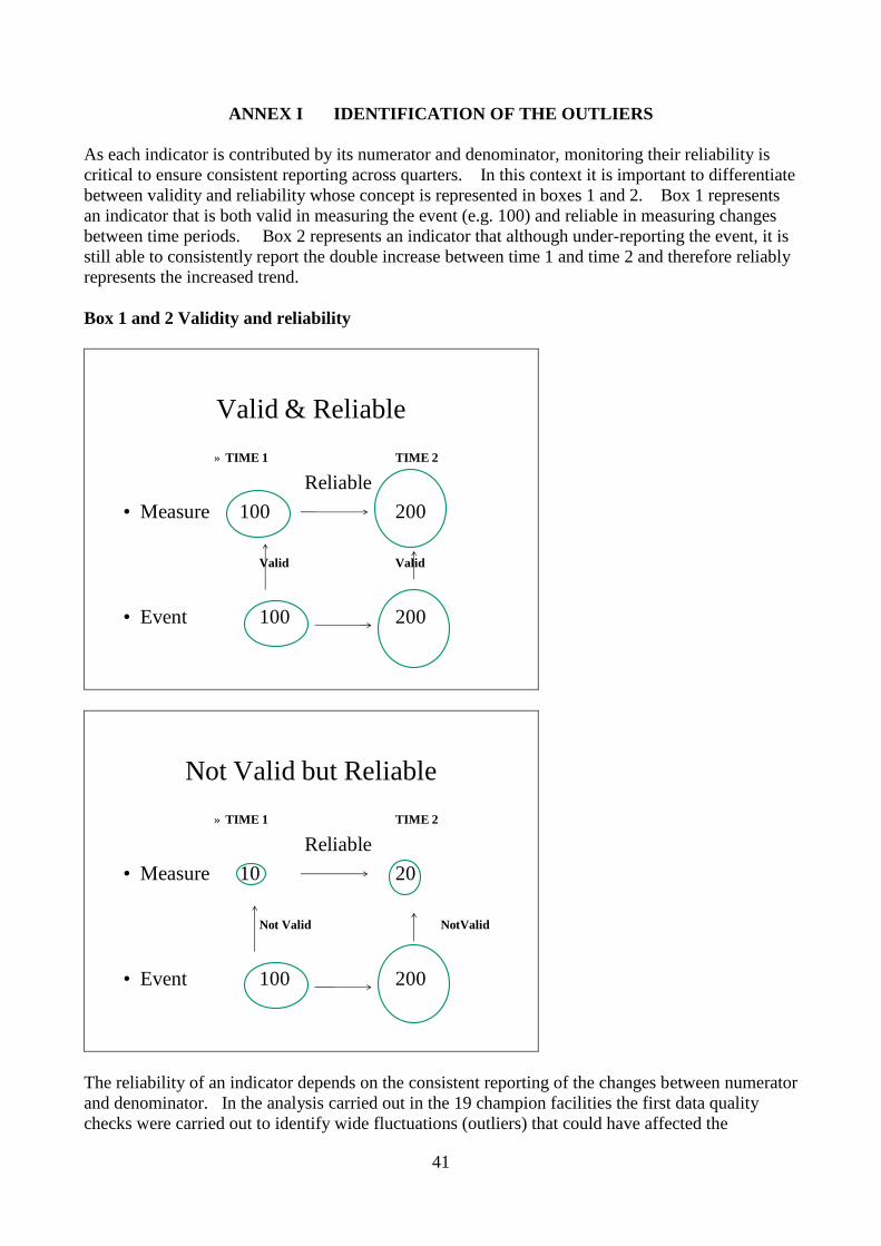
41
ANNEX I IDENTIFICATION OF THE OUTLIERS
As each indicator is contributed by its numerator and denominator, monitoring their reliability is
critical to ensure consistent reporting across quarters. In this context it is important to differentiate
between validity and reliability whose concept is represented in boxes 1 and 2. Box 1 represents
an indicator that is both valid in measuring the event (e.g. 100) and reliable in measuring changes
between time periods. Box 2 represents an indicator that although under-reporting the event, it is
still able to consistently report the double increase between time 1 and time 2 and therefore reliably
represents the increased trend.
Box 1 and 2 Validity and reliability
Valid & Reliable
» TIME 1 TIME 2
Reliable
• Measure 100 200
Valid Valid
• Event 100 200
Not Valid but Reliable
» TIME 1 TIME 2
Reliable
• Measure 10 20
Not Valid NotValid
• Event 100 200
The reliability of an indicator depends on the consistent reporting of the changes between numerator
and denominator. In the analysis carried out in the 19 champion facilities the first data quality
checks were carried out to identify wide fluctuations (outliers) that could have affected the

42
indicators. The method that was used to identify outliers is described below by using the TB
suspect rate which is obtained by dividing the number of TB Suspects by the Number of
Outpatients aged 5 years and above. Any substantial increase of the numerator without an equal
increase of the denominator and vice versa could be due to a mistake or to a genuine increase,
which however needs to be verified before being accepted. The method to identify a substantial
variation in quarterly reporting is described below for the denominator and numerator of the TB
suspect rate.
Denominator of TB Suspect rate
Table 1 provides the number of outpatients reported in the 19 champion facilities that were
analyzed in this report. The first step was to estimate the facility quarterly average (last column)
by dividing the sum of each row by the number of quarters. For example for Manthe facility, the
quarterly average was obtained by (3525+3817+3952+4466+4145+4991)/6=4149.
Table 2 provides the quarterly variation around the average. For example, Manthe facility
reported 3525 outpatients in Q1 2010 that was ((3525/4255) -1) = -17%, indicating that the
number of outpatients for this quarter was slightly lower than the quarterly average.
Table 2 can be represented as a graph (Figure 1). The central "0" line is the average and the bars
are the positive and negative variations around the average for each facility. It can be noticed that
the tallest bar is produced by Empumelweni facility (Extension 10 Clinic) in Q3 2010 that is +300%
or three times higher than its average. This helps to pinpoint the cell in Tables 1 and 2 that is
associated with this high variation ( Empumelweni, Extension 10 Clinic) Q3 2010). As a rule of
thumb any variation that is higher than 100% and lower than -50% is suggestive of outliers because
of the low probability than in a quarter a facility will experience a doubling or a halving of its
numbers (e.g., outpatients). When the variation is much higher than 100% such as in the case of
Empumelweni (Extension 10 Clinic) in Q3 2010, the quarterly average is seriously affected and the
rule of -50% should not be applied. For this reason, the other quarters for Empumelweni
(Extension 10 Clinic) are not considered outliers even if they are less than -50%.
Table 1 Number of Outpatients reported in the 19 champion facilities
FACILITY
NUMBER OF OUTPATIENTS QUARTER
Q1_10 Q2_10 Q3_10 Q4_10 Q1_11 Q2_11 AVERAGE
Manthe C 3525 3817 3952 4466 4145 4991 4149
Pudumong C 7389 7979 5332 7844 7135 7109 7131
J.B.Marks C 5669 5333 5465 5578 3789 4969 5134
Gateway C 3945 2846 5330 3900 3952 3059 3839
Tigane C 7341 7085 7008 6526 8465 2568 6499
Kanana C 5669 5333 5465 5578 3789 5465 5217
Botshabelo C 6834 6895 9588 9835 9869 10935 8993
Ulundi A 7932 7607 7623 8060 8811 9849 8314
Inanda C 82615 95758 73004 82837 91910 93347 86579
Jozini C 10487 11761 9537 10937 18667 19144 13422
BelaBela 8983 9632 10375 7879 7567 9718 9026
Empumelweni Ext 10 C 11384 10691 92536 8296 10569 11053 24088
Gompo C 4387 3364 4227 4725 4328 4200 4205

43
Helenvale 9750 7515 8695 8811 8736 7474 8497
Rosedale 39874 38541 27836 25477 33840 30264 32639
Belabela Warmbarths 4156 4883 5408 5861 4340 3475 4687
Northam Clinc 6984 8670 6075 6130 5444 7169 6745
Moutse 4156 4366 3859 3922 4236 4366 4151
Tyutyu 5357 4284 4441 3615 4031 3737 4244
TOTAL 236437 246360 295756 220277 243623 242892 247558
Table 2 Quarterly variation around the average for the 19 facilities
Q1_10 Q2_10 Q3_10 Q4_10 Q1_11 Q2_11
Manthe C -17% -10% -7% 5% -3% 17%
Pudumong C 6% 15% -23% 13% 2% 2%
J.B.Marks C 5% -1% 1% 3% -30% -8%
Gateway C -4% -31% 29% -5% -4% -26%
Tigane C 12% 8% 7% -1% 29% -61%
Kanana C 7% 1% 4% 6% -28% 4%
Botshabelo C -25% -24% 5% 8% 8% 20%
Ulundi A -6% -10% -10% -5% 4% 17%
Inanda C -5% 10% -16% -5% 5% 7%
Jozini C -20% -11% -28% -17% 42% 45%
BelaBela 1% 8% 17% -11% -15% 9%
Empumelweni Ext 10 C -50% -53% 303% -64% -54% -52%
Gompo C 4% -20% 1% 12% 3% 0%
Helenvale 21% -7% 8% 9% 9% -7%
Rosedale 23% 19% -14% -21% 4% -7%
Belabela Warmbarths -7% 9% 21% 31% -3% -22%
Northam Clinc 1% 26% -12% -11% -21% 4%
Moutse -1% 4% -8% -6% 1% 4%
Tyutyu 27% 1% 5% -14% -5% -12%
TOTAL -4% 0% 19% -11% -2% -2%
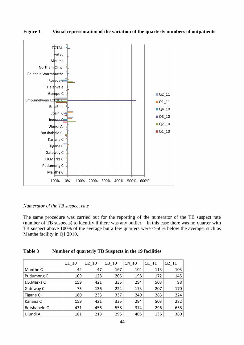
44
Figure 1 Visual representation of the variation of the quarterly numbers of outpatients
Numerator of the TB suspect rate
The same procedure was carried out for the reporting of the numerator of the TB suspect rate
(number of TB suspects) to identify if there was any outlier. In this case there was no quarter with
TB suspect above 100% of the average but a few quarters were <-50% below the average, such as
Manthe facility in Q1 2010.
Table 3 Number of quarterly TB Suspects in the 19 facilities
Q1_10 Q2_10 Q3_10 Q4_10 Q1_11 Q2_11
Manthe C 42 47 167 104 113 103
Pudumong C 109 128 205 198 172 145
J.B.Marks C 159 421 335 294 503 98
Gateway C 75 136 224 173 207 170
Tigane C 180 233 337 249 283 224
Kanana C 159 421 335 294 503 282
Botshabelo C 431 456 558 374 296 658
Ulundi A 181 218 295 405 136 380
-100% 0% 100% 200% 300% 400% 500% 600%
Manthe C
Pudumong C
J.B.Marks C
Gateway C
Tigane C
Kanana C
Botshabelo C
Ulundi A
Inanda C
Jozini C
BelaBela
Empumelweni Ext 10 C
Gompo C
Helenvale
Rosedale
Belabela Warmbarths
Northam Clinc
Moutse
Tyutyu
TOTAL
Q2_11
Q1_11
Q4_10
Q3_10
Q2_10
Q1_10

45
Inanda C 725 889 1073 1392 1517 1307
Jozini C 152 114 214 273 214 234
BelaBela 247 220 274 290 426 407
Empumelweni Ext 10 C 242 238 246 174 328
Gompo C 111 105 104 170 241 256
Helenvale 274 368 340 318 292 343
Rosedale 541 640 816 952 785 834
Belabela Warmbarths 116 75 194 103 141 109
Northam Clinc 109 114 68 126 111 41
Moutse 88 169 185 38 133 169
Tyutyu 129 131 105 167 187 106
TOTAL 4070 5123 6075 6094 6588 6122
Table 4 Quarterly Variation of the number of TB suspects
Q1_10 Q2_10 Q3_10 Q4_10 Q1_11 Q2_11
Manthe C -57% -51% 73% 8% 17% 6%
Pudumong C -30% -18% 31% 27% 10% -7%
J.B.Marks C -51% 30% 3% -9% 55% -70%
Gateway C -61% -29% 16% -10% 7% -12%
Tigane C -28% -6% 36% 0% 14% -10%
Kanana C -55% 19% -6% -17% 42% -21%
Botshabelo C -3% 2% 25% -16% -34% 48%
Ulundi A -34% -20% 8% 48% -50% 39%
Inanda C -38% -24% -9% 19% 29% 11%
Jozini C -29% -46% 0% 28% 0% 10%
BelaBela -27% -35% -19% -14% 26% 20%
Empumelweni Ext 10 C -7% -8% -5% -33% 26% -1%
Gompo C -36% -39% -40% -1% 40% 48%
Helenvale -15% 14% 5% -2% -10% 6%
Rosedale -30% -18% 5% 23% 1% 7%
Belabela Warmbarths -16% -46% 41% -25% 2% -21%
Northam Clinc -2% 2% -39% 13% 0% -63%
Moutse -35% 24% 36% -72% -2% 24%
Tyutyu -9% -8% -26% 17% 31% -26%
TOTAL -31% -13% 3% 4% 12% 4%

46
Figure 2 Visual representation of the quarterly variation in number of TB suspects
The next step would be to go back to the facilities and correct the outliers, unless they are considered
genuine. It is only once the outliers are corrected or confirmed that it will be possible to reliably estimate
the indicators related to the variables contributing to the numerators and the denominators.
Figure 3 shows how the positive and negative outliers are reflected in the wide variation of the TB suspect
rate. As the suspect rate is equal to the Number of suspect for TB divided by the number of outpatients
aged 5 years and above, the negative and positive outliers shown in the previous tables have caused under-
estimation between Q1 and Q3 2010. Once the outliers are corrected, the TB suspect rates should be around
2.5% - 3% in all quarters.
-100% -50% 0% 50% 100%
Manthe C
Pudumong C
J.B.Marks C
Gateway C
Tigane C
Kanana C
Botshabelo C
Ulundi A
Inanda C
Jozini C
BelaBela
Empumelweni Ext 10 C
Gompo C
Helenvale
Rosedale
Belabela Warmbarths
Northam Clinc
Moutse
Tyutyu
TOTAL
Q2_11
Q1_11
Q4_10
Q3_10
Q2_10
Q1_10

47
Figure 3 Variation in the TB suspect rate for all the 19 facilities
0.0%
0.5%
1.0%
1.5%
2.0%
2.5%
3.0%
Q1_10 Q2_10 Q3_10 Q4_10 Q1_11 Q2_11