ARTISTS’ … · pebbles were only about 2cm x 1cm. ... alfabeti artistici (Unknown, ... Don’t...
7
ARTISTS’ BOOKSb BOOKBINDINGb PAPERCRAFTbCALLIGRAPHY Volume 10, Number 4 $8.50
-
Upload
truongliem -
Category
Documents
-
view
217 -
download
0
Transcript of ARTISTS’ … · pebbles were only about 2cm x 1cm. ... alfabeti artistici (Unknown, ... Don’t...

ARTISTS’ BOOKSbBOOKBINDINGbPAPERCRAFTbCALLIGRAPHY
Volume 10, Number 4 $8.50

Reggie Ezzell
Words On Wood by Fiona Dempster
Write to Each Other! by Georgia Angelopoulos
White Vine Letters by Anne Rita Taylor
Quaker Wedding Certificates by Wink Covintree
Activist Scribes by Carol DuBosch
The Dancing Letters Scholarship Fund by Elissa Barr
Calligraphy for a Cause: Out of the Silence by Sally Penley
The Summit Gallery
Tomorrow’s Past: Modern Bindings on Antiquarian Books by Jen Lindsay
The Odyssey of Homer by Tracey Rowledge
Contributors / credits
Subscription information
3
4
8
10
12
16
20
22
28
34
38
42
47
Tracey Rowledge’s conservation binding of an early nineteenth-century
copy of The Odyssey with fore- edge ties. Jen Lindsay discusses the
use of contemporary designs and structures when rebinding older
volumes in “Tomorrow’s Past.” See “The Odyssey of Homer” for more on
Tracey’s binding. Photography by John Hammond Photography.
Bound & Lettered b Summer 2013 1
Volume 10, Number 4, July 2013.

WORDS ON WOODBY FIONA DEMPSTER
In 2009 I was approached to write on wooden “pebbles” by David Linton, a master timber craftsman who lives and works in Maleny in Queensland, Australia. He had tumbled small offcuts of different woods to create smooth, rounded pieces and wanted inspirational words on them. They were to be gifts. The scale made the project very manageable – the pebbles were only about 2cm x 1cm. I wrote with ink and gouache and finished them with a varnish to try and protect the words. (The ink worked better than the gouache.) Not long afterwards, David asked me if I could write on a log. I said that I could try, and off we went. He had set aside this very large piece of Tallowwood and had planed a face onto one side of it, creating a perfect setting for some writing. We talked through how best to get the words of his favorite quote onto the timber. He wanted to place the log as a sentinel at the entrance to his retail shop in town. Because the log would stand outside, it needed to be weatherproof, and in this area of Australia, that meant it would have to endure rain, rain, and more rain. Also, during the blazing days of our summers, it would have to deal with copious sunshine. (Tallowwood, Eucalyptus microcorys, is a common native tree of Queensland and New South Wales.)
Two of the calligraphic wooden pebbles.
The log as it lay in David’s workshop.
4 Bound & Lettered b Summer 2013
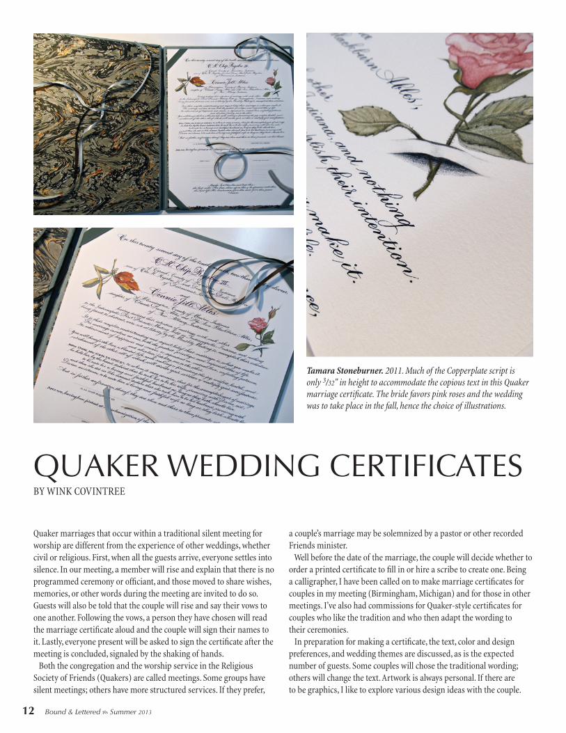
QUAKER WEDDING CERTIFICATESBY WINK COVINTREE
Quaker marriages that occur within a traditional silent meeting for worship are different from the experience of other weddings, whether civil or religious. First, when all the guests arrive, everyone settles into silence. In our meeting, a member will rise and explain that there is no programmed ceremony or officiant, and those moved to share wishes, memories, or other words during the meeting are invited to do so. Guests will also be told that the couple will rise and say their vows to one another. Following the vows, a person they have chosen will read the marriage certificate aloud and the couple will sign their names to it. Lastly, everyone present will be asked to sign the certificate after the meeting is concluded, signaled by the shaking of hands. Both the congregation and the worship service in the Religious Society of Friends (Quakers) are called meetings. Some groups have silent meetings; others have more structured services. If they prefer,
a couple’s marriage may be solemnized by a pastor or other recorded Friends minister. Well before the date of the marriage, the couple will decide whether to order a printed certificate to fill in or hire a scribe to create one. Being a calligrapher, I have been called on to make marriage certificates for couples in my meeting (Birmingham, Michigan) and for those in other meetings. I’ve also had commissions for Quaker-style certificates for couples who like the tradition and who then adapt the wording to their ceremonies. In preparation for making a certificate, the text, color and design preferences, and wedding themes are discussed, as is the expected number of guests. Some couples will chose the traditional wording; others will change the text. Artwork is always personal. If there are to be graphics, I like to explore various design ideas with the couple.
Tamara Stoneburner. 2011. Much of the Copperplate script is only 3/32" in height to accommodate the copious text in this Quaker marriage certificate. The bride favors pink roses and the wedding was to take place in the fall, hence the choice of illustrations.
12 Bound & Lettered b Summer 2013

THE SUMMIT GALLERYEach summer in the United States – for the last thirty-two years – there has been a large gathering of letter artists (every year except 2011). These summer calligraphy conferences started in 1981 with the Calligraphy Connection, held at Saint John’s University in Collegeville, Minnesota. It was sponsored by a Minnesota scribal organization, the Colleagues of Callig-raphy, and was lead by Jo White. From there the conference moved to Philadelphia and was again sponsored by a local guild; Maureen Squires was the director. In 1983, it was in Chicago (Chicago Calligraphy ’83) and then back to Minne-sota for a second Calligraphy Connection in 1984. Jo White
Alphabet Blues. Judy Melvin. 11" x 17". Ruling pen, Sumi ink, and soft pastels on blue pastel paper.
Alphabet Dance. Judy Melvin. 9½" x 14½". A rough homemade tool, bleach, soft pastels, and gold leaf on black Arches Cover paper.
directed that one, and the Colleagues would go on to spon-sor two more gatherings in 2002 and 2009. Maureen Squires would bring us two more, Innovations in 1986 (New Jersey) and Writing Beyond Words in 1999 (Connecticut). Over the years the calligraphic conclave would move from coast to coast, with occasional stops in the middle of the country, nearly always on a college campus. Last year it was in Portland as Calligraphy Northwest, the third conference brought to us by Carol DuBosh, this time with her co-director Meri Taylor (and as with all the conferences, many volunteers). Earlier Portland conferences were held in 1987 and 1991.
28 Bound & Lettered b Summer 2013

TOMORROW’S PASTModern Bindings on Antiquarian Books
“Surely it is better to create tomorrow’s past than to repeat today’s.” – Edgar Mansfield
(1907-1996), bookbinder and sculptor.
What is an appropriate way to deal with an
early book that needs to be rebound? There
are three usual responses.
One is to make a faithful facsimile of
what is presumed was the book’s original,
historical state. The antiquarian book trade
often demands that books are bound “to
style,” that is, in the perceived bookbinding
“style” of a particular period.
Another response is adherence to narrow
book conservation protocols to produce
a purely protective, aesthetically neutral
cover for the book, rendering its age and
character indiscernible and indeterminable.
This is often practiced in large institutions,
and whilst admirably well-intentioned and
certainly preferable to some other treat-
ments, it is nevertheless dishonest: it is an
unnatural interruption of history. The insti-
tutions of the world will be filled with boxes
of these bland books and, in the words of
William Morris, “…our descendants will
find them useless for study and chilling to
enthusiasm.”
The third response is the stylized bind-
ings promulgated mainly by the antiquari-
an book trade. These are the familiar books
with five raised bands on the gold-tooled
spine and smooth gilt edges, and, usually,
are quarter-bound in leather with marbled
sides and endpapers. These bindings,
devised by the late nineteenth and early
twentieth century British bookbinding
trade, are a strange hybrid of some sort of
Cristina Balbiano d’Aramengo. 2007. Unknown author, Nuova raccolta d’alfabeti artistici (Unknown, c. 1860). Handmade paper-covered concertina binding with a hinged spine that rotates on a Japanese covered wooden peg. 124 x 295 x 94mm.
Kathy Abbott. 2010. Samuel Butler esq., Hudibras (London, 1817). An adapted
simplified binding in hand-colored handmade paper. 133 x 77 x 24mm.
Photography by John Hammond Photography.
BY JEN LINDSAY
34 Bound & Lettered b Summer 2013

40 Bound & Lettered b Summer 2013
May2013x2_LAR 5/24/13 12:13 AM Page 43
This page, above: Alphabet (). Flourished
capitals in circular design with floating Italic.
Right page: Compressed Italic (). Maya Lin.
Other versions of this quote are on pages
and .
May2013x2_LAR 5/24/13 12:16 AM Page 92
What forms appeal to us? What do we know about rhythm? We are
developing our sensitivity, our ability to introduce movement without
destroying form and rhythm. It takes practice. We have to start some-
where, and the sensibility we develop as a result is what we get to
keep forever. Vision expanded never shrinks back. I go through this
in workshops because it is a blurry, uncomfortable line for many.
Some students need permission to do this inquiry and feel lost when
there is no exemplar to copy. We need to develop our judgment, yet
many confuse this with a harsh inner dialogue that is fear-based and
judgmental. Or they say, “How do you know what to harvest? What is
good?” Well, those are very good questions!
My answer is this: There is no set route, but there are signposts. Start
collecting! Make a “my future direction” folder and stuff it with things
you like: photocopies, scraps, your own scribbles, snippets. Don’t try
to understand it, just do it. Listening to and trusting your instincts
needs to start with low-threshold acts. On some level, some things
turn you on and some things do not. That is a place to start. Usually,
when I have missed something, it is because I have not trusted my
instincts. Don’t delay using your instincts to feel whether something is
good or not. For now, just go with it. Don’t
try to reason it out. The reason will be
revealed in time—if you trust. Instinct is a
muscle; you need to exercise it. Chances are,
your instincts are way ahead of your current
judgment, but you do not trust them, because
they are not yet integrated into “your truth,”
which can get bogged down with too many
left-brain considerations.
You may have to wait a few days or a few
months after you have done something to
really see it. So much of what we do or
experience relies on seeing. What stops us?
Our mind and its judgments. Oftentimes, you
are harvesting a seed, not a finished idea.
Your acting on this is the important part for
growth to happen. As Robert Fritz wrote in
his book Creating, “We make it up.” We
follow the leads that have passion or energy,
not knowing exactly how they are going to be
resolved. The second part of this regards our
skills, which are always evolving. The third
part is standards or values.
Form, Rhythm, and Movement (yes, again)
Regarding form, rhythm, and movement, we
need to have some parameters. Good forms
have complex contours that work together.
Like human anatomy or nature, the outer
form reflects the inner essence. Some would
use the word truth. Form that is alive is beau-
tiful. Sometimes in workshops, I find people
with an underdeveloped sense of form; they
have focused on other things. Perhaps they
don’t value form as highly as I do.
Rhythm is easy to name but difficult to grasp.
Everyone knows what it is, but may not know
how to achieve it. Often, we are overlooking
the spaces. You can never have something
without a context (a space that contains it or
that it relates to). Those spaces or intervals
are as important as the forms.
Movement enlivens the work. The rhythm is
the pulse, but movement is the life. There is
an old Mel Brooks joke: “Death is very still. So
keep moving.”
May2013x2_LAR 5/24/13 12:17 AM Page 127
With this book, available this summer, John Stevens takes you on a journey into his world of letters – created with pen, brush, chisel, and pixel. His years of experience as a calligrapher, designer, and lettering artist have been put to words. It is a feast for the eyes, with his exquisite lettering art on nearly every page. His mastery shines in the marks on the page,
sometimes in delicate stokes and at other times almost violent. The resulting letters take many forms, influenced by the pen or brush but not determined by it. It is John’s vision – as well as his command over tool, form, and design – that create the beauty of his work and its depth and ingenuity. For him, letterforms are both a means of communication and a subject themselves. He plays and invents with letterforms freely but with the utmost respect for their historical underpinnings, creating works that are vibrant and original. The clear text describes how John approaches projects and opens a view into his creative process. In a gentle voice, allowing his sense of humor to come through, he shares his thoughts on subjects such as the interaction of rhythm, form, and movement; chaos and order; and “broad-edged Zen,” to name only a few. You are drawn in as he tells of his experiences with clients, how the com-puter has affected the practice of the craft, why it does not matter if creating letter works is an art or craft, and so much more. While this is not an instructional book, you learn John’s views on a cal-ligrapher’s education. With both visual and verbal examples, John relates how letter-making and problem-solving can be approached. He discusses what paths can lead to a greater understanding of calligraphic form, experiences that transcend simply learning an alphabet or a hand. He goes beyond the presenta-tion of technique and instead provides a first-person report of the deeper ele-ments involved, information not normally covered in lettering or design books. You will find both insights and inspiration. John also provides a glimpse into how he conducts his classes and work-shops (which are only infrequently offered). After this book, you may look at letterforms differently as you become aware of the possibilities inherent in form and the ways calligraphy, expression, art, and graphic design connect. Well-written and beautiful to look at, this is a book that all calligraphers will want to own. Available from John Neal, Bookseller.
John Stevens Scribe: Artist of the Written Word
more likely to have energy. Those ideas discarded
when the “left judging brain” is distracted are going
to hold the most possibility. It is a wonderful, yet
sometimes painful, creative exercise, designed to
pry us loose, heighten our awareness, and get us to
think nonhabitually.
The second idea I had was to explore the shapes my
tools could make, to improvise. This is common in
other arts. In music, where experimentation was
encouraged at one time, John McLaughlin, a virtu-
oso jazz guitarist, decided to let the energy, power,
and controlled chaos of Jimi Hendrix enter his con-
sciousness (which someone with his formal knowl-
edge and skills would normally resist). This is proba-
bly something to do with him having played with
Miles Davis. The results were amazing: sonic experi-
ment meets virtuosity. These musicians (and others)
have influenced me as much as any visual artist has.
Reining the experimentation in is the other trick. It
makes the improvisations usable. My belief is that
my work stems from two broad categories: I can let
it happen, or I can make it happen. The important
part is that you are aware or accepting enough to
catch what is working or what offers potential.
Vis medicatrix naturae ()
Latin for “the healing power of nature.”
Brush-written on rough paper using
Chinese pointed brush and watercolor.
May2013x2_LAR 5/24/13 12:15 AM Page 70