Architecture Portfolio
33
A R C H I T E C T U R E P O R T F O L I O r o x a n n a m a r t i n e z s a l c e d a
-
Upload
roxanna-salceda -
Category
Documents
-
view
212 -
download
0
description
a collection of work from undergraduate, graduate, and post-graduate time frames, ranging from 2004-2012
Transcript of Architecture Portfolio

A R C H I T E C T U R E P O R T F O L I Or o x a n n a m a r t i n e z s a l c e d a

C O N T E N T Sf e a t u r e d p r o j e c t s
m o b i l e e x h i b i t i o n s p a c e
b r e a k o n t h r o u g h
f i e l d s k e t c h e s
l . a . m e t r o s t a t i o n
f l o c k w a l l
m o b i l e d a n c e s p a c e
t e s s e l l a t i o n c l o u d
n e u r a l s k y
s c h o a l w a l l

M O B I L E E X H I B I T I O N S P A C E

PROCESS
Left: sketches showng how popouts could
work and fit within the space. Above: Prelimi-
nary model maximizing popout spaces and
glazing withing the exhibition space. Right:
final model; bass wood, polycarbon, styrene
details. 1”= 1’-0”
February/March 2005
This course explored the ranging spatial qualities of align-
ment, lighting, and many more, by studying, interpreting, and
building upon the details of works by reknown architects. This
project in particular focused on the methodologies used in Le
Corbusier’s Villa Savoye. This exhibition space took
Corbusier’s idea of the house being a machine. By turning the
exhibition space mobile, the design maximized the program
requirements, in addition to making transportation efficient.
M O B I L E E X H I B I T I O N
S P A C EPROCESS
Left: sketches showng how popouts could
work and fit within the space. Above: Prelimi-
nary model maximizing popout spaces and
glazing withing the exhibition space. Right:
final model; bass wood, polycarbon, styrene
details. 1”= 1’-0”
February/March 2005
This course explored the ranging spatial qualities of align-
ment, lighting, and many more, by studying, interpreting, and
building upon the details of works by reknown architects. This
project in particular focused on the methodologies used in Le
Corbusier’s Villa Savoye. This exhibition space took
Corbusier’s idea of the house being a machine. By turning the
exhibition space mobile, the design maximized the program
requirements, in addition to making transportation efficient.
M O B I L E E X H I B I T I O N
S P A C E

PROCESS
Left: sketches showng how popouts could
work and fit within the space. Above: Prelimi-
nary model maximizing popout spaces and
glazing withing the exhibition space. Right:
final model; bass wood, polycarbon, styrene
details. 1”= 1’-0”
February/March 2005
This course explored the ranging spatial qualities of align-
ment, lighting, and many more, by studying, interpreting, and
building upon the details of works by reknown architects. This
project in particular focused on the methodologies used in Le
Corbusier’s Villa Savoye. This exhibition space took
Corbusier’s idea of the house being a machine. By turning the
exhibition space mobile, the design maximized the program
requirements, in addition to making transportation efficient.
M O B I L E E X H I B I T I O N
S P A C E

B R E A K O N T H R O U G H

Our studio’s project was in conjuction with the Great Park
Competition in Irvine. There were two parts of the competition,
and for our year, students were to individually design the
offices and cafe building for the Great Park.
Because the Great Park’s location on the former El Toro Air
Base, my concept for my particular project was the opportu-
nity for nature to regain its position. The ceiling/roof emulates
a singular piece of concrete- broken- as if some force of
nature pushed upon it and broke the slab into pieces. The
transparency of the building was achieved by using glazing
on the exterior, and concrete columns for its structure.
The use of extensive glazing was not intended to cause any
discomfort in the buildig during winter or summer, as studied
in sunpath diagrams for equinox and solstice. During winter,
sunlight is allowed in to warm the space; during summer the
overhangs (roof) procvides enough shade inside.
B R E A K O N T H R O U G H
BREAK ON THROUGH
Top Left: floor plan (hand drawn)
Top Right: site diagram illustrating winds, and
the general overview of the sun paths.
below: section elevation (hand drawn)
Opposite Page: photographs of the 1/4”=1’-0”
scale model of the exterior of the building.
March-June 2006

F I E L D S K E T C H E S

SKETCHES
Left to right: Studies of my hand in outdoor
light, charcoal and eraser in sketchbook
8.25”x5” ; study of my foot in light, charcoal
and eraser in sketchbook 8.25”x5” ; sketch of
sculpture underneath the Loggia in Florence,
Italy, pencil in sketchbook 8.25”x5”
Opposite Page: sketch of Rape of the Sabine
Woman, pencil in sketchbook 8.25”x5” ; live
sketch of nude, 2.5 hours, pencil on paper
14”x8” ; building sketch, Florence, Italy, pen
in sketchbook ; Mission Inn facade sketch,
pen on lightweight sketch, 10.5”x10.5”
There was a time when drawing and figure drawing were con-
sidered prerequisites for not only artists but architects and
engineers. The aim of this course was to enable architecture
students to increase their flexibility in drawing. We were taught
to study the space the model occupies and the existence of
simple geometry underlying complex shapes. Different
medias were utilized. Because this course took place in Flor-
ence, Italy, the city was our classroom; we utilized sculptures
and buildings. Inside the classroom, we utilized live models to
paint and draw.
F I E L D S K E T C H E S

SKETCHES
Left to right (in no particular order): sketches
done during study tours with DIS to Finland
(kiasma Museum, Rock Church, Aalto house,
and a city hall done by Aalto), and outside of
Copenhagen in the Open Air Musuem. Pen
on sketch paper (Moleskine)
Opposite page (clockwise from top left): Holy
Cross Chapel, pen on white sketch and sepia
pencil rubbing on white sketch; Koldinghus,
pen on sketch (Moleskine).

In this particular series of sketches (opposite and current page), quick studies were to
be made of the architecture, details, urban layout, and landscape. These were meant
to be relatively quick in order to capture the essence of the subject matter. Although
some were actually more meticulous than others, these sketches- which were done
during the summer study abroad program through DIS in Denmark, Sweden, and
Finland- made me realize the hidden details in the everyday, and sometimes
mundane, architectural elements .
F I E L D S K E T C H E S

L . A . M E T R O S T A T I O Nw i l s h i r e - b u n d y

WILSHIRE-BUNDY METRO STATION
Left: preliminary sketches showing how
stacking and arranging blocks like books can
create spaces. Above: diagram of a
metro/library user Right: floor plans of all
levels of the library, including the metro
station levels.
Opposite: Renderings. Clockwise from bottom
left: street view (day); street view (night), train
platform view; mezzanine/ticketing view.
October/November 2008
The purple line extension of the Los Angeles Metro provided
this course an opportunity to create designs of new metro
stations within the “Subway to the Sea” line, starting from L.A.
Union Station and ending in Santa Monica. Each station was to
have a unique program in addition to a metro stop. This
station, the Bundy-Wilshire station, was designed as a library,
in a location where retail shops and midrise business build-
ings exist. Because of such an environment where businesses
are on every corner, an investigation was made of relation-
ships between libraries and bookstores. What was gained was
insight on how a library can be successful by adopting a book-
store program, thus aiding in furthering the design of the build-
ing and its relationship with its surroundings, including that of
the metro station.
L . A . M E T R O S T A T I O N
[ B U N D Y - W I L S H I R E ]
the ground floor is the main circulation hub to bothmetro and library. it creates a constant motion emulating wilshires traffic- the library’s main circulations run horizontally through the building- the the vertical circulations being staircases, elevators, and escalators. here is the filter inwhich the users get separated between metrousers and library users.
lobbymain circulationstairway from belowground to terrace
elevatorsentrance
secondary staircasedirect access from ground fl to terrace
circulation to below
the ground floor is the main circulation hub to bothmetro and library. it creates a constant motion emulating wilshires traffic- the library’s main circulations run horizontally through the building- the the vertical circulations being staircases, elevators, and escalators. here is the filter inwhich the users get separated between metrousers and library users.
emergency exitthrough secondarystaircase
this room provides maximumflexibility within the program. it can be a computer room, a conference/meeting room, a community room, study area............
cafe kitchenprep area;service elevator provides serviceto users
one elevator becomes onlyservice from 2-roof levelsreading/study
areas
covered cafe space
service bar
elevatorsserivce and public
covered cafe space
electrical/hacpersonnel only
sun roof
enclosed walkway
the terrace provides the users of the librarythe cafe experience. the small will filter throughthe whole building and onto the stree at well.this will bring the users through the library- they will experience the library as they move towards the cafe on the rooftop. this will not just function as a cafe, but as a meetingpoint, a social gathering point, a reading space, whatever the user may make of it.
at the mezzanine level we find a secondary entrance to the library and a small lending-vendingarea for those heading specially towards the metroand would like to pick up a magazine, journal, or just a quick read-book. the children’s area is located near the secondary circulation desk for added security. this is where the expected heavier traffic is to occur
restrooms
children’s area
circulation 2 automatic ticket sales
ticket gatesticket booth
book lending-vendingon the go

F L O C K W A L L

FLOCKWALL PROCESS
Images on this page show- in no particular
order- the process of this project from initial
sketches to construction of the project. [1]
concept drawing by Sarah Hovsepian on the
movement of the ‘birds’ [2] motor attachment
to skin [3] assembled ‘birds’ [4] primary
whiteboard sketches [5] floor construction [6]
putting it all together @ our Coachella site [7]
motor assembly on campus [8] conceptural
rendering of the ‘birds’ by Daisy Yiu.
Opposite: photographs from Coachella
January-April 2009
Flockwall is a human-scale spatial environment composed of
discrete collaborative modules. The primary goals were to
develop and understand strategies that can be applied to
interactive architecture. The design and construction was
carried out in an academic context that was displayed to a
public audience of approximately 200,000 people over the
course of three days. In addressing the performance param-
eters of the prototype, the concept focused on several key
strategies: 1) geometry 2) movement 3) connections 4) scale
and 5) computational control, and human interaction. The final
objective of the approach was to create an innovative design
that was a minimally functional spatial environment with the
capability for evolving additional multi-functionality. Heavy
emphasis was placed on creating a full-scale environment that
a person could walk through, interact with, and experience
spatially.
Presented at Coachella Arts and Music Festival 2009.
F L O C K W A L L[1] [2]
[3] [4] [5]
[6] [7] [8]

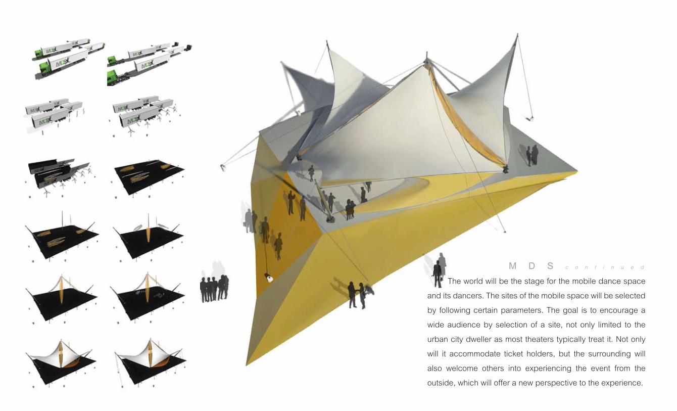
M O B I L E D A N C E S P A C E

STUDIES + PROCESS FOR MOBILE DANCE
CENTER
From left to right: tensile study models with
mock buildings sustaining the tensile tent;
drawing mennequin in a fishnet stocking to
visually show stretch on a body; study of
movement with a dancer underneath white
stretch fabric.
Opposite: concept sketches for the Mobile
Dane Space form, keeping in mind motion
within tensigrity. Also shown: diagram by
Martin Bloom of a performer surrounded by
the audience.
April 2009
Dancers are constantly creating a space through their perfor-
mances that not only moves with their choreographies, but
with their touring schedule; it is important to realize that a
stronger and more popular performance from them might be
achieved through creating a space that flexes with them and
their tour by moving with them rather than the dancers accom-
modating themselves a new venue. It shall not only be a space
only for the dancers like a stage, but for the audience as well.
The audience yearns to be entertained and at the same time
dancers yearn for the approval and acceptance from the audi-
ence. The audience is the city. The audience help dancers
survive through this. By housing the dancers is to also house
the audience. Incorporating the two together in a design will
blur the traditional line between stage and audience and
further creates a stronger and enhanced experience between
the users and the venue. >>
M O B I L E D A N C E S P A C E

FINAL IMAGES AND DRAWINGS
Clockwise: Interior renderings and montages
in Chicago and Center Pompidou (Paris); floor
plan of the Mobile Dance Center; photograph
of the final physical model, made from stretch
fabic, tule, acrylic, and metal; section
drawings of the dance space. [drawings not
to scale]
Opposite: still images from animation showing
assembly of the space; main rendering of the
dance space.
June 2009
The world will be the stage for the mobile dance space
and its dancers. The sites of the mobile space will be selected
by following certain parameters. The goal is to encourage a
wide audience by selection of a site, not only limited to the
urban city dweller as most theaters typically treat it. Not only
will it accommodate ticket holders, but the surrounding will
also welcome others into experiencing the event from the
outside, which will offer a new perspective to the experience.
M D S c o n t i n u e d

N E U R A L S K Y

NEURAL SKY PROCESS
Images on this page show- in no particular
order- the process of this project from initial
sketches to construction of the project.
Top Left: photographs from set-up at the
Coachella campgrounds in April 2010.
Left: construction of spheres and fabric;
set-up at Beyond Wonderland, March 2010.
Right: concept sketch of the structure.
Opposite: photographs of final project @
Coachella
January-April 2010
Neural Sky is a massive networked nodal structure that con-
nects people via lightening fast bolts of luminescence. When
a person moves into close proximity to any of the legs of the
structure, an ultrasonic sensor detects their position and emits
beams of light that connect that person to another standing in
the 3D the nodal structure. As additional people occupy the
space the installation evokes a large 3D network of firing neu-
rons. The network is constructed of a light steel frame and
fabric-wrapped volumetric shells at each node.
Neural Sky was designed and built by Michael Fox in collabo-
ration with the students in his Architectural Robotics course at
Cal Poly and alumni from the architectural program. Darius
Miller provided custom electronics on the project.
Presented at Beyond Wonderland (March 2010) and
Coachella Arts and Music Festival (April 2010)
N E U R A L S K Y

S C H O A L W A V E

SHOAL WAVE PROCESS
Images on this page show- in no particular
order- the process of this project from initial
sketches to construction of the project. [�]
‘scale’ assembly and materials for the wall
[�] site plan showing dimentions of the
proposed project [�] diagrams showing how
the scaled wall will work in the absence of
wind, moderate wind, and high wind. [�]
preliminary sketches of the form.
Opposite: renderings of Schoal Wave during
night and day settings.
In collaboration with the same group that brought Flockwall and Neural Sky, smaller
groups were formed to create separate proposals to be submitted for Coachella ����-
and subsequently other music and arts festivals for the next year.
Schoal wave is an installation designed to be environmentally interactive, harnessing
the power of wind to initiate movement along the facade of the wall. the movement is
inspired by A school of fish, otherwise known as a “schoal” in scientific communities.
the wall is clad in specially fabricated, hindged, scales that move with the wind; they
are � sided, with the inside scale bearing color while the outer side has a highly reflec-
tive surface (like the surface of water). with a gust of wind -provided naturally or by
integrated fans- the scales on the wall will cause a wave-like effect, accompanied by
changing color. At night, during periods of wind, mounted LED lighting along the wall
is exposed when the scales open. Once the scales closed back flat against the wall,
the leds provide a backlight to the structure.
S C H O A L W A V E
[�]
[�]
[�]
[�]

T E S S E L L A T I O N C L O U D

PROCESS
Clockwise from bottom left: studies in
tessellation; installation and process of
making a each cloud; room re-arrangement in
order to maximize each resident’s space
within the shared room.
[fall 2012]

The cloud is about creating a private enclave within a larger semi-private space. It is
about meshing the horizontal with the vertical: creating a bed canopy while maintain-
ing the elements of a bed curtain. The cloud gives an interaction to a group of women
who otherwise would not have had the experience otherwise. It draws their attention to
the ceiling- away from the clutter of their lives and room, bringing them closer to ‘me ’
time, to a private moment away, or even an instance with the other women in the room
by interaction with the other clouds above them. The cloud was formed from a blank
slate, a simple piece of fabric- like a metaphor for the women in the shelter who are in
a transitioning point of their lives, either starting fresh, or heading towards a new
direction- hence, giving their lives a fresh start, or a blank slate.
T E S S E L L A T I O N
C L O U D