Apps and Websites TV Optimization Guide - XFINITY and Websites TV... · Apps and Websites TV...
26
[ COPYRIGHT © 2014 COMCAST ] Apps and Websites TV Optimization Guide Product: Guideline Platform: STB Best practices for designers and developers for delivering optimized TV experiences.
Transcript of Apps and Websites TV Optimization Guide - XFINITY and Websites TV... · Apps and Websites TV...

[ COPYRIGHT © 2014 COMCAST]
Apps and Websites TV Optimization GuideProduct: Guideline Platform: STB
Best practices for designers and developers for delivering optimized TV experiences.

W E B S I T E & A P P T V O P T I M I Z AT I O N G U I D E V 001 10.06 .2014 2 of 26
Table of Contents
[ COPYRIGHT © 2014 COMCAST]
UNDERSTANDING THE TV VIEWING CONTEXTDesigning Your Apps and Websites for Display on TV .............................................................................................4Shared Device ............................................................................................................................................................................................................................5Distance from the Screen ........................................................................................................................................................................................6Navigation using Remote Control ................................................................................................................................................................7Lean Back Experience ....................................................................................................................................................................................................8
DESIGN FOR TV Screen Resolution ...........................................................................................................................................................................................................10Fluid Layout ...............................................................................................................................................................................................................................11Remote keys .............................................................................................................................................................................................................................12Focus States ..............................................................................................................................................................................................................................13Grid ...........................................................................................................................................................................................................................................................14Navigation ....................................................................................................................................................................................................................................15Color ......................................................................................................................................................................................................................................................16Typography ...................................................................................................................................................................................................................................17
Layout .................................................................................................................................................................................................................................................18Video Controls .......................................................................................................................................................................................................................19On Screen Text Input ..................................................................................................................................................................................................20Sound for TV ..........................................................................................................................................................................................................................21Modal Overlay ......................................................................................................................................................................................................................22Animation ..................................................................................................................................................................................................................................23Accessibility ..........................................................................................................................................................................................................................24
APPENDIX Developer Check List .................................................................................................................................................................................................25
[ COPYRIGHT © 2014 COMCAST] V 001 10.06 .2014 3 of 26 W E B S I T E & A P P T V O P T I M I Z AT I O N G U I D E
Understanding the TV Viewing Context

V 001 10.06 .2014 4 of 26 [ COPYRIGHT © 2014 COMCAST] W E B S I T E & A P P T V O P T I M I Z AT I O N G U I D E
Designing Your Apps and Websites for Display on TV
Achieving optimal display and an impressive presentation through any medium is not just about your content. It’s also about format and context. For instance, content viewed through your mobile app may look completely different than when viewed as a web page on your PC. Likewise, when designing an app or website for display on TV, simply force fitting the current navigation scheme and content on to a TV screen may prove confusing, incompatible with how the TV is used and controlled and frustrating to the consumer.
It’s important for designers and developers to understand the context, demands and expectations related to the TV watching experience in order to develop the right information structure, interaction model and layout that capitalize on the strengths of TV viewing.
In the next few pages, we will highlight significant differences between websites and apps and the TV viewing experience, including:
• TV’s uniqueness as a shared device • The ten-foot distance from TV screen to the viewer • The access of content using remote control • The “lean back” experience

V 001 10.06 .2014 5 of 26 [ COPYRIGHT © 2014 COMCAST] W E B S I T E & A P P T V O P T I M I Z AT I O N G U I D E
Shared Device
One of the biggest differences between TV and other smart devices is that a TV is a communal device.
As an entertainment hub, TV is a simultaneously used central point for family and friends to spend time together. During those moments, there might be multiple viewers and different ages around one TV, yet just one person uses the remote control. This is the social context to consider when you design an apps and websites for TV. Consequently, when you design:
• Examine if the content you want to present is appropriate in such a communal and mixed user context. It’s better to be family friendly.
• There should be an easy way to opt out from or prevent sharing personalized content with the TV community. For instance, users might not want to share personal photos when they send the photo storage website to a TV to view. Apps should also have some way to exit from displaying personal content on TV.

V 001 10.06 .2014 6 of 26 [ COPYRIGHT © 2014 COMCAST] W E B S I T E & A P P T V O P T I M I Z AT I O N G U I D E
Distance from the Screen
Video TitleVideo Detail. Smallest font should be bigger than 16 pt. 1
Button 1 Button 2 Button 3
3
2
While PC and mobile device users are within inches of their screens, most TV users will watch TV from about ten feet away; viewing it at different angles and various lighting conditions. Such conditions will make a traditional web page harder to read, feel more cluttered and make it more difficult for users to perform basic tasks like navigating menus and selecting buttons. To compensate:
• Fonts need to be bigger than 16 pt.
• Graphical elements, like video thumbnails, should be larger than 70 x 45px. This will be explained in greater detail on page 20 (Typography) and 24 (Graphical Elements).
• Make each target (like links and buttons) large with ample padding for an expanded target area. Margin should be bigger than 6px. Ensure there is a clear separation between the elements.
1
2
3

V 001 10.06 .2014 7 of 26 [ COPYRIGHT © 2014 COMCAST] W E B S I T E & A P P T V O P T I M I Z AT I O N G U I D E
Navigation Using a Remote Control
1
TV :Remote Control
Mobile : X1 Platform Remote Control App
From the X1 Platform, users can access and navigate your app or website on TV with the TV set remote control or Directional pad (D-pad) from the X1 remote control app.
The D-pad consists of [UP], [DN], [LEFT], [RIGHT] and [OK (or OK/Select)] entries. Make sure every primary activity on the site is controllable from the above input devices. Suggestions to further optimize the navigation experience:
• Like remote controls, limit the navigation model to [UP], [DN], [LEFT], [RIGHT], and [OK].
• When navigating with D-pad, clearly highlight the active item and strive to make any directional movement between items visually and physically logical to the user.
1

V 001 10.06 .2014 8 of 26 [ COPYRIGHT © 2014 COMCAST] W E B S I T E & A P P T V O P T I M I Z AT I O N G U I D E
Lean Back Experience
1
Website for PC App/ Website for TV
As TV is intended for a relaxed level of content consumption, users don’t expect requests to perform complex tasks when watching TV. They’d rather “lean back” and watch content with minimal remote control actions.
To optimize your apps and websites in this context, incorporate a design that enables easy navigation and quick access to key content. For example, a user-generated video website might support video browsing, playback, upload, editing and tagging features. A 10-foot sized version might optimize specifically for browsing and playing but not offer editing capabilities. Other suggestions:
• Design the viewable area to display less information. Prioritize your content and remove anything nonessential. Remove any text links and functionality that don’t make sense in the TV environment–such as downloading and uploading.
• Configure more content to be auto-played and pre-selected.
• Avoid text input as much as possible. Keyboard input is hard for users because they have to use the on-screen keyboard using remote control.
1

[ COPYRIGHT © 2014 COMCAST] V 001 10.06 .2014 9 of 26 W E B S I T E & A P P T V O P T I M I Z AT I O N G U I D E
Design for TV

V 001 10.06 .2014 10 of 26 [ COPYRIGHT © 2014 COMCAST] W E B S I T E & A P P T V O P T I M I Z AT I O N G U I D E
Screen Resolution
1
70 px 70 px
25 px
25 px
Because your apps and websites will be displayed on high-definition television (HDTV), you need to ensure your designs fit the TV display resolution requirements. HDTV typically provides 1280×720 (also referred to as “HD Ready”) and 1920×1080 (“Full HD”) resolutions with 16:9 aspect ratio.
You also need to place your contents within the “title-safe” area. Title safe is a rectangular area far enough from the screen’s edges to ensure that text or graphics show neatly without cropping. Other screen resolution suggestions:
• To avoid cropping or blurring contents, you should consistently provide a 1280x720 resolution website for TV.
• It is recommended to place all main UI components within the title-safe area and be sized to fit accordingly. Leave 70px margin from sides and 36px from top and bottom. If content does exist off-screen, below the fold or off the right or left edges, always provide visual indications to let the user know content can be accessed.
1
2
2
36
36
Tina Kim
Text

V 001 10.06 .2014 11 of 26 [ COPYRIGHT © 2014 COMCAST] W E B S I T E & A P P T V O P T I M I Z AT I O N G U I D E
Fluid Layout
720p Resolution: Entry-level LCD 40 inches and lower, entry-level 50-inch
plasma TV
1080p Resolution: LCD, plasma, DLP of all sizes
720 1080
1280 1920
Since TV resolutions vary and may offer multiple views, the best solution is to build your website or app with enough flexibility to adapt to a variety of screen resolutions. A key tip:
• Use percentage-based values to define the width and height of layout containers. This can further be combined with max-width, min-width, max-height and min-height in pixel values to provide some upper and lower limits to the fluidity of the containers.

V 001 10.06 .2014 12 of 26 [ COPYRIGHT © 2014 COMCAST] W E B S I T E & A P P T V O P T I M I Z AT I O N G U I D E
Remote Keys
General key rules
Within the apps and websites, you may program features on any key, but to ensure consistency and best integration with X1 Platform, following keys are reserved:
Key press Response
Exit Exits the app
XFINITY Pulls up main guide menu, exits current app or gives launch exit confirmation
Guide Display the full tv listings guide, may exit current app or launch exit confirmation
Also we strongly recommend leaving the following key functions intact:
Key press Response
Last Return to last screen = same as back button. If you returned to the initial screen of the app and press [Last] button, it will exit out of the app and return to where you launched the app
Mute Mute the volume
OK Selects object
Arrow keys Moves focus, but you can program it for multiple purposes
Playback controls (PLAY/ PAUSE/ RW/ FF)
Will control the video if they are in video. Users can control the video by accessing on-screen playback control
Pg Up/ Down

V 001 10.06 .2014 13 of 26 [ COPYRIGHT © 2014 COMCAST] W E B S I T E & A P P T V O P T I M I Z AT I O N G U I D E
Focus State
Under TV remote control or D-pad interaction, focus is the equivalent to a mouse-over state. It is the primary way that users see the app and website state and it helps users predict how they should move the focus or make a selection.
There are several ways to design focus states including:
• Highlight elements by applying borders with contrast, color or glow
• Increase element size
• Add drop shadow
• De-saturate unselected elements
No matter what you choose, make sure that the focus state differences (unselected, focused or selected–see below) are noticeable from up to 10 feet away from the TV.
Here are examples of how you can design a focus state:
• Unselected state
• Focused state: in this example, this state provides the summary of the video clip.
• Selected state: in this example, this state indicates currently playing video.
1
2
3
1 3
Movie Title
Lorem ipsum dolor sit amet, con-sectetur adipisicing elit, sed do eiusmod tempor incididunt.
2
V 001 10.06 .2014 14 of 26 [ COPYRIGHT © 2014 COMCAST] W E B S I T E & A P P T V O P T I M I Z AT I O N G U I D E
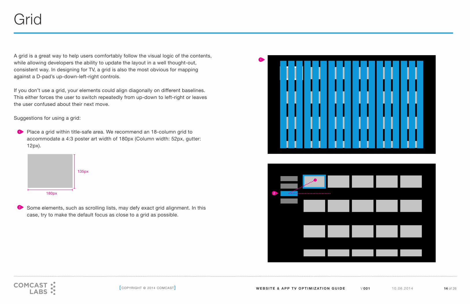
Grid
1
2
A grid is a great way to help users comfortably follow the visual logic of the contents, while allowing developers the ability to update the layout in a well thought-out, consistent way. In designing for TV, a grid is also the most obvious for mapping against a D-pad’s up-down-left-right controls.
If you don’t use a grid, your elements could align diagonally on different baselines. This either forces the user to switch repeatedly from up-down to left-right or leaves the user confused about their next move.
Suggestions for using a grid:
• Place a grid within title-safe area. We recommend an 18-column grid to accommodate a 4:3 poster art width of 180px (Column width: 52px, gutter: 12px).
•
•
•
•
•
• Some elements, such as scrolling lists, may defy exact grid alignment. In this case, try to make the default focus as close to a grid as possible.
1
2
180px
135px
V 001 10.06 .2014 15 of 26 [ COPYRIGHT © 2014 COMCAST] W E B S I T E & A P P T V O P T I M I Z AT I O N G U I D E
Navigation
1
2
2
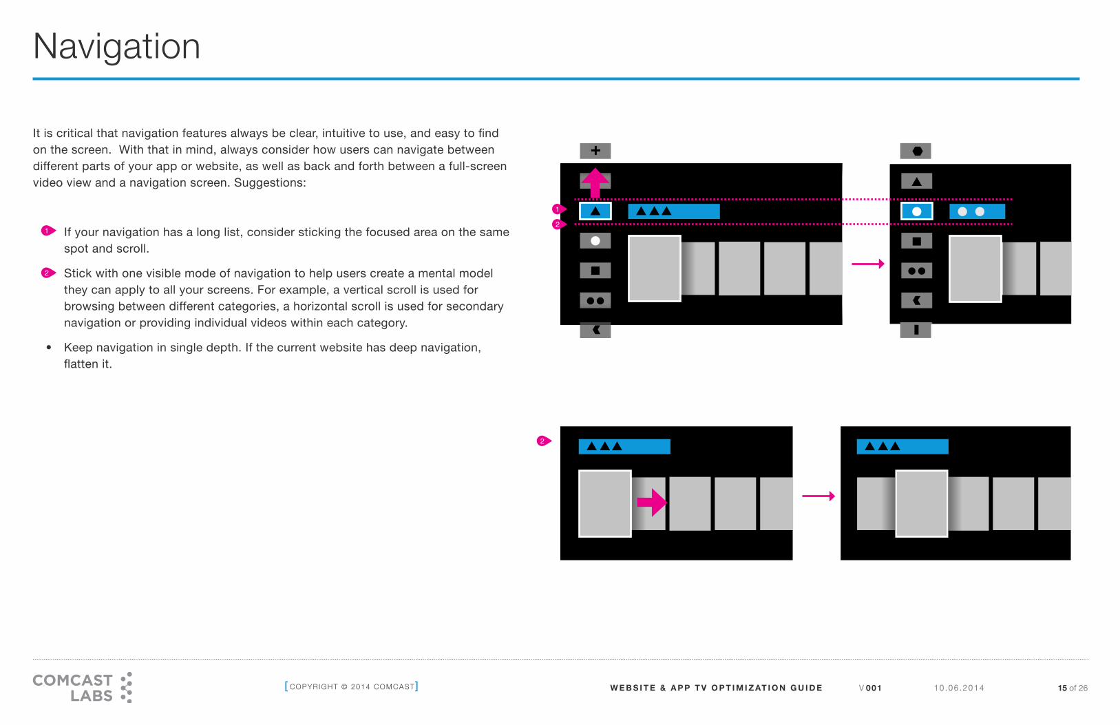
It is critical that navigation features always be clear, intuitive to use, and easy to find on the screen. With that in mind, always consider how users can navigate between different parts of your app or website, as well as back and forth between a full-screen video view and a navigation screen. Suggestions:
• If your navigation has a long list, consider sticking the focused area on the same spot and scroll.
• Stick with one visible mode of navigation to help users create a mental model they can apply to all your screens. For example, a vertical scroll is used for browsing between different categories, a horizontal scroll is used for secondary navigation or providing individual videos within each category.
• Keep navigation in single depth. If the current website has deep navigation, flatten it.
1
2

V 001 10.06 .2014 16 of 26 [ COPYRIGHT © 2014 COMCAST] W E B S I T E & A P P T V O P T I M I Z AT I O N G U I D E
Color
Do Don’t
1
2
3
4
5 5
3
Subtle Gradient
Bright Reds
Bright White (#FFFFFF)
Light Grey (#F1F1F1)
High Contrast Boarder
Bright Oranges
Low Contrast
T
Dark TextLight Background
TLight Text
Dark Background
T
TV screens are much brighter and have higher contrast ratios than PC monitors. For a better TV viewing experience, try not to use solid, vivid colors.
In general, avoid colors with luminance or brightness values of 100%. Also avoid saturation levels above 85% (relative to HSB settings in Photoshop). In RGB terms, no RGB value should be greater than 240.
Other suggestions:
• Instead of pure white (#FFFFFF), use #F1F1F1 or 240/240/240 (RGB).
• Avoid reds that have more than 70% saturation.
• Subtle gradients and low contrast colors may result in color bands or indistinguishable combinations.
• Avoid bordering areas of high contrast colors.
• Remember that light text on a dark background is slightly easier to read on TV (compared to dark text on a light background).
• Be conscious of various TV display modes. These include Standard, Vivid, Cinema/Theater, Game, etc. Be sure to test your apps and websites in all these modes.
1
2
3
4
5

V 001 10.06 .2014 17 of 26 [ COPYRIGHT © 2014 COMCAST] W E B S I T E & A P P T V O P T I M I Z AT I O N G U I D E
Typography
Tag Size Use
42pt FocusSeries Title
Row Header
Episode TitleActionsView All
Episode Preview Title
MetadataDescriptionConditional Status Info
Metadata Detail Header
35pt
28pt
22pt
20pt
16pt (Bold)
xlarge
large
normal
small
xsmall
tiny
TypeUse simple san serif font
TypeAvoid serif font
1
Remember that TV is not optimized for reading. Avoid lightweight fonts or fonts with both very narrow and broad strokes. It’s best to use simply constructed sans serif fonts and apply anti-aliasing to increase readability.
Additional suggestions:
• Create small chunks of text rather than long paragraphs on TV. Try to limit each paragraph to 450 characters.
• Ensure small chunks of text can be read at a glance.
• Keep line length at about 5–7 words per line. Never shorter than 3 or longer than 12.
• Add more leading (larger line spacing) for on-screen text than print text.
• We recommend using the following type sizes. 1

V 001 10.06 .2014 18 of 26 [ COPYRIGHT © 2014 COMCAST] W E B S I T E & A P P T V O P T I M I Z AT I O N G U I D E
Layout
1
4
2
3
Here are examples of layout patterns that you can use:
• This layout is good for viewing all visual assets or as a container when there isn’t a need to categorize or curate assets within a view.
• This layout is suitable when there are multiple assets within a category. It offers the opportunity to display multiple categories within a section or view.
• This layout is good to showcase the meta-data that is associated with a visual asset.
• This layout is designed for playing video.
1
2
3
4

V 001 10.06 .2014 19 of 26 [ COPYRIGHT © 2014 COMCAST] W E B S I T E & A P P T V O P T I M I Z AT I O N G U I D E
Video Controls
15:00
15:00
Title of the Video
Title of the Video
CC
40:00
40:00
Logo
Logo
Video
Image
if
necessary
Video
Image
if
necessary
1
2
Videos displayed on TV can be controlled either by a remote’s playback controls or the on-screen video controls. In order not to disturb the user’s video watching experience, on-screen video controls should only appear upon input control entries. Additional recommendations:
• Default Controls: Float video controls on the bottom of the screen by default and set them to fade out in 1 second unless a user presses the [Arrow] keys. The control is envoked by video playing. [Exit] or [Last] will dismiss the control.
• If the user presses the [Down arrow] key, it will summon playback controls. Users can then access the playback controls by moving focus or pressing playback keys from remote.
• In this navigational pattern, users will go back to the previous session by pressing the [Last] button on the remote. Designing another way to navigate back risks confusing users.
1
2

V 001 10.06 .2014 20 of 26 [ COPYRIGHT © 2014 COMCAST] W E B S I T E & A P P T V O P T I M I Z AT I O N G U I D E
On Screen Text Input
Focus state for the keyboard toggle control. Arrows display above/below, and currently selected keyboard is displayed. Pressing [Up]/[Down] cycles to the other keyboards.
2
Due to lack of a native keyboard in the TV context, functions like search, authentication and alphanumerical input on an X1 Platform may require the use of an on-screen keyboard to manage user input. To maintain consistency and avoid confusing users when entering data, we recommend applying the following on-screen control format to the following components. Note that this feature is currently not provided, but will be supported in the near future.
• Text Input Fields. Have the default state of the search field display help text within the field that’s descriptive of its feature or how it is to be used. Once a user begins entering characters, the input characters should display here. An icon, such as the search icon, may also be displayed.
• Keyboard. On-screen keyboard should display with a default highlight on the first character position in the input field. Multiple keyboards will be supported with a toggle control, but the available keyboards and default keyboard should be selected per the feature. Don’t display unnecessary keyboards. If only one keyboard is needed, the toggle control should not appear. Space and delete characters are at right for all keyboard types and are represented as icons. Keyboard may shrink in size, and even scroll off-screen, after the user scrolls down into the results list.
• Results Area. Default state may display additional help text or be blank depending on the feature or how it is to be used. Also, dynamic messaging may be displayed here in the case of no matching results and/or an error.
1
2
3

V 001 10.06 .2014 21 of 26 [ COPYRIGHT © 2014 COMCAST] W E B S I T E & A P P T V O P T I M I Z AT I O N G U I D E
Sound for TV
Sound output levels considered normal on a built-in TV speaker might be disturbing or unlistenable when that TV is connected to a powerful audio system. When calibrating volume for your apps and websites, the default volume should always be at an appropriate level for a living room and louder than the output level on a PC.
V 001 10.06 .2014 22 of 26 [ COPYRIGHT © 2014 COMCAST] W E B S I T E & A P P T V O P T I M I Z AT I O N G U I D E
Modal Overlay
Modal Overlay
Action 1 Action 2 Action 3
Modal OverlayAction 1
Action 2
Action 3
1
1
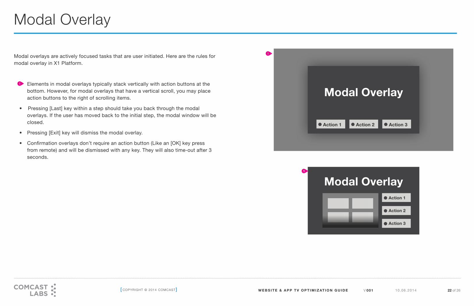
Modal overlays are actively focused tasks that are user initiated. Here are the rules for modal overlay in X1 Platform.
• Elements in modal overlays typically stack vertically with action buttons at the bottom. However, for modal overlays that have a vertical scroll, you may place action buttons to the right of scrolling items.
• Pressing [Last] key within a step should take you back through the modal overlays. If the user has moved back to the initial step, the modal window will be closed.
• Pressing [Exit] key will dismiss the modal overlay.
• Confirmation overlays don’t require an action button (Like an [OK] key press from remote) and will be dismissed with any key. They will also time-out after 3 seconds.
1

V 001 10.06 .2014 23 of 26 [ COPYRIGHT © 2014 COMCAST] W E B S I T E & A P P T V O P T I M I Z AT I O N G U I D E
Animation
1
In
Out
Ease out ExpoWhen watching TV, users expect to see the TV show’s content appear on their screen right after they select a desired channel. Users will expect the same behavior when they watch a web site from TV. Suggestions for creating the same experience:
• Use bitmap instead of vectors for animated objects.
• For animation, consider the use of tweening to save CPU processing and memory.
• We recommend that your animation start quickly and end slowly(easing), so that the perceived time for the animation is low.
1

V 001 10.06 .2014 24 of 26 [ COPYRIGHT © 2014 COMCAST] W E B S I T E & A P P T V O P T I M I Z AT I O N G U I D E
Many users have different abilities that require them to interact with their TVs just as differently. Users who are visually-impaired, hard-of-hearing, or who have other disabilities may not be able to fully use the service. Currently, the X1 Platform supports closed captioning, and we are working to support additional accessibility features. In light of those efforts, developers and designers should keep accessibility in mind as they design their apps and websites.
Key rules to follow:
• Provide alternatives to features and functions that time out.
Your app or website may have some elements that disappear after a certain amount of time (i.e. playback controls that fade from the screen in 5 seconds) If they fade too quickly, your user may not even be aware that they are available. Don’t rely on timed out controls for high-priority task flows. If the controls enable an important function, make sure that the user can turn on the controls again and/or their function is duplicated elsewhere.
• Provide aural cues and alternatives.
If your app or website includes aural cues, you should allow users to change that, in case the user is hard-of-hearing. On the other hand, developers should consider allowing users to turn on aural cues, if possible, to enable visually-impaired users to access the sites.
Accessibility

[ COPYRIGHT © 2014 COMCAST] V 001 10.06 .2014 25 of 26 W E B S I T E & A P P T V O P T I M I Z AT I O N G U I D E
Appendix
+ Developer Check list

V 001 10.06 .2014 26 of 26 [ COPYRIGHT © 2014 COMCAST] W E B S I T E & A P P T V O P T I M I Z AT I O N G U I D E
Display
• App or website works correctly on 1080p resolution displays
• App or website screen loads with 3 seconds
• App or website uses relevant visual queues to indicate that content is loading
• All assets load within title safty area
• Screen doesn’t flicker or turn black while operating
Navigation
• App or website content can be navigated easily with D-Pad
• Elements provide a visual queue when selected or focused
• Includes splash screens or help screens to aid the user on how to navigate the site
• Video players: display transport controls, media play length and current play location
• Respond to transport control buttons on input device: [A], [B], [arrows], [EXIT], etc.
• Responds to D-pad and Page up/down keys for scrolling
Design
• Colors used in the app or website display well in TV
• All graphics in the app or website render nicely without pixelation
• All text elements are bigger than 16pt, legible from 10 feet away
• No bright whites, reds and oranges (prevents color distortion)
Performance
• Animations in the app or website render smoothly
• Video content looks smooth
• System gives responses immediately after clicking
Developer Check List