Do Now: Take out your notebook and a pen. COPY FOR HOMEWORK: Define anchor point
AP Stat Chapter 1 Homework Directions: Complete all problems in a composition notebook (please not a spiral notebook). If you like you may print out these problems and glue them in the composition notebook.
This should be attempted by the first day of class. Please email Mrs. O’Neill and [email protected] with any specific questions. Section 1.1 Analyzing Categorical Data Graphing Hints: When make a graph you don’t have to use a ruler BUT it should be neat. You
will not be allowed a ruler on the exam but you can use the side of your calculator.
Problems - When possible answer in a complete sentence. Person(s) Presenting
EQ 1. What is the difference between categorical and quantitative variables?
EQ 2: What makes graphs deceptive?
EQ 3. How are marginal distributions different than conditional distributions?
4. Here is a small part of the data set that describes the students in an AP Stats class. The data come from anonymous responses to a questionnaire filled out on the first day of class.
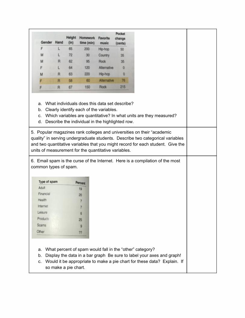
a. What individuals does this data set describe? b. Clearly identify each of the variables. c. Which variables are quantitative? In what units are they measured? d. Describe the individual in the highlighted row.
5. Popular magazines rank colleges and universities on their “academic quality” in serving undergraduate students. Describe two categorical variables and two quantitative variables that you might record for each student. Give the units of measurement for the quantitative variables.
6. Email spam is the curse of the Internet. Here is a compilation of the most common types of spam.
a. What percent of spam would fall in the “other” category? b. Display the data in a bar graph Be sure to label your axes and graph! c. Would it be appropriate to make a pie chart for these data? Explain. If
so make a pie chart.

7. Here are the data from a survey conducted at eight high schools on smoking among students and their parents.
a. How many students are described in the two way table? i. What percent of these students smoke?
b. Give the marginal distributions of parents’ smoking behavior. Both in counts and percents.
c. Calculate the conditional distributions of students’ smoking behavior. Be sure to label graph and axes.
i. Make a side by side bar graph ii. Make a segmented bar graph
d. Describe the relationship between the smoking behaviors of students and their parents in a few sentences.
8. Whether a convicted murderer gets the death penalty seems to be influenced by the race of the victim. Here are the data on 326 cases in which the defendant was convicted of murder.
a. Use these data to make a two-way table of defendant’s race (white or black) versus death penalty (yes or no)
b. Show that Simpson’s paradox holds: a higher percent of white defendants are sentenced to death overall, but for both black and white victims a higher percent of black defendants are sentenced to death.

c. Use the data to explain why the paradox holds in language that a judge could understand ..
9. What are the four steps to exploring data?
10. Define inference with a picture (try to do it with no words)
1.1 Mc Practice 1. You record the age, marital status and earned income of a sample of 1463 women. The number and type of variables you have recorded is a. 3 quantitative, 0 categorical b. 4 quantitative, 0 categorical c. 3 quantitative, 1 categorical d. 2 quantitative, 1 categorical e. 2 quantitative, 2 categorical 2. Consumers Union measured the gas mileage in milers per gallon of 38 vehicles from the same model year on a special test track. The pie chart provides information about the country of manufacture of the model cars tested by the Consumer Union. Based on the pie chart, we conclude
a. Japanese cars get significantly lower gas mileage than cars from other countries. b. U.S. cars get significantly higher gas mileage than cars from other countries. c. Swedish cars get gas mileages that are between those of Japanese and U.S. cars. d. Mercedes, Audi, Porsche, and BMW represent approximately a quarter of the cars tested. e. More than half of the cars in the study were from the United States.

3. Which of the following bar graphs is equivalent to the pie chart in Question 2?
Problem number Person presenting
11. The following table displays the total number of gold medals won by a sample of countries in the 2008 Summer Olympic Games in China.
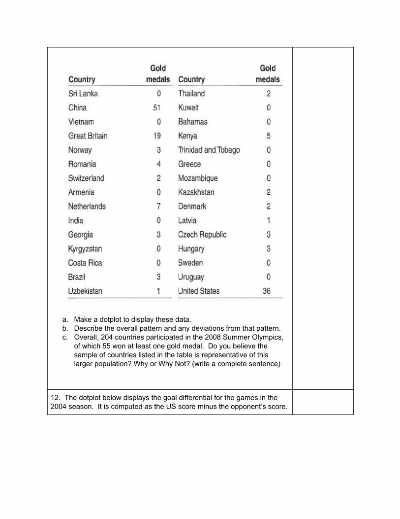
a. Make a dotplot to display these data. b. Describe the overall pattern and any deviations from that pattern. c. Overall, 204 countries participated in the 2008 Summer Olympics,
of which 55 won at least one gold medal. Do you believe the sample of countries listed in the table is representative of this larger population? Why or Why Not? (write a complete sentence)
12. The dotplot below displays the goal differential for the games in the 2004 season. It is computed as the US score minus the opponent’s score.
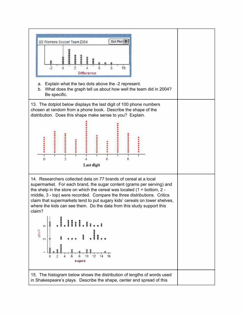
a. Explain what the two dots above the -2 represent. b. What does the graph tell us about how well the team did in 2004?
Be specific.
13. The dotplot below displays the last digit of 100 phone numbers chosen at random from a phone book. Describe the shape of the distribution. Does this shape make sense to you? Explain.
14. Researchers collected data on 77 brands of cereal at a local supermarket. For each brand, the sugar content (grams per serving) and the shelp in the store on which the cereal was located (1 = bottom, 2 - middle, 3 - top) were recorded. Compare the three distributions. Critics claim that supermarkets tend to put sugary kids’ cereals on lower shelves, where the kids can see them. Do the data from this study support this claim?
15. The histogram below shows the distribution of lengths of words used in Shakespeare’s plays. Describe the shape, center and spread of this

distribution.
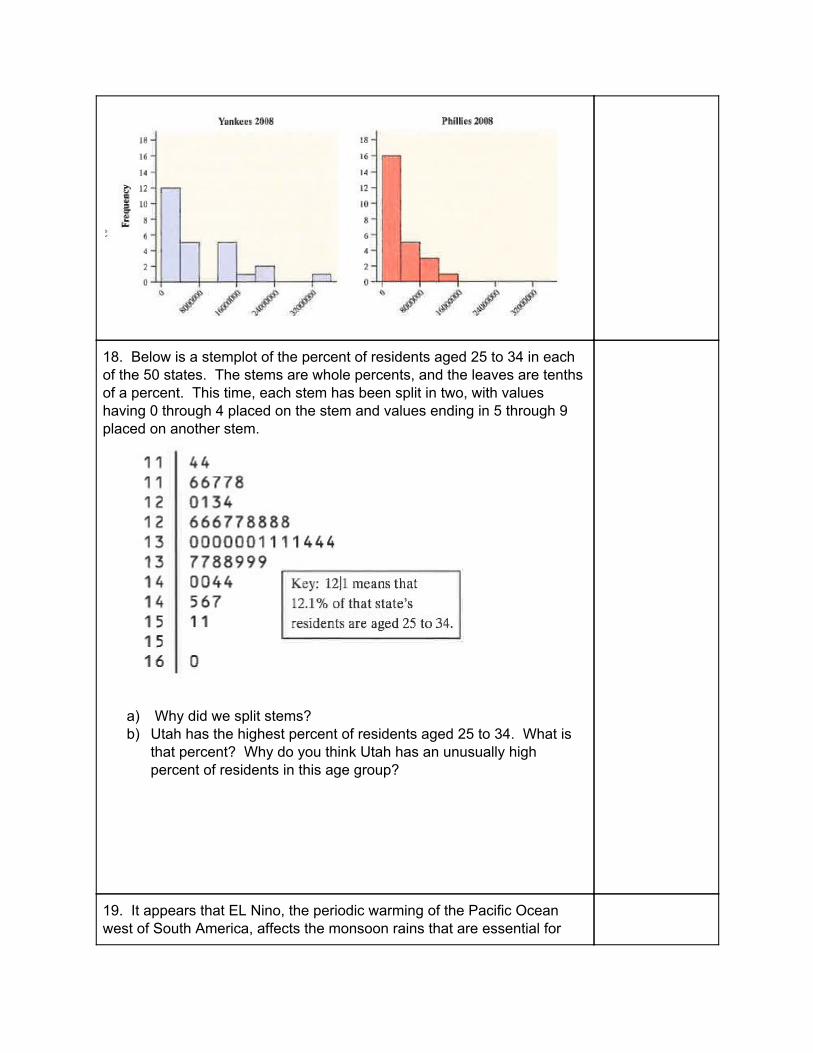
16. Does paying high salaries lead to more victories in professional sports? The New York Yankees have long been known for having Major League Baseball’s highest team payroll. And over the years, the team has won many championships. This strategy didn’t payoff in 2008, when the Philadelphia Phillies won the World Series. Maybe the Yankees didn’t spend enough money that year. The graph below shows histograms of the salary distributions for the two teams during the 2008 season. Why can’t you effectively compare the team payrolls?
17. Here is another graph of the 2008 salary distributions for the Yankees and the Phillies. Write a few sentences comparing these two distributions.
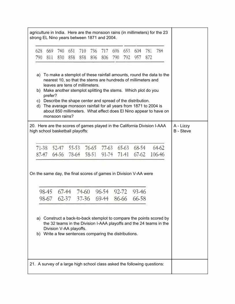
18. Below is a stemplot of the percent of residents aged 25 to 34 in each of the 50 states. The stems are whole percents, and the leaves are tenths of a percent. This time, each stem has been split in two, with values having 0 through 4 placed on the stem and values ending in 5 through 9 placed on another stem.
a) Why did we split stems? b) Utah has the highest percent of residents aged 25 to 34. What is
that percent? Why do you think Utah has an unusually high percent of residents in this age group?
19. It appears that EL Nino, the periodic warming of the Pacific Ocean west of South America, affects the monsoon rains that are essential for
agriculture in India. Here are the monsoon rains (in millimeters) for the 23 strong EL Nino years between 1871 and 2004.
a) To make a stemplot of these rainfall amounts, round the data to the nearest 10, so that the stems are hundreds of millimeters and leaves are tens of millimeters.
b) Make another stemplot splitting the stems. Which plot do you prefer?
c) Describe the shape center and spread of the distribution. d) The average monsoon rainfall for all years from 1871 to 2004 is
about 850 millimeters. What effect does El Nino appear to have on monsoon rains?
20. Here are the scores of games played in the California Division I-AAA high school basketball playoffs:
On the same day, the final scores of games in Division V-AA were
a) Construct a back-to-back stemplot to compare the points scored by the 32 teams in the Division I-AAA playoffs and the 24 teams in the Division V-AA playoffs.
b) Write a few sentences comparing the distributions.
A - Lizzy B - Steve
21. A survey of a large high school class asked the following questions:
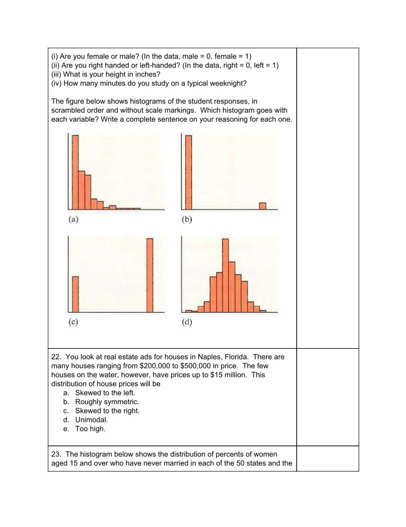
(i) Are you female or male? (In the data, male = 0, female = 1) (ii) Are you right handed or left-handed? (In the data, right = 0, left = 1) (iii) What is your height in inches? (iv) How many minutes do you study on a typical weeknight? The figure below shows histograms of the student responses, in scrambled order and without scale markings. Which histogram goes with each variable? Write a complete sentence on your reasoning for each one.
22. You look at real estate ads for houses in Naples, Florida. There are many houses ranging from $200,000 to $500,000 in price. The few houses on the water, however, have prices up to $15 million. This distribution of house prices will be
a. Skewed to the left. b. Roughly symmetric. c. Skewed to the right. d. Unimodal. e. Too high.
23. The histogram below shows the distribution of percents of women aged 15 and over who have never married in each of the 50 states and the

District of Columbia.
The center of this distribution is in the interval
a. 22% to 24% b. 24% to 26% c. 26% to 28% d. 28% to 30% e. 36% to 38%
AP Stat Hw 1.3
24. The 2009 roster of the Dallas Cowboys professional football team included 7 defensive linemen. Their weights (in pounds) were 306, 305, 315, 303, 318, 309, 285.
a. Calculate the mean i. Show your work. ii. Interpret your result in context.
b. Find the median by hand. i. Show your work. ii. Interpret your result in context.
c. Find and interpret the two quartiles. d. Make a boxplot. e. Find and interpret the Interquartile range (IQR). f. Determine whether there are any outliers. Show your work. g. Make a modified boxplot

h. Suppose the lightest lineman had weighed 265 instead of 285 pounds. i. How would this change affect the mean and median? ii. What property of measures of center does this illustrate?
25. The mean and median selling prices of existing single-family homes sold in November 2009 were $216,000 and $172,600. Which of these numbers is the mean and which is the median? Explain your reasoning with a complete sentence.
26. Suppose that a Major League Baseball team’s mean yearly salary for its players is $1.2 million and that the team has 25 players on an active roster. What is the teams total annual payroll? If you know only the median salary, would you be able to answer this question? Why or why not (answer in a complete sentence)?
27. Should you put your money into a fund that buys stocks or a fund that invests in real estate? The boxplots compare the daily returns (in percent) on a “total stock market” fund and a real estate fund over a year ending in November 2007.
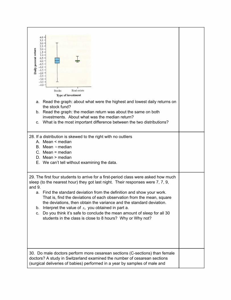
a. Read the graph: about what were the highest and lowest daily returns on
the stock fund? b. Read the graph: the median return was about the same on both
investments. About what was the median return? c. What is the most important difference between the two distributions?
28. If a distribution is skewed to the right with no outliers A. Mean < median B. Mean median≈ C. Mean = median D. Mean > median E. We can’t tell without examining the data.
29. The first four students to arrive for a first-period class were asked how much sleep (to the nearest hour) they got last night. Their responses were 7, 7, 9, and 9.
a. Find the standard deviation from the definition and show your work. That is, find the deviations of each observation from the mean, square the deviations, then obtain the variance and the standard deviation.
b. Interpret the value of you obtained in part a.sx c. Do you think it’s safe to conclude the mean amount of sleep for all 30
students in the class is close to 8 hours? Why or Why not?
30. Do male doctors perform more cesarean sections (C-sections) than female doctors? A study in Switzerland examined the number of cesarean sections (surgical deliveries of babies) performed in a year by samples of male and

female doctors. Here are summary statistics for the two distributions.
a. Based on the computer output, which distribution would you guess has a
more symmetrical shape? Write a sentence to explain. b. Explain how the IQRs of these two distributions can be so similar even
though the standard deviations are quite different. c. Does it appear that males perform more C-sections? Justify your
answer. d. Perform the outlier test. Does this data set have any outliers?
31. To become president of the United States, a candidate does not have to receive a majority of the popular vote. The candidate does have to win a majority of the 538 electoral votes that are cast in the Electoral College. Here is a stemplot of the number of electoral votes for each of the 50 states and the District of Columbia.
a. Make a boxplot of these data by hand. Be sure to check for outliers. b. Which measure of center and spread would you use to summarize the
distribution - the mean and standard deviation or the median and IQR? Justify your answer.
32. You have data on the weights in grams of 5 baby pythons. The mean weight is 31.8 and the standard deviation of the weights is 2.39. The correct units for the standard deviation are

A. No units - it’s just a number. B. Grams C. Grams squared D. Pythons E. Pythons squared
33. Which of the following is least affected if an extreme high outlier is added to your data?
A. Median B. Mean C. Standard deviation D. Range E. Maximum
34. What are all of the values that a standard deviation can possible take?sx A. 0sx ≥ B. 0sx > C. 0 ≤ sx ≤ 0 D. − 1 ≤ sx ≤ 1 E. Any number