Ancillary Text Research
20
-
Upload
mkaur22 -
Category
Art & Photos
-
view
85 -
download
0
Transcript of Ancillary Text Research


First, I need to research existing album covers so that I can get some inspiration…
I decided to look at Noah and the Whale’s (the artist of our chosen song) albums, so that I could incorporate their style into the ancillary texts for my music video.

Looks like an article or a newspaper advert
The style is very ‘vintage’ The font is
striking yet simple
The colour scheme is simple, and the photo has a faded, exposed effect
The photo is blended into a city landscape
The outfits are classic and quirky
The credits are placed on the frontThe structure
is simple and organised

The photo takes up the whole cover
The style is quirky and simple
The name is small and simple to attract attention to the photo
The photo is bright and has a blurred background
The photo is simple and not too staged
The theme seems to be adventure and exploration
There are no additional credits on the coverThe outfits are
simple and lightly coloured

The photo has been acted out
The cover looks like a movie advert
The name of the band is large and attention-grabbing
The photo doesn’t involve the band
The colour scheme is bright but still understated
The people seem to be part of a bigger story
The credits are placed on the cover, with the name of the album at the bottom
The outfits are all the same, indicating a theme

It’s clear that Noah and the Whale prefer to have an ‘artsy’ array of album covers that directly relate to their names in some way. Photos are used in all three, but one doesn’t include the band, and the others are either staged or seemingly ‘random’ shots.
I have some pictures that I chose as stills from the music video that I want to use for the ancillary texts, and all of them involve Owen acting for the video. Therefore, they don’t involve any particular pose and so are relevant to the song.
I think I will incorporate Noah and the Whale’s artistic elements, such as their bright yet understated colour schemes, and the way that they make their album covers look more like movie posters than conventional albums.
They do this in two of the covers by putting credits on the front of the album and making the structure simple and organised, with the title standing out and the picture being interesting and edited so that it looks exposed and ‘vintage’.
If we decide that we don’t like the photos of Owen from the day of filming, we can arrange a photo-shoot in the green room at college and take some where he poses intentionally like the first album cover.
I will look at other album covers from the same genre of music (indie folk) in order to gain a deeper understanding of the typical album covers and the themes that artists such as Bon Iver and John Mayer use.
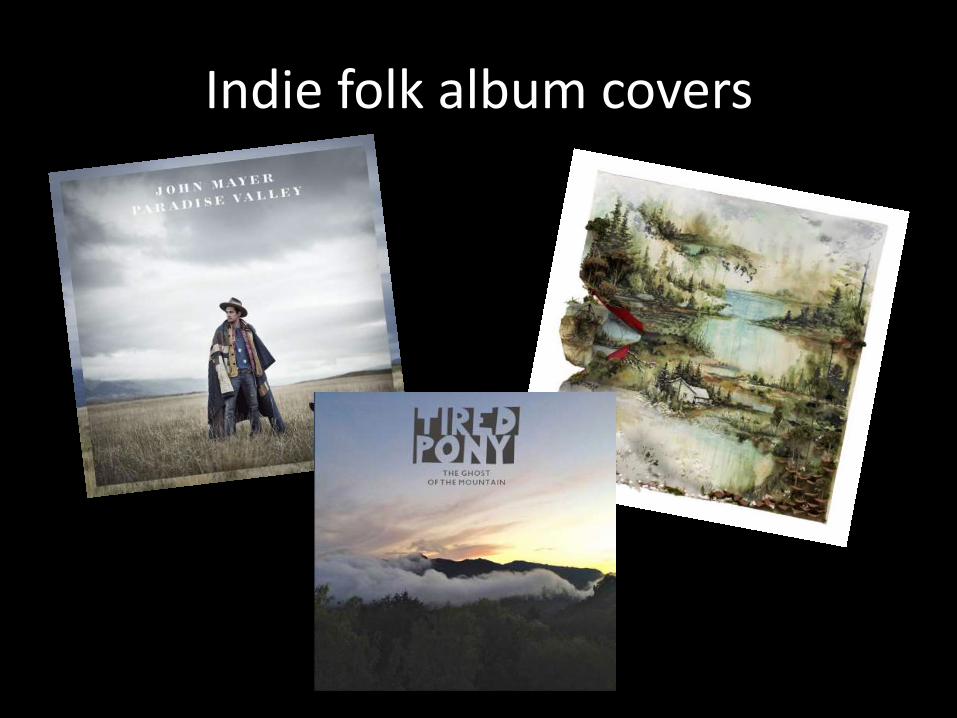
Indie folk album covers
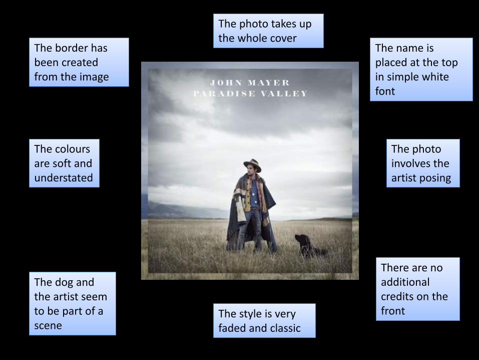
The border has been created from the image
The photo takes up the whole cover
The name is placed at the top in simple white font
The photo involves the artist posing
The colours are soft and understated
The dog and the artist seem to be part of a scene
There are no additional credits on the frontThe style is very
faded and classic

There is a white border that surrounds the image
The cover is a drawing of a setting
The name is not on the front, only the image
The drawing takes up the whole cover
The colours are bright yet soft and interesting
The artist is not even hinted at on the cover
The drawing is the main focus of the actual albumThe album is more
about the music than the artist

The entire cover is very simple yet interesting
The photo takes up the whole cover
The name is placed at the top and is in an interesting font
The artist is not on the cover
The colours are understated and calming
The mountains in the picture quite clearly relate to the name
There are no additional credits on the frontThe style is artistic
and interesting

The three indie folk album covers that I chose to look at were:
• John Mayer – Paradise Valley
• Bon Iver – Holocene
• Tired Pony – The Ghost of the Mountain
I chose them because they are similar in style of music to Noah and the Whale, yet they are all different in their own ways. All of the covers were very simple, with a photo taking up the majority of the space.
I think they did this because they are all indie artists, and so are in it for the music and not the money. This allows them to stretch further in the artistic side of their music and make their albums a work of art rather than a piece of merchandise.
Only one of the cover actually involved the artist, and even then, it was a long camera shot and so the background took up most of the image. The other two covers also included interesting landscapes, but one was a bright drawing.
Although I really like the idea of using an artistic image as the magazine cover, I think I will stick to using the conventional idea of an image of the artist. This is because I want to go against the conventions of indie folk album covers and see how it will work out.
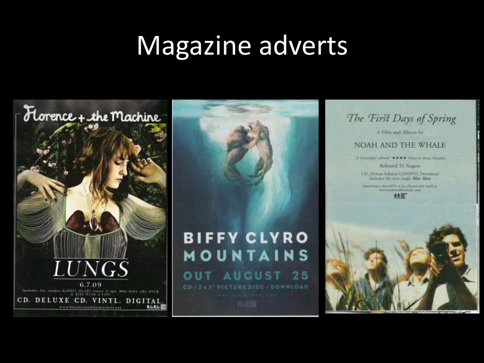
Magazine adverts

The structure of the advert is very organised
The photo takes up the whole advert
The name is placed at the top and the album details are at the bottom
The artist is posing in costume
The colours aren't too bright but the advert is still interesting
The album cover is used as the image
The release date and album details are at the bottom
The style is quirky and interesting

The colour scheme is consistent and calming
The image takes up the whole advert
The name is put right next to the name of the album
The name of the album is the biggest font on the page
The artwork is faded and interesting
The picture is the same one used on the album cover
There are a few album details at the bottomThe text is
understated and minimalist

The advert is very much like a movie poster
The photo takes up the whole advert
The name of the album is put in a contrasting font to the name of the band
The name of the album is the first thing you see
The colour scheme isn't overbearing
The image from the album is expanded to make an A4 image
There are additional credits like reviewsThe style is simple
and attracts attention

The three magazine adverts that I chose to look at were:• Florence + the Machine – Lungs• Biffy Clyro – Mountains• Noah and the Whale – The First Days of Spring
Again, these three bands are indie artists, and one of the adverts involves the artist of my chosen song. All three were very simplistic, and this reinforces the idea that indie bands and artists are more concerned about their music than flamboyant advertising and over the top images.
The adverts all have these things in common:• Interesting or simple image• Credits around the image• Details of the album e.g. release date and reviews• Understated yet interesting colour scheme• Similar to a movie poster
I like the idea of a simple magazine advert, and my favourite out of all of the adverts was the Florence + the Machine one. This is because it involved a medium close up of the artist with props that related to the name of the album and a quirky style.
I think that if I was to make an advert involving Owen, it would look most like Florence + the machine’s advert because I want to include a picture of Owen and the puppet. I would also include reviews and details of the album, such as release date and different formats.

Pinocchio

As I was inspired by the story of Pinocchio, I thought it might be good to include some aspects in my ancillary texts. I like the classic style of the art in the film, and the puppet we are using definitely reflects this style.
The colour scheme of the film Pinocchio mostly involves primary colours, and the colours themselves are very bright. Although the album covers and magazine adverts I looked at all had muted, understated colours, it would be a good idea to play around with brightness and exposure levels on my own ancillary texts to see what works the best.
The puppet will definitely by featured in the ancillary texts in some way, but I will have to see if the pictures from filming will work well or if new pictures will need to be taken. These would be done in the green room against a plain background, so that editing is easier.
I would also use studio lighting and the picture would obviously not be illustrated like the film, but I could include some drawings or illustrated aspects in the ancillary texts. I will try and keep the mood happy and light, like the film, rather than make the colour scheme too muted or unreflective of the message of the video.
I look forward to seeing how I can adapt the art of Pinocchio into my ancillary texts.

Wes Anderson

When looking at Noah and the Whale’s magazine advertisement for The First Days of Spring, the art of Wes Anderson came to mind. The style of the advert was very similar to the structure of Anderson’s poster for Moonrise Kingdom.
This made me think about incorporating some of the famous director’s ideas into my ancillary texts, as his style is very unique and the quirkiness of his work is his trademark. The colour schemes of his different films are very significant because they tend to be consistent throughout the film.
If I was to apply this to my music video, I would have to choose a colour scheme based around a certain emotion, place or person, and I would have to keep these colours at the forefront of every scene in the video.
As this is difficult to do on film, I could apply it to my ancillary texts instead. The images could involved solid colours that all compliment each other and make the onlooker feel something specific. This could sway the audiences in the advert’s favour, and I could test different responses by doing a survey or Q&A.
I think that incorporating Wes Anderson’s style into my ancillary texts could be very effective in drawing in audiences of all ages and music tastes.