ancillary text - photoshop process
6
Ancillary Text – Photoshop Process
-
Upload
taraburton07 -
Category
Education
-
view
51 -
download
3
Transcript of ancillary text - photoshop process
Ancillary Text – Photoshop
Process
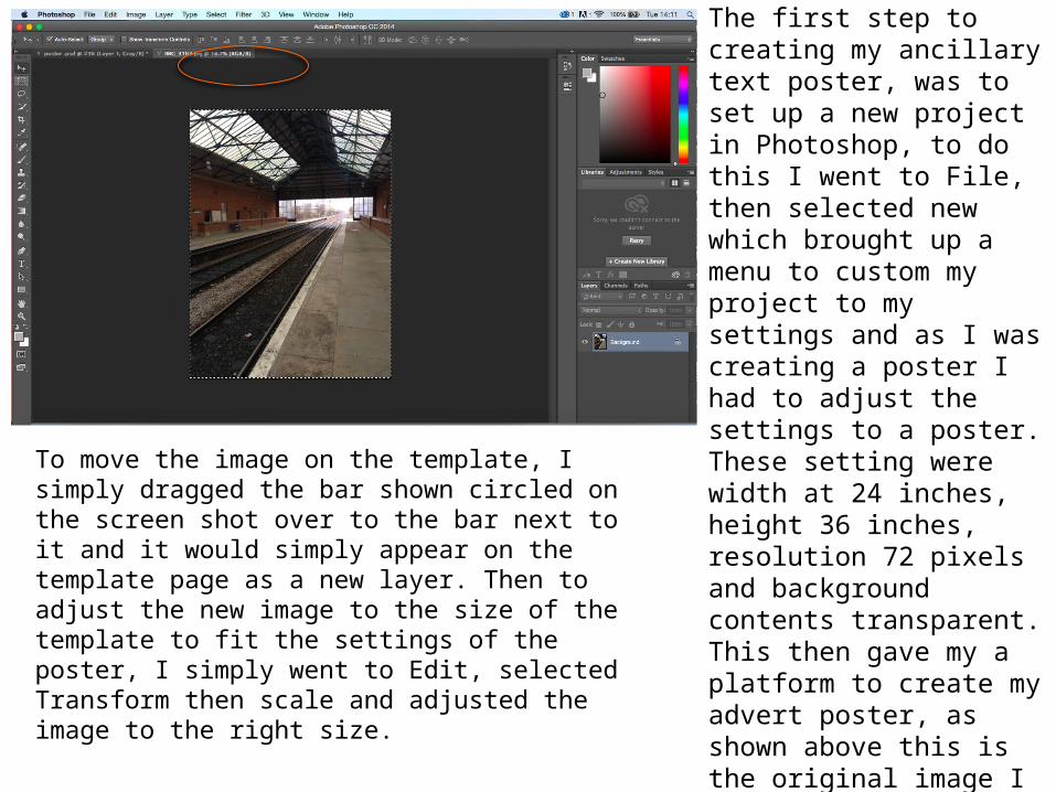
The first step to creating my ancillary text poster, was to set up a new project in Photoshop, to do this I went to File, then selected new which brought up a menu to custom my project to my settings and as I was creating a poster I had to adjust the settings to a poster. These setting were width at 24 inches, height 36 inches, resolution 72 pixels and background contents transparent. This then gave my a platform to create my advert poster, as shown above this is the original image I used for the main image, to get this as a new layer on my template I simple went to file again then open and selected the image I wanted to use, which then appeared as a separate layer to the template as shown circled above.
To move the image on the template, I simply dragged the bar shown circled on the screen shot over to the bar next to it and it would simply appear on the template page as a new layer. Then to adjust the new image to the size of the template to fit the settings of the poster, I simply went to Edit, selected Transform then scale and adjusted the image to the right size.
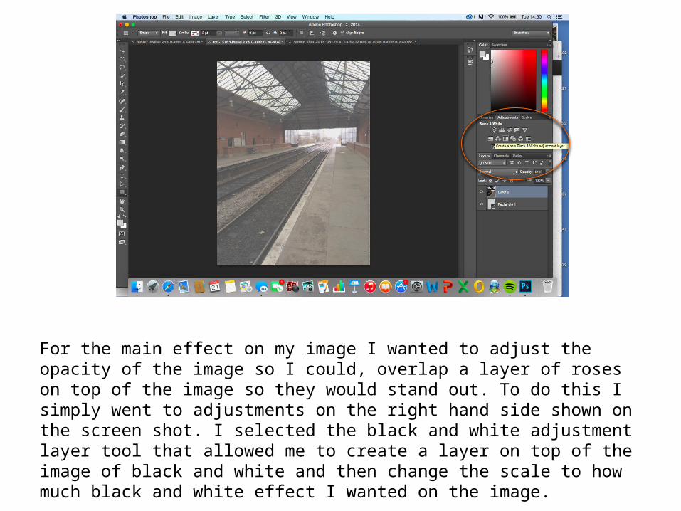
For the main effect on my image I wanted to adjust the opacity of the image so I could, overlap a layer of roses on top of the image so they would stand out. To do this I simply went to adjustments on the right hand side shown on the screen shot. I selected the black and white adjustment layer tool that allowed me to create a layer on top of the image of black and white and then change the scale to how much black and white effect I wanted on the image.
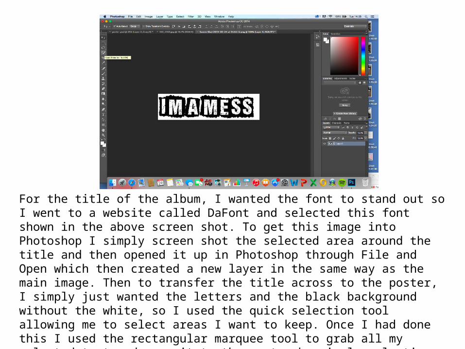
For the title of the album, I wanted the font to stand out so I went to a website called DaFont and selected this font shown in the above screen shot. To get this image into Photoshop I simply screen shot the selected area around the title and then opened it up in Photoshop through File and Open which then created a new layer in the same way as the main image. Then to transfer the title across to the poster, I simply just wanted the letters and the black background without the white, so I used the quick selection tool allowing me to select areas I want to keep. Once I had done this I used the rectangular marquee tool to grab all my selected text and move it to the poster by simply selecting the move tool and hover it over the poster bar at the top. Once the text was on the poster I had to once again adjust the scale and size of the title by doing this I went to edit, selected transform and scale and adjusted the title to the appropriate size.
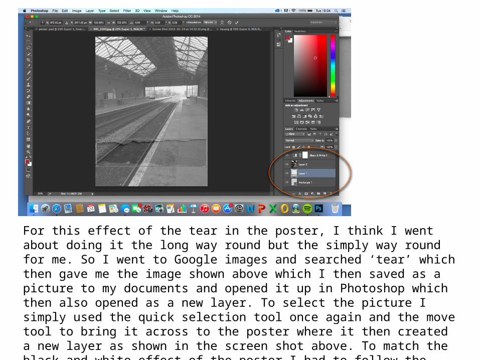
For this effect of the tear in the poster, I think I went about doing it the long way round but the simply way round for me. So I went to Google images and searched ‘tear’ which then gave me the image shown above which I then saved as a picture to my documents and opened it up in Photoshop which then also opened as a new layer. To select the picture I simply used the quick selection tool once again and the move tool to bring it across to the poster where it then created a new layer as shown in the screen shot above. To match the black and white effect of the poster I had to follow the same steps as mentioned about the adjustment panel on the main image. Similarly to the rest of the new layers on the poster I had to change the scale of the layer to fit within the poster.
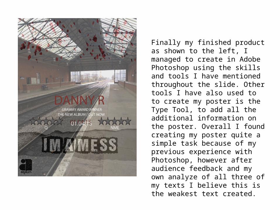
Finally my finished product as shown to the left, I managed to create in Adobe Photoshop using the skills and tools I have mentioned throughout the slide. Other tools I have also used to to create my poster is the Type Tool, to add all the additional information on the poster. Overall I found creating my poster quite a simple task because of my previous experience with Photoshop, however after audience feedback and my own analyze of all three of my texts I believe this is the weakest text created.