Ancillary task review page - research into simlar products.pptx
12
Ancillary Task - Review Feature Page Research into similar products
Transcript of Ancillary task review page - research into simlar products.pptx
Ancillary Task - Review Feature Page
Research into similar products
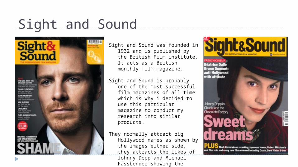
Sight and SoundSight and Sound was founded in
1932 and is published by the British Film institute. It acts as a British monthly film magazine.
Sight and Sound is probably one of the most successful film magazines of all time which is why i decided to use this particular magazine to conduct my research into similar products.
They normally attract big Hollywood names as shown by the images either side, they attracts the likes of Johnny Depp and Michael Fassbender showing the magazine attracts mainstream audiences as well as showing us that it is a very successful magazine.
My Research
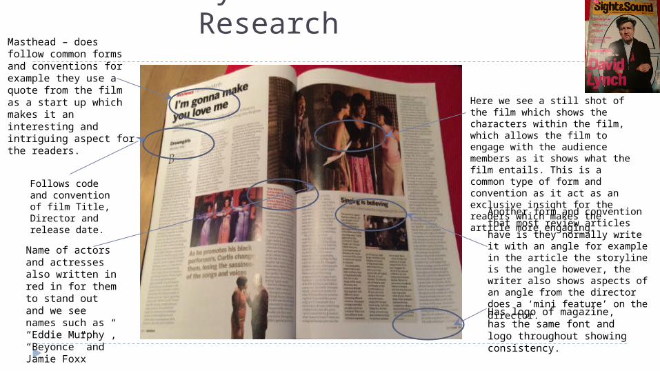
Here we see a still shot of the film which shows the characters within the film, which allows the film to engage with the audience members as it shows what the film entails. This is a common type of form and convention as it act as an exclusive insight for the readers which makes the article more engaging.
Another form and convention that most review articles have is they normally write it with an angle for example in the article the storyline is the angle however, the writer also shows aspects of an angle from the director does a ‘mini feature’ on the director.
Has logo of magazine, has the same font and logo throughout showing consistency.
Masthead – does follow common forms and conventions for example they use a quote from the film as a start up which makes it an interesting and intriguing aspect for the readers.
Follows code and convention of film Title, Director and release date.
Name of actors and actresses also written in red in for them to stand out and we see names such as “Eddie Murphy”, “Beyonce” and Jamie Foxx
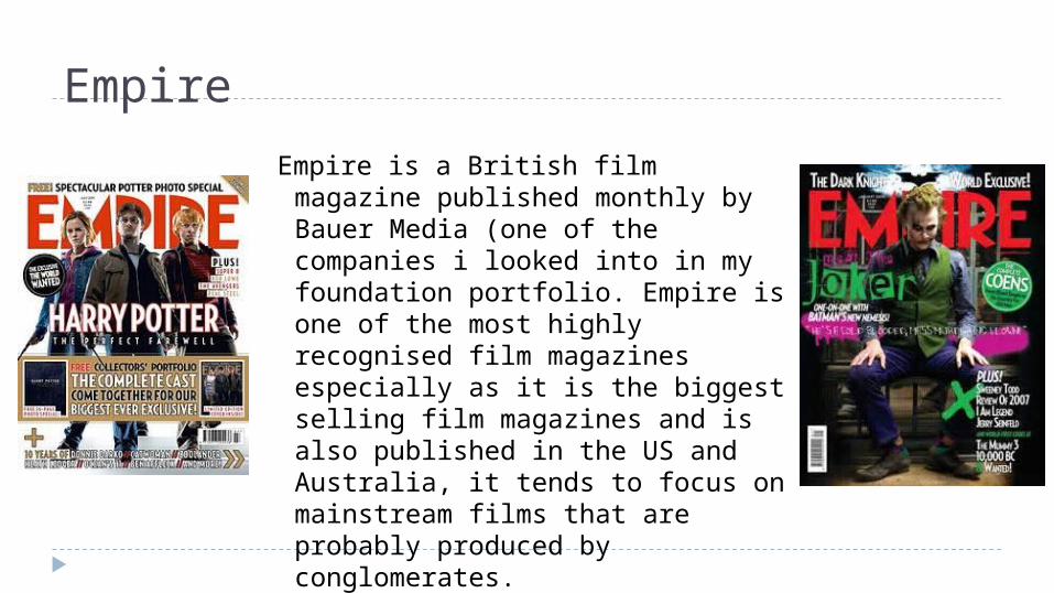
Empire
Empire is a British film magazine published monthly by Bauer Media (one of the companies i looked into in my foundation portfolio. Empire is one of the most highly recognised film magazines especially as it is the biggest selling film magazines and is also published in the US and Australia, it tends to focus on mainstream films that are probably produced by conglomerates.
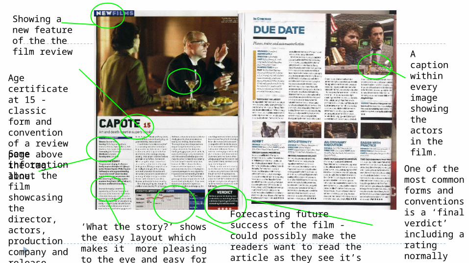
Age certificate at 15 - classic form and convention of a review page above the tag line.Some information about the film showcasing the director, actors, production company and release date.
Showing a new feature of the the film review
‘What the story?’ shows the easy layout which makes it more pleasing to the eye and easy for the audience to read.
Forecasting future success of the film - could possibly make the readers want to read the article as they see it’s suppose to be good.
One of the most common forms and conventions is a ‘final verdict’ including a rating normally out of 5
A caption within every image showing the actors in the film.
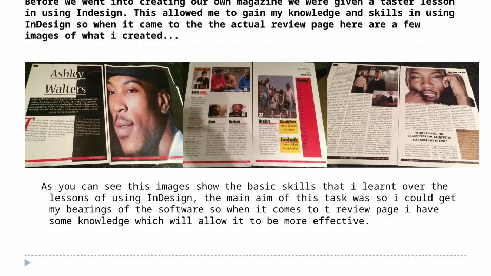
Before we went into creating our own magazine we were given a taster lesson in using Indesign. This allowed me to gain my knowledge and skills in using InDesign so when it came to the the actual review page here are a few images of what i created...
As you can see this images show the basic skills that i learnt over the lessons of using InDesign, the main aim of this task was so i could get my bearings of the software so when it comes to t review page i have some knowledge which will allow it to be more effective.
Drafts of textsThe down low…Ever thought there could be so much drama around one bench? Well you are about to be surprised, in Just 15 we follow a conversation between a group of friends with deep secrets amongst them. The film allows us to be the ‘fourth wall’ in what it seems to be like a normal conversation between group friends, however, we see the effects that society has on the young group and that eventually all succumbs to the pressure. The plot…The film starts off with Molly (Jodie Neighbour) and Lucy (Sian Madigan) discussing the relationship between Lucy and Tom (Sam Casse) however, we see Molly look uncomfortable and distressed about the situation, showing us that she is hiding something. We are then introduced to Cameron (Zach Haines) where the audience get to understand the awkwardness between to two main characters where Lucy reveals something went on. During the end we see the whole group of actors together talking about alcohol, drugs and underage pregnancy as if it is a modern trend, here the big secret is revealed by challenging forms and conventions of British Short Films. One thing to note about this film is that even though the storyline is engaging we somehow get distracted by the amateur editing. We can really see the first time filmmakers s ‘rookie’ mistakes in the way they edit, we see them trying to reveal Molly’s raw emotion which is performed great by the inexperienced actress, however, cut short by the need to see the other characters speaking their dialogue which is sometimes covered by the sound of the wind in the background. The comparison We can see clear comparisons with short films already well established, showing the influences they have over Just 15. The films we can relate to is ‘Tight Jeans (Destiny Ekaragha) 2008 with the idea of have just one location and being more dialogue orientated rather than fancy cinematography showing another aspect of amateur filmmakers. We also see references to Tom Harper’s Cubs (2006) which also relate to peer pressure.
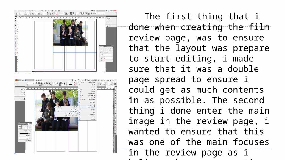
The first thing that i done when creating the film review page, was to ensure that the layout was prepare to start editing, i made sure that it was a double page spread to ensure i could get as much contents in as possible. The second thing i done enter the main image in the review page, i wanted to ensure that this was one of the main focuses in the review page as i believe the representation of the characters is really importantly when trying to attract the target audience.
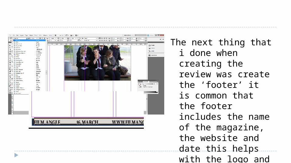
The next thing that i done when creating the review was create the ‘footer’ it is common that the footer includes the name of the magazine, the website and date this helps with the logo and how the audience will be able to identify with the film magazine.
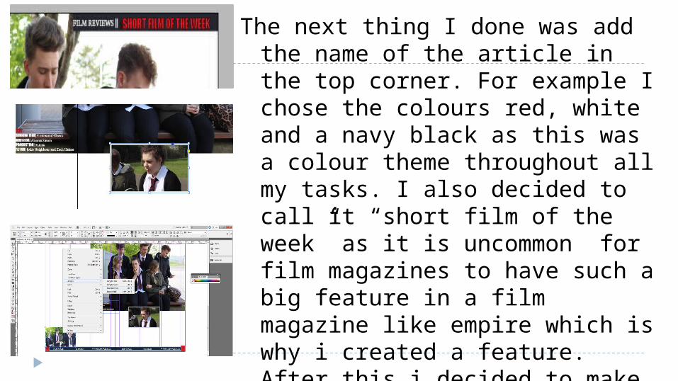
The next thing I done was add the name of the article in the top corner. For example I chose the colours red, white and a navy black as this was a colour theme throughout all my tasks. I also decided to call it “short film of the week” as it is uncommon for film magazines to have such a big feature in a film magazine like empire which is why i created a feature. After this i decided to make the layout of the review page more exciting by additional images including form and convention images such as still shots from the film.
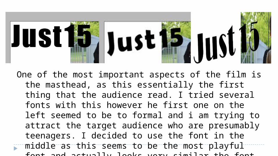
One of the most important aspects of the film is the masthead, as this essentially the first thing that the audience read. I tried several fonts with this however he first one on the left seemed to be to formal and i am trying to attract the target audience who are presumably teenagers. I decided to use the font in the middle as this seems to be the most playful font and actually looks very similar the font used in the opening sequence which makes the combination of all the tasks look familiar and therefore, professional.
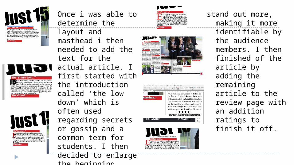
Once i was able to determine the layout and masthead i then needed to add the text for the actual article. I first started with the introduction called ‘the low down’ which is often used regarding secrets or gossip and a common term for students. I then decided to enlarge the beginning letter as that it is a common code and convention within articles it also makes the letter
stand out more, making it more identifiable by the audience members. I then finished of the article by adding the remaining article to the review page with an addition ratings to finish it off.