Ancillary Task Research by FlowMotion Films
6
Ancillary Task Research – Digipak and website FlowMotion Films
-
Upload
shyam-lakhani -
Category
Education
-
view
293 -
download
0
Transcript of Ancillary Task Research by FlowMotion Films
Ancillary Task Research – Digipak and website
FlowMotion Films
;
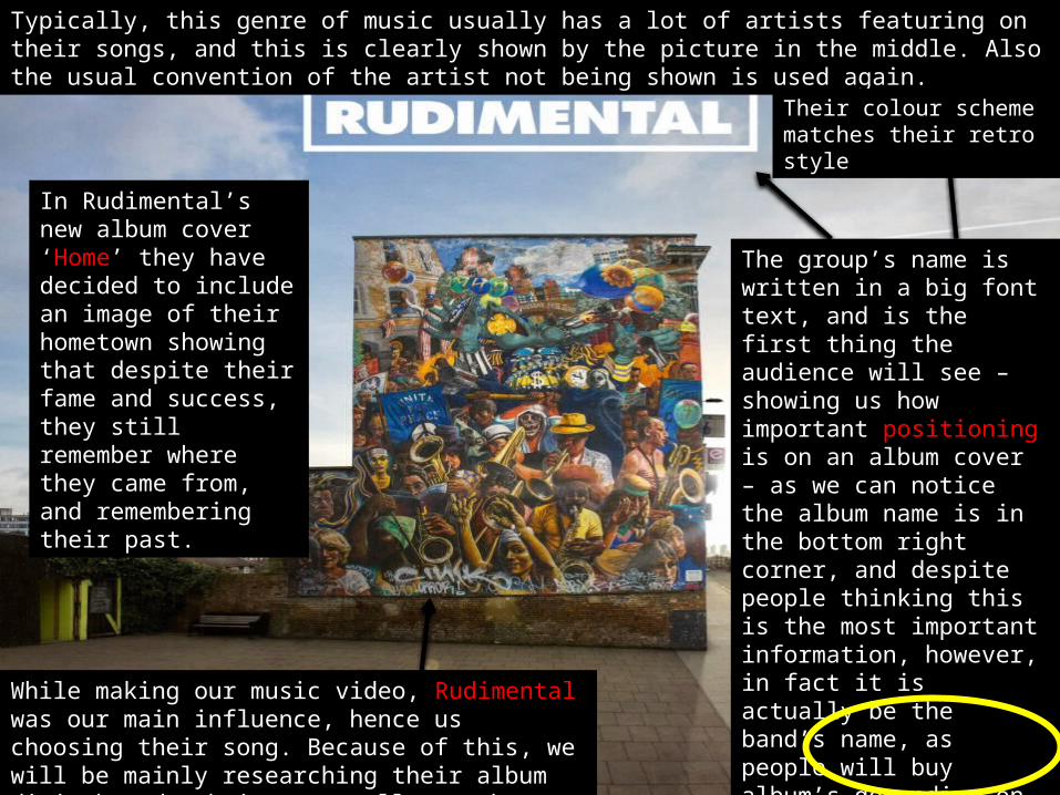
While making our music video, Rudimental was our main influence, hence us choosing their song. Because of this, we will be mainly researching their album digipak and website, as well as others.
In Rudimental’s new album cover ‘Home’ they have decided to include an image of their hometown showing that despite their fame and success, they still remember where they came from, and remembering their past.
The group’s name is written in a big font text, and is the first thing the audience will see – showing us how important positioning is on an album cover – as we can notice the album name is in the bottom right corner, and despite people thinking this is the most important information, however, in fact it is actually be the band’s name, as people will buy album’s depending on the artists and bands, rather then buy looking at names.
Typically, this genre of music usually has a lot of artists featuring on their songs, and this is clearly shown by the picture in the middle. Also the usual convention of the artist not being shown is used again.
Their colour scheme matches their retro style
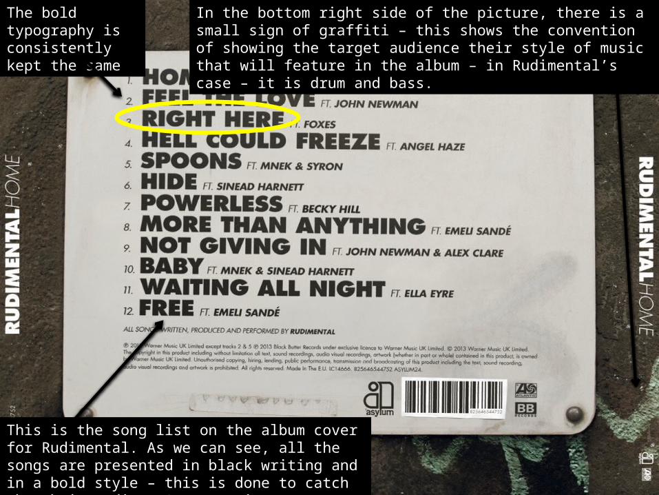
This is the song list on the album cover for Rudimental. As we can see, all the songs are presented in black writing and in a bold style – this is done to catch the their audience’s attention.
In the bottom right side of the picture, there is a small sign of graffiti – this shows the convention of showing the target audience their style of music that will feature in the album – in Rudimental’s case – it is drum and bass.
The bold typography is consistently kept the same
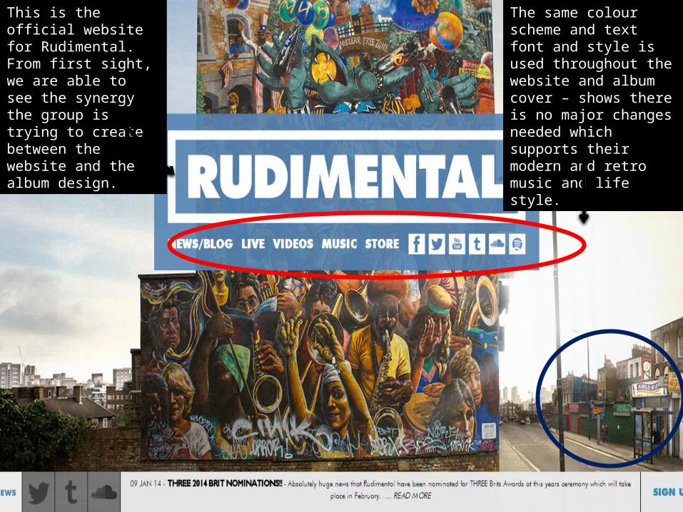
This is the official website for Rudimental. From first sight, we are able to see the synergy the group is trying to create between the website and the album design.
The same colour scheme and text font and style is used throughout the website and album cover – shows there is no major changes needed which supports their modern and retro music and life style.
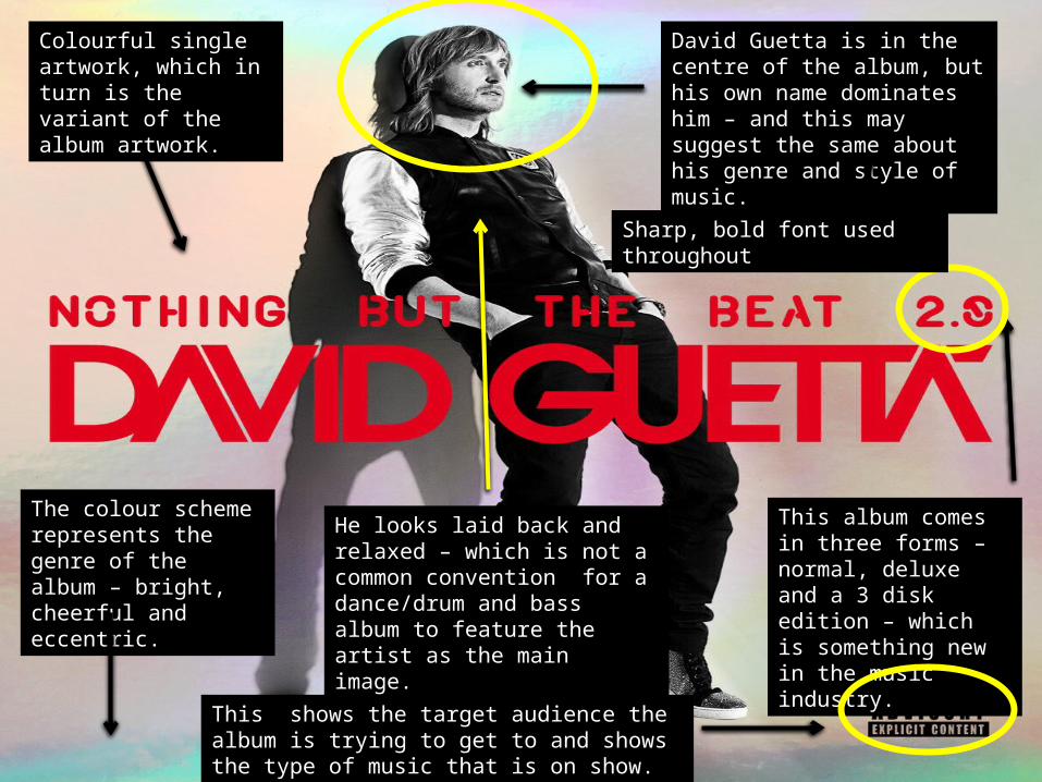
Colourful single artwork, which in turn is the variant of the album artwork.
The colour scheme represents the genre of the album – bright, cheerful and eccentric.
This album comes in three forms – normal, deluxe and a 3 disk edition – which is something new in the music industry.
David Guetta is in the centre of the album, but his own name dominates him – and this may suggest the same about his genre and style of music.
He looks laid back and relaxed – which is not a common convention for a dance/drum and bass album to feature the artist as the main image.
Sharp, bold font used throughout
This shows the target audience the album is trying to get to and shows the type of music that is on show.
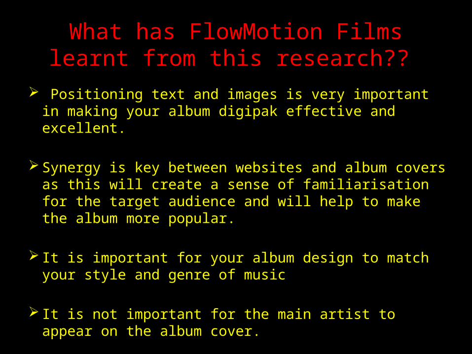
What has FlowMotion Films learnt from this research??
Positioning text and images is very important in making your album digipak effective and excellent.
Synergy is key between websites and album covers as this will create a sense of familiarisation for the target audience and will help to make the album more popular.
It is important for your album design to match your style and genre of music
It is not important for the main artist to appear on the album cover.