Ancillary task production process poster
15
ANCILLARY TASK PRODUCTION PROCESS: FILM POSTER
-
Upload
gabby-warnford-davis -
Category
Education
-
view
130 -
download
0
Transcript of Ancillary task production process poster

ANCILLARY TASK PRODUCTION PROCESS: FILM POSTER

CHOSEN PHOTO INSERTED INTO PHOTOSHOP:

ADDING CREDITS
We found a font that looked similar to one they generally tend to use on posters.

EXPERIMENTING WITH FONT:
We decided we didn’t like the font especially, it looks a bit too small and not bold enough, the red also suggests it is a horror.

FONT CHANGE
We tried out white and we liked the contrast between the white font and black background.

Experimenting with colour and font
Tried adding a white stroke and a drop shadow effect

MOVING THE TITLE DOWN

MOVING TITLE UP AND COLOUR CHANGE.
We changed the colour of the title, It was a bit too harsh and cold.
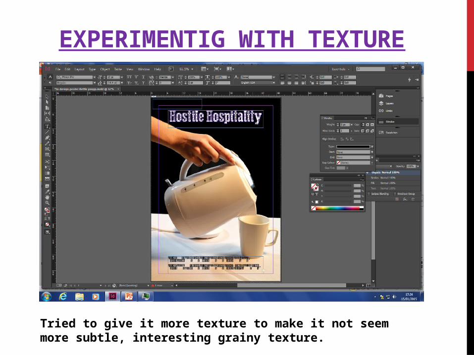
EXPERIMENTIG WITH TEXTURE
Tried to give it more texture to make it not seem more subtle, interesting grainy texture.

EXPERIMENTING MORE WITH TEXTURE
We changed the colour but kept texture to make it warmer,we like this shade of colour, works well with thriller conventions.

CHANGED COLOUR OF HAND USING PHOTOSHOP
We thought by changing the saturation /colour it would make it more interesting yet it seemes a bit too like the conventions of a horror.

WE MOVED THE HAND DOWN AND CHANGED FONT AGAIN
Moving the hand down allowed more room for the title as the title is important and we want it to be bigger. It looks more natural too

IMPROVED TITLE ,CHANGED TO 2 LINES
We tiered the title , we felt the title needed to be more noticeable and stand out more and liked the idea of white on black (effective contrast)

ADDED STAR NAMES
Like we did with the title we’ve tiered the stars name and we added colour to the first name of the stars.

ADDED TAGLINE
We’ve added the tag line in red colour so it is noticeable and also added a Black stroke with italic to make it more visible