Analysis of other double page spreads
4
Double Page Spread By Lucy Bennett
Transcript of Analysis of other double page spreads
Double Page SpreadBy Lucy Bennett

Often on a double page spread they include secondary images which link to the main article, In this double page spread they include this. Where the secondary images all include the person in the main image. Making it easy for the viewer to see that the images relate the article in some way.
There is multiple captions on this double page which explain what the secondary images are about. There is also captions which informs the viewer a little bit more about the page and article doing so entices the viewer in to read the whole page.
The main image is of Robert Patterson. This image is a median shot, he is looking at the camera making direct eye contact with the viewer and he is smiling connoting that he giving the viewer I warm welcoming and friendly smile enticing to viewer in. The colour of his clothes match the colour scheme for this double page spread this informs the viewer that the main image and article are linked.
The house style for this double page is bright pink, black and white. Rink connotes romance and love giving the impression that the article is and Robert and his love life which fits in with the masthead. White is a simplistic colour that connotes that the magazine is pure and full of information which can be trusted, white also connotes the magazine is fresh and new which is aimed at those up to date people who follow the latest trends. Black is also associated with stylish connoting that this magazine is stylish and up to date with the latest tends also.
The masthead of this double is a quote taken from the article, the writing is in bold Serif font connoting that this magazine article contents high and formal conversations.
This double page spread has the main conventions of a double page spread one of these things are the Drop Cap at the beginning of the article. Drop caps are used as they make the viewers eye focus on the larger letter causing them to read the rest of the article.
The caption at the bottom of the page tells the viewer to turn over which entices them to as the next pages are about the same person.
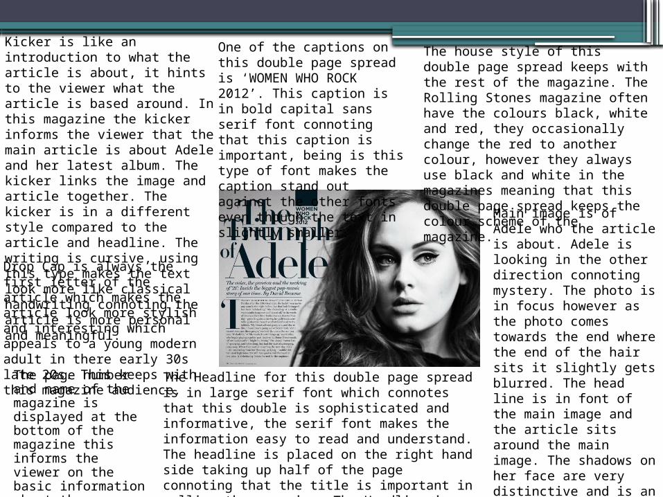
Kicker is like an introduction to what the article is about, it hints to the viewer what the article is based around. In this magazine the kicker informs the viewer that the main article is about Adele and her latest album. The kicker links the image and article together. The kicker is in a different style compared to the article and headline. The writing is cursive, using this type makes the text look more like classical handwriting connoting the article is more personal and meaningful..
Drop Cap is always the first letter of the article which makes the article look more stylish and interesting which appeals to a young modern adult in there early 30s late 20s. This keeps with this magazine audience.
The page number and name of the magazine is displayed at the bottom of the magazine this informs the viewer on the basic information about the magazine.
The Headline for this double page spread is in large serif font which connotes that this double is sophisticated and informative, the serif font makes the information easy to read and understand. The headline is placed on the right hand side taking up half of the page connoting that the title is important in selling the magazine. The Headline is placed on different levels making the font more interesting to look at and read.
One of the captions on this double page spread is ‘WOMEN WHO ROCK 2012’. This caption is in bold capital sans serif font connoting that this caption is important, being is this type of font makes the caption stand out against the other fonts even though the text in slightly smaller.
The house style of this double page spread keeps with the rest of the magazine. The Rolling Stones magazine often have the colours black, white and red, they occasionally change the red to another colour, however they always use black and white in the magazines meaning that this double page spread keeps the colour scheme of the magazine.
Main image is of Adele who the article is about. Adele is looking in the other direction connoting mystery. The photo is in focus however as the photo comes towards the end where the end of the hair sits it slightly gets blurred. The head line is in font of the main image and the article sits around the main image. The shadows on her face are very distinctive and is an effective way of using light especially on a black and white image.
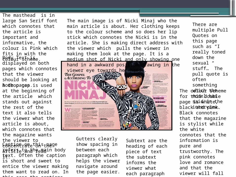
Body Text is displayed on both pages which connotes that the viewer should be looking at both pages.
Caption on this page refers to the main body text. Often the caption is short and sweet to entice the viewer making them want to read on. In this case the captions links to the article and main image.
There are multiple Pull Quotes on this page such as “I really toned down the sexual stuff…” The pull quote is often something which the model has said in the interview.
Gutters clearly show spacing in between each paragraph which helps the viewer navigate around the page easier.
Subtext are the heading of each piece of text the subtext informs the viewer what each paragraph is about.
A drop cap is used at the beginning of the article which stands out against the rest of the text it also tells the viewer what the article is about, which connotes that the magazine wants the viewer to concentrate on the article and read it.
The masthead is in large San Serif font which connotes that the article is important and informative, the colour is Pink which fits in with the colour scheme.
The colour scheme for this double page is white, black and pink. Black connotes that the magazine is stylist while the white connotes that the information is pure and trustworthy. The pink connotes love and romance and that the viewer will fall in love with the magazine and contents.
The main image is of Nicki Minaj who the main article is about. Her clothing keeps to the colour scheme and so does her lip stick which connotes the Nicki is in the article. She is making direct address with the viewer which pulls the viewer in making them look at the page. It is a medium shot of Nicki and only showing one hand in a awkward position drawing in the viewer eye towards her hand .