Analysis of front covers
6
Analysis of magazine front covers Cover 1.NME Sept 2009 Dizzee Rascal Edition
-
Upload
atkinsh1 -
Category
News & Politics
-
view
169 -
download
2
Transcript of Analysis of front covers

Analysis of magazine front coversCover 1.NME Sept 2009
Dizzee Rascal Edition
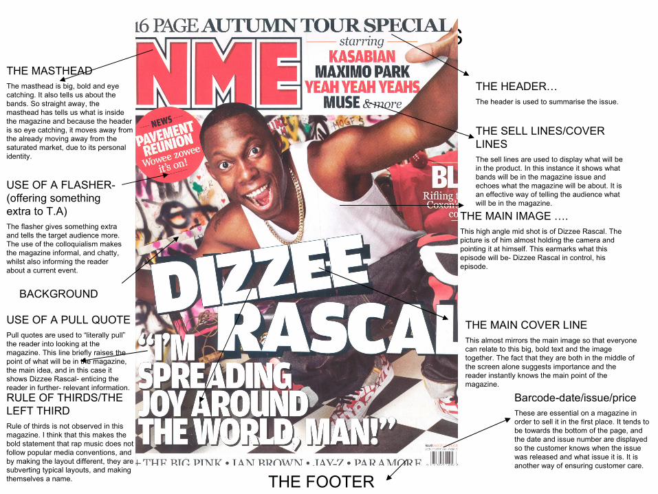
FRONT COVER ANALYSISTHE MASTHEADThe masthead is big, bold and eye catching. It also tells us about the bands. So straight away, the masthead has tells us what is inside the magazine and because the header is so eye catching, it moves away from the already moving away from the saturated market, due to its personal identity.
THE HEADER…The header is used to summarise the issue.
THE SELL LINES/COVER LINESThe sell lines are used to display what will be in the product. In this instance it shows what bands will be in the magazine issue and echoes what the magazine will be about. It is an effective way of telling the audience what will be in the magazine.
THE MAIN IMAGE ….This high angle mid shot is of Dizzee Rascal. The picture is of him almost holding the camera and pointing it at himself. This earmarks what this episode will be- Dizzee Rascal in control, his episode.
THE MAIN COVER LINEThis almost mirrors the main image so that everyone can relate to this big, bold text and the image together. The fact that they are both in the middle of the screen alone suggests importance and the reader instantly knows the main point of the magazine.
Barcode-date/issue/priceThese are essential on a magazine in order to sell it in the first place. It tends to be towards the bottom of the page, and the date and issue number are displayed so the customer knows when the issue was released and what issue it is. It is another way of ensuring customer care.
THE FOOTER
USE OF A PULL QUOTEPull quotes are used to “literally pull” the reader into looking at the magazine. This line briefly raises the point of what will be in the magazine, the main idea, and in this case it shows Dizzee Rascal- enticing the reader in further- relevant information.
BACKGROUND
USE OF A FLASHER-(offering something extra to T.A)The flasher gives something extra and tells the target audience more. The use of the colloquialism makes the magazine informal, and chatty, whilst also informing the reader about a current event.
RULE OF THIRDS/THE LEFT THIRDRule of thirds is not observed in this magazine. I think that this makes the bold statement that rap music does not follow popular media conventions, and by making the layout different, they are subverting typical layouts, and making themselves a name.

Analysis of NME, the Strokes edition

The Masthead
The masthead on this particular magazine tells us about a recent band that is playing. It clearly shows the NME title, with the easily recognizable red text, in capitals. It uses a stand out block font, which creates an identity, and makes it stand out.
The header
In this header, it summarises the main band that in this instance will be playing in new York. As the genre is mixed, these are the types of bands that will be playing.
The main image
The main image is a mid- shot of the lead singer of the strokes, who we have been told by the header has left the band. He’s direct eye contact with the reader gives a sense of relation, without the shot being a close up, a shot that is often related with a relationship with the reader.
The main sell line
This anchors the main image, and is often dramatic, to “hook” the reader in, like a fish on a line, to make them interested in the magazine they are buying. It also is in a big bold text, which in turn also makes it stand out.
Barcode/Date/Issue number
These are essential parts of the magazine that on the outlook seem useless. The barcode allows the buyer to purchase the product, an important factor in the sale of the magazine, and the issue number and the date are there for convenience to the reader. If the consumer knows what issue it is, it will help them buy the product.
Sell lines
Advertise what will be in the product. This NME magazine has tried to include the most interesting pieces of gossip/stories, once again to try to make the customer buy the product.
The footer
There doesn’t seem to be a footer present in this magazine. I think this is purposely done by NME, to try and subvert the typical magazine layout
Flasher
The flasher is used to almost say “look we have even more than your normal magazine”, once again giving the reader more, this way in form of a competition.
Analysis of Kerrang cover, My chemical Romance edition
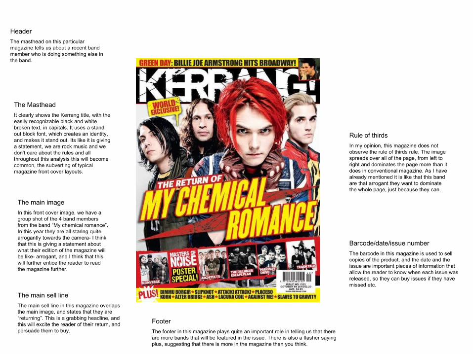
The Masthead
It clearly shows the Kerrang title, with the easily recognizable black and white broken text, in capitals. It uses a stand out block font, which creates an identity, and makes it stand out. Its like it is giving a statement, we are rock music and we don’t care about the rules and all throughout this analysis this will become common, the subverting of typical magazine front cover layouts.
Header
The masthead on this particular magazine tells us about a recent band member who is doing something else in the band.
The main image
In this front cover image, we have a group shot of the 4 band members from the band “My chemical romance”. In this year they are all staring quite arrogantly towards the camera- I think that this is giving a statement about what their edition of the magazine will be like- arrogant, and I think that this will further entice the reader to read the magazine further.
The main sell line
The main sell line in this magazine overlaps the main image, and states that they are “returning”. This is a grabbing headline, and this will excite the reader of their return, and persuade them to buy.
Footer
The footer in this magazine plays quite an important role in telling us that there are more bands that will be featured in the issue. There is also a flasher saying plus, suggesting that there is more in the magazine than you think.
Barcode/date/issue number
The barcode in this magazine is used to sell copies of the product, and the date and the issue are important pieces of information that allow the reader to know when each issue was released, so they can buy issues if they have missed etc.
Rule of thirds
In my opinion, this magazine does not observe the rule of thirds rule. The image spreads over all of the page, from left to right and dominates the page more than it does in conventional magazine. As I have already mentioned it is like that this band are that arrogant they want to dominate the whole page, just because they can.