Analysis of film reviews and posters
12
-
Upload
billiecasimir18 -
Category
Education
-
view
136 -
download
2
Transcript of Analysis of film reviews and posters
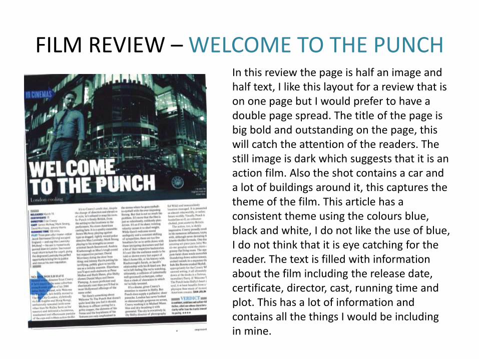
FILM REVIEW – WELCOME TO THE PUNCHIn this review the page is half an image and half text, I like this layout for a review that is on one page but I would prefer to have a double page spread. The title of the page is big bold and outstanding on the page, this will catch the attention of the readers. The still image is dark which suggests that it is an action film. Also the shot contains a car and a lot of buildings around it, this captures the theme of the film. This article has a consistent theme using the colours blue, black and white, I do not like the use of blue, I do not think that it is eye catching for the reader. The text is filled with information about the film including the release date, certificate, director, cast, running time and plot. This has a lot of information and contains all the things I would be including in mine.
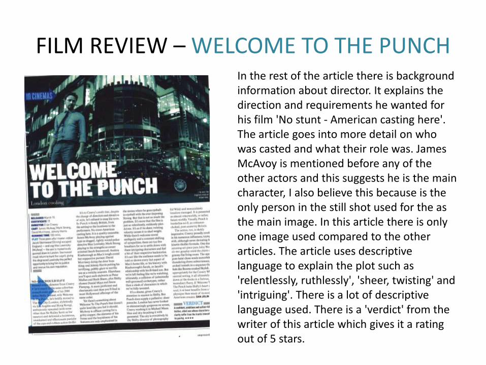
FILM REVIEW – WELCOME TO THE PUNCHIn the rest of the article there is background information about director. It explains the direction and requirements he wanted for his film 'No stunt - American casting here'. The article goes into more detail on who was casted and what their role was. James McAvoy is mentioned before any of the other actors and this suggests he is the main character, I also believe this because is the only person in the still shot used for the as the main image. In this article there is only one image used compared to the other articles. The article uses descriptive language to explain the plot such as 'relentlessly, ruthlessly', 'sheer, twisting' and 'intriguing'. There is a lot of descriptive language used. There is a 'verdict' from the writer of this article which gives it a rating out of 5 stars.
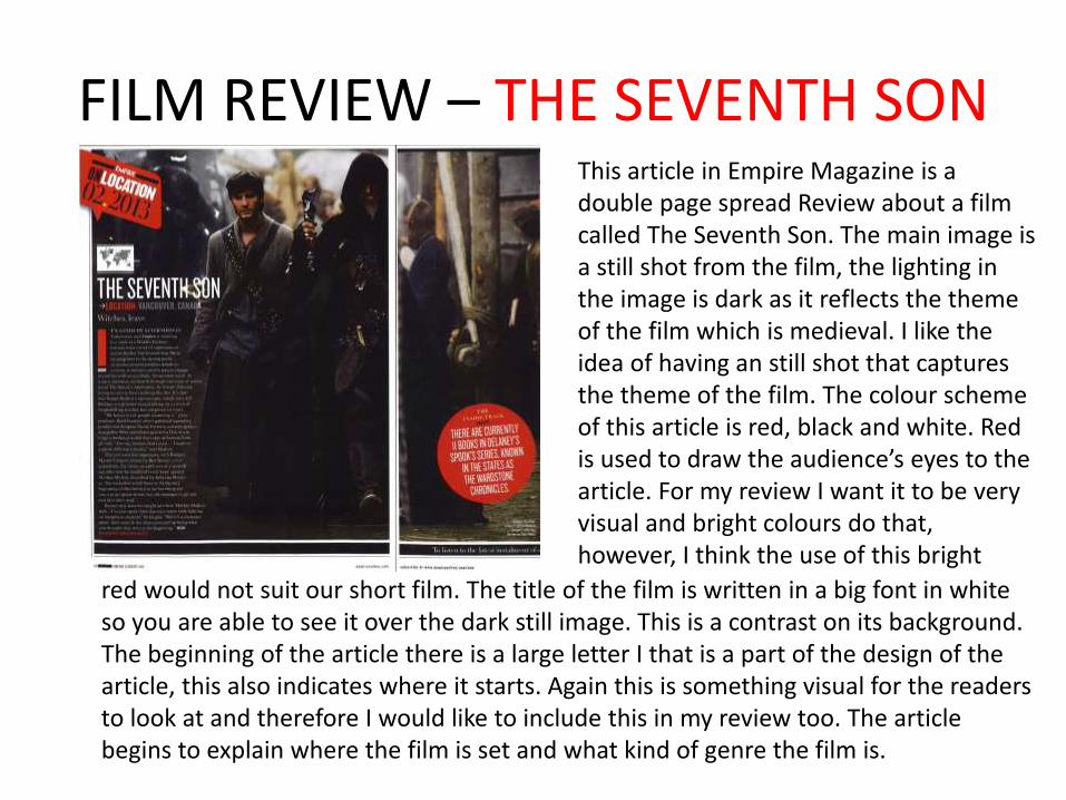
FILM REVIEW – THE SEVENTH SONThis article in Empire Magazine is a double page spread Review about a film called The Seventh Son. The main image is a still shot from the film, the lighting in the image is dark as it reflects the theme of the film which is medieval. I like the idea of having an still shot that captures the theme of the film. The colour scheme of this article is red, black and white. Red is used to draw the audience’s eyes to the article. For my review I want it to be very visual and bright colours do that, however, I think the use of this bright
red would not suit our short film. The title of the film is written in a big font in white so you are able to see it over the dark still image. This is a contrast on its background. The beginning of the article there is a large letter I that is a part of the design of the article, this also indicates where it starts. Again this is something visual for the readers to look at and therefore I would like to include this in my review too. The article begins to explain where the film is set and what kind of genre the film is.
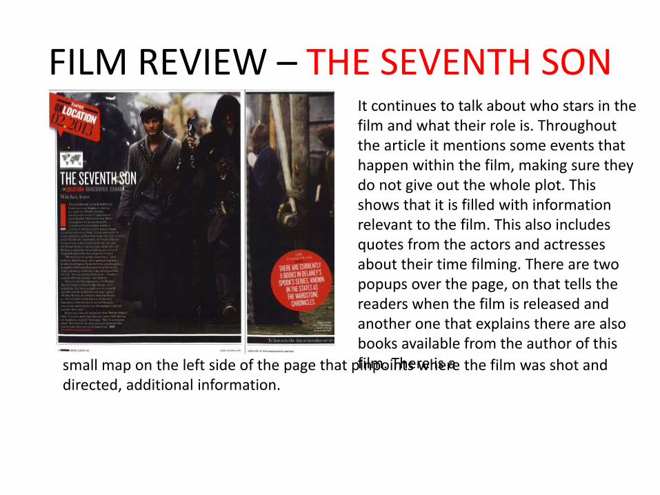
FILM REVIEW – THE SEVENTH SONIt continues to talk about who stars in the film and what their role is. Throughout the article it mentions some events that happen within the film, making sure they do not give out the whole plot. This shows that it is filled with information relevant to the film. This also includes quotes from the actors and actresses about their time filming. There are two popups over the page, on that tells the readers when the film is released and another one that explains there are also books available from the author of this film. There is asmall map on the left side of the page that pinpoints where the film was shot and
directed, additional information.
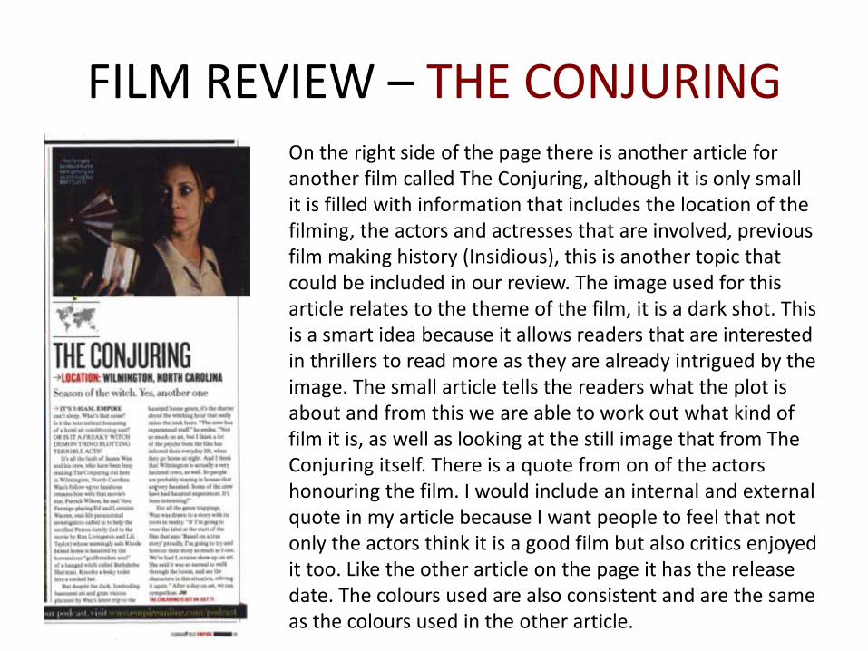
FILM REVIEW – THE CONJURINGOn the right side of the page there is another article for another film called The Conjuring, although it is only small it is filled with information that includes the location of the filming, the actors and actresses that are involved, previous film making history (Insidious), this is another topic that could be included in our review. The image used for this article relates to the theme of the film, it is a dark shot. This is a smart idea because it allows readers that are interested in thrillers to read more as they are already intrigued by the image. The small article tells the readers what the plot is about and from this we are able to work out what kind of film it is, as well as looking at the still image that from The Conjuring itself. There is a quote from on of the actors honouring the film. I would include an internal and external quote in my article because I want people to feel that not only the actors think it is a good film but also critics enjoyed it too. Like the other article on the page it has the release date. The colours used are also consistent and are the same as the colours used in the other article.
MAGAZINE LAYOUT DESIGN
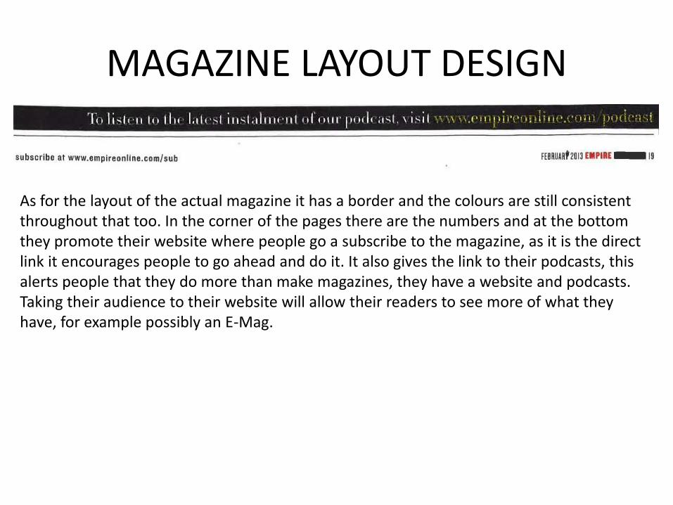
As for the layout of the actual magazine it has a border and the colours are still consistent throughout that too. In the corner of the pages there are the numbers and at the bottom they promote their website where people go a subscribe to the magazine, as it is the direct link it encourages people to go ahead and do it. It also gives the link to their podcasts, this alerts people that they do more than make magazines, they have a website and podcasts. Taking their audience to their website will allow their readers to see more of what they have, for example possibly an E-Mag.
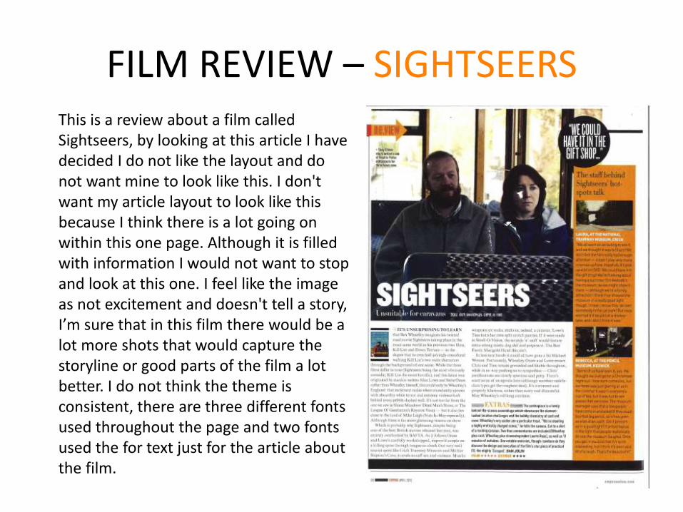
FILM REVIEW – SIGHTSEERSThis is a review about a film called Sightseers, by looking at this article I have decided I do not like the layout and do not want mine to look like this. I don't want my article layout to look like this because I think there is a lot going on within this one page. Although it is filled with information I would not want to stop and look at this one. I feel like the image as not excitement and doesn't tell a story, I’m sure that in this film there would be a lot more shots that would capture the storyline or good parts of the film a lot better. I do not think the theme is consistent, there are three different fonts used throughout the page and two fonts used the for text just for the article about the film.
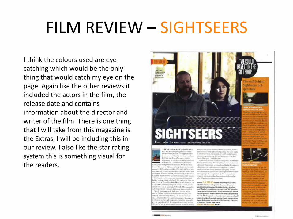
I think the colours used are eye catching which would be the only thing that would catch my eye on the page. Again like the other reviews it included the actors in the film, the release date and contains information about the director and writer of the film. There is one thing that I will take from this magazine is the Extras, I will be including this in our review. I also like the star rating system this is something visual for the readers.
FILM REVIEW – SIGHTSEERS
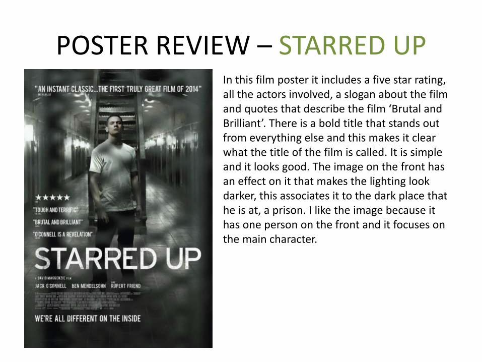
POSTER REVIEW – STARRED UPIn this film poster it includes a five star rating, all the actors involved, a slogan about the film and quotes that describe the film ‘Brutal and Brilliant’. There is a bold title that stands out from everything else and this makes it clear what the title of the film is called. It is simple and it looks good. The image on the front has an effect on it that makes the lighting look darker, this associates it to the dark place that he is at, a prison. I like the image because it has one person on the front and it focuses on the main character.
POSTER REVIEW - SHANK
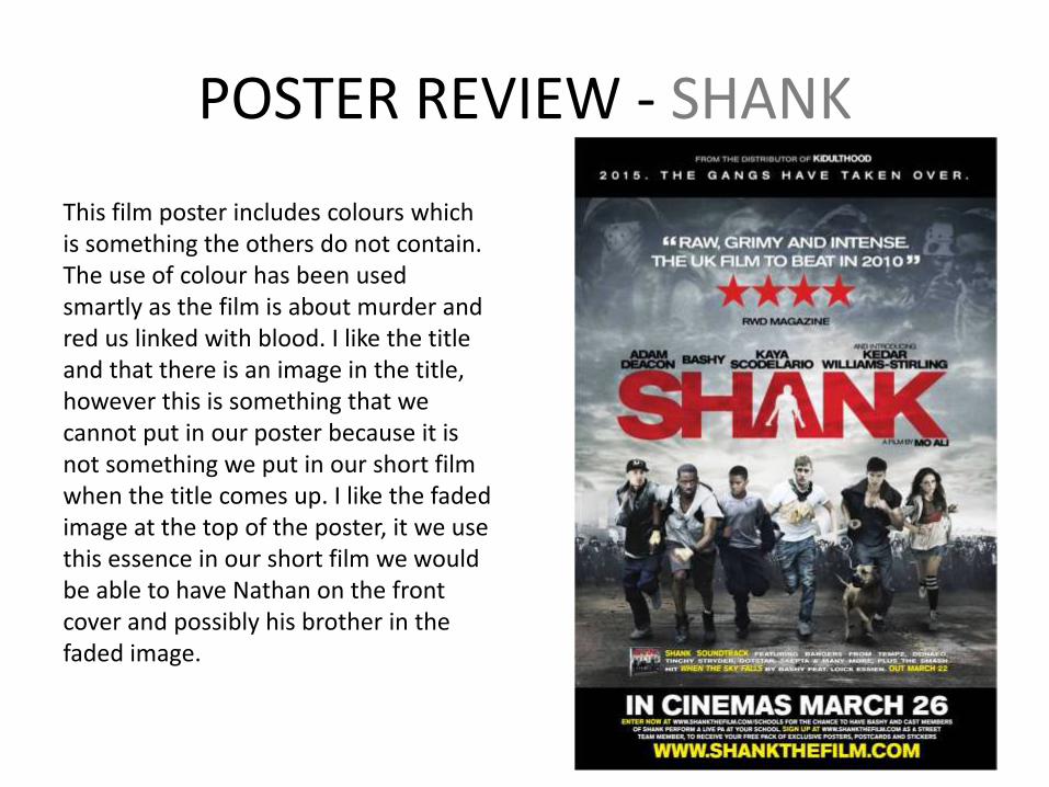
This film poster includes colours which is something the others do not contain. The use of colour has been used smartly as the film is about murder and red us linked with blood. I like the title and that there is an image in the title, however this is something that we cannot put in our poster because it is not something we put in our short film when the title comes up. I like the faded image at the top of the poster, it we use this essence in our short film we would be able to have Nathan on the front cover and possibly his brother in the faded image.
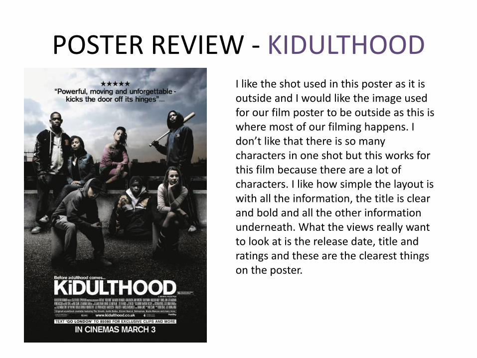
POSTER REVIEW - KIDULTHOODI like the shot used in this poster as it is outside and I would like the image used for our film poster to be outside as this is where most of our filming happens. I don’t like that there is so many characters in one shot but this works for this film because there are a lot of characters. I like how simple the layout is with all the information, the title is clear and bold and all the other information underneath. What the views really want to look at is the release date, title and ratings and these are the clearest things on the poster.