Analysis
3
I have applies a banner, (top and bottom of the magazine) and an ear piece, (top) so that I can list my featuring artist and additional incentive. I made them light grey so that it had connotations of cool, which is a social status that my demographic audience strive for. My magazine name is beats, as this relates to music and my demographic. It has a yellow base with black line running through it. Yellow and black have connotation of poison, which suggests that the ‘beats’/songs that are featuring in my magazine, are contagious. I used a banner to highlight my main featuring story, that is in line with my colour scheme. This will allow my audience to identify my magazine. The copy of the banner is in capitals and is of a formal style. This conveys a sense of power, which relates to my audience. My main image is a medium close up of my featuring artist. He is in line with the male gaze, as in the image he is viewed as a powerful icon, which my audience can relate to. also he is wearing clothes that will be recognised by my audience as cool and expectable. This will I have added: an anchor to fix the meaning of the main image. Featuring story's, (middle/left hand side of image) to dictate to my audience what story's will be include in my magazine. The text of these story’s are also in line with my colour scheme to fix my brand identity, and to suggest that my articles are also contagious. Also I have included an I have added; a date (under magazine title) and a bar code, (middle right) to dictate how much my magazine is.
-
Upload
lennylavers -
Category
Technology
-
view
141 -
download
0
Transcript of Analysis
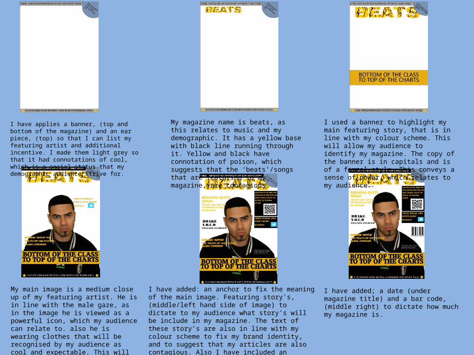
I have applies a banner, (top and bottom of the magazine) and an ear piece, (top) so that I can list my featuring artist and additional incentive. I made them light grey so that it had connotations of cool, which is a social status that my demographic audience strive for.
My magazine name is beats, as this relates to music and my demographic. It has a yellow base with black line running through it. Yellow and black have connotation of poison, which suggests that the ‘beats’/songs that are featuring in my magazine, are contagious.
I used a banner to highlight my main featuring story, that is in line with my colour scheme. This will allow my audience to identify my magazine. The copy of the banner is in capitals and is of a formal style. This conveys a sense of power, which relates to my audience.
My main image is a medium close up of my featuring artist. He is in line with the male gaze, as in the image he is viewed as a powerful icon, which my audience can relate to. also he is wearing clothes that will be recognised by my audience as cool and expectable. This will help my audience idolise this artist.
I have added: an anchor to fix the meaning of the main image. Featuring story's, (middle/left hand side of image) to dictate to my audience what story's will be include in my magazine. The text of these story’s are also in line with my colour scheme to fix my brand identity, and to suggest that my articles are also contagious. Also I have included an additional incentive, to highlight the synergy of my magazine and it’s further interactions of social media.
I have added; a date (under magazine title) and a bar code, (middle right) to dictate how much my magazine is.

Page title: UTR, meaning under the radar. This conveys a sense of crime and rebel, however it also conveys a sense of exclusiveness and that the content on this page is like a secret and therefore adds more excitement. I have added a picture of my main featuring artist, who is in a dominating R’n’B pose, that will convey power and popularity, which Is what my target audience strive for.
Here I have added my copy to make my article. The first two words are in capitals, to highlight where the article starts, and then the rest of the paragraph is in bold typography. This allows the reader to slowly adjust from the different font sizes, of the tiles of the article, to the article copy. Also I have left room for me to add a quote.
Here I have added a quote from the artist, saying “family first, charts second.” this clearly shows to the audience that he has got his morals in the right place, and will increase his likeability factor. Also the quote is in blue, again conveying a sense of coolness about him.
I changed the colour of the quote from my artist to yellow, so that it fits in with my colour scheme, therefore promoting my brand identity. Also I have added my title and my sub title here, which I coloured blue, therefore conveying connotations of ‘cool’. The title ‘demo on ladder of success’, dictates that he is potentially the next big thing, therefore attracting my audience, as they would want to be the first to know about him, making them ‘cool’. Also at the end of my article I have added a big square full stop, to clearly dictate to my audience, where the article ends.
Here I have simply added an additional photo to increase my audiences visual interaction. The photograph is in line with my genre of music, as my artist is viewed from behind bars, which has connotations of prison and crime. These themes play a big role in the R’n’B industry.

Here I have included all of my featuring story’s that relate to artist of an R’n’B genre of music. The title of this contents page, is contents, clearly labelling the incentive of the page. The copy is in capitals to convey connotations of power, therefore relating to my audience. Sub headings are listed to clearly navigate the meaning of each section to my audience
I have added; an image of an artist featuring in my magazine, to create a visual image for my audience to relate with, in reflection to the featuring story’s. Allocated numbers to my articles so that my audience can navigate their primary attention to the specific article they require. The copy has also been modified so that it fits in with my brand identity’s colour scheme. Also I have added a banner in line with the colour scheme, to fix the meaning that it is a magazine page.
Here I have simply added another artist that is featuring in my magazine. She is striking a seductive pose, so that she is being identified by her sexuality rather than her personal identity. She is not viewed negatively however her sexuality is what primarily promotes her as an artist, therefore she is in line with the male gaze. This will apply to my audience, as female R’n’B artist are usually viewed to be ‘sexy’ and seductive, therefore relating to my genre of music. Also both featuring artist are being supported by a box with the page number inside, that the artist’s are featuring on.
I have adjusted the colour of the subheading and the page title so that it fits in with my magazine colour scheme, than it previously did. Also I have change the box supporting artist, and designed it so that the are being supported by a box with the magazine brand inside it. This suggests that both artist are being supported by the magazine, and that they are now officially ‘BEATS’ artists. This incentive adds brand identity and a sense of individuality.