Analysing NME Magazine
3
Analysing NME Magazine…
-
Upload
meg-rhodes -
Category
Documents
-
view
121 -
download
0
Transcript of Analysing NME Magazine

Analysing NME Magazine…

Contents…NME is famous for its bold masthead, that is usually a bright red,unless it’s a special editionmagazine. As well as the red,similarly to Q Magazine, black awhite is used too- reinforcing themagazines image.
The articles are categorized in thecontents list which helps theaudience to navigate their waythrough the magazine.
On the left hand side of the pagethere is a band index. This is avery unique idea; it not only helpsthe audience but builds it image.
Unlike most magazines, NME’scontents page also contains ashort article- once the audiencereach the contents page they caninstantly gain and idea of how thewriting is in the rest of themagazine and an insight as towhat they possibly could be aboutto read about.
On a first glance at the page thereis a lot happening- lots of brightcolours, different fonts and a fewimages. This could sometimes beoff-putting for the reader becausethey don’t know where to look.
Having “Subscribe today…” in avery different coloured fontmakes it stand out more. Thiswould have been done topromote the idea of subscribingand to grab the readers eye.
The page is set out in threecolumns, although on first glanceyou probably can’t tell thatclearly. Three columns is usuallycommon in a newspaper butbecause NME is quite wide theycan get away with it.
Using arrows is quite a uniqueidea too, and it indicates to thereader that it could be an articlethat they are interested in.
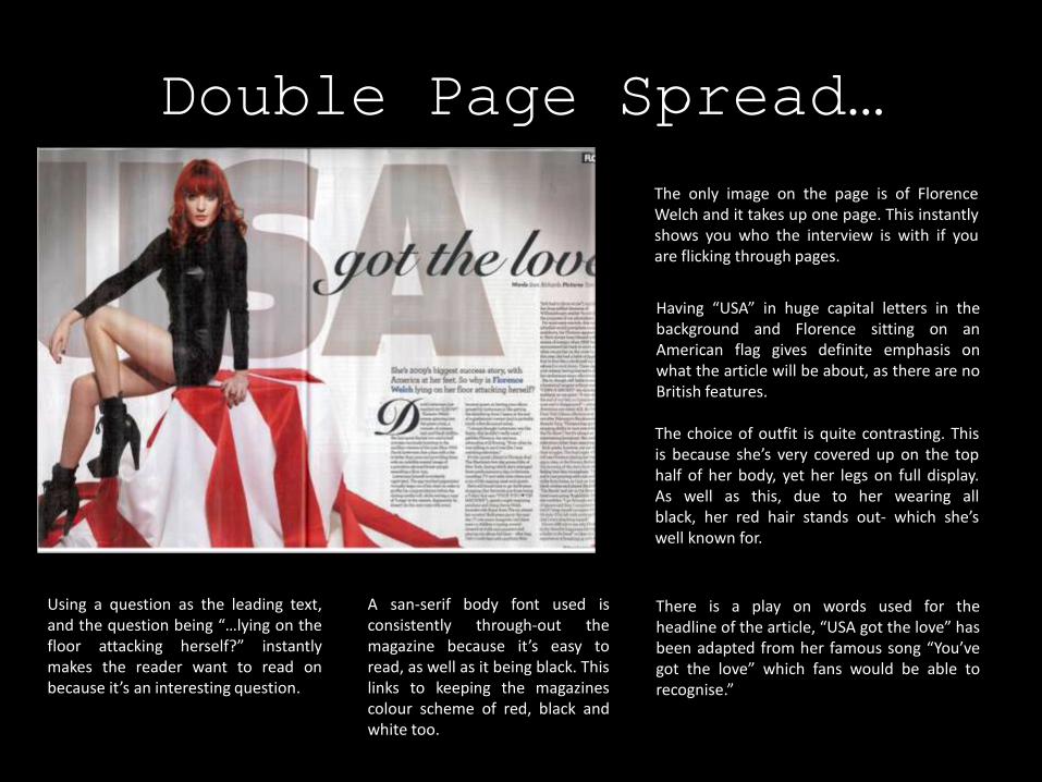
Double Page Spread…
The only image on the page is of FlorenceWelch and it takes up one page. This instantlyshows you who the interview is with if youare flicking through pages.
Having “USA” in huge capital letters in thebackground and Florence sitting on anAmerican flag gives definite emphasis onwhat the article will be about, as there are noBritish features.
The choice of outfit is quite contrasting. Thisis because she’s very covered up on the tophalf of her body, yet her legs on full display.As well as this, due to her wearing allblack, her red hair stands out- which she’swell known for.
There is a play on words used for theheadline of the article, “USA got the love” hasbeen adapted from her famous song “You’vegot the love” which fans would be able torecognise.”
Using a question as the leading text,and the question being “…lying on thefloor attacking herself?” instantlymakes the reader want to read onbecause it’s an interesting question.
A san-serif body font used isconsistently through-out themagazine because it’s easy toread, as well as it being black. Thislinks to keeping the magazinescolour scheme of red, black andwhite too.