Analysing Katy Perry's CD Artwork
7
KATY PERRY CD Cover Analysis
-
Upload
chloe-wallis -
Category
Documents
-
view
154 -
download
0
Transcript of Analysing Katy Perry's CD Artwork

KATY PERRY
CD Cover Analysis

PICTUREKaty lays on a cloud, implying that she is heavenly and flawless – the clouds are almost inviting as they look comfortable and spacious, perhaps again reflecting Katy’s public image. They also resemble cotton candy, enforcing the theme/brand which is based on candy. The candy theme itself advertises a sweet, likeable artist – who doesn’t have a sweet tooth? Katy herself is naked to the point where she is barely covered by cloud. This appeals to a male audience while it is provocative, and to a female audience also by being feminine in the most simplistic way possible (she lacks expensive looking products etc, and she does not show so much as to reduce her image). Her image is also inviting in the way that it bares all – it suggests the album will do the same, that the music will be perhaps personal, comfortable and inviting in the way that the audience will want to get involved with the music (this proves right with anthems such as T.G.I.F.). The image is otherwise very plain with the star in the centre – successfully attaching each song on the album with an image of Katy Perry. It also suggests that the album is not full of filler (the ‘heavenly’ look implies that each song has some sort of appeal and has been well worked on).
TEXTThe star’s name is in red – it is dominant, and it hints in a sexual direction without losing its feminine appeal. The text has been touched with white in some places to give it a standing out 3D look – this perhaps extends the candy theme as it resembles icing. It also implies that the artist is lively and fun. There is a blue outline around the edge which makes the text stand out. Blue cools down the warm image, and it relates to innocence. It also suggests there is a thin, personal layer underneath the artist and in the music,The album’s title – ‘Teenage Dream’ – is a different font entirely, and a lot smaller than the Katy Perry’s stamp. This implies (quite rightly) that the artist’s name is much more important and appealing than the actual album. However it still stands out. Once again the candy theme comes into play with the striped colours. The text is also melting, representing a few ideas; the melting is associated with something being too hot, reflecting Katy’s image (her being ‘hot’). It also links to Summer, extending her image again – Summer is fun, warm, and often missed once it’s gone, alike to the artist. It also suggests the music is similar (fun, lively, anthem-like) perhaps even a common soundtrack to summer (her first track, California Gurls, was released in the summer of 2010). Once again the text has been touched to have a 3D look, with blue shadows underneath. This plays further with the Summer image – blue represents the sea and the sky.
The CD enhances the candy theme without making the rest of the design too busy, as does the back cover; each image is little more than an extension of the front.The CD does, however, very cleverly match each letter ‘O’ with the design of the CD.
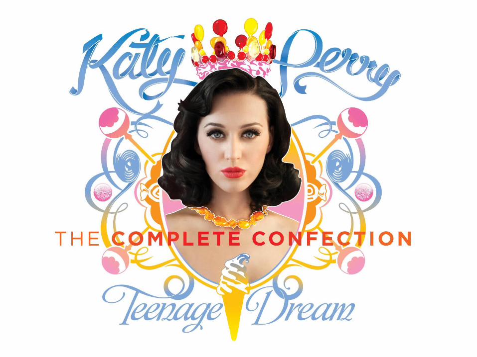

PICTUREThis cover is for the re-release of Teenage Dream, after Katy Perry had pulled off becoming a branded, househould name, and after Teenage Dream’s extreme success. Both of these are clear in the cover. Perry’s important is portrayed in its simplicity – she is the dominant image, and she is once again bare with her face standing out, implying that she can be recognised by just her face and she needs little else to sell albums. She is once again feminine in the most simplistic way, appealing to both female and male audiences. However she has been given a necklace of candy – this implies that she is still just as sweet and appealing and before. A crown has been placed to appear on her head, showing off her success. Her necklace does this too (in the way that jewellery represents riches etc). The candy theme is kept; her crown is made of candy for example, and the layers around depict lollies, liquorice wheels etc. Perhaps this reflects her lifestyle; she had recently been the centre of attention when this was released thanks to her widely publicised divorce… the candy however can be seen as a retaliation, that she has still have a fun aura to give. The artwork around Katy’s face connotes her being framed, like she is a delicate piece of art, once again implying her success, but also her feminine, personal side.
TEXTOnce again, the fact that Teenage Dream was re-released after its success is shown in the artist’s name. The material of the text has been updated to a wavy, light text that is alike to that of flowing material, almost silky – this album is the upgrade! The flexibility of the text also indicates the artist’s playful, feminine nature, and again it is in blue (soft, innocence – the rest of the picture has a lot of bright colours that once again links to the summer theme).

QUICK NOTE ABOUT THE SINGLE ARTWORK
Each single has its own individual story and there is a lack of theme to link them to the same album. In some singles Katy Perry’s logo has been incorporated; in the majority of them it has been modified to suit the cover’s theme.
This is probably due to the popularity and success of Katy Perry as an icon, and also due to the success of her singles; Perry only needs to add her name and image to a single to make it a success, and to encourage individual single success each single is attached to its own promoted theme that is exclusive to the song. It is almost like each single’s release is treated like that of an album.
However there are two common trends that can be identified; firstly, each single is dressed very femininely, and secondly, each single has a rather defined picure of Perry – all but one of them close-up. Once again, it’s her face that sells; each song is strongly assosciated with a fun, dominant but openly sensitive character.

QUICK NOTES ON DEBUT Though each product that has been released since the first album has incorporated new and different ideas it is important to understand the origin and flow of the branding.
Perry’s first album is full of colour; the main colour used to brand her image is a rich pink which is feminine but all the same dominant, but this is toned down with other blue and green shades to suit the ‘one of the boys’ theme. This is also extended by the relaxed stance of the artist. The image is full of filler too (e.g. the sky, fence, flowers), to make the artist stand out and become memorable – an artist will not be remembered by just their face is they are new to the industry. The ‘Katy Perry’ logo is defining for the artist’s career; it is used and recognised on each single and even future products.
Each single has similar artwork; each cover has a plain background with either a defining image of Perry posing or a defining item. Example 1: Perry hints at a cheeky theme on the first single’s cover, which correlates with the provocative title ‘I Kissed a Girl’. Example 2: ‘Waking Up In Vegas’ catches Perry in a fun stance but it is the flashy red dice behind that define the image.
In each single the logo has been re-used to aid recognition, both with the artist and the artist’s album.