An Introduction to Graphic design - ST. MARY TEACH - · PDF file · 2017-09-20An...
94
An Introduction to Graphic design
Transcript of An Introduction to Graphic design - ST. MARY TEACH - · PDF file · 2017-09-20An...

An Introduction to Graphic design

Slide 2
Basic Questions
What is graphic design?
How did it evolve?
When did the profession come into existence?
And why?

Slide 3
Definition
The term graphic design can refer to a number of artistic and
professional disciplines which focus on visual communication and
presentation.
Various methods are used to create and combine symbols, images
and/or words to create a visual representation of ideas and
messages.

Slide 4
All the pictures below are examples of Graphic Design

Slide 5
When people need to necessarily express something, usually with
an aim towards promotion or information dispensing, the focus
becomes how best to do it.
Graphic design was born of art and technology (printing).

Slide 6
What does a Graphic Designer do?
When he gets a graphic design job, be it a poster design, book design,
web design, advertising, he has to start with asking himself the
following fundamental questions:
What is the objective of the communication
What needs to be said first and then next and then after
that? (levels of hierarchy)
How do you want the eye to flow through the page?
What is the tone of voice?
Who are you speaking to?

Slide 7
Fundamental Question 1:
Objectives of the communication
What is the information that needs to be passed on? When the
audience reads your book/webpage/ad what’s he supposed to get
out of it?
An advertisement and a newspaper have different objectives of
communication.

Slide 8
Fundamental Question 2: What needs to be said first and
then next and then after that? (hierarchy)
Once you have figured out what the objective of your
communication is you’ll want to think about what needs to be
said first and foremost and what it should be followed by.

Slide 9
Fundamental Question 3: How do you want the user’s eye
to move around the page?
The hierarchy mentioned above, along with elements like color,
contrast, size etc, will automatically make your viewers eyes go
through the page in a certain way. This can be manipulated as per
your intention.

Slide 10
Fundamental Question 4: Who are you speaking to?
You have to be very sure about this as different people need to be
spoken to differently, just the way it is in real life.

Slide 11
Fundamental Question 5: What is the tone of voice?
Only once you have got the above figured out can you think
about the more external elements of your piece of work.
Slide 12

Slide 13

Slide 14
The solutions to the Fundamental questions are tackled using the
graphic designer’s tool kit.
Fundamental Questions
What is the objective of the communication?
What needs to be said first and then next and then after that?
(levels of hierarchy)
How do you want the eye to flow through the page?
What is the tone of voice?
Who are you speaking to?

Slide 15
Broadly speaking, the following tools are available to him to solve
the aforementioned issues:
Point
Line
Form
Pattern
Texture
Space
Size
Typography
Color
Image

Slide 16
Point
A point is the fundamental particle of graphic design.

Slide 17

Slide 18
The Line
Line is any mark connecting two points.

Slide 19

Slide 20
The Shape
Anything that has a width and a height is a shape.

Slide 21

Slide 22
Pattern
Our tendency to make meaning an order will find a pattern in things.

Slide 23

Slide 24
Texture
Texture is the look or feel of a surface. You can add richness and
dimension to your layouts with texture. Visual texture creates an
illusion of texture on a printed publication or web page.
Texture can create mood and personality
Provoke emotion

Slide 25

Slide 26
Space
Space is the distance or area between or around things.
Space separates or unifies, highlights, and gives the eye a visual rest.

Slide 27

Slide 28
Size
Size is how large or small something is.
Size is very important in making a layout functional, attractive,
and organized.
It shows what is most important, attracts attention, and helps to
fit the layout together.

Slide 29

Slide 30
Type
Typography is one of the most important tools for a graphic
designer.
Typography can take you back to a different time, set a mood, set a
tone of voice, organize pages, create unity between objects etc.

Slide 31

Slide 32
Color
Color in layouts can convey moods, create images, attract
attention, and identify objects.
When selecting colors for a publication or a web page, think
about what you want the color to do and what is appropriate for
your purpose.

Slide 33

Slide 34
Image
Image is an essential part of graphic design.
Images can be of basically three kinds; Photographs, Illustration
and paintings.
Images can be interpreted in many ways and cultural differences
should be kept in mind when ‘reading’ an image.

Slide 35

Slide 36
Miscellaneous examples of usage of graphic design

Slide 37
COMPOSITION : The use of the PRINCIPLES OF DESIGN
While using the tools we spoke about a designer that keeps in mind
some principles of design that aid him in composing his work.
These principles are:
Balance
Rhythm
Emphasis
Unity
These principles of design help you to combine the various design
elements into a composition.

Slide 38
Review
COMPOSITION : The use of the PRINCIPLES OF DESIGN
Using You computer, In a PowerPoint define and find a example of
graphic design, photos, or paintings that utilize the following forms
of compositionBalance (Symmetry or asymmerterical)
Rhythm
Emphasis
Unity
Rule of thirds
These principles of design help you to combine the various design
elements into a composition.

Slide 39
Balance
Balance refers to the distribution of visual weight in art.
Visual weight may not be a 50-50 distribution on both sides of the page.
All the quadrants in the picture at left are balanced. Clockwise
from left, they are Symmetrically, Asymmetrically, Horizontally
and Diagonally balanced.

Slide 40
Each element on a layout has visual weight that is determined by
its size, darkness or lightness, and thickness of lines.
All the images above are balanced.
Let us discuss how.

Slide 41
Rhythm
Rhythm is a pattern created by repeating elements on a page in an
expected manner.
Repetition (repeating similar elements in a consistent manner) and
variation (a change in the form, size, or position of the elements)
are the keys to visual rhythm.

Slide 42

Slide 43
Emphasis
Every page needs a focal point.
Emphasis is also known as dominance in graphic design. It is the
first thing the eye sees.
Emphasis is used to create a hierarchy of what should be most
important on a page.
Slide 44

Slide 45
Unity
Unity helps all the elements look like they belong
together.
Readers need visual cues to let them know the piece is
one unit.
One should be consistent with fonts, sizes, styles,
headers, footers etc.

Slide 46

Slide 47
GESTALT THEORIES
The Gestalt or ‘whole form’ theory sought to define the principles
of perception.
These are innate mental laws that determine how we see images.
Emergence
Reification
Multi-stability
Invariance
Closure
Similarity
Proximity
Symmetry
Continuity

Slide 48
Emergence: The dog emerges from
the other spots as a whole and not
as individual parts.
Reification: This is the
‘constructive’ aspect of perception,
i.e. we draw shapes in our mind
even though there is nothing
actually drawn.

Slide 49
Multi-stability: The tendency for us
to see a static image pop back and
forth, or for us to see two images in
one alternately.
Invariance:We recognize simple geometrical objects irrespective of rotation, scale or translation.

Slide 50
Similarity: The mind groups similar
elements into collective entities.
Closure: We have a tendency to
complete a regular figure.

Slide 51
Proximity: The mind groups
elements into collective entities
depending on their proximity.
Continuity: We will see the lines
crossing each other rather than two
angles.

Slide 55
The rule of thirds in composition

Slide 56
COLOUR THEORY
In traditional color theory, these are the 3 pigment colors that can
not be mixed or formed by any combination of other colors.
Red, Yellow and Blue are called Primary Colors.
All other colors are derived from these 3 hues.

Slide 57
Secondary Colors are colors formed by mixing the primary
colors.
Green, Purple and Orange are formed by the mixing of the
primary colors.

Slide 58
Tertiary Colors are colors formed by a primary and a secondary
color .
That's why the hue is a two word name, such as blue-green, red-
violet, and yellow-orange.

Slide 59
Why do we need to know this?
Knowledge of Color harmonies and complimentary colors aid us in
composition.
Harmonious Colors are colors
that sit next to each other on
the color wheel.
Complimentary Colors are
colors opposite each other on
the color wheel.

Slide 60
Use of color
harmonies
Use of
complimentary
colors

Slide 61
Color against different colors
One color may look different against different colors.
Red appears more brilliant against a black background and somewhat
duller against the white background. In contrast with orange, the red
appears lifeless; in contrast with blue-green, it exhibits brilliance.
Notice that the red square appears larger on black than on other
background colors.
Here the smaller rectangle on the left appears
to have a redder tint

Slide 62
Color Symbolism
The communicative properties of a color can be
defined by two categories:
Natural associations and Psychological (or cultural)
associations.
The color green can stand for both nature and Islam.

Slide 63
Color and corporate ID
The psychological aspect of color is the main rationale behind its
use in corporate ID.
The other reason is that color is the first thing we perceive in any
graphic element.

Slide 64

Computer assignment
Turn in on stmaryteach.com
Branding: Pick five companies and create either
a infographic or a PowerPoint that describe how
a company use the color of psychology into their
branding.
Suggested companies. Pick companies that relate to nature,
clothing, wealth, children, adults, video gamers just to name a few.
Slide 65

Whole Food uses green because they want to people to
think that they represent nature and healthy living. They
also use white because it represents and honest and
trustworthy brand
Slide 66

Slide 68
My definition of Web 2.0
Mostly it describes the new usage of the world wide web and
automatically presupposes a look and feel that a web 2.0 site
must have.
The characteristics of the new web are collaboration, user
generated content, blogging and extensive database
management among other things.
These new uses of the web have been made possible by
technological advancements in the means of putting content up on
the web.

Slide 69
The reason for the presupposed ‘look and feel’ (aesthetic) is
what I would like to discuss with you.

Slide 70
Statement :
Science and Technology has always defined
aesthetic. concerned with beauty or the
appreciation of beauty

Slide 71
When streamlining and aero dynamism was introduced to
planes and motor-vehicles, it was automatically translated to
fridges, furniture, clocks and fans too.

Slide 73
When diagonal typesetting was made possible with the advent
of new typesetting technology, (previously type could only be set
horizontally) it became one of the fundamental qualities of an art
movement called futurism.
Slide 74
Question :
So if technology defines aesthetic, what does the new web 2.0
technology mean for design on the web?
Logically speaking, the following can be deduced:

Slide 75
Screen sizes have increased and therefore white space. Layouts
on the web can breathe better.
Because of more space large type has also become popular.
Slide 76
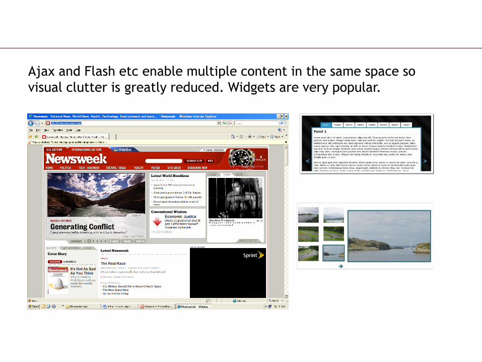
Ajax and Flash etc enable multiple content in the same space so
visual clutter is greatly reduced. Widgets are very popular.

Slide 77
Sans serif fonts, originally associated with modernity, and
greatly used in web design because of better rendition on low
screen resolutions, are slowly giving way to more and more serif
faces because screen displays have become much better.
For example Georgia and Cambria are very popular now in web
design.
The New York times, Boston Globe and some of the best
designed sites in the world use Georgia as one of their major
fonts because of its readability and character.
Also, now newer web technologies don’t limit you to the default
web fonts.

Slide 78
The New York Times and the Boston Globe

Slide 79
Because of the search engine mechanism, text to graphic ratios have
increased.
Plus with current web use there is lots of surfer generated content.
Due to this type hierarchy as a design element is extremely important
in web pages.
Designers have been getting very creative with the way they use type.

Slide 80
Sites like Digg, Delicious and Technorati have to organize large
amounts of text creatively.

Slide 81
But what is the most glaring, in your face characteristic of “Web
2.0”?
Large Type, Glassy surfaces, Beveled edges, gradients, badges,
and reflections and more reflections.
What has inspired this? We cant do anything radically new in
Photoshop now that we couldn’t do in the past.
The emphasis is on some sort of shiny material. What material
could that be?

Slide 82

Slide 83
Badges and Gradients

Slide 84
Diagonal Lines and
Beveled edges

Slide 85
Sheen and soft outer glow

Slide 86
The Culprit
Apple

Slide 87
Apple’s products physically look glassy and reflective.
They are made of materials that are beautiful and shiny and
glassy and reflective.
And their contours are beveled.

Slide 88

Slide 89
Their old logo was changed to this glassy one because of their product.

Slide 90
Hence, and hence, being the operative word, when they were
designing an OS for the Mac it necessarily had to be shiny/glassy
etc to compliment the product.
This is what we now call the Web 2.0 aesthetic. It is more of a
trend like pre-faded jeans.
The Apple look has been used in sites, operating systems and
applications that have nothing to do with being glossy at all.
In other words the reason has been divorced from the design.

Slide 91
Add to this the fact that since a million new companies and
products are more visible online than anywhere else, and they
don’t have to worry about printing costs of their logos, the
mantra has become ‘make it reflect’.
It is okay to follow a trend but it is important to understand why
you are using it and use it with discretion.
Tweaking and modifying popular design aesthetics is the only
way to avoid cliché.
It is the only way to retain the originality for your site.

Slide 92
You could argue that if technology does indeed shape design,
and Apple’s products have shaped our new aesthetic….
then what is wrong with it?
After all that’s what happened with Streamlining and the
Bauhaus stool and the Futurists.
This too is a aesthetic trend and will soon give way to
something else. Why should we be any different in our attitude
to following trends?

Slide 93
The scary thing is the new culture of amateur publishing.
In the past, it was only professional painters, designers etc who
had the means of putting content out there.
Now any joker with Photoshop is a designer, and what's worse,
he can flex his design muscle by clicking submit.
This largely explains the irresponsible use of the Apple look on
the web today.

Slide 94
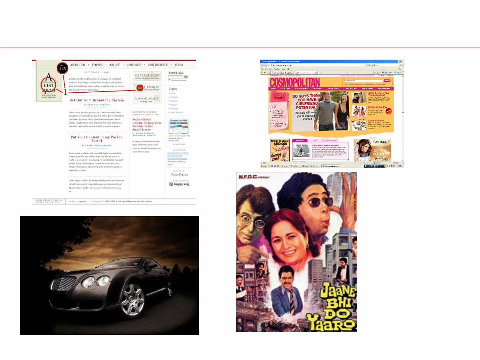
There are beautiful sites that don’t use this Apple look but are
still modern and smart and contemporary looking.
These are the truly designer websites.
The true web 2.0 websites.
The sites in the next two slides are designed intelligently, are
modern and contemporary, and are not typically ‘Web 2.0’

Slide 95

Slide 96

Slide 97

Slide 98
However, given that the apple look it is here to stay for some
time we need to ask whether it helps or impedes the
surfer/user in carrying out his tasks on the web.

Slide 99
Some thoughts I had on the Web 2.0 look
I think the 3dimensional quality of the buttons are useful because
they emulate real life buttons and give aural and visual feedback
on clicking on them. Tactile quality is achieved.
The reflections create a z dimension on the page that makes
pictures, especially of products, sit, better. The page is no
longer 2d as things are emerging from front to back, buttons are
depressible etc.
The way 2d animation is being replaced with big 3d animated
feature films in mainstream animation can be used as an analogy
to what is happening to the web.