Adam McLean's Study Course on the artwork and … · on the artwork and symbolism of modern tarot...
6
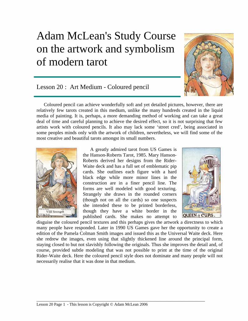
___________________________________________________________________________________ Lesson 20 Page 1 - This lesson is Copyright © Adam McLean 2006 Adam McLean's Study Course on the artwork and symbolism of modern tarot Lesson 20 : Art Medium - Coloured pencil Coloured pencil can achieve wonderfully soft and yet detailed pictures, however, there are relatively few tarots created in this medium, unlike the many hundreds created in the liquid media of painting. It is, perhaps, a more demanding method of working and can take a great deal of time and careful planning to achieve the desired effect, so it is not surprising that few artists work with coloured pencils. It also may lack some ‘street cred’, being associated in some peoples minds only with the artwork of children, nevertheless, we will find some of the most creative and beautiful tarots amongst its small numbers. A greatly admired tarot from US Games is the Hanson-Roberts Tarot, 1985. Mary Hanson- Roberts derived her designs from the Rider- Waite deck and has a full set of emblematic pip cards. She outlines each figure with a hard black edge while more minor lines in the construction are in a finer pencil line. The forms are well modeled with good texturing. Strangely she draws in the rounded corners (though not on all the cards) so one suspects she intended these to be printed borderless, though they have a white border in the published cards. She makes no attempt to disguise the coloured pencil textures and this perhaps gives the artwork a directness to which many people have responded. Later in 1990 US Games gave her the opportunity to create a edition of the Pamela Colman Smith images and issued this as the Universal Waite deck. Here she redrew the images, even using that slightly thickened line around the principal form, staying closed to but not slavishly following the originals. Thus she improves the detail and, of course, provided subtle modeling that was not possible to print at the time of the original Rider-Waite deck. Here the coloured pencil style does not dominate and many people will not necessarily realise that it was done in that medium.
Transcript of Adam McLean's Study Course on the artwork and … · on the artwork and symbolism of modern tarot...
___________________________________________________________________________________ Lesson 20 Page 1 - This lesson is Copyright © Adam McLean 2006
Adam McLean's Study Course on the artwork and symbolism of modern tarot Lesson 20 : Art Medium - Coloured pencil
Coloured pencil can achieve wonderfully soft and yet detailed pictures, however, there are
relatively few tarots created in this medium, unlike the many hundreds created in the liquid media of painting. It is, perhaps, a more demanding method of working and can take a great deal of time and careful planning to achieve the desired effect, so it is not surprising that few artists work with coloured pencils. It also may lack some ‘street cred’, being associated in some peoples minds only with the artwork of children, nevertheless, we will find some of the most creative and beautiful tarots amongst its small numbers.
A greatly admired tarot from US Games is
the Hanson-Roberts Tarot, 1985. Mary Hanson-Roberts derived her designs from the Rider-Waite deck and has a full set of emblematic pip cards. She outlines each figure with a hard black edge while more minor lines in the construction are in a finer pencil line. The forms are well modeled with good texturing. Strangely she draws in the rounded corners (though not on all the cards) so one suspects she intended these to be printed borderless, though they have a white border in the published cards. She makes no attempt to
disguise the coloured pencil textures and this perhaps gives the artwork a directness to which many people have responded. Later in 1990 US Games gave her the opportunity to create a edition of the Pamela Colman Smith images and issued this as the Universal Waite deck. Here she redrew the images, even using that slightly thickened line around the principal form, staying closed to but not slavishly following the originals. Thus she improves the detail and, of course, provided subtle modeling that was not possible to print at the time of the original Rider-Waite deck. Here the coloured pencil style does not dominate and many people will not necessarily realise that it was done in that medium.
___________________________________________________________________________________ Lesson 20 Page 2 - This lesson is Copyright © Adam McLean 2006
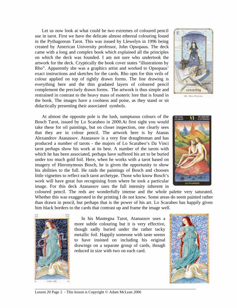
Let us now look at what could be two extremes of coloured pencil use in tarot. First we have the delicate almost ethereal colouring found in the Pythagorean Tarot. This was issued by Llewelyn in 1996 being created by American University professor, John Opsopaus. The deck came with a long and complex book which explained all the principles on which the deck was founded. I am not sure who undertook the artwork for the deck. Cryptically the book cover states “illustrations by Rho”. Apparently she was a graphics artist and worked to Opsopaus’ exact instructions and sketches for the cards. Rho opts for thin veils of colour applied on top of tightly drawn forms. The line drawing is everything here and the thin gradated layers of coloured pencil complement the precisely drawn forms. The artwork is thus simple and restrained in contrast to the heavy mass of esoteric lore that is found in the book. The images have a coolness and poise, as they stand or sit didactically presenting their associated symbols.
At almost the opposite pole is the lush, sumptuous colours of the
Bosch Tarot, issued by Lo Scarabeo in 2000.At first sight you would take these for oil paintings, but on closer inspection, one clearly sees that they are in colour pencil. The artwork here is by Atanas Alexandrov Atanassov. Atanassov is a very fine draughtsman and has produced a number of tarots - the majors of Lo Scarabeo’s Da Vinci tarot perhaps show his work at its best. A number of the tarots with which he has been associated, perhaps have suffered his art to be buried under too much gold foil. Here, when he works with a tarot based on imagery of Hieronymous Bosch, he is given the opportunity to show his abilities to the full. He raids the paintings of Bosch and chooses little vignettes to reflect each tarot archetype. Those who know Bosch’s work will have great fun recognising from where he took a particular image. For this deck Atanassov uses the full intensity inherent in coloured pencil. The reds are wonderfully intense and the whole palette very saturated. Whether this was exaggerated in the printing I do not know. Some areas do seem painted rather than drawn in pencil, but perhaps that is the power of his art. Lo Scarabeo has happily given him black borders to the cards that contrast up and frame the image well.
In his Mantegna Tarot, Atanassov uses a
more subtle colouring but it is very effective, though sadly buried under the rather tacky metallic foil. Happily someone with taste seems to have insisted on including his original drawings on a separate group of cards, though reduced in size with two on each card.
___________________________________________________________________________________ Lesson 20 Page 3 - This lesson is Copyright © Adam McLean 2006
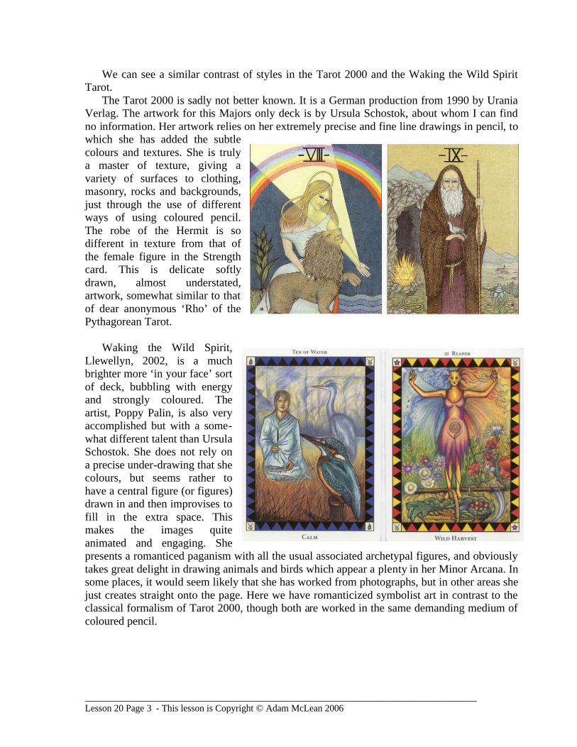
We can see a similar contrast of styles in the Tarot 2000 and the Waking the Wild Spirit Tarot.
The Tarot 2000 is sadly not better known. It is a German production from 1990 by Urania Verlag. The artwork for this Majors only deck is by Ursula Schostok, about whom I can find no information. Her artwork relies on her extremely precise and fine line drawings in pencil, to which she has added the subtle colours and textures. She is truly a master of texture, giving a variety of surfaces to clothing, masonry, rocks and backgrounds, just through the use of different ways of using coloured pencil. The robe of the Hermit is so different in texture from that of the female figure in the Strength card. This is delicate softly drawn, almost understated, artwork, somewhat similar to that of dear anonymous ‘Rho’ of the Pythagorean Tarot.
Waking the Wild Spirit,
Llewellyn, 2002, is a much brighter more ‘in your face’ sort of deck, bubbling with energy and strongly coloured. The artist, Poppy Palin, is also very accomplished but with a some-what different talent than Ursula Schostok. She does not rely on a precise under-drawing that she colours, but seems rather to have a central figure (or figures) drawn in and then improvises to fill in the extra space. This makes the images quite animated and engaging. She presents a romanticed paganism with all the usual associated archetypal figures, and obviously takes great delight in drawing animals and birds which appear a plenty in her Minor Arcana. In some places, it would seem likely that she has worked from photographs, but in other areas she just creates straight onto the page. Here we have romanticized symbolist art in contrast to the classical formalism of Tarot 2000, though both are worked in the same demanding medium of coloured pencil.
___________________________________________________________________________________ Lesson 20 Page 4 - This lesson is Copyright © Adam McLean 2006
Carole Sedillot, who has written extensively on alchemy and Jungian psychology as well as tarot, has also collaborated with the artist Claude Trapet to produce two animal tarots, Le Tarot du Chats in 1989 and Le Tarot du Chien in 1992 (thus both cats and dogs). Trapet adopts a similar style for both decks. These designs rest on the incredibly detailed drawings - such fine work. These have then been coloured with pencil. At first glance one would think these are tinted watercolour, but on close examination of some cards the tell tale signs of pencil strokes can just be seen. The sky and other backgrounds are very delicately graduated. Trapet in some cards seems to have used the technique of rubbing back to white paper to produce lighter areas. The cat tarot seems less subtly coloured with very intense reds and blues being used on some cards that they mimic watercolour or acrylic. I have been able to find out nothing about Claude Trapet, sadly, as is the case with many other tarot artists and illustrators.
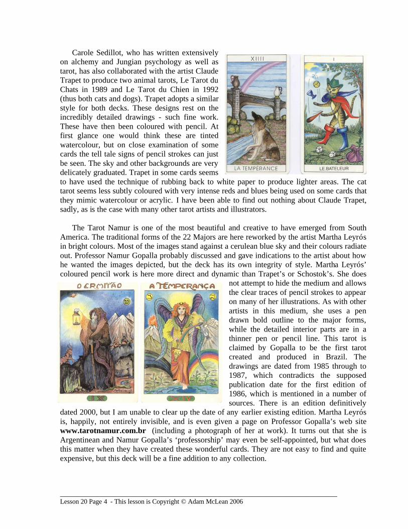
The Tarot Namur is one of the most beautiful and creative to have emerged from South
America. The traditional forms of the 22 Majors are here reworked by the artist Martha Leyrós in bright colours. Most of the images stand against a cerulean blue sky and their colours radiate out. Professor Namur Gopalla probably discussed and gave indications to the artist about how he wanted the images depicted, but the deck has its own integrity of style. Martha Leyrós’ coloured pencil work is here more direct and dynamic than Trapet’s or Schostok’s. She does
not attempt to hide the medium and allows the clear traces of pencil strokes to appear on many of her illustrations. As with other artists in this medium, she uses a pen drawn bold outline to the major forms, while the detailed interior parts are in a thinner pen or pencil line. This tarot is claimed by Gopalla to be the first tarot created and produced in Brazil. The drawings are dated from 1985 through to 1987, which contradicts the supposed publication date for the first edition of 1986, which is mentioned in a number of sources. There is an edition definitively
dated 2000, but I am unable to clear up the date of any earlier existing edition. Martha Leyrós is, happily, not entirely invisible, and is even given a page on Professor Gopalla’s web site www.tarotnamur.com.br (including a photograph of her at work). It turns out that she is Argentinean and Namur Gopalla’s ‘professorship’ may even be self-appointed, but what does this matter when they have created these wonderful cards. They are not easy to find and quite expensive, but this deck will be a fine addition to any collection.
___________________________________________________________________________________ Lesson 20 Page 5 - This lesson is Copyright © Adam McLean 2006
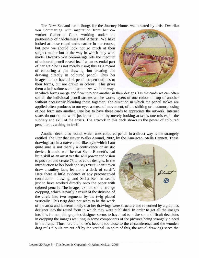
The New Zealand tarot, Songs for the Journey Home, was created by artist Dwariko von Sommaruga with inspiration from her co-worker Catherine Cook working under the partnership of ‘Alchemists and Artists’. We have looked at these round cards earlier in our course, but now we should look not so much at their subject matter but at the way in which they were made. Dwariko von Sommaruga lets the medium of coloured pencil reveal itself as an essential part of her art. She is not merely using this as a means of colouring a pen drawing, but creating and drawing directly in coloured pencil. Thus her images do not have dark pencil or pen outlines to their forms, but are drawn in colour. This gives them a lush softness and harmonizes with the ways in which forms merge and flow into one another in their designs. On the cards we can often see all the individual pencil strokes as she works layers of one colour on top of another without necessarily blending these together. The direction in which the pencil stokes are applied often produces to our eyes a sense of movement, of the shifting or metamorphosing of one form into another. One has to have these cards to appreciate the artwork. Internet scans do not do the work justice at all, and by merely looking at scans one misses all the subtlety and skill of the artists. The artwork in this deck shows us the power of coloured pencil art as a thing in itself.
Another deck, also round, which uses coloured pencil in a direct way is the strangely
entitled The Star that Never Walks Around, 2002, by the American, Stella Bennett. These drawings are in a naïve child-like style which I am quite sure is not merely a contrivance or artistic device. It could well be that Stella Bennett’s had little skill as an artist yet the will power and vision to push on and create 78 tarot cards designs. In the introduction to her book she says “But I can’t even draw a smiley face, let alone a deck of cards”. Here there is little evidence of any preconceived construction drawing, and Stella Bennett seems just to have worked directly onto the paper with colored pencils. The images exhibit some strange cropping, which is partly a result of the division of the circle into two segments by the twig placed vertically. This twig does not seem to be the work of the artist and it seems likely that her drawings were structure and reworked by a graphics designer into the round form in which they were published. In order to get all the images into this format, this graphics designer seems to have had to make some difficult decisions in cropping the images resulting in some components of the pictures being strangely placed in the frame. Thus here the horse’s head is too close to the circumference and the wooden drag rails it pulls are cut off by the vertical. In spite of this, the actual drawings serve the
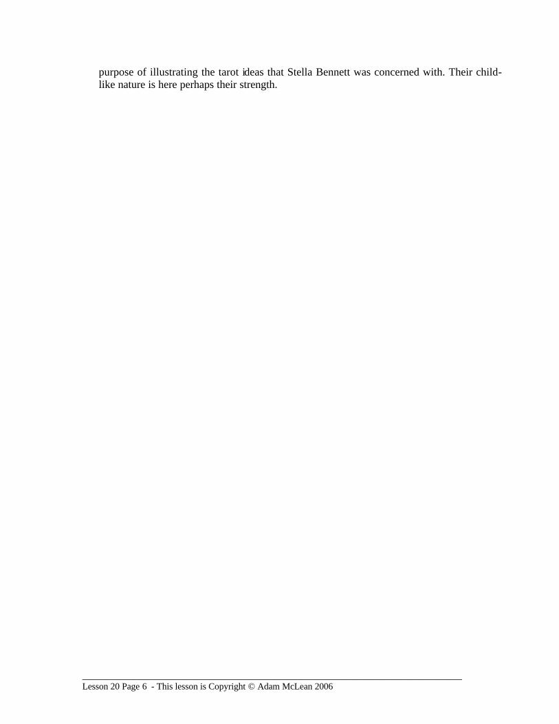
___________________________________________________________________________________ Lesson 20 Page 6 - This lesson is Copyright © Adam McLean 2006
purpose of illustrating the tarot ideas that Stella Bennett was concerned with. Their child-like nature is here perhaps their strength.