A2 Media Portfolio Evaluation
6
Evaluation of 3 A2 media productions By Jake Thorne
-
Upload
flamingdodo -
Category
Documents
-
view
175 -
download
1
Transcript of A2 Media Portfolio Evaluation
Evaluation of 3 A2 media productions
By Jake Thorne
Planning evaluation
◊ When producing my film trailer for my A2 media portfolio, I found that the planning proved the most irritating & difficult part, as I had several problems, with my memory stick braking, which meant I lost all my planning work, which took a lot of time to re-do, which obviously set me back a lot of time, in which I could have been filming/editing. Also I had a bit of problem when choosing a title for my film as I had decided on several different title, only to find that they were copyrighted, so I could not use these, so when I created my survey monkey questionnaire I had a question, on which title my audience would prefer, and most people chose Blood ‘n’ Bone, so I went with this. One part of my planning that I had to re-do, but was not to taxing was the evaluation of the 3 film trailers, posters & magazine front covers, this was because I owned the three magazine front covers & have read them several time & deconstructed them quite a few time before so I found this easy. The three film trailers was also very simple, as I own all three films on DVD so it was simple as I just had to go on special feature & I could watch the trailers as many time as I like & pause them wherever I wanted. The same was true with the posters apart from the Trainspotting poster, but it was easy to find that poster on the internet & it was also fairly easy to deconstruct.
Trailer evaluation◊ After completing my film trailer, overall I am very pleased
with how it has turned out, as in my opinion it look far better than I expected. Filming the scenes for it did have several setback however, due to the loss of my planning work, which meant that I riskily had to film it with just the storyboard & no script, which means that there is a lot of improvisation, which considering, the people I was using in my film are not actors, was brilliant, they all did a great job. After finally starting to film It was not greatly hard, and I got the filming done in about 2 weeks (it would have been done quicker, but the weather was not permitting for several days). There was a problem when filming though, as on the last day of filming, it started getting dark very quickly as it was winter, and as I was supposed to film the final scene of Tim shooting a gun, it was pitch black, but after initially panicking, we came up with a great idea, of using the car headlights on full beam as a source of light, this worked out perfectly, as it gave the final shots a kind of gritting, scary feeling, which is exactly the kind of atmosphere I wanted to create.
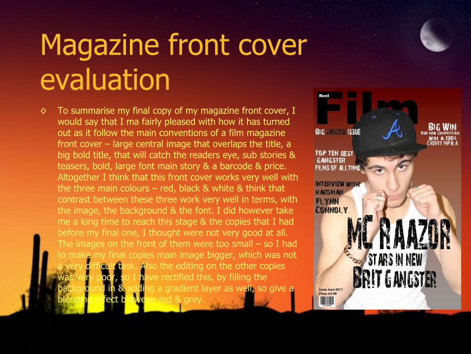
Magazine front cover evaluation◊ To summarise my final copy of my magazine front cover, I
would say that I ma fairly pleased with how it has turned out as it follow the main conventions of a film magazine front cover – large central image that overlaps the title, a big bold title, that will catch the readers eye, sub stories & teasers, bold, large font main story & a barcode & price. Altogether I think that this front cover works very well with the three main colours – red, black & white & think that contrast between these three work very well in terms, with the image, the background & the font. I did however take me a long time to reach this stage & the copies that I had before my final one, I thought were not very good at all. The images on the front of them were too small – so I had to make my final copies main image bigger, which was not a very difficult task. Also the editing on the other copies was very poor, so I have rectified this, by filling the background in & adding a gradient layer as well, so give a blending effect between red & grey.
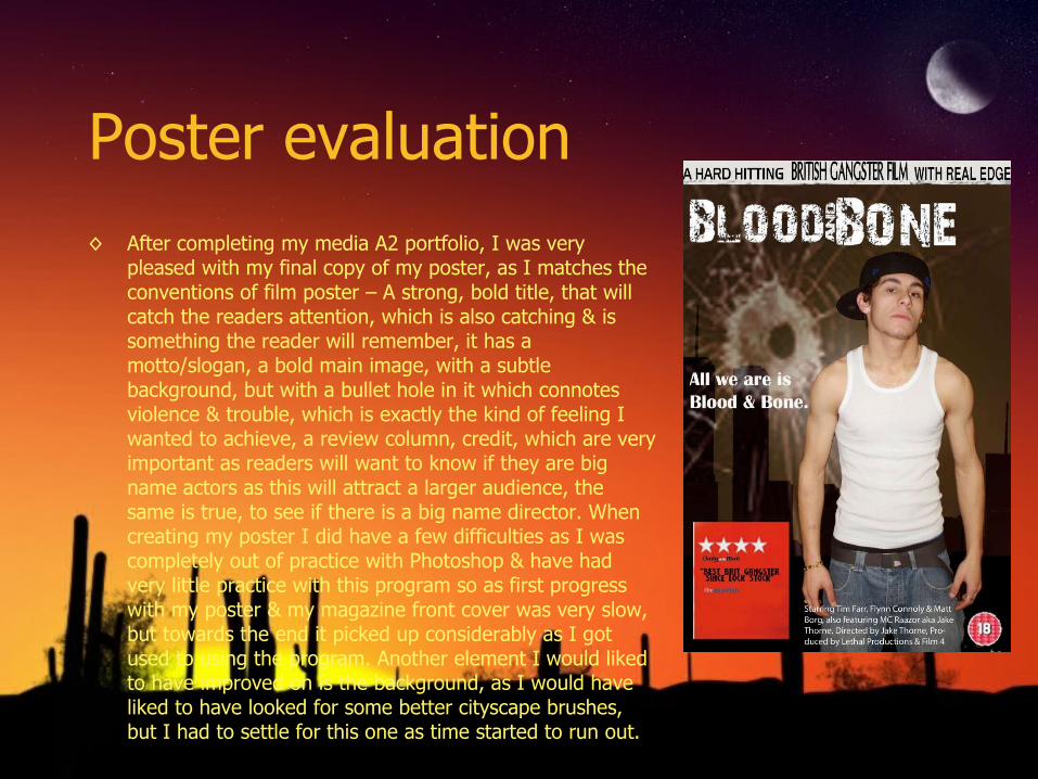
Poster evaluation◊ After completing my media A2 portfolio, I was very
pleased with my final copy of my poster, as I matches the conventions of film poster – A strong, bold title, that will catch the readers attention, which is also catching & is something the reader will remember, it has a motto/slogan, a bold main image, with a subtle background, but with a bullet hole in it which connotes violence & trouble, which is exactly the kind of feeling I wanted to achieve, a review column, credit, which are very important as readers will want to know if they are big name actors as this will attract a larger audience, the same is true, to see if there is a big name director. When creating my poster I did have a few difficulties as I was completely out of practice with Photoshop & have had very little practice with this program so as first progress with my poster & my magazine front cover was very slow, but towards the end it picked up considerably as I got used to using the program. Another element I would liked to have improved on is the background, as I would have liked to have looked for some better cityscape brushes, but I had to settle for this one as time started to run out.
Next time.....
◊ If I were to produce a portfolio like this again I would like to do several things differently.
◊ First of all I would get a lot more practice on Apple Mac’s as i think this is essential if you want to produce a good final product, and it is something I did not have when creating my portfolio. Also I would like to get my actor booked on definite dates and film the whole trailer in one weekend so as not to waste time, as I was not as organised as I could have been when filming & organising my shooting dates.
◊ The last aspect that I would improve on is that I would film it in the summer so as to maximise the time that could be spent shooting during g the day, but also to be able to get some amazing shots during the summer sunsets.
◊ To conclude I am quite pleased with how my Media A2 portfolio has turned out.