A Tale of Four Cities: Using Data to Model Variations in ... · wind circulation patterns on the...
26
Page 1 of 26 Version 2-published January 2015 View Creative Commons Attribution 4.0 Unported License at http://creativecommons.org/licenses/by/4.0/. Educators may use or adapt. A Tale of Four Cities: Using Data to Model Variations in Regional Climate in the Western United States – Middle School Sample Classroom Task Introduction In this task, students will demonstrate their ability to describe and interpret plotted climate data to explain the reasons for differences in climate among four different United States cities: Seattle, Washington; San Francisco, California; Minneapolis, Minnesota; and Las Vegas, Nevada. The cities were chosen to show the effect latitude, topography, ocean circulation patterns, and wind circulation patterns have on the mean monthly high and low temperatures and the average monthly precipitation. The task consists of two parts. First, students compare daily temperature data with mean monthly temperature data from the town in which their school is located, which will demonstrate their understanding of climate data within their own region. Second, students compare climate data among the cities listed above, examining the effects of latitude, topography, ocean circulation patterns, and wind circulation patterns on the mean monthly high and low temperatures and the average monthly precipitation. Standards Bundle (Standards completely highlighted in bold are fully addressed by the task; where all parts of the standard are not addressed by the task, bolding represents the parts addressed.) CCSS-M MP.2 Reason abstractly and quantitatively. MP.3 Construct viable arguments and critique the reasoning of others. 6.SP.A.2 Understand that a set of data collected to answer a statistical question has a distribution which can be described by its center, spread, and overall shape. 6.SP.A.3 Recognize that a measure of center for a numerical data set summarizes all of its values with a single number, while a measure of variation describes how its values vary with a single number. 6.SP.B.4 Display numerical data in plots on a number line, including dot plots, histograms, and box plots. 6.SP.B.5c Summarize numerical data sets in relation to their context, by: Giving quantitative measures of center (median and/or mean) and variability (interquartile range and/or mean absolute deviation), as well as describing any overall pattern and any striking deviations from the overall pattern with reference to the context in which the data were gathered. 7.SP.A.1 Understand that statistics can be used to gain information about a population by examining a sample of the population; generalizations about a population from a sample are valid only if the sample is representative of that population. Understand that random sampling tends to produce representative samples and support valid inferences. 7.SP.B.4 Use measures of center and measures of variability for numerical data from random samples to draw informal comparative inferences about two populations.
Transcript of A Tale of Four Cities: Using Data to Model Variations in ... · wind circulation patterns on the...

Page 1 of 26 Version 2-published January 2015 View Creative Commons Attribution 4.0 Unported License at http://creativecommons.org/licenses/by/4.0/. Educators may use or adapt.
A Tale of Four Cities: Using Data to Model Variations in Regional Climate
in the Western United States – Middle School Sample Classroom Task
Introduction
In this task, students will demonstrate their ability to describe and interpret plotted climate data to
explain the reasons for differences in climate among four different United States cities: Seattle,
Washington; San Francisco, California; Minneapolis, Minnesota; and Las Vegas, Nevada. The cities
were chosen to show the effect latitude, topography, ocean circulation patterns, and wind circulation
patterns have on the mean monthly high and low temperatures and the average monthly precipitation.
The task consists of two parts. First, students compare daily temperature data with mean monthly
temperature data from the town in which their school is located, which will demonstrate their
understanding of climate data within their own region. Second, students compare climate data among
the cities listed above, examining the effects of latitude, topography, ocean circulation patterns, and
wind circulation patterns on the mean monthly high and low temperatures and the average monthly
precipitation.
Standards Bundle
(Standards completely highlighted in bold are fully addressed by the task; where all parts of the standard are not addressed by the task, bolding represents the parts addressed.)
CCSS-M
MP.2 Reason abstractly and quantitatively.
MP.3 Construct viable arguments and critique the reasoning of others.
6.SP.A.2 Understand that a set of data collected to answer a statistical question has a
distribution which can be described by its center, spread, and overall shape.
6.SP.A.3 Recognize that a measure of center for a numerical data set summarizes all of its
values with a single number, while a measure of variation describes how its values
vary with a single number.
6.SP.B.4 Display numerical data in plots on a number line, including dot plots, histograms, and
box plots.
6.SP.B.5c Summarize numerical data sets in relation to their context, by:
Giving quantitative measures of center (median and/or mean) and variability
(interquartile range and/or mean absolute deviation), as well as describing any
overall pattern and any striking deviations from the overall pattern with reference to
the context in which the data were gathered.
7.SP.A.1 Understand that statistics can be used to gain information about a population by
examining a sample of the population; generalizations about a population from a
sample are valid only if the sample is representative of that population. Understand that
random sampling tends to produce representative samples and support valid inferences.
7.SP.B.4 Use measures of center and measures of variability for numerical data from
random samples to draw informal comparative inferences about two populations.

Page 2 of 26 Version 2-published January 2015 View Creative Commons Attribution 4.0 Unported License at http://creativecommons.org/licenses/by/4.0/. Educators may use or adapt.
NGSS
MS-ESS2-6 Develop and use a model to describe how unequal heating and rotation of the
Earth cause patterns of atmospheric and oceanic circulation that
determine regional climates.
CCSS-ELA/Literacy
W.7.2 Write informative/explanatory texts to examine a topic and convey ideas, concepts,
and information through the selection, organization, and analysis of relevant
content.
W.7.2.a Introduce a topic clearly, previewing what is to follow; organize ideas, concepts,
and information, using strategies such as definition, classification,
comparison/contrast, and cause/effect; include formatting (e.g., headings), graphics
(e.g., charts, tables), and multimedia when useful to aiding comprehension.
W.7.2.b Develop the topic with relevant facts, definitions, concrete details, quotations, or
other information and examples.
W.7.2.c Use appropriate transitions to create cohesion and clarify the relationships among
ideas and concepts.
WHST.6-8.2 Write informative/explanatory texts, including the narration of historical events,
scientific procedures/ experiments, or technical processes.
WHST.6-8.2.a Introduce a topic clearly, previewing what is to follow; organize ideas, concepts,
and information into broader categories as appropriate to achieving purpose; include formatting (e.g., headings), graphics (e.g., charts, tables), and multimedia
when useful to aiding comprehension.
WHST.6-8.2.b Develop the topic with relevant, well-chosen facts, definitions, concrete details,
quotations, or other information and examples.
WHST.6-8.2.c Use appropriate and varied transitions to create cohesion and clarify the
relationships among ideas and concepts.
Information for Classroom Use
Connections to Instruction This task is aimed at students in 6th or 7th grade, and was designed to align with the 7th grade NGSS
Conceptual Progressions Model Course Map (NGSS, vol. 2, Appendix K). Task Components A and B
are intended to be formative within an instructional unit covering weather and climate, in order to
check for student understanding of climate data prior to moving on to Task Components C through I.
Task Component A could also be used as a formative assessment within a mathematical unit on the
statistical description of datasets, such as in a blended course model where the associated science unit
would follow the math assessment.
Task Components C through I can be used as a series of performances within an instructional unit on
regional climate. Because the interpretation of the four cities’ scatterplots and bar graphs is essential
for successful completion of the other task components, it is recommended that students are allowed to
revisit Task Component C to ensure that knowledge of math standards can be effectively used in
subsequent task components. Task Components D through H could each be used as formative
assessments following lessons on each “climate affecting factor,” with Task Component I serving as a
demonstration of understanding for the whole unit.
This task could be tailored to lower levels of the grade range by providing the scatterplots, rather than
expecting students to construct them on their own.

Page 3 of 26 Version 2-published January 2015 View Creative Commons Attribution 4.0 Unported License at http://creativecommons.org/licenses/by/4.0/. Educators may use or adapt.
Although students are asked to create evidence-based explanations in this task, they are primarily
describing and explaining data in the task components, so this task most closely aligns with the
ELA/Literacy standards for writing to inform or to explain. All task components can be used as
formative assessments. This task has been aligned to the ELA/Literacy standards for 7th grade.
Teachers using this task for 6th or 8th grade should consult the CCSS for the standards for informational
writing for those grades.
Approximate Duration for the Task The entire task could take from 4 to 8 class periods (45-50 minutes each), spread out over the course of
an instructional unit, with divisions as listed below:
Task Components A and B: 2 class periods, or fewer if the scatterplots are provided by the instructor
or if the evidence-based explanation in Task Component B is used as
homework.
Task Component C: 1 class period, or no time if the scatterplots are provided by the instructor
Task Components D, E, F, G, and H: each up to 1 class period, depending on whether the
explanations are used as homework
Task Component I: 1-2 class periods, depending on whether the students have been labeling the map
as they do the other task components.
Note that this timeline only refers to the approximate time a student may spend engaging in the task
components, and does not reflect any instructional time that may be interwoven with this task.
Assumptions
● Prior to each task component students should understand the scientific content behind the
climate effect being assessed. For example, for Task Component G, it is assumed that students
understand the rain shadow effect.
● It is assumed that students have a basic understanding of the geography of the United States,
including where the four cities are located and what features they are located near (e.g.,
mountains, ocean, etc.).
Materials Needed
Graph paper (or charts provided in Attachments 3, 4, and 5)
The teacher may decide to use a spreadsheet application for creating the scatterplots or to use a
program such as GoogleEarthTM to show topography. If so, students will need to have access to these
programs and know how to use them.
Supplementary Resources
When considering the effect of differences in latitude on climate, students might find the Seasons and
Ecliptic Simulator to be a useful tool:
http://astro.unl.edu/classaction/animations/coordsmotion/eclipticsimulator.html
Supplementary resources for diverse student groups' might be: writing applications for students who
need scribes, translation materials, and discourse apps for students to converse (ask questions) of
experts, including local climate specialists.
Accommodations for Instruction and Classroom Tasks To accurately measure three dimensional learning of the NGSS along with CCSS for
mathematics, modifications and/or accommodations should be provided during instruction and
assessment for students with disabilities, English language learners, and students who are speakers of
social or regional varieties of English that are generally referred to as “non-Standard English”.
Page 4 of 26 Version 2-published January 2015 View Creative Commons Attribution 4.0 Unported License at http://creativecommons.org/licenses/by/4.0/. Educators may use or adapt.
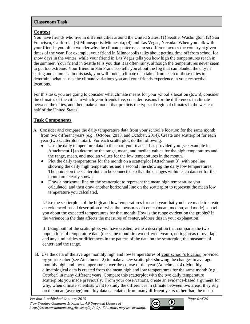
Classroom Task
Context
You have friends who live in different cities around the United States: (1) Seattle, Washington; (2) San
Francisco, California; (3) Minneapolis, Minnesota; (4) and Las Vegas, Nevada. When you talk with
your friends, you often wonder why the climate patterns seem so different across the country at given
times of the year. For example, your friend in Minneapolis talks about getting time off from school for
snow days in the winter, while your friend in Las Vegas tells you how high the temperatures reach in
the summer. Your friend in Seattle tells you that it is often rainy, although the temperatures never seem
to get too extreme. Your friend in San Francisco tells you about the fog that can blanket the city in
spring and summer. In this task, you will look at climate data taken from each of these cities to
determine what causes the climate variations you and your friends experience in your respective
locations.
For this task, you are going to consider what climate means for your school’s location (town), consider
the climates of the cities in which your friends live, consider reasons for the differences in climate
between the cities, and then make a model that predicts the types of regional climates in the western
half of the United States.
Task Components
A. Consider and compare the daily temperature data from your school’s location for the same month
from two different years (e.g., October, 2013, and October, 2014). Create one scatterplot for each
year (two scatterplots total). For each scatterplot, do the following:
● Use the daily temperature data in the chart your teacher has provided you [see example in
Attachment 1] to determine the range, mean, and median values for the high temperatures and
the range, mean, and median values for the low temperatures in the month.
● Plot the daily temperatures for the month on a scatterplot [Attachment 3], with one line
showing the daily high temperatures and a second line showing the daily low temperatures.
The points on the scatterplot can be connected so that the changes within each dataset for the
month are clearly shown.
● Draw a horizontal line on the scatterplot to represent the mean high temperature you
calculated, and then draw another horizontal line on the scatterplot to represent the mean low
temperature you calculated.
I. Use the scatterplots of the high and low temperatures for each year that you have made to create
an evidenced-based description of what the measures of center (mean, median, and mode) can tell
you about the expected temperatures for that month. How is the range evident on the graphs? If
the variance in the data affects the measures of center, address this in your explanation.
II. Using both of the scatterplots you have created, write a description that compares the two
populations of temperature data (the same month in two different years), noting areas of overlap
and any similarities or differences in the pattern of the data on the scatterplot, the measures of
center, and the range.
B. Use the data of the average monthly high and low temperatures of your school’s location provided
by your teacher (see Attachment 2) to make a new scatterplot showing the changes in average
monthly high and low temperatures over the course of the year (Attachment 4). Monthly
climatological data is created from the mean high and low temperatures for the same month (e.g.,
October) in many different years. Compare this scatterplot with the two daily temperature
scatterplots you made previously. From your observations, create an evidence-based argument for
why, when climate scientists want to study the differences in climate between two areas, they rely
on the mean (average) monthly data calculated from many different years rather than the mean

Page 5 of 26 Version 2-published January 2015 View Creative Commons Attribution 4.0 Unported License at http://creativecommons.org/licenses/by/4.0/. Educators may use or adapt.
daily temperature data from one entire year.
C. For the cities of Seattle, San Francisco, Las Vegas, and Minneapolis, use the provided temperature
data (Attachment 6) to make two graphs per city:
● One graph showing scatterplots for two different data sets: one set of data for the average
monthly high temperature and a second set of data for the average monthly low temperature.
The points on the scatterplot should be connected so that the changes within each dataset for
the month are clearly shown;
● A bar graph showing the average precipitation per month for a year (Attachment 5).
D. Compare the temperature scatterplots for Minneapolis, MN, and Las Vegas, NV. Consider the
difference between the cities in the average monthly high temperature during the hottest month
and the difference between the cities in average monthly high temperature during the coldest
month. Construct an argument to evaluate the claim that temperature differences observed in the
scatterplots can be accounted for by differences in latitude (Attachment 7). Account for the
differences between cities in terms of the heating from solar energy or the transfer of thermal
energy in your argument.
On a map of the western half of the United States (Attachment 11), identify regions where
differences in latitude affect the climate by:
- Labeling areas of the map where the climate would be affected (in terms of where differences
in temperature occur, based on latitude);
- Indicating on the map the possible cause of the differences in climate (in terms of heating
from solar energy and/or the transfer of thermal energy).
E. Seattle, WA (47.6097° N) is located at a more northern latitude than is Minneapolis, MN
(44.9833° N). Compare the temperature scatterplots for these two cities. Consider the difference
in the yearly range in temperatures between the two cities and the difference in the temperatures
of the hottest and coldest months for each city. Construct an explanation for how the differences
between the cities’ temperature ranges and max/min temperatures can be accounted for by the
geographic location of Seattle relative to the geographic location of Minneapolis (Attachment 7).
Account for the differences between these cities in terms of the heating from solar energy or the
transfer of thermal energy in your explanation.
On the map of the western half of the United States (Attachment 11), use your explanation about
the differences between Seattle and Minneapolis to identify regions where the proximity to certain
geographic features will affect the climate by:
- Labeling areas on the map where differences in temperature occur, based on proximity to
geographic features;
- Indicating on the map the possible cause of the differences in climate (in terms of heating
from solar energy and/or the transfer of thermal energy);
- Drawing arrows with labels showing the direction of energy movement if there is a transfer
of thermal energy.
F. Seattle, WA (47.6097° N) is located at a significantly higher latitude than is San Francisco, CA
(37.7833° N), but it has a similar geographic location: on the West Coast of North America.
Compare the temperature scatterplots for these two cities. Consider the difference between the
cities with regard to the yearly range in temperatures and the difference in the temperatures for the
hottest and coldest months for each city. The California ocean current runs along the coast of
California, bringing cold water from the north to the south and from deeper in the ocean up to the
surface (Attachment 8). Construct an explanation for how ocean currents, driven by temperature
differences and the Coriolis effect, can have a causal role in determining the differences between
the cities’ temperature ranges and max/min temperatures when both cities are located on the same

Page 6 of 26 Version 2-published January 2015 View Creative Commons Attribution 4.0 Unported License at http://creativecommons.org/licenses/by/4.0/. Educators may use or adapt.
coast. Account for the differences between cities in terms of the heating from solar energy or the
transfer of thermal energy in your explanation.
On the map of the western half of the US, identify regions where ocean currents will affect the
climate by:
- Labeling areas on the map where differences in temperature occur, based on ocean currents;
- Indicating on the map the possible cause of the differences in climate (in terms of heating
from solar energy and/or the transfer of thermal energy);
- Drawing arrows with labels showing the direction of ocean water circulation that would lead
to differences in temperature;
- Drawing arrows with labels showing the direction of energy movement if there is a transfer
of thermal energy.
G. Consider the maps showing the topography around Seattle, San Francisco, and Las Vegas
(Attachment 10). Winter precipitation data for Minneapolis represent the amount of
precipitation from snowfall because it is cold enough in the winter for all the precipitation to
be frozen as snow and ice. Although it would be unusual to have snow in the cities of Seattle,
San Francisco, and Las Vegas, it does snow in the mountains near these cities. Construct an
explanation that addresses why snowfall occurs in certain areas near these cities, even though
it is usually too warm in the cities, themselves, for snow to fall there.
On the map of the western US (Attachment 11), use your explanation to identify regions where
topography and altitude will affect the climate by:
- Labeling areas on the map where differences in temperature are likely to occur, based on
topography.
H. Las Vegas (36.0800° N) and San Francisco, CA (37.7833° N) are located at similar latitudes.
Compare the precipitation data for these cities. Use the map of wind direction (the Westerlies,
Attachment 9) and the topography of the land between the two cities (Attachment 10) to construct
an explanation for what causes the difference in precipitation data between the two cities.
On the map of the western US, use your explanation to identify regions where the prevailing wind
direction (and topography) will affect the climate by:
- Labeling areas on the map where differences in precipitation occur;
- Drawing arrows with labels showing the direction of air movement that would lead to
differences in precipitation.
I. Use your labeled map as a model for the western United States climate system, describe
specifically where and how air and ocean circulation patterns are affecting climate in this system.
Then, develop an argument from evidence that similar patterns occur throughout the Earth, and
therefore that unequal heating and the rotation of the Earth creates the patterns of air circulation
on the planet.

Page 7 of 26 Version 2-published January 2015 View Creative Commons Attribution 4.0 Unported License at http://creativecommons.org/licenses/by/4.0/. Educators may use or adapt.
Alignment and Connections of Task Components to the Standards Bundle
Task Components A and B ask students to plot and interpret daily and monthly average temperature
values for their school’s location (town), and Task Component C asks students to plot average
temperature and precipitation data for four selected cities. By plotting the temperature (scatterplots)
and precipitation values (bar graphs), students are partially addressing the CCSS-M standards
6.SP.B.4. By calculating the mean, median, mode, and range and by considering their meaning relative
to data on the scatterplot, students are addressing the CCSS-M standards 6.SP.A.2, 6.SP.A.3, and
7.SP.B.4 and partially addressing on the CCSS-M standard 6.SP.B.5c. By comparing two populations
of daily temperatures values from different years, students are addressing 7.SP.B.4 and partially
addressing 7.SP.B.3. By comparing daily temperature values with average monthly temperature values
and commenting on why average values are reasonable approximations for data populations
representing daily temperature, students are addressing CCSS-M practice MP.2, partially addressing
CCSS-M standard of 7.SP.A.1, CCSS-M practice MP.3, and partially addressing parts of the NGSS
practices of Analyzing and Interpreting Data and Using Mathematical and Computational
Thinking. By explaining and describing data, including observations of similarities and differences,
students can demonstrate their understanding of W.7.2, W.7.2.a, W.7.2.b, W.7.2.b, WHST.6-8.2,
WHST.6-8.2.a, WHST.6-8.2.b, and WHST.6-8.2.c.
Task Components C, D, E, F, G, and H ask students to compare the temperature and precipitation
data of four selected cities to evaluate how latitude, geographic location, ocean currents, prevailing
wind direction, altitude, and topography influence the regional climates of these cities and to build a
map outlining where these will affect climate in the western half of the United States. By asking
students to construct arguments and explanations, these task components together partially address
parts of the NGSS core ideas of Weather and Climate (ESS2.D as it relates to MS-ESS2-6) and The
Roles of Water in Earth’s Surface Processes (ESS2.C as it relates to MS-ESS2-6); parts of the
practices of Analyzing and Interpreting Data, Engaging in Argument from Evidence, and
Constructing Explanations and Designing Solutions; and parts of the crosscutting concepts of
Cause and Effect, Patterns, and Energy and Matter. The development of the map allows students
to demonstrate their understanding of the NGSS practice of Developing and Using Models (as it
relates to MS-ESS2-6). The use of scatterplots in the interpretation of the climatological data
addresses CCSS-M standards 7.SP.A.1, 7.SP.B.3, and 7.SP.B.4 as well as CCSS-M practices MP.2
and MP.3. In these task components, an understanding of statistical values, such as mean and range,
enhances students interpretation of the effects the various listed factors have on climate, while
interpretation of the plotted data populations in the context of climate enhances students’
understanding of those statistical values. By constructing how and why explanations in Task
Components D, E, F, and G, students can partially address on W.7.2, W.7.2.a, W.7.2.b, W.7.2.b,
WHST.6-8.2, WHST.6-8.2.a, WHST.6-8.2.b, and WHST.6-8.2.c.
Task Component I asks students to describe how unequal heating and the rotation of the Earth causes
air and ocean circulation patterns, and to use their labeled map as a model to describe how these
patterns affect climate in the western half of the United States. This partially addresses parts of the
NGSS core ideas of Weather and Climate (ESS2.D as it relates to MS-ESS2-6) and The Roles of
Water in Earth's Surface Processes (ESS2.C as it relates to MS-ESS2-6); parts of the NGSS
practices of Developing and Using Models (as it relates to MS-ESS2-6) and Engaging in
Argument from Evidence; and parts of the NGSS crosscutting concepts of Cause and Effect,
Patterns, Energy and Matter, and Systems and Systems Models (MS-ESS2-6).
Together, Task Components D, E, F, G, H, and I address the NGSS performance expectation of MS-
ESS2-6. The task components address parts of the core idea of ESS2.D: Weather and Climate and
of ESS2.C: The Roles of Water in Earth’s Surface Processes, and parts of the crosscutting concept
of Systems and System Models through the practice Developing and Using Models by asking for the
production of a map (model) of the western half of the United States that indicates and labels areas

Page 8 of 26 Version 2-published January 2015 View Creative Commons Attribution 4.0 Unported License at http://creativecommons.org/licenses/by/4.0/. Educators may use or adapt.
where temperature and precipitation are affected by solar heating, energy transfer, and air and ocean
circulation patterns, and the use of that model map when explaining how and why the climate
(temperature and precipitation) is affected. By (a) creating a model representative of the climate-
energy system of the western United States that indicates where the climate is affected by latitude,
altitude, and geographic land distribution; the direction and location of energy transfer between oceans
and continent; and the location where solar heating is greater or less; and (b) by using that model to
describe how these factors affect climate (including an explanation of what drives ocean and air
circulation patterns), students completing the task components are integrating the disciplinary core idea
with the crosscutting concept and the practice.
Evidence Statements
Task Component A ● Students represent daily temperature data on a scatterplot, and create one plot for each year.
● For each year, students calculate the range, mean, mode, and median values for high and low
temperatures.
● Students use straight lines on the scatterplots to represent the calculated mean high and low
temperature values.
● I. Students use specific features from their scatterplots as evidence to describe each of the
following:
○ The mean represents the temperature around which the data points are clustered, for
the time period as represented by the data;
○ The mode represents the temperature that occurs most frequently in the data;
○ The median is the temperature that falls in the middle when the data values are listed
in order from smallest to largest;
○ The range represents the difference between the smallest and largest data value (how
much the data points are spread out);
○ Variance in the data indicates the differences between the data points and their mean.
A high variance indicates that the data points are not equally distributed on either side
of the mean line and may cause the mean to be higher or lower than the median.
● II. Students compare the two data sets, describing:
○ Similarities or differences in the mean, median, mode, and range values;
○ Examples from the scatterplots of where the data ranges overlap;
○ Similarities or differences in the pattern of data on the scatterplots.
Task Component B ● Students represent monthly average high and low temperatures on a scatterplot.
● Students make a claim that the mean (average) monthly data calculated from many years are
more representative of the range of temperatures than an area could experience in any single
month.
● Students descibe the following observations from daily and monthly data scatterplots as
evidence, and connect the evidence to the claim with the following reasoning:
○ The daily temperature data from a given year, including the mean and range, may be
very different from the daily temperature data from a different year;
○ The daily temperature data from a given year, including the mean and range, may be
significantly higher or lower than other years;
○ The mean of many years of climate data will take into account a much greater range in
temperatures than is present from only one year of data;
○ The range in data from many years is more likely to include or overlap with the range
of data from any one year.
Task Component C

Page 9 of 26 Version 2-published January 2015 View Creative Commons Attribution 4.0 Unported License at http://creativecommons.org/licenses/by/4.0/. Educators may use or adapt.
● Students represent the average monthly high and low temperatures on the scatterplots, creating
one graph for each of the four cities.
● Students represent the average monthly precipitation on the bar graphs, creating one for each
city.
Task Component D ● Students identify the given claim that higher latitudes have lower average temperatures, based
on the differences in temepratures and differences in latitude between Minneapolis, MN and
Las Vegas, NV.
● To evaluate the claim, students identify and describe the following patterns as evidence:
○ That Las Vegas, NV, shows similar spread (magnitude of the range) of yearly
temperature data as Minneapolis, MN, but that the range covers higher temperatures
(from scatterplot);
○ That Minneapolis, MN, is located at a higher latitude than Las Vegas, NV (from map).
○ That lower latitudes receive more direct sunlight than do higher latitudes.
● Students evaluate the evidence for relevance and sufficiency to support the claim, including the
distinction between correlation and causation, as it relates to their interpretation of the data
from the graphs.
● Students synthesize the relevant evidence logically using the reasoning that the higher range of
yearly temperature data correlates with lower latitudes, so the amount of direct sunlight might
cause the higher temperature range found in Las Vegas (compared to Minneapolis)
● Students label the map of the western United States as follows:
○ Adding labels in the higher latitudes indicating lower temperatures due to less solar
heating;
○ Adding labels in the lower latitudes indicating higher temperatures due to greater solar
heating.
Task Component E ● Students construct an explanation that includes the idea that areas near the ocean do not
experience as large of differences in average temperature from month to month as do areas far
from the ocean, based on the differences in temperatures (range and minimum temperatures)
between Minneapolis, MN and Seattle, WA.
● Students identify and describe the following patterns as evidence to construct the explanation:
○ The yearly range in temperature is more narrow (i.e., not as great a difference in
temperature from the cold to warm months) for data from Seattle, WA, than for the
data from Minneapolis, MN (from the scatterplots);
○ The average temperatures for the warmer months are similar in both cities, but that the
average temperatures for colder months are lower in Minneapolis, MN, than in Seattle,
WA (from the scatterplots);
○ Minneapolis, MN, is geographically located in the interior of the continent and that
Seattle, WA, is located by an ocean (from map).
○ Both land and water absorb energy from the sun, but water (e.g., oceans) releases the
energy more slowly than the land does.
● To construct the explanation, students connect the evidence logically using reasoning that the
transfer of thermal energy from the ocean can account for the relationship between ocean
proximity and range in average temperature.
● On the given map, students
o Identify and label areas of land near the ocean,
o Use arrows with labels to indicate the transfer of thermal energy between the land and
the ocean.
Task Component F ● Students construct an explanation that includes the idea that the differences between the cities

Page 10 of 26 Version 2-published January 2015 View Creative Commons Attribution 4.0 Unported License at http://creativecommons.org/licenses/by/4.0/. Educators may use or adapt.
temperature ranges and max/min temperatures can be accounted for by the fact that ocean
circulation places colder ocean water adjacent to San Francisco, CA relative to Seattle, WA.
● Students identify and describe the following patterns as evidence to construct their
explanation:
○ Both cities show a relatively narrow range in yearly temperature but that the range in
data for San Francisco, CA, is narrower than the range of data from Seattle, WA (from
scatterplot);
○ Average temperatures for the warmer months in San Francisco, CA, are lower than the
average temperatures for the warmer months in Seattle, WA (from scatterplot);
○ Although both cities are located along the coast, San Francisco, CA, is located at a
place where the ocean currents are bringing in colder ocean waters (from map).
● To construct the explanation, students connect the evidence logically using reasoning that
ocean circulation for a given latitude moves ocean waters to places where they are
colder/warmer than typical for that latitude, in a process caused by temperature differences and
the Coriolis effect. The location and movement of these ocean currents can account for
warmer/cooler than typical land temperatures.
● On the map of the western United States, students:
○ Identify and label areas of land near the ocean, indicating a much smaller range of
temperatures throughout the year due to the transfer of energy to and from colder-than-
typical ocean currents;
○ Add arrows showing the direction of ocean water circulation;
○ Add arrows showing the transfer of thermal energy between the land and the ocean.
Task Component G ● Students construct an explanation that includes the idea that the colder temperatures at areas of
higher altitude allow for snowfall to occur.
● Students identify and describe the following patterns as evidence to support their explanation:
o The relationship between type of precipitation (rain versus snow) and areas of great
topographic relief.
o That some places on the map with snow are areas of higher altitude.
o The air pressure is lower at higher altitudes.
● Students use reasoning to logically connect the evidence to construct an explanation that colder
temperatures, associated with lower pressure, at higher altitudes can account for the presence
of snowfall in places with great topographic relief.
● Students label areas of higher elevation, indicating areas of colder temperatures due to a
location at higher altitudes.
Task Component H ● Students construct an explanation that connects the difference in the amount of precipitation
between San Francisco, CA, and Las Vegas, NV, with the direction of air movement from the
west to east over an area of great topographic relief, and that includes the idea that areas to the
west of the topographic highs get more precipitation than areas to the east of the topographic
highs.
● Students identify and describe the following patterns as evidence in their explanation:
○ The observation from the geographic map that there is an area of great topographic
relief between San Francisco, CA, and Las Vegas, NV;
○ The observation from the precipitation bar graphs that Las Vegas, NV, has much less
average precipitation per year than San Francisco, CA;
○ The observation from the image of prevailing wind directions that the wind patterns
move air from over the ocean in the west to over the continent in the east;
○ The observation from the image of prevailing wind directions and the geographic map
that air moves from the area near San Francisco, CA, over an area of great topographic
relief to the area near Las Vegas, NV.

Page 11 of 26 Version 2-published January 2015 View Creative Commons Attribution 4.0 Unported License at http://creativecommons.org/licenses/by/4.0/. Educators may use or adapt.
● To construct their explanation, students connect the evidence logically using the reasoning that
the connection between the amount of precipitation and the geographic location of the city can
be accounted for by the loss of moisture in the air as it moves from west to east over the areas
of great topographic relief (from the San Francisco, CA area to the area near Las Vegas, NV).
● On the map of the western United States, students:
○ Identify and label areas of land to the east of mountain ranges as areas with less
precipitation due to the movement of air over the mountain ranges;
○ Identify and label areas of land to the west of mountain ranges as areas with more
precipitation due to the movement of air over the mountain ranges;
○ Add arrows showing the prevailing direction of air circulation (patterns of air
movement).
Task Component I ● Students use their map as a model to identify where, and to describe how, air/ocean circulation
affects climate in the western United States. Examples cited include:
○ An example of where the movement of air affects the patterns of precipitation due to
the rain shadow effect;
○ An example of where the movement of ocean water affects average temperatures along
the coast due to the ability of the ocean to buffer land temperatures.
● Students develop an argument that supports the claim that air/ocean circulation affects climate
throughout the planet. In their argument, students identify the following patterns as evidence
to support their claim:
o areas on the Earth where circulation of air due to unequal heating and the rotation of
the Earth causes and defines the prevailing wind directions.
o areas on the Earth where circulation of water due to unequal heating causes and
defines the ocean circulation patterns.
● Students evaluate the evidence for relevance and sufficiency for supporting the claim,
including the idea that phenomena may have multiple contributing causes, and any limitations
their evidence may pose (e.g., the use of models, correlation vs. causation).
● Students synthesize the relevant evidence, using the following reasoning:
o Unequal heating creates differences in density between warmer and colder air/water
causing air/ocean circulation.
o The rotation of the Earth causes air and water circulation patterns to be deflected, such
as to the right in the Northern Hemisphere (clockwise rotation) and to the left in the
Southern Hemisphere (counter-clockwise rotation).

Page 12 of 26 Version 2-published January 2015 View Creative Commons Attribution 4.0 Unported License at http://creativecommons.org/licenses/by/4.0/. Educators may use or adapt.
Attachment 1. Obtaining Regional Daily Temperature Data
Note for Task Component A, students are to use actual high/low temperatures, not daily averages.
Archived temperature data may be accessed from the National Weather Service Office serving a region.
Once at the regional office website, archived data may be accessed at the National Weather Service by
clicking the following tabs:
● Climate-Local (on left side),
● Observed weather, select the product: preliminary monthly climate data
● Select location (example is from Reagan National Airport),
● Choose archived data and select a month (example below is from March 2003)
● Select go.
An example Preliminary Local Climatological Data report from the National Weather Service for
Washington D.C., March, 2003 is shown below. The first column is the day of the month, the second
column is the high temperature for the day (max) and the third column is the low temperature for the day
(min). Temperatures are given in degrees Fahrenheit (°F).
(National Weather Service; http://www.nws.noaa.gov/climate/f6.php?wfo=lwx- Web page accessed 11-
27-2013)

Page 13 of 26 Version 2-published January 2015 View Creative Commons Attribution 4.0 Unported License at http://creativecommons.org/licenses/by/4.0/. Educators may use or adapt.
Climate data obtained from the NOAA website are rewritten in the table below as a sample data set in a
form that could be given to students.
Climate Data for Washington, D.C., a Hypothetical School Location
Teachers: You will need to choose the month and the years, as well as compile the data in a chart for the
students. Choose data from a year with higher than average temperatures for the month and from a year
with average (or lower) temperatures. The data can be from whichever month you choose, as long as it is
the same month for each year. This example shows March 2013, an average to below average year for
Washington, D.C., and March 2010, an above average year.

Page 14 of 26 Version 2-published January 2015 View Creative Commons Attribution 4.0 Unported License at http://creativecommons.org/licenses/by/4.0/. Educators may use or adapt.
Attachment 2. Obtaining Regional Monthly Climatological Data
From the Weather Channel’s home page (http://www.weather.com):
1. Search for your city.
2. Select the monthly tab on the left.
3. Select the averages tab below the calendar.
4. You can select data in either Fahrenheit or Celsius, table or graph form.
Note: There may be advertisements that some might find objectionable at this website, so it might be
necessary to provide the students with the data already formatted in a table like the one below.
Sample Average Monthly
Temperature Data
from Washington, D.C.
Source: http://www.weather.com/weather/wxclimatology/monthly/DCA:9 accessed 11-27-2013.

Page 15 of 26 Version 2-published January 2015 View Creative Commons Attribution 4.0 Unported License at http://creativecommons.org/licenses/by/4.0/. Educators may use or adapt.
Attachment 3. Daily Temperature Graph
Note: Teachers may choose to have their students design their own plots rather than be given the plot below.

Page 16 of 26 Version 2-published January 2015 View Creative Commons Attribution 4.0 Unported License at http://creativecommons.org/licenses/by/4.0/. Educators may use or adapt.
Attachment 4. Average Monthly Temperature Graph
Note: Teachers may choose to have their students design their own plots rather than be given the plot below.

Page 17 of 26 Version 2-published January 2015 View Creative Commons Attribution 4.0 Unported License at http://creativecommons.org/licenses/by/4.0/. Educators may use or adapt.
Attachment 5. Average Monthly Precipitation Graph
Note: Teachers may choose to have their students design their own plots rather than be given the plot below.

Page 18 of 26 Version 2-published January 2015 View Creative Commons Attribution 4.0 Unported License at http://creativecommons.org/licenses/by/4.0/. Educators may use or adapt.
Attachment 6. Average Monthly Climate Data from www.weather.com.
Seattle, Washington San Francisco, California

Page 19 of 26 Version 2-published January 2015 View Creative Commons Attribution 4.0 Unported License at http://creativecommons.org/licenses/by/4.0/. Educators may use or adapt.
Attachment 7. Map of the United States Showing the Location of the Four Cities
Source: GoogleMapsTM
Last Accessed: February 5, 2014
© 2014 Google, INEGI

Page 20 of 26 Version 2-published January 2015 View Creative Commons Attribution 4.0 Unported License at http://creativecommons.org/licenses/by/4.0/. Educators may use or adapt.
Attachment 8. Map of Ocean Currents
Image Sources: NASA Goddard Institute for Space Sciences Institute on Climate and Planets, US Navy
Oceanographic Office; http://icp.giss.nasa.gov/research/ppa/1997/oceanchars/currents.html; Accessed
Feb.2014
Other images can be found at:
http://media.web.britannica.com/eb-media/62/112362-004-5788B8E2.gif
http://upload.wikimedia.org/wikipedia/commons/0/06/Corrientes-oceanicas.gif
Image Source: Modified from Largier, J.L., B.S. Cheng, and K.D. Higgason, eds.
(2010). Climate Change Impacts: Gulf of the Farallones and Cordell Bank National Marine
Sanctuaries. Report of a Joint Working Group of the Gulf of the Farallones and Cordell Bank
National Marine Sanctuaries Advisory Councils, 121pp
http://farallones.noaa.gov/manage/climate/pdf/climate_report.pdf - Accessed: February 5, 2014

Page 21 of 26 Version 2-published January 2015 View Creative Commons Attribution 4.0 Unported License at http://creativecommons.org/licenses/by/4.0/. Educators may use or adapt.
Attachment 9. Map of the Prevailing Global Wind Directions
Source: NASA's Remote Sensing Tutorial: The Water Planet - Meteorological, Oceanographic and
Hydrologic Applications of Remote Sensing, accessed at:
http://serc.carleton.edu/details/images/10044.html
https://www.fas.org/irp/imint/docs/rst/Sect14/Sect14_1c.html
Last Accessed: February 5, 2014

Page 22 of 26 Version 2-published January 2015 View Creative Commons Attribution 4.0 Unported License at http://creativecommons.org/licenses/by/4.0/. Educators may use or adapt.
Attachment 10. Maps Showing the Topography around San Francisco, Las Vegas, and Seattle
Source (both): GoogleMapsTM
Last Accessed: February 6, 2014
© 2014 Google, Google Maps
© 2014 Google, Google Maps

Page 23 of 26 Version 2-published January 2015 View Creative Commons Attribution 4.0 Unported License at http://creativecommons.org/licenses/by/4.0/. Educators may use or adapt.
Attachment 11. Map of the Western Continental United States
Source: GoogleMapsTM
Last Accessed: February 6, 2014
© 2014 Google, INEGI

Page 24 of 26 Version 2-published January 2015 View Creative Commons Attribution 4.0 Unported License at http://creativecommons.org/licenses/by/4.0/. Educators may use or adapt.
Sample Answer Plots:

Page 25 of 26 Version 2-published January 2015 View Creative Commons Attribution 4.0 Unported License at http://creativecommons.org/licenses/by/4.0/. Educators may use or adapt.

Page 26 of 26 Version 2-published January 2015 View Creative Commons Attribution 4.0 Unported License at http://creativecommons.org/licenses/by/4.0/. Educators may use or adapt.