A Study of Educational Simulations Part II – Interface … Study of Educational Simulations Part...
38
A Study of Educational Simulations Part II – Interface Design W. K. Adams, S. Reid, R. LeMaster, S. B. McKagan, K. K. Perkins, M. Dubson and C. E. Wieman Abstract Interactive computer simulations with complex representations and sophisticated graphics are a relatively new addition to the classroom, and research in this area is limited. We have conducted over 200 individual student interviews during which the students described what they were thinking as they interacted with simulations. These interviews were conducted as part of the research and design of simulations for the Physics Education Technology (PhET) project. PhET is an ongoing project that has developed over 60 simulations for use in teaching physics, chemistry, and physical science. These interviews are a rich source of information about how students interact with computer simulations and what makes an educationally effective simulation. The interviews demonstrate that the simulation must function intuitively or the student’s attention is focused on how to use the simulation rather than on the topic presented. Here we provide guidelines for intuitive interface design developed by this research. These cover layout, tool use, help and representations that we use to create a simulation. We give examples from interviews which demonstrate the effectiveness of each guideline for engaging students in educationally productive interactions. Table of Contents Introduction Background Interview Methodology PhET Look and Feel Interview Results Intuitive Controls Click and Drag Interface Grabbable Objects Sliders, Radio Buttons and Checkboxes. Consistent Set of Tools Representations Explicit Visual Model Start-up Settings Real World Connections Visual Cues - Everything Matters. Consistent Representations Layout Control Panel Play Area
Transcript of A Study of Educational Simulations Part II – Interface … Study of Educational Simulations Part...

A Study of Educational Simulations Part II – Interface
Design
W. K. Adams, S. Reid, R. LeMaster, S. B. McKagan, K. K. Perkins, M. Dubson and C. E. Wieman
Abstract Interactive computer simulations with complex representations and sophisticated graphics are a relatively new addition to the classroom, and research in this area is limited. We have conducted over 200 individual student interviews during which the students described what they were thinking as they interacted with simulations. These interviews were conducted as part of the research and design of simulations for the Physics Education Technology (PhET) project. PhET is an ongoing project that has developed over 60 simulations for use in teaching physics, chemistry, and physical science. These interviews are a rich source of information about how students interact with computer simulations and what makes an educationally effective simulation. The interviews demonstrate that the simulation must function intuitively or the student’s attention is focused on how to use the simulation rather than on the topic presented. Here we provide guidelines for intuitive interface design developed by this research. These cover layout, tool use, help and representations that we use to create a simulation. We give examples from interviews which demonstrate the effectiveness of each guideline for engaging students in educationally productive interactions. Table of Contents Introduction Background Interview Methodology PhET Look and Feel Interview Results Intuitive Controls Click and Drag Interface Grabbable Objects Sliders, Radio Buttons and Checkboxes. Consistent Set of Tools Representations Explicit Visual Model Start-up Settings Real World Connections Visual Cues - Everything Matters. Consistent Representations Layout Control Panel Play Area
Backgrounds Tabs Play Buttons Help Wiggle-Me Help! Extensive Help. Conclusion Acknowledgements References
Introduction
Computer animations and interactive simulations are commonly found in today’s
classroom and have been integrated in a variety of ways. This popularity is partly due to the fact
that simulations are quite easy to introduce into a curriculum. Textbooks now regularly include
DVDs or a URL to websites with a library of various simulations. While many educators
(Christian & Belloni, 2001) find it appealing to use simulations in their classroom, very little
research has been done to determine if simulations improve a student’s understanding of or
enthusiasm for science and how simulations can be designed and used most effectively.
Available simulations use a wide variety of appearances, controls, graphics, interactivity, and
design principles, often guided only by the designers’ preferences or ease of coding. Little is
known, however, about design principles and features that are important for optimal student use
and understanding (Viadero, 2007).1
An extensive analysis of student use of simulations, including comparisons of multiple
incarnations of a single simulation using different interface design features has been done as a
part of the Physics Education Technology (PhET)2 Project (Perkins et al., 2006; The PhET
1 For a more extensive discussion of the history of simulation design please see Part I. 2 PhET is an ongoing program to develop an extensive suite of freely available online simulations for teaching and learning physic, chemistry and physical science.
2

Team, 2006). This analysis has led to an empirically determined and tested set of design
principles based on our observations of student use. This research focuses on identifying which
characteristics make a simulation effective or ineffective through the use of extensive think-
aloud student interviews using simulations. This paper is Part II of a two part series. Part I
(Adams, Reid, LeMaster, McKagan, Perkins and Wieman, 2007), focuses on the general features
of a simulation that are most important for achieving engagement and learning. Here specific
details on interface design that are important for supporting these general features are described,
including characteristics that make a simulation engaging and easy to use, types of controls that
are intuitive for the student, effective use of representations, the impact of different types of help
and the impact of even small amounts of irrelevant information.
Background
Part I focuses on the simulation design process, examining those features that encourage
students to explore and understand physical relationships and engage them in the process of
‘discovering’ the desired learning goals of the simulation. We also discussed the interview
research methodology and protocol, and surprising degree of consistency in responses. Here we
will only give a brief description of our interview methodology and how our design guidelines
were created. For a more in depth discussion of this and other research and the theoretical
principles which support our guidelines, please see Part I.
Interview Methodology
Over the past three years we have video-taped more than 200 simulation interviews with
89 different students covering 52 of 60 simulations. Student interviewees are volunteers that are
typically non-science majors who have typically not yet received formal instruction on the ideas
3

covered by the simulation. For the more advanced quantum simulations, we also interview
physics majors. For each simulation, we typically interview a diverse group of four to six
students.
Our standard interview protocol includes the following: in the first interview with a
particular student, the interviewer begins by getting to know the student, asking about their
background, career and major choices, and courses. Once the student relaxes, and in all
subsequent interviews with that student, the simulations are explored in a think-aloud style
format. With this approach, the students are asked to talk out-loud while they investigate the
simulation. The simulation explorations are structured one of two ways: 1) The student is asked
prediction-type conceptual questions (where the student describes their understanding of an
idea/concept before seeing the simulation) to guide their interactions. Then, after, or more often
while, interacting with the simulation, they are allowed to revise their answer; or 2) The student
is simply asked to explore the simulation freely without a guiding question.
The PhET Look and Feel
The summary of this research on interface design is embodied in the “PhET Look and
Feel” (Adams, Perkins & Wieman, 2006), which the design teams now follow while creating a
new simulation. During the first year of interviews, when the look and feel was still in the early
development stages, student difficulties ranged from simulation usability to conceptual problems.
These difficulties included problems such as interface design, help functions, tool placement,
effective types of representations, and what types of features encouraged students to interact with
and think about the simulation (Figure I). Many interface problems and successes were found to
be consistent from simulation to simulation, and thus informed our simulation design guidelines
contained in the PhET Look and Feel. We would typically research particular aspects of the
4

interface design in depth using multiple versions of the same simulation, and then utilize those
results in designing subsequent simulations. Results from interviews on the subsequent
simulations would then confirm or refine the design guidelines.
Interviews have also revealed three different levels of usability:
1. Non-intuitive –difficult to use even with instruction.
2. Semi-intuitive – easy to use after instruction and demonstration; and
3. Intuitive – easy to use with no instruction.
It is relatively easy to create a simulation that will be easy for a student to use after observing a
demonstration. It is more difficult to create an intuitive simulation that requires no instructions;
but, we have found that an intuitive simulation can be designed rather routinely (even for rather
complex simulations) by following the now highly-refined PhET Look and Feel guidelines
Figure I – Interface Design: The black region is the play area containing the representations of physical objects that students can manipulate themselves and observe the effects of their actions instantly. The grey area on the right is the control panel which contains radio buttons, sliders and text boxes for adjusting various parameters and in the lower half of the control panel there are several tools for the students to use while working in the play area.
5

derived from our interview studies. Thus, our new simulations rarely have usability issues, and
our current interviews focus primarily on a simulation’s ability to engage the student and achieve
the desired learning goals.
In this paper we present the interview results which led to the larger part of the PhET
Look and Feel that focuses on the features we have found to be successful at creating an intuitive
interface while the first paper, Part I, contains the Encourage Exploration section of the PhET
Look and Feel.
Interview Results
The following discussions of design features focus on the specific simulations and
interviews where the problems were discovered, the potential solutions were explored, and the
desirable design features first confirmed. We have checked the validity of these design features
and principles in subsequent interviews with new simulations; however, in the interest of brevity,
discussions of these follow up interviews will not usually be provided in these papers when the
interviews merely confirmed the previously observed results. All general conclusions presented
here have been confirmed with interviews on at least several simulations.
Intuitive Controls
Engaging students in exploration of the simulation can only happen if they can readily
use the simulation. If simulation controls are difficult to master, students’ attention is focused on
the use of the simulation rather than on the exploration of scientific concepts. In this section we
focus on controls which are intuitive for users and don’t distract from the learning goals.
Interviews showed that certain types of controls are intuitive for users. These types of
controls are independent of the content of the simulation.
6

If highly non-intuitive controls are used, even with ‘help’ in the simulation or tutoring
from the interviewer, many students still cannot use the simulation.
Analysis of the first year of interviews consistently revealed that particular types of
controls are intuitive to students while other types of controls prove more difficult to master
regardless of the concept being addressed by the simulation. Much of the study of different
control use was carried out using various versions of ‘CCK’. This simulation underwent several
rounds of interviews and extensive rewrites until it reached its present form.
The effectiveness of user interface items revealed by the study of this specific simulation,
such as grabbable objects, sliders with immediate response for adjusting numerical values, and
radio buttons for turning things on and off, has proven to be quite general. Many subsequent
interviews with a variety of simulations have shown these to be consistently intuitive,
independent of the simulation content. Student’s desire to grab objects with the mouse and their
ability to readily use these controls is suggestive that controls are more intuitive when they most
resemble using the mouse as a simple extension of direct manipulations by hand.
Click and Drag Interface
Click and drag is the most natural motion for students.
The first version of ‘CCK’ used ‘mode-switching’ – similar to a paint program. When
the user clicked on a battery in the tool box, the mouse became a battery tool and would create a
battery in the play area each time the user clicked in the play area. This battery could then be
manipulated within the play area along with other components such as wires, resistors, light
bulbs and switches to create a circuit. (See Figure IIa) With this user interface, none of the four
students interviewed figured out how to build a circuit on their own, although one did figure out
how to get components into the play area but could not connect them. In the end, three of the
7

students were able to readily build circuits after it was explained and demonstrated for them. The
fourth never mastered it and quit in frustration. She kept performing common mouse motions
that she knew by instinct such as double clicking or dragging from the tool bar even after being
shown by the interviewer how to use the simulation. She became frustrated and said “here, you
do it!” so the interview could build circuits for her to use.
Before interviewing on this simulation, we were aware that some instruction was required
before students could use the simulation to do their homework. However, once instructed they
used it easily in small groups. As a result, the extent of its difficulties went unnoticed until
interviews were conducted. This example emphasizes how easily one can be misled into creating
simulations that the first time user will find difficult or impossible to use.
Since demonstration by interviewer or in class demonstration was quite adequate for most
students with this type of interface, we tried adding help to the simulation as a substitute for
personal demonstration; however, adding help was unsuccessful. (See the section below on Help!
for more detail.) To solve this interface problem, ‘CCK’ was completely rewritten with a click
and drag interface based on the interview students’ instincts which were to click and drag from
Figure II a – ‘CCK’ Version I. The ‘mode-switching’ interface changed mouse function. In the above case the mouse was set to create light bulbs. When the user tried to drag a battery from the tool box, they ended up with light bulbs hanging out of the tool box.
Figure II b – ‘CCK’ Version II. This new version uses the more intuitive ‘click-and-drag’ style interface.
8

the tool box (Figure IIb).
After the rewrite was complete, five students were interviewed (three new ones plus two
from the first set of interviews). During this series of interviews, the major difficulties were gone
and students had limited, but consistent, problems with the interface that were connected with
representations. Four of the five students had difficulty determining that a connection had been
created. The ends of two components had to be placed nearly on top of one another before a
connection was established. A red circle around a junction indicated no connection; however, the
students did not pick up on this cue. Another problem that surfaced with four of the five subjects
was finding that the light bulb connects at the bottom and then only on the left side of the bulb.
Students would try the right hand side first at times never finding the connection on the left. In
addition, batteries came with wires attached and students wanted to make new connections
directly to the battery terminals. To deal with the problems with all junction connections, we
decided to change the representations to make all junctions more obvious and another total
rewrite took place that provided a somewhat less realistic representation. (see Figure III) This
included loosening the tolerance for connection so a connection was established quite easily.
Later interviews, using the final
version of ‘CCK’, did not reveal
interface difficulties with the
exception of one user who did not
know he could right click on a
component to access further
controls. This series of interviews
and rewrites illustrates the coupling Figure III – ‘CCK’ Version 3. Right-clicking on a component brings up controls for that object such as the light bulb as shown.
9
of visual representation and interface issues, as well as illustrating the need for using
representations that emphasize important features beyond what appears necessary to someone
already expert in the topic.
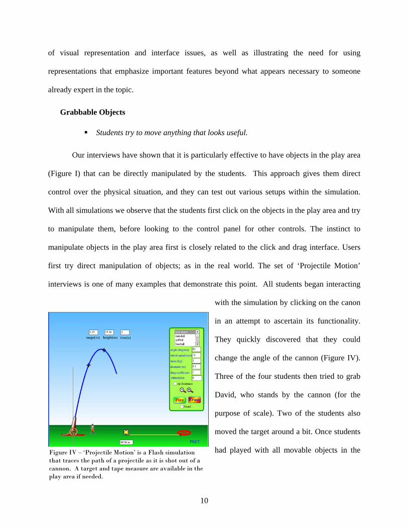
Grabbable Objects
Students try to move anything that looks useful.
Figure IV – ‘Projectile Motion’ is a Flash simulation that traces the path of a projectile as it is shot out of a cannon. A target and tape measure are available in the play area if needed.
Our interviews have shown that it is particularly effective to have objects in the play area
(Figure I) that can be directly manipulated by the students. This approach gives them direct
control over the physical situation, and they can test out various setups within the simulation.
With all simulations we observe that the students first click on the objects in the play area and try
to manipulate them, before looking to the control panel for other controls. The instinct to
manipulate objects in the play area first is closely related to the click and drag interface. Users
first try direct manipulation of objects; as in the real world. The set of ‘Projectile Motion’
interviews is one of many examples that demonstrate this point. All students began interacting
with the simulation by clicking on the canon
in an attempt to ascertain its functionality.
They quickly discovered that they could
change the angle of the cannon (Figure IV).
Three of the four students then tried to grab
David, who stands by the cannon (for the
purpose of scale). Two of the students also
moved the target around a bit. Once students
had played with all movable objects in the
10

play area, they then used the fire button. It wasn’t until the students had played for about 10
minutes that they started to explore the radio buttons and adjustable controls in the control panel.
This sort of exploration, where items in the play area are manipulated before looking to the
control panel, is common in all interviews.
Sliders, Radio Buttons and Checkboxes.
Students are familiar with the functionality of radio buttons and sliders.
Students use sliders when they first explore a simulation and then turn to the
digital input when completing a specific task such as homework or lab.
Students turn things on with a checkbox but seldom turn things off.
When a control cannot be placed on a specific item in the play area, we rely on controls
in the control panel. For example, if a representation will be changed or the user can change an
all encompassing parameter such as which planet the simulation is on, then the control panel is
utilized. For example, in ‘Energy Skate Park’ a slider in the control panel adjusts gravity. During
interviews students have never required instruction on the use of sliders and radio buttons;
however, checkboxes have caused some confusion at times. Students do not have difficulty
turning check boxes on; however, quite often they do not think to uncheck the box when they
want to turn something off. Their instinct is to choose a new setting which will erase the old
setting, similar to the functionality of a radio button. An extreme example comes from ‘Radio
Waves’ where a checkbox is used to bring up an additional small window with a strip chart
graphing electron positions. This window did not have a red x in the upper right corner to close
it; instead the user was required to uncheck the box to remove the chart. During interviews, none
of the students turned to un-checking the box to remove the window when they wanted to get rid
of it. They either asked for help or moved the window off to the side. The addition of a red x in
11
the upper right-hand corner of pop-up windows or graphs solved this since students are familiar
with this type of control to close a window.
When using sliders, we’ve found it useful to combine them with a digital readout box that
allows numbers to be directly typed in. In interviews when a user is first exploring the
simulation and starts interacting with the sliders, they tend to use the slider to determine the basic
effect: e.g. less gravity lets the speeding skateboarder bounce higher in ‘Energy Skate Park’. We
have found these sliders (as well as draggable objects) to be more engaging and better at
encouraging interaction and exploration than direct number entry. However, when the students
are completing a homework assignment or using a simulation in lab where they need to use
particular values, they prefer the efficiency and control afforded by a text box that allows them to
enter the exact value, e.g. setting the position, velocity and/or acceleration in ‘Moving Man’ or
adjusting the voltage of the battery or the resistance of the light bulb in ‘CCK’ as shown in
Figure III.
There may be other types of intuitive tools beyond what we have listed here. Once we
identified this set of intuitive tools, we continued to use them and did not examine other
possibilities.
Consistent Set of Tools
Experienced PhET users have little difficulty immediately interacting with a new
simulation.
Experienced users “know” what something should look like. If the appearance does
not match their expectations, it makes it considerably harder for them to figure out
what it is.
12

We have found it helpful to provide consistent controls and tools (stopwatch, ruler, tape
measure). The PhET interviews were often conducted with the same set of students throughout a
semester. These students became familiar with the ‘PhET look and feel’ and were able to
immediately begin investigating the physical concepts associated with new simulations presented
during the weeks following their initial interviews. There were times that multiple iterations of
interviews were required for the same simulation. In these cases, we would bring in additional
students and often these students would also be first time PhET users. These ‘first timers’ take a
little more time (around 5 minutes) finding controls or becoming familiar with tools. For
example, during the interviews on ‘Nuclear Physics’, several new students were interviewed. All
three of these students took more time to explore the control panel and figure out how the
controls worked for adding Uranium, while the experienced PhET users knew how to do this
immediately when they first encountered this particular simulation.
On the other hand, when the experienced user thinks they know how something should
look/function based on one simulation, and it appears differently in another simulation, they do
not recognize the tool’s function and quite often spend time trying to determine what is different
about its functionality. These differences created difficulties for the experienced PhET users but
not for a brand new user. For example, ‘CCK’ has probes attached to a voltmeter. Students
learned how to use the meter and move the probes around without difficulty during interviews.
Some of the same students were interviewed on ‘Semiconductors’. In this simulation, similar
looking probes are used to show that the energy levels on the side are a measure of what is
happening in the semiconductor. These probes do not move. The students who had experience
with ‘CCK’ were very bothered by the fact that they could not move the probes to different
13

locations. Interviews were also performed on ‘Semiconductors’ with students who had not
previously used ‘CCK’ and they were not concerned that these probes were stationary.
Representations
The obvious benefit of a computer simulation is the animated visual model that is
provided for the student. It is far simpler and more reliable to show students how something
moves rather than telling them about that motion or describing it in written text. With a
simulation, behavior can not only be explicitly shown, but the student is able to interact with the
objects on the screen and determine for themselves what happens as things are changed. Visual
representations must be created with care because we observe that when students are learning
about the phenomena they will apply equal importance to every feature. We have also found that
care must be taken not to overwhelm the students with too much new information at once. Using
common real world objects gives students a place to begin and facilitates connections with what
they already know. It is critical to emphasize the characteristics that convey the learning goals of
the simulation; and, our interviews have shown that consistent representations between
simulations create connections between different phenomena.
Explicit Visual Model
Simulations provide a correct visual mental model of the physics.
Such visual models advance discussion and analysis beyond trying to establish a
common visualization.
Our interviews have clearly shown that simulations are a powerful tool for helping
students develop an accurate mental model of the physics. At times simulations show something
students have already seen such as oscillating springs or projectile motion; however, in a
14
simulation time can be slowed or the path traced. During interviews and lab, students talked
about how the trace helped them see the path of the familiar motion of a projectile and connect
the pictures in their text with their everyday experience. Other simulations provide a visual
model for more abstract concepts, such as current flow. During interviews students regularly
refer to the desire to have a visual model of such physics; for example they talk about wanting to
see what it ‘looks like’ inside a wire when a switch in a circuit is opened and closed. The value
of providing an explicit visual model has been particularly evident in interviews on quantum
mechanics simulations such as ‘Quantum Bound States’ and ‘Quantum Wave Interference
(QWI)’. In these interviews, it is clear that many students have constructed incorrect mental
models from lecture and text books that are corrected rapidly as they play with the simulation.
Many interviews begin with prediction questions about the phenomena that will be
investigated with the simulation. During these discussions, before using the simulation, there are
times when the student and/or interviewer is unable to adequately describe his or her personal
mental picture to the other and as a result, they are unable to have an effective discussion of the
prediction questions. Once the simulation is employed, the students are able to move past
describing what they are personally visualizing and begin discussing what is happening and why.
In other interviews the simulation is used immediately without prior discussion. In these
interviews there is also no clarification or discussion of what the phenomena looks like, the
visual model has been provided by the simulation. Interview students become more confident
about discussing the reasoning about the phenomena once they know what it looks like. We see
the same advances in conversation between students that use simulations during homework
sessions.
15

Figure V b – The current version of ‘Radio Waves’ begins in manual mode with a simple line of text called a wiggle-me that descends onto the screen to let the user know that they can move the electron with the mouse and to identify the blue sphere as an electron.
Figure V a – An early version of ‘Radio Waves’. When the simulation first opens, the transmitting electron moves up and down along the antenna producing an electromagnetic wave that radiates out filling the screen with oscillating red arrows.
Start-up Settings
To encourage exploration, simulations should start up with very little or no
animation.
A “wiggle-me” is an effective way to initiate desired exploration when necessary.
We’ve found that the best start-up settings include the least amount of animation and
complexity possible. At times a simple cue is needed to focus the user on a moveable object that
may not be obviously grabbable. Clark and Mayer’s Coherence Principle (2003) describe the
same characteristics that we have found to be important for the start up settings of a simulation.
Start-up settings were first investigated during the multiple interviews of ‘Radio Waves’.
Our start-up settings for ‘Radio Waves’ (Figure V a) were initially chosen to showcase the
simulation’s most impressive capabilities. The simulation started up in full field view and the
transmitting electron oscillating creating an impressive 2-D display of electromagnetic waves
radiating out from the transmitting antenna. Physicists and teachers were very impressed with the
appearance of this simulation when it started up. Students on the other hand were overwhelmed
16

and stared without speaking for extended periods of time. The interviews for this simulation
were done with guiding questions. With this simulation students would often try to answer the
questions based on watching the start-up screen, rather than by playing with the simulation on
their own. In addition, once students became experienced ‘Radio Waves’ users, they would open
it up and immediately change to a simpler view without exception, while making comments such
as “this is too confusing”, or “I like the curve better, it makes more sense to me.”
An additional problem that surfaced during these interviews was that students didn’t try
the manual mode on their own. In this mode, the electron on the transmitting antenna is
grabbable and will not move unless moved by the user. Only one student clicked on the manual
button but never figured out that the electron was grabbable. Other students assured the
interviewer that they had tried everything in the control panel after trying all tools except the
manual mode. Once it was pointed out to them, and they switched to manual mode, they still did
not figure out that the electron could be manipulated with the mouse. Only after students were
prompted to play with the electron did they discover that the creation of radio waves is linked to
the motion of the electron.
For these reasons we tried changing the start-up setting to manual mode (Figure V b)
with the simplest display format (wave represented as a curve w/ vectors). When the simulation
screen first appears, a line of text “wiggle the electron” slowly descends on the screen with no
other animation. New interviews were performed with these revised start-up settings. All the
students that were interviewed immediately began investigating the simulation and talking about
it. They were then able to explore and reason out the answer to the question that the interviewer
had posed to them before playing.
17

We have repeatedly seen that simulations that start-up with things moving, draw the
user’s attention to the movement and can easily prove overwhelming. If all their attention is
focused on the movement, students do not think about how to manipulate the simulation. This
reaction is consistent with the cognitive load principle; there is too much to process and the
students get overwhelmed. We find it more effective to design the simulation so that students
are first exposed to and can master the simple cases. They can then build up complexity at their
own pace. Also, we observe that if the simulation already has things moving when it opens,
students do not play and some express nervousness about trying things on their own, asking if
it’s ok before making each change. This reaction is never observed when the activity in the
simulation is initiated by the actions of the student. The observed difference between physics
teacher reaction and student reaction to the elaborate initial display of ‘Radio Waves’ illustrates a
prevalent danger in simulation design; what looks good to an expert may be frightening and
overwhelmingly complex for a novice and not result in useful learning.
Real World Connections
Simulations showing familiar everyday objects encourage exploration and encourage
understanding.
Cartoon-like features are an effective way to emphasize important features while
avoiding misleading literal interpretations.
Students test the limits of the simulations looking for realistic reactions. Simulations
need to ‘break’ in a meaningful way when pushed to extremes.
During interviews and observations of users, real life objects are where the user first
begins manipulating the simulation. For example, in ‘Gas Properties’ (formerly ‘Ideal Gas’)
(Figure I) users immediately pump the handle on the bicycle pump to see what will happen. Not
18
only is the function of this object familiar but the connection between air and a bicycle pump
already exists in their minds so all students recognize that it is air that they are putting into the
box when they pump the handle. When a student is learning about an unfamiliar concept or idea,
there is a lot of information to process and it’s sometimes difficult to tie the new information in
with current knowledge. For this reason, we find it effective to include visual features that a
student will have encountered in their everyday life. Other examples of objects that students have
immediately recognized and connected with their everyday experience include: Faucets to supply
water in both ‘Faraday’s – Electromagnetic Lab’ and ‘Wave Interference’; light bulbs and
batteries in ‘Circuit Construction Kit’ (see Figure IV); speakers to generate sound in ‘Sound
Waves’ and ‘Wave Interference’ and theater lamps to supply light in ‘Color Vision’, ‘Wave
Interference’ and ‘Lasers’.
However, it is undesirable and impossible to depict everything realistically. For example,
the earlier versions of ‘CCK’ were written with relatively realistic looking wiring; however,
several students had trouble identifying the junctions. A third rewrite was done changing the
look to the current very cartoon-like version seen in Figure III. We have found the larger, not-to-
scale, representations of wires and junctions to be more effective by emphasizing the
characteristics we want the students to notice, such as the junctions. Fortunately we have also
found that when the scale is completely off such as for these features and the size of the electrons
in ‘CCK’, students recognize the scale as unrealistic and don’t attempt to attribute meaning to the
relative size of these objects. Similar large cartoon-like features can be found with the water
molecules in ‘Microwaves’. During interviews, students immediately recognized that far more
than six water molecules exist in a cup of coffee, but that the behavior of these molecules had the
general characteristics shown and that this was the most important feature of the simulation. This
19

large cartoon type of representation can focus the student's attention where it is pedagogically
most effective. Students also appear to be attracted to cartoon-like appearances. When students
look at the PhET web page, they nearly always choose the more cartoon-like simulations to play
with first.
During interviews and observations, both students and teachers regularly explore the
limits of the simulation behavior by setting parameters to extremes, and they are disappointed if
there is not a physically meaningful response. For example in ‘Gas Properties’ users cool the
molecules to absolute zero to see if the molecules stop moving completely, and then they heat
the molecules up enormously to see what happens. Users were disappointed that the temperature
could reach thousands of degrees and the box remained intact, so we added a feature where the
lid flies off under extreme conditions. Now users are more satisfied. We have found, however,
that there is a fine line between enabling the simulation to break in a meaningful way and in the
breaking creating a distraction. Part I includes more details on simulations where such elements
were so much “fun” that they interfered with learning.
Visual Cues - Everything Matters.
Students look at all visual cues equally, if they do not understand a concept. It is
important to emphasize items that are pedagogically important and eliminate all
potential distractions.
Color is an important visual cue.
The interviews consistently show that when students are attempting to make sense of a
phenomenaon they look at everything. If they do not understand a concept, they’ll attribute
equal importance to all cues; including features that experts often do not even notice. Thus any
irrelevant visual feature results in increased cognitive load and potential confusion for the
20

student. For example, in both ‘Signal Circuit’ and ‘CCK’, electrons are shown flowing inside the
wires of an electric circuit. In ‘Signal Circuit’ the electrons would bunch up at the light switch
just after it was turned off. In the first two versions of ‘CCK’ a different density of electrons was
depicted due to the branching of circuits (see Figure II a). These small effects were inadvertent
features of the simulation code which experts often did not notice. During interviews with both
simulations, students spent considerable time trying to make sense out of these small changes in
the electron spacing. In both cases students used this cue to create an incorrect understanding of
current flow and electron movement. We saw the same type of problem in an earlier version of
‘QWI’. There was one extra pixel on the right hand side of the box that created a slight
asymmetry in the interference pattern. During interviews students were extremely troubled by
this asymmetry, believing it to be caused by some physics principle that they didn’t understand.
Interviews have shown that color and other visual cues are a much more powerful cue
than text labels. Several simulations use colored arrows to depict different types of forces. The
same simulations will have graphs that depict the forces and different types of energy. We’ve
found that students look to the color coding to match up forces or to match different types of
energy to forces. Students who used ‘Forces 1-D’ became accustomed to a green arrow depicting
total force and red denoting friction. When a different color scheme was used a few weeks later
in a new simulation, students thought the green arrow represented the total force, even though it
had a label on it saying “gravity”. We consistently observe that students believe the simulations
and work hard to incorporate all the visual cues into a coherent understanding. While this
reaction is highly desirable, it emphasizes the need to take care in the design of simulations and
to test them adequately with non-experts, since experts can easily overlook irrelevant but
misleading visual cues.
21

Consistent Representations
When an object is represented differently from simulation to simulation, students
perceive it as two different objects, and when objects are represented in a similar
fashion they are perceived as the same, even though they may be completely
unrelated.
Several unrelated simulations (‘Greenhouse Effect’, ‘Lasers’, and ‘Color Vision’) were
developed independently and used different representations for photons. Photons are a unique
challenge because of their wave particle duality. In this case, the representation chosen for each
simulation was effective within that particular simulation and elicited accurate understandings of
the core concepts. However, when users were asked to compare the little objects in the different
simulations (all of which were representations of photons), two out of four students believed
them to be fundamentally different objects.
Students had less difficulty with the simulations where they were presented with
consistent wave representations. For example, ‘Radio Waves’ had three possible views of
electromagnetic waves; two of which were quite similar to those used in the microwaves
simulation. When students were asked to compare these views in ‘Radio Waves’, the question
elicited thought and their answers indicated greater understanding of electromagnetic waves and
their applications. This response occurred with all four students. When these same students used
‘Microwaves’, they brought the ideas they had developed with ‘Radio Waves’ to ‘Microwaves’.
After these observations, we removed the inconsistencies between the simulations that
use a photon view of light, and we added functionality to many of these simulations, such as
‘Lasers’ and ‘Color Vision’ so the student can explicitly move from one representation to
another (e.g. switch between wave view and particle view) for the photons. Subsequent
22

interviews showed that adding this capability not only elicited an understanding amongst the
students that they had the same type of object in each simulation, but was also effective at
encouraging sense-making of the wave/particle duality of electromagnetic radiation.
Another example of the importance of consistent representations between simulations
was seen with ‘Gas Properties’ and ‘Reversible Reactions’. In this case, the same representation
was used for fundamentally different objects. Users brought what they had learned in ‘Gas
Properties’ about little blue and red spheres to the ‘Reversible Reactions’ simulation. ‘Gas
Properties’ uses little red and blue spheres to denote heavy and light gas atoms. When
‘Reversible Reactions’ was written, very similar little spheres were used to denote molecules
where the sphere’s color changed to represent a change in molecular structure. When this
simulation was used in the context of a chemistry course, where there was instructor guidance, it
worked well; however, experienced ‘Gas Properties’ users (including teachers) had a completely
different response. Teachers were confident that they fully understood the representation, but
came away from the simulation with a complete misunderstanding believing the spheres to be
individual atoms, as in gas properties, and thus the simulation must be demonstrating kinetics
rather than reversible reactions.
It is important to use a consistent representation for objects that appear in more than one
simulation such as photons, EM waves, electrons and light bulbs. When a veteran user
encounters a familiar appearing object in a new simulation, they have strong ideas about what
that object is and how it behaves based on their previous simulation experiences.
Layout
Using results from many interviews, we have created a basic set of guidelines for laying
out a simulation; however, it is something that cannot be rigidly dictated. Each simulation has a
23
special set of characteristics that require a certain amount of flexibility in the layout. We do try
to be consistent in as many ways as possible and follow a general outline which provides
consistency between the simulations and a framework from which to start for each simulation.
This basic layout was adopted after a number of interviews, and it seemed to work for
subsequent simulations. Therefore, we have not explored possible alternatives.
Each simulation has the same basic layout consisting of the play area on the left
dominating the screen and a control panel on the right. The play area contains animated objects
that can be directly manipulated while the control panel contains global controls. In the original
‘CCK’ students did not see the distinction between the tool box which was located in the control
panel and the play area. They became frustrated when they could not drag tools from the tool box
into the play area (See Figure II a). We found that a clear division between the play area and
control panel can be created by the use of different color backgrounds. Students quickly see that
“clicking and dragging” works only in the play area and that extended controls can be found in
the different color control panel.
The general features of the layout are described in the following sections. These features
include: controls that are placed in the play area on or near the object they control, when
possible; VCR type ‘Play, Pause, Step’ buttons that are placed along the bottom of the play area;
large, prominent tabs that are placed, when necessary, in the upper left hand corner; and a Help!
button that is placed at the bottom of the control panel. When rearranging is necessary due to
unique aspects of a simulation, we try to keep all controls in the same basic area of the
simulation (e.g. the right-hand side), otherwise users focus on one area and completely miss the
rest of the controls. This approach follows Clark and Mayer’s Contiguity Principle (2003) which
states that people learn more readily when corresponding printed words and graphics are placed
24

close to one another on the screen. Below we discuss how specific aspects of the layout arose
from interview results.
Control Panel
Limiting the number of tools/controls and arranging them in small groups makes it
easier to identify what is available and makes the simulation less intimidating.
Students become familiar with the layout.
Limited text
• Students only read text that is attached to a control
• Abbreviations are not understood by most students.
• Text strings of one to three words work best.
Interviews showed that students are hesitant to begin playing with simulations that have
lots of tools/controls (more than three groups of about three similar items). Once they turn from
direct manipulation in the play area to using the control panel, most users investigate one set of
controls at a time, usually beginning with the most inviting, such as a simple slider. They will
then quickly become immersed in exploring the simulation. If a simulation has too many controls
or a poorly laid out control panel, when asked if they’ve tried everything, students will often say
yes, without realizing that they have not, and several prompts from the interviewer are required
before the user will try every control. After the interviewer points out a specific control, then the
student realizes she missed something. Experienced users also become frustrated with
simulations that have an extensive number of controls because it is difficult to locate previously
used controls. To reduce this problem we have limited the number of controls and grouped them
according to functionality.
25

We find it most effective to allow students to manipulate all relevant parameters.
However, this can at times be overwhelming and requires a large number of controls in the
control panel. When this happens we have found it useful to hide some of the controls and allow
access through an advanced button, such as in ‘CCK’, where the control panel initially allows
them to adjust basic parameters such as “life-like” or “schematic” [view] and access to basic
tools such as a voltmeter and an ammeter. The advanced features, accessible by clicking on the
advanced button, add in such elements as the resistance of wires and the option to show
equations.
Interviews reveal that students read as little as possible when using simulations. Once
students turn their attention to the control panel, students nearly always first begin using the
controls that have the shortest simplest descriptions. For example, in ‘Radio Waves’, all users
explored the set of controls that had the brief labels “Full Field”, “Curve” and “Curve
w/Vectors”, before turning to controls that had longer labels (Figure V). We’ve also observed
that students read one to three words at a time and glance past strings of text. For example, in
‘Radio Waves’, after encouragement from the interviewer, users would click the “Show strip
chart” check box. Users indicated that they had no idea what they would see based on the control
label. When the box is checked, a pop-up window appears where an active graph is plotting the
transmitting and receiving electrons’ positions. At the top of the window there is a label that says
“Electron Positions”. After watching these graphs for awhile, three out of four students could not
figure what the graphs were depicting until the interviewer pointed out the very clear label at the
top that says “Electron Positions”. Once they read these two words, they made sense of the
graphs without any sort of explanation from the interviewer. Similar results are seen where
students consistently overlook the labels within the control panel that are not directly attached to
26

a control. We’ve also found that students are not familiar with abbreviations, so it is best to use
complete words or add a legend to define the abbreviation as we described for ‘Nuclear Physics’
in Part I.
Additional characteristics for the control panel were not based explicitly on interview
results; however, they have had positive reactions during interviews. The tools that are placed in
the control panel have a 3-D look about them and are limited to items such as sliders, radio
buttons and check boxes. Students are familiar with the functionality of these basic control types
as described in Sliders, Radio Buttons and Checkboxes above. Based on the preferences students
showed for the Flash simulations compared to the early Java simulations, we concluded that the
3-D look (which is built into Flash tools) is seen as friendlier and more inviting. Finally, the
Help! button is consistently placed at the bottom of the control panel and experienced PhET
users know where to find it.
Play Area
The play area must be distinct from the control panel in look and functionality.
Objects in the play area are grabble and animated.
When too many tools are in the play area, the control panel is overlooked.
Text is a distraction in the play area.
The play area contains the physical objects that the user is investigating. We find that
students always begin by attempting to manipulate these objects before turning to the control
panel. For this reason it is best to allow manipulation of play area objects directly with the
mouse as much as possible. If it’s not possible to manipulate all the features of the object with
the mouse, it is best to have an attached control adjacent to the object to make the connection
between the control and the object clear. Under these circumstances we see that students do not
27
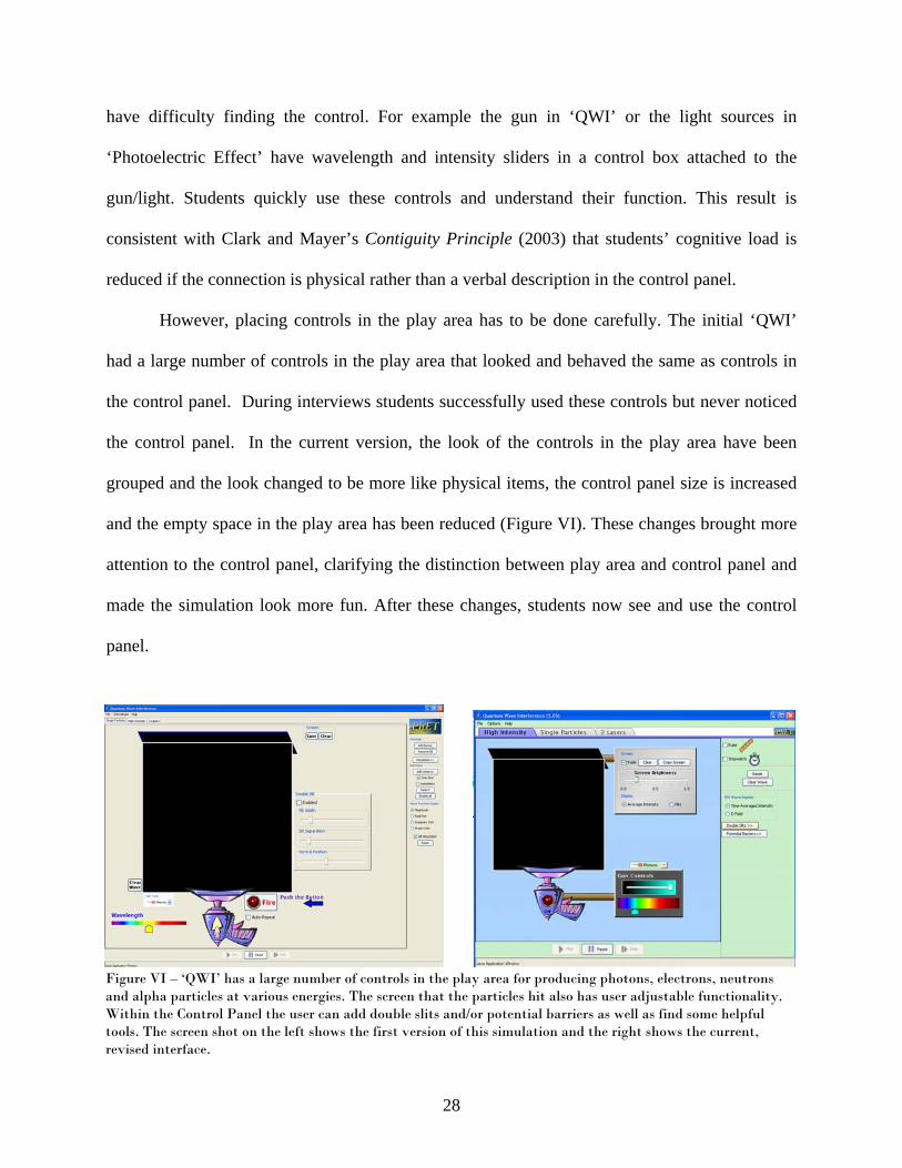
have difficulty finding the control. For example the gun in ‘QWI’ or the light sources in
‘Photoelectric Effect’ have wavelength and intensity sliders in a control box attached to the
gun/light. Students quickly use these controls and understand their function. This result is
consistent with Clark and Mayer’s Contiguity Principle (2003) that students’ cognitive load is
reduced if the connection is physical rather than a verbal description in the control panel.
However, placing controls in the play area has to be done carefully. The initial ‘QWI’
had a large number of controls in the play area that looked and behaved the same as controls in
the control panel. During interviews students successfully used these controls but never noticed
the control panel. In the current version, the look of the controls in the play area have been
grouped and the look changed to be more like physical items, the control panel size is increased
and the empty space in the play area has been reduced (Figure VI). These changes brought more
attention to the control panel, clarifying the distinction between play area and control panel and
made the simulation look more fun. After these changes, students now see and use the control
panel.
Figure VI – ‘QWI’ has a large number of controls in the play area for producing photons, electrons, neutrons and alpha particles at various energies. The screen that the particles hit also has user adjustable functionality. Within the Control Panel the user can add double slits and/or potential barriers as well as find some helpful tools. The screen shot on the left shows the first version of this simulation and the right shows the current, revised interface.
28

As described above in the Control Panel section, students rarely read. We’ve found that
when the text is in the play area, students are actually more likely to read it; but, it often distracts
them from engagement. For example, in the original version of CCK there were strings of text in
the play area describing what to do. Students would read the text before playing, but then their
interaction was limited to the one action or object being described by the text. The students did
not explore on their own after following the text directive. Furthermore, most students
misunderstood the text and became frustrated after being mistaken about what would happen.
However, one word labels that are included on an object or as part of a control have been
correctly interpreted and useful without unduly guiding students in their exploration. Very short
sentences or phrases in the Help!, as described for ‘Sound Waves’ below, is effective at guiding
student actions and getting them engaged; however, students’ exploration was then scaffolded by
these directions rather than their own questioning. Since such text seldom encourages the
student-driven engaged exploration, as described in Part I, that we see is most pedagogically
effective, we believe that an important property of a good simulation is to provide a clear and
friendly environment that does not require written explanation to initiate exploration.
Backgrounds
Backgrounds, pictures in the play area, can serve as a useful visual cue, but it is
important that the main objects in the play area can be easily distinguished from the
background.
We have found that backgrounds (e.g. pictures depicting location) can serve a useful
function, but they must not be distracting. In some initial designs, we found the backgrounds
were competing with the central features of the simulation for the user’s attention. For example,
in ‘Radio Waves’ (Figure V) the important features were cartoon-like and the background
29
consisted of a cartoon-like picture of mountains. Both the background and features were of the
same character and novice users would miss the receiving antenna and other important features.
(This fits with differences in novice and expert perceptions (Chi, Feltovich and Glaser, 1981).)
An effective background is distinct from the features of the simulation. For example, the first
version of ‘Energy Skate Park’ had a very distinct photo of the mountains behind Boulder,
Colorado in the “earth” setting, but the simulation features were all quite cartoon-like so were
easily distinguishable from this background. Interviews revealed that the background provided a
useful cue as to when the simulation was portraying the earth, moon, or outer space. When this
background was reduced to a solid color so that the user only had the slider as an indication of
gravity’s setting or a drop down menu with the planet name, we found that quite often the user
would forget they had adjusted the gravity or planet parameter and would get confused as to the
behavior of their skater. When the background depicting their location was restored, this
confusion did not recur.
Tabs
Students notice large, bright tabs. When tabs are small and professional looking, they
go unnoticed.
Multiple panels are used in PhET simulations that have many levels of sophistication or
show several connected ideas. We use file-folder like tabs in the upper left corner to allow users
to switch between these panels. One might think that students have been trained by everyday
applications to look for controls in the upper left hand corner; however, our interviews and
observations of students in classes have found less than one in ten students would click on
standard program menus or typical tabs. Typical looking controls or tabs, which are commonly
overlooked, are those of the same size font as the labels in the control panel and with a grey
30

background. However, when these tabs are large, contain larger fonts and are colored to be more
prominent, most students find them. Figure VI illustrates the difference between everyday
application tabs and the larger more prominent tabs we’ve found successful.
Play Buttons
Students do not find play/pause buttons, but students will use these buttons as needed,
including in new simulations, once they have been shown to them.
Centered along the bottom of the play area we locate various VCR type buttons such as
play, pause, record, step etc. There have only been five interviewees, most of whom were
engineering and physics majors using advanced simulations, out of approximately 80 students,
who have found these buttons without help from the interviewer. We were unable to find a
location that was obvious to all students. During interviews, many students asked if they could
replay something or more often if they could slow it down, but they only recognized and used the
buttons after the interviewer pointed them out. Once students became familiar with the location
of the play/pause buttons, they used them to investigate phenomena in all future simulations.
Help
In a good simulation explanation is not necessary to stimulate learning.
Verbose help can be a deterrent to exploration.
PhET simulations can have up to three levels of help. The first is named a “wiggle-me”.
A wiggle-me is a short snippet of text that makes a slow, relaxed entrance into the simulation
when the simulation is first opened. The next level is called “Help!” and usually consists of
about four short strings of text explaining important but not obvious functions of the simulation.
31
The most complete form of help is “Megahelp”. It is a still graphic of the simulation with a
description of nearly every object on the screen.
Wiggle-Me
When the most important object in the play area is not obviously grabbable, a wiggle-
me is useful for telling the user where to start.
The wiggle-me should draw attention to itself; however, it should not distract the user
from the rest of the simulation.
The wiggle-me was first created for the ‘Radio Waves’ simulation (Figure V b). During
interviews we found that starting the simulation with the electron oscillating on its own was
overwhelming to students as discussed in Start-up Settings above. We also found that when the
simulation was in manual mode, students had no idea they could move the little blue dot, or for
that matter, what the little blue dot represented. Both of these problems were solved with the
addition of the wiggle-me. The simulation’s start-up was changed to the manual mode where the
user must grab the blue dot - that is, the electron - in the antenna and move it up and down to
create a radio wave. The wiggle-me text says “wiggle the electron,” both identifying the little
blue dot and describing its functionality. We have since found wiggle-mes to be an effective
way to begin many simulations.
Wiggle-mes are always a short bit of text used to give the user an invitation to begin
exploring in the play area. Once the user clicks the mouse anywhere, the wiggle-me disappears.
For a number of simulations, the entrance of the wiggle-me is the only movement on the screen
when the simulation begins. Wiggle-mes are particularly successful when they swoop or
descend in to the play area, grabbing the user’s initial attention, and then sit stationary until the
user clicks in the play area. By making the wiggle-me stationary and having it disappear once the
32

user starts interacting with anything, the user has a chance to become familiar with the
simulation environment and to start interacting with it however they wish. Other designs, such as
wiggle-mes that always remain on the screen or move continuously until the user interacts as
directed, are annoying and distracting to the user; they draw the user’s attention from the rest of
the simulation and essentially force them to follow the directive even when they have not had a
chance to look over the rest of the simulation, or they intended to investigate something else first.
For the reasons discussed above, we only introduce a wiggle-me when attempts to make grabble
objects obvious without text fail.
Help!
Must be clear, concise strings of text.
If it is too prominent, then it gets followed like a command and the user is unlikely to
explore on their own.
Needs to be able to remain on screen as continual reference while the user explores
the simulation. For this reason it must be located so that it does not interfere with
manipulation of the simulation.
We investigated several forms of Help! and found that most hinder a student’s ability to
learn from the simulation. This result is consistent with Clark and Mayer’s Coherence Principle
(2003): No extraneous, pictures, words, help etc. should be included. What is perhaps not so
obvious is that help that provides useful guidance can still be distracting. The most important
thing we learned from these investigations was that avoiding the need for help clearly works the
best. When help is absolutely necessary, it must include: minimal reading – conversational style
rather than formal; minimal guidance – directions/help severely limits student's natural curiosity
and exploration; no distractions – if it stands out, students will only follow it’s directives; no
33

science explanations – only cues on how to make the simulation function; and good location –
placed right beside the item as described by Clark and Mayer’s Contiguity Principle (2003)
defined in the Underlying Principles section of Part I. We provide samples of the data below
that support these conclusions.
One form that failed was “help bubbles”. When attempting to create an intuitive
environment with ‘CCK’, we tried using help bubbles. The original interface of the ‘CCK’
simulation was found to be impossible for first time users, as discussed above, but it was easily
used by most students after some instruction. For this reason, we first thought that a few written
directions would be adequate to clarify the interface. Help was implemented by making it so that
when the user clicked on various question marks that were placed in the play area, a help bubble
appeared containing a sentence describing how to build a circuit. We found that some sentences
contained words students were not familiar with such as “tool box” or “construction area”,
and/or were too complicated. Users tended to read these sentences quickly and were in a hurry to
do what they said, which increases the opportunities for confusion. Quick reading, coupled with
the sentences not remaining on the screen at all times, caused students to go back and forth
between trying to play and reading the help. One student tried to use the help as the tool itself,
dragging the circuit components onto the question marks. The students were not able to use the
simulation following this help until the interviewer took the mouse and demonstrated how to use
the tool box and construction (play) area. After demonstration, all but one student could
manipulate the simulation perfectly.
Interviews revealed another problem with the Help!. Once Help! was available, most of
the students interviewed would limit their play to following the Help! directions and refrained
from trying anything else. For example, when interviews were performed with the first version of
34
‘Energy Skate Park’ (formally ‘Energy Conservation Kit’), the help that was provided consisted
of a few sentences that appeared on top of the play area when first starting up the simulation. The
large bright lettering with three different sets of instructions would disappear once the student
would clicke in the play area. After the students tried one of the things that the help text told
them to do, they were unsure what to do next because their instructions were gone, and they
focused their exploration on how to get the help back. When used in lab, once students could not
find a way to bring the help back, every group asked for instructor assistance. When these same
lab students used other PhET simulations that start-up without any text, the students did not
request assistance and began interacting immediately.
The Help! in ‘Sound Waves’ proved successful. It consisted of clear simple sentences
near relevant objects that would remain on the screen and were not distracting, e.g. “listener can
be moved left and right”. In interviews students would follow what one help indicator said and
then play further on their own, forgetting about the help. When they were done exploring, they
looked to the help to see if they had tried each indicated feature. This type of help design
provides useful guidance, but does not seem to dominate students’ actions. With this type of
help, student’s explorations were still somewhat directed by the sentences rather than their own
questioning, so we believe it is better to only have help appear upon request.
After implementing this type of simple help on request, we have found users usually only
look for Help! now when in search of quick answers to explain the physics. Once they see that
Help! merely describes the simulation’s functionality, they quickly close it and begin exploring
the simulation in search of understanding. Hopefully, this is at least partly due to the effort we
have put into making the simulations intuitively clear.
35

Extensive Help.
• Users do not use detailed extensive help.
In early tests, after Help! had been selected, two buttons appear – “Hide Help” and
“Megahelp”. Clicking Megahelp brings up a screenshot of each pane of the simulation with a
bubble describing each item. The descriptions include any relevant and not obvious actions the
object can perform, for instance a description may need to include the fact that an object can be
moved and thus are quite extensive. In a year of interviews, we only had one interviewee look at
Megahelp. This person was of a different generation than the traditional student. It is our belief
that this extensive help only provides an efficient reference guide for teachers to quickly view all
the features a simulation has to offer.
Conclusion
We have carried out extensive interview studies on the student use and learning from
interactive simulations for teaching physics. We find overwhelming evidence that simulations
that suitably incorporate interactivity, animation, and context can provide a powerful learning
environment where the students productively engage with and master physics content. However,
we find that this can only be achieved by following an extensive set of principles for design and
layout as contained in the PhET Look and Feel. Here we have detailed specific design guidelines
along with relevant interview results for creating an intuitive simulation including layout,
representations, tool use and help functions. The findings presented here include the interface
design features of the PhET Look and Feel for creating intuitive simulations. Details of the
Encourage Exploration section and a more extensive discussion of engagement and learning
with simulations can be found in Part I. This work reveals many design pitfalls that can result in
36

simulations not achieving the desired educational effectiveness. Finally, this work demonstrates
the importance of testing educational simulations carefully with the desired target users.
Acknowledgements
We would like to thank Danielle Harlow, Noah Podolefsky, and Stephanie Fonda who
conducted some of the interviews whose results are incorporated in this paper. We also thank
Noah Finkelstein and the other members of the Colorado Physics Education Research group for
many useful discussions. We are pleased to acknowledge support of this work by the University
of Colorado, the National Science Foundation, the Kavli Operating Institute, and the Hewlett
Foundation.
References
Adams, W.K., Perkins, K.K., and Wieman, C.E., (2006). PhET Look and Feel Retrieved November 23, 2006, from University of Colorado, Physics Education Technology Web site: http://phet.colorado.edu/web-pages/publications/PhET Look and Feel.pdf Adams, W.K., Reid, S., LeMaster, R., McKagan, S.B., Perkins, K.K., Dubson M. and Wieman, C.E. (2007). A Study of Educational Simulations Part I – Engagement and Learning. Journal of Interactive Learning Research, 12, 397-419. Chi, M. T. H. , Feltovich, P. J., & Glaser, R., (1981). Categorization and representation of physics problems by experts and novices. Cognitive Science, 5, 121-152. Christian, W. and Belloni, M., (2001). Physlets: Teaching Physics with Interactive Curricular Material. New Jersey: Prentice Hall, Inc. Clark, C. and Mayer, R., (2003). E-learning and the Science of Instruction (pp 111-129). San Francisco, California: Pfeiffer. Perkins, K. K., Adams, W., Finkelstein, N. D., Dubson, M., LeMaster, R., Reid, S. and Wieman, C.E., (2006). PhET: Interactive Simulations for Teaching and Learning Physics. The Physics Teacher 44, 18-23. The PhET Team, (2006). PhET Interactive Computer Simulations [Computer software] Available at: http://phet.colorado.edu Colorado: Physics Education Technology Project.
37

38
Viadero, D. (2007). Computer Animation Being Used to Bring Science Concepts to Life: Evidence of learning gains remains sparse. Education Week, 26, 12.