A Poverty Profile for Sierra Leone...A POVERTY PROFILE FOR SIERRA LEONE June 2013 The World Bank...
46
A POVERTY PROFILE FOR SIERRA LEONE June 2013 The World Bank Poverty Reduction & Economic Management Unit Africa Region Statistics Sierra Leone
Transcript of A Poverty Profile for Sierra Leone...A POVERTY PROFILE FOR SIERRA LEONE June 2013 The World Bank...
A POVERTY PROFILE FOR SIERRA LEONE
June 2013
The World Bank
Poverty Reduction & Economic Management Unit
Africa Region
Statistics Sierra Leone
1
Currency Equivalents
Currency Unit = Sierra Leonean Leone
US$1 = 4,327.51 Le.
(As of June 13, 2013)
Acronyms and Abbreviations
AfP Agenda for Prosperity
CPI Consumer Price Index
EA Enumeration Area
GDP Gross Domestic Product
NEC National Election Commission
PPP Purchasing Power Parity
SLIHS Sierra Leone Integrated Household survey
SSL Statistics Sierra Leone
Vice President Makhtar Diop
Country Director Yusupha Crookes
Sector Manager PREM Marcelo Giugale
Task Manager Kristen Himelein
2
Table of Contents Poverty Profile ............................................................................................................................................................... 5
Executive Summary ................................................................................................................................................... 5 Introduction .............................................................................................................................................................. 7 Macroeconomic Trends............................................................................................................................................. 7 Poverty & Growth ..................................................................................................................................................... 9 Inequality ................................................................................................................................................................ 15 Demographics ......................................................................................................................................................... 17 Public Services ......................................................................................................................................................... 19 Education ................................................................................................................................................................ 20 Health ...................................................................................................................................................................... 22 Agriculture & Rural Livelihoods ............................................................................................................................... 23 Determinants of Poverty ......................................................................................................................................... 24
Appendix 1. Methodology for Poverty Analysis .......................................................................................................... 26 Adult Equivalent Measures ..................................................................................................................................... 27 Food Consumption .................................................................................................................................................. 27 Non-Food Consumption .......................................................................................................................................... 28 Price Adjustment ..................................................................................................................................................... 30 Poverty Line ............................................................................................................................................................. 30 Purchasing Power Parity ......................................................................................................................................... 31 Poverty Measures ................................................................................................................................................... 32 Population Pyramids ............................................................................................................................................... 33 References ............................................................................................................................................................... 34
Appendix 2 : Tables & Figures ..................................................................................................................................... 35
Figures Figure 1 : Gross Domestic Product (GDP) per capita, growth (annual %) ...................................................................... 8 Figure 2: GDP Per capita (current US$) .......................................................................................................................... 8 Figure 3 : Poverty Headcount by District (2011) ............................................................................................................ 9 Figure 4 : Poverty Headcount by Region (2003) .......................................................................................................... 10 Figure 5 : Correlation between Food and Total Poverty (2011) .................................................................................. 11 Figure 6. Projected reductions in poverty by 2030 ...................................................................................................... 11 Figure 7 : Mean Per Adult Equivalent Consumption by Decile ................................................................................... 12 Figure 8 : Gini Coefficient by District (2011) ................................................................................................................ 15 Figure 9 : Theil Decompositions of the Level and Change in Inequality ..................................................................... 16 Figure 10 : Age Distribution by Gender (2011) ............................................................................................................ 17 Figure 11 : Population Growth (annual %) .................................................................................................................. 17 Figure 12 : Average Number of Births Per Woman (2003 and 2011) .......................................................................... 17 Figure 13 : Average Number of Births By Age (2011) .................................................................................................. 17 Figure 14 : Rural Households by District (2011) .......................................................................................................... 18 Figure 15 : Access to Improved Sanitation Facilities (2011) ........................................................................................ 19 Figure 16 : Poverty Headcount by Education of Household Head (2011) ................................................................... 20 Figure 17 : School Attendance by Age (2003 & 2011) ................................................................................................. 21 Figure 18 : Net Primary Enrollment by District (2011) ................................................................................................ 22 Figure 19 : Location of Birth (2011) ............................................................................................................................. 23 Figure 20 : Agriculture as Main Livelihood by District (2011) ...................................................................................... 24 Figure A1 : Original and Revised Consumption Aggregates (2003) ............................................................................. 26 Figure A2 : Growth Incidence Curves (2003-2011) ...................................................................................................... 42 Figure A3 : School Attendance by Age, 2003 ............................................................................................................... 43 Figure A4 : School Attendance by Age, 2011 ............................................................................................................... 44
3
Tables Table A1 : Total poverty (2003) ................................................................................................................................... 35 Table A2 : Total poverty (2011) ................................................................................................................................... 36 Table A3: Determinants of Per-Capita Consumption (OLS) ......................................................................................... 37 Table A4: Determinants of Poverty (Logit) .................................................................................................................. 38 Table A5 : Poverty Statistics (2011) ............................................................................................................................. 39 Table A6 : Educational Attainment of Household Head by Quintile of Consumption, Gender, and Residence Location ....................................................................................................................................................................... 40 A7 : Access to Public Services and Residence Location .............................................................................................. 41
4
ACKNOWLEDGMENTS
This poverty profile has been prepared as joint work by the World Bank Poverty Reduction
& Economic Management Unit and Statistics Sierra Leone. The World Bank has
specifically benefited from discussions with SSL staff Abubakarr Turay, the Director of
Economic Statistics Division, Nyakeh Ngobeh, Senior Statistician, and Samuel Turay, Senior
Statistician. Mohamed Bailley, Economic Statistician in the Ministry of Finance &
Economic Development also provided key feedback during the drafting stage.
This poverty profile was prepared principally by Kristen Himelein (TTL, AFTP3). The data
cleaning, aggregate construction, and poverty line calculations were led by Rose Mungai
(AFTPM) with assistance from Ainsley Charles (consultant) and the SSL team. Other team
members that provided leadership and advice during the survey and analysis processes
include Cyrus Talati (APTP3), Andrew Dabalen (AFTPM), John Ngwafon (DECDG), Vasco
Molini (AFTP3), Kinnon Scott (LCSPP), Nobuo Yoshida (AFTPM), Nina Rosas Raffo (AFTSW),
Joao Montalvao (AFTPM), and Johannes Hoogeveen (AFTP4).
5
1. Poverty Profile
Executive Summary
Between 2003 and 2011, Sierra Leone has experienced continued macroeconomic growth, but still lags
behind the sub-Saharan African average GDP per capita. This growth has generally translated into
poverty alleviation. The poverty headcount has declined from 66.4 percent in 2003 to 52.9 percent in
2011. The overall reduction was led by strong growth in rural areas, where poverty declined from 78.7
percent in 2003 to 66.1 percent in 2011, yet this figure was overall still higher than urban poverty.
Urban poverty declined from 46.9 percent in 2003 to 31.2 percent in 2011. This decline was despite an
increase from 13.6 percent to 20.7 percent in the capital, Freetown. District level poverty analysis
showed that by 2011 most districts had converged to poverty levels between 50 and 60 percent, with
the exceptions being Freetown at 20.7 percent and levels above 70 percent in Moyamba and Tonkolili.
Underlying this poverty reduction was an annualized 1.6 percent per capita increase in real household
expenditure from 2003 to 2011. While steady positive progress is encouraging, much higher growth
rates will be necessary to meet government’s 4.8 percent targets outlined in the new Agenda for
Prosperity.
The characteristics of poor households varied between urban and rural areas in 2011. In rural areas,
households in which the head’s primary occupation is agriculture were more likely to be poor as well as
those with smaller landholdings. Those growing rice were neither more nor less likely to be poor. In
addition, households in which the head has at least some secondary or post-secondary education were
less likely to be poor. In urban areas, education was a more important determinant of poverty status, as
the increasing levels of education of the household head consistently reduced a household’s probability
of being poor. In addition, those households which were engaged in a non-farm enterprise and female
headed households in urban areas were less likely to be poor.
Following stronger growth rates in districts with higher poverty rates and in rural areas compared to
urban areas, the overall level of inequality has declined. Only urban areas outside Freetown showed
higher inequality while both rural areas and Freetown have decreased. The areas where the largest
decreases in inequality have been demonstrated have been between urban and rural areas, as rural
areas have narrowed the gap with urban areas, and between different urban areas, reflecting the strong
growth in urban areas outside Freetown compared with declines in the capital.
Demographically, Sierra Leone remains a rural and extremely young country. The majority of the
population lived in rural areas in 2011, with most districts outside Freetown being more than three-
quarters rural. In addition, the majority of the population was below the age of 20 and more than 75
percent are below the age of 35. Population growth has declined sharply from 2003 to 2011, though
fertility has remained high at around four births per woman. Most children under five were born at
home in 2011, though this percentage appears to have declined since the implementation of the Free
Health Care Initiative in April 2010.
Educational completion rates are low by international standards, which is troublesome given the
relationship between education and poverty. According to the 2011 SLIHS, 56 percent of adults over the
6
age of 15 have never attended formal school. Current enrollment indicators show mixed results from
2003 to 2011. Both net and gross primary enrollment rates have decreased, but some caution should be
taken in interpreting these results as the 2003 survey was conducted in the immediate post-conflict
period before the situation in many areas had fully normalized. Higher level education indicators have
improved, however, as greater numbers of students were attending junior, secondary, and post-
secondary education. They were also attending at ages more closely appropriate to grade level
expectations. In addition, gender parity has almost been reached in primary education, though gaps do
open as female students approach child bearing age. Substantial gaps remain across income groups and
between urban and rural areas.
Access to public services was low overall, but particularly in rural areas, where individuals had to travel
long distances to reach facilities.
7
INTRODUCTION
1.1 This poverty profile has been prepared as part of the World Bank’s Poverty Assessment of
Sierra Leone. The key objective of the poverty update is to provide inputs to the government of Sierra
Leone’s policy making process. The first chapter presents an overview of poverty, demographics,
livelihoods, education, and health in Sierra Leone, and measures progress in these indicators compared
to the 2003 Poverty Assessment. The forthcoming work to be conducted as part of the Poverty Update
will include a series of policy notes with more detailed analysis proposed on health, education,
agriculture, labor, and the impact of changes in food and fuel prices.
1.2 The data on which this profile is based are two rounds of the Sierra Leone Integrated
Household Survey (SLIHS) conducted by Statistics Sierra Leone (SSL). The first was implemented
between March 2003 and April 2004, and the second between January and December 2011. Both
surveys are nationally representative, with sample sizes of 3,714 and 6,727 respectively.
1.3 The analytic work underlying this chapter was produced in collaboration between SSL and the
World Bank. Tasks undertaken jointly include the compiling and cleaning of survey data, the
construction of the consumption aggregate, the development of a poverty line with appropriate spatial
and regional deflators, and the calculation of poverty statistics. Details on the methodology employed
are available in appendix 1.
1.4 The profile uses consumption as the starting measure for household well-being following the
standard in poverty analysis for developing countries. This consumption-based approach reflects a
harmonized set of food and non-food items from the 2003 and 2011 surveys. A consumption aggregate
was then computed at the household level. A poverty line was developed for the 2003 survey, which
reflects the monetary value of a minimum set of food and non-food items to fulfill basic needs. For the
2011 analysis, this poverty line was increased to correspond with inflation during this period.
1.5 The profile is divided into two sections: the main text and the appendices. The main text
includes 20 key figures with accompanying explanations and analysis. The appendices include
supporting information, including a series of tables of more detailed statistics and technical notes on the
construction of the consumption aggregate and poverty lines.
MACROECONOMIC TRENDS SINCE 2003
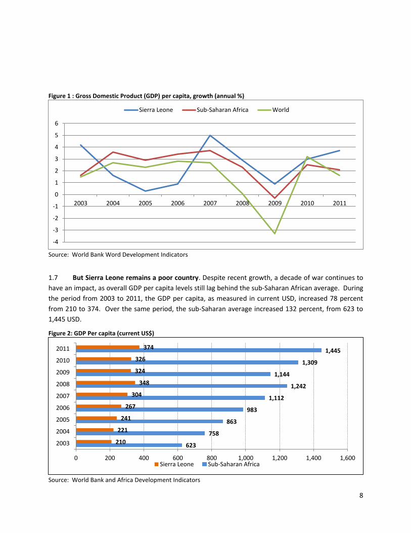
1.6 GDP per capita has shown above-average growth since 2003. The average annual growth rate
in Sierra Leone was 2.5 percent between 2003 and 2011, which was slightly higher than the sub-Saharan
average of 2.4 percent during this period, and well above the global average of 1.5 percent. The highest
overall GDP growth levels occurred during the immediate post-conflict period as the situation stabilized
and economic activity was reestablished, but this also coincided with a period of high population growth
which offset per capita gains. As the population growth rate declined, per capita growth increased,
though in 2009 Sierra Leone was impacted by the global financial crisis and a spike in global food prices.
Since that time, the growth rates have largely recovered.
8
Figure 1 : Gross Domestic Product (GDP) per capita, growth (annual %)
Source: World Bank Word Development Indicators
1.7 But Sierra Leone remains a poor country. Despite recent growth, a decade of war continues to
have an impact, as overall GDP per capita levels still lag behind the sub-Saharan African average. During
the period from 2003 to 2011, the GDP per capita, as measured in current USD, increased 78 percent
from 210 to 374. Over the same period, the sub-Saharan average increased 132 percent, from 623 to
1,445 USD.
Figure 2: GDP Per capita (current US$)
Source: World Bank and Africa Development Indicators
-4
-3
-2
-1
0
1
2
3
4
5
6
2003 2004 2005 2006 2007 2008 2009 2010 2011
Sierra Leone Sub-Saharan Africa World
623
758
863
983
1,112
1,242
1,144
1,309
1,445
210
221
241
267
304
348
324
326
374
0 200 400 600 800 1,000 1,200 1,400 1,600
2003
2004
2005
2006
2007
2008
2009
2010
2011
Sierra Leone Sub-Saharan Africa
9
POVERTY AND GROWTH
1.8 Overall, the poverty incidence was 52.9 percent in 2011, a decline from 66.4 percent in 2003.
The poor were individuals living in households with per adult equivalent consumption below 1,625,568
Leones per year in 2011. In 2003, this was equivalent to 750,326 Leones per adult equivalent per year.
Using these poverty lines, the urban poverty rate was substantially lower than the rural poverty rate,
and has also showed a sharper decline over this time period. Rural poverty was 66.1 percent in 2011,
compared with 78.7 percent in 2003. Urban poverty was 31.2 percent in 2011, a decline from 46.9
percent in 2003, despite an increase in poverty in the country’s largest metropolitan area, Freetown,
from 13.6 to 20.7 percent.
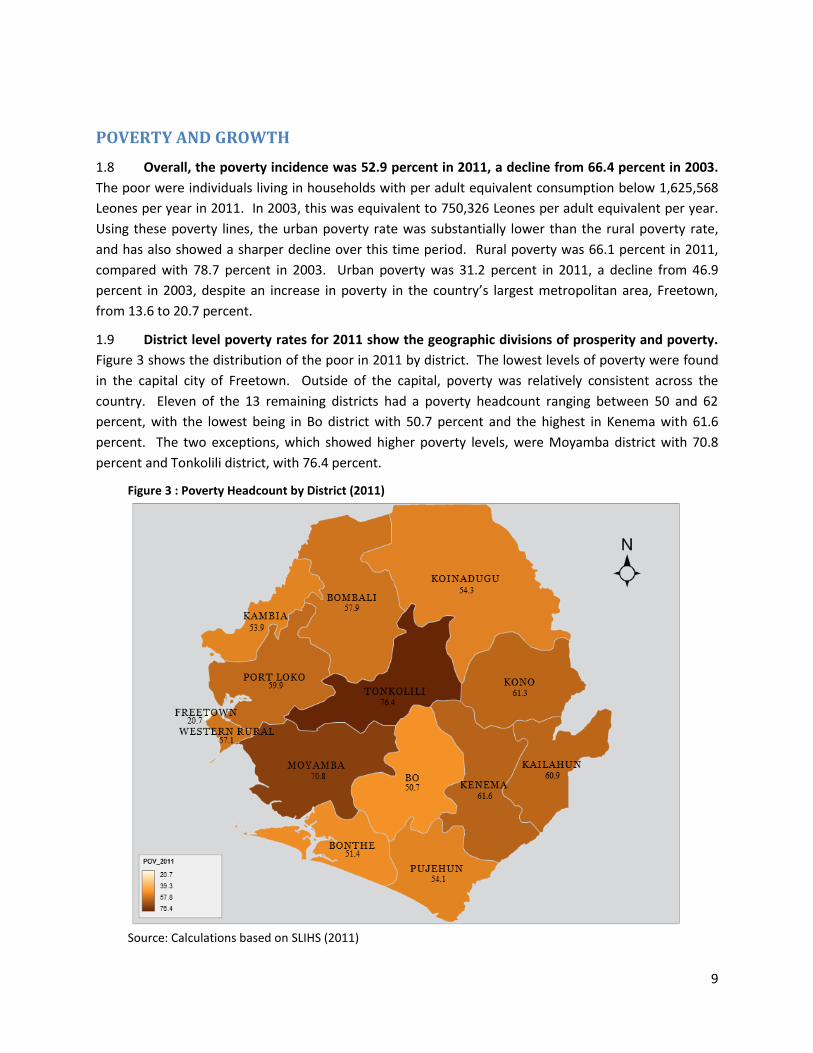
1.9 District level poverty rates for 2011 show the geographic divisions of prosperity and poverty.
Figure 3 shows the distribution of the poor in 2011 by district. The lowest levels of poverty were found
in the capital city of Freetown. Outside of the capital, poverty was relatively consistent across the
country. Eleven of the 13 remaining districts had a poverty headcount ranging between 50 and 62
percent, with the lowest being in Bo district with 50.7 percent and the highest in Kenema with 61.6
percent. The two exceptions, which showed higher poverty levels, were Moyamba district with 70.8
percent and Tonkolili district, with 76.4 percent.
Figure 3 : Poverty Headcount by District (2011)
Source: Calculations based on SLIHS (2011)
10
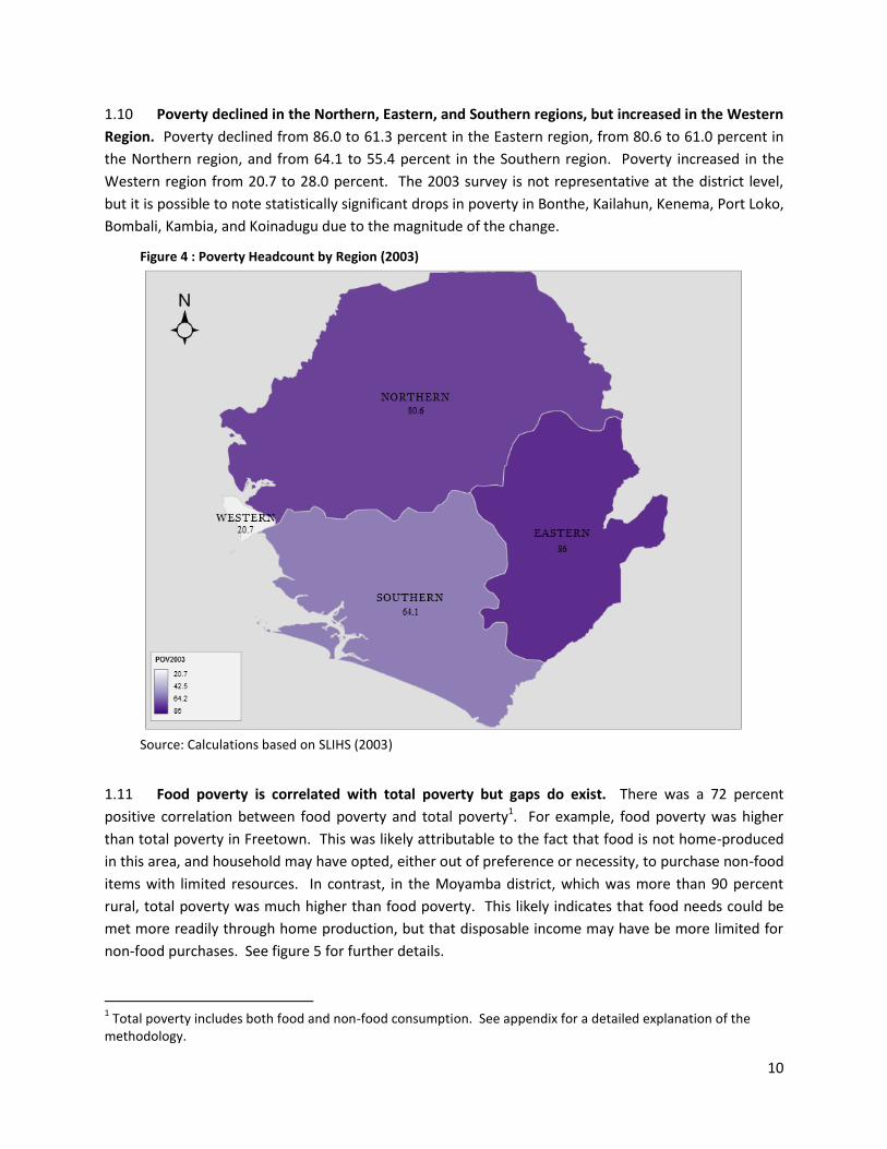
1.10 Poverty declined in the Northern, Eastern, and Southern regions, but increased in the Western
Region. Poverty declined from 86.0 to 61.3 percent in the Eastern region, from 80.6 to 61.0 percent in
the Northern region, and from 64.1 to 55.4 percent in the Southern region. Poverty increased in the
Western region from 20.7 to 28.0 percent. The 2003 survey is not representative at the district level,
but it is possible to note statistically significant drops in poverty in Bonthe, Kailahun, Kenema, Port Loko,
Bombali, Kambia, and Koinadugu due to the magnitude of the change.
Figure 4 : Poverty Headcount by Region (2003)
Source: Calculations based on SLIHS (2003)
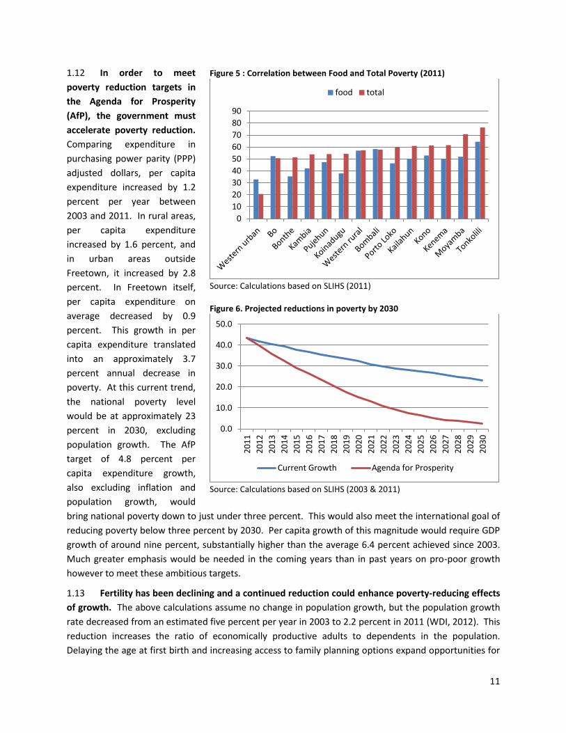
1.11 Food poverty is correlated with total poverty but gaps do exist. There was a 72 percent
positive correlation between food poverty and total poverty1. For example, food poverty was higher
than total poverty in Freetown. This was likely attributable to the fact that food is not home-produced
in this area, and household may have opted, either out of preference or necessity, to purchase non-food
items with limited resources. In contrast, in the Moyamba district, which was more than 90 percent
rural, total poverty was much higher than food poverty. This likely indicates that food needs could be
met more readily through home production, but that disposable income may have be more limited for
non-food purchases. See figure 5 for further details.
1 Total poverty includes both food and non-food consumption. See appendix for a detailed explanation of the
methodology.
11
1.12 In order to meet
poverty reduction targets in
the Agenda for Prosperity
(AfP), the government must
accelerate poverty reduction.
Comparing expenditure in
purchasing power parity (PPP)
adjusted dollars, per capita
expenditure increased by 1.2
percent per year between
2003 and 2011. In rural areas,
per capita expenditure
increased by 1.6 percent, and
in urban areas outside
Freetown, it increased by 2.8
percent. In Freetown itself,
per capita expenditure on
average decreased by 0.9
percent. This growth in per
capita expenditure translated
into an approximately 3.7
percent annual decrease in
poverty. At this current trend,
the national poverty level
would be at approximately 23
percent in 2030, excluding
population growth. The AfP
target of 4.8 percent per
capita expenditure growth,
also excluding inflation and
population growth, would
bring national poverty down to just under three percent. This would also meet the international goal of
reducing poverty below three percent by 2030. Per capita growth of this magnitude would require GDP
growth of around nine percent, substantially higher than the average 6.4 percent achieved since 2003.
Much greater emphasis would be needed in the coming years than in past years on pro-poor growth
however to meet these ambitious targets.
1.13 Fertility has been declining and a continued reduction could enhance poverty-reducing effects
of growth. The above calculations assume no change in population growth, but the population growth
rate decreased from an estimated five percent per year in 2003 to 2.2 percent in 2011 (WDI, 2012). This
reduction increases the ratio of economically productive adults to dependents in the population.
Delaying the age at first birth and increasing access to family planning options expand opportunities for
Figure 5 : Correlation between Food and Total Poverty (2011)
Source: Calculations based on SLIHS (2011) Figure 6. Projected reductions in poverty by 2030
Source: Calculations based on SLIHS (2003 & 2011)
0
10
20
30
40
50
60
70
80
90
food total
0.0
10.0
20.0
30.0
40.0
50.0
20
11
20
12
20
13
20
14
20
15
20
16
20
17
20
18
20
19
20
20
20
21
20
22
20
23
20
24
20
25
20
26
20
27
20
28
20
29
20
30
Current Growth Agenda for Prosperity
12
female labor force participation. It also frees more resources for investment, both in new economic
activities as well as within the household for health and education. Though results vary by country
context, the economics literature estimates that between 25 and 40 percent of the rapid growth seen in
recent decades in East Asia was attributable to the “demographic dividend” creating by falling fertility
rates (Bloom et al, 2003, pp 45).
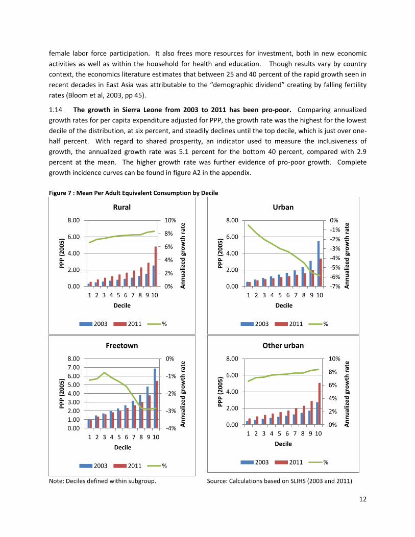
1.14 The growth in Sierra Leone from 2003 to 2011 has been pro-poor. Comparing annualized
growth rates for per capita expenditure adjusted for PPP, the growth rate was the highest for the lowest
decile of the distribution, at six percent, and steadily declines until the top decile, which is just over one-
half percent. With regard to shared prosperity, an indicator used to measure the inclusiveness of
growth, the annualized growth rate was 5.1 percent for the bottom 40 percent, compared with 2.9
percent at the mean. The higher growth rate was further evidence of pro-poor growth. Complete
growth incidence curves can be found in figure A2 in the appendix.
Figure 7 : Mean Per Adult Equivalent Consumption by Decile
Note: Deciles defined within subgroup. Source: Calculations based on SLIHS (2003 and 2011)
0%
2%
4%
6%
8%
10%
0.00
2.00
4.00
6.00
8.00
1 2 3 4 5 6 7 8 9 10
An
nu
aliz
ed
gro
wth
rat
e
PP
P (
20
05
)
Decile
Rural
2003 2011 %
-7%
-6%
-5%
-4%
-3%
-2%
-1%
0%
0.00
2.00
4.00
6.00
8.00
1 2 3 4 5 6 7 8 9 10
An
nu
aliz
ed
gro
wth
rat
e
PP
P (
20
05
)
Decile
Urban
2003 2011 %
-4%
-3%
-2%
-1%
0%
0.00
1.00
2.00
3.00
4.00
5.00
6.00
7.00
8.00
1 2 3 4 5 6 7 8 9 10
An
nu
aliz
ed
gro
wth
rat
e
PP
P (
20
05
)
Decile
Freetown
2003 2011 %
0%
2%
4%
6%
8%
10%
0.00
2.00
4.00
6.00
8.00
1 2 3 4 5 6 7 8 9 10
An
nu
aliz
ed
gro
wth
rat
e
PP
P (
20
05
)
Decile
Other urban
2003 2011 %
13
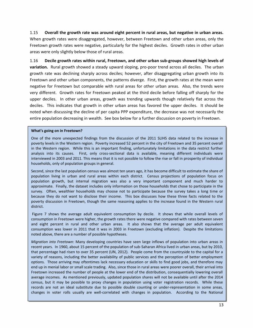
1.15 Overall the growth rate was around eight percent in rural areas, but negative in urban areas.
When growth rates were disaggregated, however, between Freetown and other urban areas, only the
Freetown growth rates were negative, particularly for the highest deciles. Growth rates in other urban
areas were only slightly below those of rural areas.
1.16 Decile growth rates within rural, Freetown, and other urban sub-groups showed high levels of
variation. Rural growth showed a steady upward sloping, pro-poor trend across all deciles. The urban
growth rate was declining sharply across deciles; however, after disaggregating urban growth into its
Freetown and other urban components, the patterns diverge. First, the growth rates at the mean were
negative for Freetown but comparable with rural areas for other urban areas. Also, the trends were
very different. Growth rates for Freetown peaked at the third decile before falling off sharply for the
upper deciles. In other urban areas, growth was trending upwards though relatively flat across the
deciles. This indicates that growth in other urban areas has favored the upper deciles. It should be
noted when discussing the decline of per capita PPP expenditure, the decrease was not necessarily the
entire population decreasing in wealth. See box below for a further discussion on poverty in Freetown.
What’s going on in Freetown?
One of the more unexpected findings from the discussion of the 2011 SLIHS data related to the increase in poverty levels in the Western region. Poverty increased 52 percent in the city of Freetown and 35 percent overall in the Western region. While this is an important finding, unfortunately limitations in the data restrict further analysis into its causes. First, only cross-sectional data is available, meaning different individuals were interviewed in 2003 and 2011. This means that it is not possible to follow the rise or fall in prosperity of individual households, only of population groups in general.
Second, since the last population census was almost ten years ago, it has become difficult to estimate the share of population living in urban and rural areas within each district. Census projections of population focus on population growth, but internal migration was also a very important component and much harder to approximate. Finally, the dataset includes only information on those households that chose to participate in the survey. Often, wealthier households may choose not to participate because the survey takes a long time or because they do not want to disclose their income. This box discusses how these three facts related to the poverty discussion in Freetown, though the same reasoning applies to the increase found in the Western rural district.
Figure 7 shows the average adult equivalent consumption by decile. It shows that while overall levels of consumption in Freetown were higher, the growth rates there were negative compared with rates between seven and eight percent in rural and other urban areas. It also shows that the average per adult equivalent consumption was lower in 2011 that it was in 2003 in Freetown (excluding inflation). Despite the limitations noted above, there are a number of possible hypotheses.
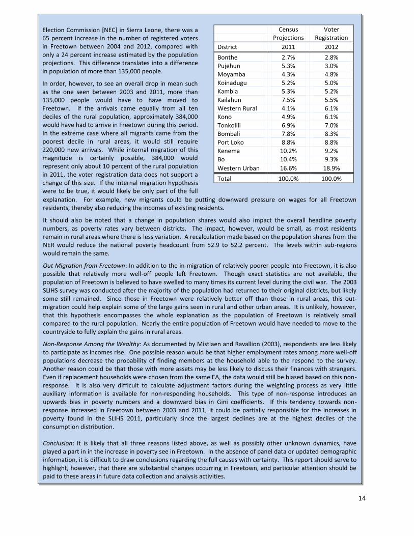
Migration into Freetown: Many developing countries have seen large inflows of population into urban areas in recent years. In 1960, about 15 percent of the population of sub-Saharan Africa lived in urban areas, but by 2010, that percentage had risen to over 35 percent (UN, 2012). People come from the countryside to the capital for a variety of reasons, including the better availability of public services and the perception of better employment options. Those arriving may oftentimes lack necessary education or skills to find good jobs, and therefore may end up in menial labor or small scale trading. Also, since those in rural areas were poorer overall, their arrival into Freetown increased the number of people at the lower end of the distribution, consequentially lowering overall average incomes. As mentioned previously, updated population shares will not be available until after the 2014 census, but it may be possible to proxy changes in population using voter registration records. While these records are not an ideal substitute due to possible double counting or under-representation in some areas, changes in voter rolls usually are well-correlated with changes in population. According to the National
14
Census
Projections Voter
Registration
District 2011 2012
Bonthe 2.7% 2.8%
Pujehun 5.3% 3.0%
Moyamba 4.3% 4.8%
Koinadugu 5.2% 5.0%
Kambia 5.3% 5.2%
Kailahun 7.5% 5.5%
Western Rural 4.1% 6.1%
Kono 4.9% 6.1%
Tonkolili 6.9% 7.0%
Bombali 7.8% 8.3%
Port Loko 8.8% 8.8%
Kenema 10.2% 9.2%
Bo 10.4% 9.3%
Western Urban 16.6% 18.9%
Total 100.0% 100.0%
explanation. For example, new migrants could be putting downward pressure on wages for all Freetown residents, thereby also reducing the incomes of existing residents.
It should also be noted that a change in population shares would also impact the overall headline poverty numbers, as poverty rates vary between districts. The impact, however, would be small, as most residents remain in rural areas where there is less variation. A recalculation made based on the population shares from the NER would reduce the national poverty headcount from 52.9 to 52.2 percent. The levels within sub-regions would remain the same.
Out Migration from Freetown: In addition to the in-migration of relatively poorer people into Freetown, it is also possible that relatively more well-off people left Freetown. Though exact statistics are not available, the population of Freetown is believed to have swelled to many times its current level during the civil war. The 2003 SLIHS survey was conducted after the majority of the population had returned to their original districts, but likely some still remained. Since those in Freetown were relatively better off than those in rural areas, this out-migration could help explain some of the large gains seen in rural and other urban areas. It is unlikely, however, that this hypothesis encompasses the whole explanation as the population of Freetown is relatively small compared to the rural population. Nearly the entire population of Freetown would have needed to move to the countryside to fully explain the gains in rural areas.
Non-Response Among the Wealthy: As documented by Mistiaen and Ravallion (2003), respondents are less likely to participate as incomes rise. One possible reason would be that higher employment rates among more well-off populations decrease the probability of finding members at the household able to the respond to the survey. Another reason could be that those with more assets may be less likely to discuss their finances with strangers. Even if replacement households were chosen from the same EA, the data would still be biased based on this non-response. It is also very difficult to calculate adjustment factors during the weighting process as very little auxiliary information is available for non-responding households. This type of non-response introduces an upwards bias in poverty numbers and a downward bias in Gini coefficients. If this tendency towards non-response increased in Freetown between 2003 and 2011, it could be partially responsible for the increases in poverty found in the SLIHS 2011, particularly since the largest declines are at the highest deciles of the consumption distribution. Conclusion: It is likely that all three reasons listed above, as well as possibly other unknown dynamics, have played a part in in the increase in poverty see in Freetown. In the absence of panel data or updated demographic information, it is difficult to draw conclusions regarding the full causes with certainty. This report should serve to highlight, however, that there are substantial changes occurring in Freetown, and particular attention should be paid to these areas in future data collection and analysis activities.
Election Commission [NEC] in Sierra Leone, there was a 65 percent increase in the number of registered voters in Freetown between 2004 and 2012, compared with only a 24 percent increase estimated by the population projections. This difference translates into a difference in population of more than 135,000 people.
In order, however, to see an overall drop in mean such as the one seen between 2003 and 2011, more than 135,000 people would have to have moved to Freetown. If the arrivals came equally from all ten deciles of the rural population, approximately 384,000 would have had to arrive in Freetown during this period. In the extreme case where all migrants came from the poorest decile in rural areas, it would still require 220,000 new arrivals. While internal migration of this magnitude is certainly possible, 384,000 would represent only about 10 percent of the rural population in 2011, the voter registration data does not support a change of this size. If the internal migration hypothesis were to be true, it would likely be only part of the full
15
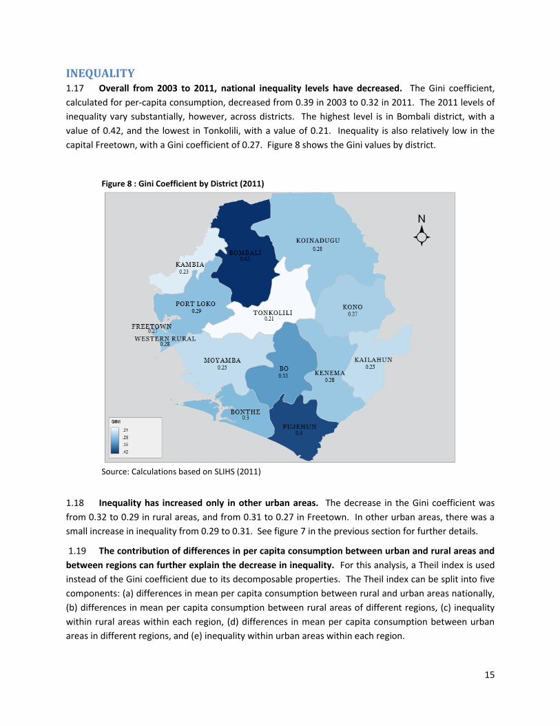
INEQUALITY 1.17 Overall from 2003 to 2011, national inequality levels have decreased. The Gini coefficient,
calculated for per-capita consumption, decreased from 0.39 in 2003 to 0.32 in 2011. The 2011 levels of
inequality vary substantially, however, across districts. The highest level is in Bombali district, with a
value of 0.42, and the lowest in Tonkolili, with a value of 0.21. Inequality is also relatively low in the
capital Freetown, with a Gini coefficient of 0.27. Figure 8 shows the Gini values by district.
Figure 8 : Gini Coefficient by District (2011)
Source: Calculations based on SLIHS (2011)
1.18 Inequality has increased only in other urban areas. The decrease in the Gini coefficient was
from 0.32 to 0.29 in rural areas, and from 0.31 to 0.27 in Freetown. In other urban areas, there was a
small increase in inequality from 0.29 to 0.31. See figure 7 in the previous section for further details.
1.19 The contribution of differences in per capita consumption between urban and rural areas and
between regions can further explain the decrease in inequality. For this analysis, a Theil index is used
instead of the Gini coefficient due to its decomposable properties. The Theil index can be split into five
components: (a) differences in mean per capita consumption between rural and urban areas nationally,
(b) differences in mean per capita consumption between rural areas of different regions, (c) inequality
within rural areas within each region, (d) differences in mean per capita consumption between urban
areas in different regions, and (e) inequality within urban areas within each region.
16
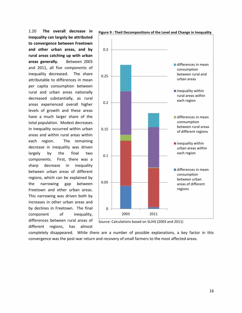
1.20 The overall decrease in
inequality can largely be attributed
to convergence between Freetown
and other urban areas, and by
rural areas catching up with urban
areas generally. Between 2003
and 2011, all five components of
inequality decreased. The share
attributable to differences in mean
per capita consumption between
rural and urban areas nationally
decreased substantially, as rural
areas experienced overall higher
levels of growth and these areas
have a much larger share of the
total population. Modest decreases
in inequality occurred within urban
areas and within rural areas within
each region. The remaining
decrease in inequality was driven
largely by the final two
components. First, there was a
sharp decrease in inequality
between urban areas of different
regions, which can be explained by
the narrowing gap between
Freetown and other urban areas.
This narrowing was driven both by
increases in other urban areas and
by declines in Freetown. The final
component of inequality,
differences between rural areas of
different regions, has almost
completely disappeared. While there are a number of possible explanations, a key factor in this
convergence was the post-war return and recovery of small farmers to the most affected areas.
Figure 9 : Theil Decompositions of the Level and Change in Inequality
Source: Calculations based on SLIHS (2003 and 2011)
0
0.05
0.1
0.15
0.2
0.25
0.3
2003 2011
differences in mean consumption between rural and urban areas
inequality within rural areas within each region
differences in mean comsumption between rural areas of different regions
inequality within urban areas within each region
differences in mean consumption between urban areas of different regions

17
DEMOGRAPHICS
1.21 Sierra Leone is an extremely young country, with more than 75 percent of the population
below the age of 35 in 2011. Figure 10 shows the distribution of male and female population by age.2
2 Note: considerable weaknesses in the data, including age heaping and under-reporting of children under 5,
necessitated substantial extrapolation to arrive at the above figure. See the population pyramid section in the appendix for a more detailed discussion.
Figure 10 : Age Distribution by Gender (2011) Figure 11 : Population Growth (annual %)
Source: Calculations based on SLIHS (2011) Source: WDI (2012)
Figure 12 : Average Number of Births Per Woman (2003 and 2011)
Figure 13 : Average Number of Births By Age (2011)
Source: Calculations based on SLIHS (2003 and 2011) Source: Calculations based on SLIHS (2011)
-0.1 -0.05 0 0.05 0.1
0-4 5-9
10-14 15-19 20-24 25-29 30-34 35-39 40-44 45-49 50-54 55-59 60-64 65-69 70-74 75-79
80+
Female Male
0
1
2
3
4
5
6
2003 2004 2005 2006 2007 2008 2009 2010 2011
0
0.5
1
1.5
2
2.5
3
3.5
4
4.5
5
urban rural urban rural
Non-poor Poor
2003 2011
0
1
2
3
4
5
6
12 14 16 18 20 22 24 26 28 30
Ave
rage
nu
mb
er
of
bir
ths
Age at first birth
18
1.22 Fertility has declined between 2003 and 2011, with the largest decreases among the rural
poor. Overall population growth has declined from a high of approximately five percent per year in
2003 to 2.2 percent in 2011 (WDI, 2012). The average number of births per woman was 4.1 in 2003 and
3.7 in 2011, nearly a 10 percent decrease overall. There was a decrease from 4.6 births per woman to
4.1 in rural areas, but this was partially offset by a marginal increase in the urban non-poor population.
See figures 11 and 12 above.
1.23 Women that delay their first birth have fewer children overall. The median age for the first
birth was 19 years old in 2011. The average number of total births was almost double for a woman that
had her first child at 16 as opposed to 31. See figure 13.
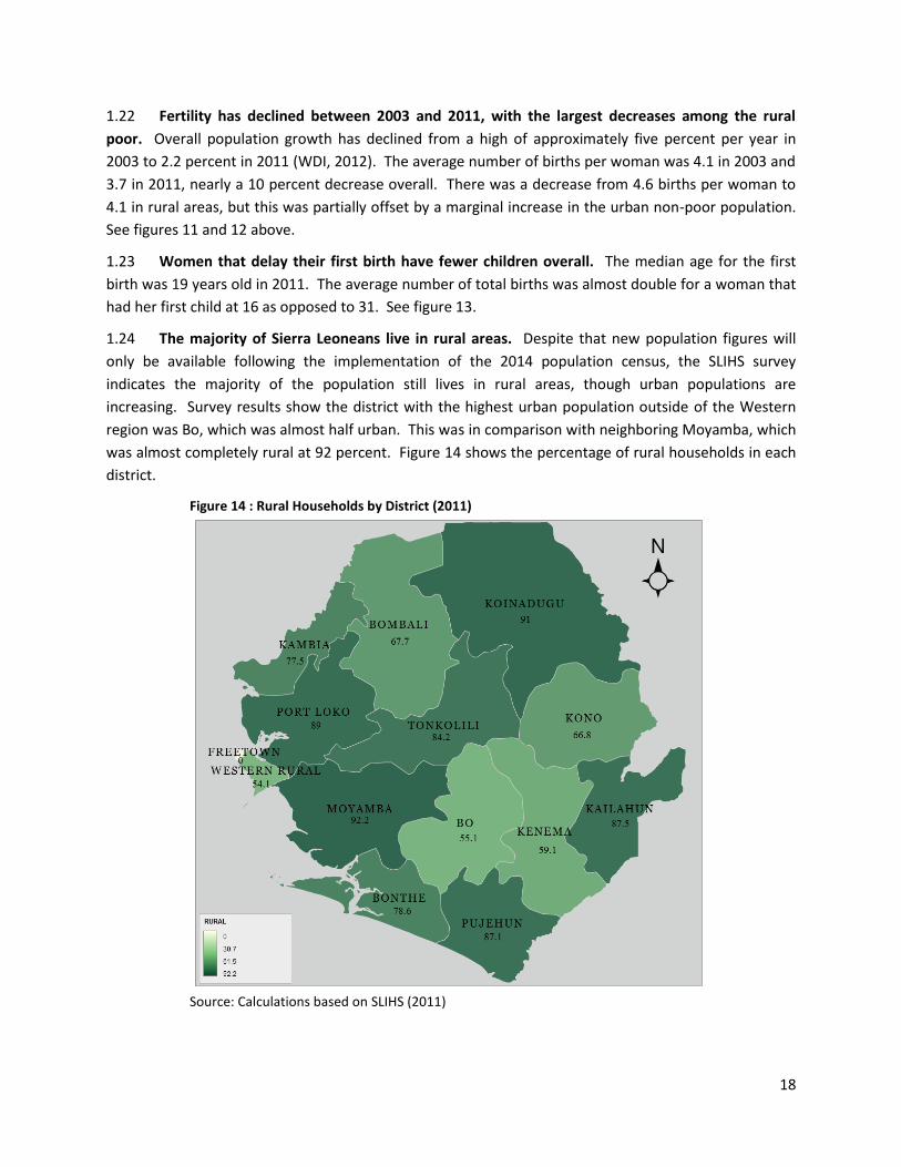
1.24 The majority of Sierra Leoneans live in rural areas. Despite that new population figures will
only be available following the implementation of the 2014 population census, the SLIHS survey
indicates the majority of the population still lives in rural areas, though urban populations are
increasing. Survey results show the district with the highest urban population outside of the Western
region was Bo, which was almost half urban. This was in comparison with neighboring Moyamba, which
was almost completely rural at 92 percent. Figure 14 shows the percentage of rural households in each
district.
Figure 14 : Rural Households by District (2011)
Source: Calculations based on SLIHS (2011)

19
1.25 Female headed households show lower poverty rates than male headed households in 2011.
Female headed households comprised 17.5 percent of total households in 2003 and 25.8 percent in
2011. In 2003, there was not a significant difference in poverty levels between the two groups, with
61.3 percent of male headed household and 59.8 percent of female headed households living below the
poverty line. By 2011, however, the difference was significant, 47.5 and 43.8 percent of households
respectively. Disaggregation by rural/urban status shows, however, that female-headed households in
urban areas are doing about the same, with approximately one-quarter of both groups of households
being poor. In rural areas, female headed households are doing better than male-headed households,
with 61.4 percent of male headed households below the poverty line compared to 57.1 percent of
female headed-households.
PUBLIC SERVICES
1.26 Access to electricity and sanitation
was limited in remote areas. Less than one
percent of households in rural areas listed
electricity as the main source of lighting,
compared with 57.7 percent in Freetown and
12.7 percent in other urban areas. Though the
majority of the population in all three areas
had access to only unimproved sanitation
facilities, the highest prevalence was in
Freetown at 17.3 percent.3 The availability
was the worst in rural areas, where 27.4
percent of the population had no access to
sanitation facilities, either improved or
unimproved. Figure 15 has further detail.
1.27 Public services were also more difficult to access in rural areas. Almost half of rural
respondents lived more than one hour from the nearest food market, a finding with strong implications
on the household’s ability to participate in the agricultural economy. Less than ten percent of other
urban residents and less than three percent of Freetown residents were more than one hour from a
food market. Access to a primary school was relatively good across the country, with less than 10
percent of rural residents being more than one hour away, and only 0.9 percent and 1.7 percent of
Freetown and other urban residents, respectively. Access to a secondary school was also fairly good in
urban areas, with less than ten percent of residents in both Freetown and other urban areas being more
than one hour away. Rural areas were at a disadvantage, however, as 57.4 percent of residents were
more than one hour’s travel from a secondary school. Access to health facilities was also much better in
3 Definitions for sanitation facilities are as follows: “improved” : flush to piped sewer system; flush to septic tank;
flush to pit latrine; flush to somewhere else; VIP latrine; composting toilet. “unimproved” : pit latrine with slab; open pit latrine (no slab); hanging toilet/latrine; other. “none” : no facilities / bush / field; bucket.
Figure 15 : Access to Improved Sanitation Facilities (2011)
Source: Calculations based on SLIHS (2011)
0%
10%
20%
30%
40%
50%
60%
70%
80%
90%
100%
Rural Freetown Other urban
improved unimproved no facilities
20
urban areas. Of rural residents, 35.5 percent lived more than one hour from a clinic and 71.7 percent
more than one hour from a hospital. Less than 5 percent in urban areas were more than one hour from
a clinic, and those more than an hour away from a hospital were 10.4 percent and 22.3 percent in
Freetown and other urban areas, respectively. Table A7 in the appendix gives further detail on the
distribution of travel times.
EDUCATION
1.28 Educational completion rates were low by international standards. According to the 2011
SLIHS, 56 percent of adults over the age of 15 have never attended formal school. The percentage of
adults without access is higher for women than for men, 64 percent versus 47 percent, and higher in
rural areas compared to urban, 73 percent versus 31 percent.
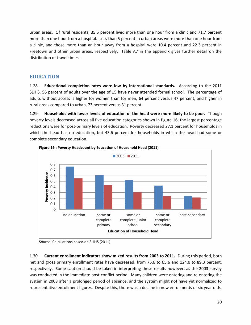
1.29 Households with lower levels of education of the head were more likely to be poor. Though
poverty levels decreased across all five education categories shown in figure 16, the largest percentage
reductions were for post-primary levels of education. Poverty decreased 27.1 percent for households in
which the head has no education, but 43.6 percent for households in which the head had some or
complete secondary education.
Figure 16 : Poverty Headcount by Education of Household Head (2011)
Source: Calculations based on SLIHS (2011)
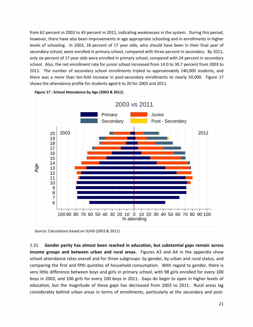
1.30 Current enrollment indicators show mixed results from 2003 to 2011. During this period, both
net and gross primary enrollment rates have decreased, from 75.6 to 65.6 and 124.0 to 89.3 percent,
respectively. Some caution should be taken in interpreting these results however, as the 2003 survey
was conducted in the immediate post-conflict period. Many children were entering and re-entering the
system in 2003 after a prolonged period of absence, and the system might not have yet normalized to
representative enrollment figures. Despite this, there was a decline in new enrollments of six year olds,
0
0.1
0.2
0.3
0.4
0.5
0.6
0.7
0.8
no education some or complete primary
some or complete junior
school
some or complete secondary
post-secondary
Po
vert
y In
cid
en
ce
Education of Household Head
2003 2011
21
from 62 percent in 2003 to 43 percent in 2011, indicating weaknesses in the system. During this period,
however, there have also been improvements in age appropriate schooling and in enrollments in higher
levels of schooling. In 2003, 18 percent of 17 year olds, who should have been in their final year of
secondary school, were enrolled in primary school, compared with three percent in secondary. By 2011,
only six percent of 17 year olds were enrolled in primary school, compared with 24 percent in secondary
school. Also, the net enrollment rate for junior school increased from 14.0 to 30.7 percent from 2003 to
2011. The number of secondary school enrollments tripled to approximately 240,000 students, and
there was a more than ten-fold increase in post-secondary enrollments to nearly 50,000. Figure 17
shows the attendance profile for students aged 6 to 20 for 2003 and 2011.
Figure 17 : School Attendance by Age (2003 & 2011)
Source: Calculations based on SLIHS (2003 & 2011)
1.31 Gender parity has almost been reached in education, but substantial gaps remain across
income groups and between urban and rural areas. Figures A3 and A4 in the appendix show
school attendance rates overall and for three subgroups: by gender, by urban and rural status, and
comparing the first and fifth quintiles of household consumption. With regard to gender, there is
very little difference between boys and girls in primary school, with 98 girls enrolled for every 100
boys in 2003, and 106 girls for every 100 boys in 2011. Gaps do begin to open in higher levels of
education, but the magnitude of these gaps has decreased from 2003 to 2011. Rural areas lag
considerably behind urban areas in terms of enrollments, particularly at the secondary and post-
2003 2011
100 90 80 70 60 50 40 30 20 10 0 10 20 30 40 50 60 70 80 90 100% attending
20191817161514131211109876
Age
2003 vs 2011
Primary Junior
Secondary Post - Secondary
22
secondary levels. Comparing the first and fifth quintiles of the household consumption distribution,
the wealthiest quintile had higher enrollment rates across all levels in both 2003 and 2011. During
this time period, however, the gap has narrowed for primary and junior education, but expanded
for the secondary and post-secondary levels.
1.32 Net primary enrollment rates vary substantially by district. The highest primary enrollment
rates were found in Freetown and Bo district, and the lowest in Kambia and Koinadugu. Figure 18 shows
net primary enrollment rates by district.
Figure 18 : Net Primary Enrollment by District (2011)
Source: Calculations based on SLIHS (2011)
HEALTH
1.33 Nearly half of children under 5 were born at home. Comparing the location of birth for
children under age 5 in the 2011 SLIHS, 57 percent of children living in rural areas were born at home,
compared with 32 percent in other urban areas and 24 percent in Freetown. Overall, 31 percent of
children under age 5 were born in hospitals and 17 percent in maternity centers, though in Freetown,
nearly 60 percent were born in hospitals. Comparing across quintiles, 57 percent of children living in
households in the lowest quintile were born at home, which is significantly less than 38 percent of
children in the highest quintile.

23
1.34 Younger children are less likely to be born at home. In April 2010, the government introduced
the Free Health Care Initiative, targeted to pregnant women, new mothers, and children under five.
Comparing children under the age of 5, those born after April 1, 2010 were less likely to be born at
home than those born prior to that date. This difference is statistically significant despite a likely lag in
the implementation of the project in many areas. Comparing four year old children at the time of the
survey to those less than a year old, 55 percent of four year olds were born at home, compared with
only 42 percent of those under one year of age. See figure 19 for further details.
Figure 19 : Location of Birth (2011)
Source: Calculations based on SLIHS (2011)
AGRICULTURE & RURAL LIVELIHOODS
1.35 Agriculture remains the dominant livelihood throughout the majority of Sierra Leone. In 52.4
percent of all households, the head listed their main occupation as agriculture. In rural areas, this
percentage was 78.3 percent. Male household heads were more likely to have agriculture as their
primary occupation, 55.5 percent versus 44.1 percent respectively. This difference was also found in
rural areas, with 81.1 percent of male headed households and 70.1 of female headed households listing
agriculture as their main occupation. With the exception of Western, Kono, Kenema, and Bo districts,
agriculture remains the main activity for household heads throughout the country. Figure 20 shows the
percentage of household heads listing agriculture as their main activity by district.
1.36 Households in which agriculture is the primary occupation of the household head are poorer
than other occupations. The poverty headcount for agricultural households showed an 18.5 percent
decrease from 74.6 in 2003 and 60.8 in 2011, while other households showed a 25.5 percent decrease
from 41.2 to 30.7 percent. This is true even within rural areas, where the poverty headcount was 62.7
percent for agricultural households, compared with 51.7 percent for other primary occupations of the
household head.
0%
20%
40%
60%
80%
100%
rural Freetown other 1 2 3 4 5 0 1 2 3 4
location quintile age
Hospital Maternity Other At home
24
Figure 20 : Agriculture as Main Livelihood by District (2011)
Source: Calculations based on SLIHS (2011)
1.37 Rice was the most common crop grown by rural agricultural households, both poor and non-
poor, though poor farmers have smaller plots. The average landholding for poor households was
approximately five acres in 2011, compared with almost seven for non-poor households. Seventy-five
percent of rural households generally and 87 percent of rural agricultural households specifically,
reported growing rice in 2011, but there was almost no difference in these figures between poor and
non-poor households. About 20 percent of rural agricultural households reported growing cash crops,
including cocoa, coffee, tobacco, wood, cotton, and sugar cane, but similarly there was no difference
between poor and non-poor.
DETERMINANTS OF POVERTY
1.38 Tables A3 and A4 in appendix 2 present findings from simple regressions of per capita
consumption and poverty on household variables for 2003 and 2011. The first regression, table A3,
demonstrates, holding all other factors constant, the relationship between a given characteristic and the
average per-capita consumption, and provides a useful summary of the correlates of poverty for urban
and rural areas. Table A4 shows the change in the likelihood of being in poverty for a hypothetical
25
household based on its characteristics. This model is useful to estimate the predicted change in poverty
status based on a change in a given characteristic.
1.39 Holding all other factors constant, larger households had lower per-capita consumption, and
generally higher probabilities of being poor. The remaining household composition variables were
significant in only a few cases. For example, in urban areas in 2003, and in both rural areas in 2011,
higher percentages of children under 15 increased the probability of a household being poor.
1.40 The age and gender of the household head overall do not seem to have a significant correlation
with consumption or poverty, though, in 2011, female headed households and household with older
heads had higher consumption in urban areas, and older household heads in rural areas were more
likely to be poor. Higher levels of education, however, were strongly associated with higher
consumption and lower poverty. For example, in rural areas in 2003, households in which the head had
no education had an 83 percent likelihood of being poor. This decreased to 69 percent if the head has
some or complete secondary education, and to 9 percent if the head had post-secondary education.
Similarly in urban areas in 2011, heads with no education had a 32 percent likelihood of being poor,
which decreases to 18 percent with some or complete primary education, and to 12 percent with post-
secondary education.
1.41 Despite the fact that Sierra Leone is a predominantly rural country, the roles of agricultural and
land variables in determining poverty and consumption outcomes are not straightforward. In 2003,
none of the three variables examined (primary occupation of household head is agriculture, household
being landless, and landholdings) had a significant correlation with poverty in either rural or urban
areas. In 2011, households in which the household head’s primary occupation was agriculture were
about 15 percent more likely to be poor compared with other households in rural areas. Households
with no landholding are not significantly more likely to be poor, but they do have lower overall
household consumption levels. In addition, for every 20 percent increase in landholdings from the
mean, there is an estimated five percent decrease in the likelihood of being poor.
1.42 Other sources of income, including non-farm enterprise and transfer payments also played a
role in household welfare. Transfer payments from outside of the household were associated with
higher consumption and lower poverty only in urban areas in 2003. Households receiving these
payments were 15 percent less likely to be poor. Having a non-farm income source was associated with
higher consumption in rural areas in 2003 and urban areas in 2011, but only in the latter was the
likelihood of being poor lower.
1.43 In addition, certain districts had higher or lower poverty levels compared to the reference
category, and these probabilities varied substantially between 2003 and 2011. In both cases, however,
the lowest likelihood of being poor was found in Freetown.
26
APPENDIX 1. METHODOLOGY FOR POVERTY ANALYSIS
A1.1 The concept of poverty can refer to many different aspects of deprivation, such as food poverty,
social exclusion, lack of access to basic public services, inability to access markets, etc. While each of
these is an important aspect of a multidimensional problem, it is necessary for the purposes of
comparability and analysis to simplify the concept of poverty to a single measureable dimension. In the
context of this report, household consumption will be considered as a representative measure of well-
being.
A1.2 In the context of sub-Saharan Africa, a consensus has emerged among analysts to use
consumption-based measures over income measures as it is seen as better able to capture utility and
well-being. First there is a substantial contribution of home production to household consumption.
Also, households are better able to smooth consumption as opposed to income, which is important in
places with large seasonal shifts in the availability of employment. The volatility of the income indicator
can therefore lead to large over- (or under-) estimations of welfare. Finally, despite well-known
difficulties in some aspects of the collection of consumption data, it is generally considered more
straight-forward than income data. While wage workers need only to recall their last paycheck, those
who are self-employed or working in informal sectors must aggregate many small transactions. In
addition, there are difficulties in valuing in-kind payments or labor sharing arrangements, separating
entwined household and business expenses, and overcoming respondent reluctance to discuss income.
A1.3 It should be noted that the 2003 poverty
figures presented in this report differ slightly from
those calculated at the time findings from those data
were originally disseminated. There are a number of
reasons for this discrepancy. First, the 2003 data was
originally presented before the weighting calculations
were finished. Also, more rigorous data cleaning
methods were applied to both the 2003 and 2011
data prior to the analysis. The scatterplot in figure A1
shows outlier points in the original data that have
been addressed in the revision. Additionally, the data
sets were harmonized to ensure comparability. For
example, items appearing in only the 2003
questionnaire were not included in the harmonized
aggregates. The impact on the poverty numbers,
however, is minimal, and roughly even across regions
and other sub-categories.
A1.4 There are three elements required to perform poverty analysis:
a. A single dimensional, measureable welfare indicator that can be used to rank the population
according to well-being.
Figure A1 : Original and Revised Consumption Aggregates (2003)
Source: Calculations based on SLIHS (2003)
0
1
2
3
4
5
6
7
8
9
10
0 5 10
up
dat
ed
agg
rega
te
original aggregate
27
b. An appropriate poverty line on the same scale as the above welfare measure that can be
used to classify individuals as poor or non-poor.
c. A set of measures that aggregate and describe the combination of the welfare indicator and
poverty line.
Adult Equivalent Measures
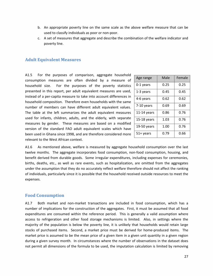
A1.5 For the purposes of comparison, aggregate household
consumption measures are often divided by a measure of
household size. For the purposes of the poverty statistics
presented in this report, per adult equivalent measures are used,
instead of a per-capita measure to take into account differences in
household composition. Therefore even households with the same
number of members can have different adult equivalent values.
The table at the left summarizes the adult equivalent measures
used for infants, children, adults, and the elderly, with separate
measures by gender. These measures are based on a modified
version of the standard FAO adult equivalent scales which have
been used in Ghana since 1998, and are therefore considered more
relevant to the West African context.
A1.6 As mentioned above, welfare is measured by aggregate household consumption over the last
twelve months. The aggregate incorporates food consumption, non-food consumption, housing, and
benefit derived from durable goods. Some irregular expenditures, including expenses for ceremonies,
births, deaths, etc., as well as rare events, such as hospitalization, are omitted from the aggregates
under the assumption that they do no accurately reflect welfare therefore should not affect the ranking
of individuals, particularly since it is possible that the household received outside resources to meet the
expenses.
Food Consumption
A1.7 Both market and non-market transactions are included in food consumption, which has a
number of implications for the construction of the aggregates. First, it must be assumed that all food
expenditures are consumed within the reference period. This is generally a valid assumption where
access to refrigeration and other food storage mechanisms is limited. Also, in settings where the
majority of the population is below the poverty line, it is unlikely that households would retain large
stocks of purchased items. Second, a market price must be derived for home-produced items. The
market price is assumed to be the mean price of a given item in a given unit quantity in a given region
during a given survey month. In circumstances where the number of observations in the dataset does
not permit all dimensions of the formula to be used, the imputation calculation is limited by removing
Age range Male Female
0-1 years 0.25 0.25
1-3 years 0.45 0.45
4-6 years 0.62 0.62
7-10 years 0.69 0.69
11-14 years 0.86 0.76
15-18 years 1.03 0.76
19-50 years 1.00 0.76
51+ years 0.79 0.66
28
the month of interview, followed by the region. Also, non-standard units are valued as they appear in
the dataset, instead of being converted and valued globally.
A1.8 The 2003 SLIHS contained 103 food items in the consumption section, while the 2011 SLIHS
contains 162. These items are organized in 19 categories in the 2011 survey: grains and flours; starchy
roots, tubers and plantains; pulses, nuts and seeds; fats and oils; fresh fruits and juices;
canned/powdered fruits and juices; fresh vegetables; canned vegetables; poultry and poultry products;
meat; fresh fish and shell fish; canned fish and seafood; milk and milk products; coffee, tea, cocoa, and
like beverages; canteen, restaurants and hotel prepared meals; sugar, sweets and confectionary; other
miscellaneous foods; non-alcoholic drinks; and alcoholic drinks.
A1.9 Since the number of included items differs between the two surveys, only those items which
appear in both questionnaires are included in the consumption aggregate. This is done to maintain
comparability between the two surveys. Some items appear in both surveys though the level of
disaggregation is different. For example, the 2003 item “fish fresh/frozen” has been split into two
categories in 2011. They are retained in the analysis.
Non-Food Consumption
A1.10 Non-food consumption was divided into two categories, frequently purchased items and
infrequent non-food items. The frequently purchased items included lighting; refuse; water; sewage;
tobacco; gas, kerosene, charcoal; firewood; palm kernel oil petrol, diesel for generators; other solid
fuels; non-durable goods for household maintenance; domestic services; petrol; diesel; lubricants;
transport repairs / maintenance; storage and warehousing costs; public transportation; communication;
entertainment; insurance, licenses; and miscellaneous. Infrequent consumption items include clothing;
footwear; maintenance; transport; communication; recreation; jewelry; other sporting goods. The
method for calculating the value of the non-food expenditure listed above was straightforward. All
items were included and normalized to a common reference period (one year). The quantities of these
items were not collected as many categories are heterogeneous, so only the total value was used in the
calculations.
A1.11 In addition to the items above, a few additional categories of non-food consumption warrant
special mention. First, housing costs were included in the aggregate, even though the value is
frequently missing from the survey as the household owns their home or receives free housing. In the
2011 SLIHS, 18 percent of household rented their dwellings. In the remainder of the cases, the rental
value of the property was imputed. The imputation used a generalized linear model which imputed the
log rent from the log number of rooms, the square log number of rooms, region/sector, water source,
electricity, primary cooking material, toilet facilities, wall material and floor material. The resulting
expectations were transformed and substituted for the missing values.
A1.12 The inclusion of household spending on education can be a controversial measure when
constructing the consumption aggregate. It is possible interpret education as an investment, since the
benefits are distributed throughout the life of the student even though spending is concentrated.
Therefore current students may appear to be better off due to education spending, but this would
29
actually be a life-cycle effect rather than a true difference in welfare. One method to address this would
be to smooth the spending on education across the life cycle, but this is not feasible in a cross sectional
survey. It is also necessary to consider the supply of public education. If the entire population can
access affordable public education, the decision to spend additional resources on private school would
be based on quality considerations, strengthening the case for inclusion. Exclusion would also not allow
the distinction between households that have one school age child enrolled in school and households
that have multiple school age children, only one of which is enrolled. As the primary goal of a
consumption aggregate is to order households based on well-being, this analysis follows standard
practice and includes education spending in the aggregate. Included education expense are school fees
and registration; school repairs and upkeep by PTA; uniforms and sports clothes; books and school
supplies; transportation to and from school; food, board and lodging at school; extra tuition; other
expenses; Quran costs; other expenditures on education; and education insurance.
A1.13 Spending on health care can also be seen as an investment, particularly in the case of
preventative care. In addition, there are other factors which may distort comparisons, such as uneven
access to free or heavily subsidized health care services, or health insurance, though insurance coverage
rates are generally low in Sierra Leone. Similar to education expenditures, it was decided to include
most health care expenses as their exclusion would make it impossible to distinguish between a
household that sought care and one that did not when a member fell ill. An exception to this, however,
is in the case of hospitalization. Since hospitalization is a rare even the cost of which is rarely borne
completely by the household, with donations frequently coming from family members and the larger
community, this expense is excluded from the aggregate. Expenses included with related to health are
consultation, transport, medicines (over-the-counter and prescription), vaccinations, pre-natal costs,
post-natal costs, contraceptive costs, therapeutic equipment, transportation costs, health insurance,
and vitamins and other supplements.
A1.14 The ownership of durable good is also an important component of the welfare of households.
These goods are purchased at a singular point in time, but the household receives benefits from them
over the course of their ownership. The utility from these items cannot be measured, but is represented
in the aggregate by the use value, a measure proportional to the current value of the good. To calculate
the use value, first a median depreciation rate is calculated by item using data on the purchase price, the
current sale price, and the age of the item. The use value is then defined as the current sale price
multiplied by the median depreciation rate plus the real interest rate. In instances where the item was
purchased in the last 12 months, the current use value was included in the aggregate instead of the sale
price. For the purposes of comparison, only the following goods which appear in both surveys are
included: furniture, sewing machine, stove, refrigerator, air conditioner, fan, radio, radio cassette,
record player, 3-in-One Radio, video equipment, washing machine, TV, camera, electric iron, bicycle,
motorcycle, and car.
A1.15 Transfers outside the household are also excluded from the consumption aggregate to avoid
double counting, as it is assumed these goods would be counted as consumption in the recipient
household.
30
A1.16 The median non-food expenditure was 36 percent overall. In rural areas 30 percent of the total
consumption aggregate was non-food spending compared with 47 percent in urban areas.
Price Adjustment
A1.17 In order to compare welfare across different areas of the country, the total consumption
aggregate must be adjusted for differences in the cost-of-living. Also in addition to spatial deflators, it
was necessary to calculate temporal deflators as the data for the two surveys was collected over 12
month periods, from November 2002 to October 2003 in the case of the 2003 SLIHS, and from January
to December 2011 in the case of the 2011 SLIHS. Monthly spatial deflators were calculated by
constructing a Laspeyres price index for a given bundle of goods in each of the four regions of the
country (Eastern, Northern, Southern, and Western). The bundle of goods was defined as the average
food consumption bundle for the lower 70 percent of the population, excluding those items with less
than a five percent share. The Laspeyres price index follows the formula:
where is the national budget share of item k, is the mean price of item k in region i, and is
the national mean price of item k. The national price was constructed, also on a monthly basis, by using
a population weighted share of the item price for each of the four regions.
A1.18 The bundle of goods used to construct the Laspeyres indices was derived separately for each
survey year to reflect the consumption patterns of that year, though they do not differ substantially in
composition or share between the two rounds.
A1.19 Non-food items were treated as a single item and received the same monthly deflators
calculated for food consumption in the four regions.
Poverty Line
A1.20 The poverty line is defined as the monetary cost to a given person, at a given place or time,
corresponding to a reference level of welfare (Ravallion, 1998). The actual process of defining this
poverty line can be complicated, however, by determining the minimum level of welfare as well as
costing that bundle of goods and services. For the purposes of this analysis, three poverty lines are
defined: the food poverty line, defined as the line below which individuals cannot meet their basic food
needs; the total poverty line, defined as the line below which individuals cannot meet their food and
non-food minimum needs, and the extreme poverty line, defined as the line below which individuals’
total food and non-food consumption falls below the minimum food requirements. This analysis is
mainly concerned with overall poverty, and therefore focuses on the total poverty measurement.
31
A1.21 To ensure comparability between the two surveys, the poverty line is constructed for the 2003
SLIHS and then inflated to the appropriate 2011 prices using the national CPI for food and non-food
expenditures. Since national CPI data was not collected until 2004, the comparison groups are January
to March 2004 and January to March 2011.
A1.22 In order to define the food poverty line, it is necessary to determine the nutritional
requirements to be a healthy and active participant in society. The minimum calorie requirements
range commonly from 2100 to 3000 calories per day, depending on the climate and general level of
activity. Sierra Leone remains a country based mainly on rural subsistence agriculture, and therefore
the minimum calorie requirements are determined to be 2700 per day. (Sensitivity analysis of the
poverty statistics to higher and lower minimum calorie requirements was performed, a summary of
which is available upon request.)
A1.23 Once the minimum calories are defined, a food bundle for these calories must also be
determined that reflect the consumption patterns in the country. It was decided to use an average food
basket as defined for the bottom 70 percent of the country, as ranked by real per adult equivalent
consumption, as using the lower portion of the distribution is more likely to accurately reflect the
preferences of the poor. Items receiving less than a five percent share are excluded from the basket.
Tobacco, meals eaten outside the household, and other consumption are excluded from these
calculations. The remaining food items are assigned a caloric equivalent, and the bundle scaled
proportionally to achieve 2700 calories per person per day.
A1.24 There are a number of different proposed methods for calculating the non-food component of
the poverty line, including regression analysis, an Engel’s curve, and the upper and lower poverty lines
(Ravallion, 1998). Sensitivity analysis was performed comparing the above methods, and a modified
version of the Ravallion upper poverty line was chosen. This is a simple non-parametric method which
begins by estimating the non-food consumption of the population whose food expenditures line within
one percent above and below the food poverty line. This calculation is then repeated for two percent
above and below, three, etc., up to ten percent. Then these ten values are averaged to obtain the final
non-food poverty line. This is added to the food poverty line to obtain the total poverty line.
A1.25 Following the above methodology, the total poverty line (encompassing both food and non-food
spending) was 732,869 Le in 2003 and 1,587,746 Le in 2011.
Purchasing Power Parity
A1.26 Purchasing power parity is a common adjustment to facilitate comparisons in the relative
exchange rate between countries. It is necessary since market exchange rates of currencies are often
volatile, and while they may have a fairly immediate impact on the price of imported good, these
changes may not be immediately felt by the population. In particular, the poor would be less
immediately impacted since they consume lower quantities of imported goods. Therefore, a 20 percent
decrease in the value of the local currency would not immediately cause the population to become 20
percent poorer. In order to make comparisons across countries and across time, consumption measures
are then adjusted using PPP.

32
A1.27 The formula for PPP benchmarks the purchasing power and inflation, as measured by the
consumer price index (CPI), against a comparator country and year. Since the 1.25 USD per day poverty
line was computed using 2005 dollars, this is the most common benchmark for these calculations.
Therefore for example for Sierra Leone in 2003, the calculation would be:
where PPP is the purchasing power parity exchange rate, CPI is the consumer price index, and using
2005 as the benchmark year. Taking to be the benchmark (with a value equal to one), the
calculation for 2003 would be:
And 2011 would be :
Poverty Measures
A1.28 Following the calculation of the consumption aggregate and the poverty line, it is necessary to
have a system of analysis to examine the relationship of these variables. Though a number of different
options exist in the literature, this analysis will focus on those proposed the Foster, Greer, and
Thorbecke (1984). This family of measure can be represented by the following equation:
Where α is some non-negative parameter, most commonly 0, 1, or 2, z is the poverty line, is the
consumption for individual i, n is the total population below the poverty line, and N is the total
population.
CPI 2003 2004 2005 2006 2007 2008 2009 2010 2011
Sierra Leone 66.2 77.1 84.5 92.0 108.0 119.5 127.2 148.6 172.4
United States 95.1 97.3 100.0 103.4 106.7 109.8 113.8 116.3 120.1
Source: http://data.worldbank.org/indicator/FP.CPI.TOTL.ZG
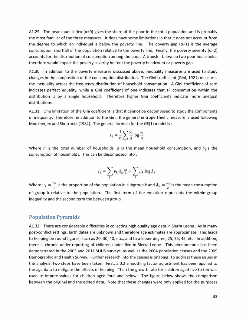
33
A1.29 The headcount index (α=0) gives the share of the poor in the total population and is probably
the most familiar of the three measures. It does have some limitations in that it does not account from
the degree to which an individual is below the poverty line. The poverty gap (α=1) is the average
consumption shortfall of the population relative to the poverty line. Finally, the poverty severity (α=2)
accounts for the distribution of consumption among the poor. A transfer between two poor households
therefore would impact the poverty severity but not the poverty headcount or poverty gap.
A1.30 In addition to the poverty measures discussed above, inequality measures are used to study
changes in the composition of the consumption distribution. The Gini coefficient (Gini, 1921) measures
the inequality across the frequency distribution of household consumption. A Gini coefficient of zero
indicates perfect equality, while a Gini coefficient of one indicates that all consumption within the
distribution is by a single household. Therefore higher Gini coefficients indicate more unequal
distributions.
A1.31 One limitation of the Gini coefficient is that it cannot be decomposed to study the components
of inequality. Therefore, in addition to the Gini, the general entropy Theil L measure is used following
Mookherjee and Shorrocks (1982). The general formula for the GE(1) model is :
Where n is the total number of households, μ is the mean household consumption, and is the
consumption of household i. This can be decomposed into :
Where
is the proportion of the population in subgroup k and
is the mean consumption
of group k relative to the population. The first term of the equation represents the within-group
inequality and the second term the between group.
Population Pyramids
A1.32 There are considerable difficulties in collecting high quality age data in Sierra Leone. As in many
post-conflict settings, birth dates are unknown and therefore age estimates are approximate. This leads
to heaping on round figures, such as 20, 30, 40, etc., and to a lesser degree, 25, 35, 45, etc. In addition,
there is chronic under-reporting of children under five in Sierra Leone. This phenomenon has been
demonstrated in the 2003 and 2011 SLIHS surveys, as well as the 2004 population census and the 2009
Demographic and Health Survey. Further research into the causes is ongoing. To address these issues in
the analysis, two steps have been taken. First, a 0.2 smoothing factor adjustment has been applied to
the age data to mitigate the effects of heaping. Then the growth rate for children aged five to ten was
used to impute values for children aged four and below. The figure below shows the comparison
between the original and the edited data. Note that these changes were only applied for the purposes
34
of the construction of the age pyramid. Ages and weights for individual data were left unaltered in the
remainder of the analysis.
Raw 2011 SLIHS age data With Smoothing / Imputation of Under-5 Population
References
Bloom, D. E., Canning, D., & Sevilla, J. (2003). The demographic dividend: A new perspective on the
economic consequences of population change (Vol. 5, No. 1274). Rand Corporation.
Gini, Corrado (1921). Measurement of Inequality of Incomes. The Economic Journal (Blackwell
Publishing) 31 (121): 124–126. doi:10.2307/2223319.
Foster, J., Greer, E., and Thorbecke, E. (1984). A class of decomposable poverty measures.
Econometrica, 52 (3): 761-766.
Mistiaen, J., and Ravallion, M. (2003). Survey compliance and the distribution of income. World Bank
policy research working paper 2956.
Mookherjee, D., and Shorrocks, A. (1982). A decomposition analysis of the trend in UK income
inequality. The Economic Journal, 92(368), 886-902.
Ravallion, M. (1998). Poverty lines in theory and practice, World Bank Publications, 133.
United Nations, Department of Economic and Social Affairs, Population Division (2012). World
Urbanization Prospects: The 2011 Revision, CD-ROM Edition.
World Bank (2012). World Development Indicators. Retrieved from http://data.worldbank.org/indicator
on June 11, 2013.
Under 5
5 to 9
10 to 14
15 to 19
20 to 24
25 to 29
30 to 34
35 to 39
40 to 44
45 to 49
50 to 54
55 to 59
60 to 64
65 to 69
70 to 74
75 to 79
80 to 84
85 to 89
90+
10 9 8 7 6 5 4 3 2 1 0 1 2 3 4 5 6 7 8 9 10 % of Population of Sierra Leone 2011
Males Females
Under 5
5 to 9
10 to 14
15 to 19
20 to 24
25 to 29
30 to 34
35 to 39
40 to 44
45 to 49
50 to 54
55 to 59
60 to 64
65 to 69
70 to 74
75 to 79
80 to 84
85 to 89
90+
10 9 8 7 6 5 4 3 2 1 0 1 2 3 4 5 6 7 8 9 10 % of Population of Sierra Leone 2003
Males Females
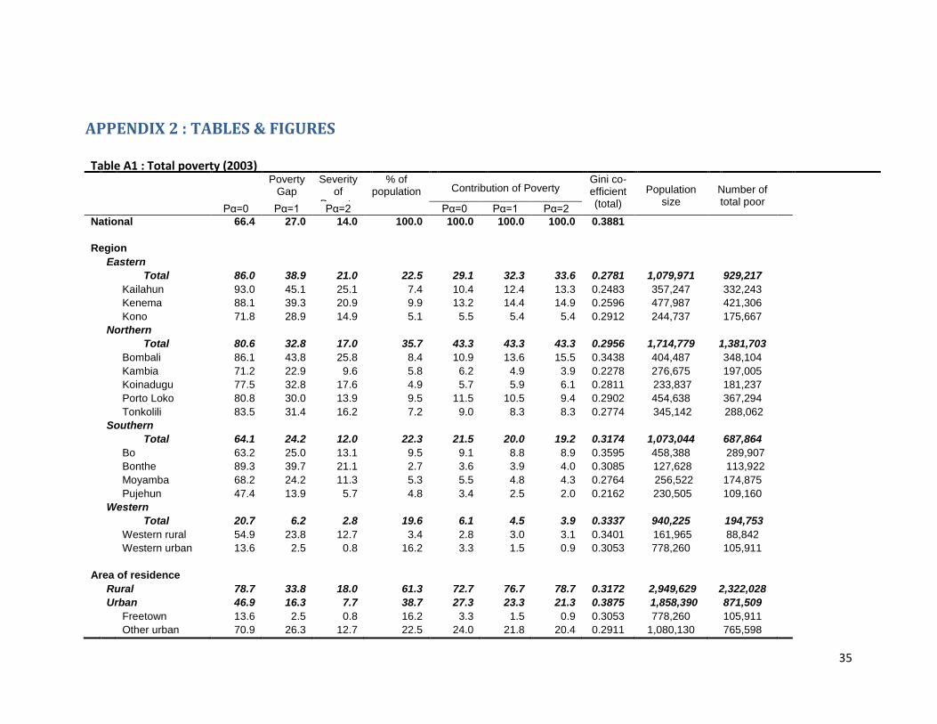
35
Table A1 : Total poverty (2003)
Poverty
Gap Severity
of Poverty
% of population Contribution of Poverty
Gini co-efficient (total)
Population size
Number of total poor
Pα=0 Pα=1 Pα=2 Pα=0 Pα=1 Pα=2
National 66.4 27.0 14.0 100.0 100.0 100.0 100.0 0.3881 4,808,019
3,193,537
Region
Eastern
Total 86.0 38.9 21.0 22.5 29.1 32.3 33.6 0.2781 1,079,971 929,217
Kailahun 93.0 45.1 25.1 7.4 10.4 12.4 13.3 0.2483 357,247 332,243
Kenema 88.1 39.3 20.9 9.9 13.2 14.4 14.9 0.2596 477,987 421,306
Kono 71.8 28.9 14.9 5.1 5.5 5.4 5.4 0.2912 244,737 175,667
Northern
Total 80.6 32.8 17.0 35.7 43.3 43.3 43.3 0.2956 1,714,779 1,381,703
Bombali 86.1 43.8 25.8 8.4 10.9 13.6 15.5 0.3438 404,487 348,104
Kambia 71.2 22.9 9.6 5.8 6.2 4.9 3.9 0.2278 276,675 197,005
Koinadugu 77.5 32.8 17.6 4.9 5.7 5.9 6.1 0.2811 233,837 181,237
Porto Loko 80.8 30.0 13.9 9.5 11.5 10.5 9.4 0.2902 454,638 367,294
Tonkolili 83.5 31.4 16.2 7.2 9.0 8.3 8.3 0.2774 345,142 288,062
Southern
Total 64.1 24.2 12.0 22.3 21.5 20.0 19.2 0.3174 1,073,044 687,864
Bo 63.2 25.0 13.1 9.5 9.1 8.8 8.9 0.3595 458,388 289,907
Bonthe 89.3 39.7 21.1 2.7 3.6 3.9 4.0 0.3085 127,628 113,922
Moyamba 68.2 24.2 11.3 5.3 5.5 4.8 4.3 0.2764 256,522 174,875
Pujehun 47.4 13.9 5.7 4.8 3.4 2.5 2.0 0.2162 230,505 109,160
Western
Total 20.7 6.2 2.8 19.6 6.1 4.5 3.9 0.3337 940,225 194,753
Western rural 54.9 23.8 12.7 3.4 2.8 3.0 3.1 0.3401 161,965 88,842
Western urban 13.6 2.5 0.8 16.2 3.3 1.5 0.9 0.3053 778,260 105,911
Area of residence
Rural 78.7 33.8 18.0 61.3 72.7 76.7 78.7 0.3172 2,949,629 2,322,028
Urban 46.9 16.3 7.7 38.7 27.3 23.3 21.3 0.3875 1,858,390 871,509
Freetown 13.6 2.5 0.8 16.2 3.3 1.5 0.9 0.3053 778,260 105,911
Other urban 70.9 26.3 12.7 22.5 24.0 21.8 20.4 0.2911 1,080,130 765,598
APPENDIX 2 : TABLES & FIGURES
36
Table A2 : Total poverty (2011)
Poverty
Gap
Severity of
Poverty % of
population Contribution of Poverty Gini co-efficient (total)
Population size
Number of total poor Pα=0 Pα=1 Pα=2 Pα=0 Pα=1 Pα=2
National 52.9 16.1 6.7 100.0 100.0 100.0 100.0 0.3207
5,838,160
3,090,961
Region
Eastern
Total 61.3 18.4 7.5 22.5 26.1 25.8 25.2 0.2688 1,315,474 805,987
Kailahun 60.9 16.9 6.5 7.5 8.6 7.9 7.2 0.2467 435,381 264,969
Kenema 61.6 19.3 8.2 10.2 11.9 12.2 12.5 0.2812 596,081 366,964
Kono 61.3 19.0 7.7 4.9 5.6 5.7 5.5 0.2737 284,013 174,054
Northern
Total 61.0 18.9 8.1 34.1 39.3 40.0 41.0 0.3063 1,989,626 1,213,215
Bombali 57.9 22.7 11.7 7.8 8.5 11.0 13.6 0.4157 456,125 263,887
Kambia 53.9 13.6 4.6 5.3 5.4 4.5 3.7 0.2340 311,454 167,774
Koinadugu 54.3 14.5 5.0 5.2 5.3 4.7 3.9 0.2787 304,140 165,151
Porto Loko 59.9 21.0 10.0 8.8 10.0 11.5 13.1 0.2926 515,312 308,927
Tonkolili 76.4 19.1 6.5 6.9 9.9 8.2 6.6 0.2057 402,595 307,476
Southern
Total 55.4 17.4 7.4 22.7 23.7 24.5 24.9 0.3409 1,001,299 554,764
Bo 50.7 16.1 6.7 10.4 9.9 10.4 10.4 0.3311 459,037 232,640
Bonthe 51.4 12.9 4.4 2.7 2.6 2.1 1.8 0.2958 119,668 61,557
Moyamba 70.8 22.4 10.1 4.3 5.8 6.0 6.5 0.2527 190,575 134,868
Pujehun 54.1 17.9 7.9 5.3 5.4 5.9 6.2 0.4041 232,019 125,543
Western
Total 28.0 7.5 2.9 20.7 11.0 9.7 9.0 0.2953 1,209,594 338,502
Western rural 57.1 18.2 7.2 4.1 4.5 4.7 4.4 0.2796 241,103 137,778
Western urban 20.7 4.9 1.8 16.6 6.5 5.0 4.6 0.2744 968,491 200,725
Area of residence
Rural 66.1 21.1 9.1 62.3 77.7 81.9 84.3 0.2891
3,636,011 2,403,048
Urban 31.2 7.7 2.8 37.7 22.3 18.1 15.7 0.3007 2,202,148 687,913
Freetown 20.7 4.9 1.8 16.6 6.5 5.0 4.6 0.2744 968,491 200,725
Other urban 39.5 10.0 3.5 21.1 15.8 13.1 11.1 0.3067 1,233,657 487,189
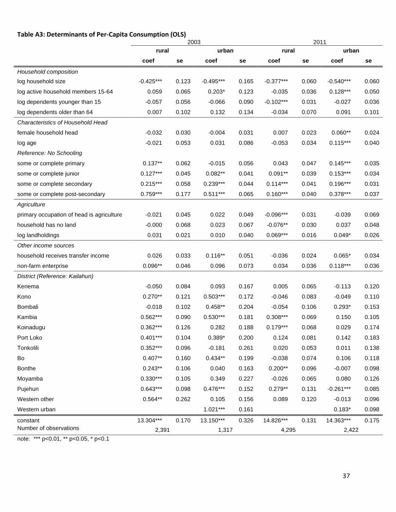
37
Table A3: Determinants of Per-Capita Consumption (OLS)
2003 2011
rural urban rural urban
coef se coef se coef se coef se
Household composition
log household size -0.425*** 0.123 -0.495*** 0.165 -0.377*** 0.060 -0.540*** 0.060
log active household members 15-64 0.059 0.065 0.203* 0.123 -0.035 0.036 0.128*** 0.050
log dependents younger than 15 -0.057 0.056 -0.066 0.090 -0.102*** 0.031 -0.027 0.036
log dependents older than 64 0.007 0.102 0.132 0.134 -0.034 0.070 0.091 0.101
Characteristics of Household Head
female household head -0.032 0.030 -0.004 0.031 0.007 0.023 0.060** 0.024
log age -0.021 0.053 0.031 0.086 -0.053 0.034 0.115*** 0.040
Reference: No Schooling
some or complete primary 0.137** 0.062 -0.015 0.056 0.043 0.047 0.145*** 0.035
some or complete junior 0.127*** 0.045 0.082** 0.041 0.091** 0.039 0.153*** 0.034
some or complete secondary 0.215*** 0.058 0.239*** 0.044 0.114*** 0.041 0.196*** 0.031
some or complete post-secondary 0.759*** 0.177 0.511*** 0.065 0.160*** 0.040 0.378*** 0.037
Agriculture
primary occupation of head is agriculture -0.021 0.045 0.022 0.049 -0.096*** 0.031 -0.039 0.069
household has no land -0.000 0.068 0.023 0.067 -0.076** 0.030 0.037 0.048
log landholdings 0.031 0.021 0.010 0.040 0.069*** 0.016 0.049* 0.026
Other income sources
household receives transfer income 0.026 0.033 0.116** 0.051 -0.036 0.024 0.065* 0.034
non-farm enterprise 0.096** 0.046 0.096 0.073 0.034 0.036 0.118*** 0.036
District (Reference: Kailahun)
Kenema -0.050 0.084 0.093 0.167 0.005 0.065 -0.113 0.120
Kono 0.270** 0.121 0.503*** 0.172 -0.046 0.083 -0.049 0.110
Bombali -0.018 0.102 0.458** 0.204 -0.054 0.106 0.293* 0.153
Kambia 0.562*** 0.090 0.530*** 0.181 0.308*** 0.069 0.150 0.105
Koinadugu 0.362*** 0.126 0.282 0.188 0.179*** 0.068 0.029 0.174
Port Loko 0.401*** 0.104 0.389* 0.200 0.124 0.081 0.142 0.183
Tonkolili 0.352*** 0.096 -0.181 0.261 0.020 0.053 0.011 0.138
Bo 0.407** 0.160 0.434** 0.199 -0.038 0.074 0.106 0.118
Bonthe 0.243** 0.106 0.040 0.163 0.200** 0.096 -0.007 0.098
Moyamba 0.330*** 0.105 0.349 0.227 -0.026 0.065 0.080 0.126
Pujehun 0.643*** 0.098 0.476*** 0.152 0.279** 0.131 -0.261*** 0.085
Western other 0.564** 0.262 0.105 0.156 0.089 0.120 -0.013 0.096
Western urban 1.021*** 0.161 0.183* 0.098
constant 13.304*** 0.170 13.150*** 0.326 14.826*** 0.131 14.363*** 0.175
Number of observations 2,391 1,317 4,295 2,422
note: *** p<0.01, ** p<0.05, * p<0.1
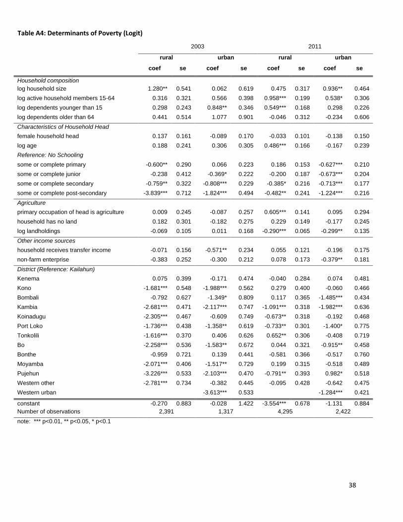
38
2003 2011
rural urban rural urban
coef se coef se coef se coef se
Household composition
log household size 1.280** 0.541 0.062 0.619 0.475 0.317 0.936** 0.464
log active household members 15-64 0.316 0.321 0.566 0.398 0.958*** 0.199 0.538* 0.306
log dependents younger than 15 0.298 0.243 0.848** 0.346 0.549*** 0.168 0.298 0.226
log dependents older than 64 0.441 0.514 1.077 0.901 -0.046 0.312 -0.234 0.606
Characteristics of Household Head
female household head 0.137 0.161 -0.089 0.170 -0.033 0.101 -0.138 0.150
log age 0.188 0.241 0.306 0.305 0.486*** 0.166 -0.167 0.239
Reference: No Schooling
some or complete primary -0.600** 0.290 0.066 0.223 0.186 0.153 -0.627*** 0.210
some or complete junior -0.238 0.412 -0.369* 0.222 -0.200 0.187 -0.673*** 0.204
some or complete secondary -0.759** 0.322 -0.808*** 0.229 -0.385* 0.216 -0.713*** 0.177
some or complete post-secondary -3.839*** 0.712 -1.824*** 0.494 -0.482** 0.241 -1.224*** 0.216
Agriculture
primary occupation of head is agriculture 0.009 0.245 -0.087 0.257 0.605*** 0.141 0.095 0.294
household has no land 0.182 0.301 -0.182 0.275 0.229 0.149 -0.177 0.245
log landholdings -0.069 0.105 0.011 0.168 -0.290*** 0.065 -0.299** 0.135
Other income sources
household receives transfer income -0.071 0.156 -0.571** 0.234 0.055 0.121 -0.196 0.175
non-farm enterprise -0.383 0.252 -0.300 0.212 0.078 0.173 -0.379** 0.181
District (Reference: Kailahun)
Kenema 0.075 0.399 -0.171 0.474 -0.040 0.284 0.074 0.481
Kono -1.681*** 0.548 -1.988*** 0.562 0.279 0.400 -0.060 0.466
Bombali -0.792 0.627 -1.349* 0.809 0.117 0.365 -1.485*** 0.434
Kambia -2.681*** 0.471 -2.117*** 0.747 -1.091*** 0.318 -1.982*** 0.636
Koinadugu -2.305*** 0.467 -0.609 0.749 -0.673** 0.318 -0.192 0.468
Port Loko -1.736*** 0.438 -1.358** 0.619 -0.733** 0.301 -1.400* 0.775
Tonkolili -1.616*** 0.370 0.406 0.626 0.652** 0.306 -0.408 0.719
Bo -2.258*** 0.536 -1.583** 0.672 0.044 0.321 -0.915** 0.458
Bonthe -0.959 0.721 0.139 0.441 -0.581 0.366 -0.517 0.760
Moyamba -2.071*** 0.406 -1.517** 0.729 0.199 0.315 -0.518 0.489
Pujehun -3.226*** 0.533 -2.103*** 0.470 -0.791** 0.393 0.982* 0.518
Western other -2.781*** 0.734 -0.382 0.445 -0.095 0.428 -0.642 0.475
Western urban -3.613*** 0.533 -1.284*** 0.421
constant -0.270 0.883 -0.028 1.422 -3.554*** 0.678 -1.131 0.884
Number of observations 2,391 1,317 4,295 2,422
note: *** p<0.01, ** p<0.05, * p<0.1
Table A4: Determinants of Poverty (Logit)
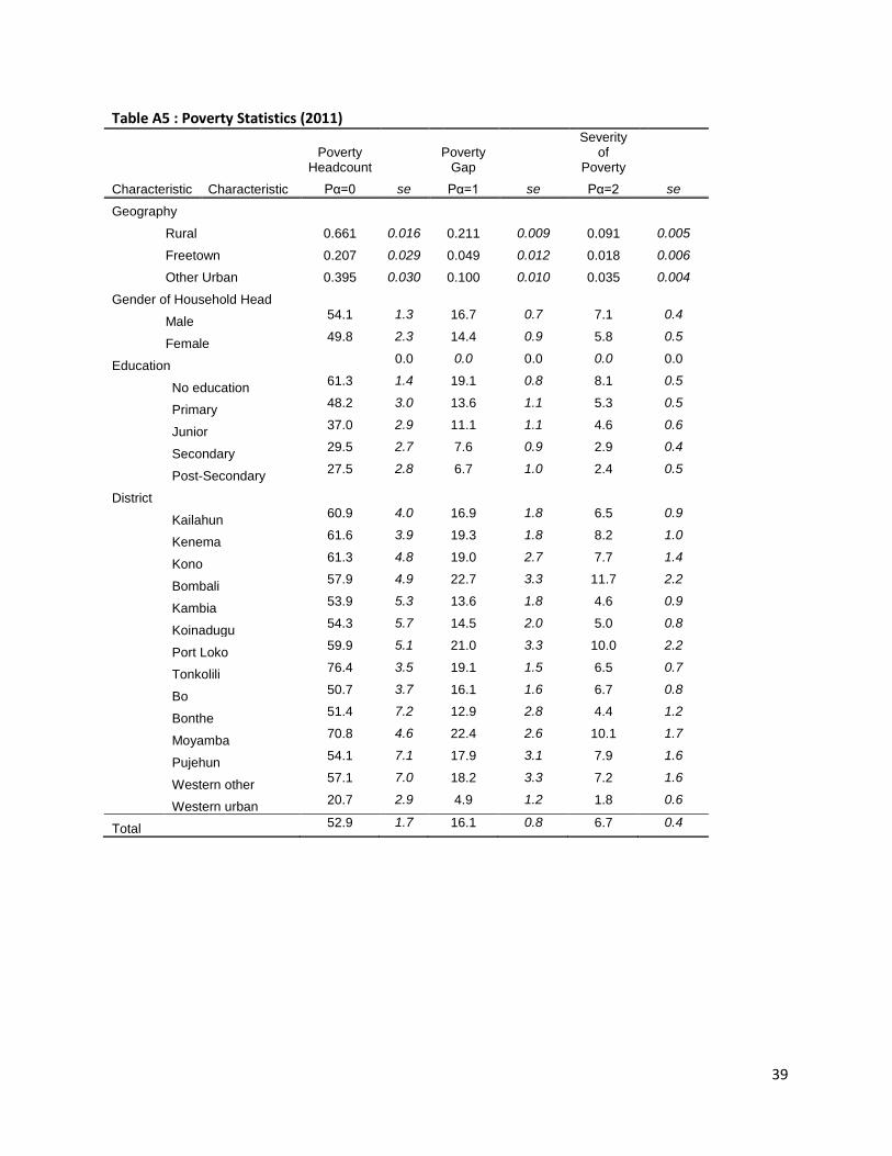
39
Table A5 : Poverty Statistics (2011)
Poverty
Headcount Poverty
Gap
Severity of
Poverty
Characteristic Characteristic Pα=0 se Pα=1 se Pα=2 se
Geography
Rural 0.661 0.016 0.211 0.009 0.091 0.005
Freetown 0.207 0.029 0.049 0.012 0.018 0.006
Other Urban 0.395 0.030 0.100 0.010 0.035 0.004
Gender of Household Head
Male
54.1 1.3 16.7 0.7 7.1 0.4
Female
49.8 2.3 14.4 0.9 5.8 0.5
Education
0.0 0.0 0.0 0.0 0.0
No education
61.3 1.4 19.1 0.8 8.1 0.5
Primary
48.2 3.0 13.6 1.1 5.3 0.5
Junior
37.0 2.9 11.1 1.1 4.6 0.6
Secondary
29.5 2.7 7.6 0.9 2.9 0.4
Post-Secondary
27.5 2.8 6.7 1.0 2.4 0.5
District
Kailahun
60.9 4.0 16.9 1.8 6.5 0.9
Kenema
61.6 3.9 19.3 1.8 8.2 1.0
Kono
61.3 4.8 19.0 2.7 7.7 1.4
Bombali
57.9 4.9 22.7 3.3 11.7 2.2
Kambia
53.9 5.3 13.6 1.8 4.6 0.9
Koinadugu
54.3 5.7 14.5 2.0 5.0 0.8
Port Loko
59.9 5.1 21.0 3.3 10.0 2.2
Tonkolili
76.4 3.5 19.1 1.5 6.5 0.7
Bo
50.7 3.7 16.1 1.6 6.7 0.8
Bonthe
51.4 7.2 12.9 2.8 4.4 1.2
Moyamba
70.8 4.6 22.4 2.6 10.1 1.7
Pujehun
54.1 7.1 17.9 3.1 7.9 1.6
Western other
57.1 7.0 18.2 3.3 7.2 1.6
Western urban 20.7 2.9 4.9 1.2 1.8 0.6
Total 52.9 1.7 16.1 0.8 6.7 0.4
40
Table A6 : Educational Attainment of Household Head by Quintile of Consumption, Gender, and Residence Location
no education primary school junior school secondary school post-secondary total
quintile
mean se mean se mean se mean se mean se
1 81.1 1.6 6.4 0.8 5.9 0.8 3.8 0.7 2.8 0.6 100
2 76.7 1.5 8.7 1.0 5.1 0.7 4.5 0.7 5.0 0.9 100
3 68.6 1.8 8.4 1.0 8.1 1.0 7.6 0.8 7.4 0.9 100
4 59.5 2.1 7.9 1.0 11.5 1.2 11.6 1.0 9.4 1.1 100
5 41.2 1.9 10.8 1.2 12.7 1.3 16.1 1.2 19.1 1.6 100
gender of household head
male 64.9 1.0 8.6 0.6 8.8 0.6 9.2 0.5 8.6 0.5 100
female 75.3 1.5 7.4 0.9 6.6 0.8 4.7 0.7 6.0 1.0 100
residence location
Rural 82.6 1.0 6.8 0.6 4.6 0.4 3.1 0.3 2.9 0.3 100
Freetown 33.5 2.3 9.1 1.2 16.6 1.5 23.0 1.5 17.8 1.6 100
Other urban 50.3 2.6 11.8 1.3 12.5 1.4 10.7 1.1 14.7 1.5 100
Total 67.6 0.9 8.3 0.5 8.2 0.5 8.0 0.4 7.9 0.5 100
41
A7 : Access to Public Services and Residence Location
0-14 minutes 15-29 minutes 30-44 minutes 45-59 minutes 60-179 minutes Over 180 minutes total
mean se mean se mean se mean se mean se mean se
Supply of Drinking Water
Rural 65.8 0.9 20.8 0.8 8.4 0.6 2.9 0.3 1.6 0.2 0.5 0.1 100.0
Freetown 68.4 1.8 21.2 1.5 5.1 0.9 1.5 0.5 3.8 0.7 0.1 0.1 100.0
Other urban 76.0 1.5 17.1 1.3 5.1 0.7 1.4 0.4 0.4 0.2 -- -- 100.0
Nearest Food Market
Rural 20.6 0.8 12.5 0.6 8.4 0.6 10.5 0.6 23.2 0.8 24.8 0.8 100.0
Freetown 36.5 1.9 38.3 1.8 18.7 1.4 3.7 0.7 2.7 0.6 -- -- 100.0
Other urban 24.2 1.4 31.0 1.7 23.2 1.7 12.0 1.3 7.9 1.0 1.7 0.4 100.0
Primary School
Rural 44.2 0.9 20.8 0.8 16.6 0.7 8.3 0.6 7.2 0.5 2.9 0.3 100.0
Freetown 42.7 1.9 33.7 1.8 20.2 1.5 2.6 0.6 0.9 0.3 0.0 0.0 100.0
Other urban 51.1 1.8 28.0 1.6 16.6 1.4 2.6 0.5 1.5 0.4 0.2 0.2 100.0
Secondary School
Rural 6.5 0.5 9.3 0.6 11.5 0.6 15.4 0.8 29.6 0.9 27.8 0.8 100.0
Freetown 22.8 1.7 33.7 1.8 26.9 1.6 8.9 1.1 6.7 0.9 1.1 0.4 100.0
Other urban 30.1 1.8 27.8 1.6 20.7 1.4 12.0 1.1 5.6 0.7 3.9 0.7 100.0
Hospital
Rural 4.9 0.4 5.1 0.4 7.2 0.5 11.1 0.6 28.0 0.9 43.7 0.9 100.0
Freetown 13.3 1.5 32.5 1.8 29.0 1.7 14.8 1.3 8.6 1.0 1.8 0.5 100.0
Other urban 10.4 0.9 24.6 1.5 25.7 1.7 17.0 1.4 13.2 1.1 9.1 1.0 100.0
Health Clinic
Rural 17.7 0.7 13.6 0.7 16.6 0.7 16.6 0.7 21.8 0.8 13.8 0.6 100.0
Freetown 24.6 1.8 36.2 1.8 30.5 1.7 6.4 0.8 1.8 0.5 0.4 0.3 100.0
Other urban 28.2 1.7 31.6 1.7 25.6 1.6 10.5 1.0 3.9 0.6 0.1 0.1 100.0
42
Figure A2 : Growth Incidence Curves (2003-2011)
Source: Calculations based on SLIHS (2003 and 2011)
-50
51
0
0 20 40 60 80 100Percentiles
Total
-50
51
0
0 20 40 60 80 100Percentiles
Rural-6
-4-2
02
0 20 40 60 80 100Percentiles
Freetown
46
81
01
21
4
0 20 40 60 80 100Percentiles
Other Urban
95% confidence bounds Growth rate
Growth rate in mean Growth rate at median
43
Figure A3 : School Attendance by Age, 2003
Source: Calculations based on SLIHS (2003)
100 90 80 70 60 50 40 30 20 10 0 10 20 30 40 50 60 70 80 90 100% attending
2019181716151413121110
9
876
Ag
eOverall
Primary Junior
Secondary Post-Secondary
Boys Girls
100 90 80 70 60 50 40 30 20 10 0 10 20 30 40 50 60 70 80 90 100% attending
2019181716151413121110
9
876
Ag
e
Boys vs Girls
Primary Junior
Secondary Post - Secondary
Urban Rural
100 90 80 70 60 50 40 30 20 10 0 10 20 30 40 50 60 70 80 90 100% attending
20191817161514131211
109876
Ag
e
Urban vs Rural
Primary Junior
Secondary Post-Secondary
Wealthiest Poorest
100 90 80 70 60 50 40 30 20 10 0 10 20 30 40 50 60 70 80 90 100% attending
20191817161514131211
109876
Ag
e
Wealthiest vs Poorest Quantile of Consumption
Primary Junior
Secondary Post-Secondary
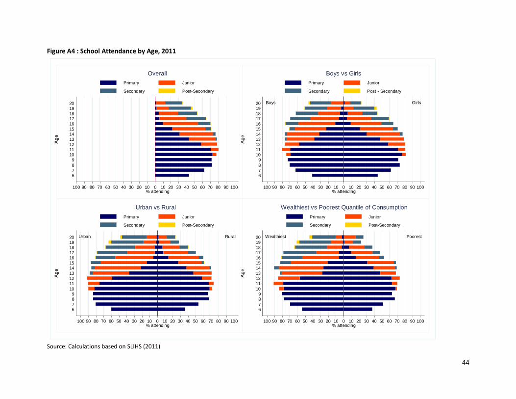
44
Figure A4 : School Attendance by Age, 2011
Source: Calculations based on SLIHS (2011)
100 90 80 70 60 50 40 30 20 10 0 10 20 30 40 50 60 70 80 90 100% attending
2019181716151413121110
9
876
Ag
e
Overall
Primary Junior
Secondary Post-Secondary
Boys Girls
100 90 80 70 60 50 40 30 20 10 0 10 20 30 40 50 60 70 80 90 100% attending
2019181716151413121110
9
876
Ag
e
Boys vs Girls
Primary Junior
Secondary Post - Secondary
Urban Rural
100 90 80 70 60 50 40 30 20 10 0 10 20 30 40 50 60 70 80 90 100% attending
20191817161514131211
109876
Ag
e
Urban vs Rural
Primary Junior
Secondary Post-Secondary
Wealthiest Poorest
100 90 80 70 60 50 40 30 20 10 0 10 20 30 40 50 60 70 80 90 100% attending
20191817161514131211
109876
Ag
e
Wealthiest vs Poorest Quantile of Consumption
Primary Junior
Secondary Post-Secondary

45