
A Large-Scale Statistical Survey of Environmental Metagenomes
100
A Large-Scale Statistical Survey of Environmental Metagenomes Naneh Apkarian * Michelle Creek † Eric Guan ‡ Mayra Hernandez § Kate Isaacs ¶ Chris Peterson * Todd Regh k August 14, 2009 Abstract A metagenome is a sampling of genetic sequences from the entire microbial community within an environment. Examining the func- tional diversity represented by these sequences gives insight into the biological processes within the environment as well as the biological differences between environments. Most research has focused on sin- gle specific environments and the few comparative analyses have been based only on small fractions of the metagenomic data which is cur- rently available. Dinsdale et al used canonical discriminant analysis to investigate 45 microbial metagenomes in Functional metagenomic profiling of nine biomes, Nature, 452, (2008), 629-632. We expand on this work by applying a wider variety of multivariate statistic and ma- chine learning techniques to study over 200 metagenomes from various human, marine, terrestrial, and extreme environments. Our findings demonstrate the ability to differentiate or predict environments with only a subset of key functional hierarchies. * Pomona College † Chapman University ‡ Torrey Pines HS § San Diego State University ¶ San Jos´ e State University k Southern Oregon University 1
Transcript of A Large-Scale Statistical Survey of Environmental Metagenomes

A Large-Scale Statistical Survey ofEnvironmental Metagenomes
Naneh Apkarian∗ Michelle Creek† Eric Guan‡
Mayra Hernandez§ Kate Isaacs¶ Chris Peterson∗
Todd Regh‖
August 14, 2009
Abstract
A metagenome is a sampling of genetic sequences from the entiremicrobial community within an environment. Examining the func-tional diversity represented by these sequences gives insight into thebiological processes within the environment as well as the biologicaldifferences between environments. Most research has focused on sin-gle specific environments and the few comparative analyses have beenbased only on small fractions of the metagenomic data which is cur-rently available. Dinsdale et al used canonical discriminant analysisto investigate 45 microbial metagenomes in Functional metagenomicprofiling of nine biomes, Nature, 452, (2008), 629-632. We expand onthis work by applying a wider variety of multivariate statistic and ma-chine learning techniques to study over 200 metagenomes from varioushuman, marine, terrestrial, and extreme environments. Our findingsdemonstrate the ability to differentiate or predict environments withonly a subset of key functional hierarchies.
∗Pomona College†Chapman University‡Torrey Pines HS§San Diego State University¶San Jose State University‖Southern Oregon University
1

Contents
1 Introduction 4
2 Data 5
3 Principal Component Analysis 73.1 Visualization . . . . . . . . . . . . . . . . . . . . . . . . . . . 73.2 Samples . . . . . . . . . . . . . . . . . . . . . . . . . . . . . . 93.3 Scaling and Centering . . . . . . . . . . . . . . . . . . . . . . 93.4 Variables . . . . . . . . . . . . . . . . . . . . . . . . . . . . . . 12
4 K-Means Clustering 154.1 Methods for K Selection . . . . . . . . . . . . . . . . . . . . . 15
4.1.1 Sum of Squares Plot . . . . . . . . . . . . . . . . . . . 154.1.2 Silhouettes . . . . . . . . . . . . . . . . . . . . . . . . . 17
4.2 Applications to Metagenomic Data . . . . . . . . . . . . . . . 18
5 Linear Discriminant Analysis 235.1 Linear Discriminant Analysis on Metagenomes . . . . . . . . . 25
5.1.1 Cross-Validation . . . . . . . . . . . . . . . . . . . . . 255.1.2 Subsampling . . . . . . . . . . . . . . . . . . . . . . . . 265.1.3 2-Dimensional Plots using Linear Discriminants . . . . 28
6 Trees 316.1 An Introduction to Trees . . . . . . . . . . . . . . . . . . . . . 316.2 Coastal Marine Samples by Geographic Zone . . . . . . . . . . 326.3 Pruning and Cross-Validation . . . . . . . . . . . . . . . . . . 356.4 Applications to Metagenomics . . . . . . . . . . . . . . . . . . 376.5 A Tree Analysis of Various Microbial Metagenomes . . . . . . 39
7 Random Forests 427.1 Supervised Random Forest . . . . . . . . . . . . . . . . . . . . 427.2 Unsupervised Random Forest . . . . . . . . . . . . . . . . . . 487.3 Partitioning Around Medoids (PAM) . . . . . . . . . . . . . . 487.4 Applications to Organism-Associated and Mat-Forming Metagenomes 497.5 Summary . . . . . . . . . . . . . . . . . . . . . . . . . . . . . 55
2

8 Canonical Discriminant Analysis 578.1 How it Works . . . . . . . . . . . . . . . . . . . . . . . . . . . 578.2 Visualization . . . . . . . . . . . . . . . . . . . . . . . . . . . 598.3 Prediction and Error Estimation . . . . . . . . . . . . . . . . . 618.4 Considerations . . . . . . . . . . . . . . . . . . . . . . . . . . 648.5 Conclusion . . . . . . . . . . . . . . . . . . . . . . . . . . . . . 65
9 Example 679.1 Motivation . . . . . . . . . . . . . . . . . . . . . . . . . . . . . 679.2 PCA . . . . . . . . . . . . . . . . . . . . . . . . . . . . . . . . 689.3 K-means . . . . . . . . . . . . . . . . . . . . . . . . . . . . . . 709.4 LDA . . . . . . . . . . . . . . . . . . . . . . . . . . . . . . . . 719.5 Trees . . . . . . . . . . . . . . . . . . . . . . . . . . . . . . . . 759.6 Random Forest . . . . . . . . . . . . . . . . . . . . . . . . . . 759.7 CDA . . . . . . . . . . . . . . . . . . . . . . . . . . . . . . . . 789.8 Strength of Analysis . . . . . . . . . . . . . . . . . . . . . . . 83
A Appendix: R Code 84A.1 Utilities . . . . . . . . . . . . . . . . . . . . . . . . . . . . . . 84A.2 Principal Component Analysis . . . . . . . . . . . . . . . . . . 86A.3 K-Means . . . . . . . . . . . . . . . . . . . . . . . . . . . . . . 87A.4 Linear Discriminant Analysis . . . . . . . . . . . . . . . . . . 88A.5 Trees . . . . . . . . . . . . . . . . . . . . . . . . . . . . . . . . 89A.6 Random Forests . . . . . . . . . . . . . . . . . . . . . . . . . . 92A.7 Canonical Discriminant Analysis . . . . . . . . . . . . . . . . . 92A.8 Packages Used . . . . . . . . . . . . . . . . . . . . . . . . . . . 95
3

1 Introduction
Vast communities of microbes occupy every environment, processing and pro-ducing substances at the molecular level which shape the local geochemistry.Study of the functional families of microbial proteins reveal these processes.Recent studies have shown the viability and reliability of functional metage-nomic analysis in describing and identifying environmental microbial andviral samples [9, 32, 27, 28, 33]. Metagenomic analysis has been shown tofar surpass 16s marker methods in explaining variance among and withinenvironmental samples [9].
Technological advances over the last decade have allowed for quick ge-nomic sequencing of microbes as well as larger organisms. However, it is es-timated that less than 1% of microbes can be individually sequenced due todifficulties of culturing them in a controlled laboratory. The field of Metage-nomics instead sequences samples of a community of microbes or virii directlyfrom the environment.
Most of the focus in Metagenomics has been on single environmentssuch as coral atolls[10, 32], cow intestines[4], ocean water[2], and humanexcrement[16, 29](Add more categories and citations). Recently, Dinsdaleet al.[9] demonstrated that analysis of functional diversity in metagenomescan differentiate between multiple environments. We offer an overview ofstatistical techniques that aid in the analysis of multiple metagenomic envi-ronments.
4

2 Data
A protein or DNA chain is recorded as a sequence of letters representing thecomponent amino acids or nucleotides. The matching of two such sequencesagainst each other, letter by letter with possible gaps, is known as an align-ment. The goal of a sequence alignment is maximizing the quality of thematching. Good matches imply homology between two sequences. The qual-ity of the matching is often measured by a scoring function. A simple scoringfunction might add one every time the letters in the same positions matchand subtracting every time they do not. More complex scoring schemes in-clude varying weights depending on the particular letter combinations andlinear gap penalties.
A common alignment task would be searching for significant matchesagainst an entire database of known sequences. Exact algorithms for sequencealignment such as Smith-Waterman[24] are too computationally intensive touse on this scale. Heuristic algorithms such as Basic Local Alignment SearchTool (BLAST)[1] are used instead. BLAST searches the database for likelymatches based on index sequence snippets. It then grows an alignment foreach candidate. The statistical significance of a match is determined basedon the length of the alignment, the size of the existing database, and thescoring function used.
Because metagenome sequence sets include tens of thousands to hunredsof thousands of sequences, search and alignment is still relatively slow evenwith existing heuristic algorithms. As a result, updating metagenomic se-quence alignments after database changes is costly. K-mer alignment per-forms the matching based on only index sequence snippets, forgoing thecalculation of match significance. The full set of available metagenomes canthen be re-aligned after database changes. This removes differences betweenmetagenomes due to differences of their underlying alignment databases.
Publicly available metagenomic sequence sets were acquired from theSEED database[19]. Sequences were aligned and categorized into functionalhierarchies using K-mer alignment[11] with a word length of 10 and a wordcutoff of 2.
Once alignment is completed, annotation is added, providing details aboutthe sequence’s function and structure. Anotation was originally done byhand, but there are now methods which perform this task computationally.With the wealth of genome data being generated and made available, theability to automatically annotate genomic data has become increasingly im-
5

portant.Metagenome sequences uploaded to the SEED database are automatically
annotated with functional information. Curators of the SEED have groupedexisting similar sequences into functional families. When a sequence in ametagenomic sequence set matches the existing database, it is automaticallycategorized with the same functional information as the database sequencesit matched. Even though metagenomes include sequences from previouslyunsequenced and possibly unknown organisms, the homology implied by thealignment enables us to develop a functional profile of the environment. Thefunctional information is what we use throughout this manuscript.
We have removed the functional hierarchies clustering-based subsystemsand experimental subsystems from our data, leaving 27 first level functionalhierarchies. Hierarchy counts were normalized by the total number of nonex-cluded hits to yield percent composition by function.
6

3 Principal Component Analysis
Principal component analysis (PCA) is a statistical technique that uses prin-cipal components as a dimensional reduction tool to preserve variance. Prin-cipal components (PC) are orthonormal linear combinations of the variablesof the data that maximize variance over a specific set of variables. The num-ber of principal components of a dataset is equal to the number of variables,with the first principal component having maximal variance and successiveprincipal components absorbing as much of the remaining variance as possi-ble.
Given an n× q (with n ≥ q) data matrix Y with q× q covariance matrixS, the q × 1 principal components ~v1, ~v2, . . . ~vq are vectors such that
max〈~vi,~vj〉=0,1≤j<i
‖~vi‖=1
‖~vTi S~vi‖ (1)
Using the spectral decomposition theorem, which states that symmetricmatrix S can be decomposed into GBGT , with orthogonal matrix G anddiagonal matrix B, it follows that ~v1, ~v2, . . . ~vq equal the eigenvectors of S.The variance of the ith principal component is equal to its correspondingeigenvalue λi, with λ1 ≥ λ2 ≥ . . . ≥ λq.[15]
All of the variance in the q variables will be transformed into the q prin-cipal components, but an effective PCA will concentrate a large proportionof the variance in the first few principal components (as much as 95% of thevariance in 2 components is not rare). This result minimizes the numberof dimensions needed to sufficiently account for the variance in the entiredataset.
For our metagenomic research, PCA was used to identify clustering withinthe data, to test how various sample groups tended to cluster or spread, toidentify outliers, and to note relations between certain variables with samplesor other variables.
3.1 Visualization
A PCA plot (or biplot), as seen in Figure 1, graphs each metagenome asa point in a 2-dimensional graph transformed over the first two principalcomponents. This can also be done in 3 dimensions over 3 components, or
7

−0.3 −0.2 −0.1 0.0 0.1 0.2
−0.
10−
0.05
0.00
0.05
0.10
PC1
PC
2
●●●
●
●
●
●
●
●
●
Amino.Acids.and.Derivatives
Carbohydrates
Cofactors..Vitamins..Prosthetic.Groups..Pigments
Photosynthesis
Protein.Metabolism
Respiration
Cell.Wall.and.Capsule
●
coralmat communitymicrobiolitewhale
Principal Component AnalysisOrganism Data
Figure 1: This figure shows a PCA plot of the organism-associated data. The variablesare represented as vectors, and each sample is plotted as a point. Distinct clusters emergenaturally in this PCA, as seen in the corals widely dispersed on the left with high pho-tosynthesis and respiration. The mat community and whale fall samples form their owntight clusters on the right, and the microbiolites are loosely grouped in that area. Thisgraph displays over 90% of the variance from the original 27-variable dataset.
8

in higher dimensions with multiple pairwise plots. Data points are usuallycolored based on their metagenomic classification. Vectors representing vari-ables are drawn, with coordinates based on their respective weights in theprincipal components. Due to the nature of the analysis, the amount of vari-ance explained by the first 2 dimensions will depend on the effectiveness ofthe orthonormal combination. A good PCA graph will have the majority ofthe variance contained in the first two principal components.
3.2 Samples
The PCA process is unsupervised, meaning that no classifications of samplesare given to the analysis. This makes PCA less vulnerable to misclassifieddata or forming false divisions in classified data. Sample selection is crucialin PCA. If the number of samples is too large and diverse, the graph is clut-tered with data. If a particular class only has 2 or 3 samples (a commonoccurrence in metagenomic data), the PCA will not be able to make defini-tive conclusions about those classes. Ideally, the samples are fairly similarand are not trivially seperated, but with distinct groups that the PCA candifferentiate between.
Due to the nature of PCA, outliers or outlier classes (most notably coral)skew the maximal-variance principal components and thus the graph as awhole. Conversely, PCA is adept at identifying outliers, partly due to beingunsupervised. These outlier data points are more easily found with an un-scaled PCA (see Section 3.3), and removing them usually improves the PCA(see Figure 2). Identifying and removing outlier data points has played acrucial role in our metagenomic research, as throughout the process severalsamples were found to be misclassified or contaminated.
3.3 Scaling and Centering
Scaling1 is an important technique when performing PCA. Normalizing thevariance for each variable prevents a variable with a high count (e.g. Car-bohydrates) from being considered more important than a variable with alow count (e.g. Dormancy and Sporulation), even though their variances areproportionally the same. Conversely, a variable whose count is high may
1Note that this refers to scaling variables to normalize their variance, not the generalscaling applied to all metagenome samples prior to statistical analysis that normalized thesum of each sample’s variables to 1.
9

−0.05 0.00 0.05
−0.
06−
0.02
0.00
0.02
0.04
0.06
PC1
PC
2
●●
●
●
●
●
●
●
●
●
Amino.Acids.and.Derivatives
Carbohydrates
Cofactors..Vitamins..Prosthetic.Groups..PigmentsPhotosynthesis
Protein.Metabolism
Respiration
Cell.Wall.and.Capsule
Principal Component AnalysisOrganism Data w/o Corals
●
mat communitymicrobiolitewhale
Figure 2: This plot uses the same data and variables as that in Figure 1, except thatall of the coral samples have been removed. The new graph presents a much closer lookat the non-coral samples than the previous graph that were previously obscured by thecorals shifting the original graph.
10

−6 −4 −2 0 2 4 6
−4
−2
02
4
PC1
PC
2 ●●
●
●
●
●
●
●
●Cell.Wall.and.Capsule
DNA.Metabolism
Photosynthesis
Nitrogen.Metabolism
Sulfur.Metabolism
Respiration
Principal Component AnalysisOrganism Data
Scaled
●
coralmat communitymicrobiolitewhale
(a) PCA Scaled
−0.5 −0.4 −0.3 −0.2 −0.1 0.0 0.1 0.2
−0.
050.
000.
05
PC1
PC
2
●●●●
●
●
●
●
●
Cell.Wall.and.CapsuleDNA.Metabolism
Photosynthesis
Nitrogen.MetabolismSulfur.Metabolism
Respiration
Principal Component AnalysisOrganism Data
Unscaled
●
coralmat communitymicrobiolitewhale
(b) PCA Unscaled
Figure 3: These two PCAs are of the same data over the same variables, but (a) hasall of its variables scaled to equal variance and (b) does not. The samples spread well inthe scaled graph, but this spread is only maintained by the coral samples in the unscaledgraph. The scaled graph treats each variable equally, while the unscaled graph revealsPhotosynthesis and Respiration to be the dominating variables. The scaled graph explains79% of the variance, while the unscaled explains 84%.
11

actually be much more significant than a variable whose count is low, andscaling may not demonstrate this. Scaling also decreases the concentrationof the variance in the first couple principal components, which hinders theability of 2 or 3 dimensions to explain the entire dataset. This hinderingeffect is amplified when there are more variables.
The following plots of organism metagenomes demonstrate this scalingissue. Figure 3(a) is the scaled PCA, with an even spread between all ofthe groupings. Figure 3(b) is the unscaled PCA, with a much larger spreadwithin the corals, and the rest of the samples clumped together. In this case,the scaled plot does not demonstrate the extremely high variance internal tothe coral group, but the unscaled plot does not display any sort of spreadbetween the mat community, whale fall, and microbiolite groups.
Centering the metagenomic data such that each variable’s mean is 0 isnecessary, because otherwise every value is positive and this uncentered PCAonly occupies 2 quadrants of the graph. Note that the statistics program Rcenters the PCA by default.
3.4 Variables
Variable choice is very important for PCA. Our metagenomic data has 27different functional classifications as variables, yet very few samples due tothe novel nature of metagenomic research. The number of variables selectedmust be less than the number of samples; otherwise PCA is not possibledue to dimensional limitations. Generally 5 to 10 well-picked variables weresufficient capture the majority of the variance in a dataset.
Selecting a handful of variables with highest variance is the best way toretain a high proportion of the variance in the dimensional reduction, al-though other methods are viable as well. Variables with the highest variancebetween class means aids in separating groups in the PCA. Using variablesfrom supervised Random Forest variable importance plot (see Section 7.1)may be more effective in differentiating between classes. Selecting biologi-cally significant groups of variables to see groupings based on specific traitsmay also prove useful (see Figure 4).
In addition to finding clusters, PCA with specific variables over one well-established group of samples yields properties of the variables in those sam-ples (see Figure 4). The magnitude of the vectors is proportional to thevariance within that particular variable, and the angle between a pair of vec-tors is linked to the correlation between those two variables. If two vectors
12

are pointing in the same direction, they are positively correlated; if they arepointing in opposite directions, they are negatively correlated; if they areorthogonal, they are uncorrelated. This technique decreases in effectivenessas the number of variables and thus the number of dimensions projected intoa single plane increases.
13

−0.05 0.00 0.05
−0.
04−
0.02
0.00
0.02
0.04
PC1
PC
2
●
●
●
●
●
●● ●
Amino.Acids.and.Derivatives
Carbohydrates
Fatty.Acids..Lipids..and.Isoprenoids
Protein.Metabolism
Metabolism.of.Aromatic.CompoundsNitrogen.MetabolismPhosphorus.MetabolismSulfur.Metabolism
Principal Component AnalysisCoral Only
Nutrient Usage
(a) Coral Nutrient Usage
−0.01 0.00 0.01 0.02
−0.
010
−0.
005
0.00
00.
005
0.01
0
PC1
PC
2
●
●●
●
●
●
●
●
Amino.Acids.and.Derivatives
CarbohydratesFatty.Acids..Lipids..and.Isoprenoids
Protein.Metabolism
Metabolism.of.Aromatic.Compounds
Nitrogen.Metabolism
Phosphorus.MetabolismSulfur.Metabolism
Principal Component AnalysisMat Community Only
Nutrient Usage
(b) Mat Community Nutrient Usage
Figure 4: These PCAs over variables associated with nutrient usage are of the coral (a)and mat community (b) metagenomes. In the coral samples, Amino Acids, Carbohydrates,and Protein Metabolism are by far the dominant nutrient-associated variables, as seen inthe vector magnitudes. The mat community samples are much more diverse in termsof nutrient usage, and their vectors are much more even in length and distributed in alldirections.
14

4 K-Means Clustering
K-means clustering is an unsupervised method which aims to classify obser-vations into K groups, for a choice of K. This approach seeks to select Kmeans and partition observations into clusters in order to minimize the sumof squared distances from each observation to the mean of its assigned group.The function that is minimized is called the objective function:
obj(µ1, . . . , µK) =n∑i=1
minµ1,...,µK
∥∥x(i) − µk∥∥2
(2)
where x(i) is an observation and µ1, . . . , µK are the means. The result is Kclusters where each observation belongs to the cluster with the closest mean.
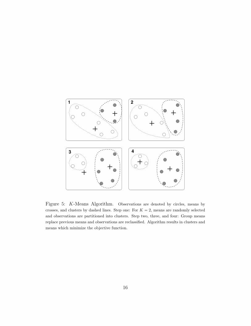
The K-means algorithm starts by randomly selecting µ1, . . . , µK and plac-ing all observations into groups based on minimizing the objective functionusing Euclidean distance. As shown in Figure 5, group means are then calcu-lated using the observations in each cluster and replace the previous means,µ1, . . . , µK . The algorithm is repeated until additional runs no longer modifythe group means or the partitioning of observations. Each initialization ofthe algorithm with multiple runs will converge to a minimum objective func-tion, though not necessarily a global minimum. It is therefore a good ideathat the algorithm is initialized numerous times before selecting the meansand clusters which produce the lowest sum of squares.
4.1 Methods for K Selection
4.1.1 Sum of Squares Plot
Different choices of K will alter the output of the K-means algorithm, soselecting the optimum K is important. A plot of the sum of squares versusvalues of K is one technique that can be used for selection. This method isuseful for minimizing both the sum of squares within each cluster and thevalue of K. The sum of squares decreases as K increases since the largerthe number of groups, the fewer observations are in each group, and thus,the smaller the within-group sums. For this reason, selecting the K with thesmallest sum of squares overfits the data. It is desirable to select a K froma plot that has an ‘elbow’, where there is a steep drop at a specific K fromwhich the plot more gradually approaches zero as shown Figure 8(a). With adistinct elbow, a best K can be selected and useful classification may result.
15
1 2
3 4
Figure 5: K-Means Algorithm. Observations are denoted by circles, means bycrosses, and clusters by dashed lines. Step one: For K = 2, means are randomly selectedand observations are partitioned into clusters. Step two, three, and four: Group meansreplace previous means and observations are reclassified. Algorithm results in clusters andmeans which minimize the objective function.
16

●
●
●
●
●
●●
●●
●
2 4 6 8 10
0.1
0.2
0.3
0.4
0.5
K−MeansS
S
(a) Desirable Sum of Squares Plot. Com-pares the sum of squared distances versusvalues of K. An elbow aids in the mini-mization of both the sum of squares andK. K = 4 has a sharp elbow which indi-cates a best K of 3, using the one-up rule,or 4.
●
●
●
●
●
●
●
●●
● ●● ● ● ●
2 4 6 8 10 12 14 16
0.01
0.02
0.03
0.04
0.05
0.06
K−Means
SS
(b) Undesirable Sum of Squares Plot. Arounded plot does not suggest a good Kto input into the K-means algorithm. Inthis case, alternative methods of K selec-tion should be used.
Figure 6: K-Means Sum of Squares Plots
Depending on the data, the sum of squares plot does not always have a clearelbow (see Figure 6(b)). For metagenomic data, it was not unusual for theplot to appear rounded or have multiple elbows. In this case, alternativeapproaches of selecting K were tested.
4.1.2 Silhouettes
With our metagenomic data, a more effective method of choosing K usedsilhouettes which test how well an observation fits into the cluster it hasbeen partitioned into rather than the next nearest cluster. Silhouettes givea good indication of how spread out groups are from each other. Let a(i) =∥∥x(i) − µk
∥∥2and b(i) =
∥∥x(i) − µl∥∥2
, where x(i) is an observation in groupk and l is the group with the next closest mean [15]. A silhouette is thendefined as
silhouette(i) =b(i)− a(i)
max{a(i), b(i)}. (3)
Ideally, each observation is much closer to the mean of its group than tothe mean of any other group. In this case, the silhouette would be close
17

●
●
●
●
●
●
●●
●
2 4 6 8 10
0.04
0.06
0.08
0.10
0.12
0.14
K−Means Sum of Squares
K
SS
Figure 7: K-Means Sum of Squares Plot. Organism Associated and Coastal Marinemetagenomic data. Slight elbow at K = 5 indicates an optimal K of 4 or 5.
to 1. Figure 8(a) shows silhouette graphs for multiple values of K. Similarto the sum of squares plot, one must be careful about choosing a minimalK which has a large average silhouette width (see Figure 8(b)). Thoughsilhouette graphs frequently suggest a clear K to select, for some data thereis no indication of an optimal K. When neither the sum of squares plot northe silhouette graphs provide a best K, the algorithm then depends on asemi-arbitrary choice of K.
4.2 Applications to Metagenomic Data
K-means is a mathematically supported method of selecting classificationswithout regard to predetermined groupings. It therefore can be used as atool to check assumed classifications or to develop more meaningful ones.With some metagenomic data, K-means identified biologically supportedgroups which could then be used with visualization methods such as PCA (seeFigure 9) and supervised techniques that require initial classifications. Hereis an example with Organism Associated and Coastal Marine metagenomes2.
The sum of squares plot given by the data, shown in Figure 7, has a slightelbow at K = 5. As a general rule, the K one up from the elbow is chosen to
2The Organism Associated data included the following number of samples: 2 fish gut,2 fish slime, 9 mat communities, 3 whale fall, 31 human gut, 4 cow gut, 2 chicken gut, and2 mouse gut. There were 57 samples of Coastal Marine metagenomes.
18

0 40 80
0.0
0.6
Observations
Silh
ouet
tes
K = 2
0 40 80
0.0
0.6
Observations
Silh
ouet
tes
K = 3
0 40 80
0.0
0.6
Observations
Silh
ouet
tes
K = 4
0 40 80
0.0
0.6
Observations
Silh
ouet
tes
K = 5
0 40 80
0.0
0.6
Observations
Silh
ouet
tes
K = 6
0 40 80
0.0
0.6
Observations
Silh
ouet
tes
K = 7
0 40 80
0.0
0.6
Observations
Silh
ouet
tes
K = 8
0 40 80
0.0
0.6
Observations
Silh
ouet
tes
K = 9
0 40 80
0.0
0.6
Observations
Silh
ouet
tes
K = 10
(a) Silhouette Graphs. Organism Asso-ciated and Coastal Marine metagenomicdata. Silhouettes calculate how well eachobservation fits into the cluster it is parti-tioned into versus the group with the nextclosest mean. (In these graphs, silhouettewidth corresponds to height.)
2 4 6 8 10
0.74
0.76
0.78
0.80
Average Silhouette Width
K
Ave
rage
silh
ouet
te w
idth
(b) Average Silhouette Width Plot. OrganismAssociated and Coastal Marine metagenomicdata. Minimizing K while maximizing the av-erage silhouette width suggests 5 or 6 are op-timal values of K. Demonstrates the conver-gence of average silhouette width to one as Kincreases.
Figure 8: K-Means Silhouettes
be the number of clusters. If it happens that the K at the elbow results inbetter classification it can be used instead. According to our sum of squaresplot K = 4 and K = 5 are potential best K’s. To verify this, silhouettes wereused. Silhouette graphs for this data are shown in Figure 8(a). The averagesilhouette width plot in Figure 8(b) shows a high average width for bothK = 5 and K = 6. Because these two values for K are similarly effective andthe sum of squares plot did not have a sharp elbow, the best strategy wouldbe to disregard K = 4 and run the K-means algorithm for both K = 5 andK = 6 to determine which value results in desirable classifications.
Tables 1 and 2 show the resulting clusters for K = 5 and K = 6. Theclusters given by both values of K demonstrate two interesting qualities ofK-means. First, when partitioning observations with an increased numberof groups, clusters with high in-group variance are divided up first. WhenK changed from 5 to 6, the new sixth group was composed of all availablefish associated samples along with two human samples, therefore splitting
19

Cluster NumberEnvironmental Groupings Environment Types 1 2 3 4 5
Fish Gut 2 0 0 0 0Water Organism Associated Fish Slime 2 0 0 0 0
Mat Community 9 0 0 0 0Whale Fall 3 0 0 0 0
Human Gut 1 30 0 0 0Land Organism Associated Mouse Gut 0 2 0 0 0
Chicken Gut 0 2 0 0 0Cow Gut 0 3 1 0 0
Coastal Marine Coastal Marine 1 0 52 2 2
Table 1: K-means Clusters. Organism Associated and Coastal Marine metagenomicdata with K = 5. Clusters appear to agree with environmental groupings. Cluster 1 corre-sponds with Water Organism Associated data, Cluster 2 with Land Organism Associateddata, and Cluster 3, 4, and 5 with Coastal Marine data.
Cluster 1 into two groups. Second, the ability of K-means to detect outlierswas demonstrated. For both values of K, three of the four coastal marinemetagenomes from Botany Bay did not group with the rest of the coastalmarine samples (two of which fall in Cluster 4, one in Cluster 1). Thisindicates variance between these samples and the rest of the coastal marinemetagenomes. In addition, one human sample and one cow sample did notgroup with metagenomes from similar environments for either value of K. Itwould be useful to study these outlying metagenomic samples to understandthe biological reasons they are partitioned into different clusters.
For this example, the K-means algorithm output for K = 5 coincideswith environmental groupings. Cluster 1 corresponds with Water OrganismAssociated data, Cluster 2 with Land Organism Associated data, and Clus-ter 3, 4, and 5 with Coastal Marine data. In this case, the differences inclusters were biologically identifiable in terms of environment. For K = 6,Cluster 1 is divided into two separate groups and another human sample wasmisclassified. Therefore this value of K did not give classifications that wereas desirable. One way to visualize the given results for K = 5 is to graph aPCA with coloring given by K-means clusterings. Despite three misclassifiedsamples, the resulting PCA in Figure 9 shows clear clustering based on en-vironmental groups, hence demonstrating the ability of K-means to identify
20

Cluster NumberEnvironmental Groupings Environment Types 1 2 3 4 5 6
Fish Gut 0 0 0 0 0 2Water Organism Associated Fish Slime 0 0 0 0 0 2
Mat Community 9 0 0 0 0 0Whale Fall 3 0 0 0 0 0
Human Gut 0 29 0 0 0 2Land Organism Associated Mouse Gut 0 2 0 0 0 0
Chicken Gut 0 2 0 0 0 0Cow Gut 0 3 1 0 0 0
Coastal Marine Coastal Marine 1 0 52 2 2 0
Table 2: K-means Clusters. Organism Associated and Coastal Marine metagenomicdata with K = 6. Clusters do not agree with environmental groupings as well as forK = 5. Cluster 1 corresponds with half of the Water Organism Associated data, Cluster2 with Land Organism Associated data, and Cluster 3, 4, and 5 with Coastal Marine, andCluster 6 with the remaining Water Organism Associated data.
groups which are biologically significant. Although K-means produced niceclassifications in this example, even with a clear optimal K, clusters whichare identifiably meaningful in a biological way are not guaranteed.
21

−4 −2 0 2 4
−4
−2
02
4
PCA with K−Means Clustering
PC1
PC
2
●
●
●
●●
●
●
●
●●
●
●
●●
●
●●
●
●
●
●
●
●
●
●
Metabolism.of.Aromatic.Compounds
Phages..Prophages..Transposable.elements
Respiration
Motility.and.Chemotaxis
Photosynthesis
Regulation.and.Cell.signaling
Coastal MarineLand Organism AssociatedWater Organism Associated
● Cluster 1Cluster 2Cluster 3Cluster 4Cluster 5
Figure 9: PCA using K-Means Clustering. Organism Associated and CoastalMarine metagenomic data. Variables selected using Random Forest variable importanceplot (see Section 7.1). Despite a few misclassified samples, this PCA shows clear clus-tering based on environmental groups, demonstrating the ability of K-means to producebiologically significant classifications.
22

5 Linear Discriminant Analysis
For a data set with predetermined groups, linear discriminant analysis(LDA)constructs a classification criterion which can be used for predicting groupmembership of new data. That is, linear discriminant analysis is a supervisedstatistical technique. LDA finds linear combinations of the data’s variablesthat best separate the groups, and using these linear combinations, we definelinear discriminant functions. The linear discriminant functions are hyper-planes cutting through the data space trying to separate the groups.
Let X be a data set with defined groups 1, . . . , n. For each group j,there exists a corresponding conditional distribution
X(i)|G(i) = j ∼ fj. (4)
Furthermore, let πj represent the proportion of X that is contained in groupj. To perform a linear discriminant analysis on X, we must assume that eachfj is normally distributed with an equal covariance matrix, but with possiblydifferent means 3. With this assumption, our conditional distributions for ourgroups become
X(i)|G(i) = j ∼ N(µj,Σj). (5)
Consequently our maximum likelihood estimation becomes [15]
fj(x;µj,Σj) =C
|Σj|1/2e−
12
(x−µj)Σ−1j (x−µj)′ , (6)
where C is the constant that insures fj is a pdf. Expanding (6) yields
fj(x;µj,Σj) =C
|Σj|1/2e(− 1
2xΣ−1
j −12µjΣ−1
j )(x−µj)′
=C
|Σj|1/2e−
12xΣ−1
j x′eµjΣ−1j x′e−
12µjΣ−1
j µ′j .
To classify a given data value x, we seek to maximize
πjfj(x;µj,Σj) = πjC
|Σj|1/2e−
12xΣ−1
j x′eµjΣ−1j x′e−
12µjΣ−1
j µ′j (7)
3Logistic regression is a popular alternative to linear discriminant analysis, and doesnot require these two assumptions about the group conditional distributions. However,statisticians such as Jia Li and Jerome Friedman assert that LDA on a data set that hasgroup distributions not normally distributed and/or lacking equal covariance matrices willhave similar results to a logistic regression.
23

by choosing the appropriate j∈{1,. . .,n}. Note that we assumed each group’sconditional distribution has equal covariance, and consequently Σj = Σk forall j ∈ {1, . . . , n}. So let Σ = Σ1 = · · · = Σn. To find which j maxi-mizes πjfj(x;µj,Σj) for a given x, it suffices to compare πjfj(x;µj,Σ) toπkfk(x;µk,Σ) for all j. Therefore, it is unnecessary to keep the terms sharedby each fj(x;µj,Σ), and consequently we omit them. Hence we seek tomaximize the following instead of (7)
πjeµjΣ−1x′e−
12µjΣ−1µ′j . (8)
We take the natural logarithm of the above equation to obtain our lineardiscriminant functions
gj(x) ≡ log(πj) + µjΣ−1x′ − 1
2µjΣ
−1µ′j. (9)
Note that πj, µj, and Σ are unknown parameters for our groups’ conditionaldistributions, so we estimate them using our sample data X in an intuitivemanner. Suppose X has N data points and group j has nj points contained
in it. Then we estimate πj by πj =nj
N, and µ by µj =
nj∑i=1
xi
nj. Let Sj be the
sample covariance matrix for group j calculated from X. Also, Σj is taken
to be 1/nth of the pooled covariance matrix of X. Consequently, Σj = Σk
for all k ∈ {1, . . . , n}. Therefore, let Σj = Σ for all k ∈ {1, . . . , n}. Withour population parameters estimated from our sample data X, the lineardiscriminant functions from (9) become
gj(x) ≡ log(πj) + µjΣ−1x′ − 1
2µjΣ
−1µ′j. (10)
Note that (10) is a linear equation since log(πj)− 12µjΣ
−1µ′j is a constant.These g′js from (10) are our classifying functions. Since for a point x we
sought to maximize πjfj, our classification criterion is
assign x to group j if gj(x) > gk(x) for all k 6= j.
With the classification criterion, decision boundaries between groups canbe found. The decision boundaries are where the discriminant functionsintersect. That is, the decision boundary between group j and k is
{x : gj(x) = gk(x)} (11)
24

Therefore, the linear discriminant functions split the data space into regions.Each region corresponds to a specific group and the decision boundariesseparate the regions.
5.1 Linear Discriminant Analysis on Metagenomes
Linear discriminant analyses were performed on a broad subset of the metage-nomic data. For example, we looked at the metagenomes from the marineenvironment, hypersaline environment, gut environment, and microorganismenvironment separately. For an LDA on a subset of the metagenomic data,leave one out cross-validation was used to judge the quality of the LDA as aclassifier. To visualize the separation between groups caused by the discrim-inant functions, 2-dimensional plots using linear discriminants[30].
5.1.1 Cross-Validation
To judge how well a given LDA acts as a classifier for new data, a functionin the statistical program R that implemented leave one out cross-validationwas written[31]. Let X be a data set with m data points, and with groups1, . . . , n. For an LDA carried out on X, leave one out cross-validation re-moves one observation, x(i), at a time from X, performs an LDA on thereduced data set, and then uses this new LDA to classify x(i). Since thegroup membership of x(i) is already known, we can check if the quasi-LDAfor X classifies x(i) correctly or not. For every observation in X, the proce-dure of leaving one out, and classifying with a new LDA is performed. Thenumber of misclassifications is found; say we had p misclassifications. Thenthe proportion p
mis an estimate for the probability of the linear discriminant
analysis carried out on X misclassifying a new observation.The leave one out cross-validation uses the assumption that the quasi-
LDA’s of X as classifiers are representative of the LDA of X. For the metage-nomic data, the sizes of our defined groups varied greatly. In particular wehad many groups with small sample sizes which raises the question if leaveone out cross-validation technique is the most appropriate way to judge agiven LDA as a classifier. To illustrate why, suppose we perform a lineardiscriminant analysis on the data set X with defined groups 1, . . . , n. Forgroup j, suppose j = {xj1 , xj2}. During the leave one out cross validation,eventually xj1 will be left out and then classified. However, when xj1 is leftout, our quasi-group j contains only one point xj2 . Then the discriminant
25

function for group j is built using only one point. Consequently if xj1 is notsimilar to xj2 , then it is not surprising that xj1 may be misclassified.
To view the classification results of leave one out cross-validation, a con-fusion matrix was constructed (See Figure 10). For a confusion matrix, therow and column names of the matrix are the group names from the data set.If C is a confusion matrix, then the Cij entry in the matrix represents howmany data points from group i were classified into group j. Therefore thediagonal entries represent correct classifications, and the off-diagonal entriesrefer to misclassifications.
C =
G1 G2 G3 G4 G5 G6
G1 0 0 0 2 0 2G2 0 3 0 1 0 2G3 1 0 2 0 0 0G4 1 0 0 1 1 1G5 0 0 0 0 2 0G6 0 1 0 1 0 2
Figure 10: Example of a confusion matrix. The Cii entry refers to the quan-tity of observations from group i classified into group i. The off diagonalentries refer to a misclassification. The Cij entry represents how many ob-servations from group i were misclassified into group j.
5.1.2 Subsampling
For a meaningful misclassification measure from a leave one out cross-validation,subsampling prior to performing an LDA may be needed. Subsamplingshould be implemented when group sizes have large variation, to reduce oneor more groups’ sizes. Subsampling refers to taking a random subset of a setwith replacement. That is, subsampling k points from a group G is the pro-cess of randomly choosing k samples from group G with replacement. Thisgives k random samples from G, and these k samples are taken to be thenew group G. The motivation for subsampling groups for linear discriminantanalysis is to prevent groups with large sample sizes from dominating theleave one out cross-validation.
Consider the gut sample metagenomes(Table 3). The twin group con-sists of 18 samples, and the human group consists of 13 samples. These
26

two group sizes are significantly larger than the other groups from thisdata set, and therefore, dominate an LDA–in particular the human andtwin groups monopolize the misclassification rate reported from the cross-validation. Two different linear discriminant analyses were run on the gutsample metagenomes; one with subsampling, and one without subsampling(Table 3). The leave one out cross-validation led to differing results depend-ing on whether subsampling was used or not. For an LDA performed on theoriginal groups, the leave one out cross-validation resulted in 27% misclassi-fication rate. For the gut sample metagenomes with subsampled human andtwin groups, the leave one out cross-validation resulted in a 35% misclassifi-cation. Differing conclusions can be drawn from the two linear discriminantanalyses even though the misclassifications rates only differ by 8%.
The human and twin groups account for 31 out of 41 total data samplesfor the gut metagenomes, and 16% of the twin and human samples weremisclassified. The remaining 10 data points, which represent 4 of the 6groups, had a 60% misclassification rate. Since each data sample contributesequally to the misclassification measure, the human and twin groups areoverrepresented in the misclassification measure.For the metagenomic data,near equal contribution to the misclassification measure by each group isdesired. In this instance, it is wise to subsample the human and twin groups,in order for each group to contribute fairly to the misclassification measure.
For the LDA performed on the gut sample metagenomes that were sub-sampled, there was a 35% misclassification rate, as mentioned above. Fromthe confusion matrix (Figure 11(b)), it is evident that the fish samples areclassified correctly, while the mouse samples were both misclassified. Be-sides these comments, it is difficult to take away other conclusions from theconfusion matrix.
Chicken 1 0 0 0 0 1Cow 0 3 0 0 0 1Fish 0 1 0 0 1 0Human 0 1 0 9 2 1Mouse 0 1 0 1 0 0Twin 1 0 0 0 0 17
(a) Original Gut Metagenomes
Chicken 1 0 0 0 0 1Cow 0 3 1 0 0 0Fish 0 0 2 0 0 0Human 0 0 0 3 0 1Mouse 0 0 0 2 0 0Twin 1 0 0 0 0 2
(b) Subsampled Gut Metagenomes
Figure 11: Confusion Matrices for LDA’s Performed on Gut Metagenomes
27

Gut Sample MetagenomesGroup Name Original Sample Size Sample Size After Subsampling
Chicken 2 2Cow 4 4Fish 2 2
Human 13 3Mouse 2 2
Twin Study 18 4
Table 3: Group sample sizes before and after subsampling was performed
5.1.3 2-Dimensional Plots using Linear Discriminants
The linear discriminant functions are functions of 27 variables for the orig-inal metagenome data. Consequently we cannot visualize the discriminantfunctions directly in the data space, and how they separate the groups. Tosee the separation of the groups, a 2-dimensional plot using the linear dis-criminants as axes variables are made in R[31]. Linear discriminants, notto be confused with linear discriminant functions, are linear combinations ofthe variables that best represent the between-class variance[30]. There is aclose relationship between linear discriminants and the linear discriminantfunctions, and therefore, no harm is done in using linear discriminants as ouraxes.
Consider the Organism Associated and Mat-forming Metagenomes (Ta-ble 4). The mat community group consists of samples from microbial mats,the microbiolite group consists of samples taken from sedimentary structuresstructures that are composed of microorganisms, and the slime group con-sists of slime samples taken from fish. Figure 12 shows a 2-D plot usingthe first two linear discriminants from the LDA performed on the organismassociated and mat-forming metagenomes. The mat community and micro-biolites are plotted next to each other, while there is separation between theother groups. Since the first two linear discriminants represent 91% of thebetween-group variance, this plot represents most of the group separationcaused by the LDA. Furthermore, the leave one out cross-validation of theLDA resulted in 5 misclassifications. 3 of the 5 misclassifications were mi-crobiolites misclassifying into the mat community, and 1 of the remaining 2misclasifications was a mat community sample misclassifying into the micro-
28

Organism Associated and Mat-forming MetagenomesGroup Name Sample Size
Coral 6Mat Community 10
Microbiolites 3Slime 2
Table 4: Organism Associated and Mat-forming Metagenomes
biolites. These four misclassifications are reasonable from Figure 12, sincethe mat community and microbiolite groups were plotted next to each other.
29

●●
●●●
●
5 10 15 20 25
−5
05
10
First Linear Discriminant
Se
co
nd
Lin
ea
r D
iscri
min
an
t
● coral
mat community
microbiolite
slime
Organism Associated and Mat Forming Metagenomes
Figure 12: Together, the first two linear discriminants explain 91% of thebetween-class variance. Five misclassifications resulted from leave one outcross-validation: all three microbiolites were misclassified into the mat com-munity, one mat community sample was misclassified as a microbiolite, andone coral sample was misclassified into the mat community.
30

6 Trees
6.1 An Introduction to Trees
A tree analysis generates a branching decision scheme, which graphically re-lates values of a response variable to values of one or more predictor variables.There are two types of trees, classification trees and regression trees. Whenthe dataset is divided into predetermined classes–generally by a discrete-valued response variable–the tree algorithm constructs a classification tree,which uses the predictor variables to distinguish between classes. Whenclasses are not provided, the process constructs a regression tree, which pre-dicts average values of the response variable. At each branching point, treesof each type attempt to minimize the node impurity, or the mixing of differentvalues of the response variable on a single side of a branch. However, the twotypes of trees rely on different measures of impurity. Our analysis will focuson classification trees, outlining the theory, construction, and application ofthese trees as they relate to metagenomic analysis.
Most trees are constructed using a greedy algorithm, which begins at theroot node and proceeds down a series of binary branching decisions untilterminating at the leaves. Although the set of predictor variables and split-ting points chosen by this greedy algorithm may not be globally optimal,the procedure is computationally efficient. At each branch, the algorithmchooses a single predictor variable and a critical value of this variable whichminimizes the impurity of the resulting node. Specifically, most tree algo-rithms use either the Gini criterion, the twoing criterion, the deviance, orthe misclassification rate as methods of measuring and ultimately of limitingnode impurity [3, 14]. Deviance is based on the likelihood of each split, andthe Gini criterion is described in the section on Random Forests 7. Minimiz-ing the deviance or Gini during tree construction and then minimizing themisclassification rate during tree cross-validation is a standard technique [7].As a result of their reliance on binary partitions, trees are invariant undermonotonic transformations of the predictor variables and thus most variablescaling is unnecessary. Good trees balance classification strength againstmodel complexity to maximize prediction strength and minimize over-fitting.Most authors suggest growing a large tree and using a pruning technique toselect the strongest model from a nested series of subtrees of that originaltree [3].
31

Zone Cell Wall Photosynthesis
tropics 0.055789155 0.002531765n.temp 0.054635574 0.00270913n.temp 0.047888534 0.00272034tropics 0.053397667 0.002728348...
......
Table 5: An excerpt from the coastal marine dataset
6.2 Coastal Marine Samples by Geographic Zone
The tree in Figure 13 uses photosynthesis and cell wall hierarchies to clas-sify various coastal marine metagenomes based on the geographic zone inwhich each sample was collected. First, an initial tree containing 7 differentleaves was grown to fit the coastal marine data, an excerpt of which is givenin Table. 5 [22]. Next, this tree was pruned to minimize the 10-fold cross-validation rate over a series of 100 random trials 4. Limiting the data tometagenomes of a single type (marine) from a single environment (coastal),helps eliminate confounding variables, and focuses the analysis on differencesbetween the two geographic zones. Coastal samples from the southern tem-perate zone were excluded because of a lack of sufficient data, and samplesfrom between 23.4◦N and 30◦N were also excluded in order to better dis-tinguish between samples from the two remaining zones, northern temperateand tropical. The resulting tree is effective as a classifier, with an error rateof only 12%, although its error rate as a predictor may be higher. Further-more, the model indicates simple relationships between the predictor andthe response variables: coastal samples from the tropical zone exhibit higherdiversity in photosynthesis and cell wall hierarchies than those collected innorthern temperate zone.
The scatterplot in Figure 14, indicates the correspondence between thesample space and the tree diagram. Each coastal marine data point is la-beled based on the geographic zone in which it was collected, and each axis
4See Section 6.3 for more information on cross-validation procedures. Figure 15 plotsthis misclassification rate for various tree sizes
32

|Cell.Wall.and.Capsule < 0.0504919
Photosynthesis < 0.0039528
Cell.Wall.and.Capsule < 0.0514783
n.temp
n.temp tropics
tropics
Coastal Marine Samples Divided by Geographic Zone
Figure 13: Coastal marine samples from two geographic zones: northern temperate andtropical. The tree plot groups samples using as predictor variables the relative diversity ofthe cell wall hierarchy and of the photosynthesis hierarchy. Labels on each branch indicatethe splitting criteria, and labels on the leaves indicate classifications. For example, sampleswith less than 5.05% of identified genetic material in the cell wall hierarchy are grouped onthe left side of the first branch and are classified as tropical. The plot is both a classificationtool and an indicator of how these functional groups change across geographic zones.
33

●
●
●
●
●
●●
●
●
●
●
●
●
●
●
●
0.045 0.050 0.055
0.00
20.
004
0.00
60.
008
0.01
00.
012
0.01
4Coastal Marine Samples Divided by Geographic Zone
Cell.Wall.and.Capsule
Pho
tosy
nthe
sis
●
n.temptropics
Figure 14: A scatter plot corresponding to the coastal marine data in Figure 13 Thetwo axes correspond to the two functional hierarchies, and data points have been labeledbased on geographic zone. Solid lines within the plot indicate branching in the tree dia-gram, whereas dashed lines indicate branchings in the over-fitted tree, which was originallygrown. All divisions in the sample space are rectangular, later divisions (all those on thebottom right) divide between fewer data points, and the predictive strength of each splitmust be determined through cross-validation.
corresponds to one of the predictor variables, the x-axis to cell wall diversityand the y-axis to photosynthesis diversity. The solid lines drawn inside theplot indicate branchings in the tree diagram. The first branch correspondsto the vertical division separating low and high levels of cell wall diversity,and subsequent branches correspond to the solid lines in the lower right.It is evident from the scatterplot that all divisions in the sample space arerectangular, i.e. that branching only depends on whether a single predictorvariable is greater than or less than a critical value.
The original 7-leaf tree was pruned back after cross-validation, and thescatterplot indicates that the tree was likely overfit. Dashed lines within theplot indicate branches grown in the original tree that were pruned back duringcross-validation. The position of each of these divisions was determined byvery small subsets of the original dataset: only 6 samples were used to fitthe horizontal line on the bottom right. The final branches in a large tree
34

diagram are fit using small subsets of the original data and may not bestatistically significant. As long as data points from separate classes aredistinct, a tree can be grown until it perfectly fits the data set, although inextreme cases this may result in a tree with only one data point per leaf.Cross-validation and pruning techniques help avoid this type over-fitting,and many of the techniques are more straightforward than those availablefor other classification techniques.
6.3 Pruning and Cross-Validation
After a tree has been grown, model selection algorithms can be used to selecta best-fitting subtree. The different model selection techniques balance treesize against classification strength, seeking to minimize the quantity:
λ(treesize)− impurity(Tree). (12)
In Equation 12, λ is a cost complexity parameter, which determines thespecific balance between model size and strength. Depending on the specificmodel selection tool, the term for impurity will be replaced by a specificmeasure such as the misclassification rate or the deviance of the entire tree5.Given a cost complexity parameter, one can select a unique subtree from anested series inside the original tree that minimizes the quantity in Equa-tion 12 [3]. This procedure yields a sequence of subtrees of decreasing size;the length of this sequence is at most the number of leaves in the original tree.The choice of this cost complexity parameter is not clear, but cross-validationcan be used to select a best-fitting tree from this sequence of subtrees.
Many projects in metagenomics already suffer from a lack of sufficientdata, and so cross-validation techniques should attempt to preserve as muchdata as possible in the training set. One of the most efficient techniquesis k-fold cross-validation [3]. In this method, the data set is divided intok randomly selected groups of near equal size. A tree is built using thedata points in only (k − 1) of these subsets, and a sequence of subtrees isconstructed as described in the previous paragraph. Next, this tree and itssubtrees are used to predict the classes of the remaining 1/k data points,
5Total deviance is computed by summing the deviance of each leaf, and this valueshould be distinguished from the single-node deviance used in tree construction.
35
Tree Size Cross Validated Deviance
1 68.997662 67.435643 65.402494 63.749006 63.514687 70.38529
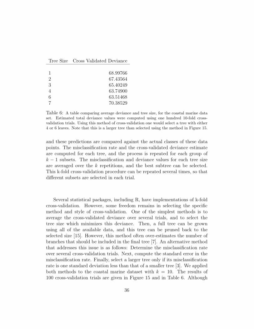
Table 6: A table comparing average deviance and tree size, for the coastal marine dataset. Estimated total deviance values were computed using one hundred 10-fold cross-validation trials. Using this method of cross-validation one would select a tree with either4 or 6 leaves. Note that this is a larger tree than selected using the method in Figure 15.
and these predictions are compared against the actual classes of these datapoints. The misclassification rate and the cross-validated deviance estimateare computed for each tree, and the process is repeated for each group ofk − 1 subsets. The misclassification and deviance values for each tree sizeare averaged over the k repetitions, and the best subtree can be selected.This k-fold cross-validation procedure can be repeated several times, so thatdifferent subsets are selected in each trial.
Several statistical packages, including R, have implementations of k-foldcross-validation. However, some freedom remains in selecting the specificmethod and style of cross-validation. One of the simplest methods is toaverage the cross-validated deviance over several trials, and to select thetree size which minimizes this deviance. Then, a full tree can be grownusing all of the available data, and this tree can be pruned back to theselected size [15]. However, this method often over-estimates the number ofbranches that should be included in the final tree [7]. An alternative methodthat addresses this issue is as follows: Determine the misclassification rateover several cross-validation trials. Next, compute the standard error in themisclassification rate. Finally, select a larger tree only if its misclassificationrate is one standard deviation less than that of a smaller tree [3]. We appliedboth methods to the coastal marine dataset with k = 10. The results of100 cross-validation trials are given in Figure 15 and in Table 6. Although
36

1 2 3 4 5 6 7
1012
1416
1820
Tree Size
Mis
clas
sific
atio
ns
Mean
Mean+1sd
Mean−1sd
Coastal Marine Metagenomes: CV Misclassifications vs Tree Size
Figure 15: A plot of the average number of misclassifications versus sub-tree size, wherethe original 7-leaf tree was grown using the coastal marine dataset. The misclassificationrate is based 100 trials of a 10-fold cross-validation experiment. In contrast to the methodof minimizing cross-validated deviance, this plot suggests that a best-fitting tree onlyinclude one branch, the first branch in Figure 13.
there are many different options for and implementations of these modelselection algorithms, a basic understanding of the procedures will result inreasonable trees well suited for data exploration. Trees constructed usingcross-validation tools are less susceptible to overfitting than many other formsof classification.
6.4 Applications to Metagenomics
Since metagenomic data often includes a large number of variables but onlya small number of samples, variable selection is an important consideration.Unlike other classification methods (such as linear discriminant analysis),trees often select small subsets of the original predictor variables for use inclassification, and so trees can be used as variable selection tools. However,since the set of variables chosen by a tree is not necessarily optimal and sincetrees do not give information on any predictor variables not used in classifi-cation, trees are not ideally suited for variable selection. Other tools, such
37

as the related Random Forests 7, are preferable. If a subset of the predictorvariables is of special biological or statistical interest, a tree analysis can beperformed just on that subset of variables. Selecting variables before growinga tree will decreasing computation time and can also increase the significanceof the final analysis. For example using the Random Forest technique, onecan determine which predictor variables are strong classifiers, and a treecan be grown just using these variables. However, the significance of a treegrown using a preselected variable set can be challenging to calculate, andsuch calculation ultimately depends on the specifics of the variable selectionprocedure.
The standard tree construction scores errors between any pair of groupsin the same way. The tree in Figure 17 includes samples from two differentstudies of human subjects, labeled as twin gut and as human gut. The tree at-tempts to separate these classes of human associated samples just as stronglyas it attempts to separate the human samples from the fish associated sam-ples. It might not be important for a tree to distinguish between these twovery similar classes, whereas a good tree plot should probably distinguishbetween the human samples and metagenomes from deep water marine envi-ronments. In order to account for similarities between classes or to prioritizeseparations between certain classes, one can run the tree analysis using aloss matrix. This matrix includes a scoring system for penalizing misclassi-fications between different groups, and the resulting tree should emphasizeseparations between groups as prioritized in the loss matrix. However, theimplementation of this technique in many statistical programs and the choiceof reasonable scoring weights remain obstacles 6 .
Another consideration when using tree analysis is its frequent instabilitywith respect to changes in the dataset. If even a small number of samplesis discarded from the dataset and a new tree is constructed, this second treemay use a different set of predictor variables than the first, and the two treesmay not be easily compared. This can complicate cross-validation, whichassumes that the misclassification error rate of a tree grown with the entiredataset is approximately equal to that of a tree grown with k − 1/k of thedata set. Instability generally increases as both the size of the dataset de-creases and the number of predictor variables increase, so finding a sufficientnumber of metagenomic samples for the construction of stable trees can be
6The R package rpart [26] allows the specification of a loss matrix whereas the packagetree [22] allows the specification of observational weights.
38

challenging. Variable selection can help decrease instability issues, but at theprice of decreasing the tree’s simplicity and eliminating its use as a variableselection method. Random Forest techniques address problems of both vari-able selection and instability while eliminating the need for cross-validation.However, Random Forests often lack the the simplicity which makes trees anattractive analytical option.
6.5 A Tree Analysis of Various Microbial Metagenomes
This final subsection presents a brief overview of the tree construction proce-dure as applied to a simple dataset consisting of metagenomic samples of fivedifferent classes. An overlarge tree is first grown, and the results of 10-foldcross-validation experiments are presented in Table 7 and in Figure 16. Sincea 7-leaf tree was the largest tree which could be grown using this dataset,the misclassification plot in Figure 16 terminates before sloping upwards forhigher values of tree size. The lowest value of average cross-validated devianceis attained with a 6-leaf tree. However, the misclassification method suggestsa choice between the 3-leaf tree and the 5-leaf tree, which has an error rateclose to one standard deviation less than the 3-leaf tree. The smaller treeseparates between human and twin samples, and groups all other samples onthe other side of the tree. This grouping results from sample size issues–thehuman and twin studies were larger than the other studies–and could be al-tered using a loss matrix. The 5-leaf tree is given below in Figure 17. Thistree groups twins and humans on the same side of the tree, it distinguishesbetween samples from each of the five different classes, and it indicates theimportance of the respiration hierarchy in distinguishing between terrestrialassociated human gut samples and the remaining sample types. A moredetailed exploration will require a larger dataset and additional statisticaltools.
39

Various Microbial Metagenomes: Tree Size vs. Deviance:Tree Size Average CV Deviance
1 163.47912 172.77983 161.78964 150.65845 147.94826 146.65107 150.7419
Table 7: A table of average deviance versus tree size for an analysis of various microbialmetagenomes. The minimum deviance is attained with a 6-leaf tree, although the im-provement between a tree of size 5 and size 6 is minimal. The tree resulting from pruningto 5 leaves is plotted in Figure 17, which can be found below.
1 2 3 4 5 6 7
1520
2530
Tree Size
Mis
clas
sific
atio
ns
MeanMean+1sdMean−1sd
Various Microbial Metagenomes: CV Misclassifications vs Tree Size
Figure 16: A plot of CV misclassifications for a tree analysis of the mixed microbialdataset. The mean and standard deviations were computed after performing one hundred10-fold cross-validation trials.
40

|Respiration < 0.0361596
Membrane.Transport < 0.0159585 DNA.Metabolism < 0.0416289
Amino.Acids.and.Derivatives < 0.130985
Twin Gut Human Gut
Fish Associated Deep Water
Mat Community
Various Microbial Metagenomes: Fitted Tree Plot
Figure 17: A classification tree dividing various microbial metagenomes into five groupscorresponding to sample type. The tree plot distinguishes between data groups withmisclassification error of approximately 19%, and was constructed by pruning a largertree. The number of leaves was selected from the cross-validation experiments, whichare depicted in Table 7 and Figure 16. The importance of the respiration hierarchy indistinguishing between marine and terrestrial associated samples is evident from the firstbranch.
41

7 Random Forests
While decision trees are useful classification instruments, the biggest draw-back is their lack of robustness. Re-running the same data can yield differentresults. Instead, Random Forests[25] examine a large ensemble of trees. Wegenerate the different trees by randomly choosing a subset of the data andvariables at each step. We can then count how many times given results wereobserved and return the most plural result. This is analogous to a democracywhere each member is given a vote and majority rules. Random Forests maybe used alone or in conjunction with other clustering and graphical methodsto ascertain a range of information.
Another benefit of Random Forests is that they are not computationallyintensive. A Random Forest with one thousand trees trained on two hundredmetagenome datasets takes only seconds to compute on a desktop computer.
7.1 Supervised Random Forest
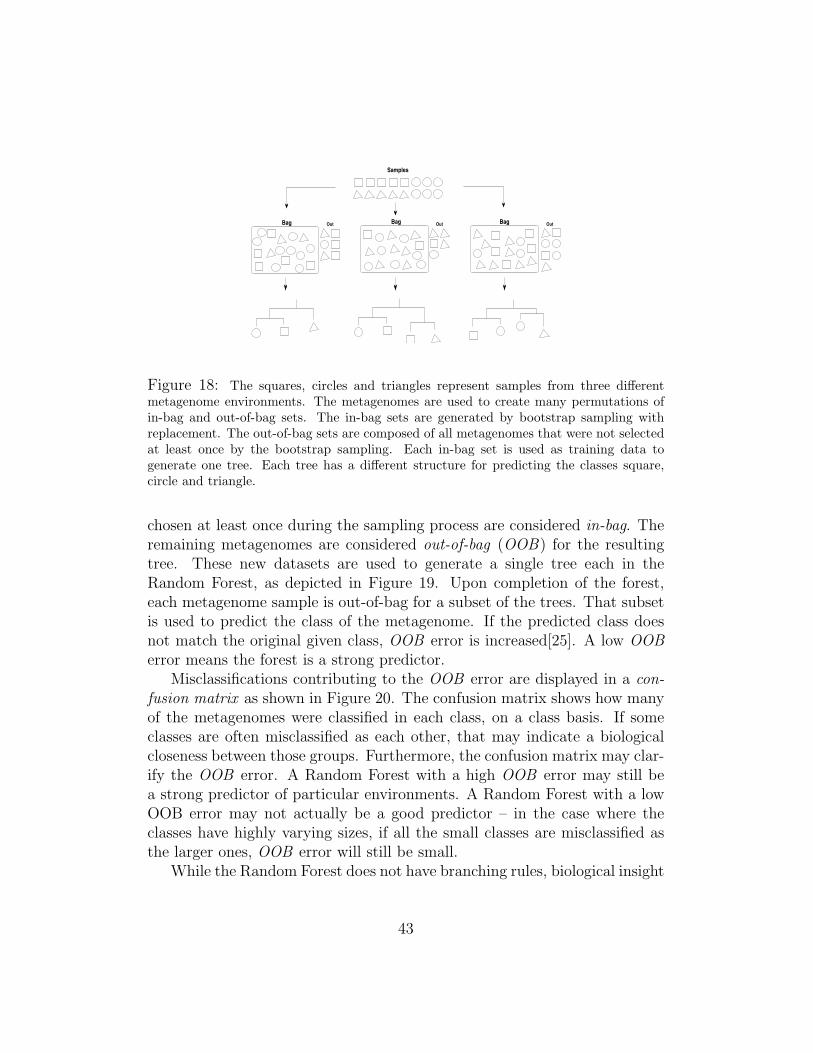
In the supervised version of a Random Forest, class groupings are given tothe classification algorithm. The trees are generated to classify around thesegiven groups. A random sampling of available metagenomes is chosen withreplacement to generate each tree as shown in Figure 18. Furthermore, ateach node, a random subset of the available variables are used to determinenode splitting, unlike the single classification tree which would examine themall. The number of variables to be considered at each node can be specifiedas an input variable to the algorithm.
New metagenomic data is analyzed by all the trees and classified into thegroup that the plurality of the trees indicate. The Random Forest can thenuse the generated trees to predict the environment to which a new unclassifiedmetagenome belongs. Due to the plurality consensus of this method, theinstability of a single tree is overcome, resulting in a more robust result,especially when using a large number of trees. However, because the trees inthe Random Forest all differ from one another, unlike a single classificationtree, the Random Forest does not produce branching rules. Instead, theRandom Forest produces an out-of-bag (OOB) error, a confusion matrix,and variable importance measures.
To grow each tree, a new dataset, the same size as the initial trainingset, is generated by sampling with replacement. The term for this process isbagging, which stands for bootstrap aggregating. The metagenomes that are
42
Samples
Bag Bag BagOut Out Out
Figure 18: The squares, circles and triangles represent samples from three differentmetagenome environments. The metagenomes are used to create many permutations ofin-bag and out-of-bag sets. The in-bag sets are generated by bootstrap sampling withreplacement. The out-of-bag sets are composed of all metagenomes that were not selectedat least once by the bootstrap sampling. Each in-bag set is used as training data togenerate one tree. Each tree has a different structure for predicting the classes square,circle and triangle.
chosen at least once during the sampling process are considered in-bag. Theremaining metagenomes are considered out-of-bag (OOB) for the resultingtree. These new datasets are used to generate a single tree each in theRandom Forest, as depicted in Figure 19. Upon completion of the forest,each metagenome sample is out-of-bag for a subset of the trees. That subsetis used to predict the class of the metagenome. If the predicted class doesnot match the original given class, OOB error is increased[25]. A low OOBerror means the forest is a strong predictor.
Misclassifications contributing to the OOB error are displayed in a con-fusion matrix as shown in Figure 20. The confusion matrix shows how manyof the metagenomes were classified in each class, on a class basis. If someclasses are often misclassified as each other, that may indicate a biologicalcloseness between those groups. Furthermore, the confusion matrix may clar-ify the OOB error. A Random Forest with a high OOB error may still bea strong predictor of particular environments. A Random Forest with a lowOOB error may not actually be a good predictor – in the case where theclasses have highly varying sizes, if all the small classes are misclassified asthe larger ones, OOB error will still be small.
While the Random Forest does not have branching rules, biological insight
43

Figure 19: Graphical representation of samples sorted into in-bag and out-of-bag. Thein-bag samples are used to generate a tree. The out-of-bag samples are compared to alltrees for which they were out-of-bag. In this figure, a square was predicted to be a circle.This would increase the OOB error.
human hypersaline mat community spring terrestrial water class.error
human 31 0 1 0 0 1 0.0606061hypersaline 0 8 0 0 0 7 0.4666667
mat community 0 0 9 0 0 1 0.1000000spring 0 2 0 3 0 1 0.5000000
terrestrial 5 0 0 0 3 1 0.6666667water 0 0 1 0 0 129 0.0076923
Figure 20: Confusion matrix showing results from a Random Forest generated from33 human, 15 hypersaline, 10 mat community, 6 spring, 9 terrestrial, and 130 wa-ter environments. The rows in the confusion matrix represent the given classes of themetagenomes. The row sums without class.error equal the total number of samples ofeach class. The columns represent the classes predicted by the subsets of the trees forwhich each metagenome was OOB. Each class error, weighted for class size, contributesto the single OOB error. The overall OOB error in this example is 9.85%, with thehypersaline and terrestrial classes being misclassified the most often.
44

may be ascertained by exploring variable importance measures such as meandecrease accuracy and mean decrease Gini. These values indicate whichvariables contributed the most to generating stronger trees. We then usethe indicated important variables to generate single trees with branchingrules or used in canonical discriminant analyses.
The mean decrease accuracy of a variable is determined during the OOBerror calculation phase. One at a time, each variable is randomly permutedalong the set of metagenomes. The classification is then computed by thesubset of the Random Forest similarly to the computation of normal OOBerror. The more the accuracy of the Random Forest decreases due to thepermutation, the more important variable is deemed[25]. Variables withlarge mean decrease accuracy are more important in proper classification.
The mean decrease Gini is a measure of how a variable contributes tothe homogeneity of nodes and leaves in the Random Forest. Let pmgi
be theproportion of samples of group gi in node m. Let gc be the most plural groupin node m. The Gini index of node m Gm is defined as:
Gm = 1−∑i∈g
pmgi∗ pmgi
. (13)
The Gini index is a measure of the purity of the node, with smaller valuesindicating a purer node and thus a lesser likelihood of misclassification[14].Tree generating algorithms may use this index as their likelihood to pickwhich variable to split on. Each time a particular variable is used to splita node, the Gini index for the child nodes are calculated and compared tothat of the original node. When node m is split into mr and ml, there is aprobability pmr of samples going into the child node mr and pml
of going intoml. The decrease[3] in Gini is then:
Dm = Gm − pmrGmr − pmlGml
. (14)
The calculated decrease is added to the mean decrease Gini for the splittingvariable and normalized at the end. The greater the mean decrease Gini ofa variable, the purer the nodes splitting.
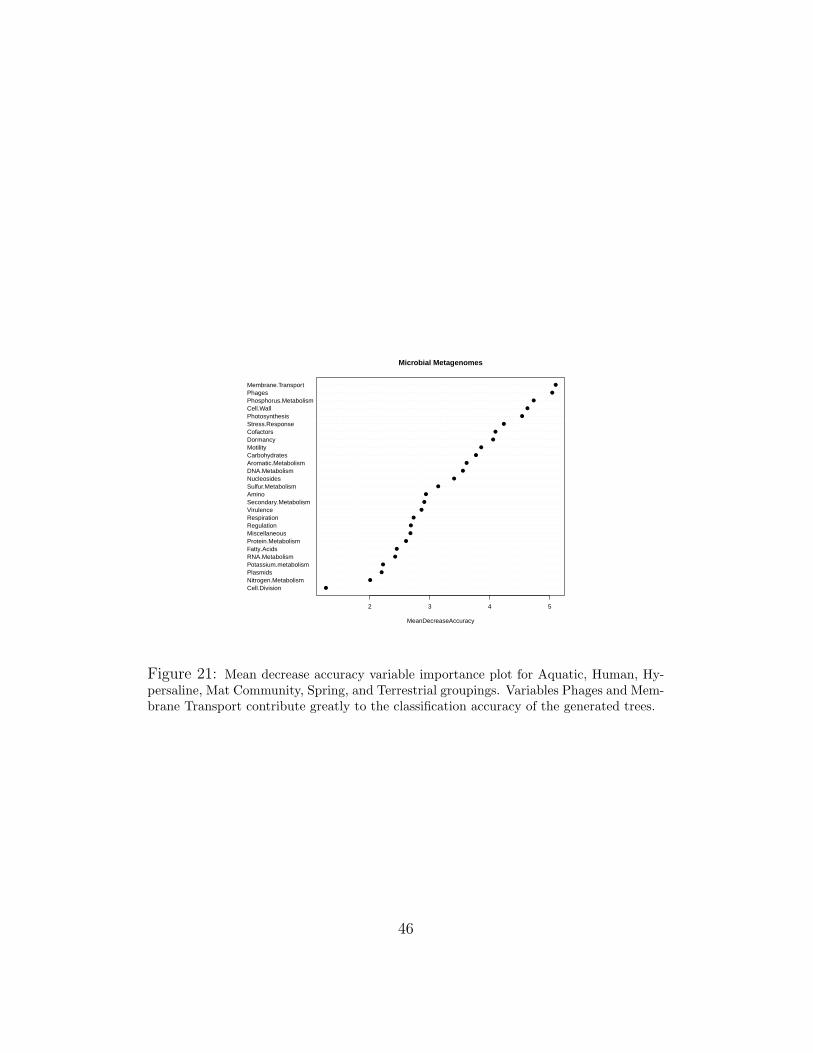
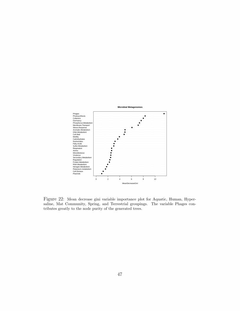
In Figures 21 and 22, the variable importance plots for a Random Forestgenerated from the microbial data sets are shown. Looking at the naturalbreaks in the graph, we chose the top scoring 7-8 variables from both. Be-cause many are overlapping, this generates a set of 11 unique variables usedto generate trees or canonical discriminants.
45
Cell.DivisionNitrogen.MetabolismPlasmidsPotassium.metabolismRNA.MetabolismFatty.AcidsProtein.MetabolismMiscellaneousRegulationRespirationVirulenceSecondary.MetabolismAminoSulfur.MetabolismNucleosidesDNA.MetabolismAromatic.MetabolismCarbohydratesMotilityDormancyCofactorsStress.ResponsePhotosynthesisCell.WallPhosphorus.MetabolismPhagesMembrane.Transport
●
●
●
●
●
●
●
●
●
●
●
●
●
●
●
●
●
●
●
●
●
●
●
●
●
●
●
2 3 4 5
Microbial Metagenomes
MeanDecreaseAccuracy
Figure 21: Mean decrease accuracy variable importance plot for Aquatic, Human, Hy-persaline, Mat Community, Spring, and Terrestrial groupings. Variables Phages and Mem-brane Transport contribute greatly to the classification accuracy of the generated trees.
46
PlasmidsCell.DivisionPotassium.metabolismNitrogen.MetabolismRNA.MetabolismProtein.MetabolismRegulationSecondary.MetabolismVirulenceMiscellaneousAminoRespirationSulfur.MetabolismFatty.AcidsNucleosidesCarbohydratesMotilityCell.WallDNA.MetabolismAromatic.MetabolismStress.ResponseMembrane.TransportPhosphorus.MetabolismDormancyCofactorsPhotosynthesisPhages
●
●
●
●
●
●
●
●
●
●
●
●
●
●
●
●
●
●
●
●
●
●
●
●
●
●
●
0 2 4 6 8 10
Microbial Metagenomes
MeanDecreaseGini
Figure 22: Mean decrease gini variable importance plot for Aquatic, Human, Hyper-saline, Mat Community, Spring, and Terrestrial groupings. The variable Phages con-tributes greatly to the node purity of the generated trees.
47

Supervised Random Forests are a good tool for classification, predictionand variable selection. The variable importance measures generated offeredinsight into which hierarchies strongly differentiate metagenomes. The im-portance rankings generated can be used to select variables for other tech-niques. Out-of-bag error and confusion matrices can be used to assess thequality and differentiability of the metagenome groupings.
7.2 Unsupervised Random Forest
In an unsupervised Random Forest, the metagenome data is input withoutclass specifications. Instead, synthetic classes are generated randomly andthen the trees are fit. Clusters form because metagenomes will end up in thesame leaves despite the synthetic classes. As Figure 23 shows, the samplesthat are similar may still end up in the same leaf despite different syntheticclasses. Since the prediction and variable importance calculations in thismethod are based on the synthetic classes, these features are not useful foran unsupervised Random Forest.
Whenever two metagenomes end up in the same leaf of a tree in a Ran-dom Forest, their proximity measure is increased[23]. This proximity is nor-malized so that a metagenome has a proximity of one with itself. Then,1−proximity can be used as a dissimilarity measure for partitioning aroundmedoids (PAM). The dissimilarity grouping can be visualized using a mul-tidimensional scaling (MDS) plot which works similar to PCA but on dis-similarity data. An example using all three of these techniques will be givenafter the section on PAM.
7.3 Partitioning Around Medoids (PAM)
Partitioning around medoids (PAM)[15] is similar to K-means with a differentmeasure. Like K-means, PAM attempts to create K clusters, where K isgiven. Also, original grouping size variances are not much of an issue, thoughwithin group-variances may cause problems. Unlike K-means, the measureused need not obey the triangle inequality. Dissimilarity measures shouldbe symmetric between metagenomes and each metagenome should have adissimiliarity of 0 with itself.
Instead of clustering around calculated means, PAM creates its clustersaround whichever K metagenomes (known as medoids) minimize the sum ofthe distances between other cluster members and the medoid. Silhouettes
48

B
A
A
B
Figure 23: The squares, circles and triangles represent samples from three differentmetagenome environments. Samples are randomly flagged with synthetic classes blackand white. Samples A and B have different synthetic classes, but are sorted into the sameleaf during tree generation. Every time two samples are in the same node, their proximitymeasure is increased. In this example, the proximity between sample A and sample Bwould be increased.
can be calculated as they were for K-means to help determine a value for K.Again, visualization of the groups can be done with an MDS plot.
Unsupervised Random Forest with PAM classifying can be a strong argu-ment for metagenome groupings – none of the original grouping informationwas used, yet groupings formed within a large number of randomly createdtrees. The method also has the benefit of not relying on any particular dis-tribution of the data, which works well with metagenomic data which maynot be normal.
7.4 Applications to Organism-Associated and Mat-FormingMetagenomes
Supervised and unsupervised Random Forest methods explain variations indata samples via different mechanisms which result in each method provid-ing the opportunity to glean biological connections from different points ofview. A good example of the differences and interplay between the resultsobtained from supervised Random Forest and unsupervised Random Forestswith PAM is the case of 4 distinct microbial environments that were analyzedtogether.
The four environments are: coral (n = 6), slime (n = 2), mat com-munity (n = 10) and microbiolites (n = 3). Microbial slime samples werecollected from the sides of freshwater fish that were found to be high inSulfur. Both healthy and morbid fish slime samples collected. The coralsamples were collected from the community of metazoans, protists and mi-
49

●
●
●
●●●
−0.2 0.0 0.2 0.4
−0.
4−
0.3
−0.
2−
0.1
0.0
0.1
0.2
Dim 1
Dim
2
Supervised Random Forest
● coralmat communitymicrobioliteslime
Figure 24: Four organism environments: Coral, Mat Community, Microbiolite, andSlime. The three Microbiolite microbial samples come from very different environmentsand naturally class with organisms that live in those environments.
50

●
●
●
●●●
−0.4 −0.2 0.0 0.2
−0.
4−
0.3
−0.
2−
0.1
0.0
0.1
Dim 1
Dim
2
12
3
4
5
6
7
8
91011
12
1314
1516
1718
19
20
21
Unsupervised Random Forest
● coralmat communitymicrobioliteslime
Figure 25: Four organism environments: Coral, Mat Community, Microbiolite, andSlime. Even though the microbiolite are highly different from one another, it was able tofind subsystems that uniquely differentiate each community from the rest. Hence the fourtight clusters we see here.
51
crobes associated with scleractinian corals, otherwise known as the coralholobiont. Metagenomes from both healthy and stressed coral (each subjectto a different kind of stress) samples were collected [28]. The mat-formingmetagenomes came from porous Teepee-like structures of evaporative saltdeposits. Vast and diverse microbial life was found within the evaporatescreating layered hypersaline communities that had developed highly adap-tive methods for surviving in their extreme environmental conditions(cite/).Last the microbiolite came from stromatolites and thrombolites found in amarine location at Highborne Cay in the Bahamas and two freshwater loca-tions: Pozas Azules II and Rio Mesquites in Mexico [8].
The different metagenomic samples of a given environment type, as de-scribed above, were found to exhibit high genomic and physiological diversity.While being phylogenetically related microbes, a genetic uniqueness could beascribed to each of them. Further microbes with similar lifestyles were foundto contain a core or minimal set of genes required for survival in similarconditions [28].
Such findings emanated from a newly formed school of thought that hasfound that functional subsystems uniquely define environment-types [9]. De-tractors to this novel idea often posit the enormous complexity and vari-ability within environment-types and the ‘sharing’ of given genomic parts bymicrobes that belong to different environments making it difficult to uniquelydifferentiate given environment-types. We were interested in describing thesefindings via different statistical methods.
To do so, we would first need to employ a classification algorithm thatwould create tight clusters for each environment-type, in spite of the genomicdiversity among samples belonging to the same environment-type. And thatat the same time would display clear separations among environment-types,in spite of the high similarities of environments-types (it is often very chal-lenging to statistically differentiate mat communities and microbiolites). Sec-ondly, we needed a classifier that was unbiased of environment-type member-ship which would find relevant associations of individual samples with otherdifferent environment-type microbes who shared similar lifestyles.
To carry out the first part of the analysis we employed a supervisedRandom Forest algorithm which generated the proximity measure for eachof the n = 21 samples and then employed an MDS plot that found thelinear combinations of the proximity measures that would minimize the intra-cluster distances and maximize the inter-cluster space when the 27 functionalsubsystem space was collapsed into the 2 dimensions that best described the
52

clusters. Figure 24 shows the MDS plot of the supervised Random Forestproximity measures of the four microbial environment-types.
Because each of the environments was placed in a single tight cluster withstatistically significant separation between them, we know that the proximityvalues must be high within each group, leading to clear divisions in the MDSplot. The algorithm knows the desired groupings so it does its best to createbranching patterns among the 27 subsystems that are best at differentiatingthe desired classes. It should be noted that such results are not the norm,especially when dealing with environmental metagenomic data. The confu-sion matrix showed an error of 19% which came primarily from microbiolitebeing misclassified as mat. One coral that was stressed by adding nitrogen(nutrient) to it is sometimes misclassified as a mat due to the high nitrateconcentration in the hypersaline deposit.
The four unique clusters seen on Figure 24 support findings by Dinsdaleet al to the effect that metagenomic functional subsystem analysis is ableto clearly define environments [9], and explain variations among and withinmicrobial communities.
For the second part of the analysis we employed an unsupervised RandomForest algorithm to generate proximity measure for each sample, unbiasedenvironment-type membership. Because the unsupervised Random Foreststarts by generating random synthetic classes ignorant of the sample’s truegroup membership, an unbiased ‘natural’ clustering emerges. While the su-pervised RF was employed to find given classes (i.e. to find the core sharedset of genes per members of a given environment), the unsupervised RF isused to glean the natural tendencies of given samples (i.e. will samples clus-ter with others who share not their group membership but their lifestyle?).The results were plotted using an MDS plot depicted in Figure 25. Thiswas followed by generation of silhouettes and a PAM algorithm that wouldtell us both the ’ideal’ k number of clusters for this data and the kth groupmembership of each of sample.
Figure 25 shows that while coral, mat community, and slime environmentseach cluster together nicely, the microbiolite do not form a tight cluster, andin fact different members of the microbiolite environment are seen to havehigher proximity to other environment-types rather than to the microbioliteenvironment-type.
In trying to understand why the three microbiolite tend to naturally bepulled towards different environment-types and away from one another (lowintra-group proximity), the metagenomic composition of each microbiolite
53

sample offers key information. The Highborn Cay (HC) microbiolite sampleclustered near the slime cluster. Both the slime and HC microbiolite camefrom environments high in sulfur which seems to be the determining envi-ronmental factor that has driven their adaptation. The microbiolite has hadmillennia to adapt to the sulfur environment, and hence become specializedto it over time.
The slime samples came from a freshwater farmed hybrid bass tank thatdue to its containment and isolation forced the bass and its associated mi-cribiota to quickly adapt to high sulfur conditions. Isolation, captivity andindustrial type environments have been shown to bring rapid behavioralchange in animals, it is then not a far stretch to suppose that microbiotaliving under similar conditions would also feel the pressure of their disruptedenvironment to evolve quickly to specialized adaptations to the environmen-tal conditions. While different process have led the microbiolite and the slimeto develop specialized adaptations to high sulfur conditions, the unsupervisedRF shows them sharing functional subsystems that are best explained alonglifestyle lines.
The Pozas Azules (PA) sample microbiolite came from a thromboliteswhich is a rock deposit that exhibits an internal clotted structure. It wasfound to be above a biofilm mat community [8]. This sample clusters close tothe mat community environment which has a similar structure (layered salineporous deposit). The PA sample had marine traces which point date back toa time when the PA was connected to the ocean. Having marine traces in anisolated environment that adapted to living along mat communities makesthis sample the most like the hypersaline mat community. Though the HCsample was also marine, it was not sharing habitat with a mat community,and though the Rio mesquite (RM) sample was also sharing space with biofilm mat communities, it had much lower saline levels (freshwater).
Finally the RM microbiolite clusters somewhere between the PA and HCsamples. It clusters closer to the PA, perhaps due to biogeographic func-tional adaptation. Yet in the MDS plot it is about equidistant from either ofthe other two microbiolite. This finding supports Desnues et al [8] findingsregarding the fact that the 3 microbiolite samples were genetically uniqueand highly adapted to their environments. The fact that these are ancientorganisms that have had a lot of time to evolve and adapt and that theyare still around in minimally changed form makes them successful exampleof bio-adaptation and highlights the important role that environment playsin the survival of organisms. Each of the 3 microbiolites are seen to nat-
54

urally adapt along the lines of their environment (marine, freshwater) andalong the lines of the other members of the environment (mat communities,marine life) so that environment or ecosystem composition are seen to befundamental to the ways in which organisms adapt and evolve. Disruptionsin either can be truly devastating.
PAM algorithm silhouettes of the unsupervised Random Forest showedk = 3 was the ideal number of clusters for the unsupervised RF (on this data).The slime and coral, despite their differences, were all classified in their owngroups, while mat and microbiolites were both classified as single class. Theunique clusters of slime and coral and the clustering of each microbiolitesample closer to organisms that share their environmental lifestyle points tothe fact that there is a minimal set of core genes shared along lifestyle /environment lines. This set is minimal and while much interplay and simi-larities remain among different environments (as seen in the mat community/ microbiolite samples). Nonetheless, these similarities can be partially de-tangled by a supervised RF which can find subsystems that uniquely defineeach environment.
In analyzing the clustering we see a two-pronged behavior. In the super-vised RF each environment clustered together tightly, even though the eachenvironment had high intra-environment diversity [27, 28]. On the otherhand, the microbiolite environment, whose members had otherwise similarlevels of stress and health and even relative peaks of key subsystems, clusterednot with each other, but with the environment in which they had evolved.Thus we find good statistical support for the view that functional genomicanalysis is effective due to environments exhibiting genetic uniqueness. Fur-ther subgroups of given environments would naturally cluster together due tomicrobes with similar lifestyles containing a core or minimal set of functionalsubsystems required for survival in similar conditions.
7.5 Summary
On the whole we find that both the supervised and unsupervised RandomForest are able to provide statistical support for biologically meaningful re-sults. Supervised and unsupervised RF provides us with tools for differenttypes of investigations, and are very good at yielding good results that speakof different underlying biological mechanisms. MDS plots of supervised RFderived proximity measures can tell us if the algorithm is acting as a goodclassifier if tight clustering results which discriminates well between distinct
55

groups. Such good classification means that the associated variable impor-tance hierarchies are highly insightful. In such cases we can use a small subsetof the functional subsystems in lieu of every subsystem when perfuming asthe starting point while perfuming a PCA, LDA or Canonical DiscriminateAnalysis (CDA). Using a small subset is a direct result, as mentioned above,of the fact that a minimal functional subset is elemental to given environ-ments.
56

8 Canonical Discriminant Analysis
Canonical Discriminant Analysis (CDA) is a dimension reduction statisticaltool, similar to both principal component analysis (PCA) and linear discrimi-nant analysis (LDA), used to separate data into categories. The most impor-tant aspect of the CDA is that it is used to separate data into g preassignedcategories. Specifically, it finds g-1 axes (uncorrelated linear functions) thatbest separate the data classes. The goal of the CDA is to understand whichvariables are responsible for differentiating between chosen groups.
8.1 How it Works
To perform a canonical discriminant analysis, we start with a data set con-taining n multivariate samples, along k variables, that has been divided intog groups. Canonical variables (or components), which are linear combina-tions of the explanatory variables, are then derived. These canonical compo-nents summarize the inter-class variance of the data. The theory is similarto that of constructing principal components in the PCA, except that thePCA is blind to classes. The PCA summarizes the total variance, acrossall samples, while the CDA looks only at variation between classes. Whenwe have k variables and g groups, we can construct min(k,g-1 ) canonicalcomponents to explain the variance. These are constructed in much thesame way as principal components, where the first canonical component isthe linear combination of variables that has maximum multiple correlationwith the classes[5]. The second canonical component is obtained by findingthe linear combination uncorrelated with the first canonical variable that hasthe highest possible multiple correlation with the classes. This process isrepeated until we have the maximum number of canonical components. Inour research, we dealt with 27 variables (the functional groups) and a rangeof class numbers. Since we almost always had fewer classes than variables,we had g-1 canonical components. In general, only two or three dimensionsare needed to adequately separate distinct groupings, and so only the firstfew canonical components are pertinent.
The theory behind calculating the canonical components during CDAis identical to that of calculating principal components during PCA. Thepractical difference is in the covariance matrix. In PCA, the covariancematrix displays the variance between individual samples, while in CDA thecovariance matrix contains variance between classes. The covariance matrix
57

must be full rank in order to complete the analysis, and as such requires atleast as many individual samples as variables.
Ensuring the full rank of the covariance matrix can require removingsome variables from the analysis. In our research, we started out with 27variables and 248 distinct microbial metagenomes. This are good values whencomputing analyses over the entire data set, since there is room to removeoutliers and highly unique samples. The problem comes when working withsmaller subsets of the data. When looking at small enough subsets of data,it is necessary to reduce the number of variables used in the analysis, butcare must be taken. While it will not compromise the analysis to removeunimportant data, how do we know which data is important before runningthe analysis? There are several tools at our disposal for deciding which arethe most important.
One method is informed selection. For example, if a researcher was specif-ically interested in how nutrient metabolism varies across environments, shecould choose to look only at variables pertinent to nutrient metabolism.Choosing variables like this introduces an inherent bias into any analysisthat is to be performed, and in general it is to be avoided. An analysis doneby openly selecting variables can only speak as to the relative importance ofthe chosen variables, and the divisions along those lines. This is because im-portant mitigating factors may have been eliminated. In an overall analysis,the nutrient metabolism levels may have such small differences as to get lostin the noise. Then our researcher friend has not modeled the overall trends,but some of the noise.
Another method of measuring variable importance is the correlation ma-trix, which can be computed over any number of variables. This is a roughestimate of what explanatory variables are linearly related to the responsevariables. The variables with the largest correlation values (positive or neg-ative) are the ones that are most likely important toward determining class.It proves useful for estimation, but is not infallible, and has scaling problems.One of the major drawbacks is that it measures only linear correlation, andin real-world data other types of relationships abound. Using the correlationmatrix is an acceptable method for eliminating a small number of variablesfrom an analysis, but for further whittling it is not sound.
It is a good idea to combine statistical techniques, as they strengthenthe analysis. Two of the stronger variable importance measures we workedwith are the Random Forest variable importance measures described in Sec-tion 7.1. These determine the ability of each variable to classify data, us-
58
ing different measures of classification skill. Performing a CDA using onlythe most discretionary variables yields a more significant analysis, especiallywhen the data has many more variables than samples.
8.2 Visualization
An advantage of the CDA is the visualization aspect. It is trivial to plot theanalysis, since it centers around transforming the coordinate system. All weneed to do plot the canonical scores of the data points along new axes (thecanonical components). See Figure 27 for a plot of CDA performed on ma-rine metagenomic data. In this CDA we used 46 samples, 26 function groups(removing the ‘miscellaneous’ group) as explanatory variables, and classifiedour data into four groups, based on the types of marine environment theycame from. This subset of the data was collected in the northern hemisphere,which homogenizes the data and reduces the possibility of confounding vari-ables.
The influence of each variable along the canonical axes is visualizedthrough vectors. CDA centers on the construction of canonical componentsto explain the variance between classes. The amount of the inter-class vari-ance that is explained by each component is indicated in parentheses alongeach axis. For a data set with variables {v1, v2, . . . , vk}, these canonical com-ponents have the form
Can1 = a1v1 + a2v2 + · · ·+ akvk
Can2 = b1v1 + b2v2 + · · ·+ bkvk.
Figure 26 shows the projections of variable vectors v1 and v2, onto the canon-ical component axes Can1 and Can2. The projections of the variables main-tain the relationship between their coefficient variables. That is,
aibi
=ai
biand
aiaj
=aiaj.
Graphically, the vectors can be rescaled to obtain the clearest visualization,but they must maintain the ratio of their lengths. Qualitatively, the greaterthe magnitude of a canonical variable vector, the greater its importance toseparation of groups.
Looking at the plot, it is easy to see that removing variables will clarifythe graphical interpretation of a CDA, and also that the choice of these
59

variables is important. We can see qualitatively that the ‘Carbohydrates,’‘Cell.Wall,’ ‘Cofactor,’ and ‘Potassium’ vectors are small, which indicatesthat those variables are explaining the least of the inter-class variance. Thisimplies that the proportion of hits in these categories is similar across theclasses, and so these are good candidates for removal in a second analysis.It is important to remember, however, that this graphical view shows onlythe first two canonical components, and they may have larger magnitude inhigher dimensions.
Each sample is plotted according to its canonical scores. Let x be asample, such that x = (x1, x2, ..., xk) from a data set whose first canonicalcomponents are C1 and C2, such that the coefficients of C1 are {a1, a2, ..., ak}and those of C2 are {b1, b2, ..., bk}. Then we compute
xC = x
| |C1 C2
| |
= (x1x2 · · ·xk)
a1 b1
a2 b2...
...ak bk
=
(C1(x)C2(x)
).
The canonical scores of a sample x are C1(x), C2(x), which describe its posi-tion in the 2-dimensional space defined by the first two canonical components.We also plot the mean scores, represented by +, and confidence intervals ofthe means, represented with circles. Our research centered on the strength ofclusters, so we focused on the spread of individual samples about the mean.For other analyses, it is valid to plot only the means and confidence intervals.
Using a variable importance plot, calculated using a Random Forest, 12most important variables were selected to further investigate the metabolicprocesses driving class divisions (Figure 28). We also removed the confidenceintervals, to simplify the representation. This plot is easier to comprehend,and more legible. Note that the environments are less clearly separated inthis second image. This analysis, and the accompanying plot, are more sig-nificant. The canonical discriminant analysis is prone to overfitting, becauseit is very good at finding small differences. Our metagenomic data, with itssmall sample sizes, is particularly vulnerable to artificial separations. Thesmallest vectors are often statistically insignificant, and so removing themgives more robust results. These two plots (Figures 27 and 28) insinuatethat estuary samples are very similar to open ocean and coastal water sam-ples, which themselves are closer than initially apparent. Only variables withsmall impact on separation were removed, and the environments clustered
60

Figure 26: Projection of variable vectors onto the first two canonical components.
more tightly. This implies that there are only small differences between thetwo.
8.3 Prediction and Error Estimation
It is important to estimate the error of any statistical model. The CDAcan separate preassigned classes easily when it knows what they are, but amisclassification error helps establish if separations exist between the classesthemselves, or only the particular samples used. In general we estimate errorby testing a model’s skill at classifying a set of known samples. There wereno available error estimation functions for canonical discriminant analyses inR, so we devised our own. Two proved especially useful7.
The first, mahalErrorEst.fun, operates on the leave-one-out principal.For a data set with n samples, it computes n canonical discriminant analyses,each time leaving out a different sample. Using the canonical components ofeach analysis, the canonical scores are computed for the left out sample, andthis score then determines how the sample is classified.
The choice of group was determined by the minimal Mahalanobis distance[6].
7The code for these can be found in A.7.
61

-10 -5 0
-4-2
02
4
Can1 (70.3%)
Can
2 (1
7.1%
)
+
++
+
coastal
deep water
estuary
open
Amino
Carb
Cell.Div
Cell.Wall
Cofactor
DNA.met
Dormancy
Fatty.Acid
Mem.Trans
AromaticMotility
NitrogenNucleo
Phages
Phosphorus
Photosynthesis
Plasmids
Potassium Protein
Regulation
Respiration
RNA.metSecondary.met
Stress
SulfurVirulence
coastaldeep waterestuaryopen
Figure 27: Plot of a CDA of marine microbial metagenomic samples collected in thenorthern hemisphere. This was calculated with 46 samples, 26 variables, and 4 environ-ments.
62
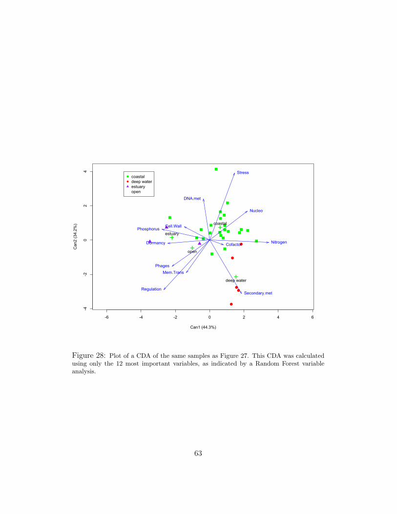
-6 -4 -2 0 2 4 6
-4-2
02
4
Can1 (44.3%)
Can
2 (3
4.2%
) +
+
++
coastal
deep water
estuary
open
Cell.Wall
Cofactor
DNA.met
Dormancy
Mem.Trans
Nitrogen
Nucleo
Phages
Phosphorus
RegulationSecondary.met
Stresscoastaldeep waterestuaryopen
Figure 28: Plot of a CDA of the same samples as Figure 27. This CDA was calculatedusing only the 12 most important variables, as indicated by a Random Forest variableanalysis.
63

The Mahalanobis measure is a scale-invariant distance measure based on cor-relation. The distance of a multivariate vector x = (x1, x2, ..., xn) from agroup with mean µ = (µ1, µ2, ..., µn) and covariance matrix S is defined as:
DM(x) =√
(x− µ)S−1(x− µ)T
More intuitively, consider the ellipsoid that best represents the group’s proba-bility density. The Mahalanobis distance is simply the distance of the samplepoint from the center of mass, divided by the spread (width of the ellipsoid)in the direction of the sample vector.
mahalErrorEst.fun goes through the data in this manner, computing aCDA for all but one of the data points, and predicting the class of the leftoversample. It returns both a misclassification rate and a confusion matrix8, arecord of how each sample was classified. From the confusion matrix we cansee how the misclassifications occurred (was a human sample classified as achicken or a mouse?), from which we can determine not only the percentageof samples which were misclassified (error estimate), but how egregious theerrors were. For example, it would be more egregious to mistake a humanmetagenome for one from deep water, rather than to mistake a deep watermetagenome for one from the open ocean.
The second test function, cdaErrorEst.fun, combines canonical and lin-ear discriminant analyses. The function first randomly divides the datainto in-bag and out-of-bag (OOB) data sets. By default, cdaErrorEst.funchooses 20% of the data in each class as OOB. It then performs a CDAon the bagged data, looks at the canonical scores of each sample, and per-forms an LDA on the canonical scores. Canonical scores are then calcu-lated for the OOB samples, and LDA is used to predict their classes. LikemahalErrorEst.fun, cdaErrorEst.fun returns a confusion matrix alongwith a misclassification rate.
8.4 Considerations
Canonical discriminant analysis is far from perfect. There are several thingsto take into consideration when using this tool. The most obvious of theseis the presence of bias. We group our data before CDA, which means thatthe analysis is not blind. The canonical components are the linear combi-nations that best separate predetermined groups, not blind data, so CDA is
8For a detailed explanation, see Figure 10 in Section 5.1.2.
64

very prone to overfitting, or finding artificial separations in data (often frommodeling noise). The larger a data set, and the more similar class sizes arewithin that data set, the smaller the risk of overfitting.
A major constraint on canonical discriminant analysis is sample size. Touse CDA, a data set must have at least as many samples as explanatoryvariables to ensure the full rank of the matrices involved in the computations.Having bigger sample sizes is always better, and will improve the validityof the analysis. The size of the class groupings must also be taken intoconsideration. Given a data set with many more samples than variables,a class with only few samples will reduce the significance of the analysis.Classification is done by comparing a sample to existing class means. Smallsamples have large confidence intervals, which means that their means arenot significant. That is not to say that CDA can say nothing about smallsamples, but the results must be taken with a grain of salt.
The sample size considerations are particularly relevant to metagenomicanalysis, due to the nature of the data. Metagenomic data is divided intosubsystems, currently 27 at the broadest level. The data available to uswas the public metagenome database of about 300 samples. The data setis sparse, with samples from a limited range geographically, and of vastlyranging sample sizes. For example, there are dozens of marine samples,ranging around the world but still not globally representative. There is onlya single termite gut sample. Trying to significantly differentiate betweenthese two classes with the CDA would be futile.
As with any statistical method, care must be taken when interpretingthe results. There is always the risk of confounding variables tainting theresults, recalling that correlation does not mean causation. There are waysof decreasing the risk of confounding variables, but the chance will never betotally eliminated.
8.5 Conclusion
The canonical discriminant analysis is an excellent technique for exploringmetagenomic data, and more generally for any type of classification analysis.The CDA is really good at separating preexisting classes, and gleaning whichvariables make the difference. The ease and extent of visual representationare also extremely helpful, it is very clear what the results of the analysisare. The CDA can predict the class of a new sample, which is useful notonly for understanding new samples but also for approximating the strength
65

of the model. Canonical discriminant analyses can be combined with manyother statistical methods in order to improve their significance.
As with any statistical method, there are constraints and drawbacks toCDA. It is prone to overfitting, biased toward groupings, and requires samplesof a certain size. There is also the risk of misinterpretation and confoundingvariables. However, if this analysis is performed under a watchful eye, andcare is taken, it is extremely powerful and informative. As the database ofmetagenomic data continues to grow, and its study alongside, the significanceof this technique will only increase.
66

9 Example
Now that several statistical techniques have been discussed, we will workthrough them all, using the data set “all.data”. This set (all.data) con-sists of 203 samples, the proportion of their identified sequences pertainingto each of 27 functional groups9, and their classification into 6 environmen-tal groups. Removed from this data set are classes with extremely smallsample sizes, samples that were contaminated during sequencing, and a fewsamples externally determined to be outliers. The environmental groups arehuman10, hypersaline, mat community, spring11, terrestrial12, and water13.This section will display the strengths and weaknesses of these techniqueswith regard to all.data, and along the way we will discuss our findings.
9.1 Motivation
To date, there is only one published study on the total public database ofmetagenomic data, Functional Metagenomic Profiling of Nine Biomes byDinsdale et al[9]. Their study was conducted when there were only 45 pub-licly available metagenome samples. Continuing in their footsteps, we per-formed analyzed all publicly available microbial metagenomic data, todayconsisting of over 200 samples.
The findings in the Dinsdale paper indicated that there are metagenomicdifferences between environments, and in part this study aimed to substanti-ate or refute their findings. We wanted to discover which functional groups,if any, can be used to differentiate between environments.
9Amino Acids and Derivatives; Carbohydrates; Cell Division and Cell Cycle; Cell Walland Capsule; Cofactors, Vitamins, Prosthetic Groups, and Pigments; DNA Metabolism;Dormancy and Sporulation; Fatty Acids, Lipids, and Isoprenoids; Membrane Transport;Metabolism of Aromatic Compounds; Miscellaneous; Motility and Chemotaxis; Nitro-gen Metabolism; Nucleosides and Nucleotides; Phages, Prophages, and Transposable El-ements; Phosphorus Metabolism; Photosynthesis; Plasmids; Potassium Metabolism; Pro-tein Metabolism; Regulation and Cell Signaling; Respiration; RNA Metabolism; SecondaryMetabolism; Stress Response; Sulfur Metabolism; Virulence.
10Human gut samples, taken from separate studies of Americans and Japanese.11Samples from hot springs12Non-human, land-based animal gut samples.13Samples from an assortment of marine and freshwater environments
67

−5 0 5 10 15 20
−5
05
10
PC1
PC
2
●●
●
●●
●●
● ●●
●
●●
●●●●●
●
●
●●
●●●
●●
●
● ●●
●●
●
●
●
●●
●
●
●
●
●
Protein.met
Carb
Cell.Div
DNA.metAmino
Cofactor.etc
RNA.met
Virulence
Cell.Wall
Phosphorus● human
hypersaline
mat community
spring
terrestrial
water
Figure 29: Plot of scaled PCA over 10 functional groups with highest variance.
9.2 PCA
We begin by performing a principal component analysis on all.data. Weplot data along the first two principal components, coloring the resultant plotby environmental grouping. First we look at the scaled and unscaled varianceanalyses over all 27 variables, but these give rather messy and confusingresults. Since the PCA acts on variance, we perform the analysis again, thistime using the variables with the largest spread. There was a clean breakafter the top 10 variances, so the PCA was performed over those variables.The resultant plot can be seen in Figure 29. We see two water samples thatare far away from the rest, and seem to be forcing the other samples intoone large cluster. Note that these samples may be outliers. Figure 30 showsa zoomed-in view of the central data cluster. The environmental classes areseparating, although the water class overwhelms the eye.
68

−4 −2 0 2 4 6
−4
−2
02
4
PC1
PC
2
●●
●
●●
●●
●●●
●
●
●
●●●
●●
●
●
●●
● ●
●●
●
●
● ●
●
●●
●
●
●
●●
●
●
●
●
●
Protein.met
Carb
Cell.Div
DNA.metAmino
Cofactor.etc
RNA.met
Virulence
Cell.Wall
Phosphorus ● human
hypersaline
mat community
spring
terrestrial
water
Figure 30: Zoomed view of central cluster from Figure 29
69

Cluster Environmental data within Cluster1 All but 1 hypersaline; water samples2 1 water sample (probable outlier)3 All spring samples; 1 human (possible outlier); water samples4 3 water samples (possible outliers or contaminated data)5 1 water sample (not shown, probable outlier)6 1 water sample (not shown, probable outlier)7 All mat community samples; 5 human; 3 terrestrial; water8 1 water sample (possible outlier)9 Remaining human samples; 2 terrestrial; water
Table 8: Breakdown of environmental data present in each of the 9-mean clusters.
9.3 K-means
The sum of squares plot for our data set, Figure 31, has no clear ‘elbow’,which would indicate the best number of clusters. In our experience withmetagenomic data, this implies the existence of outliers. To understand theclusters that K-means found, we plot the PCA but include the clusteringassigned by K-means. When the data is graphed and colored based onclustering for K = 3, the apparent elbow of the graph, the data clusters into2 single points, and a central mass. This is not a helpful analysis.
A second way of looking for good clusters is the silhouette plot. When wemake silhouette plots of our data (Figure 32) and plot their average width(Figure 33), we again are led to the conclusion that K = 3 should be ideal.We have already decided that it is not, and so look further. In Figure 33,there are peaks at 5 and 8. Looking at these as values for K, we find that5 seems to indicate outliers, but K = 8 seems to form separations alonggroupings.
Looking at the plot for K = 9, however, a clearer picture appears. InFigure 34, several clusters contain only a single point, which indicates thatthey are probably outliers. Two of these points (both water samples) havebeen cropped out of Figure 34, for ease of visualization. All of the pointsput into their own categories are, in fact, water samples. Close inspectionreveals something about the clusters, detailed in Table 8. Note that, whileimperfect, there seems to be some separation along known environmentalcategories, which leads us to continue our investigation.
70

●
●
●
●
●
●
●●
●
●●
●● ●
●
2 4 6 8 10 12 14 16
0.2
0.3
0.4
0.5
0.6
0.7
K−Means Elbow Plot
K−Value
Sum
of S
quar
es
Figure 31: Sum of squared error versus K values, ranging 2:16, from K-means analysisof all.data
9.4 LDA
We performed a linear discriminant analysis (LDA) on all.data, with en-vironmental groupings as the response. First we attempt the analysis overall 27 functional group variables. Plotting the data along the first two lin-ear discriminant functions, Figure 35, it appears that the LDA succeeds inseparating our data along environmental factors.
There is a lot of separation between the environmental groups. Thereare a few overlaps that may indicate outliers, specifically the human andterrestrial samples that mix in with water. The mat community sample thatmixes in with hypersaline samples comes from a hypersaline environment,which may explain its proximity. There is a fair amount of mixing betweenspring, hypersaline, and water samples. This is not altogether unexpected,as they are all aquatic environments.
Using the leave-one-out error estimation technique for this LDA, this anal-ysis has an error rate of approximately .167, that is, we expect to misclassifyabout 17% of samples with this technique.
71

0 50 100 150 200
0.6
0.8
1.0
Observations
Silh
ouet
tes
K = 2
0 50 100 150 200
0.80
0.90
1.00
Observations
Silh
ouet
tes
K = 3
0 50 100 150 200
0.0
0.4
0.8
Observations
Silh
ouet
tes
K = 4
0 50 100 150 200
0.0
0.4
0.8
Observations
Silh
ouet
tes
K = 5
0 50 100 150 200
0.2
0.6
1.0
Observations
Silh
ouet
tes
K = 6
0 50 100 150 200
0.2
0.6
1.0
Observations
Silh
ouet
tes
K = 7
0 50 100 150 200
0.2
0.6
1.0
Observations
Silh
ouet
tes
K = 8
0 50 100 150 200
0.2
0.6
1.0
Observations
Silh
ouet
tes
K = 9
0 50 100 150 200
0.2
0.6
1.0
Observations
Silh
ouet
tes
K = 10
Figure 32: Silhouette plots from K-means analysis of all.data, K ranging 2:10
72

2 4 6 8 10
0.65
0.70
0.75
0.80
0.85
0.90
0.95
1.00
K
Ave
rage
silh
ouet
te w
idth
K−means Silhouette Widths for Microbial Data
Figure 33: Plot of average silhouette widths for K-means analysis of all.data. Thesilhouette plots are in Figure 32.
−4 −2 0 2 4 6
−4
−2
02
4
PC1
PC
2
●
●
●
●●●
●●●
●
●
●
●
●
●
●
●
●
●●
●
●
●
●
●● ●●
●●
●
●●
●●
●●●
●●●●
●●●
●●
●
●
●
●
●●
●●
●
●
●
●
●
●
●
●●
●●● ●
●●●● ●
●
●●
●●●●●●
●
●●
●
●
●●
●●●●
●
●●●
●●
●●●●
●●
●
●
●●
●
●
●
●
●
●
●●
●
●
●
●
●
Protein.met
Carb
Cell.Div
DNA.metAmino
Cofactor.etc
RNA.met
Virulence
Cell.Wall
Phosphorus●
●
●
●
●
●
human
hypersaline
mat community
spring
terrestrial
water
● 1
2
3
4
5
6
7
8
9
Figure 34: Central cluster of scaled PCA with 9-means clusters indicated.
73
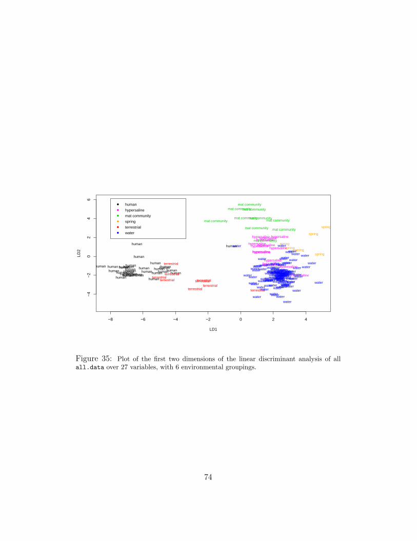
−8 −6 −4 −2 0 2 4
−4
−2
02
46
LD1
LD2
humanhumanhuman humanhuman
humanhuman human
human human
humanhumanhuman
human
humanhumanhuman
human
human
human
humanhuman
humanhuman humanhuman
humanhuman
human
humanhuman human
human
hypersaline
hypersaline
hypersalinehypersaline
hypersaline
hypersaline
hypersalinehypersaline
hypersaline
hypersaline
hypersaline
hypersaline
hypersaline
hypersaline
hypersaline
mat community
mat communitymat community
mat community mat community
mat community
mat community
mat community
mat community
mat community
spring
spring
spring
spring
spring
spring
terrestrialterrestrial
terrestrial
terrestrial
terrestrialterrestrial
terrestrial
terrestrialterrestrial
water
water
water
waterwater
waterwater
water
water
water
waterwater
water
water
waterwater
waterwater
water
waterwaterwater
water
water
water
water
water
water
water waterwaterwater waterwaterwaterwaterwaterwaterwater
waterwater
water
water
waterwater
water
waterwaterwater
waterwater
water
water
waterwater
water
waterwater
water
waterwater
water
water
water
water
water
water
water
waterwater water
water
water
waterwater
water
waterwater
waterwater
waterwater
water
waterwater
waterwaterwater
water
waterwaterwaterwater
water
water
water
waterwaterwater
water
water
water
water
water
water
water
water water
water
water
water
waterwater
waterwater
water
water
waterwaterwaterwater
water
water
water
waterwater
water
water
waterwater
●
●
●
●
●
●
human
hypersaline
mat community
spring
terrestrial
water
Figure 35: Plot of the first two dimensions of the linear discriminant analysis of allall.data over 27 variables, with 6 environmental groupings.
74

9.5 Trees
We also performed tree analyses on the data. The fully grown tree over allthe data is Figure 36. To figure out the best tree, we ran a series of cross-validation experiments. Figure 37 shows the mean and standard error ofmisclassification over 100 trials at different tree sizes, and Table 9 shows theaverage deviance for the series. From these we can determine that 9 leavesis the best, and plot the pruned tree seen in Figure 38.
While this tree is not as definitive as we might like, there is informationto be gleaned from it. At first glance we see that water is a leaf along severalbranches. This is less than ideal, and seems to indicate the wide range ofvalues among water samples. This spread is partly due to the presence ofboth freshwater and marine saline samples in the ‘water’ class, as well as thelarge sample size. However, note that the bacteria samples from terrestrialguts (human as well as non-human) are all on the left of the first node, havinga very low proportion of photosynthesis coding. That there are low levels ofcoding for photosynthesis here makes biological sense. Bacteria in eukary-otic guts have no access to sunlight, and so have nothing to photosynthesize.The human and non-human samples are split under membrane transport.On the other branch, with higher proportions of proteins dedicated to pho-tosynthesis, we see that there are differences between these groups as well,though they seem a bit more muddled. This is biologically sensible, since hotsprings, hypersaline, and water samples all come from aquatic environments,and the mat communities (though very different from the microbes that floatin water), also live in pools of water of varying salinity. Note that the watergrouping includes samples from a wide variety of marine environments, whichaccounts for the large variance. Again, the water samples mix in through thedata, but the tree appears to differentiate between environments. Of course,these are not perfect leaves, and there is some overlap between the groups,but the majority of the data splits along environmental lines, though the vastwater group mixes in.
9.6 Random Forest
As noted in Section 6, trees are highly unstable. In our research we have hadmore robust, and repeatable, results from Random Forest analyses, so thatis the next technique to use.
With unsupervised Random Forests, we want to see if our groupings
75

|Photosynthesis < 0.000795923
Mem.Trans < 0.012166
Dormancy < 0.00191578RNA.met < 0.0528424
Cell.Div < 0.0309652
Mem.Trans < 0.0144102
Cell.Wall < 0.0416959
DNA.met < 0.0431087Aromatic < 0.0109641
Cofactor.etc < 0.0939862
DNA.met < 0.0411064Amino < 0.128034
water terrestrialwater
human human
water hypersaline water water watermat communityspring hypersaline
Figure 36: Full tree grown from all.data using all available variables.
2 4 6 8 10 12
4050
6070
Tree Size
Mis
clas
sific
atio
ns
Mean
Mean+1sd
Mean−1sd
Figure 37: Plot of mean and standard errors of misclassifications for different sized treesover all.data.
76

Tree Size Average CV Deviance
1 72.653 52.054 50.266 45.639 42.4513 39.5415 39.82
Table 9: Tree size and average deviance from a series of tree cross-validation experimentsover all.data
|Photosynthesis < 0.000795923
Mem.Trans < 0.012166
RNA.met < 0.0528424
Mem.Trans < 0.0144102
Cell.Wall < 0.0416959 Cofactor.etc < 0.0939862
DNA.met < 0.0411064 Amino < 0.128034
terrestrial
water human
hypersaline water
water mat community spring hypersaline
Figure 38: Tree of all.data pruned to 9 leaves, as indicated by a series of cross-validation experiments.
77

match up with clear clustering in unmarked data. Similar to K-Means,PAM silhouettes help determine the best number of clusters. In the plot ofPAM silhouette widths (Figure 40), we see that K = 5 is the best point.Constructing MDS plots using PAM coloring (Figure 39a) and known group-ing coloring (Figure 39b), reveals its accuracy. We see that PAM seems tohave picked a cluster of human and terrestrial samples (circles, upper left),a cluster of mostly hypersaline data (triangles), a cluster of mat community,spring, and various extras (squares), and split the rest of the water samplesinto two clusters (inverted triangles and diamonds). The PAM coloring isnot a perfect match to our outside clustering, but it is similar.
We use supervised Random Forests to calculate the mean decrease accu-racy (plotted in Figure 41a) and mean decrease Gini (Figure 41b) of eachvariable. These graphs were discussed in Section 7.1. The variables withthe highest mean decrease accuracy are those judged most important foraccurate classification by the Random Forest, and those with highest meandecrease Gini are those that have the most impact on node purity. It is clearthat the functional group ‘Phages’ is one of the most important to separatingall.data, as it is at the very top of both plots. Looking at the clean breaks,we take the top variables from each and combine them to form a set of themost important variables. This is an excellent set of variables to create treesfrom, and a good set to start from when using any classification or clusteringtechnique.
Constructing a tree from this set of variables, as shown in Figure 42, wesee that it has similar leaves to the tree constructed using all the variables,which is in Figure 36. The difference is the purity of the nodes. In theRandom Forest assisted tree, the leaves are much more definitive. Originally,in the node that leads to the human class, there was approximately 40%chance of being human, but in the new tree, we have 85% probability ofbeing human and less than 10% chance for anything else. Using a smallerset of variables also increases the stability of the trees.
9.7 CDA
The next step was to perform a canonical discriminant analysis on all.data.We first did a CDA over all the variables, and looked at the vectors thatseemed most important from that plot. We also calculated error, using anLDA on canonical scores. Combining the information from all these analyses,we settle on a set of 8 functional hierarchies:
78

●
●
● ●
●
●●
●●
●
●●
●●●●●●
●● ●●●●
●
●●
●●
●
−0.4 −0.2 0.0 0.2 0.4
−0.
4−
0.3
−0.
2−
0.1
0.0
0.1
0.2
Dim 1
Dim
2
Unsupervised Random Forest MDS Plot, PAM Groupings, k=5
(a) PAM cluster coloring.
●
●
● ●
●
●●
●●
●
●●
●●●●●●
●
●
●
●
●●
●●●●
●
●
●
●
●
●
●
●
●
●
●
●
●
●
●
●
●
●
●
●
●●
●
●
●
● ●
●
●
●●
●
●
●
●
●●
●
●●●
●
●●
●
●
●
●
●
●
●
●
●
●
●
●
●●
●
●●
●
●●
●
●
●
●
●
●
●
●
●
●
●
●
●●
●
●
●
●
●
●
●
●
●
●
●
●●
●
●
●
●
●
●●
●
●●
●
●●
●
●
●
●
●
●
●
●
●
●
●
●
●●
●
●
●
●
●
●
●
●
●
●
●
●
●
●
●
● ●
−0.4 −0.2 0.0 0.2 0.4
−0.
4−
0.3
−0.
2−
0.1
0.0
0.1
0.2
Dim 1
Dim
2
●
●
humanhypersalinemat communityspringterrestrialwater
Unsupervised Random Forest MDS Plot of Microbial Data
(b) Known class coloring.
Figure 39: MDS plots of unsupervised Random Forest analysis on all.data.
79

2 4 6 8 10
0.07
0.08
0.09
0.10
0.11
0.12
K
Ave
rage
silh
ouet
te w
idth
PAM Silhouette Width, Unsupervised Random Forest Dissimilarity
Figure 40: PAM silhouette widths for all.data.
• Cell Wall and Capsule• Cofactors, Vitamins,
Prosthetic Groups, Pigments• Dormancy and Sporulation• Membrane Transport
• Phages, Prophages,Transposable Elements• Photosynthesis• Respiration• Stress Response
We performed our analysis using those variables, and plotted the results(Figure 43). This plot contains a lot of information. First, we see thatsamples from organisms split from water samples along the first canonicalcomponent, with the primitive mat communities in the middle. The firstcanonical component also separates the hot spring samples from the restof the water. The splitting along the second canonical component separateshuman and non-human samples, as well as hypersaline and hot spring samplesfrom the rest of the water. There is some overlap, but overall we see goodseparation into the general environmental categories. These findings aresimilar to those of Dinsdale et al. The four-fold increase of the metagenomicdatabase has further defined environmental clustering.
80

Cell.DivisionNitrogen.MetabolismPlasmidsPotassium.metabolismRNA.MetabolismFatty.AcidsProtein.MetabolismMiscellaneousRegulationRespirationVirulenceSecondary.MetabolismAminoSulfur.MetabolismNucleosidesDNA.MetabolismAromatic.MetabolismCarbohydratesMotilityDormancyCofactorsStress.ResponsePhotosynthesisCell.WallPhosphorus.MetabolismPhagesMembrane.Transport
●
●
●
●
●
●
●
●
●
●
●
●
●
●
●
●
●
●
●
●
●
●
●
●
●
●
●
2 3 4 5
Microbial Metagenomes
MeanDecreaseAccuracy
(a) Mean decrease accuracy.
PlasmidsCell.DivisionPotassium.metabolismNitrogen.MetabolismRNA.MetabolismProtein.MetabolismRegulationSecondary.MetabolismVirulenceMiscellaneousAminoRespirationSulfur.MetabolismFatty.AcidsNucleosidesCarbohydratesMotilityCell.WallDNA.MetabolismAromatic.MetabolismStress.ResponseMembrane.TransportPhosphorus.MetabolismDormancyCofactorsPhotosynthesisPhages
●
●
●
●
●
●
●
●
●
●
●
●
●
●
●
●
●
●
●
●
●
●
●
●
●
●
●
0 2 4 6 8 10
Microbial Metagenomes
MeanDecreaseGini
(b) Mean decrease Gini.
Figure 41: Variable importance plots generated using supervised RandomForest analysis on all.data.
81

|Photosynthesis < 0.000795923
Mem.Trans < 0.012166
Dormancy < 0.00191578
Mem.Trans < 0.0144102
Cell.Wall < 0.0416959
Phosphorus < 0.0116159
Cofactor.etc < 0.0939862
Phosphorus < 0.0140808 Cofactor.etc < 0.109989
water terrestrialhuman
water hypersalinewater
water mat communityhypersaline spring
Figure 42: Tree grown with the top 8 variables indicated by the variable importanceplots.
●●
●
●
●
●
●
●●
●●
●
●
●
● ●
●
●
●
●
●●●
●
●
●●
●
●
●●
●
●
−8 −6 −4 −2 0 2 4 6
−4
−2
02
46
Can1 (79.2%)
Can
2 (1
1.1%
)
++
+
+
++
human
hypersaline
mat community
spring
terrestrial
water
Cell.Wall
Cofactors
Dormancy
Membrane.Transport
PhagesRespiration
Secondary.Metabolism
Stress.Response
● humanhypersalinemat communityspringterrestrialwater
Figure 43: Plot of first two canonical components from CDA of all.data, computedover 8 variables.
82

human hyper- mat spring terrestrial water classsaline community error
human 6.025 0.000 0.490 0.000 0.390 0.095 0.139286hypersaline 0.000 1.760 0.000 0.000 0.000 1.240 0.413333
mat community 0.000 0.000 1.990 0.000 0.000 0.010 0.005000spring 0.000 0.135 0.000 0.865 0.000 0.000 0.135000
terrestrial 0.970 0.000 0.000 0.000 0.805 0.225 0.597500water 0.105 0.775 0.445 0.145 0.095 24.435 0.060192
Table 10: Confusion Matrix for CDA
9.8 Strength of Analysis
Using the LDA on CDA error estimation technique (the second discussed inSection 8.3), this model has an estimated 12.5% misclassification error, whichis very low. This was calculated by running the algorithm 200 times andaveraging the misclassifications. By doing this we improve our confidencelevel. The confusion matrix of this CDA is Table 10. Note that the rowsums are the number of OOB samples for each class, in this case 20% ofthe original class sizes. Looking at the last column, “class error,” we cansee the accuracy of our CDA as a predictor for each class, and averaging allthese scores (weighted by number of samples) gives us .125, our overall errorestimate. Looking more closely at the misclassifications, we see that most ofthem are benign. We see water, hypersaline, and spring mixing a little, whichis not surprising since they are just different types of aquatic habitats. Weare not surprised by the mixing of terrestrial organisms and humans either,since humans are terrestrial, but the mixups of human samples with matcommunity and water samples are a little disturbing. Taking into accountour sample sizes and the possibility for outliers, the error is small. Our modelis not perfect, but it is a very good predictor.
83

A Appendix: R Code
This appendix includes the R[21] code used to generate the graphics14 inSection 9. We reference several packages that we installed in R, more in-formation is available about each package (after it has been installed once)using the R commands:
> library(package.name)
> help(package.name)
For this overview, we’ll call our data frame “data”. We read the dataframe in from a tab-delimited text file “data.txt” that contains all the infor-mation we need to perform the analyses discussed in this section.
> data<-read.table("data.txt", header=T, sep="\t")> data
[1] [2] [3] ... [29] [30]name env Amino ... Virulence Genome.ID
coa1143 water 16125 ... 4742 4441143.3coa1144 water 17110 ... 5226 4441144.3
......
......
...gut452.4 human 14826 ... 5688 4440452.4
Note that columns [3:29] are the 27 variables (functional groupings). Inorder to compare our data samples, we normalized based on number of totalidentified hits, that is, we turned the number of hits in each functional groupinto a proportion, using a simple for-loop. Recall that we have n samples.In generating the graphs in Section 9, we used n = 203.
> cbind(env=data$env, name=data$name, data[3:29]/rowSums(data[3:29]), Genome.ID=data$Genome.ID)}
Now all.data contains n rows and 30 columns, and the data in columns[3:29] are the proportions of recognized hits that fall under that hierarchy.
A.1 Utilities
Here is a function that creates a formula from a data set y, predictors, andresponse variables.
14Note: This is the code used to generate original analyses and graphs. Since then manyof the figures have been remade in other programs, whose graphical abilities are differentfrom those in R.
84

> createFormula.fun <- function(y, response, predictors){ifelse(is.character(predictors[1]), for(i in 1:length(predictors)){
(1:length(names(y)))[names(y)==paste(predictors[i],sep="")]
->predictors[i]},predictors<-predictors);
predictors.names<-paste(names(y)[predictors], sep="");
ifelse(is.character(response),
(1:length(names(y)))[names(y)==paste(response,sep="")]
->response,response<-response);
response.name<-paste(names(y)[response], sep="");
fmla<-as.formula(paste("cbind(",paste(predictors.names,collapse=","),")
","∼ ",paste(response.name,collapse=""),collapse=""));
return(fmla) }
If response is given as a character, getSingleResponse.fun gets thenumeric value:
> getSingleResponse.fun <- function(y, response){if (is.character(response)){
for (i in 1:length(names(y))){if (names(y)[i] == response) response = i}}
return(response)}
This is code for breaking data into in-bag and out-of-bag sets. The func-tion takes outPercent as the percentage of data that should be out of bag,rounds to the nearest whole, then splits the data up and returns bag andoob.
> bagData.fun <- function(data, outPercent, response=c(1)){envColumn <- getSingleResponse.fun(data,response)
vCategories <- levels(data[,envColumn])
num levels <- length(vCategories)
for (i in 1:num levels){subData <- data[grep(vCategories[i],data[,envColumn]),]
sampleSize <- round(outPercent * length(subData[,1]))
randValues <- sample(1:length(subData[,1]), sampleSize)
bData <- subData[-1 * randValues,]
outData <- subData[randValues,]
if (i == 1) {
85

bagData <- bData
oobData <- outData}else{
bagData <- rbind(bagData, bData)
oobData <- rbind(oobData, outData)}}return(list(bag=bagData, oob=oobData))}
A.2 Principal Component Analysis
R has built-in principal component analysis functions, but we used the pack-age bpca[12]. Recall that the PCA is an unsupervised technique, and soit does not take into account groupings, so the input data frame will beall.data[3:29], a table of values only. To make a raw PCA analysis (un-scaled or scaled):
> pca.unscale<-bpca(data[3:29],var.scale=F)
> pca.scale<-bpca(data[3:29], var.scale=T)
These can then be graphed. However, for sake of clarity, we want toanalyze only the variables with highest variance. So we run:
> order(apply(data[3:29],2,sd),decreasing=T)+2
[1] 22 4 5 8 3 7 25 29 6 18 10 24 19 14 16 27 12 11 28 23
[21] 17 15 21 13 26 9 20
The resultant row vector (1×27) is the list (ordered high to low variance)of column names. When plotted, we found a clean break after the ten highestvariance values, so we compute:
> pca10scale<-bpca(data[c(22,4,5,8,3,7,25,29,6,18)], var.scale=T)
Note that, while the PCA is blind to the classes of the data while per-forming its analysis, R has access to the groupings from data. This meansthat we can indicate, on a plot of the PCA, which points are from whichclass. This is useful for finding where natural breaks in the data coincidewith those expected. To obtain Figure 29, we ran the code:
> plot(pca10scale, obj.name=F, obj.cex=1,
obj.pch=c(1,2,0,4,5,6)[unclass(data$env)],
obj.col=c(1,2,3,4,5,6)[unclass(data$env)],
86

xlim=c(-4,7), ylim=c(-5,5), var.factor=.5, var.cex=1)
A.3 K-Means
K-means is the first technique discussed that uses randomness. To exactlyreplicate results you get from an analysis that includes a random factor,use set.seed(x) for some x. When the seed value changes, the randomnumbers generated will also change. Setting the seed will ensure replicableresults, simply reset the seed to repeat the pattern.
To perform a K-means analysis for some K, averaging over 10 indepen-dent random starts:
> kmeans(data[3:29], K, nstart=10)
To make a sum of squares plot (Figure 31):
> temp<-rep(NA,15)
> for(k in 1:15){temp[k]<-sum(kmeans(data[3:29],k+1,nstart=10)$withinss)}
> plot(2:16, temp, type="o")
We wrote code to make both a silhouette plot (Figure 32) and a plot ofaverage silhouette widths (Figure 33), based off code by Marden[15]. Thedefault is to run the K-means algorithm with 10 random starts, but theargument iter allows that to change. The argument maxK (also with default10) is the maximum value of K that you want silhouettes for. This functiontakes a data frame "x" that has only data, no classes.
> doSilhouette.fun <- function(x, iter=10, maxK = 10){kms <- vector("list", maxK)
w <- NULL
for(k in 2:maxK) {kms[[k]] <- kmeans(x, centers=k, nstart=iter)
w <- c(w,sum(kms[[k]]$withinss))}ss <- NULL
for(k in 2:maxK) {a <- sil(x,kms[[k]]$centers)
s <- NULL
for(j in 1:k) {s<-c(s,sort(a[kms[[k]]$cluster==j]))}
87

ss <- cbind(ss, s)}par(mfrow=c(ceiling((maxK - 1) / 3),3))
for(k in 2:maxK) {plot(ss[,k-1], type="h", ylim=c(0,1), xlab="Observations",
ylab="Silhouettes")
title(paste("K =", k))}a <- apply(ss,2,mean)
win.graph()
par(mfrow=c(1,1))
plot(2:maxK,a,type="l",xlab="K",ylab="Average silhouette width")}
After running the function code, with 50 as our number of starts, weinput:
> doSilhouette.fun(data[2:29],iter=50)
After choosing some K-values from the elbow plot and silhouettes, welike to plot the PCA analysis with K-means cluster choices. In Figure 34,we graphed the scaled PCA analysis over the 10 highest-variance functionalgroups, and used K = 9. We’ve colored the image according to our classes,but shaped the data points according to their assigned cluster. To make thisimage:
> kmeans(data[c(22,4,5,8,3,7,25,29,6,8)], 9, nstart=10)-> cl9
> plot(pca10scale, obj.name=F, obj.cex=1,
obj.pch=c(1,2,0,4,5,6)[unclass(cl6$cluster)],
obj.col=c(1,2,3,4,5,6)[unclass(data$env)],
xlim=c(-5,20), ylim=c(-5,10), var.factor=5, var.cex=1)
A.4 Linear Discriminant Analysis
The linear discriminant analysis is one of the simpler functions to run in R.The function lda is in the package MASS[31] that is built in to R. To performan LDA against the environmental groups, simply run:
> lda.data<-lda(data[3:29],data$env)
To plot the LDA, just use:
plot(lda.data, col=c(1,2,3,4,5,6)[unclass(data$env)])
88

To plot just the first two linear functions, add the argument dimen=2.To estimate the misclassification rate of the LDA, we wrote a function
that runs a leave-one-out cross-validation. The data frame inputed into thisfunction needs to have the classification in its first column, the data in therest. First we run the code to create the function:
> error est<-function(x,response){n<-length(x[,1]);
k<-0;
getSingleResponse.fun(x,response)->response;
nlevels(x[,response])->levels.n;
confusion<-matrix(0,nrow=levels.n,ncol=levels.n);
row.names(confusion)<-levels(x[,response]);
for(i in 1:n){lda(x[-i,-response],x[-i,response])->x lda;
predict(x lda,x[i,-response])->x predict;
ifelse(x predict$class==x[i,response],k+0->k,k+1->k);
(1:levels.n)[levels(x[,response])==x[i,response]]->confusion.r;
(1:levels.n)[levels(x[,response])==x predict$class]->confusion.c;
confusion[confusion.r,confusion.c]+1->confusion[confusion.r,confusion.c]};output<-vector("list",2);
output[[1]]<-confusion;
output[[2]]<-k*1/n
output}
With this function, you can run LDA leave-one-out cross-validation onany data frame, as long as it has the classes in the first columns, and it willreturn the misclassification rate. For our example:
> error.est(data[2:29])
[1] 0.167
A.5 Trees
To exactly replicate results you get from an analysis that includes a randomfactor, use set.seed(x) for some x. When the seed value changes, therandom numbers generated will also change. Setting the seed will ensurereplicable results, simply reset the seed to repeat the pattern.
89

To do tree analyses in R, we used the tree[22] package.
> tr.data<-tree(as.factor(env)∼.,data[3:29])> plot(tr.data);text(tr.data, digits=1)
Optional: add argument label="yprob" to print the proportion of sam-ples in each leaf that belong to each class.
We wrote code to find the average deviance from a series of cross-validationexperiments. The function formats the names of predictor variables (predict)and response, grows a tree using the control parameters mincut and minsize,repeats a cross validation experiment n times, then outputs a data frame oftree size and average deviance.
> table.deviance<-
function(y, predict, response, n=100, kfold=10, mincut=0, minsize=0){createFormula.fun(y, response, predict)->fmla;
getSingleResponse.fun(y, response)->response;
ifelse(mincut!=0, tree.control(length(y[,response]), mincut, minsize)->control,
tree.control(length(y[,response]),5,10)->control);
y.tr<-tree(formula=fmla, data=data.frame(y), model=T, control=control);
y.tr$call<-call("tree", fmla, data=quote(y));
length(cv.tree(y.tr,,prune.misclass,K=kfold)$dev)->n.dev;
x<-rep(0,n.dev);
for(i in 1:n){cv.tree(y.tr,,prune.misclass,K=kfold)$dev+x->x};
cbind(cv.tree(y.tr,,prune.misclass,K=kfold)$size,x/n)->x;
rev(x[,1])->x[,1];
rev(x[,2])->x[,2];
data.frame(x)->x;
names(x)<-c("Tree Size","Average CV Deviance");
x;
}
A second function formats the names of predictor variables (predict) andresponse, grows a tree using the control parameters mincut and minsize,keeps track of total misclassifications over n cross-validation trials, then findsand plots the mean and standard error over all the trials.
> plot.misclass<-
90

createFormula.fun(y, response, predict)->fmla;
getSingleResponse.fun(y, response)->response;
ifelse(mincut!=0, tree.control(length(y[,response]), mincut, minsize)->control,
tree.control(length(y[,response]),5,10)->control);
y.tr<-tree(formula=fmla, data=data.frame(y), model=T, control=control);
y.tr$call<-call("tree", fmla, data=quote(y));
length(cv.tree(y.tr,,prune.misclass,K=kfold)$dev)->n.dev;
x<-matrix(0,nrow=n,ncol=n.dev);
for(i in 1:n){cv.tree(y.tr,,prune.misclass,K=kfold)$dev->x[i,]};
apply(x,2,sd)->x.sd;
apply(x,2,mean)->x.mean;
matplot(cv.tree(y.tr,,prune.misclass,K=kfold)$size,
cbind(x.mean,x.mean-x.sd,x.mean+x.sd), type="l",
ylab="Misclassifications", xlab="Tree Size",
col=c(1,2,2), lwd=2,main=" ");
legend("topright",legend=c("Mean","Mean+1sd","Mean-1sd"),
lty=c(1,3,2),lwd=2,col=c(1,2,2));
}
These functions were used to make the plots in Section 9.5. Specifically,for Figure 36:
> tree(env∼.,big[,2:29])->big.tree> plot(big.tree);text(big.tree)
Figure 37:
> plot.misclass(big,c(3:29),2,n=100)
Table 9:
> table.deviance(big,c(3:29),2,n=100)
Figure 38:
> prune.tree(big.tree,best=4)->big.tree4
> plot(big.tree4);text(big.tree4)
91

A.6 Random Forests
To exactly replicate results you get from an analysis that includes a randomfactor, use set.seed(x) for some x. When the seed value changes, therandom numbers generated will also change. Setting the seed will ensurereplicable results, simply reset the seed to repeat the pattern.
To do Random Forest analyses, we used the randomForest[17] R package.To compute a supervised Random Forest analysis:
> rfAll <- randomForest(all.data[3:29], all.data$env,
importance=TRUE, proximity=TRUE, ntree=5000)
Then we want to plot the variance important plots from this analysis(Figures 41):
> varImpPlot(rfAll, type=1, pch=19, col=black, cex=.8)
> varImpPlot(rfAll, type=2, pch=19, col=black, cex=.8)
And the unsupervised:
> urfAll <- randomForest(all.data[3:29],proximity=TRUE,ntree=5000)
With the unsupervised Random Forest analysis, we can create MDS plots.This is the coding for (Figure 39b):
> MDSplot(urfAll, all.data$env,
bg=rainbow(length(levels(all.data$env)))[unclass=all.data$env],
pch=c(rep(21:25,plot.cycles),
21:(21 + plot.remainder))[unclass=all.data$env],
palette=rep("black",length(levels(all.data$env))))
A.7 Canonical Discriminant Analysis
For our canonical discriminant analyses, we used the R package candisc[13].To perform a CDA, we first build a linear model using the functional groups(here referenced by their shortened column names) as our explanatory vari-ables, and environment class (env) as our response. Any set of variables canbe used in the formula, and several good methods of choosing variables havebeen discussed previously.
92

> data.mod <- lm(cbind(Amino, Carb, Cell.Wall, Cofactor.etc, DNA.met,
Dormancy, Fatty.Acids, Mem.Trans, Aromatic, Motility, Nitrogen,
Nucleo, Phages.etc, Phosphorus, Photosynthesis, Plasmids,
Potassium, Protein.met, Regulation, Respiration, RNA.met,
Secondary.met, Stress.Response, Sulfur, Virulence)
∼ env, data=data)
Only then can we use the canonical discriminant function:
> data.can <- candisc(data.mod, data=data)
The candisc object can then be plotted. To obtain Figure 43:
> data2.mod <- lm(cbind(Cell.Wall, Cofactor.etc, DNA.met, Dormancy,
Mem.Trans, Aromatic, Phages.etc, Respiration, Secondary.met,
Stress.Response) ∼ env, data=data)
> data2.can <- candisc(data2.mod, data=data)
> plot(data2.can, pch=c(1,2,3,4,5,6)[unclass(data$env)],
col=c(1,2,3,4,5,6)[unclass(data$env)], conf=0)
Two methods for error-estimation of CDA were discussed in Section 8.3,the first is here:
> can error<-function(y,response,predictors){getSingleResponse.fun(y,response)->response
for(i in 1:length(predictors)){getSingleResponse.fun(y,predictors[i])->predictors[i]} createFormula.fun(y,response,predictors)
length(y[,1])->row.n;
length(y[1,])->col.n;
levels.n<-nlevels(y[,response]);
error.n<-0;
confusion<-matrix(0,nrow=levels.n,ncol=levels.n);
row.names(confusion)<-levels(y[,response]);
for(i in 1:row.n){y[-i,]->x;
y.mod <- lm(fmla,data=x);
y.can <- candisc(y.mod,data=x);
y norm<-y;
apply(x[,predictors],2,mean)->x mean;
93

for(j in 1:length(predictors)){y[,predictors[j]]-x mean[j]->y norm[,predictors[j]]};
as.numeric(y norm[i,predictors])%*%y.can$coeffs.raw->score;
means.n<-length(y.can$mean[,1]);
mean dist<-rep(0,means.n);
cov.list<-vector("list",levels.n);
for(h in 1:levels.n){grep(levels(y.can$scores[,1])[h],y.can$scores[,1])->class.rows;
ifelse(i>=min(class.rows),class.rows,class.rows-1->class.rows);
cov(y.can$scores[class.rows,-1])->cov.list[[h]]};for(j in 1:means.n){
mahalanobis(as.numeric(score), as.numeric(y.can$mean[j,]),cov.list[[j]])
->mean dist[j]};(1:levels.n)[levels(y[,response])==y[i,response]]->confusion.r;
confusion[confusion.r,order(mean dist)[1]]+1
->confusion[confusion.r,order(mean dist)[1]];
ifelse(row.names(y.can$mean)[order(mean dist)[1]]==y[i,response],
error.n->error.n,error.n+1->error.n);
};output<-vector("list",2);
output[[1]]<-confusion;
output[[2]]<-error.n/row.n;
output;
};
This is the second:
> cdaErrorEst.fun <- function(metagenome, response, predictors,
outPercent=.2, trials=length(metagenome[,1])){totalTest = 0
totalError = 0
fmla <- createFormula.fun(metagenome,response,predictors)
envColumn <- getSingleResponse.fun(metagenome,response)
envFactor <- levels(metagenome[,envColumn])
facLength <- length(envFactor)
confuMatrix <- matrix(rep(0, facLength * (facLength+1)),
nrow=facLength, ncol=(facLength+1),
94

dimnames=list(envFactor, c(envFactor, "class.error")))
for (i in 1:trials){metagenomeBags <- bagData.fun(metagenome, outPercent, response)
bagMG <- metagenomeBags$bag
oobMG <- metagenomeBags$oob
metagenome.mod <- lm(fmla, data=bagMG)
metagenome.can <- candisc(metagenome.mod, data=bagMG)
can.scores <- metagenome.can$scores
can.env <- can.scores[,1]
metagenome.lda <- lda(can.scores[,-1], can.env)
bag.means <- apply(bagMG[,predictors],2,mean)
oobMG.norm <- oobMG[,predictors]
for (j in 1:length(oobMG[,1])){oobMG.norm[j,] <- oobMG.norm[j,] - bag.means}
oobMG.scores <- as.matrix(oobMG.norm) %*% as.matrix(metagenome.can$coeffs.raw)
metagenome.predict <- predict(metagenome.lda, oobMG.scores)
for (k in 1:length(oobMG[,1])){totalTest = totalTest + 1
currentRow <- oobMG[k,]
trueClass <- as.character(oobMG$env[k])
predictClass <- as.character(metagenome.predict$class[k])
confuMatrix[trueClass,predictClass]
<- confuMatrix[trueClass,predictClass] + 1
if (predictClass != trueClass){totalError = totalError + 1}
}}confuMatrix <- confuMatrix / trials
for (m in 1:facLength) {confuMatrix[m,facLength+1] = 1 - (confuMatrix[m,m] / sum(confuMatrix[m,]))
}return (list(error=(totalError / totalTest), confusion=confuMatrix))}
A.8 Packages Used
The R packages we used in the analyses presented here are:
95

• bpca[12]
• tree[22]
• randomForest[17]
• candisc[13]
• cluster[18]
• RColorBrewer[20]
96

References
[1] Thomas L. Madden Alejandro A. Schaffer Jinghui Zhang Zheng ZhangWebb Miller Altschul, Stephen F. and David J. Lipman. Gapped blastand psi-blast: a new generation of protein database search programs.Nucleic Acids Research, 25:3389–3402, 1997.
[2] FE. Angly, B. Felts, M. Breitbart, P. Salamon, RA. Edwards, C. Carlson,AM. Chan, M. Haynes, S. Kelley, H. Liu, JM. Mahaffy, JE. Mueller,J. Nulton, R. Olson, R. Parsons, S. Rayhawk, CA. Suttle, and FL.Rohwer. The marine viromes of four oceanic regions. PLoS Biology,4(11):21212131, 2006.
[3] L. Breiman, J. Friedman, R. Olshen, and C. Stone. Classification andRegression Trees. Wadsworth International Group, 1984.
[4] JM. Brulc, DA. Antonopoulos, ME. Berg Miller, MK. Wilson, AC.Yannarell, EA. Dinsdale, RE. Edwards, ED. Frank, JB. Emerson,P. Wacklin, PM. Coutinho, B. Henrissat, KE. Nelson, and BA. White.Gene-centric metagenomics of the fiber-adherent bovine rumen micro-biome reveals forage specific glycoside hydrolases. PNAS, 106(6):1948–1953, 2009.
[5] N.A. Campbell and William R. Atchley. The geometry of canonicalvariate analysis. Systematic Zoology, 30(3):268–280, 1981.
[6] S. Dasgupta. The Mahalanobis distance. Chemometrics and IntelligentLaboratory Systems, 50(1):1–18, 2000.
[7] Glenn De’ath and Katharina Fabricius. Classification and regressiontrees: A powerful yet simple technique for ecological data analysis. Ecol-ogy, 81(11):3178–3192, 2000.
[8] C. Desnues, B. Rodriguez-Brito, S. Rayhawk, S. Kelley, T. Tran,M. Haynes, H. Liu, M. Furlan, L. Wegley, B. Chau, Y. Ruan, D. Hall,F. E. Angly, R. A. Edwards, L. Li, R. Vega Thurber, R. P. Reid,J. Siefert, V. Souza, D. Valentine, B. K. Swan, M. Breitbart, and F. Ro-hwer. Biodiversity and biogeography of phages in modern stromatolitesand thrombolites. Nature, 452(20 March 2008):340–343, 2008.
97

[9] EA. Dinsdale, RA. Edwards, D. Hall, F. Angly, M. Breitbart, JM Brulc,M. Furlan, C. Desnues, M. Haynes, L. Li, L. McDaniel, MA. Moran, KE.Nelson, C. Nilsson, R. Olson, J. Paul, B. Rodriguez-Brito, Y. Ruan,BK. Swan, R. Stevens, DL. Valentine, RV. Thurber, L. Wegley, BA.White, and F. Rohwer. Functional metagenomic profiling of nine biomes.Nature, 452:629–632, 2008.
[10] EA. Dinsdale, O. Pantos, S. Smirga, RA. Edwards, F. Angly, L. Weg-ley, M. Hatay, D. Hall, E. Brown, M. Haynes, L. Karuse, E. Sala, SA.Sandin, RV. Thurber, BL. Willis, F. Azam, N. Knowlton, and F. Ro-hwer. Microbial ecology of four coral atolls in the northern line islands.PLoS ONE, 3(2):1–17, 2008.
[11] T. Disz, R. Edwards, R. Olson, R. Overbeek, G. Pusch, A. Rodriguez,and V. Vonstein. A novel use of k-mers to support accurate and rapidannotation of prokaryotic genomes and environmental samples.
[12] Jose Claudio Faria and Clarice Garcia Borges Demetrio. bpca: Biplot ofMultivariate Data Based on Principal Components Analysis. UESC andESALQ, Ilheus, Bahia, Brasil and Piracicaba, Sao Paulo, Brasil, 2009.
[13] Michael Friendly and John Fox. candisc: Generalized Canonical Dis-criminant Analysis, 2009. R package version 0.5-15.
[14] T. Hastie, R. Tibshirani, and J. Friedman. The Elements of StatisticalLeanring. Springer, 2001.
[15] Marden J. Multivariate Statistical Analysis Old School. lulu, 2008.
[16] K. Kurokawa, T. Itoh, T. Kuwahara, K. Oshima, H. Toh, A. Toy-oda, H. Takami, H. Morita, VK. Sharma, TP. Srivastava, TD. Tay-lor, H. Noguchi, H. Mori, Y. Ogura, DS. Ehrlich, K. Itoh, T. Takagi,Y. Sakaki, T. Hayashi, and M. Hattori. Comparative metagenomics re-vealed commonly enriched gene sets in human gut microbiomes. DNAResearch, pages 1–13, 2007.
[17] Andy Liaw and Matthew Wiener. Classification and regression by ran-domforest. R News, 2(3):18–22, 2002.
98

[18] Martin Maechler, Peter Rousseeuw, Anja Struyf, and Mia Hubert. Clus-ter analysis basics and extensions. Rousseeuw et al provided the S orig-inal which has been ported to R by Kurt Hornik and has since beenenhanced by Martin Maechler: speed improvements, silhouette() func-tionality, bug fixes, etc. See the ’Changelog’ file (in the package source),2005.
[19] F Meyer, D Paarmann, M D’Souza, R Olson, EM Glass, M Kubal,T Paczian, A Rodriguez, R Stevens, A Wilke, J Wilkening, and RA Ed-wards. The metagenomics rast server - a public resource for the au-tomatic phylogenetic and functional analysis of metagenomes. BMCBioinformatics, 9(1):386, 2008.
[20] Erich Neuwirth. RColorBrewer: ColorBrewer palettes, 2007. R packageversion 1.0-2.
[21] R Development Core Team. R: A Language and Environment for Sta-tistical Computing. R Foundation for Statistical Computing, Vienna,Austria, 2009. ISBN 3-900051-07-0.
[22] Brian Ripley. tree: Classification and regression trees, 2007. R packageversion 1.0-26.
[23] T. Shi and S. Horvath. Unsupervised learning with random forest pre-dictors. Journal of Computational and Graphical Statistics, 15(1):118–138(21), 2006.
[24] T. F. Smith and M. S. Waterman. Identification of common molecularsubsequences. Journal of Molecular Biology, 147(1):195 – 197, 1981.
[25] Leo Breiman Statistics and Leo Breiman. Random forests. In MachineLearning, pages 5–32, 2001.
[26] Terry M Therneau and Beth Atkinson. R port by Brian Ripley. rpart:Recursive Partitioning, 2009. R package version 3.1-45.
[27] RLV. Thurber, KL. Barott, D. Willner-Hall, H. Liu, B. Rodriguez-Mueller, C. Desnuesa, RA. Edwards, M. Haynes, FE. Angly, L. Wegley,and FL. Rohwer. Metagenomic analysis indicates that stressors induce
99
production of herpes-like viruses in the coral porites compressa. Proceed-ings of the National Academy of Sciences, USA, 105(47):1841318418,2008.
[28] RV. Thurber, D. Willner-Hall, B. Rodriguez-Mueller, C. Desnues, RA.Edwards, F. Angly, E. Dinsdale, L. Kelly, and F. Rohwer. Metage-nomic analysis of stressed coral holobionts. Environmental Microbiology,11(5):1–16, 2009.
[29] PJ. Turnbaugh, M. Hamady, T. Yatsunenko, BL. Cantarel, A. Duncan,RE. Ley, ML. Sogin, WJ. Jones, BA. Roe, JP. Affourtit, M. Egholm,B. Henrissat, AC. Heath, R. Knight, and JI. Gordon. A core gut micro-biome in obese and lean twins. Nature, 457:480–484, 2008.
[30] W. N. Venables and B. D. Ripley. Modern Applied Statistics with S.Springer, 2002.
[31] W. N. Venables and B. D. Ripley. Modern Applied Statistics with S.Springer, New York, fourth edition, 2002. ISBN 0-387-95457-0.
[32] L. Wegley, R. Edwards, B. Rodriguez-Brito, H. Liu, and F. Rohwer.Metagenomic analysis of the microbial community associated with thecoral porites astreoides. Environmental Microbiology, 9(11):2707–2719,2007.
[33] D. Willner, RLV. Thurber, and F. Rohwer. Metagenomic signatures of86 microbial and viral metagenomes. Environmental Microbiology, 2009.
100


![[2013.12.02] Mads Albertsen: Extracting Genomes from Metagenomes](https://static.fdocuments.net/doc/165x107/554f4724b4c905423f8b49e4/20131202-mads-albertsen-extracting-genomes-from-metagenomes.jpg)