A harmony of opposites - pdxscholar.library.pdx.edu
42
Portland State University Portland State University PDXScholar PDXScholar Dissertations and Theses Dissertations and Theses 1983 A harmony of opposites A harmony of opposites Patricia Reppenhagen Portland State University Follow this and additional works at: https://pdxscholar.library.pdx.edu/open_access_etds Part of the Art Practice Commons, and the Painting Commons Let us know how access to this document benefits you. Recommended Citation Recommended Citation Reppenhagen, Patricia, "A harmony of opposites" (1983). Dissertations and Theses. Paper 3391. https://doi.org/10.15760/etd.5245 This Thesis is brought to you for free and open access. It has been accepted for inclusion in Dissertations and Theses by an authorized administrator of PDXScholar. Please contact us if we can make this document more accessible: [email protected].
Transcript of A harmony of opposites - pdxscholar.library.pdx.edu

Portland State University Portland State University
PDXScholar PDXScholar
Dissertations and Theses Dissertations and Theses
1983
A harmony of opposites A harmony of opposites
Patricia Reppenhagen Portland State University
Follow this and additional works at: https://pdxscholar.library.pdx.edu/open_access_etds
Part of the Art Practice Commons, and the Painting Commons
Let us know how access to this document benefits you.
Recommended Citation Recommended Citation Reppenhagen, Patricia, "A harmony of opposites" (1983). Dissertations and Theses. Paper 3391. https://doi.org/10.15760/etd.5245
This Thesis is brought to you for free and open access. It has been accepted for inclusion in Dissertations and Theses by an authorized administrator of PDXScholar. Please contact us if we can make this document more accessible: [email protected].

A HARMONY OF OPPOSITES
by
PATRICIA REPPENHAGEN
A Thesis Report Submitted in Partial Fulfillment of the Requirements for the Degree of
MASTER OF FINE ARTS
in
.PAINTING
Portland State University, 1983
PORTlAND STAT£ UNIVERSITY LIBRARY

TO THE DEPARTMENT OF ART AND ARCHITECTURE:
The Members of the Thesis Committee Approve the Thesis and Report of Patricia Reppenhagen presented May 26, 1983.
/Mary Constans
~
Wilma .~hcridan
-

TABLE OF CONTENTS
PAGE
LIST OF ILLUSTRATIONS • • • • • • • • • • • • • • • • • • • • • • • • • • • ii
CHAP.rER I STATEMENT OF IDEAS, CONCEPT ••••••••••••• 1
II BACKGROUND•••••••••••••••••••••••••••••• 2
III INCORPORATION OF CONCEPr IN THE WORK •••• 7
IV PROCESS ••••••••••••••••••••••••••••••••• 11
V REFLECTIONS ••••••••••••••••••••••••••••• 13
ILLUSTRATIONS ••••••••••••••••••••••••••••••••••• 14
ILLUSTRATION SOURCES............................ 21

ii
LIST OF ILLUSTRATIONS
ILLUSTRATION
1 Allan d'Archangelo. Highway Number 80, 1964. Acrylic.
2 Andy Warhol. Elvis I and Elvis II, 1964. Acrylic and silkscreen enamel.
3 Victor Vasarely. Supernovae, 1959-61. Acrylic.
4 Georgia O'Keefe. Single Lilv with rled, 1928. Oil.
1i/ S_harles Sheeler. Water, 1945. Oil. ·-,~ ,• ,,~.¥
6~ '.:P""at Reppenhagen. View Through Vines, 1980. Acrylic. ,...,,.
"t " ~
II
·~; II
i6 n
11 II
12 n
i3 ff
14 IJ
15 II
16 n
11 fl
,.,
18 ti
19 "u
' -
20 n
{ 21 II
~,' '
22 " 23 n
II
u
It
" ff
n
11
.. 11
If
If
"
" II
II
" "
Around the Table, 1981. Acrylic.
Tomatoes and Grapefruit, 1980. Acrylic.
Resting Man, 1981. Acrylic.
Crossing Pedestrians, 1981. Acrylic.
Reading Couple, 1981. Acrylic.
Onions I, 1981. Acrylic.
Onions II, 1982. Acrylic.
Pineapple I, 1982. Acrylic.
.Q!:ossing Pedestrians, 1981. Colored pencil.
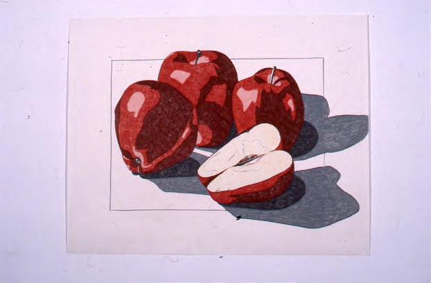
Aoples I, 1982. Colored pencil.
Apples II, 1982. Ebon3 pencil~
Grapes, 1982. Ink and colored pencil.
Pineapple I, 1982. Ink and colored pencil.
Green Pepper I, 1981. Colored pencil.
Radishes, 1982. Ink and colored pencil.
Bananas, 19810 Colored pencil.
Onions, 1981. Colored pencil.

CHAP.rER I
STATEMENT OF IDEAS, CONCEPr
The central concept of my work is to bring opposing
visual elements into harmony with one another. I feel that
every aspect of life is composed of contradictory components
or forces: order vs. chaos, the beautiful vs. the offensive,
work vs. leisure, excitement vs. stability, method vs.
chance. The examples are endless. These opposing elements
are components in life which need to be balanced against
each other to achieve harmony and order, as opposed to
strife and conflict. Personally, the need for order and
control in my own life is important and, I feel, is
reflected in the above classical idea of harmony and balance.

CHAPTER II
BACKGROUND
A wide range of experiences and interests has
influenced me in the development of my work. I have always
lived in urban areas: Detroit, Cleveland, Chicago, and now
Portland. Like most other people, especially those living
2
in the city, I have been exposed to the attention-getting
tactics of the mass media: billboards, neon signs, posters,
handbills, television commercials. ~~ awareness of the
visual imagery in advertising has been heightened through
my studies and work as a graphic designer. Since the
representation of specific subject matter has also always
interested me, as opposed to the motifs of non-objective
art, it is not surprising that my work can be seen as having
some similarity to some of the imagery associated with the
Pop Art Movement. The clean, graphic shapes of Allan
d'Archangelo's Highway Number 80, 1964 (ill. 1), are similar
to the forms in my Tomatoes and Grapefruit painting {ill. 8).
The straight, diagonal lines of the highway resemble the
diagonal lines of the grid behind the fruit. The organic
forms of the landscape are strikingly similar to the irreg
ular shapes inside the tomatoes and grapefruit. Another Pop
artist, Andy Warhol, used the posterization process that I
have adopted in my work. This device, which is commonly used

3
in advertising art, accounts for the similar "high contrast
look" of Warhol's Elvis I and Elvis II, 1964 ·(ill.2), and
my Crossing Pedestrians painting (ill.10).
I have always enjoyed mathematics. This was a special
interest of mine during my studies at Wayne State University.
Also I had four years of accelerated math and science in
high school. The mathematical challenge of my geometric
grids, which are superimposed on some of my imagery, is a
particular delight to me. In my Resting Man painting (ill.9),
I applied the algebraic formula of X ~ 1, X=1,2,3,4 to
determine the number of inches of gradated space in the
horizontal gray bars and the spaces between them. In this
vein, Victor Vasarely has caught my attention. He says,
11Everything that I have been able to produce of major scope
has tallied as by enchantment with the most recent achieve
ments of science and technology. 111 Just as Vasarely employs
technology through the use of a computer, I use darkroom
techniques, a projector and airbrush. The geometric grid in
my Onions II painting (ill. 13) was directly inspired by the
upper right-hand corner of Vasarely's Supernovae, 1959-61
(ill. 3). Patterns achieved through geometry are an
important element in Vasarely's work as well as in my own.
From this purely technical description, it might be feared
1Marcel Joray, Vasarely (Switzerland, Editions Du Griffon, 1976), p. 44.

4
that dryness and sterility might afflict the work.
Hopefully the artist will be able to use these technological
tools in an imaginative and creative way to make personal
and unique works of art.
Another artist who has influenced me is Georgia
O'Keefe. I remember being especially taken by one of her
paintings from the Jack in the Pulpit Series. I saw it at
The Art Institute of Chicago in 1978. At that time, I
admired her use of an ~nlarged image, as well as the subject
matter of the flower, with its elegant organic shapes. These
elements are apparent in my Pineapple I painting and drawing
(ill. 14 and 19). Note the similarity of composition and
form of these works and her Single Lily with Red, 1928
(ill. 4). O'Keefe is loosely associated with the Precision=>
ist Movement, and Charles Sheeler is one of the predominant
artists of that movement. Sheeler's subject matter is
typical of the Precisionists; factories, skyscrapers,
railroads and bridges. Although I do not take my subject
matter from the American industrial scene, I do use man
made geometric imagery. Take a look at Charles Sheeler's
Water, 1945 (ill. 5). He uses photographs to define his
initial imagery. His paintings are also brought to a
sharp],~' defined and near-flawless finish, with little
evidence to me of bEushstrokes or the trials and hesitations
of arriving at the finished stage. I hope my work shares
this quality, which I mainly attribute to that portion

of my personality which demands a high degree of
"precision" in the work. Other similarities to Sheeler's
work incluoe tbe u5e o! 5traight lines, flat planes and
formalized geometric compositions.
5
During Fall Term 1981, my research for an art history
term paper, entitled A Question of Art and Science:
Georges Seurat, made me aware of some interesting parallels
in our thinking. In a letter to Maurice Beaubourg, dated
August 28, 1890, Seurat gave a complete exposition of
his esthetic:
ESTHETIC
Art is harmony. Harmony is the analogy of opposites, the analogy of similar elements of value, hue and line, considered according to their dominants and under the influence of lighting, in gay, calm, or sad combinations. The opposites are: For value, a more luminous, light, for a darker one. For hue, the complementaries; i.e., a certain red opposed to its complementary, etc., red-green, orange-blue, yellow-violet. For line, those forming a right angle. 2
I was startled to find such a striking similarity to
my ideas about art and the harmony of opposites. Our
concern for the balance of light and dark values is
parallel. Our approaches differ slightly concerning hue
2Letter of Seurat to Beaubourg, August 28, 1890, as published by William Homer, Seurat and the Science of Painting (Cambridge, Massachusetts, 1964), pp.186-187.

and line. I use black, white and grays vs. color, as
opposed to complementary hues. And instead of using lines
of opposing directions, as Seurat suggests, I empl~y
organic, irregular shapes and lines vs. geometric,
man-made forms. Seurat states that "Art is harmony."
I think of life in general and each of our personal life
experiences as being harmony. I ·see most decisions
and experiences as being the resolution of two opposing
forces which represent the extremes of possible behavior.
This is actually what I am trying to represent in my
artwork.
6

CHAPTER III
INCORPORATION OF CONCEPr IN THE WORK
I have developed the ideas in my work by trying to
incorporate opposite visual elements in a harmonious
balance. By a harmonious balance, I mean artwork that is
optically pleasing to me. Specifically, I use contrary
formal elements, such as irregular, organic, curvilinear
shapes and lines vs. regular, geometric forms; color vs.
black, white and grays; gradated color vs. flat color.
In the Around the Table painting (ill. 7) the seated
figures are made up of irregular, organic shapes which
7
are contrasted with the regular, geometric elements of the
circular table and grid-like tile floor. Similarly, the
Banana.a drawing (ill. 22) shows the brightly colored,
organic forms of the fruit played against the contrasting
gray, man-made grid.
My view is generally a positive, optimistic one,
particularly in my outlook on resolving conflicts between
humankind and nature. I want to present a successful
relationship between man-made and organic forms by bringing
them into harmonious visual interaction. I also try to use
colors that are pleasing to myself, although some of the
darker colors in my works could be interpreted as gloomy.
Looking again at Seurat's Theory of Esthetic:

Gaiety of value is the light dominant; of hue, the warm dominant; of lines, lines above the horizontal. Calmness of value is the equality of dark and light; of hue, of warm and cool; and the horizontal for line. Sadness of value is the dark dominant; of hue, the cool dominant; and of line, downward direction. 3
To a degree, I have ref erred to this portion of
Seurat's theory. However, I have made allowances for
8
color selection with regard to subject matter, and
the darker colors of my work conform with the division
of the image into three major value groups (discussed
in Part IV, PROCESS). I directly use his principle of
"Calmness of value is the equality of dark and light."
A similar value range and area coverage of each
value is the key element which brings the black, white,
and gray areas into visual harmony with the color areas.
This can be _easily seen in the Reading Couple painting
(i-11. 11) as well as in the Tomatoes and Grapefruit
painting (ill.8). The image remains intact and recog
nizable because the values of the gray and the color
representing one shape are the same. I have always
remembered Johannes Itten's principle, "Equality of light
or dark relates colors to each other, tying or bracketing
them together. Light-dark contrast between them is
extinquished. This is an invaluable resource of
3Homer, pp. 186-187.

artistic design. 11 4
The pair of opposites that I have most recently
incorporated into the work can best be seen in tbe
Onions I painting and in the Green Pepper I and
Pineapple I drawings (ill. 12, 19 and 20). This is the
use of color gradation vs. flat color areas. In the
paintings, the gradation of color is achieved with the
use of an airbrush and in the drawings, with varying
intensity of colored pencil.
My central concept also determines subject matter.
I look for imagery that has natural organic form as
9
well as geometrically based form. Figures in urban settings
and fruits and vegetables contrasted with geometric
elements provide t_he necessary opposing shapes and lines.
At the beginning of my program, I started out with human
figures in man-made geometric settings. I found that this
imagery sometimes leads viewers to receive unintended
messages from the positions and the activities of the
people shown. For instance, the Crossing Pedestrians
image (ill. 10 and 15) often elicited comments about the
social isolation of these urban dwellers. This was quite
a learning experience for me. Initially, I was upset
by these comments. Then I realized that these comments
4Johannes Itten, The Art of Color (New York, Van Nostrand Reinhold Co., 1973), p. 53.

10
from the viewers were certainly valid ones, and that
perhaps I did include other messages of my own on a level
that was not a conscious one. So, I have realized that
ideas are perceived differently by the viewer and that
this really is acceptable.
The fruits and vegetables have a more neutral content.
Their visual image is consistent and exists in a wide
range of cultures, so they have little meaning or
connotations of their own. I also find them to be a bit
humorous, especially those on a larger-than-life scale,
like the five foot tall Pineapple I painting (ill. 14).

CHUTER IV
PROCESS
I us~ a well-defined, methodical process to produce
the work. This systematic procedure suits my temperament
and parallels my approach to other areas of my life.
I begin by taking photographs. After having the film
developed, I take the negatives into the darkroom and
expose the image to a high contrast film called Kodalith.
I experiment with several different time exposures
until I have two films that have broken the image into
11
the desired value families. This step in the process,
called posterization, breaks the imagery into three
general value groups with approximately equal area
coverage of each value. This helps give my work a uniform
look as well as creating a more personal, stylized way
of seeing imagery. Posterization of the image enables me
to see the basic structure of the subject. Using an
Astroscope opaque projector, I project each of these
kodalith images seperately onto the canvas or paper, and
then pencil in outlines of the form. The projected
outlines are used as guides for the application of acrylic
paint or colored pencil. Some painted areas are masked
with frisket film and then sprayed, using a Model 350
Wagner Power Painter. The areas of flat color are obtained

12
with several thin coats of paint applied with a brush.
I have been using the spray gun on larger areas of recent
paintings as I master the technical problems of this
technique. A considerable number of changes and additions
are made from the initial pencil outline. Some changes are
made to emphasize the central theme of the work and
others to make allowances for practical considerations,
such as the amount of detail that can be handled.

CHAPTER V
REFLECTIONS
As my graduate program draws near to its end, I
can look back on the past two years and feel that it
was a significant learning experience. Primarily, I
13
have learned about myself. I have addressed soul-searching
questions; i.e., What is art? What is ~ art? Where did
my art come from? What does it mean to me? Where does
art fit into my life? As I reflect on these issues, I
realize that I have barely scratched the surface in
their resolutions and I have been made aware of the vast
horizons that could be discovered through the further
development of my work.


ILLUSTRATION SOURCES
(ill. 1) David Irwin, "Pop Art and Surrealism," Studio, 171, May 1966, p. 190.
(ill. 2) Edward Lucie-Smith, Art Now: From Abstract Expressionism to Surrealism, (New York, Wm. Morrow & Co., Inc., 1981), p. 201.
21
(ill. 3) Marcel Joray~ Vasarelv, (Switzerland, Editions Du Griffon, 1976J, p. 39.
(ill. 4) Karen Petersen and J.J. Wilson, Women Artists: .Reco nition and Rea raisal from the Earl ·Middle Ages to the Twentieth Century, New York, Harper. and Row, 1976), p. 121.
(ill,~ 5) Martin Friedman, Charles Sheeler, (New York, Watson-Guptill Publications, 1975), p. 124.


I
'


'