4 Elements of a Winning Product page
11
BEST PRACTICES IN RETAIL WEBSITE TESTING AND OPTIMIZATION, PART 3 4 ELEMENTS OF A WINNING PRODUCT PAGE
-
Upload
maxymiser -
Category
Technology
-
view
1.388 -
download
1
description
"4 Elements of a Winning Product Page” takes the industry’s best of examples of online retailers who are getting it right, and who have reaped conversion and revenue rewards in return. The eBook looks at crucial category page areas such as pricing, imagery, page layout, product ratings and reviews, calls-to-action, and recommendations to help retailers on a path to better customer experiences.
Transcript of 4 Elements of a Winning Product page

BEST PRACTICES IN RETAIL WEBSITE TESTING AND OPTIMIZATION,
PART 3
4 ELEMENTSOF A WINNING
PRODUCT PAGE

$
4 Elements of a Winning Product Page : : Best Practices in Retail Website Testing and Optimization, Part 3
2
Table of Contents
4 Elements of a Product Page
5 #1 Product Imagery, Pricing and Layout 6 #2 Product Ratings & Reviews 7 #3 Calls-to-Action 8 #4 Related Product Recommendations 10 Case Study: HarperCollins

3
4 Elements of a Winning Product Page : : Best Practices in Retail Website Testing and Optimization, Part 3
There’s no underestimating the importance of a product page. It’s the grand finale before a choice is made to “Add to Cart.”
It’s really the only goal that matters at this point in the path to purchase. But as we know, this is not as simple — or easy — as it sounds.
Because behind this seemingly straightforward choice for the visitor is a world of possibility for retailers when it comes to copy, design, layout and functionality.
So, what does it take to improve your “add to cart” odds?

4
4 Elements of a Winning Product Page : : Best Practices in Retail Website Testing and Optimization, Part 3
Elements of a Product PageIt goes without saying that the star of your product page is, well...the Product!
But a multitude of details — from the small to the significant — play a pivotal role in giving shoppers the nudge they need to go from
“on-the-fence” to “add-to-cart,” while still tempting them to shop more and buy more.
It starts by giving plenty of attention to your featured product with appealing and revealing images, along with key information and relevant descriptions and recommendations.
There are 4
crucial parts of the page to pay attention to for the utmost in optimization…

The clean design relies only on the style and design of the product to grab the attention and interest
of the shopper.
Clearly displayed pricing
information, along with
called-out details on the shoe’s
distinct fit, allow for informed shopping.
A hover-over zoom feature mimics the in-store experience by allowing
shoppers to inspect the product closely.
$
5
4 Elements of a Winning Product Page : : Best Practices in Retail Website Testing and Optimization, Part 3
Clear product images, taken from different angles and showing the ins and outs, the ups and downs, the size and colors, give shoppers the next-best thing to brick-and-mortar shopping. Pricing should be prominently displayed alongside images, and testing out different colors and font sizes will help you discover what resonates with your audience.
Element #1Product Imagery, Pricing and Layout

Highlighted star-based ratings system is displayed above the fold, offering immediate value
judgment, while also encouraging shoppers to read more.
Starred reviews feature prominently in other recommended products, reinforcing the value of other products and encouraging
shoppers to explore them.Review details are located directly below the product image
to engage visitors.
Share to social feature functionality with additional
Own/Love/Want feature allows — and encourages — visitors
to post to Facebook.
Reviews can be sorted by “Most Recent,” “Lowest Rating”
or “Highest Rating.”
Product reviews are called out near the price display.
Product images submitted by people who already have purchased offer a richer form of endorsement
and recommendation.6
4 Elements of a Winning Product Page : : Best Practices in Retail Website Testing and Optimization, Part 3
Element #2Product Ratings & Reviews
The ratings and reviews of fellow customers can help sway uncertain customers, or reassure them that they are buying into something great. Stars or numbered rankings offer an immediate signal that others have bought, used and rated a particular product, and they encourage shoppers to look to longer, text-driven reviews for more product information and insights.

CTA falls above the fold.
Crucial calls-to-action are featured in gold,
the same color as the pricing, to draw the eye.
CTA is a bright color with an icon and clear language.
7
4 Elements of a Winning Product Page : : Best Practices in Retail Website Testing and Optimization, Part 3
Leave nothing up to chance with the button your visitors will be engaging with to “Add to Cart.” Clear, prominent calls-to-action are essential to encouraging desired behaviors. Testing out the color, size, copy and location will inform you of what makes your customers click the most.
Element #3 Calls-to-Action
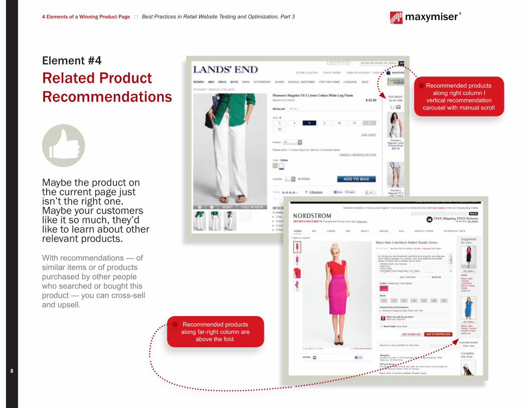
Recommended productsalong far-right column are
above the fold.
Recommended products along right column l
vertical recommendation carousel with manual scroll
8
4 Elements of a Winning Product Page : : Best Practices in Retail Website Testing and Optimization, Part 3
Maybe the product on the current page just isn’t the right one. Maybe your customers like it so much, they’d like to learn about other relevant products. With recommendations — of similar items or of products purchased by other people who searched or bought this product — you can cross-sell and upsell.
Element #4 Related Product Recommendations

The sizes are presented like buttons, darkening upon selection.
Price, size and CTA are all presented in a far-right column, highlighted with a light blue box.
CTA is shown in a contrasting color to draw attention.
Layout: This product page is organized as 3 columns, allowing much more
information to be shown above the fold.
Reviews and social elements are
located directly below product name.
Product description is presented in tab format,
with “More” link that triggers a pop up with
additional text.
Recommended products that “Complete the Look” are shown to
the right of the main image.
Clear product pictures with
alternate views and zooms.
9
4 Elements of a Winning Product Page : : Best Practices in Retail Website Testing and Optimization, Part 3
The Full ThrottleSometimes, a product page just has it all goin’ on.

WINNER
DEFAULT
10
4 Elements of a Winning Product Page : : Best Practices in Retail Website Testing and Optimization, Part 3
Book retailer HarperCollins wanted to determine optimal page design to implement during site redesign. Instead of playing guessing games with their product pages, HarperCollins decided to use Maxymiser’s multivariate testing to inform the new design.
The test looked at crucial elements such as price (showing or not showing), the CTA (red button vs. third-party branded icons), the location and look of the “read now” button and presence of “shop other retailers” in the description.
Real-Life Product Page Conversion
The winning page produced a 4.77% uplift in conversion rates.
11
4 Elements of a Winning Product Page : : Best Practices in Retail Website Testing and Optimization, Part 3
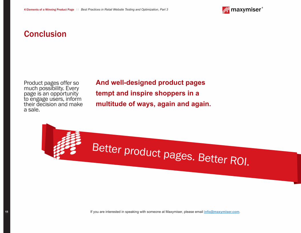
Product pages offer so much possibility. Every page is an opportunity to engage users, inform their decision and make a sale.
Conclusion
Better product pages. Better ROI.
If you are interested in speaking with someone at Maxymiser, please email [email protected].
And well-designed product pages tempt and inspire shoppers in a multitude of ways, again and again.