
29 February 2016 DAVID KERLY'S GOLD-SILVER-SHARES and MARKETS
11
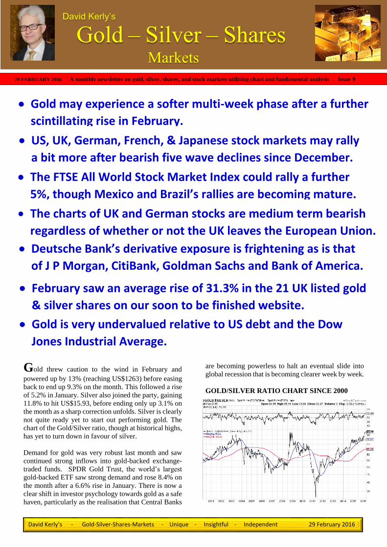
Gold – Silver – Shares Markets David Kerly’s David Kerly’s - Gold-Silver-Shares-Markets - Unique - Insightful - Independent 29 February 2016 Gold threw caution to the wind in February and powered up by 13% (reaching US$1263) before easing back to end up 9.3% on the month. This followed a rise of 5.2% in January. Silver also joined the party, gaining 11.8% to hit US$15.93, before ending only up 3.1% on the month as a sharp correction unfolds. Silver is clearly not quite ready yet to start out performing gold. The chart of the Gold/Silver ratio, though at historical highs, has yet to turn down in favour of silver. Demand for gold was very robust last month and saw continued strong inflows into gold-backed exchange- traded funds. SPDR Gold Trust, the world’s largest gold-backed ETF saw strong demand and rose 8.4% on the month after a 6.6% rise in January. There is now a clear shift in investor psychology towards gold as a safe haven, particularly as the realisation that Central Banks are becoming powerless to halt an eventual slide into global recession that is becoming clearer week by week. GOLD/SILVER RATIO CHART SINCE 2000 29 FEBRUARY 2016 A monthly newsletter on gold, silver, shares, and stock markets utilising chart and fundamental analysis Issue 9 The charts of UK and German stocks are medium term bearish regardless of whether or not the UK leaves the European Union. February saw an average rise of 31.3% in the 21 UK listed gold & silver shares on our soon to be finished website. US, UK, German, French, & Japanese stock markets may rally a bit more after bearish five wave declines since December. Deutsche Bank’s derivative exposure is frightening as is that of J P Morgan, CitiBank, Goldman Sachs and Bank of America. Gold may experience a softer multi-week phase after a further scintillating rise in February. Gold is very undervalued relative to US debt and the Dow Jones Industrial Average. The FTSE All World Stock Market Index could rally a further 5%, though Mexico and Brazil’s rallies are becoming mature.
-
Upload
david-kerly -
Category
Documents
-
view
116 -
download
0
Transcript of 29 February 2016 DAVID KERLY'S GOLD-SILVER-SHARES and MARKETS
’s
Gold – Silver – Shares Markets
David Kerly’s
David Kerly’s - Gold-Silver-Shares-Markets - Unique - Insightful - Independent 29 February 2016
Gold threw caution to the wind in February and
powered up by 13% (reaching US$1263) before easing
back to end up 9.3% on the month. This followed a rise
of 5.2% in January. Silver also joined the party, gaining
11.8% to hit US$15.93, before ending only up 3.1% on
the month as a sharp correction unfolds. Silver is clearly
not quite ready yet to start out performing gold. The
chart of the Gold/Silver ratio, though at historical highs,
has yet to turn down in favour of silver.
Demand for gold was very robust last month and saw
continued strong inflows into gold-backed exchange-
traded funds. SPDR Gold Trust, the world’s largest
gold-backed ETF saw strong demand and rose 8.4% on
the month after a 6.6% rise in January. There is now a
clear shift in investor psychology towards gold as a safe
haven, particularly as the realisation that Central Banks
are becoming powerless to halt an eventual slide into
global recession that is becoming clearer week by week.
GOLD/SILVER RATIO CHART SINCE 2000
29 FEBRUARY 2016 A monthly newsletter on gold, silver, shares, and stock markets utilising chart and fundamental analysis Issue 9
The charts of UK and German stocks are medium term bearish
regardless of whether or not the UK leaves the European Union.
or not.
February saw an average rise of 31.3% in the 21 UK listed gold
& silver shares on our soon to be finished website.
US, UK, German, French, & Japanese stock markets may rally
a bit more after bearish five wave declines since December.
Deutsche Bank’s derivative exposure is frightening as is that
of J P Morgan, CitiBank, Goldman Sachs and Bank of America.
Gold may experience a softer multi-week phase after a further
scintillating rise in February.
Gold is very undervalued relative to US debt and the Dow
Jones Industrial Average.
The FTSE All World Stock Market Index could rally a further
5%, though Mexico and Brazil’s rallies are becoming mature.

David Kerly’s - Gold-Silver-Shares-Markets - Unique - Insightful - Independent 29 February 2016
FINANCE OFFICIALS FROM G20 MEMBER
COUNTRIES MET IN SHANGHAI ON 26th-27th
FEBRUARY
As we suspected finance ministers and central bankers
of the G20 nations tried to reassure jittery financial
markets over this weekend that the global economy is
healthy. However, they acknowledged in a statement
that they "need to do more" to boost growth. It is our
view at Gold-Silver-Shares-Markets that they are going
to find it very difficult, to sustain growth, let alone
“boost it” given the downtrends that are developing in
the charts of global stock markets and economic data.
They promised on Saturday to use "all tools" to shore
up sagging global growth and to avoid devaluing their
currencies to boost exports, but made no pledges of joint
action. Such a comment reminds us of Mario Draghi’s
2012 comment that the ECB will do “whatever it takes”
to save the Eurozone from collapse. So far a policy of
Q/E and now negative interest rates is not working. We
note the German bank Commerzbank commented in its
2015 interim report last August that “companies
unwillingness to invest, which is reflected in low
demand for credit, is lessening only very gradually”.
Global growth is at its lowest in two years and
forecasters say the danger of recession is rising. The
International Monetary Fund cut this year's global
growth forecast by 0.2 percentage points last month to
3.4 percent. It said another downgrade is likely in April.
On Friday, Germany's finance minister said his
government would refuse to take part in any new joint
stimulus in the event of falling global growth. He
insisted governments had to embrace reforms instead.
The Shanghai meeting concluded that a possible vote to
withdraw from the Eurozone "is among the biggest
economic dangers this year," Osborne said. "If that's
their assessment of the impact on the world economy,
imagine what it would do to the U.K." We have also
noted the surprising openness displayed by George
Osborn recently in TV appearances and in the press
about the difficulties facing the UK economy.
Other gold exposed funds such as the UK based
BlackRock Gold & General Fund which invests in gold
and silver mining shares (77.4%) and precious metals
(17.7%) has risen 36.7% since the end of 2015. Below
we show a chart of it back to 2011.
A clear floor became established at 500 and the recent
sharp rise has cut the downtrend. Some work will
though be needed to get through major resistance in the
800 region. However, clearly, a buy on dips. We also
show a chart of the FTSE 100 index which is
diametrically opposed and is a clear sell on rallies.
GOLD – DAILY CHART WITH COT
(COMMITMENT OF TRADERS INDICATOR)
Gold rose further than we were expecting last month,
but as can be seen from the wide divergence in net
positions of Hedge Funds (large specs) and the
producers (commercials), a downward reaction is now
likely. As to how far it could react is, as ever, not an
easy task. However, it should at least drop back into the

David Kerly’s - Gold-Silver-Shares-Markets - Unique - Insightful - Independent 29 February 2016
US$1160 to US$1180 support zone from the
August/October top areas and quite possibly beyond
that to the 50% and 61.8% retracement levels at
US$1155 and US$1129. We should though get some
strong clues from the price action and the COT position
when a base or reaction low has been established.
Though we cannot say with certainty how long this may
take, we suspect that given the significant overextension
above the 200 day moving average, which has only just
turned up, that it may take longer than the gold bulls
among us would prefer. It’s a bit like the financial
prudence needed after blowing ones monthly salary on
a new bike or the new Microsoft surface book laptop!
SILVER – DAILY CHART WITH COT
(COMMITMENT OF TRADERS INDICATOR)
Silver broke above resistance from the early December
high of US$14.66 sooner than expected. This completed
a near three month base pattern, meeting and exceeding
our target of US$15.30, the 61.8% retracement level and
the base target of US$15.62 to reach US$15.92 before
retreating. Silver was unable to extend anywhere as far
above the 200 day moving average that gold did and is
now in danger of dropping well back into the underlying
near three month base area. In fact we would not be
surprised to see short positions being aggressively built
up in anticipation of even a test of the December lows
around US$13.62-US$13.66. Such is the volatile nature
of silver though, that we would again not be surprised
to see a sharp recovery once a fresh floor had been
established. Here too, some advance warning should be
evident in the price action and COT position.
STOCK MARKET RALLIES FOLLOW FIVE
WAVE DECLINES
The sharp falls in stock markets during the opening half
of January and February were waves three and five,
completing the down legs from the early December
highs. We have labelled the waves on the five stock
market charts shown.
The MACD for the S&P 500 Index is very similar to
that seen in September/October when a bear market
rally followed. This time the rally has scope to test the
2025-2050 supply area before selling pressure reverses
the market to the downside for a fresh bear leg.
The FTSE 100 has oscillated around the key long term
pivotal level of 6000 since September, but still shows a
completed Elliott five wave move at the 5500 February
low. Potentially the current rally could extend towards
a test of the falling 200 day moving average near 6325,
though resistance around 6200 could provide the
ceiling. Thereafter, the next down leg should begin.

David Kerly’s - Gold-Silver-Shares-Markets - Unique - Insightful - Independent 29 February 2016
The German DAX Index (bottom of previous page)
does not look quite as weak as the FTSE 100 Index on
a longer term chart (see our 01 February newsletter- last
page), though it has fallen the most (29.7%) from last
years high. It needs to break the pivotal 8170 level to
really set the bear market on its way. Near term, the
completed five waves from the December high
signalled the current rally. This may extend into the
10,000-10,250 region but probably falling short of the
200 day moving average now at 10549, before the
downtrend resumes.
France’s CAC 40 Index saw its fifth wave bottom just
over two weeks ago at 3892. The latest rally just tests
the falling 50 day moving average also close to the
August/September lows. Clearing the top of wave 4
near 4100 should open a further rally but probably no
more than 4500-4600 before selling pressure returns.
Japan’s Nikkei 225 Index looks to have the weakest
pattern of the five indices since last autumn, though has
not fallen (29%) quite as far as the DAX Index. Rally
scope looks confined to below the top of wave four at
17,905 before fresh weakness returns later on.
Thereafter the risk would be for a test of the 2014 low
at 13885.
TWO YEAR HEAD AND
SHOULDERS TOP IN FTSE
ALL WORLD STOCK
MARKET INDEX
The plunge in World stock markets in January through
a 245-250 neckline completed a large two year head and
shoulders top pattern, signalling the onset of a major
bear market in global stocks. A fall of 20.8% from the
May 2015 peak of 292.79 (just beyond a 20% drop)
officially confirmed a bear market. This has in our
opinion only just begun, though a further near term
rally, but to probably no more than to the 260 area
(+5%), may follow to further unwind a recent oversold
condition. The target (which is of course only a
minimum) from the H & S is the 200 area. That would
represent a decline of 31.7% from last year’s record
high.
MEXICO AND BRAZIL ARE FURTHER INTO
THEIR RALLIES

David Kerly’s - Gold-Silver-Shares-Markets - Unique - Insightful - Independent 29 February 2016
The Mexican stock market completed its five wave
bear leg in January, one month earlier than US, UK,
European and Japanese bourses. Consequently it has
already rallied 10% from the recent low and may now
be in wave three (of a corrective three) or in effect an
A-B-C as we have labelled on the chart (shown on the
previous page at the bottom). A lot of overhead supply
is evident between current levels and 45,700 and we
would expect the market to reverse to the downside
before long.
The Brazilian Bovespa Index has been in a bear market
since the end of 2010, just over five years. The decline
to this January’s low of 37,000 represents a near 50%
fall from the 2010 peak of 73,100, or an 11% drop from
last May’s high. Given that the 50% level (36,550) is a
potential prime rebound level (37,000 is pretty close),
we should be on the lookout for more than just a bear
market rally, as currently appears to be underway now.
A daily close, at least to 46,000, clearing a pivotal
resistance area at 44,000 to 45,000 and a 10 month
(purple) trend line would suggest further upside, rather
than the risk, along with world stock markets, of fresh
downside later on. We would add that commonality, in
terms of the main trend with other markets, would be
more likely given the bearish look to the long term
chart.
BREXIT ? OR NOT FROM THE EU?
Whether the UK decides in June to stay in or leave the
Eurozone is to some extent an academic exercise. The
UK and German stock markets are already officially in
bear markets (down 22.8% and 29.7% from last year’s
peaks) and have further to fall. If we leave, the positives
and negatives will probably cancel each other out.
One of the main positives to being out would hand back
the right for us to control our own borders. Thus,
immigration could be controlled. Hmm, whether it
would is a topic for debate given that historically the
UK has always been regarded as a “soft touch” in that
regard. It would though potentially make it harder for
terrorists to enter the UK. Though once again that is also
open to debate given the persistence of such
organisations or individual’s intent on inflicting harm.
What would be a benefit is the elimination of social
security payments to family members of immigrants
still in their own countries.
On the one hand some trade deals between UK and EU
companies require both to be in the EU vis a vis being
eligible for the necessary documentation and other
requirements, though we suspect that the rules could be
bent if vested interests were strong enough. However,
not being in could be viewed negatively in this
particular aspect. A recent prime ministers question
time provided us with an amusing analogy to the
negative camp. Lack of an appropriate suit and tie as far
as Jeremy Corbyn is concerned could prevent him from
being admitted to a select Gentlemen’s Club. Do they
still exist?
“DERIVATIVES ARE FINANCIAL WEAPONS
OF MASS DESTRUCTION” – WARREN
BUFFETT
Germany’s largest bank, DeutscheBank had as at 31
December 2014 (as shown in its 2014 annual report and
accounts) an exposure of 52 Trillion euro’s to
derivatives, over 15 times larger than the GDP of
Germany, over 4 times the size of the GDP of the
Eurozone or not far short of the entire GDP of the world
in 2014 (Euro’s 71 Trillion or US$77.6 Trillion). Derivatives can be big money spinners for large
banking institutions when trading conditions remain
fairly stable. However, when market conditions are
volatile and markets move further than anticipated and
in unexpected directions, then these derivative
instruments can very rapidly expose banks and indeed
the entire financial system to massive risks. The long
term capital management (LTCM) disaster in 1998
which would have taken the entire financial system
down was averted by the Federal Reserve bail out. LTCM failed because the volatility that ensued in stock
markets and bonds after Russia declared it was
devaluing its currency and basically defaulting on its
bonds, was beyond the regular range that LTCM, who
used derivatives, had counted on. Also, the wild
derivative exposure that grew up out of US sub-prime
mortgage lending in 2005 and 2006 which would have
also taken down the entire financial system in 2008 was
averted by central banks once again. However, in the
next disaster, which we believe has already been
written, central banks have said that they will not step
in this time to save too big to fail institutions. The risk
falls on to the shoulders of shareholders and bank
creditors, e.g. current account holders. Cypress and
Greece were warnings!

David Kerly’s - Gold-Silver-Shares-Markets - Unique - Insightful - Independent 29 February 2016
It doesn’t stop there as DeutscheBank is not the only big
player in derivatives. Four of the largest US banks, J P
Morgan, CitiBank, Goldman Sachs and Bank of
America have combined derivatives exposure of
US$175 Trillion, between two and three times the entire
GDP of the World economy. Also, as of 30 September
2015 the total exposure of the 25 largest US banks was
US$191.7 Trillion.
Below we show the stock price charts for the five
banks that have the most exposure to derivatives.
The least bad is JP Morgan, which may or may not be
due to the fact that you could argue that their derivative
exposure is to some extent “hedged” by the largest ever
hoard of silver amassed in history. However, at current
prices that is still only worth between US$5billion to
US$6 billion.
The chart of DeutscheBank goes back beyond the
2008/2009 lows of 18.39 which were recently taken out,
the shares reaching 14.78. They have since rallied to
17.32, still under the lows of seven years ago, but the
chart is very bearish and any further rally may be hard
pushed to exceed the low 20’s.
J P Morgan has met support from the late 2014/early
2015 lows at US$52.50 and has rallied to near
US$60.00 so far. It could get to US$62.00-US$63, but
an eventual break of US$50.00 opens the risk of a
significant decline.
Citigroup (Citibank) completed a very wide (35 month)
top pattern on January’s break of key neckline support
at US$45. That US$45 level should prove to be a very
solid ceiling and the top pattern calls for a later
downside target of US$30, ahead of the 2012 lows
around US$25.

David Kerly’s - Gold-Silver-Shares-Markets - Unique - Insightful - Independent 29 February 2016
Goldman Sachs completed a 17 month Head and
Shoulders top pattern in January on the loss of US$170
neckline support. A return rally towards the neckline
may follow, but the risk is for renewed weakness to a
minimum H & S target of US$125 (US$140 seen
already) and possibly US$110 to US$120 where a band
of support is evident, mostly formed during 2012.
Bank of America completed a 27 month top pattern,
also in January, and has already met the minimum target
of around US$11.00. The top area is not so “high” as
most of the others but ultimately the width of the pattern
should be able to force a lower target of US$8.60 to
US$9.80, the upper region of the trading activity in
2012.
THE WORLD’S FINANCIAL SYSTEM IS A
TICKING TIME BOMB
The derivatives markets have been largely unregulated
for the last 15 years and most derivatives are traded over
the counter (OTC). That is to say seller direct to buyer
and vice versa. As of 30 September 2015 OTC
derivatives by the top 25 US banks accounted for 93.5%
of the US$191.7 Trillion exposure. The total global
market for derivates traded in unregulated fashion
(OTC) is a mind boggling US$630 Trillion (31
December 2014), or eight times World GDP. This is
without doubt a ticking time bomb of epic proportions.
By now it should have become abundantly clear why
gold, and also silver, are the preferred assets to hold
looking immediately forward and some years hence.
In a 2015 Q3 bulletin by the Bank of England, entitled
OTC derivatives, central clearing and financial stability,
the author, Arshadur Rahman, states that “When OTC
derivatives are traded bilaterally, they involve the risk
that a counterparty fails to meet their obligations under
the contract” This of course is what happened around
the time of the Lehman Bros collapse in 2008. “This
risk can be mitigated by using a CCP (central
counterparty) to centrally clear the transaction. The
CCP acts as buyer to every seller, and seller to every
buyer, simplifying the network of exposures within the
system.”
“Central clearing is therefore recognised as a key way
to manage systemic risk. Following the financial crisis
of 2007–09, G20 leaders agreed to reform the structure
of OTC derivatives markets, requiring that contracts
which are sufficiently standardised be centrally cleared.
The United States and Japan have already implemented
this ‘clearing obligation’ for certain interest rate and
credit derivative contracts. The European Union is
scheduled to do so in 2016. Approximately 50% of
interest rate contracts and 20% of credit derivative
contracts outstanding globally are now centrally
cleared.”
Interest rate and foreign exchange derivatives
accounted for 76.7% and 16.7%, respectively of
derivative contracts either regulated or OTC. The
remainder are mainly Credit derivatives (4.3%), the
ones which blew up in 2008. Figures as at 30 September
2015. With the unusually currently low interest rate
environment and some even going negative, the
potential for derivative “shocks” could be rising. Also,
the risk for a derivate “upset” in the Foreign Exchange
markets has perhaps got to be greater, particularly with
“currency wars” between countries on the rise. This
time around credit derivatives may not be the future
“problem”.
Also we note that in the bulletin it says that:
“According to data collected by the Bank for
International Settlements (BIS), the United Kingdom is
the single largest global venue for OTC derivatives
activity: it accounts for almost half of all global activity
in interest rate derivatives, and over a third of global
activity in foreign exchange derivatives contracts
(Chart 3).(1) The United Kingdom is also a major
centre for the central clearing of OTC derivatives
contracts: it is home to four CCPs, which between them
account for most of the cleared activity in OTC interest
rate derivatives globally, and a substantial proportion of
the cleared activity in the other asset classes.(2)

David Kerly’s - Gold-Silver-Shares-Markets - Unique - Insightful - Independent 29 February 2016
RISKS TO THE UK FINANCIAL SYSTEM
“The size of the UK market and the systemic
importance of some of the CCPs within it make it
essential for the Bank of England to understand and
monitor the risks arising from this sector. The Bank is
the supervisor of UK CCPs, and in fulfilling this
function it works closely with other authorities in
regulatory colleges (see Supervisory co-operation
section later). The Bank’s Financial Policy Committee
(FPC) considers risks to the UK financial system more
broadly, including from outside the core banking
system. It intends to conduct an in-depth analysis of the
derivatives market during 2016.”
This “spider web” chart looks rather complex and
potentially financially catastrophic. It may not be.
However, can anyone be so sure it is not?
POTENTIAL ADVERSE EFFECTS OF CCP
POLICIES
“As CCPs become more central to OTC derivatives
markets, the risk increases that they could take actions
which have the effect of imposing stress on other parts
of the financial system. For example, under the CPMI-
IOSCO Principles, CCPs are expected to consider the
potentially adverse effects of the models they use to
calculate clearing member margin requirements. This
includes in particular the impact of procyclicality,
whereby margin requirements may increase rapidly
during periods of market stress. In such situations,
CCPs may require their clearing members to post
more margin due to worsening market conditions,
but these conditions themselves may make it more
difficult to source that additional margin, and also
further reduce the value of the margin already
posted, thus driving up margin requirements even
more. Procyclicality can cause liquidity stress,
because clearing members posting margin might
have to find additional liquid assets precisely at
times when they are least able to do so.”
IAMGOLD Corp +2.1% in Jan 201
At this pivotal point in the global economic, stock market, currency and interest rate markets cycles, the
extremely excessive exposure of the global banking system to derivatives is in our view a totally stupid, crazy
and downright irresponsible situation for the world to be in because of the unbridled greed of huge
investment banking organisations. This is going to end badly – Warren Buffett is right.

David Kerly’s - Gold-Silver-Shares-Markets - Unique - Insightful - Independent 29 February 2016
In February the 21 UK listed gold and silver
producers that we follow from a fundamental and
technical standpoint rose by an average of 31.3%
during February. Charts with analysis and technical
commentary will in future be posted on our soon to
be finished unique website.
These are the individual shares in descending order of
performance last month.
1 Trans-Siberian Gold + 116.4%
2 Avocet Mining + 90.6%
3 Aureus Mining + 61.9%
4 Anglo Asian Mining + 46.5%
5 Hochschild Mining + 42.6%
6 Fresnillo + 37.6%
7 ASA Resources + 33.3%
8 Patagonia Gold + 33.3%
9 Centamin + 32.1%
10 Randgold Resources + 29.0%
11 Petropavlosk + 24.5%
12 Highland Gold Mining + 22.0%
13 Pan African Resources + 20.9%
14 Acacia Mining + 19.3%
15 Serabi Gold + 18.2%
16 Caledonia Mining + 14.6%
17 Orosur Mining + 14.2%
18 Polymetal International + 13.0%
19 Griffin Mining + 1.5%
20 Shanta Gold - 5.0%
21 Vast Resources - 8.9%
US DEBT & DEBT LIMIT vs GOLD since 2000
Here we can see how up until 2011 gold rose in the same
direction as US debt (red line) and the US debt limit
(black staircase trend). Since then however, an apparent
anomaly is evident. The gold price has fallen back
significantly. This can be explained by a combination of
(A) a market which had in 2011 got ahead of itself and
was in need of a correction and (B) large vested interests
using the trend change to exploit the market to their
advantage while other diametrically opposed markets,
namely stock indices were being forced higher by
similar vested interests. This of course is nothing new
in the gold market, a market whose small relative size
to stock markets makes it ripe for such “manipulation
“and whose exchange traded demand is inversely
correlated with such financial instruments. The longer
term chart of gold vs US federal debt since 1970
demonstrates this amply.
Clearly, the potential now is for gold to play “catch up”
with US debt, the other side of the equation which is, at
present, unlikely to fall to close the gap.
200 YEARS OF THE DOW/GOLD RATIO
This very long term chart of the Dow Jones Industrial
Average relative to gold in US dollars shows that since
the formation of the Federal Reserve in 1913 the ratio
has seen very wild swings. This is in essence the boom
and bust cycle, which since the involvement of the Fed
has been more violent and thus has created greater
opportunities for profit or loss within the capitalist
system.
The last big upswing from 1980 was the boom cycle and
from the year 2000, the bust cycle which favours gold
over stocks has been underway. This has yet to
completely to run its course. Our take on that is shown
on the same chart but with annotations, trend lines and
arrows.

David Kerly’s - Gold-Silver-Shares-Markets - Unique - Insightful - Independent 29 February 2016
The latest four year rise in the ratio we think is akin to
the two year rise that occurred between 1974 and 1976
when gold fell from US$197 to US$103.50. The fall in
gold from the 2011 high of US$1920 is coincidentally
about ten times the 1974 high and also about ten times
(US$1046) the low seen in 1976. The two declines are
virtually the same also at around 46% to 47%.
So what some would say! Well, taken on its own we
would have to agree with them. However, this is not the
only reason to suggest that this is more than just a
coincidence. Then as now, the world was undergoing
great changes in the global economy. Inflation began to
take off in the second half of the 1970’s as soaring oil
prices and the loss of control over economic conditions
by central banks led to a runaway gold price.
The situation as far as inflation is concerned is reversed.
The risk now is for deflation to gather pace as Q/E and
zero/negative interest rates fail to attract demand from
heavily indebted consumers and corporates whose only
means to growth has been in record values of Merger
and Acquisition activity and share buy backs. Cost
cutting in newly acquired businesses will also help to
kick start a rise in unemployment from historically low
levels and thus further feed a deflationary environment.
Falling oil prices have also contributed to the
deflationary trends.
While the likelihood of making long term targets that
pan out as forecast is not great and indeed perhaps of
dubious value given that most will have forgotten what
the target was, or indeed that a target was even made, in
this instance we feel that such a major change in global
markets that we see ahead warrants an attempt at least.
The similarity with 1974-1976 continues with the
location on the chart. That is the two respective lows
(1974 and 2011) appear about the same extent below the
bottom of the green confidence band and the highs
(1976 and 2015) near or towards the rising dark green
centre trend line.
Widening red boundary lines since 1929 and 1933 puts
the lower red boundary towards the 0.8 level. Whether
the ratio gets as low as that is open to debate. If it
eventually does that would also mean a greater
percentage decline than seen in the move to the 1980
low (gold high/Dow low). However, given the potential
for a major bear market in stocks, which we argue is
already underway, then a fall in the DJIA back to its
2009 lows around 6470 is quite feasible. Probable, only
time will tell. For the ratio to get to 0.8 that would imply
a gold price of just over US$8000 per ounce. We have

David Kerly’s - Gold-Silver-Shares-Markets - Unique - Insightful - Independent 29 February 2016
had that figure in our heads for some time, but it does
make sense, particularly if a return to some form of gold
standard takes place in the years ahead because of
currency debasement. However, we could well be way
out, in which case the folly of making long term targets
will become apparent, assuming that any one will
remember them in the years to follow!
FINALLY A CHART THAT SPEAKS VOLUMES
ABOUT THE LEVEL OF THE UK HOUSING
MARKET
I am grateful to a client of Fuller Treacy Money, who
saw one of my newsletters posted on this excellent
website, for reminding me of this chart. I worked for
David Fuller and Anne Whitby back in the days of Chart
Analysis and learnt a lot from these great masters and
enjoyed my 4 years there immensely.
For fans of Elliott wave analysis this has to be a classic.
It is very clear and has five waves, the last of which is
also made up of five waves. So this market, UK average
house prices is finally approaching a grand top, some 45
years or so from its bull market beginnings around
1970. It also ties in with the ratio of average earnings
to average house prices. This is now around 5.69, just
under the 2007 peak of 5.83, and is thus actually
showing bear divergence with the average UK house
price.
Also, the chancellor’s imposition from 6th April of a 3%
levy on buy to let has already led to a final surge in
prices, a trend ending characteristic, also seen at the end
of wave 1 in 1988/1989 when multiple mortgage
interest relief ended. The stage is now set for a very
significant fall in UK house prices in the years ahead.
DISCLAIMER
Gold-Silver-Shares-Markets expresses our views and
opinions on precious metals, shares and other financial
markets and are subject to change without notice. Trading or
investing in stocks or any other financial market carries a high
degree of risk and it is possible that an investor may lose part
or all of their investment. The information in this newsletter
is expressed in good faith, but is not guaranteed. A market
service that is completely accurate100% of the time does not
exist. Please ask your broker or investment advisor to explain
the risks involved before making any trading and investing
decisions.


![INVESTOR FACT SHEET - Denver Gold Group Resources Fact...Shareholding [1] (shares in millions) Public Float 161.7 Silver Standard Shares 17.0 Total Issued & Outstanding Shares 178.8](https://static.fdocuments.net/doc/165x107/5e7178c6fb707741215015b0/investor-fact-sheet-denver-gold-group-resources-fact-shareholding-1-shares.jpg)


