29 Chapter 2
49
After completing this chapter you should be able to • construct tally charts, frequency tables and cumulative frequency tables • group data into classes including classes of varying width and open ended classes • construct two-way tables • read and interpret data presented in tabular or graphic form • construct, draw, use and understand pictograms, bar charts including multiple and composite bar charts, vertical line graphs, stem and leaf diagrams, pie charts and comparative pie charts. 29 Chapter 2: Representing and processing qualitative and discrete data Oceans make up 70% of the Earth’s surface. Percentages can be compared using a table or a diagram. Ocean Percentage of Earth’s surface Pacific 32.2% Atlantic 18.9% Indian 13.3% Southern 3.5% Arctic 2.1% When you have completed this chapter you will be able to represent and process qualitative data and discrete quantitative data, like the ocean data. You will know how to order this sort of data, draw diagrams like the one shown and make comparisons. 10 0 20 30 40 % of Earth’s surface Ocean Pacific Atlantic Indian Southern Artic Chap_02_029_077.indd 29 6/3/09 10:57:41
Transcript of 29 Chapter 2

After completing this chapter you should be able to• constructtallycharts,frequencytablesandcumulativefrequencytables
• groupdataintoclassesincludingclassesofvaryingwidthandopenendedclasses
• constructtwo-waytables
• readandinterpretdatapresentedintabularorgraphicform
• construct,draw,useandunderstandpictograms,barchartsincludingmultipleandcompositebarcharts,verticallinegraphs,stemandleafdiagrams,piechartsandcomparativepiecharts.
29
Chapter 2:Representing and processing qualitative and discrete data
Oceans make up 70% of the Earth’s surface. Percentages can be compared using a table or a diagram.
Ocean Percentage of Earth’s surface
Pacific 32.2%
Atlantic 18.9%
Indian 13.3%
Southern 3.5%
Arctic 2.1%
When you have completed this chapter you will be able to represent and process qualitative data and discrete quantitative data, like the ocean data. You will know how to order this sort of data, draw diagrams like the one shown and make comparisons.
10
0
20
30
40
% ofEarth’ssurface
Ocean
Pacifi
c
Atlantic
Indian
Souther
nArti
c
Chap_02_029_077.indd 29 6/3/09 10:57:41

2.1 Tally charts and frequency tablesBefore data are processed they are known as raw data.
Here are some raw data: the colours of the front doors of 30 houses chosen at random.
They are qualitative data.
blue brown red yellow red red
brown red green green yellow red
green blue red green blue brown
yellow blue blue brown blue green
blue red brown blue blue red
It is not easy to see the pattern or trend of these raw data.
To make these data easier to interpret they are sorted into a frequency table.
Colour Tally Frequency
blue 9
brown 5
green 5
red 8
yellow 3
The first column shows the colours of the front doors. •
Each door is represented by one tally mark in the second column. •
The frequency column shows the number of times each colour •occurs.
The most common colour is blue, with a frequency of 9. The least common colour is yellow, with a frequency of 3.
The same idea may be used for discrete data, as Example 1 shows.
A tally chart, or frequency table, can be used to process raw data. They make it easier to spot patterns.
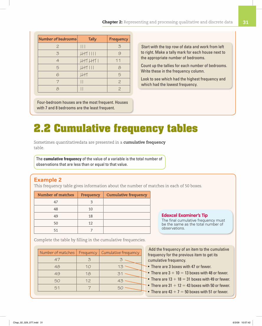
Example 1These are the numbers of bedrooms in each of 40 houses chosen at random.
5 6 3 4 5 2 6 4 5 7 3 8 4 4 3 5 4 2 7 86 3 4 5 3 3 5 5 3 4 6 2 4 5 3 6 4 4 3 4
Sort the data into a frequency table and comment on it.
Go through the raw data and each time you see ‘blue’ put a tally mark in the table next to blue. Make groups of five tally marks with the fifth tally mark drawn through the other four . This makes them easier to count.Repeat for the other colours.Add up the tally marks for each colour to find the frequencies.
Chapter 2: Representing and processing qualititive and discrete data30
Chap_02_029_077.indd 30 6/3/09 10:57:41
2.2 Cumulative frequency tablesSometimes quantitativedata are presented in a cumulative frequency table.
The cumulative frequency of the value of a variable is the total number of observations that are less than or equal to that value.
Number of bedrooms Tally Frequency
2 3
3 9
4 11
5 8
6 5
7 2
8 2
Start with the top row of data and work from left to right. Make a tally mark for each house next to the appropriate number of bedrooms.
Count up the tallies for each number of bedrooms. Write these in the frequency column.
Look to see which had the highest frequency and which had the lowest frequency.
Four-bedroom houses are the most frequent. Houses with 7 and 8 bedrooms are the least frequent.
Example 2This frequency table gives information about the number of matches in each of 50 boxes.
Number of matches Frequency Cumulative frequency
47 3
48 10
49 18
50 12
51 7
Complete the table by filling in the cumulative frequencies.
Number of matches Frequency Cumulative frequency
47 3 3
48 10 13
49 18 31
50 12 43
51 7 50
Add the frequency of an item to the cumulative frequency for the previous item to get its cumulative frequency.• Thereare3boxeswith47orfewer.• Thereare31 10 513boxeswith48orfewer.• Thereare131 18 531boxeswith49orfewer.• Thereare311 12 543boxeswith50orfewer.• Thereare431 7 550boxeswith51orfewer.
Edexcel Examiner’s TipThefinalcumulativefrequencymustbethesameasthetotalnumberofobservations.
Chapter 2: Representing and processing qualitative and discrete data 31
Chap_02_029_077.indd 31 6/3/09 10:57:42

2.3 Grouping discrete dataSometimes data can have a wide range of values, with few values that are the same. Such data may be sorted into groups or classes.
If data are widely spread they should be grouped into classes.
Tally marks do not need to be included in every frequency table.
When grouping data, think about the number of class intervals and the width of these intervals:
If there are not enough classes, important detail may be lost. •
If too many classes are used, the classes will be very small which •could hide any pattern.
Example 3Sixty computer game scores were collected.
Sort the 60 pieces of data into classes.
0 7 34 40 52 53 52 24 48 32
56 3 2 35 42 55 56 14 23 34
51 54 6 6 49 48 55 57 12 29
62 63 73 4 22 45 44 45 47 5
71 79 70 77 3 28 44 47 49 2
72 78 71 72 75 9 27 43 46 9
Decide on the classes. Each class in this table covers ten different integers.Theintervals0–9,10–19,etc.arecalledclass intervals.
Make sure your class intervals don’t overlap. For example, if you had 0–10 and 10–20, which class interval would 10 be in?
Using class intervals makes it easier to see the distribution of the data and to spot any patterns.
Score Frequency
0–9 12
10–19 2
20–29 6
30–39 4
40–49 14
50–59 10
60–69 2
70–79 10
Total 60H
igher
Statistics
You can use ICT to create frequency tables. (See page XX.)
Chapter 2: Representing and processing qualititive and discrete data32
Chap_02_029_077.indd 32 6/3/09 10:57:42

Exercise 2A
1 Here are the colours of 50 cars in a car park.
red white white blue white yellow whiteblue white red blue red yellow whiteblue blue red black white white blackwhite white blue red white white blackyellow blue white red white red redred red black red blue black blueblue red black white white black whitewhite
Copy and complete the frequency table to show the colours of the cars.
Colour Tally Frequency
black
blue
red
white
yellow
Total
2 Last season, Woodbank football team played 30 matches.
This is a list of the number of goals scored in each match.
2 3 0 1 2 4 3 0 2 12 2 1 3 0 2 4 0 2 10 5 3 2 1 4 1 2 0 1
Design and complete a frequency table to show the distribution of the number of goals scored.
3 A company sells drawing pins in boxes. They claim that there are 50 drawing pins in each box.
Des checks the contents of 20 boxes. The number of drawing pins in each box is shown below.
48 52 51 50 50 50 49 50 50 5153 50 51 52 49 50 50 52 49 50
a Design and complete a frequency table to show the number of drawing pins in each box.
b Do you think that the company’s claim that ‘there are 50 drawing pins in each box’ is reasonable?
4 The length of a word can be measured by counting the number of letters it contains. Count the length of each of the 34 words in this question. Record your answers in a frequency table.
Watch out!
When asked to tally results in a frequency table, some students didn’t use the ‘five-bar gate’ | | | |. They didn’t lose marks for this, but some wrote down the wrong value for the frequency. Using ‘five-bar gates’ helps you count up the totals accurately.
Chapter 2: Representing and processing qualitative and discrete data 33
Chap_02_029_077.indd 33 6/3/09 10:57:43

5 A mathematics test is marked out of 100. Here are the marks for 60 students.
71 62 40 72 59 63 43 81 44 2355 52 55 58 66 31 45 54 57 5963 61 54 42 35 47 33 62 41 7357 82 26 71 52 48 38 65 52 5668 36 49 63 57 53 77 65 27 8841 62 35 47 63 39 62 43 46 51
a Copy and complete the frequency table to show the students’ marks.
Mark Tally Frequency
20–29
30–39
40–49
50–59
60–69
70–79
80–89
Total
b The pass mark for this test was 40 out of 100.
How many students passed the test?
6 A newsagent recorded the number of newspapers sold on each day in January:
40 62 67 40 49 52 57 4246 44 48 55 53 51 56 5858 59 60 44 52 63 48 4942 53 57 56 53 61 51
a Draw and complete a frequency table, using class intervals 40–44, 45–49, and so on.
b In order to cut costs, the newsagent decides that he will stock only 60 newspapers each day. In January, on how many days would he have sold out of newspapers?
7 Forty people took part in a competition flying model aeroplanes.
The competitors included experts and beginners.
Each competitor was given a score out of 120.
Here are the scores awarded:
111 97 36 41 115 15 112 99 56 105 73 71 47 33 46 105 109 22 56 52109 43 36 95 17 48 85 107 42 35 56 28 103 59 57 116 38 29 53 61
High
er Statistics
Chapter 2: Representing and processing qualititive and discrete data34
Chap_02_029_077.indd 34 6/3/09 10:57:43
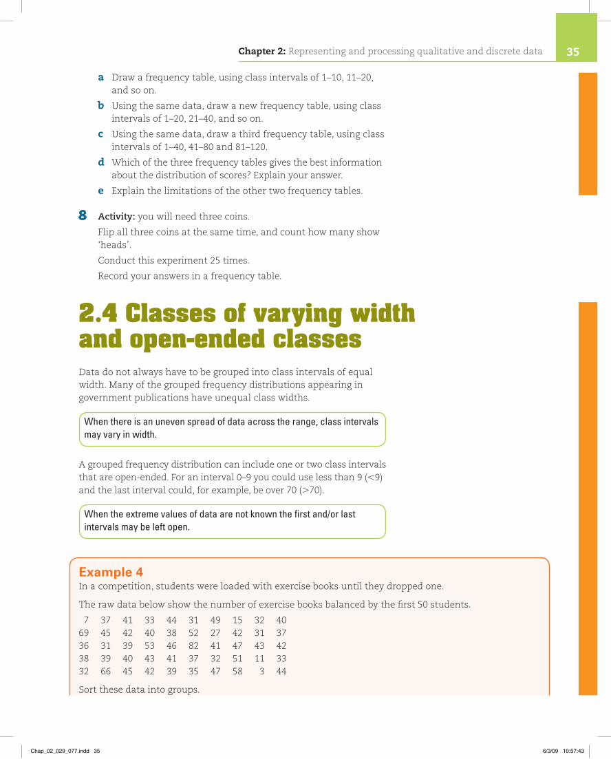
a Draw a frequency table, using class intervals of 1–10, 11–20, and so on.
b Using the same data, draw a new frequency table, using class intervals of 1–20, 21–40, and so on.
c Using the same data, draw a third frequency table, using class intervals of 1–40, 41–80 and 81–120.
d Which of the three frequency tables gives the best information about the distribution of scores? Explain your answer.
e Explain the limitations of the other two frequency tables.
8 Activity: you will need three coins.
Flip all three coins at the same time, and count how many show ‘heads’.
Conduct this experiment 25 times.
Record your answers in a frequency table.
2.4 Classes of varying width and open-ended classesData do not always have to be grouped into class intervals of equal width. Many of the grouped frequency distributions appearing in government publications have unequal class widths.
When there is an uneven spread of data across the range, class intervals may vary in width.
A grouped frequency distribution can include one or two class intervals that are open-ended. For an interval 0–9 you could use less than 9 (,9) and the last interval could, for example, be over 70 (.70).
When the extreme values of data are not known the first and/or last intervals may be left open.
Example 4In a competition, students were loaded with exercise books until they dropped one.
The raw data below show the number of exercise books balanced by the first 50 students.
7 37 41 33 44 31 49 15 32 4069 45 42 40 38 52 27 42 31 3736 31 39 53 46 82 41 47 43 4238 39 40 43 41 37 32 51 11 3332 66 45 42 39 35 47 58 3 44
Sort these data into groups.
Chapter 2: Representing and processing qualitative and discrete data 35
Chap_02_029_077.indd 35 6/3/09 10:57:43
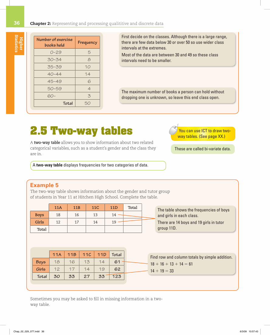
2.5 Two-way tablesA two-way table allows you to show information about two related categorical variables, such as a student’s gender and the class they are in.
A two-way table displays frequencies for two categories of data.
Sometimes you may be asked to fill in missing information in a two-way table.
Number of exercise books held
Frequency
0–29 5
30–34 8
35–39 10
40–44 14
45–49 6
50–59 4
60– 3
Total 50
First decide on the classes. Although there is a large range, therearefewdatabelow30orover50sousewiderclassintervals at the extremes.Mostofthedataarebetween30and49sotheseclassintervals need to be smaller.
The maximum number of books a person can hold without dropping one is unknown, so leave this end class open.
These are called bi-variate data.
Example 5The two-way table shows information about the gender and tutor group of students in Year 11 at Hitchen High School. Complete the table.
11A 11B 11C 11D Total
Boys 18 16 13 14
Girls 12 17 14 19
Total
The table shows the frequencies of boys and girls in each class.Thereare14boysand19girlsintutorgroup 11D.
11A 11B 11C 11D Total
Boys 18 16 13 14 61
Girls 12 17 14 19 62
Total 30 33 27 33 123
Find row and column totals by simple addition.18 1 16 1131145 6114119533
High
er Statistics
You can use ICT to draw two-way tables. (See page XX.)
Chapter 2: Representing and processing qualititive and discrete data36
Chap_02_029_077.indd 36 6/3/09 10:57:43

Exercise 2B
1 Henry asked 30 students in his class how much money they had in their pockets.
These are the amounts.
£1.20 £2.43 76p 0p £1.63 £1.42£2.09 £1.80 £1.36 £10.50 37p £1.28£2.61 £1.60 £1.50 £2.00 £1.22 £1.55£3.50 £2.32 £1.40 £1.50 £2.00 £1.87£1.75 £2.50 £1.35 £1.40 £1.59 £2.05
Copy and complete the frequency table.
Amount Tally Frequency
£0–£1.00
£1.01–£1.50
£1.51–£2.00
£2.01–£3.00
£3.01–
Total
Example 6This table shows the results of a survey of houses on an estate. Complete the table.
Type of house
Accommodation Detached Semi-detached Terraced Total
2 bedrooms 1 3 10
3 bedrooms 4 12 24
4 bedrooms 4 2
Total 11 20
Type of house
Accommodation Detached Semi-detached Terraced Total
2 bedrooms 1 3 6 10
3 bedrooms 4 8 12 24
4 bedrooms 6 4 2 12
Total 11 15 20 46
Edexcel Examiner’s TipLookforrowsorcolumnswithonlyonefiguremissing.
1 Row 10 (31 1) 5 6
2 Row24 (12 14)5 8
3 Column 11 (41 1) 5 6
4 Row 6 141 2 5 12
5 Column31 8 145 15
6 Row or column 10 1241 12 5 46 11 1151 20 5 46 Check totals are the same.
Chapter 2: Representing and processing qualitative and discrete data 37
Chap_02_029_077.indd 37 6/3/09 10:57:43

2 Here are the batting scores for 50 cricket players.
30 24 15 31 23 28 32 29 33 48
31 37 42 18 20 34 40 25 36 31
29 32 26 33 25 27 32 22 29 28
21 35 34 29 30 34 26 32 22 31
29 35 19 28 24 33 27 50 32 27
a Write down the lowest score.
b Write down the the highest score.
c Design and complete a varying width frequency table for these data. Use classes of varying width.
3 Eighty people were asked how many television programmes they had watched in one week.
The results of the survey are shown in two different frequency tables.
Table 1 Equal class intervals Table 2 Varied class intervals
Number of programmes Frequency Number of
programmes Frequency
0–9 4 0–8 3
10–19 54 9–12 21
20–29 16 13–16 8
30–39 4 17–20 32
40–49 1 21–30 11
50–59 0 31–40 3
60–69 1 41– 2
Total 80 Total 80
a Give two limitations of Table 1.
b In Table 2, why has the last class been left open?
c Only one person watched over 60 programmes in one week. What reason could there be for this not happening more often?
d What extra information can you read from Table 2 that was hidden in Table 1?
4 Sue and John conducted a survey into the ages of 125 people at a classical music concert. They used the same data but drew different frequency tables.
These are their frequency tables.
Chapter 2: Representing and processing qualititive and discrete data38
Chap_02_029_077.indd 38 6/3/09 10:57:44

Sue’s table John’s table
Age Frequency Age Frequency
0–9 1 0–29 3
10–19 0 30–34 18
20–29 2 35–39 37
30–39 55 40–44 43
40–49 56 45–49 13
50–59 8 50–59 8
60–69 2 60– 3
70–79 0 Total 125
80–89 1
Total 125
a What is the main difference between the two frequency tables?
b Explain why John has made such a wide class interval for people below the age of 30.
c Which frequency table shows more detail about the most common age ranges? Explain your answer.
d Why did John leave the last interval open?
e How could Sue have improved her frequency table? Give two ways.
5 Charles asked 87 adults and children whether they were right-handed or left-handed.
Adults Children Total
Right-handed 32
Left-handed 22
Total 47 87
a Copy and complete the two-way table.
b How many right-handed children were in the sample?
Charles thinks that a child is more likely to be left-handed, than an adult.
c Do these data support his view?
6 Copy and complete the two-way table to show drinks chosen by 28 children at a birthday party.
Lemonade Orange juice Total
Girls 9
Boys 10 6
TotalHint: Fill this one first!
Chapter 2: Representing and processing qualitative and discrete data 39
Chap_02_029_077.indd 39 6/3/09 10:57:44

7 Victoria conducted an experiment to see whether or not a piece of buttered toast was more likely to land ‘butter-side’ down.
Each time, she either dropped the toast or threw it. •She conducted the experiment 82 times in total. •She dropped the toast 37 times in total. •When the toast was thrown, it landed ‘butter-side down’ on •21 occasions.When the toast was dropped, it landed ‘butter side-up’ on •11 occasions.
a Copy and complete the two-way table.
‘Butter-side down’ ‘Butter-side up’ Total
Dropped
Thrown
Total
b In the experiment, which way up did the toast land most frequently?
8 In a survey, teachers of different subjects were asked how they preferred to travel to work. Some of the results are shown in this table.
Car Bus Cycle Walk Other Total
English 4 0 1 0
Games 3 1 18 3 32
Geography 8 1 18 32
Maths 28 3 1 1
Science 16 5 7 6
Total 17 33 9 156
a Copy and complete the two-way table.
b How many science teachers were involved in the survey?
c In total, how many teachers travelled by car?
d How many maths teachers preferred to walk to school?
2.6 Other tables and databases
A database is an organised collection of information.
Computers can store huge databases that can be easily selected, sorted and ordered at the touch of a button.
Chapter 2: Representing and processing qualititive and discrete data40
Chap_02_029_077.indd 40 6/3/09 10:57:44

A summary table shows data that been sorted and summarised. It is easier to interpret than the original data.
Example 7The table gives information about world production of nuclear electricity in 1995.
Producer Percentage of world total
Installed capacity (Gigawatts)
Percentage of total domestic electricity
Canada 4.2 15 17.7
France 16.2 60 77.1
Germany 6.6 22 28.9
Japan 12.5 44 29.7
Korea 2.9 9 36.3
Russia 4.3 20 11.6
Sweden 3.0 10 47.6
Ukraine 3.0 12 36.3
UK 3.8 14 26.7
USA 30.6 102 20.1
Rest of world 12.9 46 5.6
World total 100 354 17.7
Source: International Energy Agency
a What percentage of the world total was produced by the UK?
b Which countries had the capacity to produce more than 50 Gigawatts of nuclear electricity?
c Which country produced less than 4% of the world total of nuclear electricity but more than 40% of its total domestic electricity was nuclear?
Look down the ‘Percentage of world total’ column to where it crosses the UK row and read off the percentage.
Lookdownthe‘Installedcapacity’columnforvaluesgreaterthan50and read off the names of countries in those rows.
Look down the ‘Percentage of world total’ column and note those thatarelessthan4%.Lookacrosstothe‘Percentageoftotaldomesticelectricity’toseeifanygeneratedmorethan40%oftheirtotalbynuclear electricity.
a 3.8%
b France and the USA
c Sweden
Edexcel Examiner’s TipTherecouldbeseveralanswerstopartbsocheckthroughthewholetable.
Chapter 2: Representing and processing qualitative and discrete data 41
Chap_02_029_077.indd 41 6/3/09 10:57:45

Exercise 2CThis exercise shows a variety of tables that you may come across in everyday life.
1
In the table, all distances are given in kilometres.
a What is the distance between i) Liverpool and Dover ii) Newcastle and Edinburgh iii) London and Cardiff?
b Mrs McQueen travels from Dover to London, and then on to Newcastle. How far does she travel altogether?
c Mr King is a travelling salesman. In one week he travelled from London to Cardiff, to Liverpool, to Newcastle and finally returned to London. How far did he travel in that week?
2 Here is part of a train timetable.
a What time is the earliest train from Andwich to Elchester on a Monday?
b What time is the earliest train from Andwich to Elchester on a Saturday?
c Winston catches the train from Ciffingham at 11:08.
What time does he arrive at Dilsbury?
d Cathy catches the train from Balstone at 20:02. What time does she arrive at Elchester?
373
632
323
245
512
Cardiff
Dover
Edinburgh
Liverp
ool
London
Newca
stle
789
475
125
587
360
648
174
338
277 470
Andwich
Balstone
Ciffingham
Dilsbury
Elchester
Train timetable – Andwich to Elchester
X
07:30
07:42
07:58
08:09
08:20
X service not available on Saturday
S Saturday only
X
12:55
13:07
13:23
13:34
13:45
S
13:15
13:27
13:43
13:54
14:05
S
23:30
23:42
23:58
00:09
00:20
08:45
08:57
09:13
09:24
09:35
10:40
10:52
11:08
11:19
11:30
15:30
15:42
15:58
16:09
16:20
17:25
17:37
17:53
18:04
18:15
19:50
20:02
20:18
20:29
20:40
Chapter 2: Representing and processing qualititive and discrete data42
Chap_02_029_077.indd 42 6/3/09 10:57:45

e How long does the train take to travel between i) Andwich and Balstone ii) Balstone and Ciffingham iii) Ciffingham and Dilsbury iv) Andwich and Elchester?
f Daniel arrives at Dilsbury at 13:30 on a Saturday. What time is the next train to Elchester?
3 This table gives information about the number of egg-laying hens and pullets in England over three years.
Number (in thousands)
Type June 2005 June 2006 June 2007
Caged hens 14 712 12 935 12 091
Barn hens 1278 1172 992
Free-range hens 7294 8457 7982
Pullets 8823 7628 6354
Source: Defra Survey of Agriculture, June 2007
a How many barn hens were there in June 2006?
b Describe what has happened to the number of caged hens over the three years.
c Work out how many more pullets there were in June 2005 than June 2007.
d Work out the percentage change in the number of free-range hens between 2006 and 2007.
4 The price of car insurance is dependent on many factors. These include the gender of the driver, and the area in which the driver lives.
The table shows the price of insurance for a particular make and size of car.
Area
Age Gender A B C D E
17–25M £484 £366 £633 £500 £558
F £387 £293 £506 £400 £446
26–35M £397 £300 £519 £410 £458
F £315 £238 £411 £325 £363
36–50M £242 £183 £317 £250 £279
F £194 £146 £253 £200 £223
511M £266 £201 £348 £275 £307
F £266 £201 £348 £275 £307
a How much would the insurance cost for i) Arthur, a 42-year-old male who lives in area C ii) Amrita, a 20-year-old female who lives in area E iii) Michael, a 70-year-old male from area A
b In which age group do males and females pay the same for their insurance?
Chapter 2: Representing and processing qualitative and discrete data 43
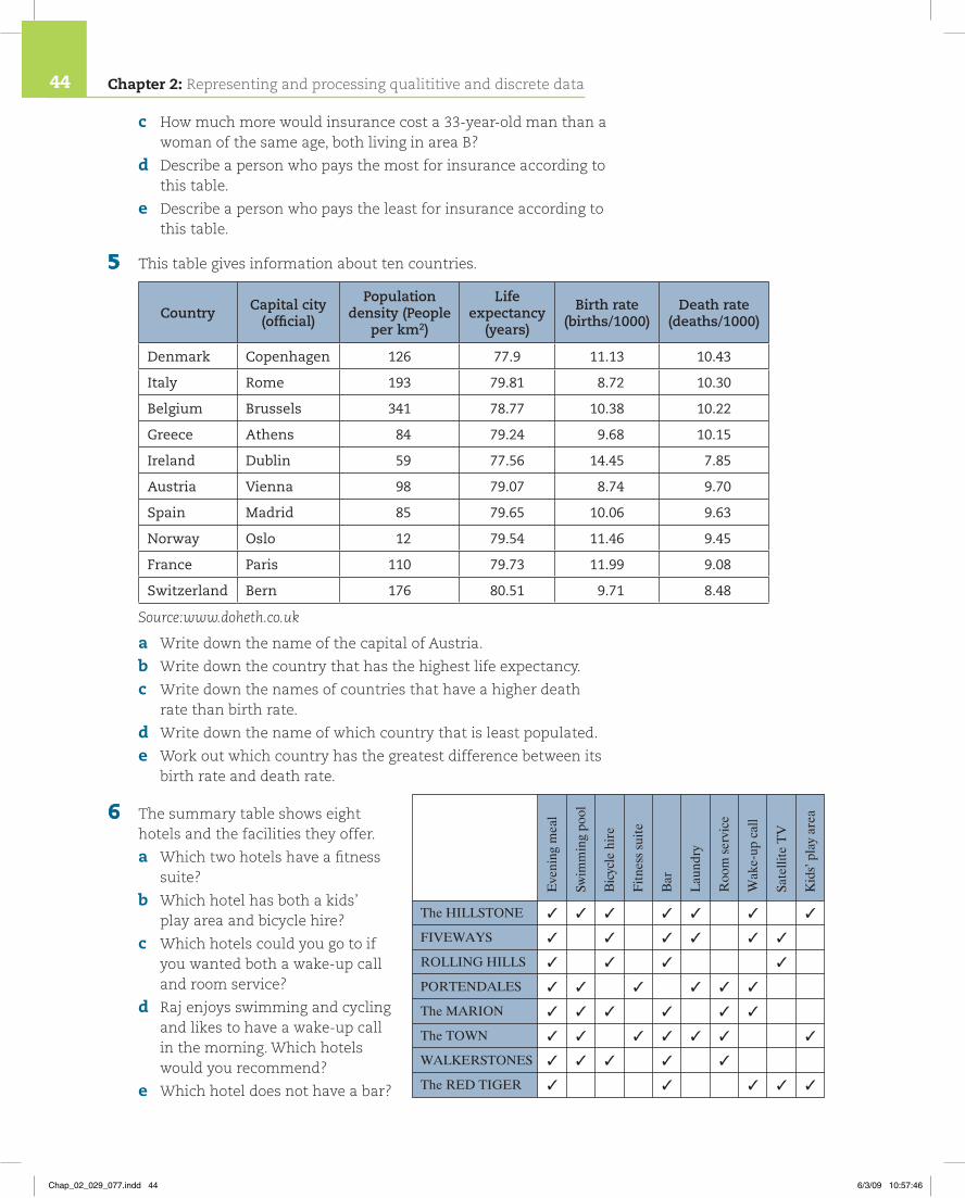
Chap_02_029_077.indd 43 6/3/09 10:57:46
c How much more would insurance cost a 33-year-old man than a woman of the same age, both living in area B?
d Describe a person who pays the most for insurance according to this table.
e Describe a person who pays the least for insurance according to this table.
5 This table gives information about ten countries.
Country Capital city (official)
Population density (People
per km2)
Life expectancy
(years)
Birth rate (births/1000)
Death rate (deaths/1000)
Denmark Copenhagen 126 77.9 11.13 10.43
Italy Rome 193 79.81 8.72 10.30
Belgium Brussels 341 78.77 10.38 10.22
Greece Athens 84 79.24 9.68 10.15
Ireland Dublin 59 77.56 14.45 7.85
Austria Vienna 98 79.07 8.74 9.70
Spain Madrid 85 79.65 10.06 9.63
Norway Oslo 12 79.54 11.46 9.45
France Paris 110 79.73 11.99 9.08
Switzerland Bern 176 80.51 9.71 8.48
Source:www.doheth.co.uk
a Write down the name of the capital of Austria.
b Write down the country that has the highest life expectancy.
c Write down the names of countries that have a higher death rate than birth rate.
d Write down the name of which country that is least populated.
e Work out which country has the greatest difference between its birth rate and death rate.
6 The summary table shows eight hotels and the facilities they offer.
a Which two hotels have a fitness suite?
b Which hotel has both a kids’ play area and bicycle hire?
c Which hotels could you go to if you wanted both a wake-up call and room service?
d Raj enjoys swimming and cycling and likes to have a wake-up call in the morning. Which hotels would you recommend?
e Which hotel does not have a bar?
The HILLSTONE
FIVEWAYS
ROLLING HILLS
PORTENDALES
The MARION
The TOWN
WALKERSTONES
The RED TIGER
�
�
�
�
�
�
�
�
�
�
�
�
�
�
�
�
�
�
�
�
�
�
�
�
�
�
�
�
�
�
�
�
�
�
�
�
�
�
�
�
�
�
�
�
�
�
Eve
ning
mea
l
Swim
min
g po
ol
Bic
ycle
hir
e
Fitn
ess
suite
Bar
Lau
ndry
Roo
m s
ervi
ce
Wak
e-up
cal
l
Sate
llite
TV
Kid
s’ p
lay
area
Chapter 2: Representing and processing qualititive and discrete data44
Chap_02_029_077.indd 44 6/3/09 10:57:46

7 This table shows the numbers of road accident casualties in thousands. The accidents were in Northern Ireland in the years 1986 to 2000 and all involved illegal alcohol levels.
Year Fatal injuries
Serious injuries
Slight injuries
Total casualties
1986 1.03 6.57 19.60 27.20
1987 0.93 6.01 17.99 24.93
1988 0.81 5.18 17.25 23.24
1989 0.84 4.92 17.05 22.81
1990 0.80 4.23 16.01 21.04
1991 0.69 3.72 14.00 18.41
1992 0.69 3.40 13.28 17.37
1993 0.57 2.82 12.25 15.63
1994 0.54 2.95 12.26 15.75
1995 0.56 3.10 12.89 16.56
1996 0.60 3.13 13.93 17.67
1997 0.57 3.07 13.90 17.55
1998 0.49 2.68 13.25 16.42
1999 0.48 2.60 14.64 17.72
2000 0.56 2.71 15.75 19.02
Source: Department for Transport, Royal Ulster Constabulary
a Write down the number of total casualties in 1989.
b The total number of casualties in 1996, found by adding together the Fatal, Serious and Slight injuries columns comes to 17.66 thousand.
The number of casualties in the total casualties column is 17.67 thousand.
Give a reason for this difference.
c Describe the trend in the total numbers of fatal injuries in the years
i) 1986 to 1991
ii) 1993 to 2000. past paper question
8 Activity: ask 10 students in your class for the following data.
the month of their birthday •their height in centimetres •their gender •their shoe size. •
Design a summary table to show these data.
Watch out!
In this type of question, very few students mentioned that the numbers given are ‘thousands’ so they have been rounded – which can lead to inaccuracies.
Chapter 2: Representing and processing qualitative and discrete data 45
Chap_02_029_077.indd 45 6/3/09 10:57:46

2.7 Pictorial representationData that are presented in the form of tables may not be as clear or easy to understand as the same data presented as pictures or diagrams.
Pictorial representation lets you:
show clearly any relations or patterns in the data •
show how big or small the differences are between the data items •
quickly and accurately show the important information. •
Frequencies can be represented in two ways.
By the length of a line or bar. •
By an area. •
There are many ways of representing data pictorially. You need to be able draw and interpret pictograms, bar charts, line graphs and pie charts.
2.8 PictogramsA pictogram is used to show the frequency of qualitative data. Pictograms should have a key.
A pictogram uses symbols or pictures to represent a certain number of items.It must have a key to tell you the number of items represented by a single symbol or picture.
Example 8This pictogram shows the number of computers in the art department in each of four schools.
a Which art department had the most computers?
b How many computers are there in the art department at Woodridge High School?
c How many computers are there in the art department at Hursley Comprehensive?
Woodridge High
Ecliffe Secondary
Hursley Comprehensive
Caslehey High
Key: represents4 computers
In pictograms, each picture is related to what it represents. In this case it is a computer picture.
Chapter 2: Representing and processing qualititive and discrete data46
Chap_02_029_077.indd 46 6/3/09 10:57:47

When drawing a pictogram, make sure that:• eachpictureisthesamesize• thepicturecanbedividedeasilytoshowdifferentfrequencies• thespacingbetweenthepicturesisthesameineachrow• yougiveakey.
Exercise 2D1 Woodridge High School organised an
activity day. The pictogram shows how the students decided to spend their day.
a Which activity was the most popular?
b How many students went bowling?
c Estimate how many students went to the theme park.
d Estimate how many students took part in the least popular activity.
e Approximately how many students took advantage of the activities offered?
2 This pictogram shows the number of days in January with more than one hour of sunshine in three cities.
The information for Cardiff is not shown on the pictogram.
Cardiff had eight days with more than one hour of sunshine in January.
a Copy and complete the pictogram.
b Write down the city that had the most days with more than one hour of sunshine?
c Write down gthe number of days with more than one hour of sunshine in Edinburgh. past paper question
a Caslehey High has most computers.
b 16
c 10
Look to see which school has the greatest number of symbols.
Eachpicturerepresents4computerssoitiseasytoseethat one quarter of a picture represents 1 computer.
LookatWoodridgeHigh,ithas4completesymbols,eachrepresenting4computers.4345 16 computers
Hursley Comprehensive has 2 1 _ 2 complete symbols.2 1 _ 2 345 10 computers
Theme Park
Bowling
Cinema
Sport
Key: represents50 pupils
London
Edinburgh
Belfast
Cardiff
Key: represents4 days
Chapter 2: Representing and processing qualitative and discrete data 47
Chap_02_029_077.indd 47 6/3/09 10:57:47
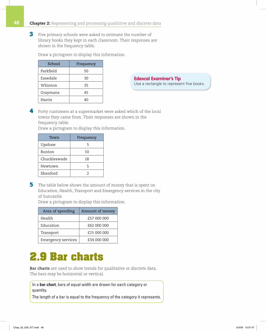
3 Five primary schools were asked to estimate the number of library books they kept in each classroom. Their responses are shown in the frequency table.
Draw a pictogram to display this information.
School Frequency
Parkfield 50
Easedale 30
Whinton 35
Graymans 45
Harris 40
4 Forty customers at a supermarket were asked which of the local towns they came from. Their responses are shown in the frequency table. Draw a pictogram to display this information.
Town Frequency
Upshaw 5
Bunton 10
Chuckleswade 18
Newtown 5
Shenford 2
5 The table below shows the amount of money that is spent on Education, Health, Transport and Emergency services in the city of Suncastle. Draw a pictogram to display this information.
Area of spending Amount of money
Health £57 000 000
Education £62 000 000
Transport £15 000 000
Emergency services £34 000 000
2.9 Bar chartsBar charts are used to show trends for qualitative or discrete data. The bars may be horizontal or vertical.
In a bar chart, bars of equal width are drawn for each category or quantity.The length of a bar is equal to the frequency of the category it represents.
Edexcel Examiner’s TipUsearectangletorepresentfivebooks.
Chapter 2: Representing and processing qualititive and discrete data48
Chap_02_029_077.indd 48 6/3/09 10:57:47

Example 9This bar chart shows the results of a survey of 75 people. Each person was asked which newspaper they read.
a Which was the most popular newspaper?
b How many people read The Times?
c Which two papers had the same number of readers?
Edexcel Examiner’s TipWithqualitativevariablesitisusualtoputthehighestfrequencyontheleftandthelowestontheright.
5
0
10
15
20
25
30
35
Frequency
NewspaperThe S
un
Daily M
irror
Daily E
xpres
s
The Dail
y Tele
gragh
The Tim
es
The Guard
ian
The Inde
penda
nt
Newspapers read by a group of people
a The Sun
b 6
c The Daily Express and The Daily Telegraph.
Look to see which is the highest bar.
Find The Timesonthehorizontalaxis.Gotothetopofitsbar, follow the top across and read off the vertical scale.
Look for the two bars that are the same height and read off thepapersfromthehorizontalscale.
Example 10This bar chart shows students’ marks out of 10 scored in a class spelling test.
Students were given one mark for each correct spelling.
a What is the range of marks in this test?
b How many students scored full marks?
c Which is the most common mark?
d How many students are in the class?
10
23456789
10
Frequency
1 2 3 4 5 6Mark out of ten
7 8 9 10
Spelling tests marksBars are of equal width and separated by equal gaps.
Four people scored a mark of seven out of ten.
Both axes are clearly labelled.
Although the marks are discrete, they are ordered.
Chapter 2: Representing and processing qualitative and discrete data 49
Chap_02_029_077.indd 49 6/3/09 10:57:48

This horizontal bar chart shows the number of copies of Daily Stats sold in the UK in one week.
On this chart the bars are horizontal.
It is not possible to read off how many newspapers were sold on each day with any accuracy so the actual numbers are shown next to each bar.
2.10 Vertical line graphsA vertical line graph is similar to a bar chart except that the bar width is reduced to a pencil line thickness.
This graph shows the data from Example 10 on a vertical line graph. The heights of the lines are exactly the same as the heights of the bars in Example 10.
a 2 to 10
b 1
c 6 out of 10
d 33
The lowest score was two out of ten (nobody got only one mark). The highest was 10.
Lookfor10onthehorizontalscale.Readoffthebar’sheightontheverticalscale.
Look for the highest bar (this is the highest frequency).
Find the total by adding the frequencies represented by each bar.0 1 1 1 2 151 6 1914131 2 1 1 533
0 1 2 3 4 5Papers sold (millions)
Mon
Tue
Wed
Thu
Fri
Sat
Day
of t
he w
eek
Sun 1 864 372
4 352 421
1 546 673
2 500 312
1 643 764
3 186 456
2 216 538
10
23456789
10
Frequency
1 2 3 4 5 6Mark out of ten
7 8 9 10
Spelling test marks
Bar charts and line graphs can be drawn using ICT. (See page XX.)
Chapter 2: Representing and processing qualititive and discrete data50
Chap_02_029_077.indd 50 6/3/09 10:57:48

Exercise 2E
1 The vertical line graph shows the shoe sizes of students in class 11G.
a How many students had size 5 shoes?
b Which is the most common shoe size?
c Which size of shoe does the student with the smallest feet wear?
d Which two shoe sizes have identical frequencies?
e How many students were in 11G?
f Construct a pictogram to show the same information.
Example 11This vertical line graph shows the number of people in each car that passed the gates of a school between 9 am and 10 am.
a What was the most frequently occurring number of people?
b Estimate the number of cars that contained two people.
c Why do you think there were no cars with more than five people in them?
10
0
20
30
40
50
60
70
80
Frequency
1 2 3 4 5Number of people
Number of people in cars
a 1
b About 45
c There are not many cars that can hold more than five people.
Look for the highest line.
Find the line for two people and read off its height from the vertical scale.
This answer has to relate to the data given.
0123456789
2 3 4 5 6 7 8 9 10 11Shoe size
FrequencyShoe sizes of class 11G
Chapter 2: Representing and processing qualitative and discrete data 51
Chap_02_029_077.indd 51 6/3/09 10:57:49

2 The bar chart shows the number of pets owned by members of class 11H.
a How many students did not have any pets?
b What is the largest number of pets owned by a member of this class?
c How many students are in 11H altogether?
d How many pets is a student chosen at random most likely to have?
e Is this a good way to show these data? Explain your answer.
3 This frequency table shows the number of children in 30 families.
Number of children 0 1 2 3 4 5
Frequency 4 7 10 5 3 1
Draw a bar chart to display this information.
4 A book was opened at random and the lengths of 1000 words were counted. The results were as follows.
Number of letters 1 2 3 4 5 6 7 8 9 10
Frequency 35 132 306 183 123 96 62 41 14 8
a Draw a pictogram to display this information.
b Is the pictogram a good way to show these data? Explain your answer.
c Draw either a bar chart or vertical line graph for these data. Explain your choice.
5 Activity: conduct a survey to find out the number of mobile phones owned by the families of your classmates. Choose a frequency diagram to show this information. Explain your choice.
0123456789
0 1 2 3 4 5 6 7 8 9Number of pets
FrequencyNumber of pets owned by students in class 11H
Chapter 2: Representing and processing qualititive and discrete data52
Chap_02_029_077.indd 52 6/3/09 10:57:49

2.11 Stem and leaf diagramsA stem and leaf diagram shows data distribution in the same way as a bar chart but it retains the details of the data.A key shows how the stem and the leaves are combined to form a number.
Exercise 2F
1 Thirty members of a fitness club were asked how many sit-ups they could do in a minute. These are the results.
12 15 16 23 26 26 27 28 29 2932 33 33 33 35 37 38 39 40 4041 42 45 48 53 59 68 72 75 239
a Explain why the club manager decided to ignore the final result of 239.
b Draw a stem and leaf diagram to show these data. Use steps of 10. Leave out the final result of 239.
c Which number of sit-ups was the most common?
Edexcel Examiner’s TipDonotforgetthekey.Studentsoftendoandloseamark.
Example 12Here is information about the number of motorists who bought diesel fuel on each of 25 randomly selected days.
19 34 41 26 1814 8 36 33 2518 30 37 19 4025 31 43 21 3522 33 13 10 23
Draw an ordered stem and leaf diagram to show this data.
0 81 9 8 4 8 9 3 02 6 5 5 1 2 33 4 6 3 0 7 1 5 34 1 0 3
Ordered0 81 0 3 4 8 8 9 92 1 2 3 5 5 63 0 1 3 3 4 5 6 74 0 1 3
First, draw a vertical line.To the left of this line, write the first figures of the observations in increasing order. This is called the stem (like the stem of a plant).To the right of the stem, write down the remaining figures in each observed value. These are the leaves.
Re-draw the diagram with the numbers in each row in order.Add a key.
Key 2 1 means 21
Stem LeavesUnordered
Chapter 2: Representing and processing qualitative and discrete data 53
Chap_02_029_077.indd 53 6/3/09 10:57:50

2 A shop manager records details of the customers during the first half hour that his shop is open.
The stem and leaf diagram shows the ages of the customers.
0 1 2 4
0 5 6 6 8 9
1 1 1 2 2 2 3 4 4
1 5 5 6 7 8 8
2 2 3 3 4
2 5 5 8
3 2
a How many customers visited the shop in this time?
b What was the age of the oldest customer?
c What was the most common age of customer?
d How many customers were 6 years old?
e Draw a frequency table from these data.
f Redraw the stem and leaf diagram with steps of 10 between the stems.
3 Every day a dairy farm records the milk yield, to the nearest litre, for each of its herd of 50 cows. Here are the data for one particular day.
26 35 23 15 35 32 13 9 42 3640 34 39 34 25 17 19 21 31 1641 23 32 28 26 25 19 25 22 2418 24 28 27 26 18 9 14 24 2534 5 25 39 23 7 29 34 26 25
Draw a stem and leaf diagram to show this information.
4 This stem and leaf diagram shows the weekly number of complaints received by a media company.
0 5 6
1 1 1 3 4 7
2 2 2 3 3 3 6 6 9 9
3 1 2 2 4 8
4 0 5 5 6
5 2
a Work out the number of weeks that are represented on the diagram.
b Write down the greatest number of complaints.
c Write down the most common number of complaints.
Key
1 8 5 18 years old
Key
2 6 means 26
Chapter 2: Representing and processing qualititive and discrete data54
Chap_02_029_077.indd 54 6/3/09 10:57:51

5 Carol asked 60 of her friends to name a whole number between 100 and 200.
These are their answers.
100 107 134 140 152 153 152 124 148 132162 163 173 104 122 145 144 145 147 105156 103 102 135 142 155 156 114 123 134172 178 171 172 175 109 127 143 146 109151 154 106 106 149 148 155 157 112 129171 179 170 177 103 128 144 147 149 102
Draw a stem and leaf diagram to show this information.
2.12 Pie chartsA pie chart is a way of displaying data when you want to show how something is shared or divided.A pie chart uses area to represent frequency.The anglesatthecentreofapiechartaddupto360°.
This pie chart shows the types of housing in Showtown.
Types of housing in Showtown
Each sector of this pie chart represents a type of house. The proportion of each type of house is clear.
The most common type of house is semi-detached.
About one quarter of the houses are detached.Semi-detached
DetachedFlat
Terraced
Others
Example 13This frequency table shows what 24 people in a hotel had for breakfast.
Choice of breakfast Frequency
Cereal 6
Full English 11
Continental 5
Fruit 2
Total 24
Draw a pie chart to show this information.
Chapter 2: Representing and processing qualitative and discrete data 55
Chap_02_029_077.indd 55 6/3/09 10:57:51

Method 1
Cereal: 6 __ 24 3 360° 5 90°
Full English: 11 __ 24 3 360° 5 165°
Continental: 5 __ 24 3 360° 5 75°
Fruit: 2 __ 24 3 360° 5 30°
OR
Method 2
24 guests are represented by 360°.
One guest is represented by 360° _____ 24 5 15°.
Cereal: 6 3 15° 5 90°
Full English: 11 3 15° 5 165°
Continental: 5 3 15° 5 75°
Fruit: 2 3 15° 5 30°
90° 1 165° 1 75° 1 30° 5 360°
First calculate the angles for each sector.6outof24oftheguestshavingcerealis6 __ 24 ths of total. So, it needs to be 6 __ 24 thsof360°.Calculate the other angles in the same way.
Addtheanglestocheckthattheytotal360°.
Draw a circle. Mark the centre.Draw a radius from the centre of the circle to the circumference.For the first sector, measure and drawanangleof90°.For the second sector, measure anddrawanangleof165°.For the third sector , measure anddrawanangleof75°.Add labels for each sector and shade them to make the proportions clearer.Add the title.
Choice of breakfastFruit
26
11
5
Cereal
Full English
Continental
Edexcel Examiner’s TipMeasurethefinalsectortocheckthatyouhavemeasuredtheothersectorscorrectly.
Edexcel Examiner’s TipItisagoodideatoincludetheactualfiguresonpiecharts.
You can use ICT to draw pie charts. (See page XX.)
Edexcel Examiner’s TipTrybothmethodsandthenusetheoneyouprefer.
Chapter 2: Representing and processing qualititive and discrete data56
Chap_02_029_077.indd 56 6/3/09 10:57:52

Edexcel Examiner’s TipRememberthatthesectoranglesinapiechartmustaddupto360°
Exercise 2G
1 A research company recorded the country of manufacture of 120 cars. It will use a pie chart to show the data. This table shows the information.
Country Frequency Angle
UK 20 60°
France 15
Germany 48
Italy 5
Japan 32 96°
a Show how the angle for the UK is calculated.
b Copy and complete the table.
c Draw and label the pie chart.
2 This table shows the amount of money, in millions of pounds, to be spent on Education, Health, Transport and Emergency services in Tadcastle. A pie chart is needed to show the information.
Area of spending Amount spent (£million) Angle
Health 59
Education 67
Transport 17
Emergency services 37
a Copy and complete the table by filling in the angles.
b Draw and label the pie chart.
3 A dentist recorded the number of each type of treatment she carried out in a single week. She wants to draw a pie chart to show the information in this table.
Treatment Frequency
Check up 24
Filling 22
Clean/Scale 10
Cap 4
a The angle for a Cap is 24°. Show how the angle was calculated.
b Copy and complete the following table.
Treatment Angle in pie chart
Check up
Filling
Clean/Scale
Cap 24°
c Draw and label the pie chart.
Chapter 2: Representing and processing qualitative and discrete data 57
Chap_02_029_077.indd 57 6/3/09 10:57:52

4 The pie chart shows the 240 g of ingredients used to make a cake.
Ingredients Weight
Flour
Butter
Eggs
Sugar
Use the pie chart to complete the table.
5 The pie chart below shows the way
Edward spent the last 24 hours.
a How many degrees represents each hour in the day?
b What angle represents ‘Other activities’ in the pie chart?
c How many hours did Edward sleep yesterday?
d How many hours did Edward spend working yesterday?
6 Some research was done into the popularity of different carpet colour in offices. A number of offices were asked to fill in a questionnaire. A pie chart is to be drawn to show the information collected. The carpet colour results are shown in the table.
Colour Frequency Angle
Grey 22
Green 16
Patterned 10 50°
Red 30°
Other 90°
a Copy and complete the table.
b Work out how many offices filled in the questionnaire.
c Write down the most popular carpet colour.
d Draw a pie chart to show these data.
7 Class activity
a Draw a frequency table for the number of children in each student’s family.
b Draw a pie chart for the information collected.
105°
Flour
Butter
Eggs
Sugar
111°
135°120°
30°
EatingOther
WorkingSleeping
Watch out!
When asked to calculate the angle for a section in a sketch of a pie chart, many students measured the angle in the sketch, so gave the wrong answer. ‘Calculate’ means ‘work out’, so show some working.
Chapter 2: Representing and processing qualititive and discrete data58
Chap_02_029_077.indd 58 6/3/09 10:57:53
2.13 Advantages and disadvantages of each type of diagramPictograms
Although similar to a bar chart, they are not very accurate. •
Suitable for people who require a simple, but not accurate, •representation.
Bar charts/line chartsEasy to draw. •
Fairly accurate. •
Values can, in many cases, be read from a scale. •
Information more easily seen than on pie charts. •
Pie chartsNot as accurate as bar charts. •
Not easy to draw. •
Values cannot be read off, but must be given. •
Show the relation of parts to the whole better than bar charts. •
Stem and leaf diagramsGive visual comparison like bar charts. •
Store a large amount of data in a smaller space. •
Retain details of the data. •
Not all sets of data can be displayed as stem and leaf diagrams. •
2.14 Cumulative frequency step polygonsAnother way of displaying frequencies is to use a cumulative frequency step polygon.
Example 14The cumulative frequency table gives information about the number of matches in each of 50 boxes.
Number of matches Frequency Cumulative frequency
47 2 2
48 10 12
49 18 30
50 10 40
51 7 50
Draw a cumulative frequency step polygon for these data.
High
er Statistics
Chapter 2: Representing and processing qualitative and discrete data 59
Chap_02_029_077.indd 59 6/3/09 10:57:53

2.15 Using bar charts to make comparisonsMultiple bar charts and composite bar charts can be used to make comparisons.
Multiple bar charts
Multiple bar charts have more than one bar for each class.
Number of matches
Cumulativefrequency
10
0
20
30
40
50
60
4746 48 49 50 51 52
Thecumulativefrequencyiszerountil47isreached,it then jumps up to 2. Draw a vertical line from 0 to 2 to represent this jump.Thevalueofthecumulativefrequencyfrom47upto,butnotincluding48,remainsconstantat2.Itthenjumpsup to 12.Drawahorizontallineat2from47to48,thenaverticallinefrom 2 to 12 to represent this jump.Thendrawahorizontallineat12between48and49,thenaverticallineupto30.Continue in this way.
Example 15This multiple bar chart gives information about the shoe sizes of 40 boys and 40 girls.
a Which is the most common shoe size for girls?
b Did more boys or girls wear size 8 shoes?
c Which shoe size was worn by an equal number of boys and girls?
d Only one child had size 2 shoes. Was this a boy or a girl?
e Janet thinks boys have larger feet than girls. Do you think she is correct? Give a reason for your answer.
1
0
2
3
4
5
6
7
8
9
10
Frequency
2 3 4 5 6Shoe size
7 8 9 10
Girls
Boys
High
er Statistics
Chapter 2: Representing and processing qualititive and discrete data60
Chap_02_029_077.indd 60 6/3/09 10:57:54

Composite bar charts
Each bar in a composite bar chart shows how the total frequency for each category is made up from the separate component groups.The total frequencies and the frequencies of each of the component groups can be compared.
The green bars represent the girls’ shoe sizes.Lookforthehighestgreenbar.
Comparetheboys’orangebarforsize8withthegirls’barforsize8.Whichisthehighest?
Lookforashoesizethathasgreenandorange bars the same height.
Comparetherangeofsizesandthemostcommonsizes.
Lookatthecolourofthebarforsize2.
a Size 6
b More boys
c Size 7
d A girl
e Janet’s theory seems to be correct, but she would have to assume that the boys’ and girls’ ages are similar.The bar chart shows the girls’ shoes range in size from size 2 to size 10. The most common size is 5 or 6.The chart shows the boys’ shoes range from size 4 to size 10. The most common size is 8 or 9.
Example 16This composite bar chart gives information about the numbers of computers and printers sold by a shop over a three-year period.
In the third year the shop sold 1500 desktop computers, 2000 laptop computers and 200 printers.
a Copy and complete the chart by filling in the bar for Year 3.
b In which year was the total number of sales highest?
c How many laptops were sold in Year 1?
d Describe how the sale of laptops changed over the three years.
500
0
1000
1500
2000
2500
3000
3500
4000
Frequency
Year 1
Year
Printer
Laptop
Year 2
Computer shop sales
Year 3
Desktop
Chapter 2: Representing and processing qualitative and discrete data 61
Chap_02_029_077.indd 61 6/3/09 10:57:54

Exercise 2H
1 Paul sells scarves in three colours. Each scarf is black or red or blue. The multiple bar chart below shows his sales over one week.
1.Thetotalsalesare15001 2000 1 200 53700. Drawarectangle3700high.
2. 1500desktopcomputersweresoldsodrawalineacrossat1500.
3. 15001 2000 53500laptopsanddesktopcomputersweresoldsodrawalineat3500.
4.ShadethesectionsoftheYear3barinthecorrect colours.
Look to see which bar is highest.
Work out the height of the laptop section of the bar for Year 1.1500 1000 5500
Compare the laptop sections of the bar to see how total laptop sales have varied for the different years. Use the desktop sections and the laptop sections of the bars to make comparisons about the proportion of sales.
a
b Year 3
c 500
d The proportion of laptop sales to desktop sales was the same in Year 2 compared to Year 1 (in both years laptops accounted for approximately one third of the total computer sales), but increased in Year 3 (when laptops accounted for over half the total computer sales).
500
0
1000
1500
2000
2500
3000
3500
4000
Frequency
Year 1
Year
Printer
Laptop
Year 2
Computer shop sales
Year 3Desktop
You can use ICT to draw both multiple and composite bar charts. (See page XX.)
0
1
2
3
4
5
6
7
8
9
10Frequency
Day of the week
Red
Blue
Black
Monday Tuesday Wednesday Thursday Friday
Chapter 2: Representing and processing qualititive and discrete data62
Chap_02_029_077.indd 62 6/3/09 10:57:55
a What colour scarf was most popular on Monday?
b Which colour had the most consistent sales over the whole week?
c How many scarves were sold on Wednesday?
d How many red scarves were sold over the whole week?
e On which day did Paul sell the fewest scarves?
2 Joel has collected some data on the types of animals taken to a veterinary surgery. He wants to show his data on a diagram but cannot decide whether to use a bar chart or a pie chart.
Give the advantages and disadvantages of using each type of diagram.
3 A nursery collects some data on the number of tomatoes produced by each of their plants. They decide to draw a stem and leaf diagram to represent these data.
Write down the advantages of using a stem and leaf diagram.
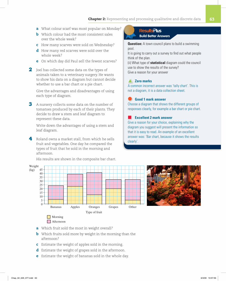
4 Roland owns a market stall, from which he sells fruit and vegetables. One day he compared the types of fruit that he sold in the morning and afternoon.
His results are shown in the composite bar chart.
a Which fruit sold the most in weight overall?
b Which fruits sold more by weight in the morning than the afternoon?
c Estimate the weight of apples sold in the morning.
d Estimate the weight of grapes sold in the afternoon.
e Estimate the weight of bananas sold in the whole day.
Weight(kg)
Bananas Apples Oranges Grapes Other05
1015202530354045
Type of fruit
Morning
Afternoon
Build Better Answers
Question: A town council plans to build a swimming pool.It is going to carry out a survey to find out what people think of the plan.(ii) What type of statistical diagram could the council use to show the results of the survey?Give a reason for your answer
Zero marksA common incorrect answer was ‘tally chart’. This is not a diagram, it is a data collection sheet.
Good 1 mark answerChoose a diagram that shows the different groups of responses clearly, for example a bar chart or pie chart.
Excellent 2 mark answerGive a reason for your choice, explaining why the diagram you suggest will present the information so that it is easy to read. An example of an excellent answer was: ‘Bar chart, because it shows the results clearly’.
Chapter 2: Representing and processing qualitative and discrete data 63
Chap_02_029_077.indd 63 6/3/09 10:57:56
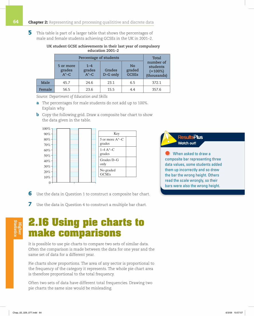
5 This table is part of a larger table that shows the percentages of male and female students achieving GCSEs in the UK in 2001–2.
UK student GCSE achievements in their last year of compulsory education 2001–2
Percentage of students Total number of students (5100%)
(thousands)
5 or more grades A*–C
1–4 grades A*–C
Grades
D–G only
No graded GCSEs
Male 45.7 24.6 23.1 6.5 372.1
Female 56.5 23.6 15.5 4.4 357.6
Source: Department of Education and Skills
a The percentages for male students do not add up to 100%. Explain why.
b Copy the following grid. Draw a composite bar chart to show the data given in the table.
6 Use the data in Question 1 to construct a composite bar chart.
7 Use the data in Question 4 to construct a multiple bar chart.
2.16 Using pie charts to make comparisonsIt is possible to use pie charts to compare two sets of similar data. Often the comparison is made between the data for one year and the same set of data for a different year.
Pie charts show proportions. The area of any sector is proportional to the frequency of the category it represents. The whole pie chart area is therefore proportional to the total frequency.
Often two sets of data have different total frequencies. Drawing two pie charts the same size would be misleading.
10%
0
20%
30%
40%
50%
60%
70%
80%
90%
100%Key
5 or more A*–Cgrades
1–4 A*–Cgrades
Grades D–Gonly
No gradedGCSEs
High
er Statistics
Watch out!
When asked to draw a composite bar representing three data values, some students added them up incorrectly and so drew the bar the wrong height. Others read the scale wrongly, so their bars were also the wrong height.
Chapter 2: Representing and processing qualititive and discrete data64
Chap_02_029_077.indd 64 6/3/09 10:57:57
This problem can be avoided by drawing scaled pie charts. This means the areas of the pie charts are in the same ratio as the two frequencies.
Comparative pie charts can be used to compare two sets of data.The areas of the two circles should be in the same ratio as the two total frequencies.To compare the total frequencies, compare the areas.To compare proportions, compare the individual angles.
Calculating the radii of scaled pie chartsThe area of a circle is calculated using the formula: area 5 πr2, where r is the radius of the circle.
Call the radius of the first circle r1 and the radius of the second circle r2.
The ratio of the areas of the two circles is: πr12 : πr2
2
So r12 : r2
2 (dividing both sides by π).
If you call the first frequency F1 and the second frequency F2,
Then r12 : r2
2 5 F1 : F2 or r1 : r2 5 √__
F1 : √__
F2
We can write this as r2 __ r1
5 √
___ F2 ____
√___
F1 .
Since the first radius, r1, can be any size, the formula can be rearranged as
r2 5 r1 √
___ F2 ____
√___
F1
Edexcel Examiner’s TipYoumustrememberthisformula.
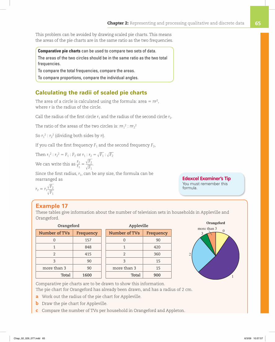
Example 17These tables give information about the number of television sets in households in Appleville and Orangeford.
Orangeford Appleville
Number of TVs Frequency Number of TVs Frequency
0 157 0 90
1 848 1 420
2 415 2 360
3 90 3 15
more than 3 90 more than 3 15
Total 1600 Total 900
Comparative pie charts are to be drawn to show this information. The pie chart for Orangeford has already been drawn, and has a radius of 2 cm.
a Work out the radius of the pie chart for Appleville.
b Draw the pie chart for Appleville.
c Compare the number of TVs per household in Orangeford and Appleton.
more than 33
2
0
1
Orangeford
Chapter 2: Representing and processing qualitative and discrete data 65
Chap_02_029_077.indd 65 6/3/09 10:57:57
Exercise 2I
1 At Springbank High School, students can choose to study either French or Spanish. The tables opposite give information about their GCSE results.
a Which was the most popular language?
b What grades was a student most likely to achieve in a language GCSE?
c Draw two scaled pie charts to show this information.
Draw a circle with a radius of2.25cm,thencompletethe pie chart in the usual way.
You only need to compare the angles to compare the proportions.
a 2 3 √____
900 _______ √
______ 1600 5 2 3 30 ___ 40 5 1.5 cm
b
c Orangeford has more TVs. This could be because there are more households in Orangeford. There is a greater proportion of households with 2 TVs in Appleville. The proportion with no TVs is about the same. The proportions of households with 1, 3 or more than 3 TVs in Orangeford are greater than in Appleville.
Appleville
more than 33
2
0
1
more than 33
2
0
1
Orangeford
Use the formula r2 5 r1 √
__ F2 ___
√__
F1
High
er Statistics
Build Better Answers
Question: Five shops in Whitehaven sell both videos and DVDs.The comparative pie charts show the percentage of each that were sold by the five shops in one week.a) Comment on the sales of videos compared to DVDs in Whitehaven.
Give reasons for your opinion. (2 marks)b) Discuss any relationship between the percentage of videos sold and the
percentages of DVDs sold in each of the two shops. (1 mark)
Basic 1 mark answersDo not realise that the pie charts are drawn to scale: the larger pie chart represents a larger sample. Answer to b) talks about numbers rather than percentages of videos and DVDs.
Good 2 mark answerCompared the percentages of DVDs and videos sold in part b).
Excellent 3 mark answerMeasure the radii of the pie charts to work out that the total number of DVDs is 1.35 times the total number of videos, and use this fact in answer to part a).
French Spanish
GCSE result Frequency GCSE result Frequency
A or A* 12 A or A* 8
B or C 36 B or C 29
D or E 24 D or E 9
F or G 9 F or G 3
Total 81 Total 49
Videos sold DVDs sold
Shop A26%
Shop B23%
Shop C19%
Shop B22%
Shop C20%
Shop D18%
Shop D19%
Shop E15%
Shop E15% Shop A
24%
Chapter 2: Representing and processing qualititive and discrete data66
Chap_02_029_077.indd 66 6/3/09 10:57:58

2 A survey was conducted to find the uses of land in two counties, Southshire and Northshire. The results are shown in the table below.
Southshire Northshire
Use of land Land area (acres) Use of land Land area (acres)
Agriculture 89 Agriculture 157
Urban 420 Urban 845
Woodland 365 Woodland 403
Water 72 Water 88
Total 946 Total 1493
a What is the most common use of land in Southshire?
b What is the most common use of land in Northshire?
c Draw two scaled pie charts to show this information.
3
The pie charts show the favourite colours of students in two year groups in a school. There are 180 students in Year 10.
a The radii of the two circles are 1 1 _ 2 cm and 2 cm. How many students are there in Year 11?
b How many students liked the most favourite colour in Year 10?
c How many students liked green in Year 11?
d Complete the table below for Year 10.
Colour Red Blue White Yellow Green Other Total
Frequency 180
e How many students in Years 10 and 11 liked the colour blue?
f Use this information to draw a multiple bar chart to compare the favourite colours of the two year groups.
OtherOther
GreenGreen
Yellow
YellowWhite
WhiteBlue
Blue
Red
Red
Year 11Year 10
Chapter 2: Representing and processing qualitative and discrete data 67
Chap_02_029_077.indd 67 6/3/09 10:57:58

4 A survey was conducted to find out Europe’s most popular classical composer.
The table shows the results of the survey in France and Germany.
Germany France
Composer Frequency Composer Frequency
Beethoven 82 Beethoven 255
Mozart 486 Mozart 321
Handel 136 Handel 189
Saint-Saëns 0 Saint-Saëns 287
Wagner 48 Wagner 36
Other 32 Other 33
Draw two scaled pie charts to show this information.
5 James and Alex asked the children in their respective classes how they had travelled to school that morning.
The results are shown in these two tables.
James’ class Alex’s class
Mode of travel Frequency Mode of travel Frequency
Bus 3 Bus 3
Train 2 Train 6
Car 5 Car 11
Bicycle 2 Bicycle 1
Walk 13 Walk 15
Total 25 Total 36
They draw pie charts to show their data.
a These pie charts are misleading. It looks as if there were more children in James’ class who walked to school. Explain why this is not the case.
b Construct two comparative pie charts to show the data in the frequency tables more effectively.
WalkWalk
Bus Bus
Train Train
Car
CarBicycle Bicycle
Alex’s classJames’ class
High
er Statistics
Chapter 2: Representing and processing qualititive and discrete data68
Chap_02_029_077.indd 68 6/3/09 10:58:00

Chapter 2 review1 This pictogram shows the results of a survey of some people who
were asked on which day they preferred to do their shopping.
Four people stated that they preferred to shop on a Tuesday.
a Copy and complete the pictogram by showing the information for Tuesday.
b Which day was the most popular day to go shopping?
c How many people preferred to shop on a Thursday?
past paper question
2 This table is part of a larger table that shows the examination results of students in 2001–2.
UK student GCSE achievements in their last year of compulsory education 2001–2
Percentage of students Total number of students (5100%)
(thousands)
5 or more grades A*–C
1–4 grades A*–C
Grades D–G only
No graded GCSEs
United Kingdom 51.0 24.1 19.4 5.5 729.7
North East 43.9 24.8 24.8 6.5 33.3
North West 48.0 24.5 21.7 5.7 89.6
Yorkshire and the Humber 44.4 24.3 25.2 6.2 63.0
East Midlands 49.1 23.1 22.1 5.7 51.6
West Midlands 47.4 25.0 21.9 5.7 67.9
East 54.0 23.3 18.1 4.6 65.4
London 48.6 26.4 19.5 5.5 77.7
South East 55.5 22.3 17.2 5.0 95.9
South West 54.6 22.8 17.8 4.8 58.9
Source: Department of Education and Skills
a What percentage of students in the North West got five or more grades A*–C?
challenge
challenge
challenge
challenge
Wednesday
Thursday
Friday
Saturday
Sunday
Monday
Tuesday
Key � 2 people
Chapter 2: Representing and processing qualitative and discrete data 69
Chap_02_029_077.indd 69 6/3/09 10:58:01

b Write down the total number of students in the last year of compulsory education in the United Kingdom in 2001–2.
c Which region shown in the table had the lowest percentage of students with no graded GCSEs?
past paper question
3 This composite bar chart shows information about the metals used to make brass, bronze and pewter.
Source: www.gizmology.net
Three of the following statements are true. Write down the true statement
A Bronze is made from three different metals.
B There is a large proportion of tin in pewter.
C Fifty per cent of brass is zinc.
D There is copper in brass, bronze and pewter.
E There is more tin than copper in bronze. past paper question
4 This multiple bar chart shows information about the average price, to the nearest £1000, of three different types of housing in Newcastle and Bristol in August 2005.
The average price of a flat in Newcastle in August 2005 was £130 000.
The average price of a flat in Bristol in August 2005 was £160 000.
challenge
challenge
challenge
10
0
20
30
40
50
60
70
80
90
100
Percentageuses
Brass
Year
Zinc
Tin
Bronze
Alloy composition
Pewter
Copper
50
0
100
150
200
250
300
350
Terraced
Type of housing
Average price of housing in August 2005
Average price(£1000)
Bristol
Newcastle
Semi-detached Detached Flat
Chapter 2: Representing and processing qualititive and discrete data70
Chap_02_029_077.indd 70 6/3/09 10:58:01

a Copy and complete the multiple bar chart to show the information for flats.
b What does the multiple bar chart show you about the average price of detached houses?
If you had £150 000 to spend on housing in Newcastle in August 2005,
c which type of housing were you most likely to be able to buy? past paper question
5 This table gives some information about the number of male and female car drivers who were killed or injured in the UK in 1994.
It also shows the percentage of those killed or injured in each of three age groups.
Males and females drivers killed or injured in the UK in 1994
Age of driver (years) Number killed or injured17–21 22–39 40 and over
Males 18% 48% 34% 70 100
Females 16% 52% 32% 54 700
Source: Social trends 1996
a Use the information from the table to complete this composite bar chart.
b Calculate the number of male drivers aged 17–21who were killed or injured. past paper question
6 This pie chart shows information about the area of land used for different crops at High Meadows Farm.
a Measure and write down the size of the angle for wheat.
challenge
challenge
challenge
challenge
challenge
challenge
Percentages of Male and Femaledrivers killed or injured
10%
0Male Female
20%
30%
40%
50%
60%
70%
80%
90%
100%Key
17 – 21
22 – 39
40 and over
Oats
High Meadows Farm
Barley
Wheat
Others
Chapter 2: Representing and processing qualitative and discrete data 71
Chap_02_029_077.indd 71 6/3/09 10:58:02

180 hectares of land are used for crops at High Meadows Farm.
b Work out the number of acres used for oats.
The table shows the number of acres of land used for crops at Springfield Farm.
Crops at Springfield Farm
Oats Barley Wheat Others
40 acres 60 acres 50 acres 30 acres
c Using a cricle radius 13 cm, draw a pie chart to show the information in the table.
Show all your working. past paper question
7 An estate agent surveyed the number of bedrooms in each house on three streets of Frimmerton. The results of the survey are shown in the charts below.
Squib Street
Number of bedrooms
Frequency
1 3
2 17
3 22
4 11
5 7
Total 60
a What is the most common number of bedrooms in Round street?
b How many two-bedroom houses are there in Crumple street?
c How many houses are on Squib Street?
d How many houses are there in total on Crumple Street?
challenge
challenge
0
5
10
15
20
1 2 3 4 5
Frequency
Number of bedrooms
Crumple Street
Round Street
1 bedroom
2 bedrooms
3 bedrooms
4 bedrooms
5 bedrooms
challenge
challenge
challenge
challenge
Chapter 2: Representing and processing qualititive and discrete data72
Chap_02_029_077.indd 72 6/3/09 10:58:03

e There are 48 houses on Round Street. How many of them have
i) 1 bedroom
ii) 2 bedrooms?
f Which street has the most four-bedroom houses?
g The estate agent said that ‘In every street, there are more four-bedroom houses than there are five-bedroom houses.’
Is he correct? Explain your answer.
h A house is chosen at random. In which street is it most likely to have exactly two bedrooms?
i Which type of chart do you think shows these data most clearly?
Explain your answer.
j Show the data for Squib Street using
i) a bar chart
ii) a pie chart
iii) a pictogram.
8 One Saturday, Adrian recorded the ages of the first 40 customers at a supermarket. These are the ages.
25 8 36 29 12 17 33 28 22 3655 21 27 33 37 48 42 3 35 4416 22 29 31 36 56 41 24 28 3346 56 38 25 41 38 11 7 17 26
a Draw a tally chart. Use the class intervals 0–9, 10–19, 20–29, ..., etc.
b Why can you not use the intervals 0–10, 10–20, 20–30 … for this tally chart?
c Construct a stem and leaf diagram to show these data.
d What information was lost when constructing the tally chart, but could still be seen on the stem and leaf diagram?
9 The number of boys and girls in each year at Finbow High School is shown in this two-way table.
Year 7 Year 8 Year 9 Year 10 Year 11 Total
Boys 72 71 66 320
Girls 63 75 55 286
Total 122 101
a Copy and complete the two-way table.
b Draw a multiple bar chart to show the number of boys and girls in each year of Finbow High School.
challenge
challenge
challenge
challenge
challenge
challenge
challenge
challenge
challenge
challenge
challenge
challenge
Chapter 2: Representing and processing qualitative and discrete data 73
Chap_02_029_077.indd 73 6/3/09 10:58:03

Chapter 2 summaryTally charts and frequency tables
1 A tally chart, or frequency table, can be used to process raw data. They make it easier to spot patterns.
Cumulative frequency tables2 The cumulative frequency of the value of a variable is the total number of
observations that are less than or equal to that value.
Grouping discrete data3 If data are widely spread they should be grouped into classes.
Classes of varying width and open-ended classes4 When there is an uneven spread of data across the range, class intervals may
vary in width.
5 When the extreme values of data are not known the first and/or last intervals may be left open.
Two-way tables6 A two-way table displays frequencies for two categories of data.
Other tables and databases7 A database is an organised collection of information.
8 A summary table shows data that have been sorted and summarised. It is easier to interpret than the original data.
Pictograms9 A pictogram uses symbols or pictures to represent a certain number of items.
10 It must have a key to tell you the number of items represented by a single symbol or picture.
11 When drawing a pictogram, make sure that
each picture is the same size •
the picture can be divided easily to show different frequencies •
the spacing between the pictures is the same in each row •
you give a key. •
High
er Statistics
Chapter 2: Representing and processing qualititive and discrete data74
Chap_02_029_077.indd 74 6/3/09 10:58:04

Bar charts12 In a bar chart, bars of equal width are drawn for each category or quantity.
13 The length of a bar is equal to the frequency of the category it represents.
14 The gaps between bars must be of equal width.
Vertical line graphs15 A vertical line graph is similar to a bar chart except that the bar width is
reduced to a pencil line thickness.
Stem and leaf diagrams16 A stem and leaf diagram shows the data distribution in the same way as a bar
chart but it retains the details of the data.
17 A key shows how the stem and the leaves are combined to form a number.
Pie charts18 A pie chart is a way of displaying data when you want to show how something
is shared or divided.
19 A pie chart uses area to represent frequency.
20 The angles at the centre of a pie chart add up to 360°.
Using bar charts to make comparisons21 Multiple bar charts have more than one bar for each class.
22 Each bar in a composite bar chart shows how the total frequency for each category is made up from the separate component groups.
23 The total frequencies and the frequencies of each of the component groups can be compared.
Using pie charts to make comparisons24 Comparative pie charts can be used to compare two sets of data.
25 The areas of the two circles should be in the same ratio as the two total frequencies.
26 To compare the total frequencies, compare the areas.
17 To compare proportions, compare the individual angles.
Chapter 2: Representing and processing qualitative and discrete data 75
Chap_02_029_077.indd 75 6/3/09 10:58:04

Test yourself1 A council kept a 30-day record of the number of absentees
among its workers. The data are as follows:
5 12 17 27 4 13 32 54 6 1314 23 24 3 9 5 15 21 7 2 6 8 9 14 14 19 17 18 22 24
Sort these data into groups and draw a grouped frequency table.
2 This two-way table shows ice cream preferences of a group of males and females. Copy and complete the table.
Vanilla Chocolate Strawberry Total
Male 6 3 20
Female 8 5 18
Total
3 Write down the difference between a bar chart and a vertical line graph.
4 For 20 days, a garage counts the number of people who buy newspapers when they buy petrol. The data are
26 19 28 17 22 28 32 31 29 4119 27 9 16 27 27 23 25 30 29
a Draw an ordered stem and leaf diagram to show these data.
b Write down the most common number of people.
c Write down the advantages of a stem and leaf diagram.
5 Clark Garage records the colours of cars visiting the garage. It wants to use the information to help decide the colours of the new cars it orders. A pie chart is to be drawn of these data.
Copy and complete the table for the numbers of cars and for the angles of the pie chart.
Car colour Frequency Angle for pie chart
Silver 112°
Red 10
Blue 6
White 12
Black 3 24°
Try these questions and then check your answers on page XX.
Chapter 2: Representing and processing qualititive and discrete data76
Chap_02_029_077.indd 76 6/3/09 10:58:04

6 Describe the difference between a multiple bar chart and a composite bar chart.
7 Pie chart 1 represents 80 members of a gym in 2008 and is drawn with a radius r1 of 6 cm.
Work out the radius that should be used for pie chart 2, which represents 160 members in 2009.
Chapter 2: Representing and processing qualitative and discrete data 77
Chap_02_029_077.indd 77 6/3/09 10:58:04