20141216 heatmaps eindhoven
89
Alex Priem (@_alex_priem_) Edwin de Jonge (@edwindjonge) BITs of Physics, 16 dec 2014, Eindhoven Patterns and meta patterns in Income Tax Data
-
Upload
alex-priem -
Category
Data & Analytics
-
view
151 -
download
1
Transcript of 20141216 heatmaps eindhoven
Alex Priem (@_alex_priem_)Edwin de Jonge (@edwindjonge)BITs of Physics, 16 dec 2014, Eindhoven
Patterns and meta patterns in Income Tax Data
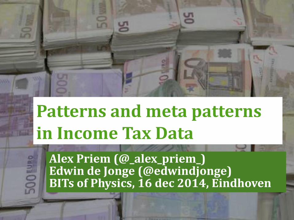
Age vs mortgage debt (men)
Who am I?
Statistical consultant / Data scientist
working @ R&D department of Statistics
Netherlands
Statistics Netherlands (SN):
- Government agency
- Produces all official statistics of The Netherlands
3
‘(big) data’ @ CBS:
4
‘Big’ data at CBS (2):
– Muncipal population register
– Income tax
– Payroll tax
– Central Registration of Higher Education
– Health care use (DBC’s; ‘diagnose-behandelcombinatie’)
– Company data
– Etc.
All datasets are anonymized and stripped of identifiable
records.
5

6
Income statistics based on Tax data
7
Tax Income data
– Contains all income tax records for the Netherlands
– Approx 17M records with 550 variables.
– Used to produce income statistics!
Analysis is not trivial
– Income Tax is complex (at least in the Netherlands)
‐ stages of progressive tax
‐ Complex Tax deductions
‐ Complex Tax benefits
8
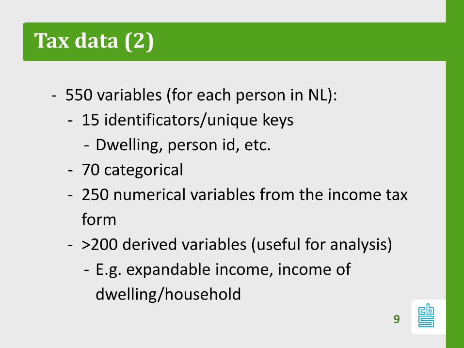
Tax data (2)
- 550 variables (for each person in NL):
- 15 identificators/unique keys
- Dwelling, person id, etc.
- 70 categorical
- 250 numerical variables from the income tax
form
- >200 derived variables (useful for analysis)
- E.g. expandable income, income of
dwelling/household
9
Analyzing big datasets?
10
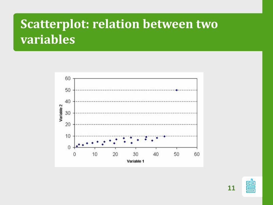
Scatterplot: relation between twovariables
11
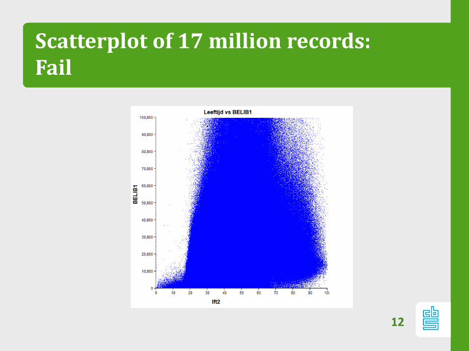
Scatterplot of 17 million records:Fail
12
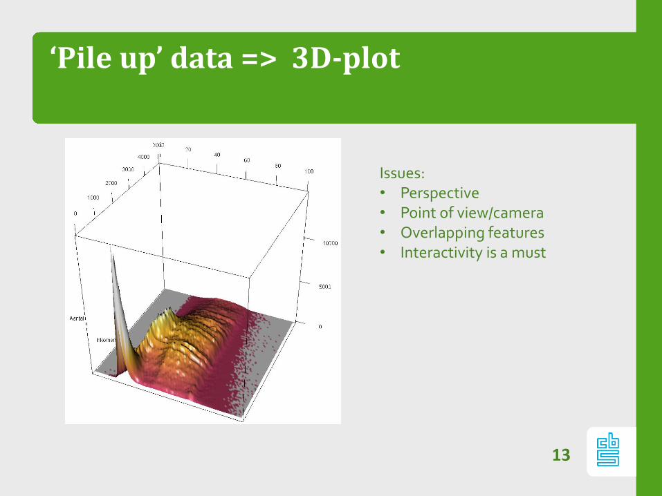
‘Pile up’ data => 3D-plot
13
Issues:• Perspective• Point of view/camera • Overlapping features• Interactivity is a must
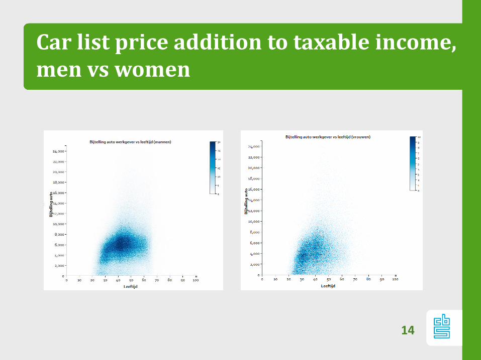
Car list price addition to taxable income, men vs women
14
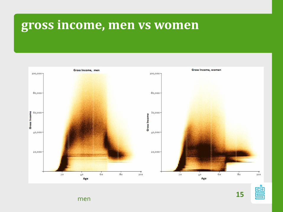
gross income, men vs women
15men
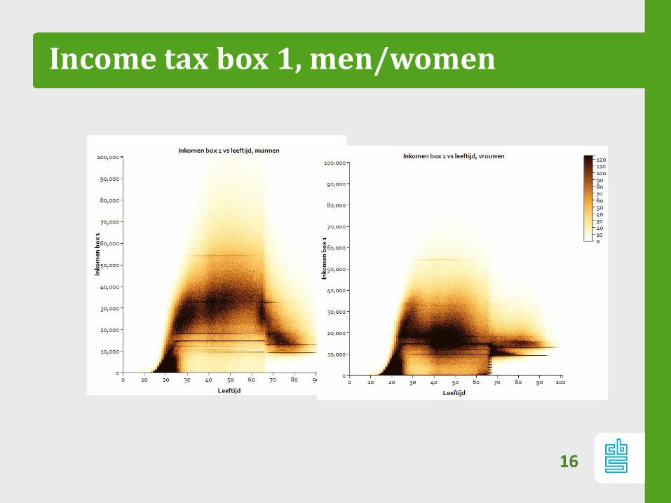
Income tax box 1, men/women
16
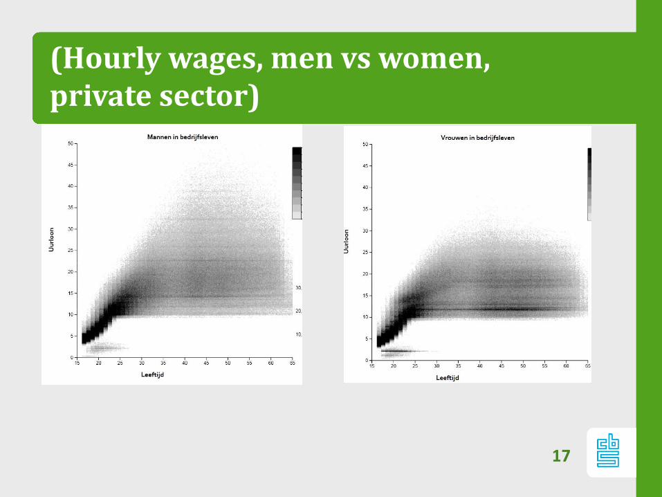
(Hourly wages, men vs women, private sector)
17

Let look at Patterns…
18
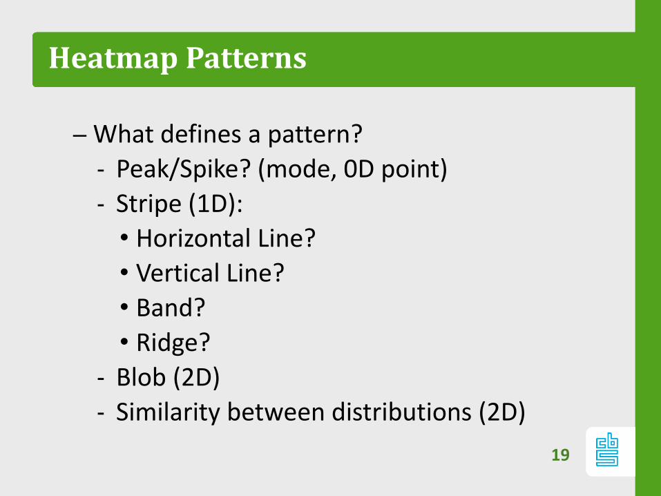
Heatmap Patterns
– What defines a pattern?
‐ Peak/Spike? (mode, 0D point)
‐ Stripe (1D):
• Horizontal Line?
• Vertical Line?
• Band?
• Ridge?
‐ Blob (2D)
‐ Similarity between distributions (2D)
19

Meta pattern?
Meta patterns constitutes of repeating pattern in:
‐ different subpopulations
• E.g. Male/female, Socio economic status, Branch
of Industry
‐ different pairs of variables
• Income x age
• Benefits x age
• Etc.
So patterns that are generic over different heatmaps.
20
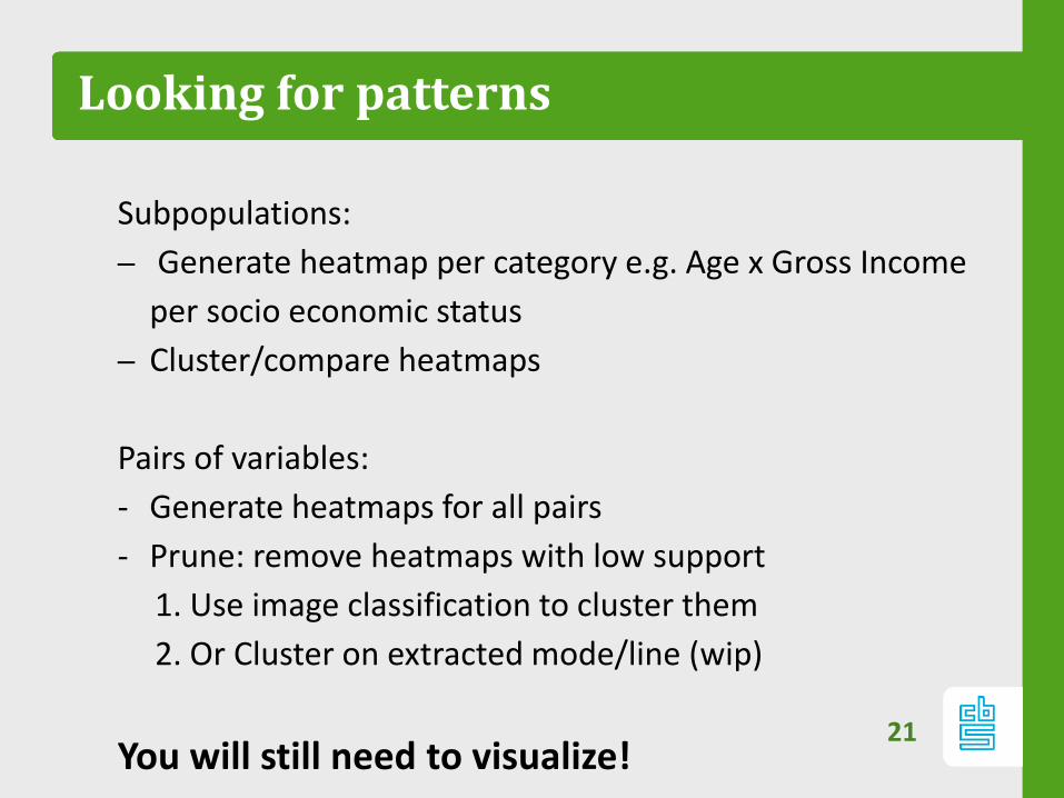
Looking for patterns
Subpopulations:
– Generate heatmap per category e.g. Age x Gross Income
per socio economic status
– Cluster/compare heatmaps
Pairs of variables:
- Generate heatmaps for all pairs
- Prune: remove heatmaps with low support
1. Use image classification to cluster them
2. Or Cluster on extracted mode/line (wip)
You will still need to visualize!21

Why Visualization?
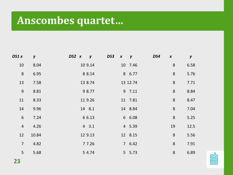
Anscombes quartet…
23
DS1 x y DS2 x y DS3 x y DS4 x y
10 8.04 10 9.14 10 7.46 8 6.58
8 6.95 8 8.14 8 6.77 8 5.76
13 7.58 13 8.74 13 12.74 8 7.71
9 8.81 9 8.77 9 7.11 8 8.84
11 8.33 11 9.26 11 7.81 8 8.47
14 9.96 14 8.1 14 8.84 8 7.04
6 7.24 6 6.13 6 6.08 8 5.25
4 4.26 4 3.1 4 5.39 19 12.5
12 10.84 12 9.13 12 8.15 8 5.56
7 4.82 7 7.26 7 6.42 8 7.91
5 5.68 5 4.74 5 5.73 8 6.89
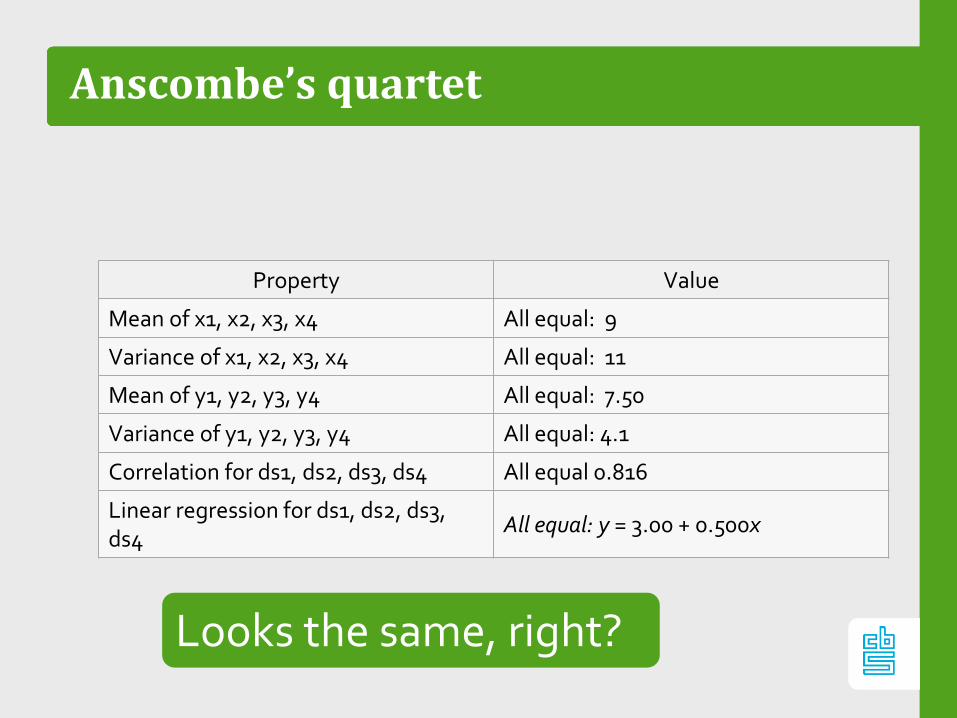
Anscombe’s quartet
Property Value
Mean of x1, x2, x3, x4 All equal: 9
Variance of x1, x2, x3, x4 All equal: 11
Mean of y1, y2, y3, y4 All equal: 7.50
Variance of y1, y2, y3, y4 All equal: 4.1
Correlation for ds1, ds2, ds3, ds4 All equal 0.816
Linear regression for ds1, ds2, ds3, ds4
All equal: y = 3.00 + 0.500x
Looks the same, right?
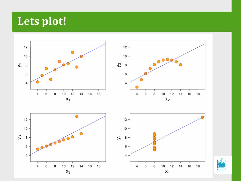
Lets plot!
Machine learning
So clustering
(machine learning)
different?
26

27
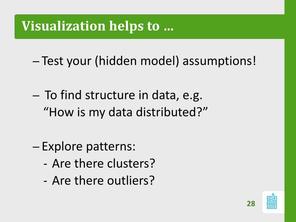
Visualization helps to …
– Test your (hidden model) assumptions!
– To find structure in data, e.g.
“How is my data distributed?”
– Explore patterns:
‐ Are there clusters?
‐ Are there outliers?
28
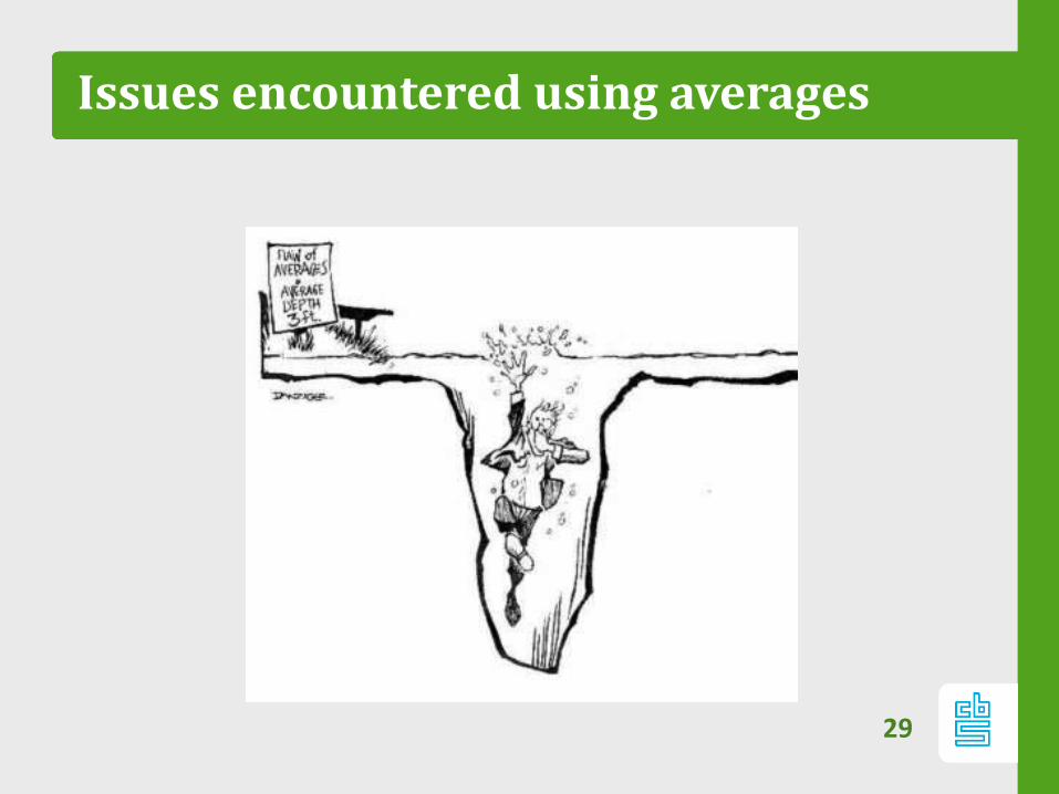
Issues encountered using averages
29

30
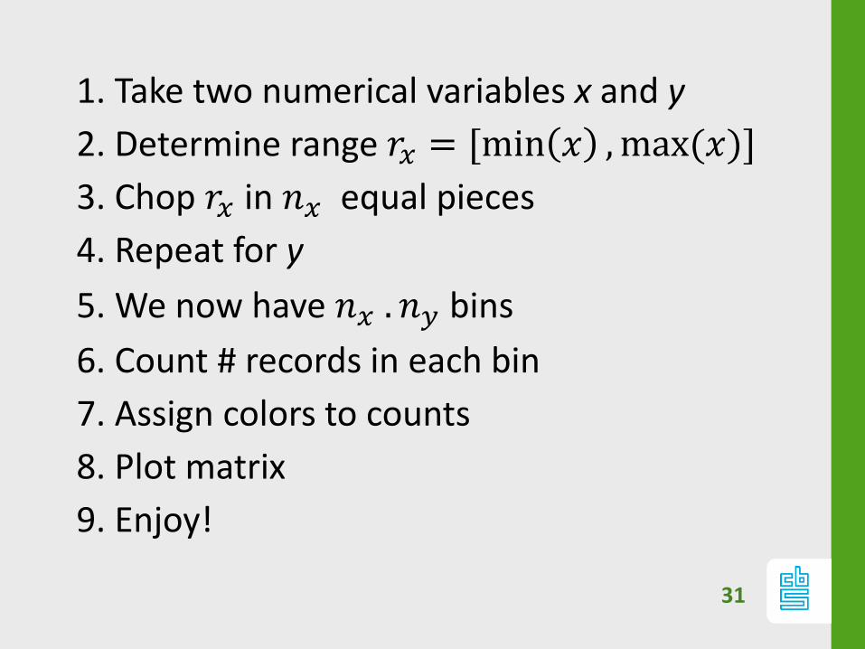
Heatmap recipe
31
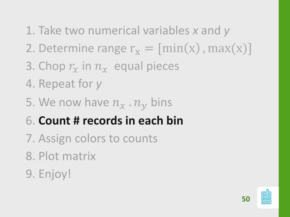
1. Take two numerical variables x and y
2. Determine range 𝑟𝑥 = [min 𝑥 ,max(𝑥)]
3. Chop 𝑟𝑥 in 𝑛𝑥 equal pieces
4. Repeat for y
5. We now have 𝑛𝑥 . 𝑛𝑦 bins
6. Count # records in each bin
7. Assign colors to counts
8. Plot matrix
9. Enjoy!
Easy as pie?
Best practices and problems with heatmaps:
- Resolution
- Rescaling
- Zooming
- Outliers
- Color scales
32

33
34
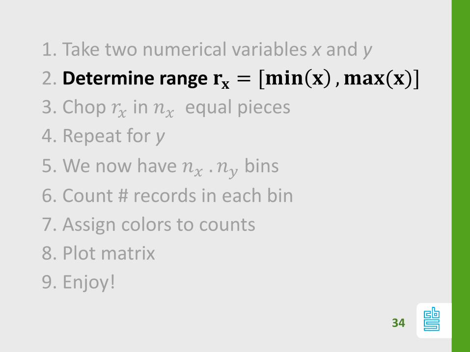
1. Take two numerical variables x and y
2. Determine range 𝐫𝐱 = [𝐦𝐢𝐧 𝐱 ,𝐦𝐚𝐱(𝐱)]
3. Chop 𝑟𝑥 in 𝑛𝑥 equal pieces
4. Repeat for y
5. We now have 𝑛𝑥 . 𝑛𝑦 bins
6. Count # records in each bin
7. Assign colors to counts
8. Plot matrix
9. Enjoy!
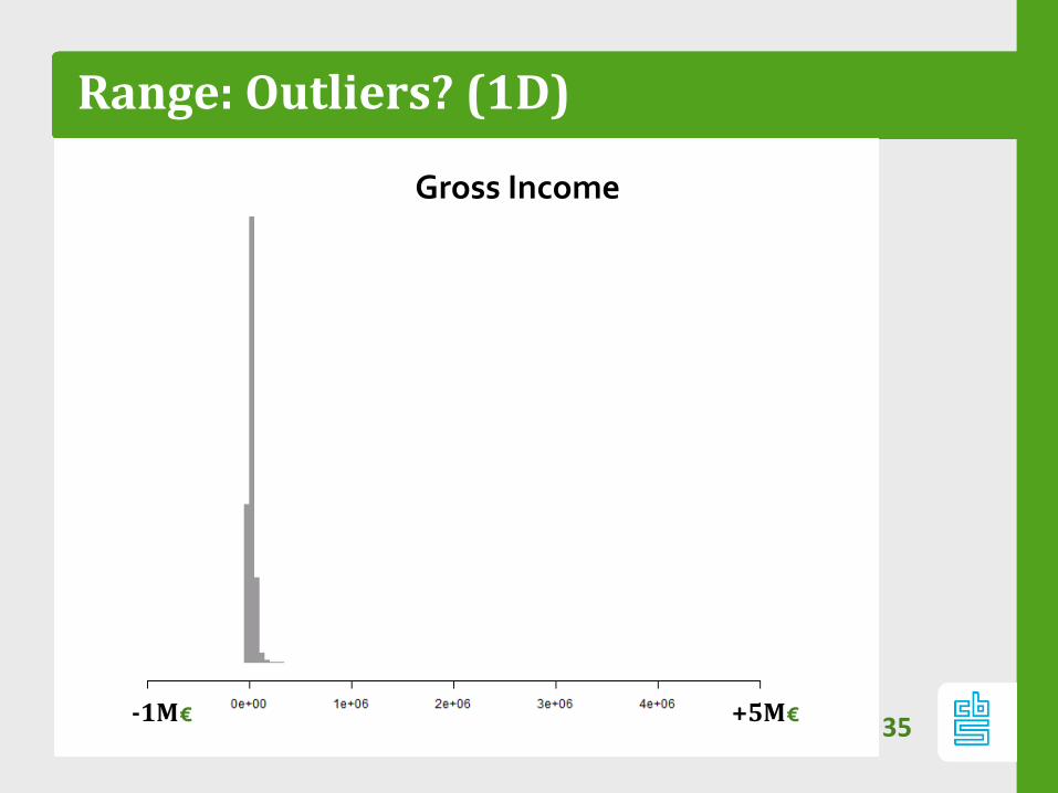
Range: Outliers? (1D)
35+5M€-1M€
Gross Income
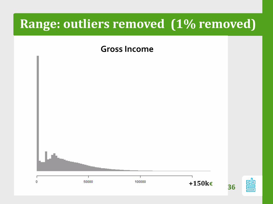
Range: outliers removed (1% removed)
36
Gross Income
+150k€
Range outliers…
Does your data contain outliers?
- If so: most pixels are empty
- Most cases: outliers have low mass and are
barely visible
Truncate range: in x or y direction: e.g. 99%
quantile
- Interactively: allow for zoom and pan.37
Range: data skewed?
38
–Many variables are not normal
distributed:
‐ Power law: 𝒙𝛼
‐ Exponential: 𝑒𝑎𝒙+𝑏
So rescale x or y or both
39
1. Take two numerical variables x and y
2. Determine range rx = [min x ,max(x)]
3. Chop 𝒓𝒙 in 𝒏𝒙 equal pieces
4. Repeat for y
5. We now have 𝑛𝑥 . 𝑛𝑦 bins
6. Count # records in each bin
7. Assign colors to counts
8. Plot matrix
9. Enjoy!
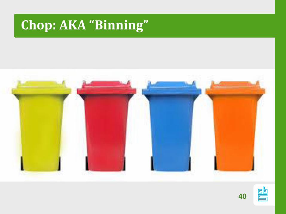
Chop: AKA “Binning”
40
41
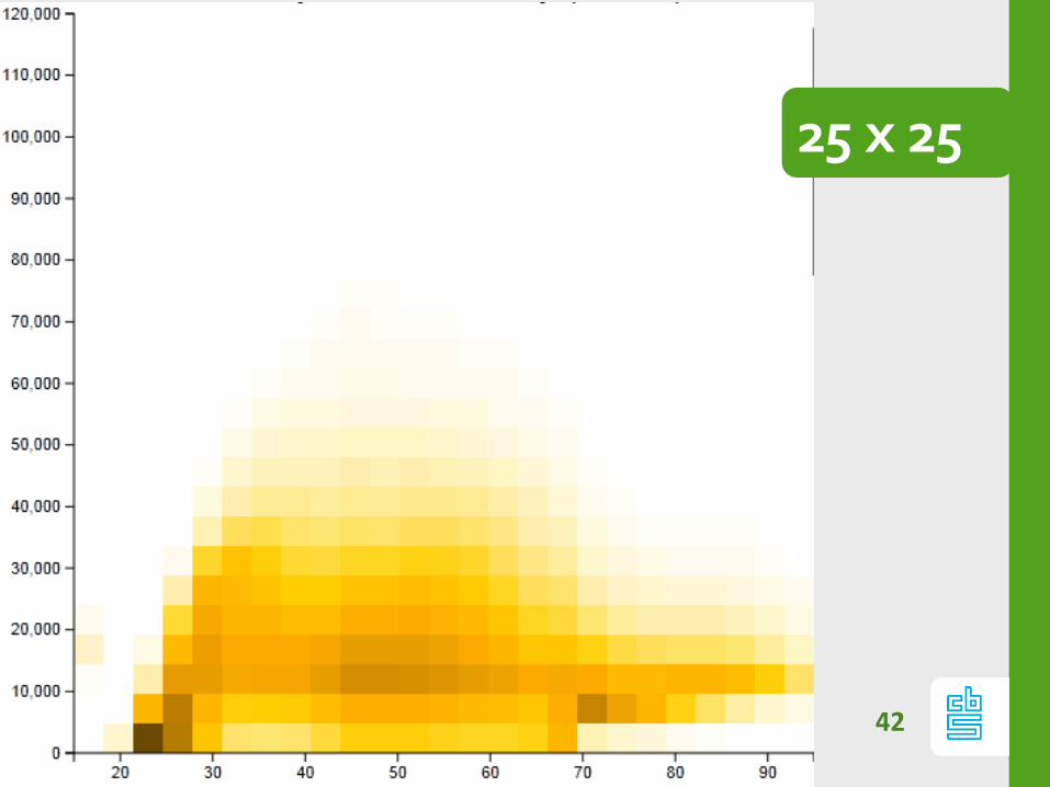
Chop: resolution
Resolution matters
42
25 x 25
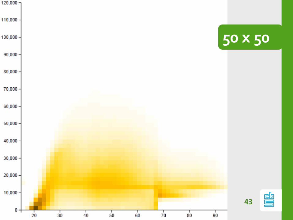
43
50 x 50
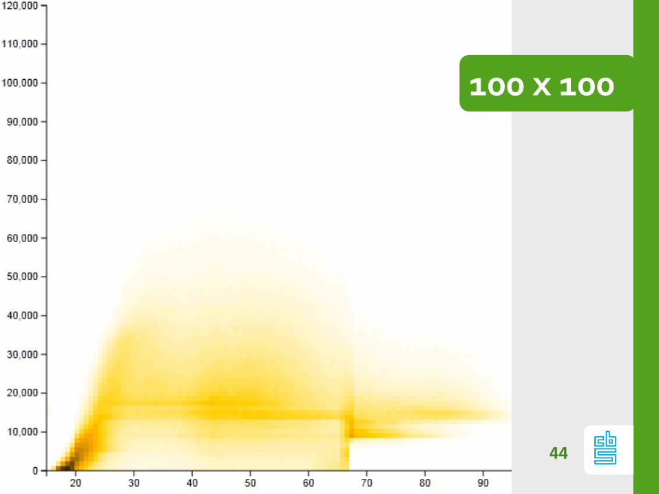
44
100 x 100
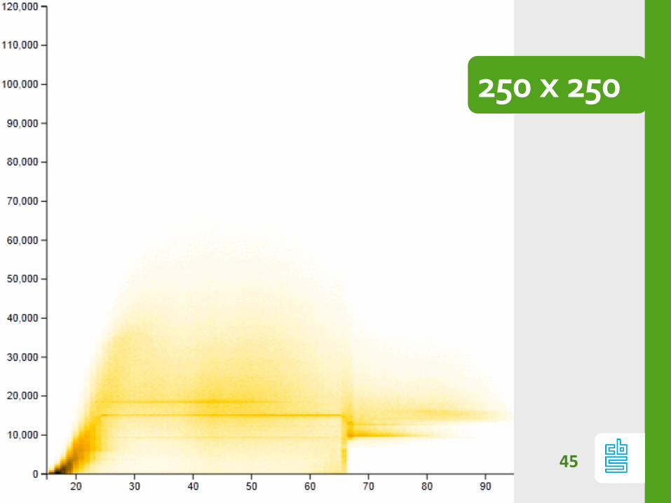
45
250 x 250
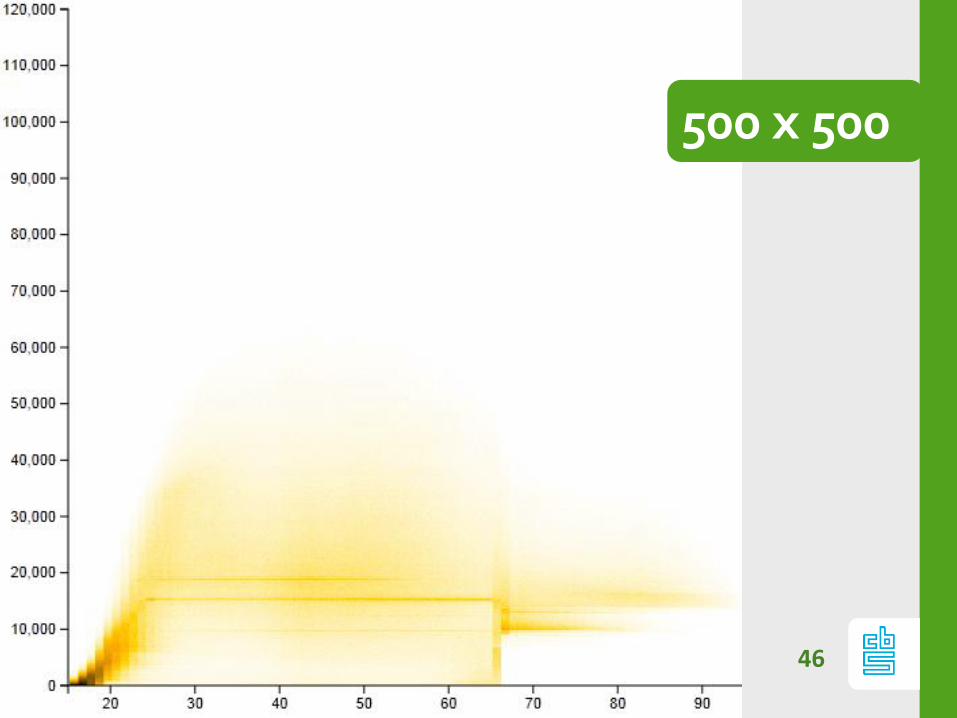
46
500 x 500
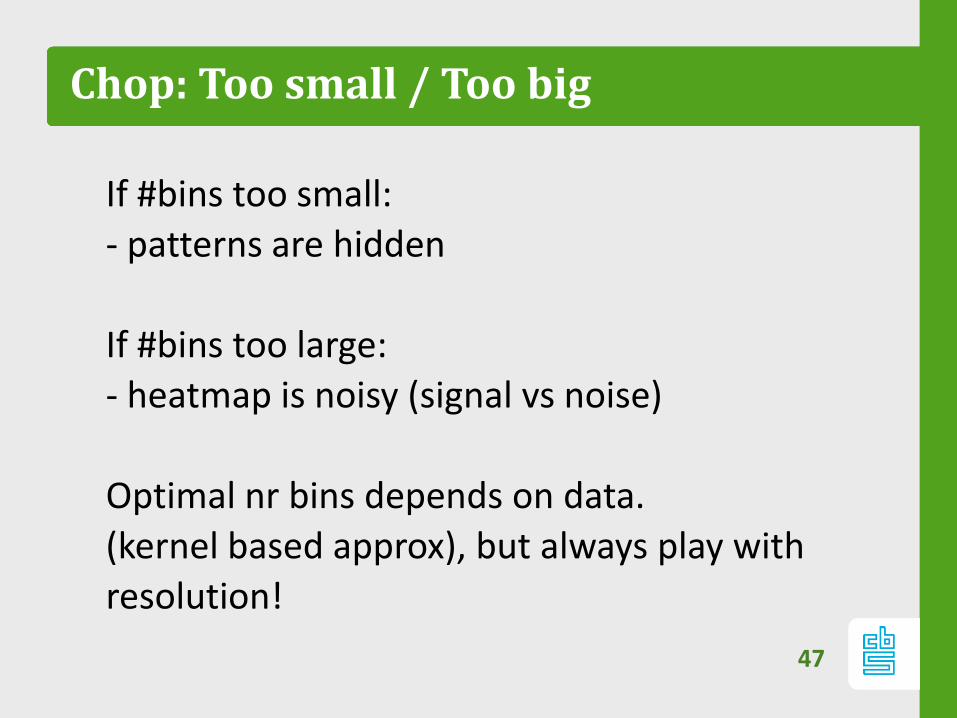
Chop: Too small / Too big
If #bins too small:
- patterns are hidden
If #bins too large:
- heatmap is noisy (signal vs noise)
Optimal nr bins depends on data.
(kernel based approx), but always play with
resolution!
47
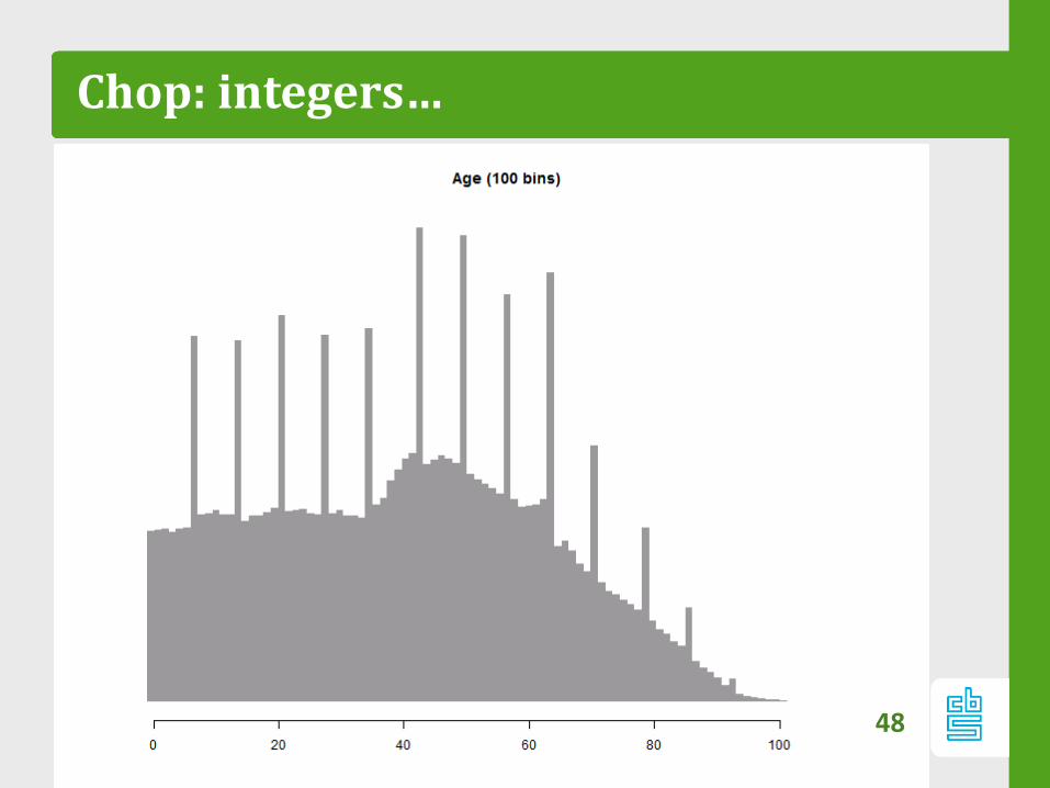
Chop: integers…
48
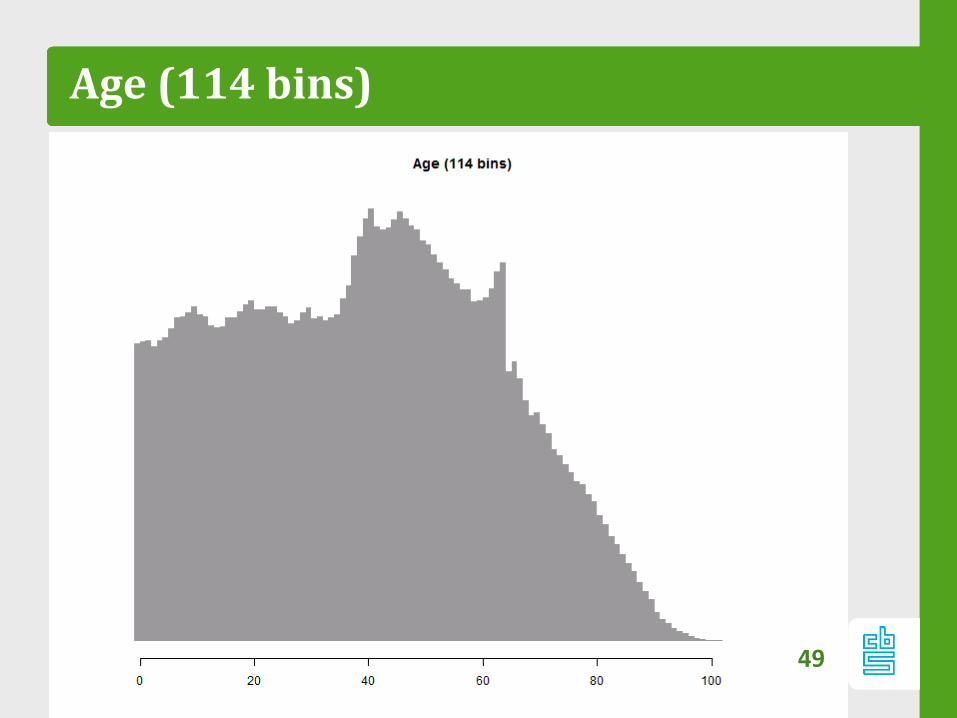
Age (114 bins)
49
50
1. Take two numerical variables x and y
2. Determine range rx = [min x ,max(x)]
3. Chop 𝑟𝑥 in 𝑛𝑥 equal pieces
4. Repeat for y
5. We now have 𝑛𝑥 . 𝑛𝑦 bins
6. Count # records in each bin
7. Assign colors to counts
8. Plot matrix
9. Enjoy!

Count: zero counts
Not every variable is relevant for each person!
51
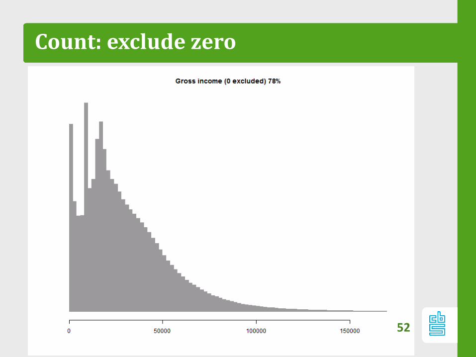
Count: exclude zero
52

Assign colors!
53
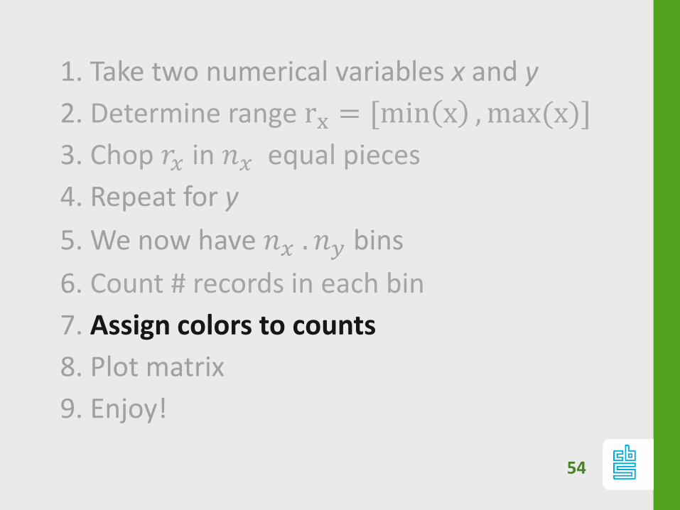
54
1. Take two numerical variables x and y
2. Determine range rx = [min x ,max(x)]
3. Chop 𝑟𝑥 in 𝑛𝑥 equal pieces
4. Repeat for y
5. We now have 𝑛𝑥 . 𝑛𝑦 bins
6. Count # records in each bin
7. Assign colors to counts
8. Plot matrix
9. Enjoy!
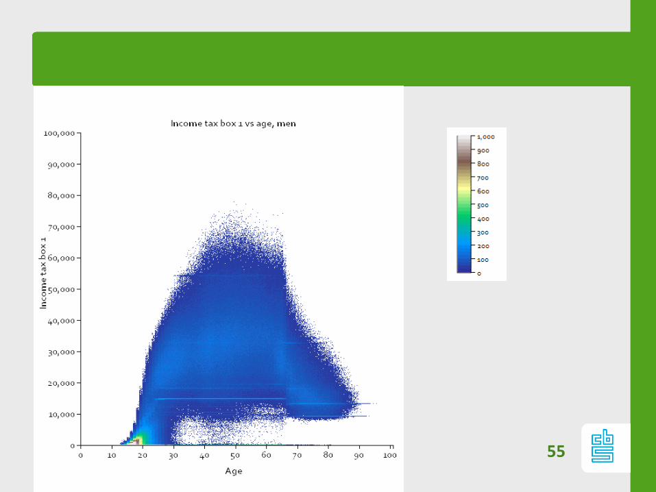
55
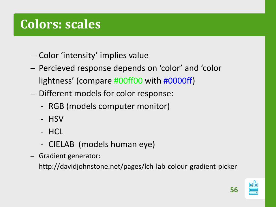
Colors: scales
– Color ‘intensity’ implies value
– Percieved response depends on ‘color’ and ‘color
lightness’ (compare #00ff00 with #0000ff)
– Different models for color response:
‐ RGB (models computer monitor)
‐ HSV
‐ HCL
‐ CIELAB (models human eye)– Gradient generator:
http://davidjohnstone.net/pages/lch-lab-colour-gradient-picker
56
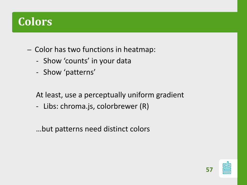
Colors
– Color has two functions in heatmap:
‐ Show ‘counts’ in your data
‐ Show ‘patterns’
At least, use a perceptually uniform gradient
- Libs: chroma.js, colorbrewer (R)
…but patterns need distinct colors
57
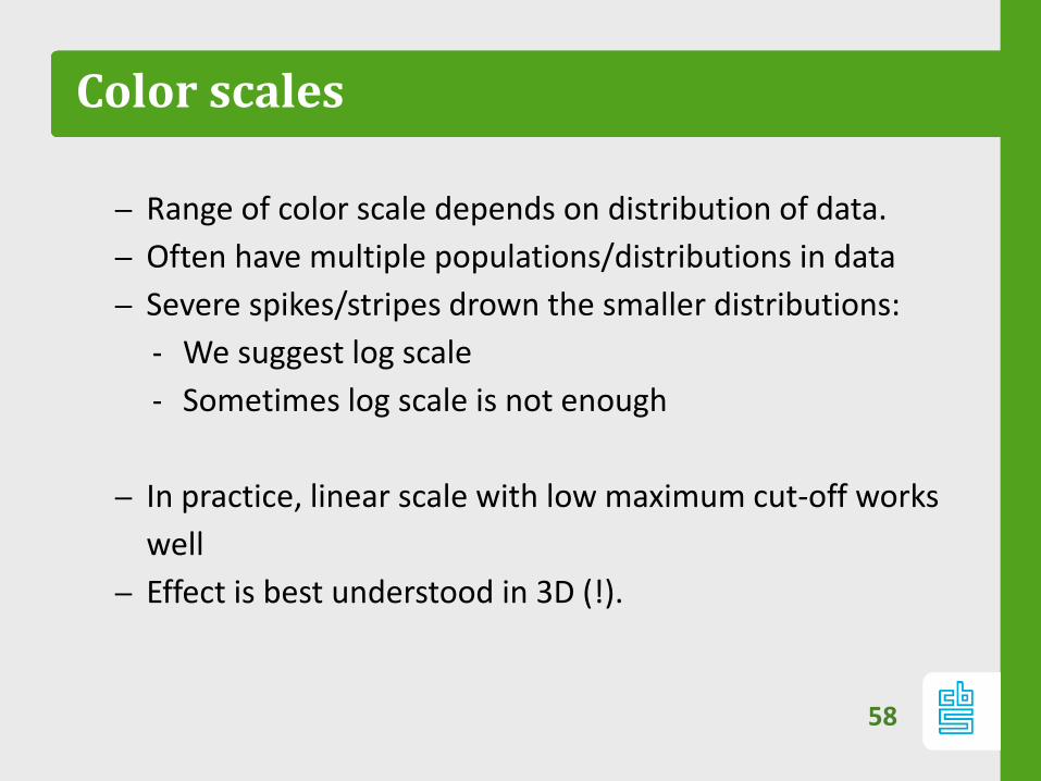
Color scales
– Range of color scale depends on distribution of data.
– Often have multiple populations/distributions in data
– Severe spikes/stripes drown the smaller distributions:
‐ We suggest log scale
‐ Sometimes log scale is not enough
– In practice, linear scale with low maximum cut-off works
well
– Effect is best understood in 3D (!).
58
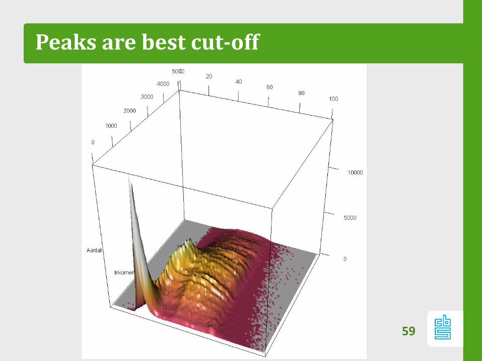
Peaks are best cut-off
59
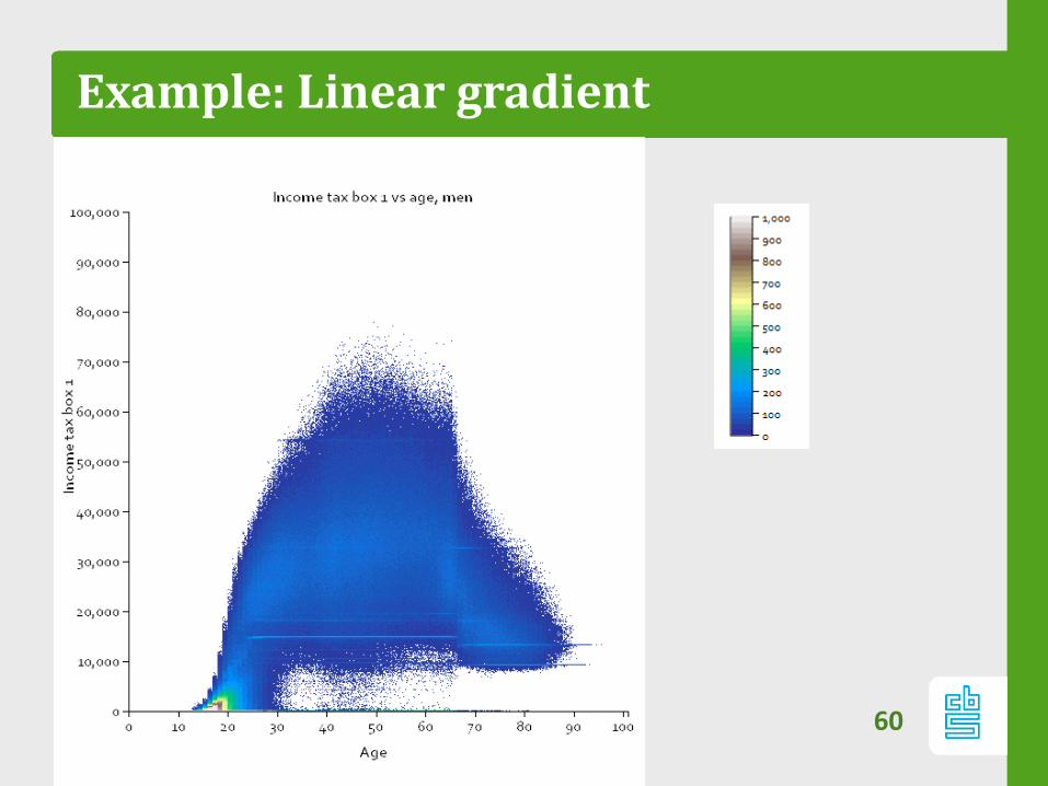
Example: Linear gradient
60
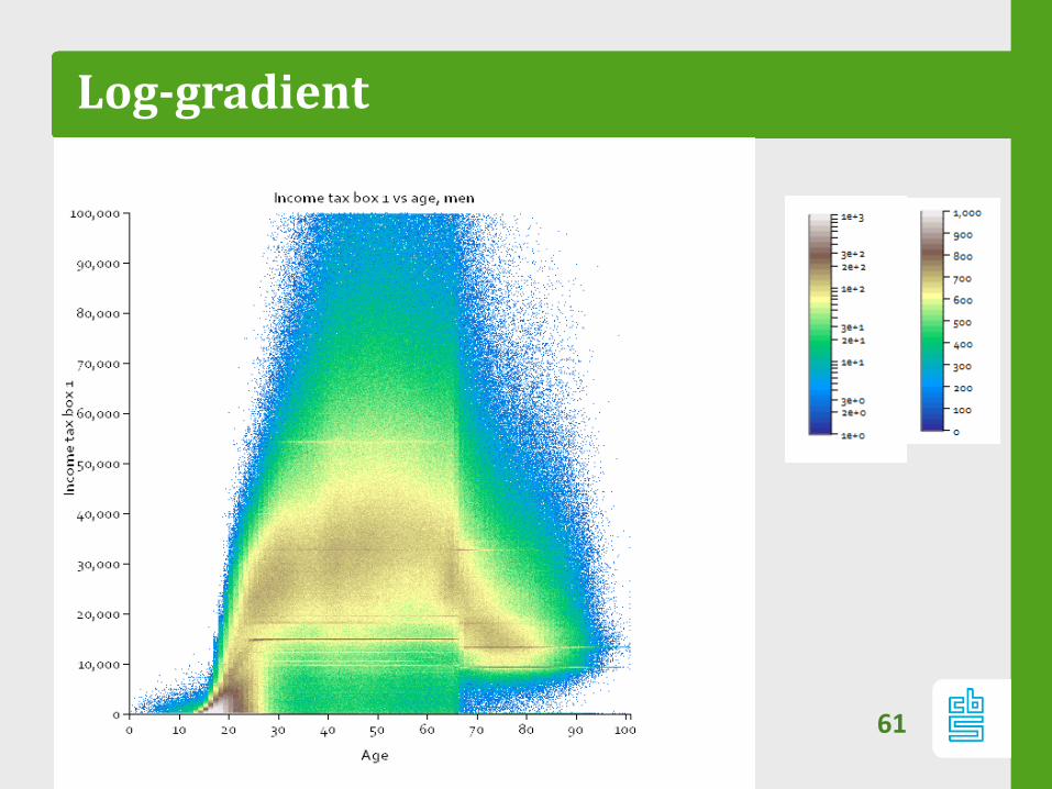
Log-gradient
61
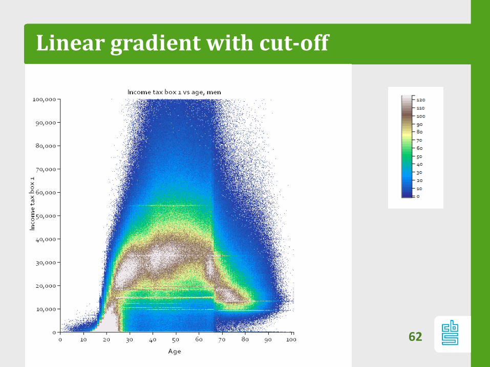
Linear gradient with cut-off
62
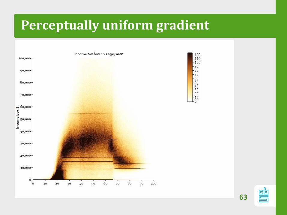
Perceptually uniform gradient
63
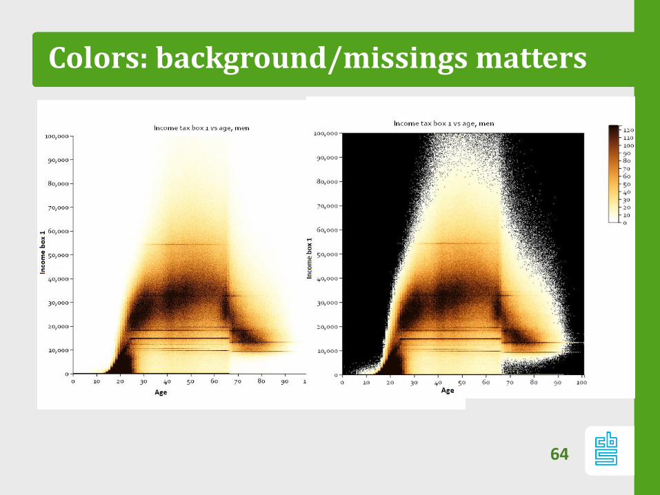
Colors: background/missings matters
64
Meta pattern
Meta patterns constitutes of repeating pattern in:
‐ different subpopulations
‐ different pairs of variables
So patterns that are generic over different
heatmaps.
65
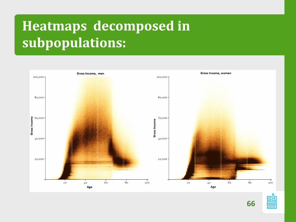
Heatmaps decomposed in subpopulations:
66
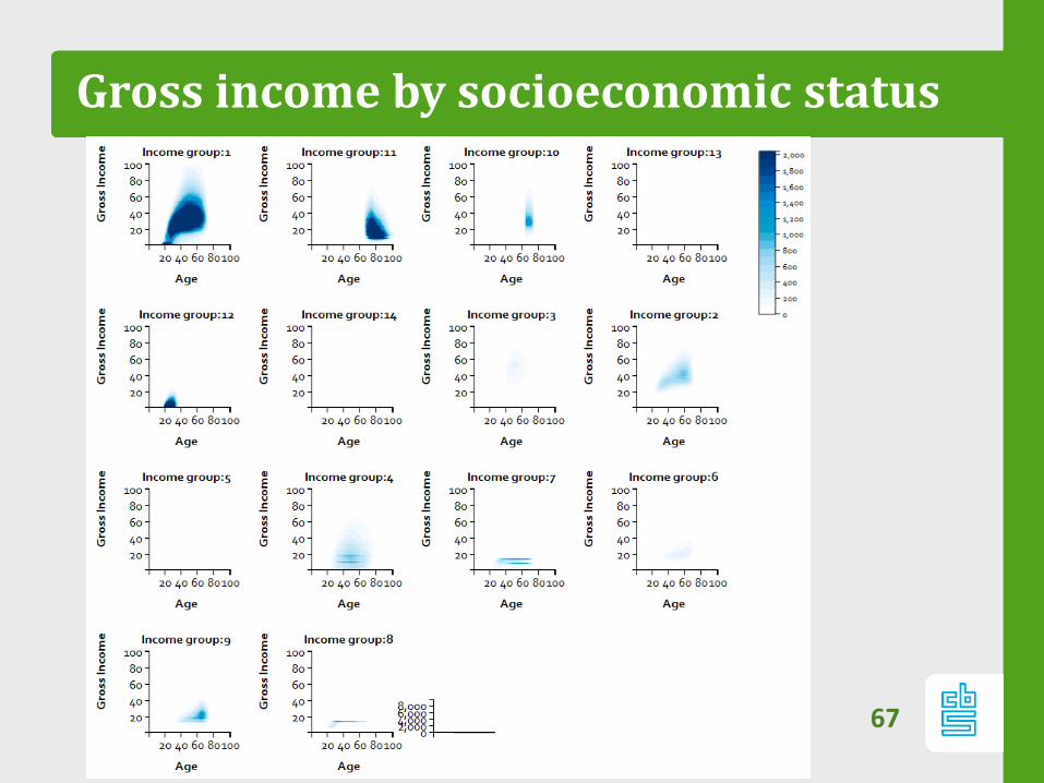
Gross income by socioeconomic status
67
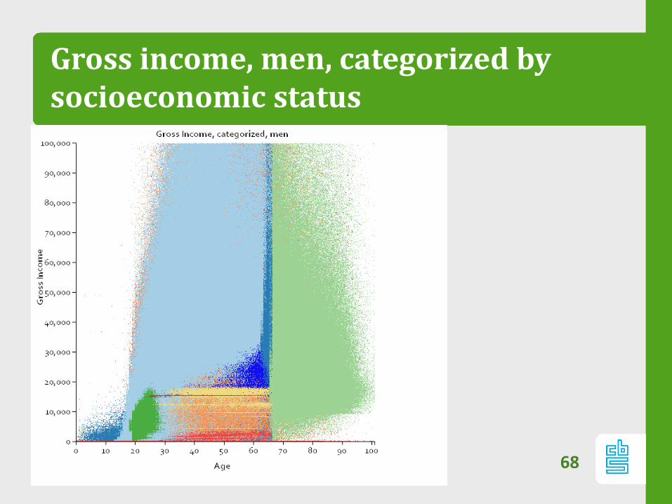
Gross income, men, categorized bysocioeconomic status
68
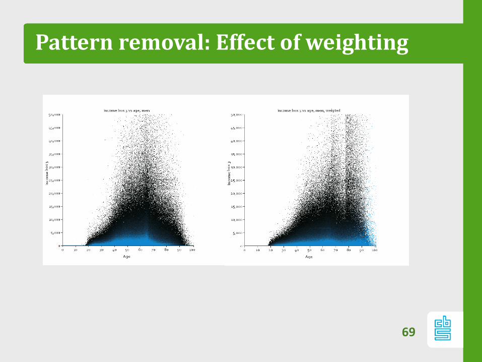
Pattern removal: Effect of weighting
69
Patterns
– Stripes are real, not outliers:
– Corresponds with benefits, tax breaks
– Needs paradigm shift: data is not normally
distributed (but we knew that).
70

No Domain knowledge required?
71

72
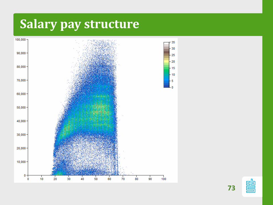
Salary pay structure
73
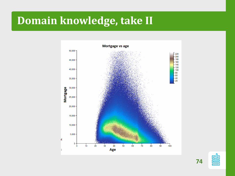
Domain knowledge, take II
74
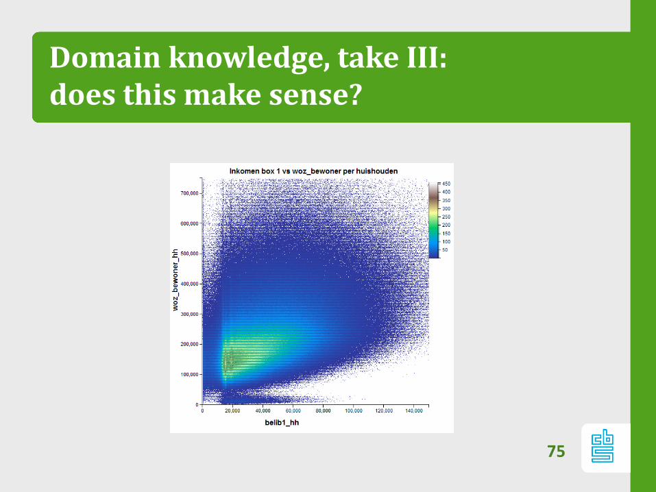
Domain knowledge, take III:does this make sense?
75
Small datasets?
76
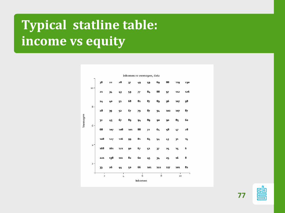
Typical statline table: income vs equity
77
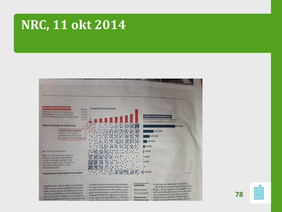
NRC, 11 okt 2014
78
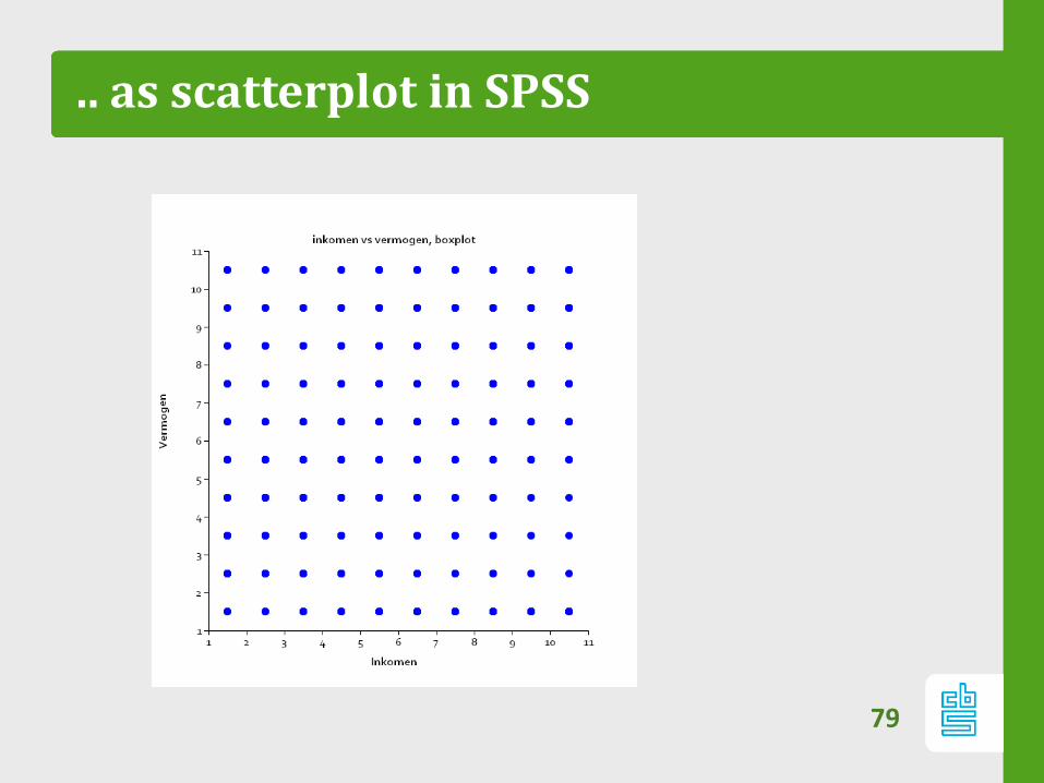
.. as scatterplot in SPSS
79
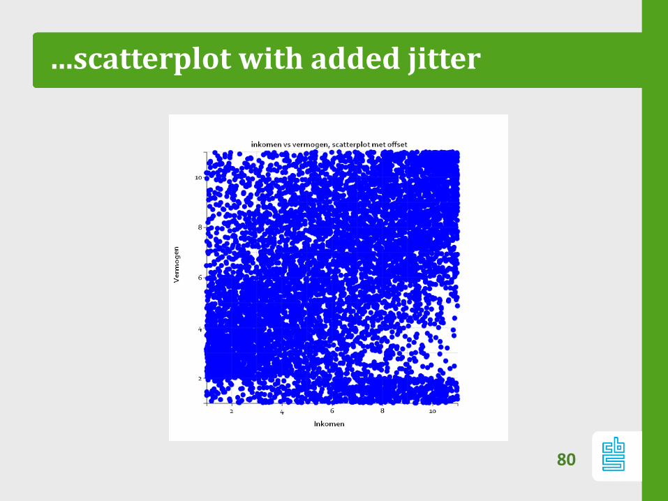
…scatterplot with added jitter
80
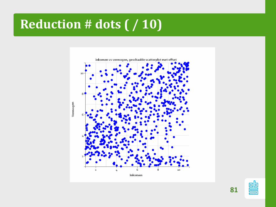
Reduction # dots ( / 10)
81
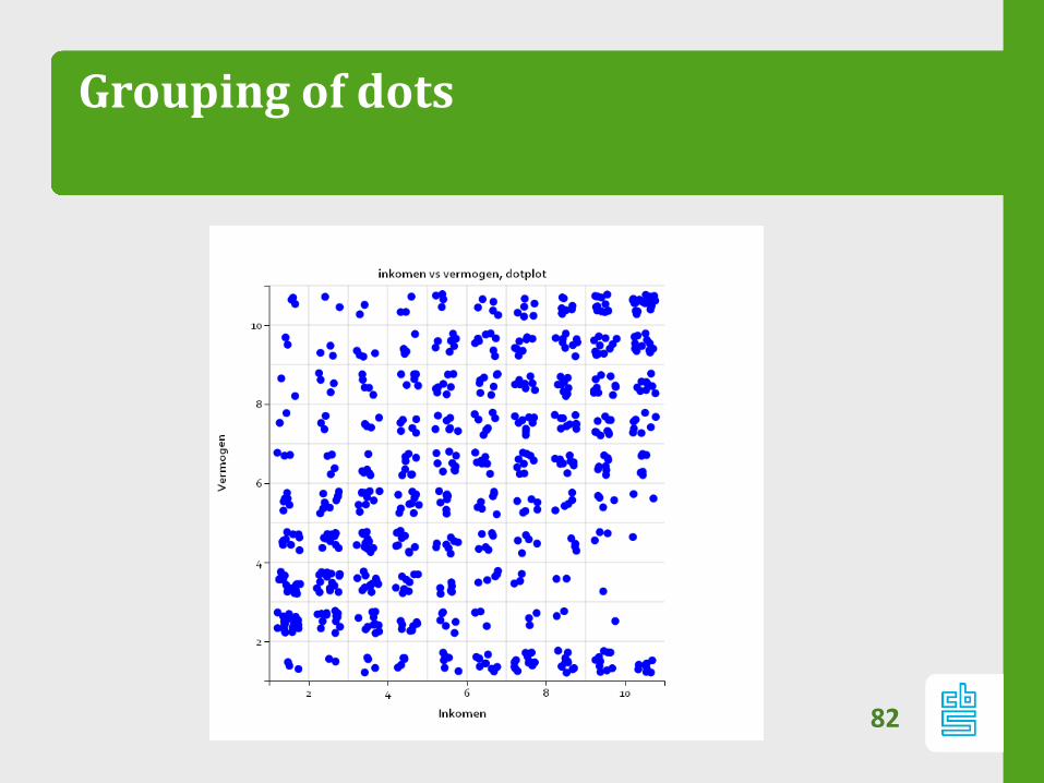
Grouping of dots
82
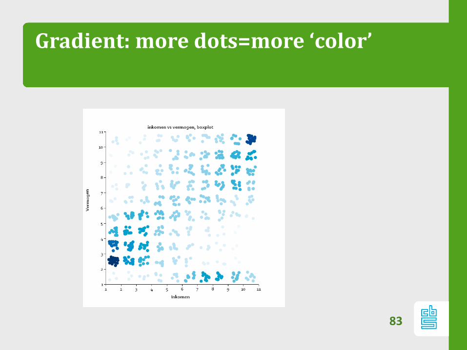
Gradient: more dots=more ‘color’
83
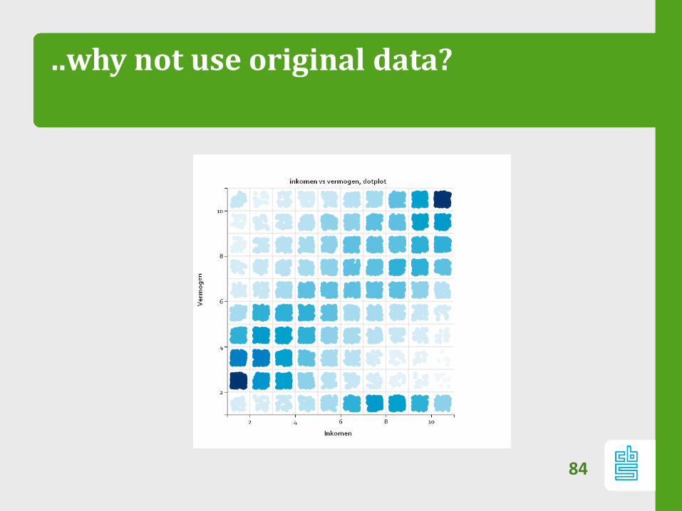
..why not use original data?
84
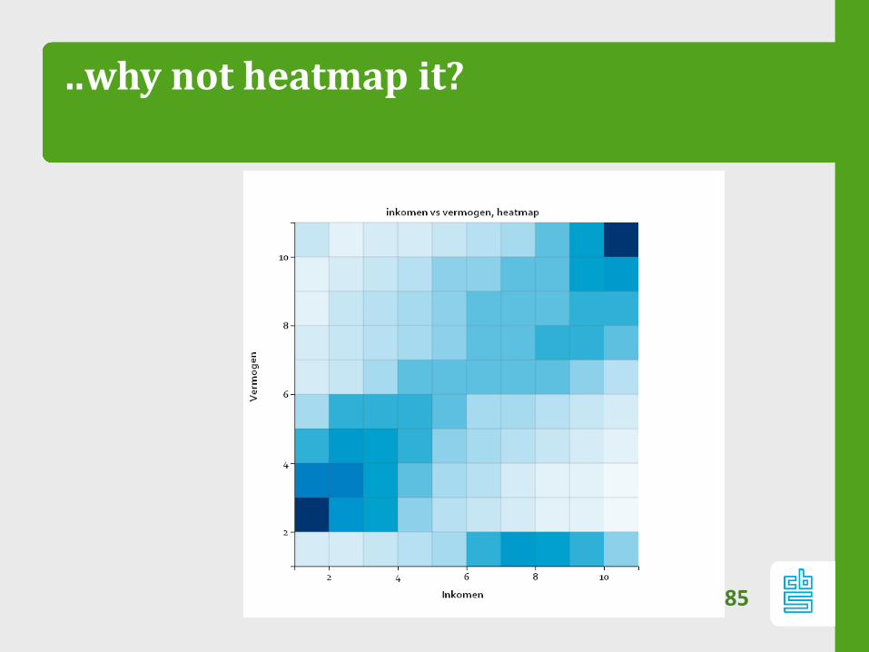
..why not heatmap it?
85
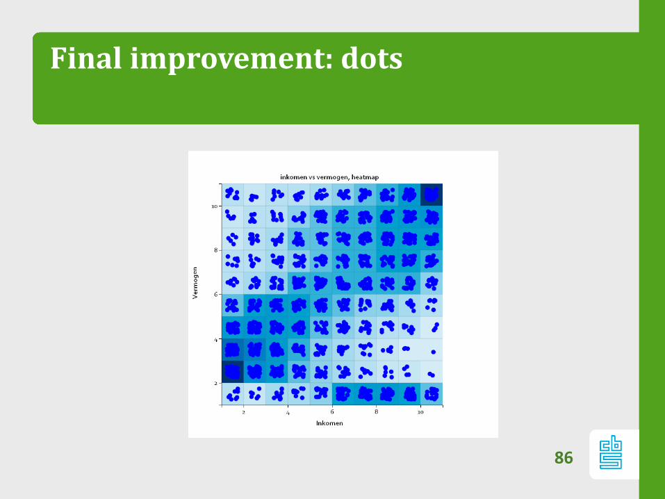
Final improvement: dots
86
Summary
Heatmaps: – ideal tool for analyzing big datasets
– Be aware of perceptual and data biases!
87
Questions?
Thank you for your attention!
More info?
Heatmapping code available at
https://github.com/alexpriem/heatmapr
88

Really interested?
www.werkenbijhetcbs.nl
89