16. Outliers: Identification, Problems, and Remedies (Good...
51
1 16. Outliers: Identification, Problems, and Remedies (Good and Bad) What is an outlier? An outlier is a data point that is (i) far from the rest, and (ii) rare. Let’s parse that definition for a bit. First, “data point” indicates that the outlier may involve a combination of values, as in a point on a scatterplot. Second, “far,” in the English language, refers to distance. “Far” also refers to distance in statistics, but in statistics, “distance” is defined relative to the typical range of the data. Third, “rare” means “unusual,” meaning that only a small percentage of the data are near the outlier. Later in this Chapter, we will discuss the differing effects of outliers in the X and Y variables. For now, consider the following univariate data from a variable “V,” which could be either an X or a Y variable. v1 = 2.31, v2 = 1.28, v3 = 2.15, v4 = 23.02, v5 = 3.02, v6 = 1.10 Here, v4 = 23.02 is an obvious outlier, because it is “far” from the rest, and there is only one such unusual value. If there were several other values near 23.02, such as 20.1, 39.4, 23.5, and 30.0, you could say that the number 23.02 is indeed “far” from the lower data values (2.31, 1.28, 2.15, 3.02, and 1.10), but it would not be “rare,” and would therefore not be an outlier in that case. In terms of ordinary distance, v4 = 23.02 is “far” from the rest because it is 20 units away from the next nearest observation, v5 = 3.02. Now consider another variable, say “W”: w1 = 231, w2 = 128, w3 = 215, w4 = 322, w5 = 302, w6 = 110. Here, w4 = 322 is also 20 units away from the next nearest observation (w5 = 302), but it is no longer an outlier. See Figure 16.0.1. R code for Figure 16.0.1 par(mfrow=c(1,2)) v = c(2.31, 1.28, 2.15, 23.02, 3.02, 1.10) plot(v, rep(0,6), ylab="", yaxt="n") points(23.02, 0, pch=16, col="red") w = c(231, 128, 215, 322, 302, 110) plot(w, rep(0,6), ylab="", yaxt="n") points(322, 0, pch=16, col="red")
Transcript of 16. Outliers: Identification, Problems, and Remedies (Good...

1
16. Outliers: Identification, Problems, and Remedies (Good and Bad)
What is an outlier?
An outlier is a data point that is (i) far from the rest, and (ii) rare.
Let’s parse that definition for a bit.
First, “data point” indicates that the outlier may involve a combination of values, as in a point on
a scatterplot.
Second, “far,” in the English language, refers to distance. “Far” also refers to distance in
statistics, but in statistics, “distance” is defined relative to the typical range of the data.
Third, “rare” means “unusual,” meaning that only a small percentage of the data are near the
outlier.
Later in this Chapter, we will discuss the differing effects of outliers in the X and Y variables. For
now, consider the following univariate data from a variable “V,” which could be either an X or a
Y variable.
v1 = 2.31, v2 = 1.28, v3 = 2.15, v4 = 23.02, v5 = 3.02, v6 = 1.10
Here, v4 = 23.02 is an obvious outlier, because it is “far” from the rest, and there is only one such
unusual value. If there were several other values near 23.02, such as 20.1, 39.4, 23.5, and 30.0,
you could say that the number 23.02 is indeed “far” from the lower data values (2.31, 1.28, 2.15,
3.02, and 1.10), but it would not be “rare,” and would therefore not be an outlier in that case.
In terms of ordinary distance, v4 = 23.02 is “far” from the rest because it is 20 units away from
the next nearest observation, v5 = 3.02.
Now consider another variable, say “W”:
w1 = 231, w2 = 128, w3 = 215, w4 = 322, w5 = 302, w6 = 110.
Here, w4 = 322 is also 20 units away from the next nearest observation (w5 = 302), but it is no
longer an outlier. See Figure 16.0.1.
R code for Figure 16.0.1
par(mfrow=c(1,2))
v = c(2.31, 1.28, 2.15, 23.02, 3.02, 1.10)
plot(v, rep(0,6), ylab="", yaxt="n")
points(23.02, 0, pch=16, col="red")
w = c(231, 128, 215, 322, 302, 110)
plot(w, rep(0,6), ylab="", yaxt="n")
points(322, 0, pch=16, col="red")

2
Figure 16.0.1. Left panel: The red point is an outlier. Right panel: The red point is not an outlier.
In both data sets, the red point is 20 units distant from the next nearest value.
As seen in Figure 16.0.1, the definition of “far,” as it relates to statistical outliers, must use some
other metric than ordinary1 distance.
The problem indicated by Figure 16.0.1 is that the ranges of possible values of V and W differ
greatly: Their standard deviations are 8.62 and 87.0, respectively.
By measuring distance in terms of standard deviations, you can more easily identify outliers. In
the left panel of Figure 16.0.1, the outlier is (23.02 – 3.02)/8.62 = 2.32 standard deviations from
the next closest value; in the right panel the red point is (322 – 320)/87.0 = 0.023 standard
deviations from the next closest value.
The signed distance2 from the average of the data, in terms of standard deviations, is called the
“z-value”:
z-value = (data value – average)/(standard deviation)
You can easily identify an outlier in a particular variable (i.e., in a column of your data frame) by
calculating how far (in terms of standard deviations) it is from the average of that variable. The
“scale” function in R does this for you automatically. Using scale(v)and scale(w) on the data
above gives the z-value for v4 to be 2.034, indicating that v4 = 23.02 is 2.034 standard deviations
above the average of the V data. The z-value for w4 is 1.196, indicating that w4 = 322 is 1.196
standard deviations above the average of the W data.
Ugly Rule of Thumb for Identifying Outliers
Observations with |z| > 3 can be considered “outliers.”
1 Formally, “ordinary distance” is Euclidean (or straight-line) distance. 2 “Signed distance” means difference that includes the sign. The distance from 3 to 10 is |3 – 10| = 7 units, but the
“signed distance” is 3 – 10 = –7. Signed distance includes the + or – sign.

3
This rule of thumb, like most rules of thumb, is “ugly” because you should not take it too
seriously. An observation having z = 2.98 is as much of an outlier as one having z = 3.01.
Further, there are many statistical methods to identify outliers other than z values.
As the word “ugly” in the “ugly rule of thumb” given above indicates, there is no hard boundary,
or threshold, by which a point is classified as “outlier” or “not and outlier.” There are just
degrees of extremity; degrees of “outlierness.” The z-value is one statistic that measures
outlierness, with larger z-values indicating greater “outlierness.” Below, we give other measures
of outlierness that have special relevance in regression analysis.
More important than any “ugly rule of thumb” is the logic behind it. In the case of the “large z
indicates outlier” rule of thumb, the logic is based on Chebychev’s inequality, which states that
at most (100/k2)% of the data will have |z| values greater than k. For examples: (i) at most 11.1%
of the |z| values can be greater than 3; (ii) at most 1.0% of the |z| values can greater than 10.
Thus, larger |z| indicates a data value that is both more distant and more rare.
(Self-study question: Simulate 100,000 data values from (i) the normal distribution, (ii) the
exponential distribution, and (iii) the Cauchy distribution and find the percentage of |z| values
that are more than k = 3. Does Chebychev’s inequality hold for these three simulated data sets?
Repeat for k = 10.)
Suppose you saw a data set where about n = 10,000 data values were between 0 and 1, but there
was one data value around 1,000. To see what kind of an outlier this is, let’s simulate some data
like that.
set.seed(12345)
Most.data = runif(10000)
Outlier.data.value = 1000
z.all = scale(c(Most.data, Outlier.data.value))
z.all[10001]
The z-value is 99.95 for the unusual data value, 1,000. So that data value is about 100 standard
deviations from the meanWow!3
There is a very serious point underlying the flippant “Wow” characterization. Some sources you
might read suggest that there are rules for “rejecting” data points that are outliers4. They give
fancy-looking rejection rules, sometimes involving complex formulas, perhaps even lengthy
tables of critical values, which seem to lend credence to the methods. However, such methods
are not only bad science, they also verge on academic misconduct; more on this below.
The serious and important message here is that there is no magic formula for determining
whether an observation is an outlier. Further, automatic outlier deletion (and Winsorizing as
discussed below) is usually just bad scientific practice. On the other hand, you should certainly
3 “Wow!” is the appropriate scientific characterization of a data point that exceeds an extreme (ugly rule of thumb)
threshold for determining “outlier.” 😊 4 Sometimes, rather than throwing out outliers, some people simply replace them with a less extreme value. This is
called “Winsorizing.” This practice is discussed in detail later in the chapter.
4
(i) understand what an outlier is, (ii) know how to recognize outliers in your data, (iii) understand
when one observation is more of an outlier than another, (iv) understand what effects outliers
have on your regression analysis, and (v) understand how to model outlier-prone data-generating
processes.
In the case where the data points are bivariate or multivariate, “outlierness” takes on another
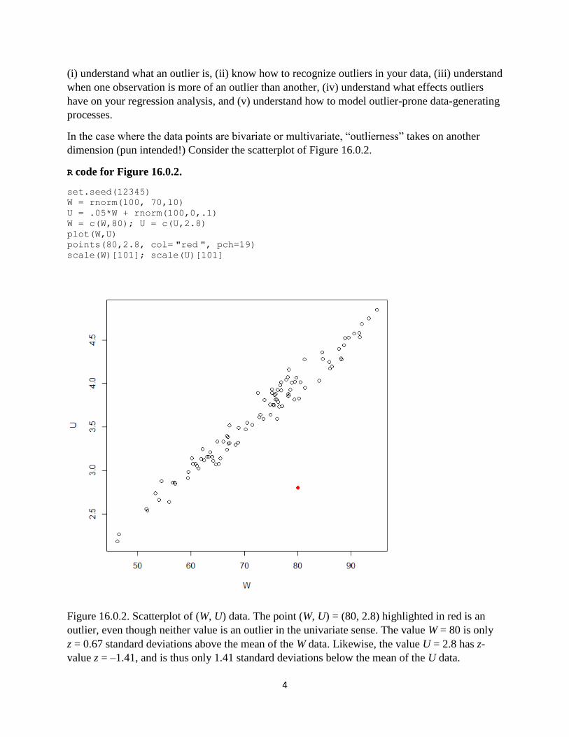
dimension (pun intended!) Consider the scatterplot of Figure 16.0.2.
R code for Figure 16.0.2.
set.seed(12345)
W = rnorm(100, 70,10)
U = .05*W + rnorm(100,0,.1)
W = c(W,80); U = c(U,2.8)
plot(W,U)
points(80,2.8, col= "red ", pch=19) scale(W)[101]; scale(U)[101]
Figure 16.0.2. Scatterplot of (W, U) data. The point (W, U) = (80, 2.8) highlighted in red is an
outlier, even though neither value is an outlier in the univariate sense. The value W = 80 is only
z = 0.67 standard deviations above the mean of the W data. Likewise, the value U = 2.8 has z-
value z = –1.41, and is thus only 1.41 standard deviations below the mean of the U data.

5
As seen in Figure 16.0.2, you cannot always identify outliers in multiple dimensions by using
univariate z-values alone. You must also consider the joint distribution of the data values,
because, depending on the correlation structure, certain combinations of values (such as (80, 2.8)
shown in Figure 16.0.2) may be unusual, even when the individual values, by themselves, are not
unusual.
What is the problem with outliers?
The problem with outliers is that they can have an inordinate effect on your estimated model,
particularly if you use ordinary least squares (OLS). Recall that your regression model p(y | x) is
one you assume to have produced your data. More importantly, p(y | x) is also what you assume
to produce potentially observable data that you have not observed. If your model states that the
p(y | x) are normal distributions (giving you OLS estimates), then data values that are far from
the rest may indicate that your model is wrong. If your data really are produced by normal
distributions, you will rarely see an observation that is 4.0 standard deviations from the
regression mean line, let alone 99.95 standard deviations as shown above. If an observation is
99.95 standard deviations from the mean, its contribution to the normal distribution likelihood
function is
(1/)(2)–1/2exp(–0.599.952)
Notice that this a very small number. So, if you have such a data point in your data set, the
parameter values that maximize the likelihood will have to be chosen to make this number not so
small. Specifically, the estimated mean line and standard deviation will be chosen to make this z
value smaller so that the data point does not “drag down” the likelihood so much. Hence, this
one outlier data point will force the mean function and standard deviation towards the outlier.
This problem, where an outlier has an inordinate effect on the fitted model, is more of a problem
with the normal distribution than it is with other distributions. Distributions that produce extreme
values (called heavy-tailed distributions), such as T distributions with small degrees of freedom
and the Laplace distribution, have higher density values at the extremes than does the normal
distribution (that’s why they are called “heavy-tailed”). Thus, with heavy-tailed distributions, the
likelihood of outliers is not as small as it is with the normal distribution. When you use heavy-
tailed distributions p(y | x), outliers have less influence on the likelihood function, and thus the
model parameter estimates (mean, scale) are not so highly influenced by outliers. With such
heavy-tailed distributions, outliers are expected.
We introduced this issue in Chapter 2, Section 2.4. See Figure 2.4.2 for a vivid illustration of
how maximum likelihood with a heavy-tailed distribution (the Laplace distribution, in the case of
Figure 2.4.2) gives estimates that are not influenced inordinately by outlier(s).

6
Why outliers are important
Outliers provide valuable insights. In many ways they are more important than the “common”
data. In production and manufacturing applications, outliers identify conditions where the
production process is “out of control,” indicating need for immediate investigation and/or
remedial action. They also might indicate good things: A famous engineer/statistician claimed
that many of his patents were the results of locating outliers that showed unexpectedly good
results. So he uncovered their mechanisms through further study, replicated the effects, and then
got the patents.
In health care, the “1 in a 10,000” type of person will be allergic to certain drugs, foods, or
therapies, resulting in outlier data values. These people need to be identified so that you don’t
make them sick or kill them inadvertently. A statistician in the pharmaceutical industry was
heard to say, “All this talk about deleting outliers is backwards. In my work, I ignore the main
body of the data and just study the outliers.”
Outliers are also extremely important in finance. Nassim Nicholas Taleb, in his book The Black
Swan, notes that most of the money that changes hands in financial markets is caused by outliers.
The famous “80 – 20” rule states that 80% of the activity is caused by 20% of the potential
causes, but Taleb argues for a “99 – 1” rule rather than an “80 – 20” rule, because around 99% of
the change of money is caused by 1% of the financial instances (these 1% are the outliers).
Outliers have an influence on society in general. Author Malcolm Gladwell has a book about
those rare people that have “made it big” and have had great influence. The title of his book:
Outliers.
As the examples above show, outlier identification is one the most important things you can do
with statistical data, because the most interesting facets of a scientific process are often its
outliers. Thus, at best, automatic outlier deletion (and its relative, Winsorization) is silly because
you are likely throwing away the most interesting features of your data. At worst, outlier deletion
(and Winsorization) is bad scientific practice, verging on academic and scientific misconduct.
Here is an amusing true story. A non-statistician consultant for a medical device start-up
company was seeking advice. His client company was making a device that purports to measure
the same thing as electroencephalograph (EEG) data on the human heart, but one that can be
used easily at home to give early warning signals of heart problems in people with heart
conditions. The gold standard is the EEG, but the patient has to be in the medical office hooked
up to electrodes to get such data. The medical device company has lots of data comparing the
EEG with the device, and found that most of the time, the device works very well, giving
measurements within 1% of the gold standard EEG. However, in the rare occasions where the
heart is unusually stressed, the device misses the EEG target badly. The non-statistician
consultant had heard that in some academic disciplines it is considered “OK” to delete or
Winsorize the outliers. So he deleted the rare occasions where the device badly missed the EEG
target. After deletion, he found there were no cases where the device performed badly. Based on
that analysis, he was thinking of recommending to his client company that they continue with
product development, “as is.”

7
(Self-study question: What do you think about the non-statistician consultant’s
recommendation?)
You should always identify and consider outliers carefully. You should never ignore them, or
“sweep them under the rug.” Of course, if an outlier is truly an incorrect data value, then you
should do some research and replace it with the correct data value. If you can’t do that, the
second-best option is to delete the erroneous data value, but realize, as you learned in the
previous chapter, that such deletion can cause bias. Also, while you are finding errors in the data,
don’t just look at the outliers. If some of the outliers are mistakes, it is likely that the mechanism
that caused these mistakes (e.g., data entry error) also caused mistakes that are not outliers. Thus,
you should scour your entire data set for mistakes and do the needed research to correct them
all5. Mistakes are garbage, and if you put garbage into your estimated model, then your estimated
model will likewise be garbage6. It doesn’t matter whether the garbage are outliers; they are still
garbage, and your estimated model will likewise be garbage.
If your outliers are not mistakes, then you should model them. You want your regression model
p(y | x) to produce data that look like what you will actually observe, right? Therefore, if you are
modeling a process that produces outliers every once in a while, then your model p(y | x) should
also produce outliers once in a while7.
16.1 Identifying Outliers in Regression Data: Overview
By “regression data,” we mean data where you have a single “Y” variable and one or more “X”
variables. Each variable is indexed by “i”, the observation number, where i = 1,2,…,n. For such
data, the following two classifications of outliers are useful.
1. The combination of data values (xi1, xi2, …,xik) may indicate that observation i is an
outlier in X space.
2. The combination of data values (yi, xi1, xi2,…,xik) may indicate that observation i is an
outlier in Y | X space.
To understand “outlier in X space,” see Figure 16.0.2. If both W and U are “X” variables, then the
red point indicates an outlier in X space. Of course, any other point well outside the main scatter
would also be an outlier in X space as well; for example, (W, U) = (100, 5) would also be an
outlier in X space.
(Self-study question: Look at Figure 16.0.2 and explain why (W, U) = (100, 5) would be an
outlier in X space if both W and U were X variables.)
To understand “outlier in Y | X space,” see Figure 16.0.2 again, but now suppose U is the “Y”
variable and W is the “X” variable. The red dot would be an outlier in Y | X space because 2.8 is
5 Or, as a distant second-best option, delete them all. 6 The shorthand version: “Garbage in, garbage out.” 7 A “good model” is one that produces realistic data.

8
an unusual value of Y, given that X = 80. On the other hand, Y = 2.8 is not an outlier in Y space,
because it is only 1.41 standard deviations below the mean of the Y data.
While it is useful to investigate outliers in Y space just to get to know your data, remember that
regression is a model for p(y | x), so for the purposes of regression, it is more important to
diagnose outliers in Y | X space than it is to diagnose outliers in Y space.
Figure 16.1.1 shows four distinct cases where a point (the red dot) is (a) neither an outlier in Y | X
space nor an outlier in X space, (b) an outlier in Y | X space but not an outlier in X space, (c) not
an outlier is Y | X space but an outlier in X space, and (d) an outlier in both Y | X space and an
outlier in X space.
R code for Figure 16.1.1
set.seed(12345); X = runif(30, .5, 3.5)
beta0 = 1.0; beta1 = 1.5; sigma = 0.7
Y = beta0 + beta1*X + sigma*rnorm(30) # The regular process
# Contaminated data: Four cases
X.suspect1 = 1.5; Y.suspect1 = 3.3
X.suspect2 = 1.5; Y.suspect2 = 9.7
X.suspect3 = 9.0; Y.suspect3 = 14.5
X.suspect4 = 9.3; Y.suspect4 = 0.6
Y.all1 = c(Y, Y.suspect1); X.all1 = c(X, X.suspect1)
Y.all2 = c(Y, Y.suspect2); X.all2 = c(X, X.suspect2)
Y.all3 = c(Y, Y.suspect3); X.all3 = c(X, X.suspect3)
Y.all4 = c(Y, Y.suspect4); X.all4 = c(X, X.suspect4)
par(mfrow=c(2,2),mar = c(4,4,2,1))
plot(X.all1, Y.all1)
points(X.suspect1, Y.suspect1, col="red", pch=19)
plot(X.all2, Y.all2)
points(X.suspect2, Y.suspect2, col="red", pch=19)
plot(X.all3, Y.all3)
points(X.suspect3, Y.suspect3, col="red", pch=19)
plot(X.all4, Y.all4)
points(X.suspect4, Y.suspect4, col="red", pch=19)

9
Figure 16.1.1. Upper left: The indicated point is neither an outlier in Y | X space nor an outlier in
X space. Upper right: The indicated point is an outlier in Y | X space but not an outlier in X space.
Lower left: The indicated point is not an outlier in Y | X space but is an outlier in X space. Lower
right: The indicated point is an outlier in Y | X space and an outlier in X space.
In Figure 16.1.1, upper left panel, the indicated point is not troubling at all. It is easily explained
by the model where p(y | x) are normal distributions strung together along a straight line function
of X = x. In the upper right panel, the observation is not unusual in its X value, but the Y value
appears unusual if the distributions p(y | x) are normal distributions. (On the other hand, this data
point is explainable by a model where the p(y | x) are distributions with heavier tails than the
normal distribution.) In the lower left panel, the observation is unusual when the Y data are
considered separate from the X data (i.e., it is an outlier in Y space), but since the point is near the
trend predicted by X, it is not an outlier in Y | X space.
The most troublesome case of all is the bottom right panel of Figure 16.1.1, where the data value
is both an outlier in Y | X space and an outlier in X space. This data point is not well explained by
the model where p(y | x) are normal distributions strung together along a straight line function of
X = x. However, it can be explained alternatively in at least two very distinct ways: (i) by a
model where the p(y | x) are distributions with heavier tails than the normal distribution, strung

10
together as a straight line function of X = x, and (ii) by a model where the p(y | x) are normal
distributions, strung together as a curved (concave in this case) function of X = x. There is only
one data point, so it is difficult to tell which of these two models is best. You can fit those two
models and compare penalized log-likelihoods, but since there is only one data point to
distinguish the two, you should not put too much stock in the results. (Self-study exercise: Try
it!) Instead, as with all cases involving sparse data, you need to use reasoned arguments
involving subject matter considerations8 (informally, Bayesian arguments) to help decide
whether (i) or (ii) is the most plausible scenario.
16.2 Using the “Leverage” Statistic to Identify Outliers in X space
When you have an outlier in X space, such a point is said to have high leverage. Like a lever,
such an outlier has the capability to move the entire OLS-fitted regression line a great deal. See
the lower right panel of Figure 16.1.1: The outlier value will affect the fitted regression line
greatly. Without that data point, the OLS line will have a distinctly steep positive slope.
Including that data point “leverages” the OLS line so that it has a negative slope.
In regression analysis, the “hat matrix” is used to identify high-leverage outliers in X space.
Recall from Chapter 7 that the OLS estimates are given by
β = (XTX) –1XTY.
Thus, the predicted values are given by
Y = X β = X(XTX) –1XTY = HY,
where H = X(XTX) –1XT is called the “hat” matrix. The meaning of “hat” is clear: The matrix H
converts the (n 1) data vector Y into the (n 1) vector of predicted (hatted) values, Y .
The (conditional) covariance matrix of Y is thus
Cov( Y | X=x) = H(2I)HT 2 HHT = 2 HH
Now,
HH = X(XTX) –1XTX(XTX) –1XT = XI(XTX) –1XT = X(XTX) –1XT = H, hence
Cov( Y | X=x) = 2 H.
How interesting! The hat matrix H multiplied by itself gives you back that same matrix; i.e., HH
= H. Matrices that have this property are called idempotent matrices.
Recall from Chapter 3 that, in simple regression,
8 Here, and elsewhere in the book, “subject matter considerations” means a discussion of the particular X and Y
variables. For example, if Y = workhours and X = lotsize, then “subject matter considerations” involves discussion of
how workhours relates to lotsize.

11
22
0 1 2
ˆ( )1ˆ ˆˆ( ) ( )ˆ( 1)
i xi i
x
xVar Y Var x
n n
Comparing terms, you can see that in the case of simple regression involving only one X
variable, the ith diagonal element of H, hii, is given by
hii =
2
2
ˆ( )1
ˆ( 1)
i x
x
x
n n
=
21
( 1)
iz
n n
,
where iz is the ith standardized X value. Thus, in the case of simple regression, hii is a linear
function the 2
iz value for the ith observation on the X variable, implying that larger hii means that
xi is more of an outlier in X space.
The formula above for ˆ( )iVar Y shows you that a more remote (farther from the mean) X data
value results in a less precise estimates of E(Y | X = x), because the variance of the estimate,
ˆ( )Var Y , is larger. This is intuitively sensible, right? If you try to estimate the mean of the
distribution of Y for an extreme X value, you expect your estimate to be less accurate. After all,
the fact that X is extreme means there is little data nearby with which to estimate the conditional
mean of Y.
The statistic hii is also called the leverage statistic—larger hii means that the X data for the single
observation i is (are) potentially highly influential in determining the OLS fit. You don’t really
need an ugly rule of thumb here as to what constitutes a “large” hii, because hii is a function of zi,
and you already know when a z value indicates “outlier.” (Self-study exercise: What was that
ugly rule of thumb?)
In the case of multiple regression, this hii statistic can identify vectors (xi1, xi2, …, xik) that are far
from the centroid 1 2( , ,..., )kx x x . With multiple X variables, the hii statistic can also identify
vectors such as the one shown in Figure 16.0.2, where the combination of values is unusual, but
the individual components are not9.
Do you really want an ugly rule of thumb for how large hii has to be to be considered “large”?
Ok. But first, we need some matrix algebra.
The trace of a square matrix, denoted tr(A), is defined as the sum of its diagonal elements. With
some attention to detail, you can prove that
tr(AB) = tr(BA),
provided that A and B can be multiplied in either order. Thus, the sum of the hii is given by
9 If you have had a class in multivariate analysis, you should be thinking that this hii must be similar to Mahalanobis
distance. Yes indeed! In fact, hii is a linear function of the squared Mahalanobis distance (in k-dimensional space)
from the point (xi1, xi1, …, xik) to the centroid 1 2( , ,..., )kx x x .

12
hii = tr(H) = tr{X(XTX) –1XT} = tr{(XTX) –1XTX} = tr(Ik+1) = k+1,
implying that the average value of the hii is (k+1)/n. Thus, an ugly rule of thumb is that an hii
much larger than average (say, greater than twice the average, or greater than 2(k+1)/n), is pretty
large, and indicates that the vector (xi1, xi2, …, xik) is far from the centroid.
But don’t make too much of this. There is no recipe for action here; most importantly, there is no
suggestion that the observation should be deleted. The number 2(k+1)/n just a useful reference
point to gauge “outlier in X space” when using the leverage statistics hii, but main thing you need
to know is that larger hii indicate greater remoteness of the point (xi1, xi2, …, xik) in X-space.
You can annotate Figure 16.0.2 by labelling points according to their hii values as shown in the
following code.
R code for Figure 16.1.2
# method 1: “By hand” calculation of hii.
set.seed(12345)
W = rnorm(100, 70,10)
U = .05*W + rnorm(100,0,.1)
W = c(W,80); U = c(U,2.8)
X = cbind(rep(1,101), W,U)
H = X %*% solve(t(X) %*% X) %*% t(X)
hii = diag(H)
# method 2: Requires a fitted lm object. So make up fake Y data.
Y = rnorm(101)
hii = hat(model.matrix(lm(Y~U+W)))
hii
plot(W,U, xlim=c(40,105), ylim=c(2.0,5.0))
identify(W,U, round(hii,3)) # now point and click on the graph

13
Figure 16.1.2. Scatterplot shown in Figure 16.0.2 with some points labelled by their hii statistic.
Notice in Figure 16.1.2 that the outlier indicated in Figure 16.0.2 has the highest hii, namely,
0.597. There are two X variables here, so the average of the hii values is (2+1)/101 = 0.0297;
twice that value is 0.0594; the outlier exceeds that threshold by quite a bit, with hii = 0.597. But
rather than worry about any ugly rule of thumb, just look at the data. The most extreme hii, 0.597,
is much larger than the next largest value 0.072, which occurs for the data point in the lower left
corner.
If you only have two X variables, you can simply plot them to identify the outliers. The
“identify” option shown in the R code above allows you to identify the particular observation i
in the data set, simply by pointing and clicking on the suspicious data point.

14
With more than two X variables, the hii statistics still tell you which observation vectors are
outliers, even though you can’t draw the scatterplot in higher dimensional space to see them
directly. The fact that hii can identify outliers in high-dimensional space, where you can’t directly
see the data values as you can in a 2-D or 3-D scatterplot, is a wonderful feature of the hii
(leverage) statistic.
The concept of “leverage” in multiple X dimensions is essentially the same as in one X
dimension. Look at Figure 16.0.2 again. If the variables in Figure 16.0.2 are both X variables,
then the Y variable axis will come off the screen (or page if you are reading this on paper)
towards you. The fitted regression function will be a tilted plane, also in the space between you
and the screen. And the outlier is a high leverage point that will tip the entire plane towards the
particular Y value that goes with that outlier X point. In summary:
Outliers in X space have high leverage to move the fitted OLS regression function.
16.3 Using Standardized Residuals to Identifying Outliers in Y | X space
An outlier in Y | X space is simply a data point with a large deviation from the mean function,
i.e., a large residual. But what is “large” for a residual? As with any univariate measure, we use
distance in terms of number of standard deviations from the mean (also known as ‘standardized
value’ and ‘z score’) to measure extremity.
With the homoscedastic model, you know that Var(i) = 2, a constant. But you also know that ei
= Yi – ( 0 1ˆ ˆ
ix ) differs from i = Yi – ( 0 1 ix ), right? As we hope is abundantly clear by
now, there are major consequences to the fact that estimates differ from their true values. One
consequence is the fact that the variances of the ei terms are not constant, even when the variance
of the i terms is constant.
The logic goes back to leverage: When you have a high leverage X data value (an outlier), “high
leverage” means that the OLS regression line is “leveraged” towards whatever the Yi value is that
corresponds to the Xi outlier. See the lower right panel of Figure 16.1.1 again: The outlier
“leverages” the OLS line downward toward the Y value for the outlier.
So, if a high leverage value pulls the regression line toward the Y value, then the residual ei will
tend to be closer to zero, i.e., have smaller variance, for such a value. The actual formula is (in
the homoscedastic model),
Var(ei) = 2(1 – hii).
Thus, points with high leverage hii give residuals ei with smaller variance, even when the
variance of the errors i is constant.
Since we have already done most of the math, we can easily show you why it is true that Var(ei)
= 2(1 – hii).Note that the vector of residuals is e = Y – Y = Y – HY = (I – H)Y, so that

15
Cov(e | X=x) = (I – H)(2I)(I – H)T 2 (I – H)(I – H) = 2(I – H – H + HH) = 2(I – H).
Hmmm… both H and (I – H) are idempotent … intriguing10!
The formula Var(ei) = 2(1 – hii) is true because the diagonal elements of 2(I – H) are 2(1 –
hii).
So, the standardized sample residual for observation i is given by
ri = ˆ 1
i
ii
e
h .
Here, the estimate is the usual OLS estimate, called “Residual standard error” in the lm
summary. Since these ri values are standardized, they are z-values, so you can use the ugly rule
of thumb for z-values discussed above to identify outliers in Y | X space using the rule |ri| > 3.
To understand these standardized residuals a little better, let’s see how they look for our
pathological example in the lower right corner of Figure 16.1.1. You can get these residuals by
asking for rstudent(fit) in R, where “fit” is a fitted lm object.
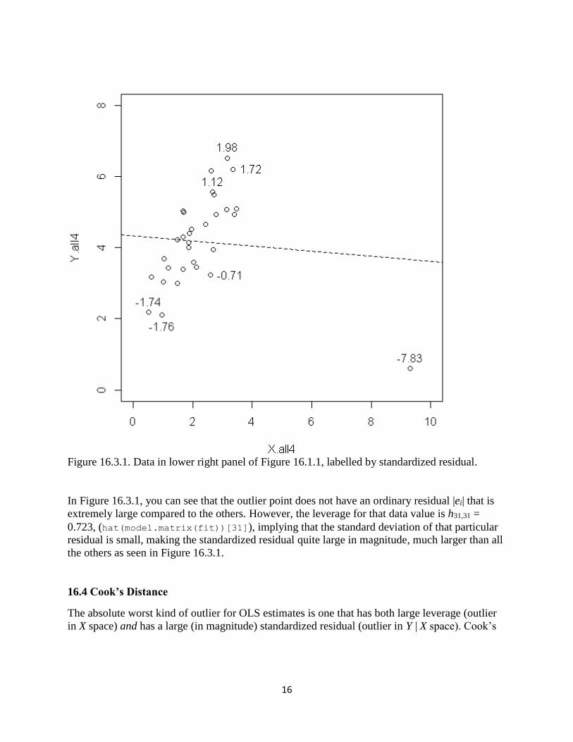
R code for Figure 16.3.1
fit=lm(Y.all4~X.all4)
rstudent(fit)
plot(X.all4,Y.all4, xlim = c(0,10), ylim = c(0,8))
identify(X.all4,Y.all4, round(rstudent(fit),2)) # now, point and click on
the graph!
abline(lsfit(X.all4,Y.all4), lty=2)
10 This is intriguing because of the geometry it represents. Idempotent matrices are “projection matrices” – they
project n-dimensional data onto lower-dimensional subspaces.
16
Figure 16.3.1. Data in lower right panel of Figure 16.1.1, labelled by standardized residual.
In Figure 16.3.1, you can see that the outlier point does not have an ordinary residual |ei| that is
extremely large compared to the others. However, the leverage for that data value is h31,31 =
0.723, (hat(model.matrix(fit))[31]), implying that the standard deviation of that particular
residual is small, making the standardized residual quite large in magnitude, much larger than all
the others as seen in Figure 16.3.1.
16.4 Cook’s Distance
The absolute worst kind of outlier for OLS estimates is one that has both large leverage (outlier
in X space) and has a large (in magnitude) standardized residual (outlier in Y | X space). Cook’s

17
distance is an outlier diagnostic that combines both. One (slightly mysterious-looking11) formula
for Cook’s distance is
di = 2
( 1)(1 )
i ii
ii
r h
k h
All else fixed, larger leverage hii will give you larger Cook’s distance (di), and all else fixed,
larger squared standardized residual 2
ir will give you larger Cook’s distance. But large hii,
coupled with large 2
ir , gives the most extreme Cook’s distance.
The Cook’s distance statistic di is a simple formula to compute by hand, but it is automatically
available as cooks.distance(fit) for a fitted lm object.
Let’s see how this statistic looks for the pathological data set in the lower right panel of Figure
16.1.1.
R code for Figure 16.4.1
fit=lm(Y.all4~X.all4)
cooks.distance(fit)
plot(X.all4,Y.all4, xlim = c(0,10), ylim = c(0,8))
identify(X.all4,Y.all4, round(cooks.distance(fit),2)) # point and click!
abline(lsfit(X.all4,Y.all4), lty=2)
11 A better formula shows the original intent of Cook in developing the distance statistic. It is another example of
“Mahalanobis distance” alluded to in a previous footnote, and is a measure of how far the entire OLS-estimated
vector moves when observation i is removed from the data set. If the estimated vector moves a great deal when
observation i is removed, then that single observation has a great effect on the estimated model.

18
Figure 16.4.1. Data in lower right panel of Figure 16.1.1, labelled by Cook’s distance.
Comparing the numbers on the graph in Figure 16.4.1, it is clear using Cook’s distance that there
is only one point that is of concern; namely, the outlier.
Do you really need an ugly rule of thumb? Can’t you just look at the Cook’s distance values and
notice if one of them is well above the others, as shown in Figure 16.4.1?
Ok. There are indeed several ugly rules of thumb that have been given for Cook’s distance. We
are loathe to give any of them, because then you might get the wrong message and think that
there is some recipe for automatic exclusion of outliers based on the ugly rule of thumb. The
only reason we are going to give any ugly rule of thumb at all is that this book uses R, and one of
the “default” graphs for the lm function in R uses the following ugly rule of thumb:

19
A Cook’s distance di greater than 0.5 or 1.0 indicates that
observation i inordinately influences the OLS fit.
Notice that in Figure 16.4.1, we see a Cook’s distance of 26.04. (Self-study question: Is di =
26.04 “large” according to the just-given ugly rule of thumb? Or is it “larger than large”? Or is it
“very much larger than very large”? Or is it very very much larger than very very large?)
The default graph that uses this ugly rule of thumb is produced by the command plot(fit),
where “fit” is a fitted lm object. This command produces several graphs we have already
discussed for assessing validity of the classical model assumptions. The last of these graphs is a
plot of (hii, ri), with contour lines demarking points having Cook’s distance > 0.5 and > 1.
We haven’t seen the graph yet because we haven’t yet talked about outliers. Using the lm OLS fit
to pathological data set in the lower right panel of Figure 16.1.1, if you enter plot(fit) and
click through to the last graph, you get Figure 16.4.2.
Figure 16.4.2. Plot of (hii, ri) for the pathological data set. Points having Cook’s distance greater
than 1.0 are outside the outer dashed curve envelope.

20
Notice that the outer dashed curve envelope in Figure 16.4.2 is given by di > 1, or by
di = 2
( 1)(1 )
i ii
ii
r h
k h > 1.
Equivalently,
2
ir > ( 1)(1 )ii
ii
k h
h
.
Taking the square root of the right hand side gives the upper and lower dashed curve envelopes
of the standardized residual as a function of leverage, shown in Figure 16.4.2. By the way, k = 1
in this example, because there is only one X variable.
Notice also that R labels the points with observation numbers. This can be very handy if you have
a large data set, so that you can easily go into your data set and investigate the outliers. In the
pathological data set, the outlier is observation i = 31.
Example: The Crime Rate Prediction Model in Chapter 11.
In that example we considered various subsets of the X variables to predict crime rate. The
complete model as estimated using our familiar “lm” is
fit = lm(crime.rate ~ pop.log + docs.per + beds.per + civ.per + inc.per +
landarea.log)
When you enter plot(fit), you get several useful diagnostic plots, all of which we have
discussed except the last one, which is given in Figure 16.4.3.

21
Figure 16.4.3. Plot of (hii, ri) in the crime rate prediction example.
To understand Figure 16.4.3 more, let’s do some investigation. First, the numbered data points
refer to the values with largest Cook’s distance. You can check this using
tail(order(cooks.distance(fit)))
which shows that the observations having largest Cook’s distance are observations 91 62 141
94 68 and 88. Checking these values, we see that observation 88 has the largest Cook’s distance
(cooks.distance(fit)[88] = 0.1275103), and observations 94 and 68 have the next largest
values of Cook’s distance (cooks.distance(fit)[94] = 0.07126757, and
cooks.distance(fit)[68] = 0.08636208).
These observations as not particularly influential to the OLS analysis, as their Cook’s distance
values are not very large.
What jumps out in Figure 16.4.3 is the extreme hii (leverage) data point on the right hand side of
the graph. Some detective work is needed: Using
tail(order(hat(model.matrix(fit))))

22
you can see that the most extreme leverage points are observations 141, 138, 140, 62, 68, and
133, with observation 133 being the most extreme. The leverage statistic for that city is
hat(model.matrix(fit))[133] = 0.3526512, as you can see in Figure 16.4.3.
Why is this city the most remote city with regard the X variables? To answer, let’s do some more
detective work. Maybe one of the X variables is an outlier in terms of z value? Checking, you can
enter scale(newdata)[133,], getting z-values
crime.rate pop.log docs.per beds.per civ.per inc.per
0.6266613 -1.0979925 6.1157905 2.6501033 1.7054807 1.0302709
landarea.log
-1.2301294
for observation 133.
It’s pretty obvious that this city has grossly more doctors per capita than other cities. This is
interesting information! We now know that there is a ridiculously large number of doctors in one
of the U.S. cities. Why are all those doctors there? We don’t know! We’d like to find out! You
see, that is the kind of inquisitive attitude you should have about outliers.
Despite the gross outlier nature of that city in terms of doctors per capita, the city does not have
inordinate influence on the OLS estimates of the regression model, because its standardized
residual is small: rstudent(fit)[133] = -0.636013, leading to a small Cook’s distance
(cooks.distance(fit)[133] = 0.03162097). Observation 133 is an outlier in X space, but not
in Y | X space; thus its influence on the OLS fit, as measured by Cook’s distance, is minor.
Example: The Oil Production Data.
The data set
oil.data = read.csv("http://westfall.ba.ttu.edu/isqs5349/Rdata/oil_out.csv")
contains variables “oil1,” a measure of oil production at an oil well, and “eff1,” a measure of the
well’s efficiency.
The scatterplot of (eff1, oil1) shows serious outliers:

23
Figure 16.4.4. Scatterplot of (efficiency, production) with the oil well data.
The (hii, ri) plot produced by plot(lm(oil1 ~ eff1)) (the fourth graph) concurs. Notice that
there are observations that are nearly 40 standard deviations from the regression line!
Figure 16.4.5. Plot of (hii, ri) for the oil well data.

24
The maximum Cook’s distance for the oil production data is 125.3751
(max(cooks.distance(lm(oil1 ~ eff1, data=oil.data)))), indicating an observation that
has inordinate influence on the fitted OLS function.
A simple remedy is to log-transform the variables: After log transformation, the (leverage,
standardized residual) plot is as shown in Figure 16.4.6. Notice that there are no data points with
Cook’s distance larger than 0.5.
Figure 16.4.6. Plot of (hii, ri) for the oil well data after log transform.
16.5 Strategies for Dealing with Outliers
The first thing to consider is, are the outlier simply mistakes, e.g., data entry errors? If so, then it
makes sense to correct the data values. Deletion is a second-best option, but can cause bias. Also,
do not assume that data values that are outliers are the only possible mistakes. All else equal, it is
indeed more likely that the grossly extreme values are mistakes than the typical values, so the
outliers are a good place to start looking for mistakes. That having been said, it is likely that
whatever mechanism caused the mistakes among the outlier data, also caused mistakes among
the more typical data. So you should identify the mechanism, and track down all the mistakes,

25
not just the ones that are outliers. Science is serious work, not a silly academic game. Just
because an observation is not an outlier does not mean it is a good data value. As mentioned
before: Garbage in, garbage out. If you estimate a model using data where many of the
observations are simply wrong, how can you trust the results?
If the outlier observations are not mistakes, there are a number of strategies for handling them.
On the design side, you might re-consider the nature of the variables you are collecting. Perhaps
you are defining a ratio-type measure V/W. Such a ratio measure will automatically induce
outliers when the variable W is close to zero. You might consider whether that ratio measure is
needed, or whether you can just as well use the variables V and W in their raw forms.
Ratio measures or not, if some of your key variables are quite outlier-prone, then they are not as
reliable as other measures that are not so outlier-prone. You might consider identifying
alternative, more reliable measurements.
But if nothing can be done on the design and measurement side, and you are simply stuck with
outlier measurements, there are a number of possibilities for data-centric analyses. Our
suggestions are as follows:
1. The simplest, and often best solution is the simple log transform, as discussed in Chapter
5, and as shown in the Oil Well data example above. This works very well for right-
skewed “size-related” data, where there are occasional large outliers. If there are 0’s in
the variable V, you can simply use log(V + 1), and if there are negative values of V you
can use log(V + m), where m is larger than the maximum absolute negative value. You
have to be careful, though, that you do not induce negative skew by log transforming.
Examples of this approach are given in Chapter 5 and also above with the Oil Production
example.
2. Recall that regression is a model for p(y | x). All of the discussion in this chapter has
centered on the effects of outliers on OLS estimates, which implicitly assume that the
distributions p(y | x) are normal distributions. With normal distributions, points that are
far from the mean have extremely low likelihood. Recalling that OLS estimates are
maximum likelihood estimates, the estimated OLS parameter estimates are thus greatly
influenced by outliers, which pull the regression function closer to them so that their
contributions to the likelihood are not so infinitesimal.
A simple remedy is to assume a non-normal distribution. Implicitly, log-transforming Y
models the distributions p(y | x) as lognormal. If log-transforming does not work, perhaps
because the distribution of Y is symmetric to begin with, or perhaps because Y has many
negative data values, then you can always assume a distribution that is more heavy-tailed
than normal to both (a) minimize the influence of the outliers, and (b) estimate a more
reasonable model for p(y | x). In this book, we now have seen several examples of such
distributions, including the Laplace distribution, the logistic distribution, and the T
distribution with small degrees of freedom. An additional benefit of this approach is that

26
you have likelihood-based fit statistics to assess which distribution(s) are best supported
by your data. An example of this approach is given below in this section.
Sometimes it makes sense to keep the normal distributions, but fit a heteroscedastic
model: The outliers may simply result from distributions p(y | x) that have higher
variance. The AIC statistic will tell you whether a heteroscedastic normal model fits your
data better than a homoscedastic non-normal (e.g., T error distribution) model.
A point that bears repeating: When you use likelihood-based methods, you have
objective, likelihood-based methods for comparing the models to see which best fit the
data. But the next two recommendations are not likelihood-based, so you cannot use
likelihood to see whether they fit your data better.
3. Quantile regression provides a model for relating the median of the distribution p(y | x) as
a function of X = x. Since the median is not affected by outliers, quantile regression
estimates are similarly not affected. An additional benefit of quantile regression is that
you can estimate quantiles other than the median (the 0.5 quantile). For example, you can
model the 5th percentile (the 0.05 quantile) and the 95th percentile (the 0.95 quantile) of
the distributions p(y | x) as a function of X= x to obtain a nonparametric 90% prediction
interval for Y given X = x.
This approach is discussed in the next section.
4. The Mother of All Blunt Axes. This final option is one we do not recommend at all. We
only discuss it because, strangely enough, it is considered to be a good idea in some
circles. This approach is to either delete outliers or Winsorize them. Outlier deletion
means simply discarding outliers; Winsorization means replacing the outliers with a less
extreme number, then performing the usual analysis. Winsorization is discussed in the
final section of this chapter.
If you think this option 4. sounds like scientific misconduct, you are thinking correctly. People
have lost their jobs for selectively using data (e.g., deleting observations) or data fabrication
(e.g., using data other than what was collected). A classical case involves the resignation of
researcher Dirk Smeesters, PhD, a professor of Consumer Behavior and Society at Erasmus
University in Rotterdam, who published some suspicious-looking results. The following is a
quote from the news story found here.
Smeesters denied having made up the suspect data, but was unable to provide the raw
data behind the findings, asserting the files were lost in a computer crash ...
But he did admit to selective omission of data points that undercut the hypotheses he was
promoting. However, he insisted that such omission was common practice in psychology
and marketing research.
When this note was shared with a Marketing professor, the return comment was “No wonder I
am having such a hard time getting published. Everyone else is cheating!”

27
Our main point in discussing this option 4., then, is to convince you why you should not use it.
The oil production example above illustrates remedy 1. (log-transformation). A quick re-analysis
of the pathological data set in the lower right panel of Figure 16.1.1 illustrates the idea of remedy
2. (fitting a heavy-tailed distribution). As discussed in Chapter 15, the survreg function can be
used to estimate heavy-tailed distributions p(y | x). You can use this R function on data with no
censored observations; you just need to define a “censoring” variable that has all 1’s to indicate
that all observations are observed and none are censored.
In the example below, we use dist = "t" to model the distributions p(y | x) as T rather than
normal distributions. The T distributions all have heavier tails than the normal distribution, with
the most extremely heavy-tailed case being the T distribution with one degree of freedom, which
is also known as the Cauchy distribution. The default of the survreg function is to use the T4
distribution; i.e., the T distribution with four degrees of freedom.
Analysis of the Pathological Data Using a Heavy-Tailed Distribution library(survival)
one = rep(1,length(Y.all4))
fit.T = survreg(Surv(Y.all4, one) ~ X.all4, dist = "t")
summary(fit.T)
plot(X.all4, Y.all4)
abline(lsfit(X.all4, Y.all4), col="red", lwd=2)
abline(fit.T$coefficients[1:2], lwd=2)
logLik(lm(Y.all4~X.all4))
logLik(fit.T)

28
Figure 16.5.1. Estimated mean functions assuming p(y | x) are normal distributions (the
red line, same as the OLS fit), and assuming the p(y | x) are heavy-tailed distributions
(specifically, T4, black line).
In Figure 16.5.1., the fitted line using the heavy-tailed distribution obviously looks better than
the normality-assuming OLS fit. The log-likelihoods also show better fit, with –45.3 for the T4
distribution vs. –51.3 for the normal distribution.
We will discuss remedy 3., quantile regression, in the next section, and “remedy” 4., outlier
deletion and/or Winsorization in the final section of this chapter. Again, our suggested first lines
of defense against outliers are remedy 1. log transform the data, and remedy 2. model the data
appropriately. Quantile regression (remedy 3.) is also a good option, but does not give a
likelihood statistic, so you cannot compare it with 1. or 2. We do not recommend outlier deletion
or Winsorization (“remedy” 4) at all.

29
16.6 Quantile Regression
Data from the United States Bureau of Labor Statistics (BLS) give us the 10th and 90th
percentiles of the distribution of weekly U.S. salaries for the years 2002 – 2014. These data are
entered and graphed as follows:
Year = 2002:2014
Weekly.10 = c(295, 301, 305, 310, 319, 330, 346, 350, 353, 358, 359,
372, 379)
Weekly.90 = c(1376, 1419, 1460, 1506, 1545, 1602, 1693, 1744, 1769,
1802, 1875, 1891, 1898)
plot(Year, Weekly.10, ylim = c(0,2000), pch="+", ylab = "Weekly U.S.
Salary")
points(Year, Weekly.10, type="l")
points(Year, Weekly.90, pch="+")
points(Year, Weekly.90, type="l", lty=2)
legend(2009, 1300, c("90th percentile", "10th percentile"),
pch=c("+","+"), lty= c(2,1))
Figure 16.6.1. Quantiles (0.90 and 0.10) of the weekly U.S. salary distributions, 2002 –
2014.

30
Notice in Figure 16.6.1 that the quantile functions look reasonably well approximated by straight
lines, albeit with different slopes: The 90th percentile increases more rapidly than the 10th
percentile over time. These relationships are quantile regression relationships. With quantile
regression, you can model a quantile of the conditional distribution p(y | x) as a function of X = x.
In Figure 16.6.1, Y = weekly salary, X = year, and there are two conditional quantile functions
represented:
y0.10 = 0(0.10) + 1(0.10) x,
which is a model for the 0.10 quantiles of the distributions p(y | x), and
y0.90 = 0(0.90) + 1(0.90) x,
which is a model for the 0.90 quantiles of the distributions p(y | x).
The ’s of the two quantile lines are different because, as you can see in Figure 16.6.1, the lines
themselves are different.
The fact that the 90th percentile line has a steeper slope than the 10th percentile line in the BLS
example tells you that there is greater variation12 in the distribution of Salary for more recent
years. You could make political arguments using these data. On the one hand, you might say it is
troubling that the income gap is getting wider, that this is bad for society, and that a minimum
wage hike or tax credits should be given to those who earn less. On the other hand, you could
argue that income inequality is necessary for a free, efficient economy, and that we are only
recently getting a more optimal disposition of income inequality, where goods and services will
flow more freely for the benefit of everyone. We don’t care which side of the political spectrum
you are on, as long as you understand quantile, regression, and most importantly, that regression
is a model for the conditional distribution of Y, given some predictor variables’ values.
The most famous quantile is the median (the 0.50 quantile). You can use quantile regression to
estimate the medians of the conditional distributions p(y | x) as a function of X = x. Such an
estimate is a robust13 alternative to OLS, which estimates the means of the distributions p(y | x)
as a function of X = x.
Recall that the OLS estimates are those values b0, b1 that minimize
SSE{yi – (b0+ b1xi)}2
If you don’t have any X variable, and you choose the value b0 to minimize
SSE =(yi – b0)2
,
12 I.e., heteroscedasticity. 13 In English, “robust” means “strong.” In statistics, a “robust method” is a method that “works well despite violated
assumptions.” The heteroscedasticity-consistent standard errors presented in Chapter 12 are sometimes called
“robust standard errors,” because they work well when homoscedasticity is violated.

31
then the minimizing value will be b0 = y , the average of the yi values. This is a result you can
prove by calculus, but it should be a fairly intuitive result, even without the proof.
On the other hand, if you choose b0 to minimize the sum of absolute errors, rather than the sum
of squared errors, i.e., if you choose b0 to minimize
SAE|yi – b0|,
then the minimizing b0 will be the median of the yi values. This fact is not provable by calculus,
because the absolute value function is non-differentiable. So to gain some insight into this
minimization process, consider the following R code used to draw Figure 16.6.2.
R Code for Figure 16.6.2
par(mfrow=c(1,2))
y = c(2.3, 4.5, 6.7, 13.4, 40.0) # Median is 6.7
# y = c(2.3, 4.5, 6.7, 13.4) # For second graph
b0 = seq(2, 15,.001)
mat = outer(y,b0,"-")
SAE = colSums(abs(mat))
plot(b0, SAE, type="l")
abline(v = 6.7, lty=2)
# abline(v = (4.5+6.7)/2, lty=2)
Figure 16.6.2. Graphs of sum of absolute errors as a function of b0. In the left panel with
n = 5 (an odd number of) data values 2.3, 4.5, 6.7, 13.4, and 40.0, the median 6.7
uniquely minimizes the sum of absolute errors. In the right panel with n = 4 (an even
number of) data values 2.3, 4.5, 6.7, and 13.4, the usual median estimate (4.5+6.7)/2 does
not uniquely minimize the sum of absolute errors. Rather, any number between 4.5 and
6.7 also gives the minimum.

32
Notice in Figure 16.6.2 that the usual median of a data set minimizes the SAE when n is odd, but
in the case where n is even, there is no unique minimum. This explains why, when you perform a
quantile regression analysis, you sometimes get a warning message saying that the “solution is
nonunique.”
The method for finding the median based on SAE minimization extends to a method for finding
the quantile using minimization of a different function. Suppose you want to estimate the
quantile of the data. Define the function
x) = (1 – x |, if x < 0; and
x) = x |, if x ≥ 0.
Then define
SAE() = (yi – b0).
Then a value14 b0 that minimizes SAE() can be called the quantile of the data set {y1, y2, …,
yn}.
The OLS estimates arise from a similar definition: If you define (x) = x2, then (yi – b0) =
(yi – b0)2 is just the SSE, and you know that minimizing SSE gives you the OLS estimates.
Thus, you get different estimates depending upon what function (.) you use when you minimize
(ei). Figure 16.6.3 shows graphs of four such functions.
14 As noted above for the median, there is often no unique value that minimizes the function, which is why we say “a
value” rather than “the value.”

33
Figure 16.6.3. Functions used in the minimization of (ei), where ei = yi – (b0 + b1xi).
Upper left: Minimization gives estimates of the 0.1 quantile. Upper right: minimization
gives estimates of the 0.7 quantile. Lower left: Minimization gives estimates of the 0.5
quantile or median. Lower right: Minimization gives an estimate of the mean.
To understand how this minimization works to obtain quantiles other than the median, consider a
data set containing 100 yi values, {1,2,3,…,98,99,1000}. This is a simple data set in that the
median should be around 50, the tenth percentile should be around 10, the 80th percentile should
be around 80, etc. For good measure, and to show robustness to outliers, we have made the
largest value in the data set 1,000 (an outlier) rather than 100.

34
Let’s see which b0 minimizes the function 0.1(ei).
tau = .10 ## A quantile of interest, here .10
y = c(1:99, 1000) ## The .10 quantile should be around 10.
b0 = seq(5, 15,.001)
mat = outer(y,b0,"-")
mat = ifelse(mat < 0, (1-tau)*abs(mat), tau*abs(mat))
SAE = colSums(mat)
plot(b0, SAE, type="l")
Figure 16.6.4. Plot of (b0, 0.1(yi – b0)). The function is minimized by values between
10 and 11.
As expected, values around 10 can be considered as estimates of the 10th percentile of these data.
And again, there is no unique minimizing value: Any number between 10 and 11 will minimize
the function, so all such numbers are legitimate estimates of the 10th percentile.

35
When you ask R for the 10th percentile of that data set, it picks a particular number in the
minimizing range using an interpolation formula: For the data depicted in Figure 16.6.4,
quantile(y, .10) gives 10.9; but again, any number in the range from 10 to 11 can be called
the 10th percentile.
The real use of these (.) functions is not to find quantiles of individual variables, but rather to
estimate the quantiles of distributions p(y | x). Recall that minimization of
{yi – (b0 + b1xi)} , where (x) = x2
gives you the usual OLS values 0 and 1 , and that 0 1ˆ ˆ x is an estimate of the mean of the
distribution p(y | x). By the same token, minimization of
{yi – (b0 + b1xi)}
gives you values 0,ˆ
, 1,ˆ
such that 0, 1,ˆ ˆ x is an estimate of the quantile of the distribution
p(y | x).
Don’t believe this can possibly work? Maybe a simulation study will convince you!
Suppose
Y = 0.7X + , where
Var( | X = x) = (0x)2.
This is a heteroscedastic model. Further, suppose the X data are uniformly distributed on (10,
20), and that the values are normally distributed.
Then the distribution of Y | X = x is normal, with mean 2.1 + 0.7x and standard deviation 0.4x.
Thus, the 0.90 quantile of the distribution p(y | x) is
2.1 + 0.7x + z.90(0.4x),
where z.90 = 1.281552 is the 0.90 quantile of the standard normal distribution. Collecting terms
algebraically, the true 0.90 quantile function is thus
y.90 = 2.1 + 1.212621x.
Notice in particular that the heteroscedasticity in this model causes the slope of the 0.90 quantile
function (1.212621) to be larger than the slope of the median function (0.7). See Figure 16.6.1
again to understand.
If the quantile regression method works, then minimization of yi – (b0 + b1xi)} should give
estimates that are close to 2.1 and 1.212621 in this case, and those estimates should get closer to

36
those targets as the sample size gets larger. Further, the 95% confidence intervals15 for the true
parameters (one approach to finding them is to use the bootstrap) should trap the true parameters
in approximately 95% of the intervals.
The “rq” function in the “quantreg” library performs quantile regression16. You used it in
Chapter 2 to find estimates that minimize the sum of absolute errors, thus finding maximum
likelihood estimates when the error terms have the Laplace distribution.
Simulation Study to Validate Quantile Regression Estimates
n = 1000
beta0 = 2.1
beta1 = 0.7
set.seed(12345)
X = runif(n, 10, 20)
Y = beta0 + beta1*X + .4*X*rnorm(n)
beta1.90 = beta1 + qnorm(.90)*.4 # True slope of the .90 quantile
function
beta1.90
library(quantreg)
fit.90 = rq(Y ~ X, tau = .90)
summary(fit.90)
The result is:
Call: rq(formula = Y ~ X, tau = 0.9)
tau: [1] 0.9
Coefficients:
coefficients lower bd upper bd
(Intercept) 1.65748 -0.33148 4.30665
X 1.21470 1.04248 1.36427
Warning message:
In rq.fit.br(x, y, tau = tau, ci = TRUE, ...) : Solution may be
nonunique
Notice the following about the output.
The “solution may be nonunique” comment is explained by the function to be
minimized: Sometimes it is flat at the minimum as shown in the figures above.
While this default can be over-ridden, with smaller sample sizes the rq function
gives intervals for the coefficients rather than standard errors or p-values. This is
15 There are several approaches to finding confidence intervals for the parameters of a quantile regression model;
one approach is to use the bootstrap. 16 To find the estimates that minimize the objective function, the software uses non-calculus based algorithms such
as linear programming.

37
because the distribution of the estimates is non-symmetric with smaller sample
sizes. While you may be thinking that n = 1,000 in this study is actually “large,”
remember that we are estimating the 0.90 quantile. Thus, you need data on either
side of the quantile to get estimates. Here, there are only 100 observations above
the 0.90 quantile, so 100 is a more relevant sample size than 1,000.
The intervals nicely contain the true parameters, 2.1, and 1.212621. In particular,
the slope of the mean (and median, because of normality) function, 1 = 0.7, is
well outside the interval 1.04248 1.36427, so it is clear that the quantile
regression method is not estimating the same thing that is estimated by OLS.
If you change the sample size to n = 100,000, you get the following:
Call: rq(formula = Y ~ X, tau = 0.9)
tau: [1] 0.9
Coefficients:
Value Std. Error t value Pr(>|t|)
(Intercept) 1.90385 0.16094 11.82965 0.00000
X 1.22385 0.01135 107.80454 0.00000
Notice now that the standard errors are given. With larger sample sizes, the distribution
of the estimates is closer to symmetric, so it makes sense to take the usual estimates plus
or minus two standard errors as intervals. Notice also that the estimates have tightened
considerably around the theoretical targets 2.1 and 1.212621, and that these targets are
well within plus or minus two standard errors of the estimates.
The simulation above is not a proof that the method works in general, just an illustration that it
works in our simulation model. But hopefully, this analysis makes you feel more comfortable
that the method is doing what it is supposed to. There are mathematical proofs that quantile
regression produces consistent estimates, though, so the simulation results were not just
coincidences.
Notice that the simulation model of the example above is a heteroscedastic normal model. In
Chapter 12, you learned how to estimate such models using maximum likelihood. This brings up
a good question: Which is better, quantile regression or maximum likelihood? The answer is,
hands down, maximum likelihood—if you have specified the distributions p(y | x) correctly in
your likelihood function. On the other hand, if you specify these distributions incorrectly,
quantile regression may be better. You can use simulation to give a more precise answer.
As always, the answer to the question “Is maximum likelihood good” is not “yes/no,” as in
“correct distribution, yes, good” and “incorrect distribution, no, not good,” but rather an answer
that involves of degree of misspecification. You can (and should) use maximum likelihood, even
when you have not specified the distributions correctly. Just realize that the closer your specified
model is to Nature’s processes, the better your results will be. You can guess which distributions
to use by using your subject matter knowledge about your Y measurements, and by looking at
scatterplots. You can also check which distributions fit the data better using penalized likelihood

38
statistics such as AIC, so you do not have to make a wild guess as to which distribution you
should use.
Example: The peak energy data
The peak energy data example is one where we have established that there is
heteroscedasticity. In addition to being robust to outliers, quantile regression also works
well in the presence of heteroscedasticity, as shown in the simulation above.
The following R code estimates the 25th, 50th, and 75th percentiles17 of the p(y | x)
distributions, and displays them, along with the data scatter, in Figure 16.6.5.
mp90 = read.table("http://westfall.ba.ttu.edu/isqs5349/Rdata/mp90.txt")
attach(mp90)
library(quantreg)
fit.25 = rq(peakdmnd ~ monthuse, tau = .25)
b = coefficients(fit.25); b0 = b[1]; b1 = b[2]
x = seq(0, 4000)
y.25 = b0 + b1*x
fit.50 = rq(peakdmnd ~ monthuse, tau = .50)
b = coefficients(fit.50); b0 = b[1]; b1 = b[2]
y.50 = b0 + b1*x
fit.75 = rq(peakdmnd ~ monthuse, tau = .75)
b = coefficients(fit.75); b0 = b[1]; b1 = b[2]
y.75 = b0 + b1*x
plot(monthuse, peakdmnd, xlim = c(0,4000))
points(x, y.25, type="l")
points(x, y.50, type="l", lty=2)
points(x, y.75, type="l", lty=3)
abline(lsfit(monthuse, peakdmnd), col = "red")
legend(2700, 5, c("tau=.25", "tau=.50", "tau=.75", "OLS"),
lty=c(1,2,3,1),
col = c(1,1,1,"red"))
17 There are only n = 53 observations in this data set, so estimates of quantiles closer to 0.00 or 1.00 will be
unreliable due to extremely small sample size on the rare side of the quantile.

39
Figure 16.6.5. The peak demand energy data set, with fitted quartile functions and the
fitted mean function (OLS).
Note the following in Figure 16.6.5.
The different slopes of the quantile functions are consistent with evidence of
heteroscedasticity seen earlier.
The median and mean estimates ( = 0.50 and OLS) are similar, which is expected
with symmetric error distributions.
Even though it is an extrapolation, the = 0.25 and = 0.50 functions cross near
0, suggesting that the 0.25 quantile can be higher than the 0.50 quantile, which is
of course impossible. Quantile regression estimates all lines separately, so such
crossings can occur by chance alone. This is a negative feature of quantile
regression compared to likelihood-based estimates of p(y | x), where such
crossings cannot possibly happen.
While there is no assumption of normality or homoscedasticity in the quantile
regression models, they do assume that the given quantile is a linear function of X
= x. As a consequence of the linearity assumption, three of the models shown in
Figure 16.6.5 cross below zero, predicting negative quantiles. The zero crossings
point to problems with the linearity assumption.

40
Example: The Oilfield data
The oilfield data discussed above is an example of data with extreme outliers. As
estimates of the means of the distributions p(y | x), OLS estimates are inordinately
influenced by outliers.
Let’s compare four different estimates: (i) OLS on the untransformed data, (ii) OLS on
the log-transformed data, then back-transformed, (iii) median ( = 0.5) regression on the
untransformed data, and (iv) median ( = 0.5) regression on the log-transformed data,
then back-transformed. The following code performs all these analyses and graphs the
results in Figure 16.6.6.
oil.data =
read.csv("http://westfall.ba.ttu.edu/isqs5349/Rdata/oil_out.csv")
attach(oil.data)
loil1 = log(oil1)
leff1 = log(eff1)
b.ols = lm(oil1 ~ eff1)$coefficients
b.ols.log = lm(loil1 ~ leff1)$coefficients
b.med = rq(oil1 ~ eff1)$coefficients
b.med.log = rq(loil1 ~ leff1)$coefficients
x = seq(0,4000,.1)
par(mfrow=c(2,1), mar=c(4,4,1,2))
plot(eff1,oil1, pch=".")
points(x, b.ols[1] + b.ols[2]*x, lty=1, type="l", col="red")
points(x, exp(b.ols.log[1] + b.ols.log[2]*log(x)), lty=2, type="l",
col="red")
points(x, b.med[1] + b.med[2]*x, lty=1, col="blue", type="l")
points(x, exp(b.med.log[1] + b.med.log[2]*log(x)), lty=2, col="blue",
type="l")
plot(eff1,oil1, log="xy", pch=".")
points(x, b.ols[1] + b.ols[2]*x, lty=1, type="l", col="red")
points(x, exp(b.ols.log[1] + b.ols.log[2]*log(x)), lty=2, type="l",
col="red")
points(x, b.med[1] + b.med[2]*x, lty=1, col="blue", type="l")
points(x, exp(b.med.log[1] + b.med.log[2]*log(x)), lty=2, col="blue",
type="l")

41
Figure 16.6.6. Fitted functions to the oilfield data. Top panel, original scale; bottom
panel, logarithmic scale. Solid lines are linear fits using untransformed data; dashed lines
are linear fits to log-transformed data, then back-transformed. OLS fits are shown as red,
quantile regression ( = 0.5) fits are shown as blue.
Notes on Figure 16.6.6.
Clearly, the OLS fit to the raw data is the oddball. The other three fits are similar
to one another.
As seen in the logarithmically scaled graph in Figure 16.6.6, the OLS fit behaves
horribly: For large X it is too high to represent the “middle” of the data, and for
low X the graph dives below 0, giving nonsensical results.
Even though the quantile regression estimate for the raw data is not required to
stay positive, it does in this example, giving much more reasonable estimates than
the OLS fit.
Recall that the OLS fit to the transformed data, then back-transformed, can be
considered as an estimate of the median of the distribution of the untransformed
data. Thus all fits other than OLS to the raw data are estimating the same thing,
which explains why they are all so similar.

42
Based on this analysis, we recommend the OLS fit to the log-transformed data,
because it is the simplest of the three reasonable fits. Unfortunately, there is no
likelihood-based statistic to compare the fits using quantile regression. Our
recommendation here is based only on the graphical analysis above, and on the
“simpler is better” philosophy.
16.7 Outlier Deletion and Winsorization
Let’s start with outlier deletion first. As noted above, the outlier detection rules are not meant to
be a recipe for deleting them.
On the other hand, there is no harm in investigating the effect of outliers through deletion. You
can (and in many cases, should) delete an outlier, or outliers, and compare the results with and
without the outlier(s). If your conclusions are essentially the same either way, then you have
confidence that your results are not inordinately influenced by an aberrant observation or two. If
you do this, all analyses should be disclosed—there is no harm in doing any number of analyses
of a given data set as long as the nature of the data exploration is fully disclosed. The problems
noted earlier of academic misconduct arise when much data-tinkering is done behind the scenes,
then a particular chosen analysis is put forward without disclosure.
It is possible that the current “replication crisis” in science is largely due to such behind-the-
scenes data tinkering. If an analyst tortures a data set into “proving” his or her preferred theory,
is it any surprise that the results do not replicate when carried out in a fresh context with new
data?
There are two main types of outlier deletion in regression: (1) Finding outliers that are
influential, e.g., via Cook’s distance, and deleting them to assess their effects, and (2) Deleting
all extremes beyond a certain quantile for a given variable (e.g., less than the 0.05 quantile or
greater than the 0.95 quantile) and deleting them. The first method is called sensitivity analysis,
and the second is called truncation.
Researchers are generally aware that outlier deletion is a slippery slope on the way to academic
misconduct. As well, outlier deletion reduces the sample size, and in studies with small to
medium sample sizes, researchers simply cannot afford to throw away data. So truncation is
generally frowned upon.
An alternative to truncation that seems more palatable to some researchers is the related method
called Winsorization. Rather than delete the extreme observations en masse, Winsorization
means simply replacing them by the 0.05 or 0.95 quantile. (Other quantiles can be used as well;
quantiles 0.05 and 0.95 are defaults of an R function.) The typical logic used by a Winsorizer to
motivate this practice goes something like this:
“Well, I know I have outliers, and I know that they cause problem with OLS. But I am
reluctant to throw away the data completely, because that seems wrong. So instead, I will
keep the data value in my data set, just replace its value with something less extreme.

43
That way, I still acknowledge that ‘there is something out there,’ but now it is not so far
‘out there’ to cause problems.”
Truncation and Winsorization violate the entire notion of modeling the distribution of Y as a
function of X = x. If the real process you are studying produces occasional outliers in Y, then a
model that is faithful to your reality will similarly produce occasional outliers of the same type
and magnitude that are typically seen in reality.
But some academics prefer not to model their data generating processes, preferring instead to
Winsorize the extreme Y and/or X data values, then to proceed with the analysis using OLS, as if
the Winsorized Y data were normally distributed.
Let’s see how well this works. Suppose the true process is
Y = 2.0 + 0.1X +
where ~ T3; which, as noted above, is a heavy-tailed distribution. The true parameters are 0 =
2.0, 1 = 0.1, and = 1.5. The parameter is called the “scale” parameter18. We will generate X
data from the lognormal(1,1) distribution, and then the Y data from the model above, and then
Winsorize.
R code to see what Winsorization does to regression data set.seed(123)
X = exp(rnorm(1000, 1, 1))
Y = 2 + .10*X + 1.5*rt(1000,3)
library(DescTools)
X.w = Winsorize(X)
Y.w = Winsorize(Y)
par(mfrow=c(2,1), mar=c(4,4,1,1))
plot(X, Y, cex=.5, xlim = c(0,80), ylim = c(-10,20)); plot(X.w, Y.w, cex=.5,
xlim = c(0,80), ylim = c(-10,20))
18 Scale parameters are related to standard deviation, but not quite the same. The actual standard deviation of the
distribution p(y |x) according to the above model is (The standard deviation of the T3 distribution) =
1.5sqrt(3/(3-2)) = 2.60.

44
Figure 16.7.1. Top panel: Typical regression data. Bottom panel: Same data as in the top panel,
but using Winsorized data.
From Figure 16.7.1, it is clear that even the most useful and basic regression tool, the one tool
that you should use before doing anything else with your data, namely, the scatterplot, becomes
useless once you Winsorize. Instead of showing you the actual data, the Winsorized scatterplot
just shows you a box.
But nevertheless, Winsorizors use the “box data” of the bottom panel of Figure 16.7.1, and apply
least squares regression to it. Let’s explore this practice.
First, ordinary least squares is motivated by normal conditional distributions p(y | x). Looking at
the bottom panel of Figure 16.7.1, imagine a vertical strip above X = 10, and picture the

45
distribution of Y data. Clearly it is not normal—there are observations “piled up” at the
Winsorized values in the left and right tails.
Second, recall the discussion of censored data in Chapter 15, which tells you that Winsorized
values are actually censored data values. You also recall that treating the censored data values
“as is” (a) causes bias, and (b) cannot be used in the likelihood function in the ordinary way. So,
Winsorization causes bias, and you can’t use likelihood to see whether the model “Winsorize,
then assume normal” is better than any other model. By the way, truncation, in which the
extremes are simply deleted, suffers the same problems of bias, also as noted in the discussion of
the “Call Center” data in Chapter 15.
Third, pretty much everything we have discussed in this book is no longer relevant with
Winsorized data. This book was all a waste of time, if you are a Winsorizer. Graphical analysis is
moot, as shown in Figure 16.7.1. Parameter interpretation19 is moot. Assessment of linearity of
the mean function is moot. Assessment of heteroscedasticity is moot. Assessment of normality
(e.g., via q-q plots) is moot. Modeling of bona fide censored data is moot. Any likelihood-based
method whatsoever is moot (and therefore all Bayesian methods are moot as well). Many other
statistical methods are also unsupportable after you Winsorize.
So what good can be stated for Winsorizing? Well, if you look around, you will find some
research touting its benefits in terms of (a) more accurate estimates of 1 than OLS despite its
bias (the variance-bias trade-off again), and (b) more powerful tests of the hypothesis H0: 1 = 0
than OLS.
So let’s see if these benefits hold using the model that gives Figure 16.7.1. We will simulate
many samples, fit the OLS model to the raw data and also to the Winsorized data, store the
estimates of 1 and the p-values for testing H0: 1 = 0 using both fits, and summarize the results.
Simulation Study Attempting to Show the Benefit of Winsorization over OLS n = 100
beta0 = 2
beta1 = 0.10
scale = 1.5
set.seed(12345)
nsim = 20000
pv.ols = numeric(nsim)
b1.ols = numeric(nsim)
pv.wins = numeric(nsim)
b1.wins = numeric(nsim)
library(DescTools)
for (i in 1:nsim) {
X = exp(rnorm(n, 1, 1))
Y = beta0 + beta1*X + scale*rt(n,3)
fit.ols = summary(lm(Y~X))$coefficients
19 In OLS, ML and quantile regression, the parameters have clear and specific interpretations in terms of the
distributions p(y | x), e.g., in terms of means, quantiles, etc. After Winsorizing, the parameters have no clear meaning
whatsoever.

46
b1.ols[i] = fit.ols[2,1]
pv.ols[i] = fit.ols[2,4]
X.w = Winsorize(X)
Y.w = Winsorize(Y)
fit.wins = summary(lm(Y.w~X.w))$coefficients
b1.wins[i] = fit.wins[2,1]
pv.wins[i] = fit.wins[2,4]
}
mean(b1.ols); sd(b1.ols); mean(b1.wins); sd(b1.wins)
mean(pv.ols<.05); mean(pv.wins<.05)
Results are as follows:
> mean(b1.ols); sd(b1.ols); mean(b1.wins); sd(b1.wins)
[1] 0.1003494
[1] 0.05227359
[1] 0.1154705
[1] 0.05383873
> mean(pv.ols<.05); mean(pv.wins<.05)
[1] 0.58565
[1] 0.61475
The results show that the Winsorized estimates are slightly biased, with an average 0.11547 that
is 0.01547 larger than the target 1 = 0.10. The OLS estimates are, as theory predicts, unbiased,
with the average 0.10035 differing from the target 1 = 0.10 by chance alone.
The Winsorizers would have hoped that the bias in the Winsorized estimates was offset by a
decrease in variance, thus achieving more accurate estimates than OLS via the variance-bias
tradeoff, but sadly this is not the case here: The standard deviations are 0.0538 for the
Winsorized estimates and 0.0522 for the OLS estimates. The reason is that, when you Winsorize
the X data, you reduce the standard deviation of the X data. And recall that a larger standard
deviation of X decreases the standard deviation of the OLS estimate of 1.
On the other hand, the Winsorized estimates in this simulation give rise to a more powerful test
of H0: 1 = 0, with 61.475% power versus 58.565% power for OLS. So, while the Winsorized
estimates are not preferred on the basis of accuracy in this example, Winsorization does provide
a more powerful test of the hypothesis H0:1 = 0 in this simulation setting.
Let’s change the simulation setting a little to greatly favor Winsorization. First, we will generate
X data from a uniform distribution over the range from 0 to 20, so that Winsorization will only
barely affect the range of the X data. Second, we will make the p(y | x) distributions much more
outlier-prone, using the T1 (Cauchy) distribution instead of the T3 distribution. Replacing
X = exp(rnorm(n, 1, 1))
Y = beta0 + beta1*X + scale*rt(n,3)
with
X = runif(n, 0, 20)

47
Y = beta0 + beta1*X + scale*rt(n,1)
gives a much more outlier-prone process in Y | X space. See Figure 16.7.2 for a typical data set
from this process.
Figure 16.7.2. A typical sample where p(y | x) is a Cauchy distribution.
Re-running the simulation code yields results of Table 16.7.1. The complete code for the
simulation can be found here. (Warning: The code takes about an hour to run, so change nsim to
1,000 instead of 20,000 if you want to tinker with the code.)
Table 16.7.1. Simulation results comparing various estimation/testing methods for the data-
generating process that produced Figure 16.7.2. All estimates are of the true slope 1 = 0.1, and
all results are based on 20,000 simulated data sets of size n = 100 each.
Method Average S. Dev. RMSE Power Type I
error rate
OLS 0.004 14.79 14.79 0.066 0.035

48
Winsorized 0.093 0.080 0.080 0.263 0.048
Quantile Regression 0.101 0.043 0.043 0.642 0.060
ML (Cauchy errors) 0.101 0.038 0.038 0.763 0.058
The Winsorizers are extremely happy with the first two lines in Table 16.7.1! The OLS results
are horrible—the RMSE of the OLS estimates is 14.79 compared to 0.080 for the Winsorized
estimates, indicating that the OLS estimates are 185 (=14.79/.08) times worse. Or, in the
common vernacular, “lots worse.”
Winsorizers are even happier that OLS has essentially no power, with 6.6% correct rejections of
the null hypothesis H0: 1 = 0. The power of the Winsorized test is better, although not stellar:
26.3% of the simulations correctly rejected the null hypothesis H0: 1 = 0. (Self-study question:
Why were these rejections ‘correct’?)
So there you have it. With a horribly outlier-prone data-generating process, Winsorization does
indeed greatly outperform OLS.
But wait! There’s much more to this story! Who ever said you should use OLS with outlier-
prone data-generating processes anyway? We have repeated throughout this book that OLS can
only be considered best when the distributions p(y | x) are normal distributions. But outlier-prone
distributions, like the Cauchy, are quite different from normal distributions.
Thus, a better comparator to the Winsorized results in the simulation above would be the quantile
regression results. What are the results of using quantile regression on the simulated data above
from Cauchy distributions? Brace yourself if you are Winsorizer (drum roll, please …)
As shown in Table 16.7.1, the RMSE of the quantile regression estimates is estimated to be
0.043, approximately half that of the Winsorized estimates’ RMSE of 0.080. Thus, the
Winsorized estimates tend to be twice as far from the target 1 = 0.10 as are the quantile
regression estimates. Further—and now really brace yourself—the quantile regression method
correctly rejected the null hypothesis H0: 1 = 0 in 64.2% of the studies. The power of the
Winsorized test, while much better than OLS, was a comparatively paltry 26.3%.
And you know what? Quantile regression is not even the best method! Using maximum
likelihood with Cauchy distributions p(y | x) provides still more accurate estimates and more
powerful tests than the quantile regression method. See the last line of Table 16.7.1.
But wait! There are even more problems with Winsorizing!
The reason that the emphasis of this book is on the conditional distributions p(y | x) is that it is a
realistic and correct model. The relationship between Y and X = x is not deterministic; rather, for
any given X = x, there is a distribution p(y | x) of possible Y values. From this realistic and correct
standpoint, it is clear that any single number that you might give for Y when X = x must be the
wrong number. Instead, there is a range of possible values of Y for that X = x.

49
In Chapter 3, you saw how to estimate this range using a prediction interval for Y. This interval
strongly depends on the normality assumption. The hope (hype?) of Winsorizing is that, once the
data are Winsorized, the usual normality-assuming methods will be OK.
Consider the same data-generating process analyzed above in Table 16.7.1. Let’s see how well
the 90% prediction intervals look with the Winsorized data, as compared to the corresponding
intervals obtained by using quantile regression with = 0.05 and = 0.95. Let’s choose a very
large sample size, n = 200,000, to see whether the procedures are consistent.
By definition, a consistent procedure is one that works better and better with larger sample sizes.
Intuitively, consistency is one of the most important properties that you would like an estimation
procedure to have, because it just makes sense that you should have better and better information
with larger and larger data sets. Thus, you should avoid using inconsistent methods. With the
current “data science revolution,” where large data sets are commonplace, consistency is a very
practical concern, rather than a theoretical concept.
The true model for the data-generating process studied above is
Y = 2.0 + 0.10X + 1.5
where
~ Cauchy (or T1)
Thus, the true 90% central range of the p(y | x) distribution is the range from
2.0 + 0.10x + 1.5to
2.0 + 0.10x + 1.5
using qt(0.05,1)= -6.313752 and qt(0.95,1) = 6.313752, the true 90% range is from 2.0 +
0.10x + 1.5to 2.0 + 0.10x + 1.5 or from
y.05 = -7.47 + 0.10x
to
y.95 = 11.47 + 0.10x.
These are the true quantile regression functions for quantiles = 0.05 and = 0.95, respectively.
Figure 16.7.3 shows the results of estimating this prediction interval using n = 200,000
observations, using standard prediction intervals obtained after Winsorization, as well as by
using quantile regression.

50
R code for Figure 16.7.3
n = 200000
beta0 = 2; beta1 = .10; scale = 1.5
set.seed(12345)
library(DescTools)
library(quantreg)
X = runif(n, 0, 20)
epsilon = scale*rt(n,1)
Y = beta0 + beta1*X + epsilon
X.w = Winsorize(X)
Y.w = Winsorize(Y)
fit.wins = lm(Y.w~X.w)
X.new = seq(0, 20, .1)
X.new = data.frame(X.new)
names(X.new) = c("X")
Xw.new = data.frame(X.new)
names(Xw.new) = c("X.w")
pred.w = predict(fit.wins,Xw.new, interval="prediction", level=.90)
fit.quant.05 = rq(Y~X,tau=.05)
fit.quant.95 = rq(Y~X,tau=.95)
lower.W = predict(fit.quant.05, X.new)
upper.W = predict(fit.quant.95, X.new)
x.plot = X.new[,1]
true.quant.05 = beta0 + beta1*x.plot + scale*qt(.05,1)
true.quant.95 = beta0 + beta1*x.plot + scale*qt(.95,1)
plot(x.plot, lower.W, type="l", lty=2, ylim = c(-10,15), xlab="X",
ylab="Prediction Limits")
points(x.plot, upper.W, type="l", lty=2)
points(x.plot, true.quant.05, type="l")
points(x.plot, true.quant.95, type="l")
points(x.plot, beta0 + beta1*x.plot, type="l", col="blue")
points(x.plot, pred.w[,2], type="l", lty=2, col="red")
points(x.plot, pred.w[,3], type="l", lty=2, col="red")

51
Figure 16.7.3. Graph showing inconsistency of 90% prediction limits using Winsorized data.
Solid black lines are true 90% limits. Dashed black lines are estimated 90% prediction limits
using quantile regression on n = 200,000 observations with = 0.05 (upper limit) and = 0.95
(lower limit). Dashed red lines are estimated 90% prediction limits using Winsorized data with
the same n = 200,000 observations. Blue line is the true median function.
Figure 16.7.3 illustrates the inconsistency of the Winsorized prediction limits. The logic is clear:
If you change the data in the extremes to same smaller values, you can’t expect to estimate
possible ranges of Y values correctly, even with extremely large sample sizes as the n = 200,000
shown.
On the other hand, the quantile regression estimates show consistent behavior, with estimates
nearly equal to the true limits. And as suggested by Table 16.7.1, Maximum Likelihood
estimates would be better still.
Thus, there is little or no benefit of Winsorizing. Better methods are available for dealing with
outliers.