15 A/B Testing Stats That Will Blow your Mind
38
15 A/B TESTING STATISTICS THAT WILL BLOW YOUR MIND
-
Upload
wishpond -
Category
Technology
-
view
3.210 -
download
0
Transcript of 15 A/B Testing Stats That Will Blow your Mind

15 A/B TESTING STATISTICS THAT WILL BLOW YOUR MIND


A/B testing is a strategy in marketing in which two
versions, A and B, (the Control and the Treatment) are tested
against each other.

The goal is to identify changes that increase the chance of the
what you want to occur, occurring.
Here are 15 awesome A/B testing statistics to inspire your own
tests

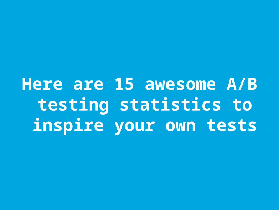
#1. 66% of companies test multiple landing pages on their
websites…
Only 13% think they’re doing it well.

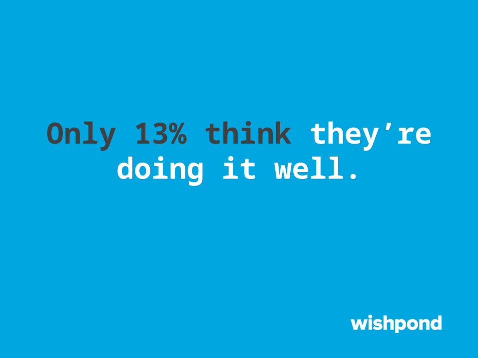
#2. 72% of online retailers test their CTA buttons (Calls-to-
Action)…
Only 49% test the performance of their checkout process.

#3. Google ran more than seven thousand A/B tests in 2011…

40 of them to determine which shade of blue earned more
clicks.

#4. QuickSprout runs one A/B test every two weeks…

A quarter of all their tests boost the relevant conversion rate by
at least 20%.

#5. Eric Siu from Treehouse found his ad Cost per Acquisition (CPA) was
stubbornly floating around $60…

Adding the word ‘Free’ to the ads decreased his CPA by 17
dollars per signup.

#6. People on TreeHouse’s library page weren’t signing up. At first they tested changing the color of the signup button from
grey to green, but with no change…
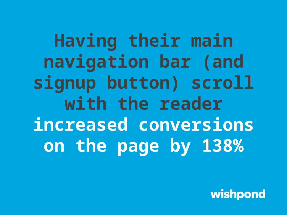
Having their main navigation bar (and signup button) scroll with
the reader increased conversions on the page by
138%

#7. NeilPatel.com had four fields in their entry form: Name, Email, URL and Revenue

Removing ‘Revenue’ from the entry form rocketed its conversion rate by 26%

#8. A software company’s testing of a 14-day trial versus
their original 30-day trial resulted in no change in
conversions. But…

It resulted in 102% more people continuing after the trial had
ended
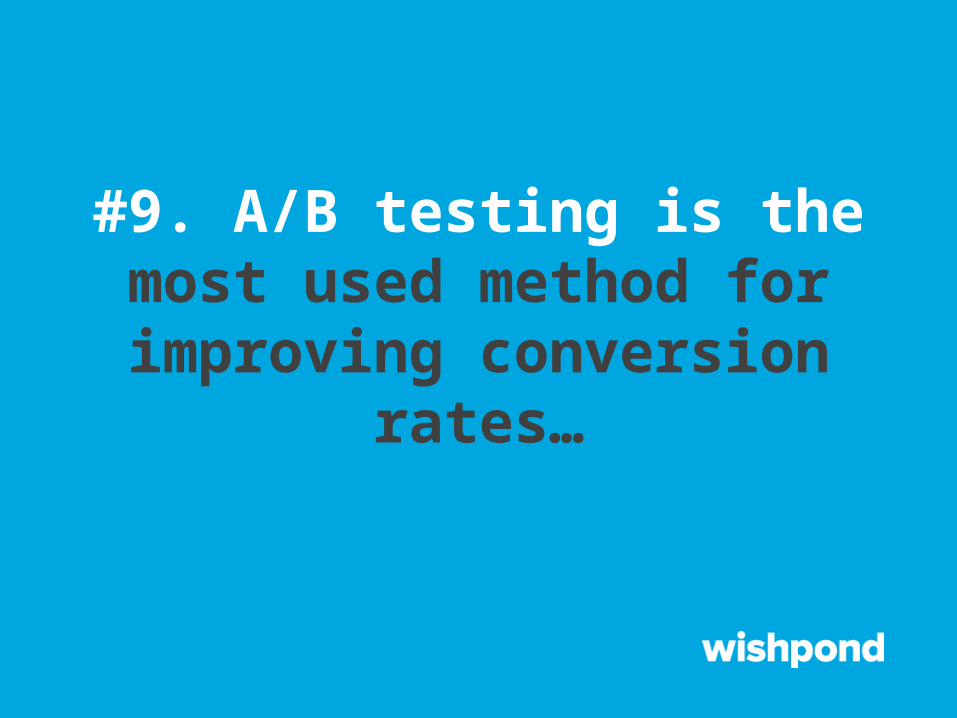
#9. A/B testing is the most used method for improving
conversion rates…

But only one out of eight A/B tests has ever driven major
changes

#10. President Obama’s 2008 presidential election tested their
media on display and call-to-action button combinations…
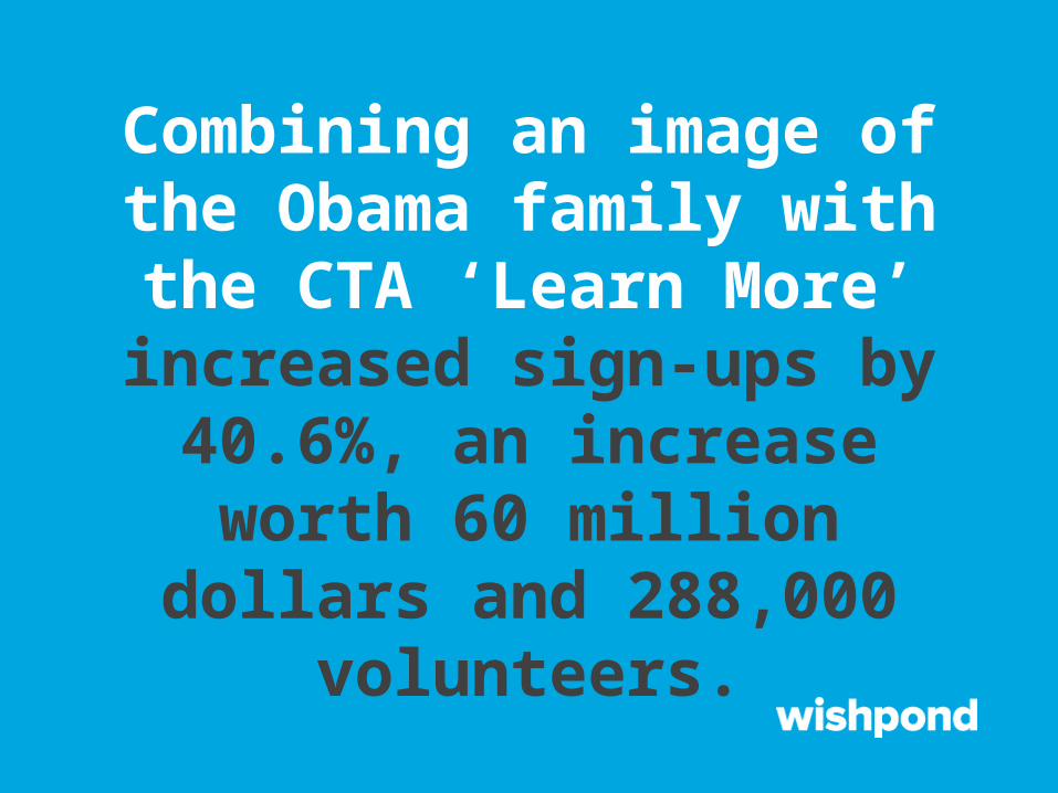
Combining an image of the Obama family with the CTA
‘Learn More’ increased sign-ups by 40.6%, an increase worth 60
million dollars and 288,000 volunteers.

#11. For their ‘Get a Live Demo’ CTA button, Hubspot tested a more dynamic sprocket image against standard rectangular
buttons…
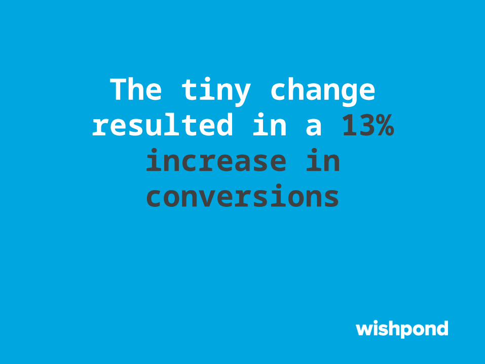
The tiny change resulted in a 13% increase in conversions

#12. Even though they offered free trials, email marketing
company GetResponse had only the ‘Buy Now’ CTA on their
homepage…
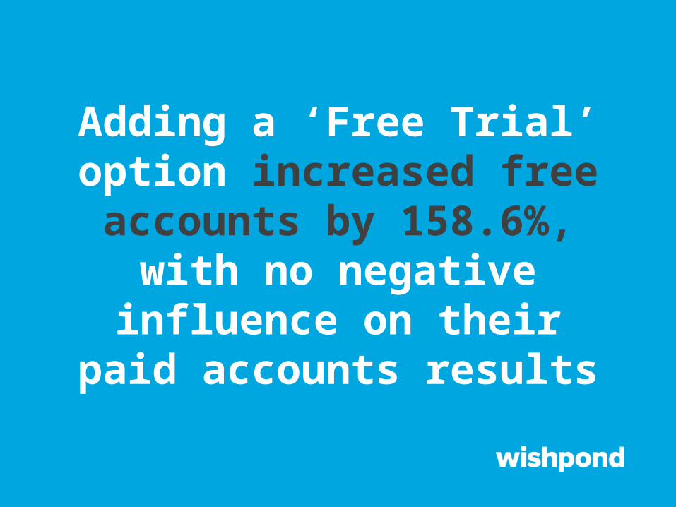
Adding a ‘Free Trial’ option increased free accounts by 158.6%, with no negative
influence on their paid accounts results
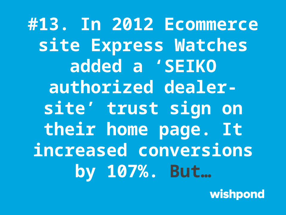
#13. In 2012 Ecommerce site Express Watches added a ‘SEIKO authorized dealer-site’ trust sign on their home page. It increased
conversions by 107%. But…
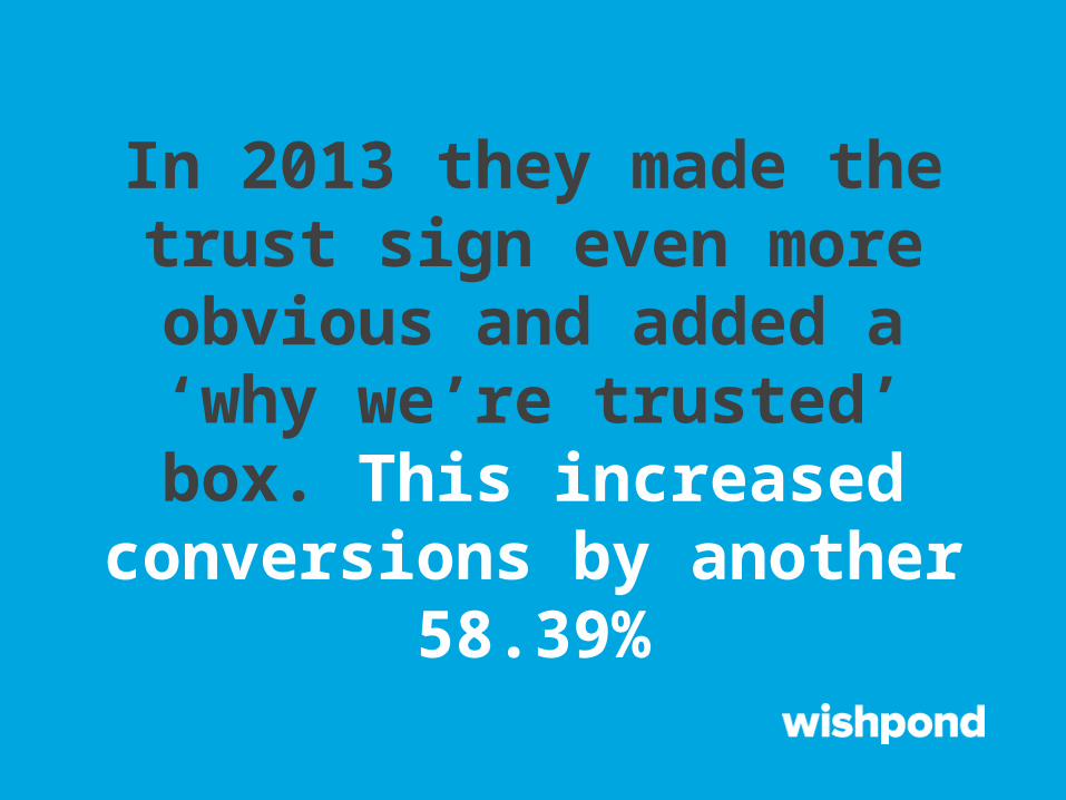
In 2013 they made the trust sign even more obvious and added a
‘why we’re trusted’ box. This increased conversions by
another 58.39%

#14. Data protection company Veeam Software changed their CTA ‘Request a Quote’ in order to increase clck-through-rate…

The CTA adjustment to ‘Request Pricing’ increased their Click-
Through-Rate by 161%

Want to know what inspired us to make this presentation?

#15. Wishpond recently A/B tested our Sweepstakes App
landing page. Moving the ‘Create my Free Account’ CTA
button from the top right to the middle left resulted in…

A 22% increase in sign-ups.
monetate.comiterativepath.wordpress.com
pardot.comadpushup.com
event360.comblog.hubspot.com
visualweboptimizer.comcorp.wishpond.com
Sources:

Thank you for viewing!
Wishpond makes it easy to run social media marketing campaigns.Learn more at Wishpond.com